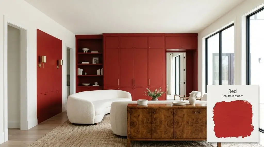
Red 2000-10
Benjamin MooreBenjamin Moore Red (2000-10) is a bold, classic primary red with an LRV of 14.23. Striking a perfect balance between warm and cool, this highly saturated hue delivers a dramatic, energetic statement without leaning too far into orange or burgundy.
Paint Technical Profile
| Color ID / SKU | 2000-10 |
| HEX Code | #C92E2E |
| Light Reflectance (LRV) | 14.23 |
| Use | Interior, Exterior |
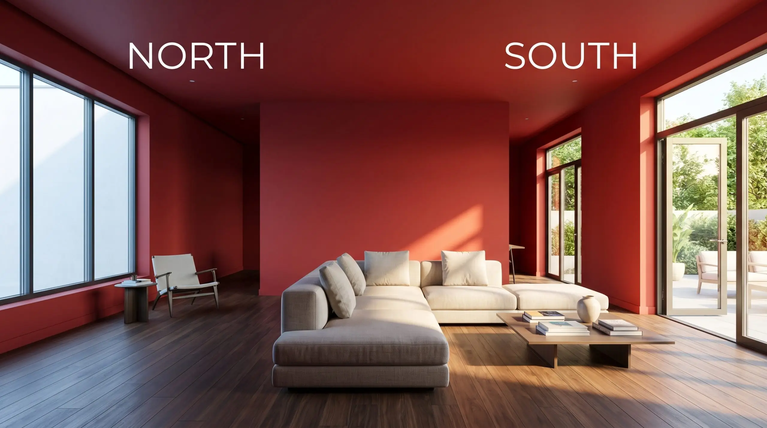
| Best Exposures | South, North |
| Best For | Dining Rooms, Front Doors, Accent Walls, Powder Rooms |
Benjamin Moore Red: Injecting Pure Energy Into Your Architectural Palette
True primary colors are often misunderstood as elementary, but in the hands of a thoughtful designer, they become the most powerful tools in a home’s aesthetic arsenal. Benjamin Moore Red (2000-10) is a fearless, unapologetic pigment that demands attention the second you walk into a room.
It strips away the muddy undertones of trendy burgundies or rustic terracottas to deliver a pure, high-chroma hue. This specific color structure instantly changes the emotional temperature of your space, turning flat walls into dynamic architectural features.
Benjamin Moore Red: Undertones & LRV
Homeowners constantly ask if this specific paint leans warm or cool on the wall. The answer is a resounding warm, but its brilliance lies in an incredibly balanced chromatic profile.
With an LRV 14.23, this shade absorbs a significant amount of light while retaining an undeniable vibrancy. It offers enough visual weight to feel sophisticated and substantial, yet reflects just enough illumination to prevent the room from looking like a dark, muddy crimson.
Mastering the Light Reflectance of This Pure Red
Even the most perfectly balanced pigment will shift throughout the day depending on your home’s natural and artificial exposures. Understanding this light reflectance is the secret to ensuring your walls look intentional rather than accidental.
Popular Applications for Benjamin Moore Red
Integrating such a saturated color saturation requires strategic editing rather than simply painting four walls and hoping for the best. Here is how we apply this vibrant shade across different architectural scenarios to create curated, high-end environments.
Formal Dining Spaces
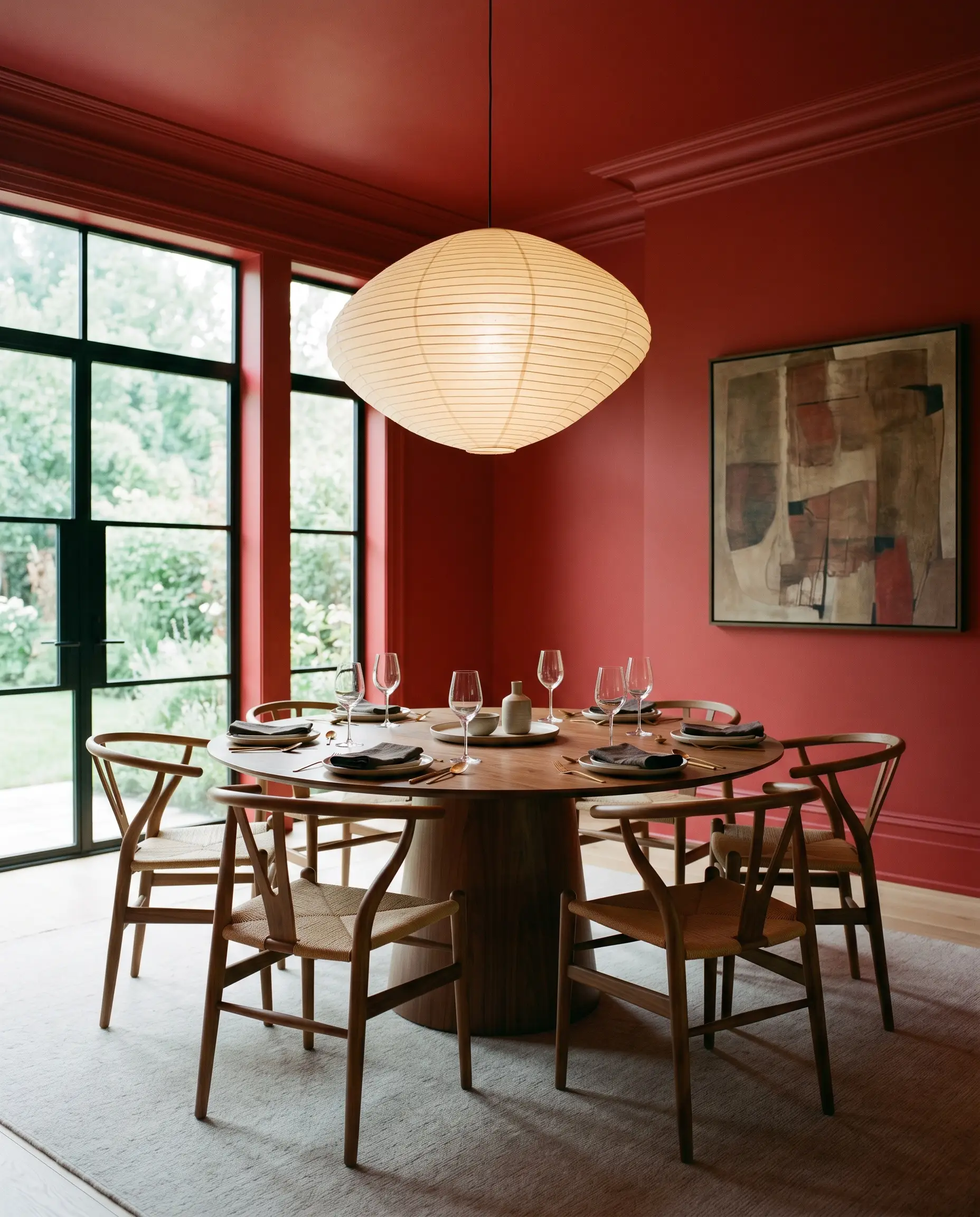
Instead of defaulting to a predictable heritage look, use this rich shade to create a contemporary, color-drenched dining experience. Taking the pigment across the walls, baseboards, and crown molding immediately modernizes the room.
Pair it with a sleek walnut pedestal table, cane-backed wishbone chairs, and an oversized, asymmetrical paper lantern to diffuse the light.
When wrapping a room in an intense primary red, switch to a flat or matte sheen for the walls. This helps absorb light and soften the intensity, while using a satin finish on the trim provides subtle structural definition.
Hackrea Pro-Tip (The Sheen Strategy)
Interior Entryway Doors
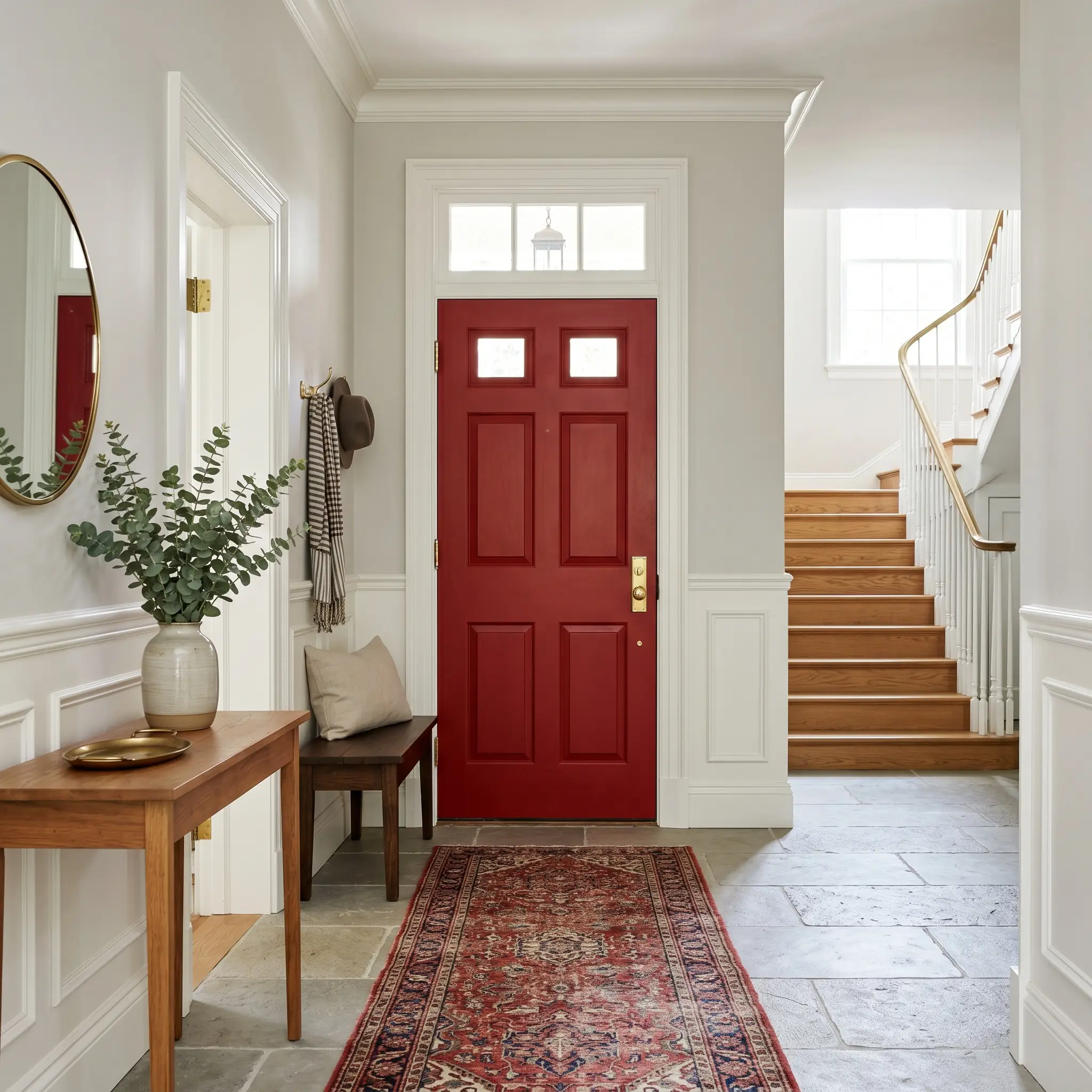
Painting the interior side of your front door is a brilliant way to inject personality into a neutral foyer without overwhelming the floor plan. This pure pigment acts as a graphic focal point against crisp white wainscoting or soft gray limewash walls.
Anchor the vibrant door with unlacquered brass hardware and a vintage, heavily patterned runner rug. This approach effortlessly bridges the gap between classic architecture and contemporary styling.
High-Impact Powder Baths
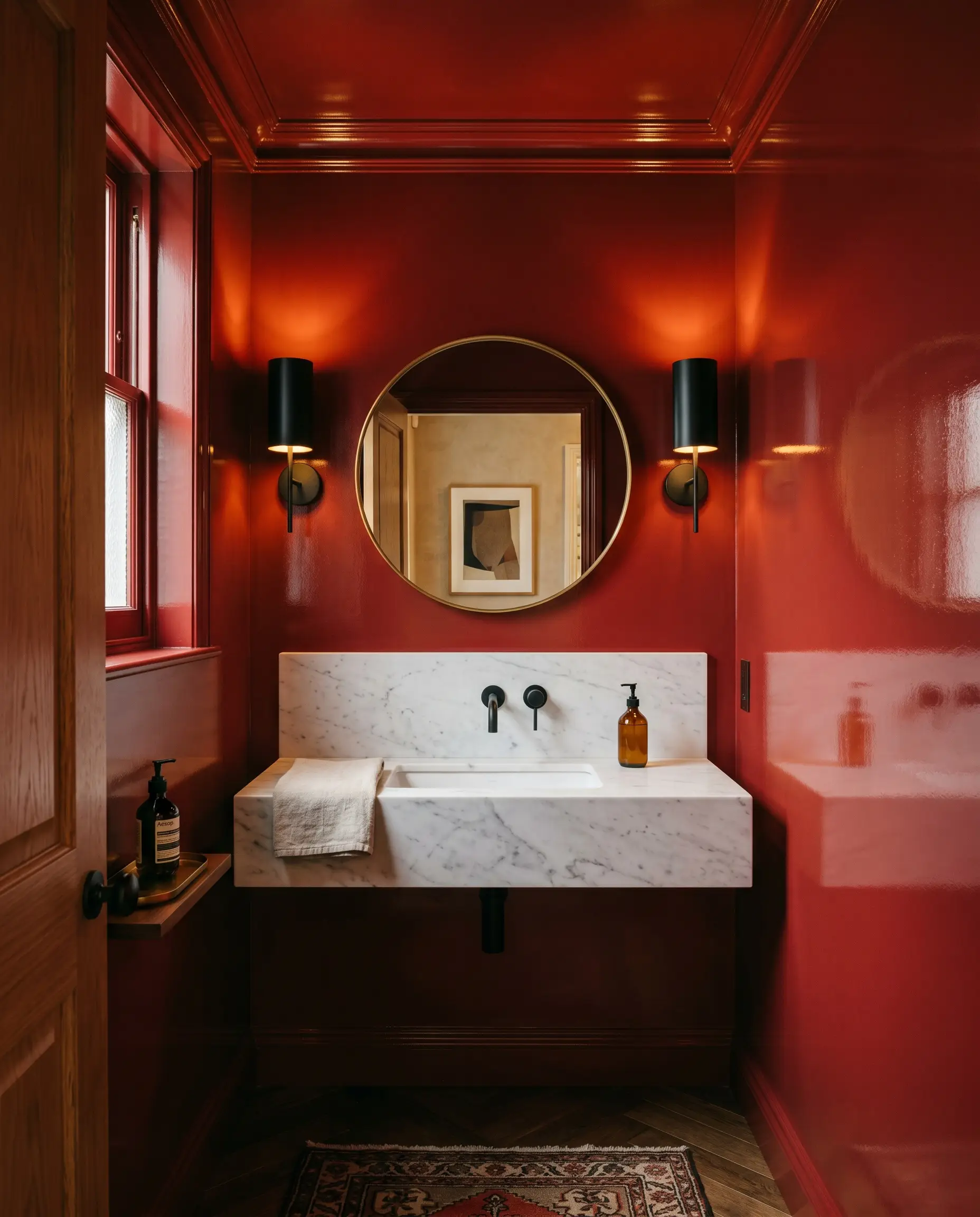
Small, windowless spaces are the perfect architectural canvas for fearless color saturation. Elevate the room by wrapping the walls and ceiling in a high-gloss finish, turning the tight quarters into a reflective, jewel-box experience.
Offset the intense visual weight with a floating honed marble sink and matte black steel sconces. Finish the space with a minimalist brass mirror for a sharp, modern edge.
Workspaces and Built-In Bookcases
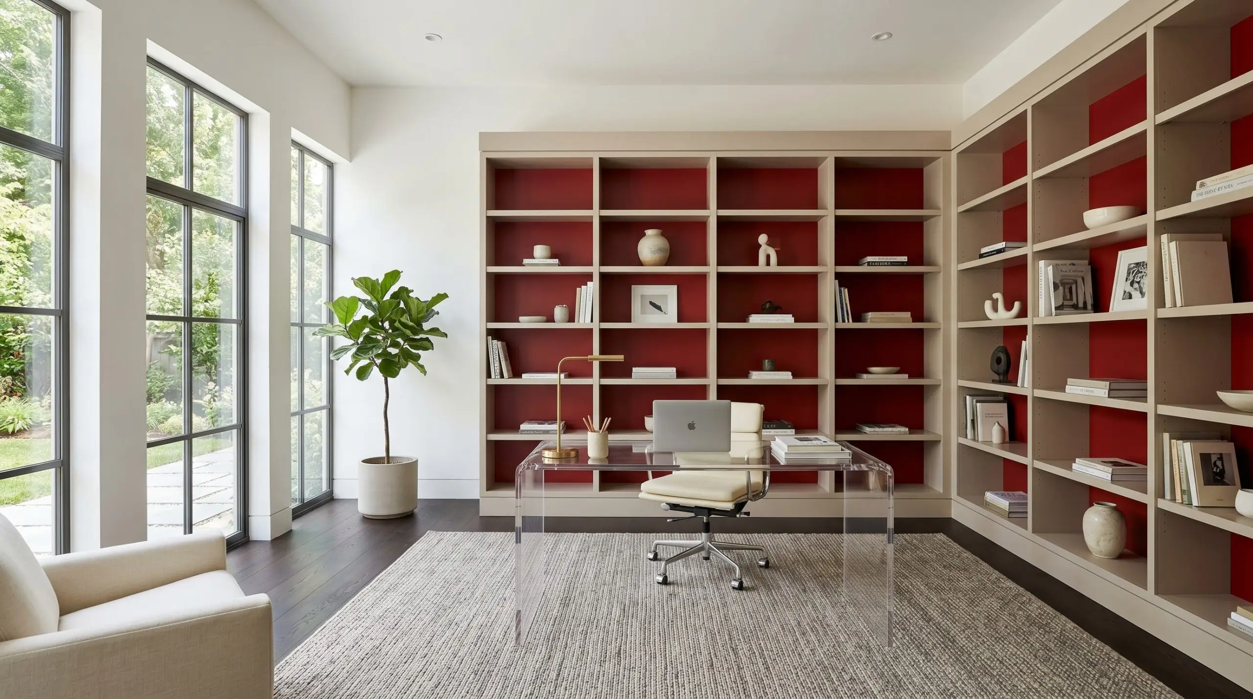
Rather than leaning into dusty, traditional library tropes, use this bold shade to create an energizing backdrop for a modern home office. Applying it exclusively to the back panels of built-in bookcases provides a stunning millwork contrast that makes books, minimalist ceramics, and trailing plants pop.
Keep the surrounding walls a soft, warm neutral and introduce a sleek lucite desk to maintain a light, airy flow.
If your office features heavily yellow-toned wood floors like golden oak, this vibrant shade will amplify those yellow tones. Counteract this by layering a large, cool-toned sisal or wool rug to separate the vibrant paint from the flooring.
Hackrea Clash Warning (Flooring Conflicts)
Kitchen Cabinetry Focal Points
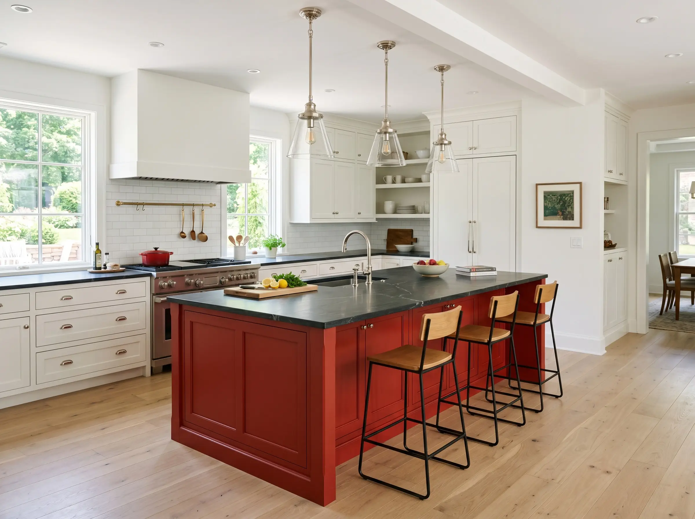
A vibrant kitchen island instantly breaks up the monotony of an all-white or wood-toned culinary space. This shade brings incredible warmth and energy to the center of the room where families naturally gather.
Top the island with a honed soapstone counter to introduce a sophisticated, dark contrast. Suspend polished nickel pendants above it to balance the heat of the paint with cool, tactile materials.
Building a Palette Around Benjamin Moore Red
Because this pigment brings such intense heat to a room, it requires secondary elements that either confidently stand their ground or offer a cool, shadowy contrast. It thrives on clear visual boundaries to keep its energy contained and intentional, rather than letting it bleed softly into the background.
Framing the Pigment: Ideal Millwork Choices
Tactile Elements for a High-Chroma Hue
Secondary Hues to Balance the Energy
Curated Styling Concepts
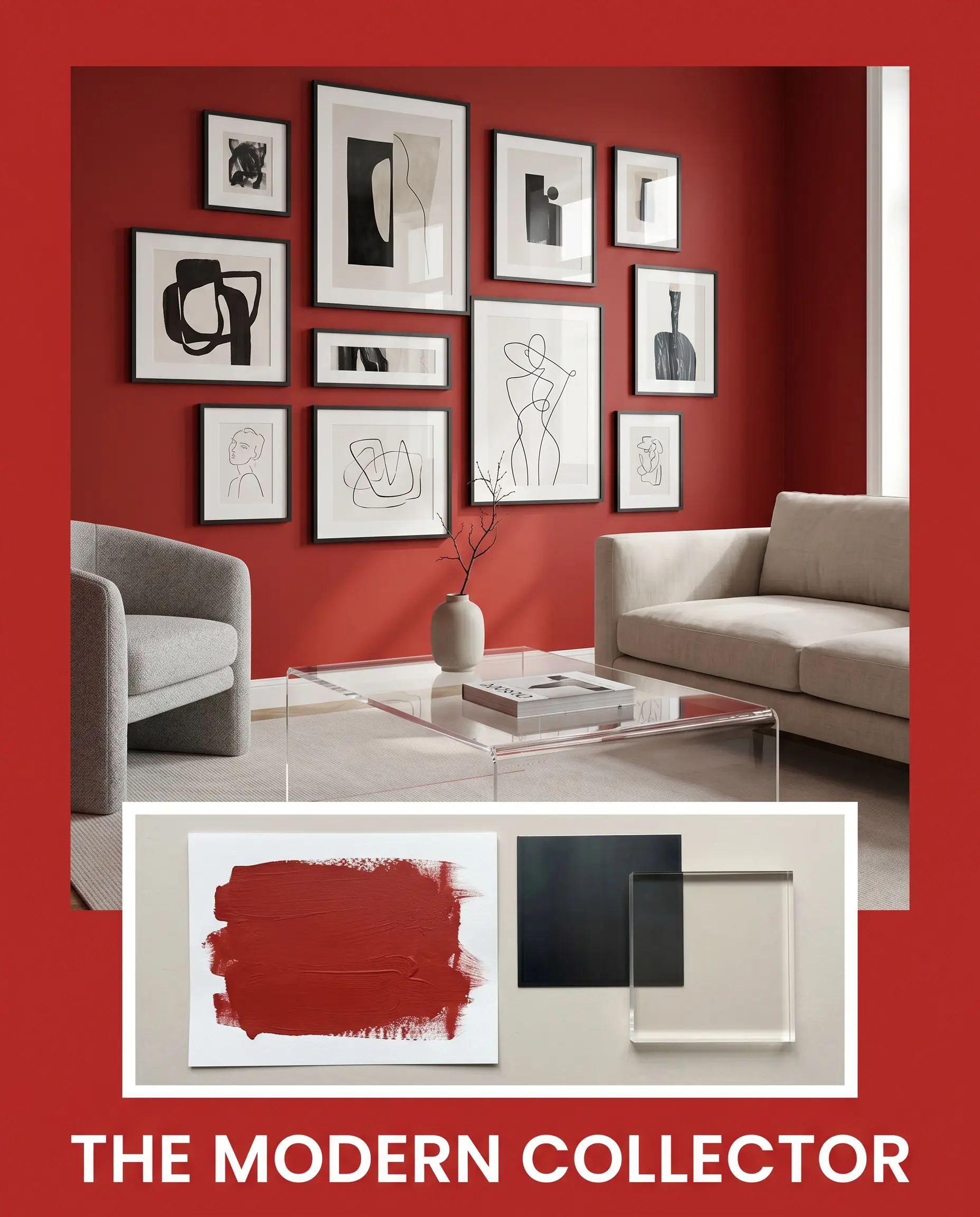
The Modern Collector: This aesthetic relies on high-contrast tension to create an energetic, gallery-like atmosphere. The fiery walls serve as a dynamic backdrop for asymmetrical gallery walls filled with abstract canvas art and stacked art books. Introduce sleek matte black steel accents and a lucite coffee table to keep the visual flow sharp and entirely contemporary.
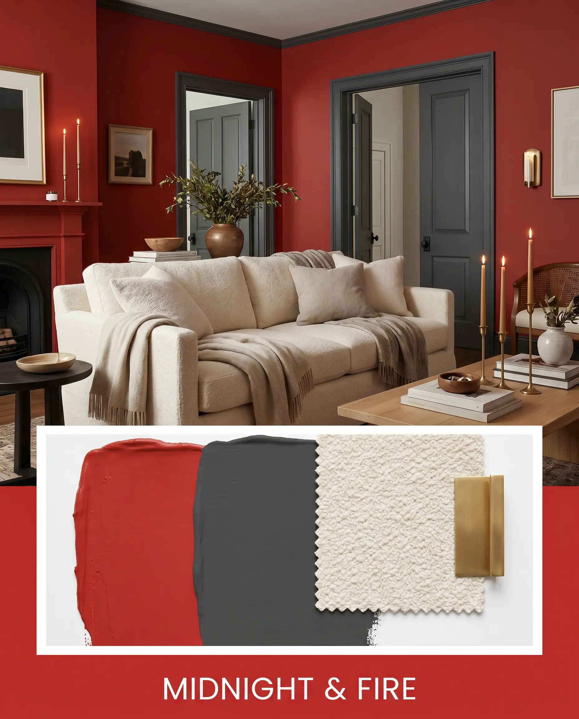
Midnight & Fire: Grounding the intense warmth with deep, moody shadows creates a highly sophisticated, enveloping vibe. Layer in Farrow & Ball Railings on the trim or interior doors to cool down the room’s temperature. Add a creamy boucle slipcovered sofa and unlacquered brass taper candles to introduce soft, tactile luxury that glows against the darker elements.
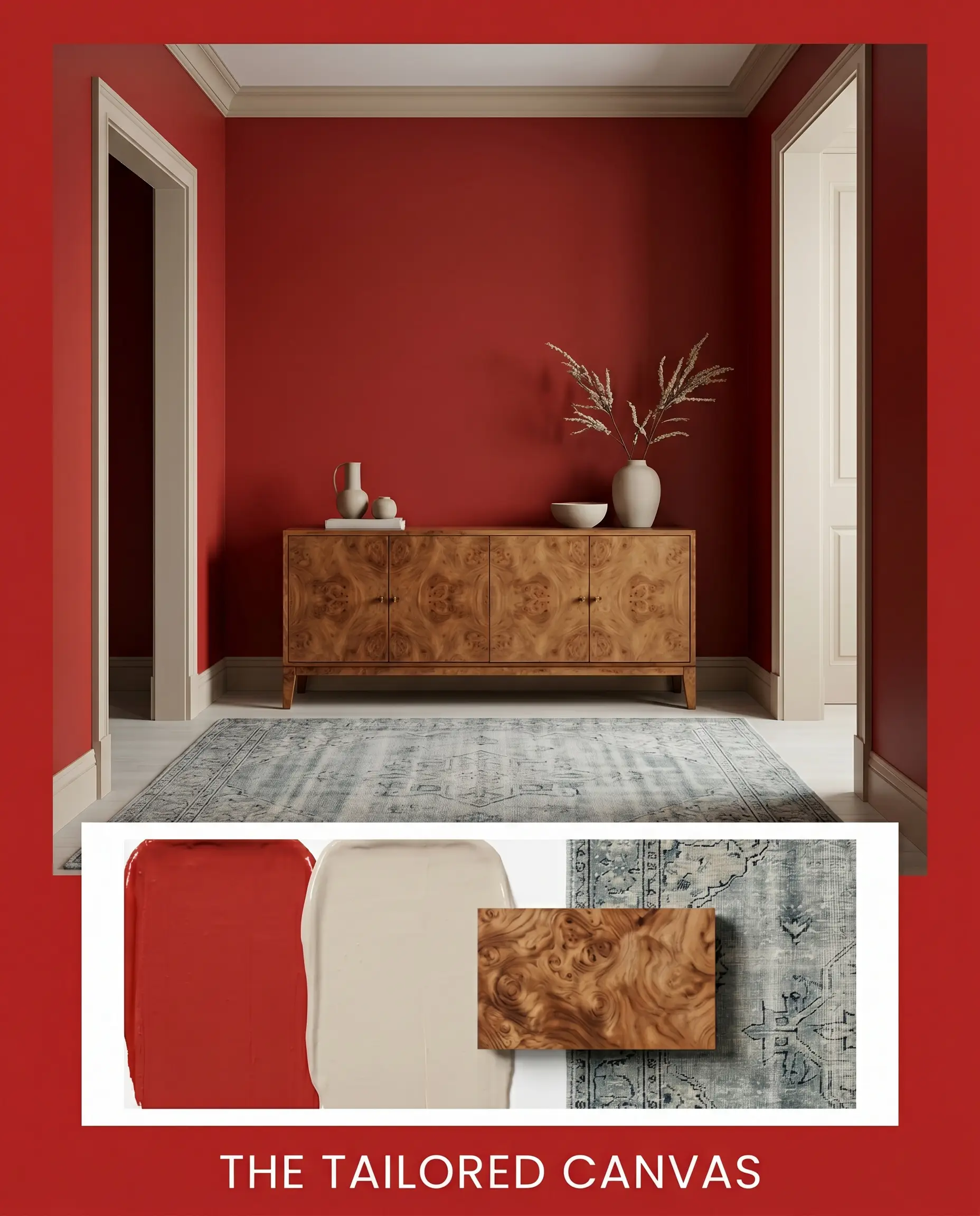
The Tailored Canvas: For a more understated approach, this concept softens the vibrant pigment with organic textures and earthy warmth. Pair the paint with a vintage burl wood credenza and Sherwin-Williams Accessible Beige on the surrounding trim to temper the color’s inherent heat. Minimalist ceramics and a cool-toned vintage rug establish a serene, beautifully curated balance.
Comparing Benjamin Moore Red Against Rival Shades
When evaluating highly saturated colors, the decision often comes down to how the pigment responds to your specific lighting and architectural style. If your room lacks natural light or you need a softer historical vibe, you may need to pivot away from this pure red to find the perfect fit.
Benjamin Moore Red 2000-10 vs. Benjamin Moore Heritage Red HC-181
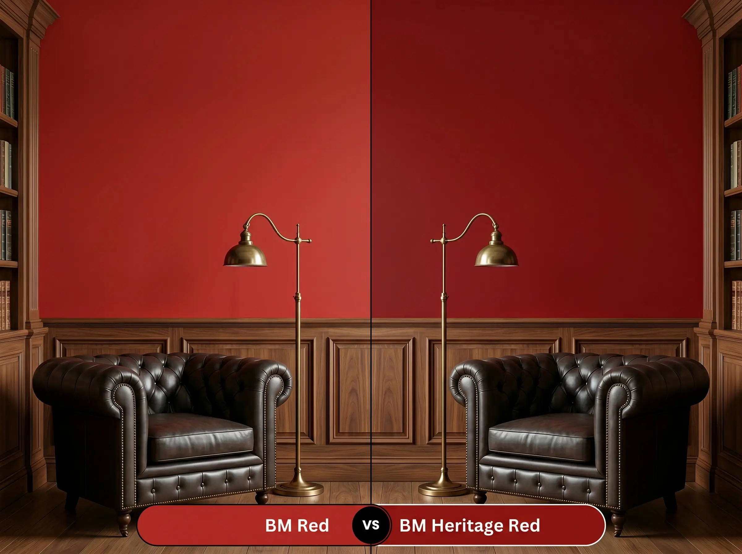
Heritage Red is slightly deeper and leans into a more muted, historical profile. If you want a classic, time-honored look that feels slightly softer in bright sunlight, Heritage Red is often the safer choice. However, if you crave a punchy, energetic statement that retains its vivid clarity even in shadows, 2000-10 is the clear winner.
Benjamin Moore Red 2000-10 vs. Sherwin-Williams Real Red SW 6868
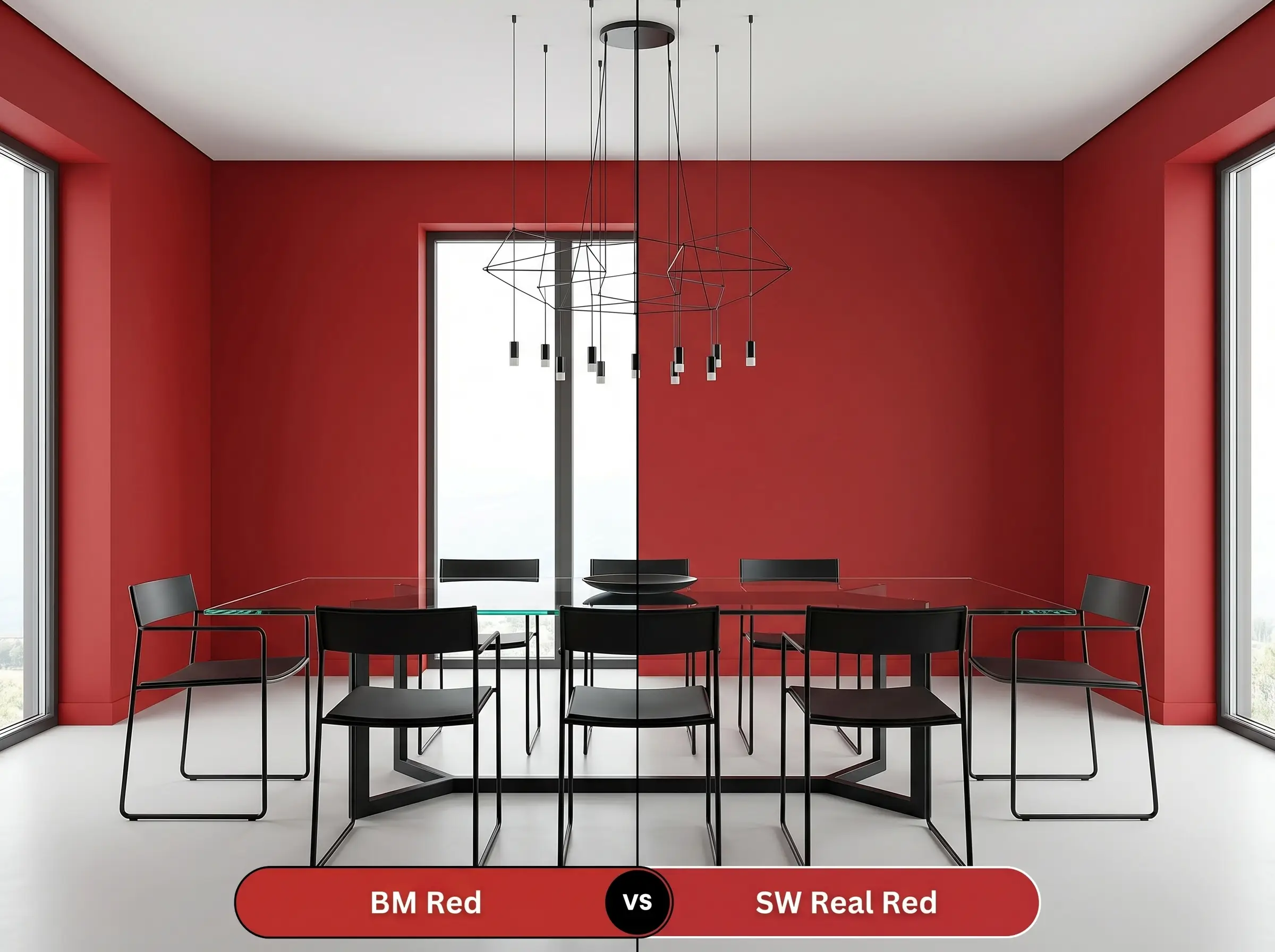
Real Red pushes slightly brighter and can occasionally flash a microscopic pink undertone in cool northern light. If your room is bathed in warm southern sun, Real Red will amplify that heat beautifully. But if you need a steadfast, true primary hue that resists shifting across different lighting conditions, the Benjamin Moore option offers superior stability.
Alternative Options for This Primary Pigment
Sometimes a space requires just a subtle tweak in depth or a slight shift in warmth to feel perfectly resolved. Whether you need a slightly darker anchor or are shopping across different brands, these alternatives provide beautiful flexibility.
Benjamin Moore Alternatives
Color Matches from Rival Brands
Executing Your Red Paint Project
Transitioning from design theory to the physical application requires careful planning, especially with a color this intense. The right prep work and finish selection will make the difference between a premium result and a frustrating weekend project.
Selecting the Right Finish
Primer Strategies and Flawless Coverage
Because red pigments are notoriously sheer, using a standard white primer will result in a frustrating, streaky mess. You must use a high-quality gray-tinted primer to create a solid, neutral base that allows the true color structure to develop. Even with the correct primer, expect to apply a minimum of two to three generous coats to achieve full opacity.
Always maintain a “wet edge” when rolling this color, and never go back over a partially dried section. Touching up a vibrant hue often leads to “flashing”—visible roller marks that reflect light differently—so it is crucial to apply even, consistent coats from corner to corner.
Hackrea Design Secret (Avoiding Flashing)
Frequently Asked Questions
Yes, a gray-tinted primer is absolutely essential for this color. Red pigments are naturally translucent, and a gray base prevents the color from looking streaky or washed out, ensuring the final hue is rich and beautifully even.
Applying this vibrant hue to a ceiling visually lowers the height of the room, creating an incredibly intimate, enveloping atmosphere. On the walls, it acts as an energizing, expansive force that pushes the boundaries of the space outward.
This specific organic pigment is highly susceptible to UV degradation. When exposed to direct, prolonged sunlight outdoors, the color will rapidly fade and lose its signature vibrancy, making it strictly an interior choice.
A satin finish is the perfect balance for architectural features like wainscoting. It provides the necessary durability to resist scuffs while maintaining a soft, elegant glow that avoids the overly reflective look of high-gloss.
The Final Verdict on This Vibrant Hue
Benjamin Moore Red 2000-10 is a brilliant, uncompromising hue designed for homeowners who want to make a definitive architectural statement. Its pure, balanced chromatic profile excels in contemporary dining spaces, high-gloss powder rooms, and on striking interior doors where it can act as a curated focal point. This paint thrives when paired with high-contrast elements like crisp white millwork, matte black steel, and organic textures that ground its intense energy.
However, if your home features extensive honey-oak flooring, warm Tuscan-style stonework, or earthy terracotta tiles, you must proceed with caution. The pure heat of this red will clash uncomfortably with those orange and yellow undertones, creating a visual competition that distracts the eye. It requires a neutral or cool-toned foundation to truly shine, making it the perfect choice for those ready to embrace bold, intentional design.