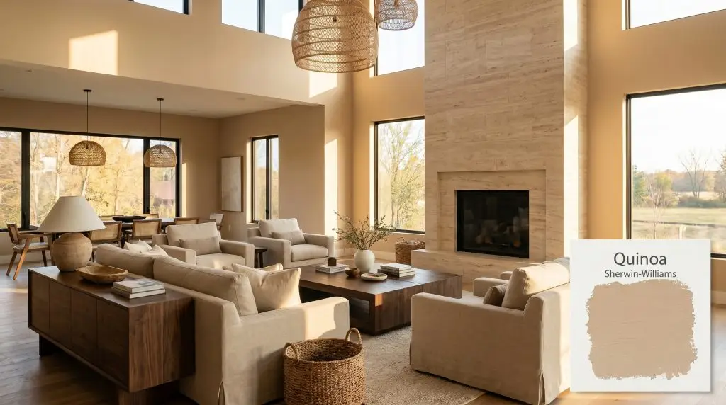
Quinoa SW 9102
Sherwin-WilliamsSherwin-Williams Quinoa (SW 9102) is a warm, mid-tone beige with distinct golden-tan and subtle peach undertones. Boasting an LRV of 49, it acts as a grounding, earthy neutral that brings cozy warmth to living spaces and cabinetry without feeling overly heavy or dark.
Paint Technical Profile
| Color ID / SKU | SW 9102 |
| HEX Code | #CFB597 |
| Light Reflectance (LRV) | 49 |
| Use | Interior, Exterior |
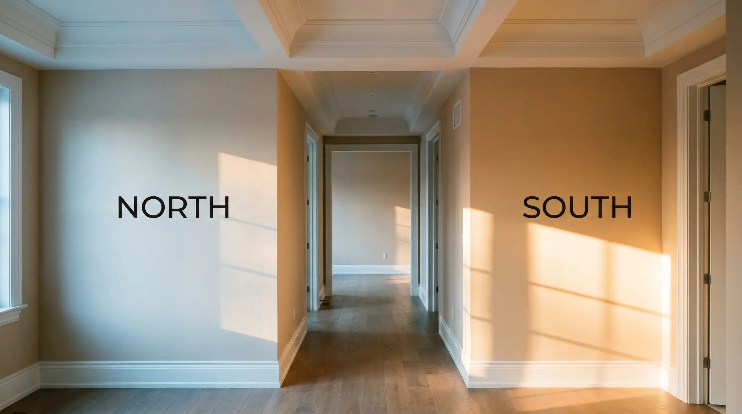
| Best Exposures | North, East |
| Best For | Living Rooms, Bedrooms, Kitchen Cabinetry, Home Offices |
Sherwin-Williams Quinoa: Sculpting Warmth With an Earthy Golden-Beige Neutral
A room defined by stark white walls often feels unfinished, lacking the foundational warmth that turns a house into a lived-in sanctuary. Sherwin-Williams Quinoa steps into this void, replacing sterile boundaries with a rich, enveloping softness.
This earthy tan operates as a grounding anchor for spaces that feel untethered. By absorbing harsh glare and radiating a subtle, baked-clay energy, Quinoa SW 9102 transforms ordinary drywall into a textured, tactile backdrop.
Sherwin-Williams Quinoa: Undertones & LRV
When evaluating whether this paint leans warm or cool, the answer is definitively warm. Sherwin-Williams Quinoa is deeply rooted in the golden-beige family, radiating an inviting, sun-baked energy. This temperature profile allows it to soften harsh structural lines seamlessly.
With a light reflectance value of 49, this mid-tone depth strikes a delicate balance. It absorbs slightly more light than it bounces back, making it substantial enough to hold its own against bright windows. However, it lacks the reflective capability to artificially illuminate a dark, heavily shadowed corridor.
The Chameleon Factor: Ambient Lighting Shifts
The biggest environmental risk for this warm neutral lies in heavily shaded, north-facing spaces where cool daylight strips away its golden-beige warmth. Without adequate lighting, the terracotta micro-undertone retreats, leaving behind a flat, heavy shadow that can feel unintentionally dreary.
Because of its hue angle 32 degrees, this color responds dramatically to shifting sunlight throughout the day. You must test this earthy tan on multiple walls to see how it reacts to your home’s unique exposure.
Everyday Architecture: Popular Room Applications
This golden-beige brings a cohesive, stabilizing energy to residential architecture. It replaces the starkness of bare walls with a gentle, enveloping warmth that redefines the boundaries of a home.
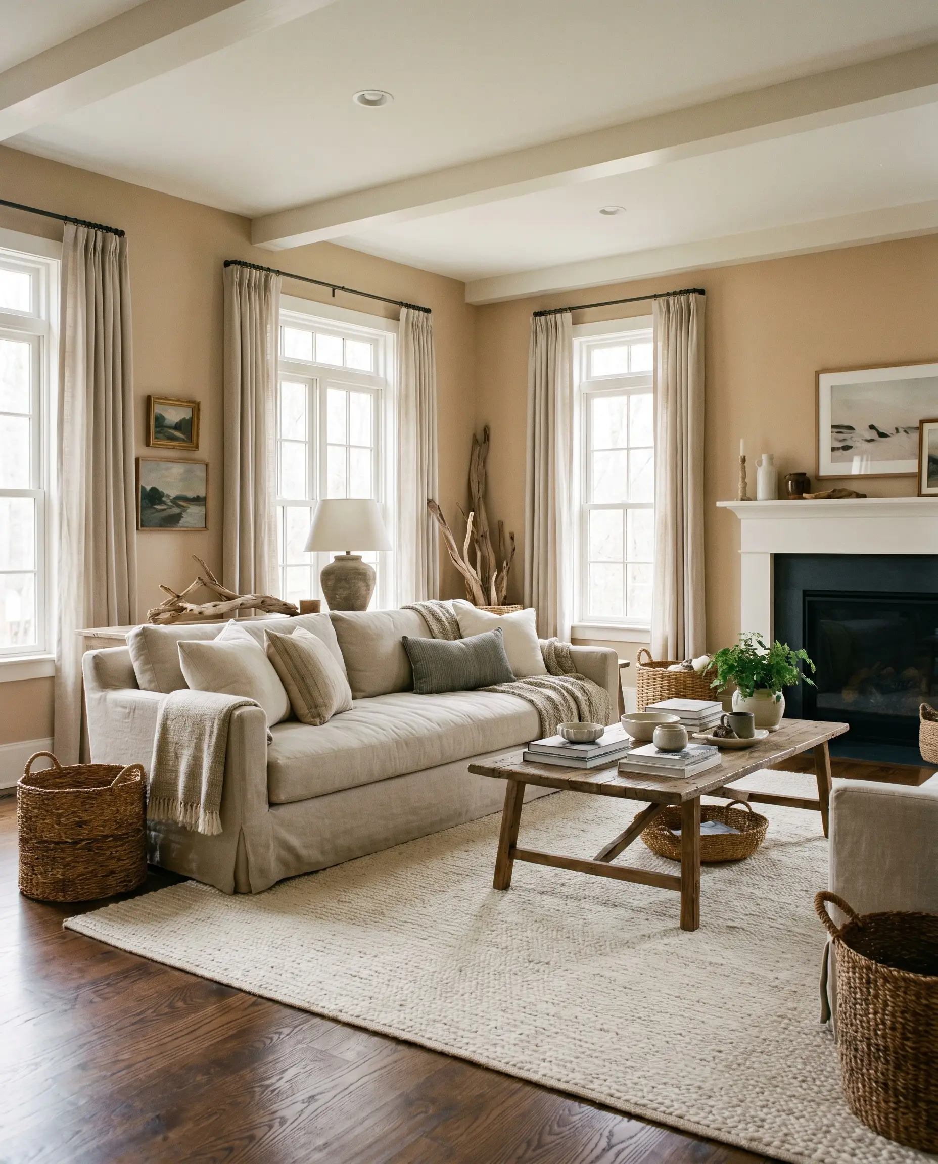
Living Rooms
Quinoa wraps basic drywall in a comforting, baked-earth glow. It pairs beautifully with oversized linen upholstery and richly stained oak floors to create an inviting, relaxed gathering space. To prevent the room from feeling too heavy, balance the mid-tone depth with plenty of creamy white textiles or a large, light-reflecting mirror.
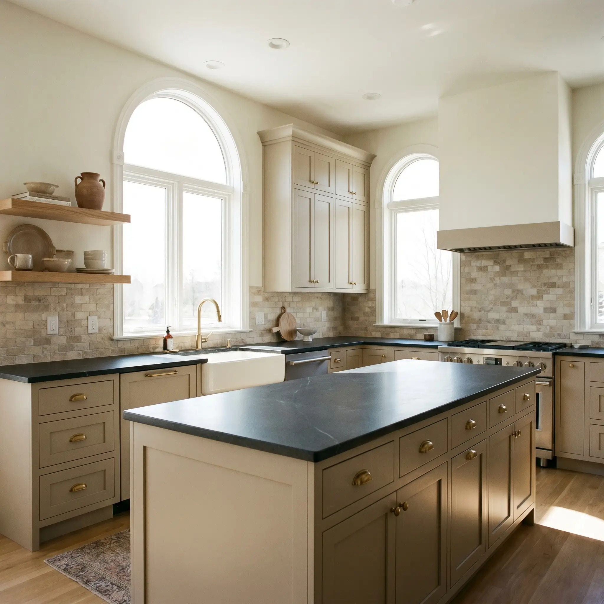
Kitchens
Using this earthy tan on stock cabinetry instantly brings custom warmth to an otherwise utilitarian cooking space. It provides a stunning alternative to stark white, grounding the kitchen while beautifully complementing honed soapstone counters or tumbled travertine backsplashes.
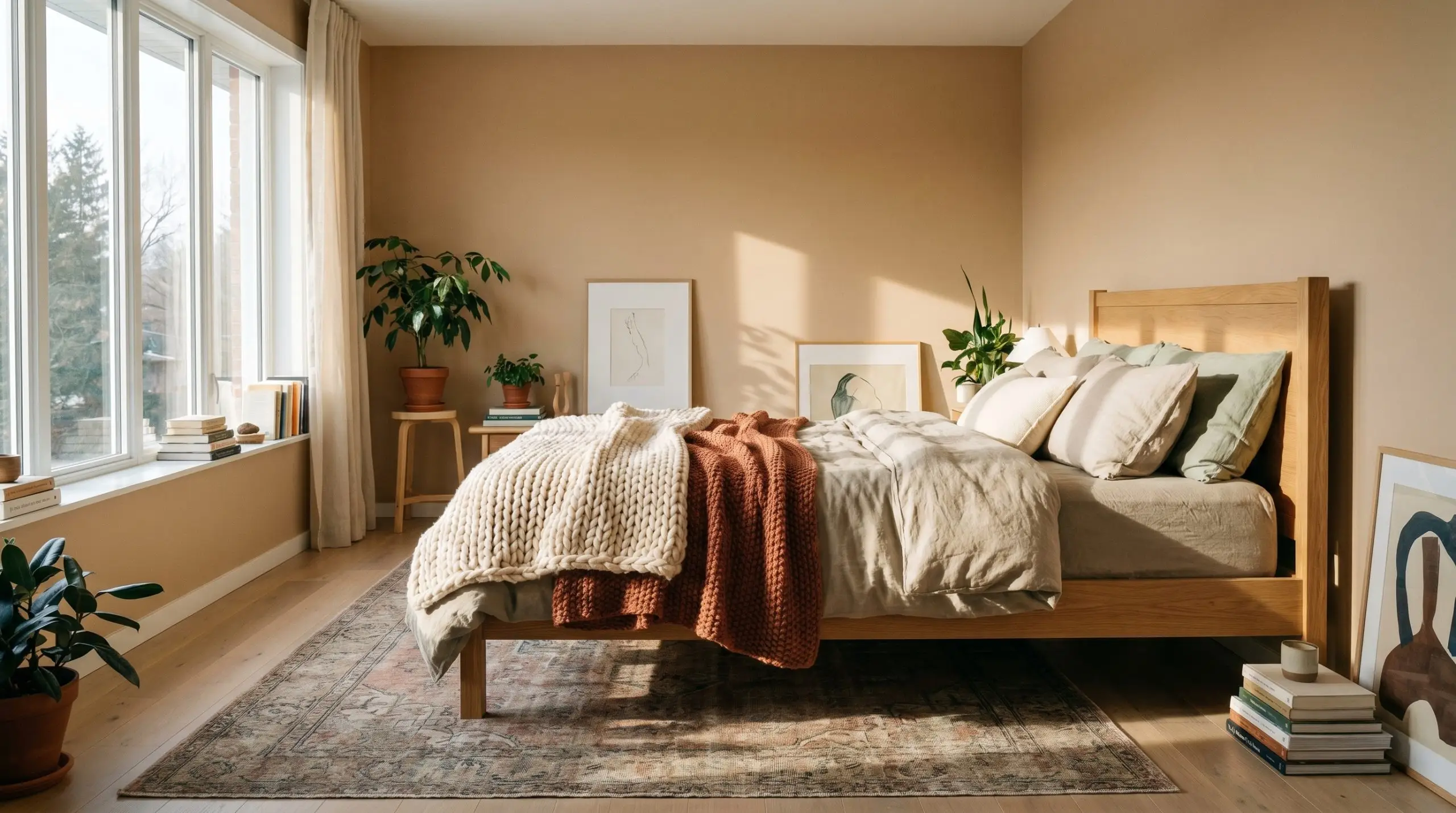
Bedrooms
In a sleeping space, this color establishes a serene, cocooning atmosphere. The warm neutral softens the harsh lines of simple furniture, encouraging a restful transition at the end of the day. Layer the bed with chunky knit throws and soft, stonewashed cotton to enhance the tactile, relaxed aesthetic.
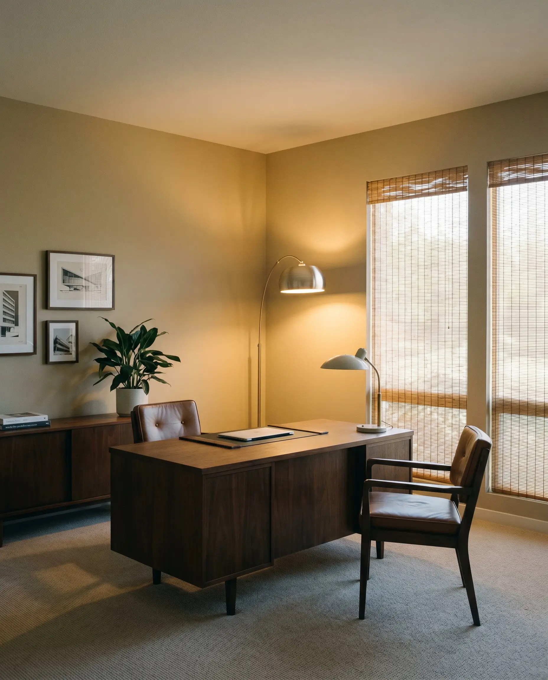
Home Offices
For a workspace, this shade offers a sophisticated, distraction-free backdrop. It feels significantly more grounded than a basic off-white, lending a sense of permanence and focus to the room. Pair it with dark walnut desks and woven window shades for a layered, professional finish.
When using a mid-tone like SW Quinoa in a room with limited windows, strategically place floor lamps with warm 3000K bulbs in the corners. This washes the walls with light, highlighting the terracotta micro-undertone and preventing the corners from feeling heavy.
Hackrea Design Secret (Lighting Control)
Distinctive Projects: Creative Ways to Use Quinoa
Moving past traditional four-wall applications, this shade inspires highly custom, intentional design moments. Its specific color absorption qualities make it a brilliant tool for manipulating the perceived scale and texture of unique architectural features.
The Enveloped Entryway
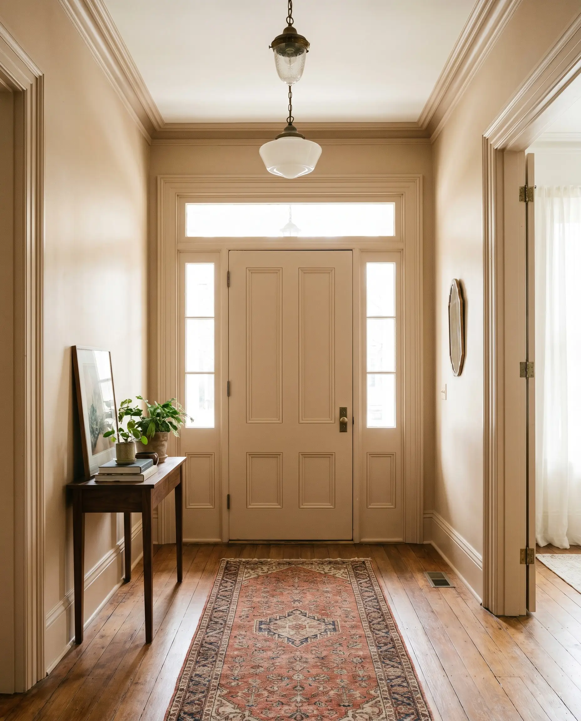
Painting the entire foyer—including the interior front door and baseboards—in this rich hue creates an immediate sense of arrival. The subtle terracotta warmth embraces guests, making the transition from the bright outdoors into the home feel intentional and welcoming.
Grounding the Dining Room Ceiling
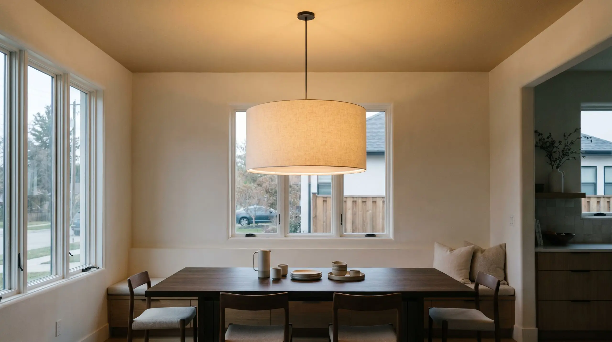
Applying this mid-tone depth to the ceiling above a dining table visually lowers the height of the room, fostering an intimate, conversational atmosphere. Paired with a dramatic, oversized fabric drum pendant, the color absorbs the upward light, casting a flattering, ambient glow over dinner guests.
Customizing Stock Built-Ins
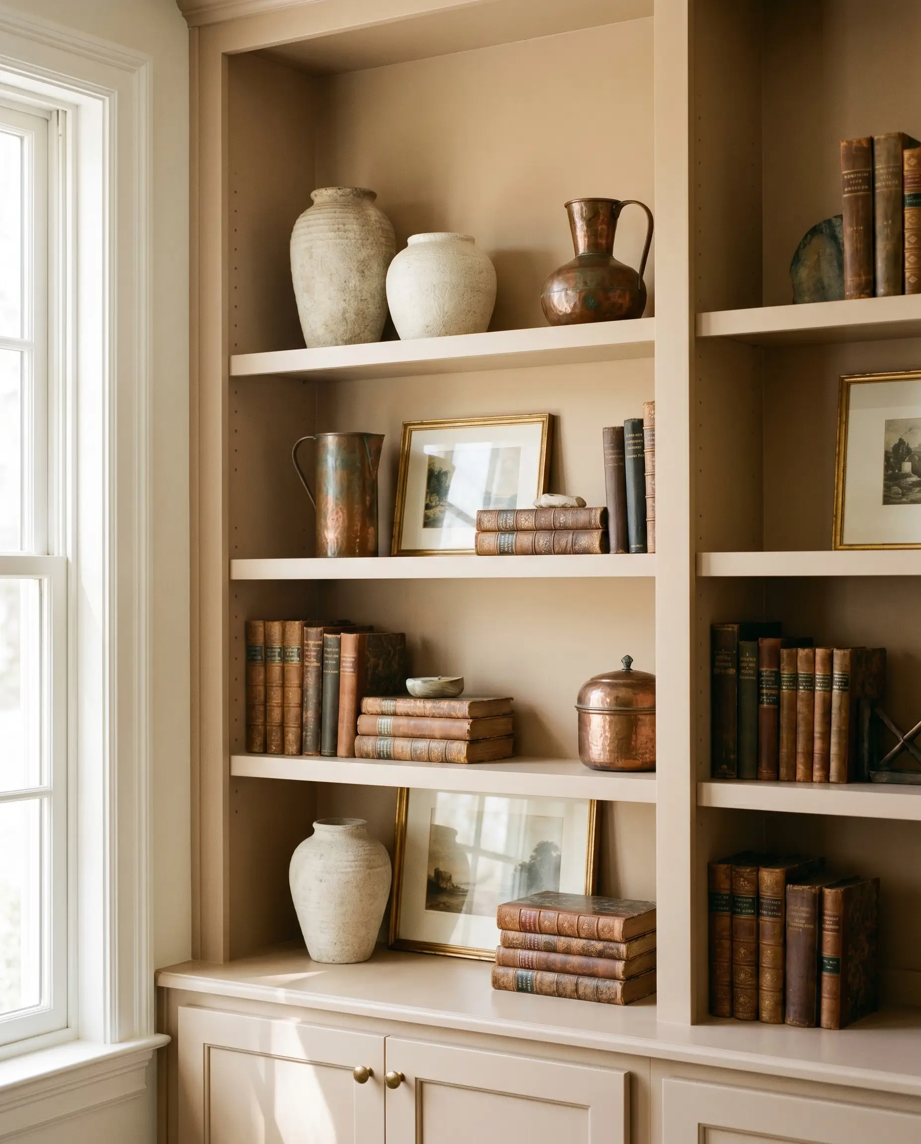
Coating basic living room bookshelves in this earthy tan instantly upgrades them to look like custom, high-end millwork. When styled with textured ceramic vases, oxidized copper accents, and vintage leather-bound books, the paint’s golden-beige profile provides a rich, contrasting backdrop that makes the decor pop.
Coordinating Colors & Best Pairings
The key to building a palette around this warm neutral lies in understanding its relational behavior. It thrives when paired with crisp boundaries that allow its earthy depth to shine, or with contrasting cool tones that balance its inherent warmth.
Trim & Baseboards
To frame this mid-tone properly, you need a trim color that provides a clean break without feeling icy.
Hardware, Wood & Material Pairings
Coordinating Colors
Designer Mood Boards
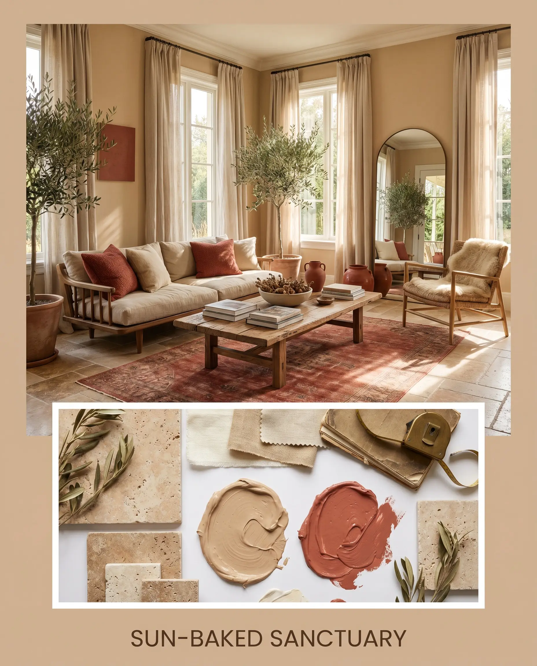
Sun-Baked Sanctuary: This palette radiates a relaxed, organic warmth. By combining the earthy tan walls with Farrow & Ball Red Earth No. 64, tumbled travertine, and soft linen drapery, the space feels incredibly grounded and restorative. It captures the essence of a slow, intentional afternoon bathed in golden-hour light.
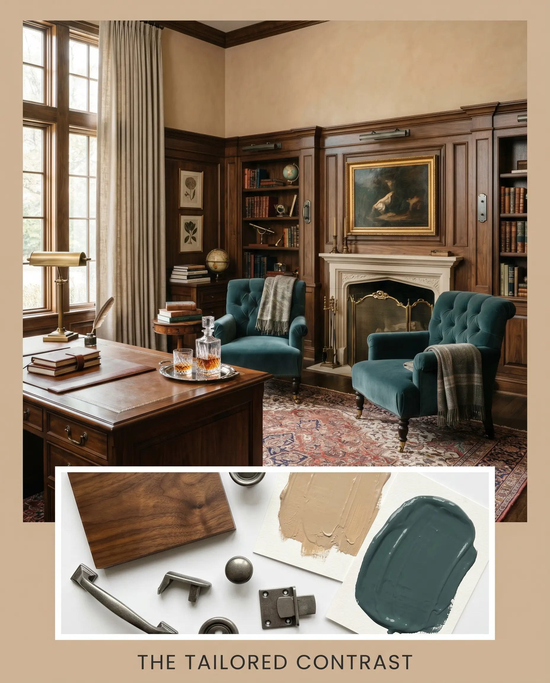
The Tailored Contrast: A sophisticated, high-impact aesthetic that balances warmth and depth. The golden-beige provides a soft backdrop for the deep, moody Benjamin Moore Newburg Green HC-158, while smoked walnut accents and aged pewter hardware introduce a refined, tailored edge. The resulting energy is grounded, crisp, and effortlessly elegant.
Head-to-Head Comparisons
Choosing the perfect earthy neutral often comes down to assessing your room’s specific lighting conditions and architectural flow. If your space lacks natural light or has conflicting fixed elements, you may need to pivot to a rival shade to achieve the right balance.
Sherwin-Williams Quinoa vs. Sherwin-Williams Accessible Beige SW 7036
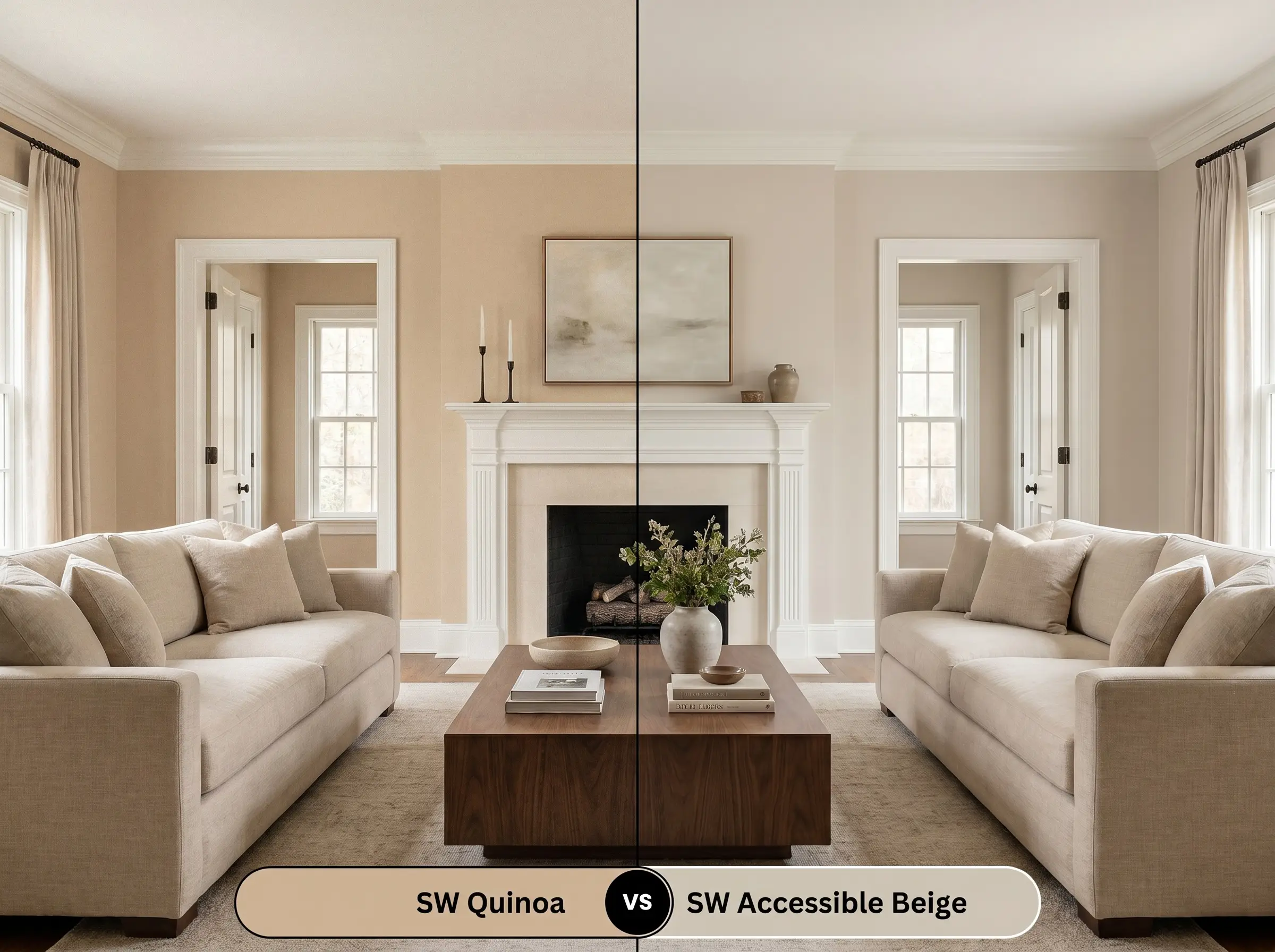
Accessible Beige leans significantly cooler, featuring gray undertones that make it a true greige. If your room has heavy south-facing light that makes Quinoa SW 9102 look slightly too vibrant, Accessible Beige is the safer, more muted alternative.
Sherwin-Williams Quinoa vs. Benjamin Moore Shaker Beige HC-45
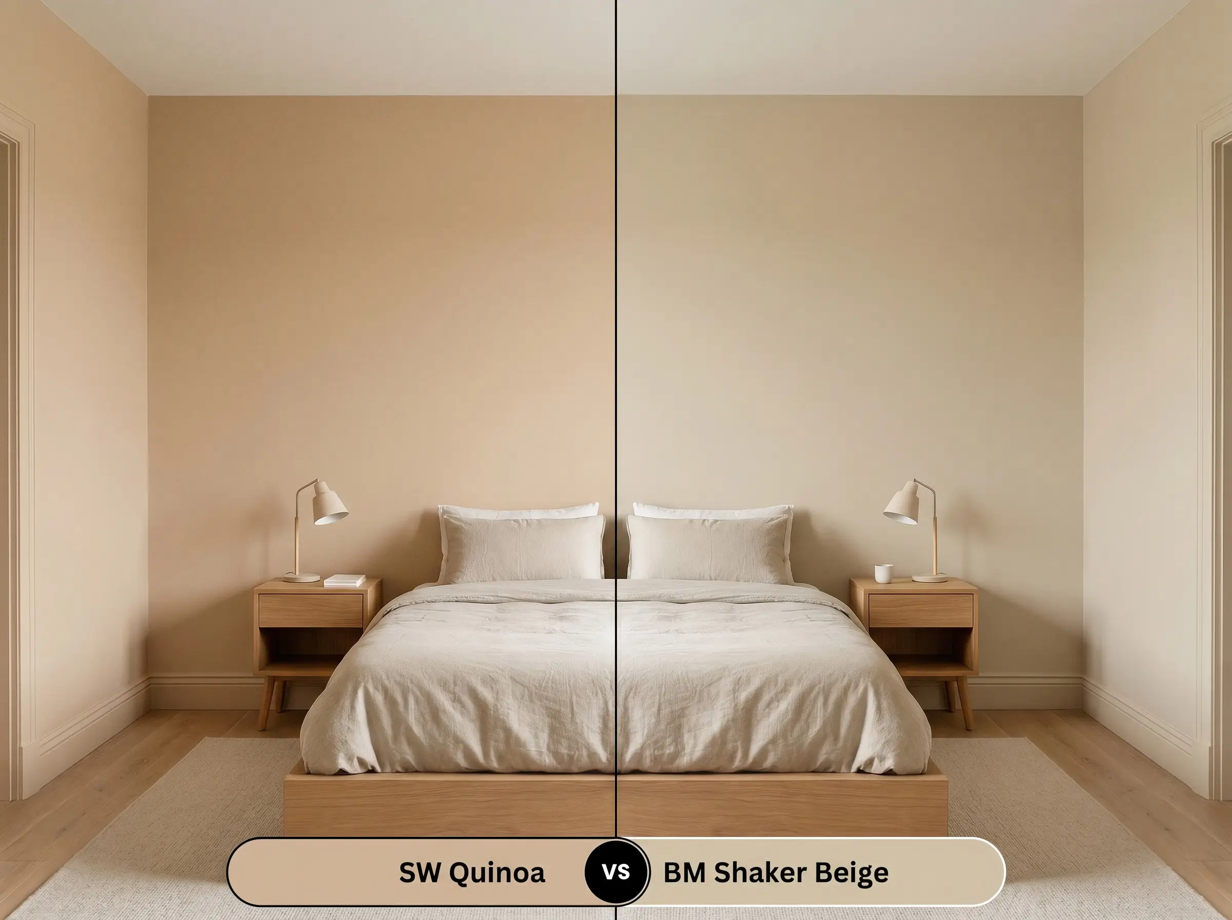
Shaker Beige shares a similar mid-tone depth but lacks the distinct terracotta micro-undertone found in its Sherwin-Williams counterpart. If you want a more traditional, straightforward tan without the peach influence, Shaker Beige is the better choice.
Sherwin-Williams Quinoa vs. Sherwin-Williams Macadamia SW 6142
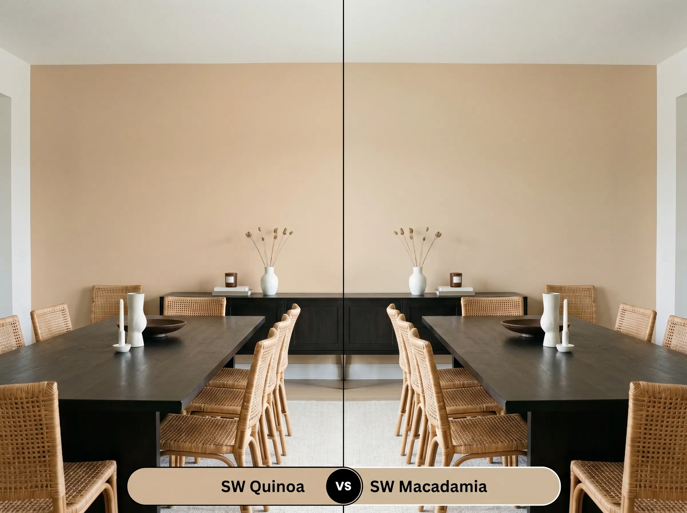
Macadamia pushes further into the yellow-brown spectrum, offering a slightly more traditional, golden glow. If you are trying to warm up a very cool, north-facing room and need a stronger yellow base to combat the shadows, Macadamia will perform better.
Similar Colors & Brand Equivalents
Sometimes a color is incredibly close to your vision, but you need a subtle adjustment in depth or a match from a different manufacturer. These alternatives provide nuanced shifts in light reflectance and undertone to fine-tune your design.
Similar Colors from Sherwin-Williams
Cross-Brand Matches
Practical Application & DIY Advice
Translating this beautiful color theory into a flawless finish requires the right materials and application strategy. Understanding how this specific pigment interacts with sheen and primer is essential for a professional result.
The Dynamic Sheen Guide
Primer Strategy
Because of its mid-tone depth, this color requires a high-quality, white acrylic primer over raw drywall or patched areas to ensure the terracotta undertones develop accurately. If you are painting over a very dark or vibrant color, a lightly tinted gray primer will help you achieve full coverage faster.
Coverage & Success Tips
You can expect to need two full coats for a completely opaque, even finish. Be careful to maintain a wet edge while rolling. Mid-tones like this can sometimes show “flashing”—visible, slightly shiny roller marks—if you touch up a dry wall or stretch the paint too thin.
Frequently Asked Questions
Because direct exterior sunlight washes out most mid-tones, this color will actually lighten significantly on stucco, pulling the golden-beige forward. However, in intense southern exposures, the terracotta micro-undertone can flash slightly peach, so testing a large swatch outdoors is mandatory.
Low-E glass often casts a subtle green or blue tint into the room, which can clash with the warm orange-beige base of this paint. This interaction can occasionally make the color feel slightly muddy, so you may need to introduce warm artificial lighting to correct the balance.
While it brings beautiful warmth, its LRV of 49 means it absorbs a fair amount of light. If your basement is completely windowless, using it on the ceiling might visually lower the room too much unless you have an excellent, layered recessed lighting plan in place.
Final Verdict & Expert Warnings
Sherwin-Williams Quinoa is an exceptional, grounding neutral designed for homeowners who want to inject genuine, baked-earth warmth into their architecture. It thrives in well-lit living spaces, cozy bedrooms, and custom millwork projects where its subtle terracotta nuance can be fully appreciated. This color replaces sterile, builder-basic whites with a tactile, enveloping energy that feels incredibly intentional.
However, this specific golden-beige is not universally adaptable. You must carefully evaluate your existing hard finishes, as the prominent warm undertones will aggressively clash with cool-toned gray luxury vinyl plank flooring or icy Carrara marble countertops, making the paint look unintentionally muddy and the floors look starkly blue. Furthermore, pairing this shade with overly yellow oak cabinets can create a heavy, monochromatic effect that overwhelms the eye. If your home is heavily anchored in cool, silvery finishes, you will be much better served by a cooler, gray-leaning neutral.