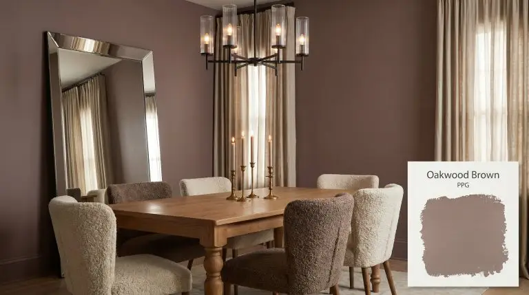
PPG Oakwood Brown (PPG1054-6) is a deep, nostalgic rusty red with strong chocolate undertones. With an LRV of 18, it is a moody, grounding hue that absorbs significant light, making it ideal for intimate libraries, vintage-inspired dining rooms, or striking exterior accents.
PPG Oakwood Brown: How to Style This Robust, Chocolate-Tinted Red
Certain wall colors require you to completely rethink your approach to texture, and PPG Oakwood Brown is one of them. When you brush this robust, earthy shade against unlacquered brass hardware or honed travertine, the entire room instantly feels more intentional and collected. It is a color that commands attention without shouting.
Homeowners often shy away from saturated reds, fearing they will overwhelm a space or look dated. This PPG shade solves that problem by relying on a substantial dose of brown pigment to stabilize the vibrancy. The result is a sophisticated, intimate spatial perception that makes large, echoing rooms feel instantly cozy and secure.
Whether you are updating a suburban dining space or reviving the original character of an older home, this shade acts as a rich architectural foundation. It pairs effortlessly with everything from raw silk window treatments to slipcovered linen sofas. Let’s break down exactly how this color is built and how it behaves when the lights turn on.
PPG Oakwood Brown: Undertones & LRV
If you are wondering whether this paint leans warm or cool, it is undeniably warm. PPG Oakwood Brown operates as a desaturated red-orange, relying on a highly complex, warm color structure to generate its inviting atmosphere.
At a light reflectance value (LRV) of 18, this shade absorbs a significant amount of light. It is a definitively moody aesthetic that will visually advance your walls. This means the color pulls the perimeter of the room inward, making the space feel wrapped and enclosed rather than expansive and airy.
You can apply wallpapers, paints, etc. on walls and see how they look in various interiors.

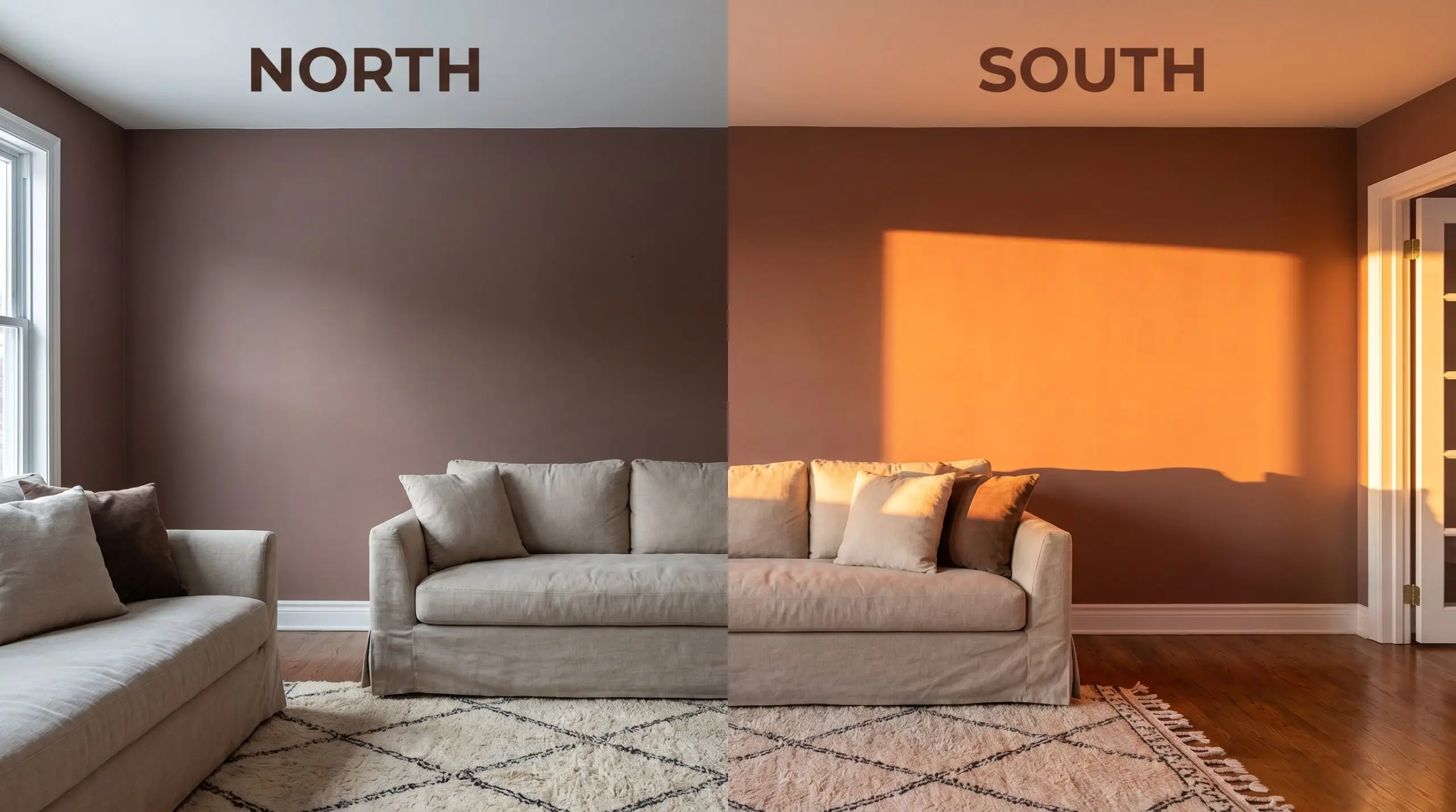
Navigating the Chameleon Factor & Light Shifts
Because this paint relies on a delicate balance of red, orange, and brown, its appearance is entirely at the mercy of your lighting.
Where to Use This Desaturated Red-Orange
Understanding the raw data of a paint color is only half the battle; the real magic happens when you apply it to drywall, trim, and exterior siding. Because this shade carries such a substantial visual weight, it thrives in spaces where you actively want to encourage lingering and conversation. Here is how to execute this color across different architectural scenarios.
Formal Dining Rooms
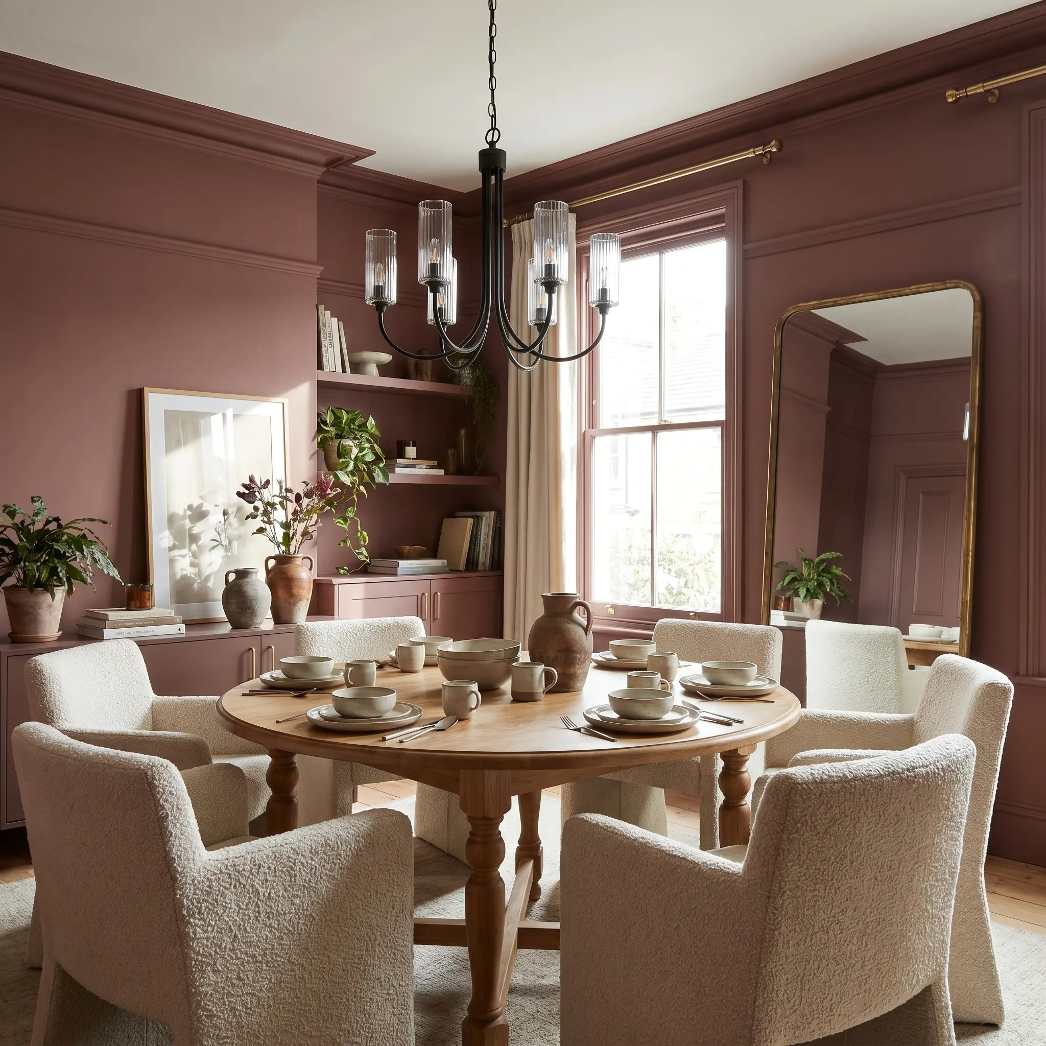
A dedicated dining space is the perfect laboratory for testing a saturated, moody palette. Instead of defaulting to a predictable, traditional aesthetic, use this robust color to create a modern rustic atmosphere for evening dinner parties. Apply the paint across the walls and the baseboards, letting the rich red-brown serve as a backdrop for high-contrast materials.
To elevate the room, suspend a sleek, blackened steel and fluted glass chandelier over a simple turned-leg oak table. The warmth of the walls practically begs for tactile fabrics, so consider surrounding the table with chairs upholstered in a textured boucle or worsted wool. If you have picture molding or wainscoting, painting it in the exact same finish as the walls prevents the room from feeling chopped up and visually chaotic.
Because an LRV of 18 absorbs so much light, you must introduce reflective surfaces to keep the dining room from feeling like a cave. An oversized mirror leaning against one wall or a collection of unlacquered brass candlesticks will bounce the ambient light beautifully.
Hackrea Pro-Tip (The Contrast Rule)
Libraries and Home Studies
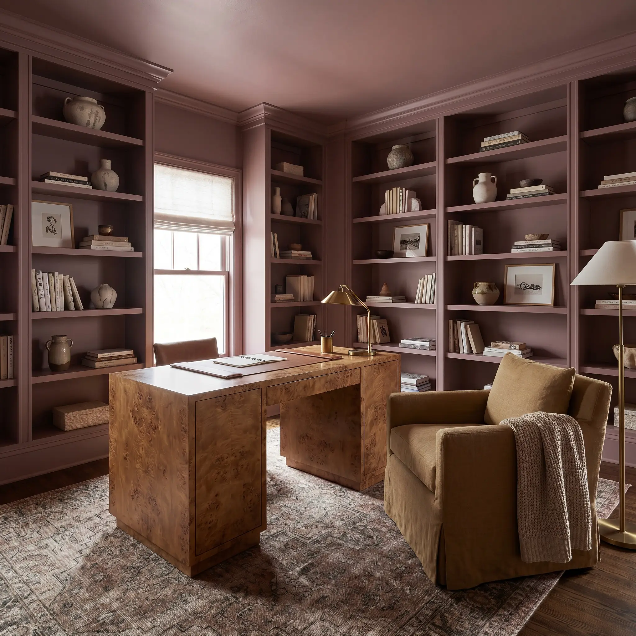
For the work-from-home professional who needs a space that feels distinct from the rest of the house, this shade offers incredible focus. Move away from the standard “dark academia” cliches and push the room toward a curated, eclectic transitional style. Color-drenching is highly effective here—painting the walls, the ceiling, and the built-in bookcases in the same finish.
This unified application makes the room feel like a seamless jewelry box. Against this earthy backdrop, a vintage burl wood parsons desk becomes a stunning, aspirational focal point. Balance that premium piece with an accessible, slipcovered club chair in an ocher or muted sage fabric. Stacked art, sculptural ceramics, and a vintage Moroccan rug will bring necessary pattern and life to the rich chocolate-red walls.
Vintage-Inspired Bedrooms
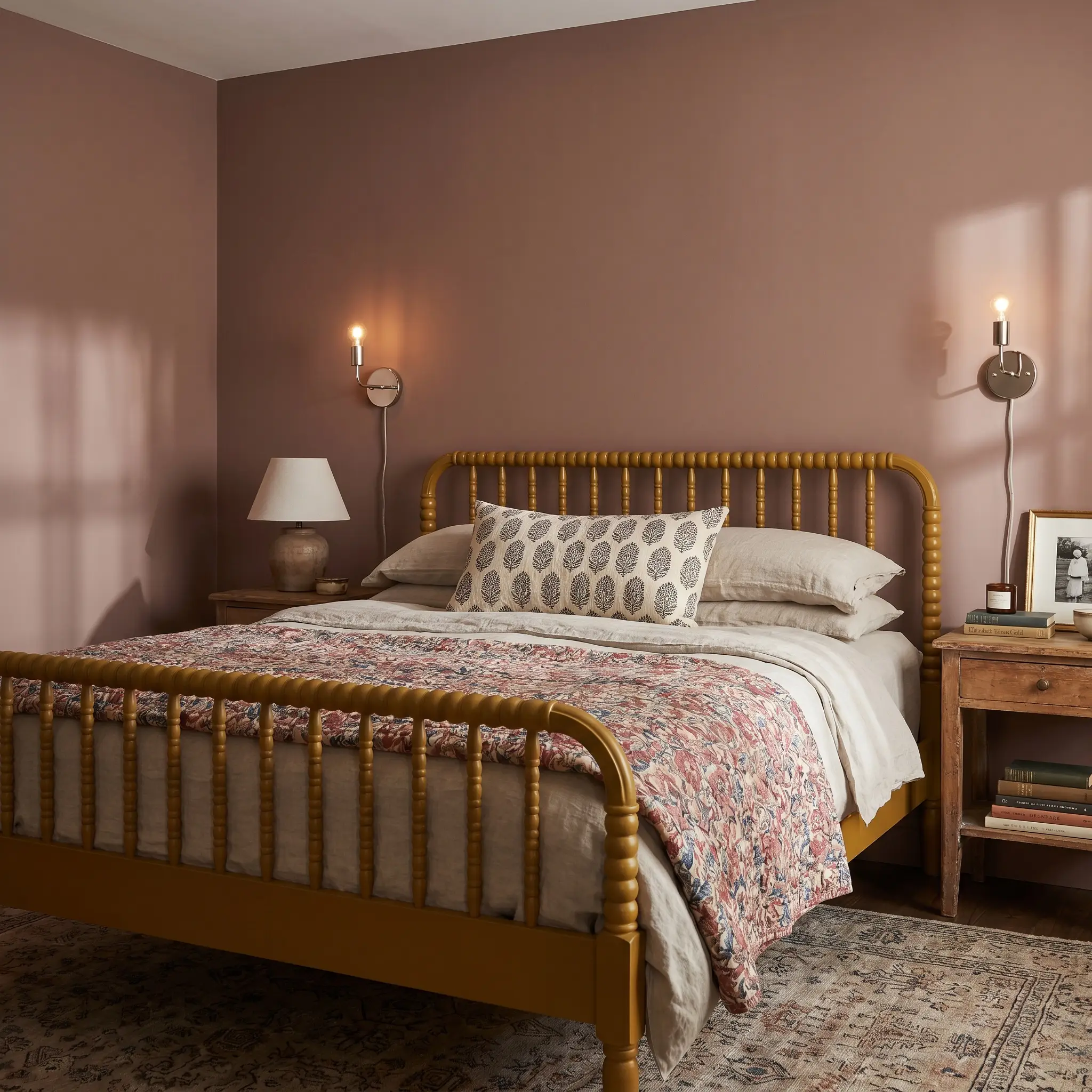
When designing a cozy retreat—whether for a teenager or a weekend guest—this color acts as a brilliant foundational layer for nostalgic styling. The warm, rusty tones naturally evoke a sense of history and comfort. Paint the walls in a matte finish to soften the color’s intensity and let the natural shadows play across the corners of the room.
To nail the vintage-inspired brief, anchor the space with a classic spindle bed painted in a chalky black or deep mustard. Layering is critical when working with saturated wall colors. Dress the bed in washed linen sheets, a floral chintz quilt, and a chunky block-printed throw pillow. Add a pair of minimalist, polished nickel sconces to provide a sharp, modern counterpoint to the historically leaning wall color.
Avoid pairing this specific paint with stark, hospital-white bedding. The extreme contrast will make the walls look muddy and the sheets look sterile. Instead, opt for warm creams, oatmeals, or soft clays to create a harmonious transition.
Clash Warning (The Bedding Trap)
Exterior Architectural Accents (Shutters & Front Doors)
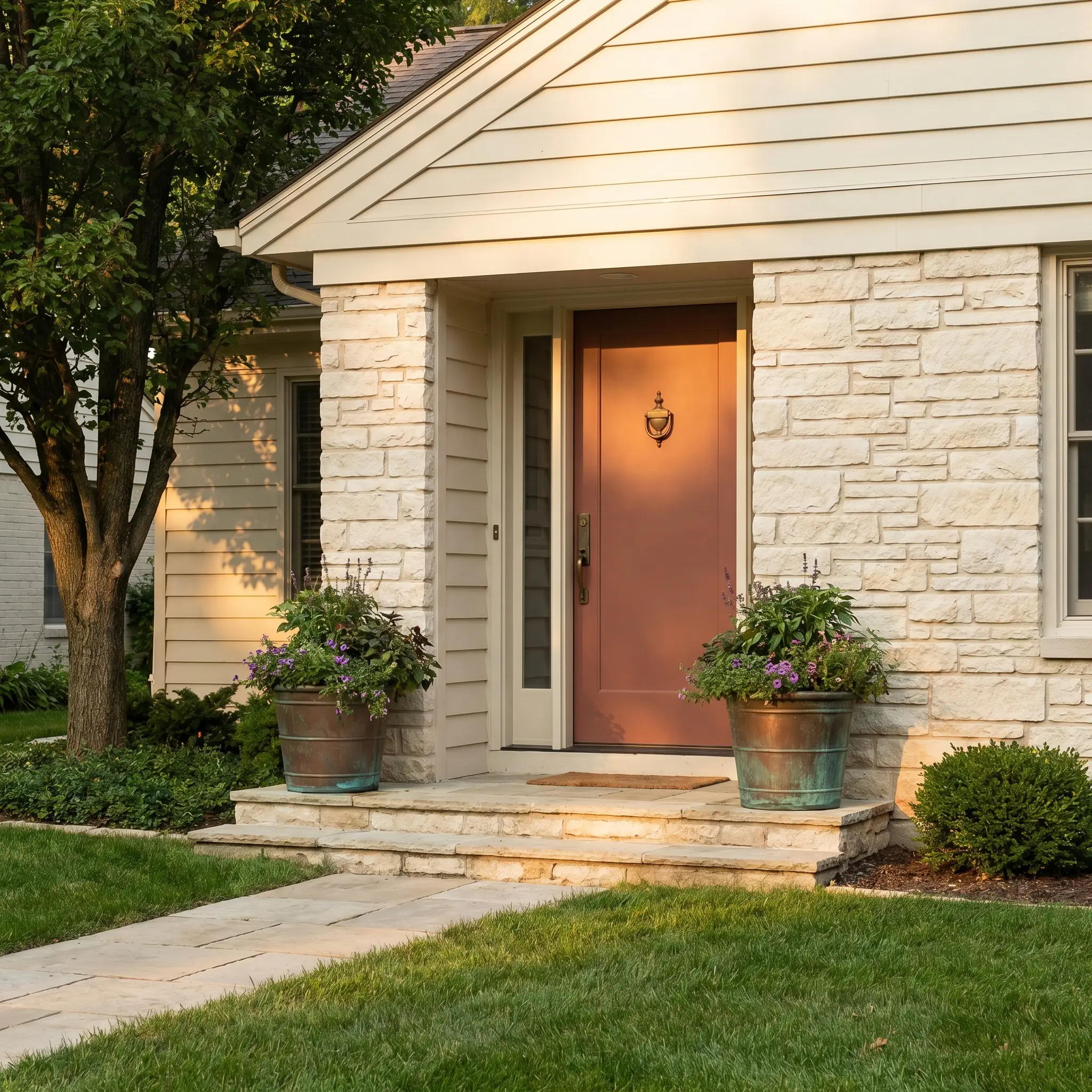
If you are not ready to commit to an entire interior room, this shade is a phenomenal tool for upgrading a suburban facade. It brings an undeniable sense of heritage to exterior architectural accents without feeling overly theme-park historic. Using it on a front door or flanking window shutters instantly warms up a neutral exterior.
It pairs beautifully with creamy, off-white siding, natural stone facades, or even muted olive green exteriors. Because direct sunlight will pull the terracotta notes forward, your front door will look incredibly welcoming and vibrant during the afternoon. Finish the entry styling with a pair of oversized, oxidized copper planters and a classic brass door knocker to complete the high-end, curated look.
Elevating PPG Oakwood Brown with Curated Pairings
This desaturated red-orange requires surrounding elements that either gently absorb its intensity or provide a crisp, tailored boundary. Its robust pigment craves tactile contrast to prevent the walls from looking flat or lifeless. By intentionally selecting your hardware and secondary colors, you dictate whether the room feels like a vibrant historic estate or a grounded modern retreat.
Selecting the Right Trim Profiles
Benjamin Moore White Dove OC-17 provides a soft, shaded boundary that respects the warmth of the walls without casting a harsh glare. Because it carries a faint, creamy undertone, it bridges the transition between the dark wall and the ceiling beautifully.
For a creamier, more seamless aesthetic, Sherwin-Williams Alabaster SW 7008 pulls forward the terracotta notes, creating a gentle, atmospheric glow. If you want a slightly more tailored edge, Farrow & Ball Pointing No. 2003 offers a warm, red-based white that perfectly echoes the primary paint’s underlying DNA.
Tactile Hardware and Material Compositions
Harmonizing Paint Palettes
Curated Design Aesthetics
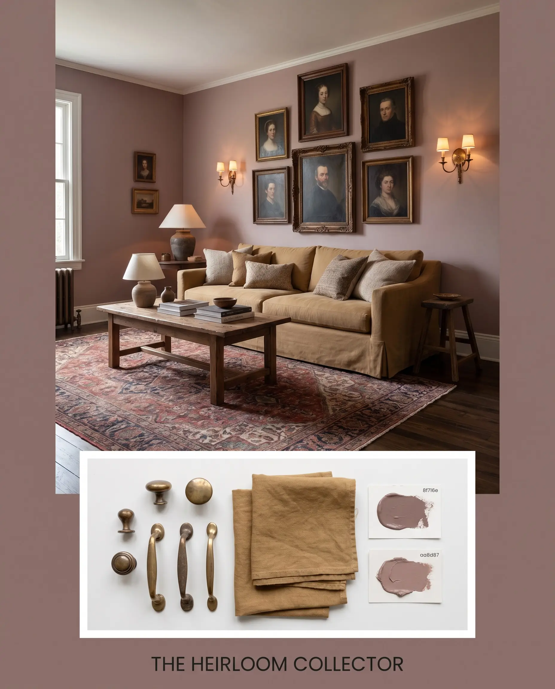
The Heirloom Collector This aesthetic leans into the nostalgic hue of the paint by surrounding it with history and texture. Imagine the rich wall color serving as a backdrop for a gallery wall of antique portraits and unlacquered brass sconces. A vintage Moroccan rug anchors the floor, while a slipcovered sofa in a muted ocher fabric invites relaxed conversation. The addition of Farrow & Ball Sulking Room Pink No. 295 on an adjacent accent wall creates a soft, tonal warmth that feels collected over decades.
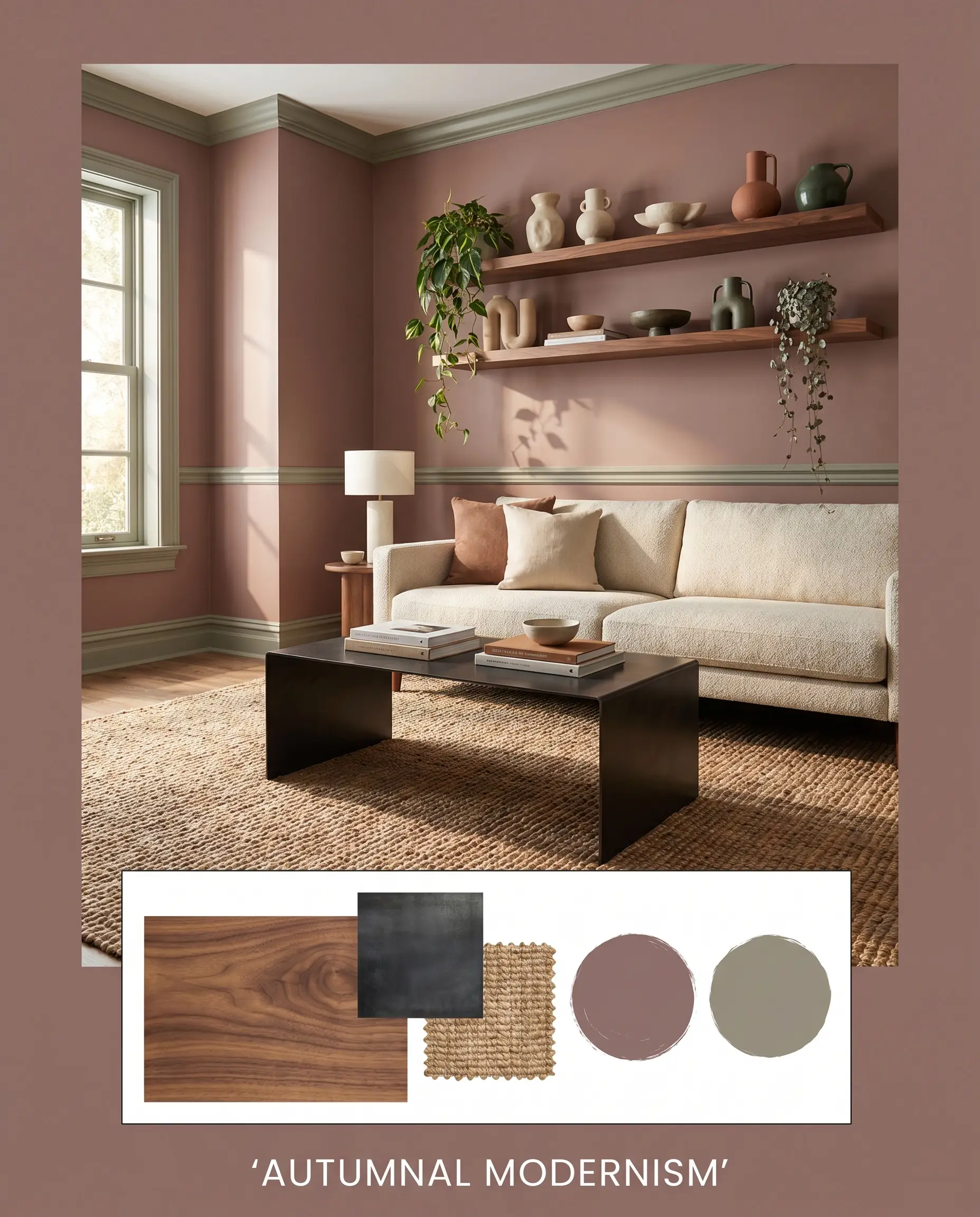
Autumnal Modernism Here, the robust chocolate-red is sharpened by clean lines and high-contrast materials. A sleek, blackened steel coffee table sits atop a light, textured jute rug, providing a modern counterpoint to the earthy walls. Walnut floating shelves display a collection of sculptural ceramics and trailing plants, bringing organic life indoors. Sherwin-Williams Studio Clay SW 9172 acts as the perfect secondary color on the trim, keeping the boundary crisp and contemporary.
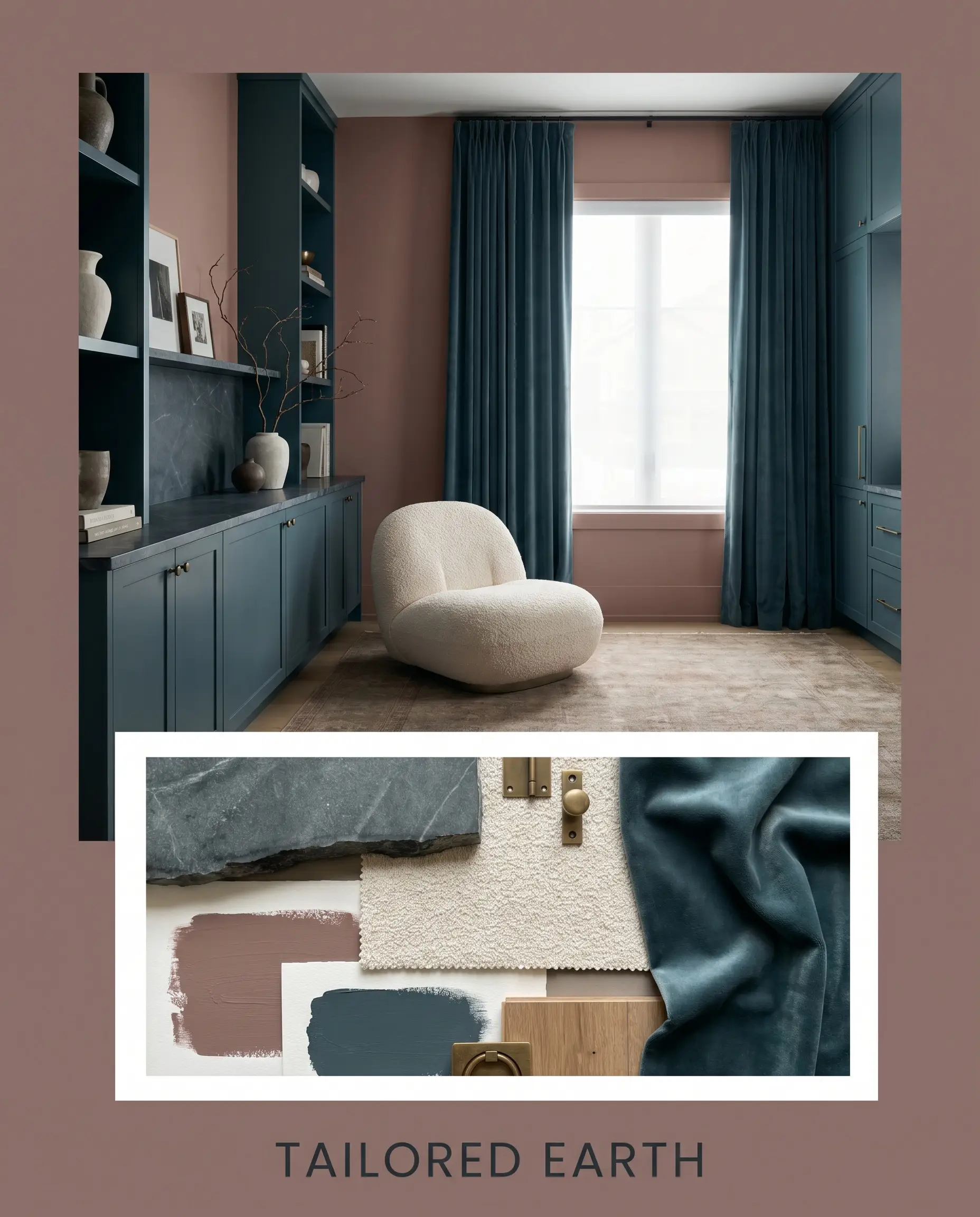
Tailored Earth This palette focuses on deep, moody sophistication by pairing the rusty red base with intensely saturated cool tones. Benjamin Moore Newburg Green HC-158 is introduced through custom cabinetry or heavy velvet drapery, creating a stunning visual tension. Honed soapstone surfaces and a single boucle nub chair provide tactile relief from the dark colors. The resulting energy is incredibly grounded, secure, and effortlessly premium.
PPG Oakwood Brown vs. Leading Alternatives
Sometimes a specific architectural exposure or a lack of natural light demands a slight pivot in your color strategy. If your space pulls too muddy or you need a crisper finish, evaluating a rival shade is the best way to protect your design intent.
PPG Oakwood Brown vs. Sherwin-Williams Rookwood Terra Cotta SW 2803
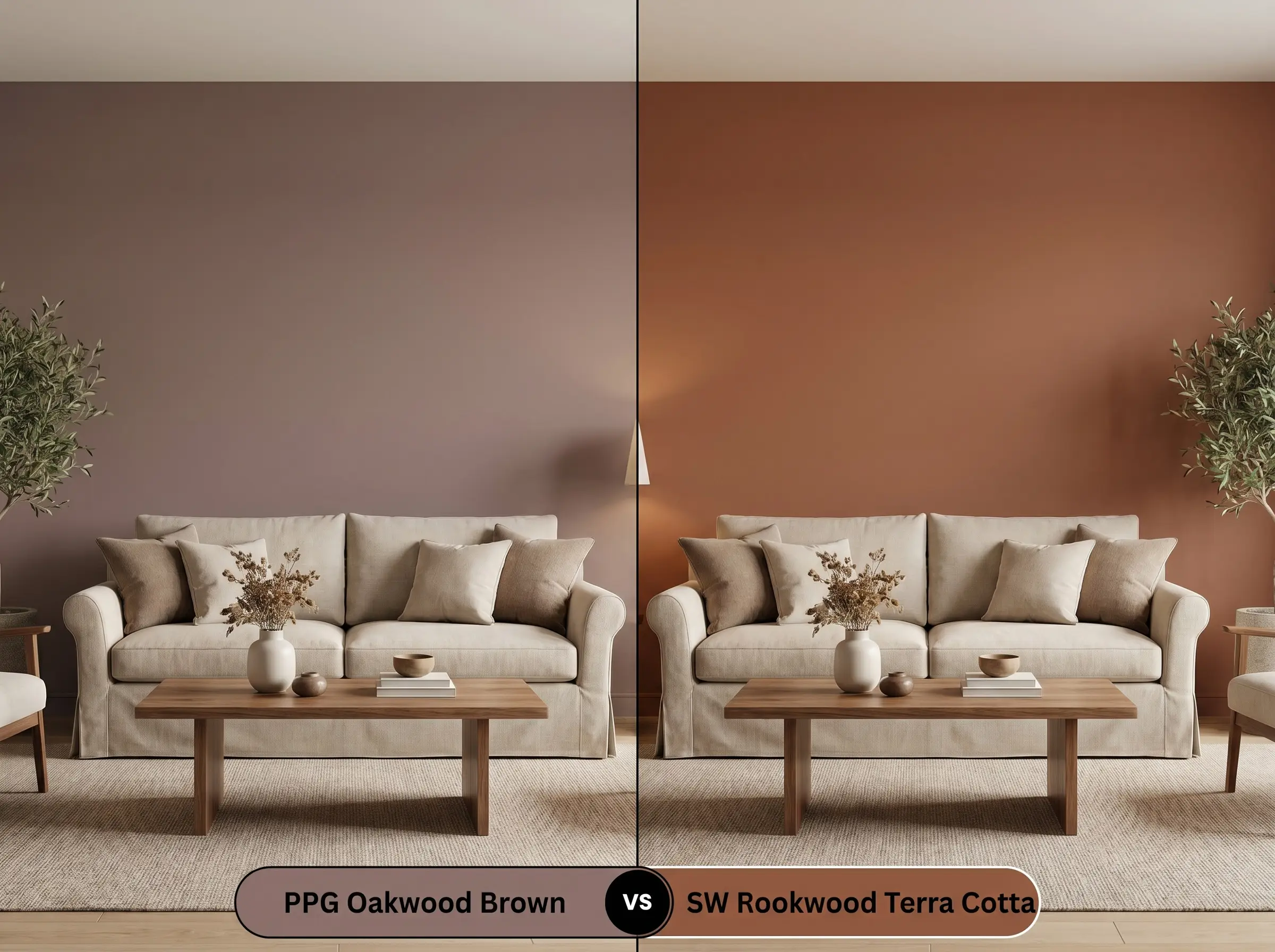
If you are craving a true, vibrant terracotta, Sherwin-Williams Rookwood Terra Cotta SW 2803 is the superior choice. It features a noticeably higher LRV and significantly less brown in its base, meaning it reads as a much brighter, fired-clay orange on the wall. Choose the PPG option if you need the stabilizing weight of a chocolate undertone to keep the room feeling moody and subdued.
PPG Oakwood Brown vs. Benjamin Moore Townsend Harbor Brown HC-64
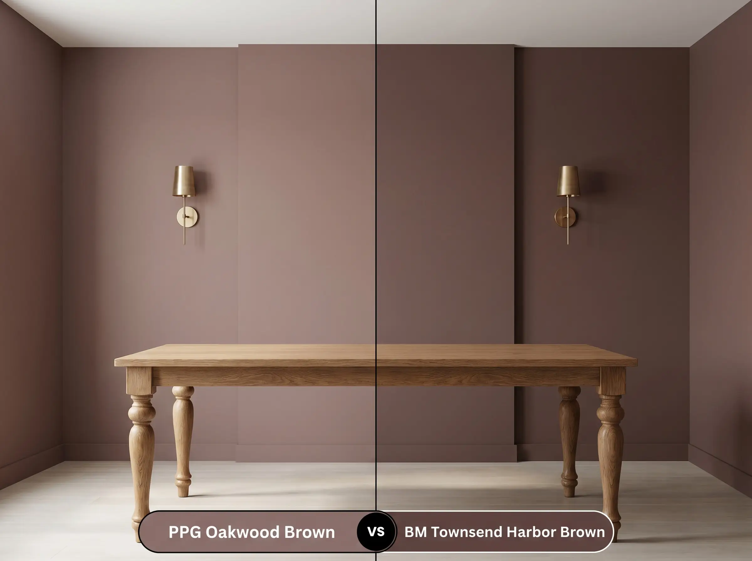
These two colors behave very differently once the lights turn on. Benjamin Moore Townsend Harbor Brown HC-64 carries a distinct plum undertone that surfaces in indirect light, giving it a slightly cooler, almost purple-brown finish. If you want to maintain a strict, fiery red-orange glow, stick with the PPG shade to avoid those cooler magenta shifts.
PPG Oakwood Brown vs. Farrow & Ball London Clay No. 244
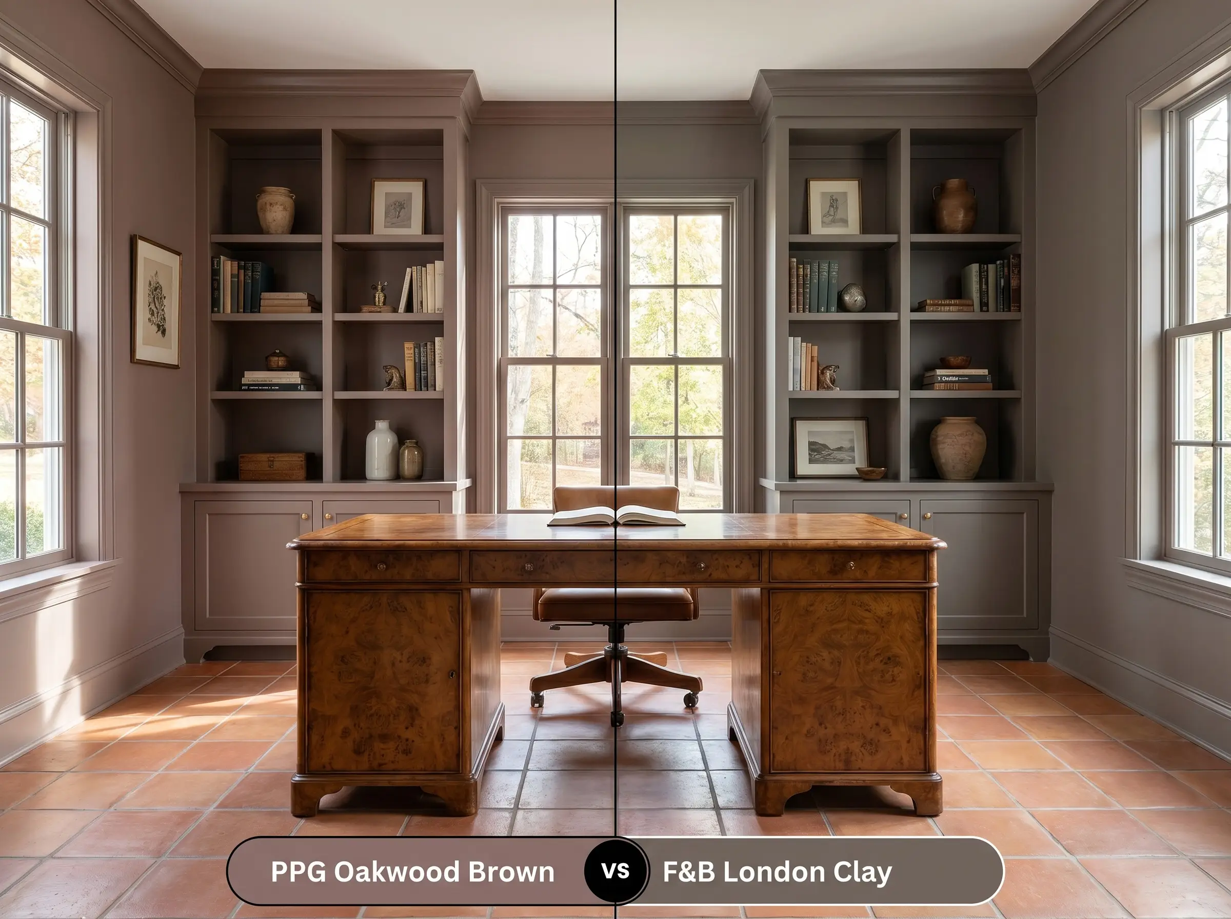
Farrow & Ball London Clay No. 244 is an iconic, deeply saturated brown that leans heavily into a magenta base rather than a rusty red one. It feels slightly more formal and less rustic than its competitor. If your styling relies on earthy, casual textures like terracotta tile and jute, the PPG option provides a more relaxed, organic foundation.
Navigating Sibling Shades and Cross-Brand Matches
When a room’s specific lighting washes out your primary choice, you often need an alternative that stays within the same tonal family but offers a slightly different depth.
Exploring the Sibling Color Family
Locating Competitor Equivalents
Executing a Flawless Finish
Moving from color theory to the physical reality of a roller requires strict attention to your materials.
Optimizing Your Sheen Strategy
The Essential Primer Protocol
You must use a high-quality, gray-tinted primer before applying this desaturated red-orange. Standard white primer will fight against the dark pigment, requiring you to apply unnecessary extra coats to achieve true opacity. A tinted base ensures the rich chocolate undertone develops correctly on the very first pass.
Mastering Coverage and Consistency
Expect to apply a strict minimum of two coats to achieve the advertised LRV of 18. Because dark reds and browns are notorious for “flashing”—where uneven roller pressure leaves visible, shiny streaks—you must maintain a wet edge while painting.
Never attempt to spot-touch a scuff mark on a dark, matte wall weeks after it has dried. The new paint will dry at a slightly different sheen, leaving an obvious patch. You will always need to repaint the entire wall corner-to-corner for a flawless fix.
Hackrea Pro-Tip (The Touch-Up Warning)
Frequently Asked Questions
Because it shares a similar warm, red-orange undertone, it actually harmonizes beautifully with red oak floors, creating a seamless, tonal envelope. To prevent the room from feeling too monotonous, break up the transition with a highly textured, neutral rug like a chunky jute or a vintage ocher weave.
In heavy shade, the vibrant terracotta notes will recede, and the paint will lean heavily into its chocolate undertone, appearing quite dark and moody. It is a stunning, natural fit for wooded lots, but you must pair it with high-contrast, creamy trim to ensure the home’s architectural details do not get lost in the shadows.
Absolutely. Painting the ceiling in this robust shade creates a dramatic, jewel-box effect that actually distracts from the lack of natural light. Simply ensure you have adequate, warm-toned sconce lighting to illuminate the walls and reflect off your vanity mirrors.
Cool, blue-toned 4000K lighting will instantly flatten the complex warmth of this paint, turning the rich, rusty red into a dull, muddy brown. To maintain the intended cozy atmosphere, you must swap your bulbs for a warmer 2700K or 3000K temperature.
The Final Verdict on This Nostalgic Hue
PPG Oakwood Brown is an incredibly successful architectural finish for homeowners who want to inject warmth and history into their spaces without relying on predictable neutrals. Its absolute best application is in rooms designed for lingering—intimate dining spaces, curated home libraries, and cozy, vintage-inspired bedrooms. The brilliant balance of its rusty red base and stabilizing chocolate undertone allows it to act as a deeply grounding foundation for premium materials like unlacquered brass, rich walnut, and heavily textured textiles. It is the perfect choice for anyone looking to execute a sophisticated, layered aesthetic that feels collected over time.
However, a color this intentional requires strict environmental control to succeed. You must actively avoid pairing this shade with cool, gray-toned luxury vinyl plank flooring or stark, blue-white LED lighting. When this warm, earthy pigment is forced to interact with overly cool, artificial grays, the visual tension becomes instantly jarring, making the walls look muddy and the flooring look cheap. Protect the integrity of the paint by surrounding it exclusively with warm, organic materials and soft, ambient lighting to ensure your space feels effortlessly curated.