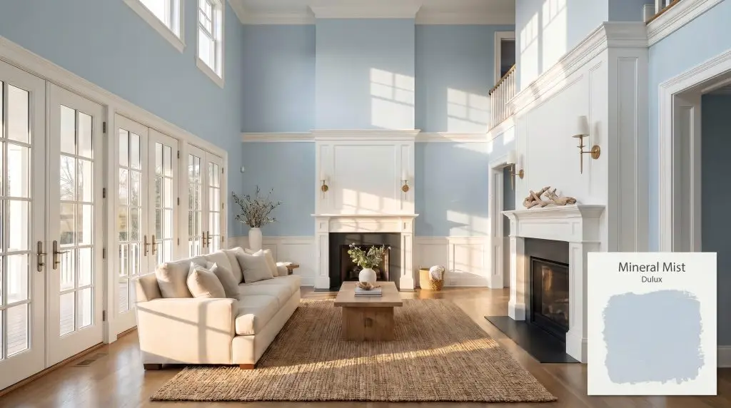
Dulux Mineral Mist is a soft, airy pale blue with subtle cool undertones. Boasting an LRV of 67, it reflects ample light, making spaces feel expansive and serene. It is the perfect choice for creating a calming, spa-like atmosphere in bedrooms and bathrooms.
Will Mineral Mist clash with your room?
Paint Technical Profile
| Color ID / SKU | 01BB 69/098 |
| HEX Code | #C3D8E3 |
| Light Reflectance (LRV) | 67 |
| Use | Interior, Exterior |
| Best Exposures | South-Facing, East-Facing |
| Best For | Bedrooms, Bathrooms, Ceilings, Coastal or Scandi Interiors |
Dulux Mineral Mist: The Expansive Blue That Redefines Vertical Space
There is a distinct shift in the energy of a room when you apply a color that inherently understands how to manipulate light and air. Dulux Mineral Mist is exactly that kind of architectural tool—a deeply serene, expansive pigment that visually pushes walls outward and lifts heavy ceilings.
Instead of leaning into the overly sweet territory of traditional baby blues, this specific formulation carries a sophisticated, icy edge that feels incredibly modern. It acts as an atmospheric veil, bringing a sense of calm, curated intention to everything from bustling family kitchens to quiet, tucked-away reading nooks.
The Hidden Depth of Dulux Mineral Mist: Undertones & LRV
Is Dulux Mineral Mist warm or cool? This pastel blue is definitively cool, relying on a crisp, refreshing temperature to create its signature airy aesthetic.
With a light reflectance value of 67, this shade sits beautifully in the mid-to-light tier of the spectrum. It bounces plenty of ambient light around the room to make tight corners feel expansive, yet it retains enough pigment to provide a striking, intentional contrast against crisp white millwork.
Chasing the Sun: How Lighting Alters This Airy Aesthetic
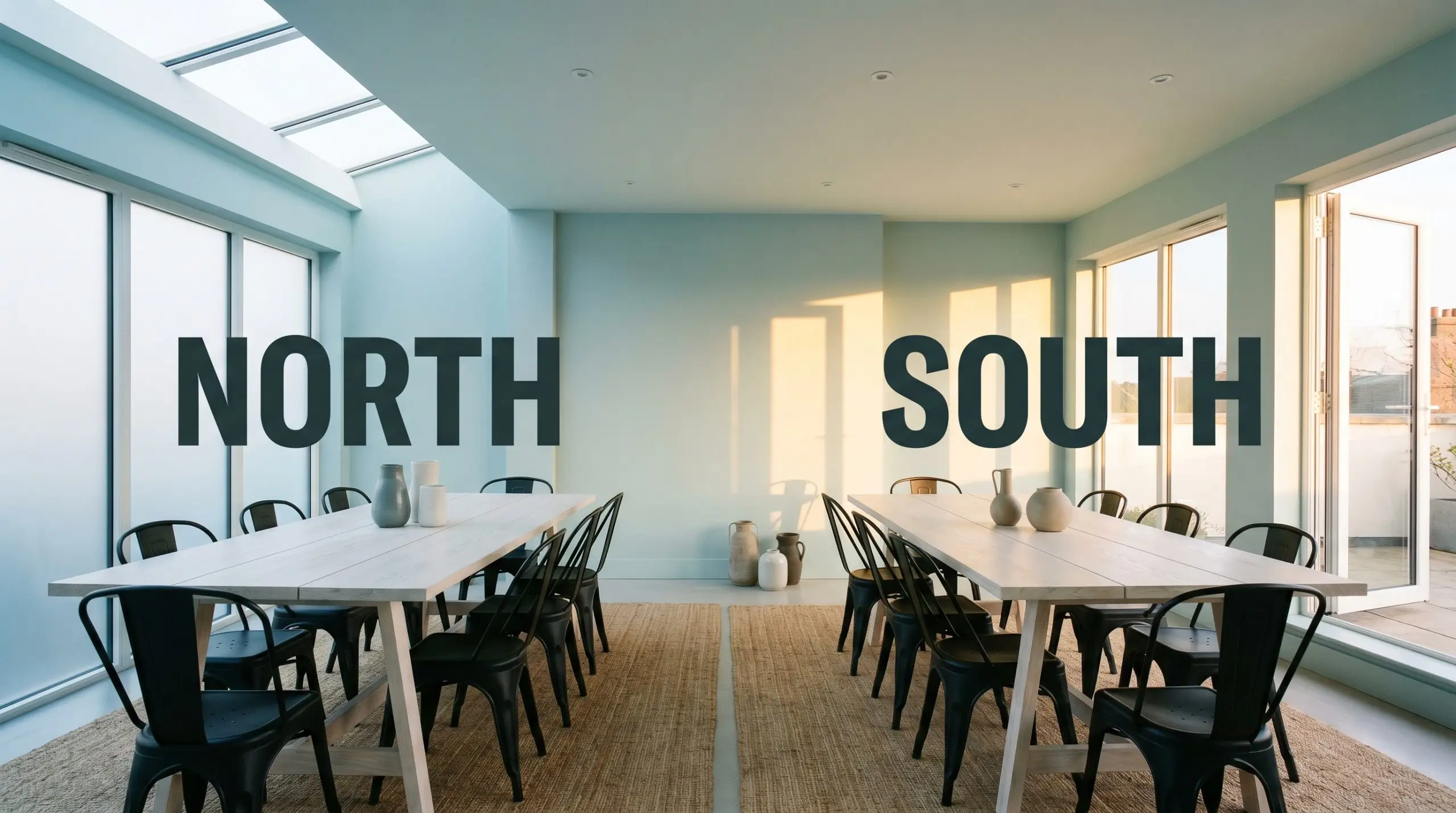
The biggest risk with this specific blue is installing it in a heavily shaded room without enough warm artificial light to balance its icy edge. Because of its subtle gray and cyan DNA, this color is highly responsive to the shifting temperature of the sun. You must test this cool hue on different walls to see exactly how your home’s unique exposure pulls those hidden notes forward.
Where Dulux Mineral Mist Transforms the Everyday
This color brings a deeply restorative, cohesive energy to a home, acting as a visual deep breath. It softens harsh architectural lines and introduces a quiet, curated elegance to spaces that typically feel purely utilitarian.
Primary Suites & Restorative Havens
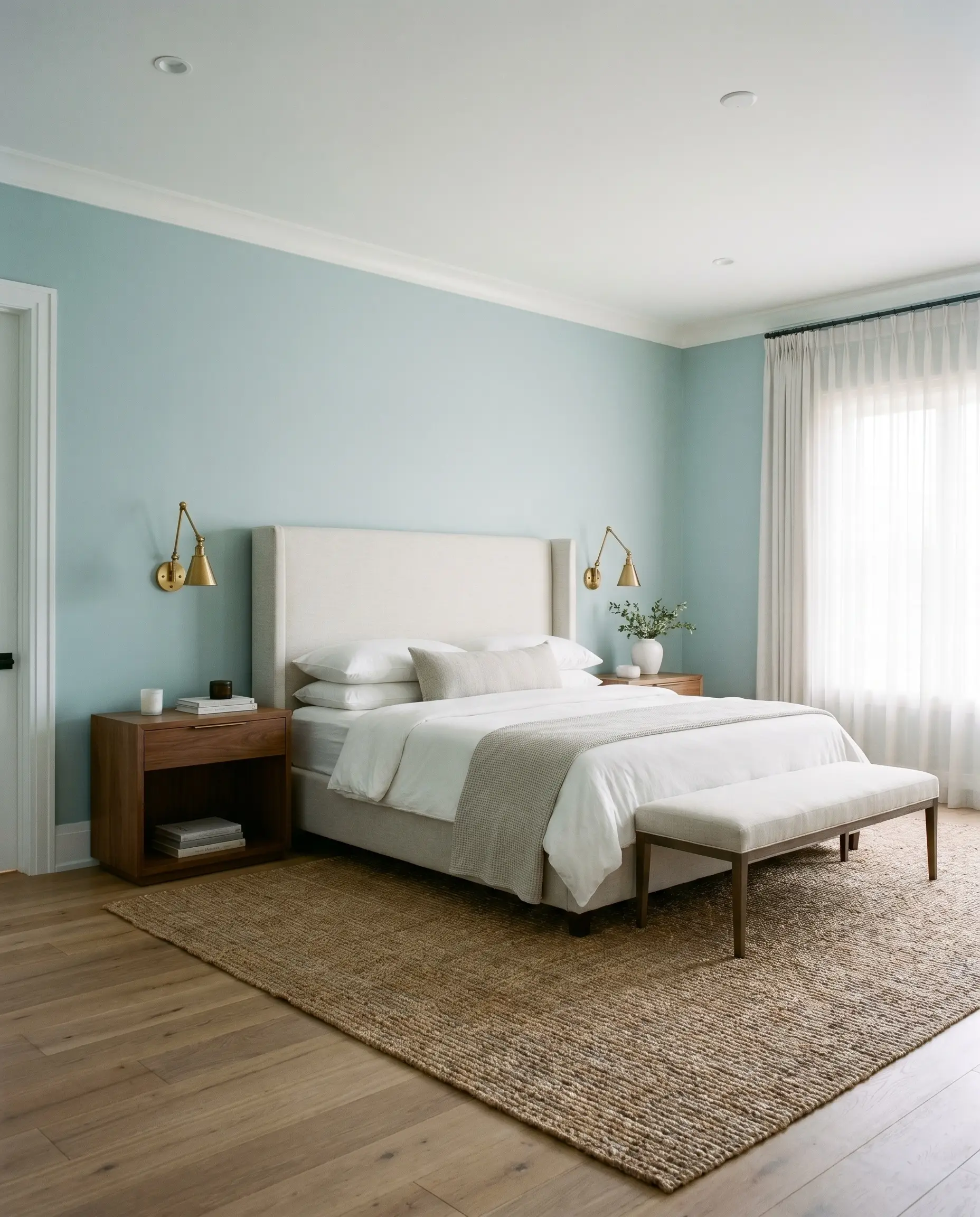
Use this hue to create a true sanctuary. Pair it with soft, tactile linens, raw oak floors, and brass sconces to warm up the cool undertones. It anchors a transitional bedroom beautifully, allowing you to mix classic upholstered headboards with sleek, modern nightstands.
Will Mineral Mist work with your specific lighting, floor, or furniture?
Bathrooms & Wet Rooms
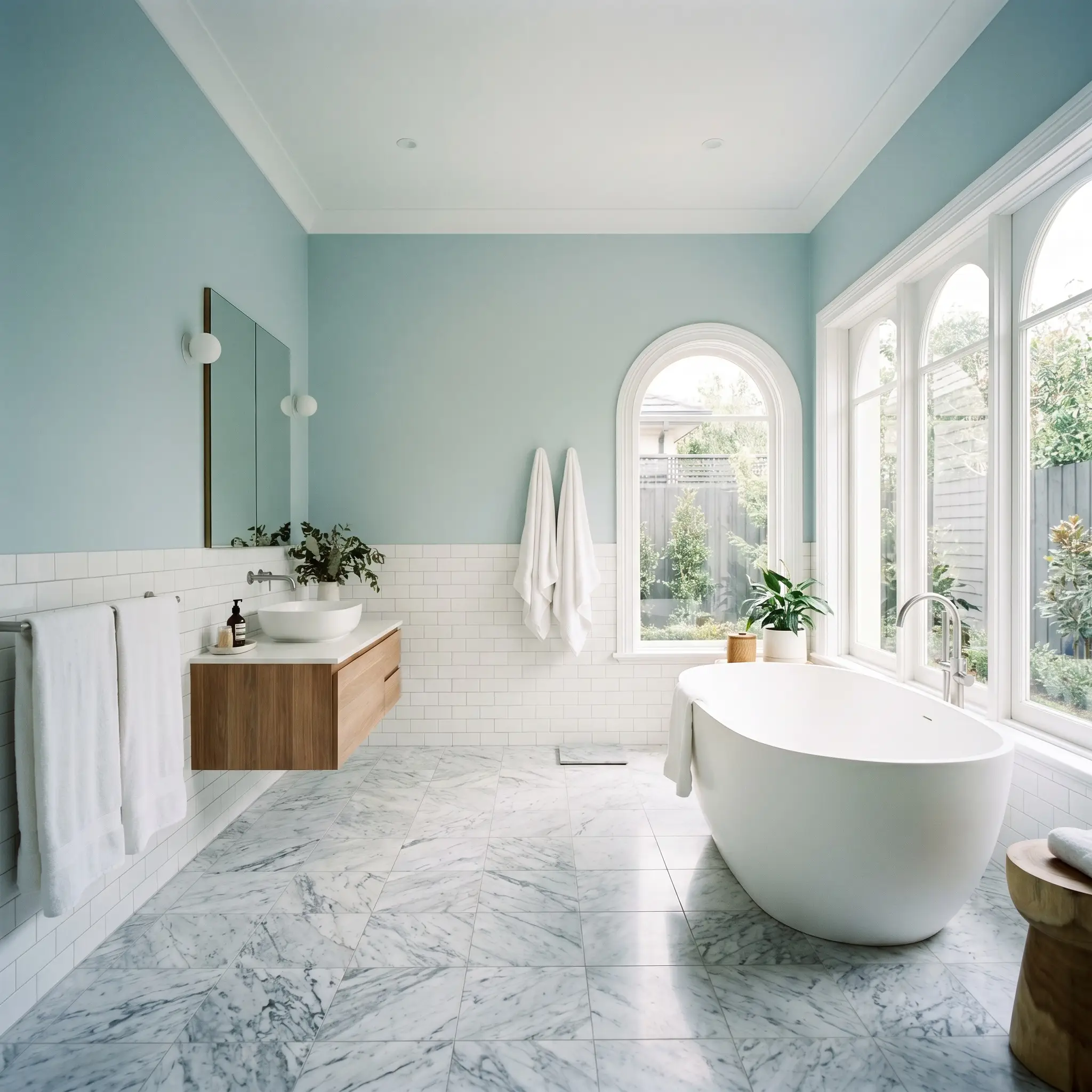
The inherent watery nature of this cyan-laced blue makes it a brilliant choice for creating a spa-like atmosphere. Wrap it around the upper half of the walls above classic white subway wainscoting, or use it across all four walls alongside heavily veined marble to bring a sense of high-end hotel luxury into your morning routine.
Children’s Rooms
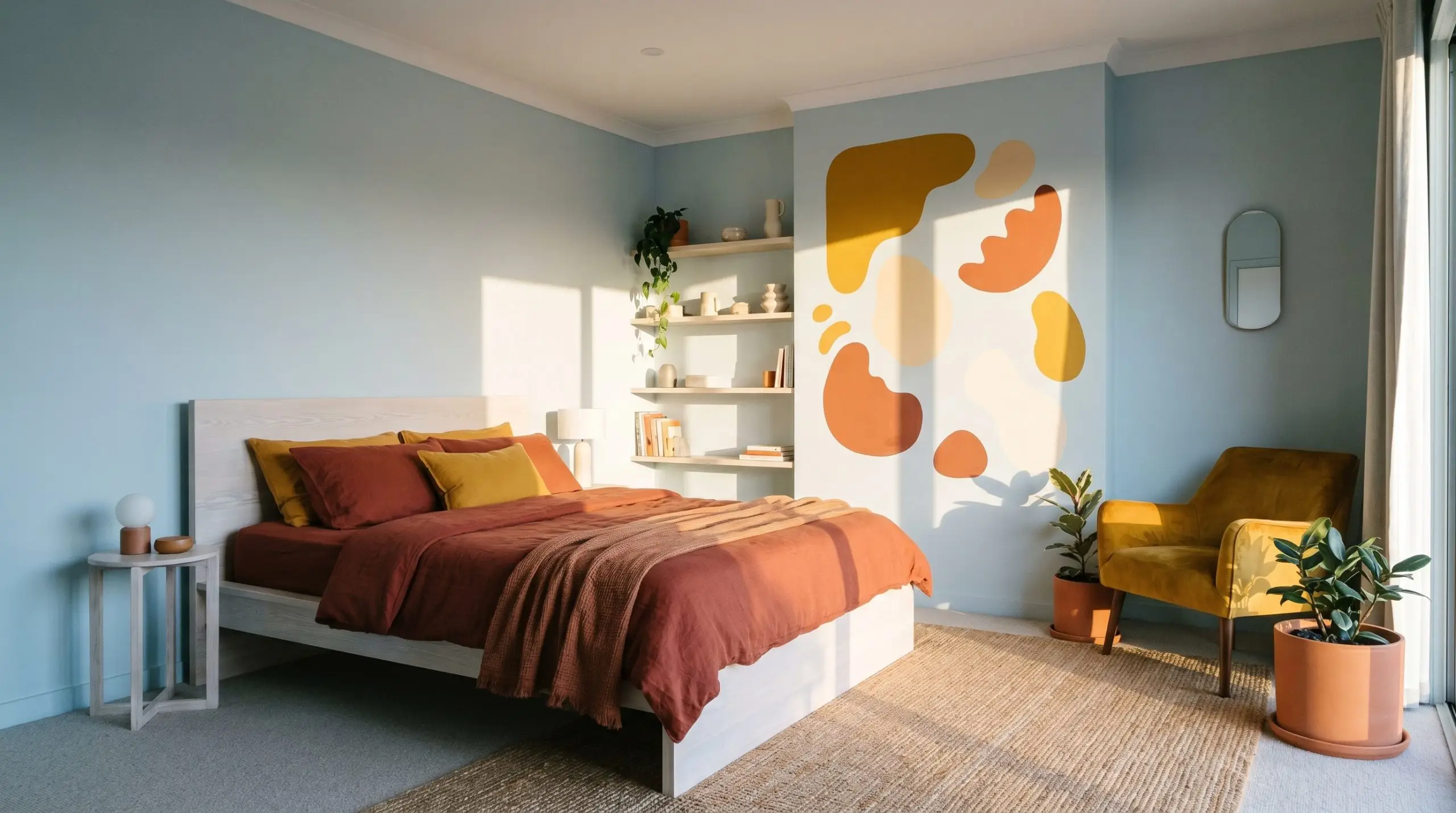
While it works perfectly in a nursery, its grounding gray micro-undertone ensures the room can easily transition into a stylish teenager’s retreat. Layer it with rich mustard yellow accents or deep terracotta textiles to introduce a playful, highly stylized contrast that feels intentional rather than overly sweet.
Living Spaces
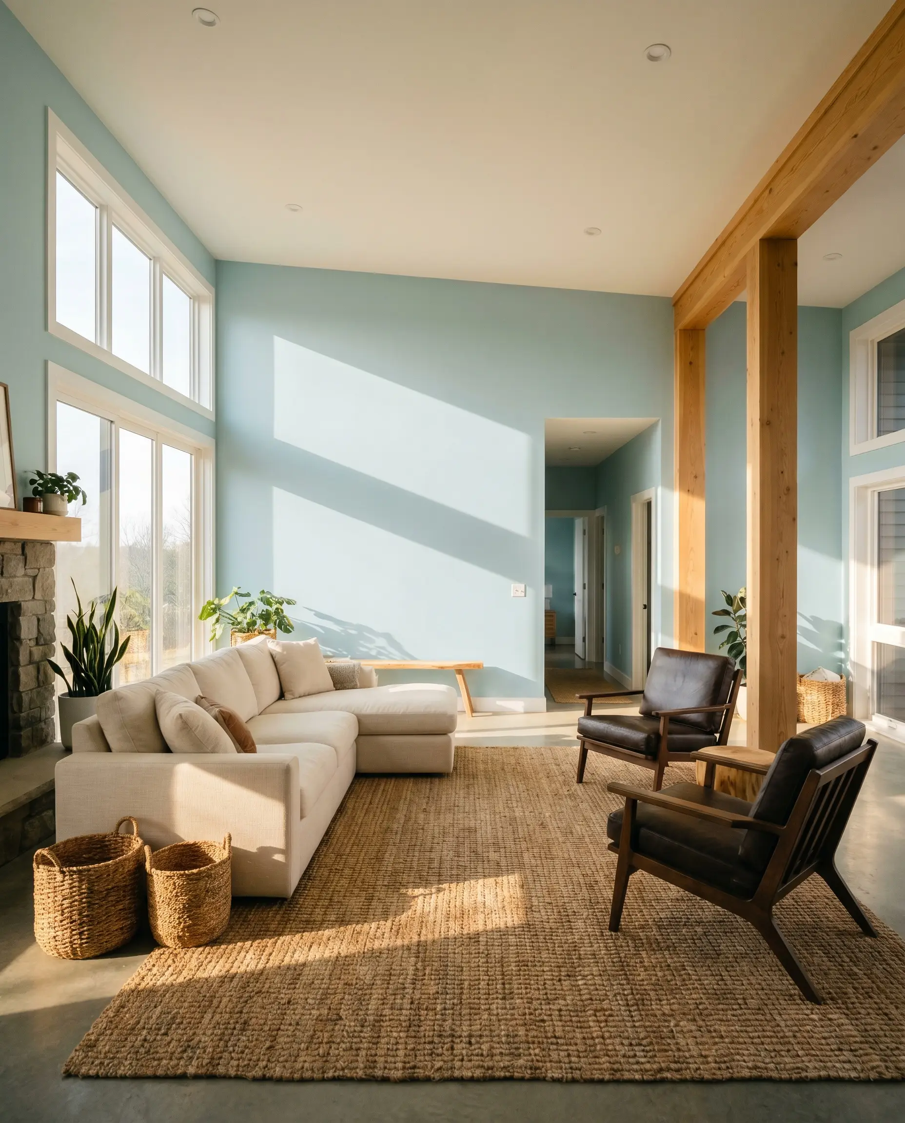
In a south-facing lounge, this blue acts as an incredible backdrop for a relaxed, coastal interiors vibe. Ground the airy walls with heavy, textural elements like a chunky jute rug, a plush cream sofa, and dark, contrasting accent chairs to keep the room from floating away.
Fifth Walls & Ceilings
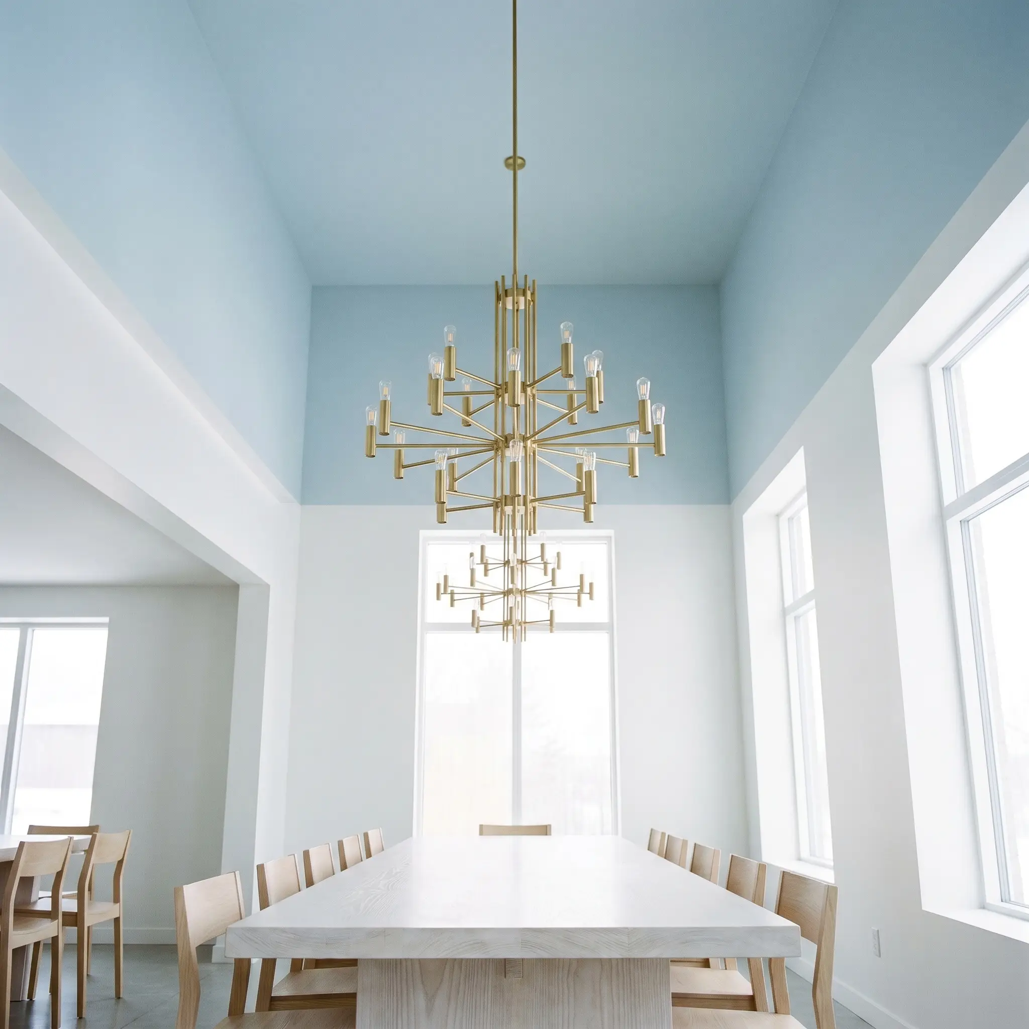
Treat the ceiling as a canvas. Instead of standard flat white, rolling this soft blue overhead mimics the expansive feeling of the open sky. This is an incredible trick for drawing the eye upward and making standard eight-foot ceilings feel significantly taller.
Will Mineral Mist work with your specific lighting, floor, or furniture?
Inventive Applications for Dulux Mineral Mist
Beyond standard drywall, this highly reflective pigment invites a more curatorial approach to your home’s architecture. Its specific depth allows you to highlight unexpected details and completely shift the perceived boundaries of a room.
The Illuminated Cabinet Interior

Painted on the inside of glass-front kitchen cabinetry, this hue creates a stunning, glowing backdrop for displaying everyday white ceramics and artisanal pottery. By leveraging its LRV 67, it introduces a beautiful layer of depth to the kitchen without absorbing the room’s natural light.
The Windowless Powder Room Mirage
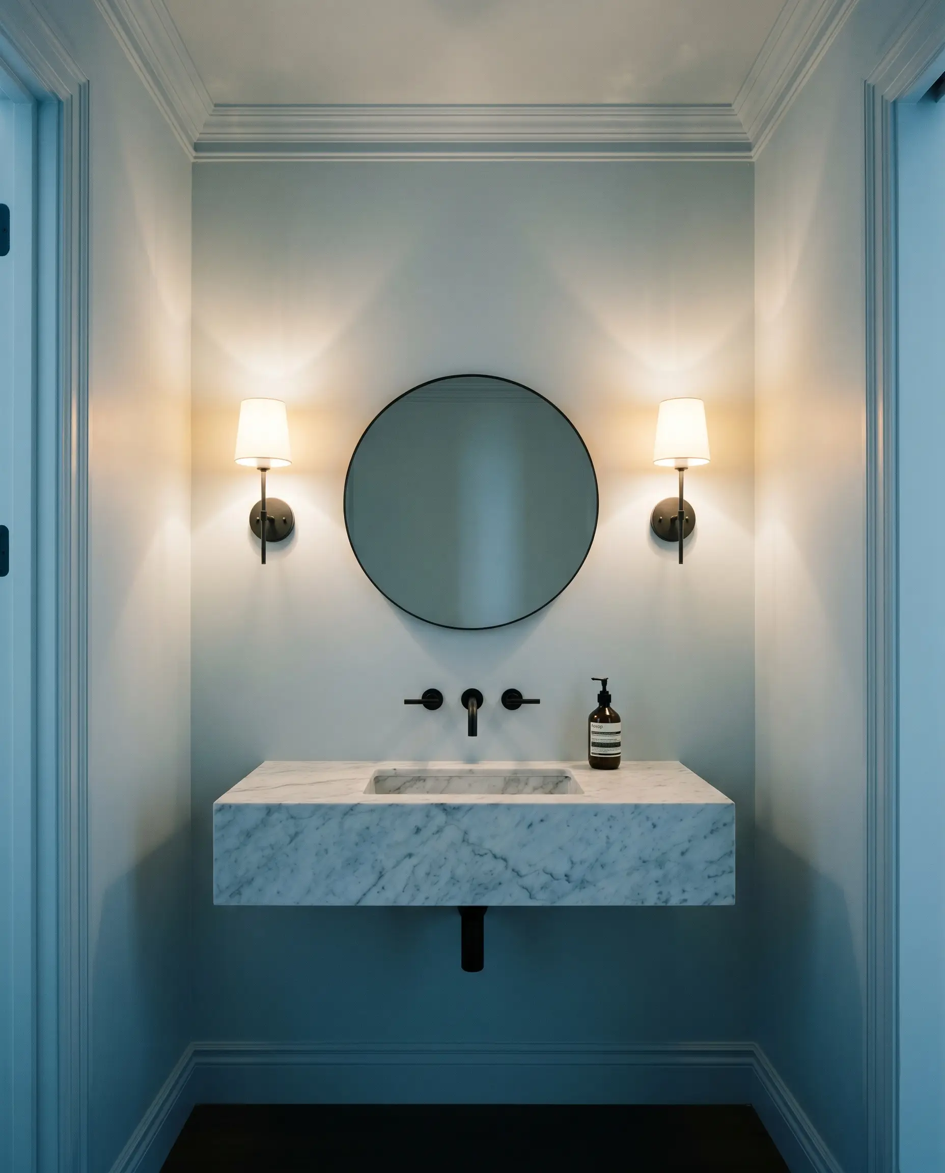
For urban townhouses lacking natural light, completely color drenching a windowless powder room—covering the walls, trim, and ceiling—creates a brilliant optical illusion. It builds an artificial sense of sky and lightness, turning a cramped utility closet into an airy, immersive jewel box.
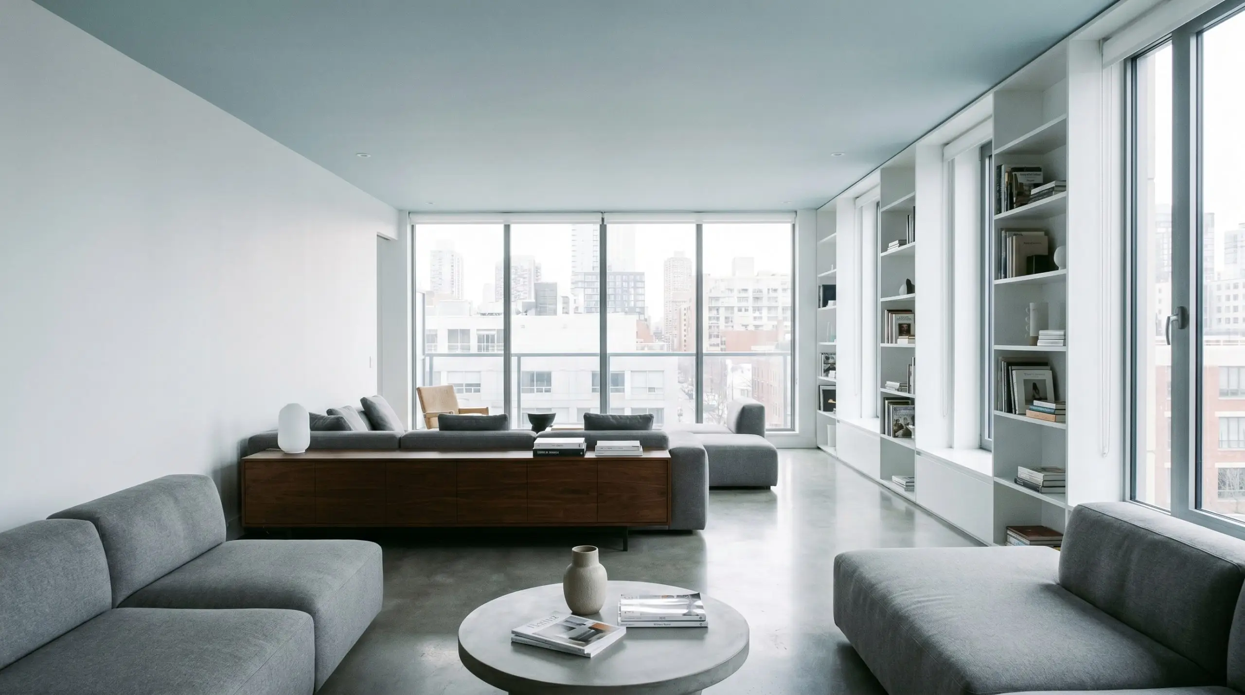
The Visual Ceiling Lift
Will Mineral Mist work with your specific lighting, floor, or furniture?
In apartments battling low clearance, applying this cool, receding blue exclusively to the ceiling is a transformative visual trick. The cool undertones physically appear to pull away from the eye, visually lifting the ceiling height and bringing immediate relief to tight, compressed spaces.
The Inverted Trim Concept
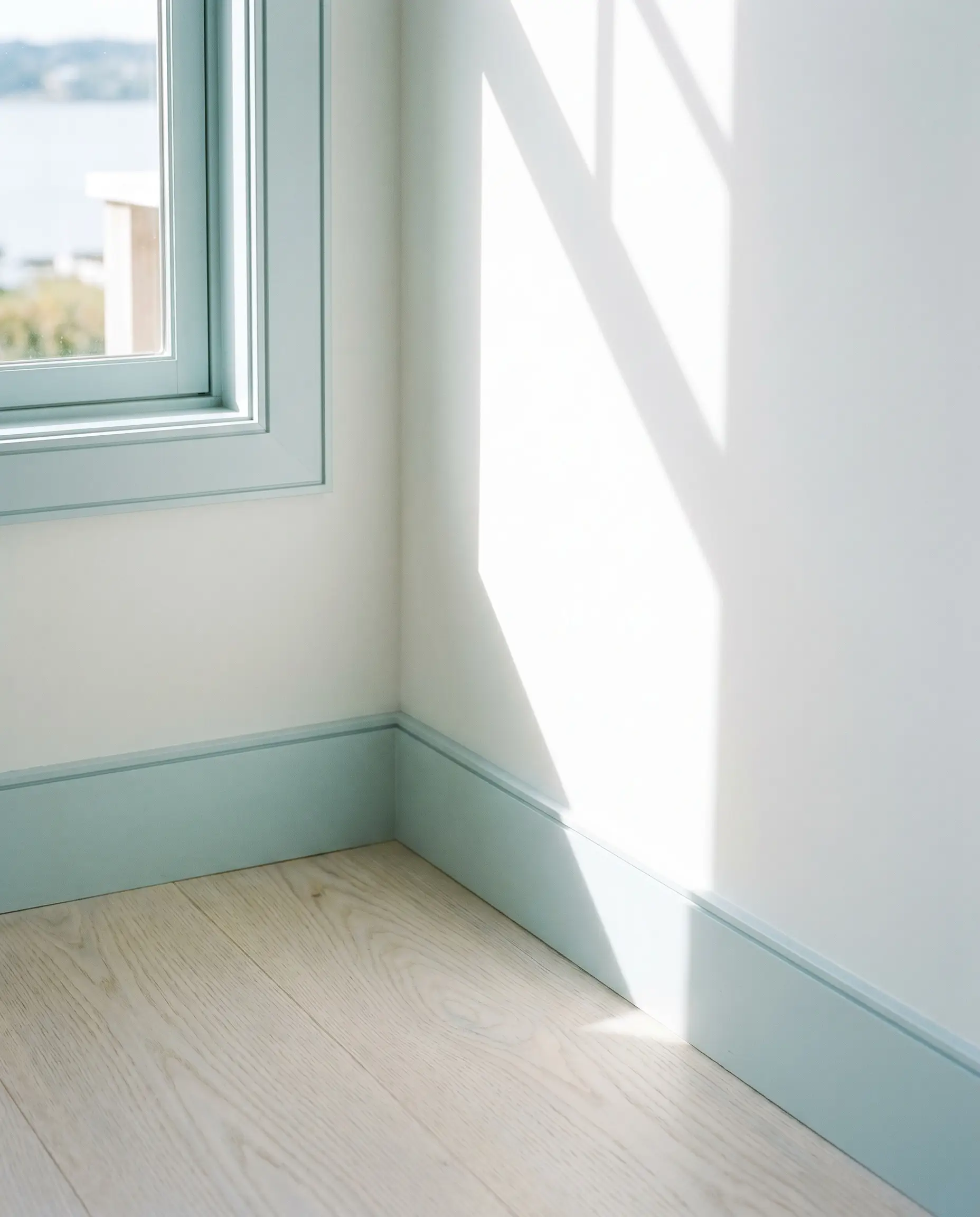
For a striking, contemporary approach to minimalism, leave the primary walls pure, gallery white and apply this soft blue exclusively to the baseboards, window casings, and crown molding.
When painting trim a contrasting color, you must ensure your drywall edges are perfectly smooth. The crisp blue lines will immediately draw the eye and highlight any imperfections in the wall’s texture.
Hackrea Pro-Tip (The Graphic Boundary)
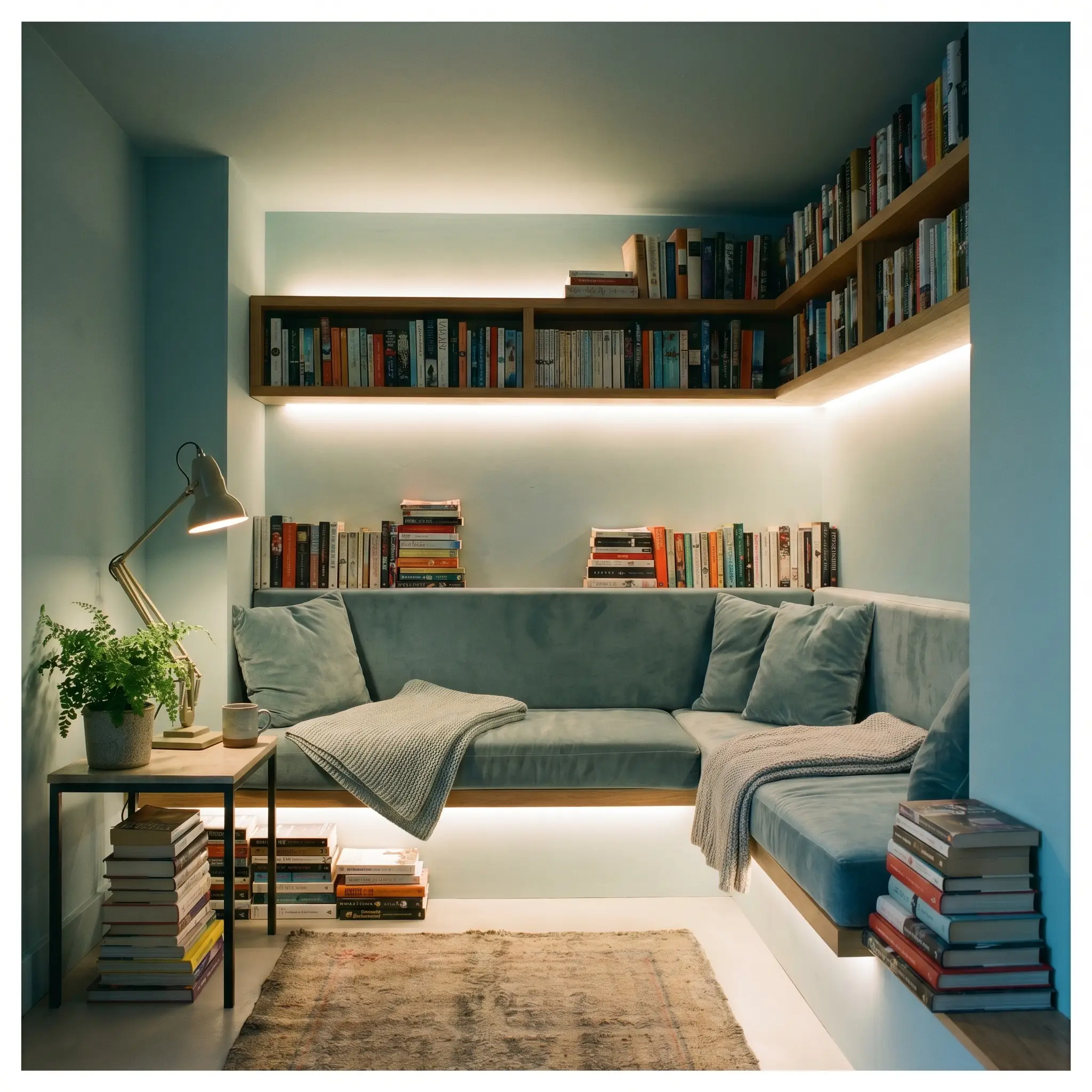
The Sensory Reading Alcove
Will Mineral Mist work with your specific lighting, floor, or furniture?
Color-drenching a small, tucked-away reading nook in this serene shade provides a deeply calming, low-stimulation environment. The gentle blue lowers the visual heart rate of the space, offering a quiet, neurodivergent-friendly retreat from the busier areas of the home.
Material Harmony & Coordinating Palettes
The secret to making this pale blue feel premium lies entirely in the friction it creates with surrounding textures. It requires warm, grounding elements to prevent its icy nature from feeling too clinical.
Millwork & Baseboards
When pairing this hue with trim, you want crisp, highly reflective whites that sharpen the blue’s boundaries. A stark, clean white like Benjamin Moore Chantilly Lace OC-65 or Sherwin-Williams High Reflective White SW 7757 allows the cyan undertones to pop, creating a tailored, high-contrast finish that feels incredibly fresh.
Hardware, Wood & Tactile Pairings
Complementary Color Pairings
Curated Designer Mood Boards
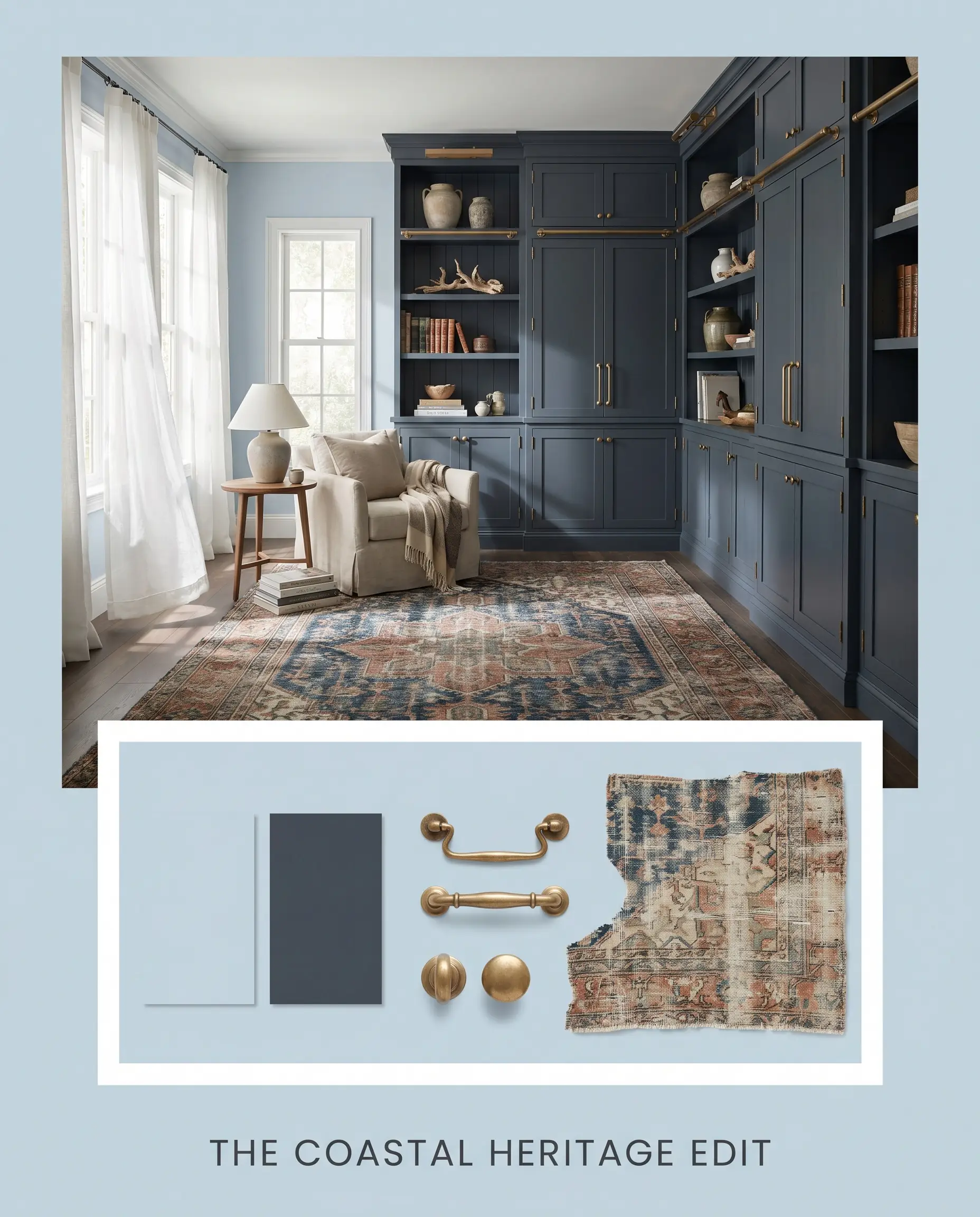
The Coastal Heritage Edit This palette blends the airy lightness of the primary blue with the heavy, historic weight of Benjamin Moore Hale Navy HC-154. By introducing unlacquered brass hardware and a vintage, heavily distressed Persian rug, the cool walls are immediately grounded in tradition. It feels collected, breezy, and deeply rooted.
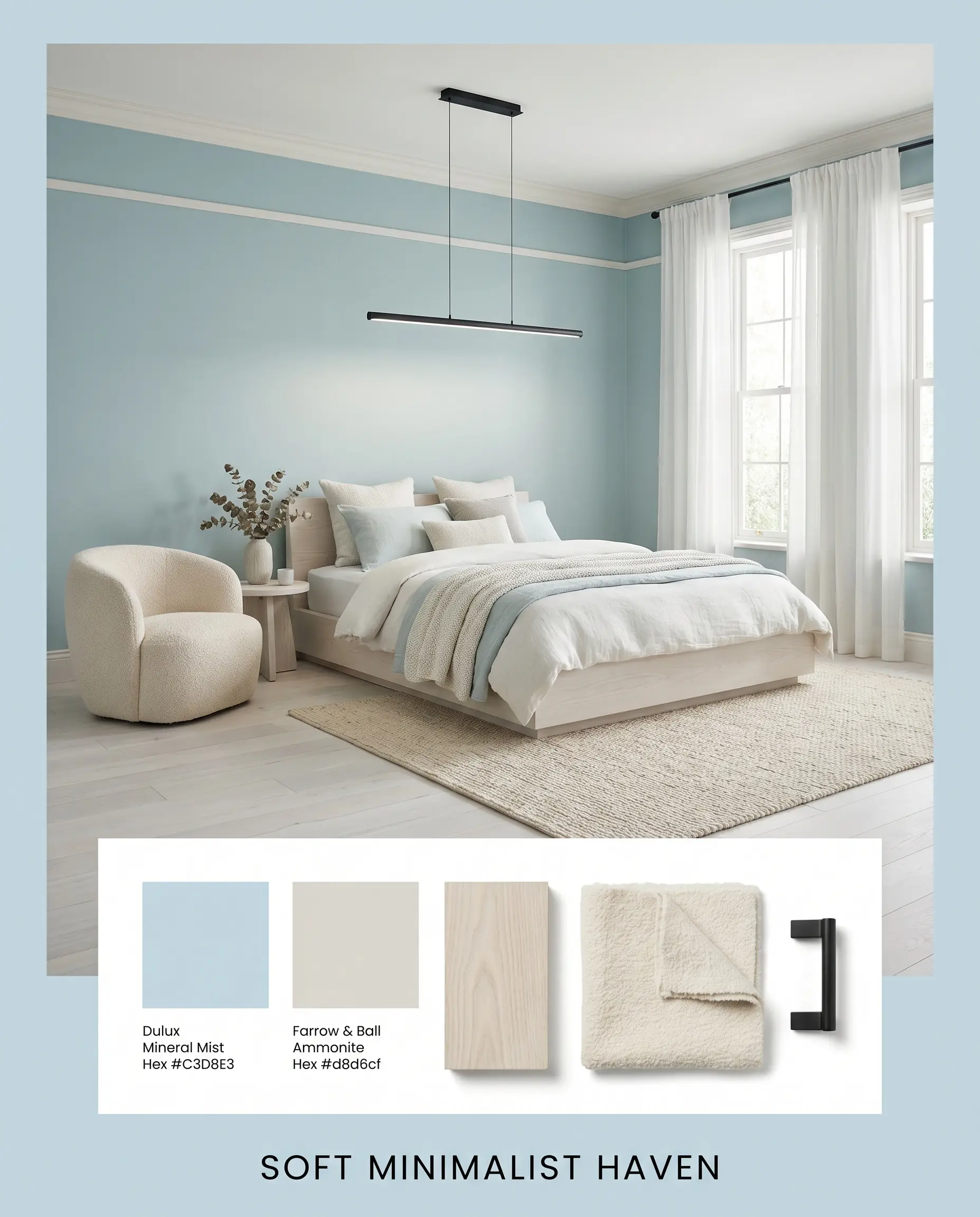
Soft Minimalist Haven Leaning heavily into organic textures, this arrangement pairs the soft blue with the stony warmth of Farrow & Ball Ammonite No.274. We layer in whitewashed ash wood, a plush bouclé accent chair, and a simple matte black linear pendant light. The result is a highly tactile, low-contrast environment that feels incredibly serene and modern.
Will Mineral Mist work with your specific lighting, floor, or furniture?
Dulux Mineral Mist vs. Industry Rivals
Selecting the perfect pastel blue often comes down to the microscopic differences in how a brand balances its gray and green pigments. If your lighting conditions are tricky, a rival formulation might offer the exact visual shift your architecture needs.
Dulux Mineral Mist vs. Dulux First Dawn
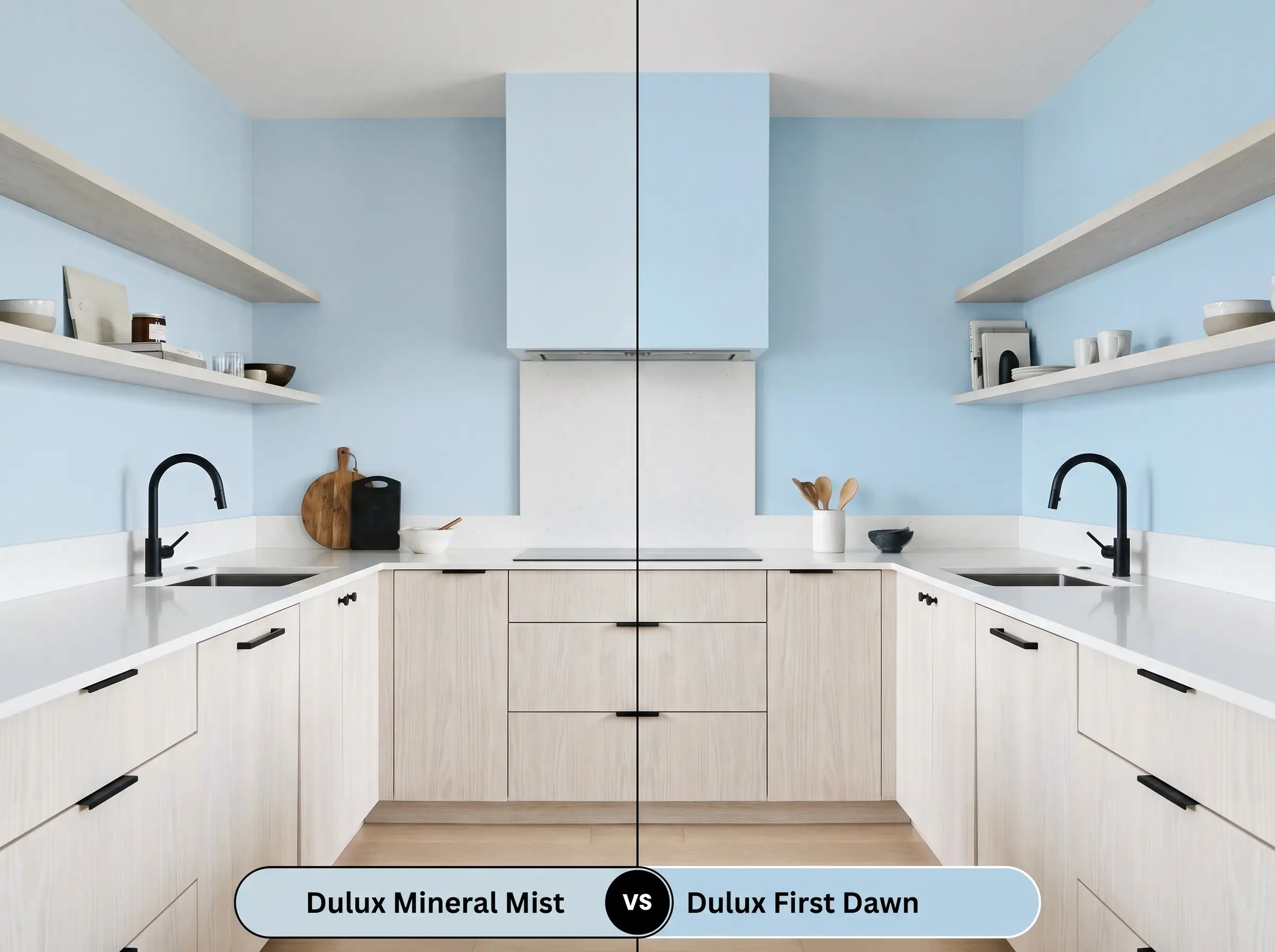
While both are beautiful Dulux blues, First Dawn carries a slightly sharper, more vibrant primary blue note. If your room receives an abundance of warm southern light and you want to ensure the color retains a crisp, true blue identity, First Dawn pushes through the yellow light better. However, if you prefer a softer, more muted, and sophisticated veil, the original choice remains superior.
Dulux Mineral Mist vs. Farrow & Ball Borrowed Light
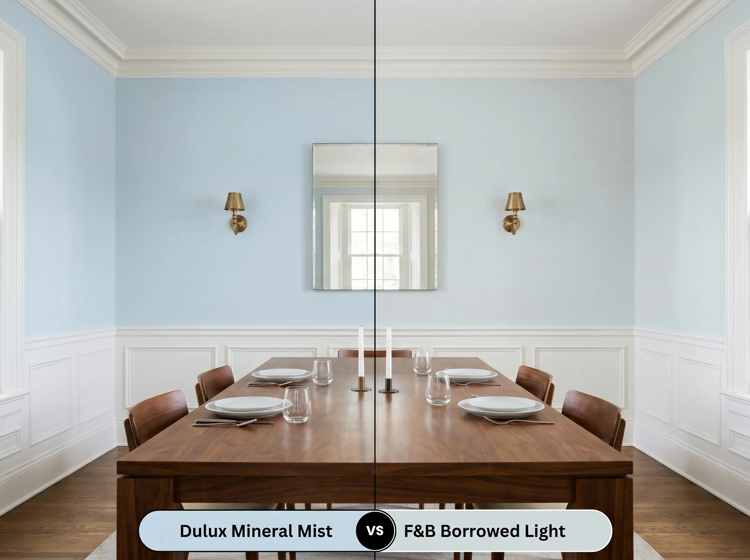
Farrow & Ball Borrowed Light is an iconic, highly responsive pale blue that leans slightly more into a classic, historic gray undertone. If you are working with an older home and want a blue that feels as though it has gently faded over decades, Borrowed Light offers that premium, aged patina. Conversely, the Dulux option provides a cleaner, more contemporary cyan finish.
Brand Equivalents & Similar Blues
Whether you need to dial the light reflectance up for a dark hallway or simply need to color-match across different manufacturers for local availability, these specific alternatives offer a very similar aesthetic.
Same-Brand Alternatives
Cross-Brand Matches
Practical Application Guide for Mineral Mist
Transitioning from a beautiful paint chip to a flawless architectural finish requires strategic planning. The way this specific blue reflects light means your sheen and preparation choices will dictate the final success of the room.
Strategic Sheen Selection
Primer Requirements
Because this color sits in the mid-to-light tier, a standard, high-quality white primer is perfectly sufficient for covering new drywall. However, if you are painting over a dark, saturated color, a high-hiding stain-blocking primer is mandatory to prevent the old hue from bleeding through and muddying the delicate cyan notes.
Coverage Expectations
This highly reflective pigment typically requires two full, even coats over a properly primed surface to achieve its true, opaque depth.
Because pale, cool colors reflect so much light, “flashing”—those visible, uneven roller streaks—can become incredibly obvious if you stretch the paint too thin. Always keep a wet edge and apply the paint generously to ensure a seamless, professional-looking cure.
Hackrea Design Secret (The Roller Warning)
Frequently Asked Questions
Because of its cool, icy DNA, it will certainly lean more toward its gray and cyan undertones in chilly, indirect northern light. It won’t look completely washed out due to its solid LRV, but it will feel significantly more crisp and modern rather than warm and soft.
Absolutely. Cool colors physically recede from the eye, so rolling this soft blue overhead mimics the open sky, brilliantly tricking the brain into perceiving a much higher ceiling.
To balance the cool temperature, warm, organic woods like whitewashed ash, natural white oak, or even rich walnut provide a beautiful, grounding contrast that warms up the entire space.
The heavy yellow cast of a 2700K incandescent bulb will interact with the blue pigment to occasionally pull forward a subtle, muted greenish-gray shadow, completely softening its crisp daytime edge.
Final Verdict & Expert Warnings
Dulux Mineral Mist is an exceptional, highly versatile pigment designed for homeowners who want to introduce color without sacrificing light or visual space. It is the perfect choice for creating restorative, airy environments, brilliantly bridging the gap between a playful pastel and a sophisticated, modern neutral.
However, this cool, cyan-leaning blue requires careful curation to succeed. You must avoid pairing it with heavily yellowed, builder-grade oak cabinetry or orange-toned terracotta tile floors, as the stark temperature contrast will make the wood look dated and the paint feel shockingly cold. Similarly, pairing it with overly warm, beige-heavy granites will create an immediate, uncomfortable visual friction. Instead, surround it with crisp whites, natural light woods, and deep, contrasting anchors to let its ethereal beauty truly breathe.
Room Compatibility & Clashes Diagnoses
Hackrea's reports evaluating the compatibility of Mineral Mist in real rooms.No compatibility tests for Mineral Mist yet.
Be the first to see how this color reacts to your space. Run a free architectural diagnostic now.
Closest Cross-Brand Equivalents
The absolute closest scientific color matches for Mineral Mist across top paint brands.