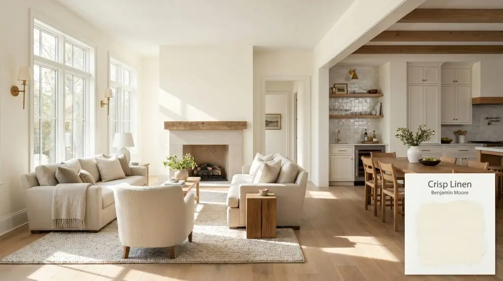
Benjamin Moore Crisp Linen (CSP-305) is a vivid, full-spectrum warm white. With an LRV of 89.63, it lacks gray colorants, allowing it to reflect light beautifully. It features soft beige and creamy yellow undertones, making it perfect for warming up low-light spaces.
Will Crisp Linen clash with your room?
Paint Technical Profile
| Color ID / SKU | CSP-305 |
| HEX Code | #F9F6E7 |
| Light Reflectance (LRV) | 89.63 |
| Temperature | Warm |
| Primary Undertone | Soft Beige And Cream |
| Hidden Undertones | Subtle Yellow And Peach |
| Use | Interior, Exterior |
| Best Exposures | North-facing or low-light rooms |
| Best For | Bedroom Walls, Living Areas, Bathroom Vanities, Kitchen Cabinets, Hallways |
Crisp Linen Digital Design Concept Boards
Bedroom Wainscoting
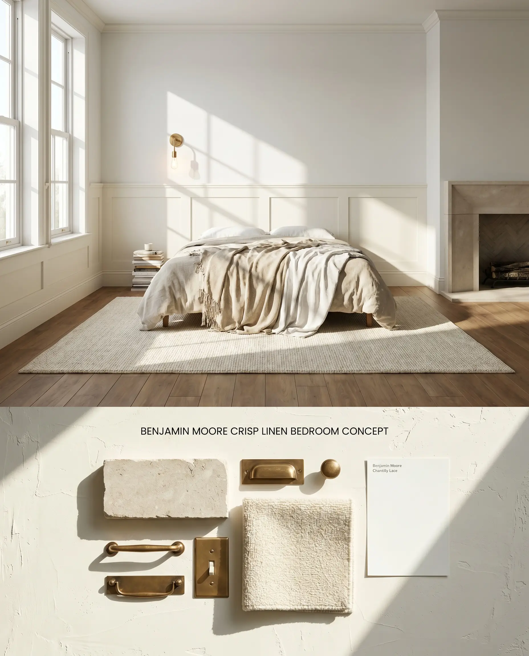
To mitigate the coverage catch of this high-LRV white and control the bounce effect from warm wood floors, apply Benjamin Moore Crisp Linen exclusively to lower bedroom wainscoting. Because this color acts as a low-light trap in basements or dim rooms, it must be used in well-lit spaces where its creamy base can reflect ambient sunlight upward. Grounding the space with low-pile wool rugs further absorbs any stray yellow reflection.
Living Area Built-Ins
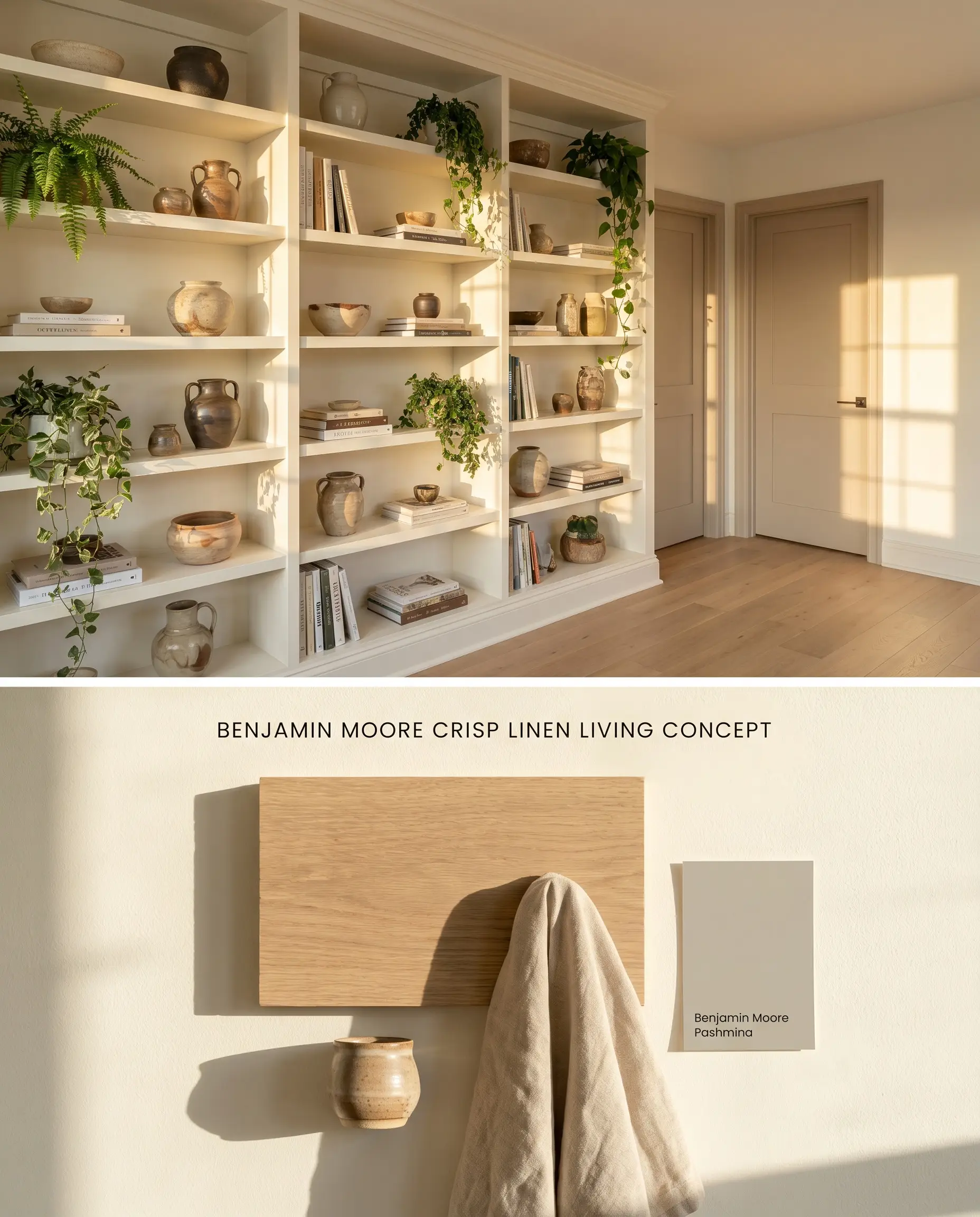
Restricting this highly reactive warm white to custom living room built-ins prevents overwhelming yellow reflection in spaces with intense southern exposure. The LRV 89.63 pushes light deep into the shelving structure, highlighting displayed objects, provided the room has ample natural sunlight to prevent the finish from falling flat. A high-quality tinted primer is strictly required on raw MDF to ensure full opacity.
Bathroom Vanities
Will Crisp Linen work with your specific lighting, floor, or furniture?
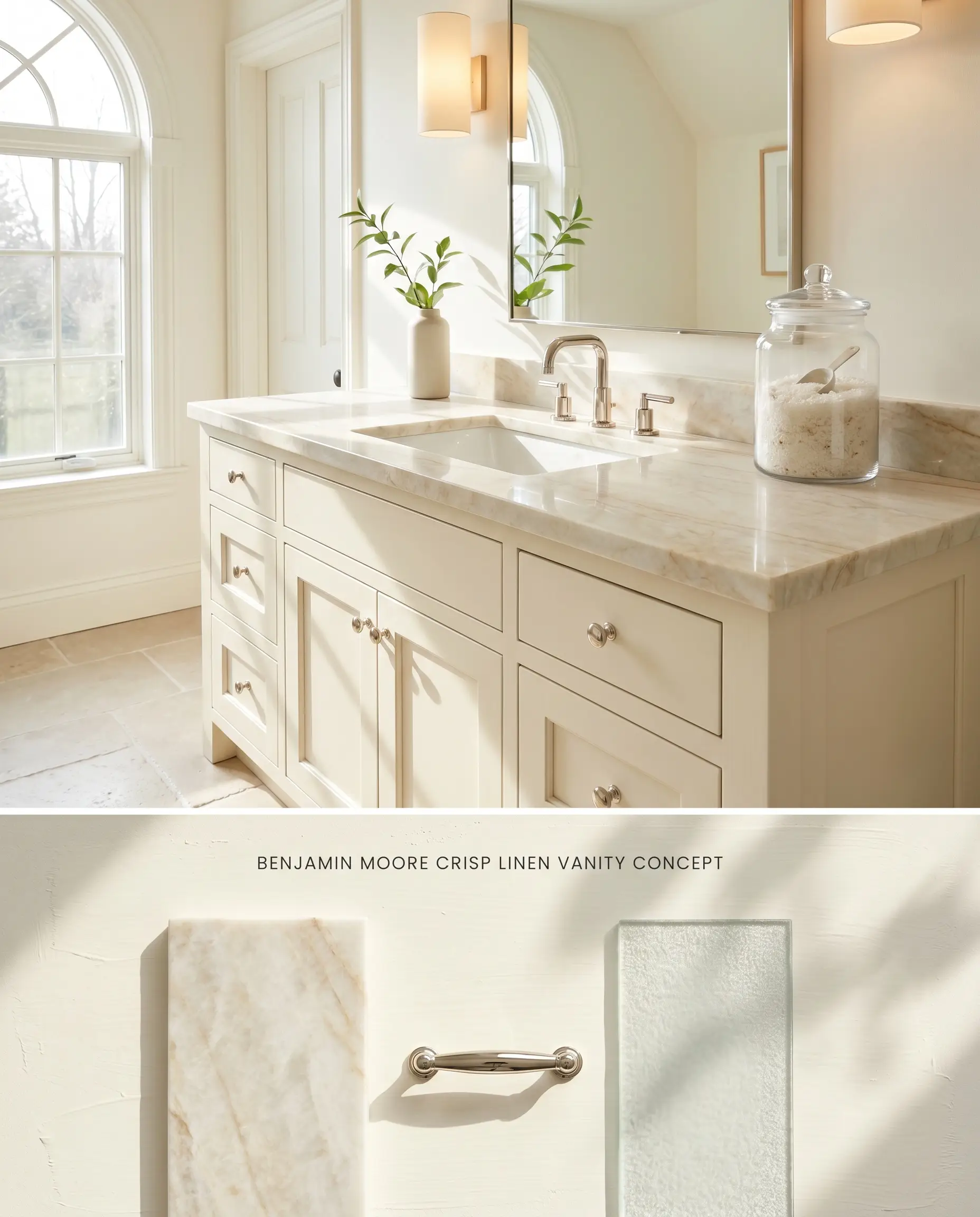
Applied to bathroom millwork, the paint introduces a rich, tactile warmth that softens hard porcelain and glass surfaces while bypassing the labor costs of multi-coat wall application. Because of the pronounced yellow warmth, you must avoid the Carrara marble clash; the gray veining will visually repel the yellow base, making the vanity read as dingy. Strictly avoid using this in windowless bathrooms, pairing it instead with creamy quartzites in sun-drenched ensuites.
Kitchen Cabinets
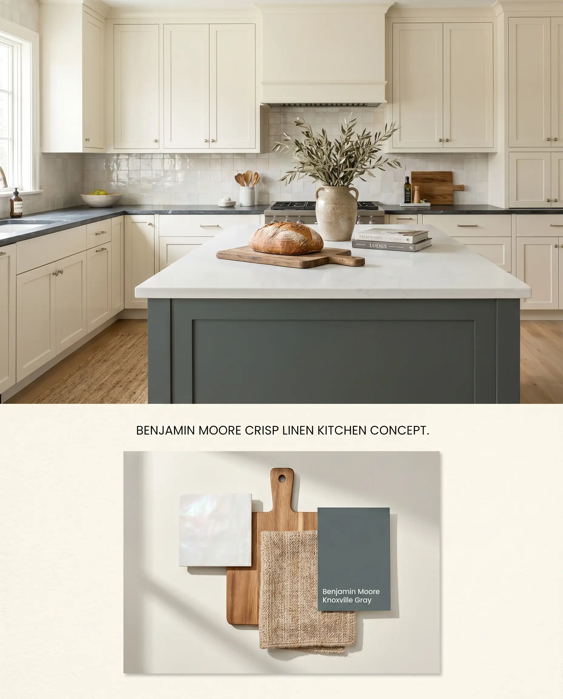
For a transitional kitchen, this full-spectrum color provides a historical, unfitted furniture aesthetic when applied to shaker profiles, naturally limiting the bounce effect that would occur on full walls. The reactive color structure shifts throughout the day, warming up significantly as incandescent evening light hits the wood. Anchor the perimeter cabinetry with a darker, grounding island color to maintain visual weight in brightly lit spaces.
Entryway Accent Paneling
Will Crisp Linen work with your specific lighting, floor, or furniture?
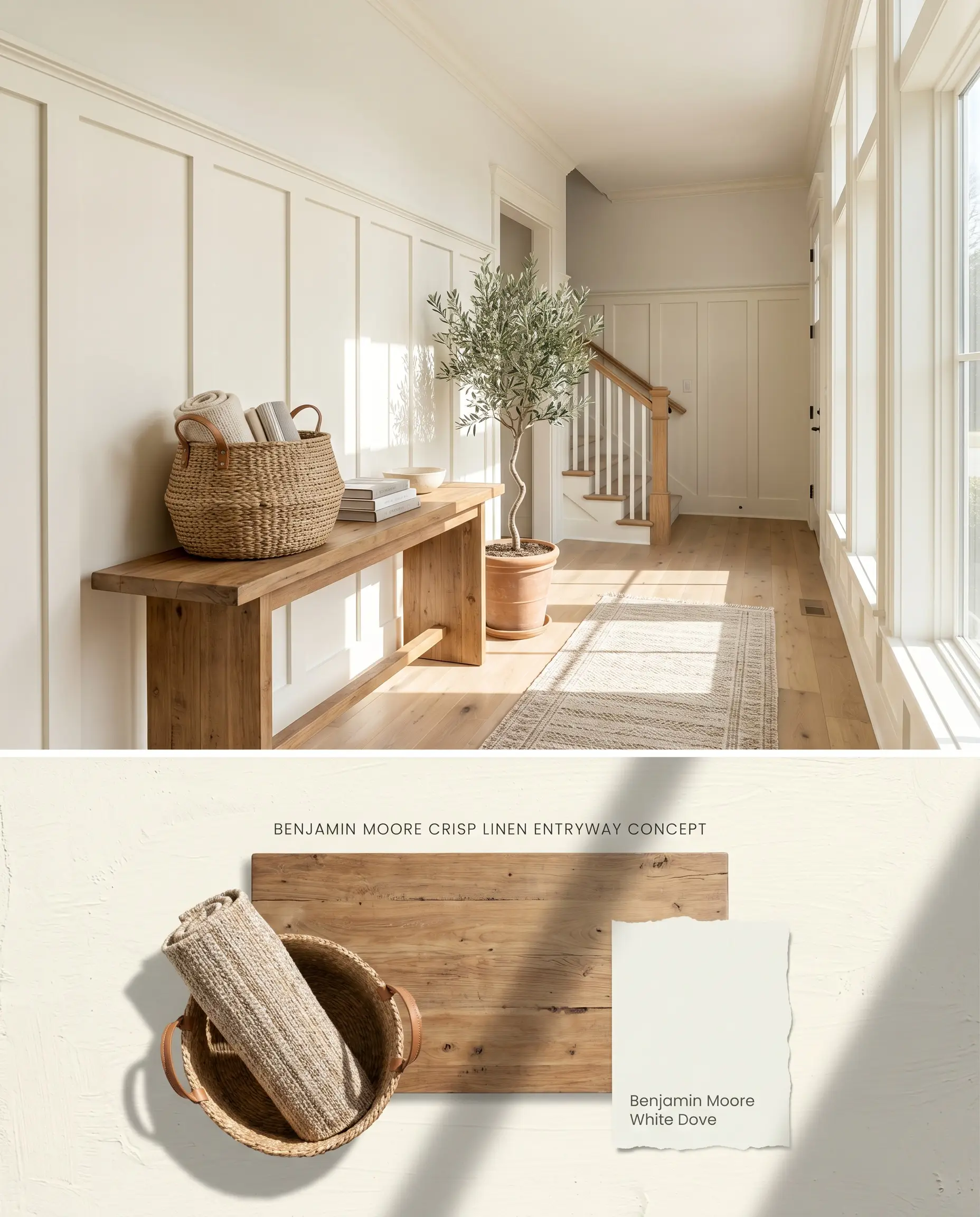
Dark hallways and enclosed corridors must be strictly avoided; instead, apply Crisp Linen CSP-305 to board-and-batten paneling in sun-drenched, open-concept entryways. The absence of gray undertones prevents the surface from shadowing out as long as natural light remains abundant. The highly user-friendly touch-up capability ensures scuffs from high foot traffic disappear effortlessly without flashing.
Head-to-Head Architectural Paint Comparisons
Benjamin Moore Crisp Linen CSP-305 vs. Benjamin Moore Linen White OC-146
Both are warm whites, but their color structure differs fundamentally. Benjamin Moore Linen White OC-146 relies on traditional universal tints, giving it a stable, predictable yellow-beige undertone that absorbs light evenly. Benjamin Moore Crisp Linen CSP-305 is a full-spectrum color with an LRV of 89.63, meaning it lacks black colorants and reacts aggressively to surrounding reflections. Use Linen White for consistent warmth in south-facing rooms where Crisp Linen would bounce too much yellow, and reserve Crisp Linen for low-light spaces that need maximum luminescence.
Benjamin Moore Crisp Linen CSP-305 vs. Sherwin-Williams Crisp Linen SW 6378
Will Crisp Linen work with your specific lighting, floor, or furniture?
Despite sharing a name, these two colors operate at different depths and reflectivity levels. Sherwin-Williams Crisp Linen SW 6378 is noticeably deeper, leaning closer to a traditional beige that physically absorbs more ambient light and grounds a space. Benjamin Moore Crisp Linen CSP-305 remains firmly in the off-white category, reflecting light rapidly off its creamy base. Specify the Sherwin-Williams iteration when reducing glare in brightly lit open floor plans, and utilize the Benjamin Moore version to lift the visual ceiling height in shaded, enclosed rooms.
Benjamin Moore Crisp Linen CSP-305 vs. Benjamin Moore Mayonnaise 2152-70
Benjamin Moore Mayonnaise 2152-70 presents a cleaner, more direct yellow undertone compared to the complex, reactive base of Crisp Linen. While both reflect a high volume of light, Mayonnaise reads as a distinct, sunny off-white regardless of the shadow play or time of day. Crisp Linen shifts dramatically between a soft beige-white and a pronounced cream depending on the angle of the sun. Deploy Mayonnaise in retro or cottage-style kitchens requiring a crisp, static backdrop, and apply Crisp Linen in formal living spaces where shifting, dynamic light interaction is required.
Technical Application FAQs
Yes, in rooms with intense southern exposure, the yellow base will amplify and bounce, making the walls appear noticeably more yellow than white. It is best to avoid this exposure or counteract it with cool-toned furnishings.
Yes, the pronounced yellow warmth of Crisp Linen creates a direct Carrara marble clash, causing the gray veining in the stone to look stark and the paint to appear dingy. Opt for warm-veined stones like Calacatta Gold or Taj Mahal Quartzite instead.
By omitting black or gray colorants, the full-spectrum color structure prevents the paint from absorbing shadows, allowing it to excel in low-light spaces without turning muddy.
As a very light, high-LRV white, it often requires three coats or a high-quality tinted primer when painting over darker walls to achieve full opacity and prevent coverage catches.
Room Compatibility & Clashes Diagnoses
Hackrea's reports evaluating the compatibility of Crisp Linen in real rooms.No compatibility tests for Crisp Linen yet.
Be the first to see how this color reacts to your space. Run a free architectural diagnostic now.
Paint Aesthetic & Practical Analysis
| Profile | Analysis | |
|---|---|---|
| Aesthetic | Crisp Linen by Benjamin Moore is a highly responsive, full-spectrum warm white. Because it omits gray elements, it possesses a unique luminescence that breathes life into dim spaces. However, its chameleon-like tendency to flash yellow or peach depending on the time of day means it requires careful testing before committing. | |
| The Coverage Catch | As a very light, high-LRV white, it may require three coats or a tinted primer over darker walls to achieve full opacity, though Aura formulations perform better. | |
| The Lighting Shift | Because it is a full-spectrum color formulated without black or gray, it is highly reactive. It can shift wildly from a pleasant beige-white to a pronounced creamy yellow depending on the time of day and surrounding reflections. | |
| The Clash Warning | Avoid pairing with cool-toned stones like Carrara marble, as the yellow warmth of Crisp Linen will clash with the gray veining. | |
| The Bounce Effect | In rooms with intense southern exposure or warm wood floors, the yellow base can amplify and bounce, making the walls appear noticeably more yellow than white. | |
| The Low Light Trap | Unlike many whites that turn dingy or flat in low natural light, Crisp Linen excels here, retaining its brightness and warmth without going muddy. | |
| The Touch Up | Highly user-friendly for touch-ups. Users report that minor touch-ups blend seamlessly without flashing, even months later. |
Closest Cross-Brand Equivalents
The absolute closest scientific color matches for Crisp Linen across top paint brands.