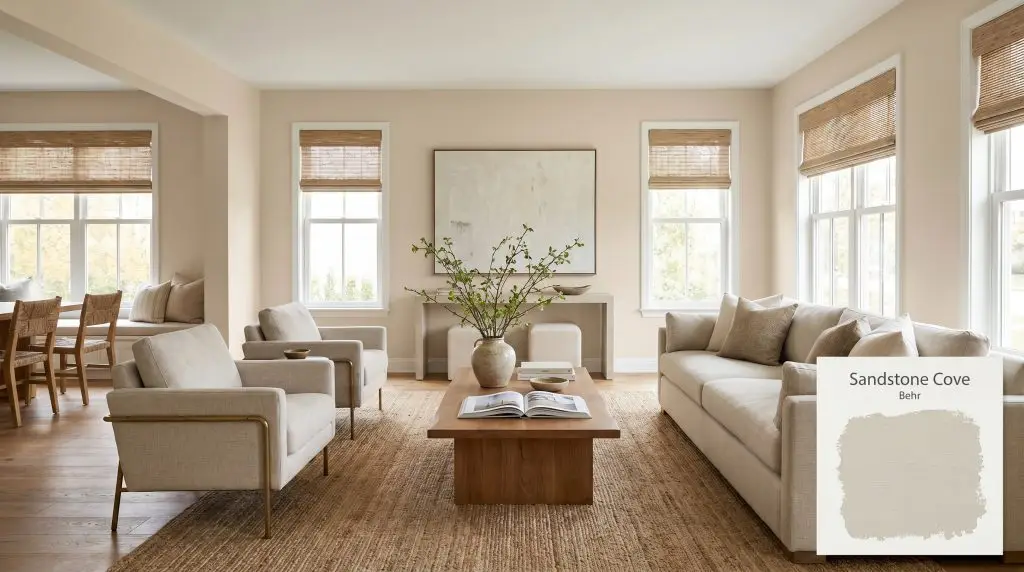
Behr Sandstone Cove (730C-2) is a light, warm beige with a sandy, slightly yellowed base and subtle green-greige undertones. Boasting an LRV of 66, this quiet neutral provides a medium-light, inviting warmth that adapts beautifully to both interiors and exteriors.
Will Sandstone Cove clash with your room?
Paint Technical Profile
| Color ID / SKU | 730C-2 |
| HEX Code | #ddd4c5 |
| Light Reflectance (LRV) | 66 |
| Temperature | Warm |
| Primary Undertone | Sandy Beige |
| Hidden Undertones | Subtle Green, Yellow, And Occasional Dusty Purple In Shadows |
| Use | Interior, Exterior |
| Best Exposures | North-facing (warms it up) or South-facing (brightens it) |
| Best For | Living rooms, open-concept spaces, bedrooms, kitchen cabinetry, exterior siding |
Sandstone Cove Digital Design Concept Boards
Open-Concept Living Rooms and Family Rooms
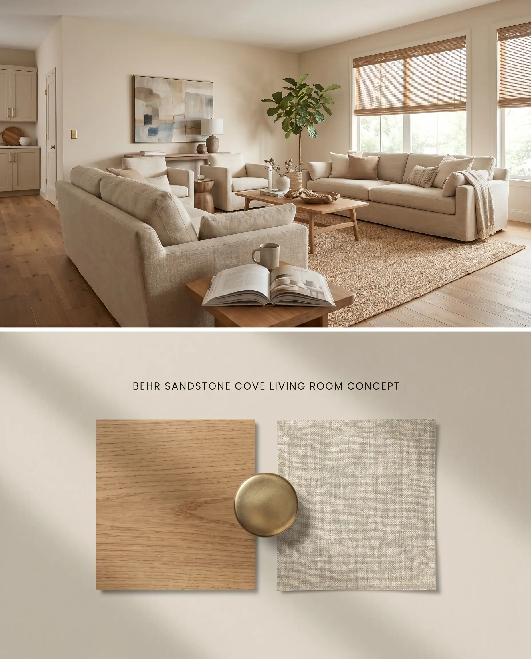
Will Sandstone Cove work with your specific lighting, floor, or furniture?
The high light reflectance value of 66 allows this warm beige to expand spatial boundaries by bouncing ambient light across wide architectural expanses. By utilizing it across continuous walls, the color structure bridges the gap between natural light sources and adjacent millwork without reading as sterile. Its low chroma pigment requires strategic pairing with organic textures to prevent the expansive surface from flattening into a muddy greige in shadowed corners.
Warm, Serene Bedrooms
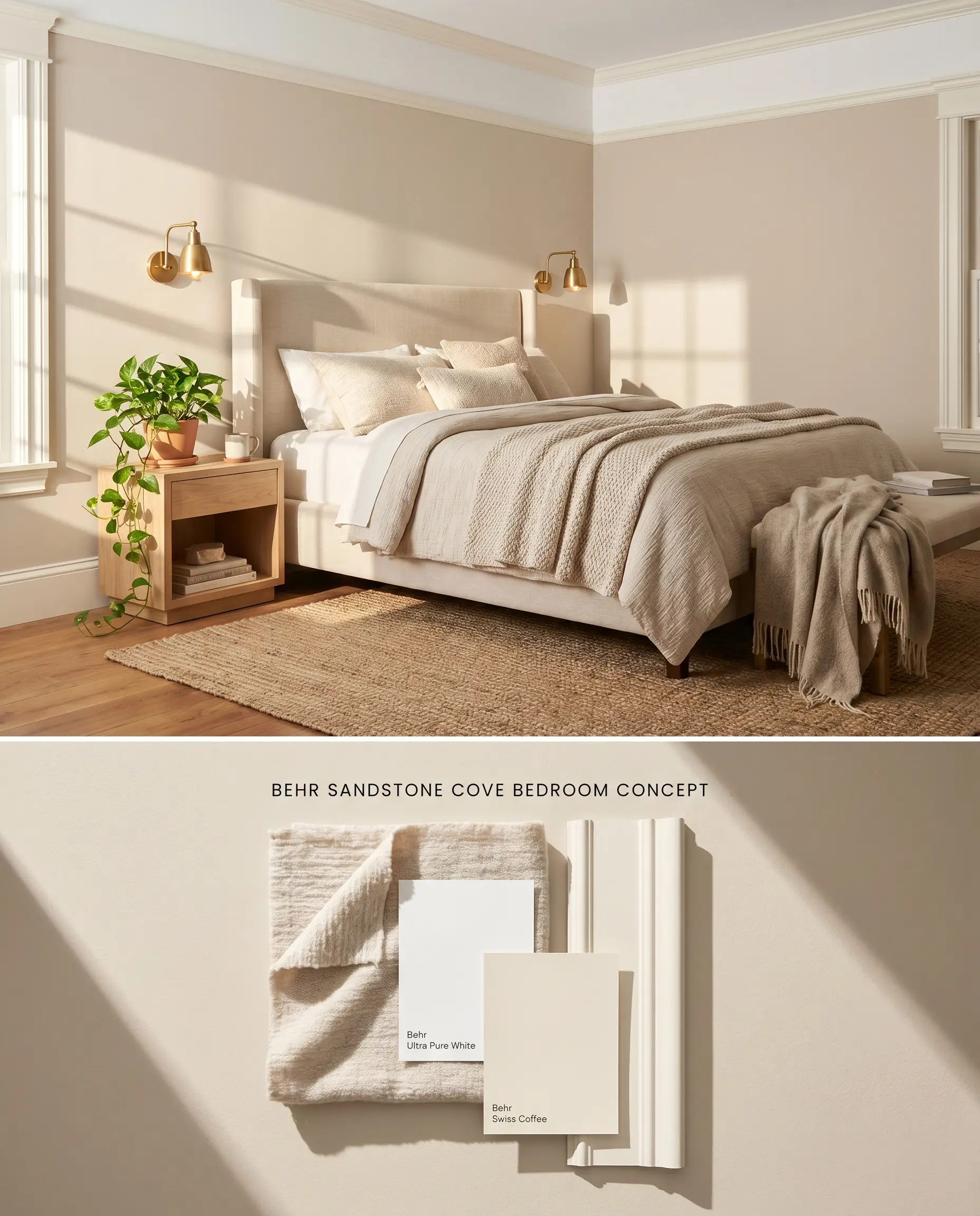
This chalky beige absorbs softer morning light, grounding the bedroom’s perimeter while maintaining an airy, expansive atmosphere. The greige undertones interact physically with layered textiles to soften harsh right angles, creating a resting space that feels structurally defined but visually quiet. Because the pigment lacks strong saturation, it relies on the physical shadows cast by architectural trim to generate visual depth.
Kitchen Cabinetry
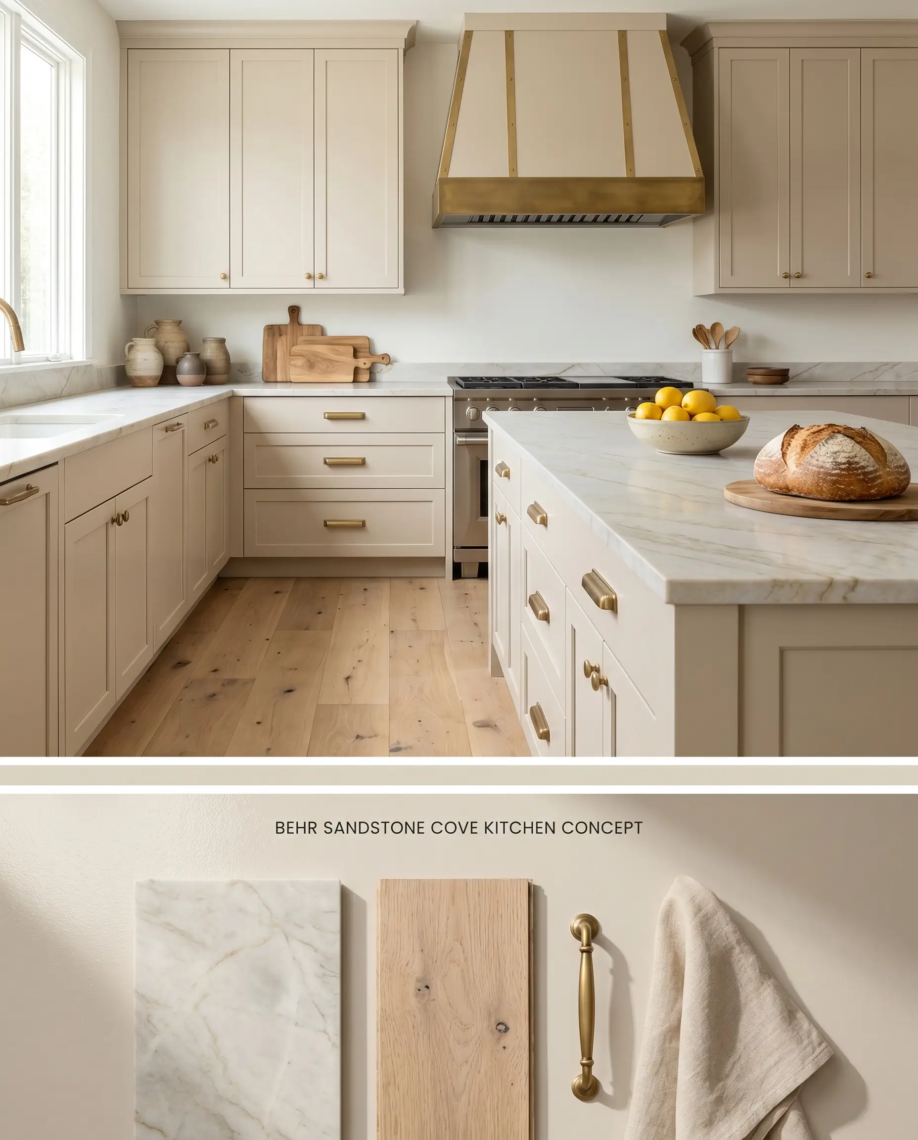
Applying this shade to lower and upper cabinetry introduces an organic, earthy foundation that physically warms up the cold, reflective surfaces of stone countertops. The muted chromatic profile prevents the cabinet boxes from dominating the visual field, allowing focal points like range hoods or statement islands to draw the eye naturally. The subtle pigment acts as a grounding neutral that bridges the visual gap between raw wood flooring and metallic hardware.
Exterior Siding and Trim
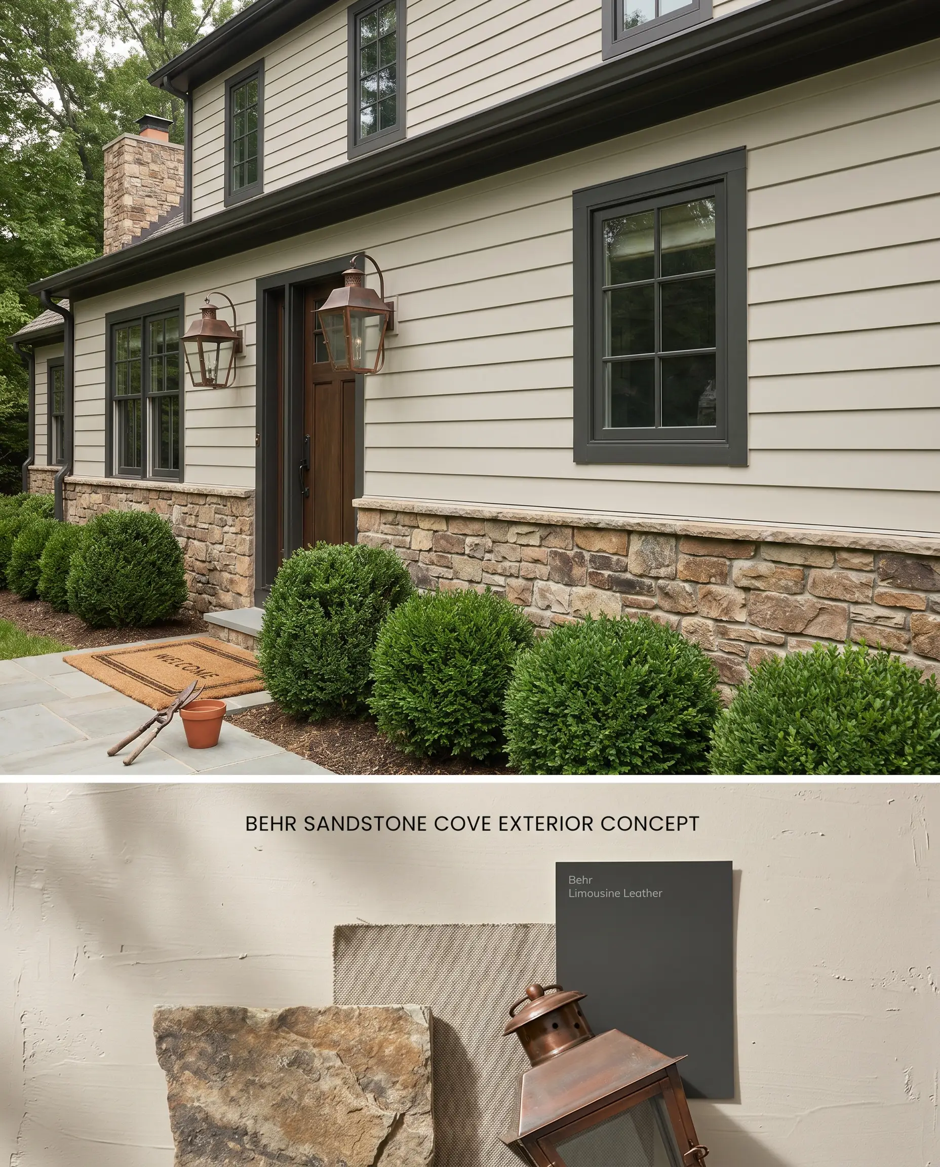
Used as a primary siding color, this tone mimics natural limestone, physically grounding the home’s elevation in its surrounding landscape. The architectural finish relies on the interaction with natural stone facades, provided the masonry lacks strong pink hues that would trigger a color clash. The high LRV reflects significant thermal energy, keeping the exterior visually crisp under diffused daylight.
Comparative Color Theory: Greige Undertones & Light Reflectance Values
Behr Sandstone Cove 730C-2 vs. Sherwin-Williams Accessible Beige SW 7036
Will Sandstone Cove work with your specific lighting, floor, or furniture?
Sherwin-Williams Accessible Beige SW 7036 sits slightly darker with an LRV of 58, bringing a more pronounced gray influence that anchors well in expansive, open-concept spaces. Behr Sandstone Cove 730C-2 reflects significantly more light, reading as a lighter, chalky beige. Deploy Behr Sandstone Cove 730C-2 when you need to brighten a moderately lit room without leaning yellow, but switch to Sherwin-Williams Accessible Beige SW 7036 if the space features stark cool gray floors that might trigger the Behr paint’s green shift.
Behr Sandstone Cove 730C-2 vs. Benjamin Moore Natural Cream OC-14
Benjamin Moore Natural Cream OC-14 shares a nearly identical light reflectance value (64.78) but carries a slightly cleaner, more yellow-based neutral profile. Behr Sandstone Cove 730C-2 relies on greige undertones that pull a dusty purple in North-facing light. Specify Benjamin Moore Natural Cream OC-14 for North-facing rooms to maintain a stable, warm off-white, and reserve Behr Sandstone Cove 730C-2 for spaces with warm, balanced light where its earthy depth can fully develop.
Behr Sandstone Cove 730C-2 vs. Behr Gobi Desert 710C-3
Will Sandstone Cove work with your specific lighting, floor, or furniture?
Behr Gobi Desert 710C-3 drops the LRV to 58 and increases the yellow-brown pigment concentration, creating a much more traditional, saturated tan. Behr Sandstone Cove 730C-2 offers a lower chroma, sandy white alternative that feels significantly more muted. Use Behr Gobi Desert 710C-3 when pairing with dense, traditional dark wood trims, but apply Behr Sandstone Cove 730C-2 to harmonize with lighter, raw oak flooring and contemporary linen textures.
Technical Specifications & FAQs
Yes, in North-facing or low light, its chromatic profile shifts, causing it to flash a dusty purple or subtle green. Warm light stabilizes it into a chalky beige.
Yes, its subtle green and greige undertones clash directly with stark cool grays and dominant pink-toned surfaces. It requires warm oak flooring or earthy tones to maintain visual balance.
Due to its high light reflectance value and muted tone, it can wash out completely and lose its depth when exposed to direct, intense sunlight.
Yes, the intense, direct light of a South-facing room can overpower its low chroma pigment, causing the color to flatten and lose its structural warmth.
Room Compatibility & Clashes Diagnoses
Hackrea's reports evaluating the compatibility of Sandstone Cove in real rooms.South-Facing Vaulted Bedroom
"Intense natural light amplifies the paint's golden undertones, producing a low-contrast, overly yellow monochromatic clash with the honey pine furniture."
South-Facing Dining Room
"The high LRV and warm peachy undertones of Sandstone Cove risk reading as an unfinished patch when isolated as an accent wall against saturated terracotta surfaces under intense southern sunlight."
Paint Aesthetic & Practical Analysis
| Profile | Analysis | |
|---|---|---|
| Aesthetic | Sandstone Cove is a highly versatile, inviting neutral that bridges the gap between beige and greige. While it provides a beautiful, warm architectural finish for earthy textures and oak flooring, its low chroma makes it highly susceptible to lighting shifts, occasionally flashing green or dusty purple in shadows. | |
| The Coverage Catch | As a light color with very low chroma, coverage can depend heavily on the base color. Darker or patchy substrates may show through easily at first, requiring a tinted primer or multiple coats if using lower-grade untinted bases. | |
| The Lighting Shift | Depending on the light source or time of day, its chromatic profile can shift dramatically. In warm light, it reads as a chalky beige, but in North-facing or low light, it can flash a dusty purple or subtle green. | |
| The Clash Warning | Its subtle green and greige undertones can clash with stark cool grays or heavily pink-toned surfaces. It pairs best with warm oak flooring and earthy tones. | |
| The Bounce Effect | Because of its high LRV and muted tone, it doesn't aggressively bounce neon color, but it can wash out and lose its depth in direct, intense South-facing sunlight. | |
| The Low Light Trap | In windowless rooms or deep shadows, the color structure can lose its warmth and turn into a somewhat flat, muddy greige. | |
| The Touch Up | Standard for most eggshell/satin finishes, but DIYers note that painter's tape can peel the paint if the surface isn't prepped correctly or if the tape is left on too long. |
Closest Cross-Brand Equivalents
The absolute closest scientific color matches for Sandstone Cove across top paint brands.