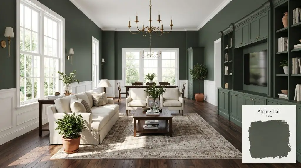
Behr Alpine Trail (N420-7) is a dramatic, almost-black pine green with deep charcoal and subtle olive undertones. With an LRV of 10, it serves as a sophisticated, moody neutral that excels in color-drenched dining rooms, cozy bedrooms, and striking kitchen cabinetry.
Will Alpine Trail clash with your room?
Paint Technical Profile
| Color ID / SKU | N420-7 |
| HEX Code | #515a52 |
| Light Reflectance (LRV) | 10 |
| Temperature | Cool-leaning Neutral |
| Primary Undertone | Charcoal Gray |
| Hidden Undertones | Pine, Soft Olive, Black |
| Use | Interior, Exterior |
| Best Exposures | South-facing, West-facing |
| Best For | Kitchen cabinets, color-drenched dining rooms, moody bedrooms, historic living spaces, exterior trim |
Alpine Trail Digital Design Concept Boards
Kitchen and Bathroom Cabinetry
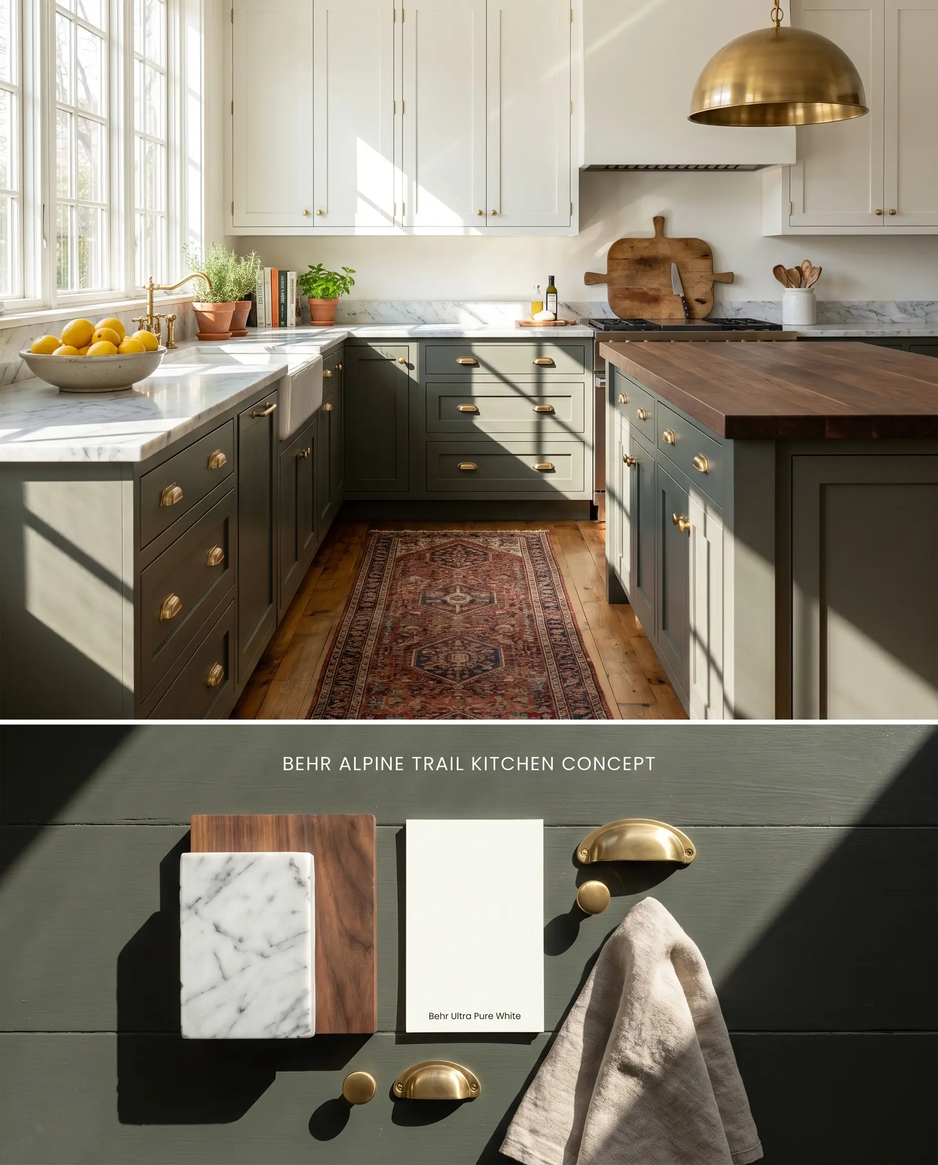
The deep gray base of this pine green grounds the lower half of a kitchen, anchoring base cabinets while receding visually to expand the walking path. Against crisp white upper cabinets or veined Carrara marble countertops, the dark chromatic profile provides necessary visual weight without the starkness of true black.
Color-Drenched Dining Rooms
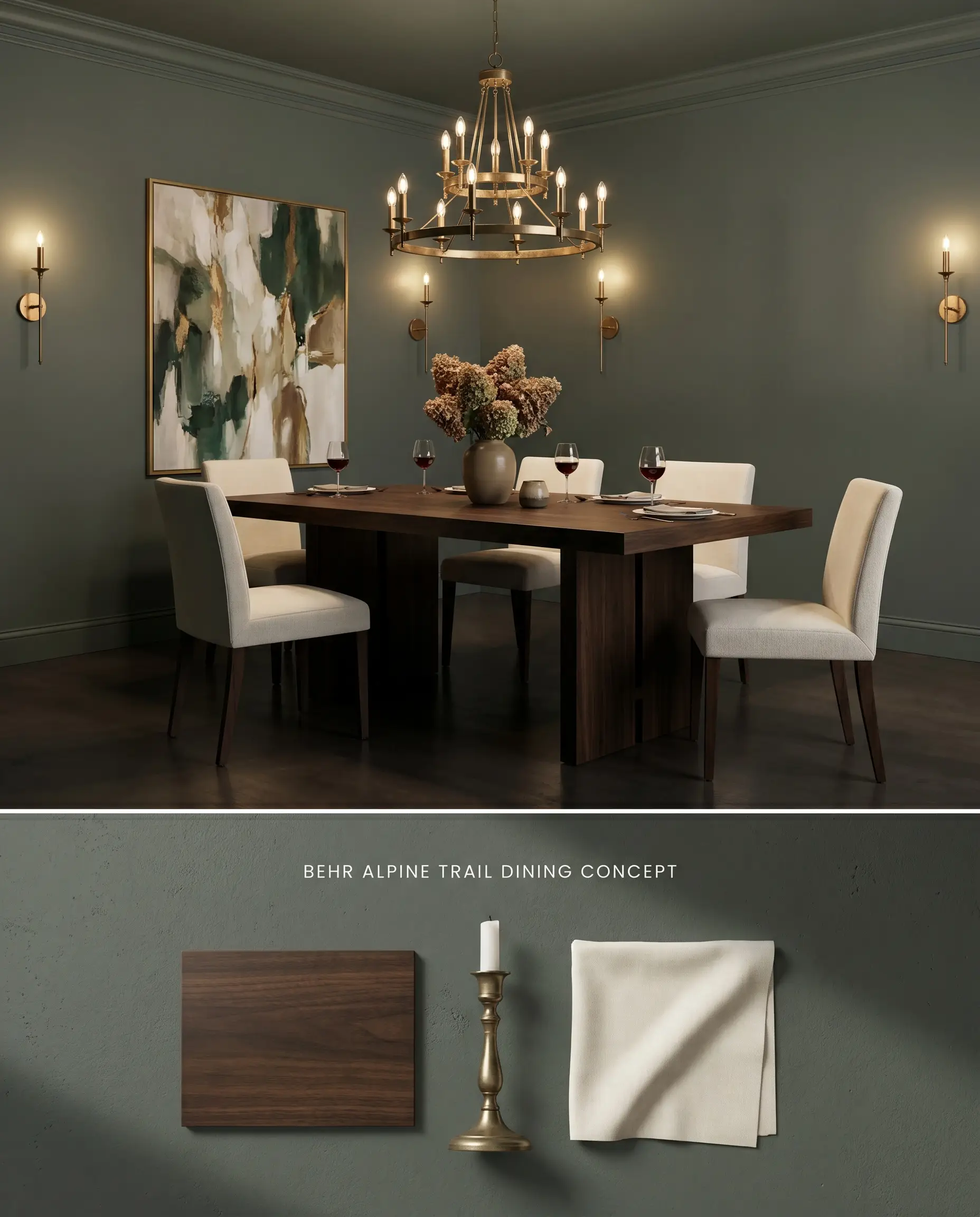
Wrapping a dining room entirely in this moody neutral blurs the physical boundaries of the walls, pushing the perimeter outward when illuminated by a central chandelier. The low light reflectance value absorbs ambient glare, creating an intimate, enveloping dining experience that reduces visual noise.
Moody Master Bedrooms
Will Alpine Trail work with your specific lighting, floor, or furniture?
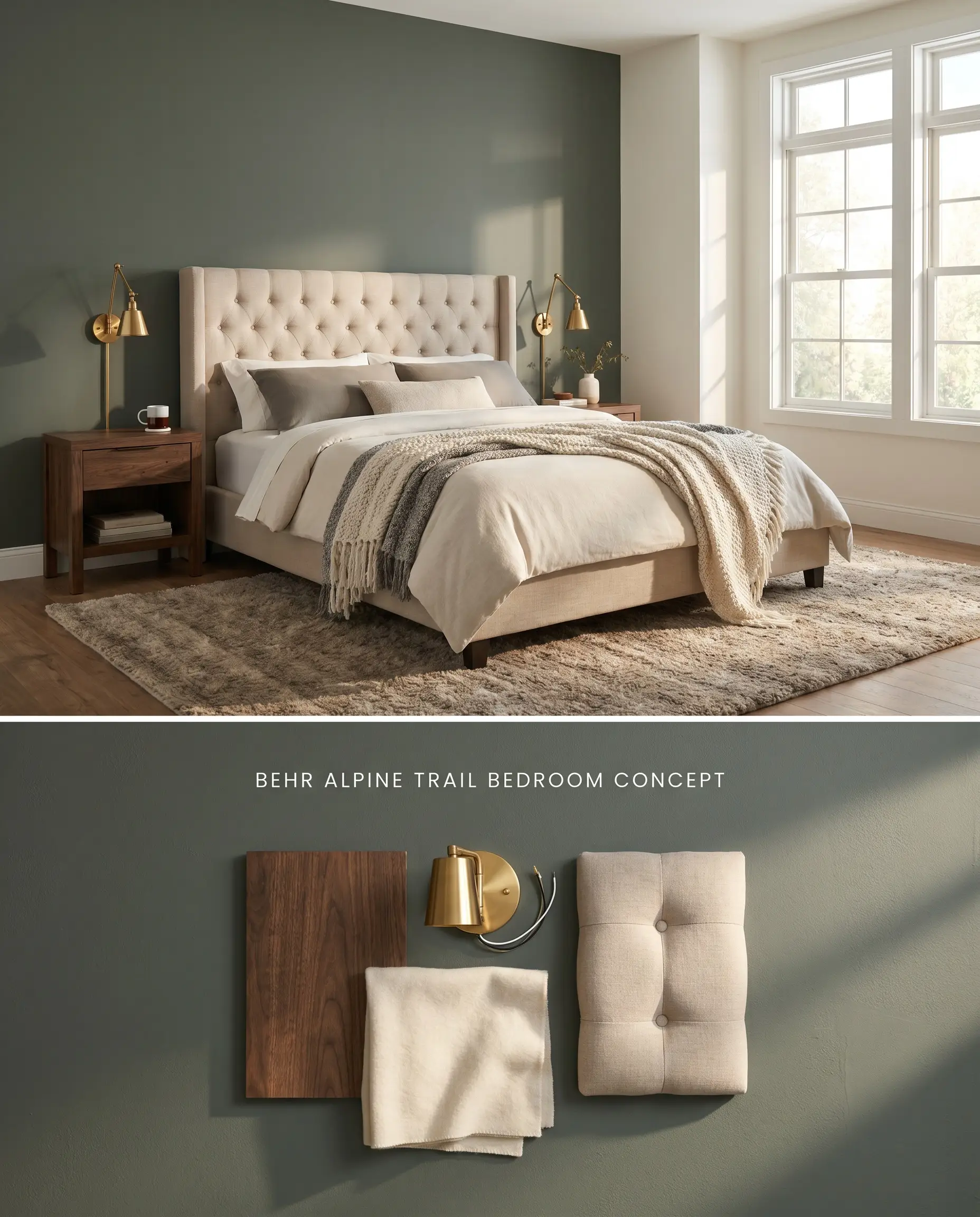
Applying this deep shade to a primary bedroom establishes a high-contrast focal point when utilized strictly as a headboard accent wall. The dark value absorbs early morning light, reducing glare and promoting a resting environment without turning the entire room into a low-light trap.
Historic Craftsman Living Spaces
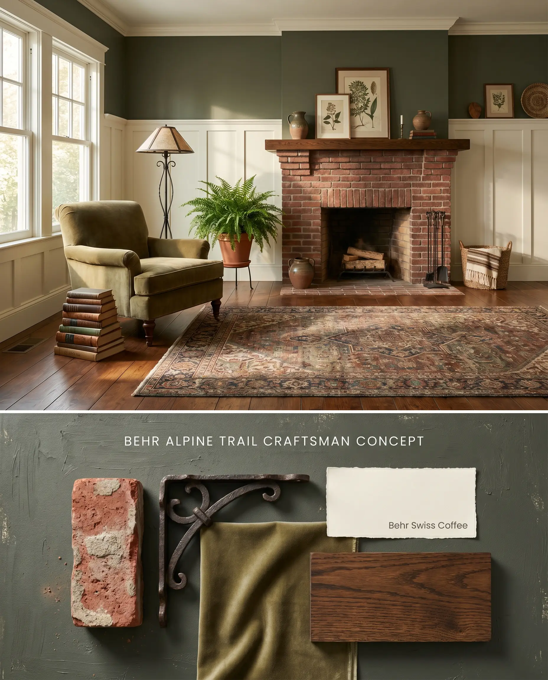
Will Alpine Trail work with your specific lighting, floor, or furniture?
The muted, gray-green undertones align perfectly with the earthy palettes characteristic of historic Craftsman architecture. Applying the color above a tall, crisp white wainscoting elevates the dark hue to eye level, preventing the low LRV from shrinking the room’s overall footprint.
Exterior Trim and Shutters
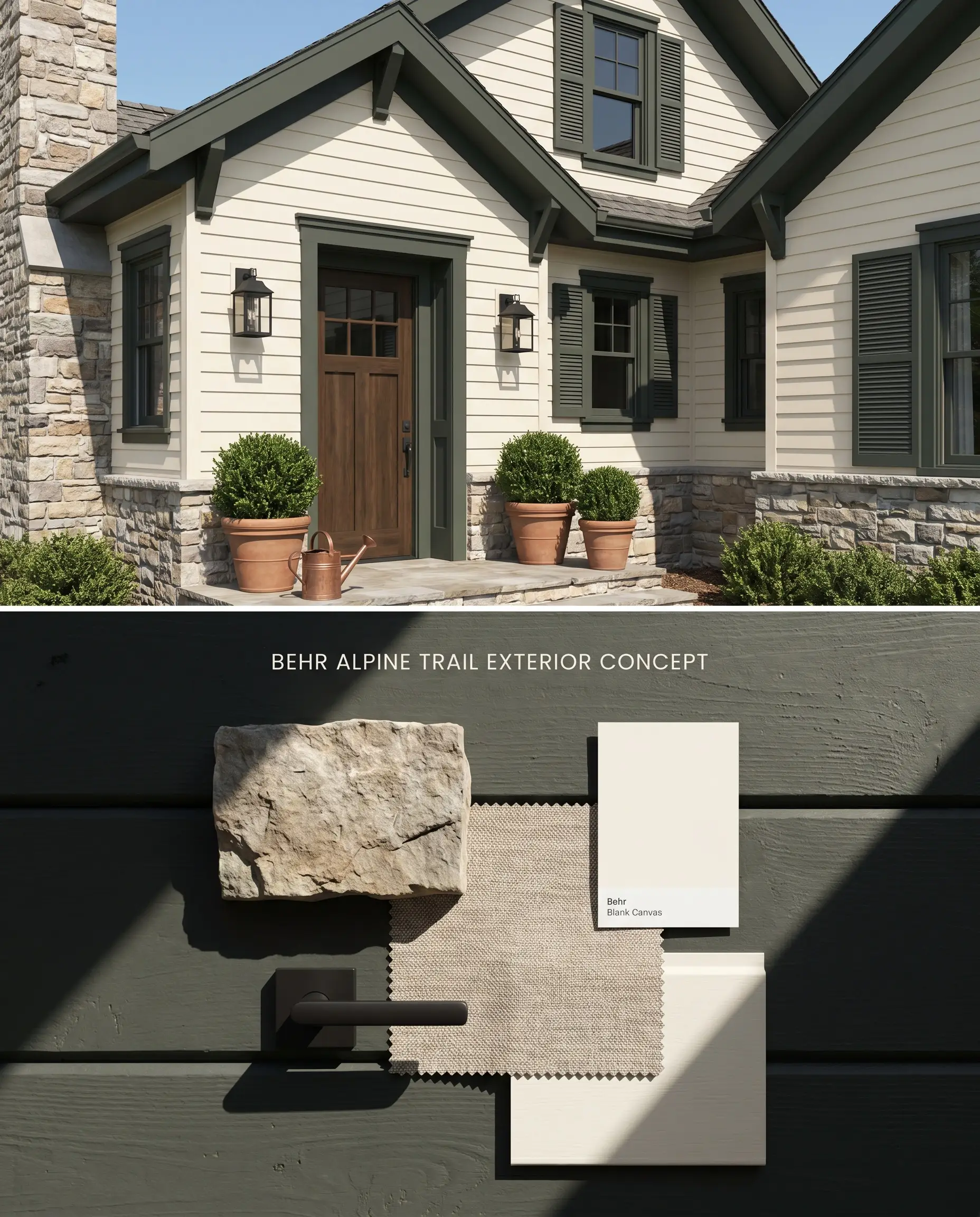
Intense UV exposure on an exterior architectural finish washes out the gray base, allowing the rich pine green to read clearly against natural stone or cream-colored siding. The dark value provides sharp structural definition to window casings and rooflines, anchoring the home to its surrounding landscape.
Evaluating Behr Alpine Trail N420-7 Against Rival Dark Greens
Behr Alpine Trail N420-7 vs. Benjamin Moore Salamander 2050-10
Benjamin Moore Salamander 2050-10 features a lower light reflectance value (LRV 3) and pushes a distinct black-blue undertone, whereas Behr Alpine Trail N420-7 relies on a gray base with olive notes that activate in direct light. Specify Benjamin Moore Salamander 2050-10 in rooms where you require a near-black appearance that shifts teal under artificial light. Deploy Behr Alpine Trail N420-7 for South-facing spaces where the pine green can fully emerge without turning overly aquatic.
Behr Alpine Trail N420-7 vs. Sherwin-Williams Pewter Green SW 6208
Will Alpine Trail work with your specific lighting, floor, or furniture?
Sherwin-Williams Pewter Green SW 6208 carries a higher LRV (12) and a pronounced silver-gray influence, making it read as a cool, muted sage. Behr Alpine Trail N420-7 is noticeably darker and warmer, pushing closer to a true forest green in bright conditions. Select Sherwin-Williams Pewter Green SW 6208 for North-facing rooms where the silver undertone reflects ambient light, and reserve Behr Alpine Trail N420-7 for high-contrast applications against crisp white millwork.
Behr Alpine Trail N420-7 vs. Behr Dark Everglade HDC-CL-21A
Behr Dark Everglade HDC-CL-21A features a cleaner, saturated emerald undertone, lacking the muddying gray base found in Behr Alpine Trail N420-7. Behr Alpine Trail N420-7 acts as a moody neutral that recedes visually, while Behr Dark Everglade HDC-CL-21A functions as a vibrant focal point. Utilize Behr Dark Everglade HDC-CL-21A on a front door for a jewel-box effect, but specify Behr Alpine Trail N420-7 for large architectural surfaces where an intensely saturated green would overwhelm the eye.
Technical FAQs & Application Constraints
Yes, the extremely low light reflectance value causes this shade to absorb light aggressively. In windowless bathrooms or dark hallways, the color turns flat and cave-like, reading almost entirely as a soft charcoal unless mitigated with strategic layered lighting.
This specific green clashes with overly orange or yellow wood tones, which pull out the gray base and make the paint look muddy. It requires pairing with dark walnut, espresso molding, or crisp white trim to maintain its crisp, intended hue.
Dark greens burnish easily, requiring you to avoid flat or matte finishes in high-traffic areas. Opt for an eggshell or satin finish engineered with scuff-resistant technology to prevent flashing and the need for corner-to-corner repainting when touching up scuffs.
No, it does not pull blue or purple; instead, the cool indirect light of a North-facing room neutralizes the olive notes. Under these conditions, the paint reads as a muted, soft black.
Room Compatibility & Clashes Diagnoses
Hackrea's reports evaluating the compatibility of Alpine Trail in real rooms.No compatibility tests for Alpine Trail yet.
Be the first to see how this color reacts to your space. Run a free architectural diagnostic now.
Paint Aesthetic & Practical Analysis
| Profile | Analysis | |
|---|---|---|
| Aesthetic | Alpine Trail is a phenomenal choice if you want the drama of a dark green without the neon intensity. Its heavy gray base keeps it grounded, making it an incredibly versatile and sophisticated architectural finish for modern and historic homes alike. | |
| The Coverage Catch | Because of its extremely low LRV (10), Alpine Trail can require three coats for full opacity over lighter walls unless tinted into a premium one-coat hide line like Behr Marquee. | |
| The Lighting Shift | In direct South-facing light, the pine and soft olive notes become prominent. In North-facing or artificial light, it reads almost entirely as a soft black or dark charcoal. | |
| The Clash Warning | Homeowners note it can clash with overly orange or yellow wood tones, making the green look muddy. It pairs best with dark walnut, espresso molding, or crisp white. | |
| The Bounce Effect | This shade absorbs light aggressively. It will not bounce light around a room, meaning it can make a space feel significantly smaller if not balanced with adequate ambient lighting. | |
| The Low Light Trap | In windowless rooms or hallways, the color can turn flat and 'cave-like' without strategic layered lighting. | |
| The Touch Up | Like many dark greens, it burnishes easily in a matte or eggshell finish. Touching up scuffs often requires repainting the entire wall corner-to-corner to avoid flashing. |