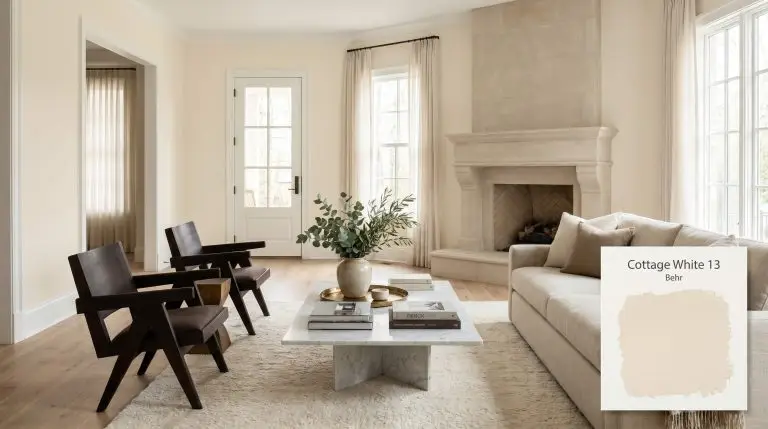
Behr Cottage White (13) is a warm, luminous off-white with distinct honey-gold and creamy yellow undertones. With an LRV of 82, it reflects a significant amount of light, making it an excellent choice for creating soft, inviting spaces without the starkness of a pure white.
| Temperature | Warm |
|---|---|
| Primary Undertone | Yellow / Honey Gold |
| Hidden Undertones | Cream, subtle peach |
| Best Exposures | North-facing or East-facing |
| Best For | Living rooms, dining rooms, bedrooms, kitchen cabinets, traditional exteriors |
Hackrea Review
Cottage White by Behr is a beloved classic for a reason. It wraps a room in a comforting, buttery glow that feels inherently welcoming. While it can lean a bit too yellow in intense southern light, it is an absolute lifesaver for warming up chilly, north-facing spaces.Architectural Applications for Behr Cottage White 13
Living Rooms
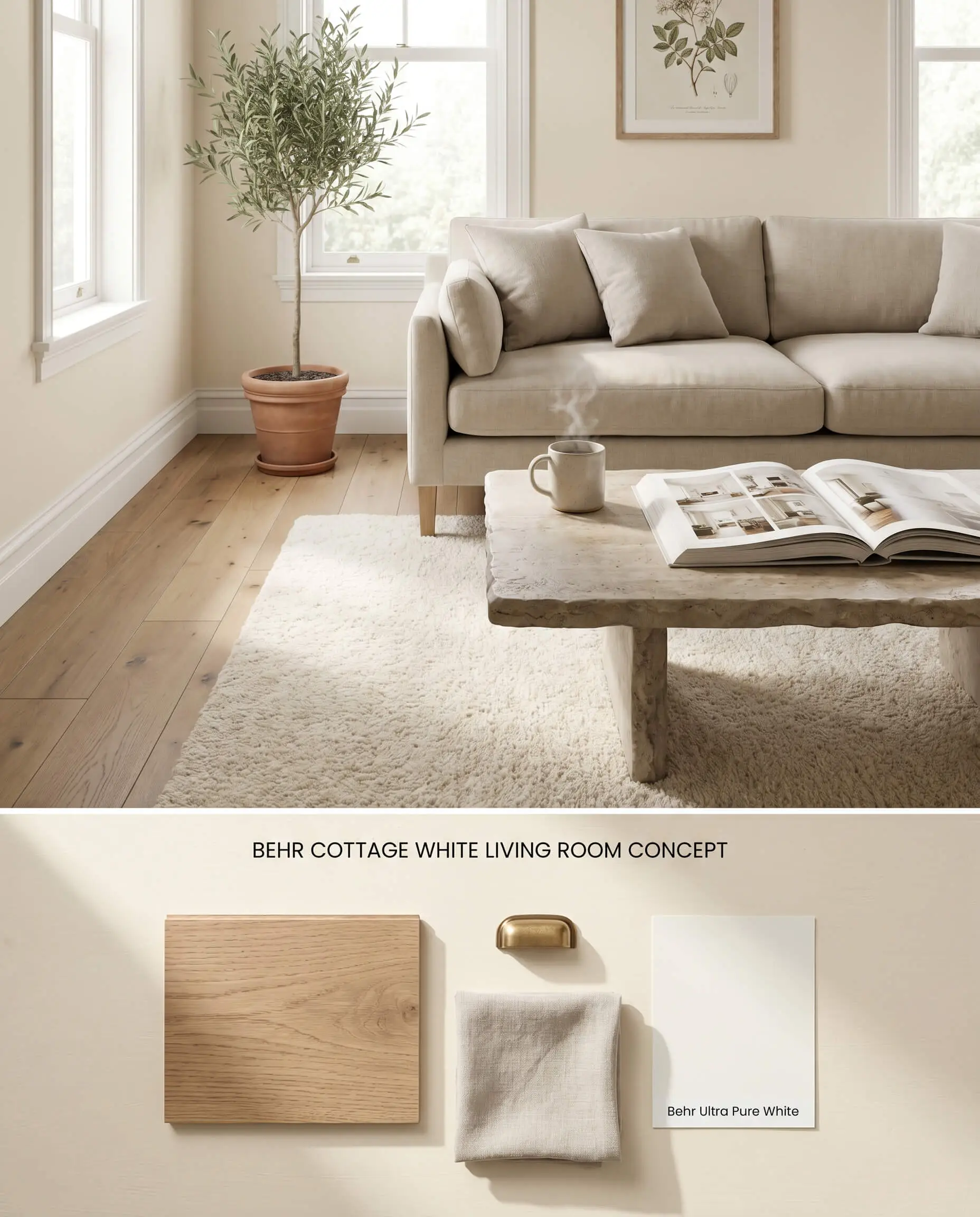
In North-facing living spaces, the color temperature shift of this warm off-white offsets the naturally cool, blue-tinted daylight without shifting into an aggressive yellow. The honey gold undertones remain subdued but active, preventing the walls from reading as sterile plaster in shadowed corners. Pairing this paint with matte, wide-plank European oak floors actively mitigates the bounce effect that typically occurs when yellow-based paints reflect off orange or red-toned woods.
Dining Rooms
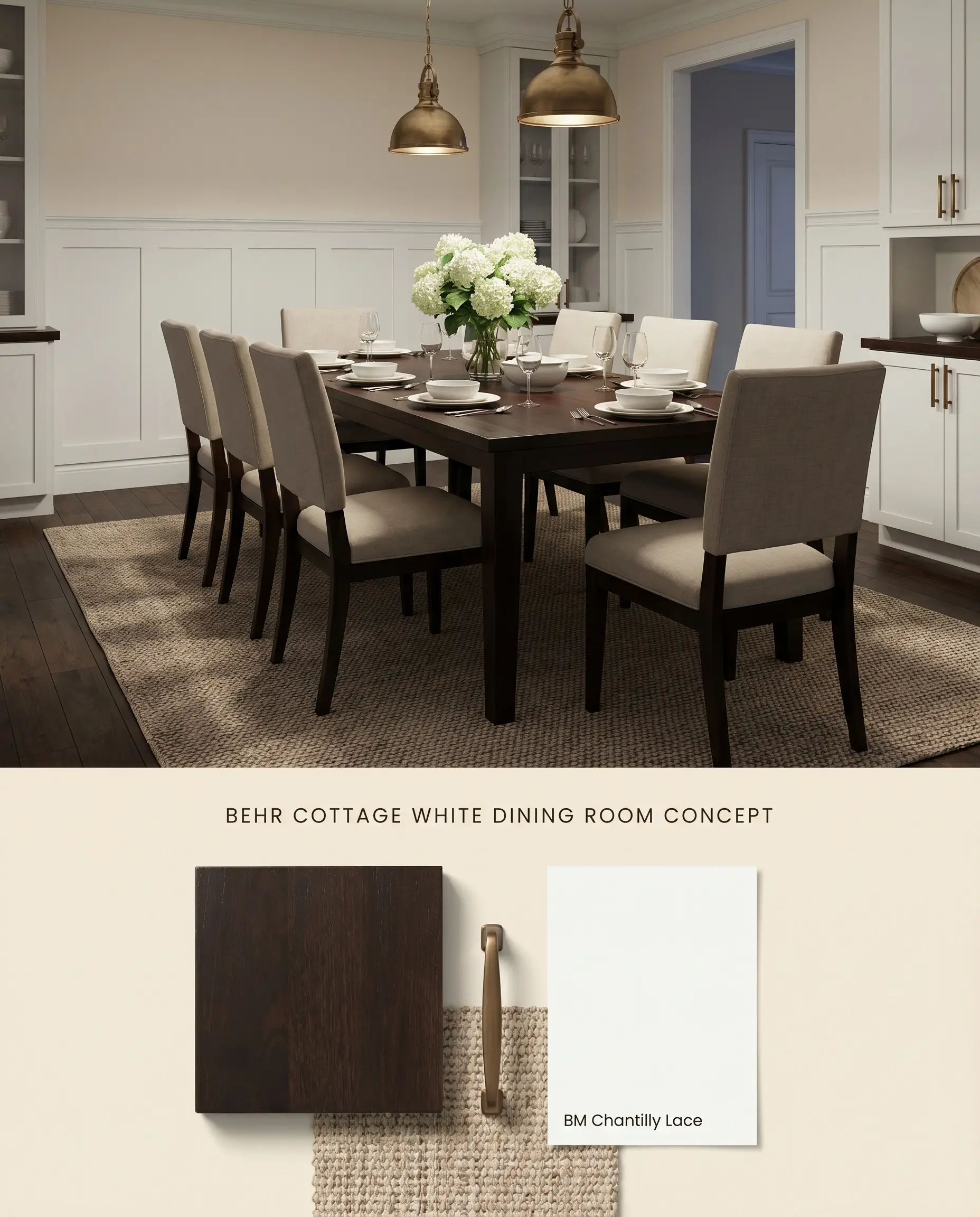
This luminous neutral acts as an ambient reflector in formal dining spaces when illuminated by warm artificial lighting. The high LRV 82 keeps the room feeling expansive, while the yellow base anchors dense, dark-stained mahogany or espresso furniture. Crisp, stark white wainscoting provides the necessary structural break to keep the yellow undertones from overwhelming the visual field in low-light scenarios.
Bedrooms
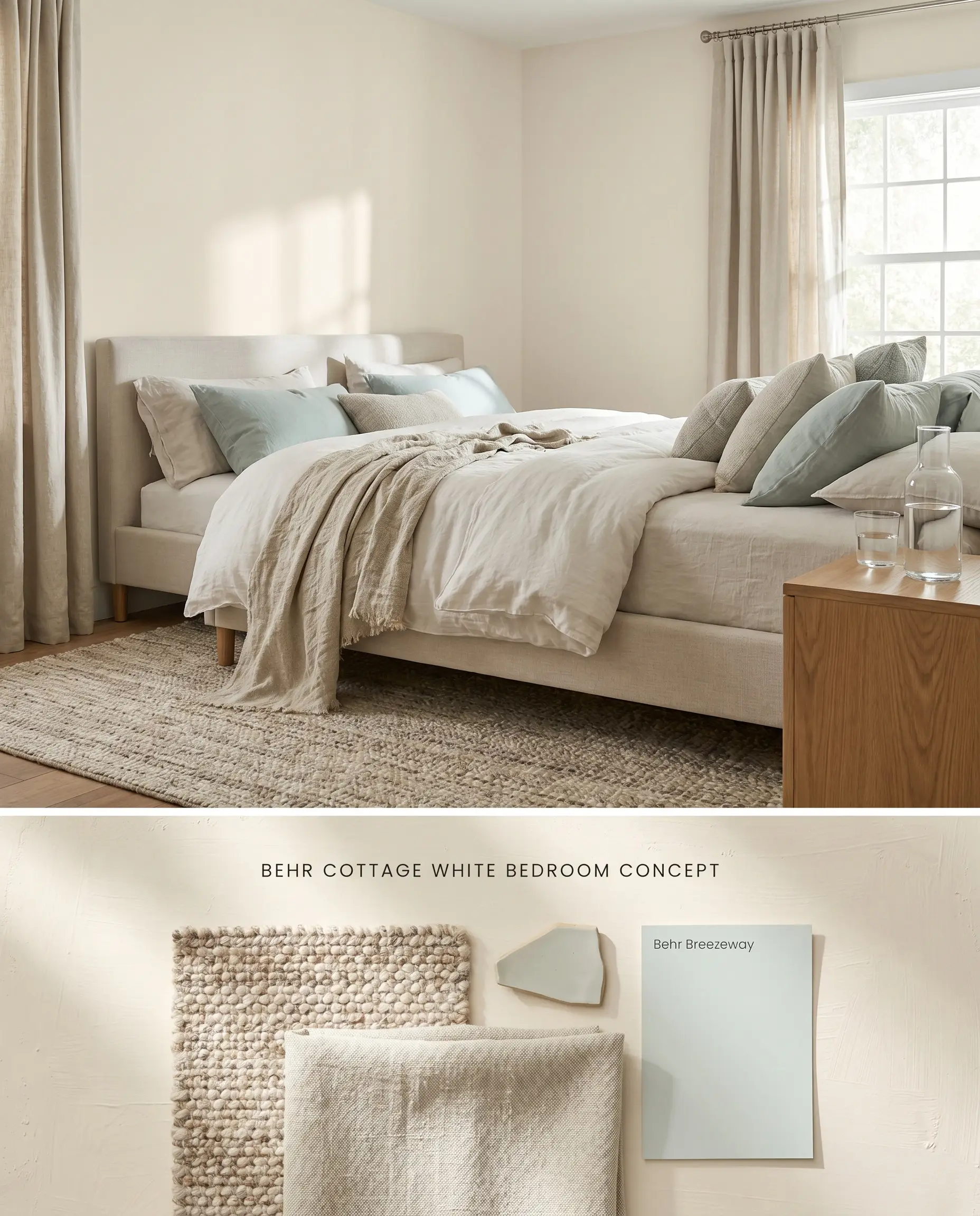
Utilizing Behr Cottage White 13 in a bedroom requires careful orientation to avoid the color reading as overly yellow in intense afternoon sun. Placed in spaces with filtered, indirect light, it creates a creamy architectural finish that softens the hard right angles between walls and ceilings. Layering thick, textured linen textiles and woven wool rugs absorbs excess light reflection, grounding the high-value paint.
Kitchen Cabinets
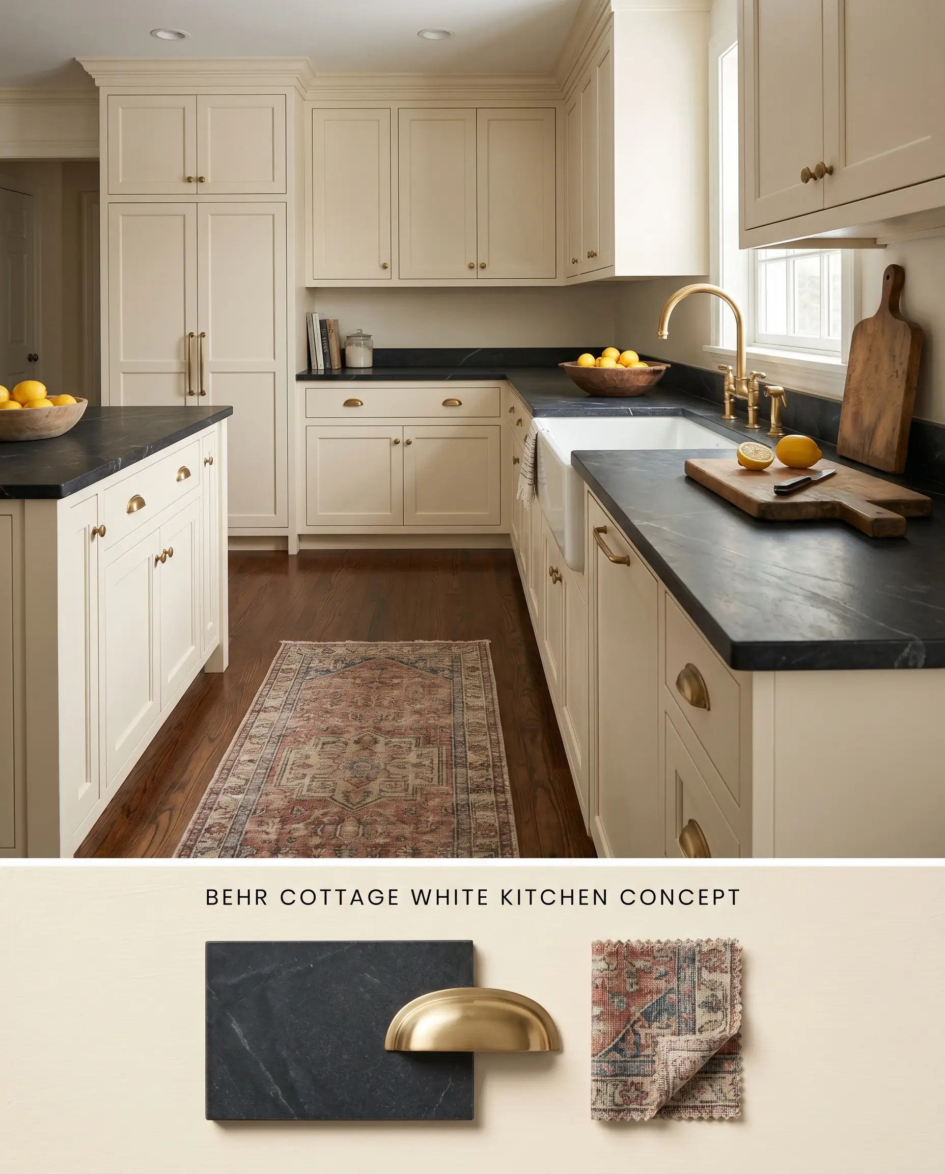
Refinishing cabinetry with this warm off-white requires a high-quality tinted primer to ensure the yellow base covers dark or saturated wood grain evenly. Once cured, it delivers a traditional, tailored warmth that stark whites cannot achieve, especially when paired with honed soapstone counters. The slight green-yellow undertones harmonize with earthy stone veining while actively resisting the clinical feel of modern kitchens.
Traditional Exteriors
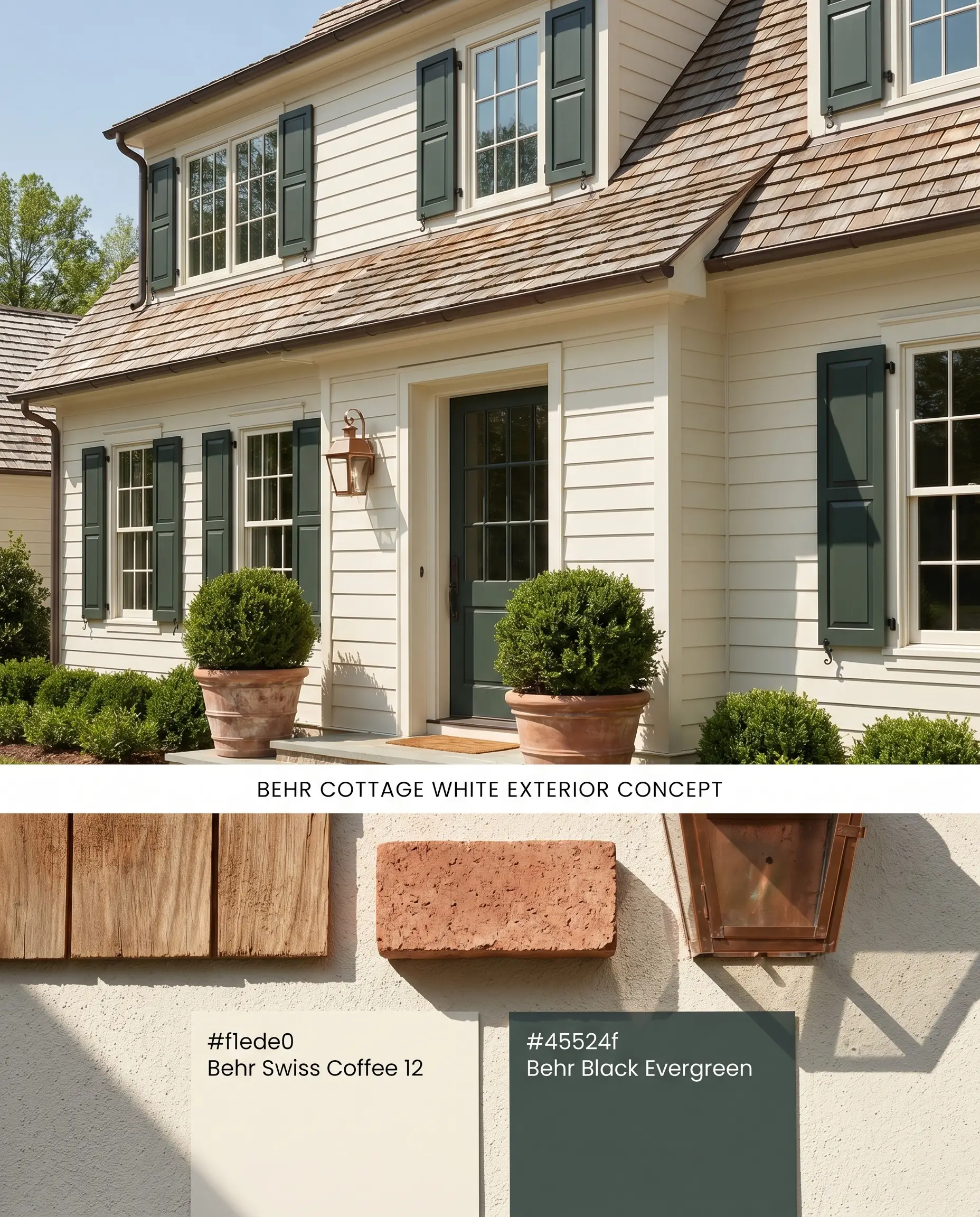
In full exterior sunlight, an LRV of 82 washes out significantly, pushing Behr Cottage White 13 past a yellow-cream and closer to a true, soft white. It forms the backbone of a traditional exterior palette, pairing seamlessly with natural cedar shake roofs and dark, earthy shutters. Avoid stark, cool white exterior trim, which will immediately highlight the yellow base and make the siding look muddy by comparison.
You can apply wallpapers, paints, etc. on walls and see how they look in various interiors.

Comparative Color Theory: Warm Off-Whites & Luminous Neutrals
Behr Cottage White 13 vs. Sherwin-Williams Creamy SW 7012
Sherwin-Williams Creamy SW 7012 (LRV 81) shares a nearly identical light reflectance value but relies on a more neutralized, peach-leaning yellow base. Behr Cottage White 13 possesses a distinct honey gold undertone that interacts aggressively with warm wood floors, often bouncing yellow light upward. Specify Sherwin-Williams Creamy SW 7012 when working around red-toned wood trim to avoid the sickly, muddy clash that Cottage White produces, but deploy Cottage White in North-facing rooms where its stronger yellow base is required to offset cool, blue daylight.
Behr Cottage White 13 vs. Benjamin Moore Swiss Coffee OC-45
Benjamin Moore Swiss Coffee OC-45 (LRV 83.93) is noticeably lighter and significantly more muted, leaning into gray-green undertones rather than a pronounced yellow base. Behr Cottage White 13 acts as a true warm off-white, holding its creamy saturation even in bright light, whereas Benjamin Moore Swiss Coffee OC-45 often flashes to a standard white in direct sun. Use Cottage White for deep, traditional warmth on cabinetry, and reserve Benjamin Moore Swiss Coffee OC-45 for modern, airy spaces that require a subtle, less committal off-white.
Behr Cottage White 13 vs. Behr Swiss Coffee 12
Within the same manufacturer ecosystem, Behr Swiss Coffee 12 (LRV 84) serves as the cleaner, more versatile sibling, lacking the strong yellow-gold push of Cottage White. Behr Cottage White 13 carries a denser visual weight and requires crisp contrasting trim to prevent it from looking flat or dingy in low-light traps. Select Behr Swiss Coffee 12 as a foolproof, whole-house neutral, but choose Cottage White when a specific architectural element—like a traditional exterior or wainscoting—demands a richer, more saturated cream.
Technical Constraints & Application FAQs
Yes, the intense, warm light of a South-facing room amplifies the paint’s honey-gold base, often causing the walls to read as noticeably yellow in the afternoon. To mitigate this color temperature shift, reserve this shade for North-facing or diffused Eastern exposures.
The yellow undertones in this paint will actively bounce off honey oak or orange-toned pine floors, reflecting upward and intensifying the yellow effect. Furthermore, pairing it with red-toned wood trim will cause the slight green-yellow base to appear muddy and visually sickly.
In full exterior sunlight, its high LRV causes it to wash out into a soft, traditional cream rather than a blinding stark white. Avoid pairing it with stark white exterior trim, as the high contrast will immediately highlight the yellow base and make the siding look dingy.
Similar Paint Colors
Same Brand
Cross-Brand Equivalents