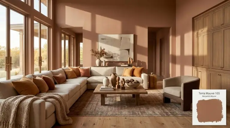
Terra Mauve 105
Benjamin MooreBenjamin Moore's Terra Mauve (105) is a deeply grounded, warm terracotta with a muted brown base and a subtle mauve influence. This earthy, burnt sienna shade brings quiet luxury and sophisticated depth to both interiors and exteriors.
| Temperature | Warm |
|---|---|
| Primary Undertone | Muted Brown |
| Hidden Undertones | Clay-Red, Subdued Mauve |
| Best Exposures | South, West |
| Best For | Living rooms, cozy bedrooms, dining rooms, exterior siding, and accent walls. |
Hackrea Review
Terra Mauve is an incredibly sophisticated take on terracotta. It avoids the aggressive orange lean of typical clay colors by grounding itself in a muted brown and soft mauve base. It’s perfect for creating a moody, enveloping space that feels both earthy and elevated.Architectural Applications for Terra Mauve 105
Living Rooms
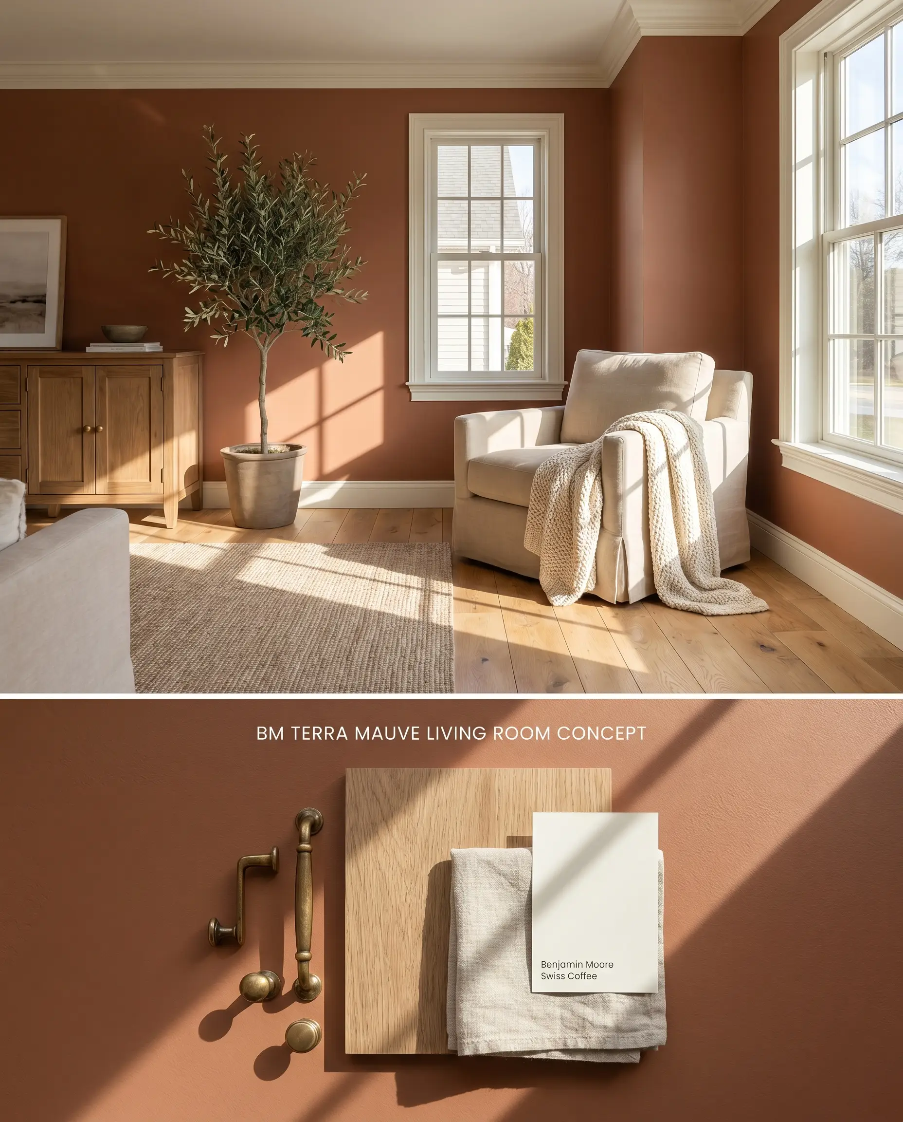
In sun-drenched living spaces, the clay-red influence of Benjamin Moore Terra Mauve 105 expands, anchoring large architectural volumes. The subdued mauve undertones interact with the natural grain of reclaimed wood, absorbing excess glare while maintaining a warm, structural perimeter.
Bedrooms
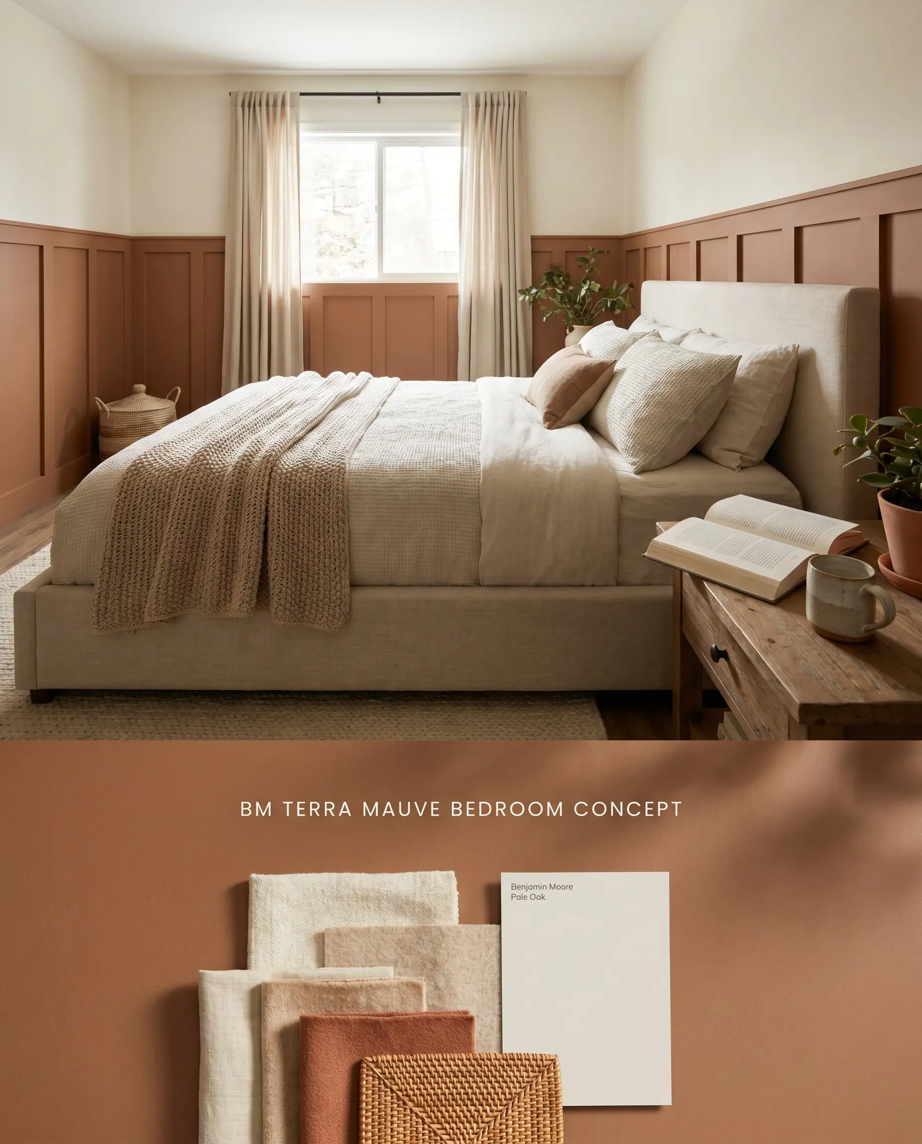
Applying this burnt sienna tone to lower wainscoting grounds the bedroom without triggering a ceiling-height bounce effect in smaller footprints. The rich chromatic profile stabilizes morning light, offering quiet luxury when paired with warm, natural textiles.
Dining Rooms
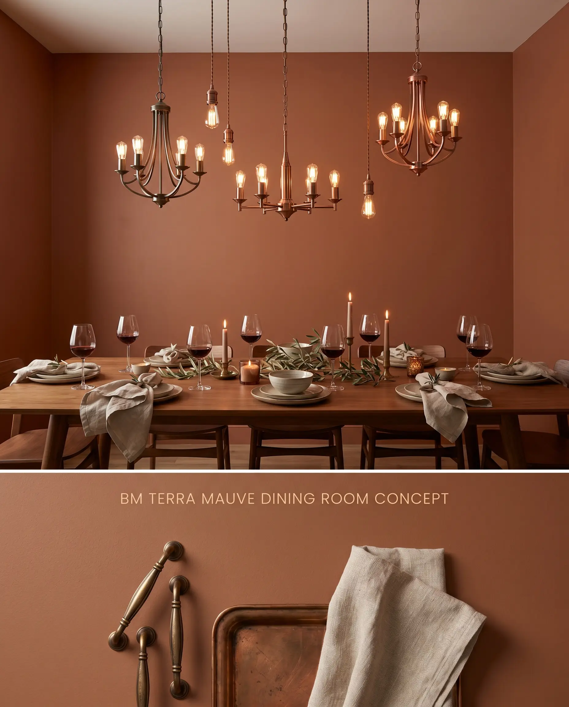
A full-wrap application in a dining space harnesses the color structure of Terra Mauve 105, amplifying the glow of ambient evening fixtures. The earth-toned walls recede slightly behind warm metallic accents, creating an intimate, grounded dining experience.
Exterior Siding
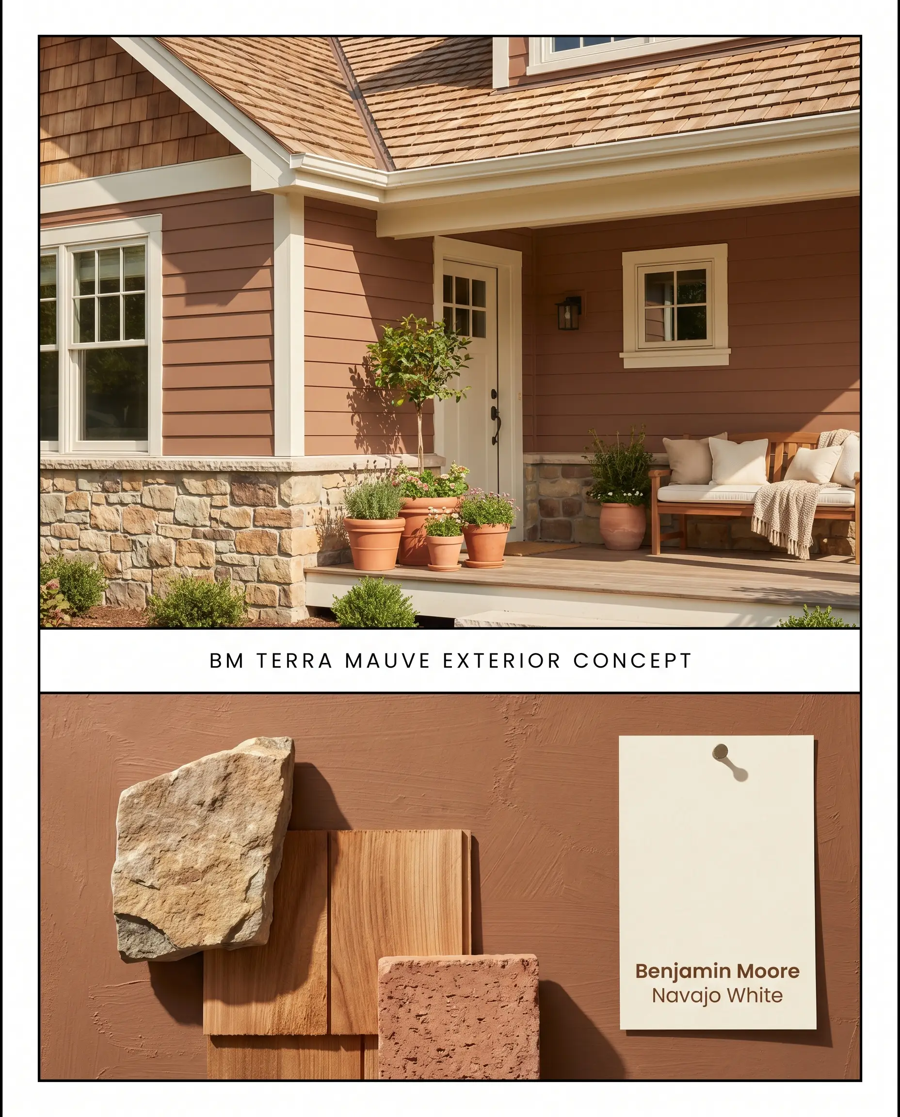
Intense exterior UV rays pull the terracotta and clay-red notes to the surface, preventing the muted brown base from dominating the facade. The color integrates seamlessly with natural stone foundations and warm cedar shake roofing.
Accent Walls
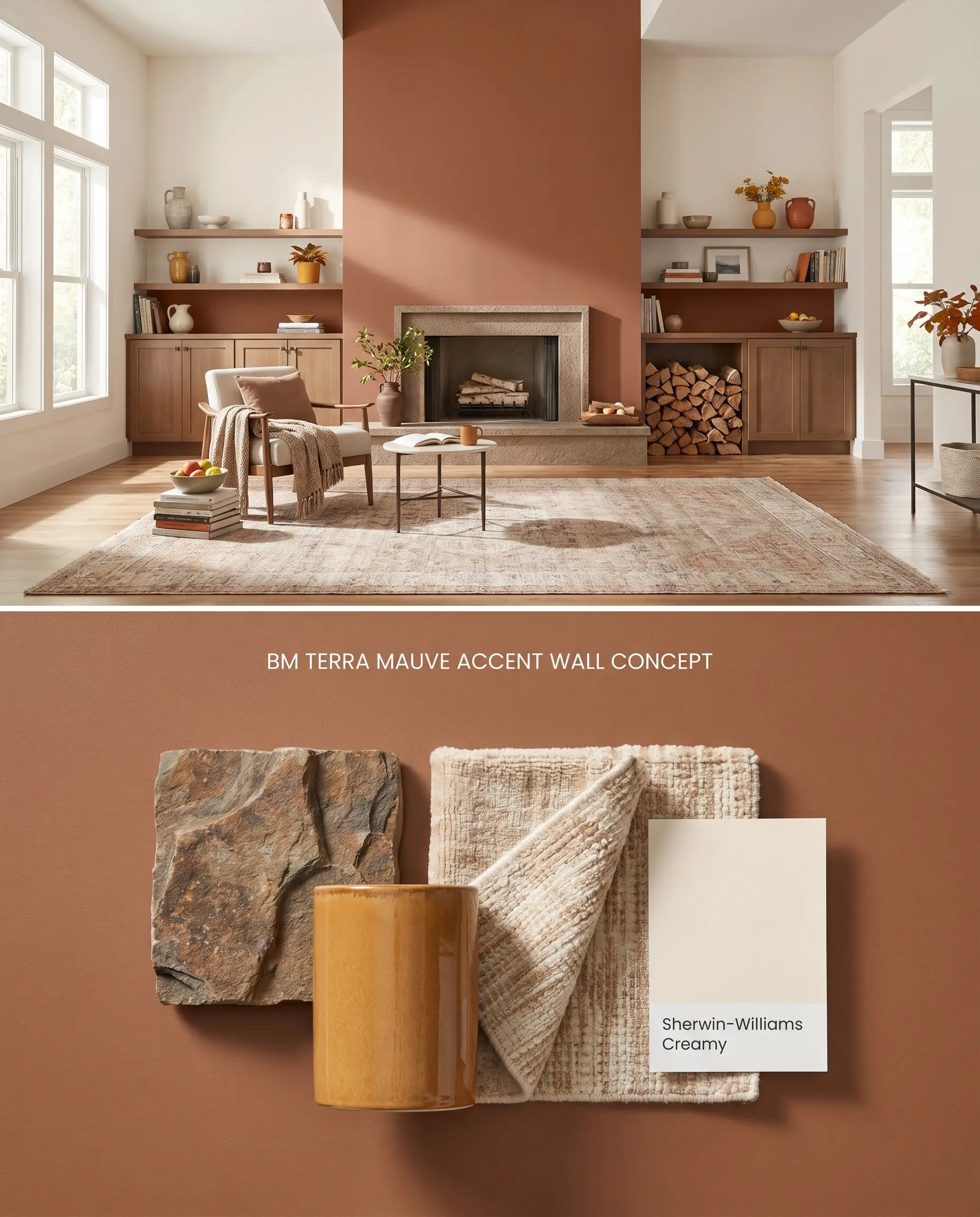
Confining this shade to a single focal wall mitigates unwanted color reflection while anchoring the geometry of an open-concept layout. The stark boundary of the accent wall emphasizes the earthy elegance of the paint against adjacent warm ochres.
You can apply wallpapers, paints, etc. on walls and see how they look in various interiors.

Chromatic Profile Comparisons: Terra Mauve 105
Benjamin Moore Terra Mauve 105 vs. Sherwin-Williams Copper Mountain SW 6356
Sherwin-Williams Copper Mountain SW 6356 operates with a much higher orange saturation, pushing it firmly into a vibrant rust category. Terra Mauve 105 relies on a muted brown base and subdued mauve undertones to pull the color back toward an architectural neutral. In rooms with intense western exposure, Copper Mountain will ignite into a fiery copper, whereas Terra Mauve absorbs the harsh light, retaining its grounded, clay-red influence. Select Copper Mountain for high-energy focal points, and reserve Terra Mauve for spaces requiring quiet, structural warmth.
Benjamin Moore Terra Mauve 105 vs. Farrow & Ball Picture Gallery Red 42
Farrow & Ball Picture Gallery Red 42 is a classic, highly pigmented traditional red that lacks the brown-sludge grounding of Terra Mauve 105. Picture Gallery Red projects a refined, historic brightness suitable for formal, traditional millwork. Terra Mauve introduces a distinct terracotta profile that aligns better with organic modernism and reclaimed wood textures. Use Picture Gallery Red when the architecture requires a crisp, historic parlor aesthetic, and deploy Terra Mauve when bridging the gap between natural exterior landscapes and interior living spaces.
Benjamin Moore Terra Mauve 105 vs. Sherwin-Williams Earthen Jug SW 7703
Sherwin-Williams Earthen Jug SW 7703 is a sun-baked clay tone that lacks the specific purple-pink cooling mechanism found in Terra Mauve 105. The mauve undertone in the Benjamin Moore formulation prevents the paint from reading as a flat, unrefined orange in indirect light. Earthen Jug excels in desert-inspired, Southwestern palettes where pure warmth is the goal. Terra Mauve is the superior choice for transitional spaces where the paint must harmonize with complex, multi-tonal masonry or nuanced, warm-white wainscoting.
Technical FAQs
Yes, in environments lacking natural light, the muted brown base dominates the chromatic profile. This causes the color to lose its terracotta warmth and read as flat or muddy due to its low 15.67 LRV.
Yes, the earthy terracotta and mauve profile actively clashes with stark, cool blue-grays. To maintain architectural balance, this paint requires warm creamy whites, ochres, or natural wood tones.
Intense natural light draws out the clay-red and mauve undertones, preventing the deep color from appearing dull. The high UV exposure highlights its earthy elegance, making it an excellent pairing for natural stone.
Yes, the warm terracotta base reflects onto adjacent walls and ceilings, rapidly intensifying the room’s overall warmth. In compact spaces, it is best applied strategically on wainscoting or single accent walls to control this reflection.
Similar Paint Colors
Same Brand
Cross-Brand Equivalents