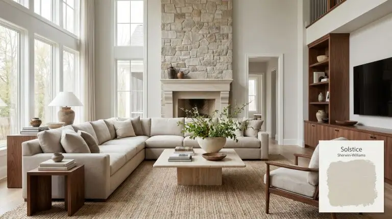
Solstice SW 9571
Sherwin-WilliamsSherwin-Williams Solstice (SW 9571) is a warm, inviting greige with an LRV of 69. It perfectly balances gray and beige, featuring subtle earthy and peachy undertones that bring a cozy, sunlit warmth to interior spaces without feeling heavy or overly yellow.
| Temperature | Warm |
|---|---|
| Primary Undertone | Warm Gray |
| Hidden Undertones | Subtle earthy peach and warm yellow |
| Best Exposures | North-facing or East-facing |
| Best For | Living Rooms, Bedrooms, Kitchen Cabinets, Open Concept Spaces, Home Offices |
Hackrea Review
Solstice is an underrated gem in the Sherwin-Williams lineup. It splits the difference between a traditional warm gray and a soft beige, making it an incredibly versatile, welcoming neutral that never feels sterile.Architectural Applications for Solstice SW 9571
Living Rooms
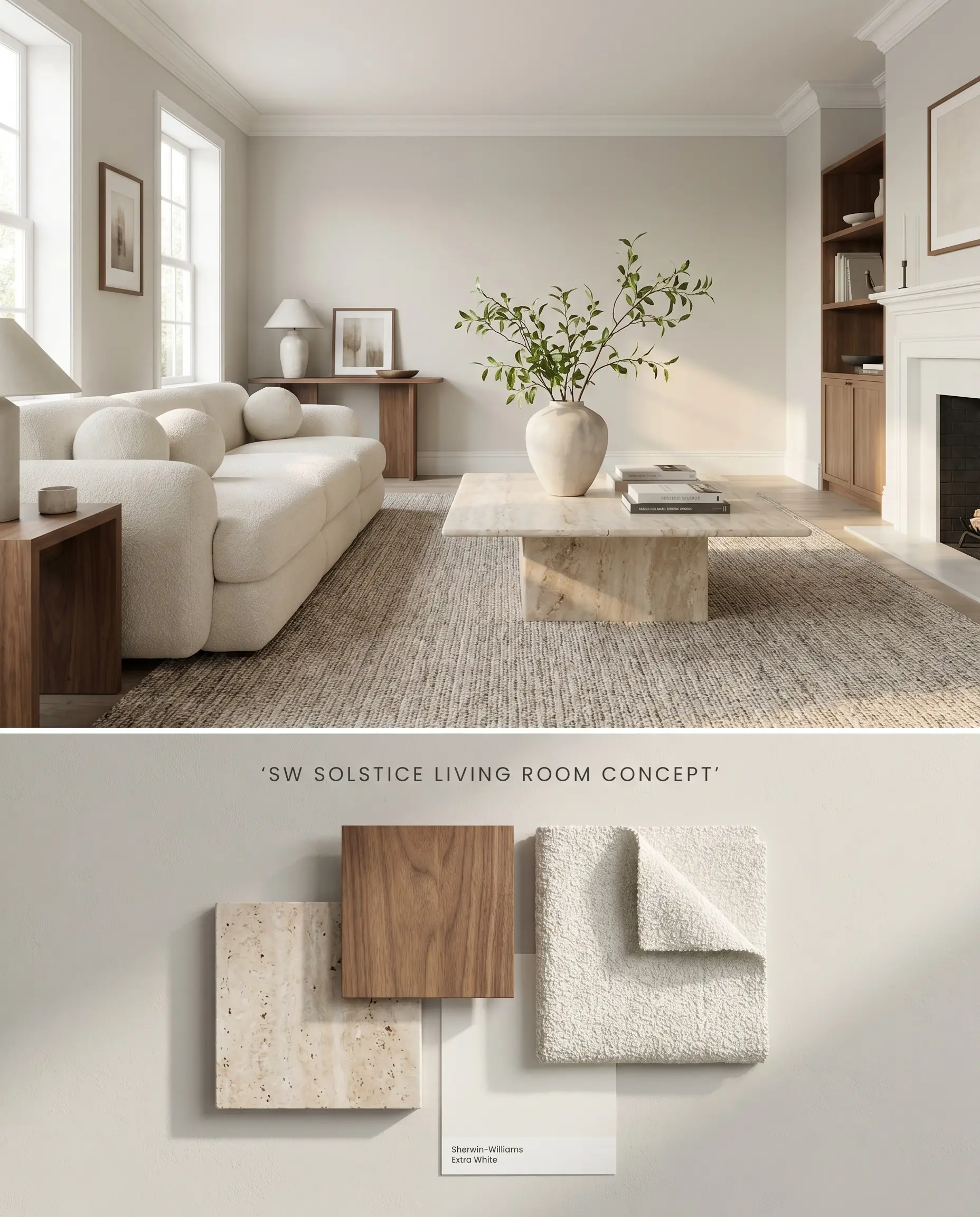
Solstice SW 9571 corrects the icy, flat shadows inherent to north-facing rooms by projecting a soft beige cast that warms incoming indirect light. The earthy undertones anchor expansive drywall, preventing the space from feeling unmoored or sterile. Pairing this color structure with textured, matte textiles absorbs excess glare and softens the room’s acoustic and visual edges.
Kitchen Cabinets
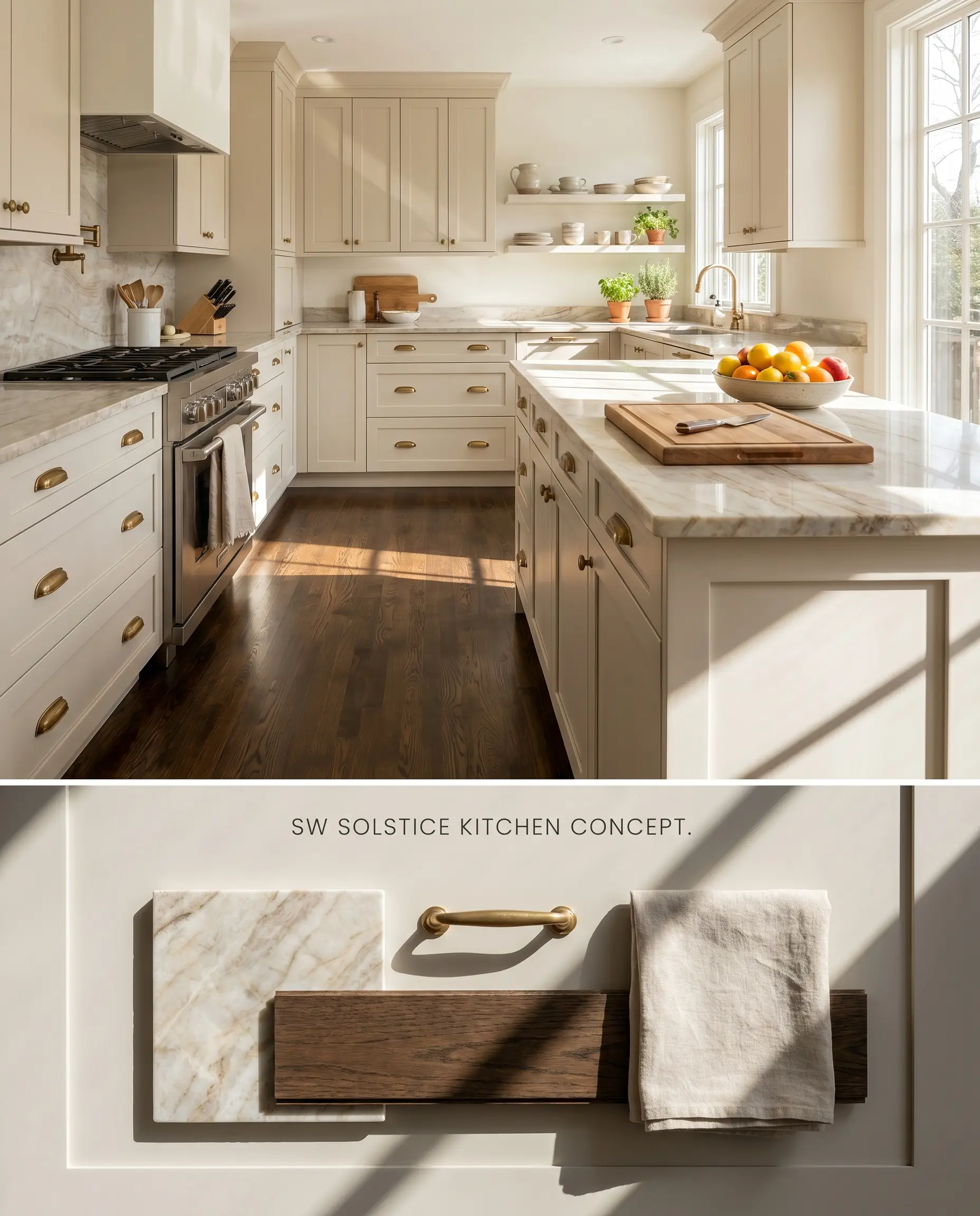
Applying this shade to kitchen millwork leverages its chromatic profile to bridge the visual gap between stark white quartz countertops and darker hardwood floors. The subtle peachy warmth neutralizes the clinical edge of stainless steel appliances, grounding the room’s utility with an organic, tactile presence.
Open Concept Spaces
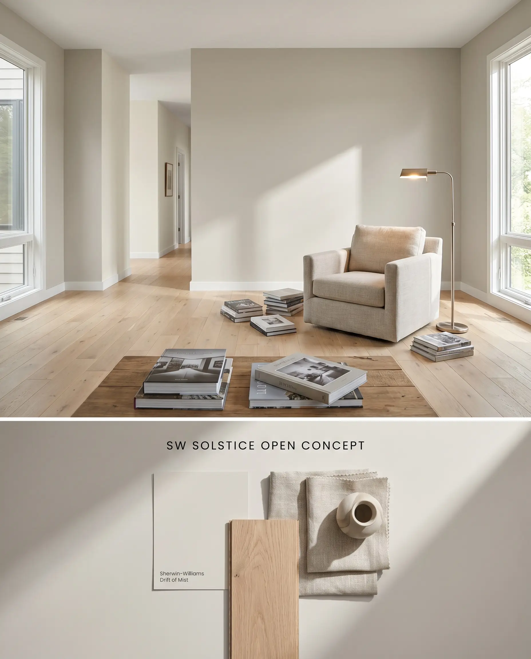
With a Light Reflectance Value of 69, this warm greige actively pushes light deep into the interior footprint, maintaining luminosity even as natural light degrades across a large floor plan. The pigment transitions seamlessly across different functional zones without shifting into a sterile gray when shadows lengthen.
Bedrooms
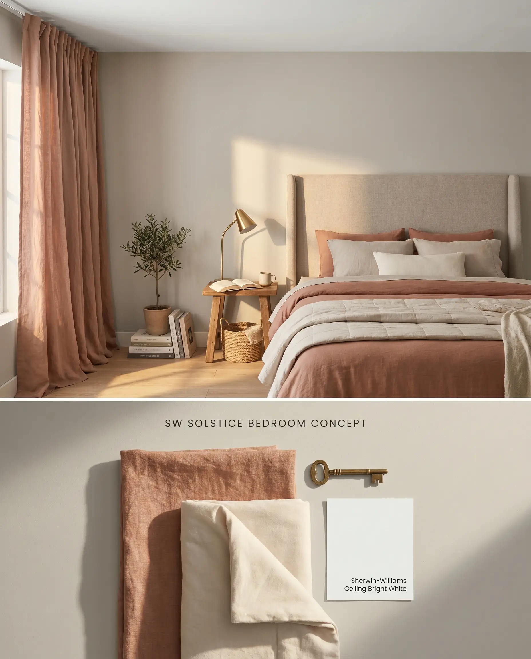
The soft beige cast of Solstice SW 9571 absorbs the harshness of artificial ambient lighting, lowering the visual temperature of the room for evening relaxation. By avoiding sharp chromatic contrasts against the trim, the walls recede, allowing layered bedding and upholstered headboards to command the visual hierarchy.
Home Offices
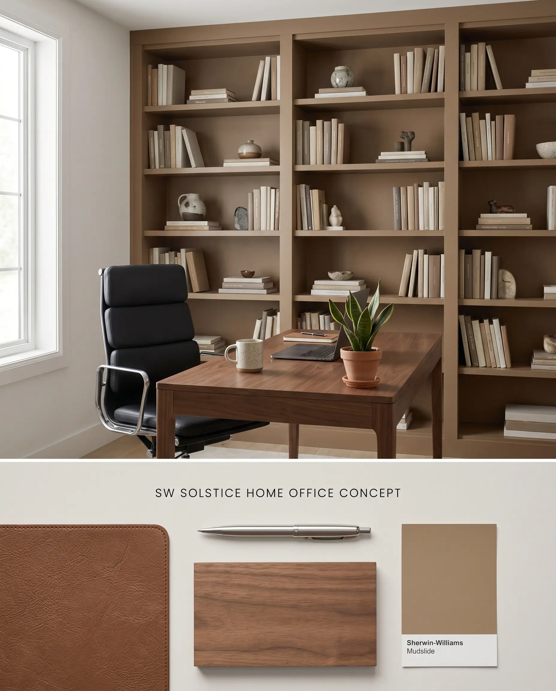
This shade reduces eye strain by minimizing the stark contrast between bright computer monitors and the surrounding vertical planes. The color structure provides a stable, non-distracting background that prevents the clinical fatigue often associated with pure white workspaces.
You can apply wallpapers, paints, etc. on walls and see how they look in various interiors.

Head-to-Head Comparisons: Earthy Undertones vs. Rival Neutrals
Sherwin-Williams Solstice SW 9571 vs. Sherwin-Williams Agreeable Gray SW 7029
Sherwin-Williams Agreeable Gray SW 7029 operates with a lower LRV of 60 and leans into green-gray undertones, absorbing more light and pulling spaces cooler. Solstice SW 9571 utilizes a higher Light Reflectance Value and a distinct peachy warmth. Specify Agreeable Gray for high-glare southern rooms that need thermal grounding, and deploy Solstice in north-facing rooms where the light requires a physical temperature boost.
Sherwin-Williams Solstice SW 9571 vs. Benjamin Moore Shoreline 1471
Benjamin Moore Shoreline 1471 projects a distinct violet-gray undertone that cools down a room, reacting sharply against warm wood tones. Solstice SW 9571 utilizes a soft beige cast that harmonizes with natural wood accents and brass hardware. Use Shoreline in modern, industrial spaces paired with cool marble, and reserve Solstice for transitional spaces heavily layered with organic textures.
Sherwin-Williams Solstice SW 9571 vs. Sherwin-Williams On the Rocks SW 7671
Sherwin-Williams On the Rocks SW 7671 is a true, cool-toned gray that flashes icy blue in northern exposures. Solstice counters this specific lighting failure with earthy undertones that maintain a stable, warm greige profile regardless of shadow intensity. Specify On the Rocks to neutralize overly warm western light, but rely on Solstice to inject subtle warmth into shaded or uniformly lit environments.
Ambient Lighting & Chromatic Profile FAQs
Intense, direct Southern light will amplify the peachy warmth inherent to SW 9571, occasionally pushing it toward a soft, sunlit terracotta rather than a true yellow. To mitigate this effect, balance the room with cool-toned furnishings or low-iron glass accents.
It pairs beautifully with stark white trim, which sharpens its color structure, but it will physically clash with cool-toned gray floors. The blue or violet undertones in cool gray flooring will force Solstice to look muddy and distinctly orange by comparison.
A true white reflects all light and can feel clinical against stainless steel, whereas the chromatic profile of Solstice absorbs harsh reflections and grounds the cabinetry with a soft beige cast. It provides enough contrast against white countertops to look intentional while hiding daily smudges far better than pure white.
Without natural light to activate its earthy undertones, the LRV of 69 is not high enough to prevent the color from falling flat. In windowless bathrooms or interior hallways, it requires a robust, 3000K to 3500K artificial lighting plan to prevent it from reading as a muddy, lifeless beige.
Similar Paint Colors
Same Brand
Cross-Brand Equivalents