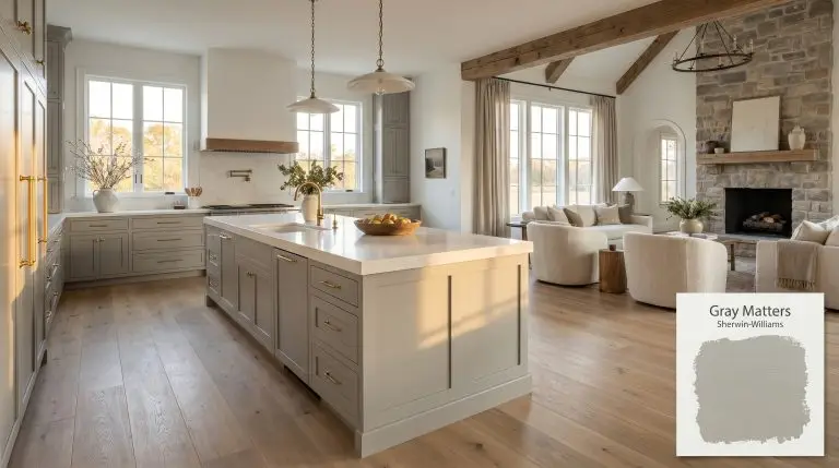
Gray Matters SW 7066
Sherwin-WilliamsSherwin-Williams Gray Matters (SW 7066) is a balanced, mid-tone cool gray with subtle green and blue undertones. With an LRV of 39, it provides excellent depth for exteriors and cabinets, though it can flash cooler depending on the lighting.
| Temperature | Cool |
|---|---|
| Primary Undertone | Green |
| Hidden Undertones | Blue, with a slight purple cast in certain lighting |
| Best Exposures | South-facing, West-facing |
| Best For | Exteriors, Kitchen Cabinets, Living Rooms, Accent Walls, Interior Doors |
Hackrea Review
Gray Matters is a highly versatile mid-tone gray that excels on exteriors and cabinetry. While its cool undertones can make it a bit of a chameleon in north-facing light, it remains a sophisticated and dependable choice for modern and transitional spaces.Architectural Applications for Sherwin-Williams Gray Matters
Exterior Siding & Trim
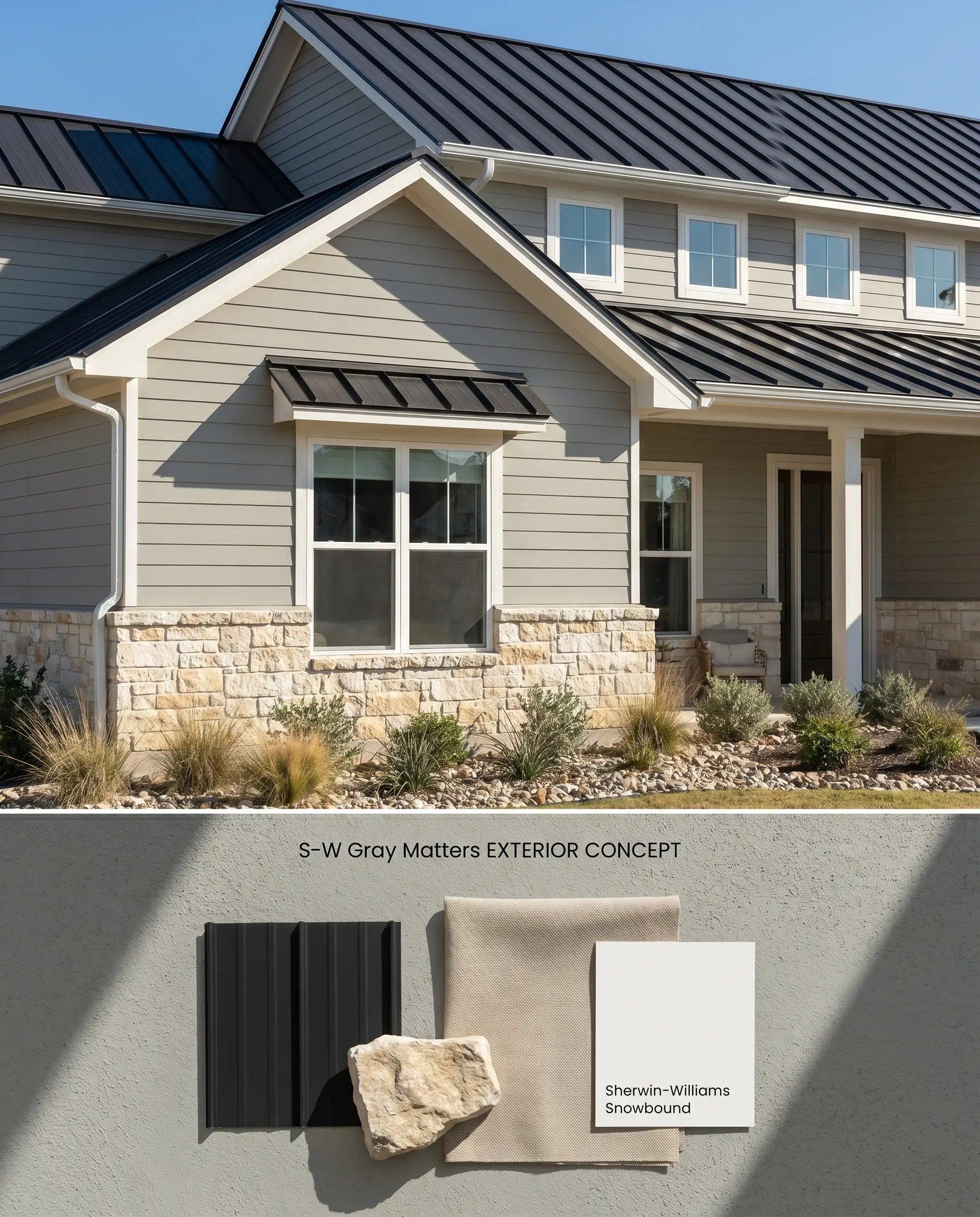
Sherwin-Williams Gray Matters SW 7066 possesses an LRV of 39, providing enough depth to resist washing out under harsh, direct sunlight on an exterior facade. Its base tint anchors the structure, while the subtle green and blue undertones harmonize with natural landscaping without turning stark.
Kitchen Cabinetry
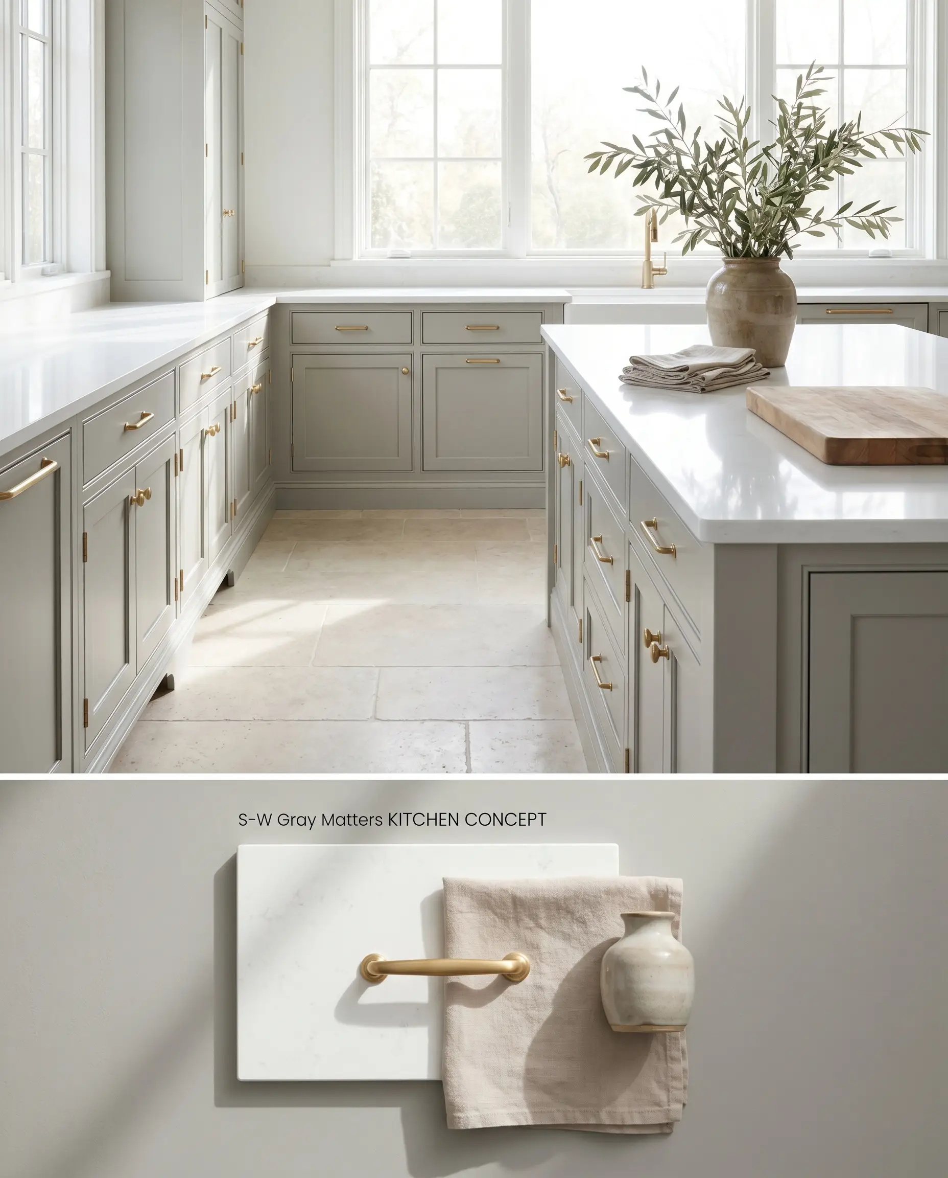
When applied to millwork, this mid-tone neutral grounds lower cabinets or kitchen islands, allowing white quartz countertops to reflect ambient light upward. The cool gray color structure visually recedes, enlarging the perceived footprint of the cooking space.
Living Rooms (Well-Lit)
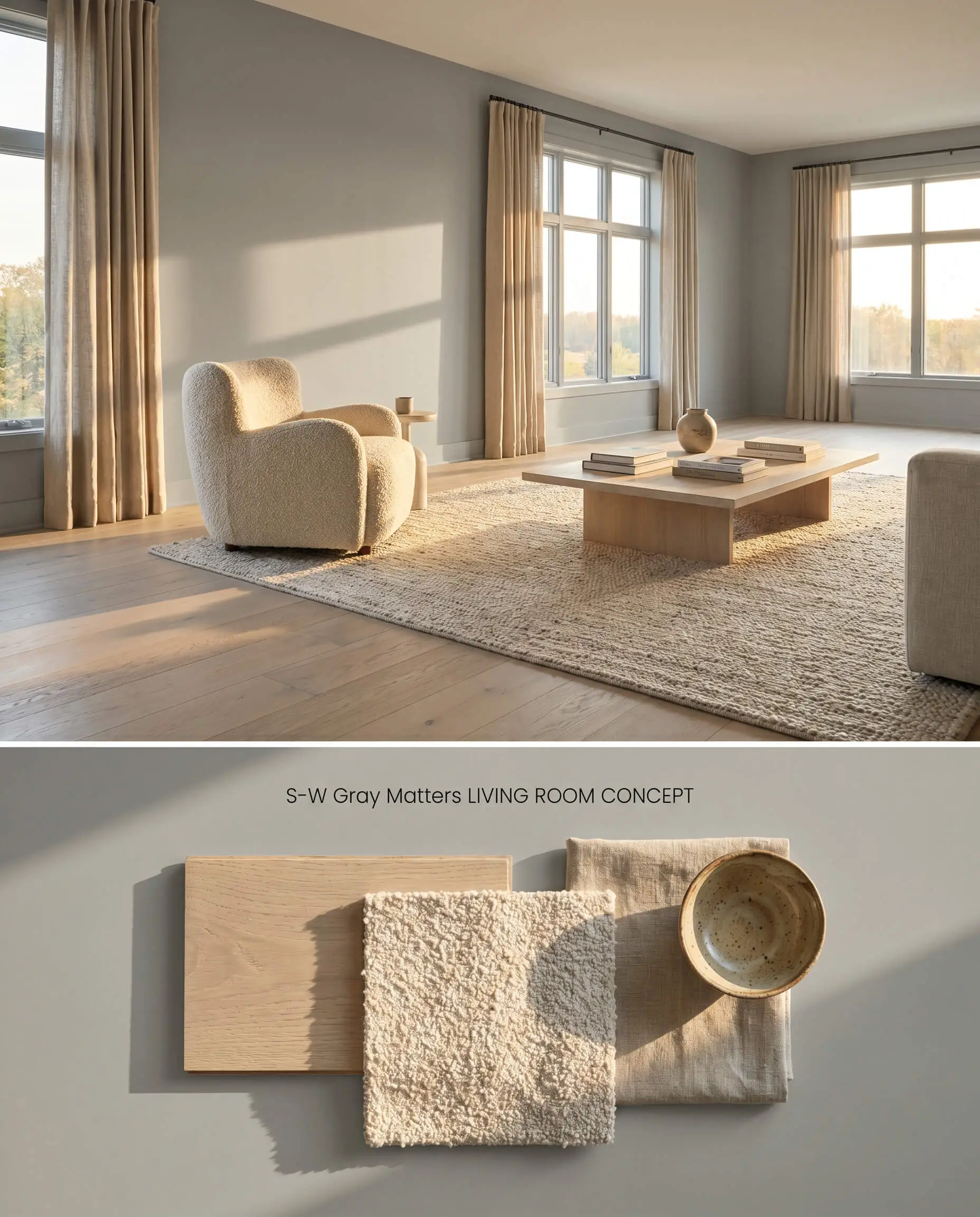
Wrapping a large, sun-drenched living room in Gray Matters SW 7066 lowers the visual ceiling, bringing the walls inward to create an intimate enclosure. The paint acts as a color chameleon, shifting its perceived temperature as the sun moves across the sky and interacts with the room’s textiles.
Interior Doors & Accent Walls
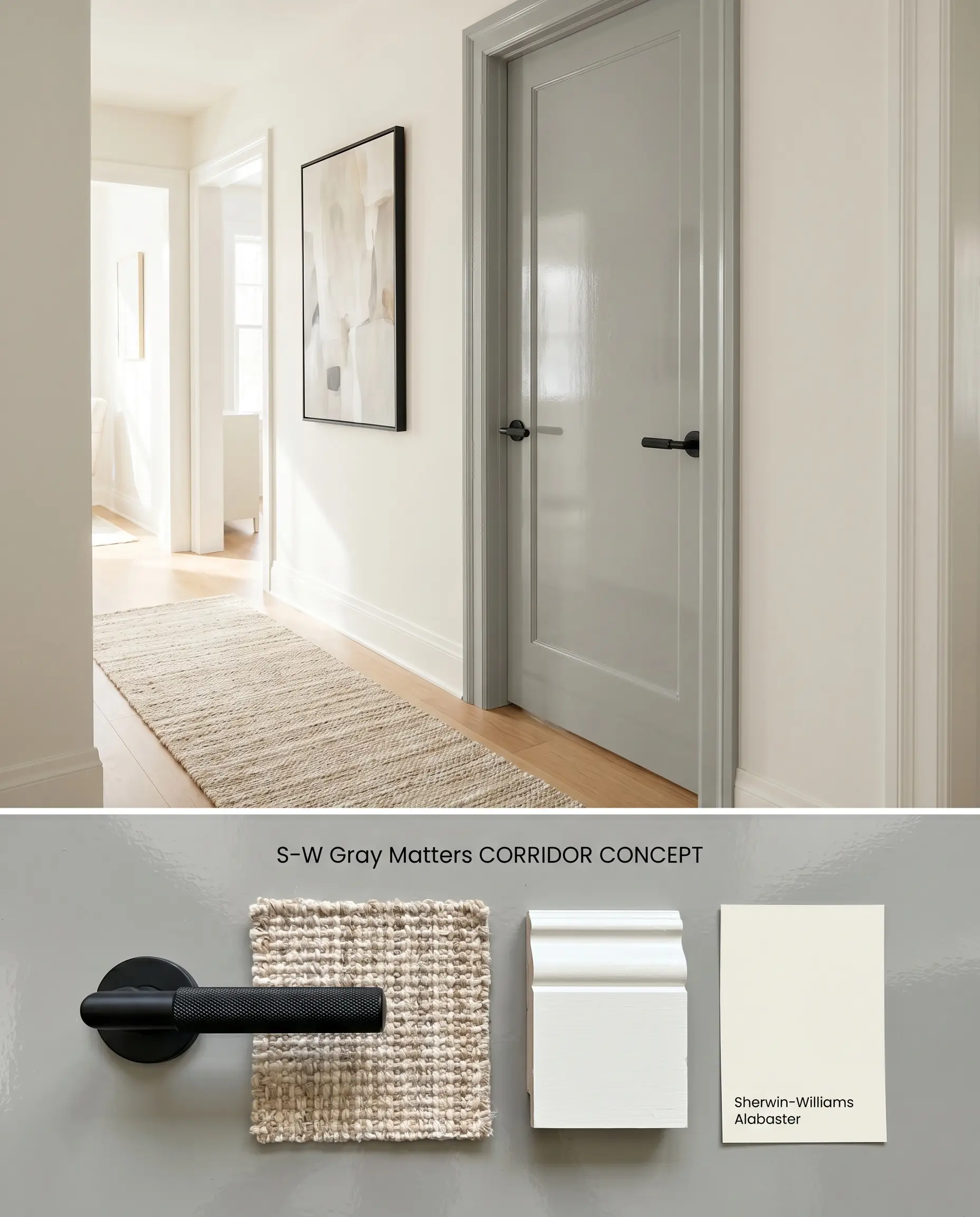
Applying this shade to interior doors establishes a rhythmic, high-contrast pathway through a bright, neutral corridor. The depth of the pigment draws the eye down the hall, anchoring the space without requiring a full-room commitment to a darker hue.
You can apply wallpapers, paints, etc. on walls and see how they look in various interiors.

Mid-Tone Neutral Chromatic Profile Comparisons
Sherwin-Williams Gray Matters SW 7066 vs. Sherwin-Williams Dorian Gray SW 7017
Sherwin-Williams Dorian Gray SW 7017 carries an LRV of 39, identical to Gray Matters SW 7066, but its undertone structure leans decidedly warmer, pulling subtle taupe and brown notes. Gray Matters relies on a cooler green and blue base. Specify Dorian Gray SW 7017 for spaces with Northern light where you need to artificially inject warmth, and reserve Gray Matters SW 7066 for Southern exposures where the sun’s yellow rays will neutralize its cool edge.
Sherwin-Williams Gray Matters SW 7066 vs. Benjamin Moore Stonington Gray HC-170
Benjamin Moore Stonington Gray HC-170 is significantly lighter with an LRV of 59, reflecting far more ambient light than the deeper Gray Matters SW 7066. While both are cool grays, Stonington Gray HC-170 flashes distinct blue undertones. Deploy Stonington Gray HC-170 in moderately lit rooms where light reflection is critical, but switch to Gray Matters SW 7066 for exterior siding where a lighter gray would wash out into a stark white under direct sunlight.
Sherwin-Williams Gray Matters SW 7066 vs. Sherwin-Williams Argos SW 7065
Sherwin-Williams Argos SW 7065 sits one step lighter on the same color swatch with an LRV of 51, sharing the exact same green and blue undertones. Argos SW 7065 provides a safer mid-tone neutral for interiors with average lighting. Upgrade to Gray Matters SW 7066 when painting lower cabinetry or exterior trim where a stronger, more grounded architectural finish is required to anchor the surrounding materials.
Sherwin-Williams Gray Matters SW 7066 Technical FAQs
Yes, in North-facing light or when surrounded by dense green foliage, the natural lighting shift will pull its blue and green undertones forward. To mitigate this, restrict its exterior use to South or West-facing elevations where warm sunlight neutralizes the cool base.
The cool chromatic profile of Gray Matters actively fights against orange-toned woods, creating an aggressive visual clash. This combination forces the wood to appear artificially orange while turning the paint icy and stark.
With an LRV of 39, this paint absorbs a significant volume of light and will make windowless or poorly lit spaces feel gloomy and enclosed. It requires abundant natural or layered artificial lighting to maintain its structural depth.
The intense, warm yellow rays of South-facing light balance the cool green and blue undertones built into the paint’s base tint. This interaction stabilizes the color, allowing it to render as a true, sophisticated mid-tone neutral.
Similar Paint Colors
Same Brand
Cross-Brand Equivalents