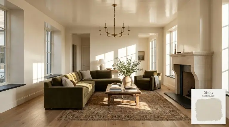
Farrow & Ball Dimity (No. 2008) is a very pale, warm taupe with a subtle red base. Named after a lightweight cotton fabric, this subdued neutral provides unmatchable depth, making it an elegant choice for creating welcoming, cozy spaces without leaning too yellow or grey.
| Temperature | Warm |
|---|---|
| Primary Undertone | Subtle Red / Pinkish-Taupe |
| Hidden Undertones | Warm cream, yellow cast |
| Best Exposures | North-facing or South-facing |
| Best For | Hallways, Living Rooms, Primary Bedrooms, Kitchen Cabinets, Sunny Rooms |
Hackrea Review
Dimity is a beautifully balanced warm neutral that avoids the sterile trap of standard off-whites. Its subtle red base brings a sophisticated, lived-in warmth to hallways and bedrooms. However, homeowners should be mindful of the Estate Emulsion finish, which is known to scuff easily in high-traffic zones.Architectural Applications for Farrow & Ball Dimity 2008
Elegant Hallways & Entryways
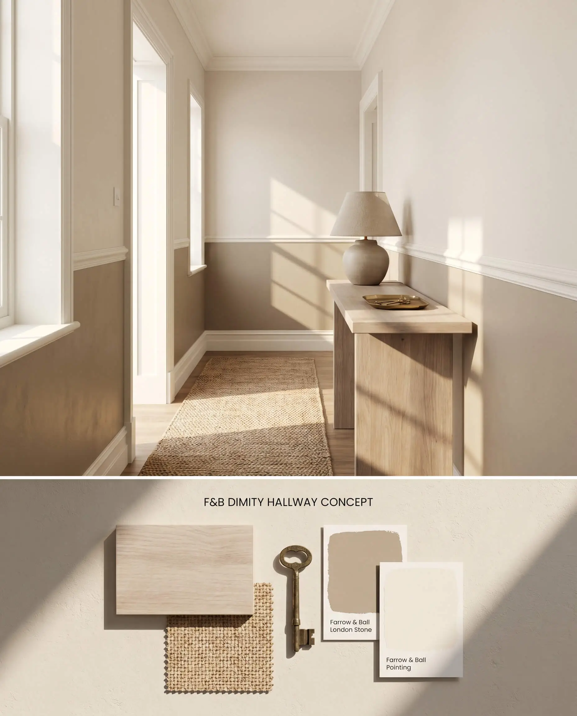
Tight corridors naturally amplify light bounce, intensifying the red base of this pale taupe until the walls read distinctly pink. Anchoring the lower third of the corridor with a grounding, darker wainscoting breaks this continuous reflection cycle. Avoid pairing the upper walls with stark white ceiling trim, which instantly forces the off-white cast to look dirty and aged.
Cozy Primary Bedrooms
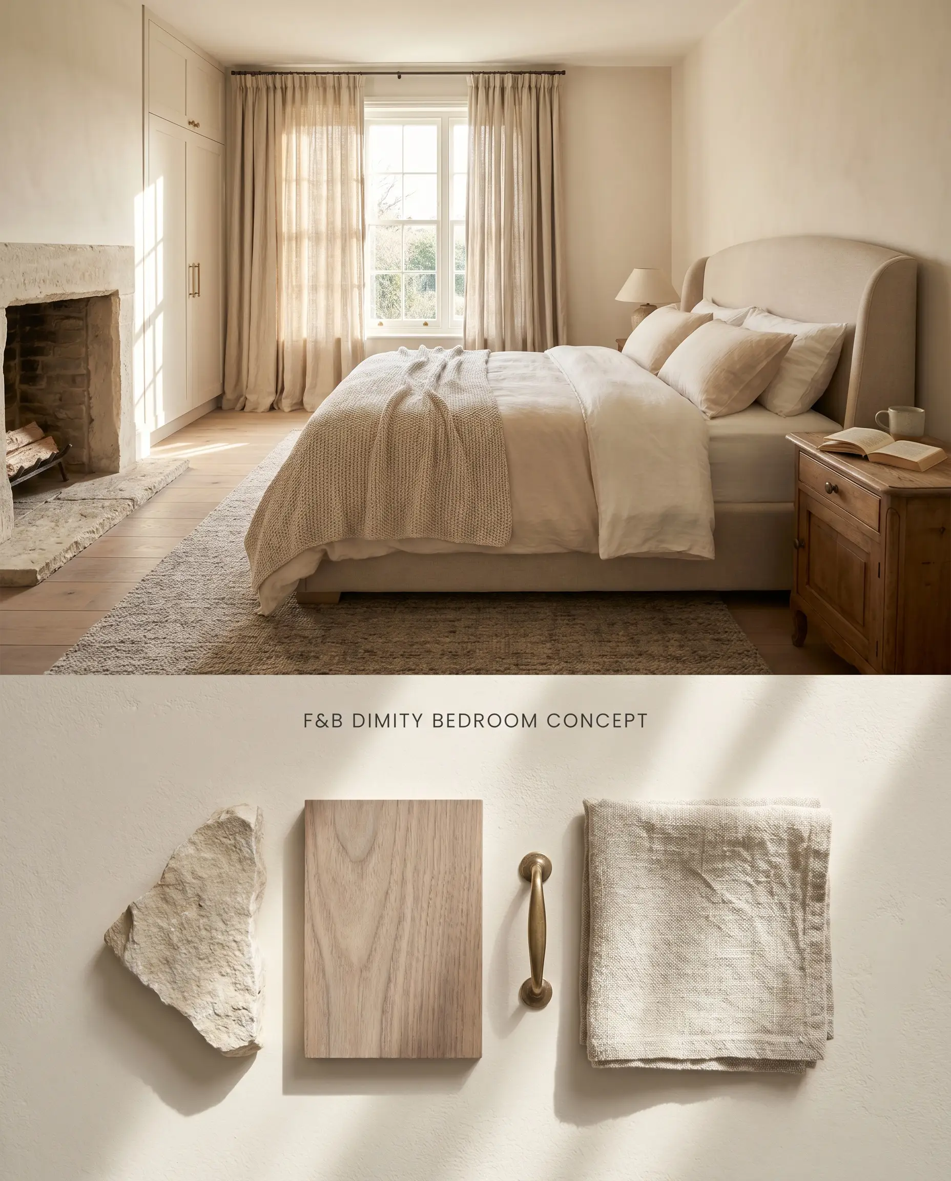
The subdued warmth of Farrow & Ball No. 2008 mimics the soft, light-absorbing qualities of lightweight cotton fabric. Layering this warm neutral with highly textured linen drapery and unlacquered brass hardware enhances its organic color structure. Failing to utilize the manufacturer’s specific undercoat alters the final LRV, allowing old wall colors to bleed through the delicate pigment.
Warm Living Room Walls
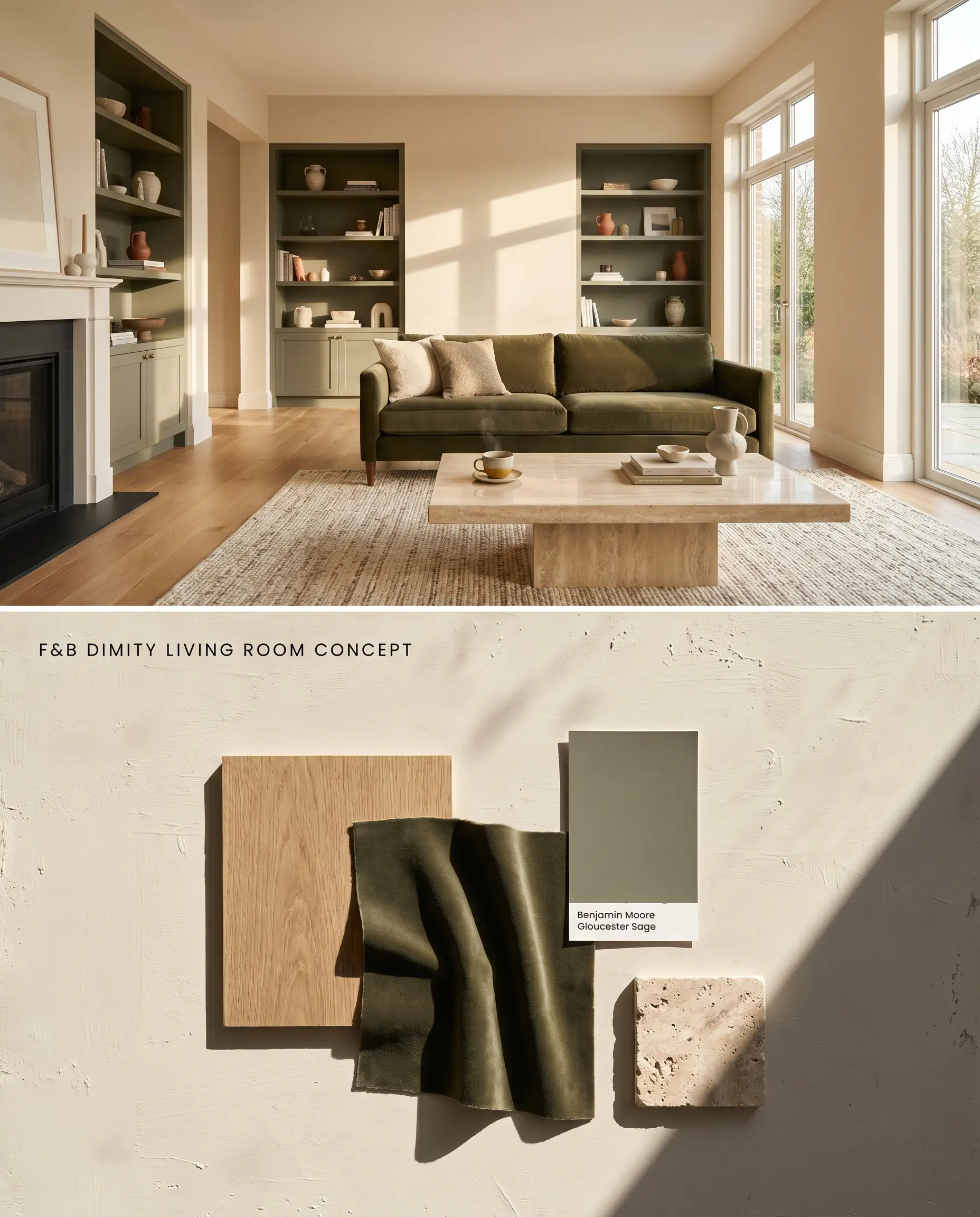
Expansive wall surfaces demand strict control over the room’s surrounding finishes to prevent the paint’s chromatic profile from shifting. Pairing the walls with warm-toned white oak flooring and deep olive velvet upholstery pulls the creamy, taupe tones forward. Introducing blue-toned grays into the furniture plan or area rugs will immediately trigger a clash, forcing the walls to project an unwanted peach hue.
Traditional Kitchen Cabinets
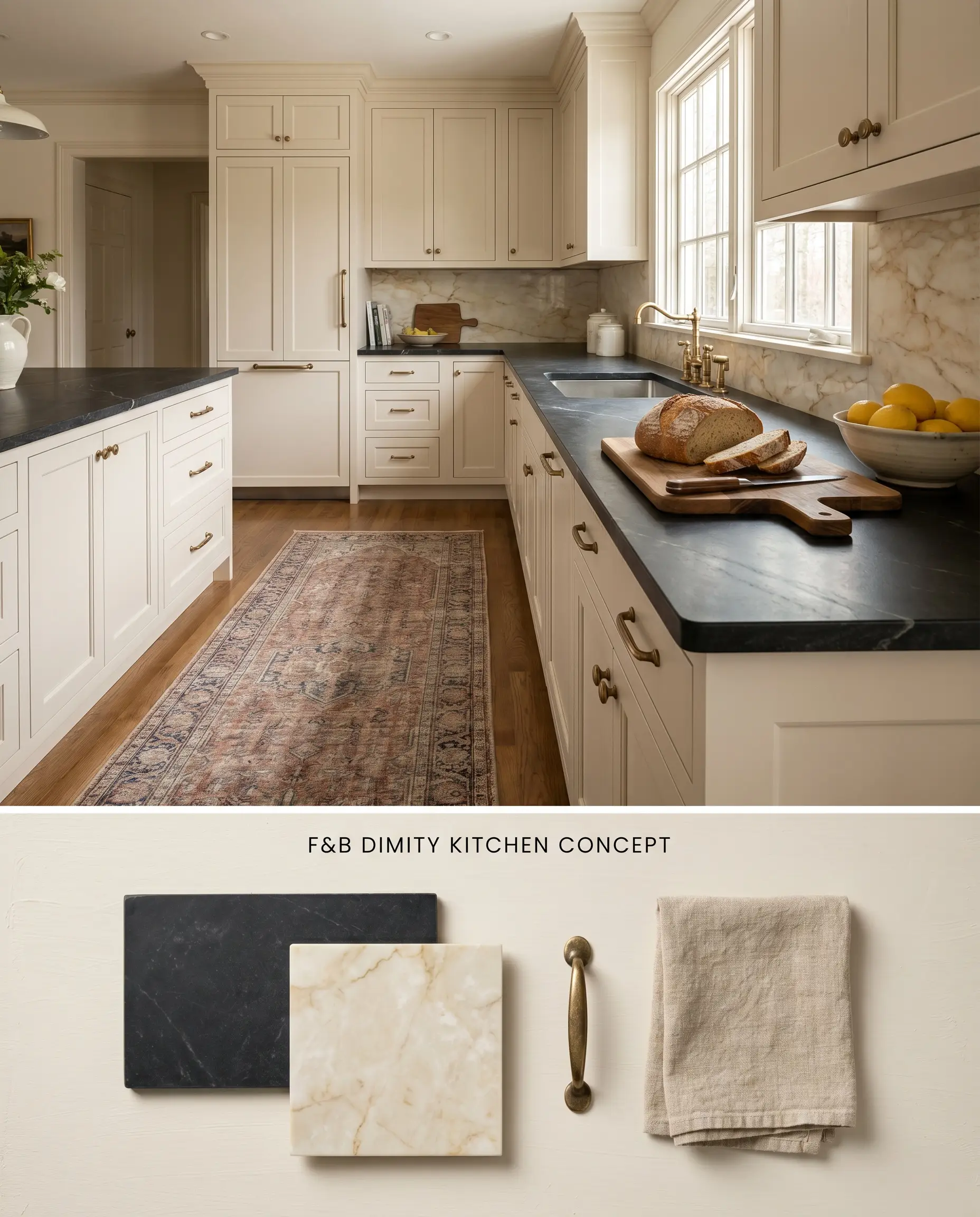
Applying this architectural finish to millwork adds historical weight, provided the surrounding hard surfaces share its warm undertone. Honed soapstone counters or warm Imperial Danby marble neutralize the pink flash by harmonizing with the cabinet’s base notes. Installing glossy, bright white subway tile backsplashes directly against the cabinetry will ruin the visual balance and expose the red undertones.
Sunny South-Facing Spaces
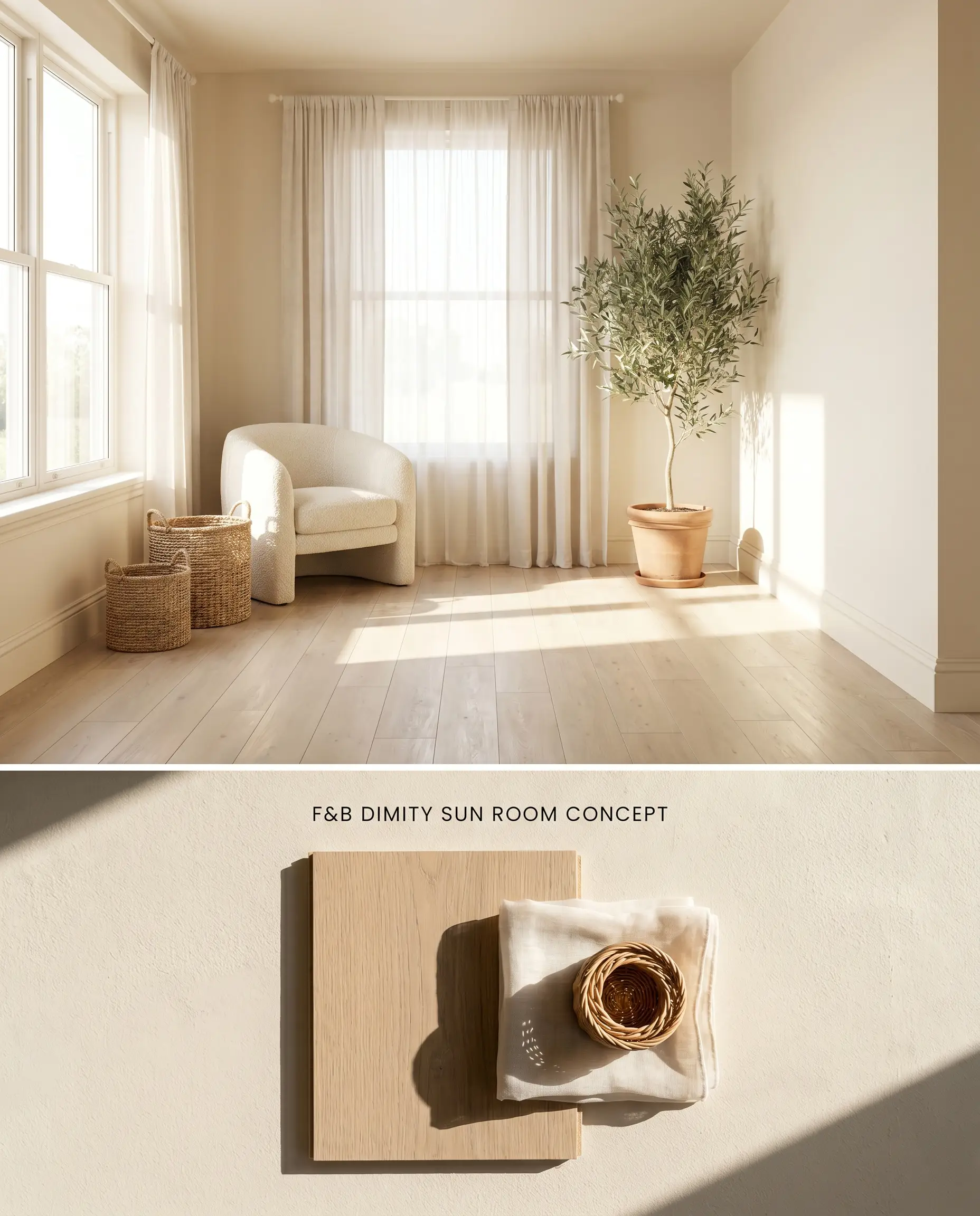
Direct, intense southern light acts as a natural neutralizer for the red base, stripping away the pink shift and leaving a highly reflective, creamy surface. The high LRV of 76 allows the paint to flood the room with warmth without feeling visually oppressive. Wrapping the color continuously from the baseboards up across the ceiling blurs the architectural lines, maximizing the perception of ceiling height.
You can apply wallpapers, paints, etc. on walls and see how they look in various interiors.

Farrow & Ball Dimity 2008 vs. Farrow & Ball Slipper Satin 2004
While both sit in the off-white category, Slipper Satin 2004 relies on a subtle, cooler beige undertone that plays safely alongside stark whites and cooler architectural elements. Dimity 2008 utilizes a distinct red base, requiring warmer, creamier trim pairings to prevent a dirty, contrasting edge. Specify Slipper Satin for north-facing rooms to avoid the pink lighting shift inherent to Dimity.
Farrow & Ball Dimity 2008 vs. Farrow & Ball Joa’s White 226
Joa’s White 226 shares the exact same warm taupe lineage as Dimity but drops significantly in LRV, presenting as a much darker, richer neutral. When paired together in a single space, Dimity serves as the luminous wall color while Joa’s White anchors the room on baseboards, doors, and crown molding. This monochromatic pairing eliminates the risk of stark white clashing while maintaining a consistent, warm color structure.
Farrow & Ball Dimity vs. Sherwin-Williams Panda White SW 6147
Sherwin-Williams Panda White SW 6147 is built on a yellow-green undertone, making it highly resilient in cool, northern light where it maintains its warmth. Dimity 2008 reacts poorly to that same northern exposure, shifting noticeably peach or pink due to its red base. Specify Panda White for low-light or north-facing rooms, reserving Dimity strictly for sun-drenched southern exposures.
Technical FAQs
Yes, the cool, blue-tinted light of north-facing rooms amplifies Dimity’s subtle red base, causing it to flash pink or peach. In windowless spaces or poor lighting conditions, it loses its delicate nuance entirely and reads as a flat, muddy beige.
Estate Emulsion is a 2% flat finish that is notoriously difficult to touch up without flashing. For high-traffic areas like hallways, you must upgrade to the Dead Flat finish, as scuffs on Estate Emulsion often require repainting the entire wall from corner to corner.
Dimity clashes aggressively with stark, cool whites and blue-toned grays, which force its warm taupe color structure to look dirty or excessively pink. It pairs seamlessly with creamy, warm whites and neutral-to-warm wood tones.
Dimity is built on a warm red base that reads as a pale taupe, whereas Slipper Satin lacks the red pigment, functioning as a cooler, more versatile beige off-white.
Similar Paint Colors
Same Brand
Cross-Brand Equivalents