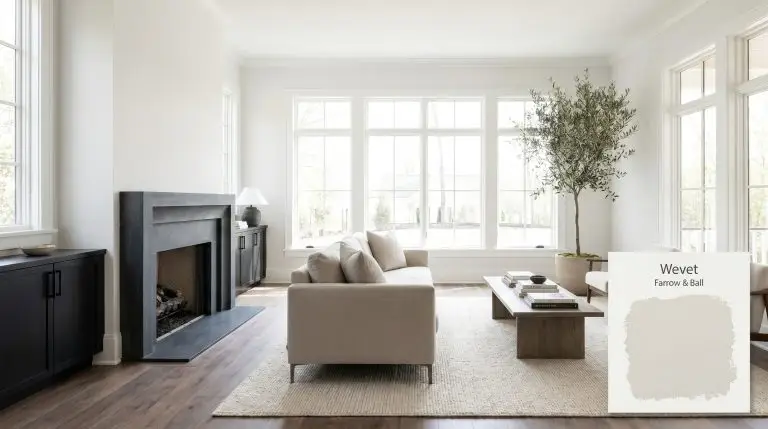
Farrow & Ball's Wevet No. 273 is a delicate, almost translucent white with a subtle cool grey undertone. Named after an old Dorset term for a spider's web, it boasts an LRV of 83, making it an incredibly reflective, clean, and understated neutral perfect for contemporary spaces.
| Temperature | Neutral to Cool |
|---|---|
| Primary Undertone | Cool grey |
| Hidden Undertones | Translucent, faint neutral base |
| Best Exposures | South-facing, East-facing |
| Best For | Living rooms, bedrooms, hallways, open-plan spaces, ceilings, modern minimalist walls |
Hackrea Review
Wevet is one of Farrow & Ball's most underrated whites. It sits beautifully on the edge of white and grey, offering a hushed, weightless feel that never feels stark. While it demands the right lighting to avoid falling flat, in south or east-facing rooms, it provides a quiet elegance that outshines standard brilliant whites.Architectural Applications for Farrow & Ball Wevet
South-Facing Living Rooms
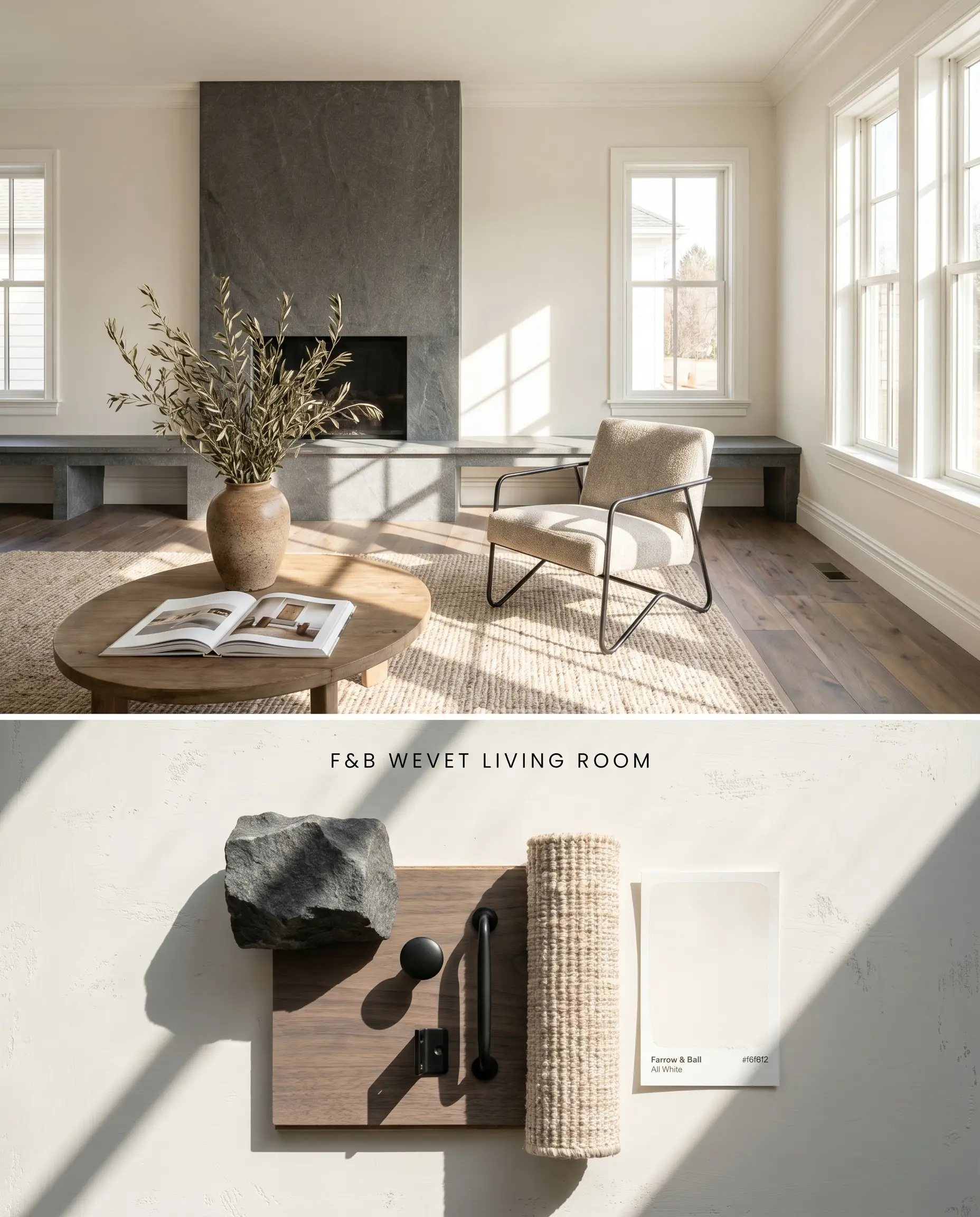
The abundant, warm light of a south-facing exposure counteracts Wevet’s cool grey undertone, suspending the color in a state of clean, translucent white. Because this paint readily absorbs ambient hues, placing it in a sun-drenched room prevents the chromatic profile from flattening. Grounding the space with honed basalt or cool-toned walnut flooring anchors the airy walls without triggering a yellow clash.
Estate Emulsion ($$$$ (Boutique/Luxury Tier)). This formulation delivers Farrow & Ball’s signature, chalky matte finish with unparalleled depth of color, perfect for formal living rooms where aesthetic impact is prioritized over frequent scrubbing.
The Consultant’s Finish
Contemporary Open-Plan Spaces
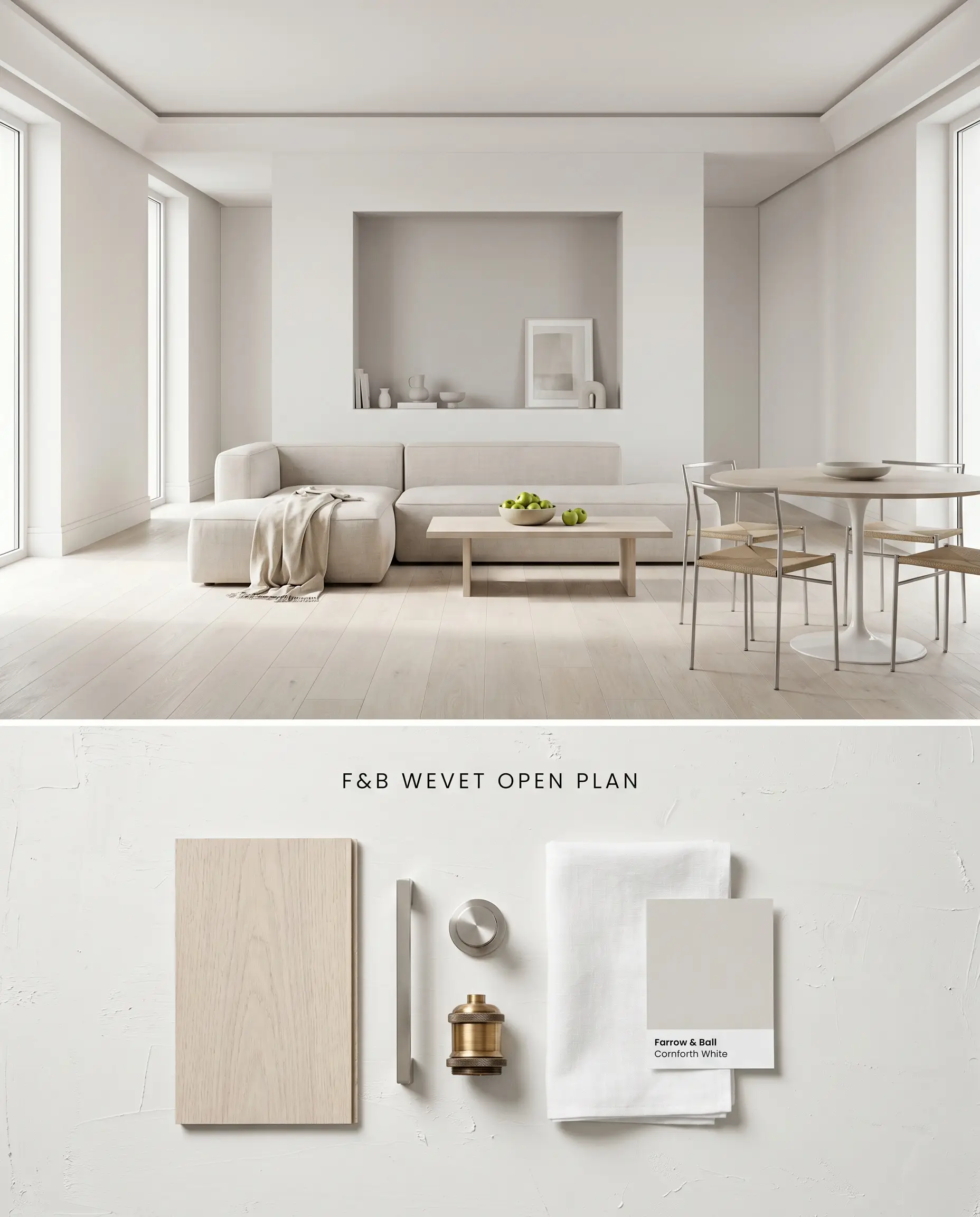
In expansive layouts with cross-directional light, this hushed neutral acts as a unifying architectural skin rather than a focal point. The sheer nature of the pigment requires Farrow & Ball’s White & Light Tones Primer to achieve uniform coverage across long spans of drywall. Pairing it with pale, bleached oak or polished concrete flooring maintains a crisp, modern envelope.
Dead Flat ($$$$ (Boutique/Luxury Tier)). As a multi-surface, ultra-matte finish offering exceptional scuff resistance and washability, this is the premier choice for continuous color-drenching across busy open layouts.
The Consultant’s Finish
Minimalist Bedroom Walls
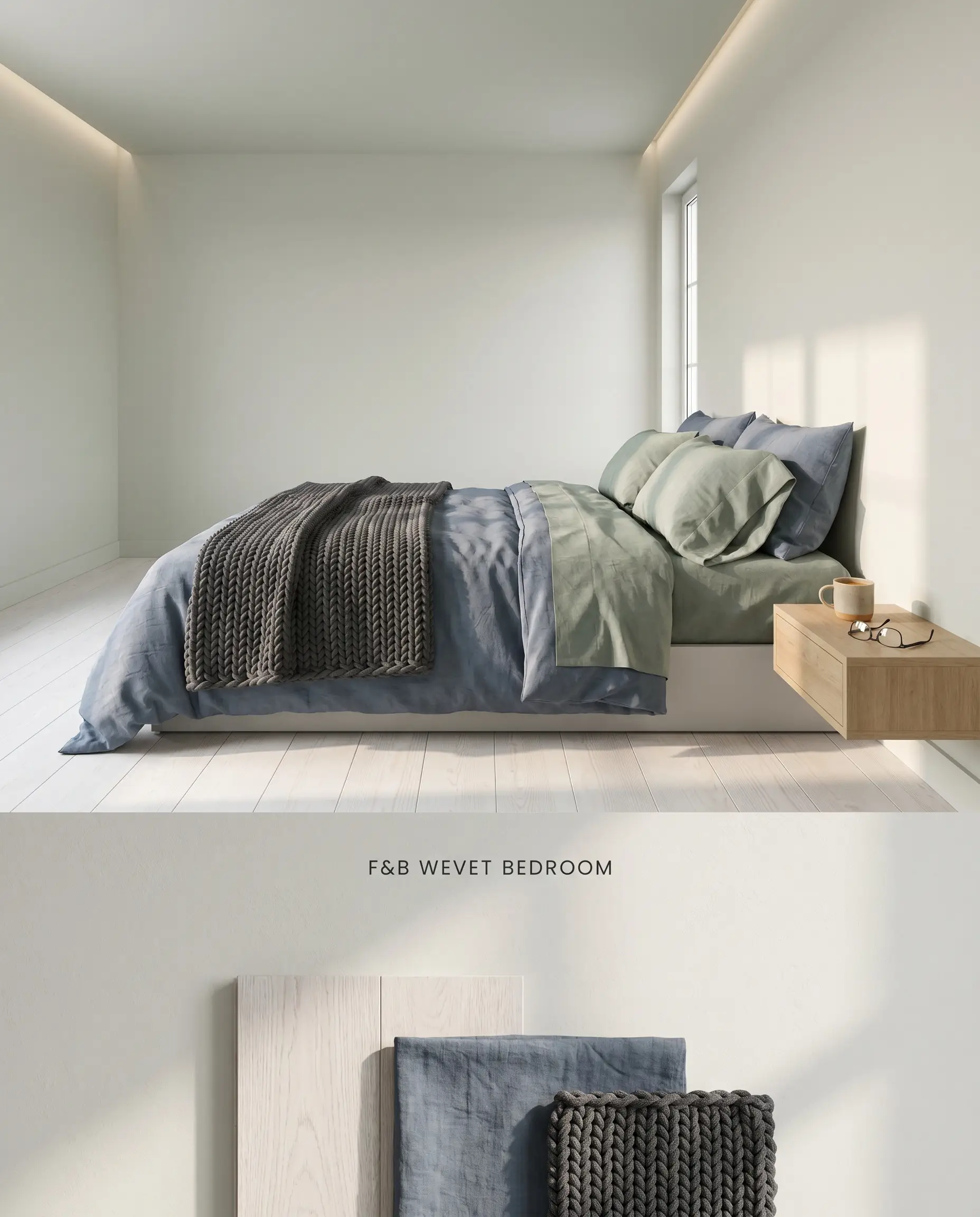
Wevet provides a quiet, low-contrast backdrop that relies on texture rather than stark color shifts to create visual interest. To prevent the room from reading as chilly, incorporate layered organic textiles like washed linen and chunky wool knits. Avoid yellow-toned lighting fixtures, opting instead for bulbs in the 3000K range to maintain the color’s delicate balance.
Estate Emulsion ($$$$ (Boutique/Luxury Tier)). This finish delivers Farrow & Ball’s signature chalky profile with unparalleled depth of color, anchoring minimalist master bedrooms where aesthetic impact supersedes the need for extreme durability.
The Consultant’s Finish
Ceilings (Paired With Cooler Grey Walls)
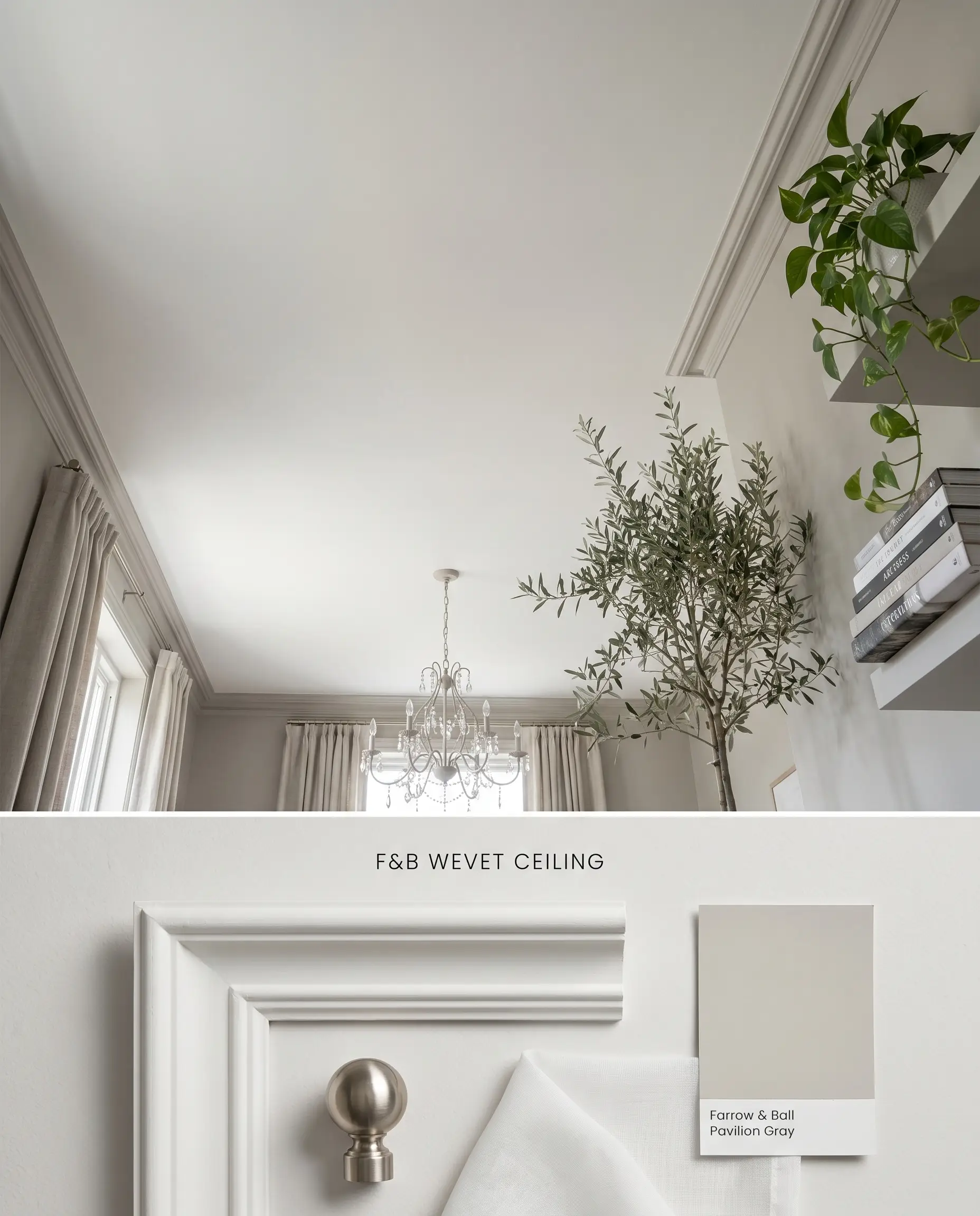
When utilized overhead, Wevet reflects ambient light downward without the harsh glare of a standard ceiling white. Its subtle grey undertone bridges the gap between mid-tone grey walls and the ceiling plane, softening the architectural transition. This application requires a completely flat sheen to mask drywall seams and prevent light pooling.
Dead Flat ($$$$ (Boutique/Luxury Tier)). This ultra-matte profile minimizes light bounce, expertly hiding plaster imperfections while allowing for seamless color-drenching from walls up onto the ceiling.
The Consultant’s Finish
Hallways With Ample Natural Light
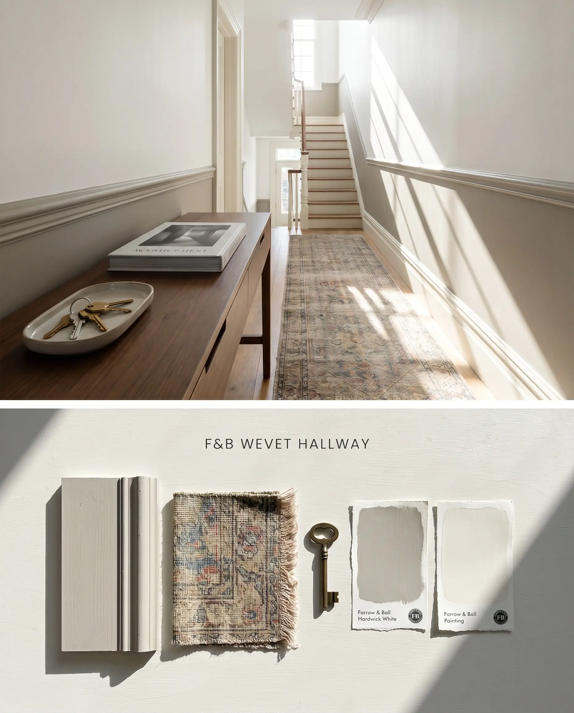
A light reflectance value (LRV) of 83 allows this shade to carry natural illumination deep into transitional spaces, provided there are large windows or skylights present. In poorly lit corridors, the delicate “Dorset spider’s web” effect collapses into a flat, dingy grey. Rely on high-sheen trim to bounce additional light and provide a durable barrier against scuffs.
Dead Flat ($$$$ (Boutique/Luxury Tier)). Offering exceptional scuff resistance and washability, this multi-surface, ultra-matte finish is the premier choice for busy hallways where continuous wall contact is inevitable.
The Consultant’s Finish
You can apply wallpapers, paints, etc. on walls and see how they look in various interiors.

Direct Head-to-Head Color Comparisons
Farrow & Ball Wevet No. 273 vs. Farrow & Ball Ammonite No. 274
Ammonite possesses a slightly deeper, warmer stone-grey base compared to the sheer, icy translucency of Wevet. When dealing with stark, brilliant white trim, Ammonite provides enough contrast to look intentional, whereas Wevet will look muddy by comparison. Reserve Wevet for continuous color-drenching in sunlit rooms, and deploy Ammonite when you need a distinct, structured wall color against crisp white millwork.
Farrow & Ball Wevet No. 273 vs. Benjamin Moore White Dove OC-17
White Dove relies on a subtle yellow-grey base to generate warmth, making it highly compatible with golden oak flooring or traditional cherry cabinetry. Wevet’s cool grey undertone actively rejects those yellow tones, creating a jarring clash. Specify White Dove for traditional homes with warm, fixed wood elements, and select Wevet for contemporary spaces featuring cool concrete, pale ash, or honed slate.
Farrow & Ball Wevet No. 273 vs. Sherwin-Williams Alabaster SW 7008
Alabaster is a creamy, warm off-white with a significantly higher perceived opacity than Wevet’s delicate architectural finish. In north-facing rooms, Alabaster retains its soft, inviting glow while Wevet will immediately shift into a flat, chilly grey. Utilize Alabaster to counteract cool northern light, but switch to Wevet in south-facing rooms where Alabaster might turn overly yellow or dingy.
Technical Specifications & Application FAQs
Wevet functions as a sheer, translucent white in south-facing rooms with abundant natural light. In north-facing rooms or poorly lit spaces, its cool grey undertone becomes dominant, causing the paint to read as a distinct, icy grey rather than a true white.
Yes, the cool grey base of Wevet actively clashes with prominent yellow oak and warm wood tones. This juxtaposition makes the paint appear muddy or dingy; it pairs best with cool-toned woods like bleached ash or white-washed oak.
It performs poorly in these conditions. Lacking a warm base, the cool northern light flattens Wevet’s chromatic profile, turning it toneless and chilly, while windowless spaces trap the grey undertone and eliminate its delicate translucency.
Yes. Because Wevet is an incredibly sheer color, it requires Farrow & Ball’s specific White & Light Tones Primer & Undercoat to build true depth and hide existing wall colors, especially when using the chalky Estate Emulsion finish.
Similar Paint Colors
Same Brand
Cross-Brand Equivalents