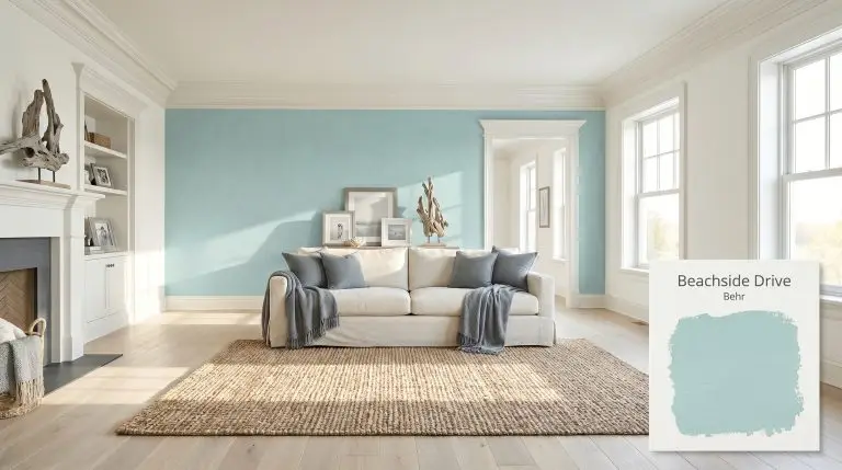
Behr Beachside Drive is a light, airy blue-green paint color with a soft gray cast. Boasting an LRV of 65, it acts as a calming, coastal-inspired aqua that leans slightly cool, making it perfect for bathrooms, bedrooms, and sunny living spaces.
| Temperature | Cool |
|---|---|
| Primary Undertone | Blue-green |
| Hidden Undertones | Soft gray, seafoam green |
| Best Exposures | South-facing, East-facing |
| Best For | Bathrooms, coastal-inspired living rooms, bedrooms, laundry rooms, porch ceilings |
Hackrea Review
Beachside Drive by Behr is an incredibly refreshing aqua that strikes the perfect balance between blue and green. Its subtle gray undertone keeps it from feeling overly neon, making it a sophisticated choice for coastal and transitional interiors.Architectural Applications for Coastal Design & Aqua Tones
Bathrooms
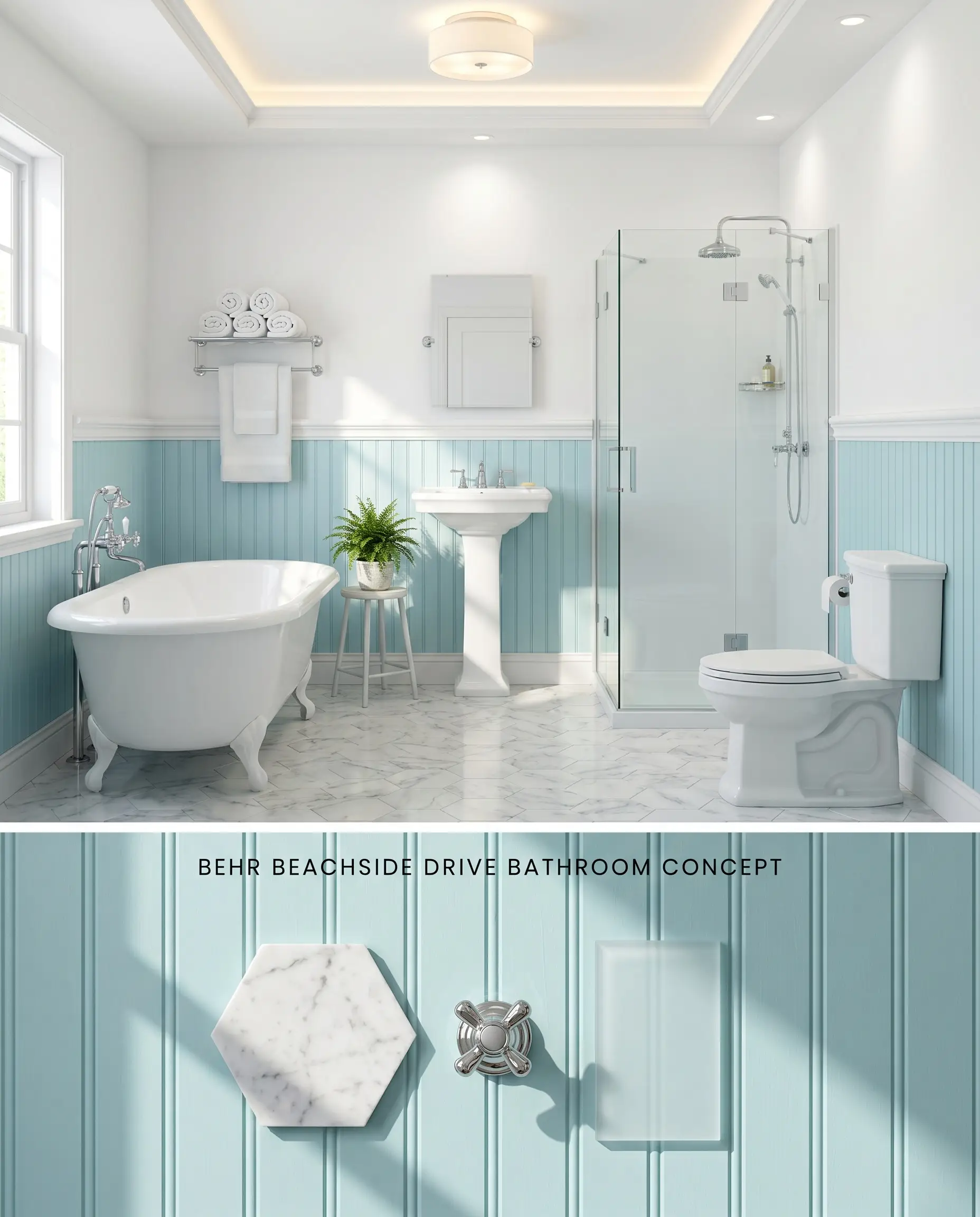
Applying this blue-green hue exclusively to beadboard wainscoting grounds the lower half of the room while mitigating the intense light bounce that occurs when aqua tones reflect upon themselves in tight quarters. The LRV 65 base contrasts crisply against pristine white plumbing fixtures and polished stone, establishing a spa-like retreat without overwhelming the visual field. To avoid the low-light trap where the gray cast reads flat, this half-wall application must be illuminated by large frosted windows or layered 4000K artificial lighting.
Behr Ultra Interior ($$ (Value Tier)). This specialized coating features an antimicrobial, stain-blocking formula that effectively resists moisture and mildew growth in bathrooms and kitchens at a highly practical price point, ensuring the wainscoting withstands daily humidity.
The Consultant’s Finish
Coastal-Inspired Living Rooms
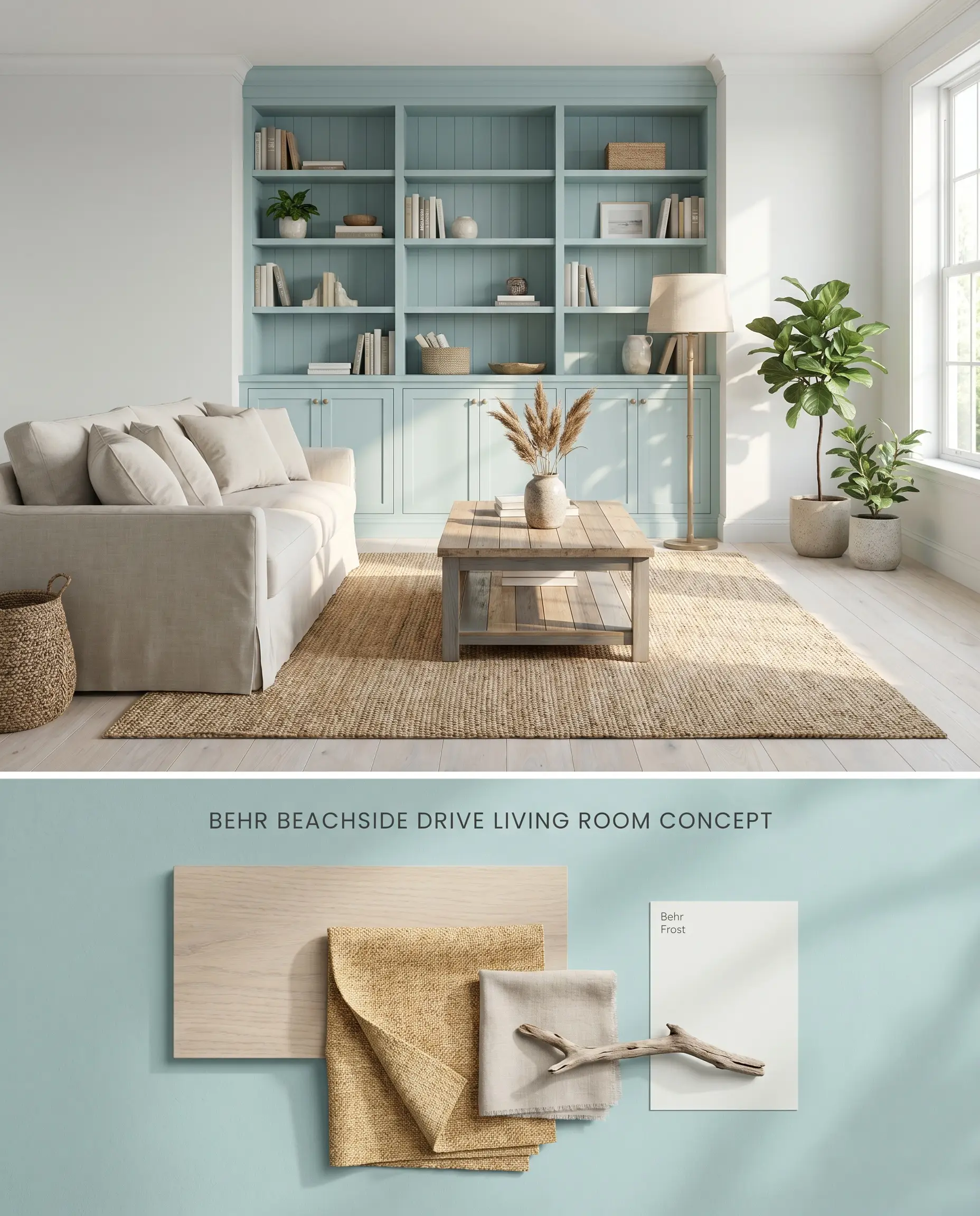
Deploying this shade on a single architectural accent wall or built-in bookcase controls the color structure and significantly reduces the labor costs associated with the multiple coats required to hide darker previous colors. The seafoam green acts as a focal point that reflects significant ambient daylight, while surrounding crisp, cool white walls absorb excess light bounce. Natural, ash-toned woods and woven rattan textures further diffuse the room’s energy, preventing the aqua tint from dominating the spatial layout.
Behr Dynasty Interior Matte ($$$ (Premium/DIY Tier)). This formulation provides highly concentrated pigmentation and one-coat coverage in a flat, elegant profile that minimizes surface imperfections in formal, low-traffic living spaces, perfectly anchoring the accent wall.
The Consultant’s Finish
Bedrooms
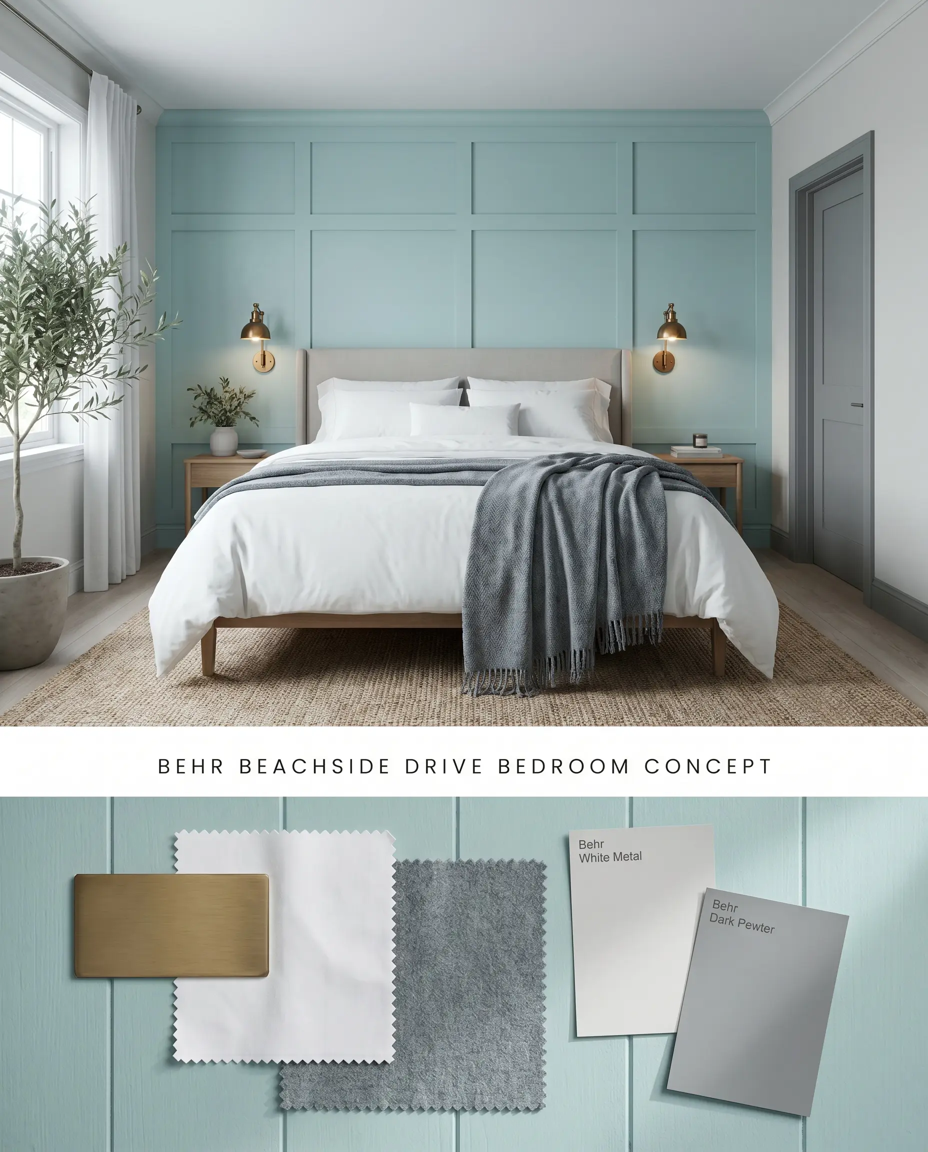
Restricting this color to a paneled accent wall behind the headboard leverages its cool temperature to lower the perceived visual energy of the sleeping quarters without inducing an overwhelming bounce effect. In north-facing exposures, the hidden gray cast emerges across the millwork, shifting the chromatic profile toward a sophisticated, muted sea-glass rather than a vibrant pastel. Layering matte textiles and brushed metals against this localized color block prevents the hue from feeling juvenile.
Behr Dynasty Interior Matte ($$$ (Premium/DIY Tier)). Utilizing this product provides highly concentrated pigmentation and one-coat coverage in a flat, elegant profile that minimizes surface imperfections in formal, low-traffic living spaces, maintaining the sophisticated matte aesthetic.
The Consultant’s Finish
Laundry Rooms
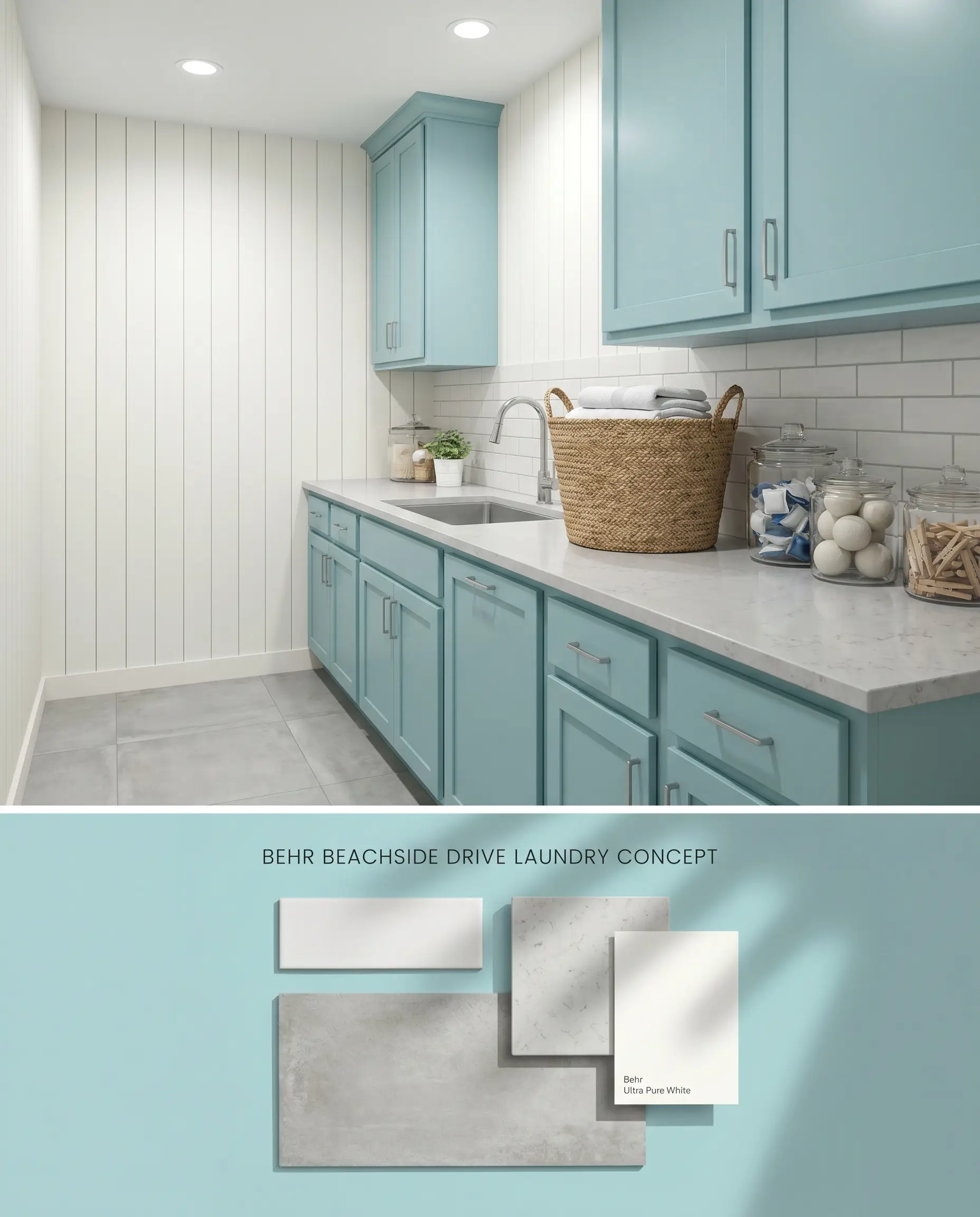
Painting utility cabinetry in this bright, reflective aqua tone counteracts the inherently utilitarian nature of appliances while bypassing the coverage catch issues of rolling large, dark wall expanses. Because tight, bright spaces can cause the color to intensify, pairing the blue-green cabinets with stark white vertical shiplap breaks up the sightlines and controls the saturation. The crisp hue cuts through the visual clutter of shelving and laundry baskets, anchored by cool-toned flooring.
Behr Cabinet, Door & Trim Enamel ($$ (Value Tier)). This specialized enamel provides a durable, fast-drying finish that resists sticking and withstands rigorous daily use, offering an excellent cost-to-performance ratio for cabinet and millwork updates in utility spaces.
The Consultant’s Finish
Porch Ceilings
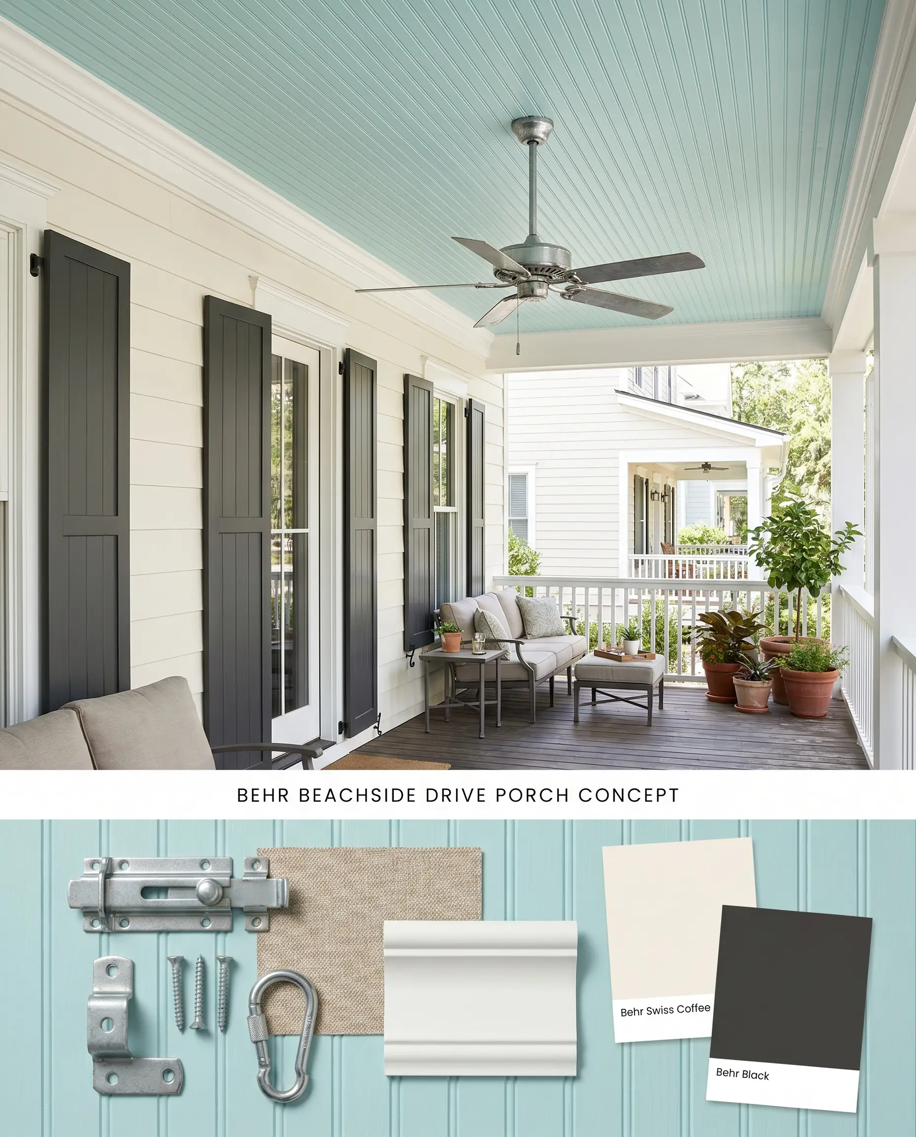
Functioning as a modernized exterior accent, applying Behr Beachside Drive M460-2 strictly to porch ceilings draws the eye upward and mimics the open sky while naturally limiting the surface area to prevent overwhelming reflection. The LRV 65 provides enough brightness to prevent the covered porch from feeling shadowed, while the gray cast prevents the ceiling from looking like a neon canopy. This overhead application pairs flawlessly with neutral exterior siding and crisp white architectural columns, utilizing the Behr Marquee line for optimal weather resistance.
Behr Marquee Exterior ($$$ (Premium/DIY Tier)). Deploying this robust, dirt-resistant formula offers exceptional UV protection and weather resistance, maximizing time efficiency and long-term value for exterior projects like porch ceilings.
The Consultant’s Finish
You can apply wallpapers, paints, etc. on walls and see how they look in various interiors.

Comparative Color Theory: Behr Beachside Drive M460-2 vs. Rival Brands
Behr Beachside Drive M460-2 vs. Sherwin-Williams Spa SW 6765
Operating in the mid-60s LRV range, both shades offer nearly identical light reflectance, but Sherwin-Williams Spa SW 6765 carries a cleaner, more translucent chromatic profile that leans closer to a pure pastel aqua. Behr Beachside Drive M460-2 contains a more pronounced hidden gray cast, making it the required architectural choice for grounding spaces with abundant natural light where Spa might read excessively vibrant. Deploy Sherwin-Williams Spa SW 6765 strictly in north-facing rooms that demand a clearer, unmuted blue-green injection to counteract cool, shadowing light.
Behr Beachside Drive M460-2 vs. Benjamin Moore San Clemente Teal 730
Benjamin Moore San Clemente Teal 730 presents a slightly higher LRV of 67, reflecting marginally more ambient light than the Behr alternative while pushing further into the green spectrum to create a warmer, traditional teal aesthetic. The cooler seafoam green of Behr Beachside Drive M460-2 naturally recedes, visually expanding tight floor plans. Specify Benjamin Moore San Clemente Teal 730 when transitioning from adjoining rooms painted in warm, earthy neutrals, but rely on Behr Beachside Drive M460-2 when coordinating with stark, cool whites and slate grays.
Behr Beachside Drive M460-2 vs. Behr Ocean Boulevard PPU13-10
Behr Ocean Boulevard PPU13-10 drops significantly in lightness, registering an LRV of 53 compared to the airy 65 of Behr Beachside Drive M460-2. This dramatic reduction in light reflectance transforms Behr Ocean Boulevard PPU13-10 into a denser, saturated medium aqua that absorbs ambient light rather than bouncing it across the room. Utilize Behr Ocean Boulevard PPU13-10 for lower-level cabinetry or high-contrast wainscoting where deep visual anchoring is required, reserving Behr Beachside Drive M460-2 for upper walls, ceilings, or spaces demanding maximum daylight amplification.
Technical FAQs: Mastering the Blue-Green Hue
In bright, south-facing light, the vibrant seafoam green and aqua notes are significantly amplified, which can cause the color to reflect upon itself and intensify in small spaces. To prevent a neon effect, apply the hue strategically on accent walls or wainscoting and anchor the room with crisp, cool whites and ash-toned woods.
Yes, the cool blue-green hue directly clashes with intense warm reds, oranges, and yellow-dominant woods like honey oak. This severe temperature contrast makes the paint look disjointed and overly vivid, requiring coordination with bleached white oak, driftwood, or gray-washed finishes instead.
Without adequate natural daylight, the soft gray undertone causes the shade to look muted and flat. To achieve true color rendering and prevent a sterile aesthetic in windowless spaces, you must illuminate the room with layered artificial lighting calibrated strictly between 3500K and 4000K.
Similar Paint Colors
Same Brand
Cross-Brand Equivalents