Riverdale N410-3
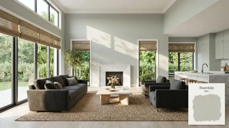
BehrBehr Riverdale (N410-3) is a muted, cool-leaning sage green with a heavy gray base. It boasts an LRV of 54, making it a perfectly balanced mid-tone that brings a tranquil, spa-like atmosphere to bedrooms and bathrooms without feeling overly dark.
| Temperature | Cool |
|---|---|
| Primary Undertone | Gray |
| Hidden Undertones | Silver and subtle blue |
| Best Exposures | South-facing or West-facing |
| Best For | Spa-like Bathrooms, Tranquil Primary Bedrooms, Kitchen Cabinets, Coastal Living Rooms, Laundry Rooms |
Hackrea Review
Riverdale is Behr's unsung hero for those chasing the perfect 'spa green.' Its heavy gray base grounds the color structure, preventing it from ever feeling like a neon pastel, though you must watch its tendency to lean slightly blue in cool lighting.Architectural Finish Applications for Behr Riverdale
Spa-like Bathrooms
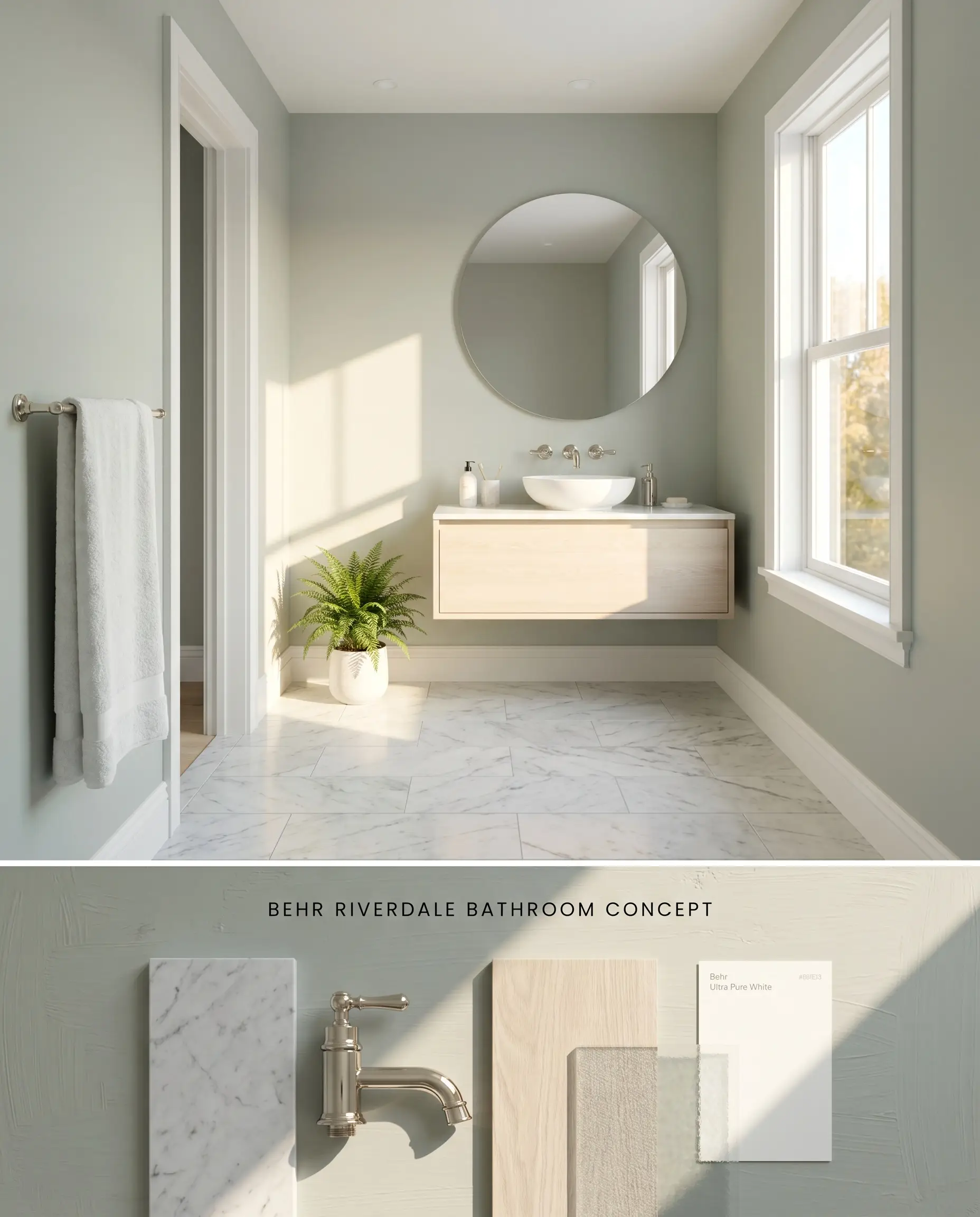
Behr Riverdale N410-3 relies on abundant natural light to activate its sage green chromatic profile and prevent the muted base from reading flat. In a sun-drenched washroom, the green interacts with the reflective qualities of polished stone to lower the visual temperature of the space. Avoid windowless layouts where the LRV of 54 acts as a low-light trap, shifting the color toward a stark, cement-like appearance.
Tranquil Primary Bedrooms
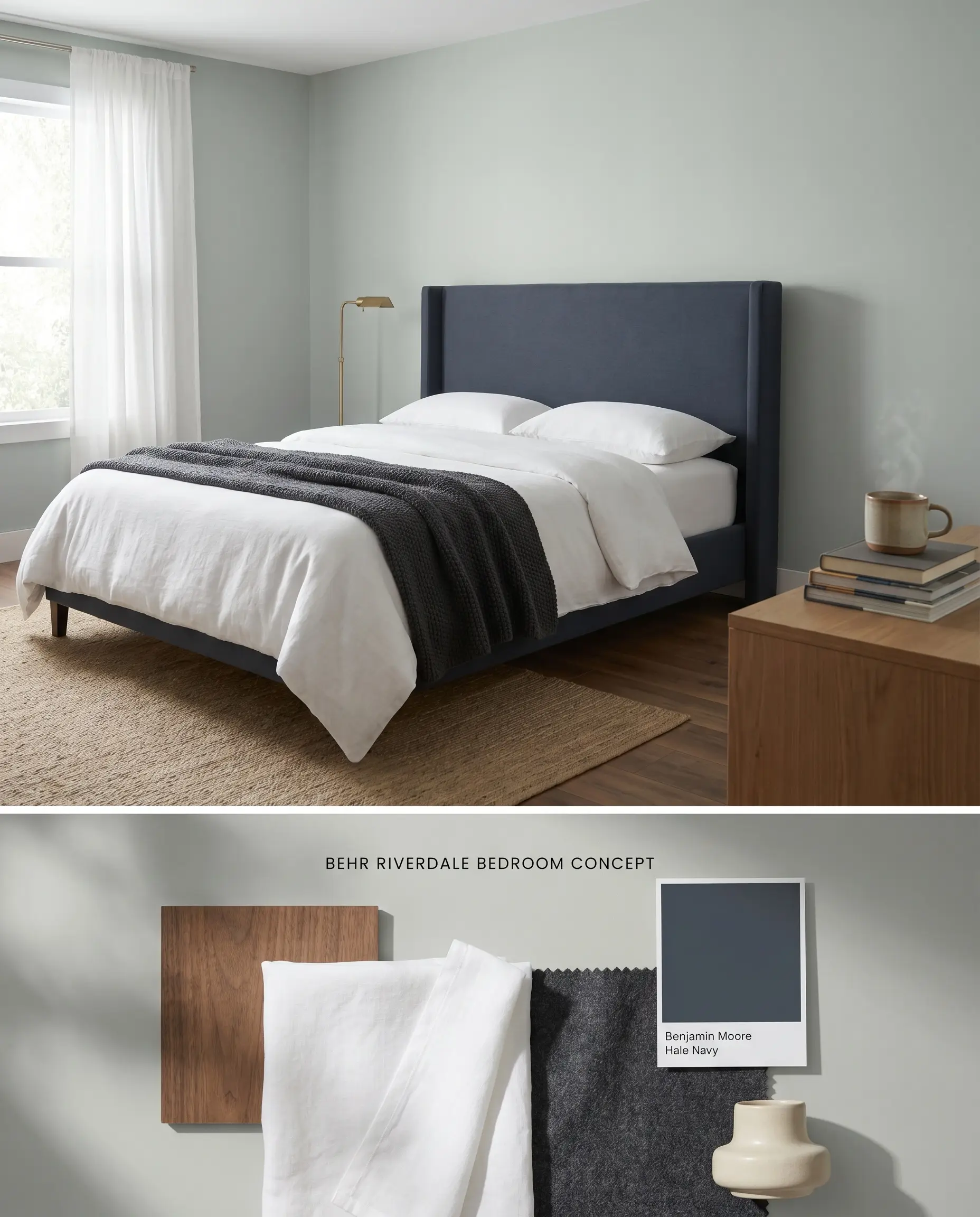
When applied to bedroom walls, the silver undertone in this gray-green blend establishes a cooling, restorative environment. If the room faces North, expect the hue to undergo a lighting shift toward a crisp gray-blue, requiring layered textiles to introduce necessary warmth. A strict two-coat application or tinted primer is mandatory when covering a darker existing color to prevent the gray base from muddying.
Kitchen Cabinets (especially lower cabinets)
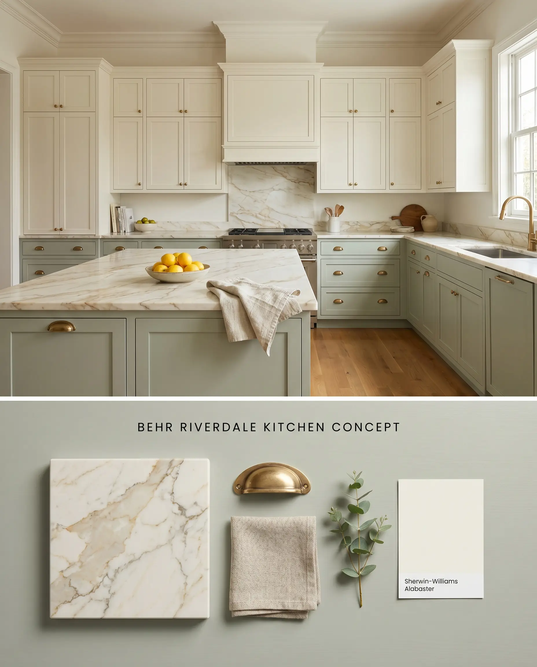
Grounding lower cabinetry with this color structure anchors the kitchen layout while allowing upper sightlines to remain visually expansive. Because touching up a satin or semi-gloss architectural finish on cabinetry often results in visible flashing, precise initial application and durable hardware are critical. The organic green easily mitigates the stark, clinical edge of pure white quartz countertops.
Coastal or Farmhouse Living Rooms

The botanical qualities of this sage green effortlessly bridge the gap between interior living areas and exterior landscapes. If the living room features large windows facing dense exterior foliage, the green wavelengths will bounce and amplify, overriding the muted gray base. Counteract this amplification by incorporating highly textured, neutral furnishings that absorb the excess color saturation.
Laundry Rooms
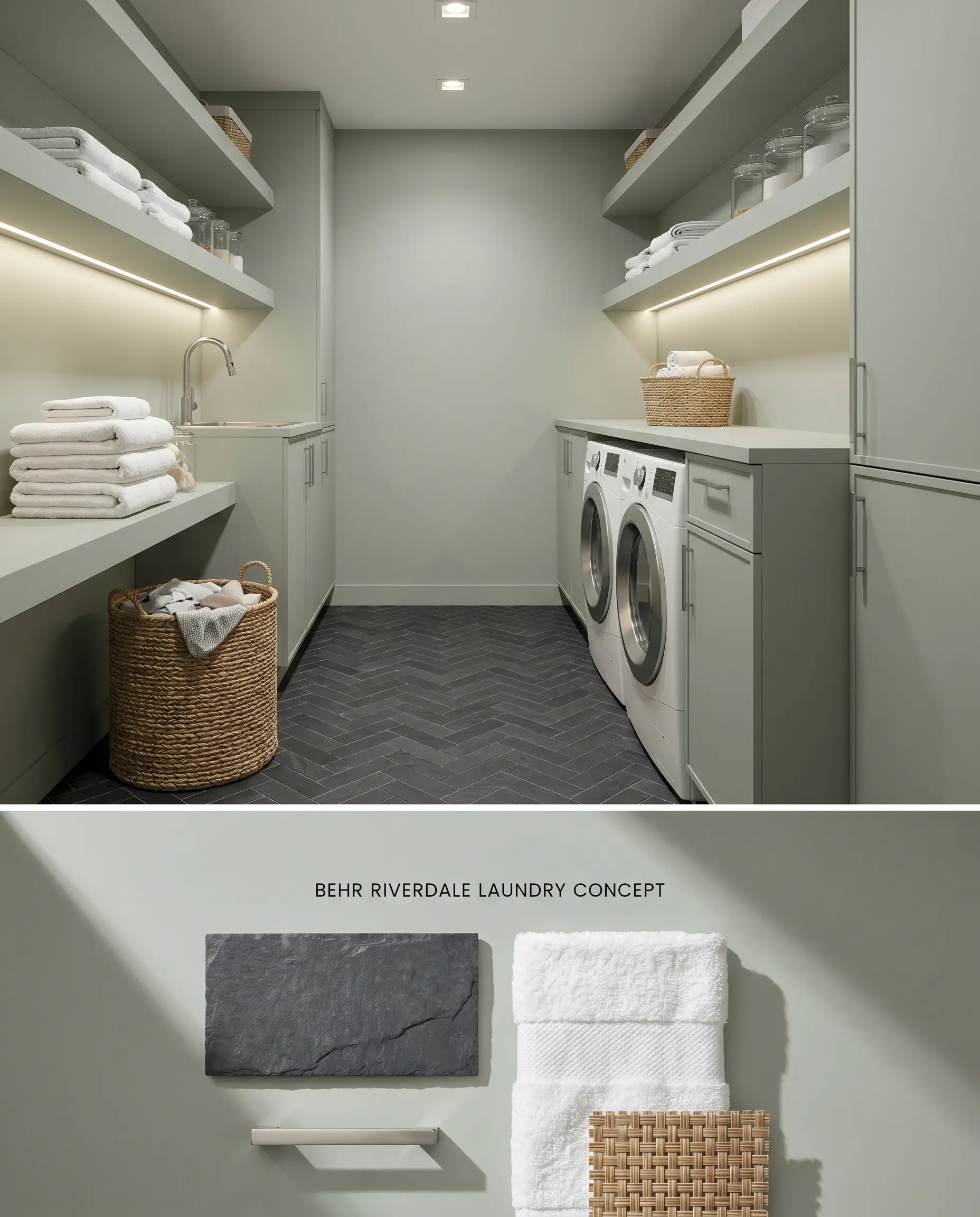
Utility spaces benefit from the crisp, clean energy of a cool-toned hue to offset the sterile nature of modern appliances. To prevent the blue-gray hidden undertones from clashing, strictly avoid pairing Behr Riverdale N410-3 with aggressively yellow or orange wood shelving. Utilize crisp white built-ins and natural slate tile to maintain a cohesive, functional aesthetic.
You can apply wallpapers, paints, etc. on walls and see how they look in various interiors.

Behr Riverdale vs. The Competition
Behr Riverdale N410-3 vs. Sherwin-Williams Comfort Gray SW 6205
Comfort Gray SW 6205 operates with a nearly identical LRV of 54 but leans slightly more blue-cyan in its base compared to Riverdale’s truer sage green. In a North-facing room, Comfort Gray reads distinctly icy, while Riverdale retains a touch more of its organic green structure. Choose Behr Riverdale N410-3 when attempting to ground a space with natural stone, and Comfort Gray when designing a crisp, coastal interior reliant on bright white wainscoting.
Behr Riverdale N410-3 vs. Benjamin Moore Gray Wisp 1570
Gray Wisp 1570 presents a highly similar light reflectance value but features a more dominant silver undertone that strips away some of the botanical green presence. When applied next to warm wood flooring, Gray Wisp acts as a stark, cooling contrast, whereas Behr Riverdale N410-3 provides a smoother, more transitional bridge. Select Gray Wisp for modern, minimalist spaces with metallic accents, but rely on Riverdale for transitional rooms densely layered with natural textiles.
Behr Riverdale N410-3 vs. Farrow & Ball Mizzle 266
Mizzle 266 utilizes a traditional clay and chalk base that absorbs light differently, resulting in a slightly darker perceived value despite a comparable LRV. Mizzle exhibits a smokier, more complex gray-green blend that shifts dramatically as the sun moves throughout the day. Behr Riverdale N410-3 offers a more consistent, predictable chromatic profile. Opt for Mizzle in historic homes where shifting shadows add architectural character, but specify Riverdale in contemporary open-concept layouts that demand color stability across large expanses of drywall.
Technical Color FAQs
Yes, in crisp, North-facing light, the silver and blue undertones step forward, causing the paint to read as a cool gray-blue. To counteract this shift, introduce warm artificial lighting at 3000K or integrate warm wood tones like walnut.
Yes, the complementary contrast between the aggressively yellow or orange undertones of honey oak and the blue-gray base of Riverdale will unintentionally amplify the blue, creating a jarring visual clash. Stick to bleached oak, walnut, or painted cabinetry when using this color.
In spaces lacking natural light, the LRV of 54 combined with the muted gray base causes the color to read flat and cement-like. It requires abundant natural light or strategically placed, warm artificial fixtures to properly activate its green profile.
If applied in a room with large windows facing dense exterior foliage, the green wavelengths will bounce and amplify the paint’s sage character. This overrides the muted gray base, making the color appear significantly brighter and greener than the physical swatch.
Similar Paint Colors
Same Brand
Cross-Brand Equivalents