Hawthorne Yellow HC-4
Benjamin MooreBenjamin Moore Hawthorne Yellow (HC-4) is a balanced, buttery yellow from the Historical Collection. Featuring a slight gray undertone that prevents it from reading too neon or acidic, it acts as a cheerful yet sophisticated choice for both traditional and modern spaces.
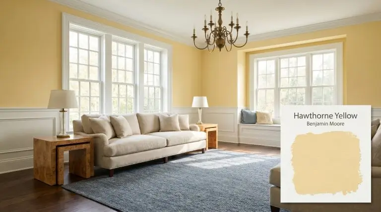
| Temperature | Warm |
|---|---|
| Primary Undertone | Soft golden yellow |
| Hidden Undertones | Subtle gray and very faint green |
| Best Exposures | North-facing or East-facing |
| Best For | Kitchens, Exteriors, Dining Rooms, Dark Hallways, Front Doors |
Avoid pairing Hawthorne Yellow with stark, cool blue-grays or pink-undertoned beige hard finishes, as the subtle gray-green undertone in the yellow can clash and look muddy. Furthermore, heavy artificial fluorescent lighting can strip its buttery warmth and amplify an acidic cast.
The Clash Warning
Hawthorne Yellow Application & Styling Ideas
Kitchen Cabinetry
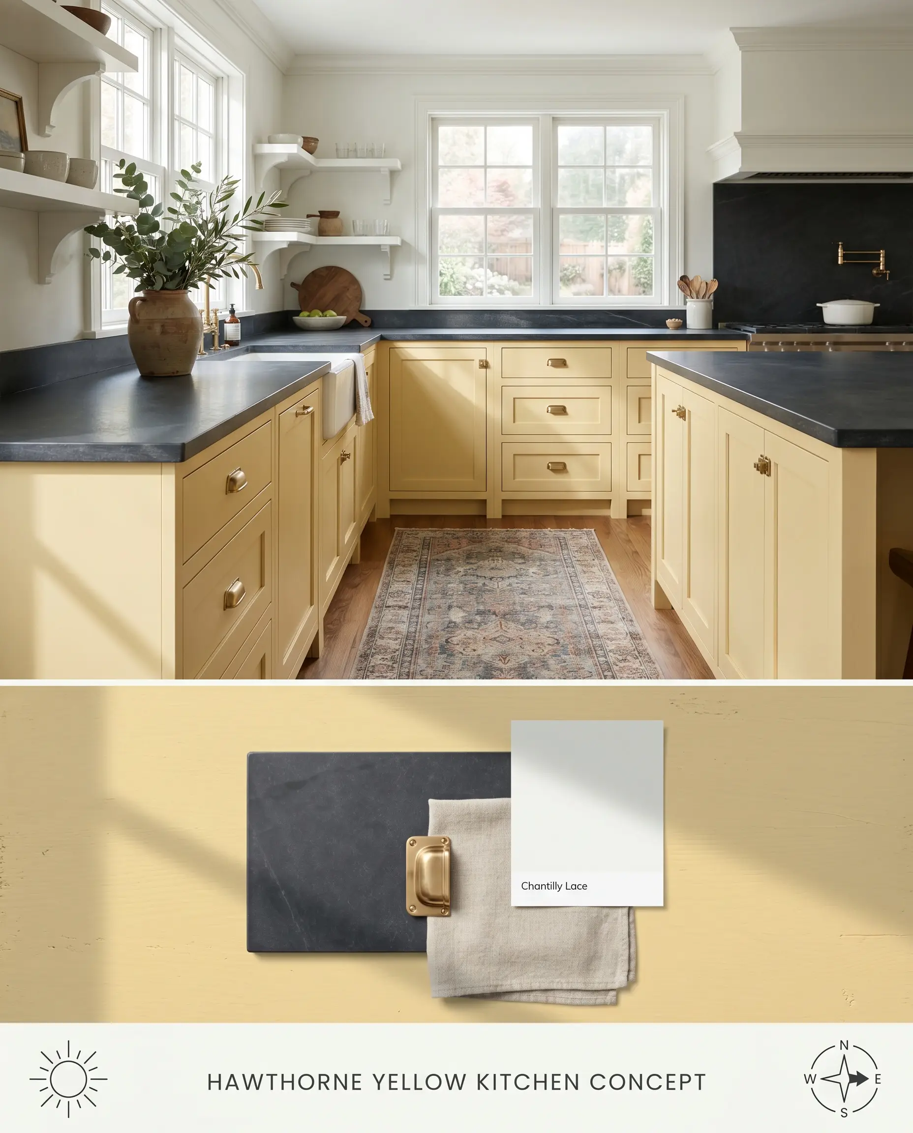
Benjamin Moore Hawthorne Yellow HC-4 operates as a luminous anchor on lower cabinetry, its golden base grounding the visual mass of the island while reflecting ambient light upward. Pairing this buttery hue with unlacquered brass hardware accelerates the aging process visually, creating a traditional aesthetic that feels inherited rather than installed. The subtle gray cast prevents the yellow from turning neon under harsh under-cabinet task lighting.
Traditional Exteriors
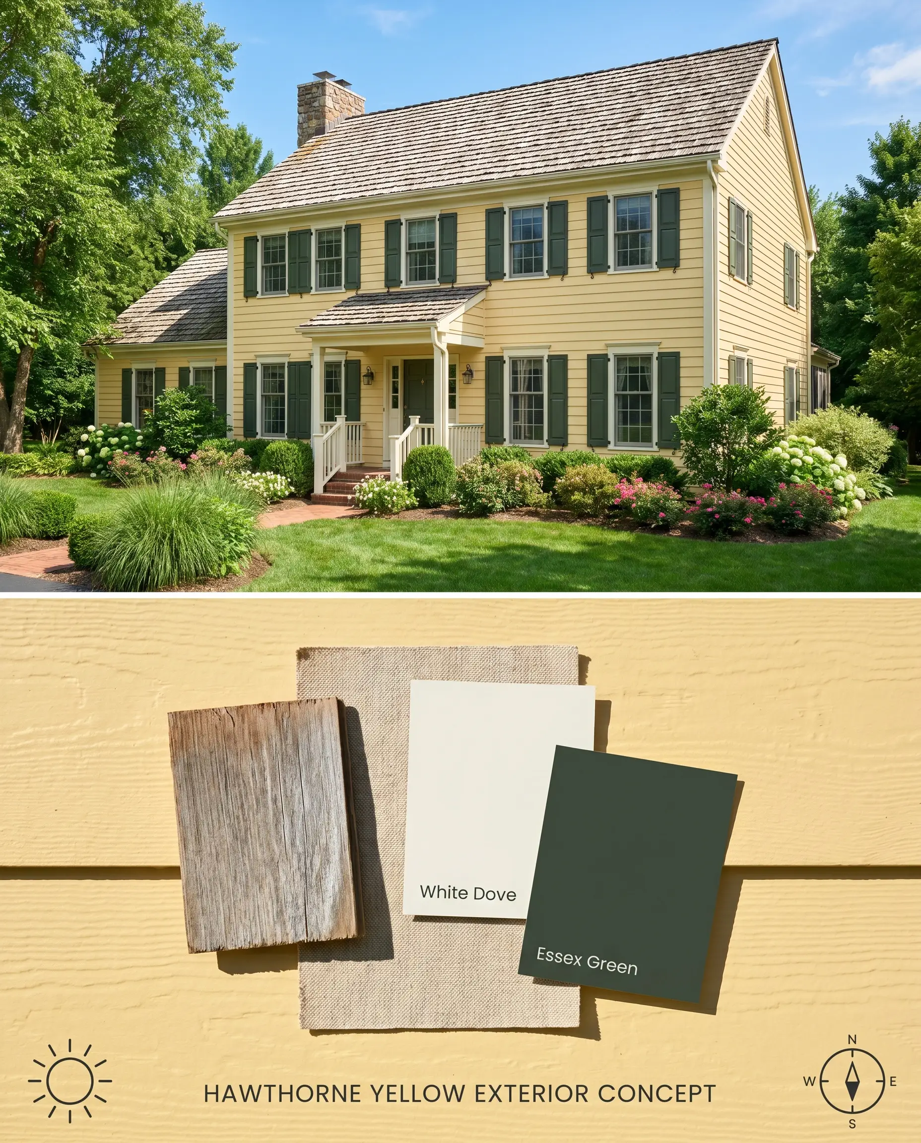
When applied to exterior lap siding, the high light reflectance value (LRV 73.04) of this heritage color expands the perceived footprint of the home. The warm chromatic profile holds its saturation against green landscaping, contrasting sharply with the organic chlorophyll tones without leaning acidic.
Dining Rooms
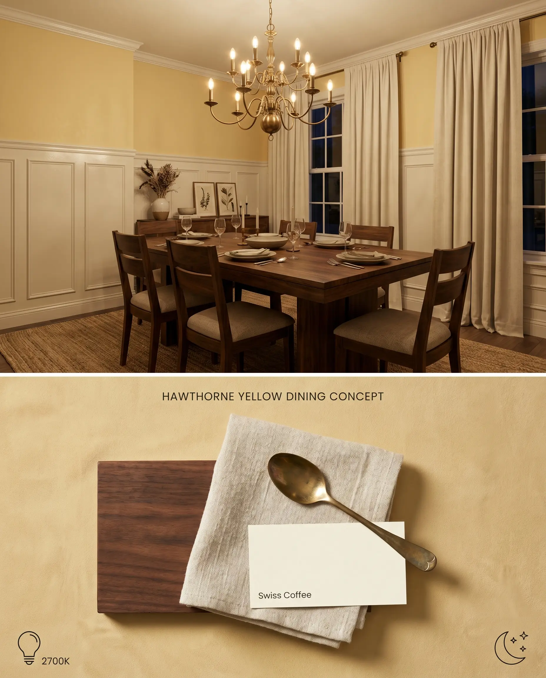
Wrapping a dining room in Hawthorne Yellow HC-4 above a classic wainscoting installation creates a glowing envelope that responds dynamically to incandescent evening lighting. The yellow pigments amplify the warmth of flickering candlelight or low-Kelvin chandelier bulbs, bouncing a flattering, amber-toned light across the room.
Windowless Hallways
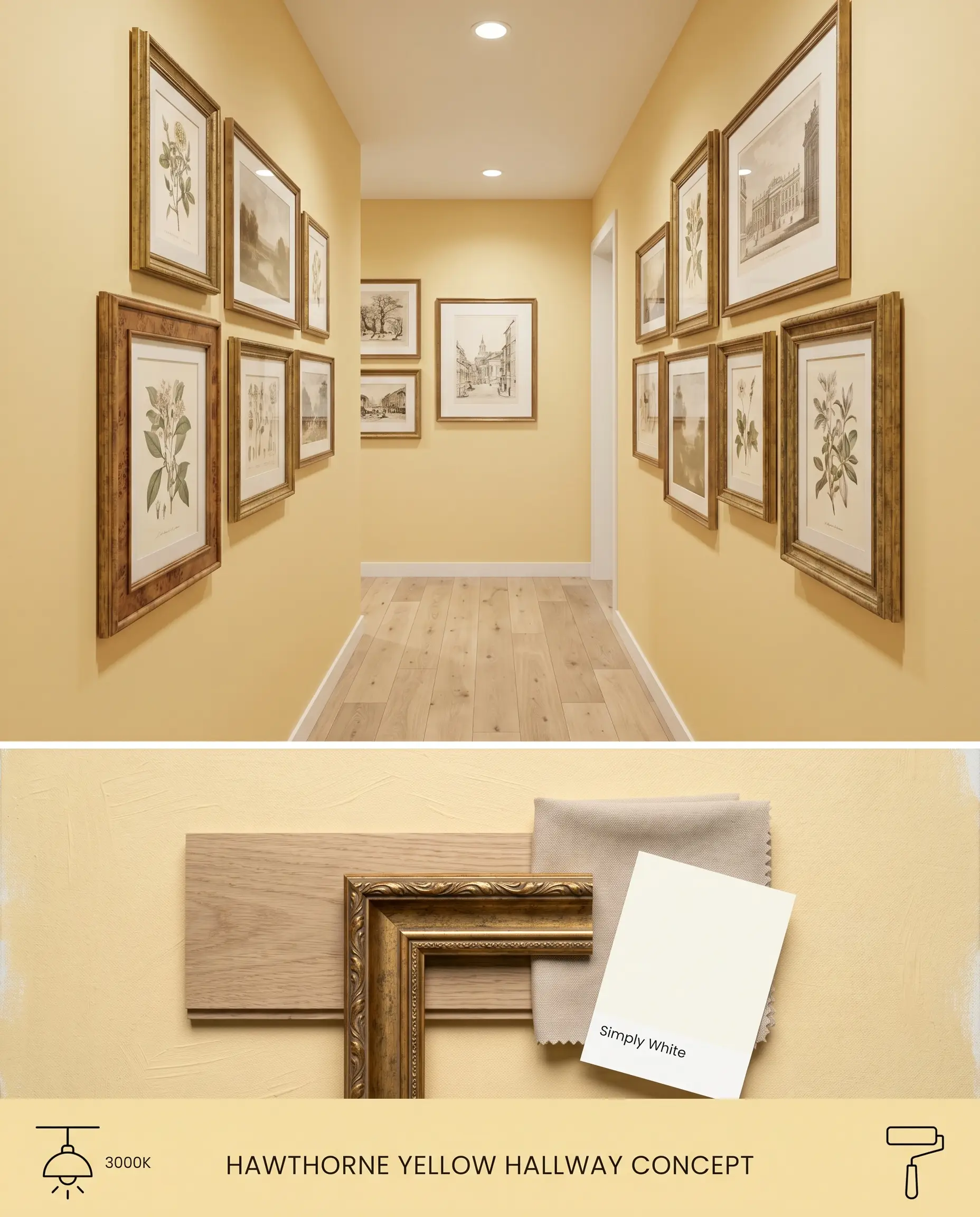
In transition spaces lacking natural fenestration, this color acts as an artificial light source, utilizing its 73.04 LRV to bounce overhead lighting down narrow corridors. The golden base combats the typical shadowing found in tight hallways, pushing the walls outward visually.
Front Doors
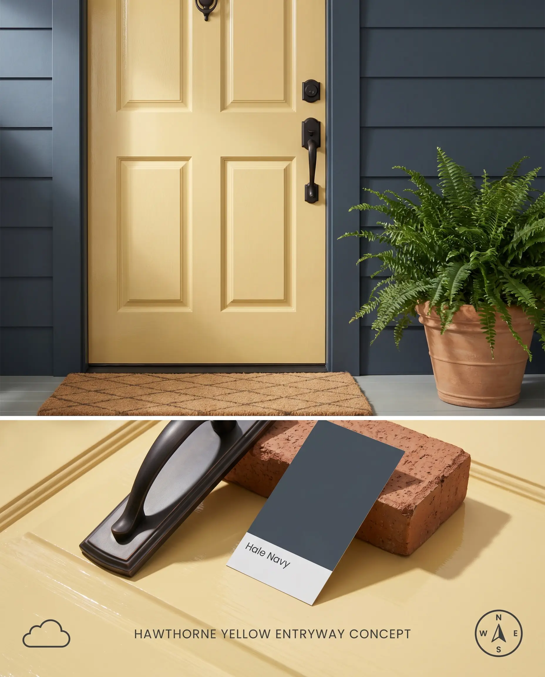
A Hawthorne Yellow HC-4 entry door serves as a high-visibility focal point against muted, cool-toned exterior claddings. The color’s historical roots allow it to bridge the gap between traditional brick facades and modern, high-contrast entryways by pulling the eye directly to the threshold.
You can apply wallpapers, paints, etc. on walls and see how they look in various interiors.

Head-to-Head Comparisons
Benjamin Moore Hawthorne Yellow HC-4 vs. Benjamin Moore Windham Cream HC-6
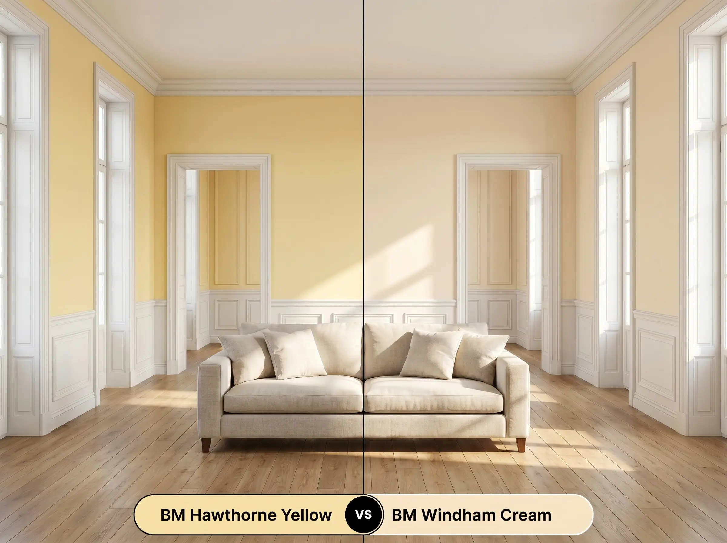
Benjamin Moore Windham Cream HC-6 features a higher LRV (79.05) and leans closer to a pastel cream with a distinct peach-orange undertone, making it softer and less assertive on the wall. Hawthorne Yellow HC-4 commits fully to a true yellow base, carrying more pigment weight and saturation. Specify Windham Cream HC-6 in small, sun-drenched rooms where you need a whisper of warmth, but utilize Hawthorne Yellow HC-4 for exteriors or large living spaces where the color must hold its ground against strong architectural features.
Benjamin Moore Hawthorne Yellow HC-4 vs. Sherwin-Williams Butter Up SW 6681
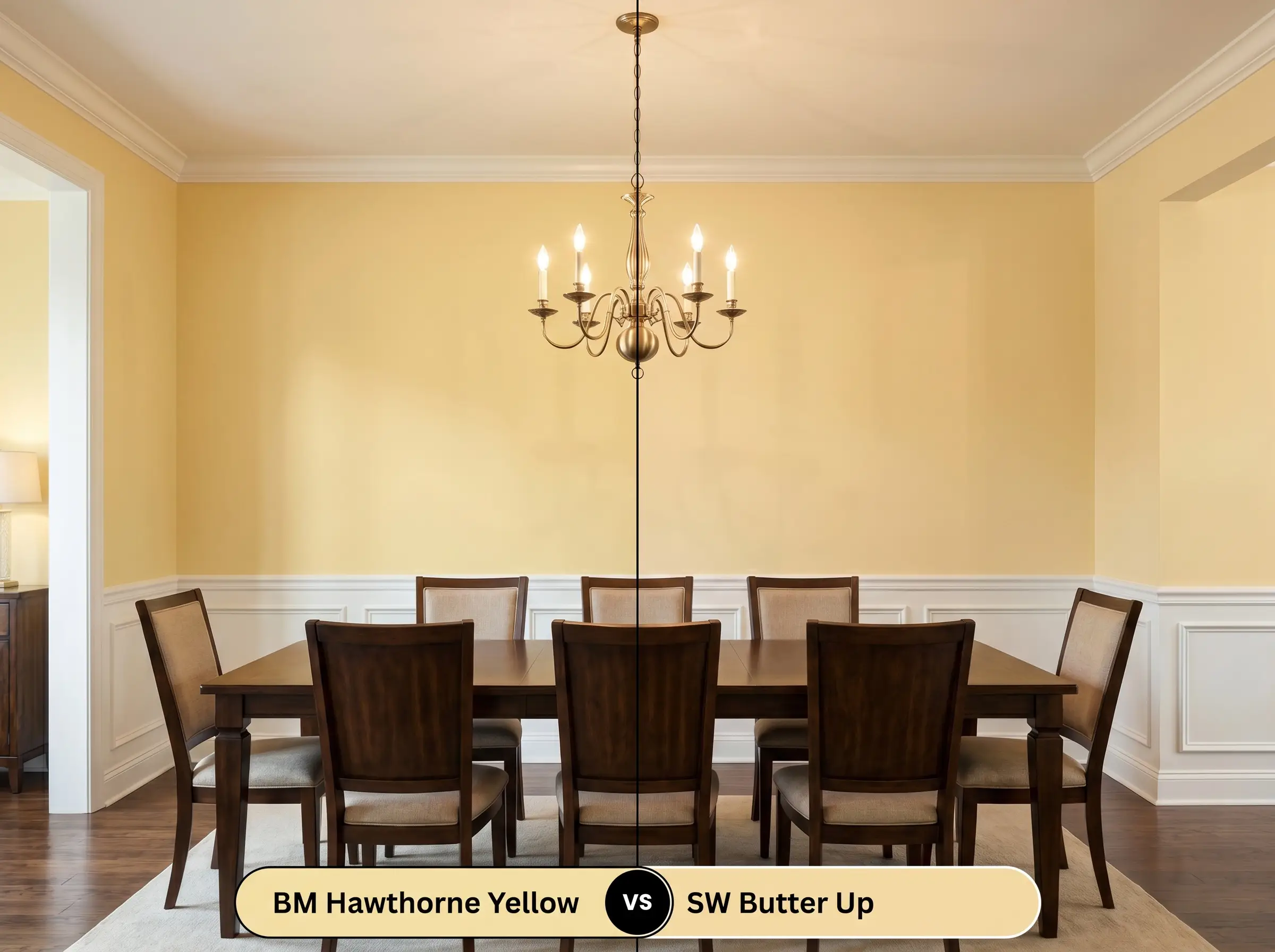
Sherwin-Williams Butter Up SW 6681 lacks the subtle gray cast found in Hawthorne Yellow HC-4, resulting in a cleaner, slightly more vivid yellow that can read as overly sweet in intense lighting. Hawthorne Yellow’s Historical Collection pedigree gives it a muted, tempered edge that prevents the color from turning fluorescent under direct exposure. Deploy Butter Up SW 6681 in dimly lit playrooms or laundry rooms requiring an artificial brightness injection, while reserving Hawthorne Yellow HC-4 for formal dining rooms and historical restorations where chromatic maturity is required.
Technical FAQs
Because North-facing light carries a cool, blue-tinted bias, it interacts with the yellow pigments in Benjamin Moore Hawthorne Yellow HC-4 to occasionally cast a faint, sickly green shadow in the corners. To counteract this optical color mixing, pair the paint with warm 3000K artificial lighting to neutralize the incoming blue light waves.
The strong orange and red undertones inherent in red oak and cherry flooring will amplify the warmth of Hawthorne Yellow HC-4, potentially pushing the entire room into an overly saturated, fiery palette. To mitigate this clash, use large, cool-toned area rugs in slate blue or sage green to physically separate the yellow walls from the red-based wood floor.
Direct, intense UV sunlight strips the perceived saturation from any paint color, and Hawthorne Yellow’s 73.04 LRV means it will reflect a massive amount of that light back at the viewer. On a Southern-facing exterior, it will read significantly lighter and closer to a pale, buttery cream rather than the rich yellow seen on an interior swatch.
The stark gray veining and icy white background of Carrara marble sit on the opposite end of the temperature spectrum from Hawthorne Yellow’s warm chromatic profile. This severe temperature mismatch forces the marble to look stark and sterile, while making the yellow paint appear muddy and aged by comparison.
Similar Paint Colors
Same Brand
Cross-Brand Equivalents