Beacon Hill Damask HC-2
Benjamin MooreBenjamin Moore's Beacon Hill Damask (HC-2) is a luminous, historical yellow with subtle green undertones. Boasting an LRV of 68.05, this muted heritage hue brings a soft, sunlit patina to traditional spaces, glowing warmly in both natural and artificial lighting.
Benjamin Moore Beacon Hill Damask: An Architectural Guide to Muted Goldenrod
Yellow paint is notoriously difficult to get right, often turning excessively bright or overly sweet the moment it hits the drywall. Benjamin Moore Beacon Hill Damask bypasses this common trap entirely. Its unique color structure acts as an architectural finish rather than just a decorative overlay, instantly maturing the aesthetic of a room.
This specific chromatic profile carries a subtle, sophisticated green-ochre cast that provides built-in visual tension. That hidden undertone gives the walls an incredibly sunlit patina, making the space feel both intentional and comfortably lived-in.
Whether you are updating a transitional townhouse or bringing warmth to a curated eclectic apartment, this historical yellow adapts beautifully to modern living. Let’s break down the exact physical traits that make this shade so highly functional.
Temperature, Undertones & LRV of Beacon Hill Damask
When homeowners ask if Benjamin Moore Beacon Hill Damask is warm or cool, the answer is definitively warm. This luminous warmth is rooted in its muted goldenrod base, but it is far from a standard, primary yellow.
With a Light Reflectance Value of 68.05, this heritage hue sits comfortably in the mid-light range. This precise measurement means it reflects enough ambient light to keep a room feeling expansive, yet holds enough pigment to avoid washing out completely when hit by direct sunlight.
You can apply wallpapers, paints, etc. on walls and see how they look in various interiors.

Lighting Effects & The Chameleon Factor
The hidden chartreuse base in Beacon Hill Damask makes it highly reactive to shifting environmental light. You must anticipate how your specific room orientation will pull these undertones forward.
If you are using this on an exterior, direct sunlight will significantly lighten the perceived color. Always sample it on both the shaded and sunlit sides of your house to ensure the ochre nuance doesn’t turn into a stark, pale pastel at high noon.
Hackrea Pro-Tip (The Facade Washout)
Popular Architectural Applications for This Heritage Hue
The mid-light LRV and complex undertones of this paint make it incredibly versatile across different architectural features. Here is how to manipulate this muted goldenrod in real-world spaces to achieve a highly curated look.
Modernizing the Living Room
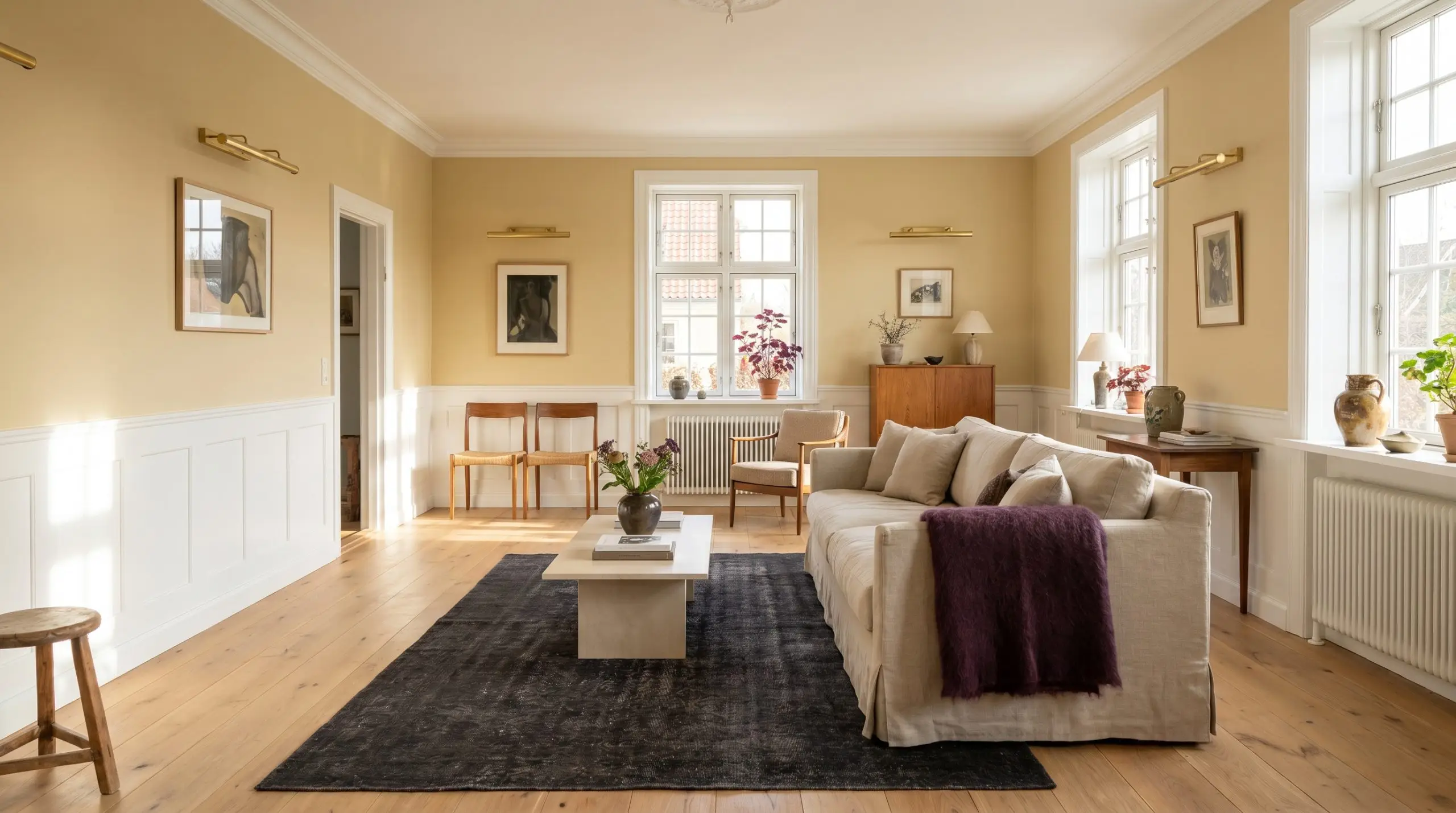
While often associated with heritage properties, this botanical yellow breathes incredible life into transitional and eclectic family living spaces. Apply it above crisp white wainscoting to establish a warm, inviting perimeter for everyday gatherings.
Pair the walls with a modern plinth coffee table, a slipcovered linen sofa, and unlacquered brass gallery lights to pull the aesthetic firmly into the present day.
To prevent a yellow living room from feeling dated, introduce contrasting textures like an aubergine mohair throw or a charcoal vintage rug. These darker textiles stabilize the luminous warmth and add necessary visual tension to the room.
Hackrea Design Secret (The Textile Bridge)
Elevating the Dining Space
Formal dining spaces thrive on atmosphere, and this colonial palette provides a stunning backdrop for evening dinner parties. Consider a full color-drenching approach, taking the paint across the walls, crown molding, and the ceiling.
This technique wraps the room in a sunlit patina that glows beautifully under dim, 2700K chandelier lighting. Balance the rich, saturated walls with a bleached oak pedestal table and woven French bistro chairs for a relaxed, high-end aesthetic.
Two-Tone Kitchen Cabinets
Updating builder-grade kitchen cabinets with this muted goldenrod instantly creates a bespoke, English Country feel for an avid home cook. Use it exclusively on the lower cabinets or a central island, pairing it with creamy white uppers to maintain an airy, open flow.
The subtle green-ochre cast pairs flawlessly with honed soapstone countertops and unlacquered brass bin pulls. If your kitchen receives heavy southern light, the lower cabinets will radiate a welcoming, baked-in warmth throughout the day.
Layered Guest Bedrooms
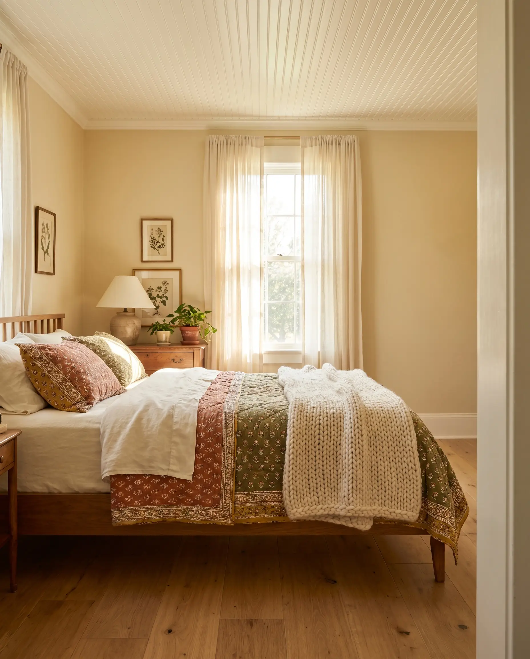
A guest bedroom should feel like a curated retreat, and this shade provides an incredibly soothing, optimistic foundation for visiting friends and family. Paint the walls and pair them with a beadboard ceiling to introduce subtle architectural texture.
Layer the bed with block-printed cotton quilts, washed linen sheets, and a chunky knit throw to lean into a refined Cottagecore aesthetic.
Avoid pairing this complex hue with stark, icy whites or cool-toned gray bedding. Those crisp tones will aggressively clash with the chartreuse undertone, making the yellow feel dirty rather than sophisticated. Stick to warm, creamy whites or earthy terracotta accents instead.
Clash Warning (The Pastel Trap)
Building a Cohesive Palette Around This Muted Goldenrod
This particular yellow requires highly intentional textural boundaries to hold its structural shape. Without crisp contrasting lines or deeply saturated secondary tones, its luminous warmth can easily bleed out and lose its sophisticated edge.
Selecting the Right White Trim
Tactile Elements and Hardware Finishes
Accent Shades and Secondary Hues
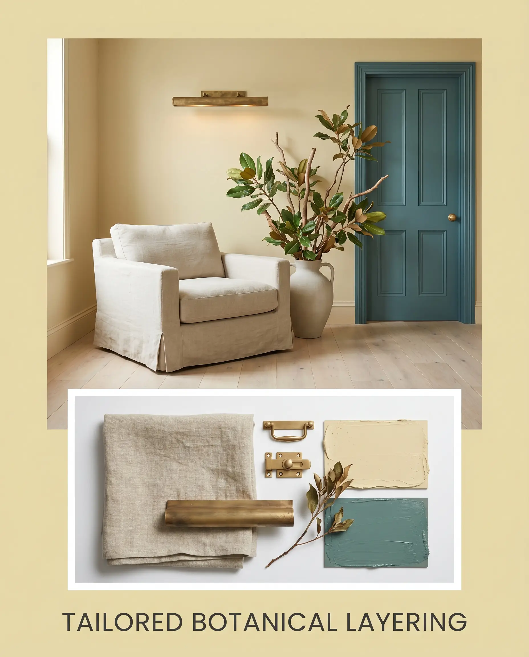
Curated Interior Concepts
The Artisan Collector This aesthetic leverages the baked warmth of the paint by pairing it directly with raw terracotta tile and deeply veined honed soapstone. Weave in a mid-century credenza and abstract ceramic sculptures to pull the vibe away from traditional roots and firmly into a curated, eclectic space. The resulting energy is grounded, worldly, and effortlessly sophisticated.
Tailored Botanical Layering Here, the chartreuse undertone takes center stage alongside accents of Benjamin Moore Waterbury Green HC-136. Introduce washed linen slipcovers and oversized botanical branches to soften the visual boundaries and create a serene, organic flow. The addition of unlacquered brass picture lights provides the necessary metallic flash to keep the muted tones from feeling flat.
Benjamin Moore Beacon Hill Damask vs. Rival Yellows
There are specific architectural scenarios—particularly in rooms with overwhelmingly cool north-facing light or highly modern, stark finishes—where this specific goldenrod might read slightly too acidic or muted. When the chartreuse base threatens to undermine your design goals, pivoting to a rival hue with a different structural makeup is the smartest path forward.
Benjamin Moore Beacon Hill Damask vs. Benjamin Moore Castleton Mist HC-1
If you are styling a room with incredibly low natural light, Castleton Mist offers a significantly higher LRV and a cleaner, more translucent yellow base. Then, pivot to Castleton Mist to bounce more light around the space and avoid the slightly muddied effect that the ochre nuance can sometimes produce in deep shadows.
Benjamin Moore Beacon Hill Damask vs. Benjamin Moore Hawthorne Yellow HC-4
Hawthorne Yellow strips away the complex green undertones entirely, delivering a much more traditional, straightforward butter-yellow. If your design relies on crisp, preppy contrasts with bright white trim and navy accents, then Hawthorne Yellow will provide that classic, uncompromised cheerfulness.
Benjamin Moore Beacon Hill Damask vs. Sherwin-Williams Jersey Cream SW 6379
Jersey Cream pushes much further into the beige and cream territory, completely abandoning the vibrant botanical energy. If you want the subtle suggestion of warmth without committing to a definitive yellow wall, then this Sherwin-Williams alternative acts as a highly forgiving, neutral backdrop.
Alternative Options and Color Matches
Finding the exact right level of pigment often requires testing a few micro-adjustments on the actual wall. Homeowners frequently need a slightly crisper finish to combat deep shadows or a slightly deeper tone to stand up to bold, dark woodwork.
Similar Shades Within the Same Brand
Color Matching Across Rival Brands
Execution Strategy and Professional Application
Once the color palette is finalized, the physical execution of the paint job dictates the final luxury feel of the room.
Recommended Sheens and Finishes
Primer Selection and Coverage Expectations
- Because yellow pigments are notoriously sheer, you must use a high-quality, white-tinted primer to create a blank, highly reflective base layer.
- Plan for a strict two-coat minimum to achieve full opacity and allow the complex ochre nuances to fully develop.
Rolling over partially dried sections of this mid-tone yellow will cause visible, uneven streaks that catch the light poorly. Always maintain a wet edge and let each coat dry completely to ensure a flawless, professional result.
Hackrea Pro-Tip (Avoiding the Flashing Effect)
Frequently Asked Questions
Because of its chartreuse undertone, this hue can absolutely pull a sickly green in spaces completely devoid of natural light. To counteract this, you must use warm 2700K artificial lighting to force the goldenrod base back to the surface.
This shade performs beautifully on exteriors, as the intense natural sunlight washes out the most intense green tones, leaving a warm, inviting colonial yellow. However, it will read significantly lighter outdoors, so always test a large swatch to ensure it retains enough pigment for your liking.
While it is possible, the icy blue undertones of cool gray marble often fight aggressively with the warm ochre base of the paint. You will achieve a much more cohesive, high-end look by opting for warmer stones like Taj Mahal quartzite or honed soapstone.
The pinkish-red tones inherent in red oak can actually create an unwanted, vibrating contrast against the yellow-green walls. If you have unstained red oak, grounding the space with a large, neutral rug is essential to break up the visual tension.
The Final Verdict on Benjamin Moore Beacon Hill Damask
Benjamin Moore Beacon Hill Damask is a highly sophisticated, architectural building block designed for homeowners who want to inject profound, lived-in warmth into their spaces. It excels in transitional living areas, curated dining rooms, and custom cabinetry where its complex, sunlit patina can be fully appreciated. This shade is the ultimate tool for bridging the gap between heritage elegance and modern, tactile design.
However, its specific color structure demands careful pairing. If your home is dominated by icy, cool-toned grays, stark blue-white LED lighting, or highly polished chrome fixtures, this paint will actively fight its environment. The cool, sterile nature of those elements will drag the muted goldenrod down, exposing its chartreuse undertone in a way that feels sickly rather than sophisticated. This hue requires warm, earthy counterpoints and rich textures to truly thrive on the wall.