Guilford Green HC-116
Benjamin MooreBenjamin Moore Guilford Green HC-116 is a gentle, medium-light silvery green with a warm yellow-gray undertone. Sitting comfortably in the Historic Color collection, it acts as a versatile, earthy neutral that brings a soft, organic luminosity to both traditional and contemporary spaces.
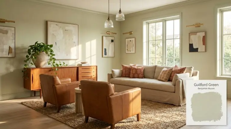
Benjamin Moore Guilford Green: The Luminous Silvery Sage Restoring Balance to Modern Homes
Certain pigments possess the rare ability to act as an architectural equalizer, softening rigid room layouts while demanding visual attention. Benjamin Moore Guilford Green HC-116 operates exactly in this elusive space. Rather than receding into a generic pastel background, this botanical wash establishes a highly intentional, tactile foundation for the entire home.
Its success lies in a complex chromatic profile that defies standard categorization. When applied to a wall, the color physically shifts the atmosphere, trading sterile modernism for a lived-in, earthy neutral warmth. This is not a flat, minty hue; it is a sophisticated structural layer that dictates how light and materials behave within the room.
Whether you are restoring a sprawling heritage property or injecting soul into a standard suburban build, this specific shade requires a strategic approach. By understanding its underlying color DNA, you can manipulate its historic landmark inspiration to serve entirely contemporary design goals.
Guilford Green HC-116: Temperature, Undertones & LRV
Benjamin Moore Guilford Green is definitively a warm paint color. High-volume search queries often question its true temperature, but a visual assessment of its structure reveals a robust warmth that prevents the shade from ever feeling icy or clinical. This inherent coziness makes it an incredibly forgiving architectural finish across diverse climates.
At an LRV (Light Reflectance Value) of 58.14, this hue absorbs just enough light to assert its presence on the wall without collapsing into shadow. It provides a highly stable mid-tone value that maintains its structural integrity across varying light levels. This specific LRV means the color will hold its own against bright windows without washing out into a generic off-white.
You can apply wallpapers, paints, etc. on walls and see how they look in various interiors.

The Chameleon Factor: Lighting Shifts
Because of its complex yellow-gray structure, this paint acts as a highly reactive surface, dramatically shifting its personality based on the literal angle of the sun.
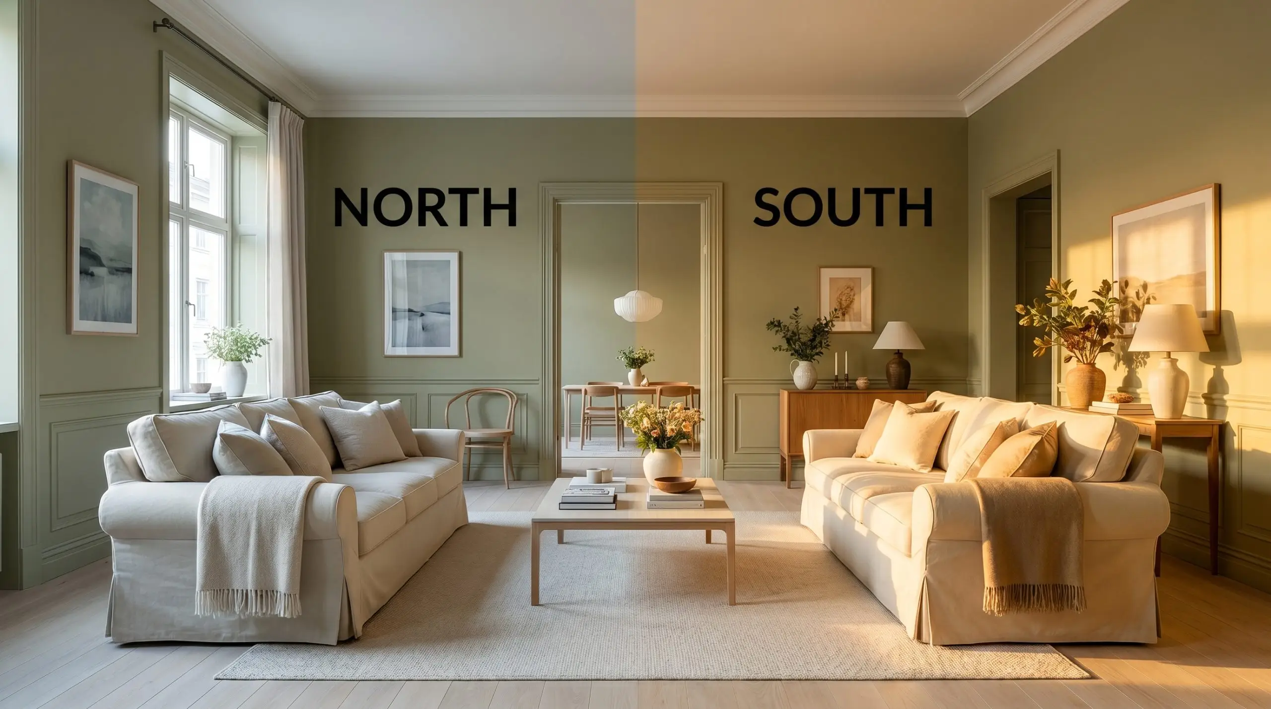
If you want to maintain the sophisticated, silvery nuance of this color in the evening, avoid ultra-warm Edison bulbs. Opt for a customized 3000K to 3500K LED to keep the green feeling fresh and intentional rather than muddy.
Hackrea Pro-Tip (The Bulb Rule)
Architectural Applications: Where to Use It
The true value of this mid-tone green lies in its remarkable elasticity across completely different architectural canvases. When you move beyond standard drywall applications, the paint becomes a powerful tool for redefining the character of your home.
Reviving Facades: Clapboard Siding & Historic Exteriors
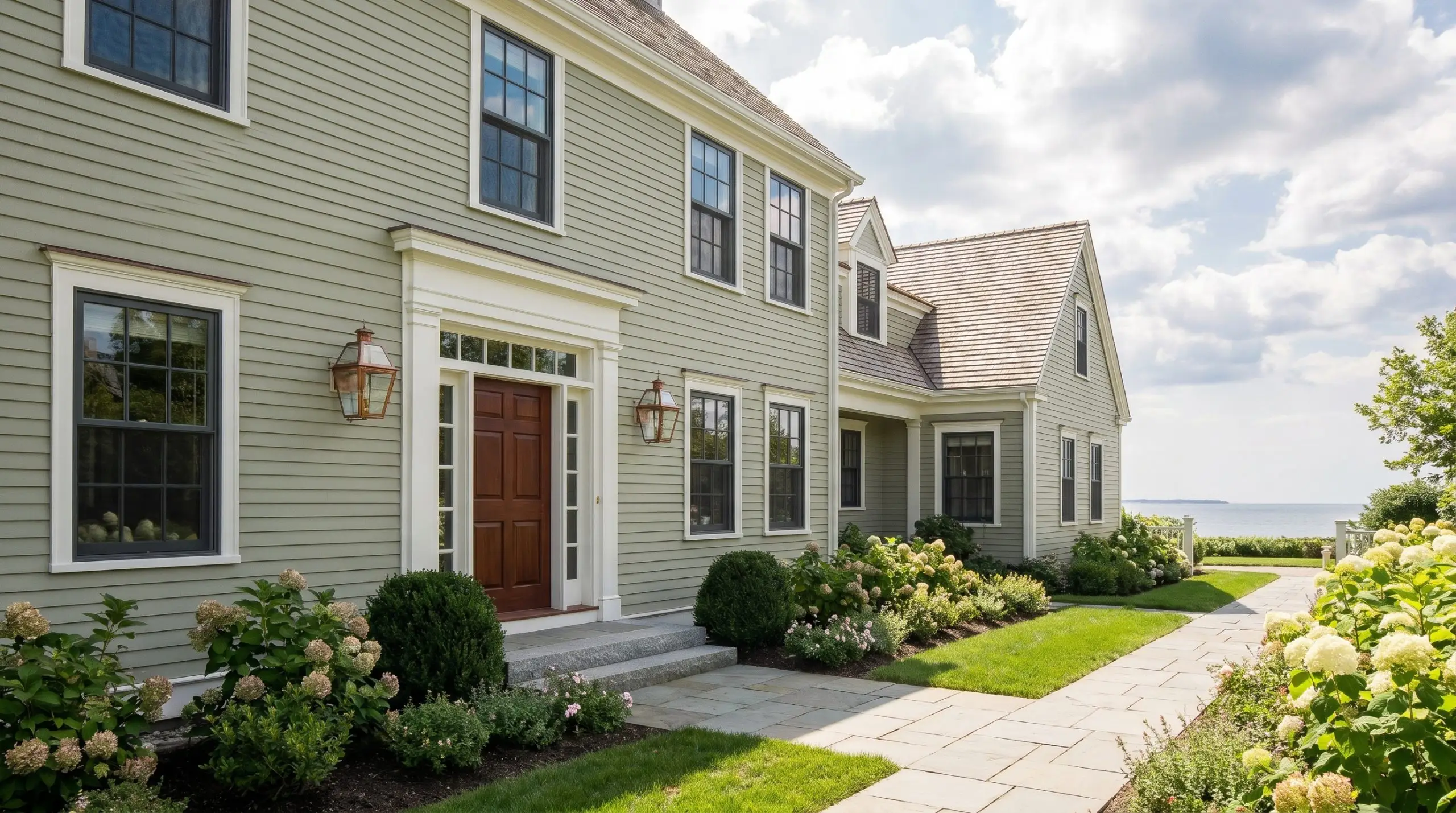
Applying this silvery sage to an exterior facade instantly updates the curb appeal of a home without erasing its architectural heritage. The natural sunlight will inevitably wash out the color by a few degrees, allowing the yellow-green bias to read as a soft, welcoming neutral rather than an overwhelming statement. For a highly curated exterior, pair the siding with standard crisp white trim and elevate the entry with a single premium element, like authentic copper lanterns or a solid mahogany front door.
If you are working with a classic colonial or a sprawling coastal cottage, avoid matching the shutters to the siding. Instead, introduce a stark, intentional contrast using a soft black or a deep charcoal gray on the window sashes and exterior doors. This sharp framing prevents the botanical wash from looking too sweet, lending the exterior a tailored, sophisticated edge.
Sun-Drenched Kitchen Cabinetry & Walls
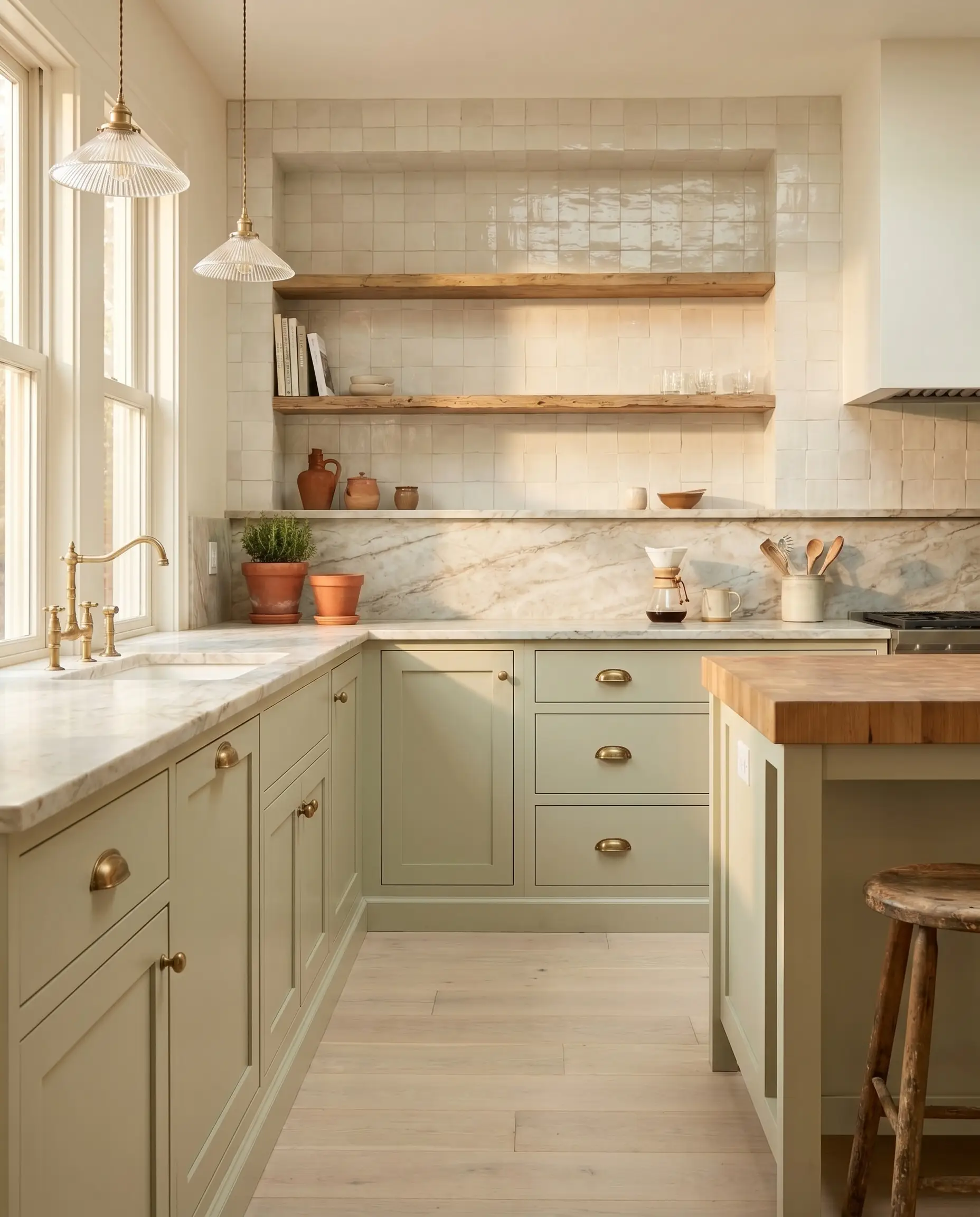
In a kitchen flooded with southern exposure, this hue transforms standard shaker cabinetry into a luminous, organic focal point. The warmth of the paint thrives alongside natural, unlacquered brass hardware, which will develop a living patina that echoes the earthy qualities of the green. To keep the space feeling modern and accessible, ground the room with practical bleached oak flooring and simple fluted glass pendants.
Avoid pairing this specific green with cool, blue-toned granites or stark, icy quartz. The yellow undertones will physically clash with the blue, making the countertops look dirty. Instead, opt for honed Carrara marble, warm soapstone, or butcher block to harmonize with the paint’s natural warmth.
Clash Warning (The Countertop Mistake)
When using it as a wall color behind open shelving, carry the paint seamlessly across the baseboards and window casings. Framing the walls with heavily textured zellige tile in a warm white creates a beautiful tactile collision that feels effortlessly high-end.
Layering Restorative Primary Bedrooms
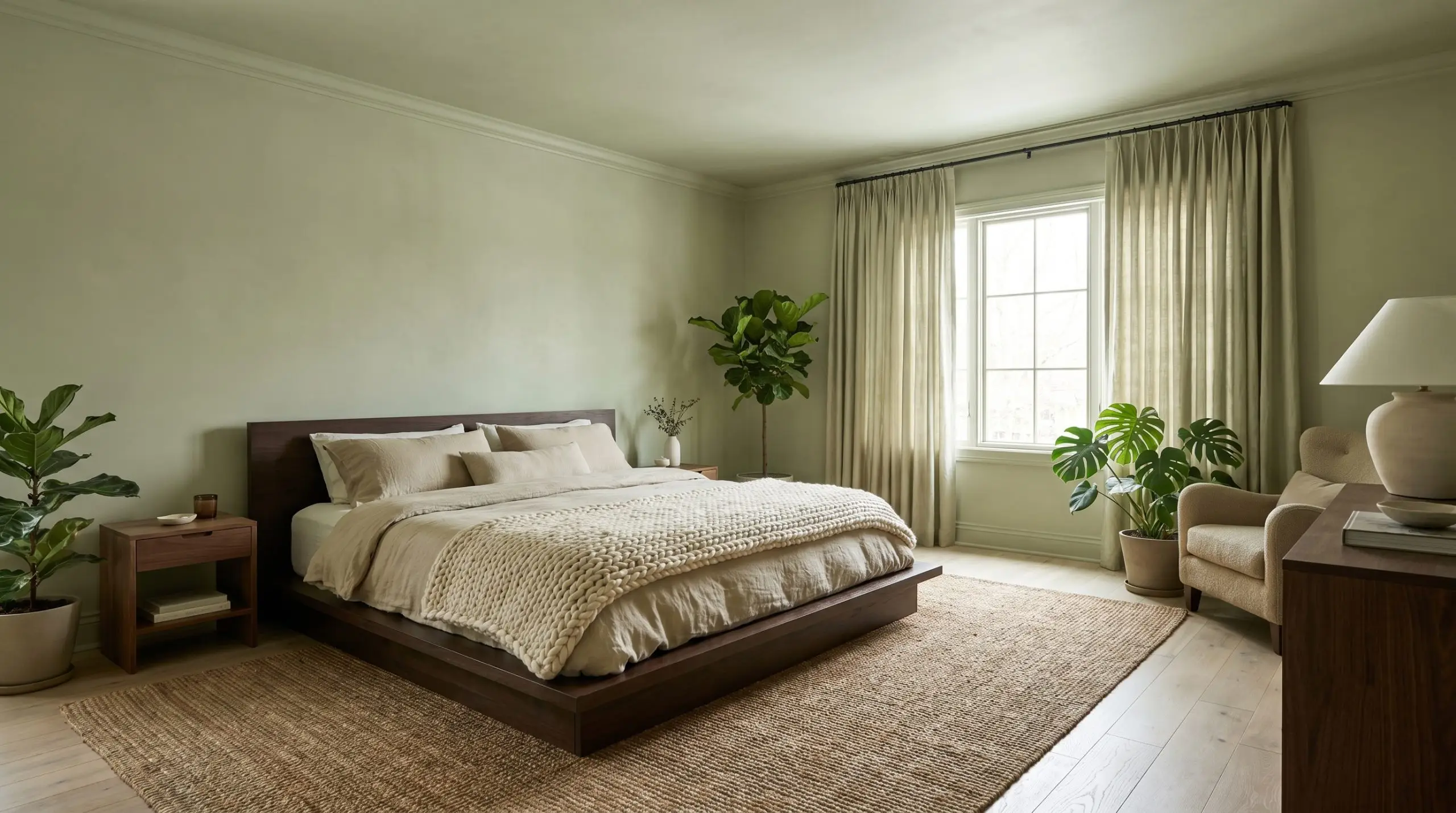
To create a restorative retreat, lean into the paint’s historic color collection roots by utilizing a full color-drenching technique. Painting the walls, ceiling, and trim in the exact same finish wraps the room in a continuous, calming botanical wash. This uninterrupted application blurs the sharp corners of the room, making standard-sized suburban bedrooms feel significantly larger and more cohesive.
Layering is critical when committing to this much green. Introduce contrasting textures through accessible textiles, like a chunky knit throw or washed linen bedding, but elevate the visual weight with floor-to-ceiling raw silk drapery. A platform bed in a rich espresso brown or burled wood will secure the airy green, ensuring the room feels intentionally designed rather than floating.
Styling Transitional Living Spaces
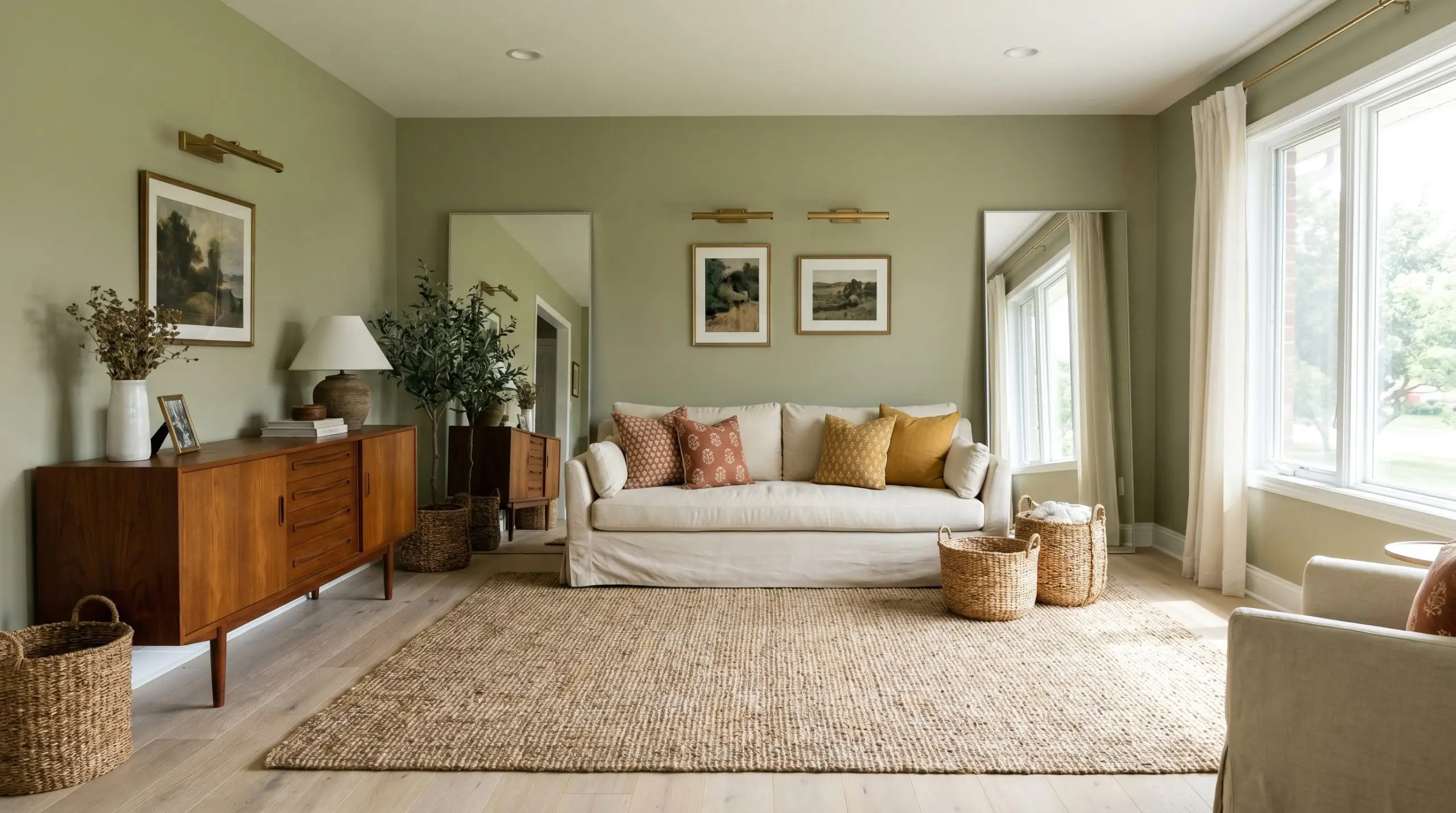
In a living room that blends multiple eras, this earthy neutral acts as the ultimate unifier. It provides enough saturation to stand up to robust mid-century teak sideboards while remaining soft enough to complement relaxed, slipcovered sofas. To maximize the transitional aesthetic, lay down a large, heavily textured jute or sisal rug to introduce a raw, organic element against the painted walls.
You can easily manipulate the mood of the room through your accent colors. Introduce subtle hits of terracotta or mustard yellow through block-print pillows and woven baskets to pull out the paint’s yellow-green bias. Conversely, pairing the walls with oversized leaning floor mirrors and brass picture lights will highlight the silvery sage undertones for a more refined, European-inspired atmosphere.
Elevating Millwork, Beadboard & Wainscoting
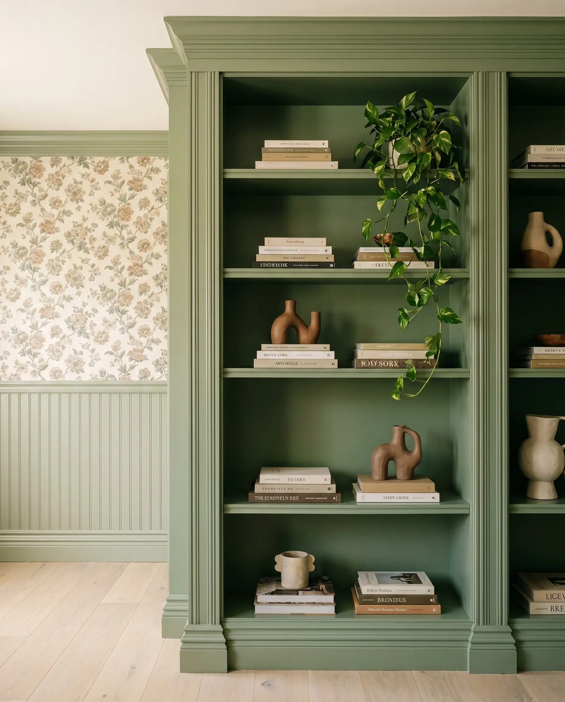
When applied to architectural features like wainscoting, picture frame molding, or beadboard ceilings, the paint’s structural qualities truly shine. Using a satin or semi-gloss finish on lower wall millwork forces the light to bounce off the varying depths of the wood, highlighting the intricate details of the trim. Pairing a green beadboard half-wall with a classic floral wallpaper above it instantly delivers a timeless, bespoke aesthetic.
For a more contemporary execution, paint built-in living room bookshelves entirely in this shade, including the interior backing. This creates a rich, saturated backdrop that makes stacked art books, abstract ceramic sculptures, and trailing pothos pop visually.
Coordinating Colors & Material Pairings for Guilford Green
This botanical wash demands contrasting textures to establish its presence, relying on crisp boundaries to keep its yellow-green bias from bleeding out into surrounding elements. The specific undertones react beautifully to warm, tactile materials that pull out its historic depth rather than competing with it.
Selecting the Right Trim & Baseboards
Tactile Elements & Hardware
The Secondary Paint Palette
Designer Mood Boards
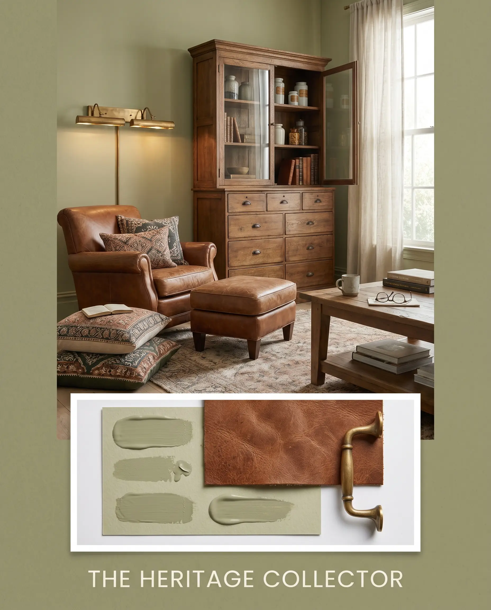
The Heritage Collector This aesthetic relies on deep, historic layering to create a room that feels intentionally collected over decades rather than purchased all at once. The silvery sage walls serve as a subdued backdrop for a rich mix of saddle leather seating and an antique apothecary cabinet. To nail this look, introduce intricately patterned block-print pillows and frame the space with warm, unlacquered brass picture lights. The resulting energy is quietly sophisticated, balancing traditional silhouettes with raw, everyday comfort.
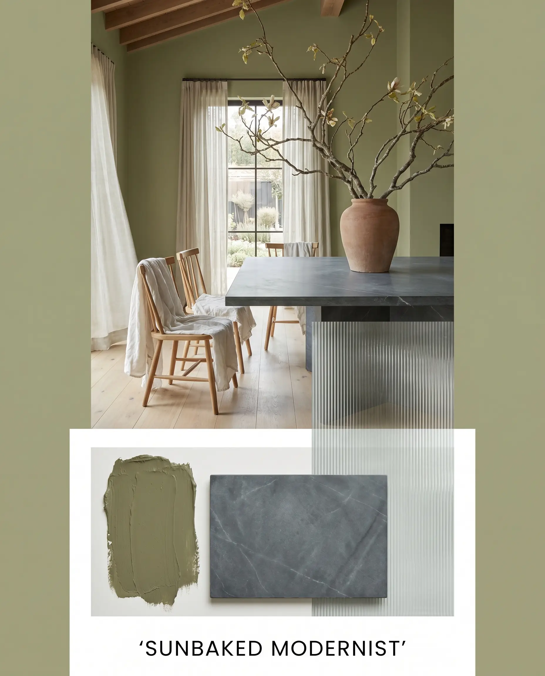
Sunbaked Modernist Here, the botanical wash shifts into a distinctly breezy, organic gear by embracing the paint’s yellow-green bias. Honed soapstone surfaces establish a firm, dark contrast, while simple fluted glass elements keep the light bouncing freely around the room. You can soften the hard architectural lines by draping washed linen over spindle chairs and incorporating oversized branches in raw ceramic vessels. The final mood is entirely restorative, feeling both highly intentional and effortlessly relaxed.
Comparing Benjamin Moore Guilford Green to Rival Shades
Navigating the specific lighting conditions of your home often reveals when a seemingly perfect shade might fail to perform. If your room lacks natural light or features challenging architectural elements, you must pivot to a color with a slightly different undertone structure to achieve the desired effect.
Benjamin Moore Guilford Green vs. Benjamin Moore Soft Fern 2144-40
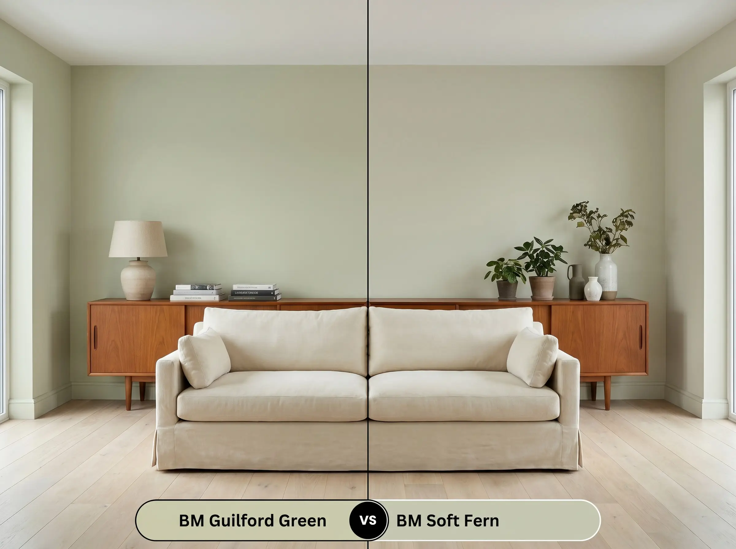
If you are dealing with a stark, north-facing room that drains the warmth out of your walls, then Soft Fern provides the necessary correction. Soft Fern carries a much stronger yellow-olive base, which prevents the color from flattening out into a chilly gray under cool light. However, if your room receives intense afternoon sun, Guilford Green remains the superior choice, as its silvery structure keeps the walls from turning overly yellow.
Benjamin Moore Guilford Green vs. Sherwin-Williams Sea Salt SW 6204
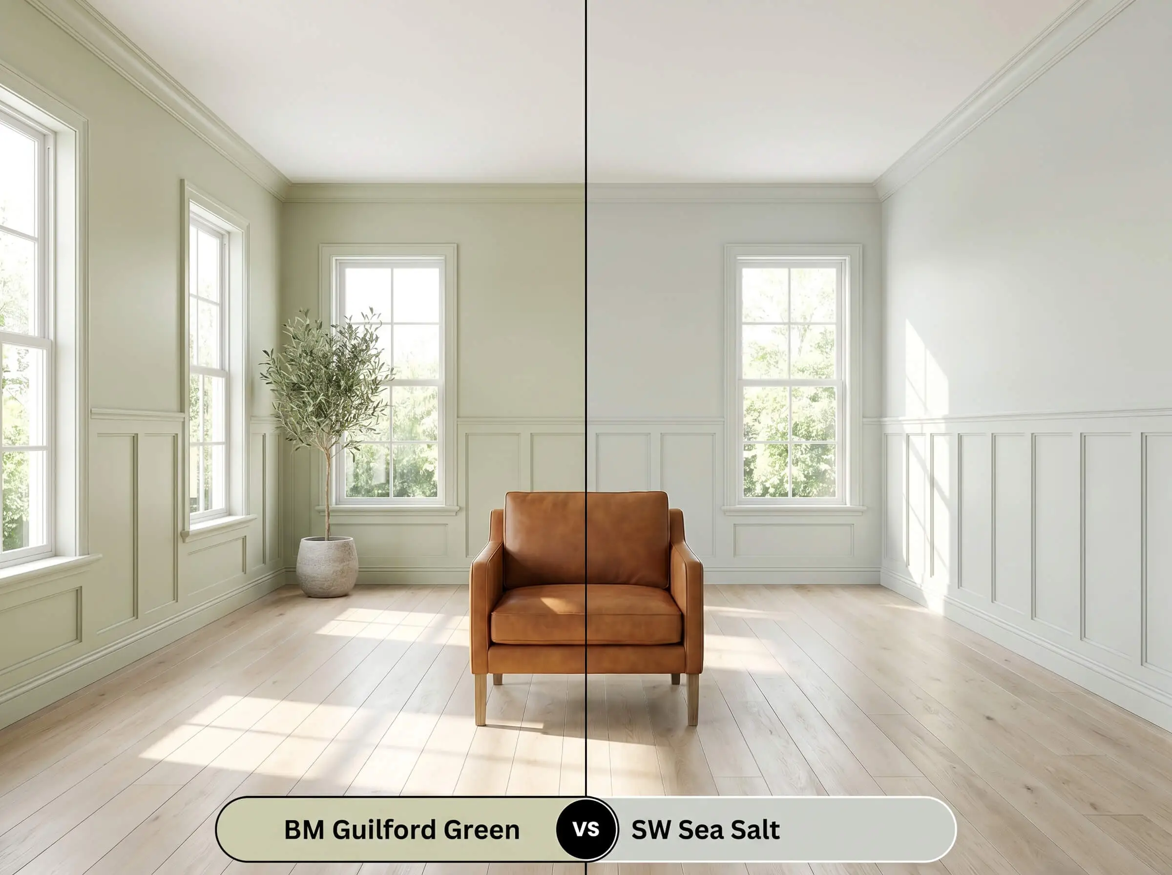
If your design goal is a crisp, coastal aesthetic, then Sherwin-Williams Sea Salt will deliver the required blue-gray undertones that HC-116 completely lacks. Sea Salt reads as a watery, shifting chameleon that leans distinctly cool, making it ideal for bright transitional spaces. Choose Guilford Green instead if you need an earthy neutral that pairs seamlessly with warm wood tones and rich leathers.
Color Matching & Alternative Options
Minor shifts in a room’s natural exposure or the specific inventory of your local paint store may force you to seek out a close alternative. These curated matches ensure you maintain the intended organic warmth without compromising the overall design.
Same-Brand Alternatives
Cross-Brand Matches
Technical Application & Paint Finish Guide
Translating this complex color from a tiny swatch to a vast expanse of drywall requires strict attention to your sheen selection and application technique.
The Dynamic Sheen Guide
Primer Strategy & Coverage Tips
Because of its stable LRV of 58.14, a standard high-quality white primer is entirely sufficient to block out previous wall colors. This specific depth of pigment generally requires two full coats to achieve a professional, opaque finish.
To avoid flashing—those visible, uneven streaks that catch the light—you must maintain a wet edge while rolling this mid-tone. Do not stretch the paint too thin across the drywall, as touch-ups on a satin or eggshell finish will inevitably show if the initial coat is uneven.
Hackrea Design Secret (The Roller Warning)
Frequently Asked Questions
The yellow-green bias actually harmonizes beautifully with the warm, red-orange tones of traditional oak floors. Because both elements share a warm structural foundation, the green neutralizes the aggressive red in the wood, making the floors feel more subdued and intentional rather than dated.
Intense, direct sunlight will significantly wash out the mid-tone value, causing the paint to read much lighter and more yellow on a stucco facade. To counteract this fading effect in high-UV areas, you often need to drop down one shade darker on the color card to maintain the intended silvery sage appearance.
This hue thrives on cabinetry when paired with highly tailored, modern finishes that ground its sweetness. By utilizing a sleek semi-gloss finish, introducing honed stone countertops, and avoiding checkered floors or chrome hardware, the green reads as a sophisticated, organic modern focal point rather than a vintage replica.
The golden warmth of the unlacquered brass physically pulls the yellow undertones forward, which suppresses the silver cast slightly. This dynamic interaction warms up the entire room, creating a rich, inviting aesthetic that highlights the paint’s historic roots.
The Final Verdict on Guilford Green
Benjamin Moore Guilford Green HC-116 is the ultimate architectural equalizer for homeowners who want to inject profound warmth into their spaces without relying on stark whites or predictable grays. Its complex balance of silvery sage and yellow-green makes it an incredibly forgiving choice for living rooms, transitional spaces, and extensive millwork. This paint thrives in homes that embrace a mix of eras, seamlessly uniting raw, tactile materials with refined, historic silhouettes.
While this luminous organic tone is highly adaptable, it possesses specific undertones that will actively fight against cool, icy environments. You must avoid pairing this shade with stark, blue-toned LED lighting, cool gray luxury vinyl plank flooring, or prominently veined cool quartz countertops. When placed next to these chilly elements, the yellow bias in the paint physically recoils, causing the green to look sickly and muddy rather than fresh. If your home is already locked into a rigid, cool-toned gray palette, introducing this specific botanical wash will create an uncomfortable visual tension that undermines your entire design.