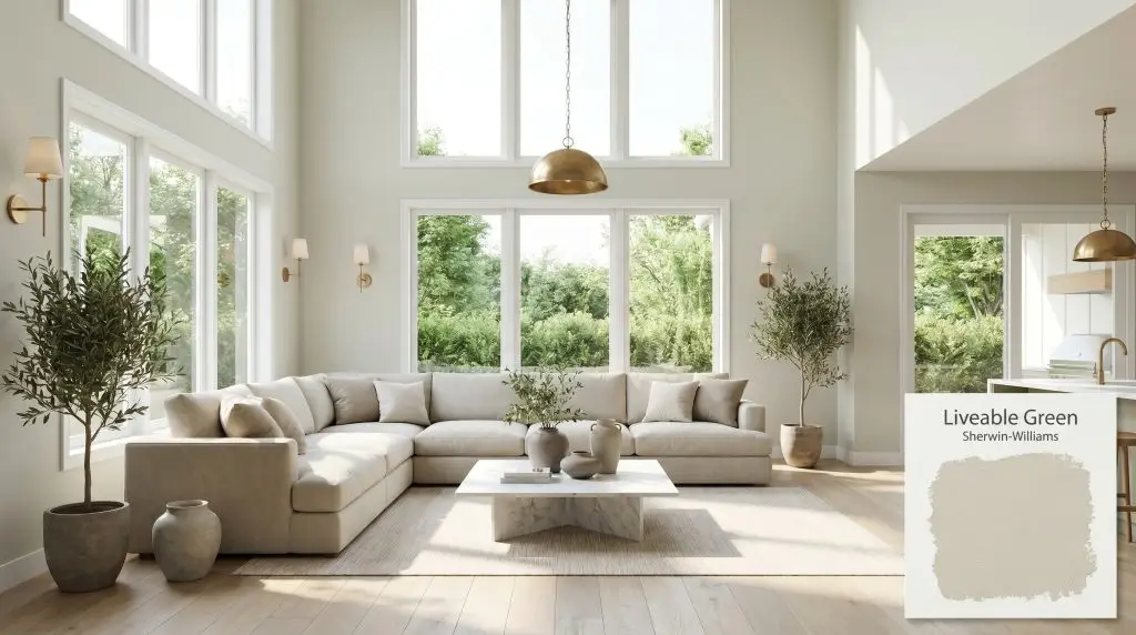
Sherwin-Williams Liveable Green (SW 6176) is a soft, muted sage green with an LRV of 61. Featuring a cool green base warmed by subtle yellow-gray undertones, this versatile architectural finish brings an organic, earthy tranquility to living rooms, bedrooms, and kitchen cabinetry.
Will Liveable Green clash with your room?
Paint Technical Profile
| Color ID / SKU | SW 6176 |
| HEX Code | #CECEBD |
| Light Reflectance (LRV) | 61 |
| Temperature | Warm |
| Primary Undertone | Gray |
| Hidden Undertones | Yellow, Subtle Blue |
| Use | Interior, Exterior |
| Best Exposures | South-facing, West-facing |
| Best For | Kitchen Cabinets, Bedrooms, Living Rooms, Home Offices, Bathrooms |
Liveable Green Digital Design Concept Boards
Kitchen Cabinets
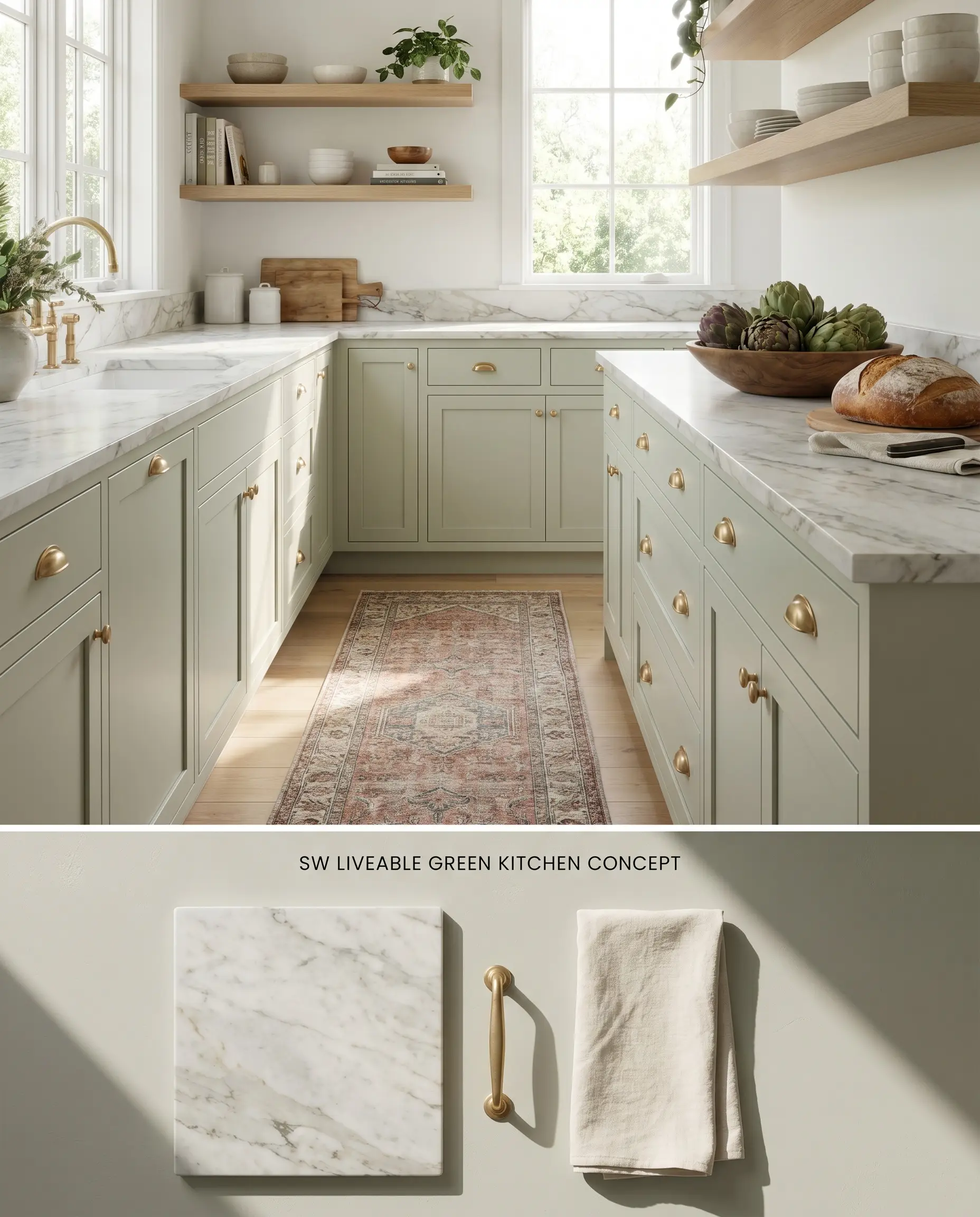
Sherwin-Williams Liveable Green SW 6176 anchors lower cabinetry by absorbing abundant natural sunlight, preventing the color structure from washing out into a stark neutral. The muted green tone physically contrasts against honed Danby marble countertops, emphasizing the stone’s subtle gray veining while providing a grounded base for the room’s visual weight. This specific chromatic profile requires careful pairing with unlacquered metals to enhance its warm sage characteristics.
Restful Bedrooms
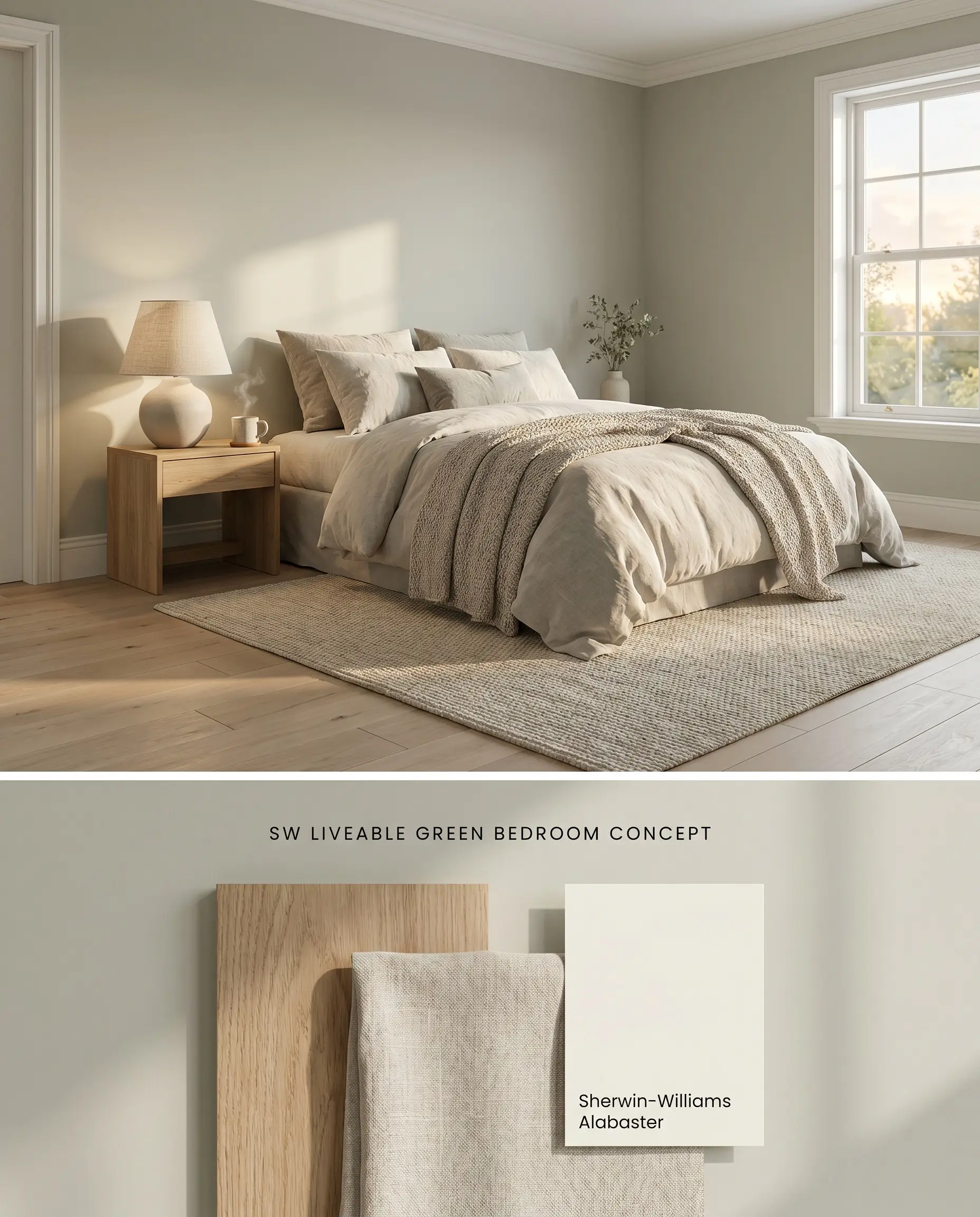
Applied to bedroom walls, this warm sage absorbs the cooler spectrum of morning light, neutralizing into a balanced gray-green envelope. The yellow-gray undertones temper the cool green base, preventing the walls from reading icy when placed against textured linen bedding and matte white oak flooring. You must strictly avoid orange-toned maple flooring in this space, as simultaneous contrast will force the paint to flash an unwanted cool blue.
Open-Concept Living Rooms
Will Liveable Green work with your specific lighting, floor, or furniture?
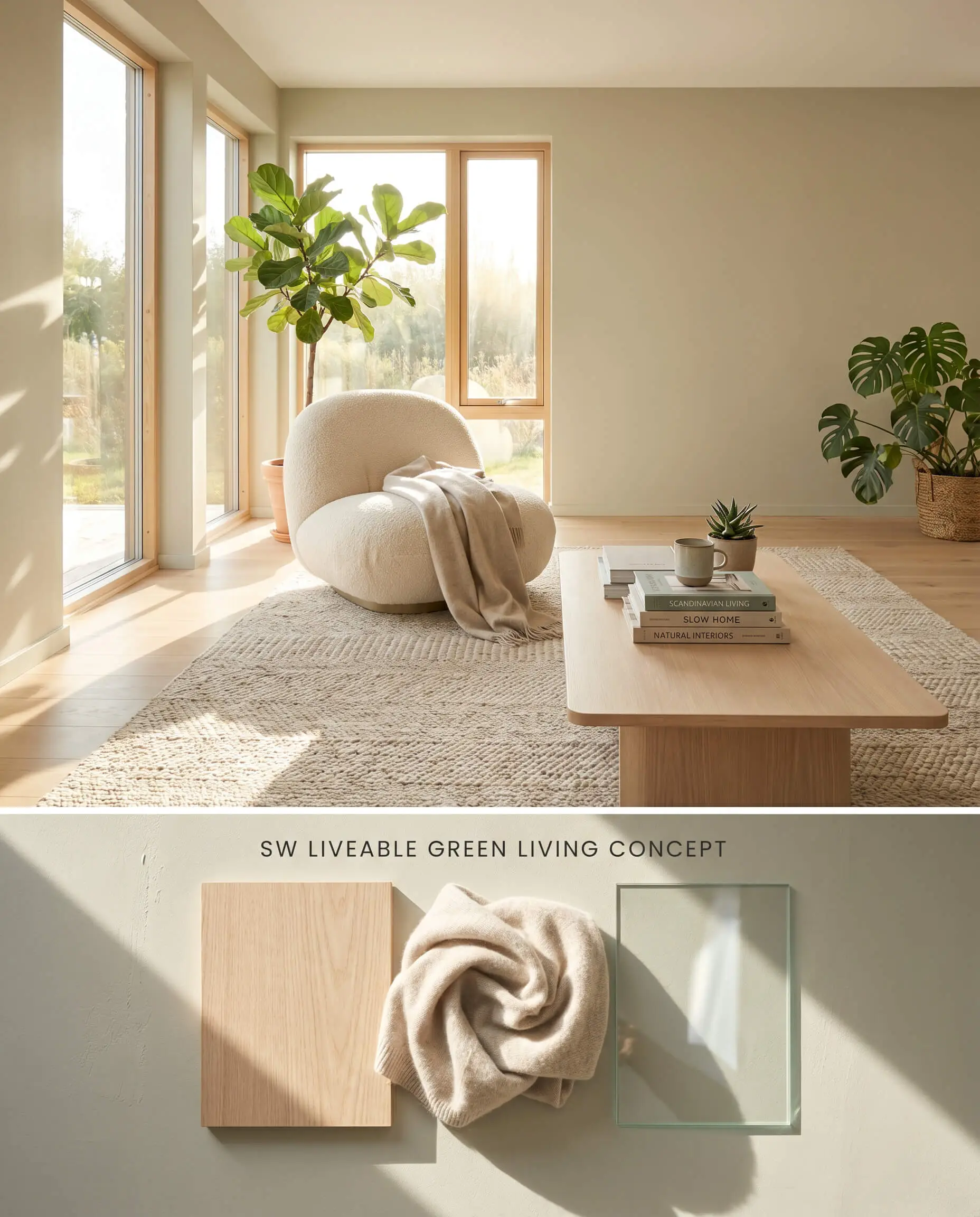
In expansive floor plans, an LRV 61 provides enough light reflectance value to bounce ambient daylight across the room without causing the glare associated with stark whites. The paint exhibits a strong bounce effect; green foliage immediately outside the windows reflects through the glass, pulling the paint’s green base forward and altering its perceived cast. Because of its low-chroma nature, dark existing walls will easily bleed through the finish if not properly isolated.
Home Offices
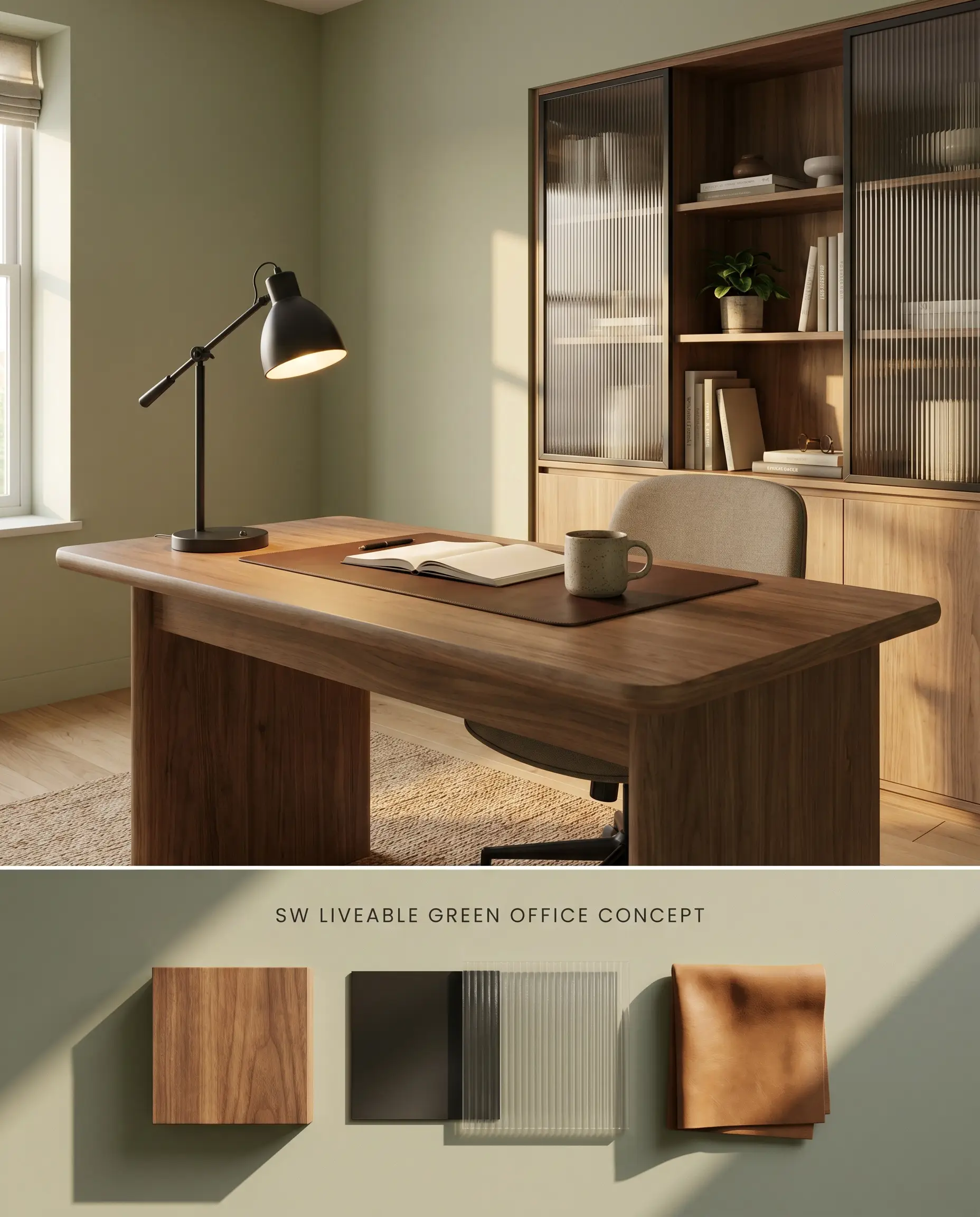
Will Liveable Green work with your specific lighting, floor, or furniture?
Wrapping a home office in this muted green reduces eye strain by absorbing harsh monitor glare into its low-chroma surface. The color’s structural gray undertones anchor the walls, allowing natural walnut desks and matte black metal fixtures to pop visually against the receding backdrop. This application relies on the paint’s ability to maintain its structural integrity without commanding too much attention during concentrated work hours.
Spa-Like Bathrooms
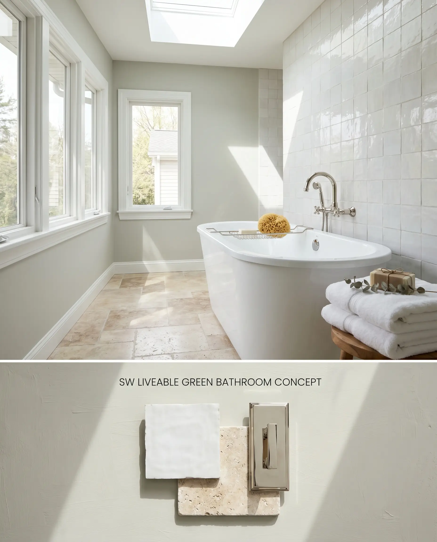
This organic modern shade physically brightens washrooms by bouncing natural light off glazed ceramic zellige tiles, creating a cohesive, unbroken visual envelope. The shade requires ample natural light to activate its subtle green pigments. In windowless spaces or dim hallways, the lack of photons causes the gray undertones to completely consume the green, resulting in a flat, muddy aesthetic.
Head-to-Head Paint Comparisons
Sherwin-Williams Liveable Green SW 6176 vs. Sherwin-Williams Softened Green SW 6177
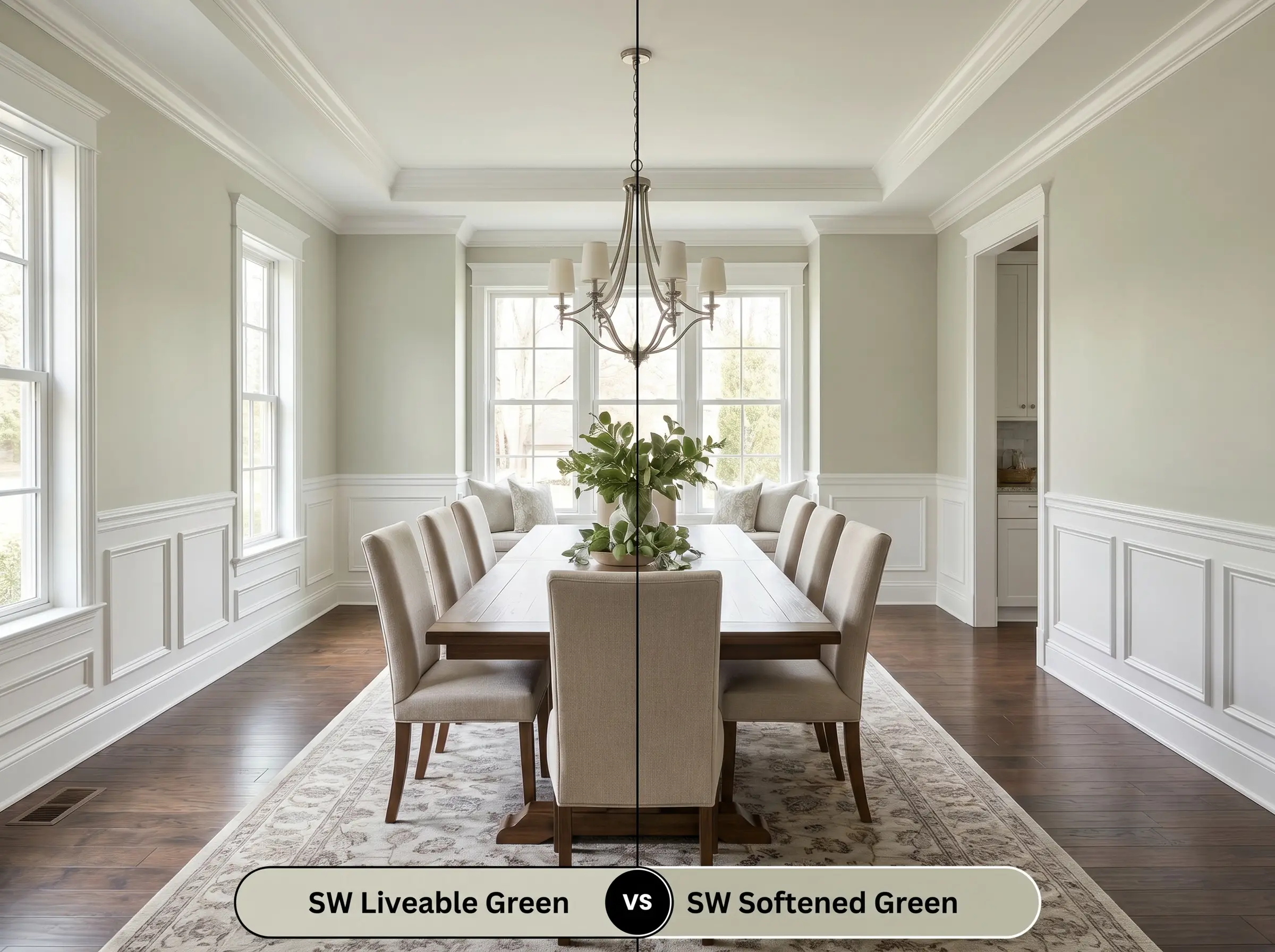
Softened Green operates with an LRV of 51, meaning it absorbs significantly more light and carries a denser, more saturated pigment load than Liveable Green. Use Liveable Green to bounce light across wide, moderately lit living rooms where a receding neutral is required. Specify Softened Green for enclosed dining spaces or wainscoting applications where you want the walls to visually advance and enclose the space with a stronger green presence.
Sherwin-Williams Liveable Green SW 6176 vs. Sherwin-Williams Sea Salt SW 6204
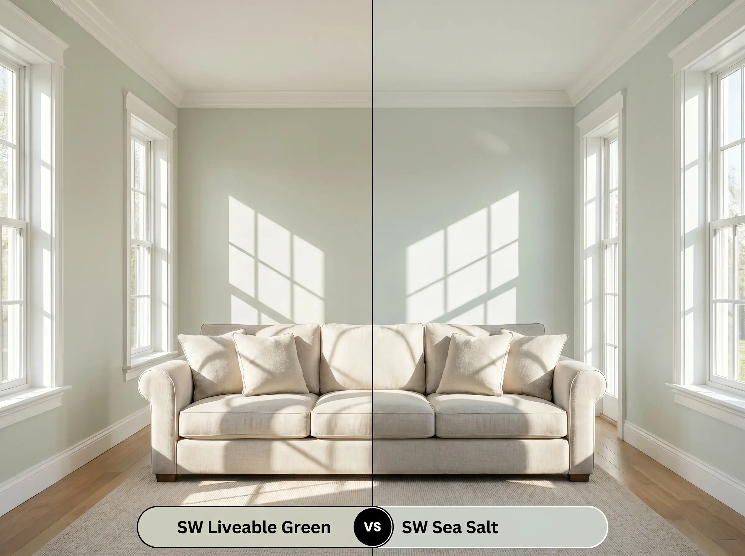
Sea Salt carries a distinct blue-gray undertone that physically cools down rooms receiving intense, direct southern heat. Conversely, Liveable Green utilizes its yellow-gray undertones to maintain a warmer temperature without leaning into mint. Deploy Sea Salt to counteract harsh afternoon sun, and use Liveable Green to warm up eastern-facing rooms where you want a green footprint without the risk of flashing blue.
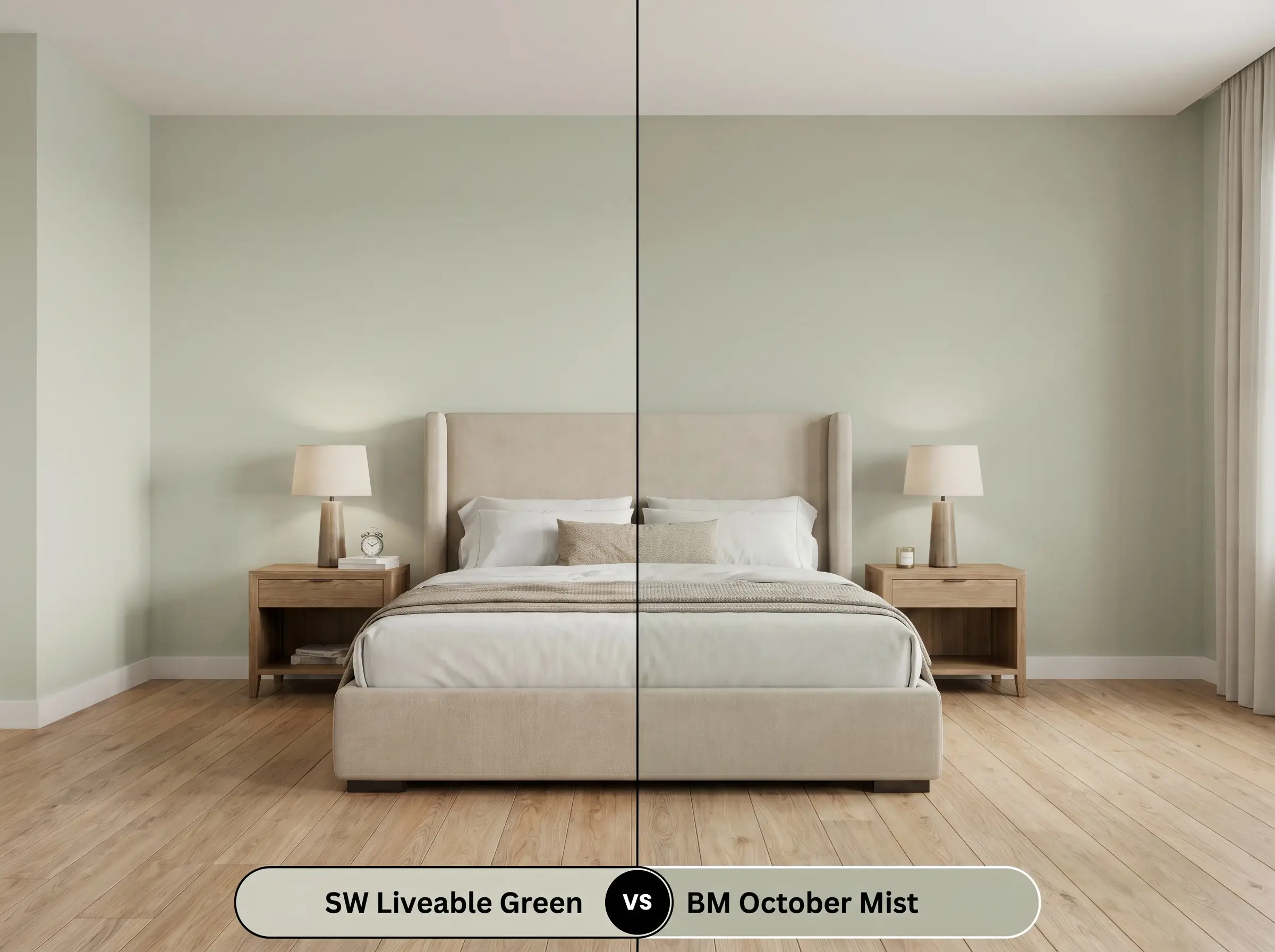
Sherwin-Williams Liveable Green SW 6176 vs. Benjamin Moore October Mist 1495
Will Liveable Green work with your specific lighting, floor, or furniture?
October Mist features an LRV of 46.54, presenting as a darker, earthier olive-toned shade that commands heavy visual weight on a wall. Liveable Green operates as a lighter, highly reflective alternative. Specify Liveable Green for primary wall applications where high light reflectance is structurally necessary, and reserve October Mist for grounding lower cabinetry or creating deep contrast on architectural focal points.
Technical Color FAQs
Yes, in north-facing rooms, the cooler, indirect light pulls the blue-green base forward. Pairing it with warm wood tones further exacerbates this shift through simultaneous contrast.
Orange-toned maple and strong yellow walls clash directly with this shade. These warm, high-chroma elements force the muted green to appear artificially cool and disjointed.
In spaces lacking natural light, the yellow-gray undertones dominate and flatten the color structure. This low-light environment causes the paint to lose its green vitality, appearing muddy and dull.
No, its low-chroma structure struggles to conceal dark or uneven substrates. A high-quality primer is strictly required to prevent the underlying color from bleeding through and altering the final tone.
Room Compatibility & Clashes Diagnoses
Hackrea's reports evaluating the compatibility of Liveable Green in real rooms.North-Facing Bedroom
"Cool northern daylight turns this paint toward a quiet eucalyptus-gray, establishing an organic balance against the warm linen headboard and metallic lighting."
North-Facing Dining Corner
"The paint's organic undertones harmonize with the dark flooring, but indirect northern light threatens to wash out its green nuance and create visual tension against the saturated amber dining chairs."
Paint Aesthetic & Practical Analysis
| Profile | Analysis | |
|---|---|---|
| Aesthetic | Liveable Green SW 6176 is an absolute triumph for organic modern and Scandinavian-inspired spaces. It strikes a delicate balance—never too minty, never too muddy. While it can occasionally flash slightly blue against warm wood tones, its overall chromatic profile is incredibly grounding and sophisticated. A top-tier choice for cabinetry and restful bedrooms. | |
| The Coverage Catch | As a lighter, low-chroma shade, Liveable Green can struggle to hide dark or uneven substrates. A high-quality primer is recommended to prevent the old color from altering its delicate tone. | |
| The Lighting Shift | Be cautious in north-facing rooms or when paired with warm light; DIYers on Reddit report it can unexpectedly flash blue or cool gray depending on the surrounding light temperature. | |
| The Clash Warning | It can clash with strong yellow walls or orange-toned maple floors, which emphasize its cooler blue-green base through simultaneous contrast. | |
| The Bounce Effect | This shade is highly reflective of its environment. Green foliage outside or warm interior reflections can significantly alter its perceived cast. | |
| The Low Light Trap | In windowless rooms or dim hallways, the gray undertones can dominate, causing the color structure to appear slightly flat or muddy. |