14 Rug Colors to Pair With a Navy Blue Sofa (Without Making the Room Feel Dark)
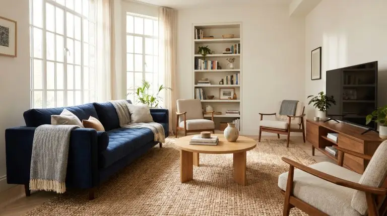
A navy sofa is a gorgeous, heavy anchor piece, but it presents an immediate spatial problem: it absorbs light. If you are staring at your living room wondering exactly what color rug goes with a navy blue sofa, you are likely trying to avoid turning the space into a dark cave or a chaotic clash of primary tones. The secret to grounding this piece lies in the “Sofa-to-Floor Light Reflectance” rule, a principle that dictates how light bounces between your upholstery, the floor beneath it, and the rug acting as the spatial boundary.
Picking a flat color from a generic list is never enough. You must factor in the specific fabric of your couch—like a light-absorbing navy velvet versus a breathable performance weave—and the underlying tone of your hardwood or tile. A rug that looks brilliant under a linen slipcover might look entirely out of place under a rigid mid-century leather frame.
By analyzing the light reflectance value (LRV) of your materials and the architectural reality of your floors, you can establish a cohesive, designer-level living room. Here is exactly how to choose the right rug for your specific space.
High-Contrast & Neutral Rug Pairings (The Sophisticated Route)
High-contrast neutrals aggressively bounce light back into the room, preventing the dark upholstery from creating a visual black hole. This approach is highly recommended for living rooms with limited natural light or dark architectural features.
Cream and Ivory Flokati (Focus on Texture)
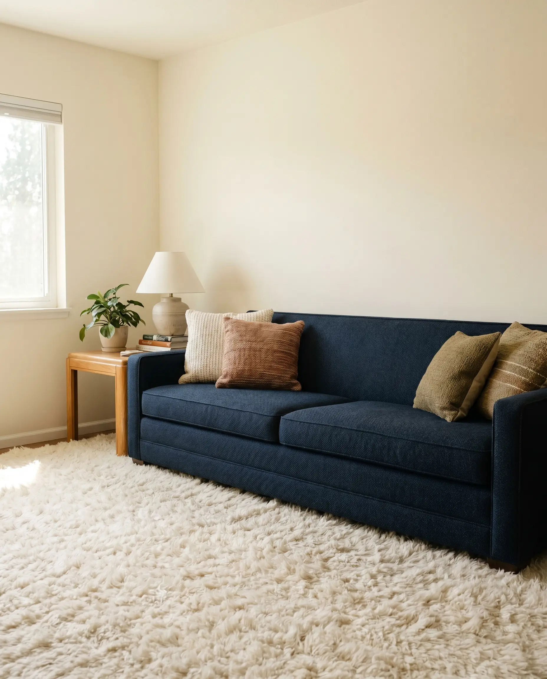
Flat, stark white rugs look incredibly cheap next to the rich depth of dark blue. To create true visual softness against the structured lines of a mid-century sofa, you need the heavy pile height of a Moroccan-style flokati or a thick wool.
- Vibe: Accessible Luxury & Mid-Century Modern.
- Key Materials: High-pile wool, authentic Moroccan shag.
- Material Pairing: Navy tight-back weaves pair perfectly with high-pile ivory wool.
- Wall Paint Match: Sherwin-Williams Alabaster.
Warm Beige and Oatmeal Jute (Organic Modern)
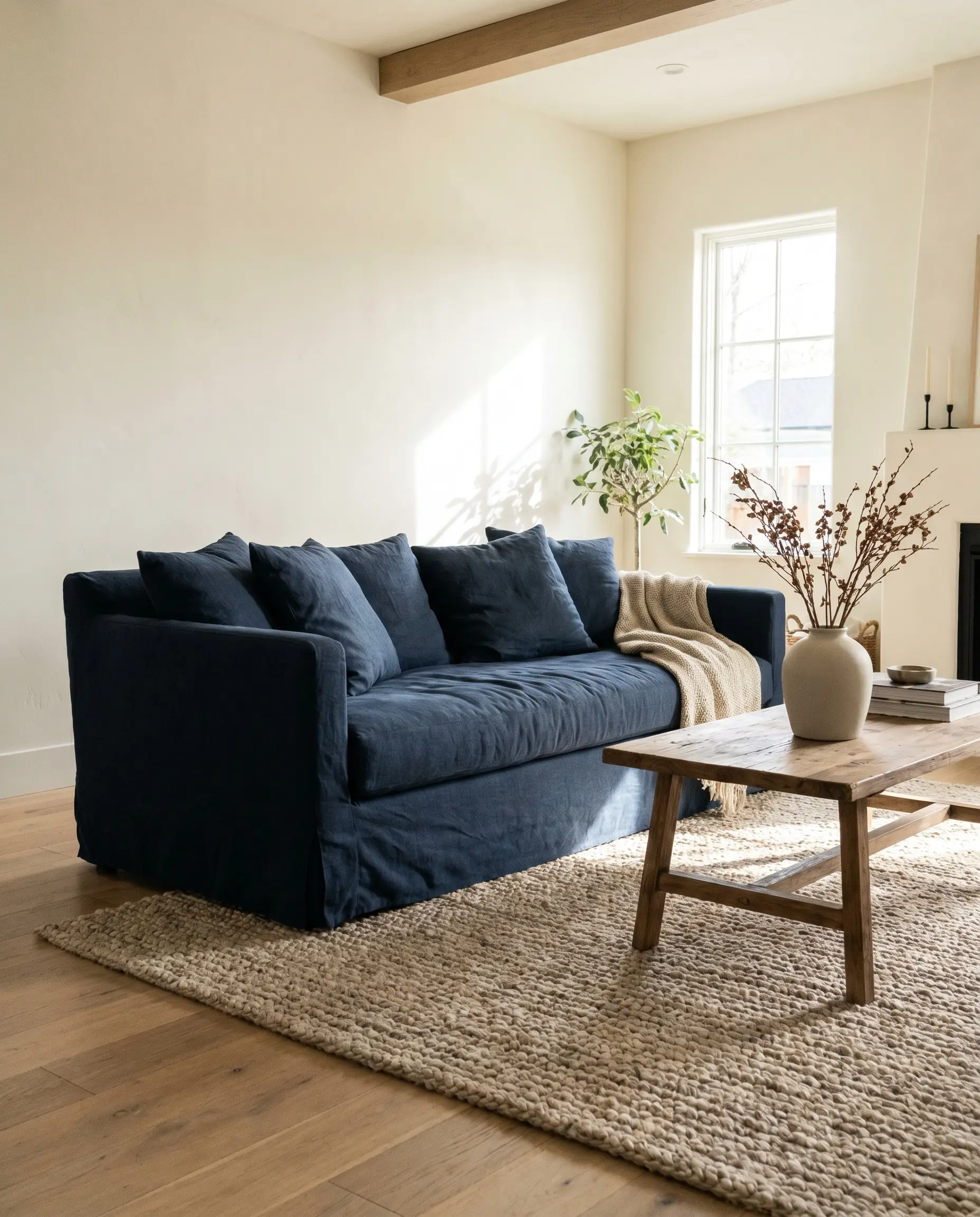
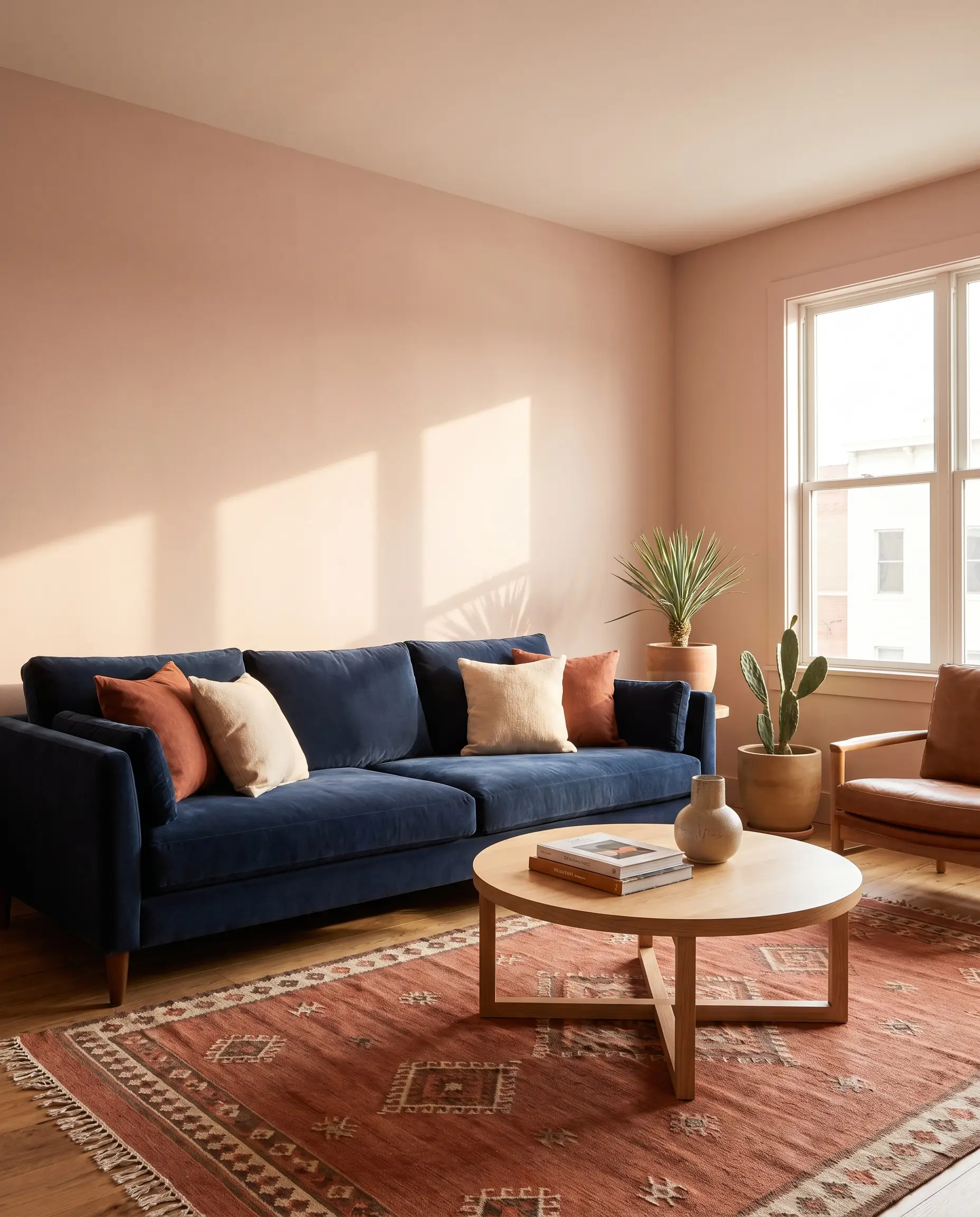
The chunky, heavily textured weave of a jute or sisal rug adds instant, casual warmth that grounds the inherent coolness of the blue. This combination creates an effortless, organic modern aesthetic without feeling strictly coastal.
- Floor Tone Match: Ideal for light oak or whitewashed wood floors.
- Key Materials: Natural jute, sisal, or chunky seagrass.
- Material Pairing: Navy slipcovered linen pairs best with chunky sisal or oatmeal jute.
- Wall Paint Match: Benjamin Moore Swiss Coffee.
Cool Silver and Heather Gray (Modern Industrial)
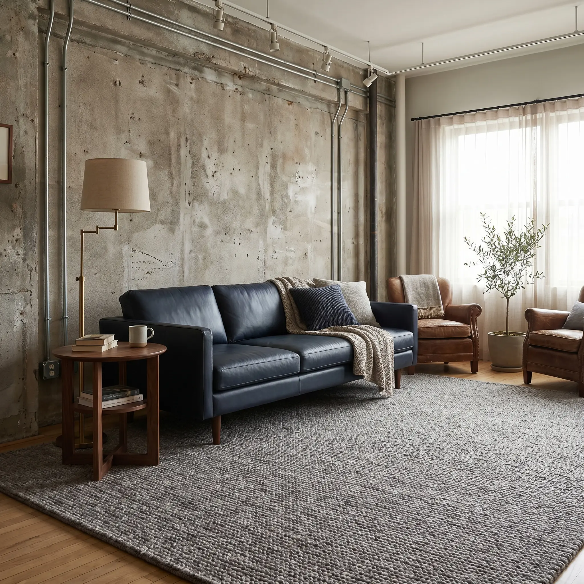
A sleek, monochromatic approach requires discipline to execute properly. Silver and heather gray establish a cool, industrial aesthetic that works exceptionally well with taut, modern upholstery.
- Warning: You must introduce warm brass lighting or rich wood accents elsewhere in the room, otherwise the cool-on-cool palette will feel completely frigid.
- Key Materials: Hand-knotted wool, low-pile synthetic blends.
- Material Pairing: Navy leather demands the visual softness of hand-knotted heather gray wool.
Black and White Checkerboard (Postmodern Punch)
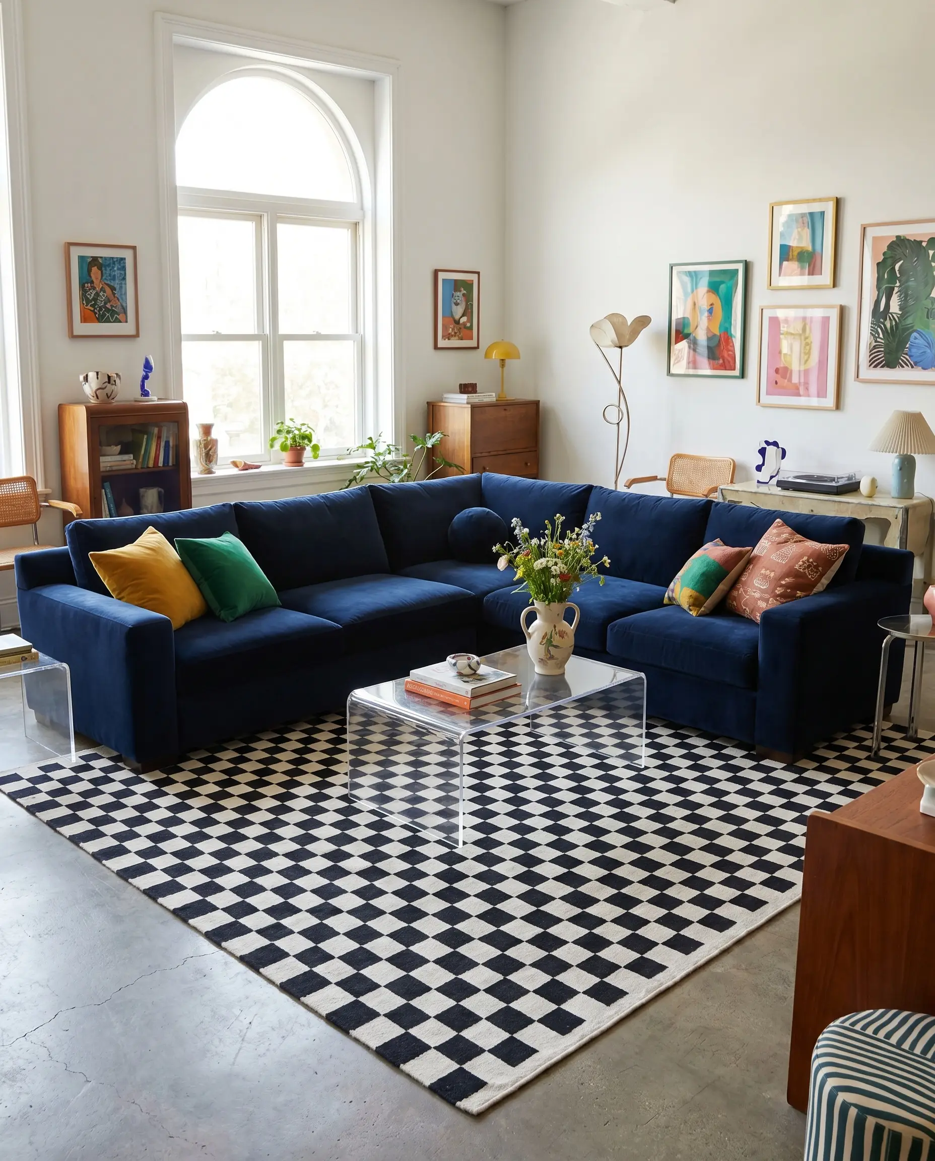
For a bolder, design-forward look, a geometric black and white rug treats the sofa as a primary color block. The stark contrast modernizes the traditional navy tone, adding immediate architectural interest to the floor.
- Pattern Scale Rule: The checkerboard squares must be large-scale; small, busy geometrics will clash uncomfortably with the sofa’s massive visual weight.
- Vibe: Postmodern, eclectic studio.
- Key Materials: Flatweave cotton, plush tufted wool.
Never place a stark, flat white rug under a dark sofa; always opt for warm ivory or cream with a heavy pile height to bridge the light reflectance gap naturally.
Stylist’s Rule
You can apply wallpapers, paints, etc. on walls and see how they look in various interiors.

Warm & Earthy Rug Colors (Creating Balance)
Because blue sits completely opposite orange and red on the color spectrum, introducing warm rugs neutralizes the cool dominance of the sofa. This complementary contrast creates a deeply inviting, grounded room rather than a sterile showroom.
Burnt Orange and Terracotta (Complementary Contrast)
The rich, earthy undertones of terracotta perfectly balance the room without making it look like a loud sports team logo. This is an exceptional way to introduce warmth while maintaining high-end sophistication.
- Vibe: Desert Modern, Warm Minimalism.
- Key Materials: Flatweave wool, low-pile Turkish kilims.
- Material Pairing: Navy velvet requires the structured restraint of a low-pile or flatweave terracotta wool.
- Wall Paint Match: Farrow & Ball Setting Plaster.
Distressed Rust and Crimson Red (Traditional Persian)
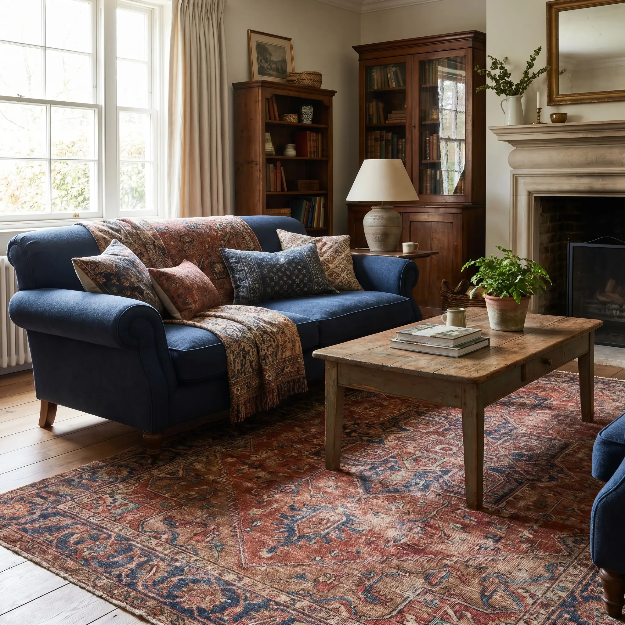
This is a classic, timeless choice where a distressed vintage rug acts as a seamless bridge. The natural fading of the fibers prevents the heavy crimson from overpowering the blue, establishing an established, lived-in aesthetic.
- Key Materials: Authentic hand-knotted Heriz, washable printed vintage styles.
- Lifestyle Perk: The intricate traditional patterns hide pet hair, high foot traffic, and stains brilliantly.
- Material Pairing: Navy rolled-arm traditional sofas pair flawlessly with distressed vintage rust wool.
Mustard Yellow and Ochre (Mid-Century Warmth)
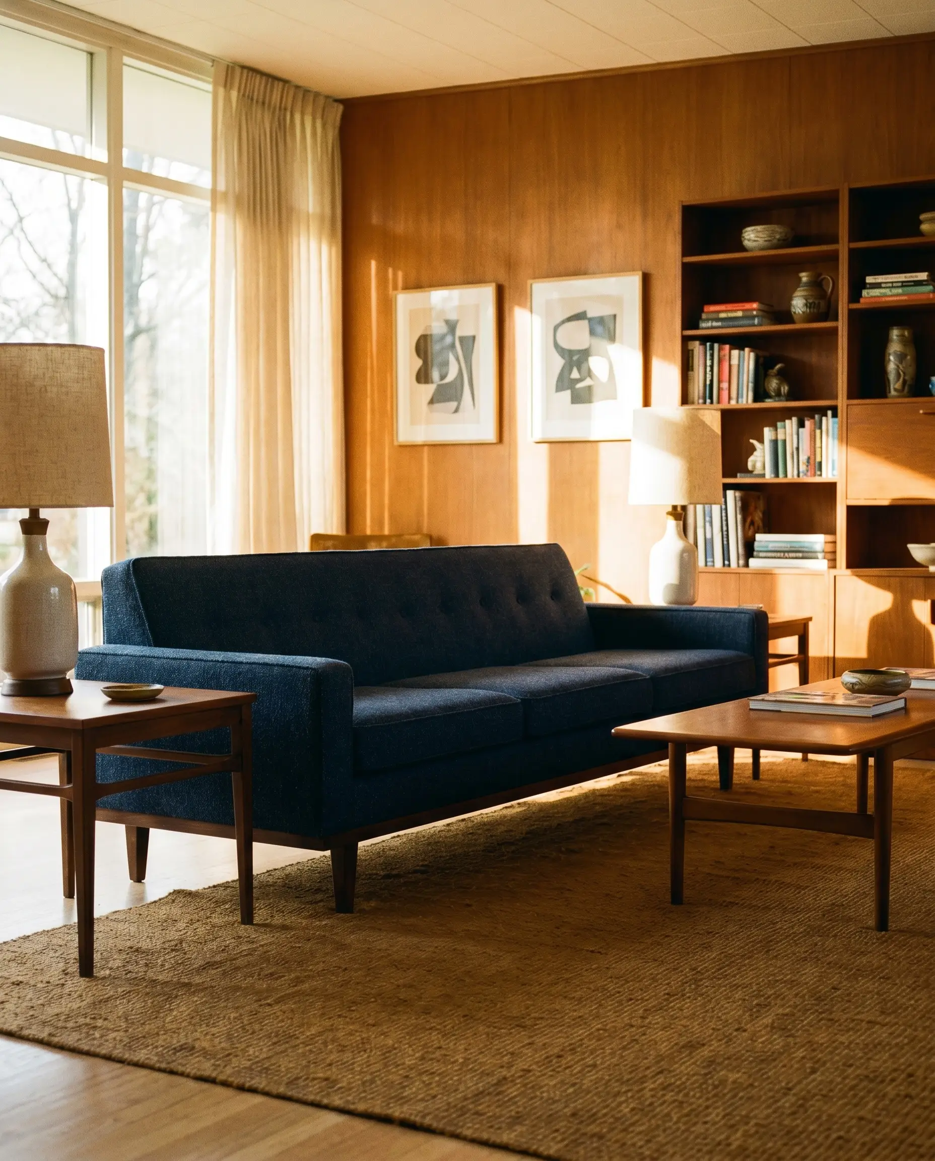
A direct nod to 1960s interior aesthetics, ochre brings a sophisticated ray of sunshine into the room. It effortlessly highlights the warm tones of exposed wood furniture legs and frames.
- Color Match: Strictly avoid bright “lemon” yellow; insist on muddy, earthy ochre or deep mustard to keep the palette mature.
- Key Materials: Overdyed vintage rugs, flatweave cotton.
- Material Pairing: Dark walnut mid-century modern navy sofas pair flawlessly with flatweave ochre.
Olive Green and Khaki (Earthy Grounding)
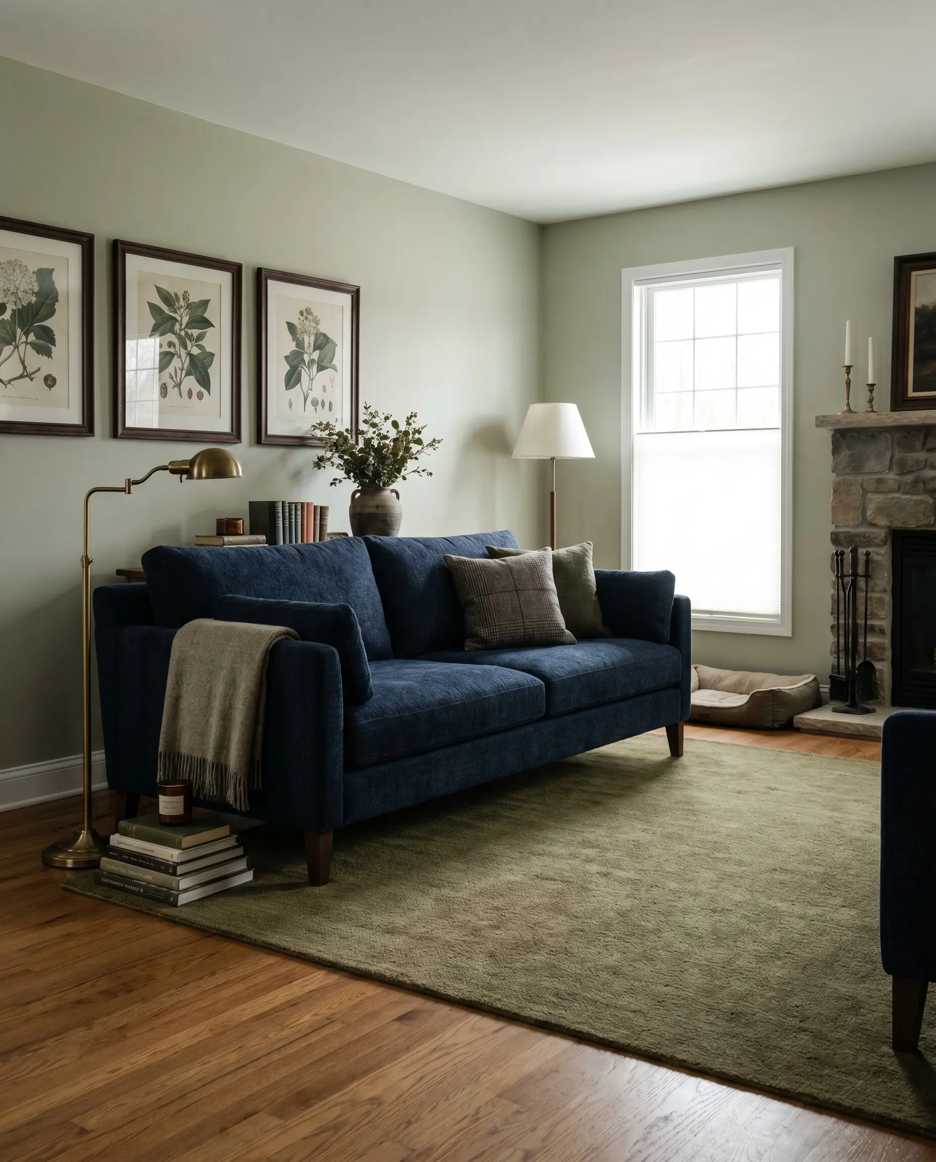
Olive green and deep blue are an analog pairing frequently found in nature, creating a deeply calming, moody, English-countryside aesthetic. The khaki undertones prevent the green from competing with the sofa for attention.
- Floor Tone Match: Highly recommended for medium-tone wood floors.
- Vibe: Moody Traditional, Heritage.
- Material Pairing: Navy chenille pairs beautifully with low-pile olive green wool.
- Wall Paint Match: Benjamin Moore October Mist.
When using complementary warm tones like rust or orange, keep the rug’s pile height low so the color acts as a subtle foundation rather than shouting for attention.
Stylist’s Rule
Cool & Moody Rug Pairings (Tonal Layering)
Executing the color-drenching trend with cool rugs requires a masterclass in subtlety. You must radically vary the textures so the dark pieces do not bleed into a single, heavy mass.
Tone-on-Tone Navy (Textural Separation)
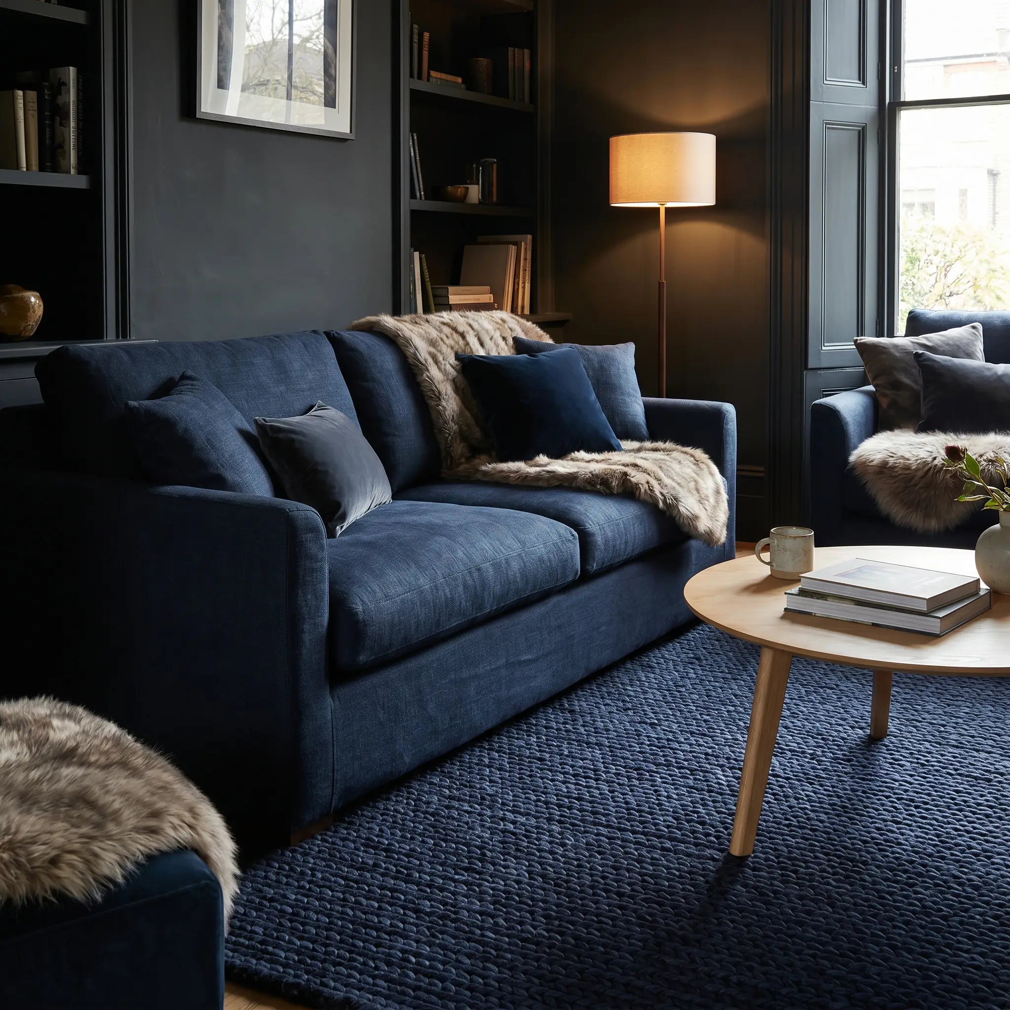
Putting a dark blue rug under a dark blue couch is incredibly risky but highly rewarding for a moody, enveloping room. The entire success of this spatial boundary relies on extreme textural contrast.
- Warning: Never match the exact shade and texture.
- Key Materials: Braided wool, silk-blend rugs with high sheen.
- Material Pairing: If the sofa is flat navy linen, the rug must be a heavily textured braided navy wool or feature a subtle silk sheen.
Dusty Blue and Slate (Subtle Transition)
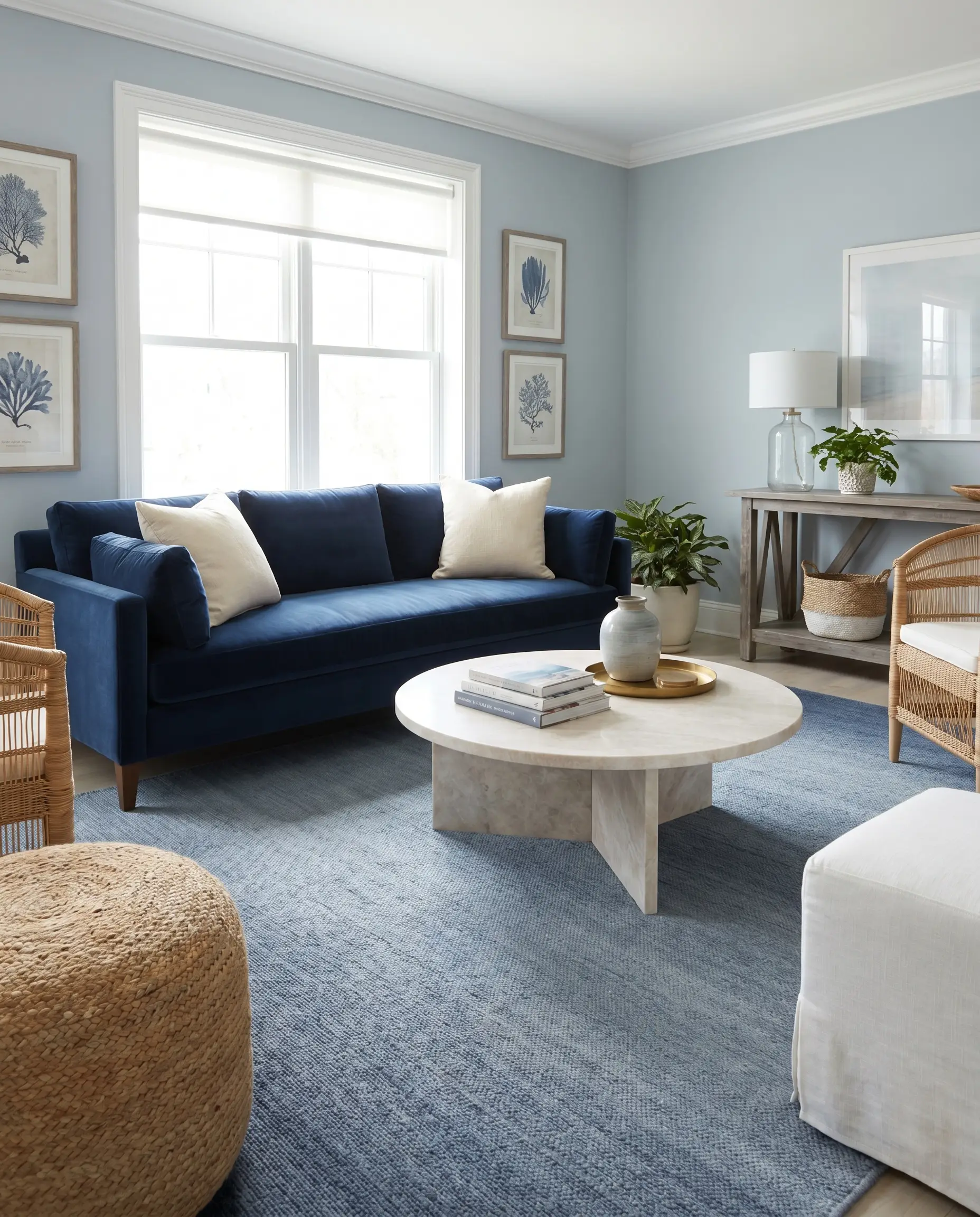
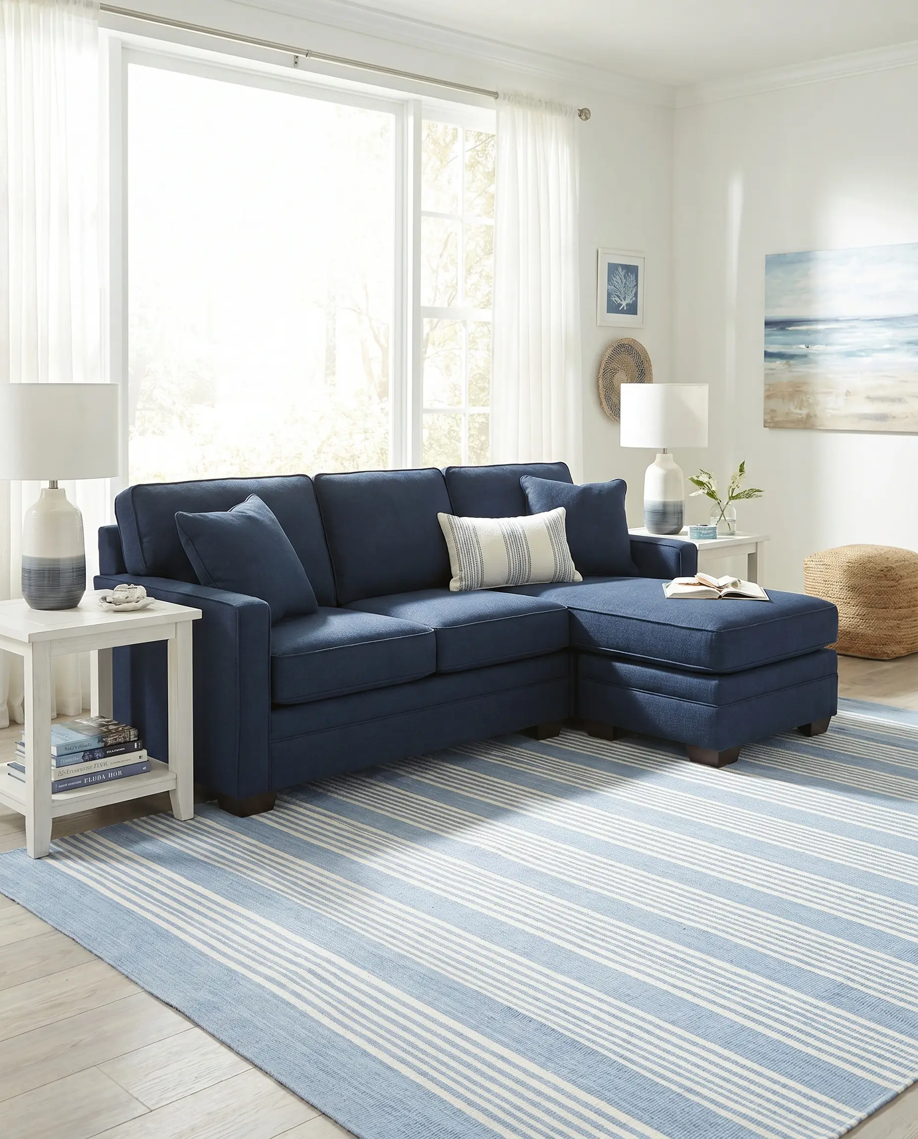
A lighter blue rug creates a beautiful, intentional gradient effect from the dark upholstery down to the floor. This tonal layering works exceptionally well for coastal or transitional homes looking for softness.
- Vibe: Sophisticated Coastal, Transitional.
- Styling Pro-Tip: Anchor this pairing with a light-colored wood or marble coffee table to break up the cool tones.
- Wall Paint Match: Farrow & Ball Parma Gray.
Deep Plum or Aubergine (Dark Academia)
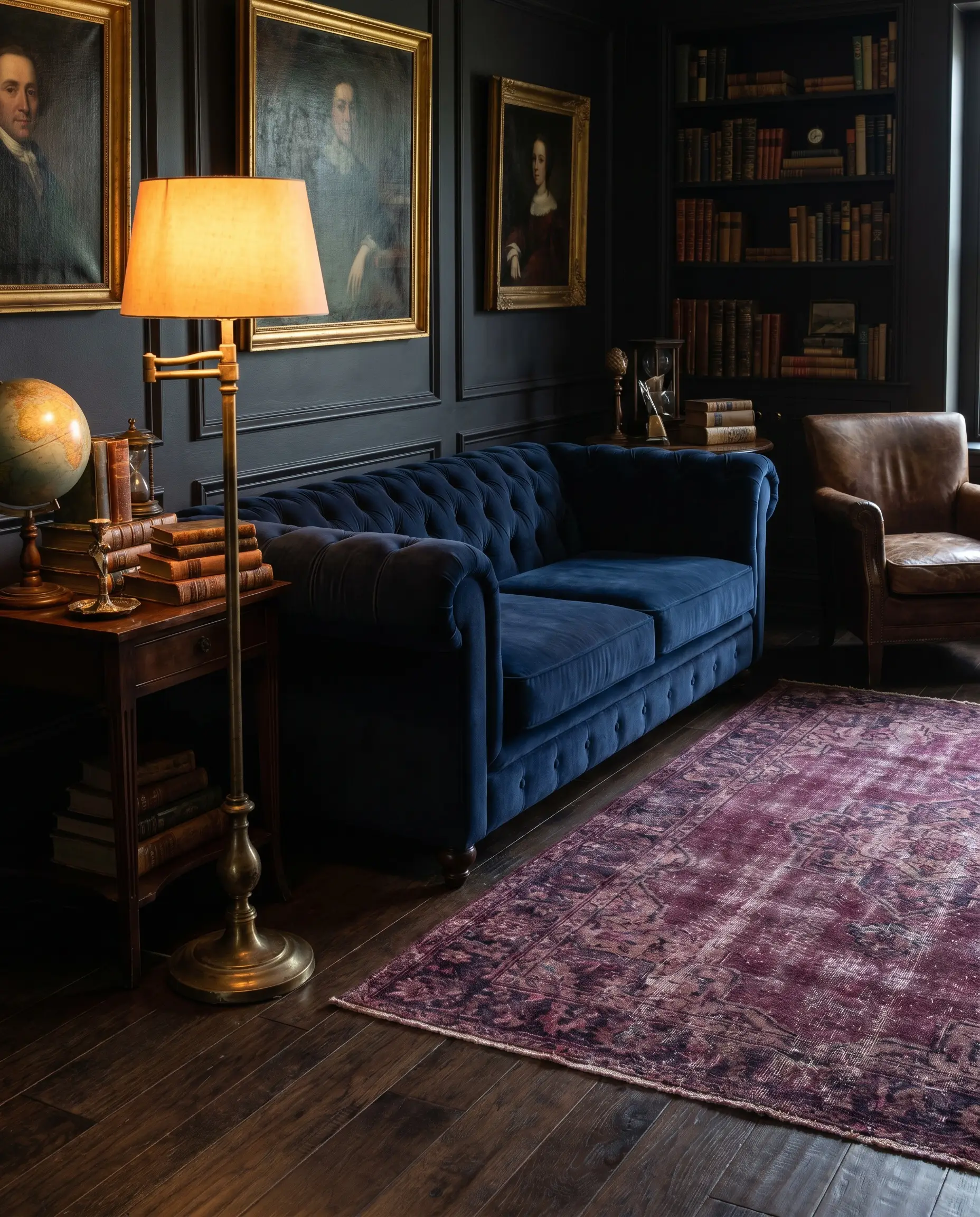
This pairing delivers a highly sophisticated, boutique-hotel atmosphere. The subtle red undertones within the plum play beautifully against the deep blue, creating a rich, intensely moody environment.
- Floor Match: Explicitly recommended for rooms with dark wood floors.
- Accent Match: Demands unlacquered brass lighting fixtures to reflect light around the dark palette.
- Material Pairing: Navy tufted velvet pairs exquisitely with overdyed plum vintage rugs.
Tonal layering only succeeds if the rug has a significantly different light reflectance value (LRV) than the sofa; one must absorb light while the other subtly reflects it.
Stylist’s Rule
Patterned & Multi-Color Rug Strategies
A multi-colored patterned rug acts as the foundational color palette map for your entire living room. The heavy sofa pulls one specific tone from the weave, while your throw pillows, drapes, and art pull the others to create a cohesive loop.
The Faded Oushak (Muted Pastels)
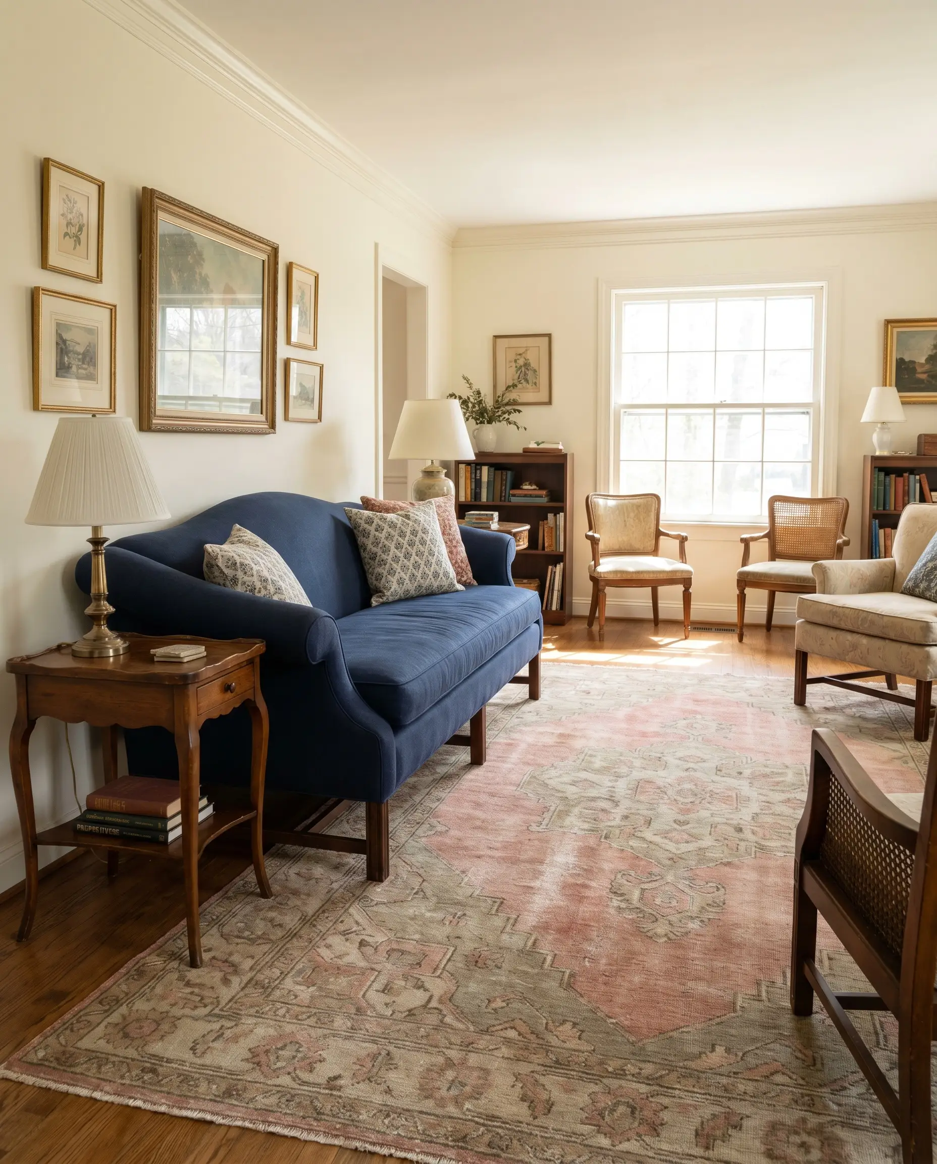
Soft pinks, muted sages, and light tans woven into an Oushak rug instantly soften the harsh, commanding presence of the couch. The intricate but faded motifs provide visual interest without fighting the upholstery.
- Key Materials: Authentic hand-knotted Turkish Oushak or a high-quality printed washable alternative.
- Vibe: Sophisticated Traditional, Grandmillennial.
- Material Pairing: Navy English roll-arm sofas pair perfectly with hand-knotted faded Oushaks.
Bold Botanical Prints (Maximalist Anchor)
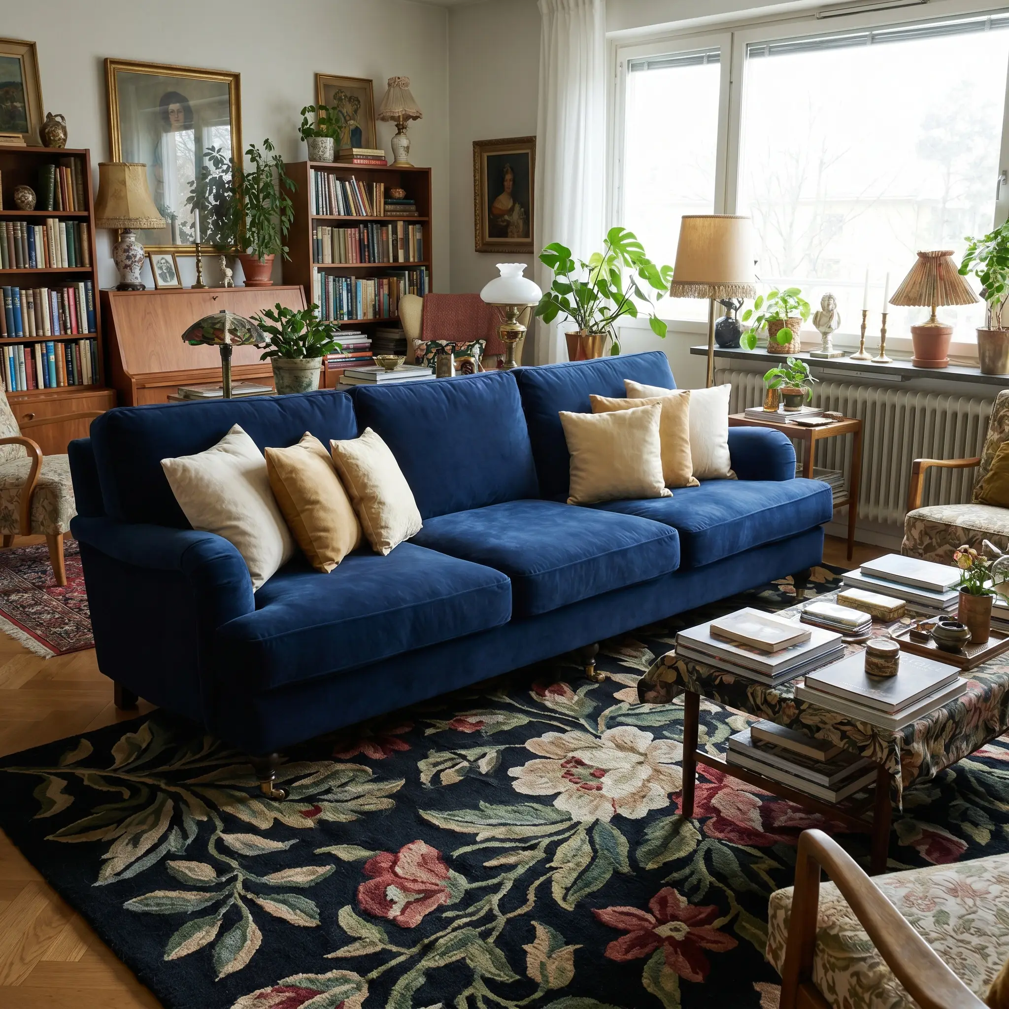
Dark floral or botanical rugs featuring black or dark green backgrounds embrace a rich, layered aesthetic. In a room full of busy patterns, the solid expanse of the dark blue sofa acts as a necessary resting place for the eyes.
- Vibe: Maximalist, Moody Eclectic.
- Key Materials: Tufted wool, synthetic printed rugs.
- Styling Pro-Tip: Pull the lightest color from the botanical print to use as your dominant throw pillow color.
Coastal Stripes in Light Blue and White (Preppy & Crisp)
This is the quintessential Hamptons look that remains highly functional and instantly recognizable. A striped pattern provides a rigid, organized geometry that sharply contrasts with the plushness of a heavy couch.
- Key Materials: Durable cotton flatweave, indoor/outdoor synthetic blends.
- Vibe: Crisp Coastal, Preppy.
- Material Pairing: Navy performance weaves pair effortlessly with crisp, flatweave coastal stripes.
When sourcing a patterned rug, ensure the navy in the rug’s motif is either an exact match to your sofa or a significantly lighter shade; never introduce a clashing navy undertone.
Stylist’s Rule
The Sofa-to-Floor Compatibility Guide
The rug you choose is heavily dictated by the hard surfaces already installed in your home. Use this quick-reference guide to understand exactly how your existing floor tone impacts your styling options when working with dark upholstery.
| Floor Tone | Best Rug Tones for Navy Sofas | Rug Tones to Avoid |
|---|---|---|
| Light Wood (White Oak, Ash) | Warm Beige, Oatmeal, Dusty Blue, Terracotta | Stark White, Cool Silver (can look washed out) |
| Dark Wood (Walnut, Espresso) | Mustard Yellow, Plum, Distressed Rust, Cream | Tone-on-Tone Navy, Black (creates a dark void) |
| Gray Tile or Concrete | Burnt Orange, Heather Gray, Faded Oushak | Khaki, Olive Green (clashes with cool gray) |
Grounding the Space: Final Styling Details
The rug does not work in isolation; it is merely the foundation of your spatial boundary. To seamlessly bridge the heavy sofa and your new floor covering, you must layer in the right transitional elements.
- The Coffee Table Break: Use a glass, acrylic, or light marble coffee table to physically break up the dark transition between the sofa and the rug, allowing the rug’s texture to remain visible.
- Pillow Color Mapping: Pull the secondary or tertiary colors from your rug directly onto the navy seating using textured throw pillows. If your rug is a neutral jute, use textured cream bouclé pillows to continue the organic thread.
- Leg Clearances: Ensure the front legs of the sofa sit entirely on the rug. If the dark fabric hovers over bare floors before the rug begins, the room will look entirely disjointed and visually chaotic.
Take a step back and look at your living room right now—does your current lighting support a moody tonal look, or do you need a high-contrast cream rug to finally bounce some light back into the space?
The Hackrea Style Desk treats interior decoration as an exact visual science. Rather than focusing on demolition or floor plans, this desk masters the art of color theory, undertone matching, material pairings, and spatial proportion. From balancing the visual weight of mixed metals to finding the perfect bridging tone between disparate wood species, this desk provides the rigorous aesthetic rules needed to achieve high-end, editorial-quality harmony in any space.