The Living Room Limewash Guide: 22 Ways to Style Mineral Walls
We are moving away from standard flat paint and embracing walls that actually breathe. The current appetite for organic modernism has brought mineral finishes to the forefront, but limewash is far more than just a trending color palette—it is a foundational architectural texture. Made from slaked lime, this breathable finish dries with a chalky, mottled patina that brings dead drywall to life, turning sterile surfaces into highly tactile environments.
Achieving a bespoke, high-end look without paying for luxury Venetian plaster requires precision. A successful limewash application relies entirely on intentional directional lighting, specific material friction, and accurate color selection to prevent the finish from looking like a poorly executed 1990s sponge technique. Here is exactly how to style, light, and pair mineral paints for a flawless, enveloping living room.
Navigating the Neutral Limewash Living Room
Neutral limewash forms the absolute foundation of the Wabi-Sabi and organic modern aesthetics. Because these mineral-based paints react intensely to their environment, these neutral tones will shift dramatically depending on the time of day, making standard swatches highly deceptive.
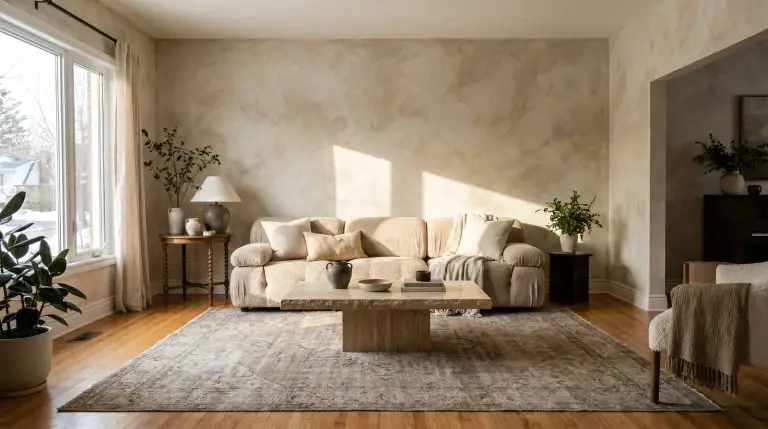
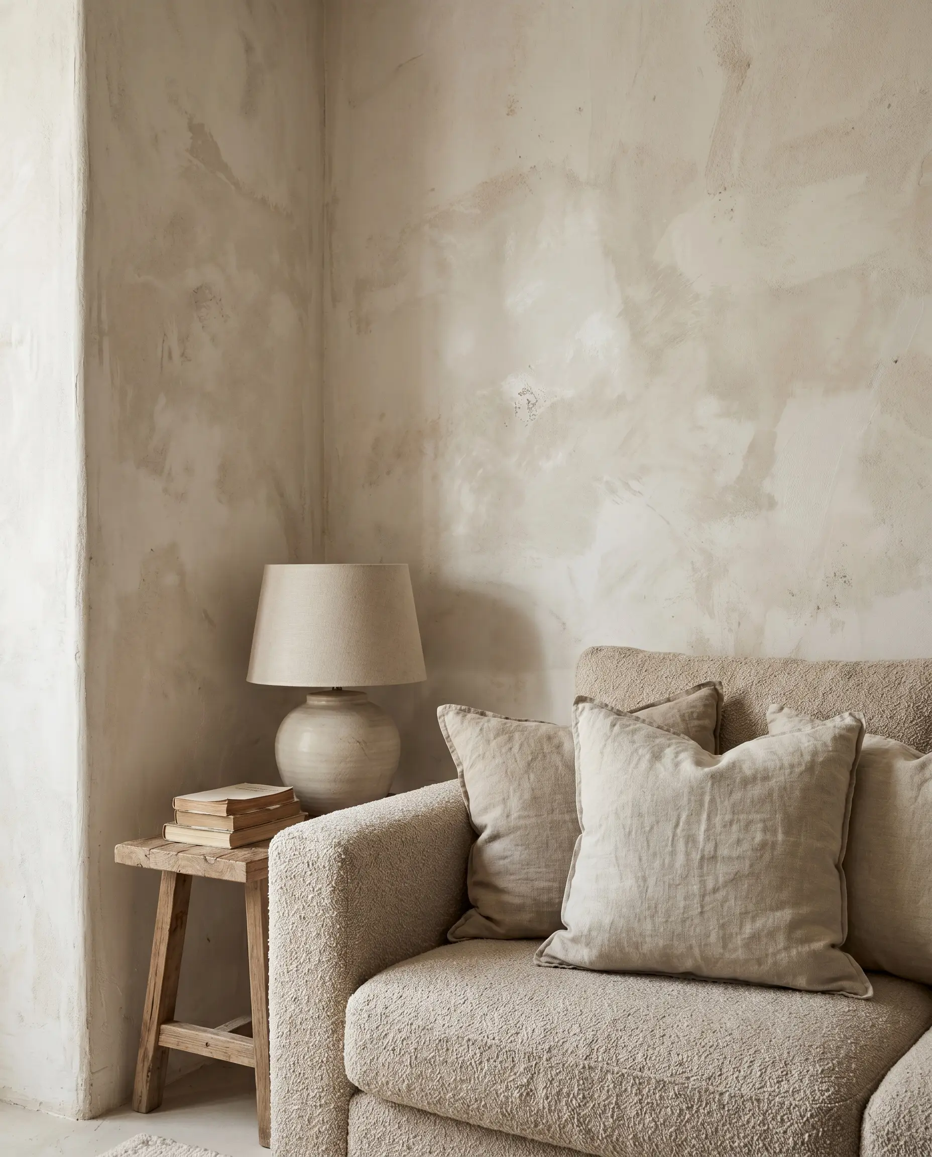
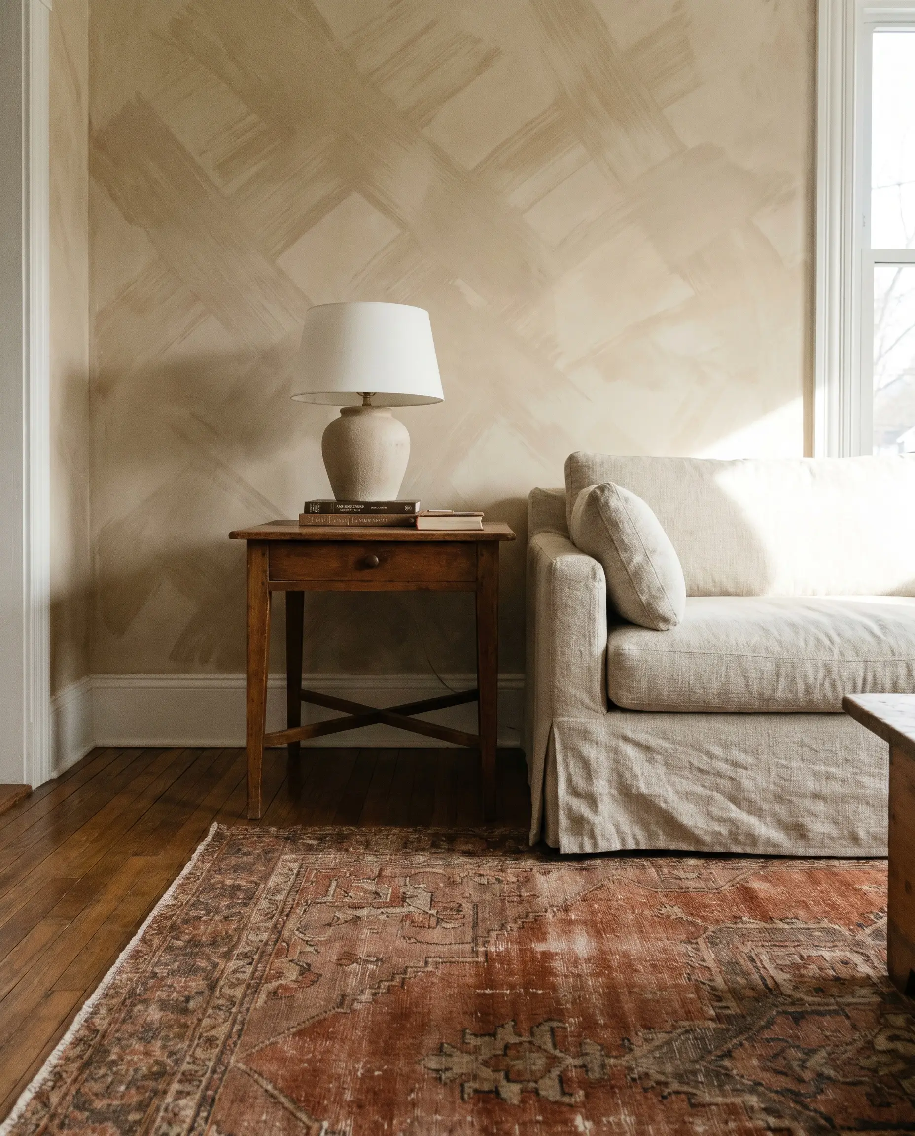
Warm Bone Whites for Organic Modern Spaces
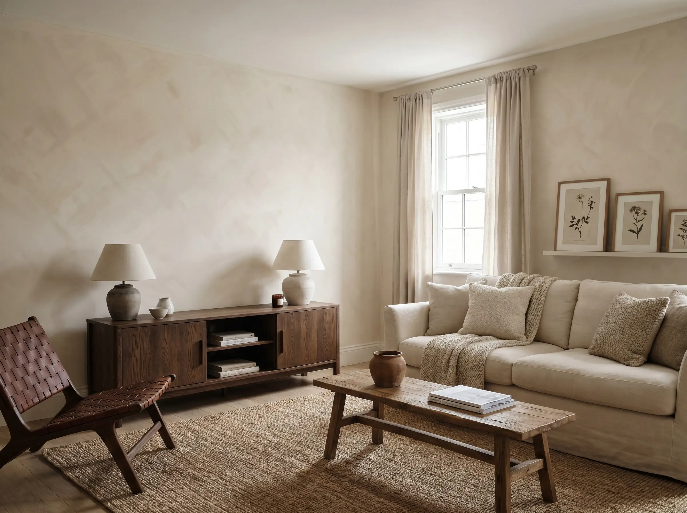
Skip the stark, sterile whites of hospital corridors and opt for a heavy bone or cream to establish a true organic foundation. Because the cross-hatch brushstrokes appear much subtler in lighter shades, applying at least three coats is essential to build that signature, cloudy movement.
- Vibe: Soft, foundational organic modernism.
- Paint Match: Bauwerk Colour “Bone” or Portola Paints “El Mirage”.
- Styling Pro-Tip: Contrast the soft walls with rigid, dark oak furniture to prevent the space from looking washed out.
- Best For: North-facing living rooms that lack natural warmth.
Mushroom and Greige for Transitional Depth
For homes with existing cool-toned flooring or gray stone fireplaces, a mushroom limewash perfectly bridges the gap between warm furniture and cool architectural elements. The earthy undertones in the slaked lime prevent the gray from feeling industrial, reading instead like aged French limestone.
- Vibe: Grounded, transitional sophistication.
- Paint Match: Portola Paints Mushroom or Bauwerk Colour “Stone”.
- Key Materials: Tumbled limestone, brushed nickel hardware.
- Best For: Open-concept spaces bridging warm living areas with cool-toned kitchens.
Sandstone Hues Paired with Walnut Wood Tones
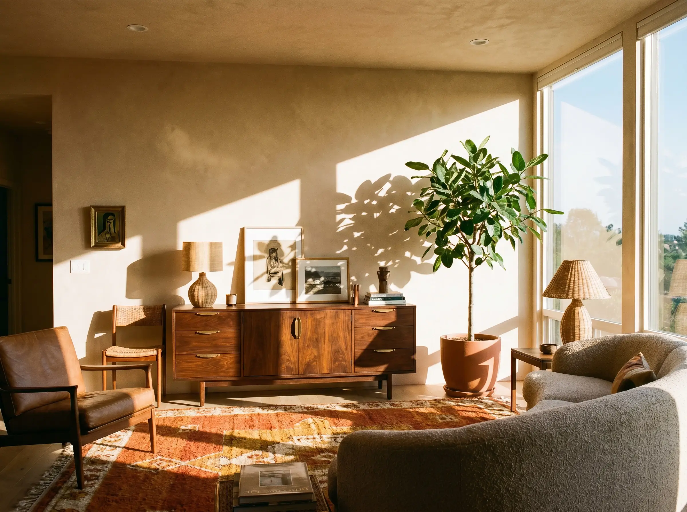
Warm, sandy limewash looks its absolute best when grounded by mid-century or contemporary walnut furniture, preventing the room from fading into a single beige blur. The deep, rich grain of the walnut provides the necessary visual weight to anchor the airy, sun-baked walls.
- Vibe: Earthy, mid-century warmth.
- Paint Match: Portola Paints “Topanga” or Color Atelier “Santos”.
- Styling Pro-Tip: Introduce large-scale, deep green foliage (like a mature Ficus Audrey) to break up the warm tones.
- Best For: South-facing rooms that receive intense, direct sunlight.
Cool Plaster Whites to Soften Contemporary Lines
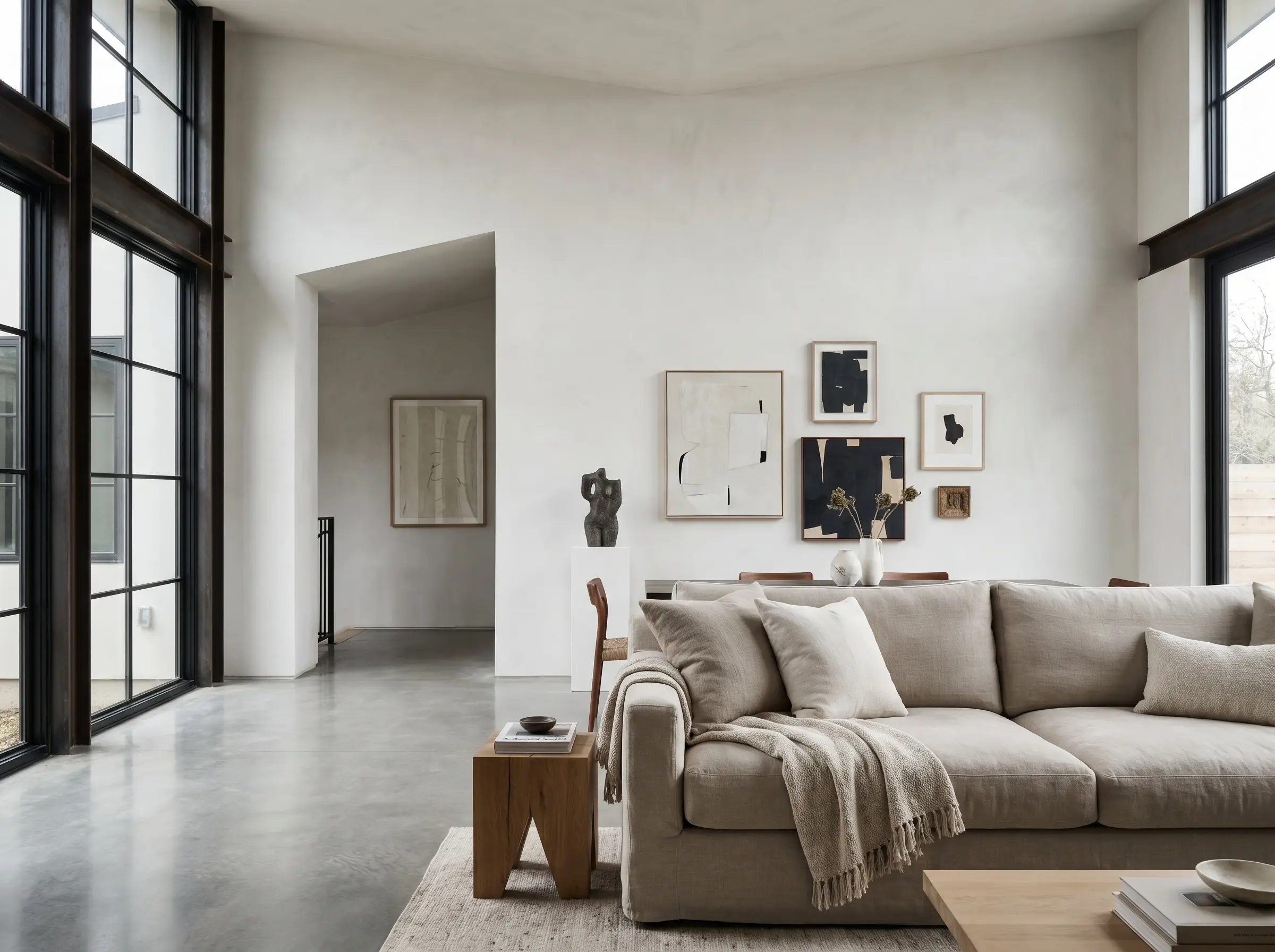
A cool-toned limewash can successfully take the sterile edge off a highly contemporary room characterized by sharp angles and expansive glass features. The subtle, matte brushstrokes introduce a vital human element, ensuring the architecture feels livable rather than strictly exhibition-focused.
- Vibe: Minimalist, gallery-like refinement.
- Paint Match: Bauwerk Colour “Ibiza”.
- Key Materials: Polished concrete floors, structural steel.
- Best For: Ultra-modern homes needing a touch of tactile warmth.
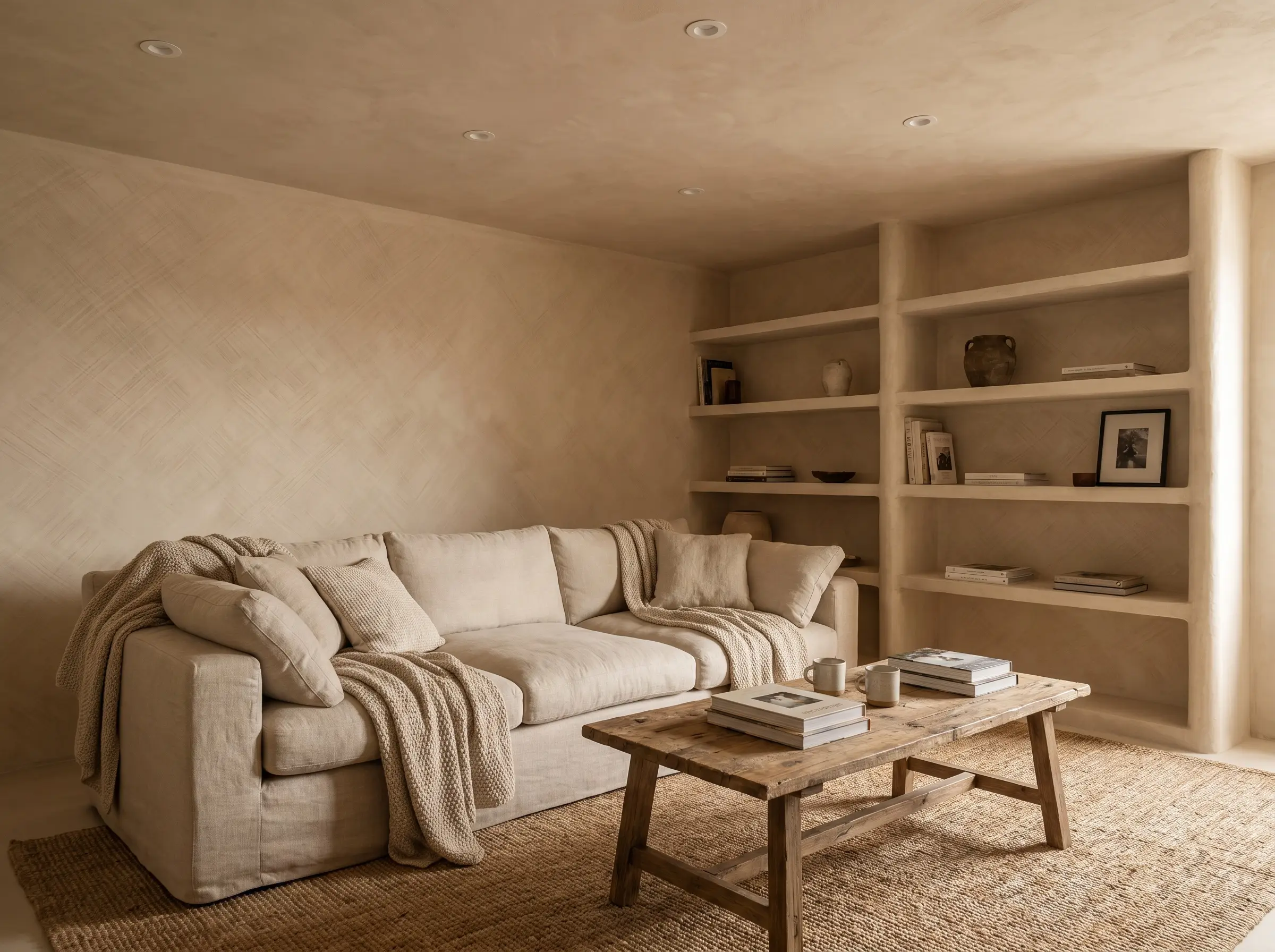
Layering Beige Limewash with Monochromatic Bouclé
When executing a monochromatic palette, you must rely on a strict “texture-on-texture” approach to avoid visual flatness. Pair the chalky, mottled walls with nubby bouclé sofas and heavy, unbleached linen to create a sensory-rich environment that feels incredibly intentional.
- Vibe: Enveloping, highly textural wabi-sabi.
- Paint Match: Portola Paints “Casa Forma”.
- Styling Pro-Tip: Keep all textiles within two shades of the wall color to maintain the enveloping illusion.
- Best For: Smaller, intimate living spaces designed strictly for lounging.
You can apply wallpapers, paints, etc. on walls and see how they look in various interiors.

Making a Statement with Dark and Moody Mineral Washes
While beiges dominate social media feeds, darker mineral washes represent a massive missed opportunity for sophisticated interiors. Darker pigments showcase the highest degree of cross-hatch movement and brushstroke variation, creating an incredibly atmospheric environment as shadows stretch across the matte walls.
Enveloping the Room in Deep Charcoal
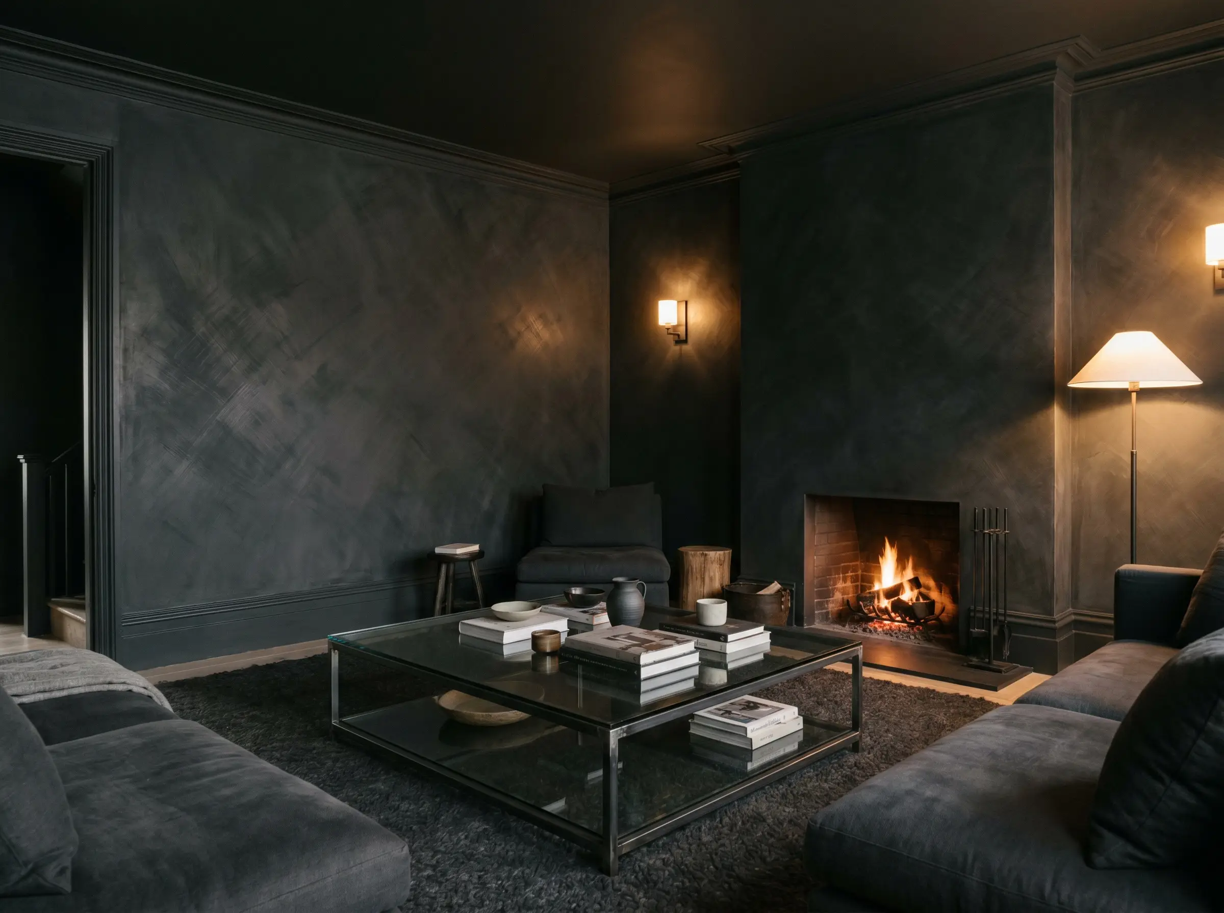
Tapping into the Soft Brutalist aesthetic, a charcoal limewash creates a cavernous, intimate feel that is perfect for evening entertaining. The mineral base ensures the black never feels flat or plastic; instead, it mimics the depth of natural slate or aged concrete.
- Vibe: Intimate, moody soft brutalism.
- Paint Match: Bauwerk Colour (Deep Charcoal/Black) or Portola Paints “Anchor”.
- Key Materials: Smoked glass, raw steel framing.
When working with dark limewash, always paint the baseboards and trim to match. Breaking a dark, cloudy wall with a stark white baseboard instantly ruins the enveloping architectural illusion.
Hackrea Design Ally Tip
Forest Green Limewash for a Biophilic Retreat
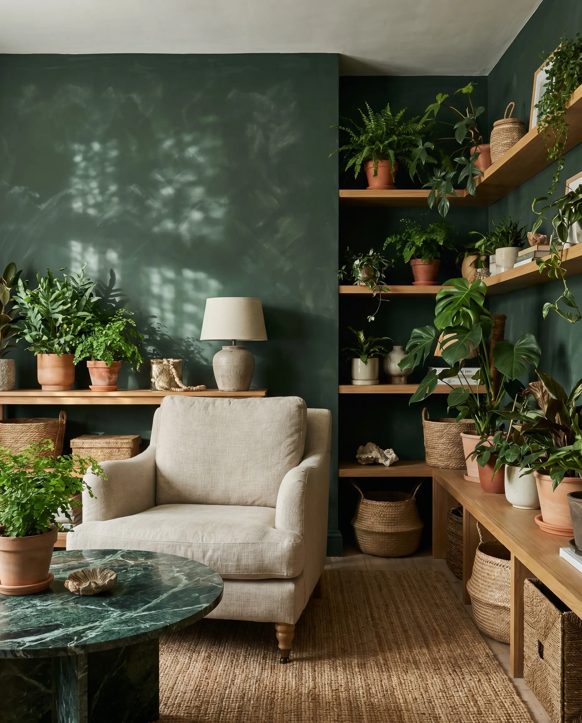
Pairing dark green washes with abundant indoor plants and natural oak actively blurs the lines between indoors and out. The mottled finish of the slaked lime mimics the dappled light of a forest canopy, bringing a profound sense of grounding to urban apartments.
- Vibe: Lush, earthy biophilic design.
- Paint Match: Bauwerk Colour “Bronte”.
- Styling Pro-Tip: Layer in heavily veined, dark green marble accents to complement the chalky walls.
Faded Terracotta for a Mediterranean Sun-Baked Look
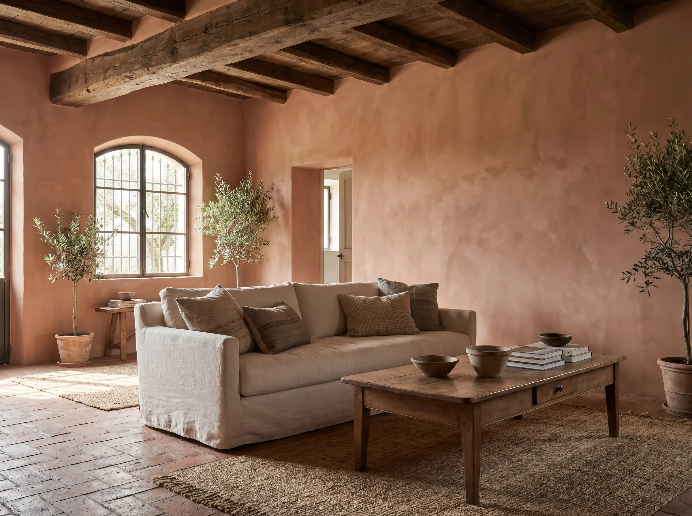
Avoid bright, synthetic oranges at all costs; achieving a Mediterranean revival aesthetic requires a dusty, faded terracotta that mimics aged Italian or Spanish villas. The color should look as though it has been baking under the sun for a century.
- Vibe: Rustic, aged Mediterranean.
- Paint Match: Portola Paints “Tierre”.
- Key Materials: Reclaimed terra cotta tiles, raw wood beams.
Slate Blue Walls with Burnished Brass Accents
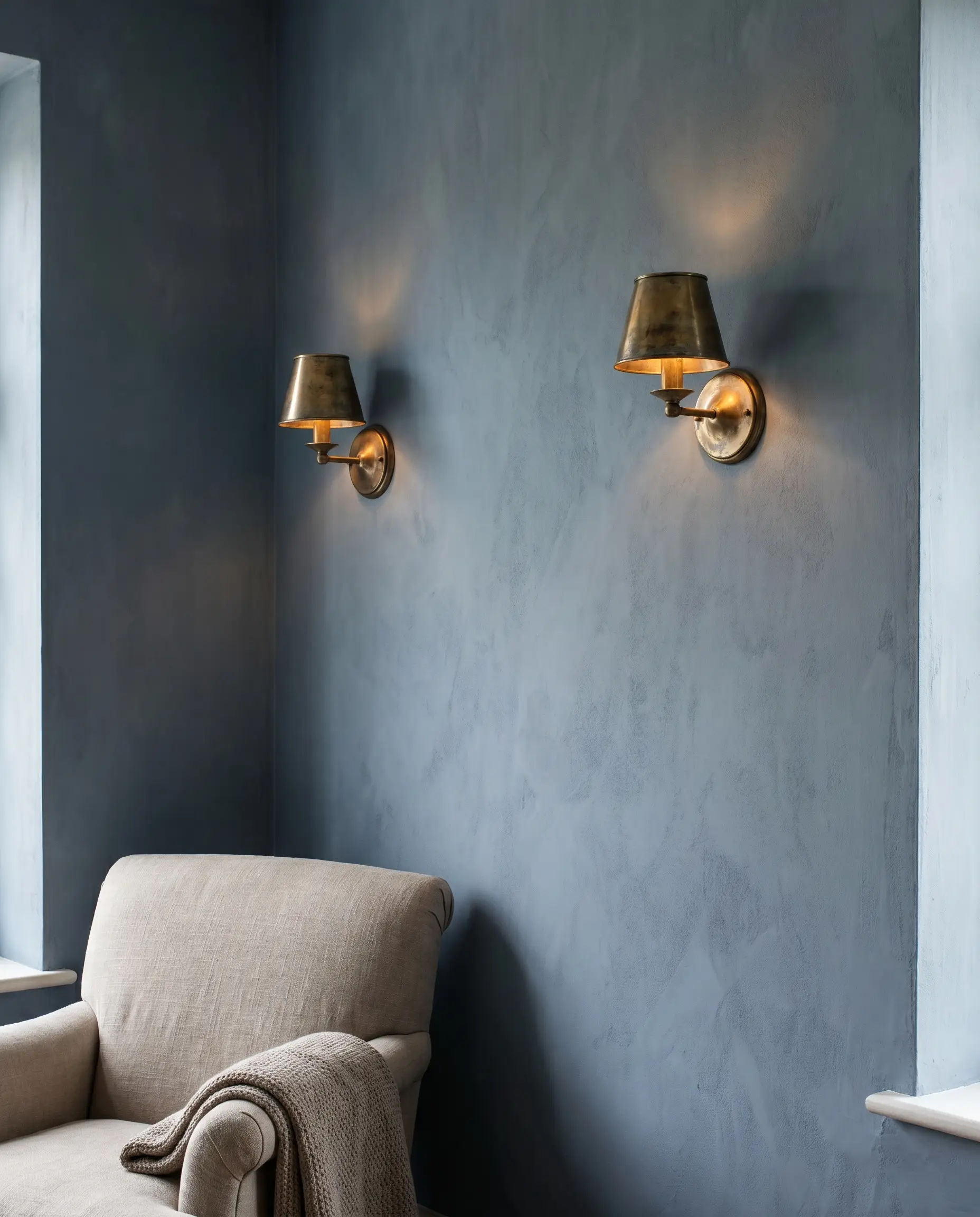
The dusty, matte finish of a slate blue limewash allows warm metals to shine brilliantly by pure contrast. When unlacquered brass sconces are mounted directly onto the chalky blue surface, the friction between the raw metal and the soft mineral paint creates an immediate, high-end focal point.
- Vibe: Historical, refined European elegance.
- Paint Match: Bauwerk Colour “Clove” (Dusty Blue).
- Styling Pro-Tip: Allow the brass to naturally tarnish over time to match the living, breathing nature of the walls.
Chocolate Brown Limewash for 1970s Revival Aesthetics
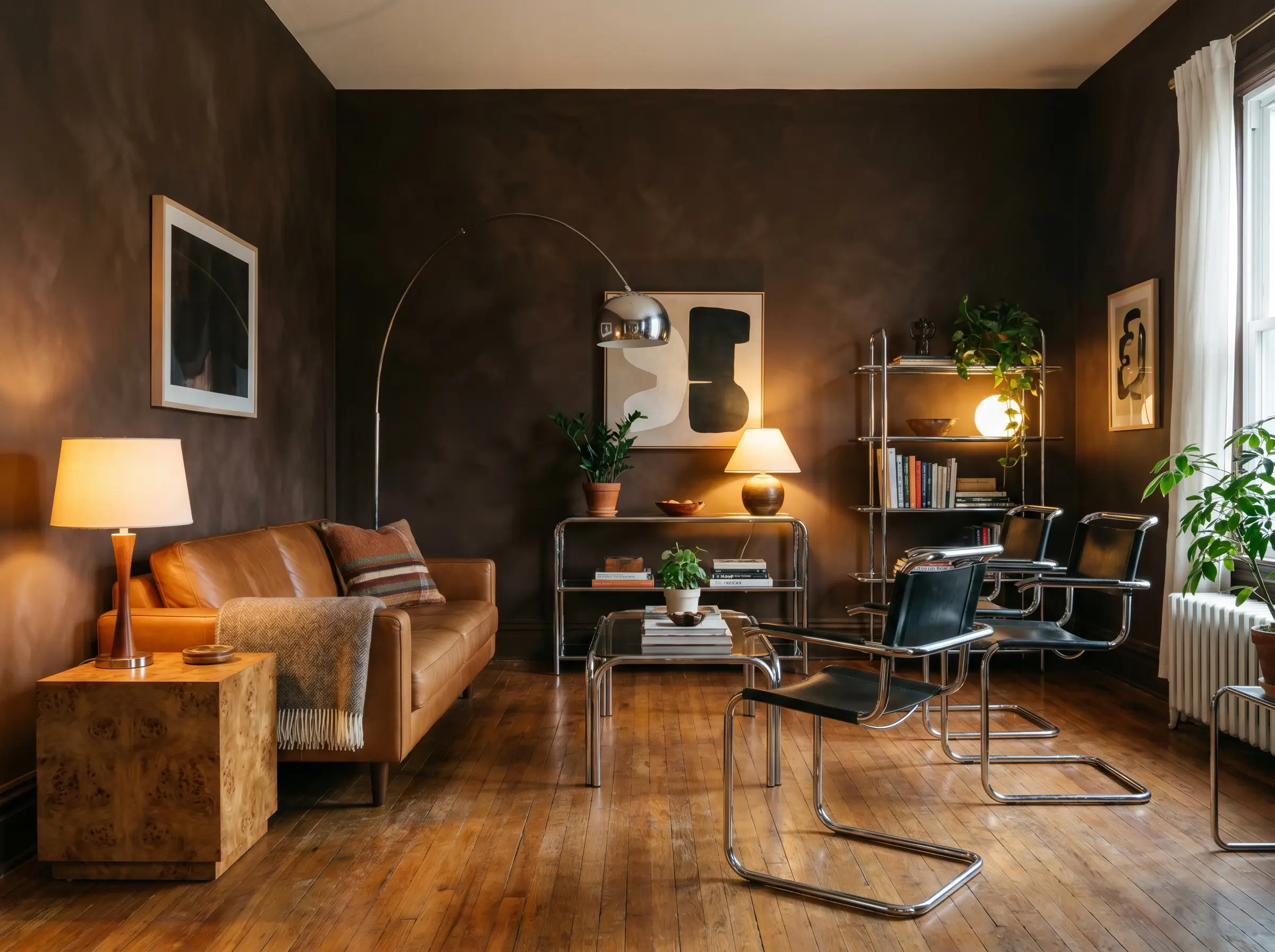
Capitalizing on the return of brown interiors, a rich chocolate limewash offers incredible depth without the heaviness of black. Pair these earthy walls with low-slung Togo sofas and cold chrome accents to create a deliberate, retro-modern friction.
- Vibe: Sophisticated, 1970s retro-modern.
- Paint Match: Portola Paints “Zion”.
- Key Materials: Burl wood, polished chrome, cognac leather.
Architectural Applications: Beyond the Flat Wall
Mineral paints do not need to be confined to a standard four-wall application. By treating limewash as an architectural tool rather than just a paint color, you can strategically highlight structural features or disguise awkward drywall bump-outs to mimic custom masonry.
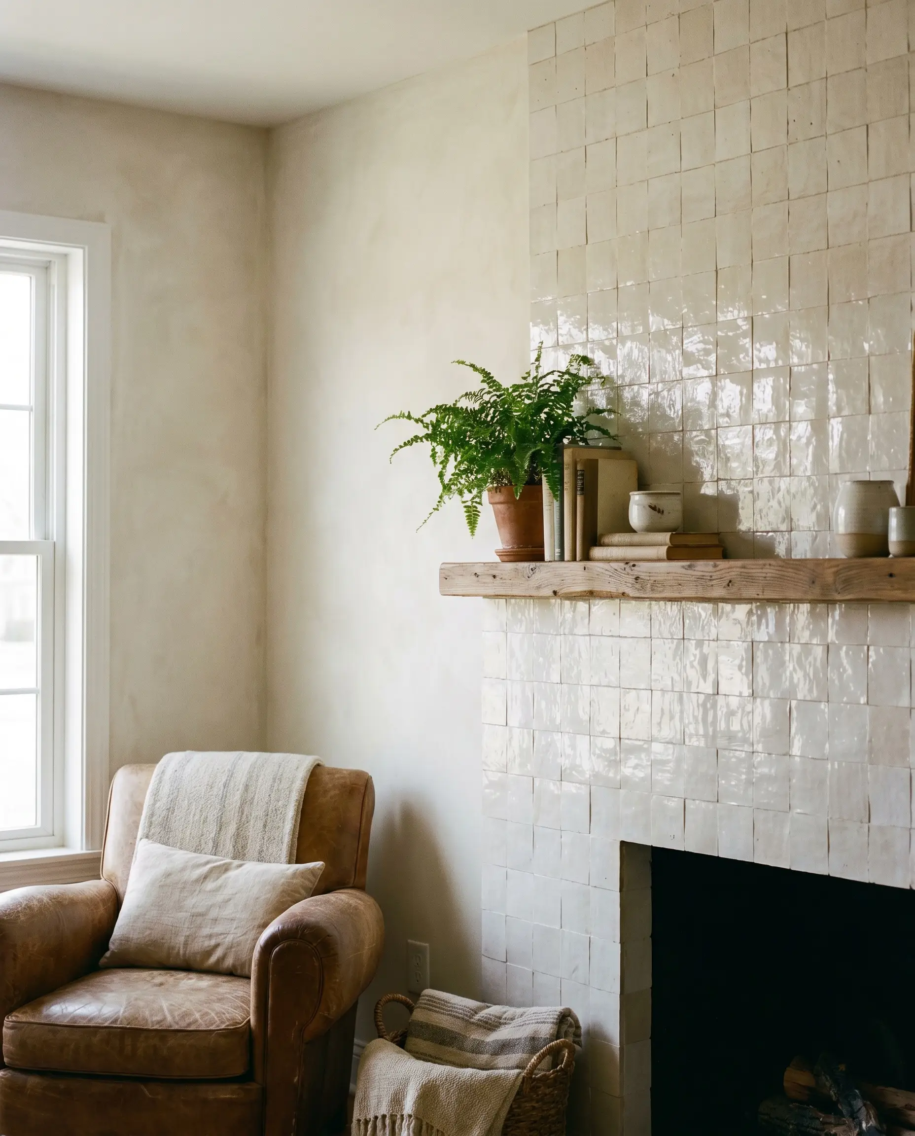
Highlighting a Limewashed Fireplace Breast
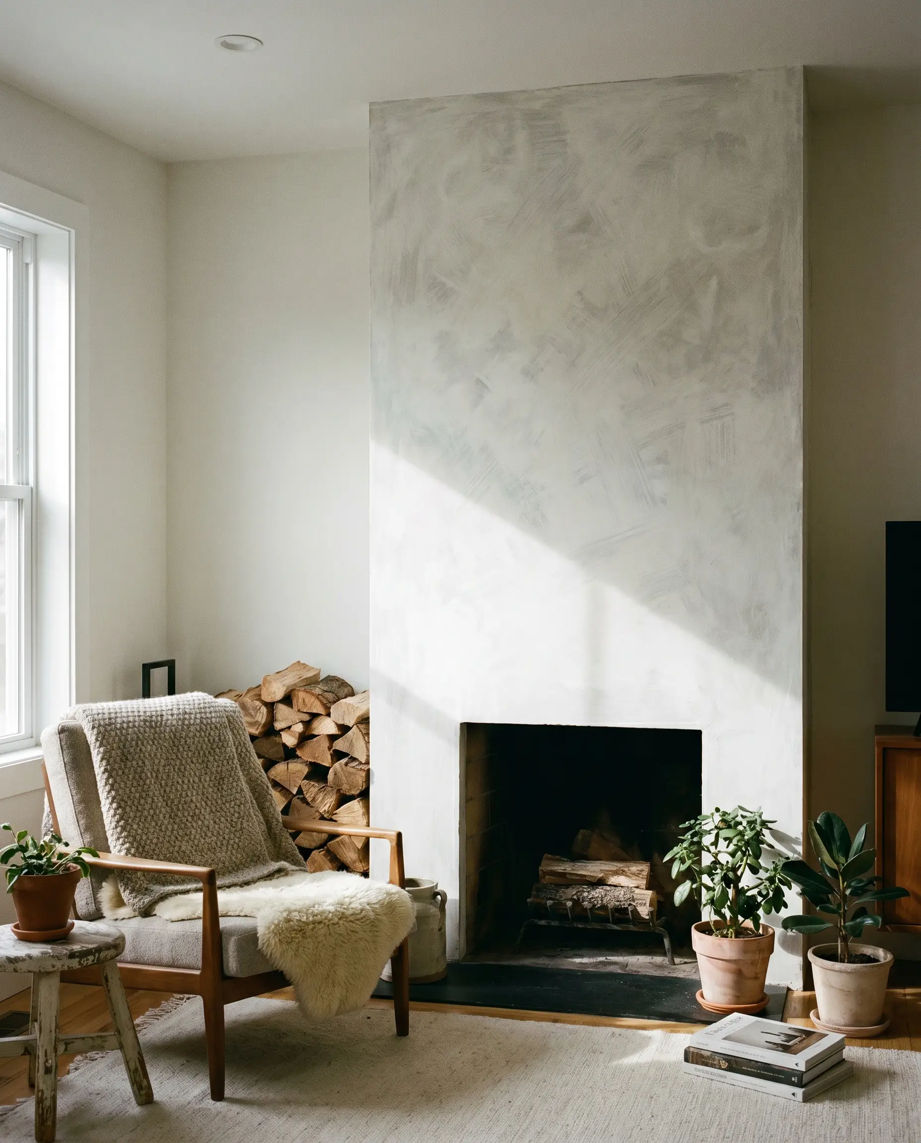
Transforming a standard drywall fireplace bump-out into a faux-concrete or custom plaster focal point is entirely achievable with just a block brush and a high-quality mineral primer. The cross-hatch technique adds immediate gravitas to the living room’s central anchor.
- Vibe: Custom, monolithic architecture.
- Key Materials: Mineral-bonding primer, 6-inch masonry block brush.
- Styling Pro-Tip: Keep the mantel minimal or omit it entirely to let the texture speak for itself.
| Feature | Limewash | Roman Clay |
|---|---|---|
| Application | Brushed on (cross-hatch pattern) | Troweled on (putty knife/spatula) |
| Finish Texture | Cloudy, matte, distinctly chalky | Smooth, marble-like, subtle sheen |
| Pros | Highly DIY-friendly, easily touched up | Looks incredibly high-end, smooth to the touch |
| Cons | Can look messy if brushstrokes are too uniform | Labor-intensive, difficult to repair if chipped |
Color-Drenching the Ceiling and Walls Together
Taking the limewash up the walls and directly across the ceiling blurs harsh architectural corners and visually expands the room’s height. This enveloping technique eliminates the stark visual break of a white ceiling, creating a seamless, cocoon-like atmosphere.
- Vibe: Immersive, luxury sanctuary.
- Key Technique: Maintain the exact same cross-hatch rhythm on the ceiling to ensure the texture flows uninterrupted.
- Styling Pro-Tip: Use a flat, matte finish for any recessed lighting trims so they disappear into the painted ceiling.
Defining Arched Doorways with Textural Contrast
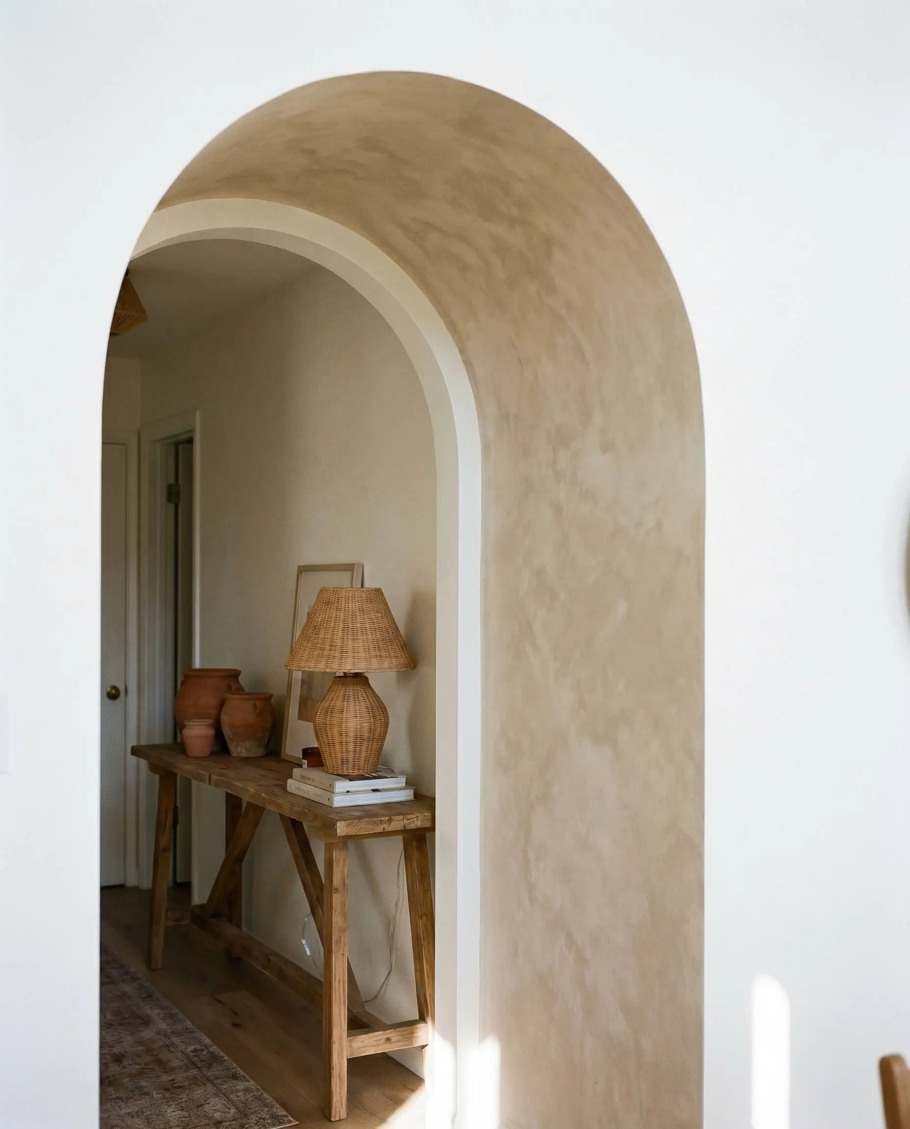
If committing to an entire room feels overwhelming, apply limewash strictly to the inside curve of an archway or the single wall housing the arch. This isolated application emphasizes the architectural curve, drawing the eye toward the transition space.
- Vibe: Subtle, curated Mediterranean detail.
- Key Materials: Flexible painter’s tape for clean arch lines, detail brush.
- Paint Match: Contrast a stark white room with a soft beige inside the arch.
Creating a Faux Venetian Plaster Wainscoting
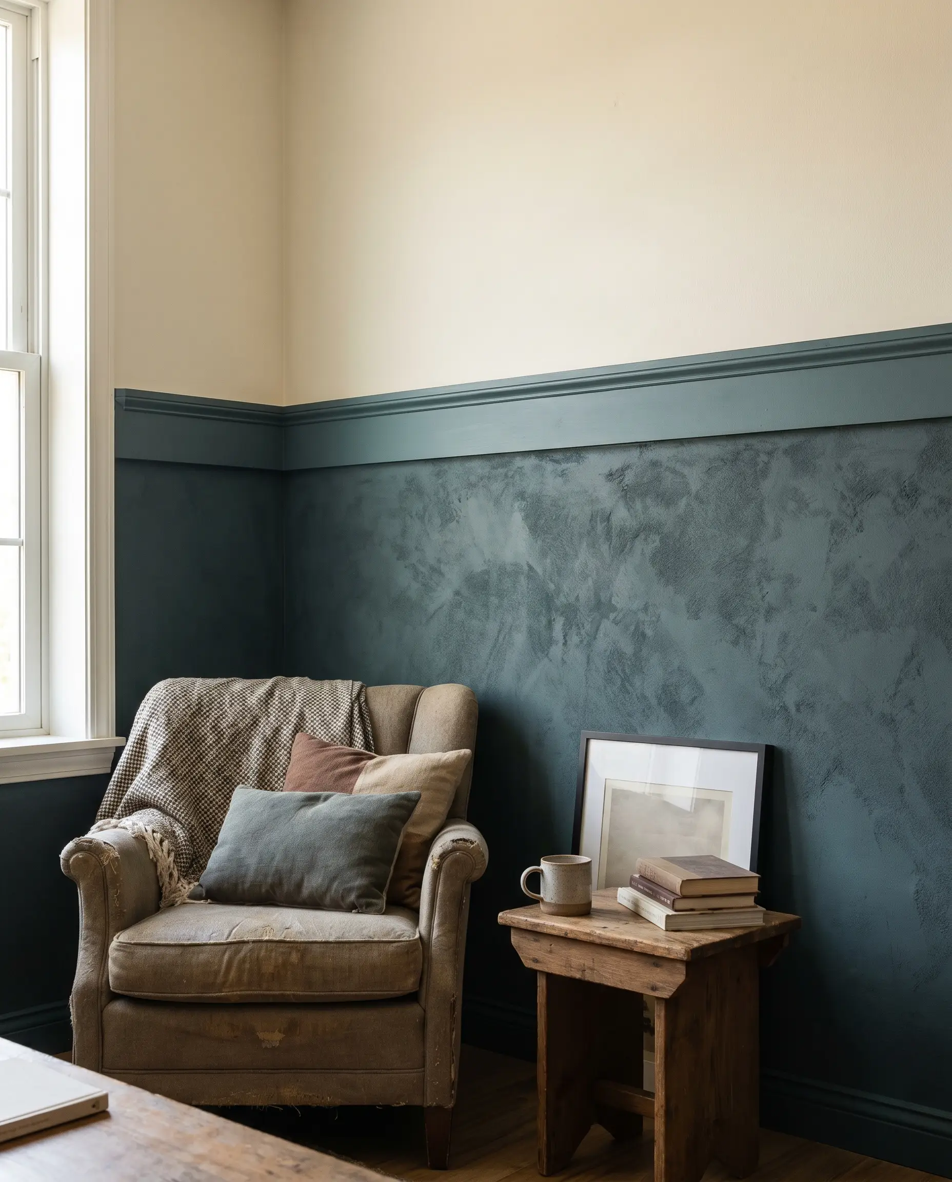
Applying limewash strictly to the lower half of the wall beneath a chair rail mimics the look of expensive tadelakt or Venetian plaster in a high-traffic zone. This budget-friendly approach grounds the room with heavy texture while keeping the upper walls light and airy.
- Vibe: Historic, traditional-meets-modern.
- Key Materials: Solid wood chair rail, deep mineral wash.
- Styling Pro-Tip: Paint the chair rail in a matching matte tone to bridge the limewash with the upper drywall seamlessly.
Furniture, Lighting, and Material Pairings
The most beautifully applied limewash wall will fail completely if it is lit poorly or placed next to flat, synthetic textures. The success of this highly tactile finish relies entirely on the friction generated by the surrounding lighting, textiles, and hard materials.
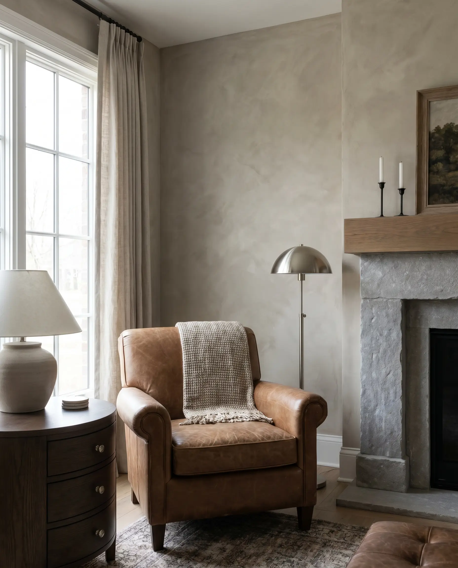
Grazing the Wall with Ambient Sconce Lighting
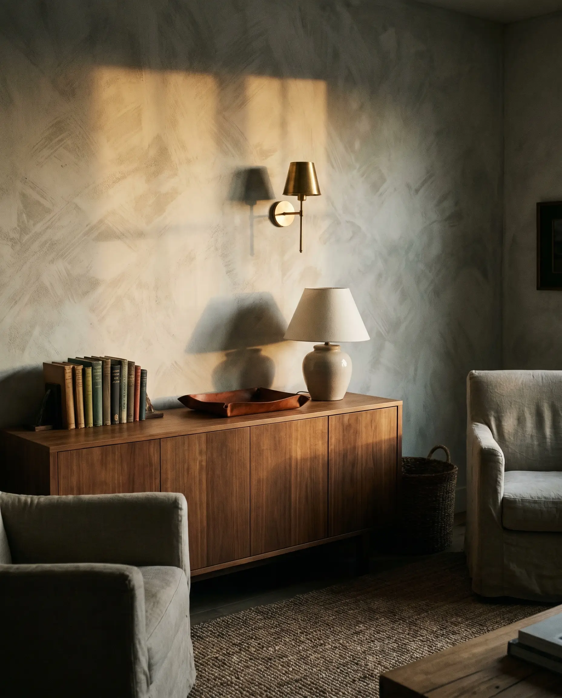
Never rely exclusively on overhead recessed lighting, which flattens the room and washes out the texture. Industry standards dictate the use of wall sconces positioned to cast light up or down the wall, actively grazing the surface to highlight the tactile brushstrokes.
- Vibe: Moody, hotel-like ambiance.
- Lighting Spec: 2700K warm bulbs.
- Styling Pro-Tip: Mount unlacquered brass sconces directly onto the limewash for maximum material contrast.
Anchoring the Space with Heavy Travertine Tables
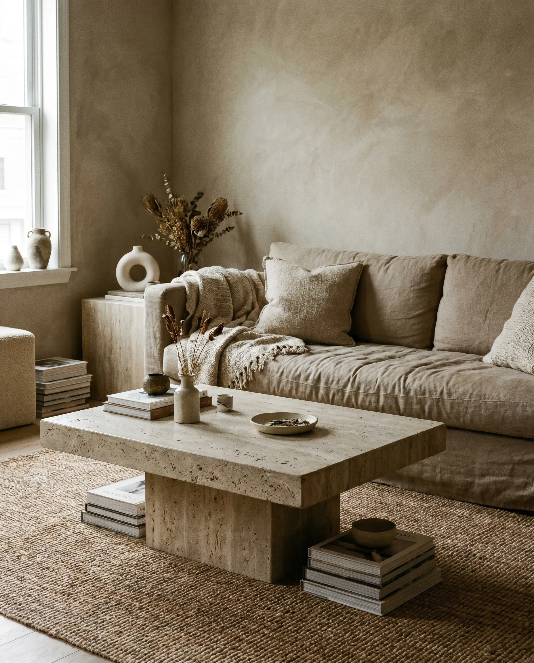
Match the porous, earthy nature of the wall with heavy, stone coffee tables to establish a cohesive geological theme. The subtle pitting in the stone perfectly mirrors the mottled, chalky variations of the slaked lime.
- Vibe: Grounded, geological modernism.
- Key Material: Honed travertine or raw limestone.
- Styling Pro-Tip: Opt for monolithic, plinth-style tables to enhance the architectural weight of the space.
Contrasting Matte Walls with Glossy Zellige Tile Accents
Too much matte material makes a room feel dead and visually exhausting. Introduce high-gloss tiles on a nearby fireplace surround or adjoining open-concept kitchen to bounce light around the room and create necessary friction.
- Vibe: Dynamic, textural contrast.
- Key Material: Glossy Moroccan zellige tiles.
- Styling Pro-Tip: Match the tile color closely to the wall color so the contrast comes entirely from the finish, not the pigment.
Softening the Look with Floor-to-Ceiling Linen Drapes
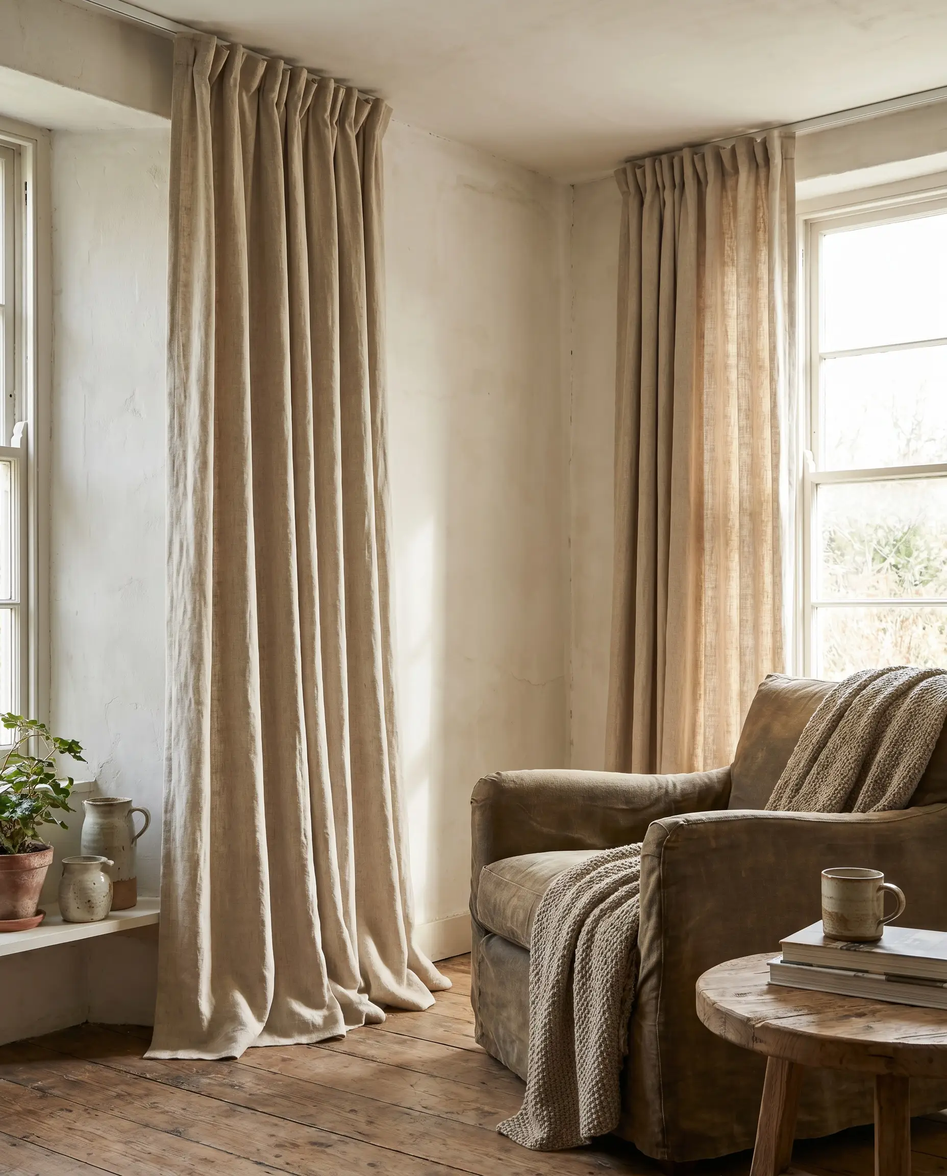
Avoid heavy, shiny silks or stiff synthetics, which instantly clash with the organic nature of the paint. Opt for relaxed, puddled window treatments to match the effortless, wabi-sabi energy of the room.
- Vibe: Breezy, effortless softness.
- Key Material: Heavyweight unbleached linen.
- Styling Pro-Tip: Mount the curtain track flush to the ceiling to emphasize the room’s height and allow the fabric to cascade down the textured walls.
Using Sculptural Seating to Echo Organic Lines
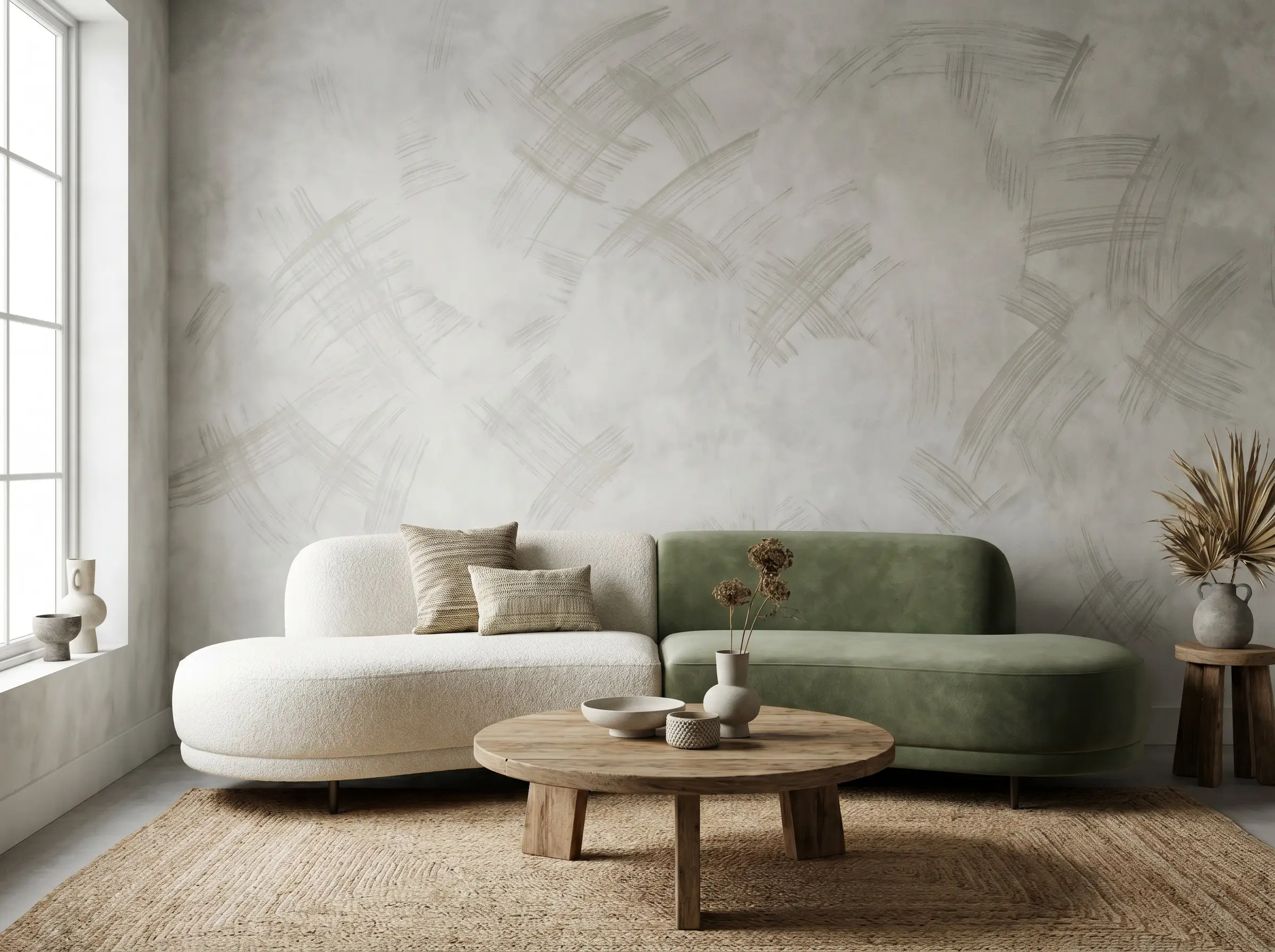
Ditch rigid, boxy sofas that fight against the cloudy movement of the paint. Current design principles favor curved, sculptural seating that mirrors the organic, fluid brushstrokes behind them.
- Vibe: Fluid, contemporary wabi-sabi.
- Key Material: Textured bouclé or matte velvet.
- Styling Pro-Tip: Float the furniture a few inches away from the wall to allow shadows to drop cleanly behind the seating.
Introducing Matte Black Hardware to Ground the Palette
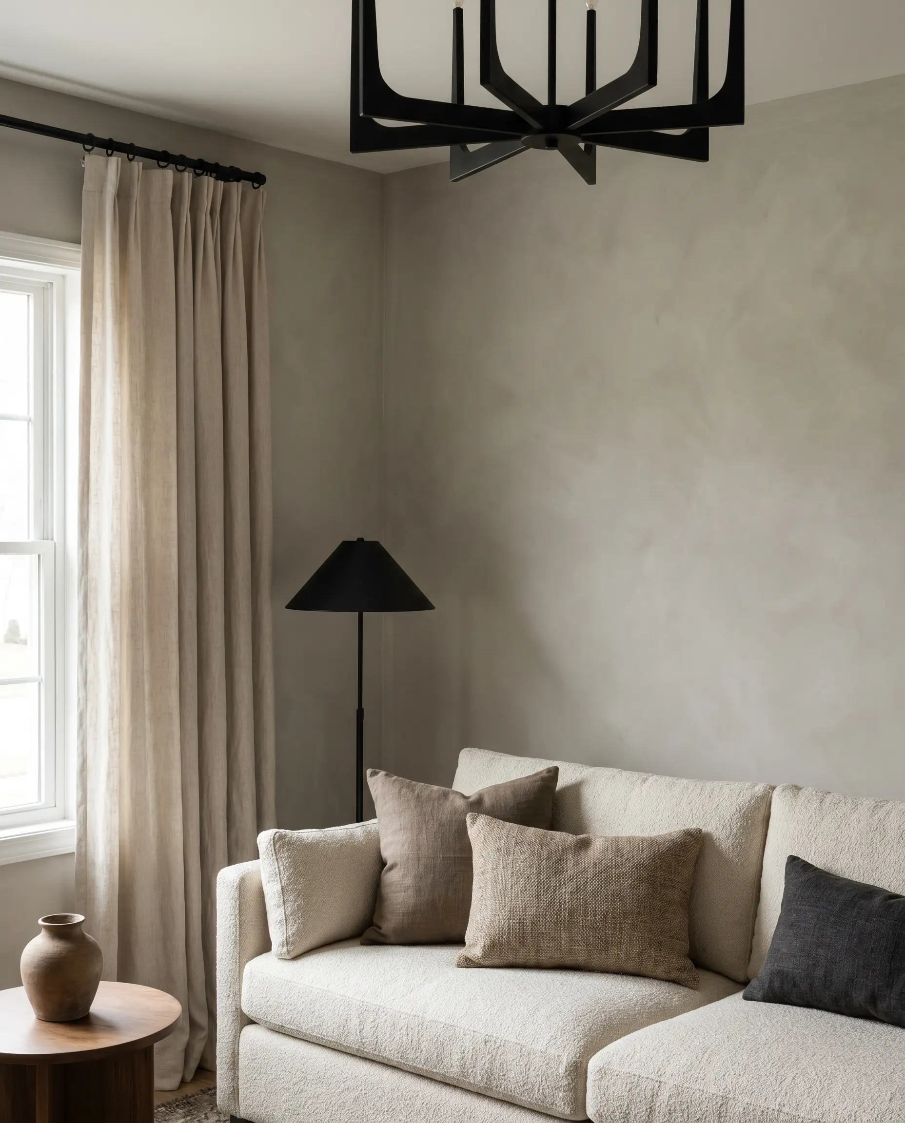
Soft, cloudy walls require sharp, necessary contrast to prevent the room from feeling completely untethered. Utilize dark hardware to act as visual punctuation marks throughout the airy space.
- Vibe: Sharp, tailored organic modern.
- Key Material: Matte black curtain rods, light fixtures, or picture frames.
Think of black hardware like eyeliner for your room. You only need a few well-placed matte black accents to define the boundaries of the space against the soft mineral wash.
Hackrea Styling Tip
Layering Vintage Oushak Rugs Over Hardwood
Pair the historical, old-world feel of slaked lime with faded, vintage floor coverings to build a collected, aged-over-time aesthetic. The intricate, worn patterns of the rug provide a beautiful counterbalance to the broad, sweeping strokes of the wall.
- Vibe: Curated, heritage revival.
- Key Material: Vintage Oushak or faded Persian rugs.
- Styling Pro-Tip: Ensure the dominant undertone of the rug complements the limewash (e.g., a rusty rug against sandstone walls).
Sourcing the Right Finish: Limewash vs. Roman Clay
Consumers constantly confuse these two finishes, leading to costly installation mistakes. Limewash is applied with a block brush, resulting in a cloudy, matte, and highly chalky surface. Roman Clay, however, is troweled on with a putty knife, resulting in a smooth, marble-like finish with a subtle sheen. Regardless of your choice, standard drywall absolutely requires a specialized mineral primer first, otherwise, the natural lime will slide right off the latex paint beneath it.
- Portola Paints: Best known for their massive, designer-approved color library and incredibly authentic, heavily pigmented Roman Clay and Limewash formulas.
- Bauwerk Colour: Best known for their eco-friendly, traditional slaked lime washes imported from Australia, offering some of the most complex, earthy neutrals on the market.
- Color Atelier: Best known for highly durable, authentic lime paints and plasters that provide an exceptional, velvety matte finish for high-traffic DIY applications.
Ready to Pick Up the Block Brush?
While achieving the perfect mottled finish requires patience, a strong arm, and the mandatory mineral primer, limewashing your living room remains the highest ROI weekend project for achieving a bespoke architectural look. Remember that slaked lime dries up to ten times lighter than it looks in the bucket, so always test large sample swatches on your actual walls, observing how your specific directional lighting changes the patina from morning to night.
Ready to complete your space? Explore our guide on Organic Modern Living Rooms for expert advice on sourcing the perfect sculptural seating and travertine tables to pair with your new mineral walls.