Reflection SW 7661
Sherwin-WilliamsSherwin-Williams Reflection (SW 7661) is a light, cool-toned gray with subtle blue-green undertones. With an LRV of 66, it reflects a generous amount of light, creating a crisp, airy, and tranquil atmosphere perfect for modern and transitional spaces.
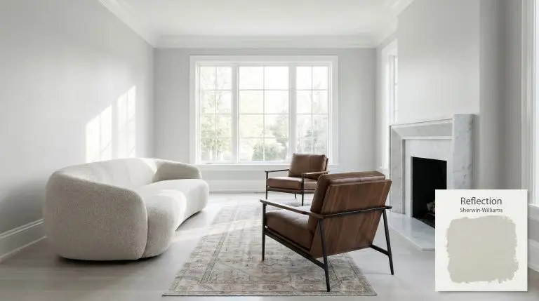
Sherwin-Williams Reflection: The Silvery Architectural Gray for Tailored Interiors
Finding the right cool neutral often feels like walking a tightrope between refreshing and sterile. Sherwin-Williams Reflection is a highly intentional, silvery backdrop that forces a room to feel instantly tailored and composed.
This crisp architectural finish thrives on contrast, offering a clean, structured edge when paired with pure white trim or honed marble surfaces. By leaning away from the muddy warmth of popular greiges, Reflection provides a refreshing, icy aesthetic that feels both modern and deeply refined.
Sherwin-Williams Reflection: Temperature, Undertones & LRV
Sherwin-Williams Reflection is a definitively cool gray. It completely abandons the beige spectrum to deliver a crisp, refreshing temperature that immediately modernizes a space. Let’s break down exactly how this color structure operates on your walls:
At a Light Reflectance Value of 66, this shade is highly reflective and actively bounces ambient lighting. This specific brightness level expands the visual boundaries of smaller rooms while retaining enough depth to pop beautifully against stark white millwork.
You can apply wallpapers, paints, etc. on walls and see how they look in various interiors.

Lighting Effects & The Chameleon Factor
Because of its delicate cyan lean, this cool gray is highly reactive to the shifting temperature of natural and artificial light.
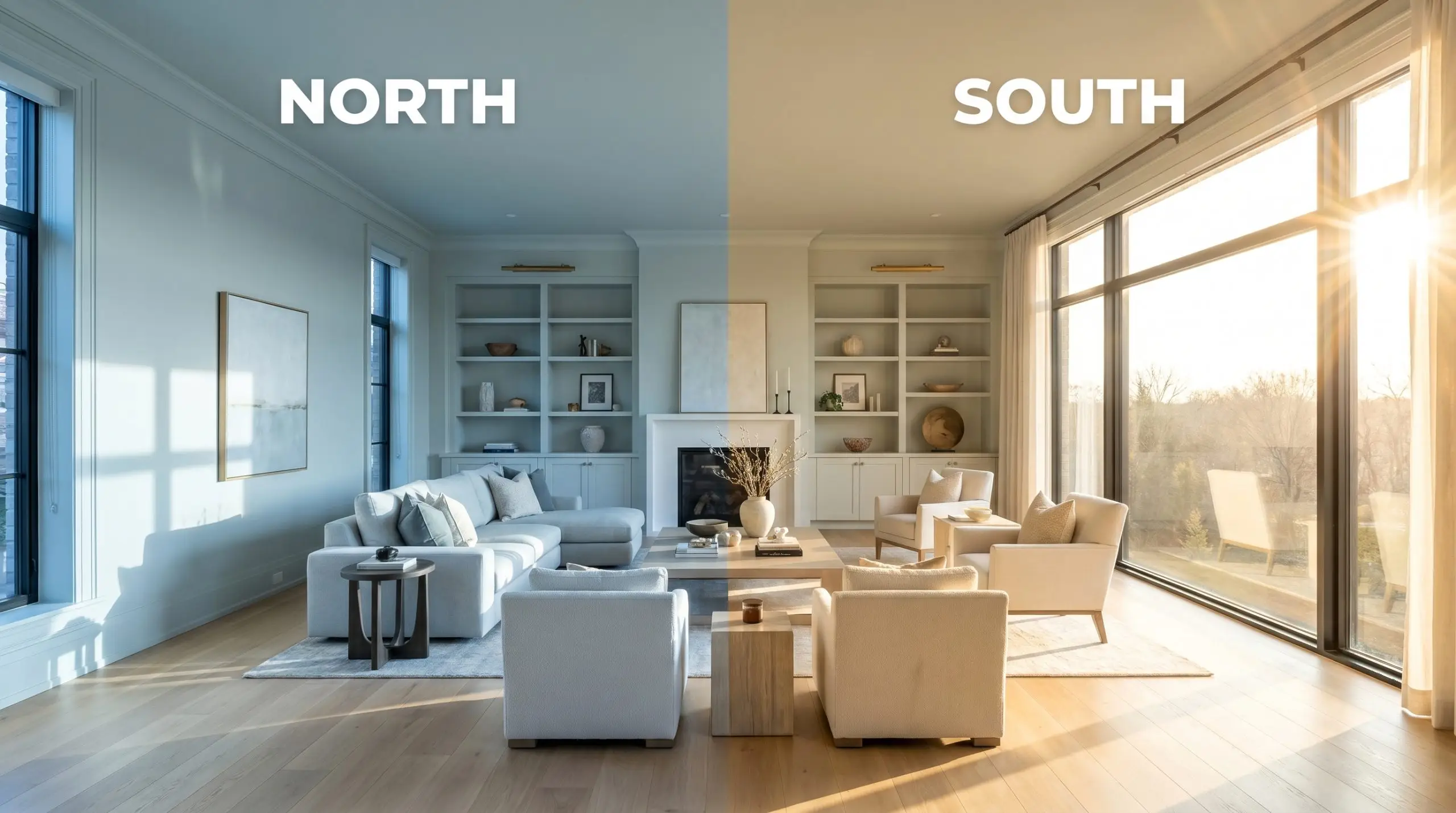
When applied to exterior siding, direct midday sun will wash out a significant portion of its depth. This intense exposure makes the paint appear much lighter and brilliantly silver on a facade.
Popular Applications for This Silvery Neutral
The crisp, reflective nature of this gray makes it an incredibly versatile tool for shaping the mood of a home. Here is how to manipulate its cool undertones across different architectural environments.
Bathrooms and Spa-Like Retreats
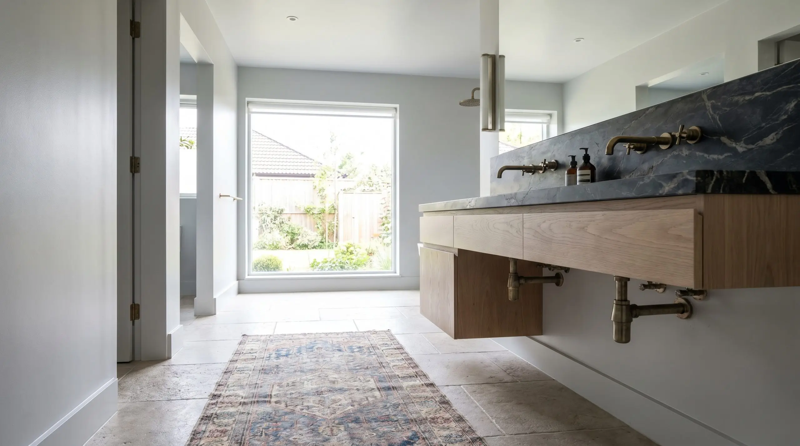
Instead of defaulting to standard white subway tile, use this shade to create a sophisticated, high-contrast wet room. Pair it with heavily veined soapstone counters and unlacquered brass plumbing fixtures to introduce organic warmth against the cool walls.
Always stabilize icy tones with tactile, organic textures. A floating white oak vanity or a vintage runner rug will keep the space from feeling too clinical.
Hackrea Pro-Tip (The Material Balance)
For a truly seamless look, carry the paint up onto the ceiling to visually expand the room’s height.
South-Facing Living Rooms
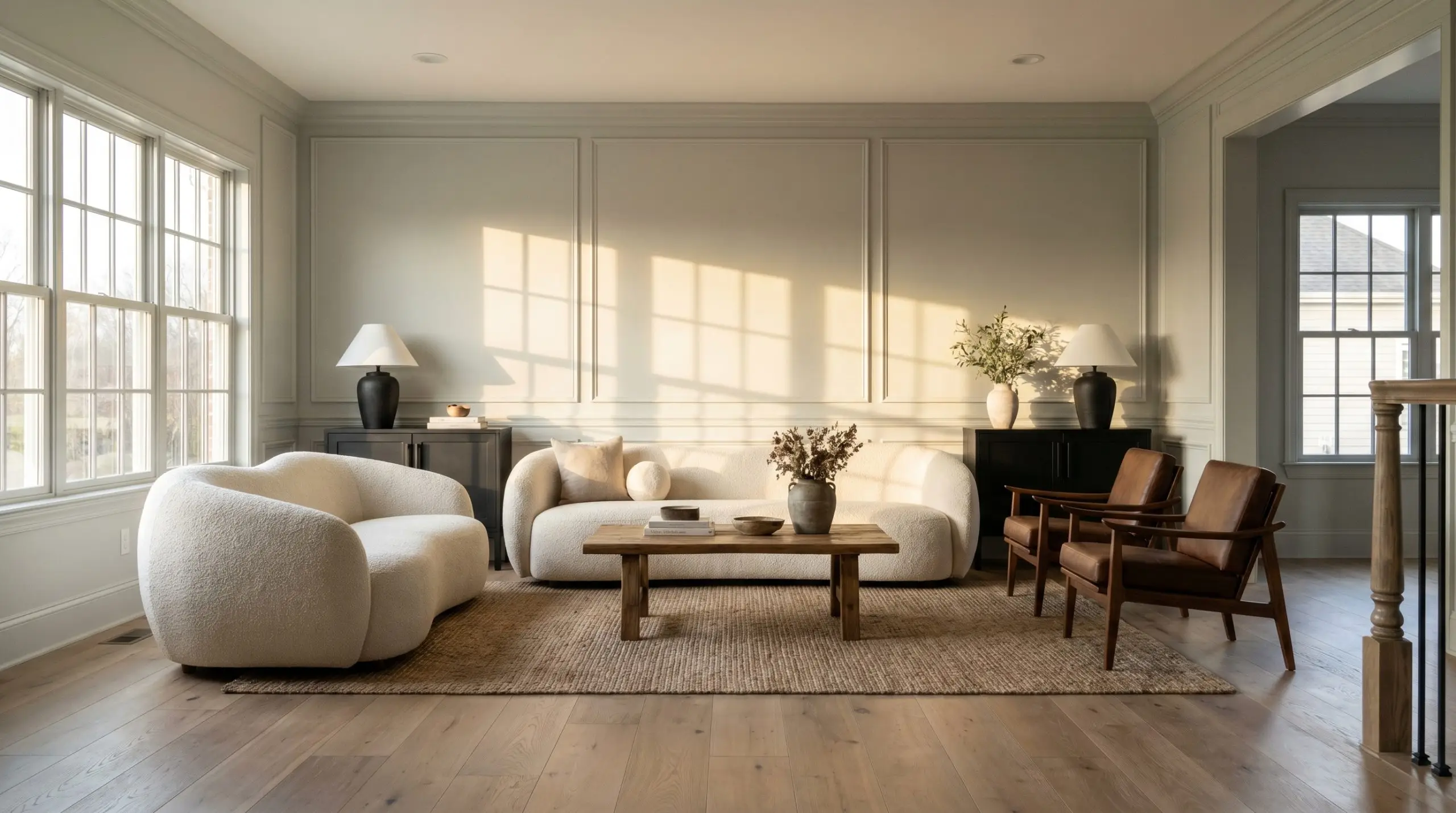
In rooms flooded with warm, southern sunlight, this color loses its chill and acts as a stabilizing, soft backdrop. This is the perfect environment to mix high-end, aspirational pieces—like a sculptural boucle sofa—with practical, everyday foundational furniture.
Layer in rich walnut accent chairs and matte black hardware to provide necessary visual tension. To elevate standard drywall, install picture frame molding and paint the entire wall, including the trim, in a satin finish for a subtly tailored, custom-built appearance.
Coastal and Modern Bedrooms
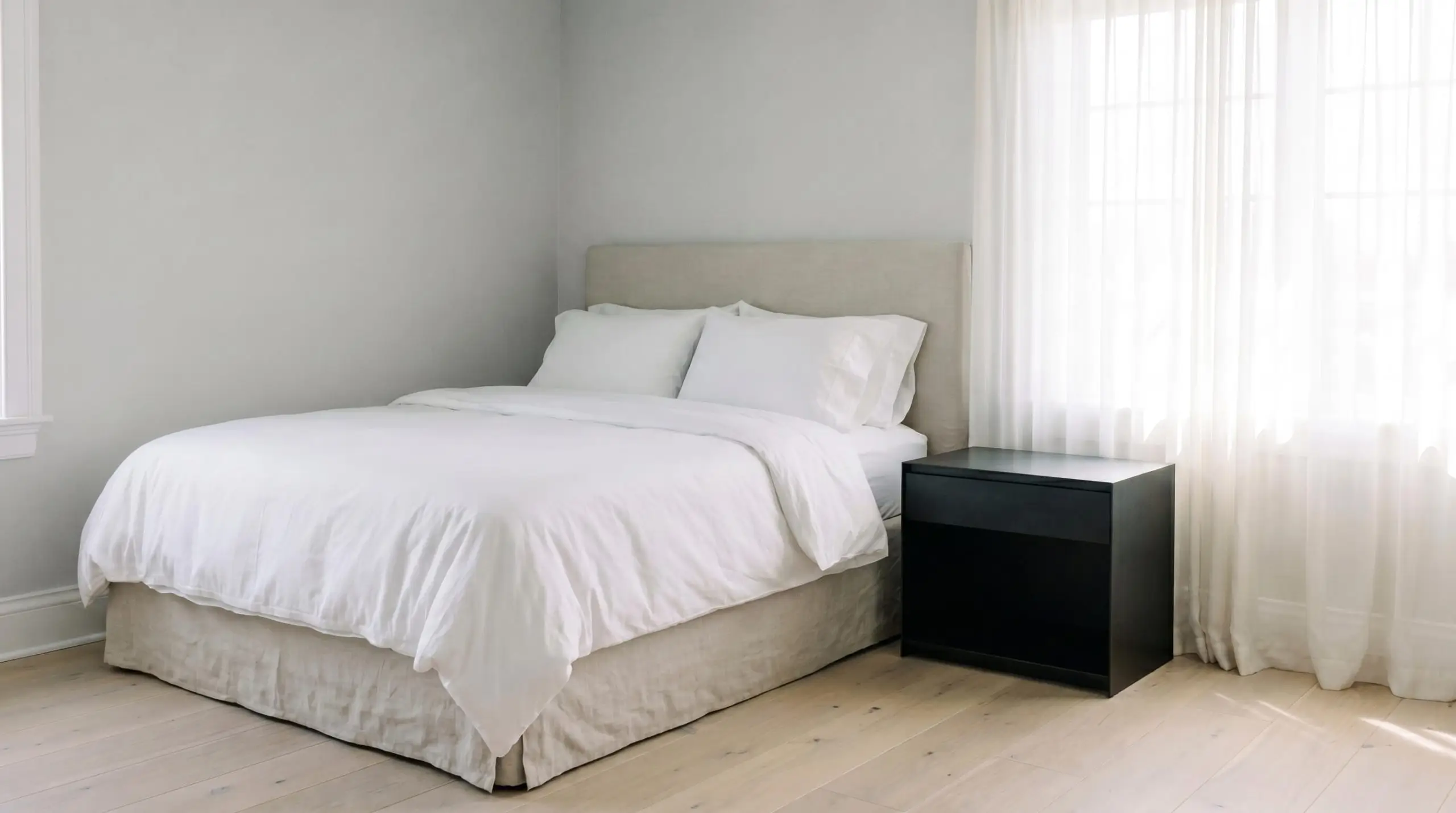
You can achieve a refined coastal aesthetic without relying on literal nautical cliches. Use this silvery hue as a quiet foundation behind a slipcovered linen bed and sheer cotton drapery that filters the morning light.
Introduce blackened steel nightstands or a modern acrylic bench to pull the design firmly into contemporary territory.
Avoid pairing this shade with cream or yellow-based ivory linens. The stark temperature difference will make the fabrics look dingy; stick to crisp, hotel-white sheets for a flawless transition.
Clash Warning (The Bedding Trap)
Exterior Siding
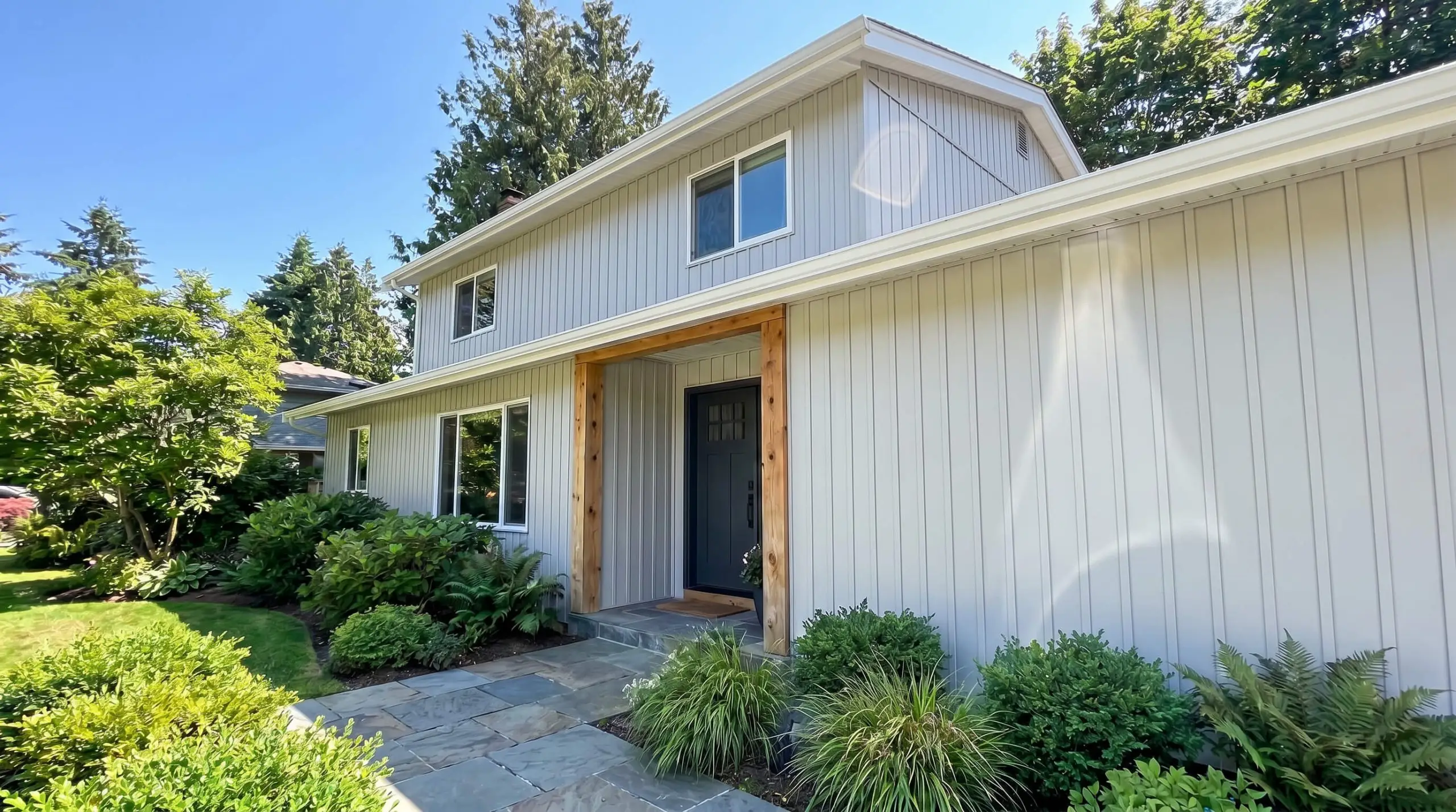
On a home’s facade, direct sunlight will significantly increase the perceived brightness, turning this gray into a brilliant, soft silver. It works exceptionally well on traditional clapboard or sleek, modern vertical paneling.
Anchor the light exterior with a dark, charcoal-painted front door and crisp white fascia boards to establish a striking architectural boundary. Integrate rough-hewn cedar columns or natural slate walkways to introduce an earthy element that softens the crisp paint job.
Building a Palette Around This Silvery Gray
This crisp gray requires sharp, deliberate boundaries to maintain its tailored structure rather than bleeding into its surroundings. Surrounding it with high-contrast whites and deeply saturated tones enhances its architectural presence without overwhelming the room.
Trim & Baseboards
Hardware, Wood & Material Pairings
Coordinating Colors
Designer Mood Boards
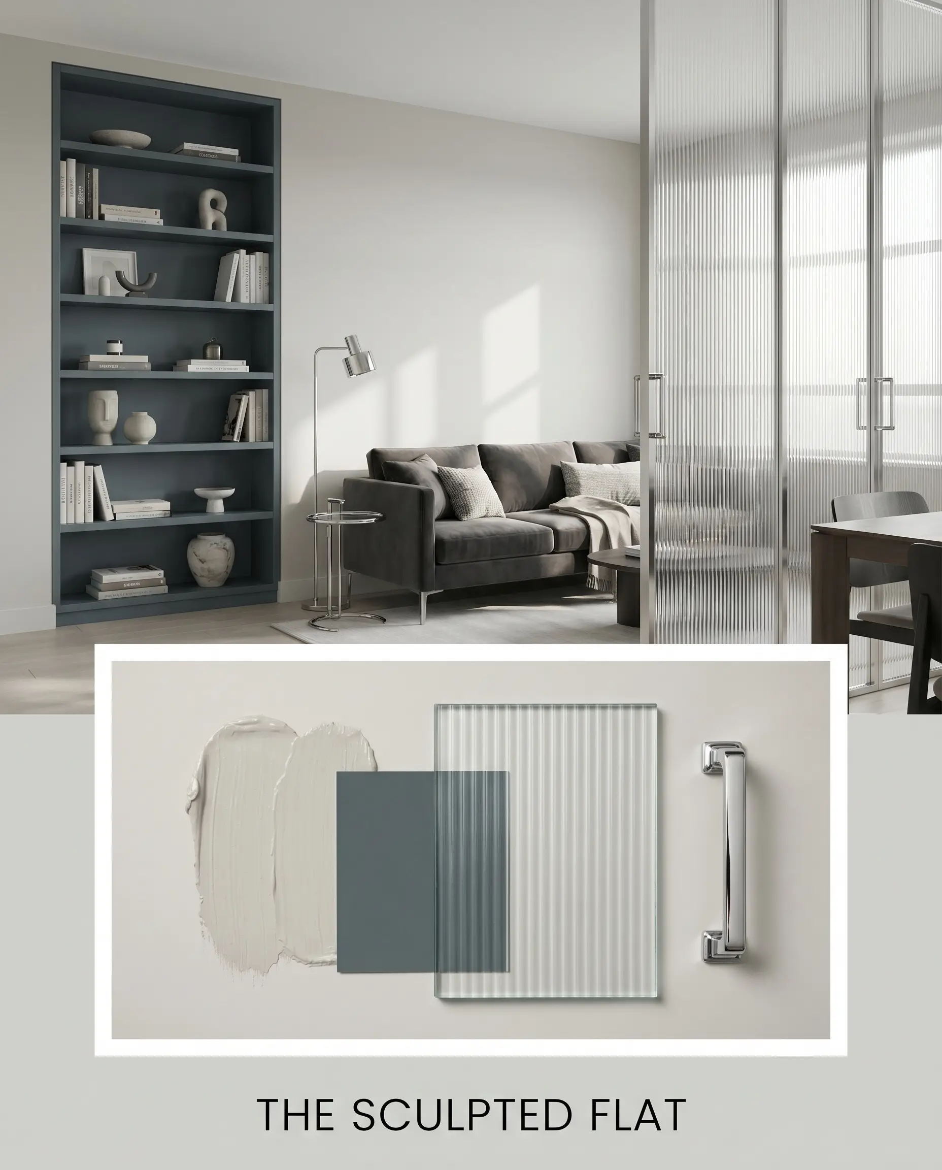
The Sculpted Flat
This aesthetic leverages the sharp contrast between the silvery walls and deep, saturated accents like an Inchyra Blue No. 289 painted bookcase. Incorporating polished chrome hardware and fluted glass partitions emphasizes a sleek, metropolitan energy that feels highly intentional. Ground the bright perimeter with a low-profile, charcoal velvet sofa to establish a sophisticated, high-contrast focal point.
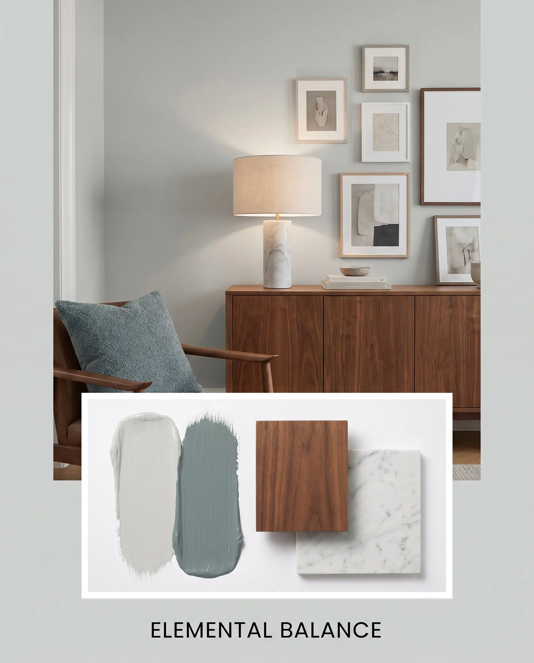
Elemental Balance
To soften the crispness of the paint, introduce rich walnut furniture and honed marble surfaces that pull organic warmth into the room. Layering muted accents like an Aegean Teal 2136-40 throw pillow creates a gentle, cohesive dialogue with the wall’s hidden undertones. Finish the styling with an asymmetrical gallery wall and linen drum shades to keep the atmosphere relaxed yet highly curated.
Head-to-Head: Sherwin-Williams Reflection vs. Rival Grays
Choosing the right cool neutral often comes down to how much natural light your specific layout receives. If your home lacks large windows or faces north, you might need to evaluate alternatives that handle shadows differently to prevent the walls from looking flat.
Sherwin-Williams Reflection vs. Sherwin-Williams Olympus White
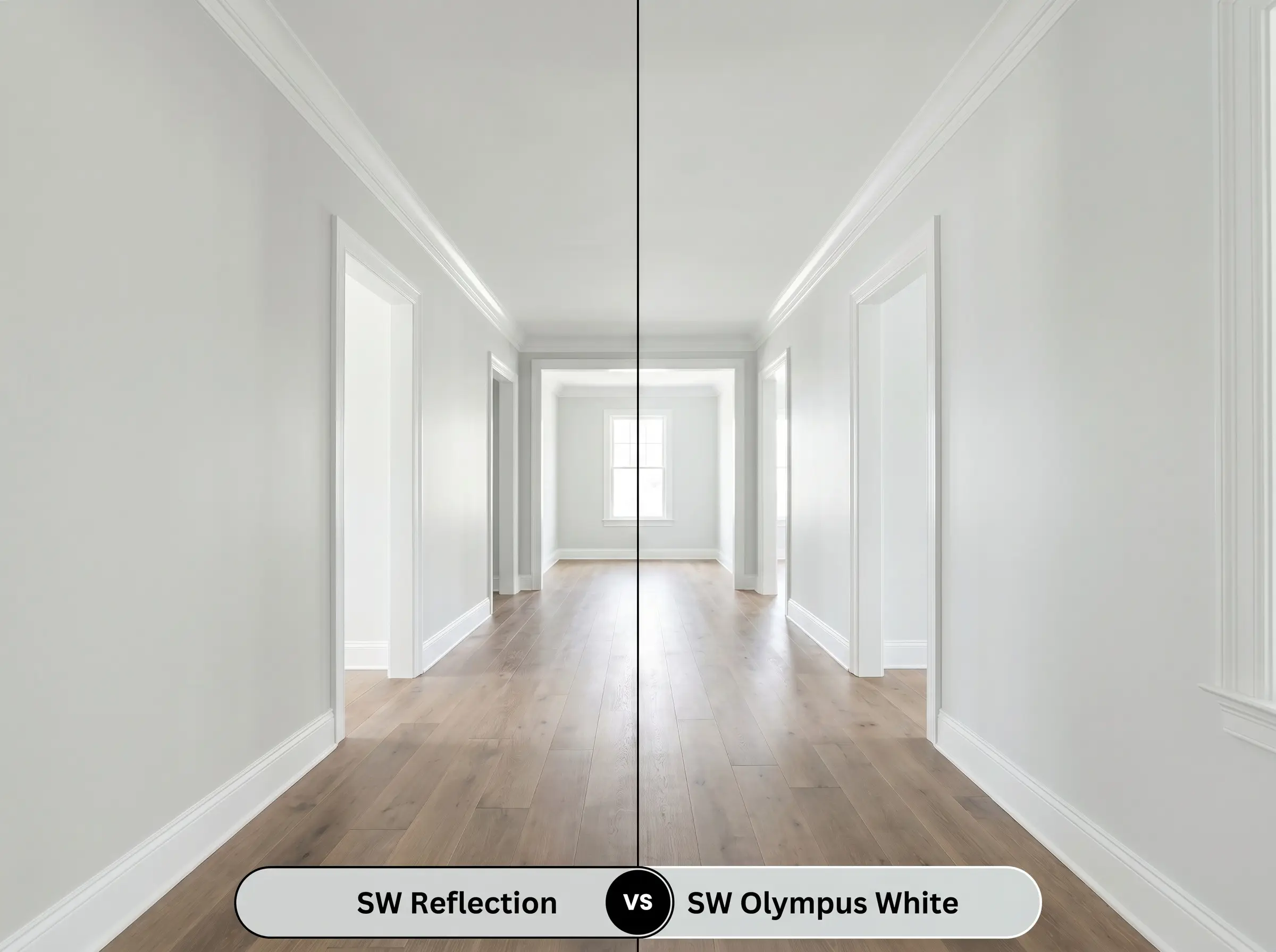
Sherwin-Williams Olympus White SW 6253 shares a remarkably similar cool profile but carries a slightly higher light reflectance and a more pronounced blue undertone. If you are designing a dimly lit hallway, Olympus White will hold onto its crispness longer before graying out. However, if your room receives intense southern light, the original silver shade provides a more grounded, sophisticated backdrop that resists turning baby blue.
Sherwin-Williams Reflection vs. Sherwin-Williams Rhinestone
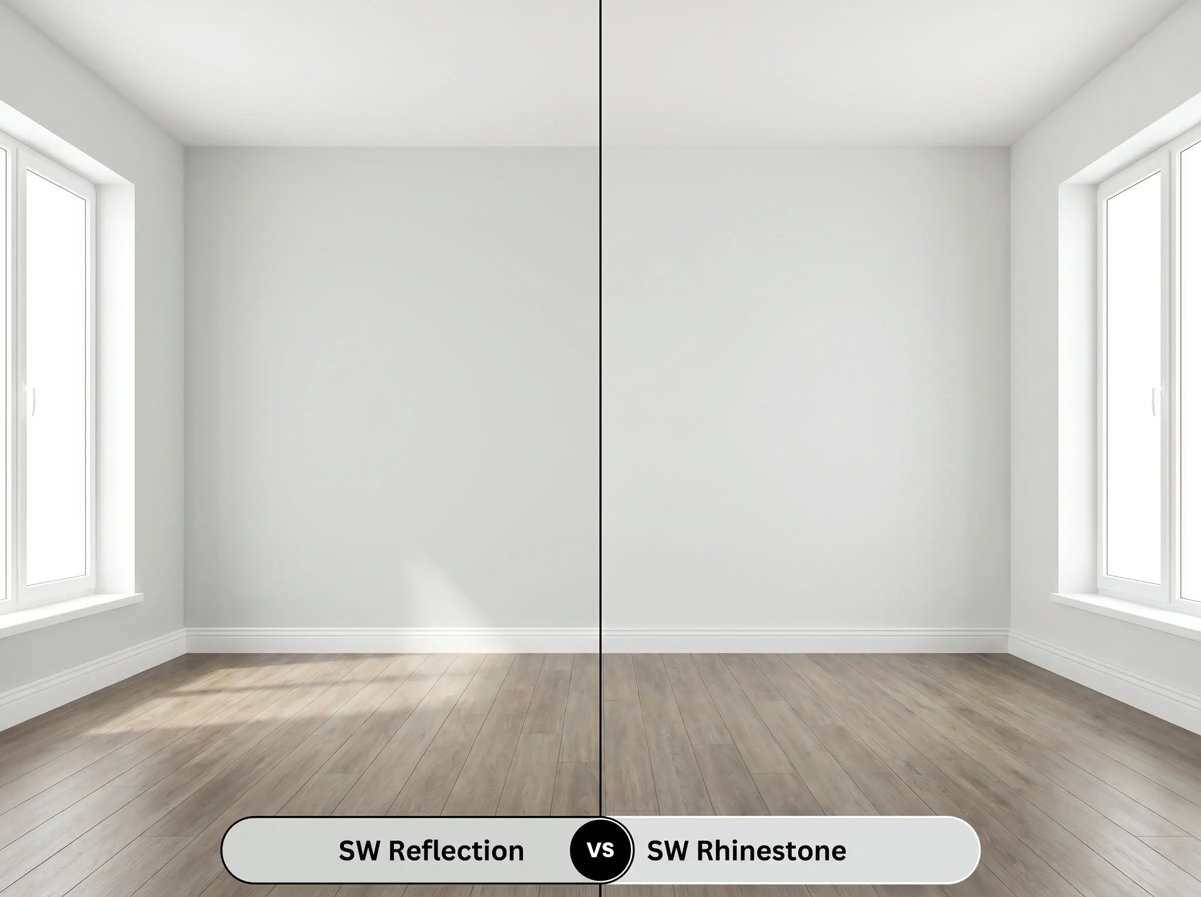
Sherwin-Williams Rhinestone SW 7656 is noticeably lighter and reads closer to a true off-white with a very faint, icy gray cast. If you want the illusion of white walls that simply feel shaded and cool, Rhinestone is the superior choice for a minimalist interior. Conversely, if you need enough depth to create a sharp, distinct boundary against pure white trim, you must stick with the slightly darker profile of the primary gray.
Exploring Similar Colors & Brand Matches
When local availability dictates a brand switch, or you simply need a micro-adjustment in brightness to suit your lighting, exploring exact matches and subtle alternatives is essential.
Same-Brand Alternatives
Cross-Brand Matches
Practical Application & DIY Advice
Executing a flawless finish with a highly reflective, cool neutral requires specific preparation to prevent the underlying drywall from altering the final aesthetic.
The Dynamic Sheen Guide
Primer Strategy
Transitioning from warm, dark colors or unpainted drywall requires a high-quality, white-tinted stain-blocking primer. A pure white base coat neutralizes underlying warmth, ensuring the icy, blue-green nuances of the topcoat cure accurately without turning muddy.
Coverage & Success Tips
This specific depth of gray typically achieves full opacity in two careful coats over a primed surface. Maintain a heavily loaded roller and a wet edge to prevent flashing, as cool, reflective neutrals easily highlight uneven application marks in brightly lit rooms. Touch-ups on highly visible walls should be done by feathering the paint lightly with a dry brush to blend the new sheen seamlessly into the old.
Frequently Asked Questions
Because its underlying structure leans toward cyan rather than magenta, it rarely flashes purple. Instead, in dim or shadowy corners, it simply deepens into a flat, steely charcoal.
The built-in blue-green nuances actually harmonize with environmental reflections from trees. Rather than clashing, the foliage simply amplifies the paint’s natural cyan lean, making it feel slightly more earthy and grounded.
This is a stunning application, as the icy crispness of the painted cabinetry provides necessary visual tension against the organic warmth of the wood. To bridge the temperature gap beautifully, incorporate unlacquered brass hardware.
Thanks to its highly reflective nature, direct exterior sun will strip away much of its depth, making it read as a brilliant, soft silver-white. You must pair it with high-contrast, dark trim to maintain architectural definition.
Final Verdict on Sherwin-Williams Reflection
Sherwin-Williams Reflection is the ultimate architectural tool for homeowners who crave a tailored, metropolitan aesthetic. It excels in well-lit transitional spaces and modern coastal interiors where its crisp, silvery profile can bounce light and create sharp, intentional boundaries against pure white trim. This paint is perfect for those who want a sophisticated, refreshing neutral that completely avoids the muddy warmth of traditional beige.
While this paint is incredibly versatile, its icy composition actively fights against earthy, yellow-dominant finishes. Pairing this crisp gray with golden oak flooring, Tuscan-style travertine, or creamy, yellow-based white trim creates an uncomfortable visual friction that makes the paint look cold and the wood look dated. If your home features predominantly warm, honey-toned hard finishes, you must pivot to a warmer, green-based greige to achieve a cohesive flow.
Hackrea Design Secret (The Temperature Clash)