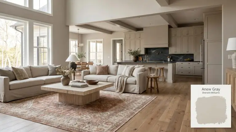
Anew Gray SW 7030
Sherwin-WilliamsSherwin-Williams Anew Gray (SW 7030) is a versatile, light-to-medium warm greige. With an LRV of 47, it bridges the gap between gray and beige, offering a soft, stone-like depth that feels cozy in living spaces and sophisticated on kitchen cabinets or home exteriors.
Sherwin-Williams Anew Gray: The Stone-Infused Neutral That Redefines Warmth
Finding a neutral that carries actual architectural weight without feeling overwhelming is an ongoing challenge. Sherwin-Williams Anew Gray answers that challenge by behaving less like a flat wall color and more like a structural material. This warm greige mimics the quiet strength of natural stone, wrapping a room in an immediate, enveloping atmosphere.
It possesses enough pigment to stand up to bright sunlight while maintaining a soft, approachable taupe base. When applied across expansive living spaces or exterior cladding, it establishes a sophisticated foundation that allows premium finishes to shine.
We rely on this mid-tone to carve out intentional, curated environments that feel both lived-in and highly polished.
Sherwin-Williams Anew Gray: Temperature, Undertones & LRV
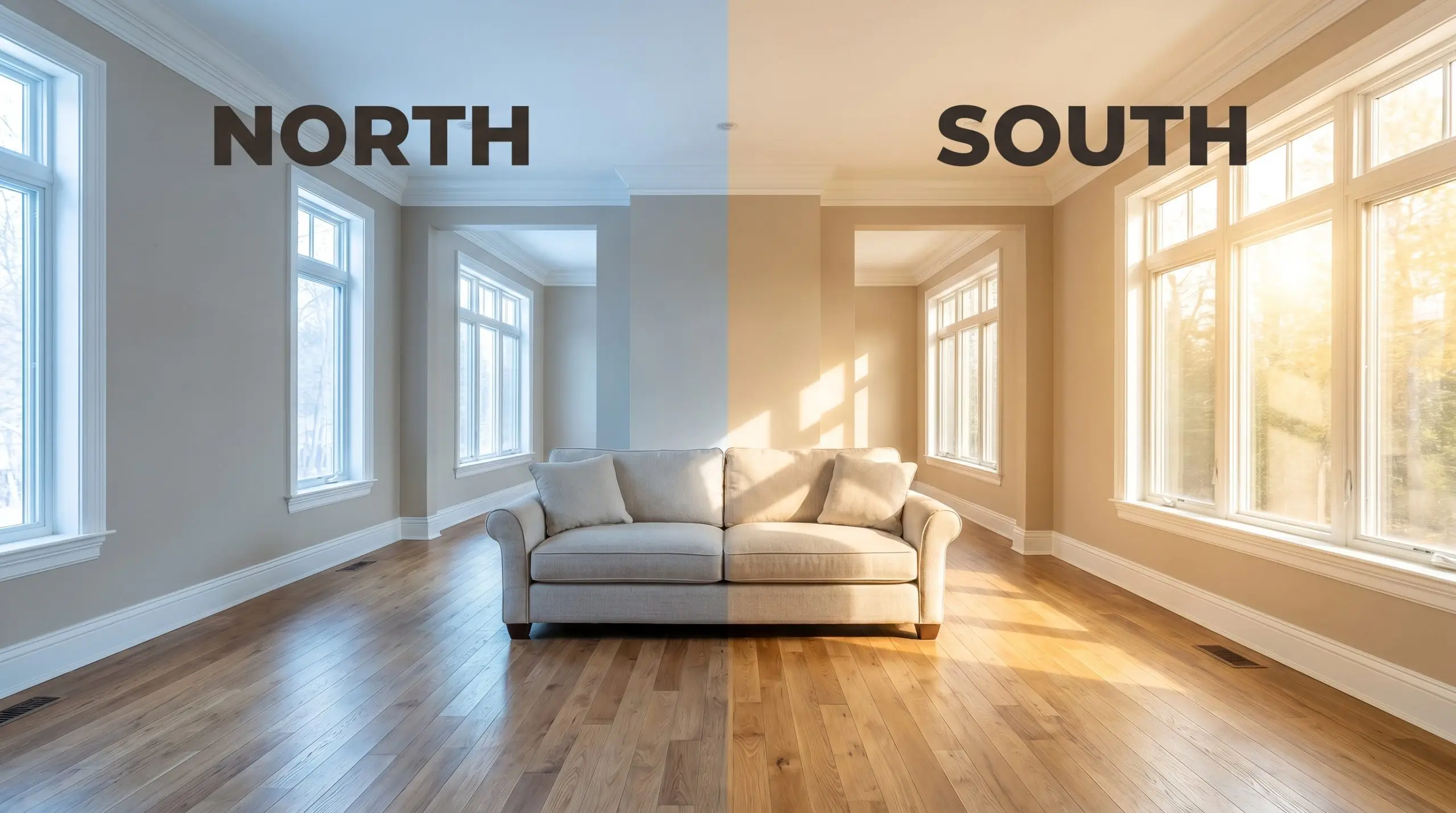
Is this paint warm or cool? Anew Gray SW 7030 is definitively a warm neutral, leaning firmly into a cozy, stone-like temperature that instantly softens a room. This color structure avoids the icy starkness of traditional grays by relying on a complex, earth-toned base.
Sitting at a Light Reflectance Value of 47, this shade absorbs a moderate amount of light to create a substantial, stabilized presence. It strikes the perfect mid-tone balance, holding its depth in brilliant sunlit spaces without turning into a shadowy cave when the lights dim.
You can apply wallpapers, paints, etc. on walls and see how they look in various interiors.

Lighting Effects & The Chameleon Factor
A mid-tone greige with a complex taupe base will always shift depending on the sun’s trajectory and your fixture choices.
Popular Architectural Applications
Because this mid-tone stone gray carries a balanced 47 LRV, it functions beautifully as an architectural finish across diverse environments. Here is how to manipulate this warm greige to build highly curated, intentional spaces.
Kitchen Cabinetry & Islands
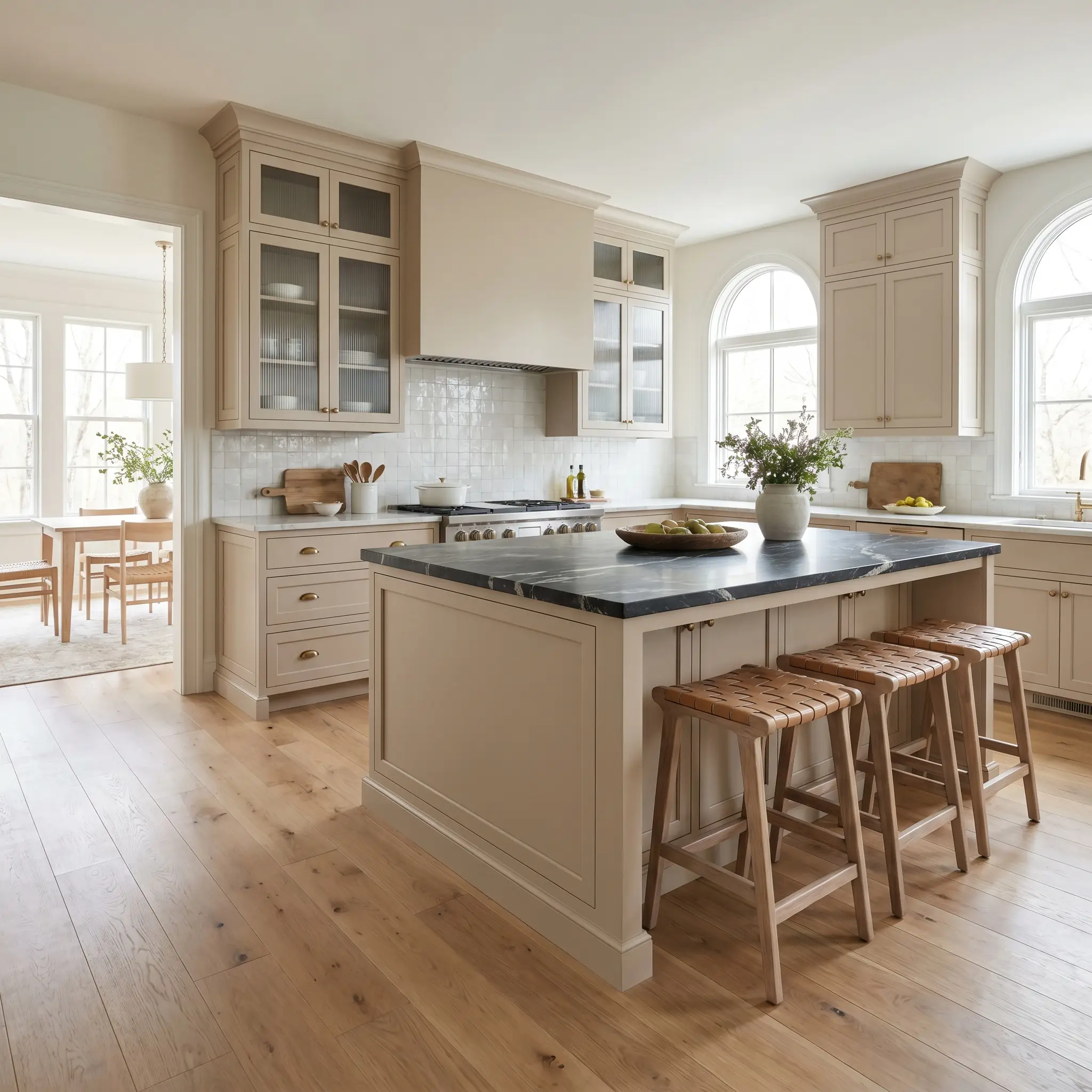
Applying Anew Gray SW 7030 as a cabinetry finish immediately roots the room with a custom, furniture-like quality. The taupe base pairs exceptionally well with intensely veined soapstone countertops or honed marble, leaning into a Parisian Chic aesthetic rather than a predictable farmhouse look.
Unlacquered brass hardware and fluted glass upper cabinets will bounce light against the warm greige, creating a beautiful tension between matte and reflective surfaces. If you have an open layout, painting the central island in this shade establishes a strong visual center that coordinates seamlessly with bleached walnut barstools.
When using a color with a green-violet micro-nuance on cabinetry, polished nickel pulls will highlight the cooler gray notes, while aged brass will pull out the rich, stone-like warmth.
Hackrea Pro-Tip (The Hardware Harmony)
Open-Concept Living & Dining Rooms
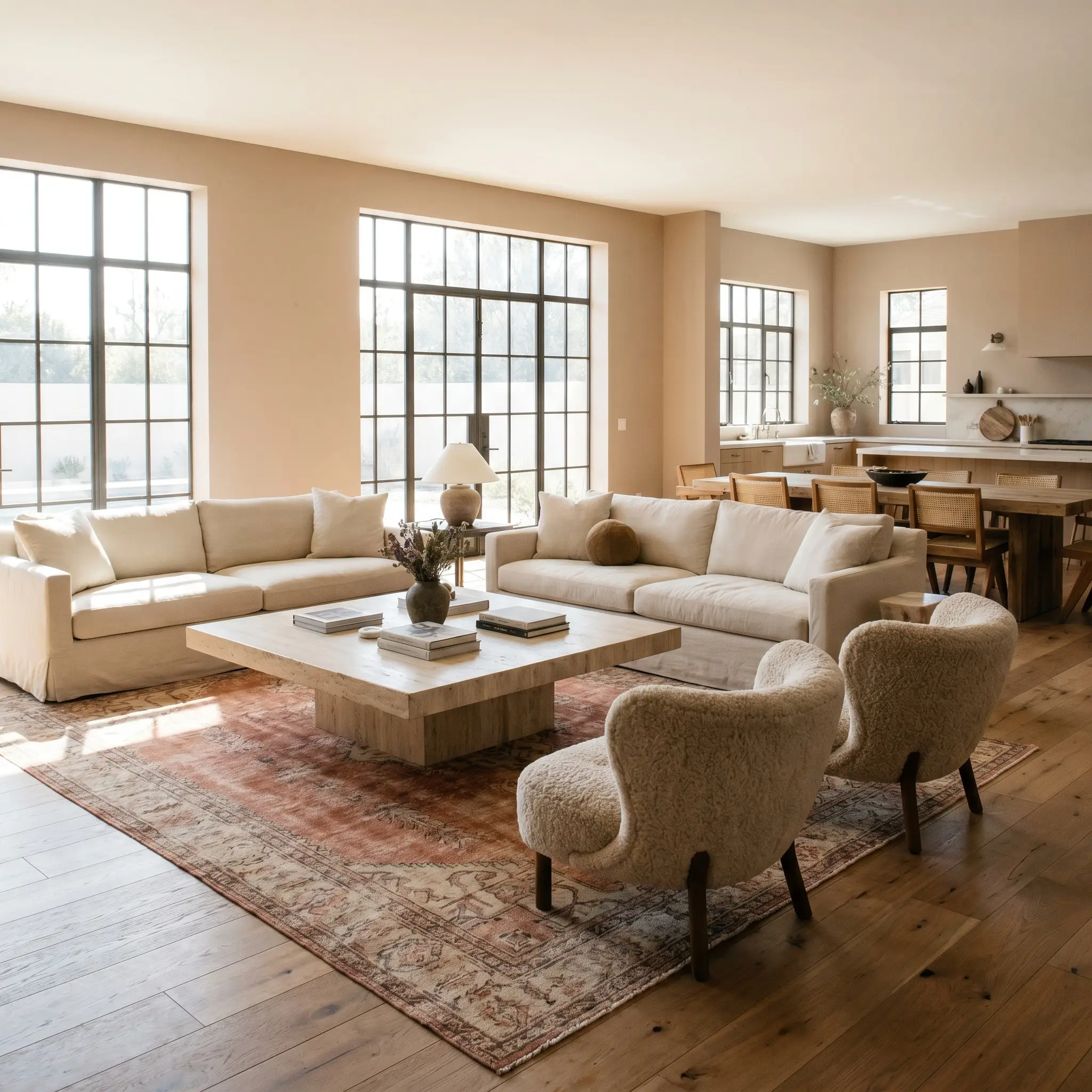
In expansive, multi-use spaces, this chromatic profile acts as a stabilizing force that unifies disparate zones. The color temperature thrives alongside Organic Modern elements, such as a brutalist travertine coffee table and slipcovered linen sofas.
To prevent a large room from feeling flat, introduce textural contrast through bouclé accent chairs or a vintage Moroccan rug in faded terracotta and ivory. You can also elevate the architecture by applying a subtle limewash finish over the greige base, adding organic movement to the walls.
Primary Bedrooms & En-Suites
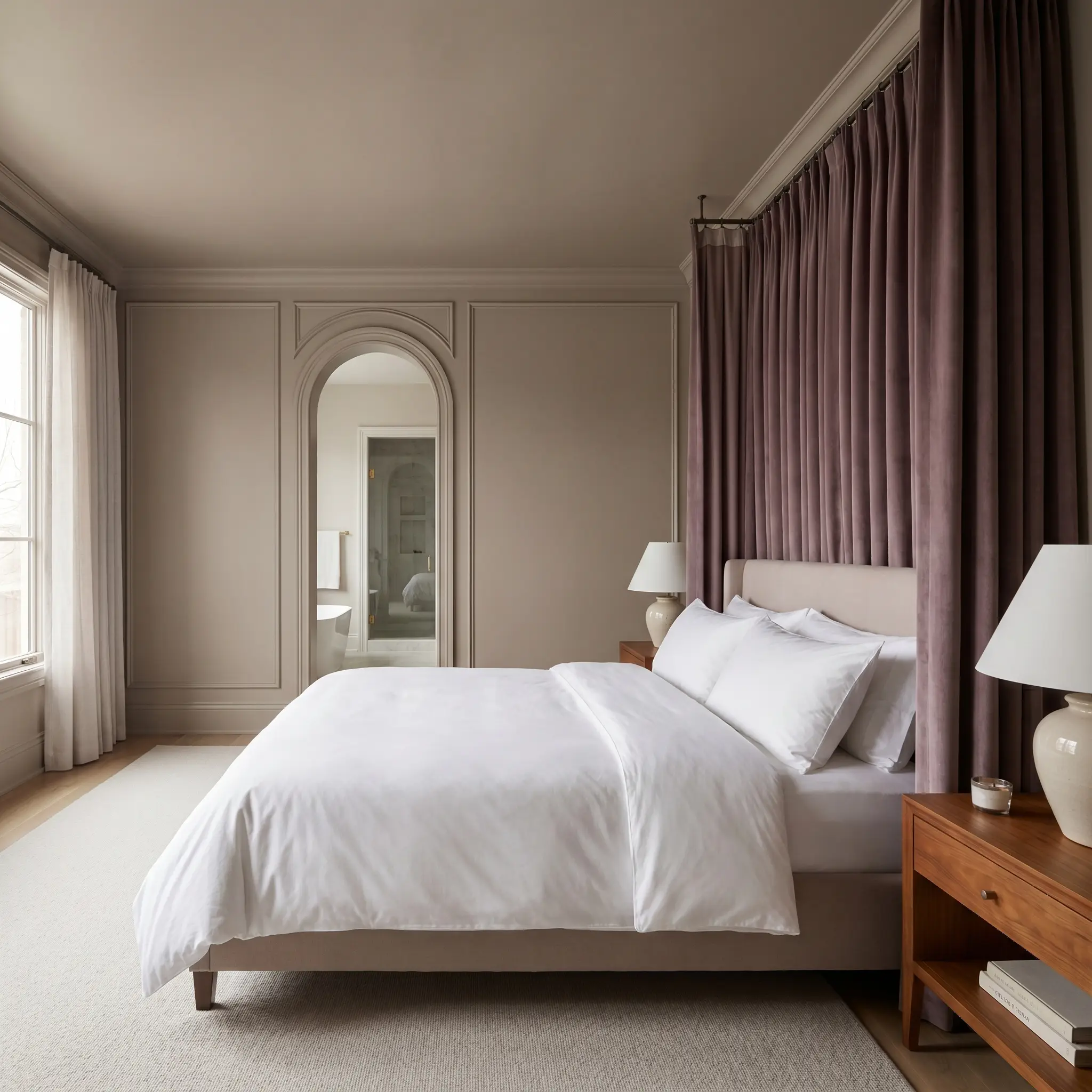
This shade transforms a primary suite into a serene, boutique-inspired retreat. Lean into a tone-on-tone layering strategy by matching the walls, trim, and ceiling in a flat or matte finish, wrapping the room in continuous warmth.
Contrast the soft mushroom paint colors on the walls with crisp, white percale bedding and thick velvet drapery in a muted plum or deep olive. Installing picture molding before painting adds classic structural shadows, allowing the ambient lighting to play across the different depths of the taupe base.
Avoid pairing this specific greige with stark, cool-toned gray bedding or rugs. The clash in temperatures will make the warm stone undertone look unintentionally dirty or yellowed.
Clash Warning (The Bedding Trap)
Exterior Siding & Trim
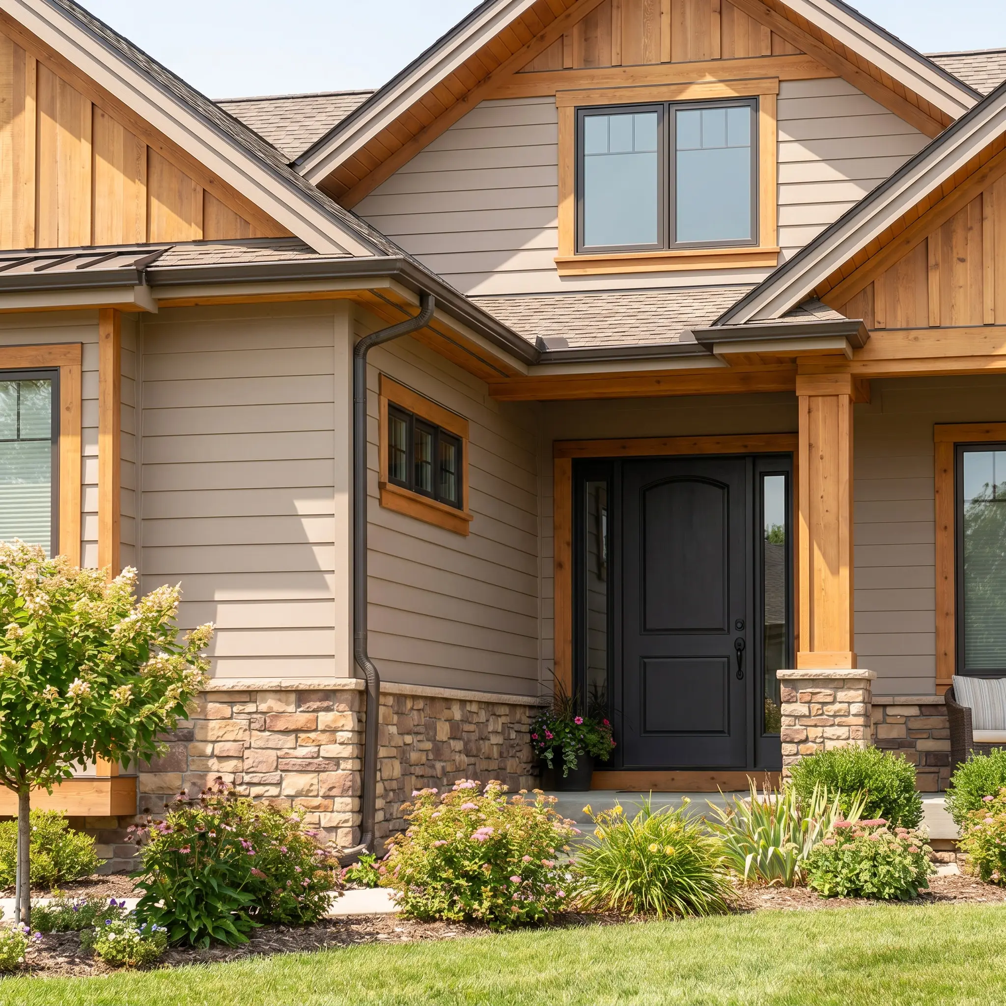
On an exterior facade, the intense natural sunlight will slightly wash out the 47 LRV, softening the pigment into a highly elegant, welcoming neutral. It serves as a brilliant alternative to stark white, offering enough depth to highlight architectural details without feeling overwhelming.
Pair this exterior cladding with dark bronze gutters, a charcoal black front door, and natural cedar accents for a striking Modern Traditional aesthetic. If your home features natural stone or brick, the earthy undertones of the paint will naturally harmonize with the masonry, creating a cohesive, established curb appeal.
Curating a Palette Around Sherwin-Williams Anew Gray
Instead of demanding strict boundaries, this taupe-infused pigment thrives when allowed to softly bleed into rich, organic textures or when sharply contrasted by crisp, tailored whites. It responds dynamically to the materials placed around it, acting as a flexible foundation that shifts its energy based on your styling choices.
Tailored Boundaries and Seamless Glows
Tactile Finishes and Wood Pairings
Secondary Accent Colors
Curated Aesthetic Concepts
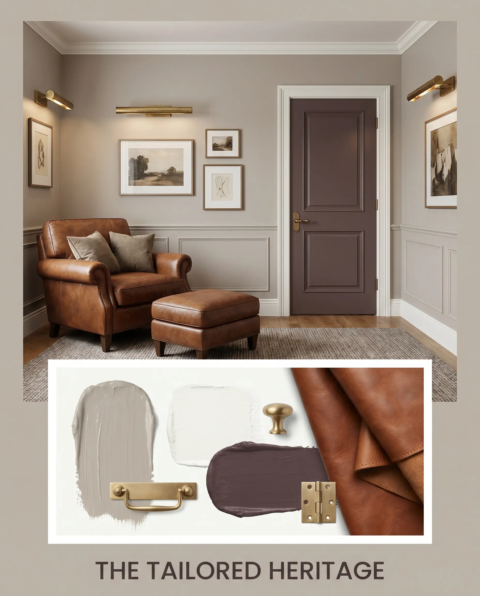
The Tailored Heritage
This aesthetic leverages the rich interplay between the warm greige walls and crisp Chantilly Lace OC-65 trim to create a highly structured, classic environment. We anchor the room with deep saddle leather seating and introduce unexpected depth by painting interior doors in Brinjal 222. Unlacquered brass picture lights and layered vintage rugs complete the vibe, resulting in an energy that feels both historically grounded and sharply modern.
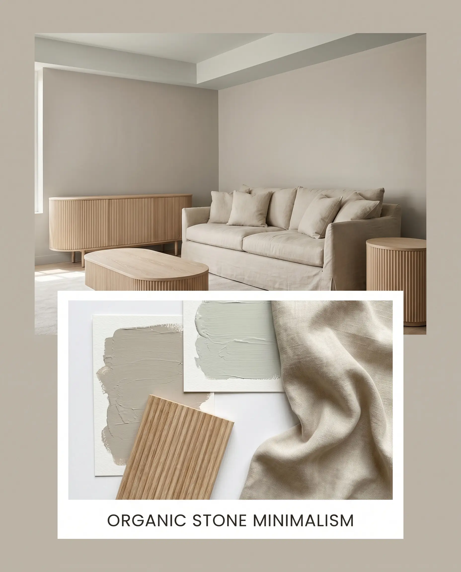
Organic Stone Minimalism
By pairing the main wall color with undulating reeded white oak and slipcovered linen furniture, this palette strips away excess to focus entirely on texture. The introduction of Sea Salt SW 6204 on an adjoining ceiling or accent nook brings a breath of fresh, watery contrast. The overall mood is incredibly serene and tactile, relying on the muted, stone-like warmth of the primary paint to carry the design without needing loud artwork or busy patterns.
Comparative Color Theory: Anew Gray vs. Industry Rivals
While this mid-tone greige is highly adaptable, specific architectural styles or challenging lighting conditions often require a subtle pivot. If your room lacks natural light or if you are working with stubbornly cool-toned fixed elements, a rival paint might provide a more successful foundation.
Sherwin-Williams Anew Gray vs. Sherwin-Williams Agreeable Gray
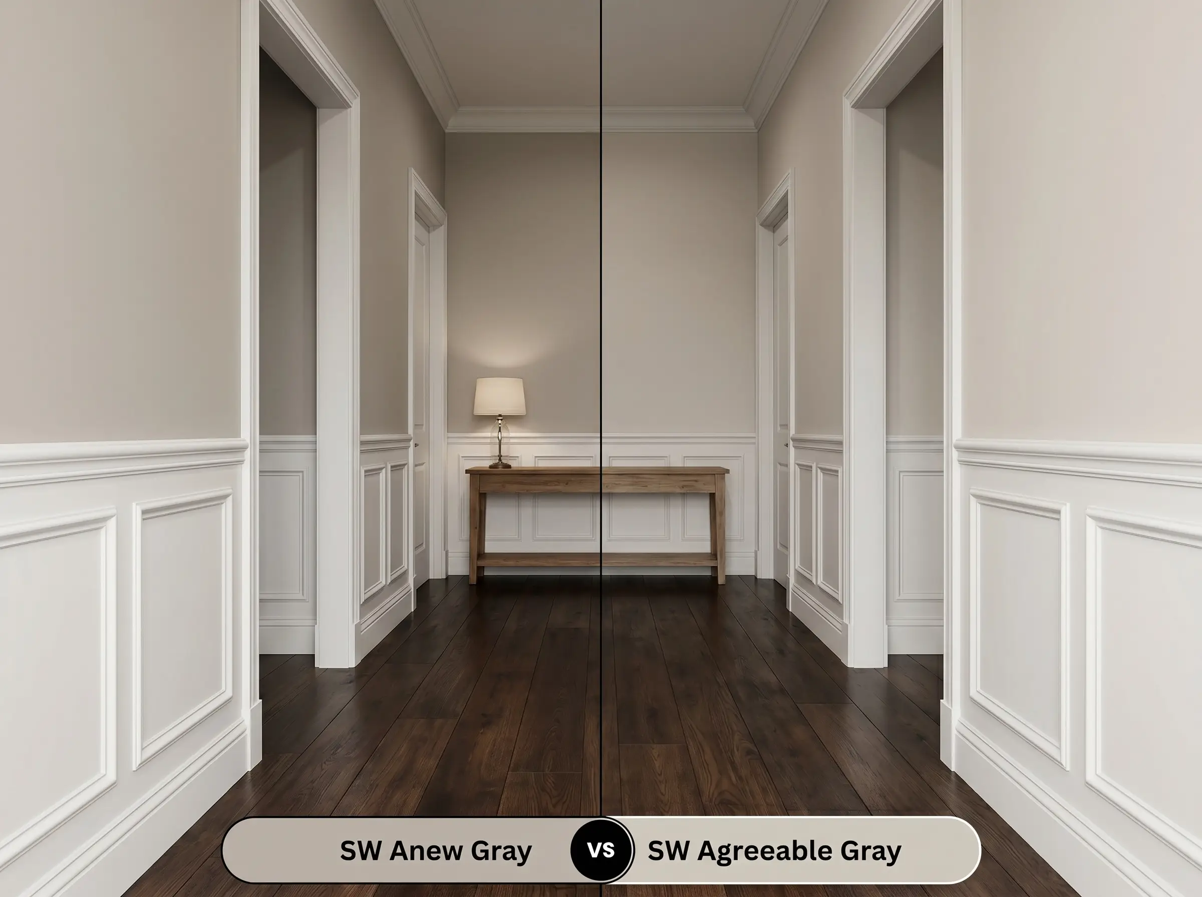
If you are painting a dimly lit hallway or a north-facing room, then Agreeable Gray SW 7029 is often the safer choice due to its significantly higher LRV of 60. Agreeable Gray bounces much more light and acts as a true, airy neutral. Conversely, if you have abundant southern exposure that washes out lighter colors, then Anew Gray’s deeper 47 LRV will hold its shape and deliver the rich, stone-like presence you actually want.
Sherwin-Williams Anew Gray vs. Sherwin-Williams Amazing Gray
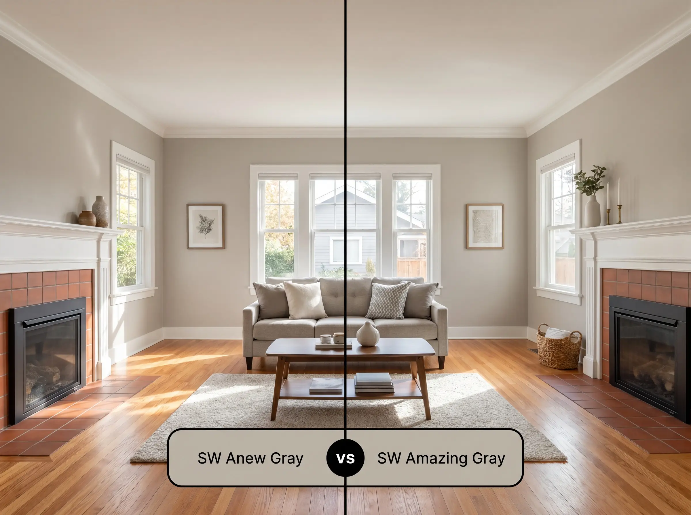
If your home features warm, earthy fixed elements like terracotta tile or red oak floors, then Amazing Gray SW 7044 might clash because it leans further into a cooler, green-gray profile. Anew Gray SW 7030 contains a much stronger taupe base, making it far superior at harmonizing with warm woods and traditional masonry. However, if you are designing a crisp, Soft Industrial space with blackened steel and cool concrete, Amazing Gray will complement those elements beautifully.
Sherwin-Williams Anew Gray vs. Benjamin Moore Revere Pewter
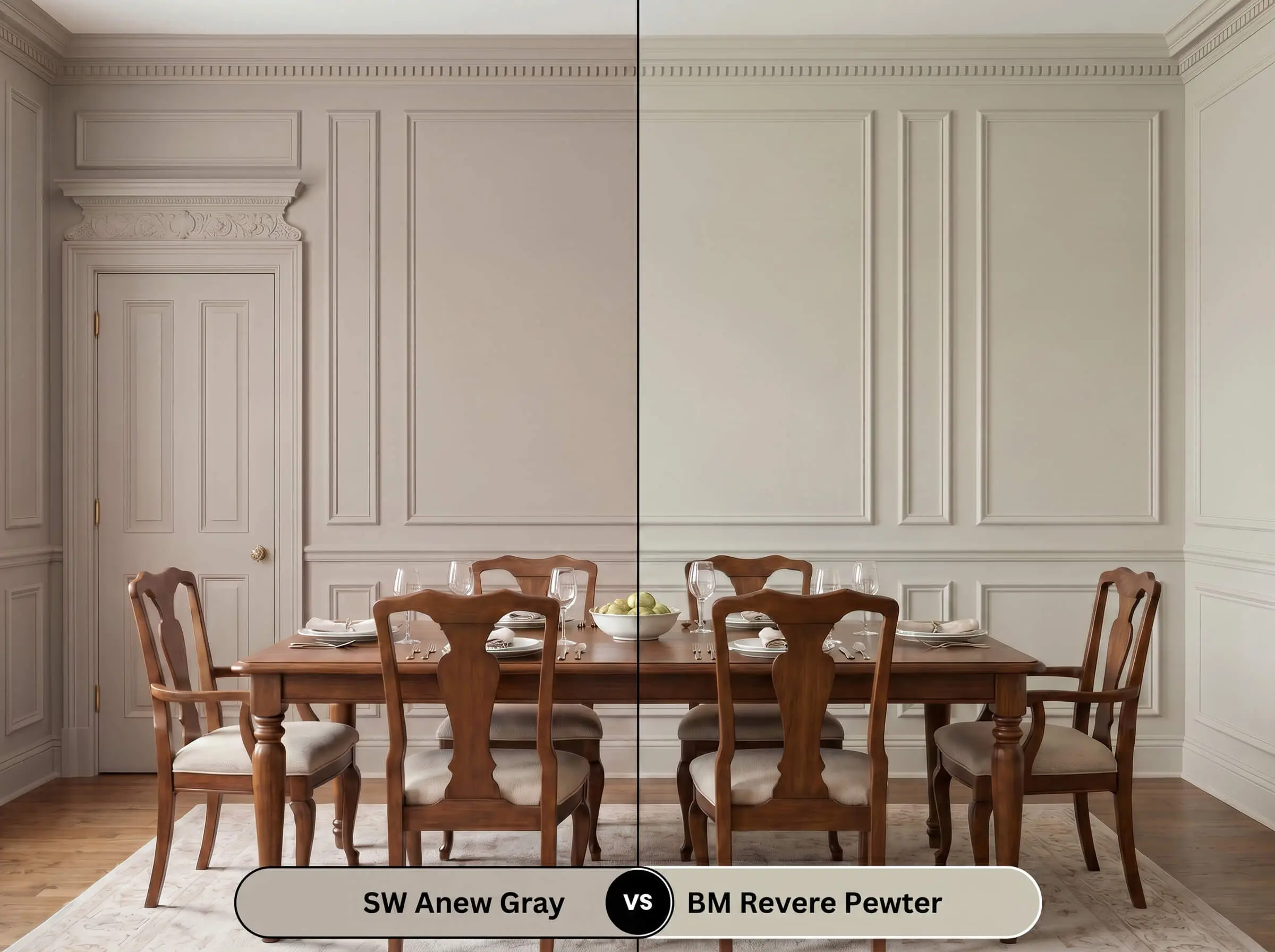
If you want a truly historic, muddy neutral that constantly shifts between green and gray, then Revere Pewter HC-172 is the industry standard. Revere Pewter is famous for its unpredictable, earthy undertones. If you prefer a more stable, predictable taupe that retains a cleaner, warmer profile throughout the day, then Anew Gray is the more tailored, reliable option.
Exploring Alternative Mushroom Paint Colors
Sometimes a hue is nearly perfect, but the specific lighting in your home demands a slight adjustment in depth or a minor shift in undertone.
Same-Brand Alternatives
Cross-Brand Matches
Professional Execution with Anew Gray SW 7030
Moving from curatorial theory to the physical reality of a roller requires a strategic approach to finishes and preparation.
Optimal Sheen Selection
Primer Strategy & Coverage Reality
Frequently Asked Questions
In spaces lacking natural sunlight, the ambient lighting dictates the shift. Warm LED bulbs (2700K) will pull out the taupe base, while cooler daylight bulbs (4000K+) can inadvertently highlight the green-violet micro-nuance, causing a slight purple flash.
On highly textured stucco, the deep crevices create micro-shadows that make the color read as a rich, dark greige. On smooth fiber-cement siding, the direct sunlight bounces off the flat surface, washing the pigment out into a softer, elegant mushroom tone.
Its green-violet micro-nuance actually works to balance out aggressive red tones in flooring. The subtle green acts as a complementary contrast, cooling down the fiery cherry wood while the taupe base maintains overall harmony.
Because it mimics the grounding presence of natural stone, it creates an environment of focused calm. It avoids the clinical sterility of pure white and the sleepy heaviness of dark charcoal, striking a perfect balance for sustained productivity.
The Architectural Final Verdict
Sherwin-Williams Anew Gray is an incredibly sophisticated, stabilizing neutral that excels in spaces requiring a touch of curated warmth. Its absolute best application is in open-concept living areas or on kitchen cabinetry where its stone-like presence can anchor lighter, organic finishes. This color is perfect for homeowners who want to move away from stark whites and icy grays, offering a deeply inviting atmosphere that elevates transitional, modern traditional, and organic modern interiors alike.
While this mid-tone greige is highly adaptable, it is not for every home. If your house is dominated by stark, cool-toned finishes—like icy Carrara marble, blue-gray glass tiles, or cool LED recessed lighting—this paint will fight its surroundings. When placed directly against aggressively cool elements, the rich taupe base loses its elegant warmth and can read as unintentionally muddy or dull. Always ensure your fixed hardscaping leans warm or neutral before committing to this shade.
Hackrea Design Secret (The Temperature Clash)