Amazing Gray SW 7044
Sherwin-WilliamsSherwin-Williams Amazing Gray (SW 7044) is a versatile, mid-tone warm greige with subtle green undertones. Boasting an LRV of 47, it bridges the gap between gray and beige, offering a sophisticated, grounded neutral perfect for well-lit open floor plans and exteriors.
| Temperature | Warm |
|---|---|
| Primary Undertone | Green |
| Hidden Undertones | Beige and subtle taupe |
| Best Exposures | South and West |
| Best For | Open-concept living spaces, home exteriors, kitchen cabinets, bedrooms |
Hackrea Review
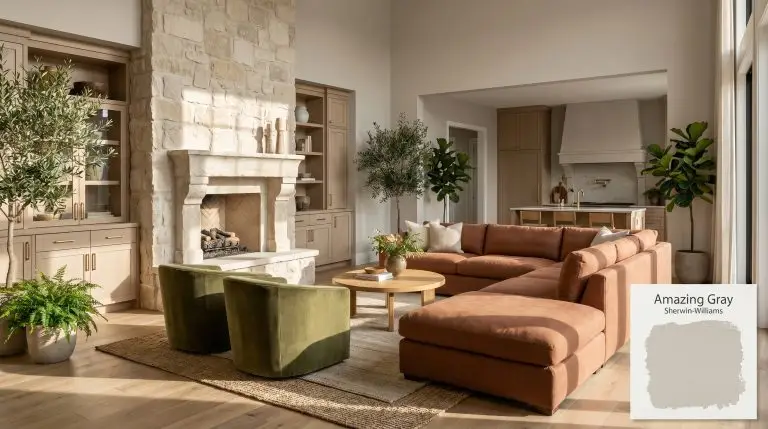
Amazing Gray is the unsung hero of the greige family. While Agreeable Gray gets all the hype, Amazing Gray offers a richer, more grounded depth that feels incredibly sophisticated. It’s a phenomenal choice for exteriors and well-lit living spaces, though it demands ample natural light to prevent its architectural finish from feeling muddy.Architectural Applications for Sherwin-Williams Amazing Gray
Open-Concept Living Spaces
In expansive footprints, this mid-tone greige acts as a grounding structural element rather than a receding neutral. The LRV 47 absorbs excess glare from large glazing, pulling the walls inward slightly to create intimacy without feeling enclosed. Pairing it with warm wood tones prevents the subtle green undertones from skewing cold, while avoiding stark, cool whites keeps the base color from looking dirty.
Home Exteriors (Stucco and Siding)
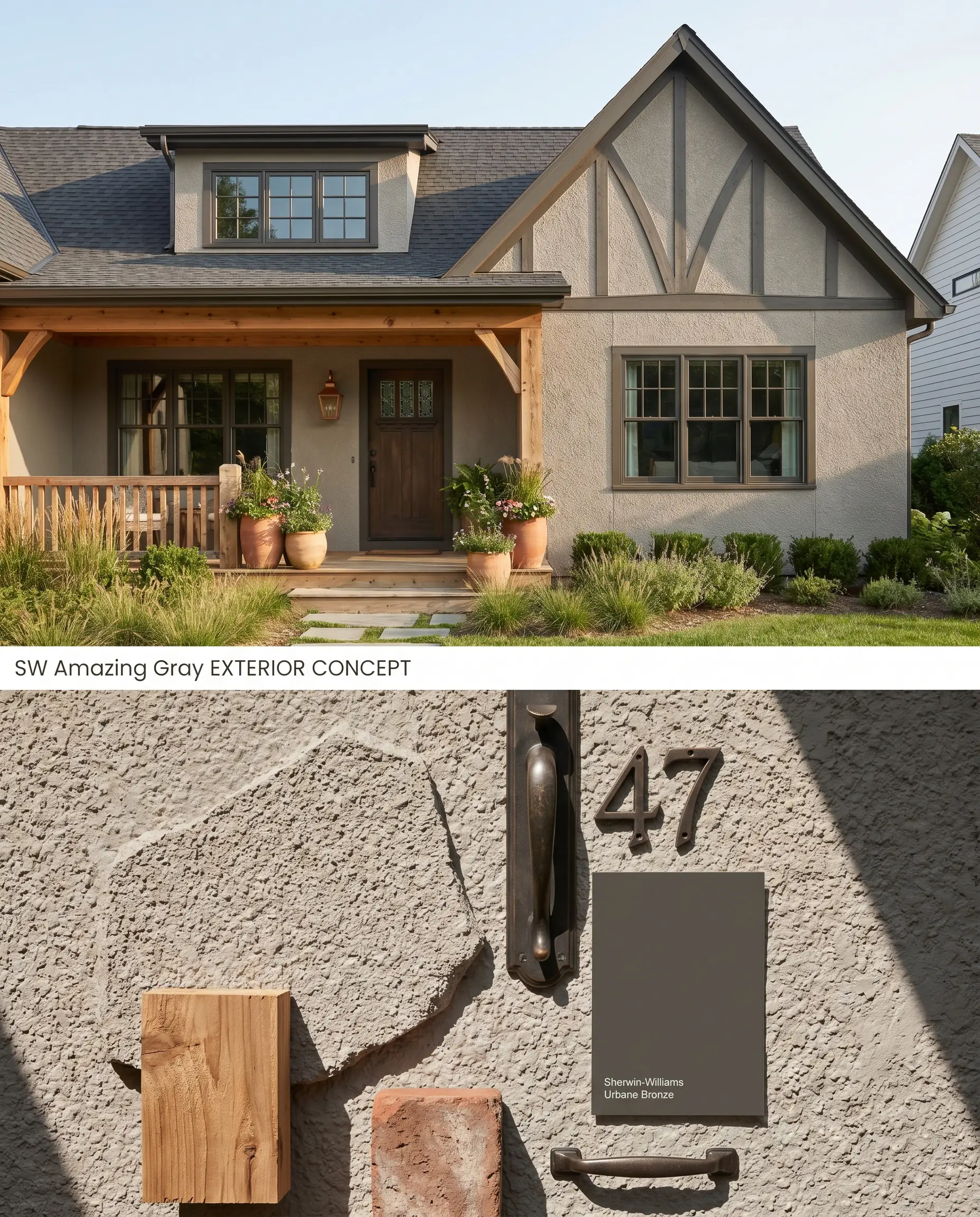
Direct sunlight washes out exterior paint, shifting this warm gray lighter and neutralizing its inherent depth. On textured surfaces like stucco, the porous material casts micro-shadows that emphasize the color’s richness, preventing the facade from looking flat or washed out. High-contrast, earthy trim anchors the elevation and highlights the architectural finish.
Kitchen Cabinets
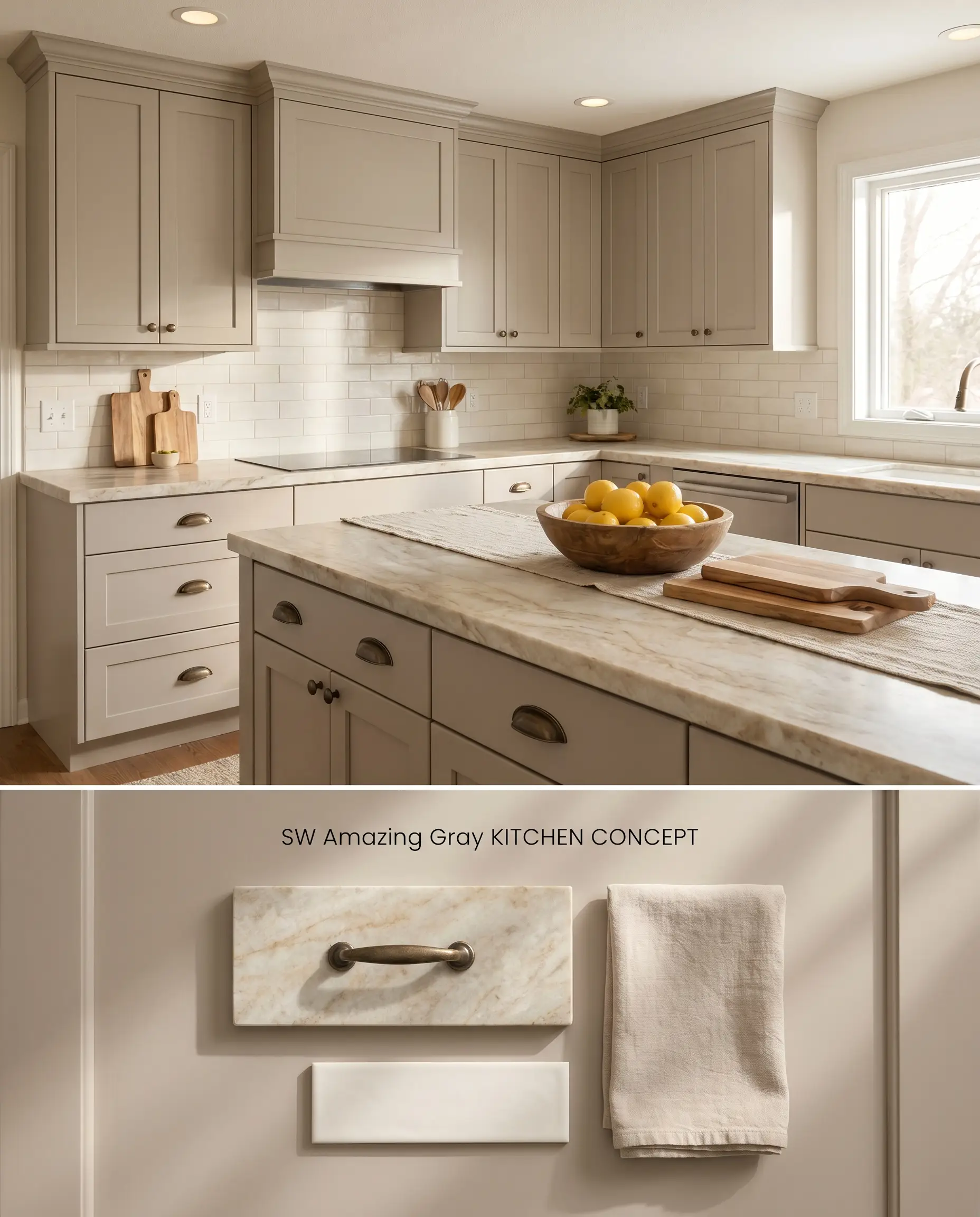
Applied to cabinetry, the color temperature of Sherwin-Williams Amazing Gray bridges the gap between warm organic materials and stark utilitarian appliances. The green chromatic profile interacts beautifully with natural stone countertops, pulling out subtle veining while grounding the island or lower perimeter. Avoiding cool blue-gray backsplashes is mandatory to keep the cabinet color looking intentional and clean.
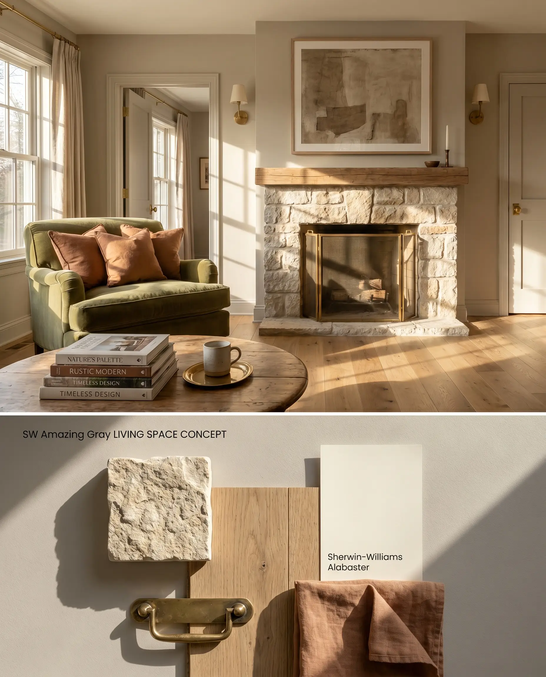
Bedrooms with Large Windows
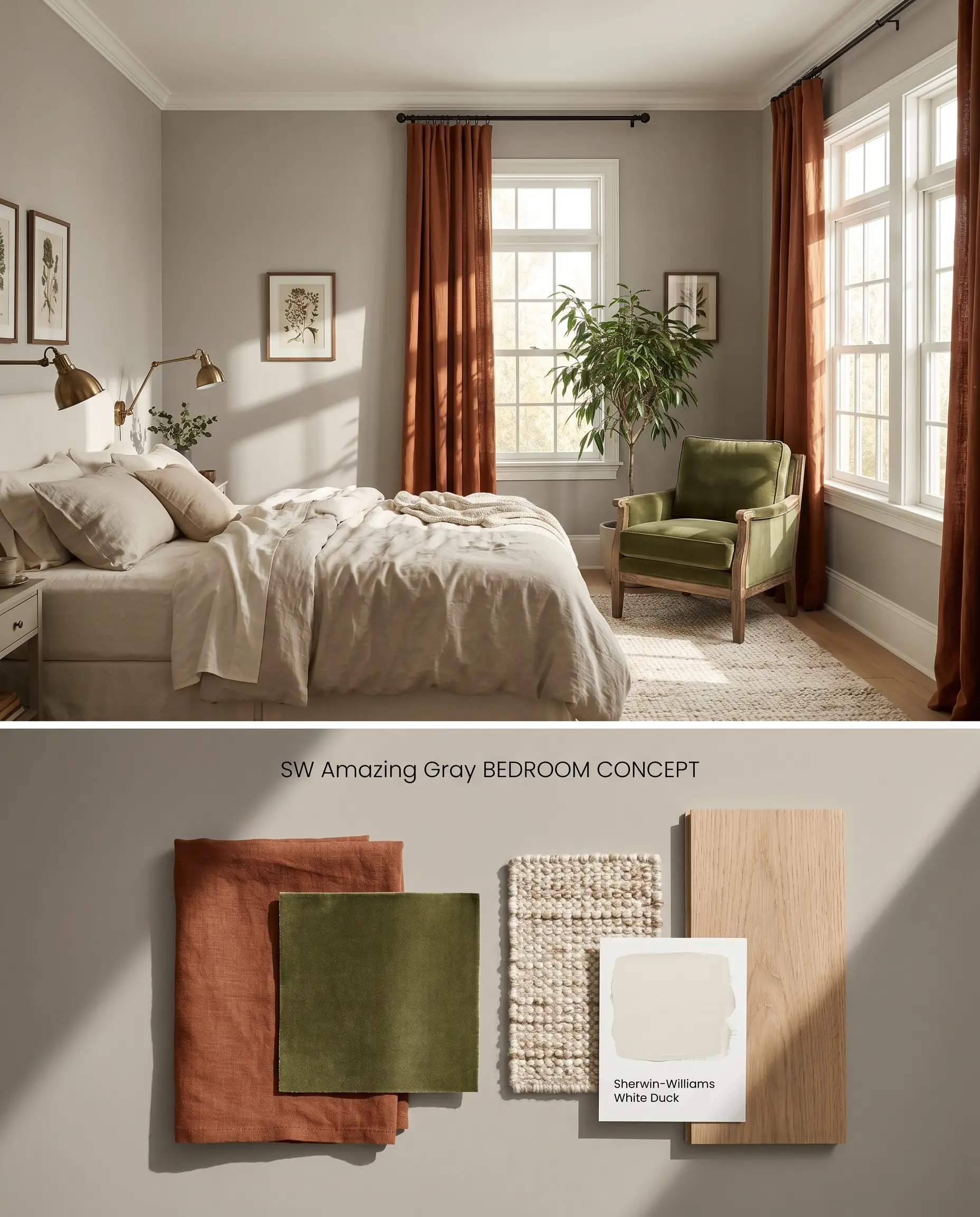
Generous natural light is mandatory to prevent this shade from turning into a low-light trap that feels flat and muddy. When illuminated by broad daylight, the walls read as a sophisticated, enveloping warm gray that softens hard angles. Layering textured textiles against this tone enhances the room’s tactile warmth and balances the light absorption.
You can apply wallpapers, paints, etc. on walls and see how they look in various interiors.

Chromatic Profile Comparisons: Amazing Gray Alternatives
Sherwin-Williams Amazing Gray SW 7044 vs. Sherwin-Williams Mindful Gray SW 7016
Mindful Gray SW 7016 sits one point higher on the LRV scale at 48 but lacks the distinct green undertone that defines Amazing Gray SW 7044. In spaces with cooler or indirect light, Mindful Gray holds its neutral temperature, while Amazing Gray will experience a color shift and turn murky. Specify Mindful Gray for rooms with cooler light exposures and reserve Amazing Gray for sun-drenched southern exposures where its warmth can expand.
Sherwin-Williams Amazing Gray SW 7044 vs. Sherwin-Williams Anew Gray SW 7030
Both share an identical LRV of 47, but their undertones pull them in opposite directions. Anew Gray SW 7030 leans into a brown-beige base, making it a much warmer, traditional greige. Amazing Gray’s green base gives it a slightly more modern, cooler edge when placed side-by-side. Choose Anew Gray if you are working with red-toned wood floors that might clash with a green undertone, and opt for Amazing Gray when pairing with neutral or white-washed oak.
Sherwin-Williams Amazing Gray SW 7044 vs. Sherwin-Williams Agreeable Gray SW 7029
Agreeable Gray SW 7029 is significantly lighter with an LRV of 60, reflecting substantially more light and functioning as a highly versatile whole-house neutral. Amazing Gray SW 7044 acts as a mid-tone architectural element that requires strong natural light to avoid a muddy appearance. Select Agreeable Gray for dark hallways and windowless rooms, strictly limiting Amazing Gray to well-lit, open-concept spaces or exterior applications.
Technical FAQs
Yes. North-facing light enhances the subtle green chromatic profile, often causing the color to flash cool or murky. It is highly recommended to avoid this shade in northern exposures and instead use it in south or west-facing rooms.
The green undertones in Amazing Gray naturally complement the red and orange tones found in cherry or warm oak, creating a balanced, high-contrast palette. However, ensure the room has ample lighting to prevent the mid-tone greige from feeling weighed down by the dark wood.
Direct sunlight washes out the color, shifting it lighter and neutralizing the green undertones into a softer warm gray. On textured exterior surfaces like stucco, it retains enough depth to avoid looking stark or flat.
Touch-ups can flash noticeably if you attempt to patch lower-tier builder-grade paint with a different Sherwin-Williams product line or sheen. To avoid this color shift, you must use the exact same chemical formulation and finish as the original application.
Similar Paint Colors
Same Brand
Cross-Brand Equivalents