Dulux Deep Aqua (S32B9) is a moody, sophisticated cool teal with a deep blue base and distinct green undertones. With an LRV of 9, this rich architectural finish absorbs significant light, creating a dramatic, enveloping atmosphere perfect for intimate spaces and striking exteriors.
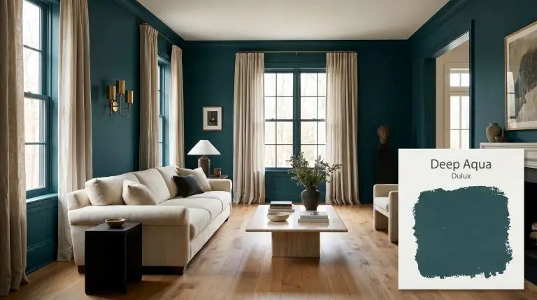
Dulux Deep Aqua: A Bottomless Teal That Redefines Interior Shadow
Some pigments sit quietly in the background, while others actively alter the boundaries of your room. When you apply a highly saturated, dark tone to a wall, the corners of the space visually dissolve into the shadows. This optical illusion is exactly why interior designers rely on colors like Dulux Deep Aqua to make standard rooms feel intentionally vast and incredibly intimate all at once.
This moody teal is a masterclass in controlled drama. Instead of relying on a stark, predictable black or a standard navy, this specific chromatic profile introduces an earthy, aquatic complexity to your walls. It wraps the room in a rich, enveloping atmosphere that feels both sophisticated and inherently relaxing.
To pull off this level of saturation, the surrounding materials need to work hard. We love seeing this bottomless pigment paired with the tactile warmth of rift-sawn oak, the subtle sheen of unlacquered brass, or the relaxed drape of washed linen drapery. The secret to making this dark color feel entirely livable is balancing its visual weight with organic, everyday textures.
Dulux Deep Aqua: Temperature, Undertones & LRV
Dulux Deep Aqua is definitively cool, bringing a crisp, stabilizing chill to any interior or exterior space. The secret to its sophisticated temperature lies entirely in how its underlying color structure is formulated.
At a light reflectance value (LRV) of 9, this pigment is exceptionally dark and absorbs the vast majority of the light that hits it. Instead of bouncing illumination around the room, this low LRV creates profound shadow absorption. On the walls, this translates to a sense of infinite spatial depth, making the physical boundaries of the room feel as though they are gently receding into the background.
You can apply wallpapers, paints, etc. on walls and see how they look in various interiors.

The Chameleon Factor: Lighting Effects on Deep Aqua
Because this teal balances both blue and green, its final appearance is entirely at the mercy of your light source.
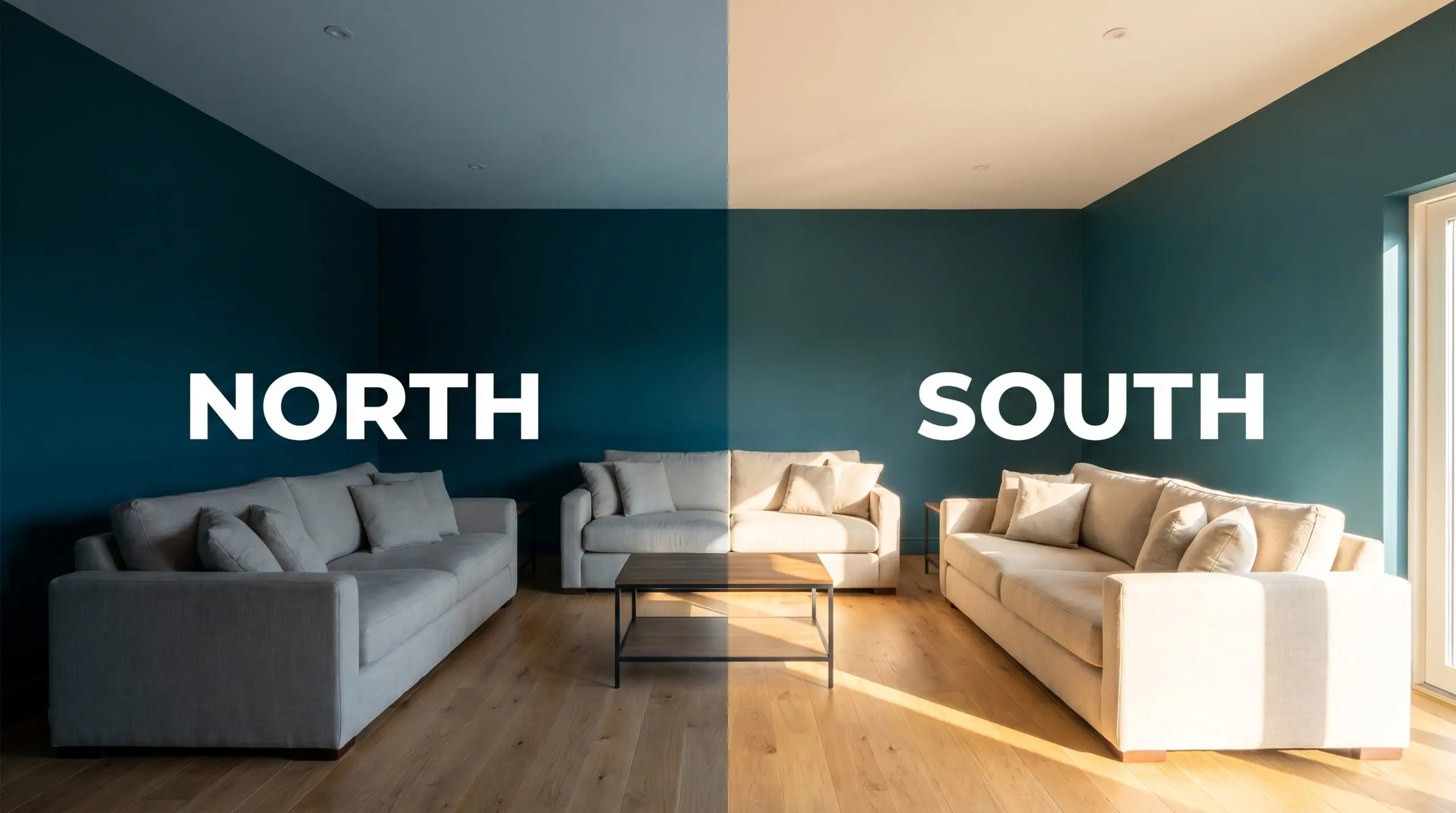
Because an LRV of 9 absorbs so much light, standard overhead lighting will leave the corners of your room feeling cavernous. You must layer your lighting—combining sculptural wall sconces, strategically placed floor lamps, and picture lights—to push illumination back into the dark pigment.
Hackrea Pro-Tip (The Wattage Warning)
Popular Architectural Applications for This Moody Teal
When a color possesses this much visual density, where you place it matters just as much as what you pair it with. The architectural finish you choose—whether a flat matte on the walls or a durable satin on cabinetry—will drastically alter how this dark teal interacts with the rest of your home.
Home Libraries and Studies
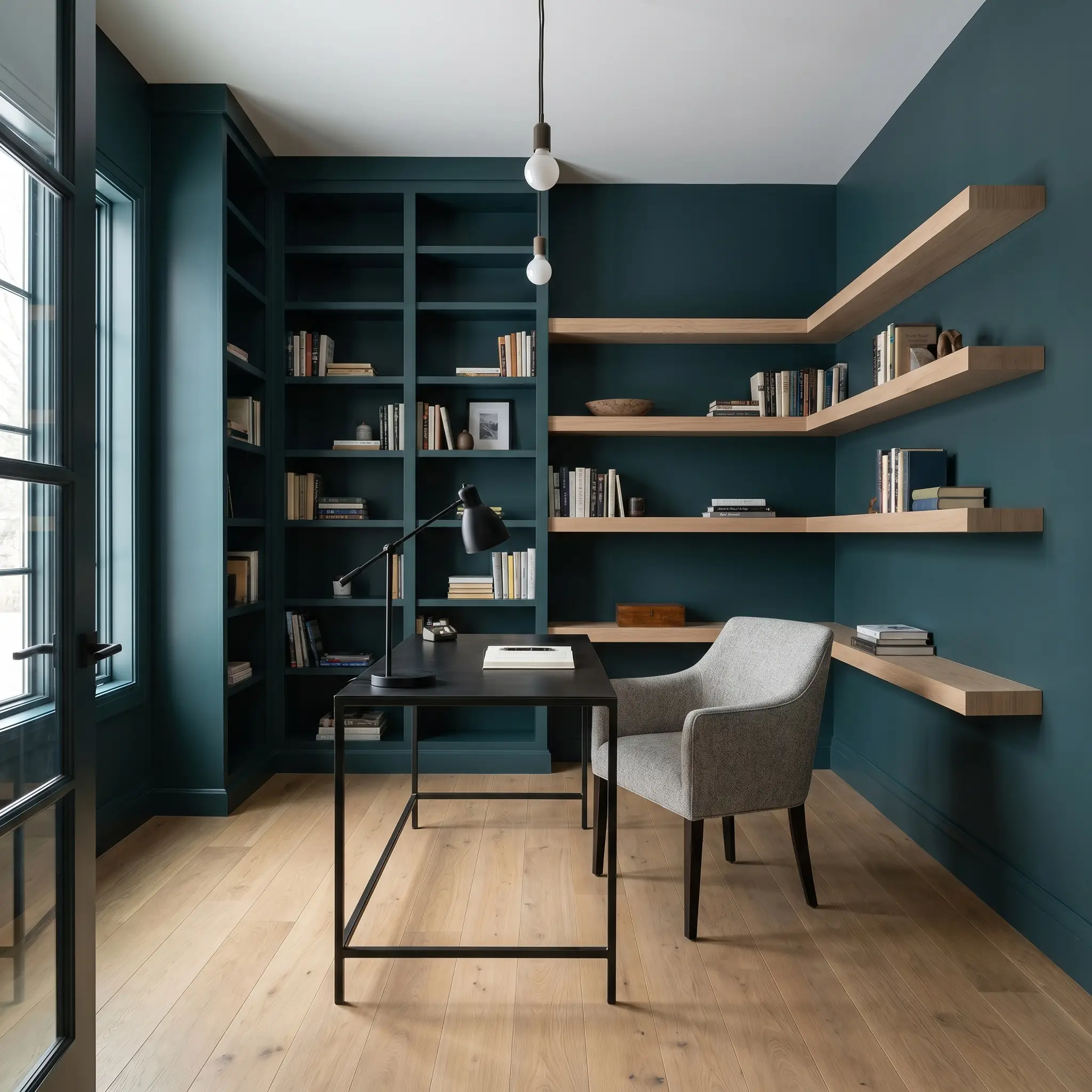
For the work-from-home creative, a study needs to feel focused and insulated without feeling like a traditional, dusty heritage library. Applying this saturated teal to the walls and built-in bookcases instantly creates a quiet, stabilizing environment that absorbs daily distractions.
To keep the room feeling modern and dynamic, avoid heavy leather and dark mahogany. Instead, introduce a Soft Industrial aesthetic by pairing the dark walls with a sleek blackened steel desk and a chair upholstered in worsted wool. Layering in floating shelves made of light ash wood will slice through the dense color, providing essential visual relief.
Dining Rooms
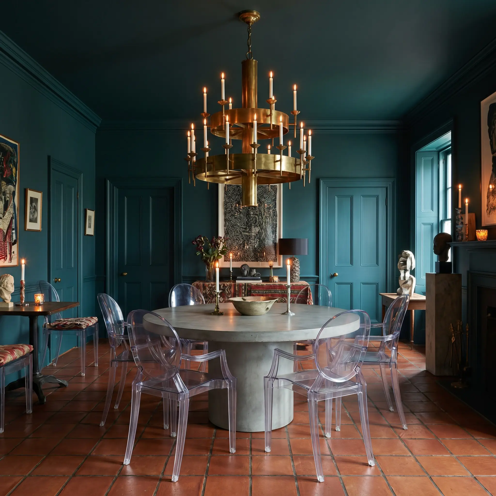
The dining room is the perfect environment for the evening entertainer to experiment with full-scale color drenching. By painting the walls, trim, doors, and even the ceiling in this bottomless teal, you erase the harsh transitional lines of the room, creating an intimate, candlelit atmosphere.
Break away from predictable traditional dining sets and lean into a more Postmodern or Maximalist vibe. Center the room with a pedestal dining table and surround it with acrylic ghost chairs to let the dense wall color take center stage. A massive, multi-tiered unlacquered brass chandelier will pop brilliantly against the cool blue base, acting as the ultimate premium focal point.
Kitchen Island Cabinetry
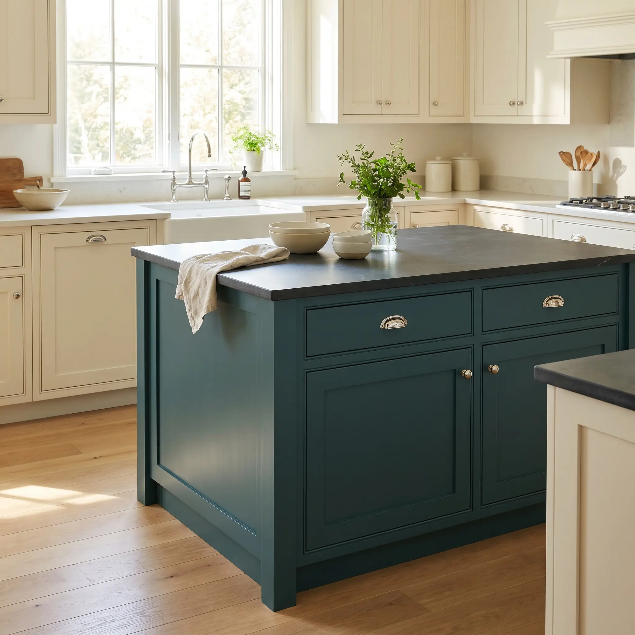
If you are a suburban family looking to upgrade a standard kitchen without a massive structural renovation, a dark cabinetry application is a highly effective strategy. Using this moody teal exclusively on the kitchen island grounds the center of the room while hiding daily scuffs and footprints.
This specific hue bridges the gap between classic and contemporary beautifully. Top the teal island with a slab of honed soapstone for a durable, matte finish, and swap out standard builder-grade hardware for polished nickel cup pulls. Keep the perimeter cabinets a warm cream to ensure the room remains bright and functional during the morning rush.
Do not pair this distinctly cool, green-leaning teal with warm, heavily veined granite countertops that feature rust or gold flecks. The clashing undertones will make the teal look muddy and the granite look dated; stick to cool marbles, crisp quartz, or neutral soapstone.
Clash Warning (The Countertop Collision)
Powder Rooms
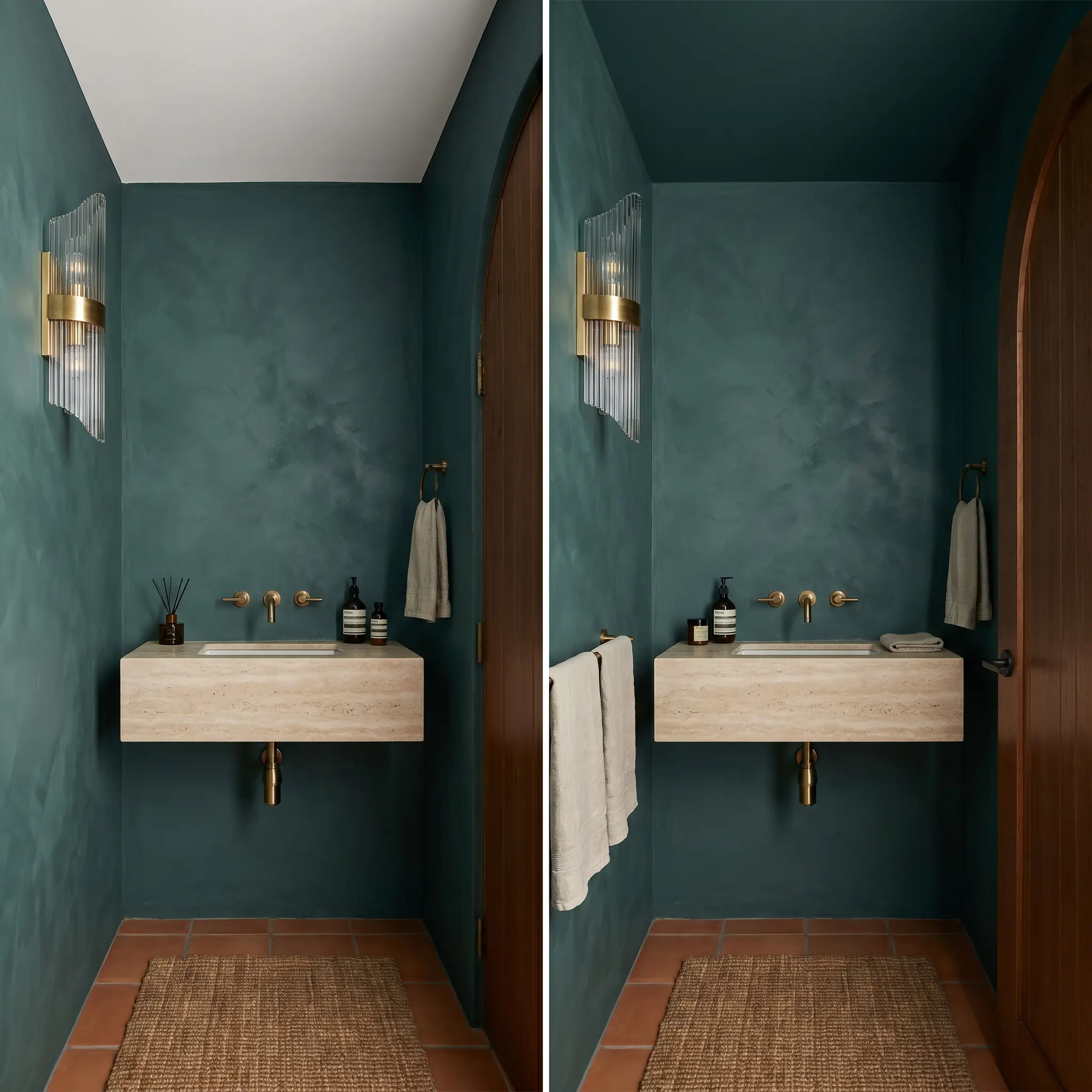
Because powder rooms are typically small and windowless, fighting the lack of light with pale paint often results in a sterile, uninviting space. Leaning into the shadows with this dark pigment transforms a basic half-bath into a highly curated, sensory escape for your guests.
To elevate the tactile experience, skip the standard drywall application and use a textured roman clay or limewash finish tinted to this exact teal. Contrast the matte, organic walls with a high-gloss, fluted glass sconce and a sleek travertine floating sink.
Exterior Front Doors
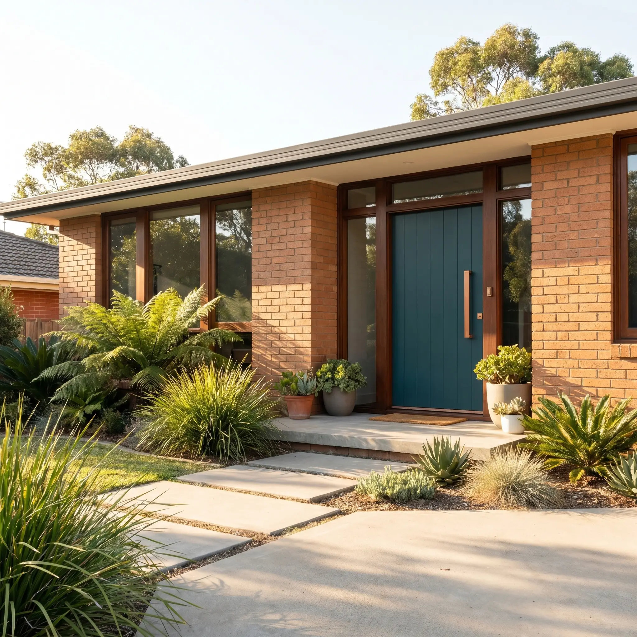
On a home’s exterior, natural sunlight washes out dark colors, meaning this LRV 9 teal will look significantly lighter and more vibrant outside than it does in your hallway. It serves as a brilliant, welcoming focal point for mid-century facades or traditional brick homes that need a modern update.
The green cast within the paint harmonizes effortlessly with surrounding landscaping, while the cool blue base provides a sharp contrast against terracotta brick or warm mustard exterior siding. Finish the door with heavy, brushed copper hardware, which will naturally patina over time and beautifully complement the earthy undertones of the paint.
Relational Dynamics: Styling Dulux Deep Aqua
This highly saturated pigment thrives on high-contrast boundaries to maintain its crisp, tailored edge. When placed next to muddy or overly soft tones, its rich blue-green structure loses focus, requiring highly intentional, sharp material transitions to feel grounded.
Trim & Baseboards
Hardware, Wood & Material Pairings
Coordinating Colors
Designer Mood Boards
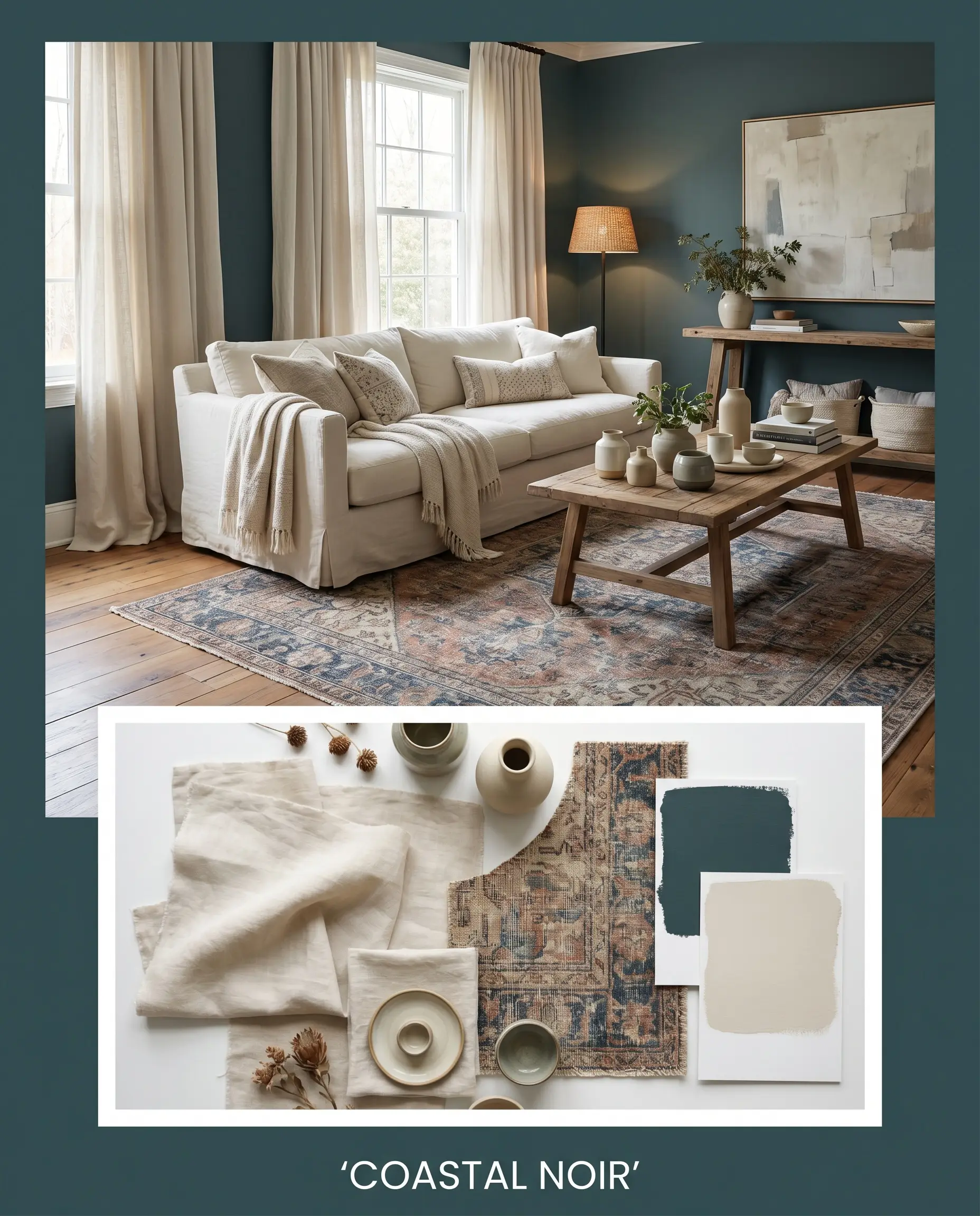
Coastal Noir: This palette rejects typical bright, beachy cliches by grounding the space in the profound depth of Dulux’s moody tone. Layering washed linen drapery against the dark walls creates a relaxed, tactile softness, while accents of Dulux White Beach keep the overall energy breathable and expansive. Ground the arrangement with a faded vintage rug and minimalist ceramics to strike a balance between sophisticated drama and effortless, everyday living.
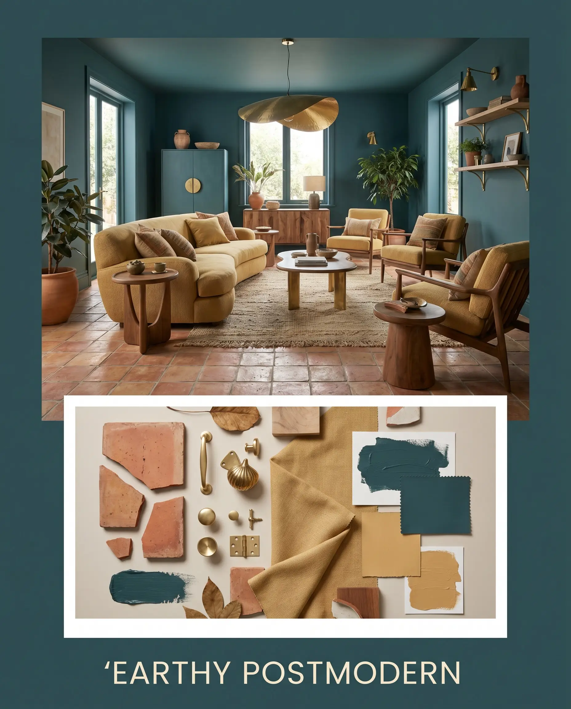
Earthy Postmodern: Intentional design tension defines this look, utilizing the sharp contrast between the cool teal walls and the baked warmth of terracotta tile. Introducing unexpected pops of Sherwin-Williams Tarnished Trumpet through upholstery or oversized abstract canvases energizes the room’s shadow-drenched corners. The addition of unlacquered brass hardware acts as the premium focal point, catching the light and adding a layer of uncompromising refinement to the playful silhouettes.
Evaluating Shadow and Depth: Head-to-Head Paint Comparisons
When working with pigments this dark, the decision often comes down to how the color behaves during the late afternoon or under artificial lighting. If your space lacks natural light or features competing architectural elements, evaluating how these rival shades handle shadow absorption is critical to avoiding a mismatched aesthetic.
Dulux Deep Aqua vs. Benjamin Moore Newburg Green HC-158
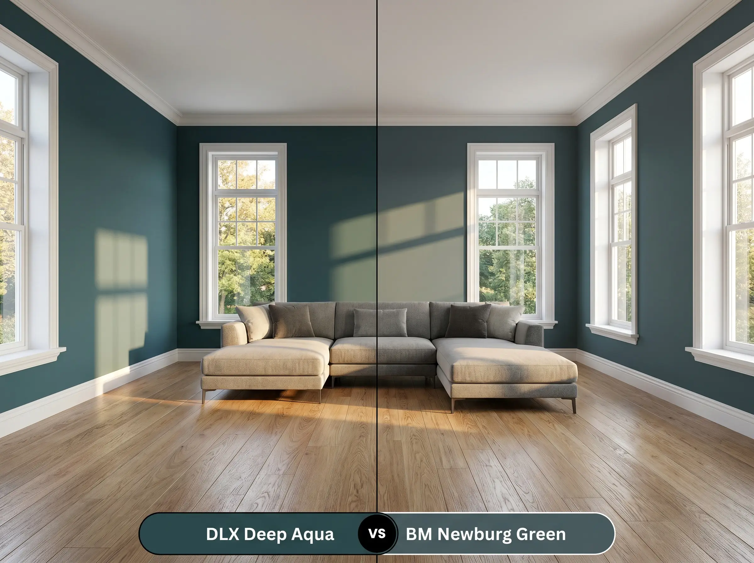
Benjamin Moore Newburg Green HC-158 carries a significantly stronger dose of muddy gray, making it much more muted and historically leaning than the Dulux option. If your home features highly textured stone fireplaces or rustic wood beams, Newburg Green HC-158 will harmonize beautifully with those rugged elements. However, if you want a crisper, more vibrant jewel-tone effect that pops against modern white trim, the cleaner chromatic profile of Deep Aqua is the superior choice.
Dulux Deep Aqua vs. Sherwin-Williams Mount Etna SW 7625
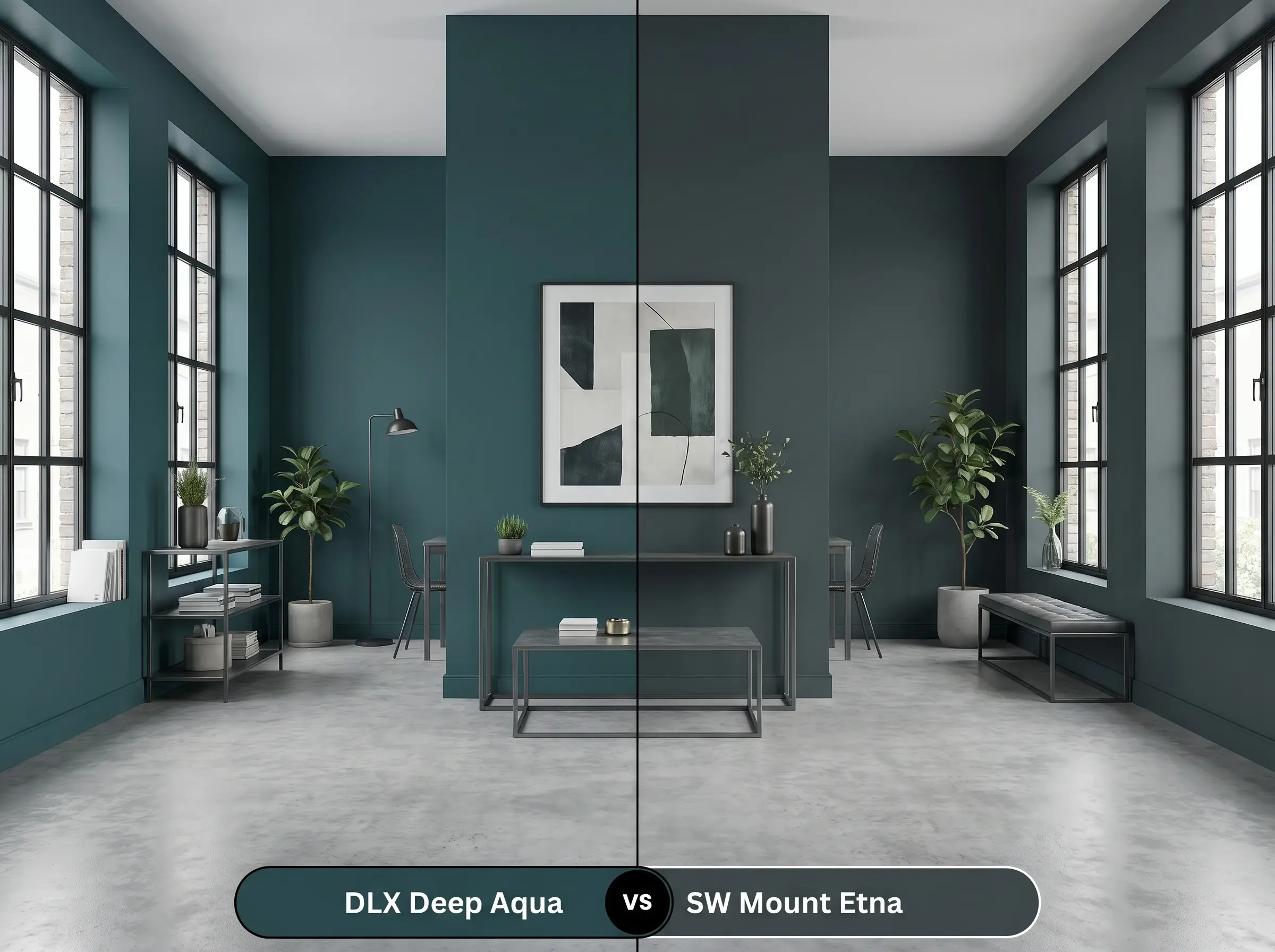
Sherwin-Williams Mount Etna SW 7625 leans distinctly into its slate-gray undertones, reading almost like a stormy charcoal in north-facing rooms. This makes the Sherwin-Williams alternative incredibly forgiving in soft industrial spaces where you want the walls to recede entirely into the background. Conversely, Deep Aqua retains a much stronger aquatic blue-green identity, making it the better candidate when you specifically want the walls to act as a definitive color statement.
Dulux Deep Aqua vs. Farrow & Ball Hague Blue No. 30
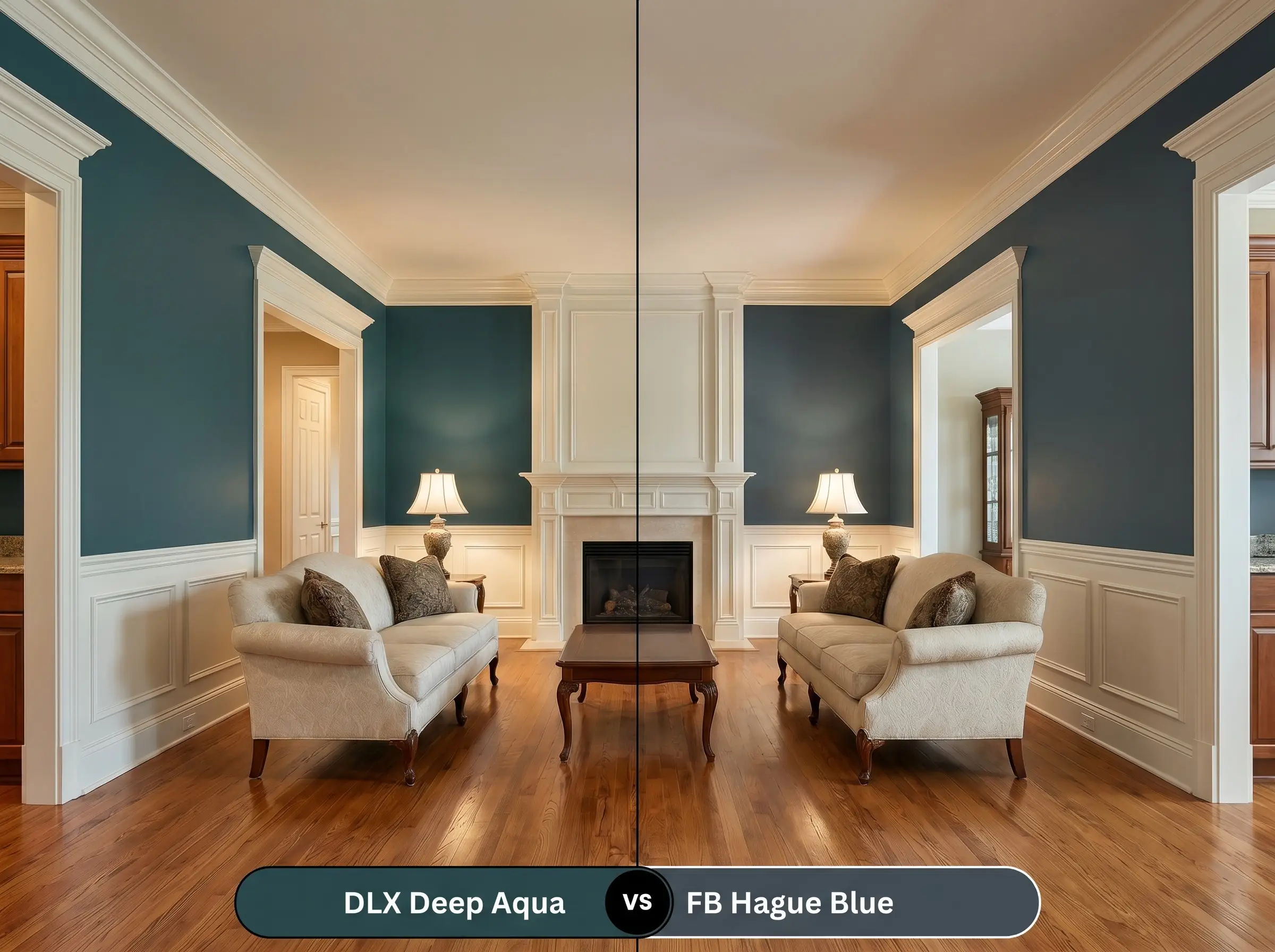
Farrow & Ball Hague Blue No. 30 is famous for its distinct green undertone, but it possesses a much deeper, inkier navy base compared to the Dulux teal. If you are designing a highly formal, traditional space with extensive crown molding, the profound depth of Hague Blue No. 30 delivers an unmatched, tailored elegance. Choose the Dulux pigment if you prefer a slightly more relaxed, earthy energy that transitions effortlessly into bohemian or mid-century styling.
Alternative Shades to Dulux Deep Aqua
Sometimes a specific room dictates a slight shift in light reflectance or undertone warmth to achieve your desired atmosphere. Whether you need a touch more depth for a moody focal point or a cross-brand match for local availability, these alternatives provide excellent tonal flexibility.
Similar Colors from Dulux
Cross-Brand Matches
Applying This Moody Teal: Sheens, Primer & Coverage
Transitioning this saturated pigment from a theoretical swatch to a flawless architectural finish requires strict attention to your application strategy.
Frequently Asked Questions
Because heavily textured render creates its own micro-shadows, the overall color will actually appear slightly darker and more charcoal-leaning outside. The green undertone will only become prominent during direct, golden-hour sunlight, making it a surprisingly adaptable choice for modern facades.
Unlike a true navy, which can easily read as a flat black in low-light environments, the green cast in this teal keeps the color feeling earthy and alive. It provides a rich, enveloping depth that feels highly intentional rather than accidental.
Yes, wrapping the walls and a low ceiling in the exact same dark pigment actually erases the sharp visual boundary where the wall ends, creating an optical illusion of infinite height. Just ensure you balance the dark envelope with highly reflective metals and strategic floor lighting.
Dark teal inherently balances the stabilizing, focused energy of blue with the organic, restorative qualities of green. This creates a deeply grounding environment that minimizes visual fatigue, making it an exceptional backdrop for deep, concentrated work.
The Final Verdict on Dulux Deep Aqua
Dulux Deep Aqua is an incredibly powerful architectural tool designed for homeowners who want to embrace shadow rather than fight it. Its absolute best application is found in spaces meant for evening relaxation or focused intimacy, such as formal dining rooms, moody home libraries, or fully color-drenched powder rooms. By balancing a crisp blue base with a restorative green undertone, this pigment effortlessly transitions between tailored mid-century design and relaxed, earthy postmodern styling. It transforms standard, uninspired drywall into a velvety, tactile canvas that demands attention.
While this saturated teal is highly adaptable, you must be incredibly cautious when pairing it with stark, cool-toned gray flooring or overly distressed farmhouse woods. The crisp, jewel-toned nature of the teal will instantly highlight the artificial, ashy qualities of gray luxury vinyl plank, making the floor look inexpensive and visually disconnected from the walls. Similarly, pairing this sophisticated pigment with heavily whitewashed, rustic decor creates a jarring, unpolished tension that entirely undermines the paint’s premium aesthetic. Instead, always ground this moody color with rich, warm-toned woods or classic, unadulterated natural stones to maintain a cohesive, high-end environment.
Hackrea Design Secret (The Undertone Collision)