Chocolate Treat S09D9
DuluxDulux Chocolate Treat is a deeply rich, warm brown paint color with subtle mocha and red-orange undertones. With an LRV of 9, it is an incredibly dark, grounding shade perfect for creating intimate, cocooning atmospheres in bedrooms, dens, and dining spaces.
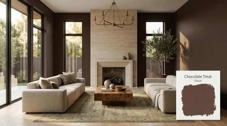
Dulux Chocolate Treat: Mastering the Visual Weight of a Modern Espresso Brown
Saturated brown walls are no longer a relic of dated suburban dining rooms; they are a deliberate architectural choice for modern interiors. When you apply a shade like Dulux Chocolate Treat, you are instantly changing the structural boundaries of the space.
This intensely saturated color acts as a rich, tactile backdrop that forces every material placed in front of it to perform at a higher level.
By treating this pigment as an architectural finish rather than just a wall color, you can manipulate how a room physically feels. It provides an earthy grounding tone that stabilizes a high-contrast design scheme.
The real power of this shade lies in its ability to absorb light and create an immediate sense of intimacy.
Dulux Chocolate Treat: Temperature, Undertones & LRV
Is Chocolate Treat warm or cool? This paint is definitively warm, radiating an undeniable heat that prevents it from ever feeling like a sterile, muddy neutral.
With a light reflectance value (LRV) of 9, this shade absorbs a massive amount of light.
This exceptionally low number translates directly into significant visual weight on your walls or exterior facade. It will dramatically pull the perimeter of a room inward, altering your spatial perception to establish a highly intimate, cocooning atmosphere.
You can apply wallpapers, paints, etc. on walls and see how they look in various interiors.

The Chameleon Factor: Lighting Effects
Because of its active red-orange base, this specific chromatic profile will dramatically shift its personality depending on the direction and temperature of your light source.
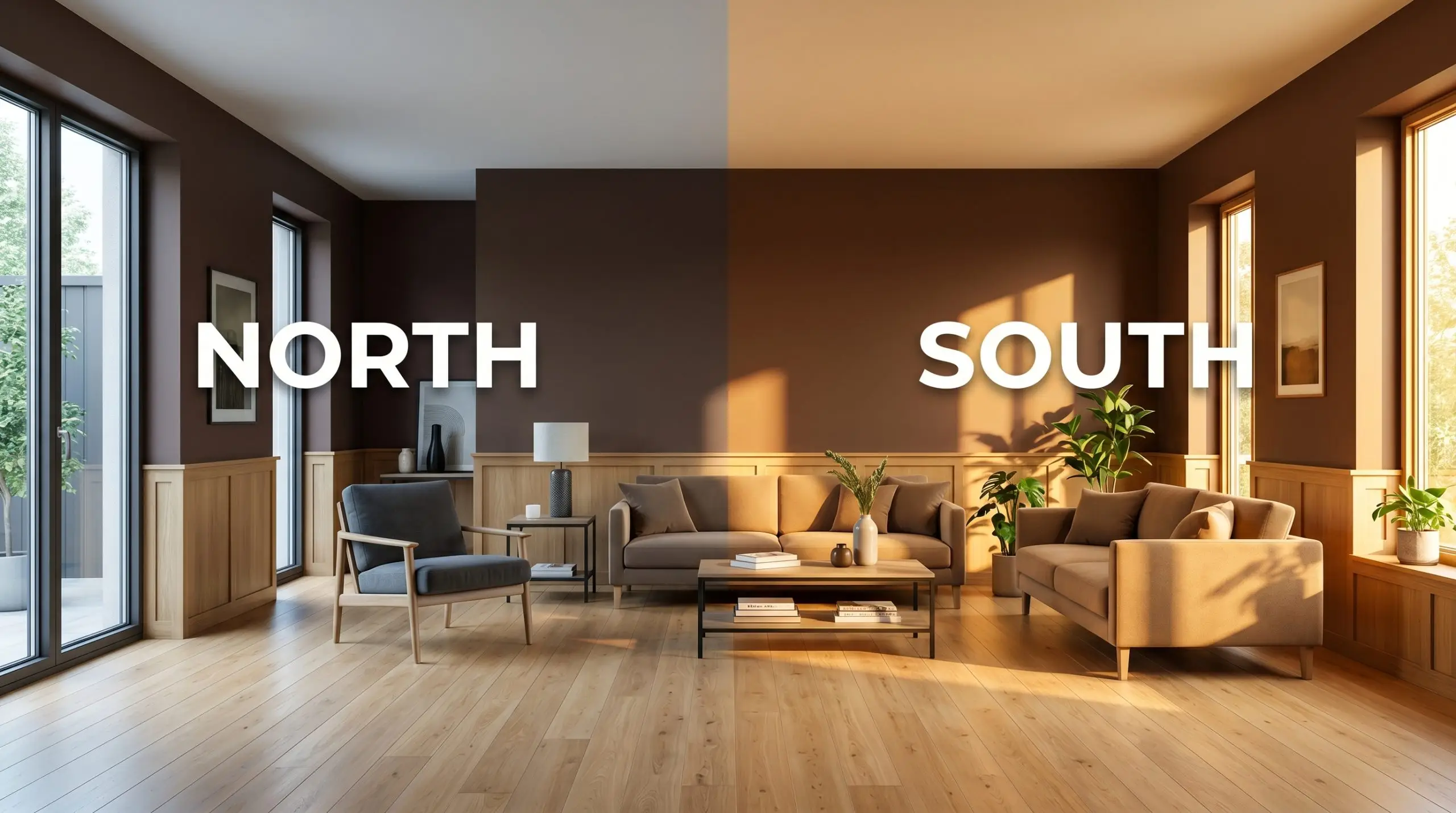
If you are committing to an LRV of 9, you must audit your lightbulbs. Mixing cool overhead LEDs with this specific mocha cast will create a visually jarring, muddy shadow effect across your walls. Always swap to 2700K bulbs before finalizing your paint swatches.
Hackrea Pro-Tip (The Bulb Rule)
Popular Applications for Chocolate Treat
Deploying a color with an LRV of 9 requires strategic intention regarding where and how the paint is applied.
Intimate Bedrooms
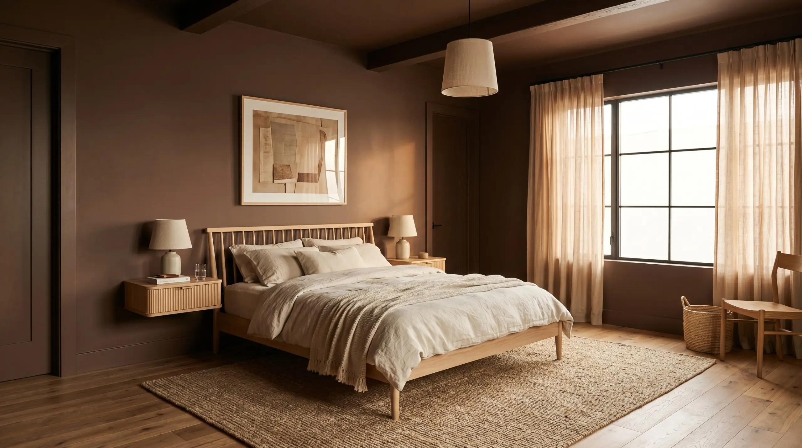
For a minimalist seeking sensory calm, this shade offers an immediate escape from visual noise. Instead of defaulting to a traditional accent wall behind the headboard, wrap the entire room in this earthy tone to blur the hard corners of the architecture.
Pair the dark walls with a low-profile spindle bed and layers of unbleached linen and stonewashed cotton to soften the dense color.
If your bedroom receives harsh afternoon sun, the baked cocoa warmth will radiate beautifully against raw silk window treatments and a jute rug. Introduce floating nightstands in a light reeded oak to provide necessary visual relief against the saturated backdrop.
Cozy Snugs and Dens
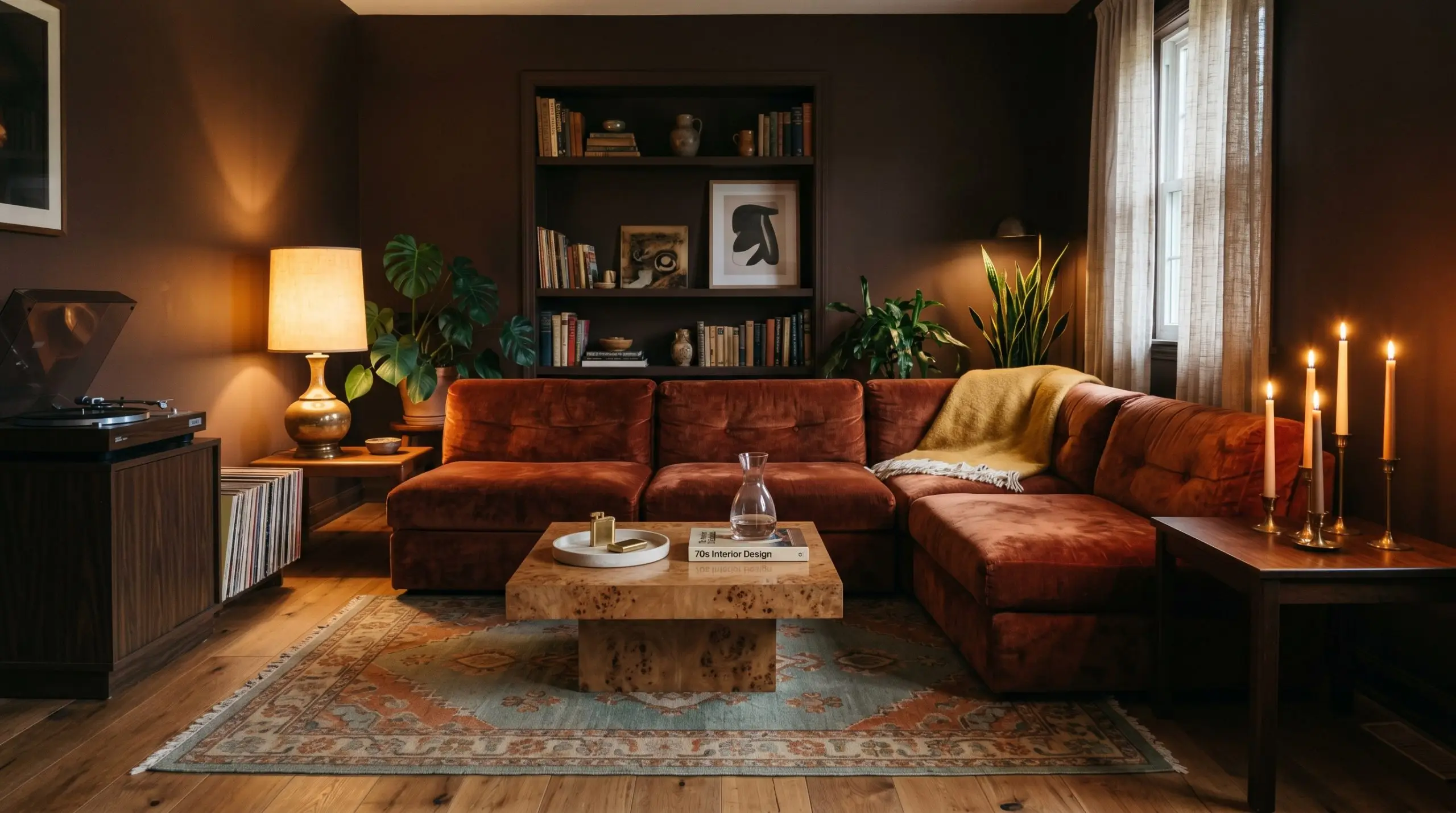
When a family wants to create a dedicated media retreat, this mocha shade is the ultimate foundational layer. The dark pigment effortlessly absorbs the glare from a television screen while establishing a relaxed, 70s-revival aesthetic.
Lean into the tactile nature of the paint by introducing a low-profile modular sofa upholstered in rust-colored crushed velvet or worsted wool.
Do not fight the darkness of the room.
Embrace the shadows by layering in a burl wood plinth coffee table and a vintage kilim rug featuring dusty sage and burnt ochre. To keep the space from feeling like a cave, use low-slung table lamps and staggered taper candles to cast warm pools of light against the matte walls.
Formal Dining Rooms
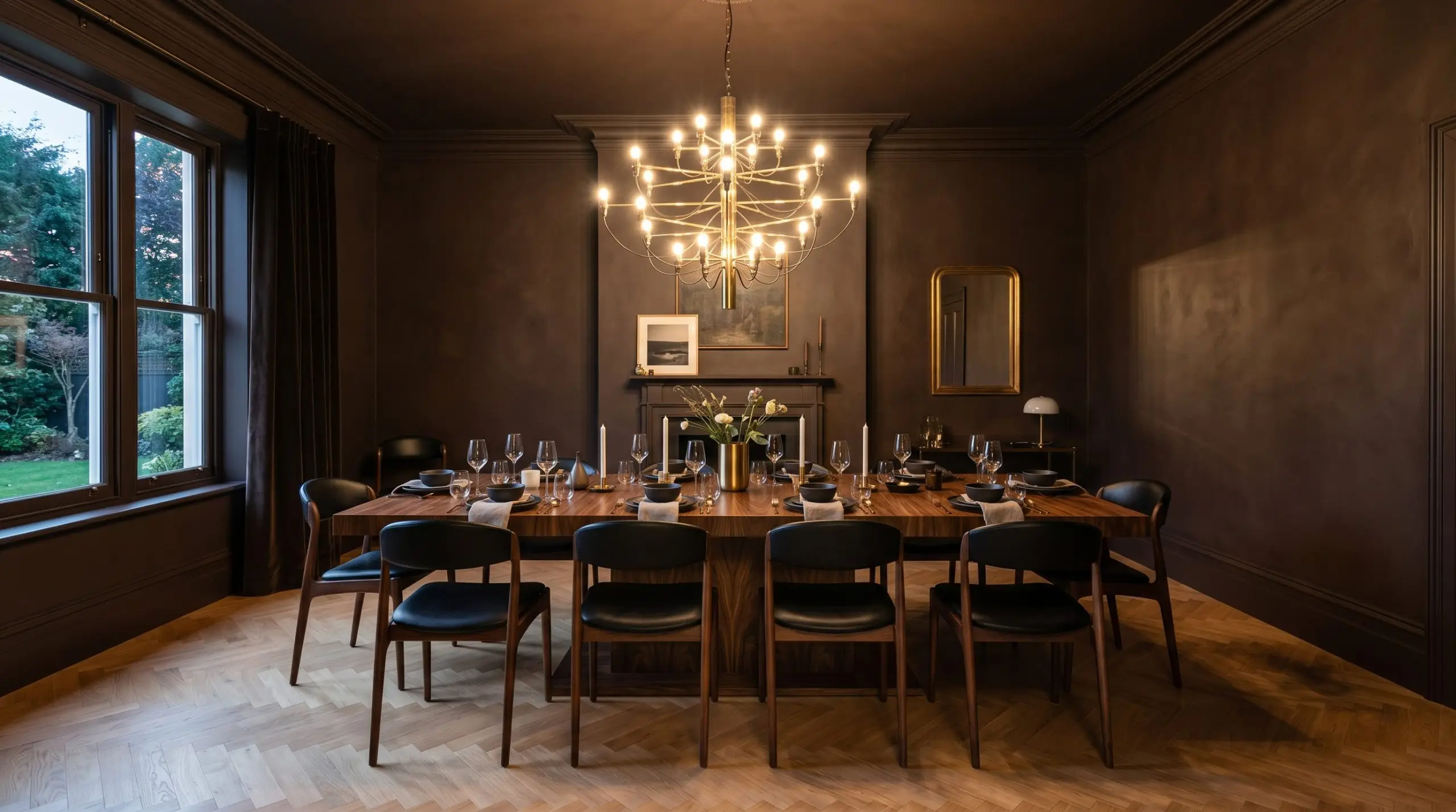
For homeowners who frequently host evening dinners, this espresso hue provides an incredibly sophisticated, moody backdrop that elevates standard furniture. Color drenching the space—painting the baseboards, crown molding, walls, and ceiling in the exact same finish—creates a seamless, high-end look.
When using a dark brown with a red-orange base on the walls, avoid pairing it with cherry or mahogany dining tables. The competing red undertones will clash violently. Instead, opt for contrasting materials like a honed travertine pedestal table or a heavily grained walnut.
Clash Warning (The Wood Tone Trap)
Illuminate the center of the room with an oversized unlacquered brass chandelier. The metallic finish will reflect off the velvety depth of the walls, adding a necessary layer of premium contrast to the dining experience.
Home Libraries and Studies
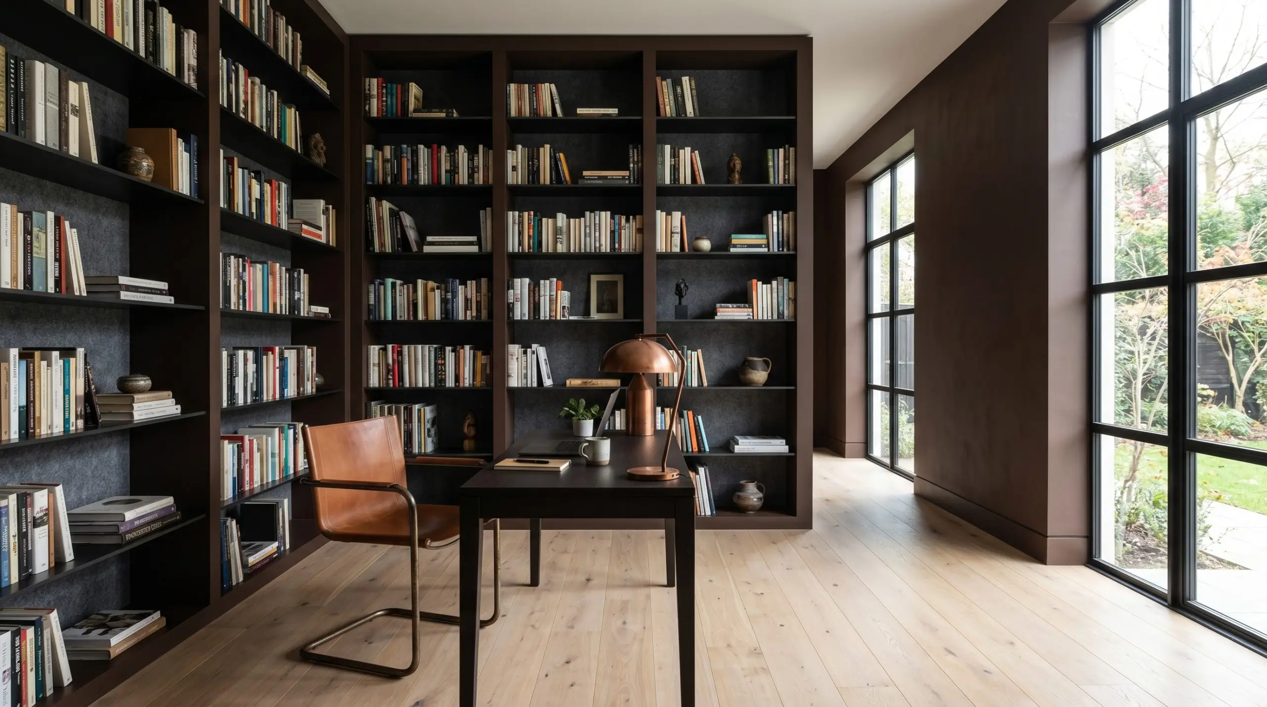
A remote tech worker needing intense focus can utilize this color to create a modern, distraction-free environment. Move away from the predictable, historic styling of a classic library and push the color into a sleek, contemporary direction.
Paint standard built-in bookcases and the surrounding walls in Chocolate Treat to create a monolithic, structural feature.
Break up the massive block of color by installing blackened steel floating shelves or backing the bookcases with acoustic felt panels in a charcoal gray. Introduce a saddle leather cantilever chair and an oxidized copper desk lamp to bring industrial texture into the highly saturated room.
Windowless Powder Rooms
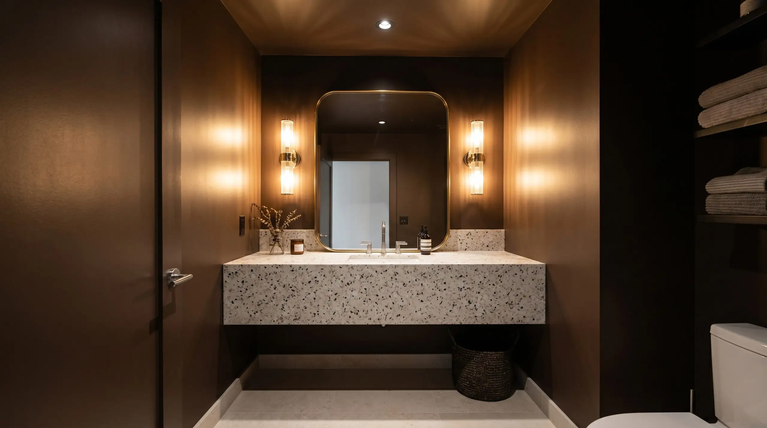
An urban apartment dweller looking to maximize a tiny footprint should use this shade to create a dramatic jewel-box effect. In a room with zero natural light, the paint will read as a profound, dark umber.
Applying this color to the ceiling is highly recommended here.
It eliminates the harsh contrast line where the wall meets the ceiling, making the small space feel infinitely taller. Offset the intense visual weight of the walls with a custom or floating terrazzo vanity and polished chrome fixtures. Incorporate a pair of fluted glass sconces on either side of a leaned oversized mirror to bounce artificial light aggressively around the tight layout.
Architectural Pairings & Coordinating Colors for Chocolate Treat
This dense pigment requires deliberate textural contrast to keep it from flattening out against your drywall. It thrives when pushed against crisp, reflective boundaries or softened by tonal, muted hues that share its underlying warmth.
Tailored Boundaries and Millwork Finishes
Tactile Elements and Hardware Integration
Secondary Palette Integration
Curated Aesthetic Concepts
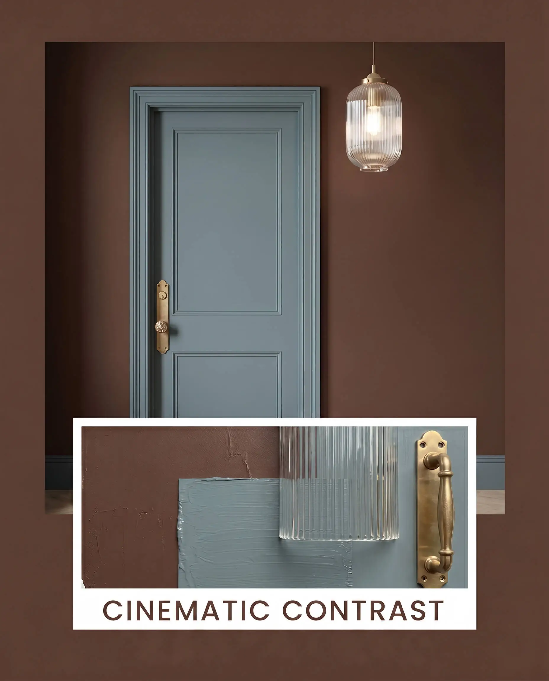
Cinematic Contrast This palette harnesses high-contrast tension to create a highly energized, sophisticated mood. The velvety depth of the dark walls serves as a structural backdrop for the vibrant pop of Benjamin Moore Aegean Teal on accent furniture or interior doors. Unlacquered brass hardware and fluted glass lighting fixtures cut through the darkness, introducing sharp, reflective moments that keep the energy of the room dynamic and elevated.
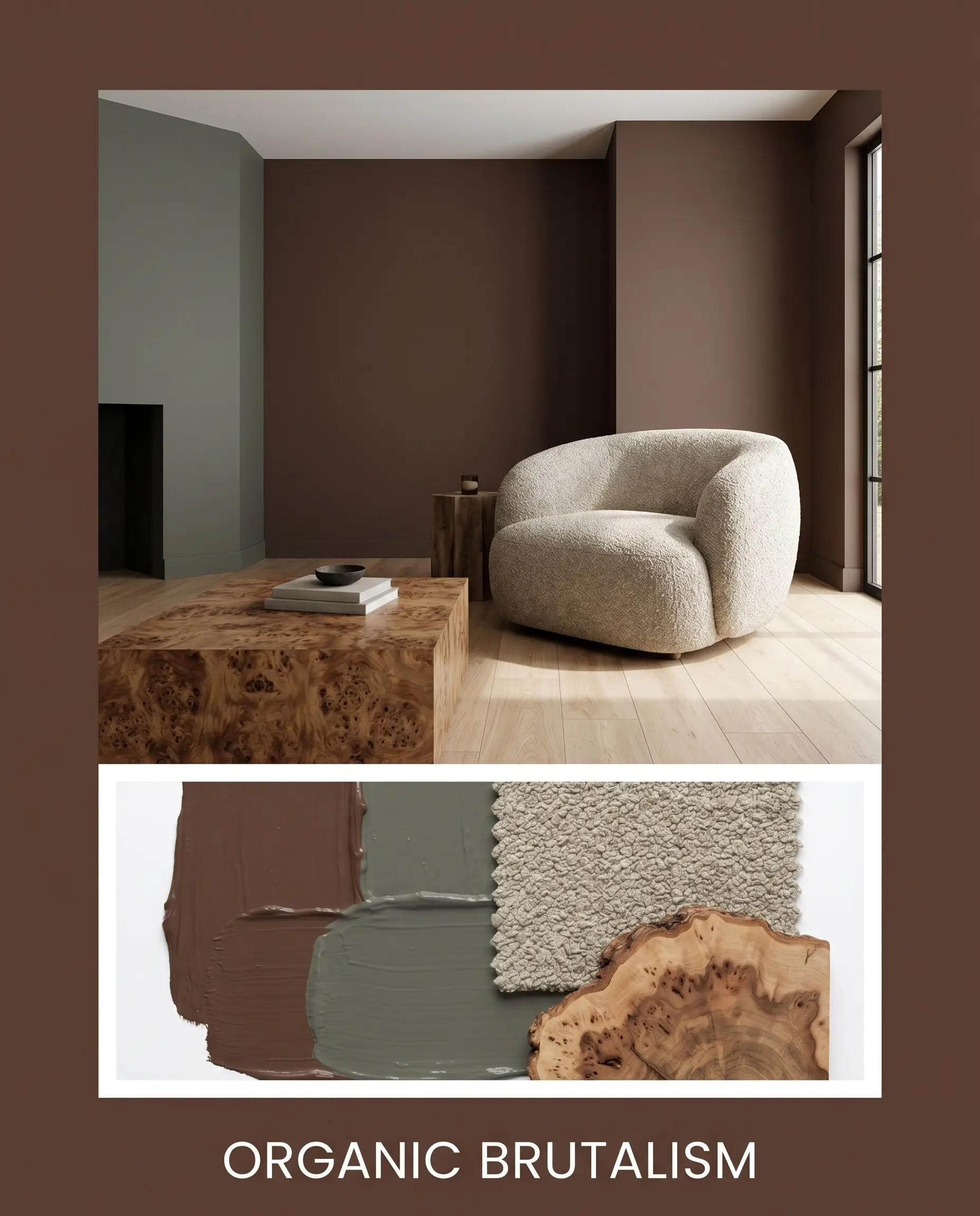
Organic Brutalism Rooted in raw textures and sensory calm, this styling approach softens the imposing nature of the dark paint. Introduce Sherwin-Williams Pewter Green on adjacent walls or large foundational rugs to cool the overall temperature. Layer in burl wood coffee tables and oversized bouclé armchairs to create a grounded, tactile environment that feels incredibly intentional and modern.
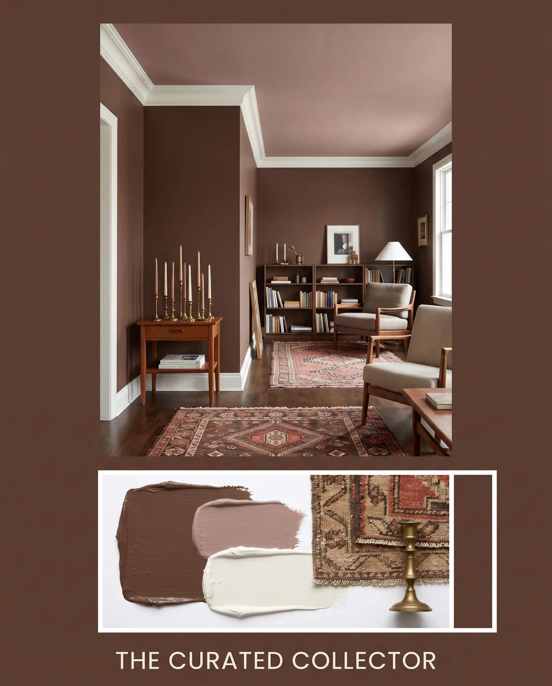
The Curated Collector This approach leans into a warm, tonal bleed for a deeply intimate and collected vibe. Pair the main espresso walls with Farrow & Ball Sulking Room Pink on the ceiling or custom millwork to amplify the shared red-orange undertones. Anchor the space with crisp Benjamin Moore White Dove trim, allowing layered vintage rugs and staggered taper candles to radiate a soft, welcoming heat.
Comparing Chocolate Treat Against Industry Alternatives
If your room lacks the necessary natural light to support a strong red-orange base, the walls can occasionally feel overly heated. Shifting to a slightly cooler or deeper rival prevents the space from feeling unbalanced, allowing you to maintain the dark aesthetic with a more cooperative undertone.
Dulux Chocolate Treat vs. Sherwin-Williams French Roast SW 6069
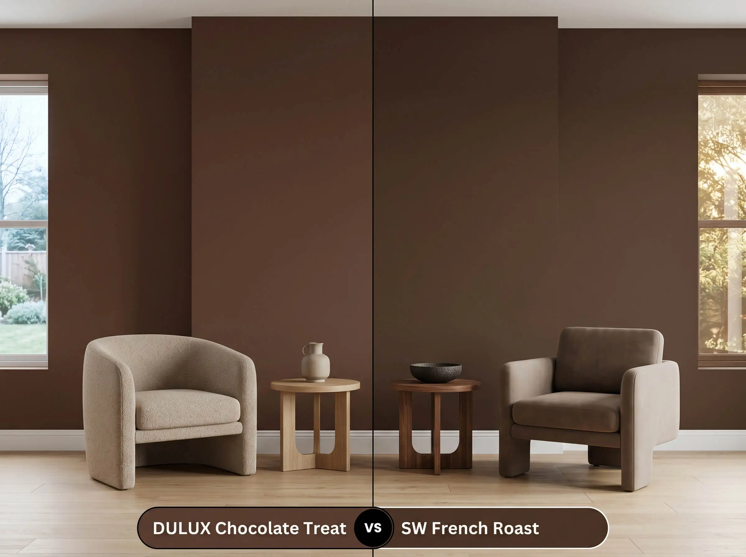
French Roast features a slightly cooler, more subdued chromatic profile. If your room receives intense, direct south-facing light, the Sherwin-Williams option will prevent the walls from visually turning too orange in the afternoon.
Dulux Chocolate Treat vs. Benjamin Moore Brown Horse 2108-30
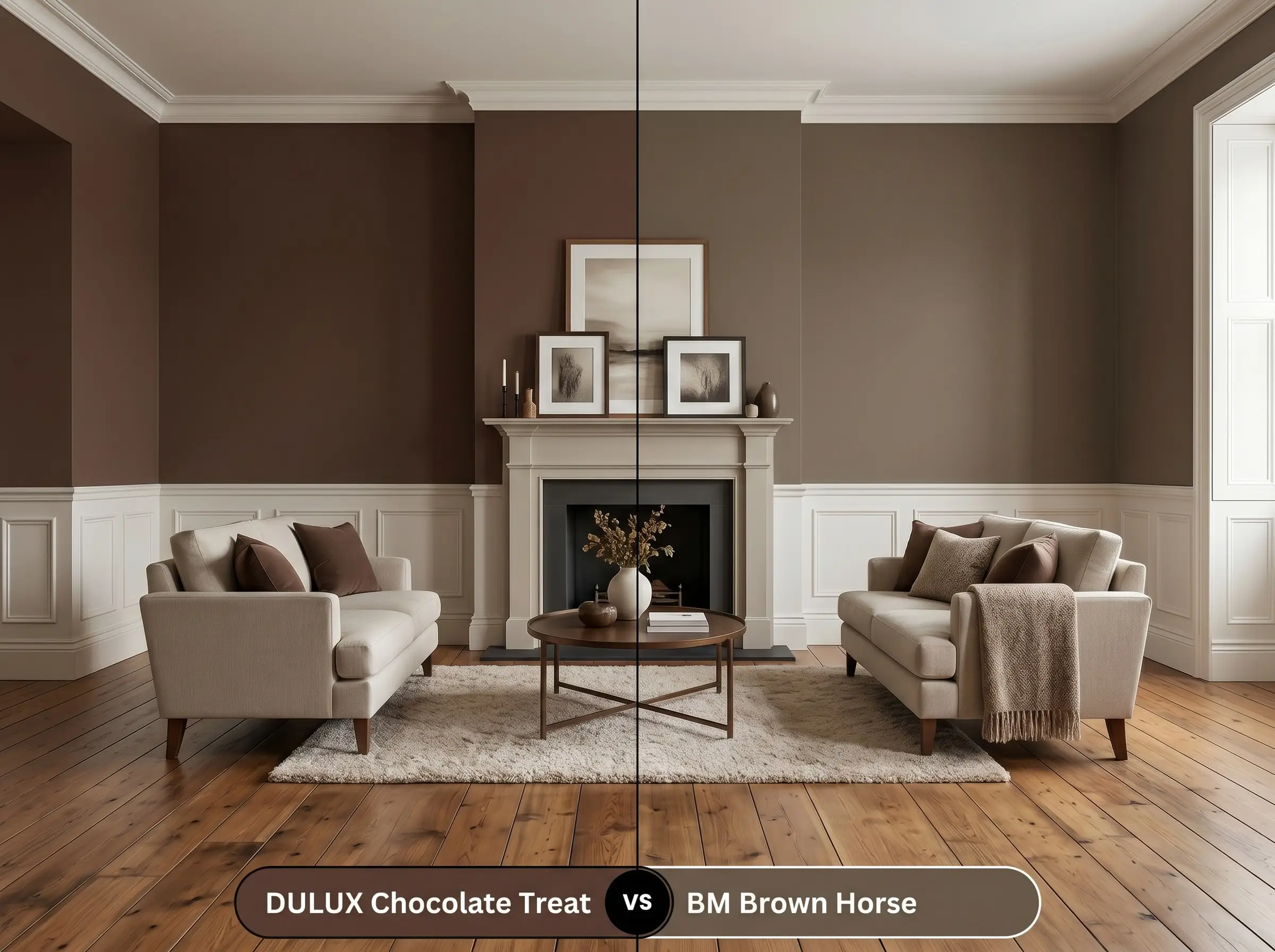
Brown Horse carries a distinctly stronger, more pronounced red undertone. If you are specifically chasing a traditional, mahogany-leaning aesthetic, the Benjamin Moore formulation delivers that classic, historical warmth far better.
Dulux Chocolate Treat vs. Farrow & Ball Tanner’s Brown No. 255
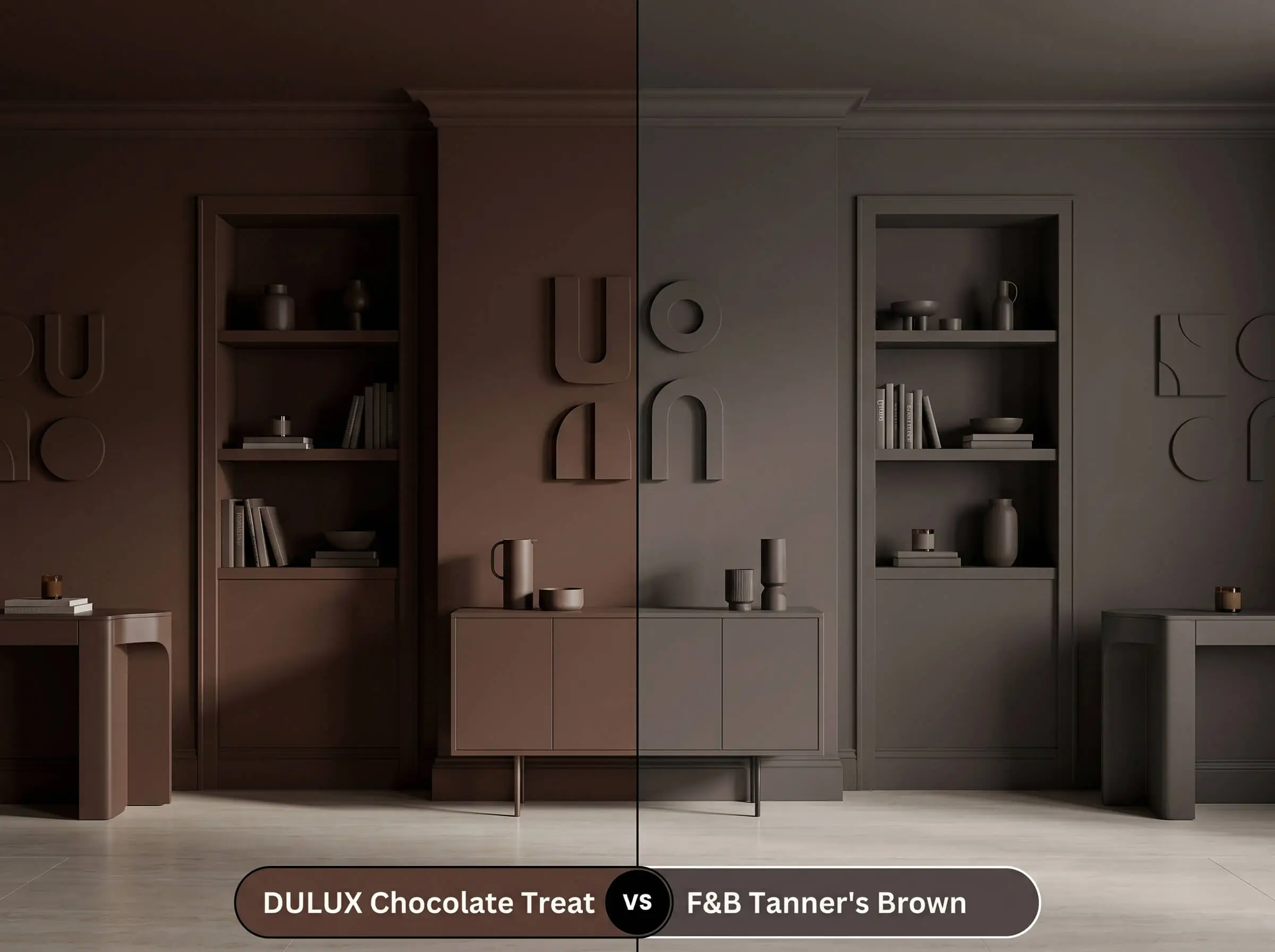
Tanner’s Brown reads almost black in low-light environments due to its exceptionally low LRV. If you are color drenching a space and require a near-black, structural shadow effect rather than a warm mocha cast, Tanner’s Brown is the superior candidate.
Alternative Formulations and Brand Matches
When local availability dictates a brand switch or your specific lighting requires a microscopic shift in depth, these alternatives provide reliable fallback options.
Tonal Variations Within the Brand
Competitor Matches
Executing Chocolate Treat: Application and Finish Guide
Moving from color theory to physical application requires strict attention to finish selection and surface preparation. Dark pigments aggressively highlight drywall imperfections and require specific layering techniques to achieve a premium result.
Surface Finish Recommendations
Essential Base Coats
- A high-quality, deeply tinted gray primer is absolutely mandatory to support this intense chromatic profile.
Professional Coverage Standards
- Expect to apply a minimum of two generous coats, though three are frequently required over lighter existing walls to achieve true opacity.
- Maintain a wet edge with your roller to prevent flashing, as dark browns will immediately reveal overlapped, dry strokes.
- Touch-ups on flat, dark walls are notoriously difficult. Always plan to repaint an entire wall corner-to-corner if surface damage occurs.
When applying a shade with an LRV this low, use a 3/8-inch microfiber roller. Thicker naps will leave a subtle stipple texture that catches the light, ruining the smooth, velvety depth you are trying to achieve.
Hackrea Pro-Tip (The Roller Nap Rule)
Frequently Asked Questions
Because of its extremely low LRV, this shade actually blurs the hard corners of a small, windowless room. This optical illusion forces the boundaries to recede, making the space feel intentionally moody and expansive rather than tight.
Amber lighting will aggressively amplify the hidden red-orange base within the paint. This interaction effectively turns the walls into a very warm, baked terracotta-brown, completely overpowering its cooler espresso characteristics.
While it grounds exterior brick beautifully, dark pigments inherently absorb intense heat and UV rays. This means the facade will require repainting sooner than a mid-tone neutral to maintain its rich, velvety depth without chalking.
Using a dead-flat finish on the ceiling prevents distracting light pooling directly above your head. You must then compensate for the color’s light absorption by adding strategically placed, warm-toned wall sconces at eye level.
The Final Verdict on This Mocha Brown
Dulux Chocolate Treat is an incredibly sophisticated, structural color designed for homeowners who want to completely redefine the boundaries of their space. Its absolute best application is in intimate, light-controlled environments—like modern dens, moody dining rooms, or color-drenched home libraries—where its dense visual weight can act as a tactile canvas for premium materials. It thrives in organic modern, 70s revival, and minimalist interiors that utilize rich woods, unlacquered metals, and matte textiles to balance its intense warmth.
However, this paint requires strict environmental control to succeed. If your home features predominantly cool, gray-toned luxury vinyl plank flooring or an abundance of matching dark cherry furniture, this specific mocha cast will actively fight against those elements. The red-orange base will clash with the cool floors, making the room feel disjointed, while matching dark woods will cause the entire space to flatten into a muddy, undefined box. You must commit to high-contrast, intentional material pairings to unlock the true luxury of this shade.