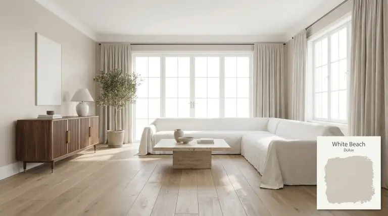
Dulux White Beach is a soft, inviting warm beige with an LRV of 65. Anchored by subtle peachy-pink and creamy undertones, it serves as a versatile neutral foundation that adds gentle warmth without appearing overly yellow or stark in interior spaces.
Dulux White Beach: The Warm Neutral Redefining Tonal Architecture
Despite what its breezy name suggests, Dulux White Beach is not restricted to coastal cottages or predictable nautical themes. This soft beige operates as a highly sophisticated architectural finish, providing the exact level of tonal warmth required to soften rigid, contemporary spaces. It is a masterclass in subtlety, offering a creamy base that physically warms up a room without ever tipping into a heavy, dated tan.
The true value of this paint lies in its complex color structure. When paired with the right fixed elements—like honed soapstone counters or unlacquered brass hardware—it acts as a stabilizing backdrop that allows premium materials to shine. If you are trying to move away from sterile, gallery-white walls but fear committing to a dark color, this is your transitional sweet spot.
The Chromatic Profile of Dulux White Beach: Temperature, Undertones & LRV
Dulux White Beach is fundamentally a warm paint color. It completely sidesteps the icy, sterile qualities of cool-toned grays, instead offering a highly welcoming, sunlit energy to residential interiors.
To understand exactly how this color behaves on the wall, we have to look at its underlying DNA:
With an Light Reflectance Value (LRV) of 65, this hue sits comfortably in the mid-to-light range of the spectrum. This specific light absorption rate means it reflects a moderate amount of light back into the room, keeping the atmosphere airy and expansive. It provides just enough visual weight to create a crisp, tailored contrast against pure white ceilings and trim.
You can apply wallpapers, paints, etc. on walls and see how they look in various interiors.

Ambient Lighting Effects & The Chameleon Factor
Because of its peachy-pink base, the way this beige reads in your home is entirely at the mercy of your directional sunlight and artificial fixtures.
Because White Beach carries a peachy undertone, you must avoid pairing it with heavily yellow-based white trims. Stick to crisp, clean whites (like a classic bright white) to ensure the undertones do not clash and muddy the architectural lines.
Hackrea Pro-Tip (The Trim Pairing Rule)
Transforming Residential Interiors with White Beach
The mid-tone value of this beige makes it an incredibly adaptable foundation across drastically different floor plans and daily routines. Because it strikes a delicate balance between light-reflecting and space-defining, it can handle both sprawling communal areas and intimate, enclosed zones.
Open-Plan Living Spaces
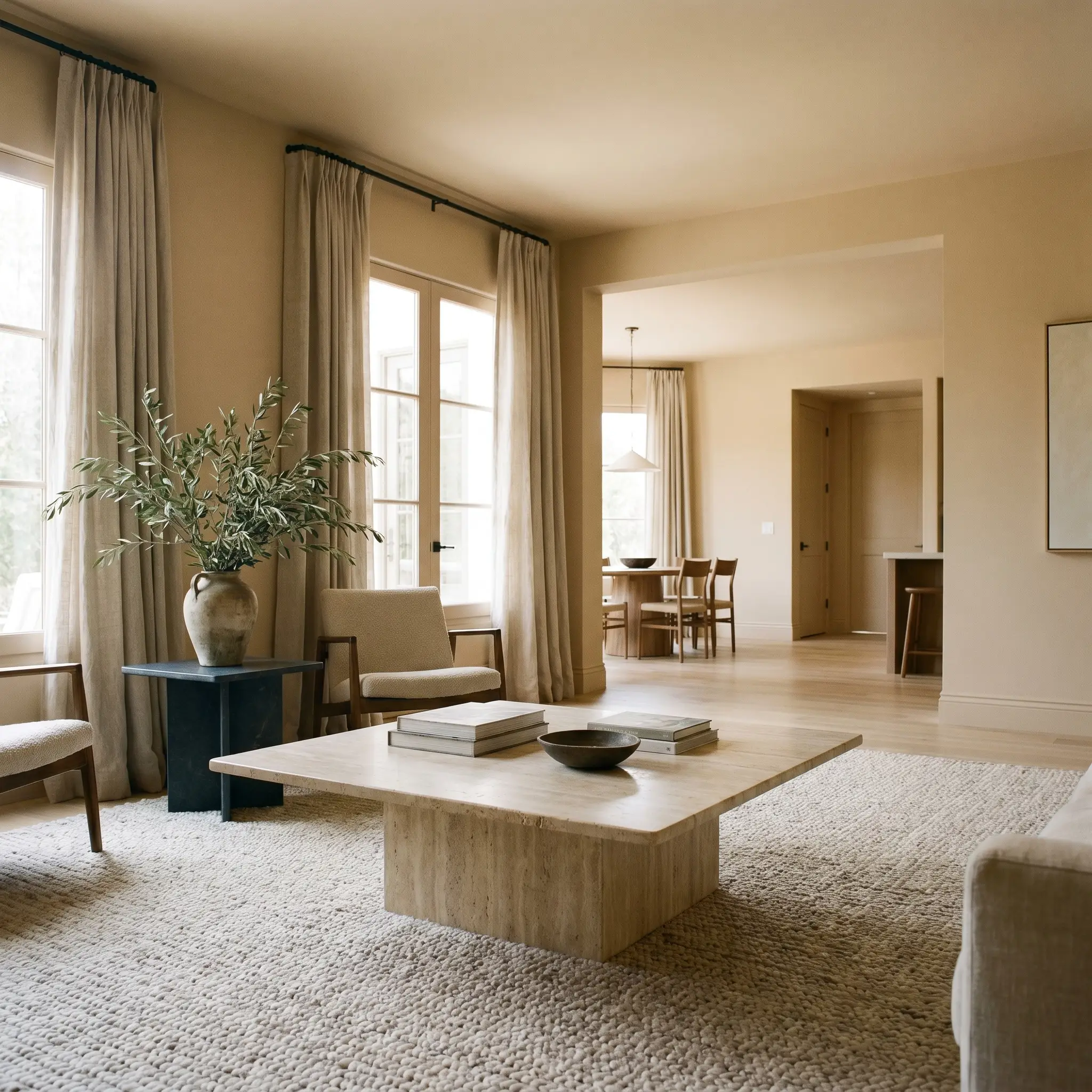
In large, multi-use living areas, this hue excels at unifying disjointed zones without making the walls feel cavernous. Lean into a Mediterranean Modern aesthetic by pairing the warm walls with raw, tactile materials like a travertine plinth coffee table and heavy, stonewashed linen drapery. The peachy undertones interact beautifully with natural textures, so styling with oversized foraged olive branches and vintage studio pottery instantly elevates the everyday living experience.
For young families where the living room serves as a high-traffic hub, this mid-tone beige is incredibly forgiving against minor scuffs compared to stark white. To establish a sense of architectural rhythm, carry the color seamlessly across the walls, baseboards, and interior doors. This unified approach masks builder-grade imperfections while creating a bespoke, tailored envelope.
Primary Bedrooms
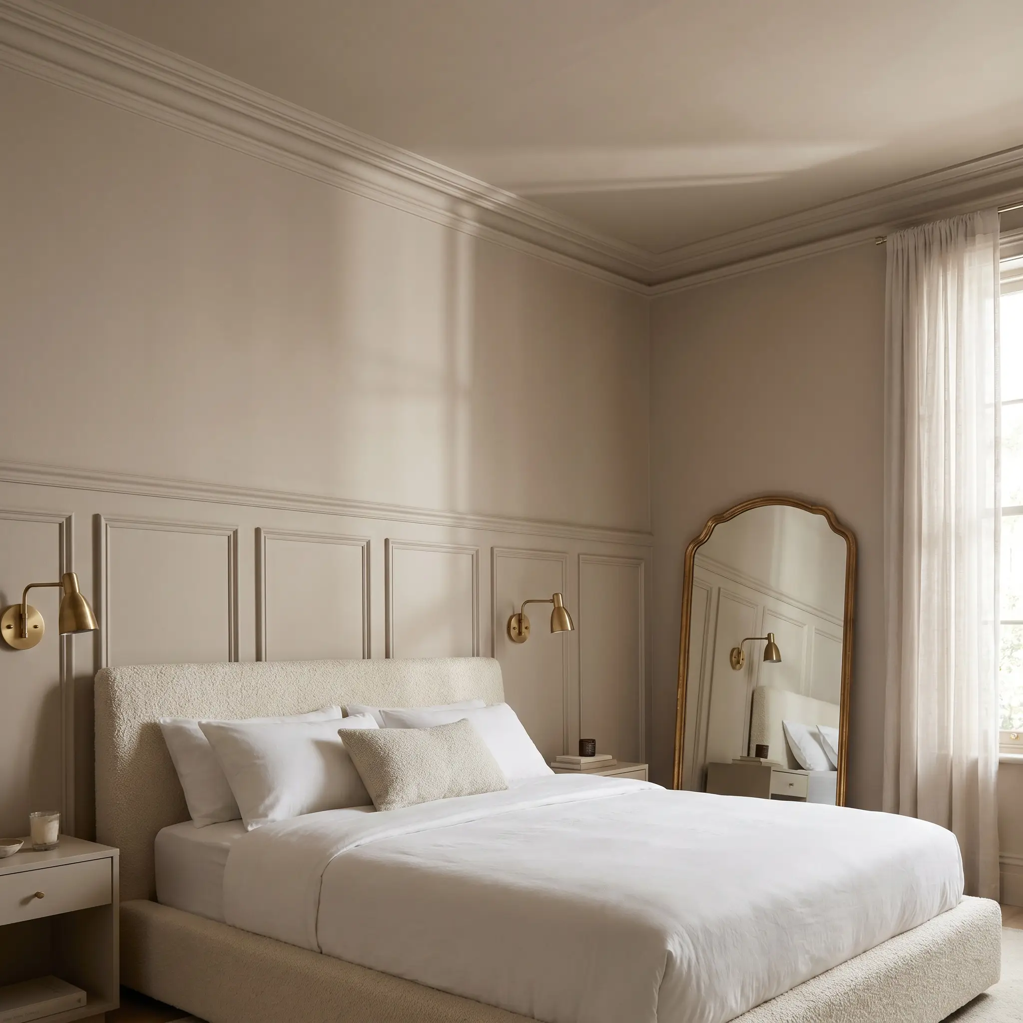
Rather than defaulting to standard drywall, use this creamy beige to highlight classic architectural features in a primary suite. Applying the color over traditional picture molding or beadboard wainscoting creates subtle shadow lines that emphasize the paint’s tonal warmth. Take a Parisian Chic approach by pairing the walls with an upholstered bouclé bed frame, unlacquered brass reading sconces, and a vintage asymmetrical mirror.
To make a standard-sized bedroom feel taller and more expansive, paint your crown molding and ceiling the exact same White Beach hue as the walls. This eliminates visual boundaries and creates a soft, continuous canopy overhead.
Hackrea Design Secret (The Monochromatic Wrap)
Warm, Inviting Hallways
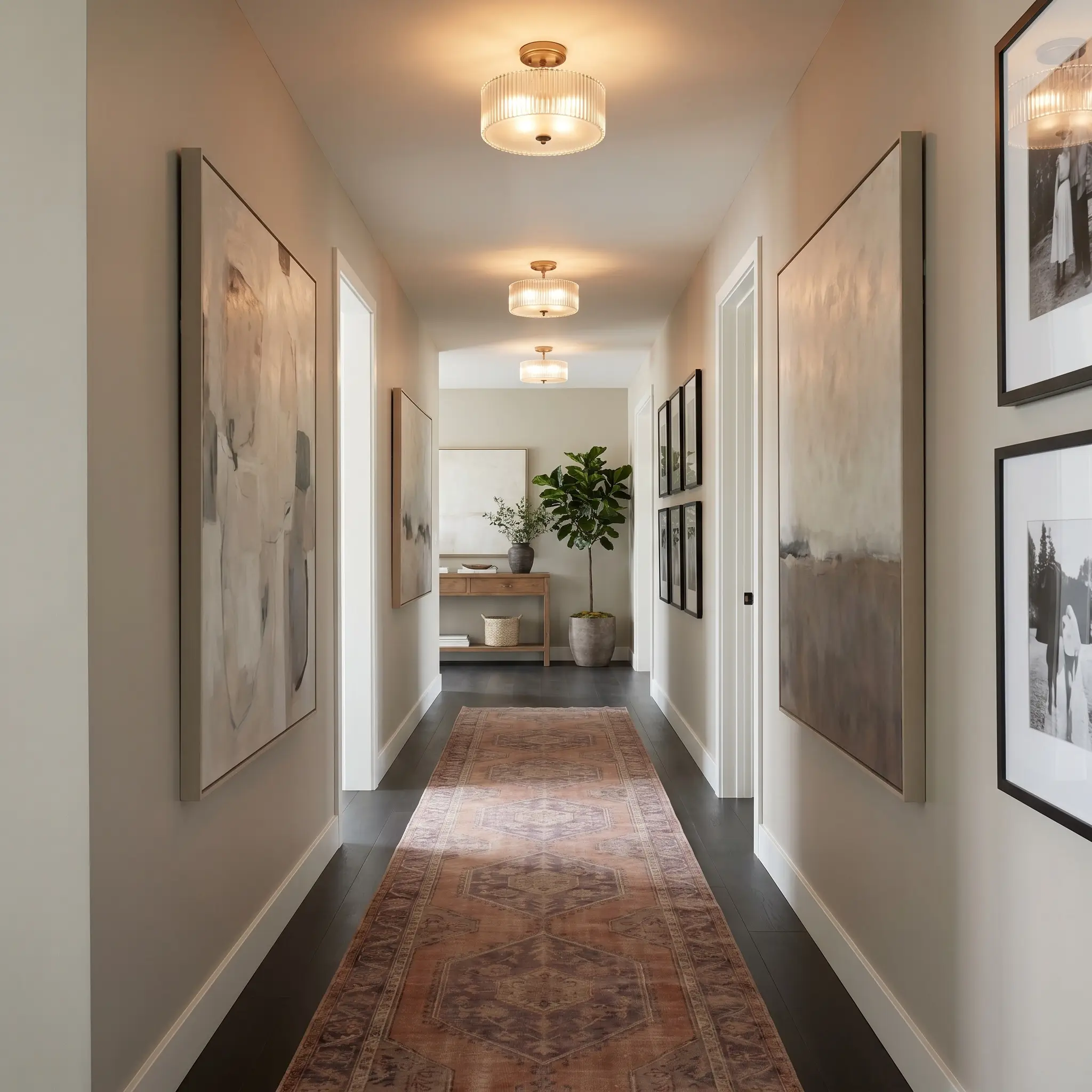
Hallways are notoriously starved for natural light, which is where the 65 LRV of this paint becomes a major asset. Instead of leaving these transitional spaces as forgotten, sterile corridors, treat them like an intimate residential art gallery. The soft beige structure provides a highly flattering backdrop for curated gallery walls featuring oversized abstract canvases or framed black-and-white photography.
Because hallways often lack architectural interest, rely on lighting fixtures to manipulate the paint’s chameleon qualities. Installing flush-mount fixtures with fluted glass and 2700K bulbs will cast a warm, inviting glow against the walls during the evening. Pair this setup with a vintage runner in muted terracotta or dusty plum to draw the eye down the corridor and complement the paint’s hidden pink base.
Exterior Render and Cladding
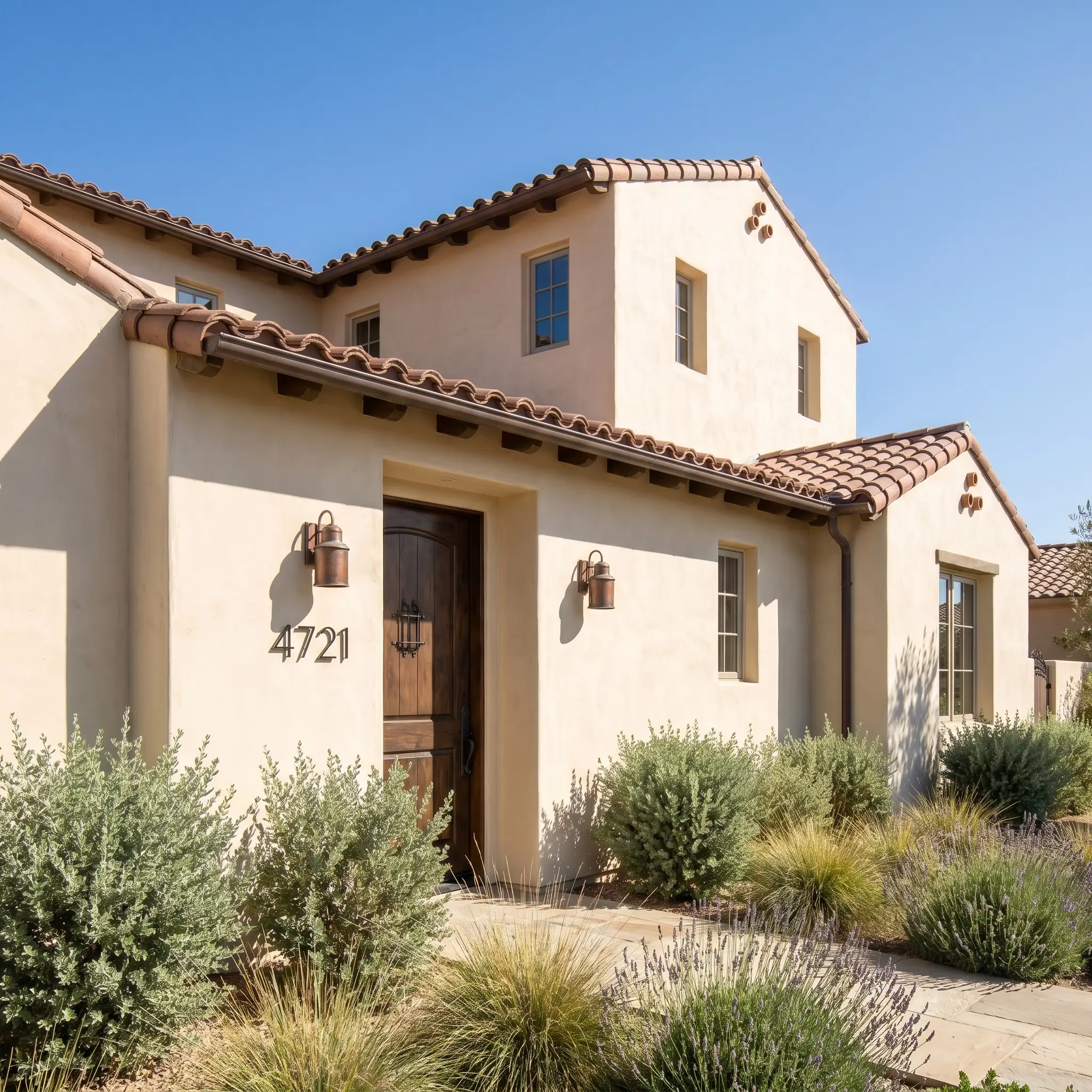
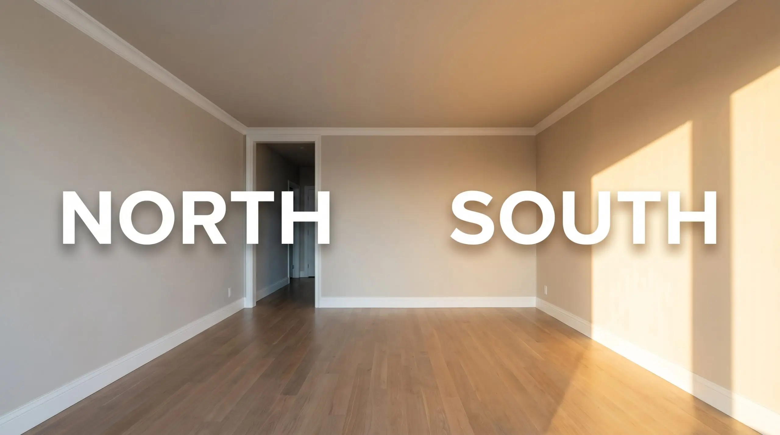
When taken outside, the intense wash of full sunlight will significantly lighten this hue, making it read as an off-white rather than a standard beige. It is a phenomenal choice for exterior stucco or masonry, particularly if you are trying to achieve a Desert Modern or European Farmhouse aesthetic. Pair the creamy facade with blackened steel house numbers, oxidized copper exterior sconces, and natural terracotta roof tiles.
If you are updating a suburban home with traditional lap siding, use this color on the main body to instantly modernize the curb appeal. It roots the house beautifully into natural landscaping, especially when surrounded by soft sage greens and ornamental grasses. Always test a large swatch on both the north and south sides of your exterior, as the shifting sunlight will dramatically alter the warmth of the finish throughout the day.
Mastering the Relational Palette: Best Pairings for Dulux White Beach
This mid-tone neutral requires highly intentional pairings that either lean into its inherent warmth to create a seamless glow or establish crisp boundaries to prevent the room from feeling washed out. Its specific pigment behavior demands materials that offer structural contrast rather than competing tonal warmth.
Crisp Boundaries: Ideal Trim Selections
Tactile Finishes and Hardware Combinations
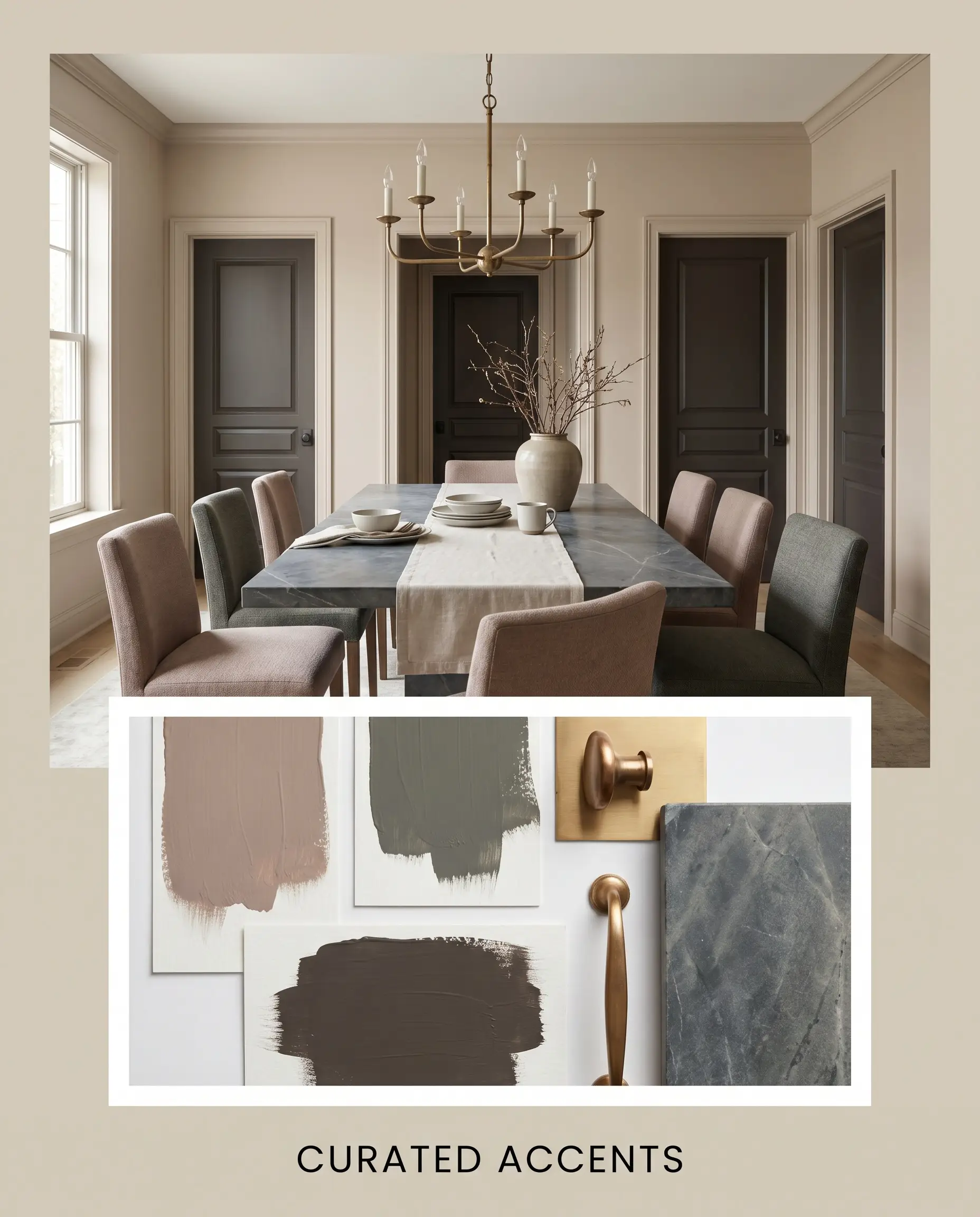
The Curated Accent Palette
Styling the Aesthetic: Curated Vibe Concepts
Sculptural Sunbaked Minimalism This aesthetic leverages the paint’s creamy base by layering it alongside raw travertine plinths and heavily slubbed cotton drapery. By incorporating abstract bronze sculptures and oversized foraged branches, the environment relies entirely on texture rather than loud color to generate visual interest. The introduction of unlacquered brass hardware acts as the singular metallic flash, elevating the rugged, earthy foundation into a highly curated experience.
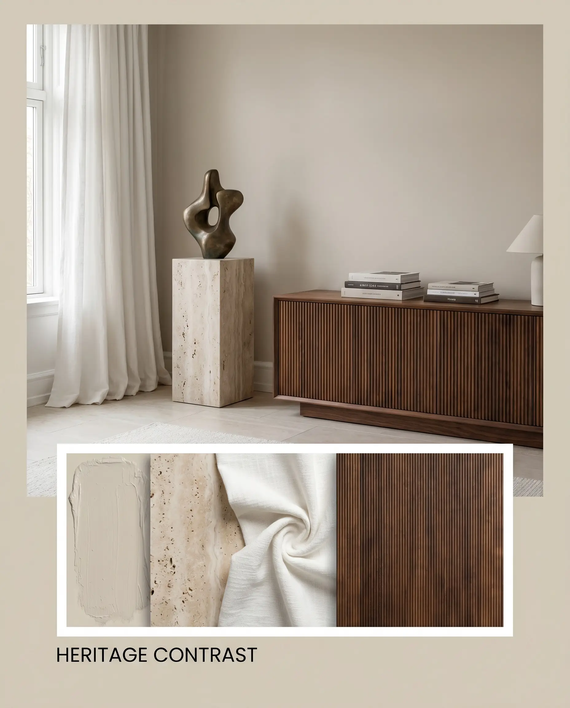
Tailored Heritage Contrast Grounding the airy walls with architectural accents painted in Benjamin Moore Black Bean Soup 2130-10 establishes an immediate, sophisticated tension. Styling this high-contrast shell with a low-profile slipcovered sofa, dark reeded walnut credenzas, and vintage sconces creates an atmosphere of restrained luxury. The dark, moody accents force the beige to read as a crisp, intentional backdrop rather than a default neutral.
Dulux White Beach vs. The Alternatives
While this creamy beige is incredibly versatile, its hidden pink base can become a liability in specific architectural environments. If your home is flooded with cool, northern light or surrounded by heavy green foliage, you might find the walls pulling an unwanted icy tone, signaling the need for a rival shade with a different structural makeup.
Dulux White Beach vs. Dulux White Beach Quarter SW1C4
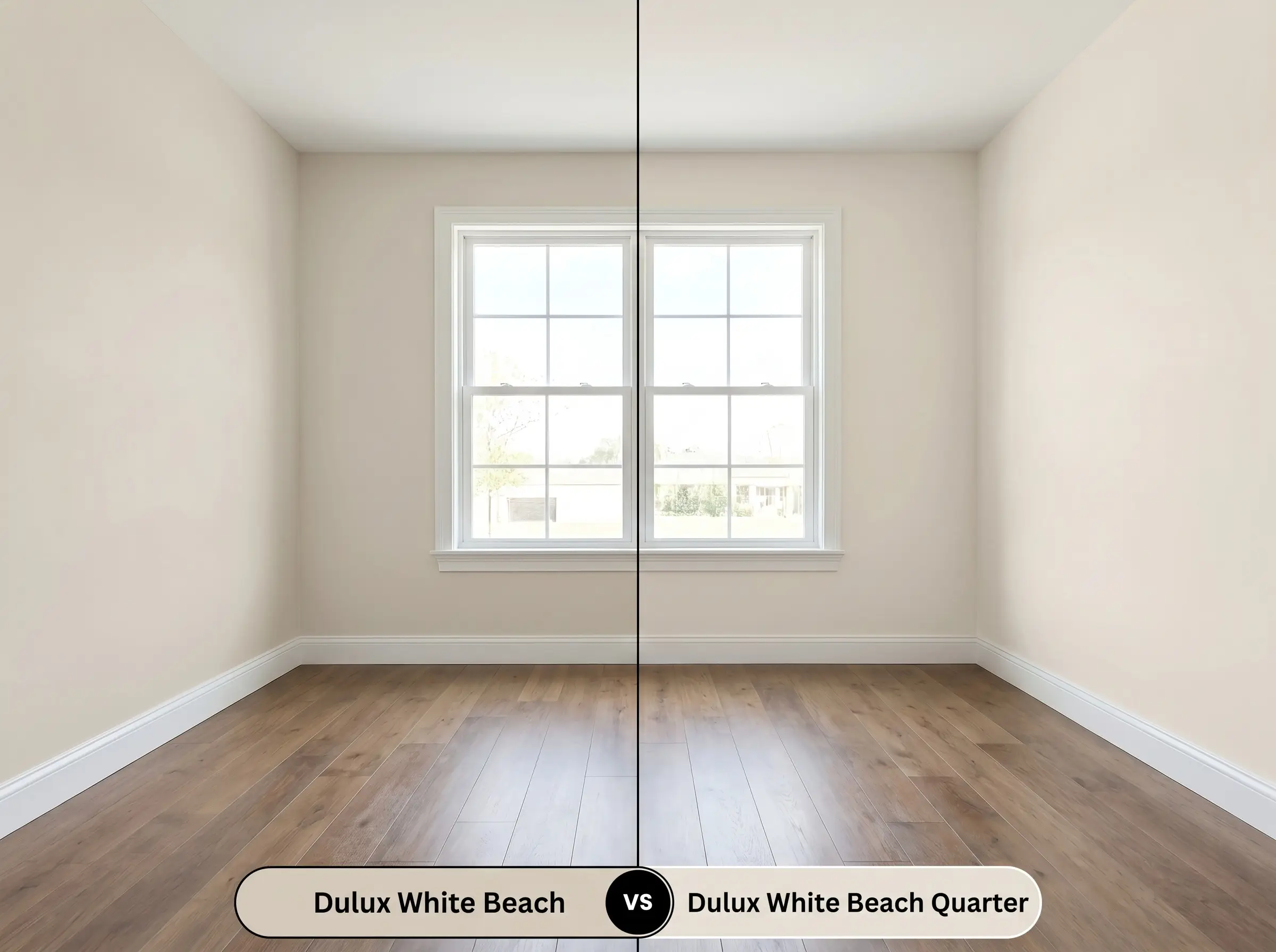
If you are designing a space with extremely limited natural light, then stepping down to the Quarter strength is often the smarter play. The Quarter variation retains the exact same peachy-cream DNA but significantly increases the light reflectance, acting more like a warm off-white. This prevents cramped, shadowed rooms from feeling visually weighted while still delivering a soft, inviting glow.
Dulux White Beach vs. Dulux Hog Bristle Half S14D1H
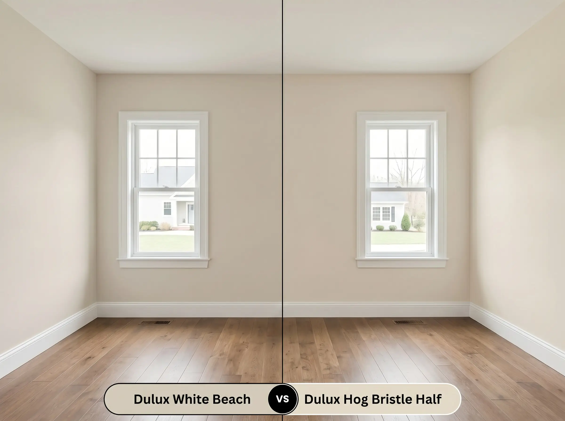
If your existing floors feature heavy yellow or orange undertones, then Hog Bristle Half is the safer architectural choice. While our primary beige leans slightly pink, Hog Bristle Half is built on a distinctly yellow-ochre base, making it far more compatible with golden oak or honey-toned timber. Choosing the wrong undertone here will result in the floors and walls actively fighting each other, leaving the room feeling discordant.
Dulux White Beach vs. Dulux Natural White SW1F4
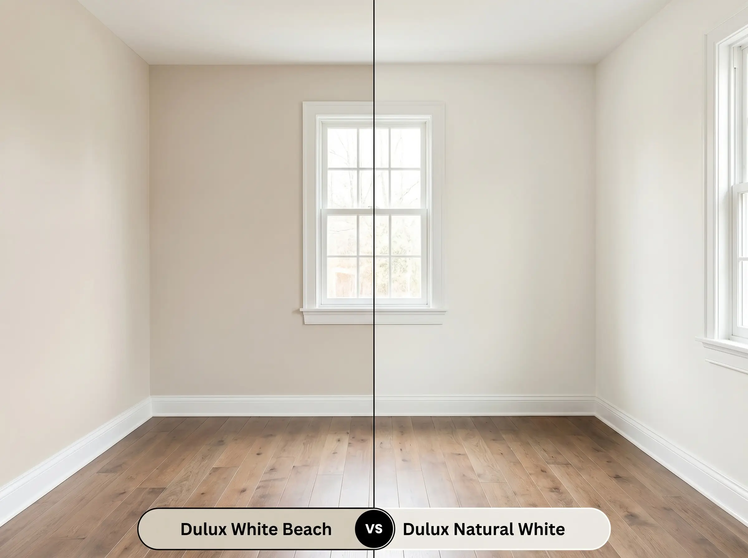
If you want a truly neutral canvas that completely avoids the risk of reading pink, then Natural White is the undisputed champion. Natural White is a much cleaner, brighter hue that lacks the earthy depth of the beige, making it ideal for minimalist, modern environments. Use the beige when you want the walls to feel like a cozy envelope, but pivot to Natural White when you need a gallery-like backdrop for vibrant artwork.
Sourcing Alternatives: Matches and Tonal Shifts
Even when you fall in love with a color’s general profile, the specific lighting in your home might demand a slight tonal pivot. Whether you need a touch more depth to anchor a large room or a cleaner base to accommodate existing furniture, these alternatives offer subtle, necessary shifts.
Same-Brand Variations
Competitor Color Matches
Executing the Finish: Application Strategy for White Beach
Transitioning a color from a digital concept to a physical wall requires strict attention to the mechanics of the paint itself. The success of this warm beige relies entirely on proper surface preparation and selecting the correct sheen to manipulate its light absorption.
The Dynamic Sheen Guide
Foundation and Prep
Because this hue relies on a delicate balance of creamy and peachy undertones, a high-quality, pure white acrylic primer is absolutely mandatory. Applying this beige directly over standard builder-grade gray or existing dark walls without a white blocking primer will instantly muddy the finish, destroying its intended warmth.
Coat Requirements and Rolling Technique
Achieving the true, intended depth of this mid-tone neutral strictly requires two full, even coats over a primed surface. To avoid flashing—where the paint dries with visible, uneven roller marks that catch the light—you must maintain a wet edge and avoid over-working the roller as the acrylic begins to set. Touch-ups on this specific depth of beige are notoriously visible if the sheen is anything above a dead flat, so completing full wall sections in a single session is crucial.
Frequently Asked Questions
Because of its underlying peachy-pink base, this paint harmonizes beautifully with red brick and terracotta. Instead of clashing, the wall color softens the intense rust tones, creating a cohesive, sunbaked Mediterranean aesthetic.
With an LRV of 65, it actually possesses enough light reflectance to keep dark corridors feeling open. When paired with warm 2700K lighting, it transforms a sterile, windowless space into an inviting, intentional transition zone.
To actively suppress the peachy undertones, pair the walls with cool, ashy blonde woods or deep, espresso-stained walnut. Avoid golden oak or warm cherry floors, as those yellow and red tones will only amplify the pink in the paint.
In heavily shaded areas surrounded by green foliage, the natural light will pull a cooler, slightly grayish cast out of the paint. It performs exceptionally well here, acting as a soft, organic off-white that bridges the gap between the architecture and the natural landscape.
The Final Verdict on Dulux White Beach
Dulux White Beach is an incredibly sophisticated, highly adaptable neutral that successfully bridges the gap between stark modernism and cozy, lived-in warmth. It is the perfect foundational color for homeowners who want to inject a subtle, sunlit energy into their spaces without committing to a dominant, saturated hue. This paint excels in open-plan living areas and primary suites, specifically elevating Mediterranean Modern and Tailored Heritage design styles by providing a soft, creamy backdrop that makes raw materials and premium hardware shine.
While this beige is highly versatile, it is absolutely not for homes dominated by golden oak cabinetry, yellow-toned trim, or heavily saturated yellow-green furnishings. Placing this peachy-creamy base directly next to strong yellow or orange wood tones will force the paint to read as an artificial, fleshy pink rather than a sophisticated neutral. If your home features immovable, honey-toned fixed elements, you must pivot to a beige with a dedicated yellow or green base to maintain visual harmony and avoid a costly, clashing mistake.
Hackrea Pro-Tip (The Undertone Clash Warning)