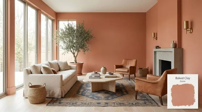
Baked Clay S08F6
DuluxDulux Baked Clay is a warm, mid-tone terracotta orange with an LRV of 37. Featuring earthy brown and subtle dusty blush undertones, it creates a comforting, grounded atmosphere perfect for living spaces and bedrooms seeking a rich, organic aesthetic.
Dulux Baked Clay S08F6: The Architectural Terracotta Redefining Modern Warmth
Certain pigments act less like a standard wall covering and more like a raw, physical building material. Dulux Baked Clay is one of those rare, substantive colors that instantly changes the perceived texture of a room. Instead of just coating the drywall, this rich terracotta visually translates as a structural element, bringing the tactile, organic warmth of fired earth indoors.
When you apply this shade, you are actively rejecting sterile, flat environments in favor of a highly curated, sensory experience. It operates as an architectural finish that demands interaction, pairing beautifully with the rough grain of bleached oak or the smooth, cool touch of honed marble. Baked Clay S08F6 establishes a resilient, welcoming atmosphere that feels both intentionally designed and effortlessly lived-in.
By treating this color as a foundational layer rather than a mere accent, you open up incredible styling possibilities. It effortlessly supports robust vintage aesthetics while remaining entirely relevant for contemporary, tactile-focused homes.
Temperature, Undertones & LRV of Baked Clay
When evaluating whether Dulux Baked Clay is warm or cool, the answer is an uncompromising, radiant warm. This mid-tone earthy orange derives its stabilizing energy from a complex pigment structure that prevents it from feeling artificially bright or neon.
Understanding the specific color structure of this paint is crucial for pairing it with your hard finishes and textiles:
With a light reflectance value (LRV) of 37, this shade absorbs a considerable amount of light rather than bouncing it around the room. This specific LRV categorizes it as one of the most effective grounding hues available; it possesses enough visual substance to stand up to blinding afternoon sun without washing out, yet it condenses into a rich, shadowed envelope in darker spaces.
You can apply wallpapers, paints, etc. on walls and see how they look in various interiors.

Lighting Effects & The Chameleon Factor
Because of its complex blush and brown undertones, Baked Clay S08F6 shifts dramatically depending on the temperature of the light hitting its surface.
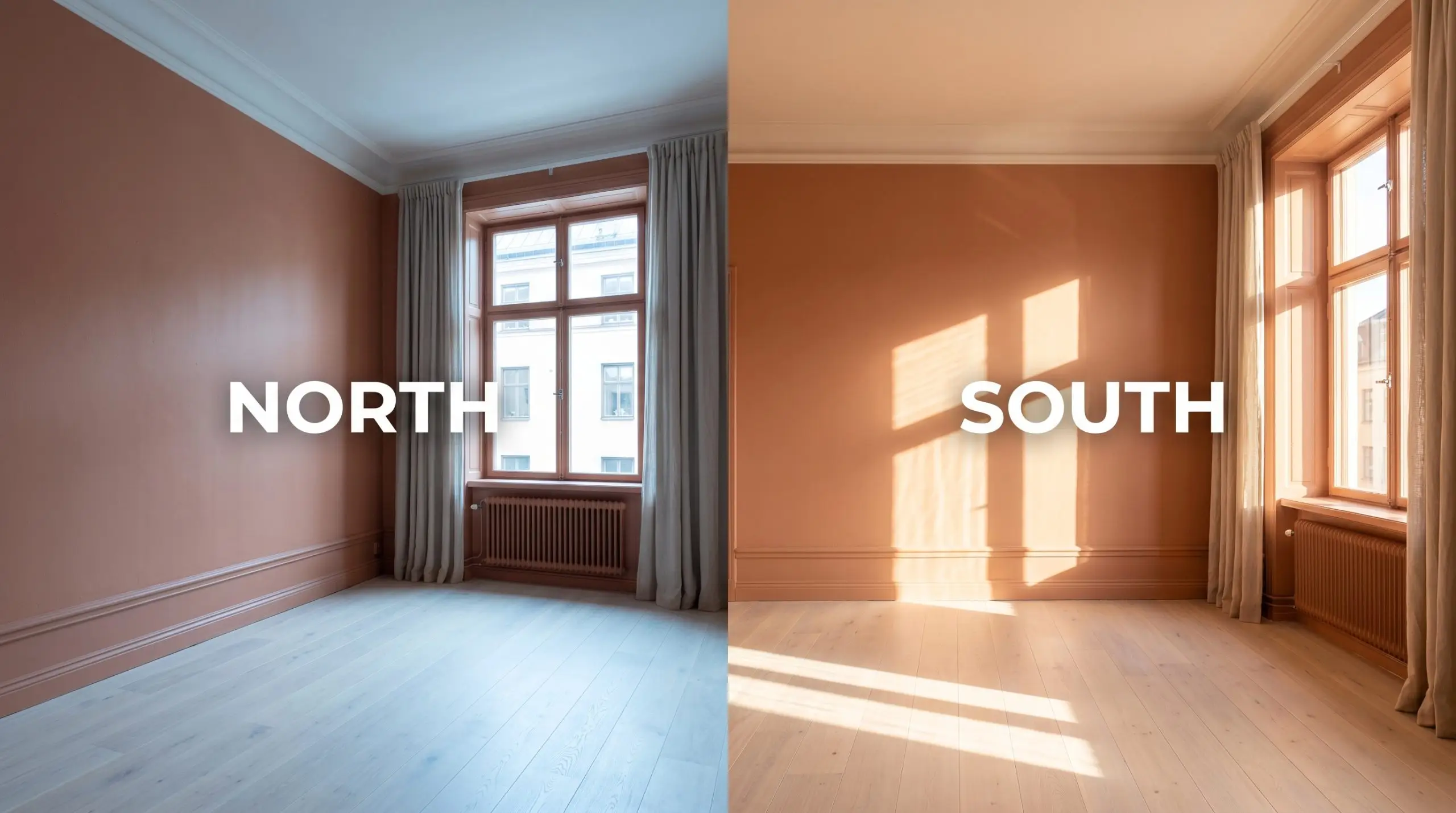
If you are using this terracotta in a windowless powder room or a dimly lit hallway, strictly avoid bulbs cooler than 3000K. Cool light strips the “baked” quality right out of the clay, leaving you with a flat, muddy mauve instead of a rich, earthy orange.
Hackrea Pro-Tip (The Bulb Rule)
Popular Applications for Dulux S08F6
Because this terracotta sits squarely in the mid-tone range, it possesses the unique ability to manipulate the perceived scale of a space. You can use it to visually lower a towering ceiling or to intentionally embrace the shadowed, intimate nature of a smaller room.
The Immersive Dining Space
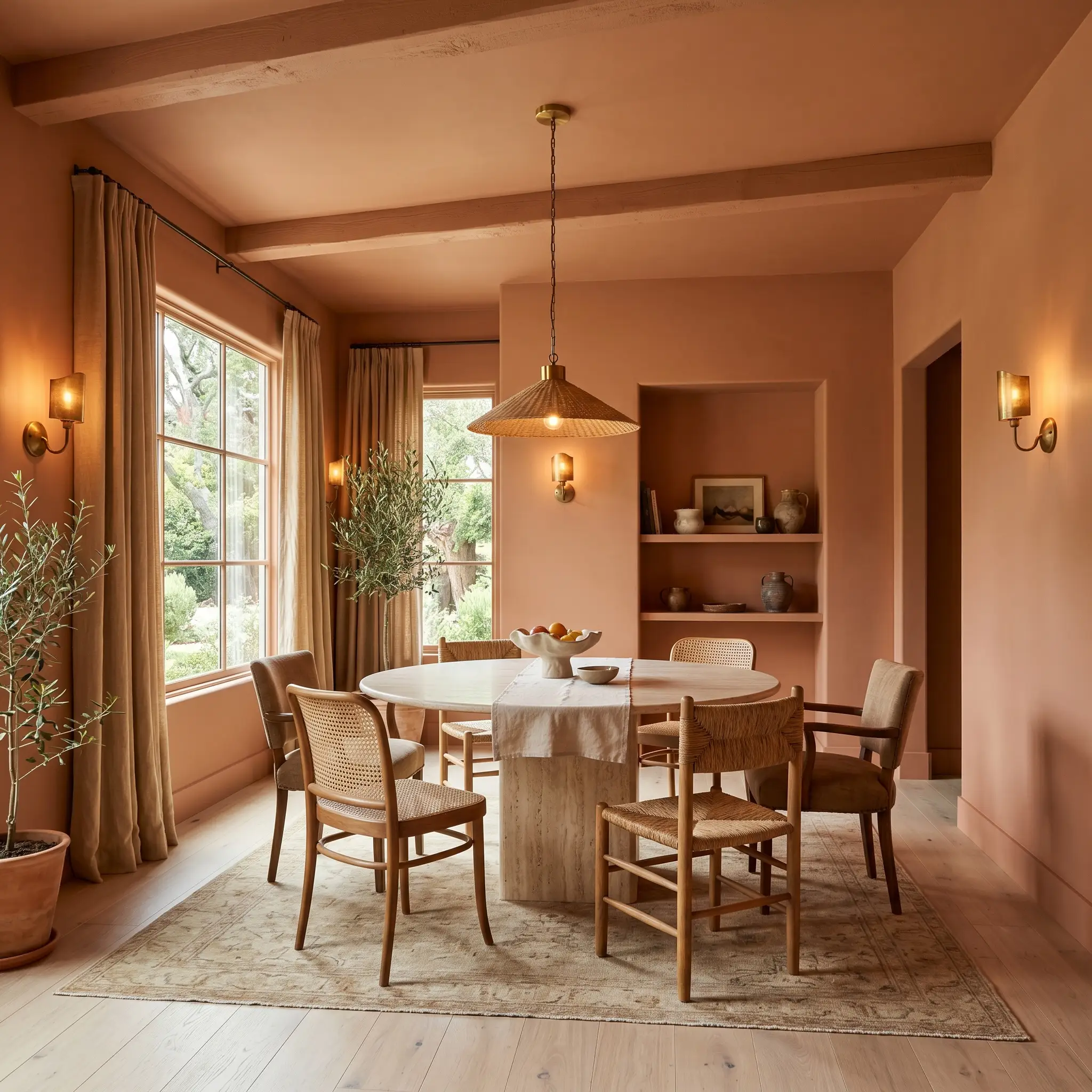
Instead of defaulting to predictable traditional dining rooms, use this terracotta to cultivate an elevated, organic modern entertaining space. Apply the color across all the walls and the ceiling to create a seamless, enveloping atmosphere for evening dinner parties.
Contrast the rich, matte walls with a honed travertine pedestal dining table and mismatched, cane-backed chairs to introduce varied textures. Unlacquered brass sconces and raw silk window treatments will catch the ambient warm lighting, adding a subtle, sophisticated sheen against the flat, earthy orange backdrop.
Restorative Sleeping Quarters
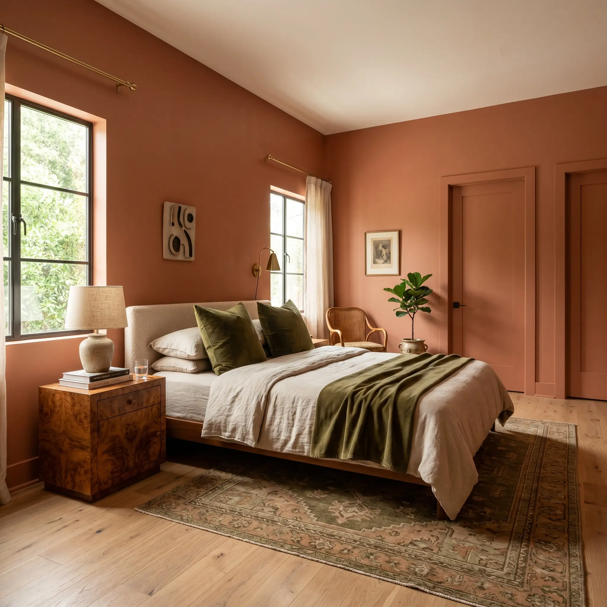
In a bedroom, this shade excels when pushed toward a sophisticated 1970s revival aesthetic, focusing heavily on tactile comfort. Paint the walls, the baseboards, and the interior doors in the same finish to eliminate visual interruptions and promote a restful environment.
Pair the walls with a low-profile bed layered in washed linen and heavy olive-green velvet throw pillows. Introduce a vintage burled wood dresser or nightstands; the swirling, organic grain of the wood plays perfectly off the dusty blush undertones of the paint.
Be highly cautious when pairing this paint with woods that have distinct yellow or cherry-red undertones (like golden oak or Brazilian cherry). The competing warm tones will fight for dominance, making the room feel chaotic. Stick to neutral bleached oaks, rich espresso browns, or highly patterned burled woods.
Clash Warning (The Wood Tone Trap)
Layered Eclectic Gathering Rooms
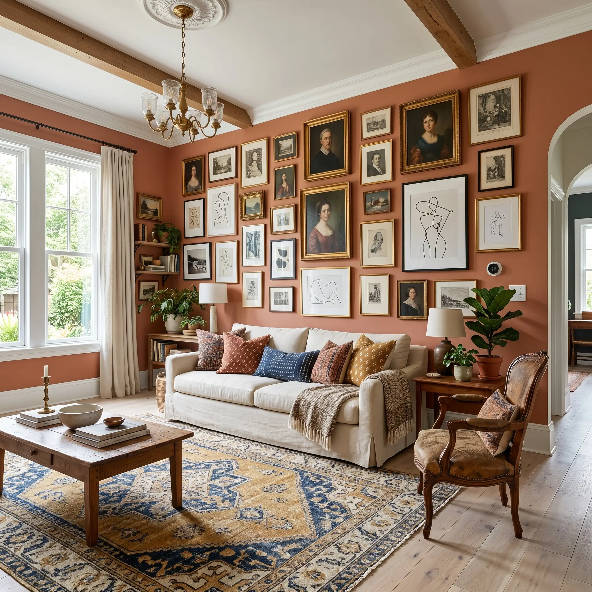
For living spaces that lean into maximalism, this structural color serves as an incredible foundational canvas for layered, eclectic collections. Use it as a stabilizing backdrop behind an asymmetrical, floor-to-ceiling gallery wall featuring vintage portraiture and minimalist abstract art.
Ground the seating area with a large, faded vintage kilim rug that incorporates subtle hints of navy blue or mustard yellow. Furnish the room with a slipcovered sofa in a soft cream fabric, accented by block-printed cotton pillows, allowing the vibrant textiles to stand out against the earthy walls.
Tactile Culinary Cabinetry
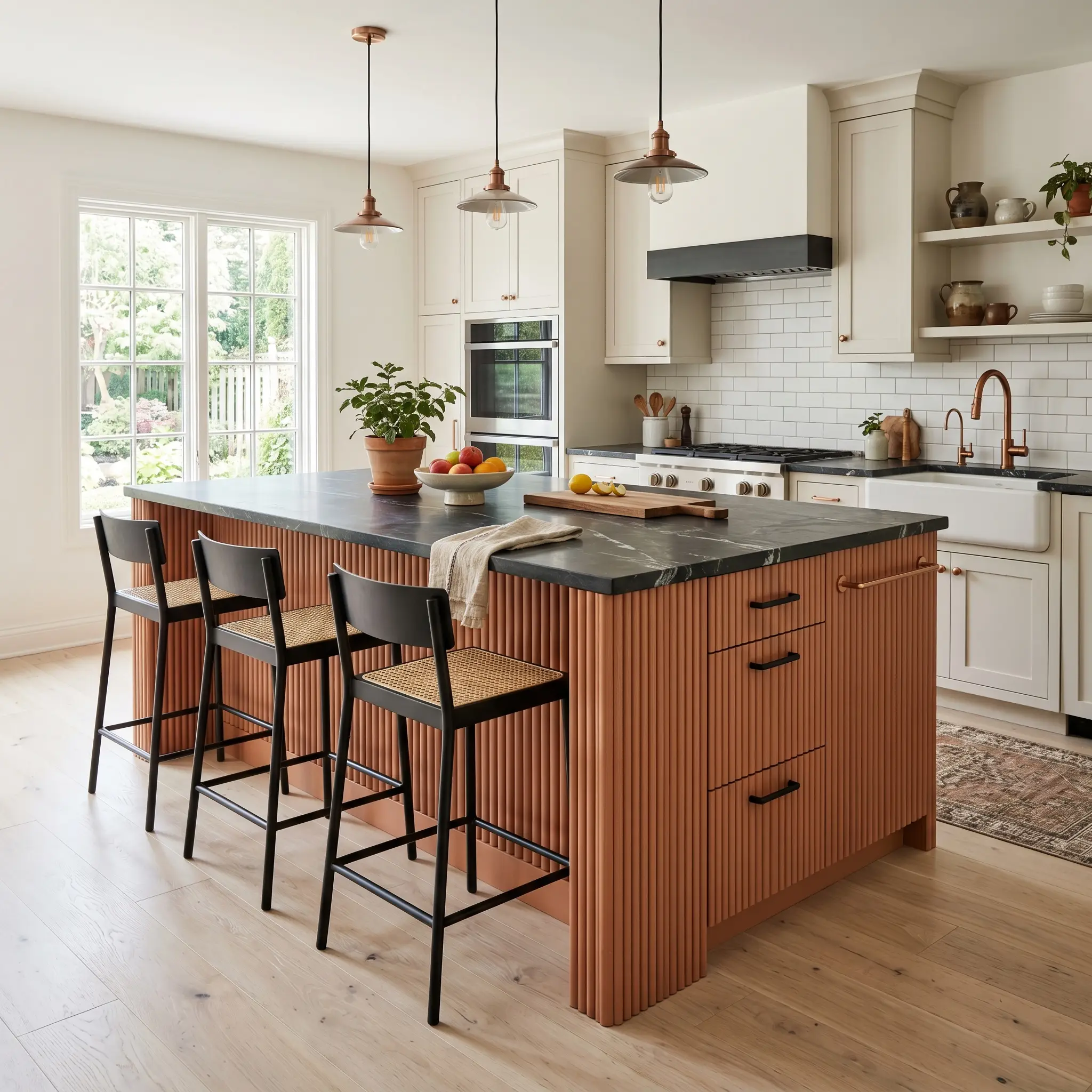
If you want to introduce warmth to a kitchen without committing to fully painted walls, use this shade on a central island or lower cabinetry. It immediately breaks up the monotony of standard white kitchens, offering a contemporary, tactile alternative to the typical farmhouse aesthetic.
Wrap the island in fluted wood detailing painted in the terracotta, then top it with a dark, veined soapstone or honed black granite counter. Finish the cabinetry with matte black hardware or brushed copper pulls to reinforce the raw, elemental design narrative.
The Welcoming Facade
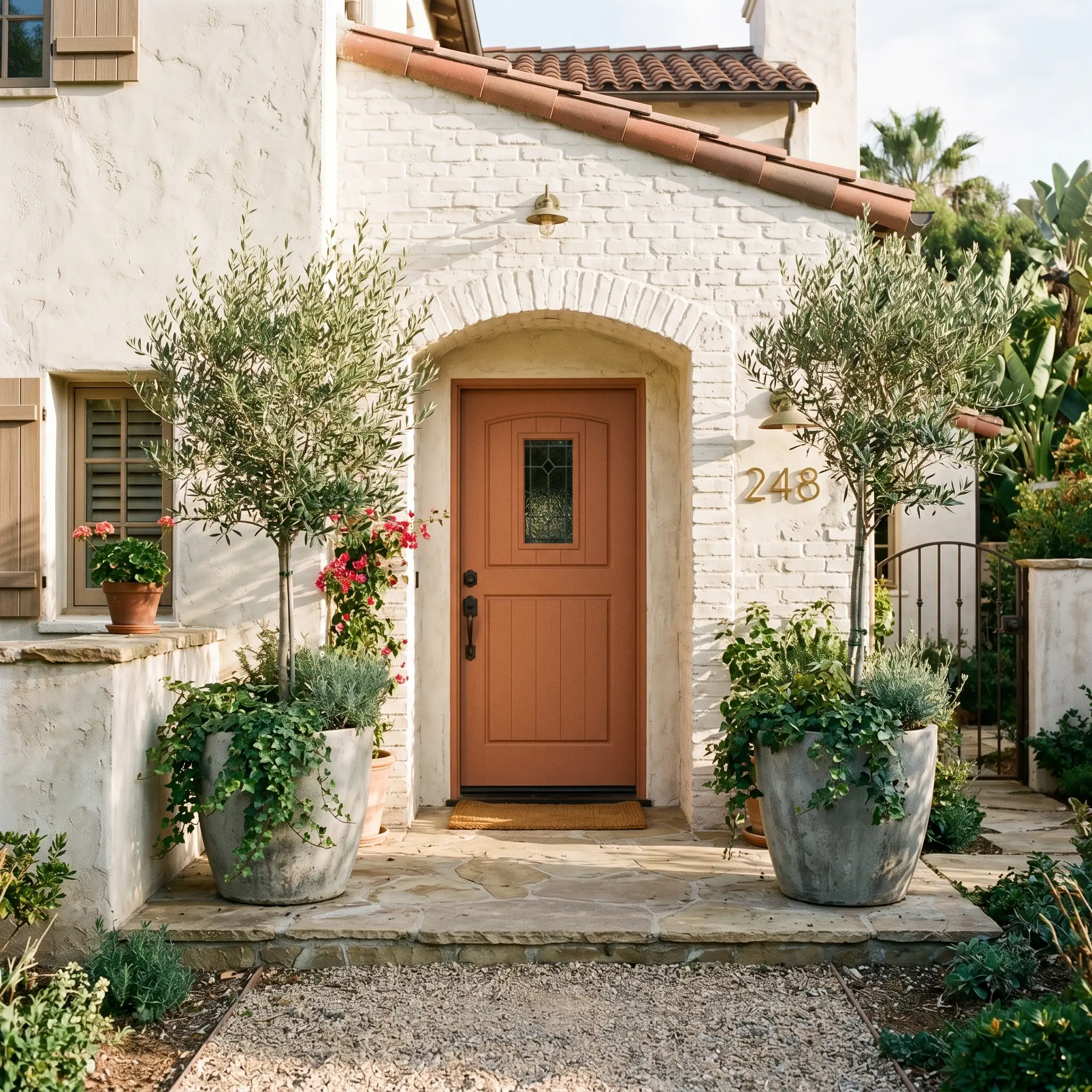
On the exterior, this shade transforms a standard front door into a striking architectural feature. It performs exceptionally well against neutral, warm-white stucco or heavily textured limewashed brick, instantly giving the facade a relaxed, Mediterranean influence. Frame the entryway with oversized raw concrete or terracotta planters filled with trailing ivy or structural olive trees to complete the organic curb appeal.
Relational Design & Best Pairings for Dulux Baked Clay
This specific pigment requires surrounding materials that share its tactile weight to prevent it from feeling isolated on the wall. Its underlying blush nuances thrive when placed next to crisp, intentional boundaries or deeply saturated secondary colors that actively pull out its organic warmth.
Tailored Trim & Baseboard Applications
Tactile Hardware, Wood & Material Pairings
Harmonizing Secondary Palettes
Curated Aesthetic Concepts
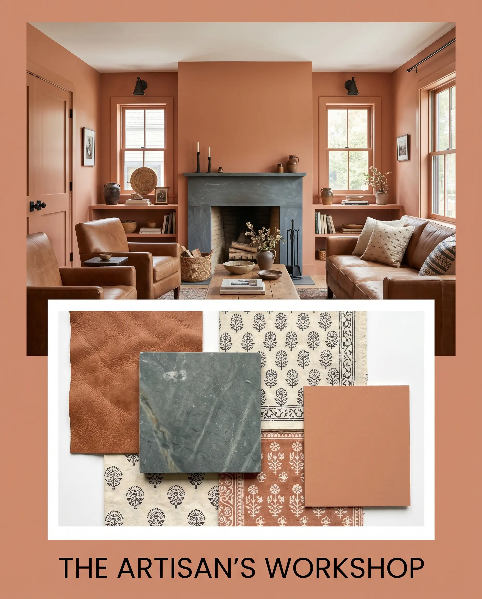
The Artisan’s Workshop This palette relies on the raw, tactile friction between the earthy orange walls and the matte, chalky finish of honed soapstone surfaces. By layering in faded saddle leather seating and subtle block-printed cotton textiles, the environment feels collected and intentionally unrefined. The addition of matte black hardware grounds the radiant warmth, ensuring the aesthetic remains sharp and contemporary.
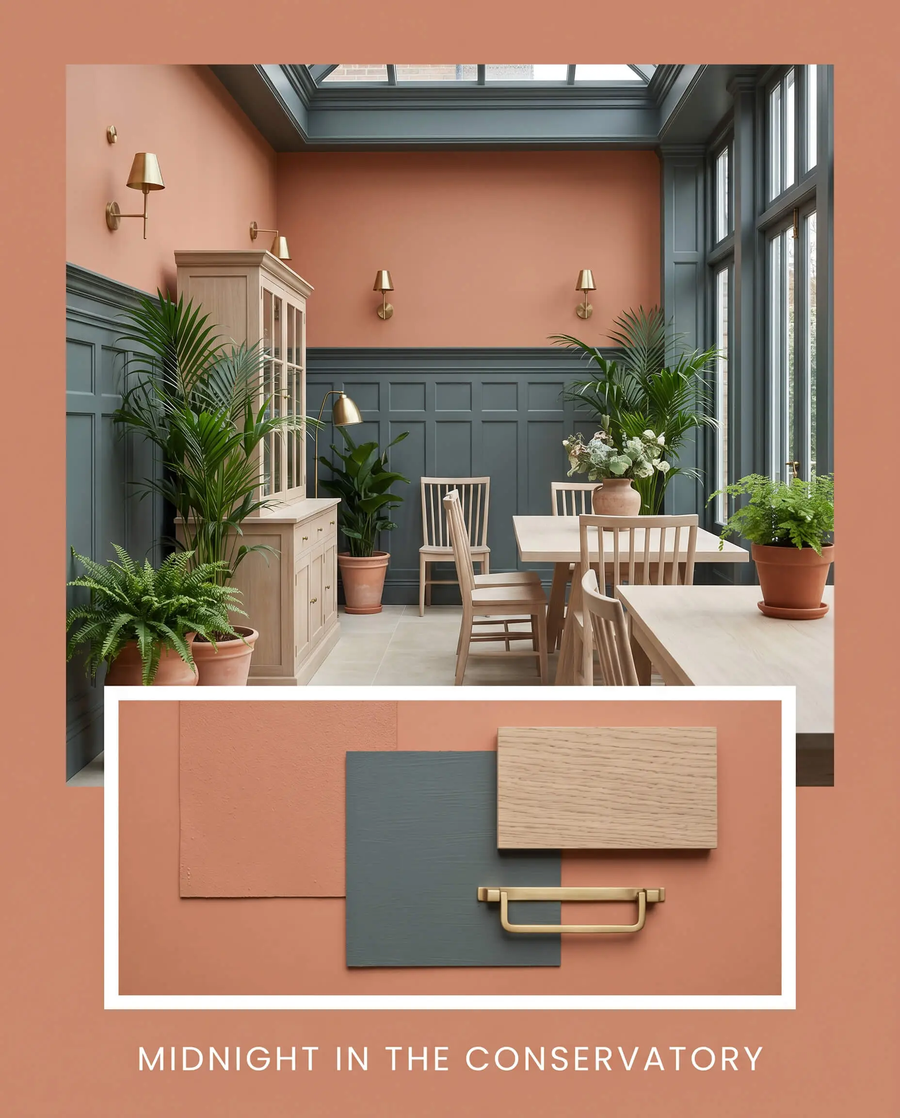
Midnight in the Conservatory Here, the vibrant terracotta acts as a glowing backdrop against the deeply saturated, moody presence of Farrow & Ball Inchyra Blue or Sherwin-Williams Rosemary applied to the millwork. Unlacquered brass accents catch the ambient light, providing a necessary metallic lift against the dense, enveloping colors. The integration of bleached oak furniture keeps the saturated palette from feeling overwhelming, maintaining a breathable, organic balance.
Comparative Color Theory & Alternatives
While this mid-tone terracotta is incredibly versatile, specific southern exposures or deeply shadowed architectural layouts might require a pigment with a slightly different foundational structure. If you are struggling with how the dusty blush undertones behave in your specific lighting, evaluating a direct rival is the smartest next step.
Dulux Baked Clay S08F6 vs. Sherwin-Williams Cavern Clay SW 7701
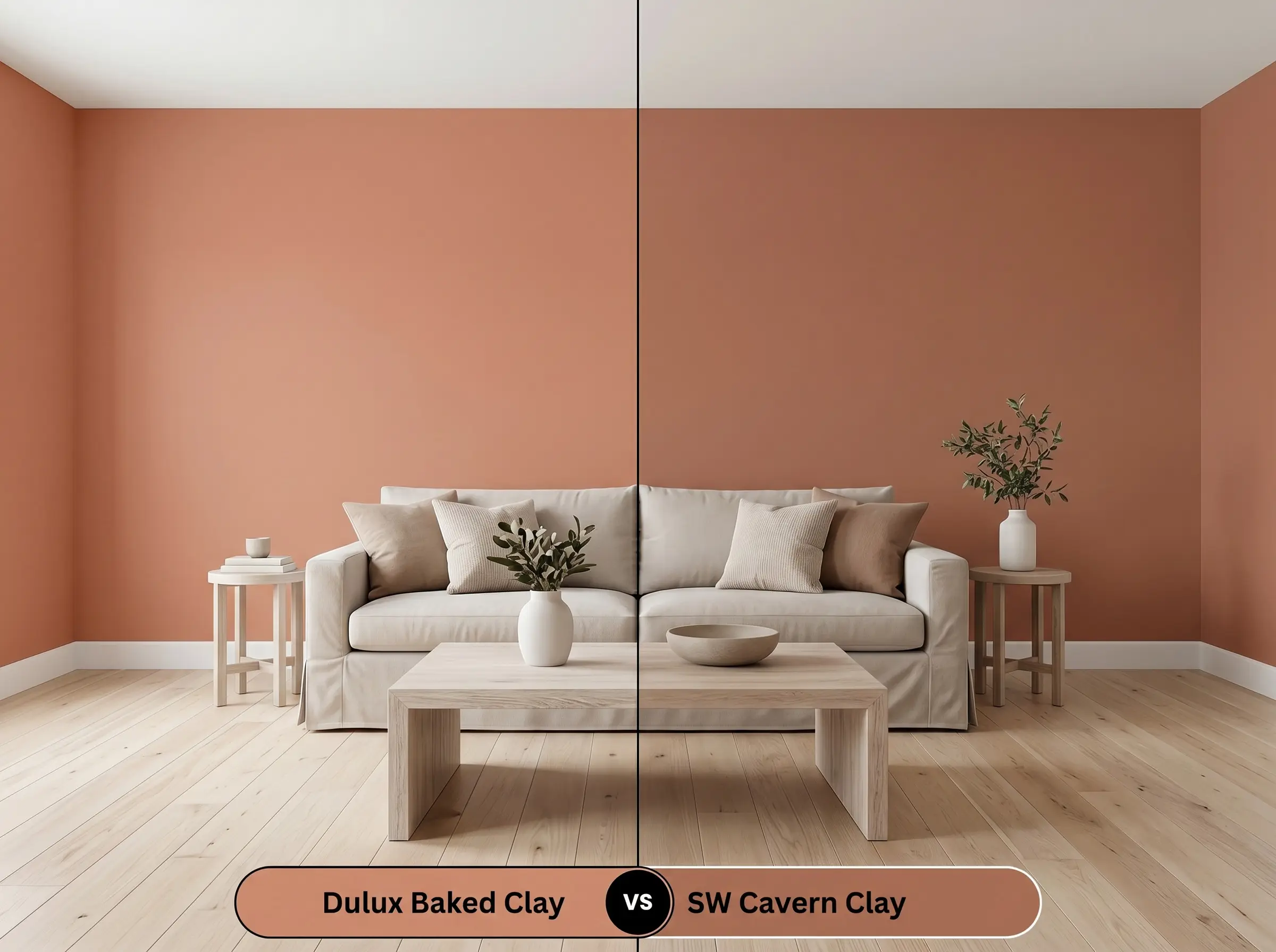
If you are designing a space with abundant, cool northern light, then Cavern Clay SW 7701 might be the stronger candidate. While the Dulux option relies on a muted, dusty blush base, the Sherwin-Williams alternative is significantly more vibrant and leans strongly into a true, sun-baked rust. Cavern Clay commands attention and requires highly decisive styling, whereas S08F6 operates more easily as a versatile, softly aged background layer.
Dulux Baked Clay S08F6 vs. Benjamin Moore Baked Terra Cotta 1202
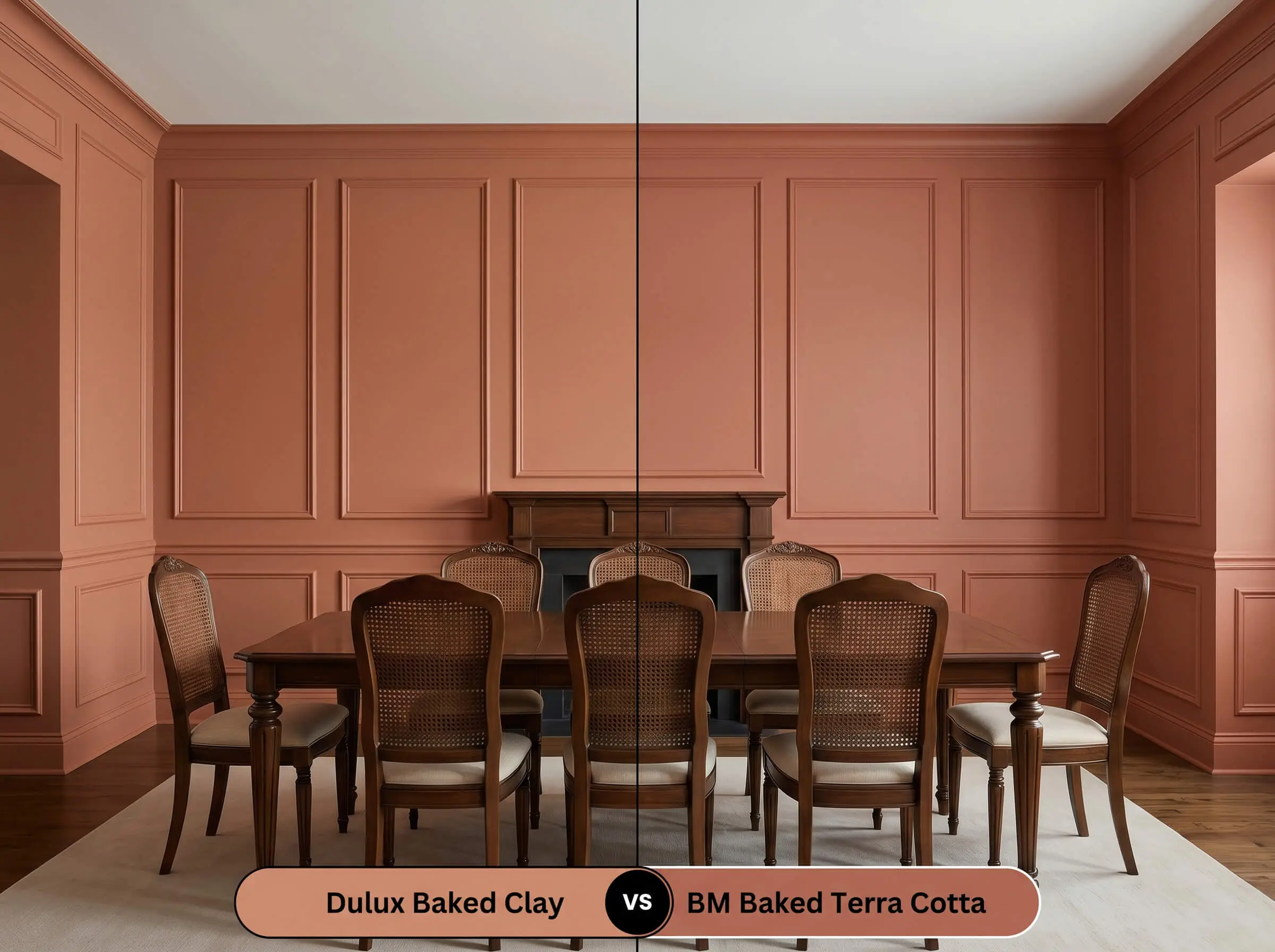
If your room features primarily dark wood finishes or dense, traditional masonry, then Benjamin Moore Baked Terra Cotta 1202 offers a deeper, more saturated solution. The Benjamin Moore iteration carries a lower LRV and a richer brown-red undertone, making it feel notably more historic on the wall. Conversely, the Dulux formulation retains just enough lightness to feel airy and adaptable in contemporary, mixed-material spaces.
Exploring Tonal Relatives & Brand Matches
Sometimes a color profile is nearly perfect, but the layout of your home demands a slight shift in light reflectance or a minor tweak to the underlying warmth.
Tonal Relatives Within the Same Brand
Direct Cross-Brand Matches
Execution Strategy & Practical Application
Transitioning this structural color from a digital concept to a tangible reality requires strict attention to your chosen sheen and preparation methods.
The Dynamic Sheen Guide
Primer Strategy & Coverage Rules
Because this mid-tone earthy orange contains a complex mix of red and brown colorants, a high-quality, gray-tinted primer is absolutely mandatory. A standard white primer will aggressively fight the pigment, forcing you to apply three or four coats to achieve true opacity.
For a flawless, professional finish, plan for two generous coats over the tinted primer.
Deep terracotta shades are notoriously prone to “flashing,” where uneven roller pressure leaves visible, shiny streaks across the wall. To avoid this, always maintain a wet edge, load your roller generously, and roll strictly from ceiling to floor in one continuous motion without stopping in the middle of the wall.
Hackrea Pro-Tip (The Roller Warning)
Frequently Asked Questions
Because of its dusty blush undertones, this color can definitely lean pink if it isn’t supported by the right lighting. In dimly lit spaces, you must use warm artificial bulbs (around 2700K to 3000K) to pull the earthy orange base forward and suppress the cooler mauve notes.
With an LRV of 37, this shade absorbs a significant amount of light, which will intentionally condense a narrow hallway into a moody, enveloping passage. If you embrace this effect with layered lighting and warm metallic accents, it feels highly curated, but it will not make the space feel larger or brighter.
This specific pigment thrives on homes that utilize highly textured materials, making it an incredible choice for Mediterranean, Spanish Revival, or modern desert exteriors. It pairs flawlessly with warm-white stucco, raw timber accents, and limewashed brick.
Absolutely. Pulling this rich, grounding hue onto the ceiling visually lowers the overhead plane, immediately transforming an uncomfortably large room into an intimate, cohesive environment.
The Final Verdict on Dulux S08F6
Dulux Baked Clay is the ultimate foundational choice for homeowners who want to inject tactile, structural warmth into their environment without resorting to predictable neutrals. Its absolute best application is in highly layered, mixed-material spaces where its earthy orange base can interact with raw woods, living metals, and deeply saturated textiles. It is perfect for those who appreciate the organic modern aesthetic or want to establish a sophisticated, vintage-inspired atmosphere that feels intentionally curated and resilient.
However, this complex pigment requires a decisive design strategy and will actively fight against certain environments. If your home is predominantly outfitted with cool-toned, blue-gray flooring, stark white LED lighting, or highly polished chrome fixtures, this paint is not for you. The icy nature of those modern finishes will harshly clash with the dusty blush and brown undertones of the clay, resulting in a disjointed, muddy aesthetic that makes the walls look dirty rather than deliberate.