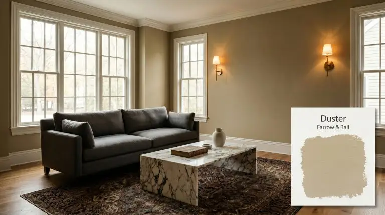
Duster No. 319
Farrow & BallFarrow & Ball Duster No. 319 is a deeply grounded, earthy ochre. This aged yellow carries subtle brown and muted olive undertones, creating a comforting, familiar warmth that feels both historic and effortlessly modern in any interior space.
Farrow & Ball Duster: The Complex, Aged Ochre Redefining Warm Interiors
Some pigments feel less like a manufactured color and more like a raw material harvested directly from the earth. Farrow & Ball Duster is exactly that kind of shade. It completely bypasses the cheerful predictability of standard yellows, offering instead a shadowed, historic architectural finish that instantly matures a room.
When you roll this earthy color structure onto a wall, it does not just reflect light; it seems to absorb the surrounding atmosphere. This creates an environment that feels intensely curated and lived-in from the moment the paint dries.
If you want a space that feels bright and breezy, look elsewhere. This muted mustard cast is designed for homeowners who crave undeniable warmth mixed with a touch of shadowy intrigue.
The Warm Chromatic Profile of Farrow & Ball Duster: Undertones & LRV
When homeowners ask if this shade leans warm or cool, the answer is a decisive, unapologetic warm. However, Duster achieves this warmth through a highly complex, muddy composition rather than relying on bright, sunny pigments. This intricate balance is exactly what makes it such a sought-after mid-tone neutral for sophisticated interiors.
Understanding the anatomy of this color requires looking past its initial golden impression:
With a light reflectance value (LRV) of 35, this paint absorbs a moderate amount of light. It possesses enough saturation to command the boundaries of a room without collapsing the space into total darkness. Because it lacks high reflectivity, it will not artificially brighten a naturally dim room, but rather lean into a cozy, enveloping mood.
You can apply wallpapers, paints, etc. on walls and see how they look in various interiors.

How Light Manipulates Duster’s Earthy Color Structure
This specific Farrow & Ball creation is a true chameleon, shifting its personality entirely based on the light waves bouncing off its surface. Because of that hidden olive-brown shadow, the way you illuminate the room dictates whether the paint feels like a rich mustard or a muted, historic brown.
Here is exactly how this ochre tone behaves across different lighting scenarios:
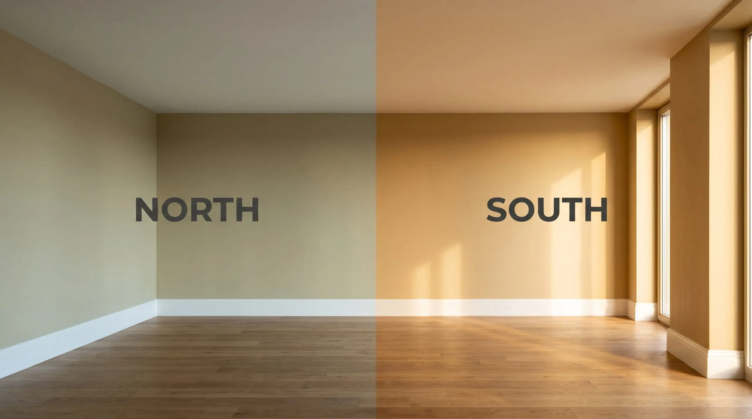
If you are using this shade in a space with zero natural light, strictly avoid daylight LED bulbs (4000K and above). The stark, bluish light will clash with the earthy color structure, turning the beautiful ochre into an unpleasant, sickly green. Stick to 2700K bulbs to maintain its rich warmth.
Hackrea Pro-Tip (The Bulb Temperature Rule)
Popular Applications
Because this shade sits comfortably in the mid-tone range, it offers immense flexibility across different architectural features. The secret to mastering this color is allowing its shadowy undertones to guide your material pairings and styling choices.
Dining Rooms
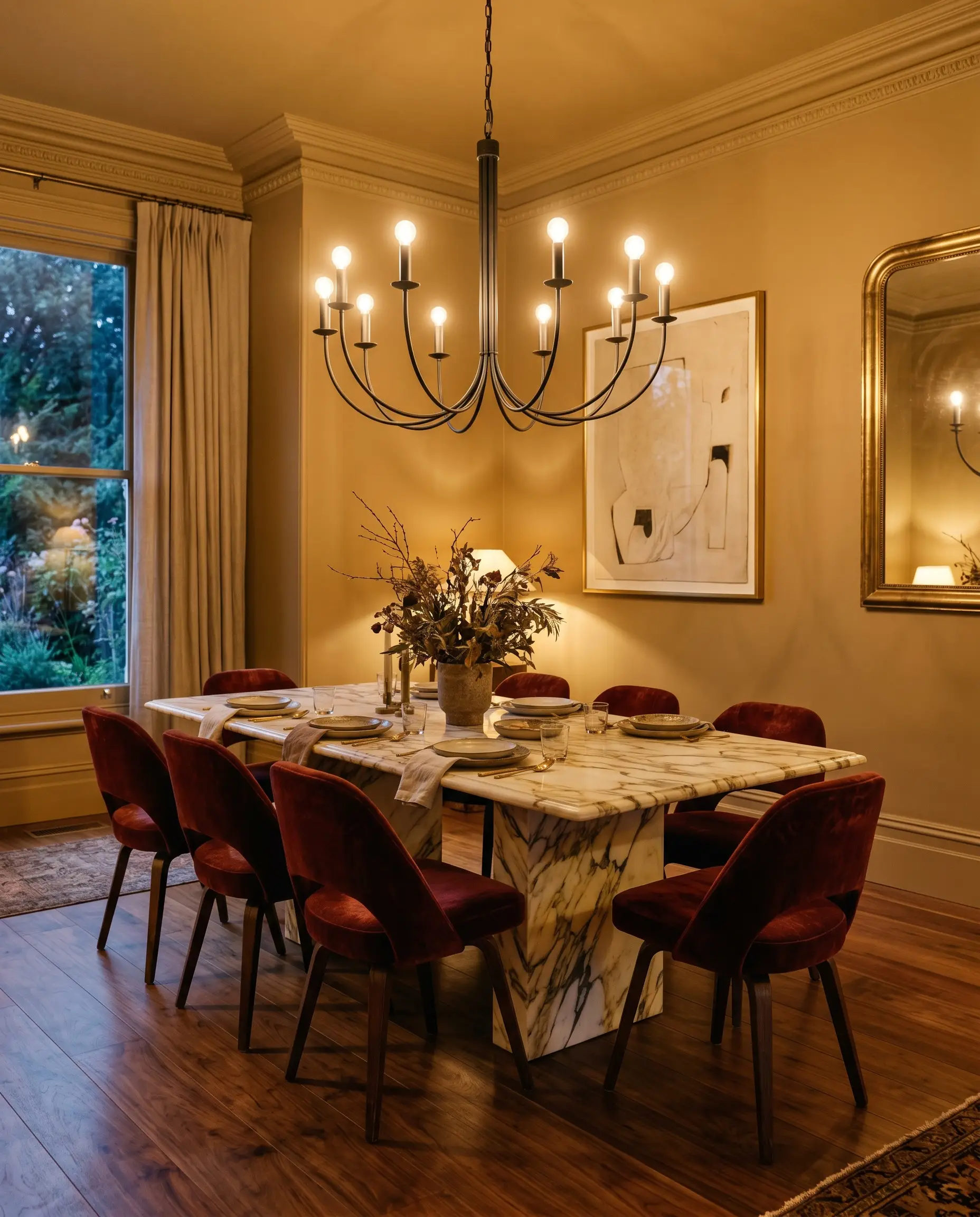
While it is easy to default to a strictly traditional aesthetic in a formal eating space, this aged yellow provides a brilliant backdrop for an eclectic, moody dining experience. Consider color-drenching the entire room—walls, deep baseboards, and crown molding—to create a seamless, enveloping dining box. This saturated approach instantly makes intimate dinner parties feel more sophisticated and secluded.
To break up the warmth, introduce high-contrast, premium materials that challenge the historic vibe. A dining table crafted from heavily veined Calacatta marble provides a stunning, cool-toned interruption against the muddy ochre walls. Surround the table with postmodern sculptural chairs in a charcoal black or oxblood distressed velvet.
Finish the space by suspending an oversized, minimalist iron candelabra above the table. The warm 2700K glow from the fixture will bounce off the walls, amplifying the baked-earth warmth while highlighting the sleek, contemporary lines of your furniture.
Reading Nooks & Libraries
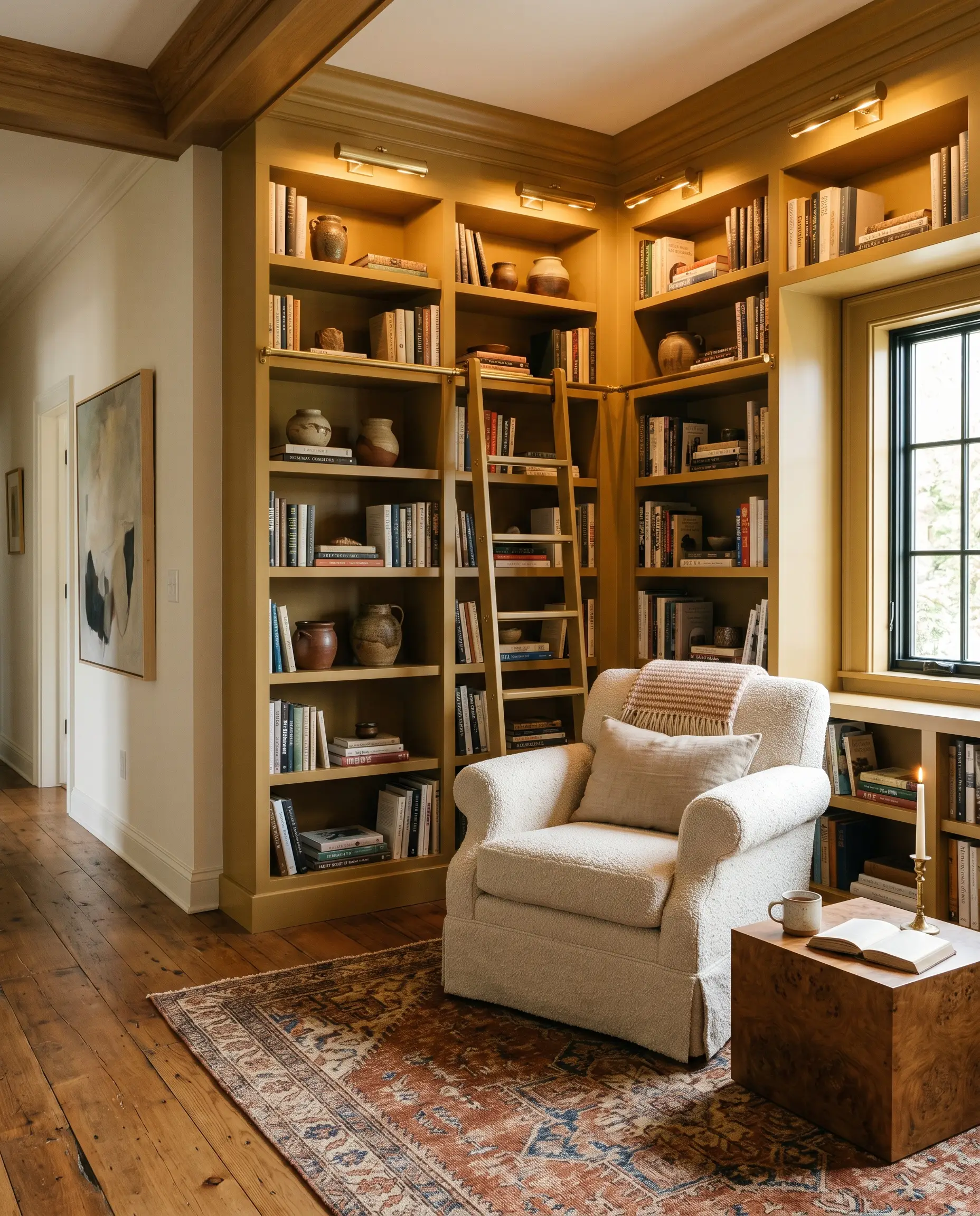
This color is practically built for quiet, focused spaces, but you do not have to style it like a 19th-century study. Instead, use this shadowy mustard to craft an organic modern retreat perfect for a remote worker or avid reader. Paint floor-to-ceiling built-in bookcases in this shade, allowing the earthy hue to establish a strong, stabilizing presence in the room.
Pair the painted millwork with tactile, unbleached textiles to soften the overall aesthetic. A slipcovered English roll arm chair in a nubby bouclé or heavy linen fabric creates an inviting, tactile collision against the smooth painted shelves. Introduce a minimal plinth coffee table crafted from burl wood to echo the natural, harvested feel of the pigment.
When applying a mid-tone with an LRV of 35 in a small nook, the corners of the room will naturally pool with shadows. Lean into this by installing unlacquered brass picture lights directly onto the painted bookcases. The localized glow highlights your curated ceramic clusters and stacked books while letting the rest of the room fade into a cozy dusk.
Hackrea Design Secret (The Corner Shadow Effect)
Kitchen Cabinetry
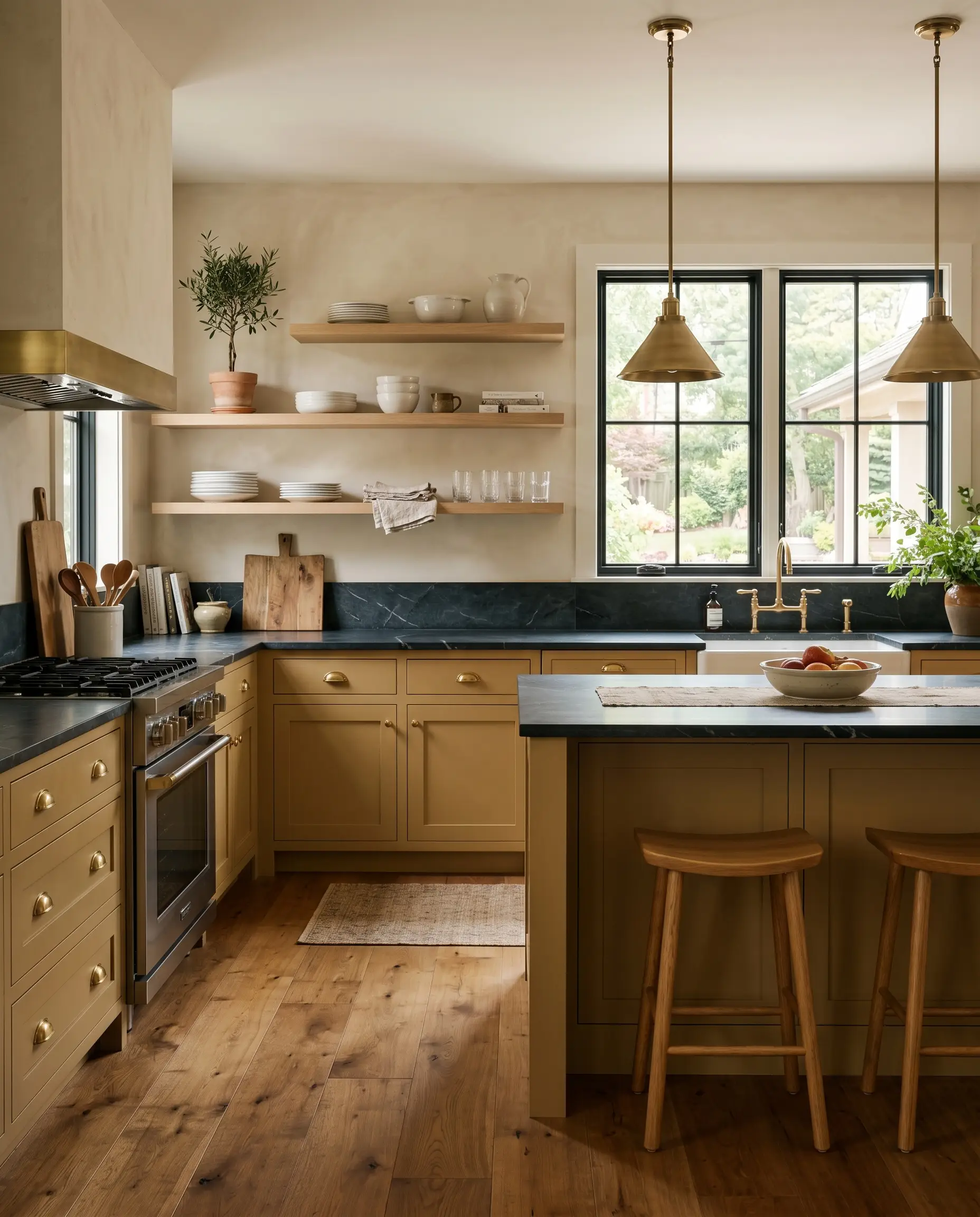
Applying this color to cabinetry is a fantastic way to inject profound warmth into the heart of a home. While it certainly sings in a rustic, country-inspired setting, it looks incredibly tailored when pushed toward a sleek, transitional culinary space. Use this shade on lower cabinets and a central island to root the kitchen, keeping the upper walls a chalky white to maintain visual balance.
The muddy olive-brown cast pairs exceptionally well with living finishes that patina over time. Top the ochre cabinets with dark soapstone counters and install unlacquered brass cup pulls that will slowly age to match the historic feel of the paint.
To keep the kitchen feeling fresh and current, swap out standard upper cabinets for floating white oak shelves or fluted glass fronts. This prevents the warm chromatic profile from feeling too enclosed, allowing the daily life of a busy household to flow easily through the space.
Hallways & Entryways
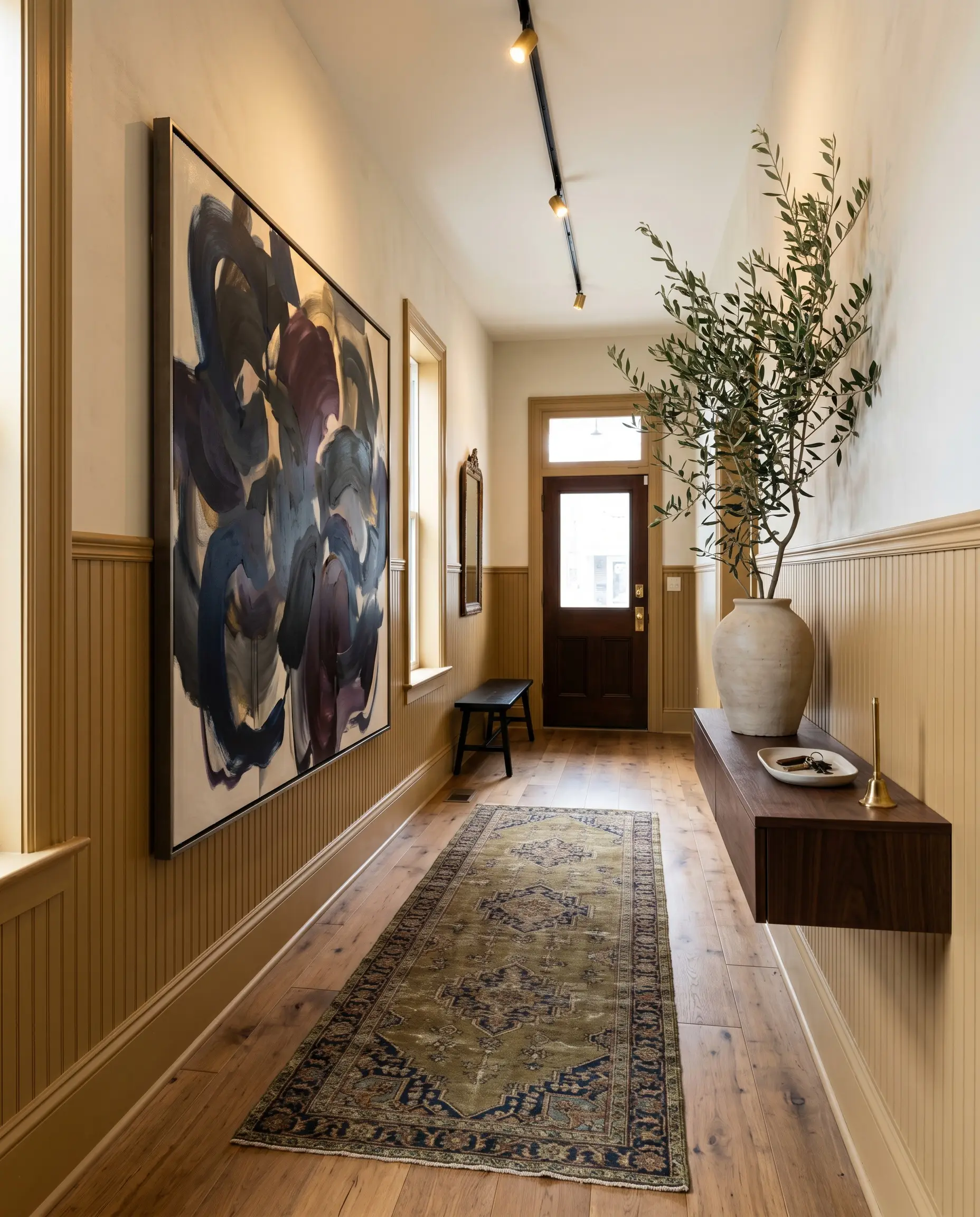
Transition zones are often neglected, but this muted mustard cast turns a simple corridor into a striking architectural canvas. For a gallery-like, minimalist entry, apply the color to traditional beadboard or tall wainscoting, leaving the upper half of the wall a crisp, unbleached linen. This half-wall application provides a durable, scuff-resistant lower layer perfect for high-traffic areas.
The earthy color structure acts as a brilliant, unexpected matting for oversized modern art. Hang large, abstract expressionist canvases featuring deep navy or aubergine directly against the painted wainscoting. The tension between the historic wall color and the contemporary art creates an immediate, high-end impact for anyone walking through the front door.
Ground the entryway with an antique Persian runner that pulls out the subtle olive tones hidden within the paint. Finish the styling with a floating console table holding a single, oversized botanical branch to breathe life into the shadowed space.
Building a Cohesive Interior Palette
This muted mustard cast requires deliberate, high-contrast boundaries to prevent the room from feeling muddy or unanchored. It thrives when placed next to materials that either pull out its golden warmth or provide a sharp, cooling interruption.
Tailoring the Architectural Boundaries
Instead of defaulting to a stark, blinding white, you need a trim color that shares a hint of warmth to create a seamless transition. Benjamin Moore Swiss Coffee OC-45 offers a creamy, sophisticated border that softens the edges of the room without looking yellow. For a slightly more luminous frame, Sherwin-Williams Creamy SW 7012 provides a gentle, sunlit contrast that allows the earthy wall color to take center stage.
Tactile Elements and Hardware
Secondary Paint Pairings
Curated Stylistic Interpretations
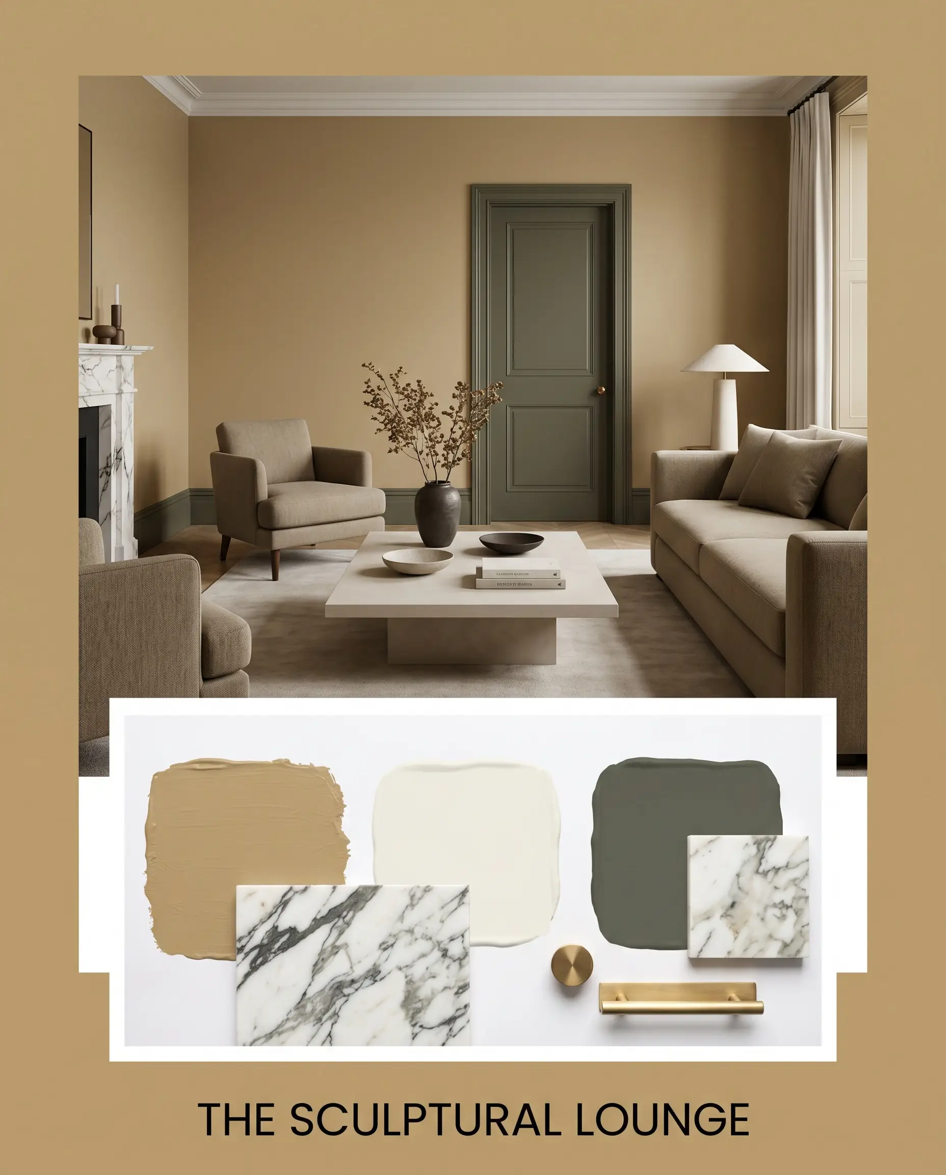
The Sculptural Lounge: This aesthetic leans into the tension between soft, muddy walls and sharp, contemporary silhouettes. Anchor the space with a minimal plinth coffee table and postmodern sculptural chairs draped in worsted wool. The resulting vibe is a sophisticated, quiet energy that feels both highly curated and effortlessly relaxed.
Shadowed Gallery: Designed for the homeowner who views their walls as a canvas for premium contrast. Combine boldly veined Calacatta marble accents with rich Dark Olive millwork to frame the aged yellow walls. The mood here is intensely dramatic and deeply personal, allowing abstract expressionist canvases to truly command attention.
Farrow & Ball Duster in Direct Comparison
Sometimes a specific room’s lighting or a home’s architectural style demands a slight pivot away from your initial color choice. If your space lacks natural light or you need a crisper golden hue, examining how this muddy shade stacks up against its closest rivals is essential.
Farrow & Ball Duster vs. Farrow & Ball India Yellow No. 66
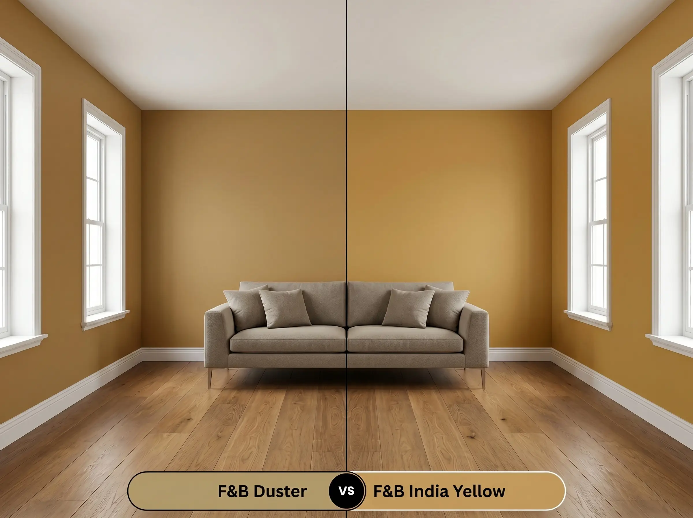
India Yellow carries a significantly stronger, more vibrant golden saturation. If you are designing a dim, north-facing room and want to artificially inject a feeling of bright sunshine, India Yellow will perform better. However, if you prefer a grounded, historic look that feels aged and slightly shadowed, Duster remains the superior choice.
Farrow & Ball Duster vs. Farrow & Ball Hay No. 37
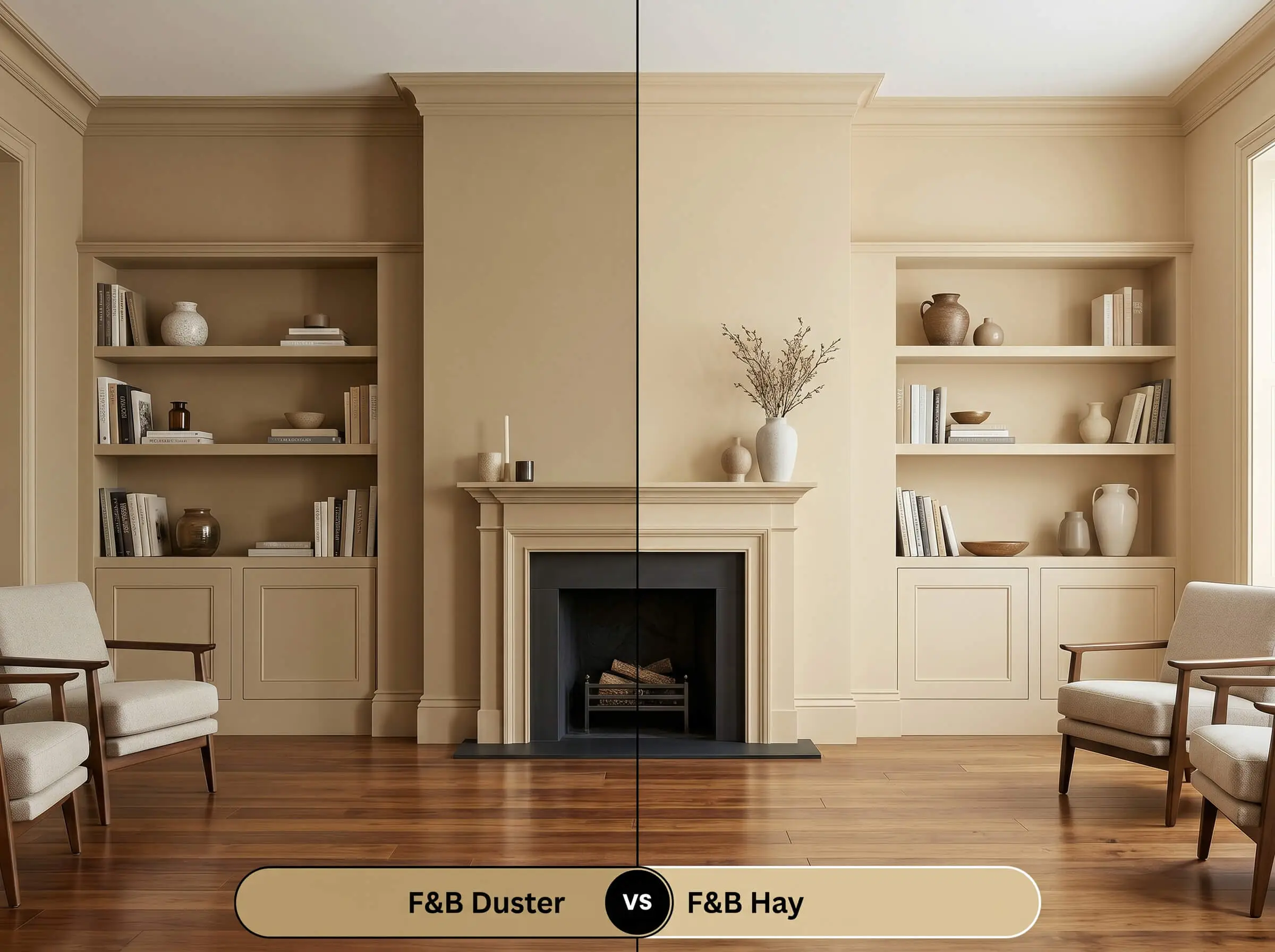
Hay is noticeably lighter and leans strongly into a soft, green-tinted undertone, making it feel much more subdued. If you are painting a large, open-concept area and fear an intense mustard might overwhelm the sightlines, Hay provides a gentler wash of color. Choose the deeper ochre tone only when you want to create a distinct, enveloping boundary.
Exploring Alternatives to This Aged Yellow
You might find that the specific undertones of this Farrow & Ball creation pull a bit too brown in your unique lighting. When that happens, exploring same-brand shifts or cross-brand matches ensures you still capture the right mood.
Same-Brand Options
Rival Matches
Achieving a Flawless Paint Finish
Transitioning from color theory to the practical reality of a roller requires understanding how this specific pigment practically behaves. Securing that flawless, high-end look depends entirely on your sheen selection and application strategy.
The Dynamic Sheen Guide
Primer Strategy & Coverage
This depth of color requires a high-quality mid-tone primer to properly anchor the complex yellow-brown base. Skipping the tinted primer will force you to apply three or four coats just to stop the underlying wall color from bleeding through.
Because this shade has a moderate light reflectance value, it is highly susceptible to “flashing”—visible, uneven roller marks that catch the light. To avoid this, maintain a wet edge while painting and resist the urge to touch up small spots as the wall dries. Always roll a complete, continuous final coat for a seamless finish.
Hackrea Pro-Tip (The Flashing Warning)
Common Questions About This Muddy Ochre
Understanding how this pigment reacts to specific elements in your home will help you apply it with total confidence.
Because it relies on a hidden olive-brown shadow, a lack of natural light will absolutely pull those darker tones forward. To prevent it from feeling like a dark brown cave, ensure you layer in plenty of warm 2700K artificial lighting to coax the golden ochre back to the surface.
Earthy color structures naturally excel on exteriors because they harmonize perfectly with the surrounding landscape. As the sun interacts with the paint over the years, it will gracefully soften into a beautiful, sun-baked mustard that feels organic and established.
Yes, and this combination creates a stunning architectural tension. The crisp, icy veining of the Carrara marble provides a brilliant visual break that stops the warm, muddy walls from feeling overly enclosed or dated.
Instead of the high-energy distraction of a bright primary yellow, this shadowed mid-tone fosters a sense of grounded focus. It envelops the room in a stabilizing, cozy warmth that makes long hours of deep work feel far more comfortable and secure.
The Final Verdict on Farrow & Ball’s Muted Mustard
This specific Farrow & Ball creation is an exceptional choice for homeowners who want to inject their spaces with profound, historic warmth. It excels in rooms where you want to foster an intimate, enveloping atmosphere rather than a bright, airy aesthetic. By pairing it with premium, contrasting materials and deeply saturated secondary colors, you create an environment that feels instantly established and undeniably sophisticated.
This rich, muddy ochre requires absolute caution when paired with mid-2010s cool-toned gray flooring or icy blue-gray upholstery. Placing this baked-earth pigment next to stark, blue-based grays forces the paint to look sickly and overly yellow, while the grays will read as flat and sterile. If your home features ash-toned wood floors, this specific shade will fight the architecture rather than elevate it.
Clash Warning (The Cool-Toned Gray Conflict)