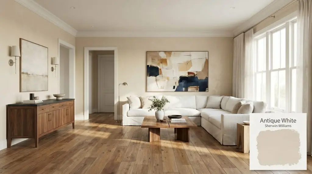
Antique White SW 6119
Sherwin-WilliamsSherwin-Williams Antique White (SW 6119) is a soft, warm off-white paint color with distinct beige and yellow undertones. With an LRV of 72, it acts as a rich, creamy neutral that brings cozy depth to traditional spaces and cabinetry without feeling stark.
Paint Technical Profile
| Color ID / SKU | SW 6119 |
| HEX Code | #E8DCC6 |
| Light Reflectance (LRV) | 72 |
| Use | Interior, Exterior |
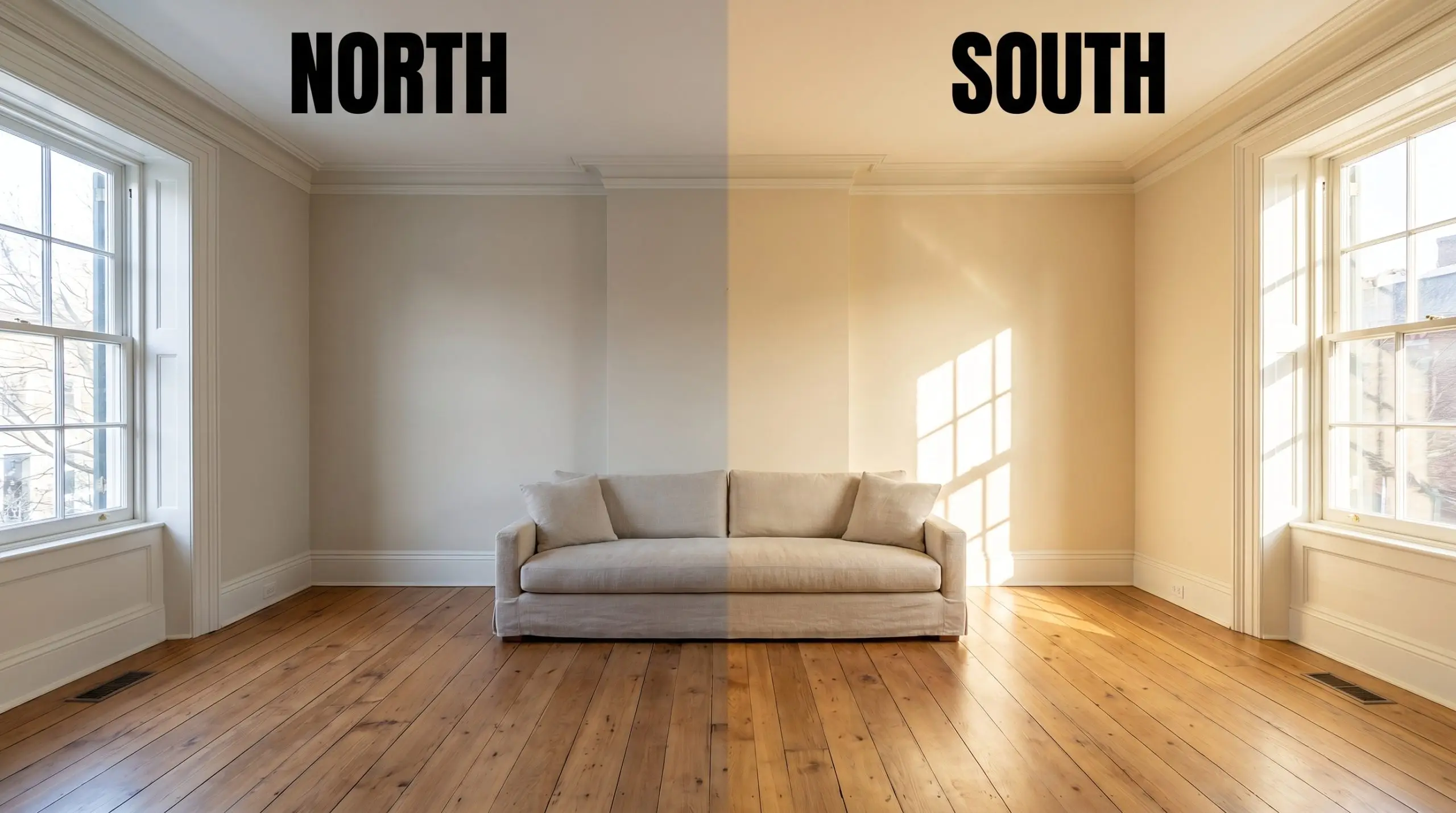
| Best Exposures | North-Facing, East-Facing |
| Best For | Traditional cabinetry, historic homes, cozy living spaces |
Sherwin-Williams Antique White: The Vintage Cream That Softens Modern Architecture
Some paint colors sit flat against a wall, while others feel like a physical material woven into the architecture of the room. Sherwin-Williams Antique White acts entirely like the latter.
This specific hue mimics the visual texture of aged parchment or unbleached linen, instantly taking the harsh, sterile edge off newly built spaces. It establishes a rich, lived-in atmosphere that feels incredibly intentional.
Whether you are trying to warm up a stark urban apartment or add a layer of sophisticated character to a suburban living room, SW 6119 provides a beautifully soft foundation. It allows you to build a room that feels both curated and effortlessly welcoming.
Sherwin-Williams Antique White: Undertones & LRV
If you are wondering whether this paint leans warm or cool, the answer is definitively warm. This is a classic warm off-white that relies on a complex, sun-baked pigment structure to create its signature glow. It completely rejects the icy, blue-tinted shadows found in stark modern whites.
To truly understand how this creamy neutral will behave on your walls or exterior, we have to look closely at its underlying chromatic profile:
With a light reflectance value (LRV) of 72, this color occupies a highly strategic sweet spot in the design world.
An LRV of 72 means it reflects a generous amount of light, keeping your spaces feeling expansive and breathable. However, it holds onto just enough of its low chroma pigment to provide a beautiful, gentle contrast when paired with crisp, bright white trim or ceilings.
The Lighting Shift: How Sunlight Alters the Hue
Because this paint relies on a delicate balance of yellow and beige, it acts as a visual sponge for whatever light hits it. You must anticipate how your specific room orientation will pull different nuances out of the color.
Here is exactly how you can expect the hue to shift throughout your home:
If you paint your walls and feel the yellow undertone is pulling a little too strong at night, do not instantly repaint. Simply swap your lightbulbs to a slightly cooler temperature (around 3500K) to instantly neutralize the warmth and balance the room.
Hackrea Pro-Tip (The Bulb Correction)
Best Architectural Placements for This Warm Off-White
While it is incredibly easy to pigeonhole a color with “antique” in the name into strictly vintage spaces, doing so limits its massive potential. This paint is a brilliant tool for softening stark architecture and providing a soulful backdrop for a wide variety of design styles.
Here is how to strategically deploy this color across your home for maximum impact.
Kitchen Cabinetry & Millwork
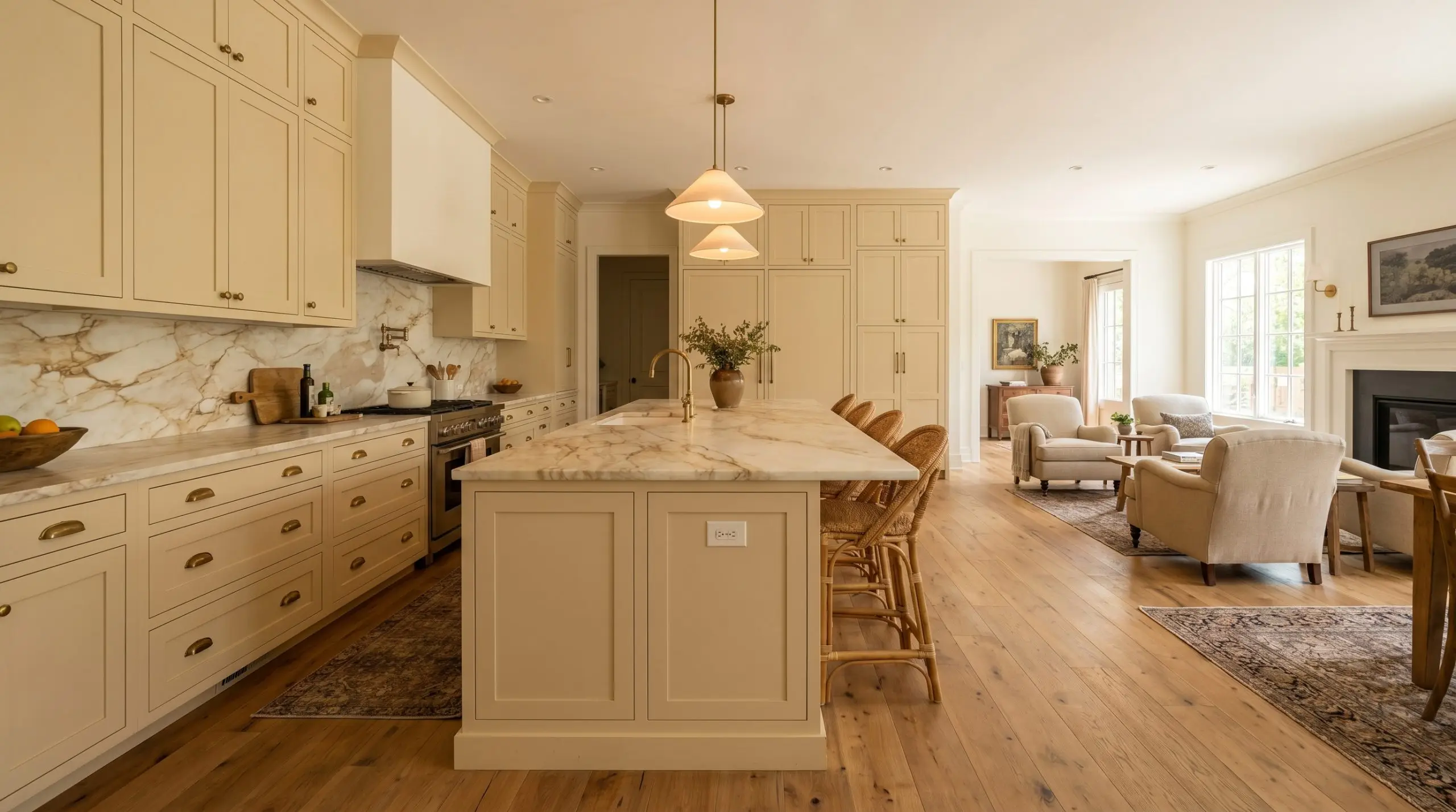
Painting your kitchen cabinets is a substantial transformation, and this hue offers a brilliant alternative to stark, sterile white kitchens. While it is a staple for traditional cabinetry, you can easily push it into a stunning transitional aesthetic.
Pair the painted cabinets with a heavily veined, honed marble countertop and unlacquered brass hardware. The raw, living finish of the brass speaks beautifully to the yellow-beige undertones, while the luxurious stone elevates the entire kitchen into a bespoke, curated space.
If you have an open-concept layout, this creamy tone on the cabinets prevents the kitchen from feeling like a cold, utilitarian zone, allowing it to seamlessly blend with your living areas.
Living Room Walls & Paneling
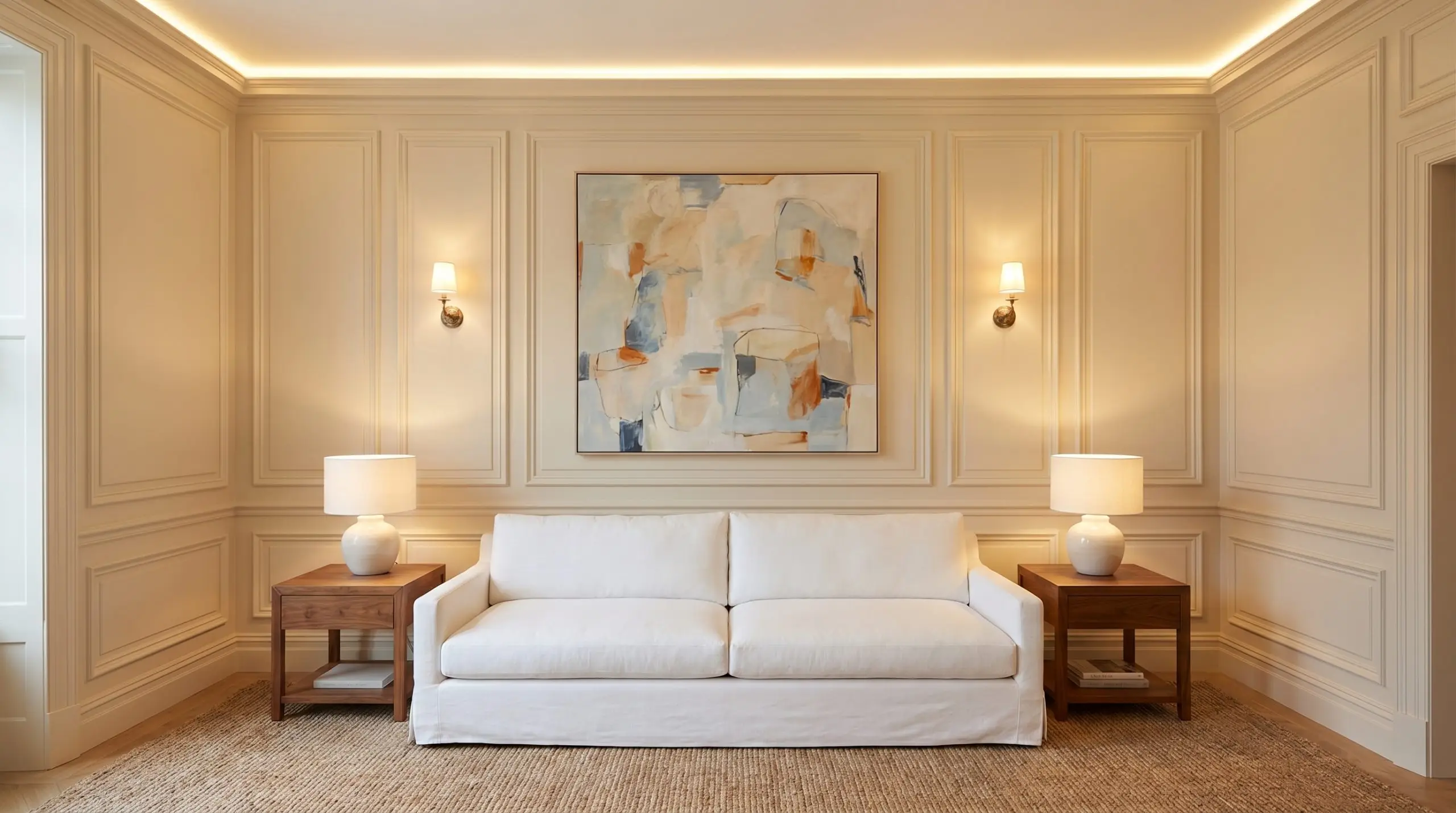
If you are updating a space that already features intricate picture molding, wainscoting, or built-in bookshelves, this color honors those details beautifully. It is a legendary choice for historic home palettes, but the real design magic happens when you introduce intentional contrast.
Instead of filling the room with heavy, dark antiques, use the vintage warmth of the walls as a backdrop for sleek, modern silhouettes. Introduce a modern, low-profile slipcovered sofa in a crisp white linen, paired with an oversized, abstract contemporary canvas.
This deliberate friction between the classic, warm walls and the clean, modern furnishings creates a highly sophisticated, editorial atmosphere that feels fresh rather than dated.
Serene Primary Bedrooms
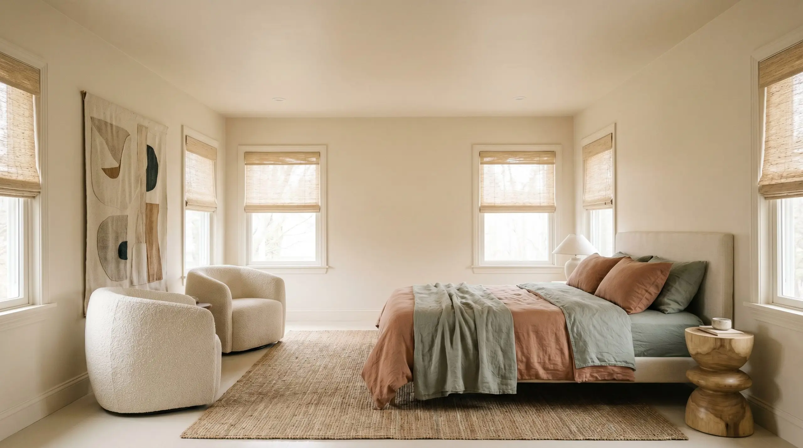
In a bedroom, your primary goal is usually to create a restful, sensory retreat that lowers your heart rate the moment you walk in. This off-white excels here because it lacks the sharp, energetic bounce of a pure white.
To maximize the cozy, enveloping atmosphere, consider color-drenching the room by painting the walls, the baseboards, and the warm-toned trim all in the exact same finish. This erases the visual boundaries of the room, making the ceiling feel higher and the space feel incredibly cohesive.
Layer the room with highly tactile fabrics to complement the soft walls. Think chunky boucle accent chairs, washed linen bedding in muted terracotta or dusty sage, and natural woven window shades to filter the morning light.
Exterior Trim & Fascia
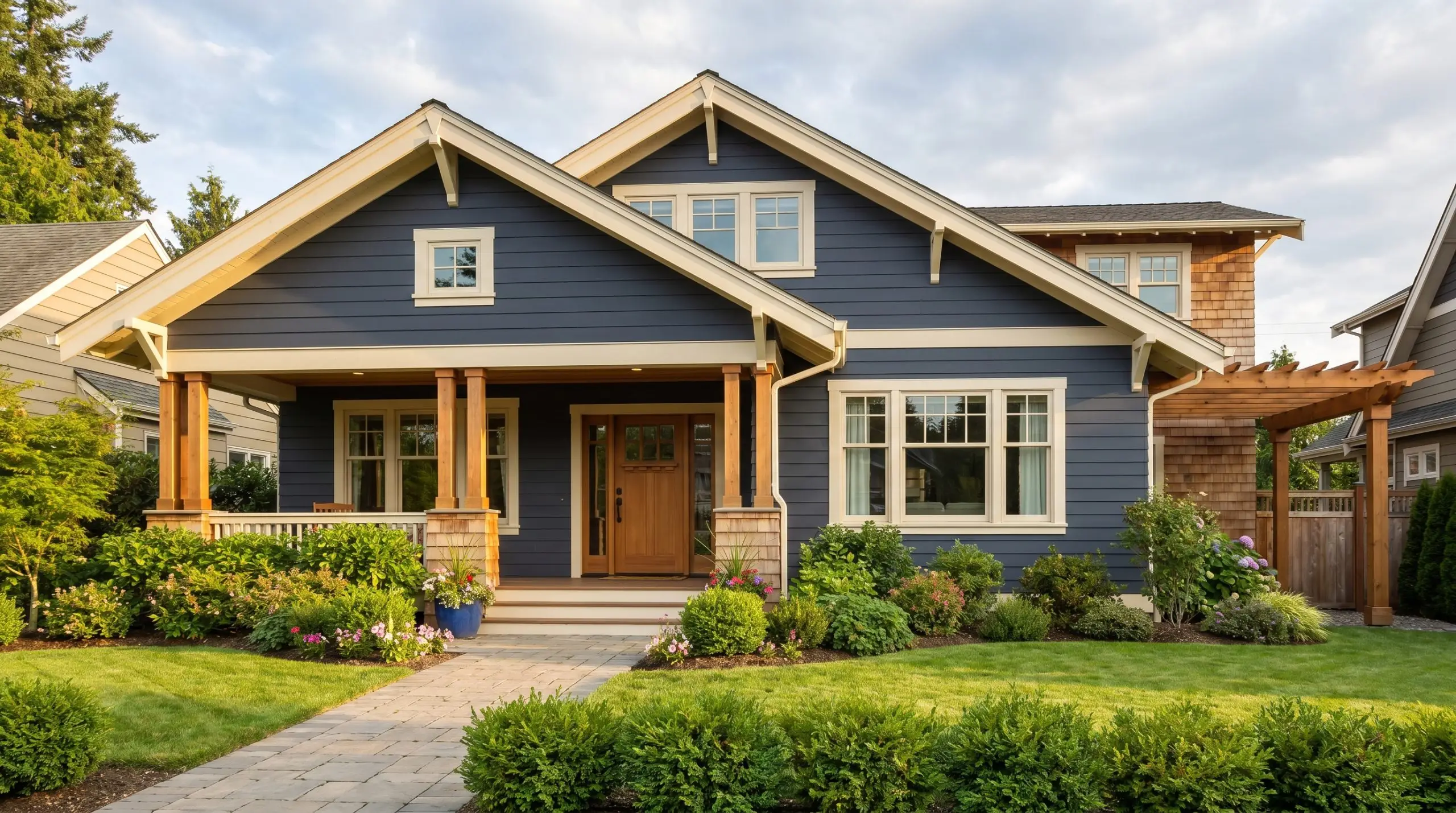
Choosing an exterior white is notoriously tricky because direct, unfiltered sunlight strips away a paint’s color, making standard off-whites look blindingly stark. Because this shade has a robust, low-chroma pigment structure, it holds its ground beautifully outdoors.
When used on exterior trim, fascia, or window sashes, it provides a gentle, welcoming contrast against darker siding colors like muted navy, olive green, or charcoal gray.
Be highly cautious when pairing this specific off-white directly against cool-toned gray stone or stark red brick. The strong beige-yellow undertones can occasionally clash with the cooler minerals in the stone, making the paint look slightly dingy. Always test a large swatch against your hardscaping before committing to the full facade.
Clash Warning (Exterior Masonry)
Material Pairings & Coordinating Colors for This Creamy Neutral
This specific pigment thrives on gentle transitions rather than sharp, jarring contrasts. Because its foundational color structure relies on a heavy dose of yellow and beige, it visually bleeds into surrounding warm tones to create a highly cohesive, atmospheric glow. If you surround it with overly stark, icy materials, the color will defensively pull back, often appearing muddy or disjointed.
Ideal Trim & Baseboard Combinations
To maintain the soft, welcoming energy of this hue, your trim color must share a similar underlying warmth. Pairing it with a stark, un-tinted white creates a harsh visual boundary that immediately makes the walls look older and dirtier than they actually are.
Benjamin Moore White Dove OC-17 is a legendary pairing for this exact scenario. White Dove carries an incredibly subtle greige shadow that perfectly bridges the gap between a crisp trim and the heavily pigmented wall, resulting in a tailored but gentle transition.
If you want a truly seamless, historical bleed between your walls and woodwork, look to Farrow & Ball Pointing No. 2003. This shade shares a distinct red-yellow undertone that converses directly with the subtle peach micro-nuance in the main wall color. The resulting combination softens the architectural lines of the room, making the entire space feel beautifully sun-drenched.
Tactile Hardware & Wood Finishes
Secondary Palette Colors
Curated Room Palettes
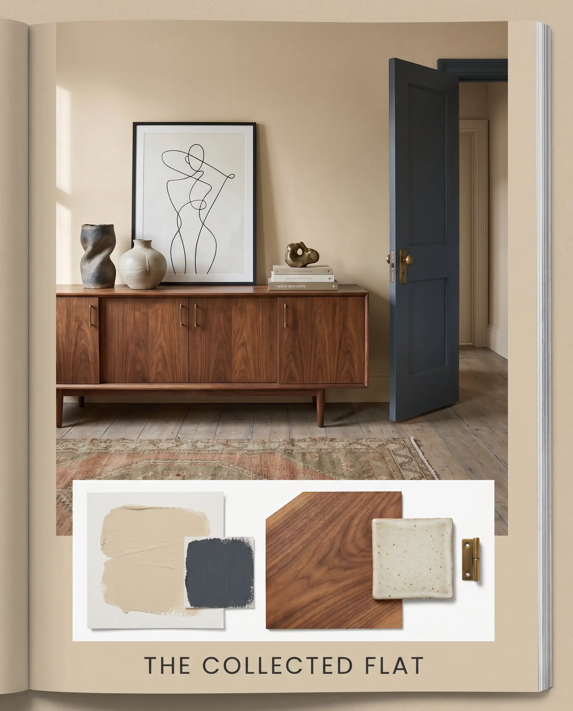
The Collected Flat This palette relies on deliberate design tension, mixing deeply traditional wall colors with sleek, contemporary silhouettes to create a worldly, traveled atmosphere. The warm off-white acts as a gallery-like backdrop for minimalist line art and sculptural stoneware. Ground the airy walls with rich walnut wood credenzas and accent the space with Benjamin Moore Hale Navy HC-154 on interior doors or trim to provide a sharp, tailored frame. The resulting energy is cosmopolitan, intentional, and highly sophisticated.
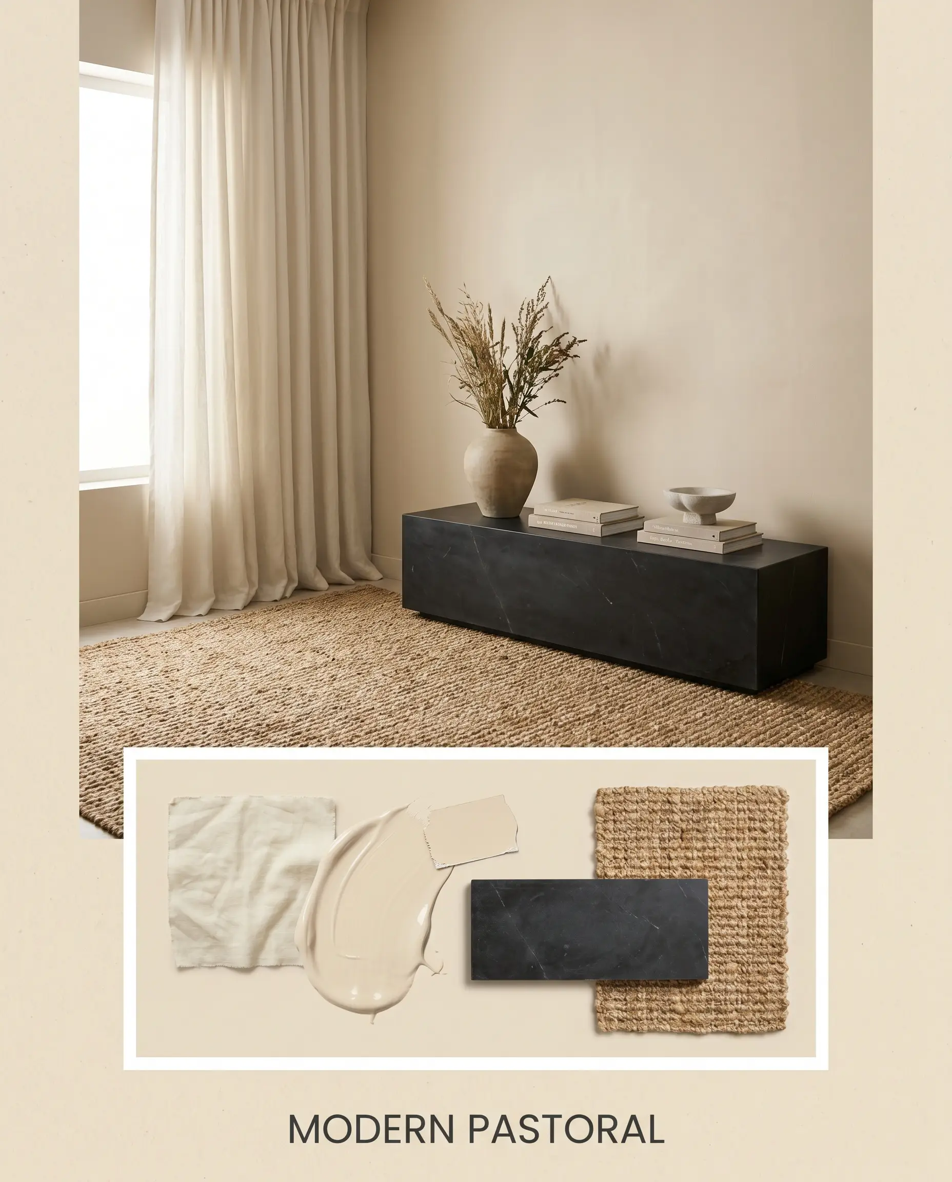
Modern Pastoral Focusing entirely on organic textures and sensory comfort, this aesthetic lowers your heart rate the moment you step inside. The creamy neutral walls seamlessly blend with washed linen drapery and heavily textured jute rugs. Introduce a dark, honed soapstone surface—perhaps as a console top or a fireplace surround—to anchor the light reflectance value of the room. The mood is incredibly serene, offering a quiet, tactile retreat from the outside world.
Head-to-Head Paint Comparisons: SW Antique White vs. Top Rivals
When selecting a foundational neutral, the final decision usually comes down to how the paint reacts to your specific lighting conditions. A color that glows beautifully in a sun-drenched southern exposure might look completely flat in a shaded northern corner. If you find that this specific off-white is pulling too much yellow or losing its depth, you need to pivot to a rival shade with a slightly different chromatic profile.
Sherwin-Williams Antique White vs. Sherwin-Williams Creamy SW 7012
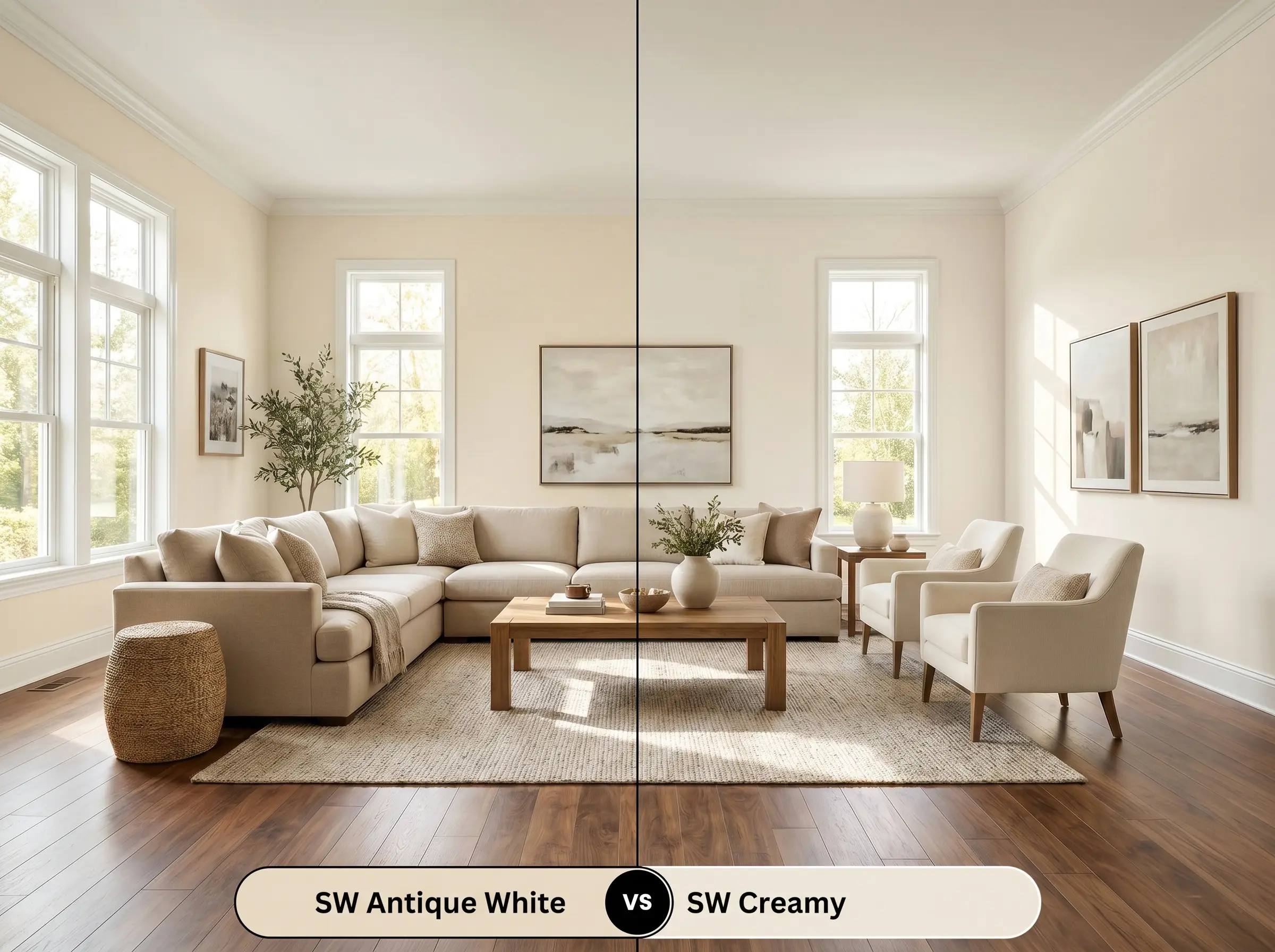
If you love the warmth of SW 6119 but feel the yellow-beige base is simply too prominent for your lighting, Sherwin-Williams Creamy SW 7012 is your immediate solution. Creamy shares a similar welcoming energy but strips away a significant portion of the beige, resulting in a cleaner, brighter off-white. Choose Creamy if your room lacks natural light and you need a hue that feels slightly more modern and less pigmented.
Sherwin-Williams Antique White vs. Benjamin Moore Navajo White OC-95
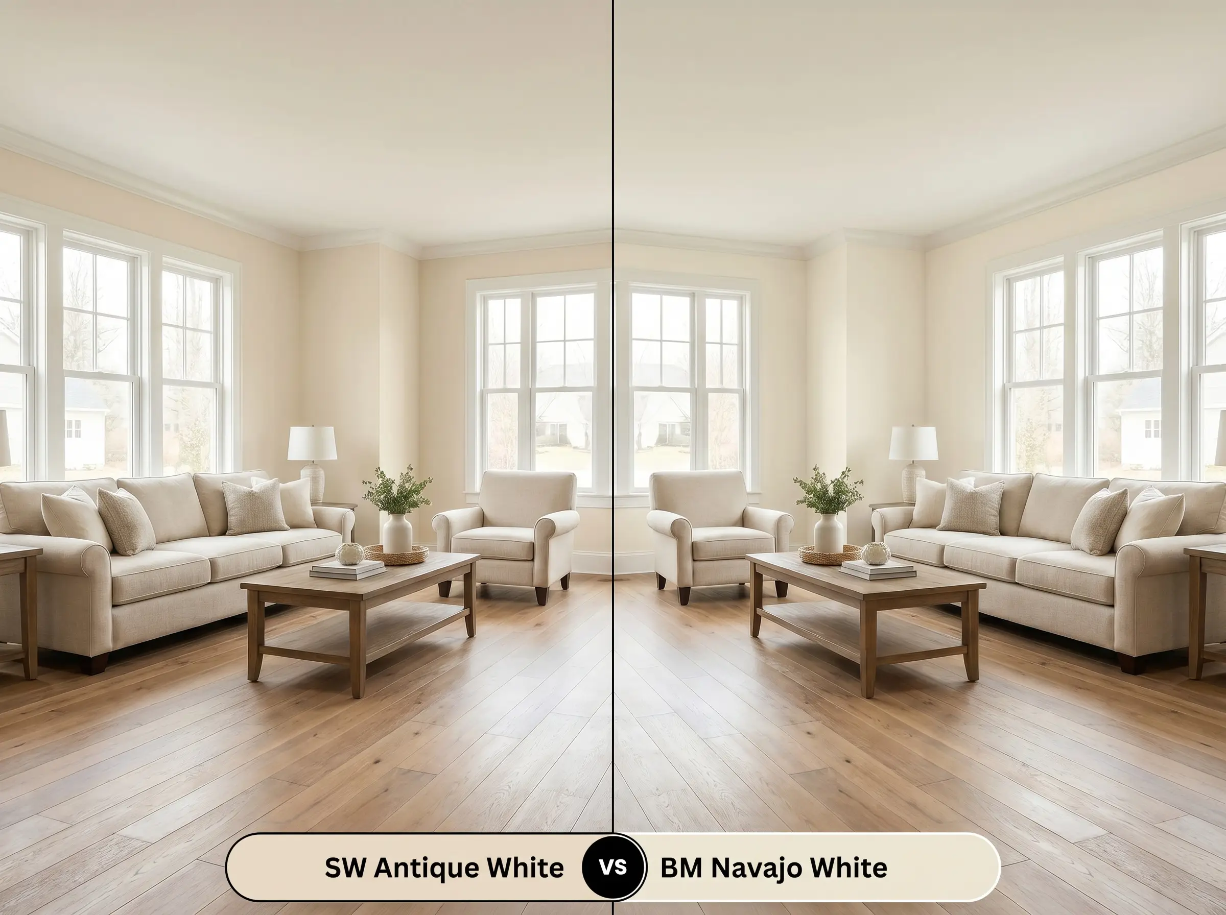
These two colors are frequently compared, but they behave very differently once applied to an entire room. Benjamin Moore Navajo White OC-95 possesses a much stronger, more assertive yellow-orange undertone that commands attention. If you want a wall color that acts as a subtle, parchment-like background, stick with the Sherwin-Williams iteration. Choose the Benjamin Moore version only if you intentionally want the walls to radiate a strong, undeniable golden warmth.
Alternative Shades & Brand Matches
Sometimes a color is incredibly close to perfection, but you need a minor adjustment in depth to suit a tricky hallway or a specific piece of furniture. Alternatively, you might be working with a contractor who exclusively uses a different manufacturer.
Closely Related Sherwin-Williams Hues
Competitor Brand Equivalents
Practical Application & Finish Strategy
Transitioning this beautiful color from a digital swatch to your actual walls requires a strategic approach to paint finishes. The sheen you choose will physically alter how the light interacts with the yellow-beige undertones, either amplifying the warmth or softening it into a matte glow.
To ensure this color accurately reflects its true chromatic profile, you must start with a high-quality white primer. Because this hue has a slightly lower chroma, painting it directly over a dark, existing wall color will drastically alter the final result, often pulling the beige into a muddy, brown shadow.
Even with a premium primer, this specific depth of off-white requires two full, even coats to achieve true color clarity. Rushing the process with a single thick coat will almost certainly result in “flashing,” where the moisture from the paint dries unevenly, leaving highly visible, dull roller streaks across your walls.
Hackrea Pro-Tip (The Coverage Rule)
Frequently Asked Questions
Because this color relies on a delicate balance of yellow and beige, a complete lack of natural light can flatten its warmth. In a windowless hallway, you must use high-quality, warm LED lighting (around 3000K) to keep the pigment feeling intentional rather than shadowed and dull.
It absolutely works on modern silhouettes. Applying this vintage, creamy neutral to a sleek, flat-panel cabinet creates a brilliant design friction that instantly warms up a minimalist kitchen and prevents it from feeling overly sterile.
Thanks to its LRV of 72 and robust pigment structure, it performs exceptionally well on bright exteriors. While crisper creams will wash out and appear blindingly stark in direct sunlight, this shade holds onto its beige foundation, providing a soft, welcoming facade.
Rather than clashing, the subtle peach nuance actually harmonizes beautifully with the natural red and orange tones found in traditional oak flooring. The shared warmth allows the walls and the floor to converse seamlessly, creating a highly cohesive, rooted atmosphere.
The Final Verdict on This Warm Off-White
Sherwin-Williams Antique White is a highly intentional, deeply comforting neutral designed for homeowners who want their walls to feel like a tactile, architectural layer rather than a blank void. It is the perfect foundational color for spaces that require a gentle, lived-in warmth, effortlessly bridging the gap between classic heritage details and sleek, modern furnishings. When applied thoughtfully, it wraps a room in a soft, sun-baked glow that feels both curated and incredibly inviting.
While this paint is highly versatile, it actively fights against cool-toned, blue-gray color palettes and icy materials like polished chrome or stark white marble. If you force this warm, beige-yellow hue to sit next to a chilly gray stone fireplace or illuminate it with harsh, daylight-toned LED bulbs (5000K+), the paint will immediately lose its creamy elegance. The conflicting temperatures will cause the off-white to look aged, dingy, and entirely out of place. Always surround this hue with complementary warm tones, natural woods, and soft lighting to guarantee a flawless execution.
Hackrea Design Secret (The Temperature Clash)
Closest Cross-Brand Equivalents
The absolute closest scientific color matches for Antique White across top paint brands.