Light Gray 17
Farrow & BallFarrow & Ball Light Gray No. 17 is a stony, mid-tone green-gray with deep earthy undertones. Despite its name, it reads as a sophisticated greige rather than a true gray, offering an ageless, grounded warmth perfect for traditional spaces and rich cabinetry.
Farrow & Ball Light Gray No. 17: How to Master This Earthy Architectural Neutral
Despite what the label suggests, Farrow & Ball Light Gray No. 17 is a masterclass in misdirection. This centuries-old pigment is neither particularly light, nor is it a conventional gray. Instead, it operates as a substantive, stony greige that physically changes the energy of a room the moment it hits the walls.
Because of its complex chromatic profile, this color acts less like a standard paint and more like a structural material. It wraps a space in a sophisticated, earthy warmth that feels incredibly intentional. Whether you are modernizing a mid-century layout or restoring intricate Victorian trim, this shade provides a rich, tactile foundation.
To use this color successfully, you have to understand how its underlying green-brown cast interacts with your specific environment. Let’s explore exactly how this architectural finish behaves on the wall and how to style it for maximum impact.
The Chromatic Profile of Light Gray: Undertones & LRV
When homeowners ask if Farrow & Ball Light Gray is warm or cool, the answer is a definitive warm. However, this warmth does not come from a predictable beige or yellow base. It is a highly nuanced, earthy neutral that shifts dramatically depending on what you place next to it.
To properly leverage this color, you need to understand the hidden layers that dictate its final appearance:
With a Light Reflectance Value (LRV) of 39.28, No. 17 falls squarely into the mid-tone category. This means it absorbs a significant amount of light, giving the walls a sense of physical weight and structure. It provides gorgeous, stabilizing contrast when paired with crisp white trim, without ever rendering a room overly dark or enclosed.
Because of its mid-tone depth, this color is spectacular for a “reverse trim” application. Paint your walls a soft, chalky white and apply Light Gray exclusively to your baseboards, window sashes, and crown molding to create crisp, architectural framing.
Hackrea Design Secret (The Trim Reversal)
You can apply wallpapers, paints, etc. on walls and see how they look in various interiors.

How Light Gray No. 17 Shifts in the Light
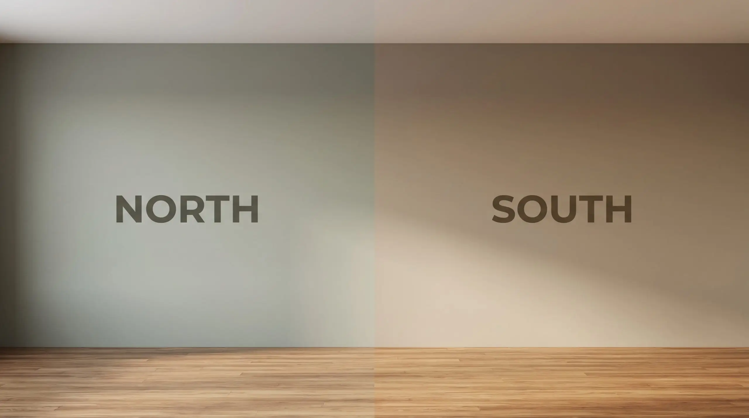
Because this paint relies on a delicate balance of red, yellow, and green, it is highly reactive to its environment. The direction of your windows and the temperature of your bulbs will entirely dictate which version of the color you experience.
Before committing to a full room, you must test how the sunlight manipulates the pigment throughout the day:
Popular Applications
The beauty of a mid-tone neutral is its ability to adapt to almost any architectural feature. Because it carries enough visual weight to stand on its own, you can use it to define specific zones or wrap an entire room in warmth. Here is how we love to see this earthy neutral applied in real homes.
Curating a Tailored Living Room
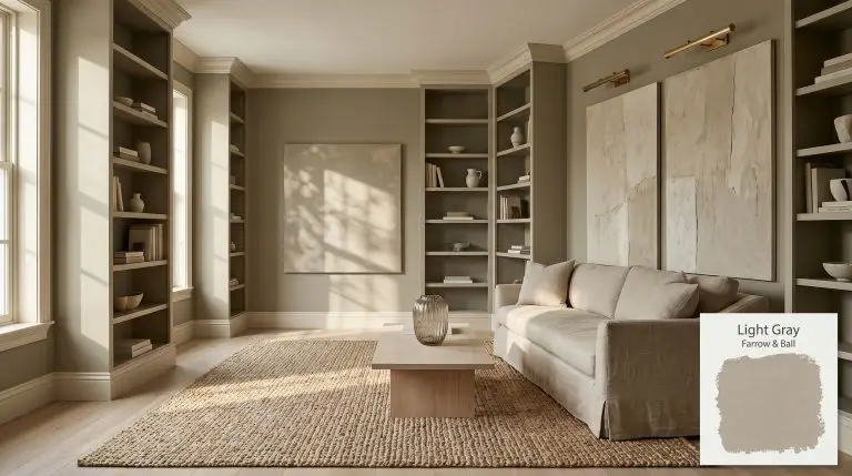
While this shade is historically associated with formal parlors, it is the perfect backdrop for a relaxed, transitional living space. The stony greige creates a sophisticated canvas that beautifully offsets the casual texture of Belgian linen slipcovered armchairs and chunky jute rugs. To keep the room feeling fresh and modern, pair the paint with expansive, abstract plaster art or oversized botanicals.
If your living room features intricate wall treatments like picture frame molding or wainscoting, consider color-drenching the entire space. Painting the walls, trim, and molding in the exact same finish modernizes traditional architecture instantly. The green-brown cast of the paint will catch the shadows of the molding, highlighting the millwork without requiring a contrasting trim color.
To elevate the styling, introduce warm metallics. Unlacquered brass picture lights or a polished nickel floor lamp will pop beautifully against the earthy walls.
Custom Cabinetry and Millwork
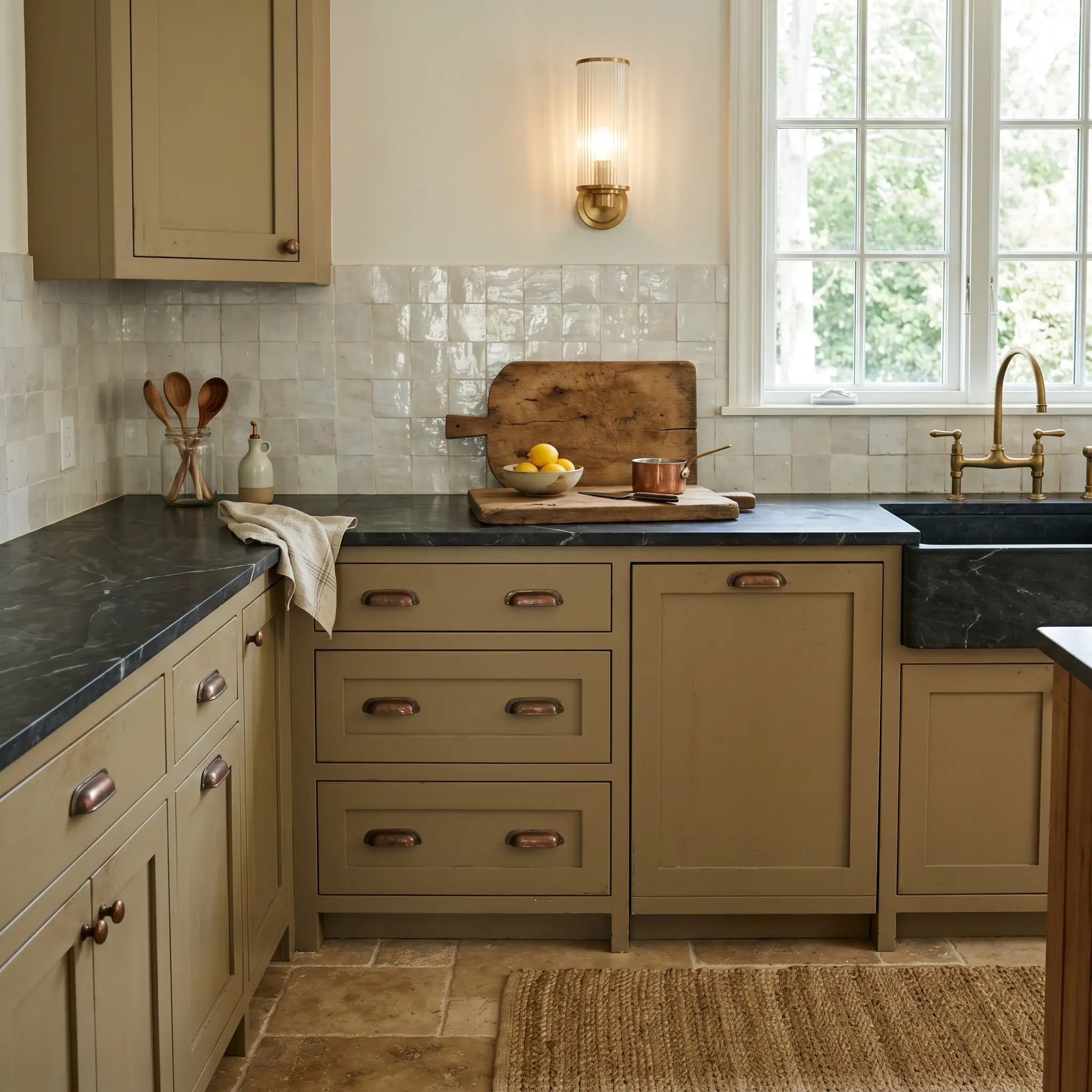
Using this mid-tone on kitchen cabinetry or built-in joinery is a brilliant way to introduce color without committing to a vibrant hue. It acts as a rich, structural neutral that grounds the lower half of a kitchen flawlessly. When applied to shaker cabinets, it pairs seamlessly with honed marble countertops and tumbled travertine floors for an organic, bespoke aesthetic.
Because of the subtle green undertone, this paint absolutely sings when paired with aged or living finishes. Opt for oxidized copper or unlacquered brass cabinet pulls to draw out the warmth of the wood-like tones.
Hackrea Pro-Tip (The Hardware Pairing)
For a more contemporary approach, use it on a floating vanity in a powder room or primary bath. The color provides enough saturation to make the vanity a focal point, especially when styled with fluted glass sconces and a vintage Oushak rug.
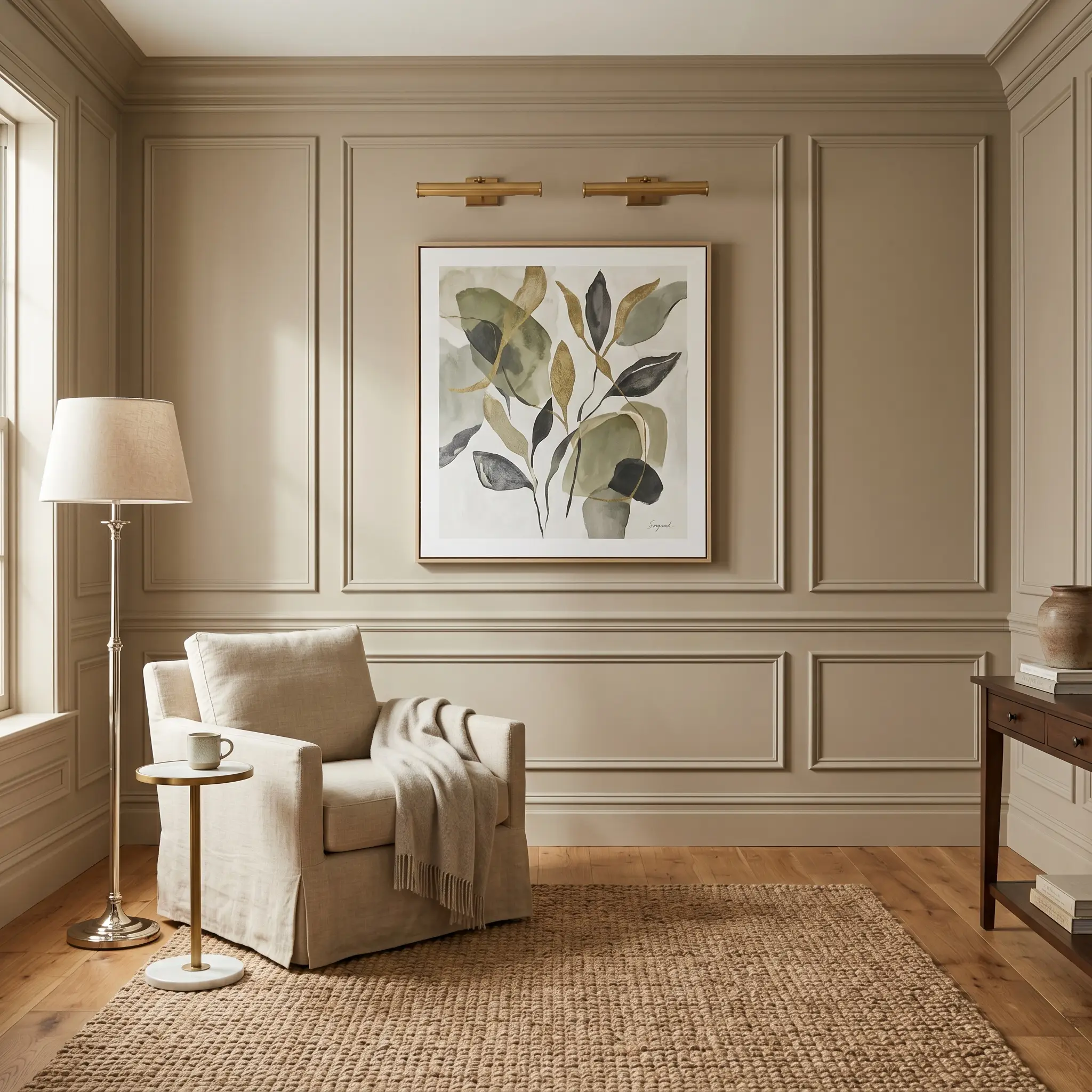
The Enveloping Home Library
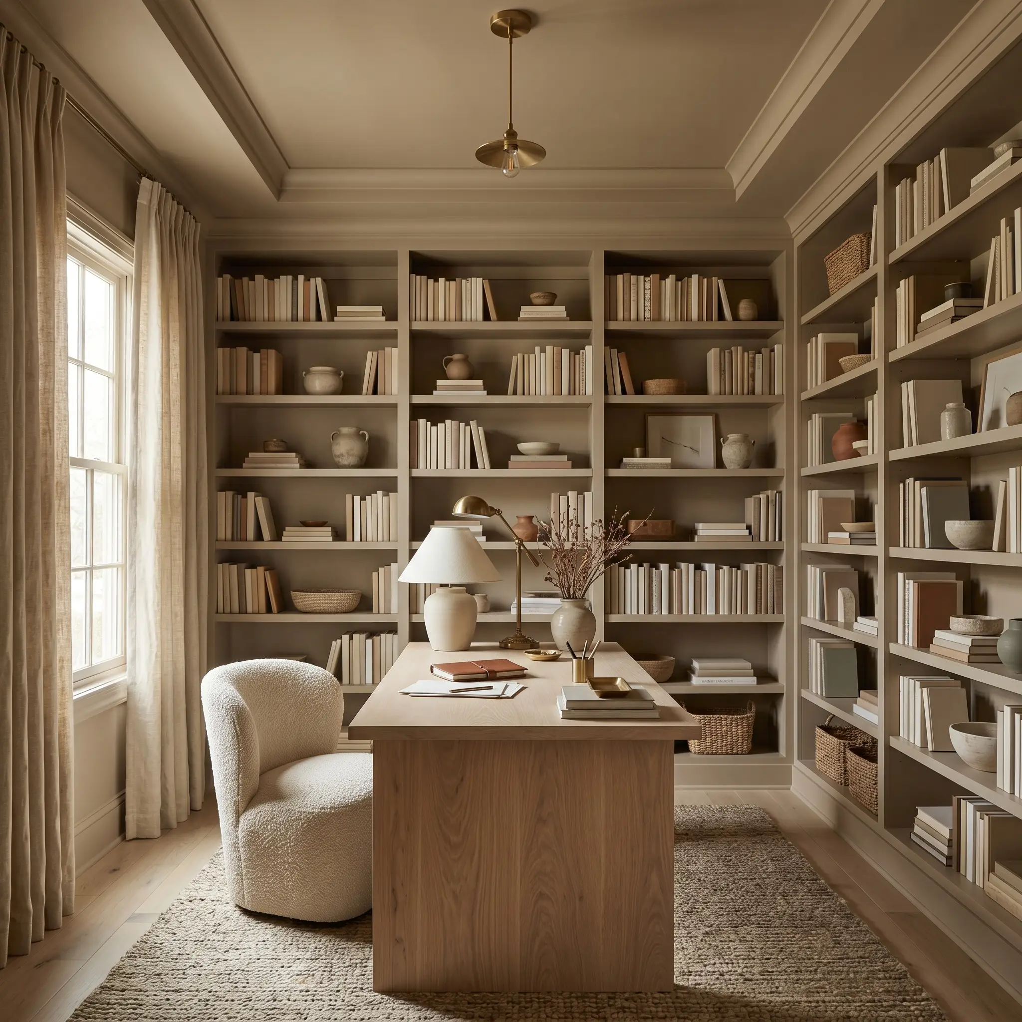
A home office or study is the ideal place to lean into the light-absorbing qualities of this paint. Instead of defaulting to a predictable dark academia aesthetic, use this shade to create a soft, tactile, tone-on-tone retreat. Wrap the walls, ceiling, and built-in bookcases in the same finish to blur the room’s boundaries and create a calming, uninterrupted visual flow.
To balance the visual weight of the walls, bring in lighter, heavily textured materials. A bleached oak desk, a bouclé accent chair, and raw silk window treatments will keep the space feeling airy and intentional. The shifting light throughout the day will continuously alter the mood of the room, keeping the study feeling dynamic rather than stagnant.
Transforming Exterior Masonry
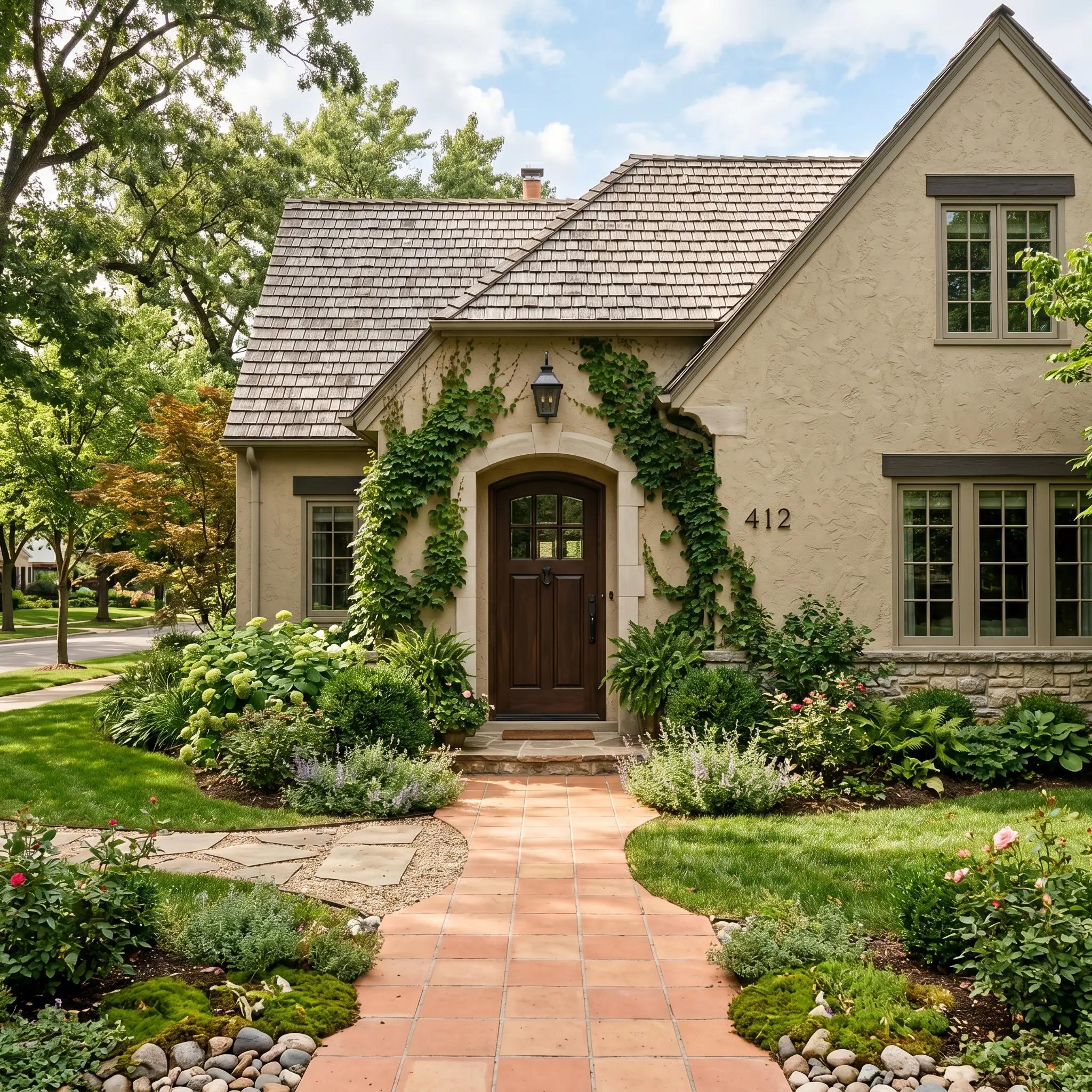
On an exterior facade, natural sunlight will wash out a significant portion of a paint’s depth. Because No. 17 has an LRV of roughly 39, it retains its character outdoors, appearing as a soft, natural stone rather than glaring white. It is an exceptional choice for painting textured stucco, brick, or expansive masonry applications.
When used as a primary body color, it blends harmoniously with organic landscaping, trailing ivy, and natural slate walkways. If you are painting your exterior masonry this shade, use a rich espresso brown or muted terracotta on the front door to create an inviting, high-end entry point.
Always compare this color against your existing roofing material before painting. Because of its earthy green base, it can clash aggressively with roof shingles that have strong, cool blue or purple undertones. It pairs best with warm charcoal, brown, or natural cedar shake roofs.
Clash Warning (Exterior Rooflines)
Material Pairings & Coordinating Palettes for Light Gray
Because this earthy neutral relies so strongly on its green-brown cast, it commands its surrounding environment rather than fading quietly into the background. It requires companion materials and colors that either match its visual weight or offer a crisp, luminous contrast to keep the room from feeling visually dense.
Framing with the Right Trim
To create a tailored, architectural boundary, you need a trim color that provides a luminous lift without jarring against the stony greige walls. Farrow & Ball Off-White No. 3 is a phenomenal companion because its subtle warmth bleeds beautifully into the main wall color, creating a seamless, atmospheric glow.
If you prefer a slightly crisper transition, Benjamin Moore White Dove OC-17 and Sherwin-Williams Alabaster SW 7008 both offer a softer, creamy contrast. These accessible whites frame the room elegantly without highlighting the paint’s green undertones too aggressively.
Tactile Finishes & Hardware
The Light Gray Coordinating Palette
Curated Aesthetic Concepts
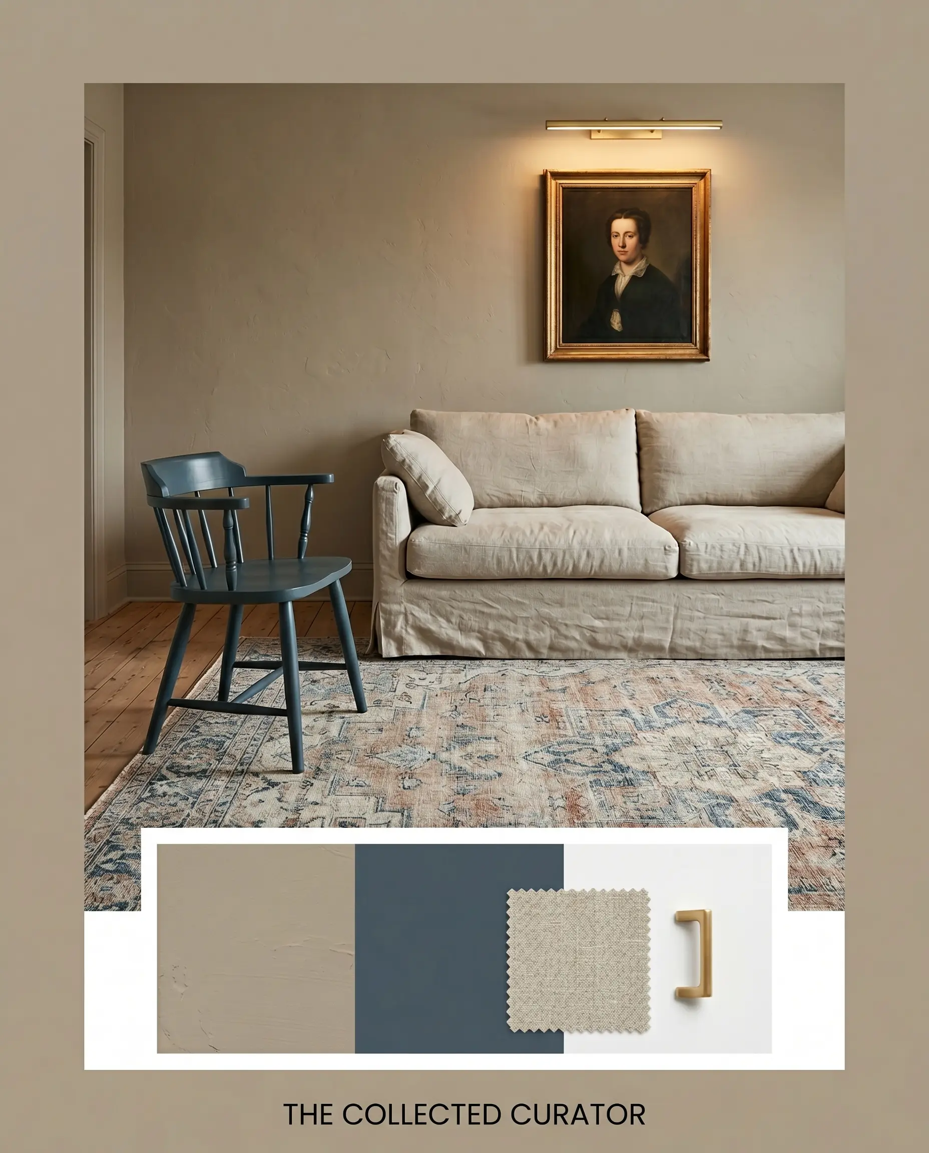
The Collected Curator
Wrap the walls in this earthy neutral to serve as a quiet, sophisticated backdrop for antique oil portraits and sleek, modern unlacquered brass picture lights. Introduce an accent piece painted in Stiffkey Blue No. 281 to inject a sharp, tailored contrast that wakes up the room. Finish the styling with a faded Oushak rug and a slipcovered linen sofa to balance the formal architecture with relaxed, tactile comfort.
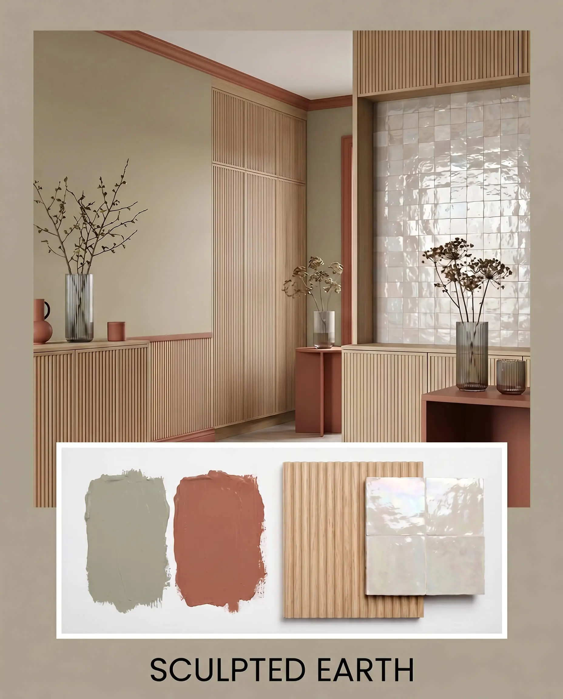
Sculpted Earth
This palette relies on rich, tonal warmth by pairing the stony greige walls with accents of Baked Terra Cotta 1202 and expansive reeded white oak millwork. To keep the aesthetic feeling elevated rather than visually dense, incorporate highly textural, light-reflecting decor like fluted glass vases and pearl-toned glazed zellige tile. The resulting vibe is deeply grounding, organic, and effortlessly luxurious.
Comparing Light Gray Against Rival Neutrals
Sometimes the specific lighting conditions or exterior exposures of your home require a slight pivot in your color strategy. If you are dealing with a challenging architectural layout or simply want to explore how this Farrow & Ball pigment stacks up against the competition, understanding these core differences is essential.
Farrow & Ball Light Gray vs. Benjamin Moore Revere Pewter HC-172
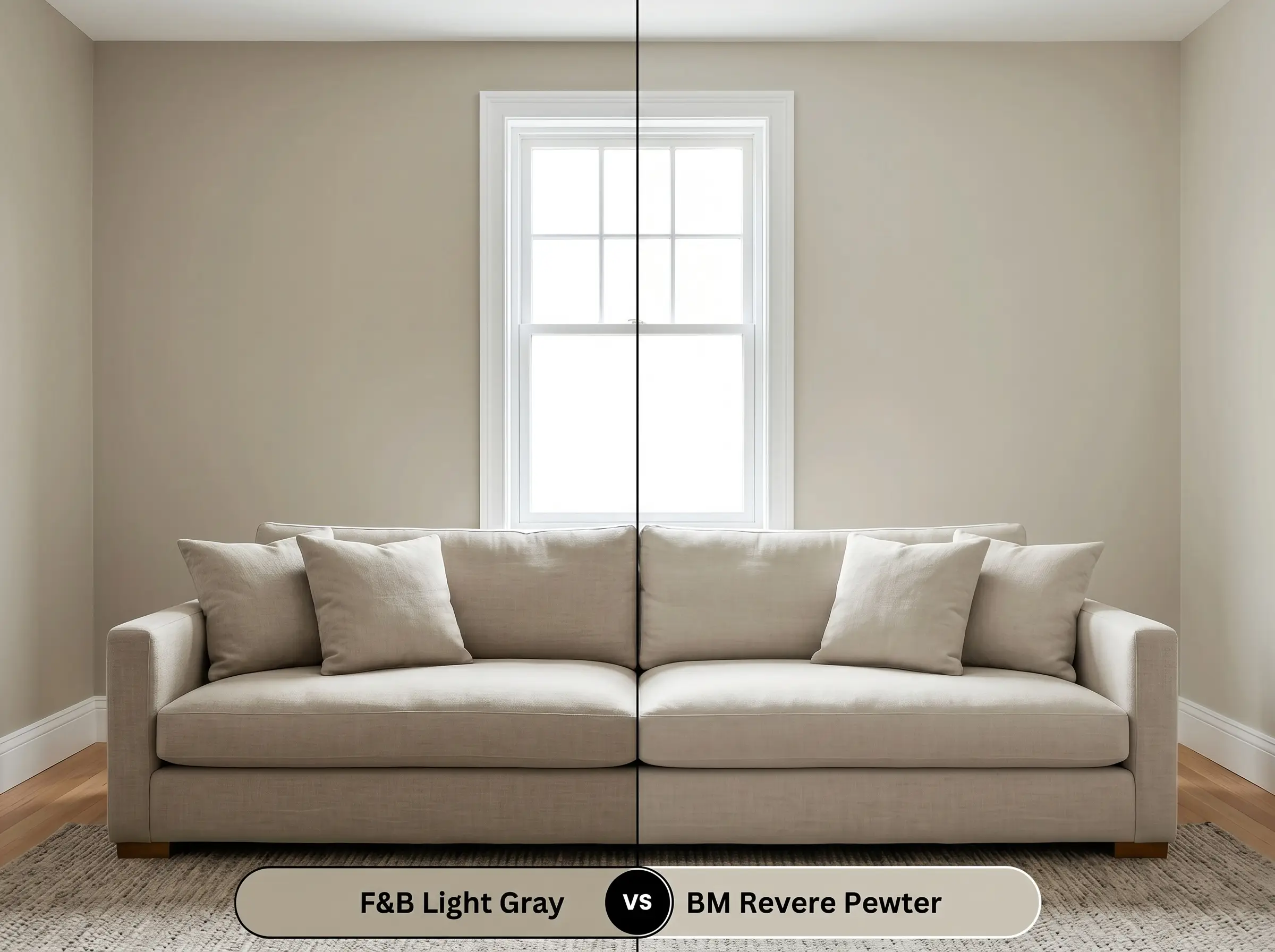
If your room receives flat, northern light, Revere Pewter will often pull slightly cooler and more silver, making it a safer bet for a traditional gray look. However, if you want a color that actively shifts and reveals a rich, green-brown cast as the sun moves, No. 17 offers significantly more architectural depth.
Farrow & Ball Light Gray vs. Sherwin-Williams Mindful Gray SW 7016
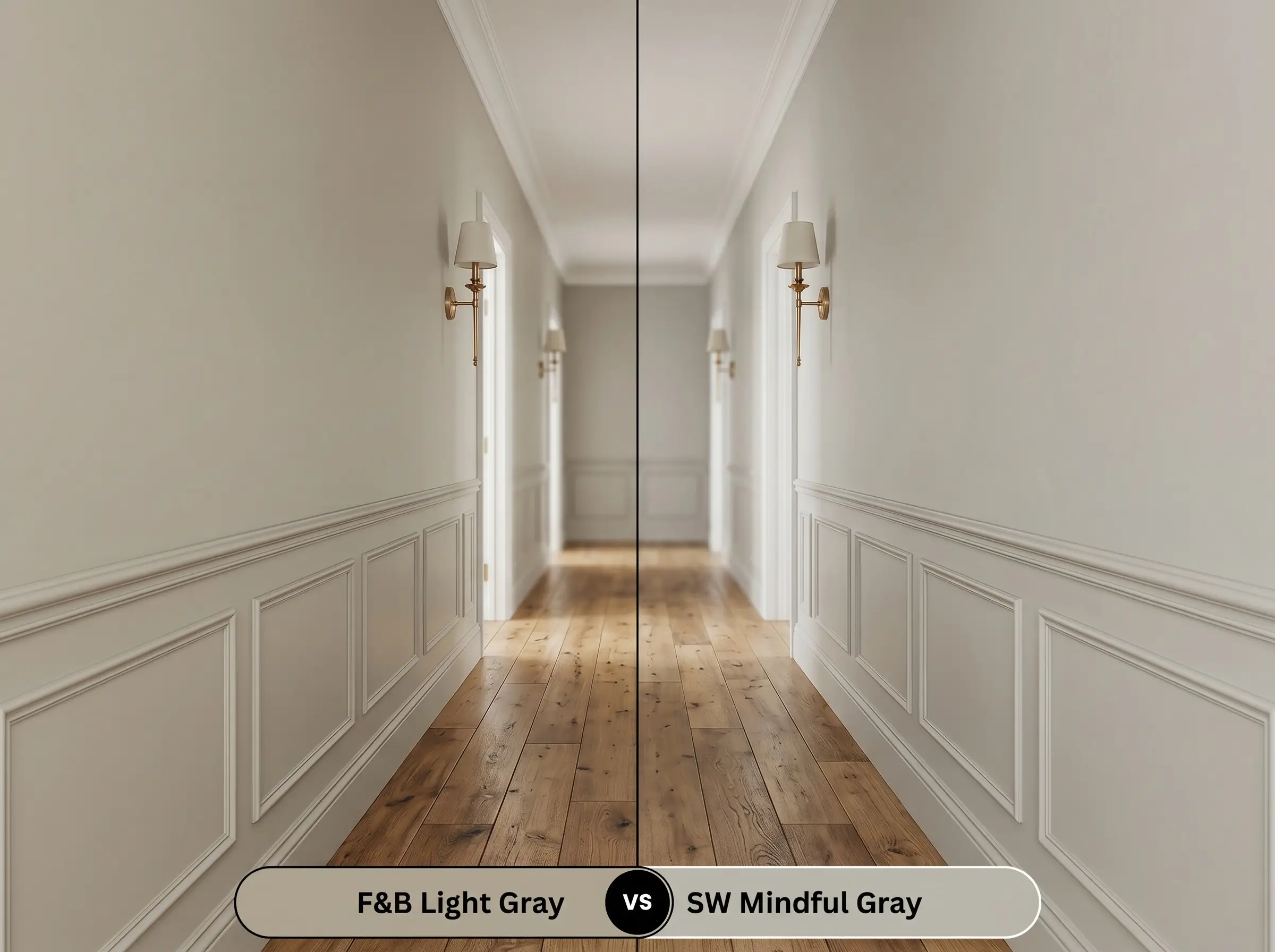
Sherwin-Williams Mindful Gray is a straightforward, highly predictable warm gray with a slightly higher LRV, making it an excellent choice for darker, windowless corridors. Choose the Farrow & Ball option when you have ample natural light and want the walls to feel like a custom, historic finish rather than a standard modern neutral.
Farrow & Ball Light Gray vs. Farrow & Ball Pavilion Gray 242
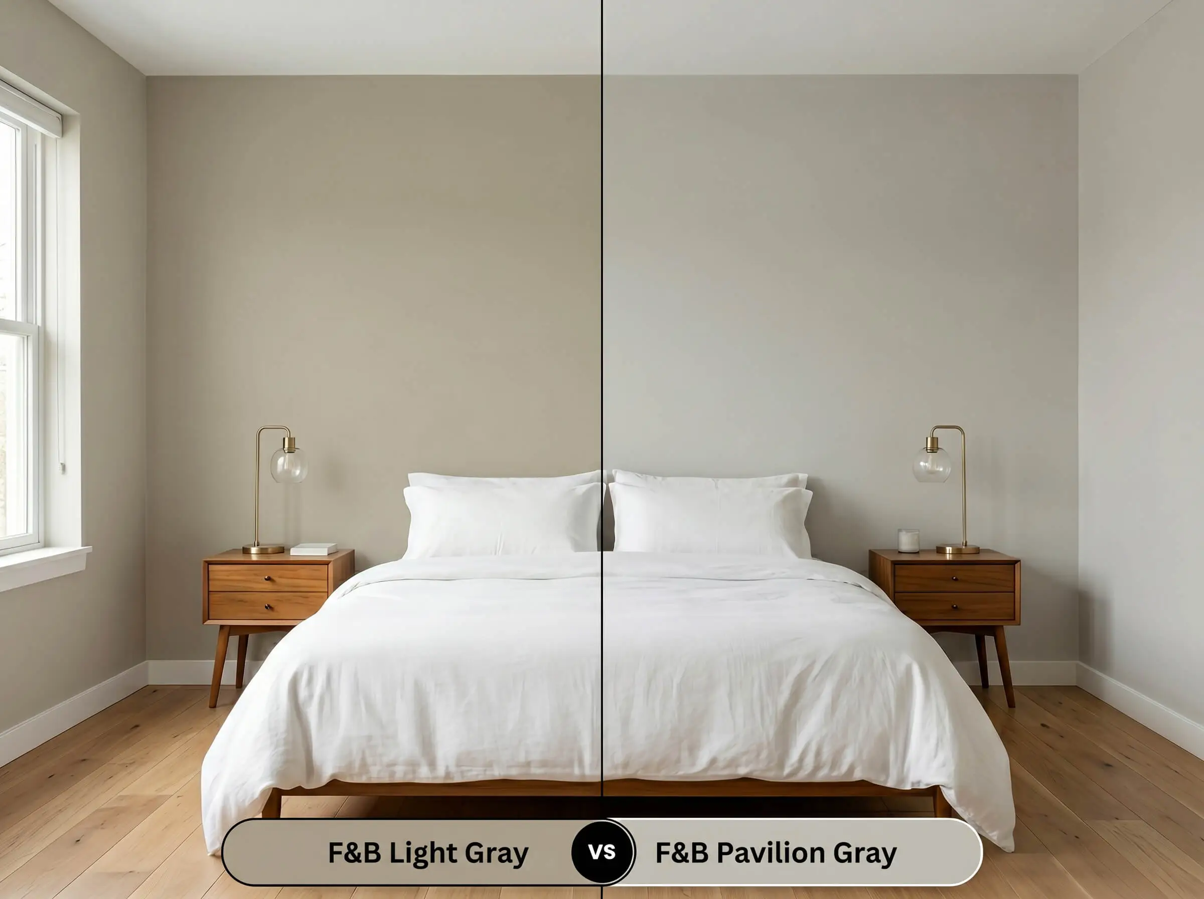
Pavilion Gray is notably lighter, crisper, and carries a much cooler blue-gray undertone compared to the earthy warmth of Light Gray No. 17. If you are styling a crisp, airy Scandinavian aesthetic, Pavilion Gray is the clear winner, whereas No. 17 is the ultimate choice for a moody, enveloping atmosphere.
Alternative Shades & Brand Matches
If you love the foundational color structure but need a slight adjustment in light absorption, or if you simply need a match from a more widely available retailer, there are excellent alternatives.
Tonal Variations Within the Brand
Cross-Brand Color Matches
Executing Light Gray on the Wall
Transitioning from design theory to the reality of a roller requires a specific strategy to ensure this mid-tone depth performs correctly.
Selecting the Right Sheen
Primer & Coverage Strategy
Because Light Gray No. 17 has an LRV of roughly 39, it requires a dedicated mid-tone primer to ensure the red-yellow base develops properly.
Mid-tone paints are notorious for “flashing”—visible, uneven roller marks that catch the light. To achieve a flawless, professional finish, you must apply two generous coats and maintain a wet edge while rolling, avoiding the temptation to touch up a semi-dry wall.
Hackrea Pro-Tip (The Flashing Warning)
Expert Answers to Your Light Gray Questions
Because natural sunlight washes out a color’s depth, the subtle green undertone actually softens outdoors, allowing the paint to look like a highly natural, organic stone rather than a vibrant green.
Without natural light to activate its warmth, this mid-tone will lean heavily into its brown-gray structure and can feel quite dark. It performs beautifully in these spaces only if you intentionally want a moody, enveloping atmosphere.
While the paint looks stunning on cabinetry, it requires careful pairing with your stone. You must ensure the veining in your Calacatta marble has warm taupe or gold flecks to harmonize with the paint’s earthy green-brown cast.
This specific pigment mimics the traditional, unrefined stone and lime-based washes used centuries ago, allowing modern homeowners to inject genuine historical authenticity into their architectural finishes.
The Final Verdict on Farrow & Ball Light Gray
Farrow & Ball Light Gray No. 17 is an incredibly sophisticated, earthy neutral designed for homeowners who want their walls to feel structural and intentional. Its absolute best application is in spaces that blend historic architectural details with relaxed, transitional styling. It thrives in south-facing living rooms, on tailored shaker cabinetry, or wrapping the walls of a cozy, tone-on-tone study.
However, you must be highly strategic with your hard finishes when bringing this color into your home. If your room features cool-toned, blue-gray slate floors or stark, icy white quartz countertops, this paint will clash noticeably. The green-brown cast of No. 17 will suddenly look muddy and unrefined when forced to compete with icy undertones. To guarantee success, always anchor this stony greige with warm, natural materials like honed soapstone, rich terracotta, and unlacquered brass.