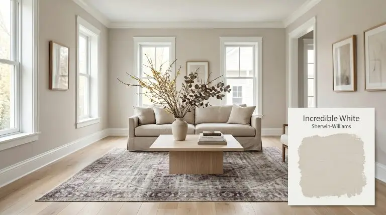
Incredible White SW 7028
Sherwin-WilliamsSherwin-Williams Incredible White (SW 7028) is a light, warm taupe-greige with an LRV of 74. While it functions as an off-white, its complex color structure holds distinct violet and pink undertones that prevent it from feeling stark or flat in residential spaces.
Sherwin-Williams Incredible White: Navigating the Hidden Violet Undertones of a Modern Off-White
Finding the right off-white often feels like chasing a mirage. You want a bright, airy space, but standard whites can leave a room feeling stark and clinical. Sherwin-Williams Incredible White offers a highly sophisticated alternative.
This is not a flat, predictable neutral. SW 7028 carries a complex chromatic profile that responds dynamically to its environment. It establishes a soft, welcoming baseline that allows your architectural finishes and curated textiles to take center stage.
By understanding how this specific pigment interacts with lighting and materials, you can transform a basic room into a highly intentional, curated space.
SW Incredible White: Temperature, Undertones & LRV
Is this paint warm or cool? Incredible White is definitively a warm off-white, but its complex color structure prevents it from ever feeling overly yellow or baked.
With a light reflectance value of 74, this shade sits firmly in the off-white category. It bounces enough natural light to keep a room feeling expansive, yet holds enough pigment to contrast beautifully against pure white trim.
You can apply wallpapers, paints, etc. on walls and see how they look in various interiors.

Lighting Effects & The Chameleon Factor
That hidden violet cast makes this taupe-greige incredibly responsive to shifting sunlight. You must test this color on multiple walls, as its color temperature shift changes drastically from morning to late afternoon.
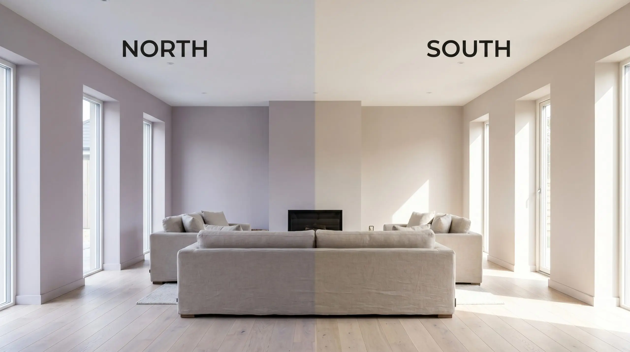
If your room lacks natural light and you want to suppress the purple flash entirely, stick to 3000K bulbs. This specific temperature provides a balanced, neutral read that stabilizes the taupe base.
Hackrea Pro-Tip (The Bulb Correction)
Popular Applications for a Warm Taupe
Because it straddles the line between beige and gray, this adaptable shade works beautifully across a wide variety of architectural elements. The key to success is understanding how its subtle purple flash interacts with your surrounding materials.
Primary Bedrooms
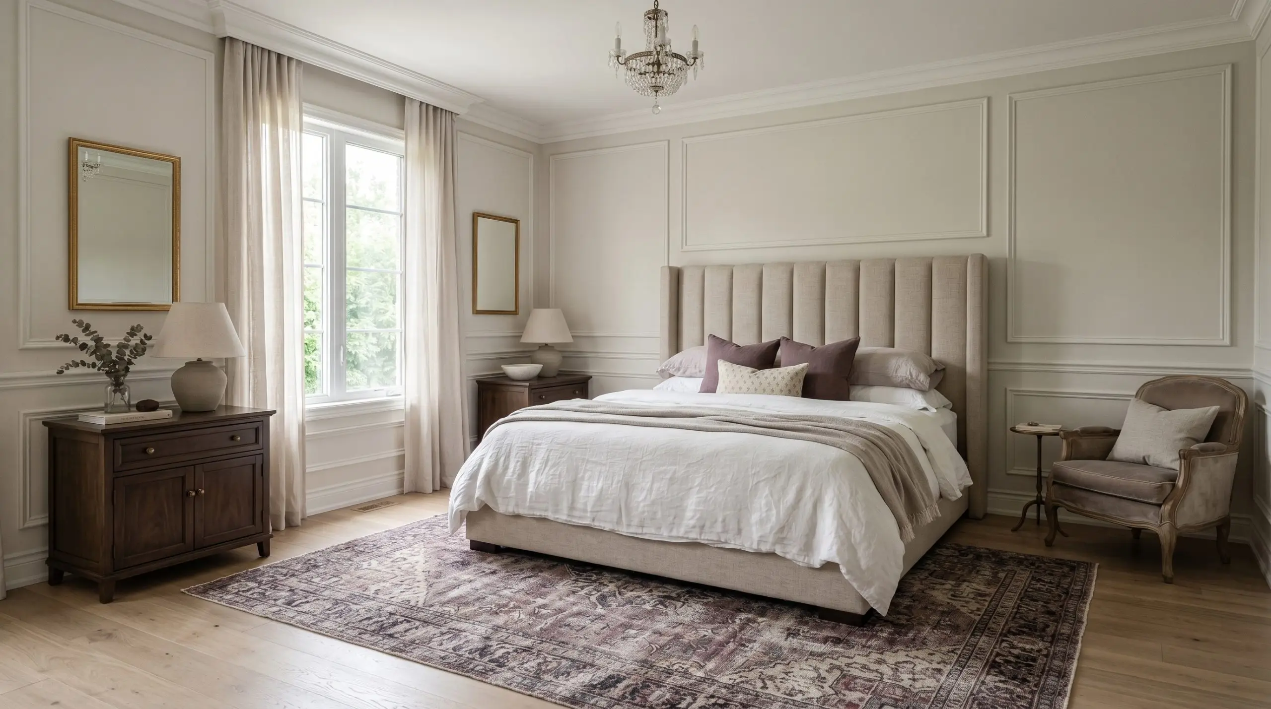
Apply this soft shade across all four walls to establish a serene, Parisian Modern retreat. Pair the walls with crisp white picture frame molding to highlight the subtle contrast between the off-white body and the bright trim.
Layering washed linen bedding and a channel-tufted headboard creates a luxurious, tactile environment. This approach feels highly intentional for a young professional looking to unwind in a sophisticated space at the end of the day.
To push the design further, introduce a vintage distressed Persian rug with muted plum accents. The rug will subtly speak to the paint’s hidden undertones without overpowering the room’s calm atmosphere.
Open-Concept Living Areas
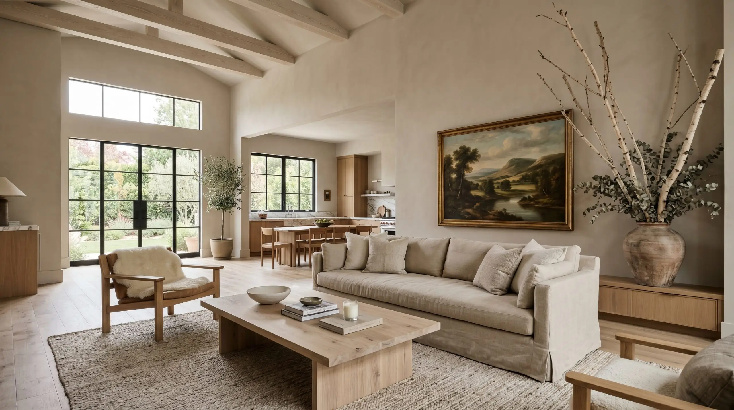
Large, sprawling spaces benefit immensely from a shade with an LRV in the mid-70s. The color bounces ambient lighting effortlessly while maintaining enough visual weight to keep the room from feeling stark or empty.
Style the space with a Soft Minimalist approach to maximize the airy feeling. Incorporate a bleached oak plinth coffee table and a slipcovered linen sofa to play up the organic warmth of the walls.
A large vintage landscape painting or oversized branches in a raw ceramic vase will break up the expansive wall space beautifully. These natural elements root the room, making a large suburban floor plan feel intimate and gathered.
Kitchen Cabinets
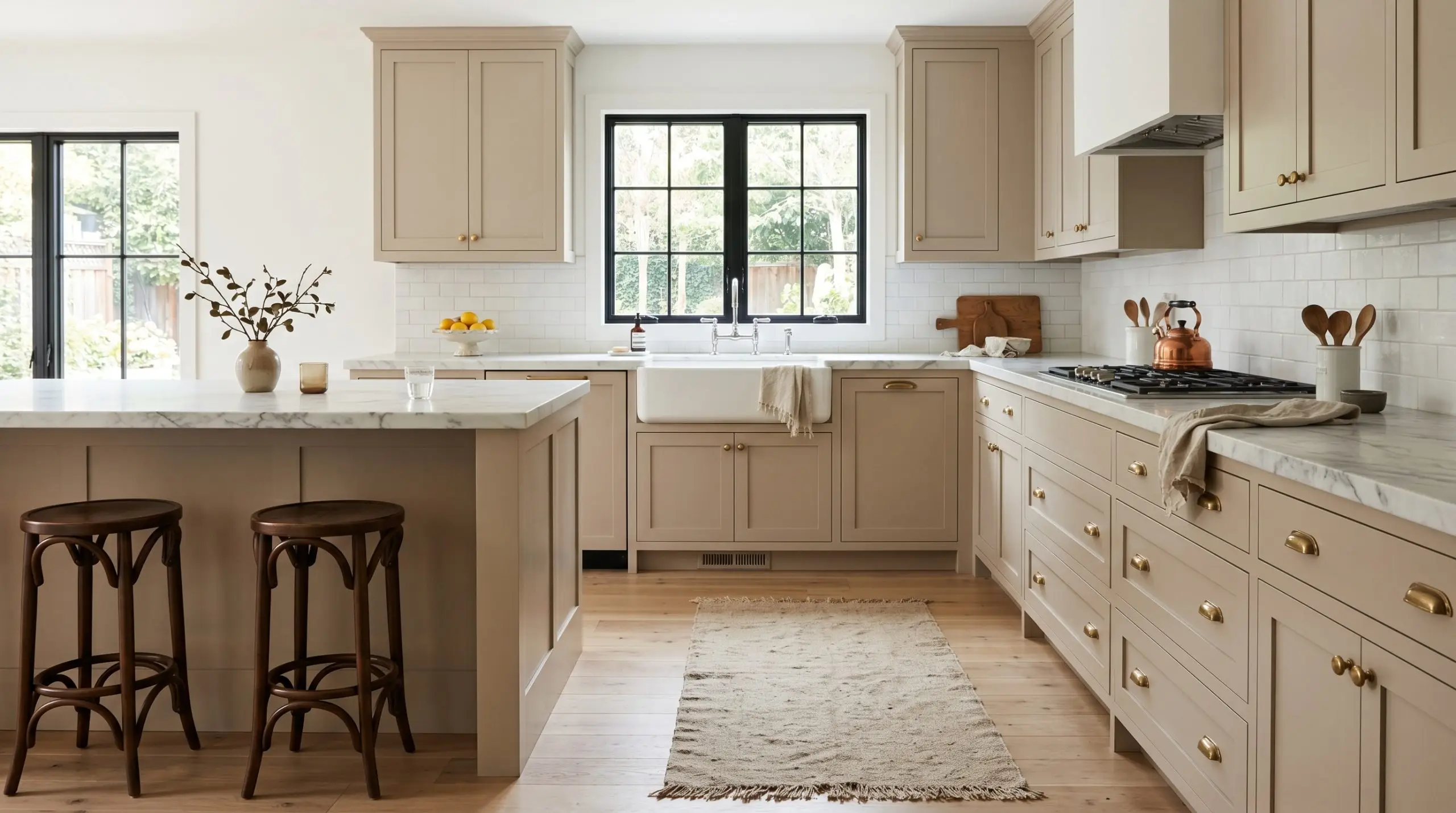
Painting cabinetry in a soft taupe is a fantastic way to introduce warmth without committing to a heavy, dark wood tone. This approach works exceptionally well when paired with honed marble countertops and unlacquered brass hardware.
The metallic sheen of the brass pulls out the subtle warmth in the paint, creating a refined, timeless aesthetic. Add a textured stonewashed canvas runner and a pair of bentwood stools to complete the high-end look using highly accessible pieces.
Avoid pairing these taupe cabinets with aggressively yellow or golden granites. The yellow tones will fight directly with the hidden violet structure, making your beautiful new paint job look muddy and confused.
Clash Warning (Countertop Pairings)
Bathrooms with Ample Natural Light
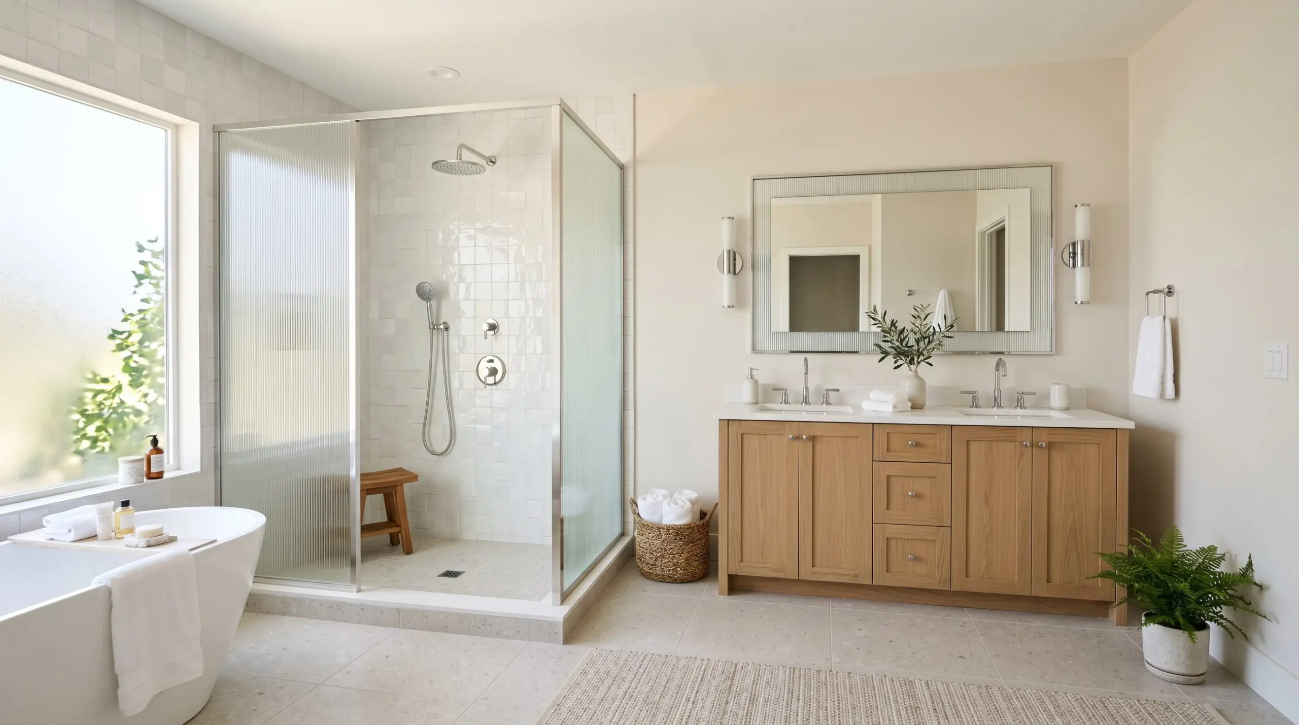
South-facing bathrooms allow this color to shine as a warm, inviting backdrop. The abundant sunlight neutralizes the cooler undertones, leaving a soft, flattering glow that works beautifully around vanities and mirrors.
Lean into a Contemporary Spa aesthetic by pairing the painted walls with glossy zellige tile and fluted glass shower enclosures. The organic texture of the tile contrasts brilliantly against the smooth, matte finish of the painted drywall.
Polished chrome or brushed nickel plumbing fixtures will add a crisp, modern edge. This metallic contrast balances the warmth of the walls, keeping the bathroom feeling fresh and clean.
Exterior Trim or Stucco
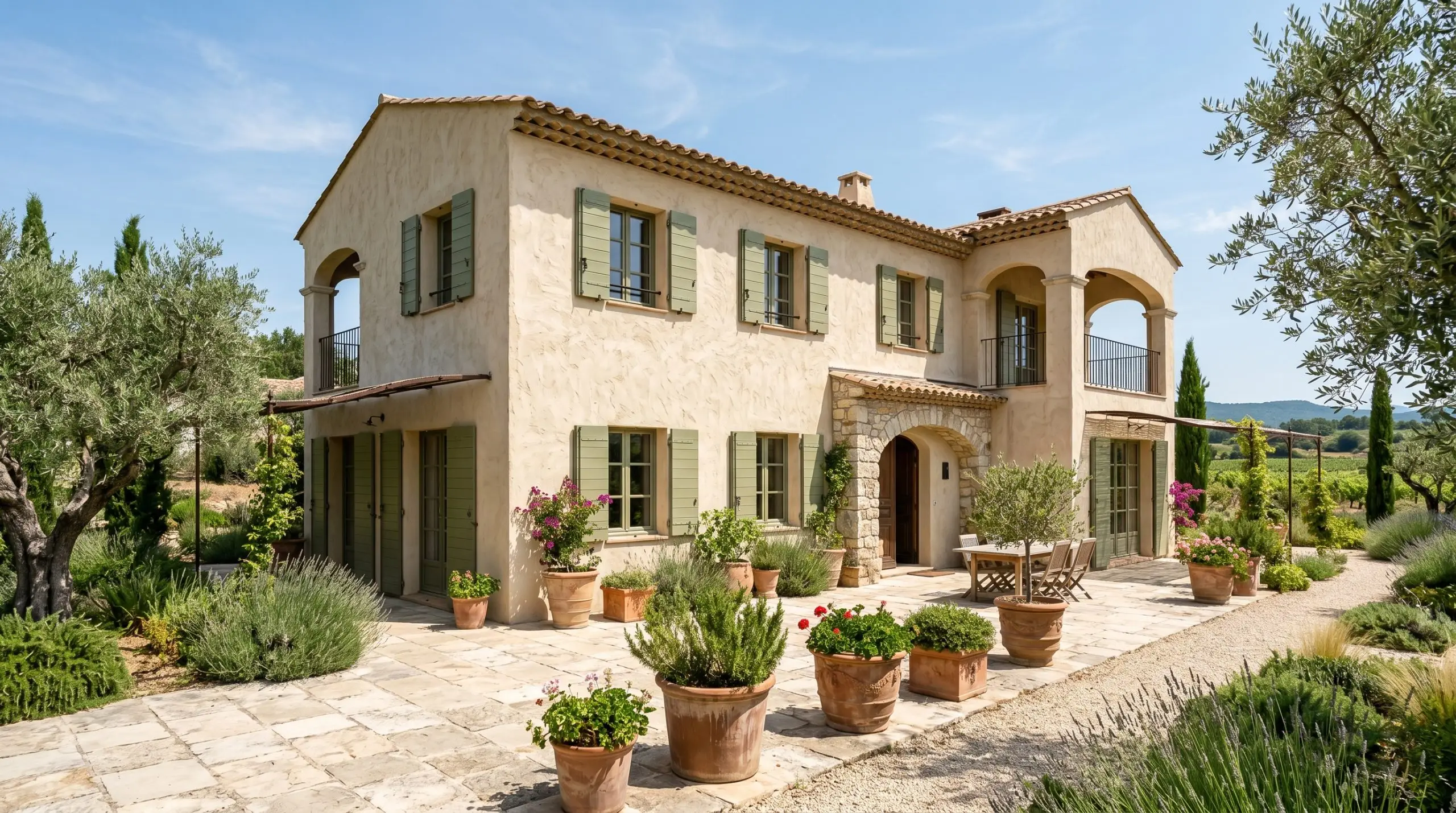
Outside, the intense exterior sunlight will wash out a significant portion of the pigment. On large stucco facades, it reads as an elegant, sun-bleached stone rather than a true taupe.
Use it as a primary body color paired with muted olive shutters and terracotta planters for a Modern Mediterranean vibe. The greenery from surrounding olive trees or landscaping will beautifully complement the warm base of the paint.
If using it strictly as trim against a darker charcoal or navy siding, expect a soft, low-contrast transition rather than a stark white pop. This creates a much softer, more integrated exterior palette that feels highly custom.
Harmonizing with a Warm Off-White: Materials & Palettes
This specific pigment requires careful pairing to either amplify its cozy nature or sharpen its modern edge. Rather than fading into the background, this muted taupe actively interacts with the textures and tones placed next to it. When positioned alongside rich materials, it acts as a luminous, structural backdrop that makes secondary colors pop.
Architectural Trim & Baseboards
Selecting the right trim color dictates whether your walls will feel softly atmospheric or cleanly tailored.
Tactile Finishes & Hardware
Grounding a soft, adaptable wall color requires introducing intentional, tactile textures. The goal is to create a visual dialogue between the smooth architectural finish of the paint and the raw materials in the room.
The Curated Color Palette
Curated Room Aesthetics
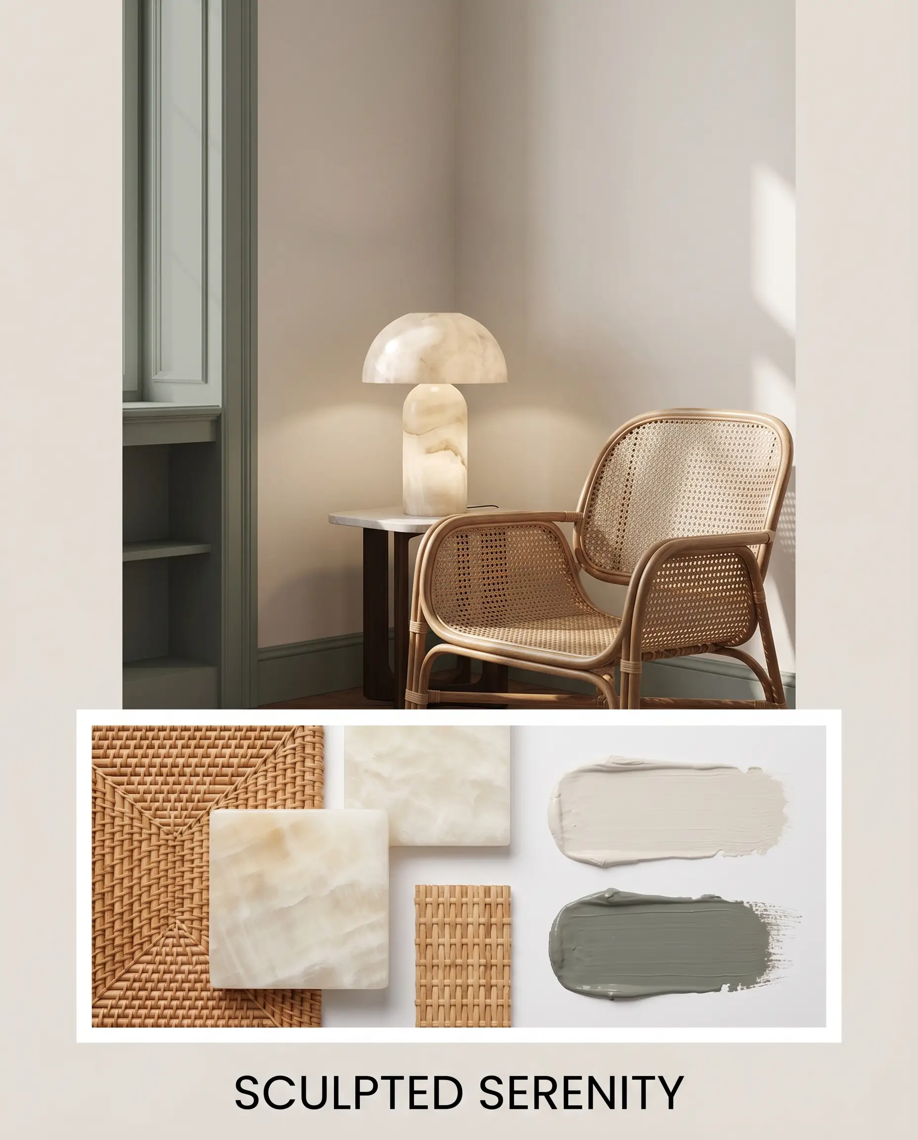
Sculpted Serenity This aesthetic relies on organic textures to create a calming, restorative environment that breathes easily. The walls provide a soft, luminous shell that beautifully highlights a woven rattan accent chair and a striking alabaster table lamp. By incorporating accents painted in Sherwin-Williams Retreat, the dusty green notes introduce a natural, grounding energy that keeps the room feeling fresh and balanced.
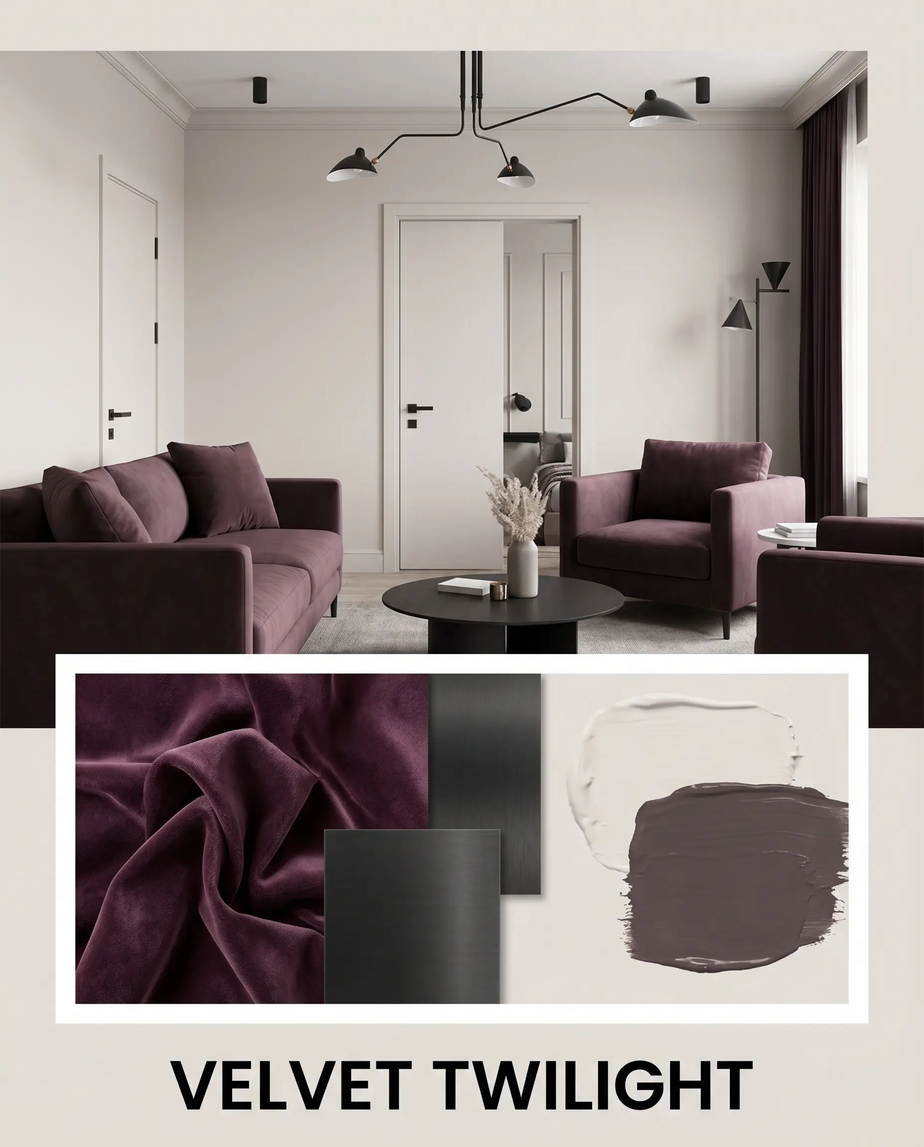
Velvet Twilight For a moodier, highly sophisticated energy, this palette leans into the paint’s hidden chromatic profile. The off-white walls serve as a quiet backdrop for plush seating upholstered in Benjamin Moore Vintage Wine, pulling those subtle violet notes to the forefront. Layering in matte black steel hardware adds a sharp, graphic punch that prevents the rich plum tones from feeling overly traditional.
Sherwin-Williams Incredible White vs. Top Competitors
Sometimes a room’s specific ambient lighting or exterior exposure demands a slight pivot in your color strategy. If your space pulls too much purple or feels a bit too washed out, comparing similar shades side-by-side reveals the exact structural differences. These comparisons will help you confidently lock in the right choice for your specific architecture.
Sherwin-Williams Incredible White SW 7028 vs. Sherwin-Williams Agreeable Gray SW 7029
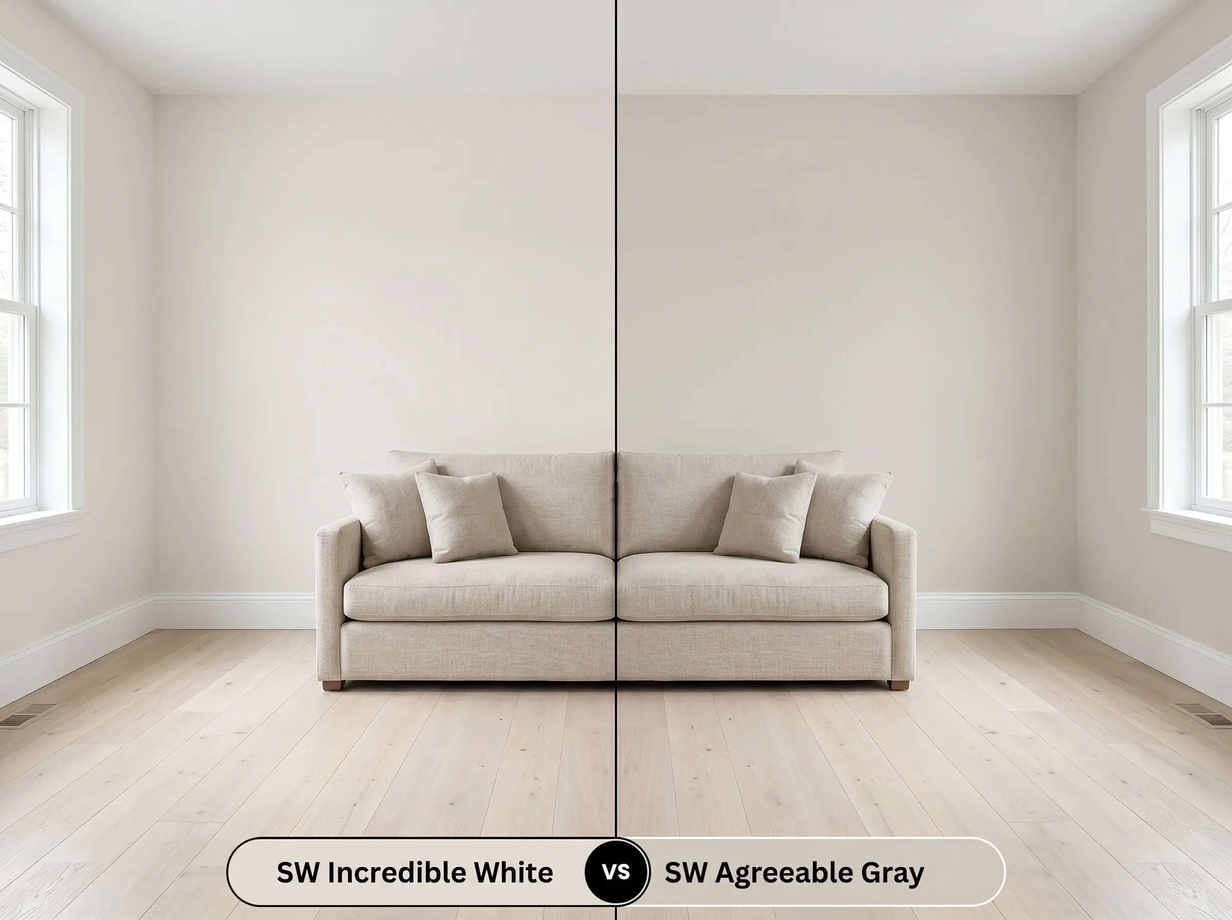
Agreeable Gray is significantly darker and carries a much stronger, warmer beige base. If you are painting a room that receives intense, flooding Southern light, Agreeable Gray holds its depth without washing out. However, if you want a brighter, airier read that bounces more light, SW 7028 is the superior choice.
Sherwin-Williams Incredible White SW 7028 vs. Sherwin-Williams Egret White SW 7570
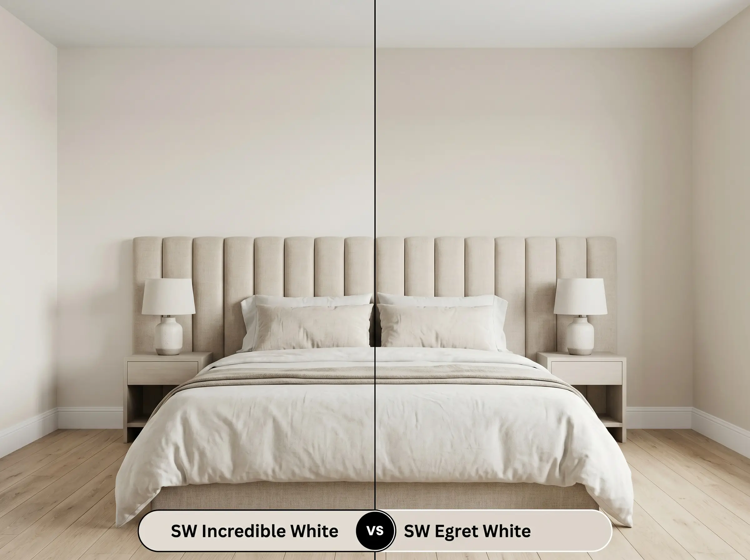
While both are light neutrals, Egret White contains a distinct pink/peach undertone rather than a violet one. If your room is bathed in cool Northern light, Egret White can sometimes read a bit fleshy on the walls. In those cooler exposures, Incredible White’s violet structure remains far more sophisticated and stable.
Sherwin-Williams Incredible White SW 7028 vs. Benjamin Moore Pale Oak OC-20
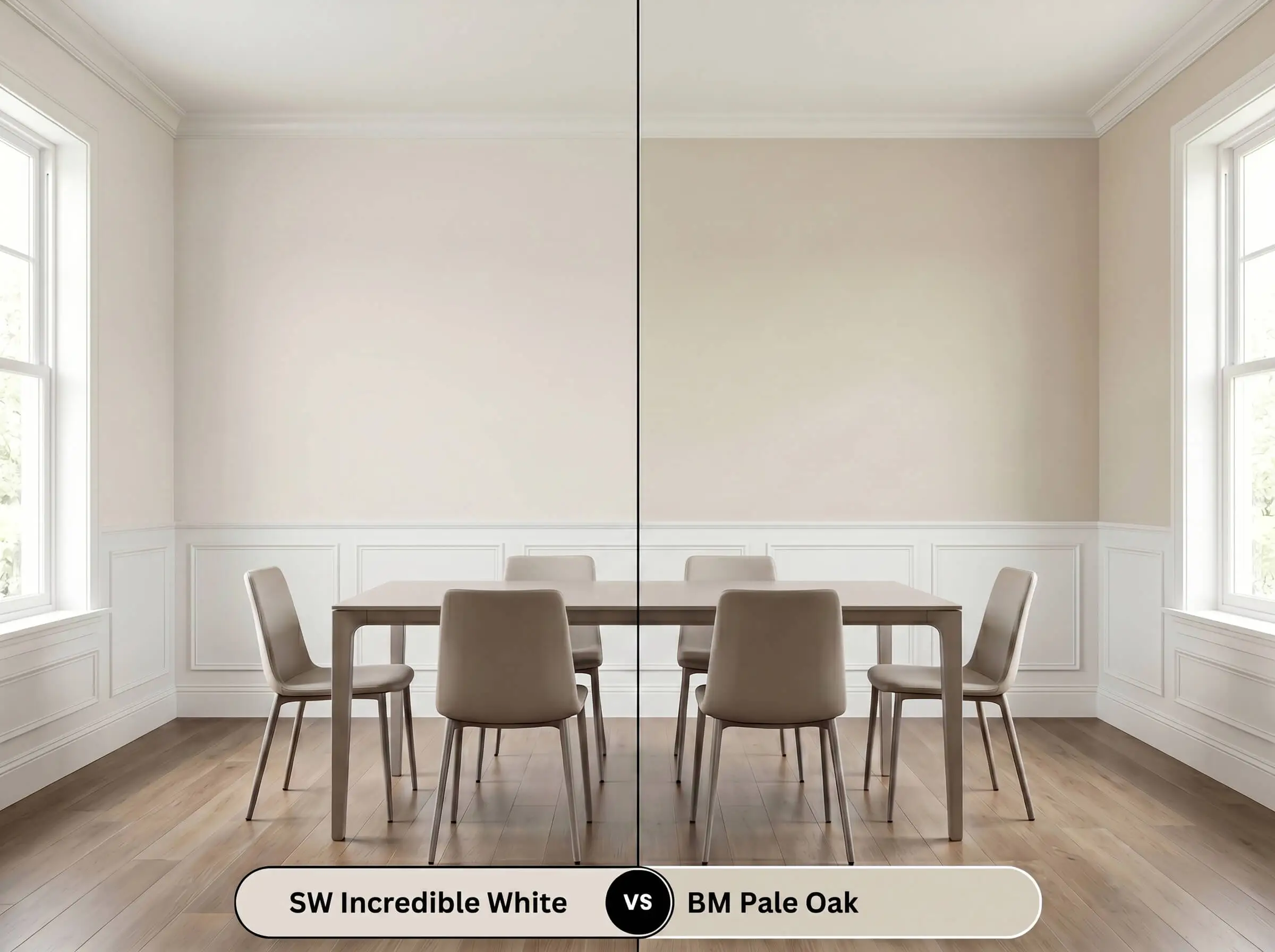
Pale Oak is a beloved neutral, but it is notoriously shifty, featuring a yellow-green undertone base. If your windows face a lush backyard, Pale Oak will often reflect that greenery and flash a sickly yellow. To avoid any green color temperature shift, Incredible White’s violet DNA provides a much cleaner, safer alternative.
Exploring the Chromatic Profile: Alternatives & Matches
Whether you are dealing with local supply chain shortages or simply need a microscopic shift in depth, finding an alternative is a common design hurdle. Here are the closest matches that share a similar structural DNA.
Same-Brand Alternatives
Competitor Color Matches
Executing the Architectural Finish: Paint Application
Moving from a tiny color swatch to a fully painted room requires understanding how this specific finish behaves on the roller. The right application strategy ensures your final result looks intentional and professional.
Primer Strategy Because this is a relatively light shade, a standard high-quality white primer is usually sufficient for new drywall. However, if you are painting over a dark, saturated color like navy or crimson, a tinted primer is mandatory. Failing to block out dark colors will manipulate the delicate taupe base, ruining the final aesthetic.
Coverage & Success Tips To achieve the true, rich color structure of this paint, you must plan for two full, even coats. Rolling only one coat often leads to “flashing,” where the old wall color peeks through in streaky, uneven patches.
Because of its complex undertones, this color is notoriously difficult to touch up later without leaving visible marks. Always keep a small amount of the original, well-mixed batch for future scuffs, and apply it with a feathering technique rather than a heavy brush stroke.
Hackrea Pro-Tip (The Touch-Up Rule)
Frequently Asked Questions
Because red-toned woods naturally carry strong orange and crimson pigments, they can aggressively fight with the cool violet notes in this paint. To successfully integrate mahogany, you must bridge the gap by layering in neutral textiles like washed linen or light gray rugs to soften the transition.
High-quality exterior acrylic formulations of this shade handle humidity beautifully, but the intense outdoor sun will significantly wash out its depth. On a large stucco facade, it will read much closer to a brilliant, slightly warm white rather than a true taupe.
Using this shade on the ceiling is a brilliant strategy for rooms flooded with green light from outdoor trees. Its hidden violet structure acts as a natural color corrector, absorbing and neutralizing the green reflections so the room feels balanced rather than sickly.
In a space entirely dependent on 3000K artificial lighting, the paint’s color temperature stabilizes into a very predictable, soft mushroom tone. The balanced light suppresses the purple flash, allowing the warm greige base to dominate and keep the basement feeling cozy.
The Final Verdict on SW Incredible White
Sherwin-Williams Incredible White is a masterclass in subtle, sophisticated color design. Its greatest strength lies in its ability to act as a luminous, warm off-white while retaining enough structural depth to contrast beautifully against pure white trim. This paint is absolutely perfect for homeowners seeking a soft, airy atmosphere who want to avoid the sterile, clinical feeling of standard builder-grade whites. It flawlessly upgrades Parisian Modern bedrooms, Soft Minimalist living spaces, and transitional kitchens.
While this shade is incredibly versatile, you must be extremely careful when pairing it with aggressively yellow or orange finishes. Golden oak floors, honey-toned trim, or bright yellow decor will violently clash with the paint’s hidden violet DNA. This abrasive interaction forces the wall color to look muddy, dirty, and confused. If your home features prominent yellow-toned woods that you cannot change, you will be much better served by a warmer, cream-based neutral.
Hackrea Design Secret (The Undertone Clash)