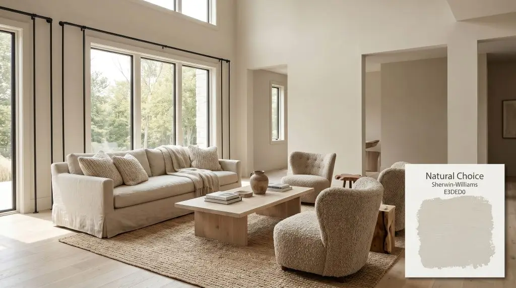
Natural Choice SW 7011
Sherwin-WilliamsSherwin-Williams Natural Choice (SW 7011) is a warm, creamy off-white paint color with subtle beige and yellow undertones, balanced by a faint hint of gray. With an LRV of 73, it serves as an inviting, versatile neutral for both interiors and exteriors.
Paint Technical Profile
| Color ID / SKU | SW 7011 |
| HEX Code | #E3DED0 |
| Light Reflectance (LRV) | 73 |
| Use | Interior, Exterior |
| Best Exposures | North, South, East |
| Best For | Living Rooms, Kitchen Cabinets, Exteriors, Hallways |
Sherwin-Williams Natural Choice: The Soft Architectural Neutral That Warms Up Rigid Spaces
The hunt for a livable off-white usually ends in one of two frustrations: a shade that turns icy the moment the sun goes down, or one that leans so aggressively into yellow that it instantly feels dated. Sherwin-Williams Natural Choice (SW 7011) completely bypasses both of these traps. This specific pigment is formulated to wrap a room in a soft, welcoming glow while maintaining enough structural crispness to feel incredibly current.
Whether you are trying to soften the harsh angles of a contemporary loft or update a classic suburban living room, this warm off-white acts as the ultimate foundational layer. It provides a quiet sophistication that allows your furniture, textiles, and art to take center stage.
Sherwin-Williams Natural Choice: Undertones & LRV
If you are wondering whether Sherwin-Williams Natural Choice is warm or cool, the answer is a definitive, unapologetic warm. However, it completely avoids the overly saturated, buttery tones found in older, traditional paints. Instead, its chromatic profile is carefully balanced to feel like a high-end, creamy neutral.
With a light reflectance value (LRV) of exactly 73, this architectural finish sits in the perfect mid-to-light sweet spot. It bounces plenty of illumination around the room to make spaces feel expansive and breathable. Yet, it retains enough physical pigment to contrast beautifully against pure white trim without washing out into a stark, clinical tint.
The Lighting Shift: Adapting to Sun and Shadows
Because this paint relies on that hidden gray cast to stabilize its beige and yellow notes, it acts like a subtle mood ring throughout the day. The color structure physically responds to the changing temperature of the sun, meaning the shade you see at breakfast will look noticeably different by dinner.
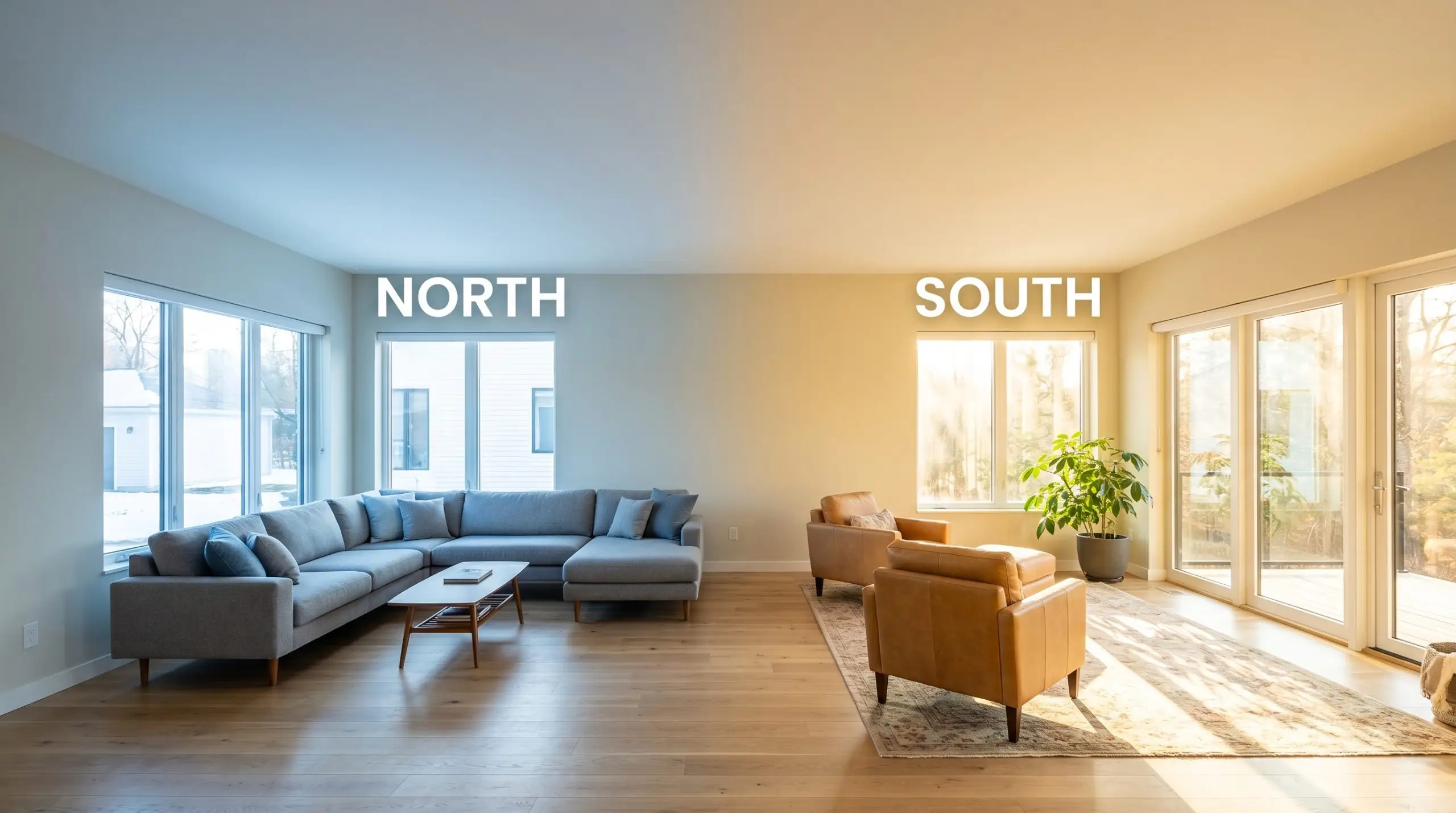
If your room faces north and you want to counteract that cooler greige shift at night, swap your standard ceiling bulbs for 3000K soft white LEDs. This specific temperature restores the paint’s natural warmth without turning your lamps into harsh, orange spotlights.
Hackrea Pro-Tip (The Bulb Strategy)
Where to Use This Creamy Neutral
Understanding the technical data is only half the battle; the true magic happens when you apply this creamy neutral to real-world architecture. Because SW 7011 is so adaptable, it serves as the perfect backdrop for a massive variety of styling choices. It effortlessly transitions from tactile, organic textures to sleek, high-contrast metals.
Living Rooms
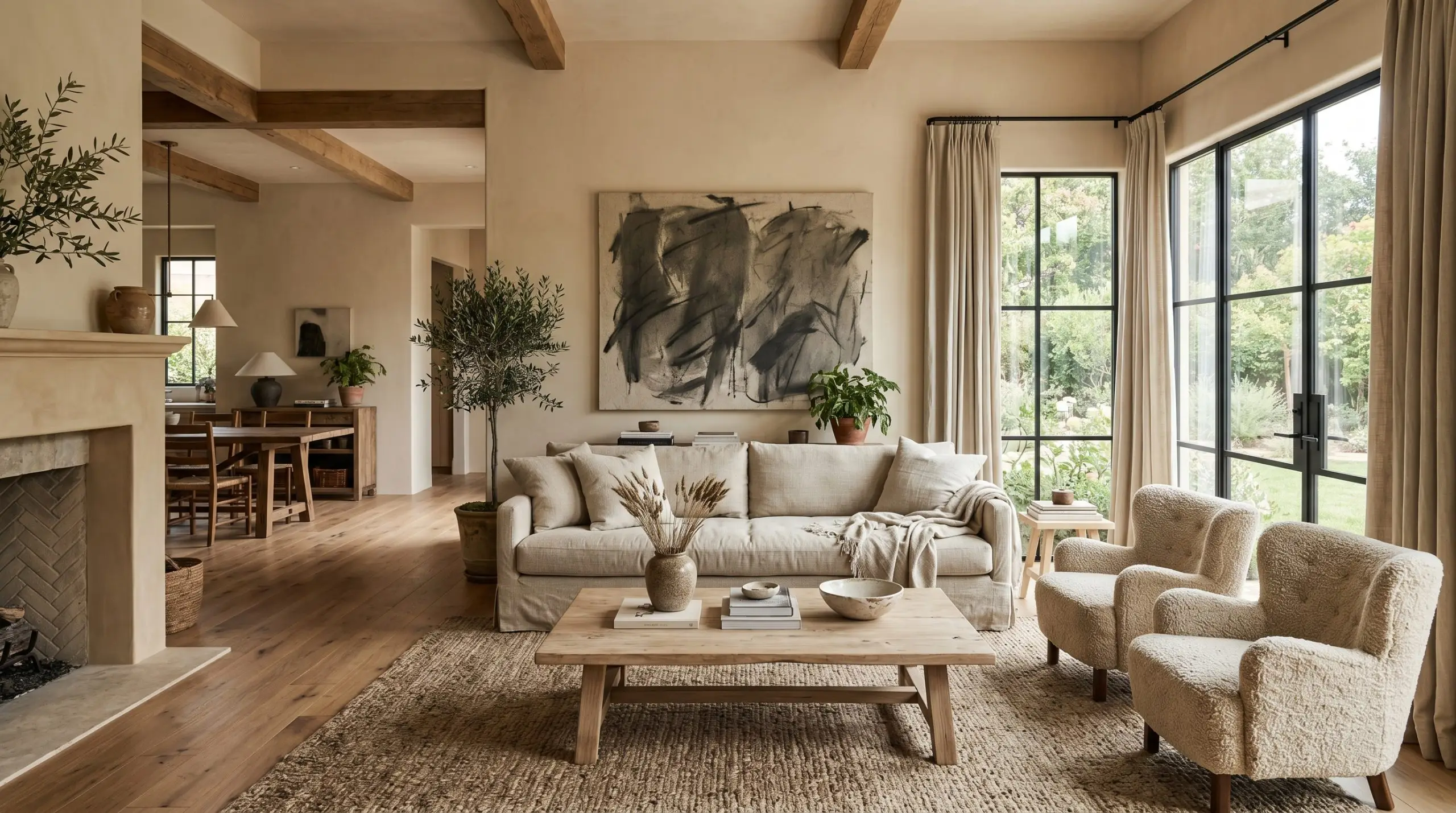
In a living space, this shade excels at softening the rigid edges of modern furniture. Pair it with tactile fabrics like nubby wool armchairs, a linen slipcovered sofa, and a bleached oak coffee table to create an incredibly serene, organic modern retreat. To prevent the room from feeling too quiet, introduce moments of sharp contrast through matte black iron curtain rods or an oversized, abstract charcoal canvas.
If you have a young, active household, this hue is forgiving enough to hide everyday scuffs much better than a stark, gallery-white wall. The subtle warmth ensures the room feels lived-in and comfortable, rather than precious or unapproachable.
Kitchen Cabinets
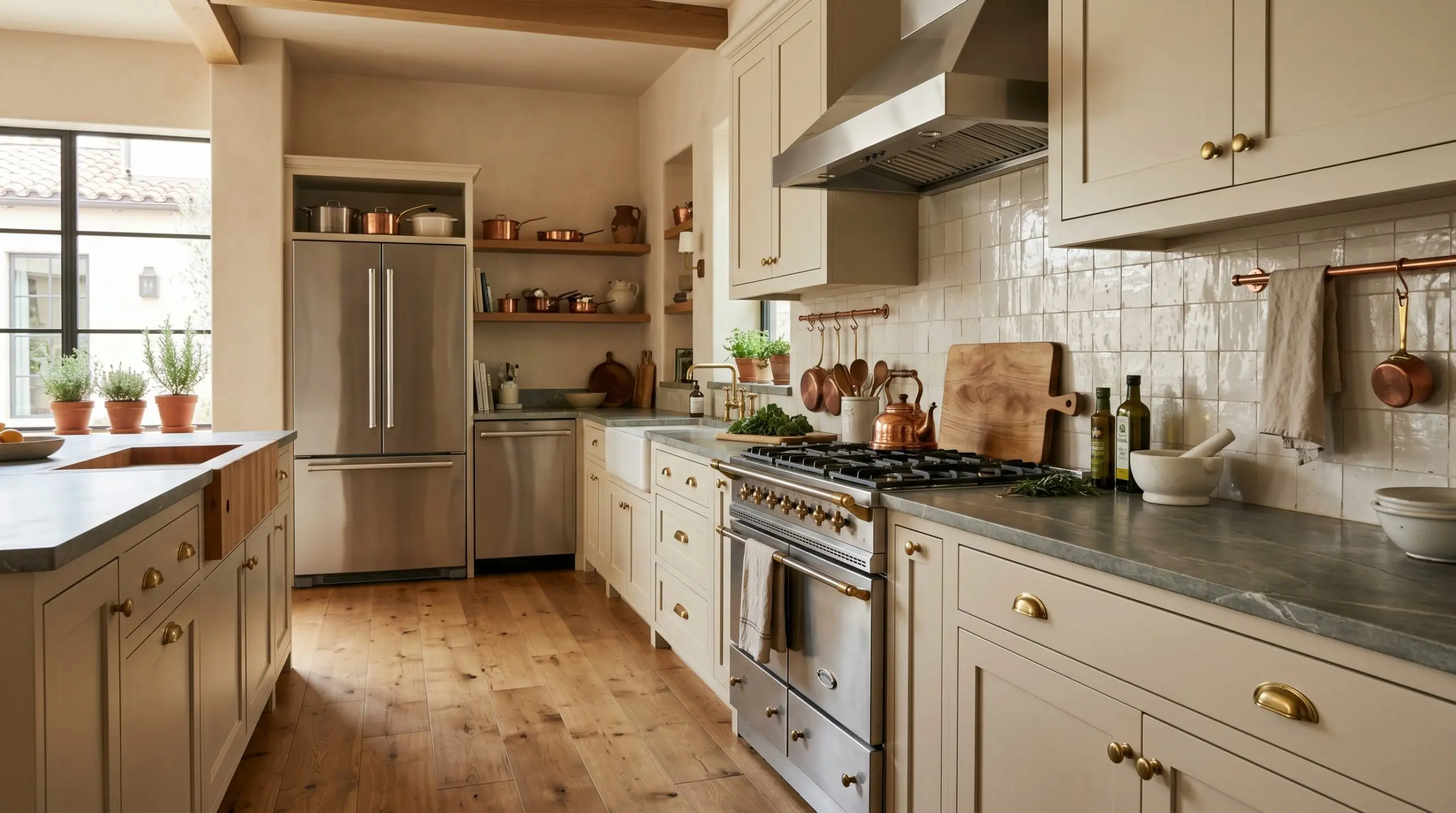
Taking this color off the walls and applying it to cabinetry instantly elevates a standard kitchen into a bespoke, European-inspired culinary space. The subtle beige undertones pair flawlessly with unlacquered brass hardware, allowing the metals to shine without clashing against a cold background. For a beautifully layered look, contrast the warm cabinetry with a honed soapstone countertop or a glossy, irregular zellige tile backsplash.
Be incredibly careful if your kitchen features standard, bright white appliances. Because Natural Choice has a distinct yellow-beige base, placing it directly next to stark white plastic or enamel will make the cabinets look slightly dingy and the appliances look harsh. Always bridge the gap with stainless steel or panel-ready options if possible.
Clash Warning (The White Appliance Trap)
Exterior Body
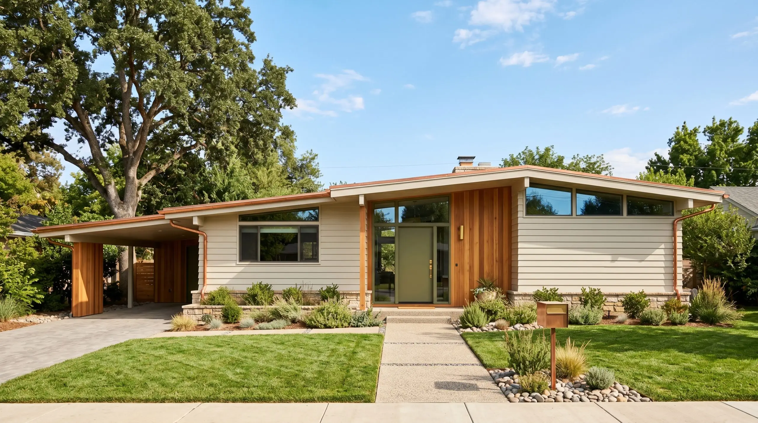
When taken outside, the intense wash of direct sunlight will strip away some of the paint’s depth, making it read significantly lighter than it does indoors. As an exterior body color, it provides a gorgeous, sun-baked warmth that works brilliantly on updated mid-century facades or modern coastal homes. Pair the creamy siding with natural cedar architectural accents, copper gutters, and a muted olive green front door for a welcoming, curated curb appeal.
Hallways and Entryways
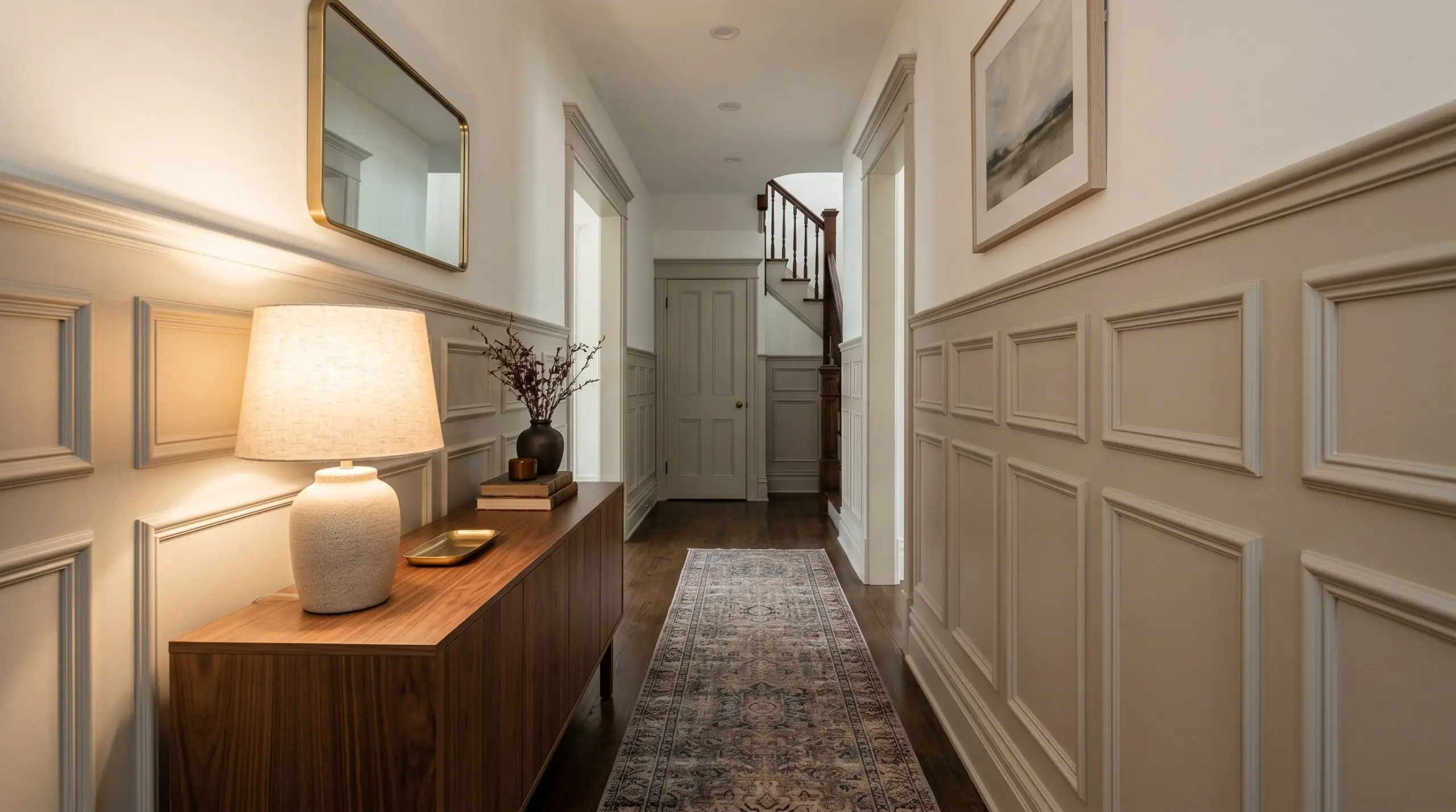
Transitional spaces often lack natural light, which allows the subtle gray cast in this paint to step forward. Use this to your advantage by installing picture frame molding or tall wainscoting along the corridor. The shadows caught in the millwork will highlight the color’s complexity, turning a boring pass-through into a sophisticated design moment.
Style the entryway with a vintage runner rug, a sleek walnut console, and a warm ceramic table lamp. This combination welcomes guests with an immediate sense of calm the moment they walk through the front door.
Open-Concept Spaces
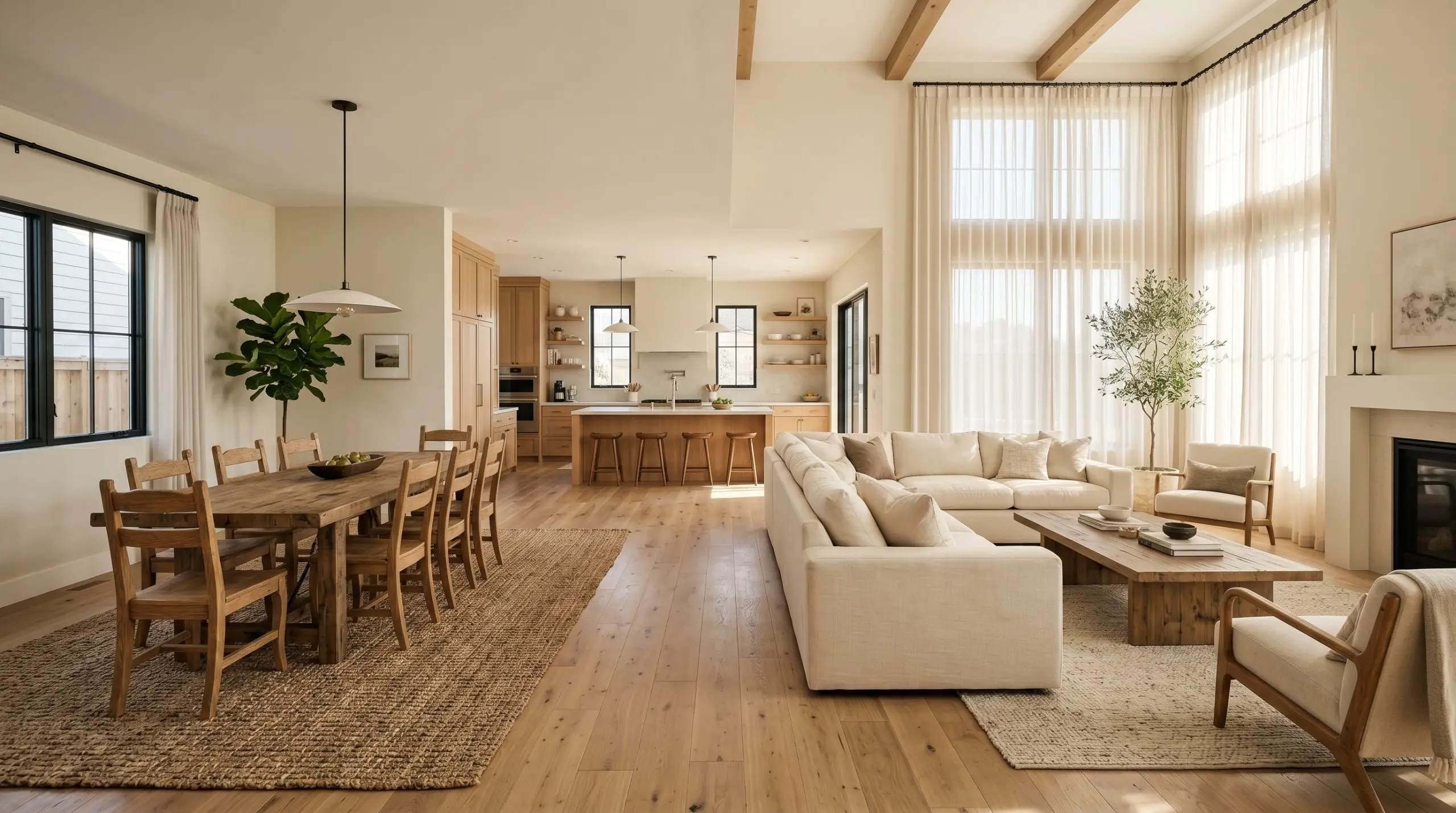
For homes with sprawling, open floor plans, finding a single shade that unifies the living, dining, and kitchen areas can be incredibly stressful. This hue acts as the ultimate unifying thread, bouncing ample light across the expansive square footage while maintaining a cozy, intimate atmosphere.
To define different zones within the open layout, use varied textures—like a chunky jute rug in the dining area and sweeping, sheer cotton drapery in the living space—all set against the same creamy backdrop. This ensures the entire floor feels cohesive, intentional, and effortlessly stylish.
Coordinating Colors & Material Pairings for Natural Choice
This creamy neutral thrives on gentle contrast, requiring accent tones and textures that either pull out its hidden gray depth or lean into its sunlit warmth. Rather than demanding sharp, high-definition boundaries, this specific pigment prefers soft tonal bleeds and organic transitions to feel truly cohesive.
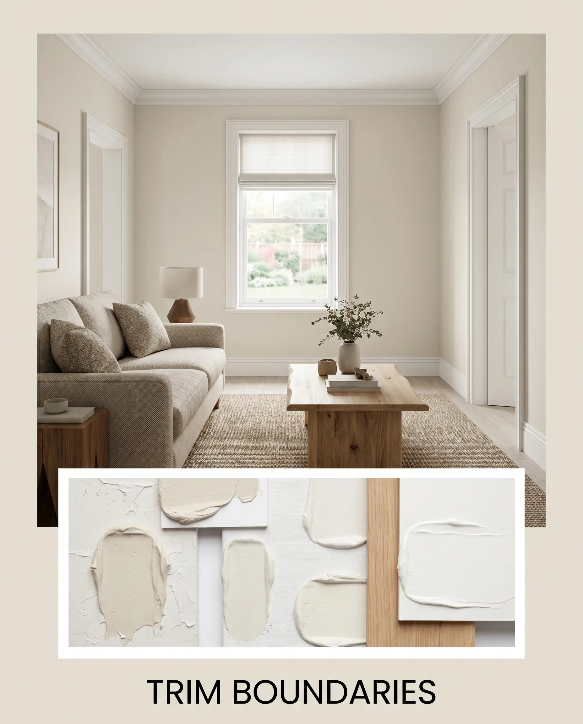
Crafting the Perfect Trim Boundary
When selecting a trim, the goal is to provide enough crispness to frame the wall without introducing a stark, icy clash. Sherwin-Williams Pure White SW 7005 is the ultimate companion, as its microscopic drop of black pigment softens the transition and allows the wall color to glow naturally.
If you prefer a slightly softer, more atmospheric boundary, Benjamin Moore White Dove OC-17 shares a similar warm undertone that creates a seamless, melted-together look. For a highly tailored contrast, Farrow & Ball All White No.2005 strips away all yellow, providing a razor-sharp edge that makes the main off-white feel incredibly intentional.
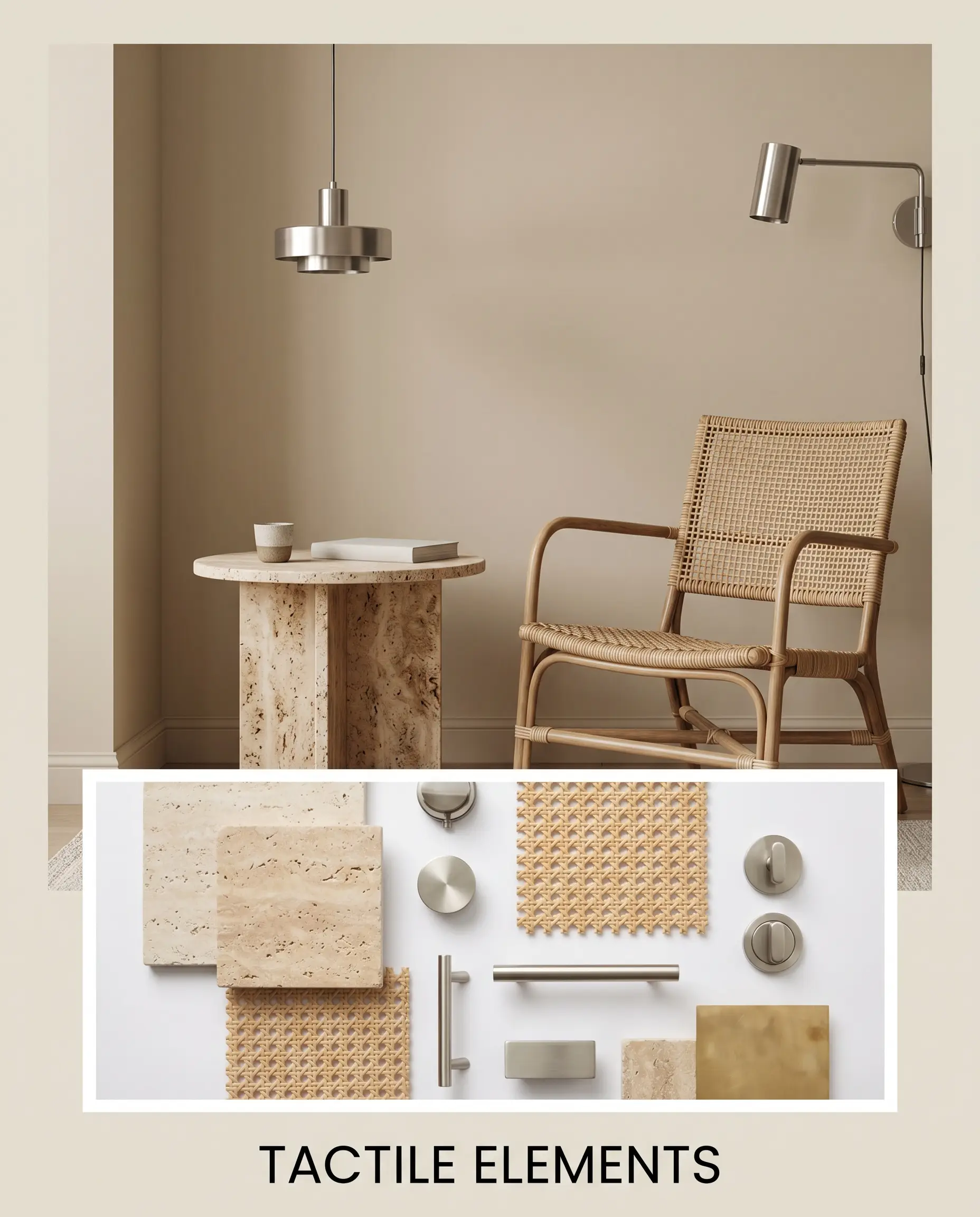
Tactile Elements and Hardware Finishes
The underlying color structure of this warm off-white craves materials that enhance its inviting energy.
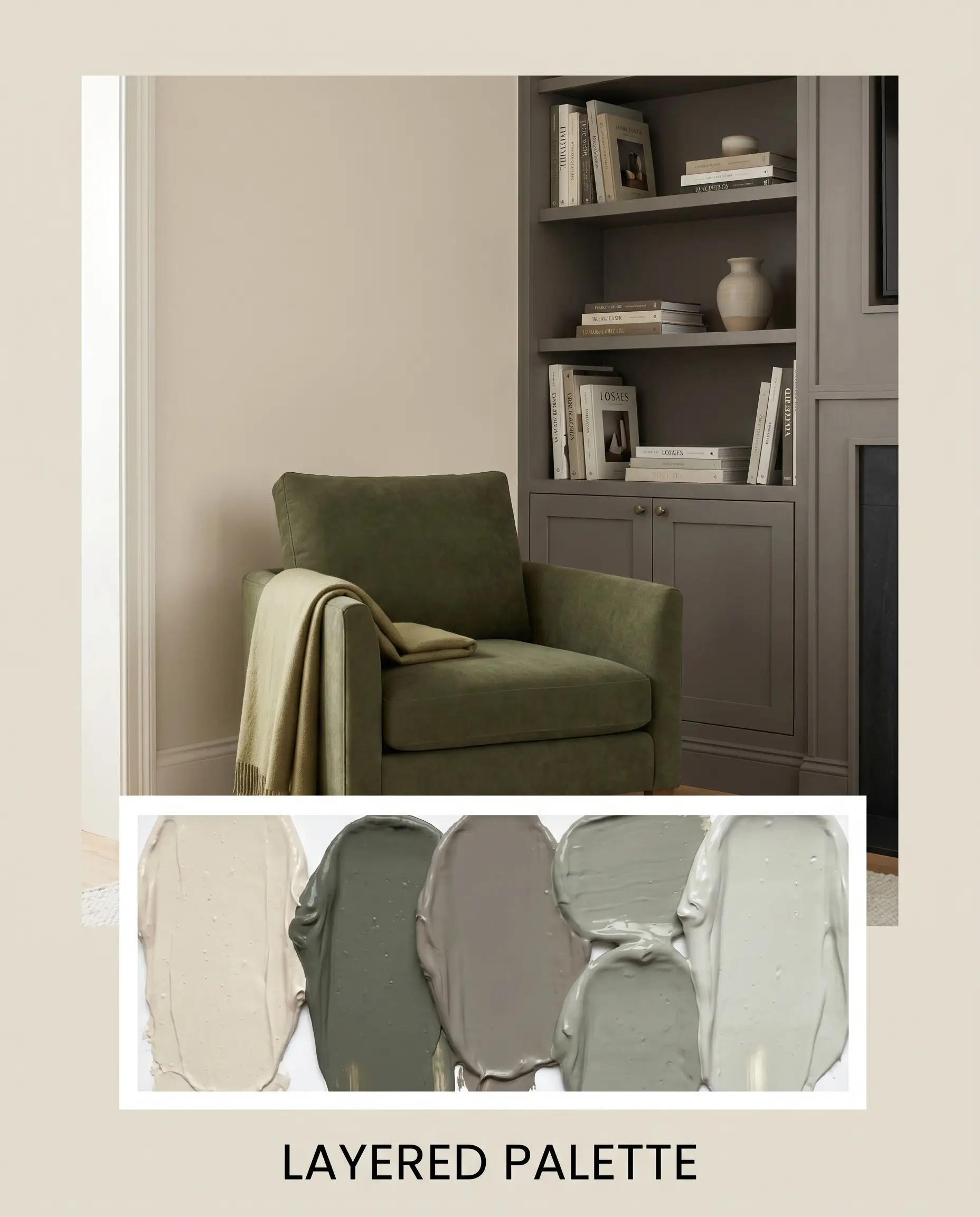
Accent Palettes for a Layered Space
Building a palette around this versatile shade means playing with its subtle greige shift and warm base.
Curated Styling Concepts
These styling concepts illustrate how to manipulate the paint’s vibe by layering specific textures, accent colors, and hardware.
The Tactile Minimalist This aesthetic uses the creamy backdrop to warm up sleek, low-profile silhouettes. Anchor the space with a travertine coffee table and brushed nickel lighting fixtures to activate the paint’s subtle gray cast. Layer in washed linen textiles and a single, structural accent chair to create a serene, uncluttered environment that still feels incredibly inviting.
Earth & Iron A beautiful tension emerges when you pair the soft, glowing walls with substantial, rooting elements. Incorporate matte black iron curtain rods and deep Benjamin Moore Chelsea Gray millwork to establish firm architectural boundaries. Add unlacquered brass cabinet hardware and vintage pottery to infuse the space with a lived-in, curated history.
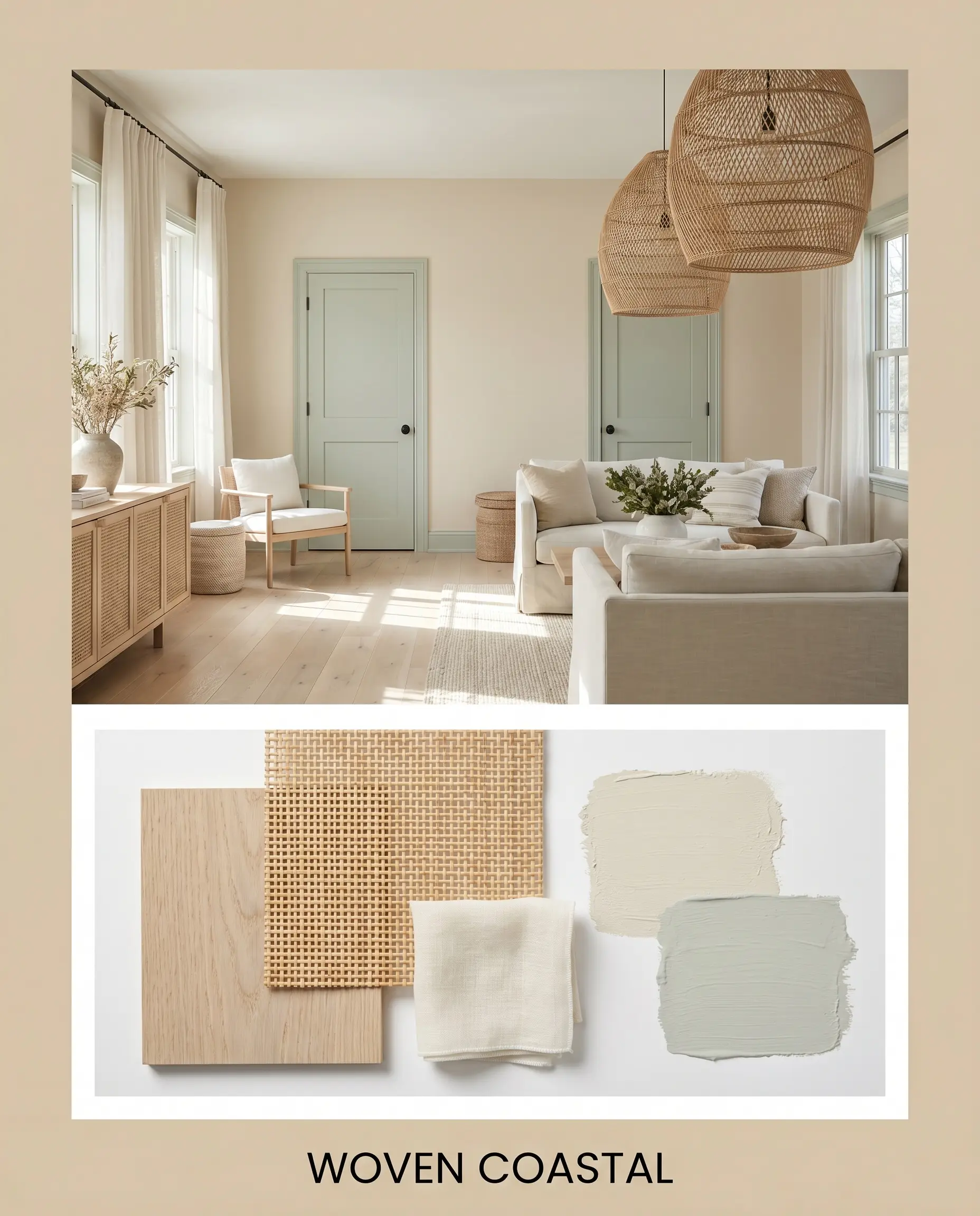
Woven Coastal This concept strips away coastal clichés, focusing instead on breezy, organic textures. Frame the room with Sherwin-Williams Sea Salt on interior doors or window sashes to introduce a gentle, cooling breeze against the warm walls. Finish the look with oversized rattan pendants, sheer cotton drapery, and bleached oak flooring for a relaxed, sun-drenched retreat.
Natural Choice Head-to-Head Paint Comparisons
Sometimes the perfect color on a swatch falls flat once it interacts with your specific lighting or exterior exposure. If your room faces a direction that dramatically alters the paint’s core undertones, you may need to pivot to a rival shade to achieve your desired aesthetic.
Sherwin-Williams Natural Choice vs. Sherwin-Williams Creamy SW 7012
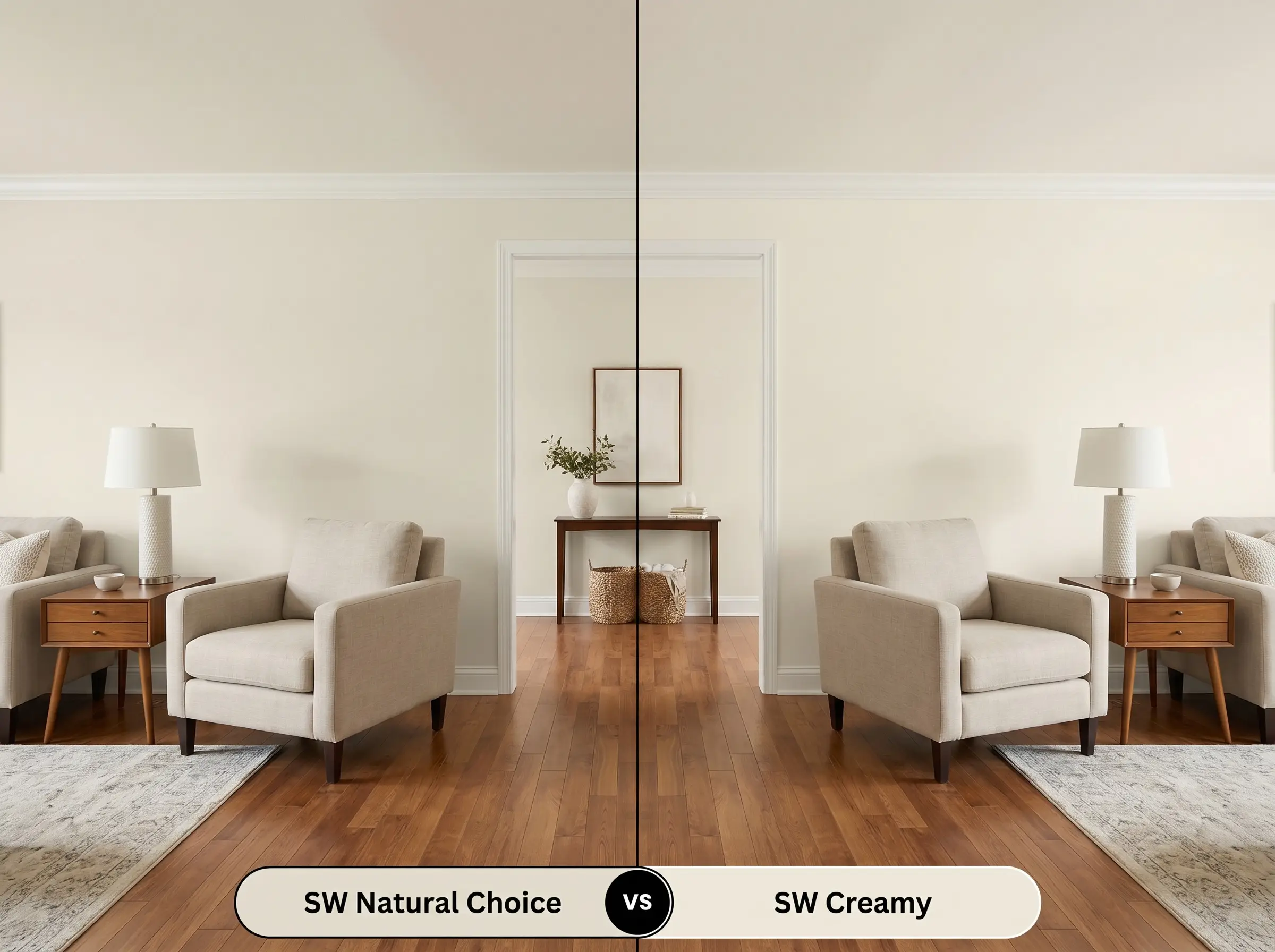
If you are designing a north-facing room where Natural Choice pulls too much gray, Creamy is your solution. Creamy lacks the stabilizing gray cast, leaning entirely into a smooth, buttery yellow base. Choose Creamy if you need to aggressively warm up a chilly space, but stick with Natural Choice if you want a more muted, adaptable neutral.
Sherwin-Williams Natural Choice vs. Sherwin-Williams Alabaster SW 7008
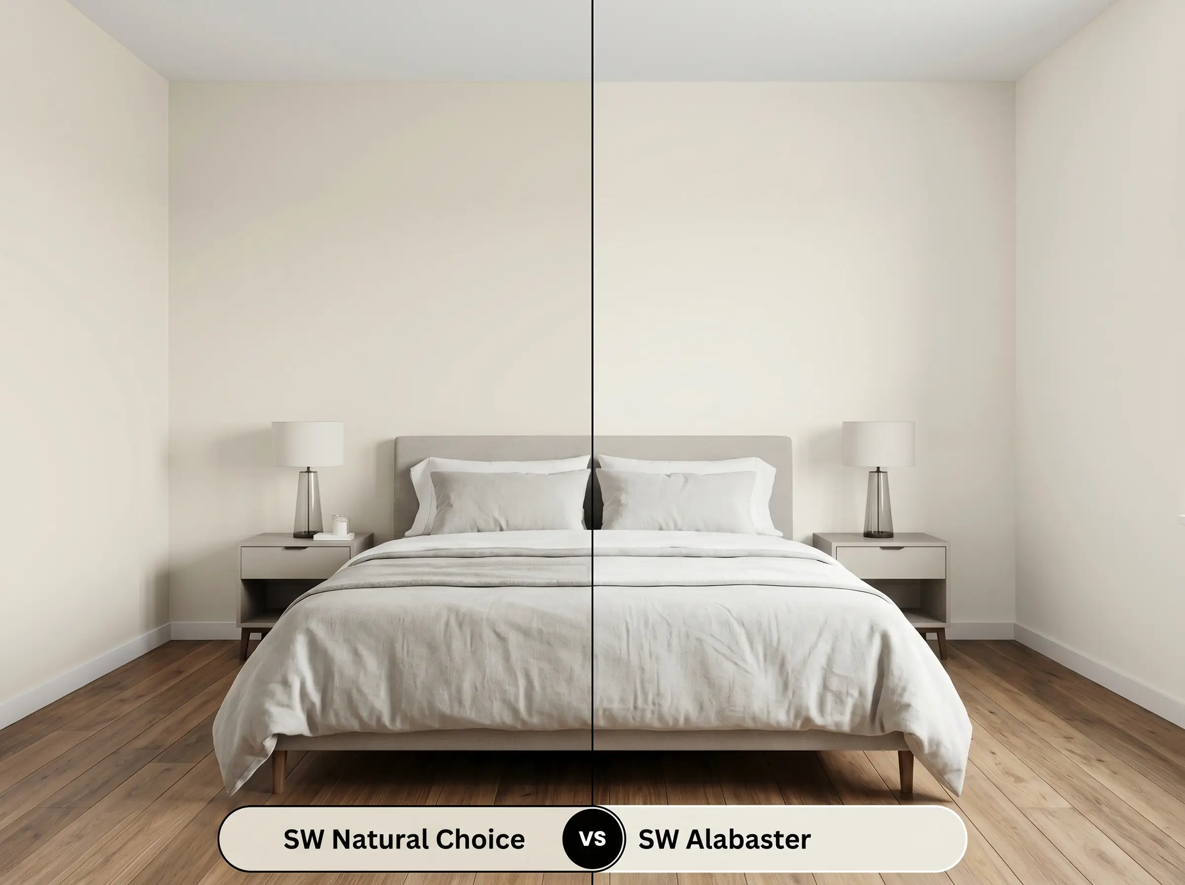
Alabaster boasts a higher LRV of 82, making it significantly brighter and more reflective. While Natural Choice acts as a distinct, creamy wall color, Alabaster reads much closer to a true white with a soft, warm glow. If your room is starved for natural light and needs a luminous lift, Alabaster is the better candidate.
Sherwin-Williams Natural Choice vs. Sherwin-Williams Shoji White SW 7042
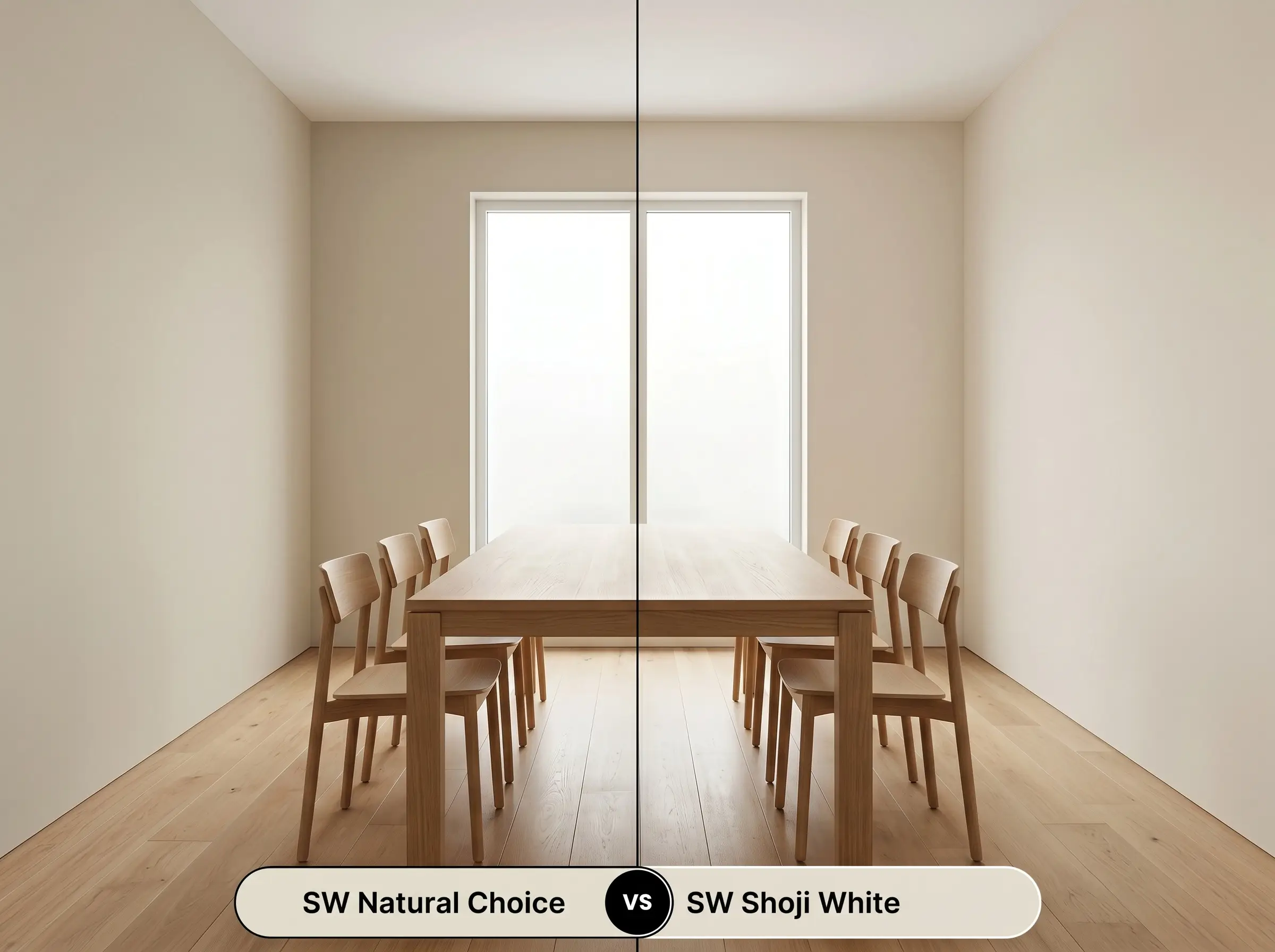
Shoji White pushes further into greige territory, carrying a more prominent green-gray undertone. If you are pairing your walls with cool-toned stones or intensely veined marble, Shoji White will harmonize beautifully where Natural Choice might clash. However, if you want a sunnier, more traditional beige warmth, SW 7011 remains the superior pick.
Exploring Alternative Paint Matches
Whether you need a slight shift in depth to accommodate a dark hallway or you are bound to a different paint manufacturer, finding the right alternative is crucial. These selections offer similar foundational warmth but with subtle, distinct variations.
Closest Matches Within the Sherwin-Williams Catalog
Rival Equivalents from Benjamin Moore and Behr
Bringing the Color to Life on the Wall
Transitioning from a theoretical mood board to a beautifully painted room requires strategic planning. The way this color reflects light depends entirely on the finish you choose and the preparation underneath.
Selecting the Right Finish
Prepping and Painting for a Flawless Result
Because this is a lighter hue with an LRV of 73, a high-quality, white-tinted primer is absolutely essential if you are covering a dark or vibrant wall. Without primer, the old color will bleed through and distort the delicate beige and gray balance. Expect to roll two full coats for a professional, opaque finish.
> Hackrea Design Secret (Avoiding the Flashing Trap): When touching up scuffs on an eggshell or satin wall, never use a brush if the original coat was rolled. The difference in texture will catch the light and create a visible “flash” mark; always use a small foam roller to feather the touch-up perfectly into the surrounding paint.
Frequently Asked Questions
Because of its balanced gray cast, it typically avoids looking like a glaring, dated yellow. However, in spaces with zero natural light, you must use 3000K to 3500K LED bulbs to maintain its creamy, sophisticated glow and prevent it from falling flat.
Textured stucco casts thousands of tiny shadows, which will pull forward the paint’s gray undertones and make it look slightly darker and more muted. On smooth siding, the sun hits it directly, washing it out into a brilliant, warm off-white.
The beige base in this paint actually harmonizes beautifully with the warmth of honey oak. It provides a soft, tonal transition rather than the harsh, jarring contrast you would get from a pure, icy white wall.
No, 3000K lighting is the sweet spot for this hue. This temperature actually neutralizes the gray and amplifies the cozy beige notes, giving the room a welcoming, sunlit feeling even at night.
The Final Verdict on This Warm Off-White
Sherwin-Williams Natural Choice is the ultimate foundational layer for homeowners who want a bright, expansive space without sacrificing warmth. It complements open-concept floor plans, organic modern living rooms, and inviting entryways where its chameleon-like pigment can interact with tactile materials and shifting sunlight. This is the perfect selection for anyone looking to soften harsh architectural lines and create an effortlessly curated, lived-in atmosphere.
While this paint is incredibly versatile, you must proceed with caution if your home features fixed elements with stark, cool undertones. Pairing this creamy neutral directly against icy blue-gray carpets, stark white vinyl window frames, or intensely veined Carrara marble will create an immediate visual disconnect. The cool materials will force the paint’s beige base to read as muddy or unpleasantly yellow, while the warm walls will make your expensive stone look sterile. Always ensure your hard finishes share a hint of underlying warmth before committing to this shade.
Clash Warning (The Cool-Toned Conflict)
Closest Cross-Brand Equivalents
The absolute closest scientific color matches for Natural Choice across top paint brands.