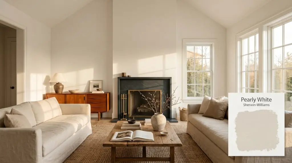
Pearly White SW 7009
Sherwin-WilliamsSherwin-Williams Pearly White (SW 7009) is a warm, complex off-white with an LRV of 77. It features a creamy base heavily softened by a gray modifier, often revealing a subtle green-beige micro-nuance that keeps it from looking overly yellow.
Paint Technical Profile
| Color ID / SKU | SW 7009 |
| HEX Code | #E8E3D9 |
| Light Reflectance (LRV) | 77 |
| Use | Interior, Exterior |
| Best Exposures | South, West |
| Best For | Living Rooms, Kitchen Cabinets, Exteriors |
Sherwin-Williams Pearly White: Mastering the Ultimate Complex Cream
Stark, glaring whites can quickly turn a beautifully furnished room into a sterile waiting area. If you are searching for a foundation that feels crisp but lives softly, you need a color with intentional structure. Sherwin-Williams Pearly White offers exactly that delicate balance.
This is not a flat, predictable neutral. SW 7009 operates as a highly sophisticated architectural finish, wrapping a room in subtle warmth while maintaining clean visual boundaries. It provides the brightness of a classic white but carries enough pigment to establish a genuine atmosphere.
By stepping away from icy modern tones, this shade allows your materials and textiles to shine. It acts as a quiet, supportive backdrop that makes raw woods look richer and metals feel more intentional.
Sherwin-Williams Pearly White: Undertones & LRV
When homeowners ask if Sherwin-Williams Pearly White is warm or cool, the answer is definitively warm. However, it is a highly refined warmth that avoids the aggressive yellow traps of older, traditional off-whites. Its beautiful color structure relies on a delicate balance of hidden pigments.
To understand how this complex cream behaves on your walls, we have to look at its core components:
With a light reflectance value (LRV) of 77, this warm off-white sits perfectly in the mid-to-high range. It bounces a significant amount of light around the room, keeping spaces feeling open and airy. Most importantly, it retains its chromatic profile even in bright rooms, refusing to wash out into a flat, blinding white.
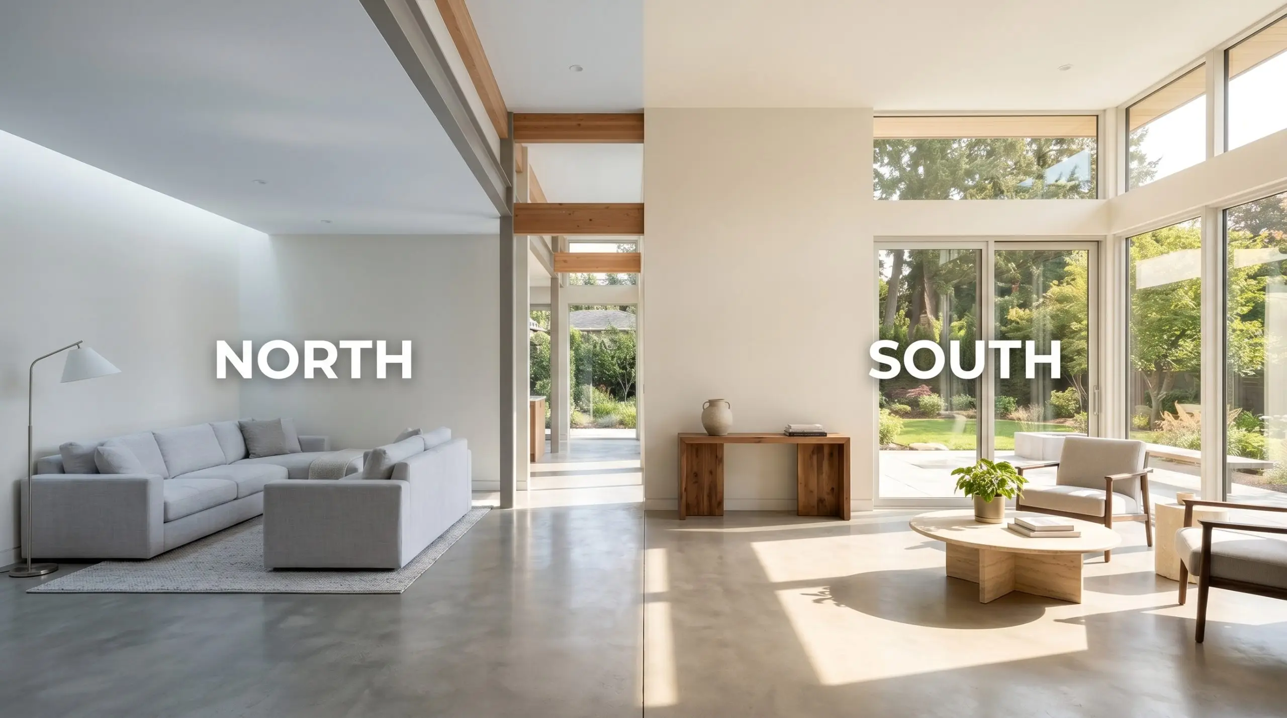
How Sunlight Alters This Muted Neutral
Because SW 7009 relies heavily on that subtle gray influence, it is highly reactive to the shifting sun. The direction of your windows will completely dictate which version of this muted neutral you experience throughout the day.
Here is exactly how the color physically shifts based on your light source:
If you want to maintain the soft, inviting nature of this cream at night, strictly avoid bulbs over 3000K. Crisp white ambient lighting will strip away the warmth, leaving the walls looking slightly muddy or unresolved.
Hackrea Pro-Tip (The Bulb Strategy)
Architectural Applications and Room Styling
The true value of this creamy off-white lies in its ability to adapt to almost any material palette you throw at it. Because it isn’t fighting for attention, you can use it to build incredibly diverse, highly textured spaces.
Here is how to maximize its potential across your floor plan.
Sunlit Living Areas and Vaulted Ceilings
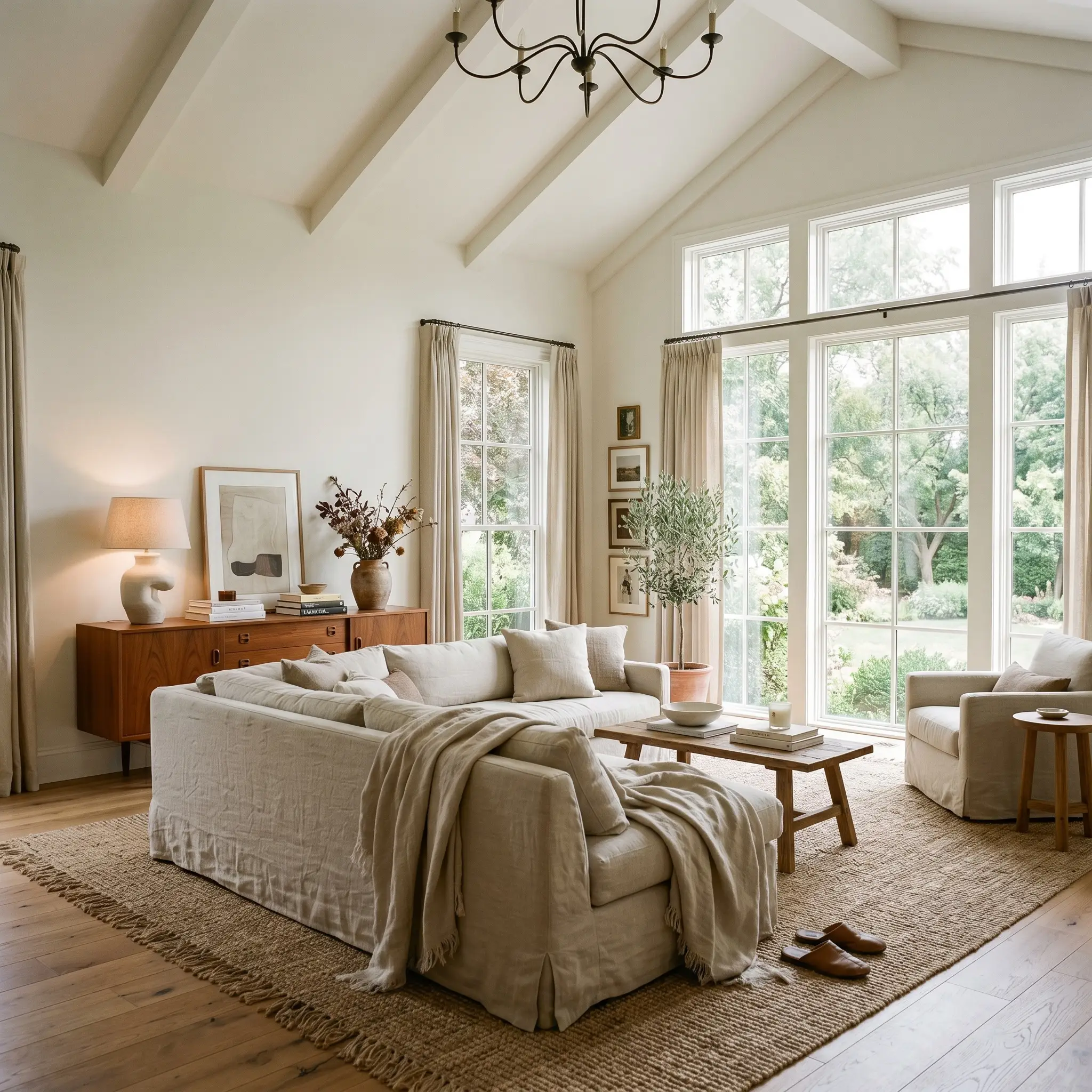
In living rooms with expansive windows or high ceilings, stark whites can create a glaring, uncomfortable echo. Pearly White secures the room, absorbing the bright light and softening the architectural edges. It creates a space that feels expansive but never sterile.
To push this color into a European transitional style, pair it with highly tactile, accessible materials. Layer the room with washed linen slipcovers, a jute rug, and a statement vintage teak credenza. The warmth of the paint highlights the natural grain of mid-century woods beautifully.
If you have architectural features like picture frame molding or a brick fireplace, consider color-drenching the entire room—walls, trim, and ceiling. This continuous application wraps the space in a seamless, velvet-like warmth that feels incredibly custom.
Elevated Cabinetry and Millwork
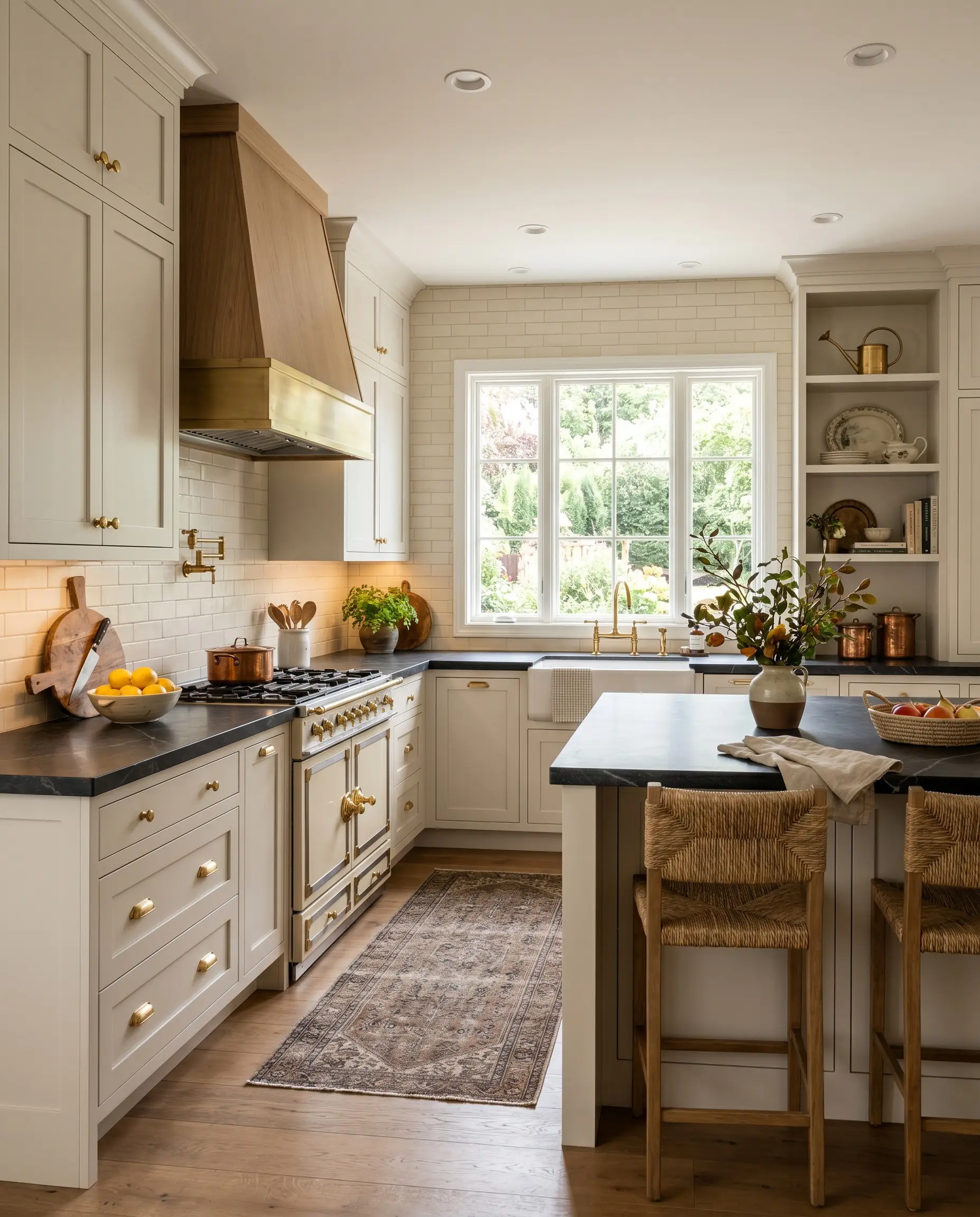
If you are renovating a kitchen and want to avoid the clinical feel of a pure white aesthetic, SW 7009 is a brilliant alternative for cabinetry. It provides the clean, fresh look of a white kitchen but carries enough depth to feel established and rich.
This shade is a masterclass in the high/low mix. You can install standard shaker cabinets painted in this soft cream, and then elevate the entire room by investing in unlacquered brass hardware and a premium soapstone countertop. The dark, matte charcoal of the soapstone creates a stunning, sophisticated contrast against the warm cabinetry.
For a softer industrial edge, pair the creamy cabinets with blackened steel fixtures and reeded glass upper doors. The subtle green-beige shadow in the paint naturally complements raw, utilitarian metals.
Serene Primary Retreats
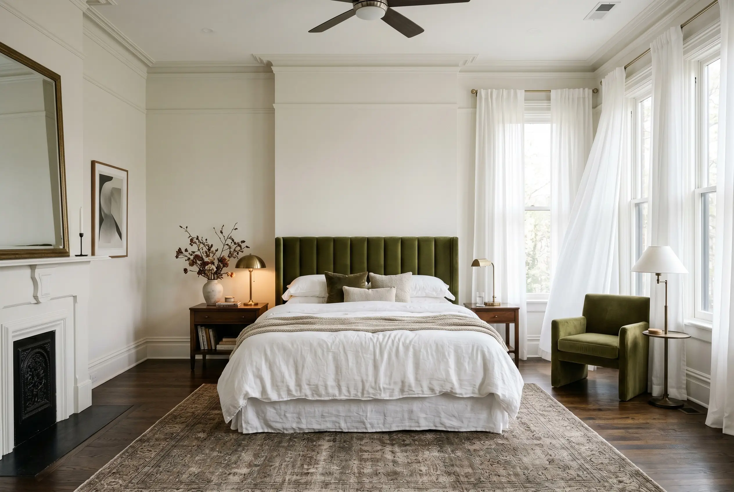
Bedrooms should be a sensory retreat, and this color provides a remarkably calming foundation. It steps back, allowing your textiles and furniture to dictate the mood of the room.
For a tailored, boutique hotel aesthetic, pair the painted walls with a rich, channel-tufted velvet headboard in deep plum or olive green. The muted yellow base of the paint makes jewel tones sing without feeling overly dramatic. Bring in crisp, sheer cotton drapery to filter the morning light.
In a bedroom, try painting your walls in a flat finish and your baseboards and crown molding in a satin finish of the exact same color. The subtle shift in sheen adds an expensive, architectural layer to the room without requiring a second paint color.
Hackrea Design Secret (The Trim Trick)
Facades, Siding, and Exterior Brick
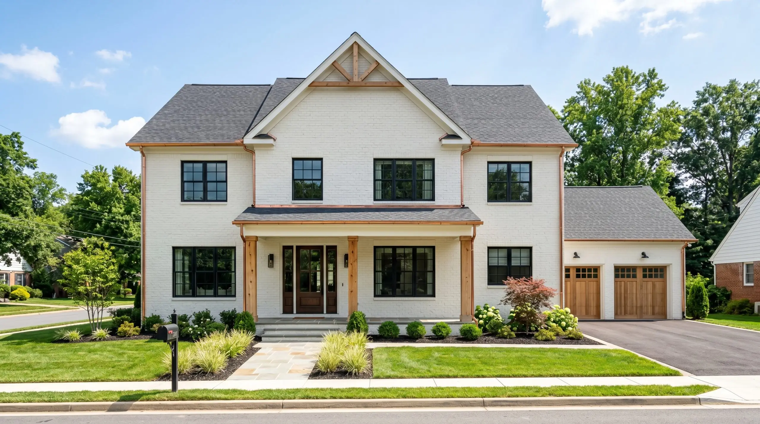
Taking this color outdoors transforms it entirely. Because natural sunlight is incredibly intense, exterior applications will wash out the color’s depth, making it appear as a brilliant, natural white. It is the perfect solution for updating dated suburban brick without creating a blinding, reflective facade.
When using it on exterior siding or stucco, pair it with earthy, organic accents to stabilize the brightness. Think natural cedar columns, copper gutters, or a muted sage green front door.
Always test a massive swatch on the south-facing side of your home before committing. The intense afternoon sun will strip away the gray modifier, and you need to ensure the remaining warm white is exactly what you envision for your curb appeal.
Vanities and Washrooms
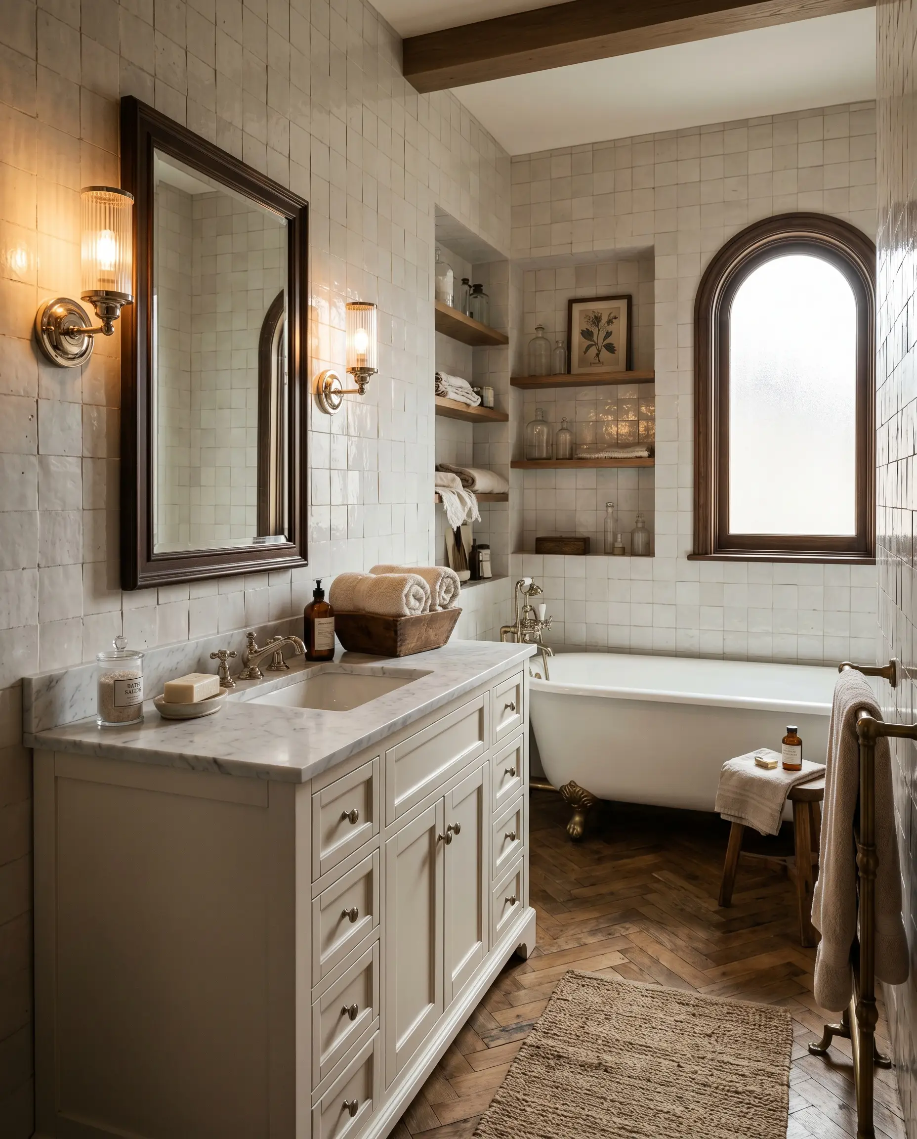
Bathrooms are notoriously difficult to paint because of the lack of natural light and the abundance of hard, reflective surfaces. This complex cream softens the harshness of porcelain tubs and standard ceramic tiles.
It is an exceptional choice for a bathroom vanity, especially when paired with warm metallic fixtures. Polished nickel or antique brass sconces mounted directly against this color will cast a flattering, hotel-like glow across the room.
To create a moody, vintage-inspired washroom, pair the painted vanity with a classic herringbone floor and handmade zellige wall tiles. The slight imperfections in the zellige tile will pick up the hidden earthy nuances of the paint, creating a space that feels curated and timeless.
Coordinating Materials and Color Palettes
Because this off-white relies on a delicate gray modifier, its visual energy shifts dramatically depending on what you place next to it. It requires deliberate textural contrast to prevent the room from feeling washed out or unresolved. When paired with the right organic elements, the hidden earthy warmth of this paint physically pulls forward, creating a beautifully established atmosphere.
Baseboards and Architectural Boundaries
To create a crisp, tailored boundary, you need a trim color that lacks strong yellow undertones. If the trim is too creamy, it will bleed into the wall color and make the entire room look muddy.
Hardware, Wood, and Tactile Finishes
The most successful interiors treat paint as just one layer of a broader tactile experience. You can elevate standard architectural features by pairing this muted neutral with specific, contrasting materials.
Complementary Paint Pairings
Curated Designer Mood Boards
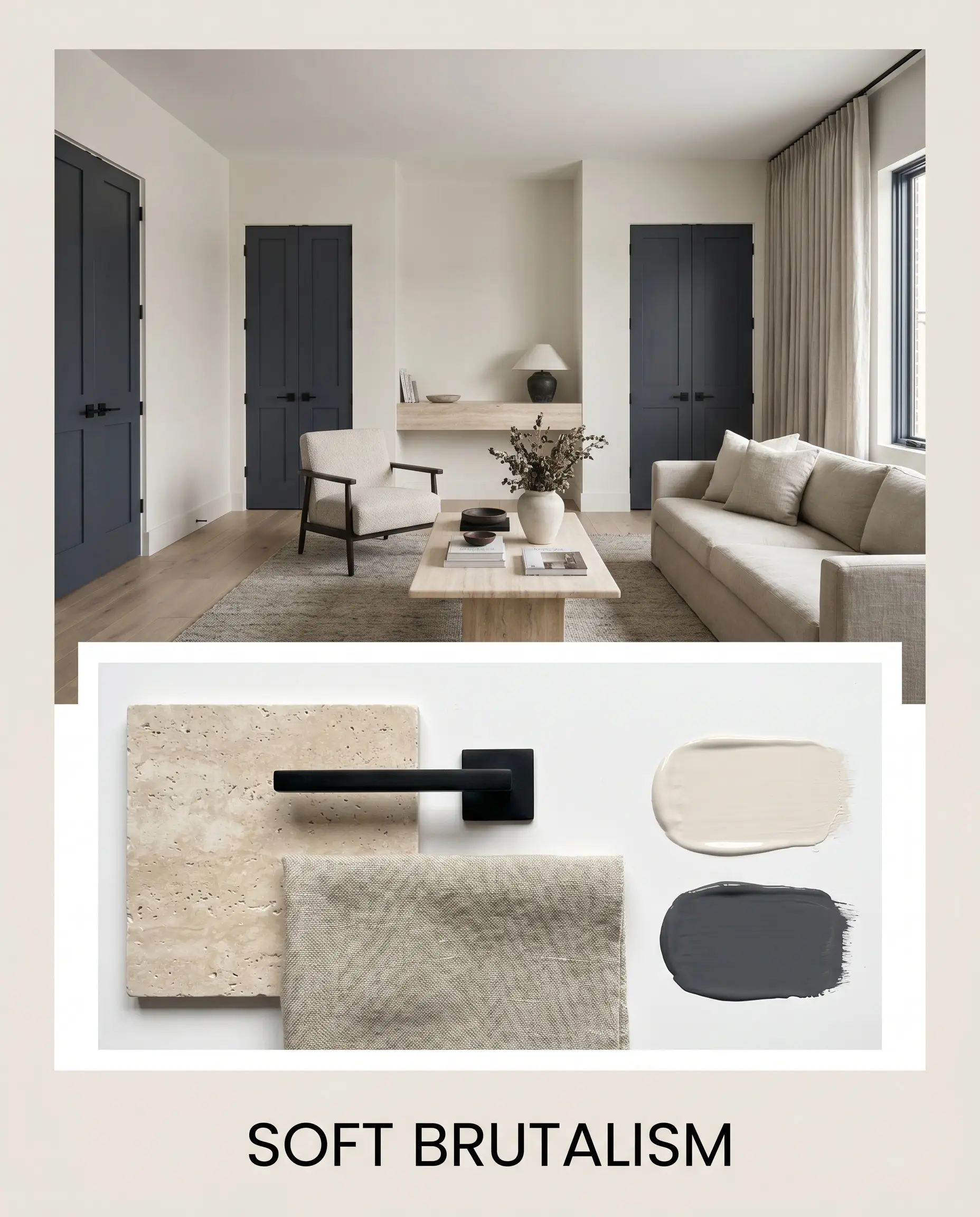
To truly understand how this complex cream behaves, we have to look at it in context. Here is how you can manipulate this color across entirely different design styles by shifting your styling elements.
Soft Brutalism This aesthetic relies on intentional tension, pairing the soft, atmospheric glow of the paint with hard, utilitarian edges. Anchor the palette with Benjamin Moore Hale Navy on your interior doors to create sharp, dramatic contrast. Layer the space with honed travertine surfaces, matte black iron hardware, and heavily textured washed linen textiles. The resulting energy is grounded, architectural, and quietly sophisticated.
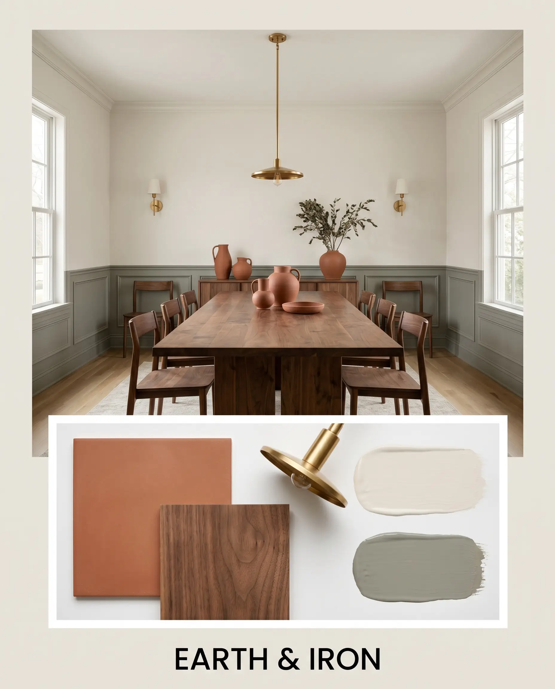
Earth & Iron If you want to amplify the organic, sun-baked qualities of this color, surround it with rich, natural pigments. Introduce Sherwin-Williams Evergreen Fog as a secondary accent color to pull forward the paint’s earthy undertones. Style the space with matte terracotta ceramics, raw walnut furniture silhouettes, and unlacquered brass lighting fixtures. This combination feels incredibly warm, tactile, and effortlessly lived-in.
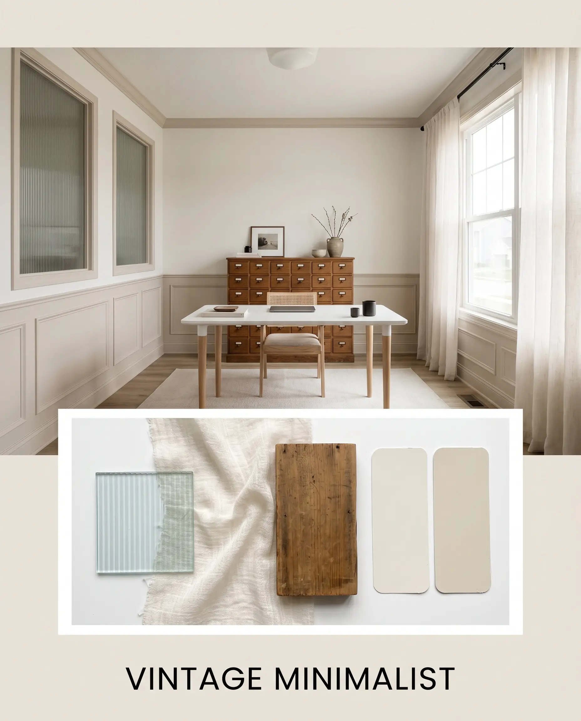
Vintage Minimalist For a serene, tone-on-tone experience, lean into the subtle shifts between light neutrals. Use Sherwin-Williams Natural Linen to create a soft, tonal bleed across your trim or paneling. Elevate the visual interest by incorporating reeded glass accents, vintage apothecary cabinets, and sheer cotton drapery that filters the light. The vibe is airy, curated, and deeply restorative.
Comparing Sherwin-Williams Pearly White to Rival Neutrals
There are specific lighting conditions and architectural environments where this soft cream might not be the most successful candidate. If your room lacks natural light or if your fixed elements demand a different undertone, you must pivot. Here is how this paint stacks up against its closest competitors.
Sherwin-Williams Pearly White vs. Sherwin-Williams Alabaster
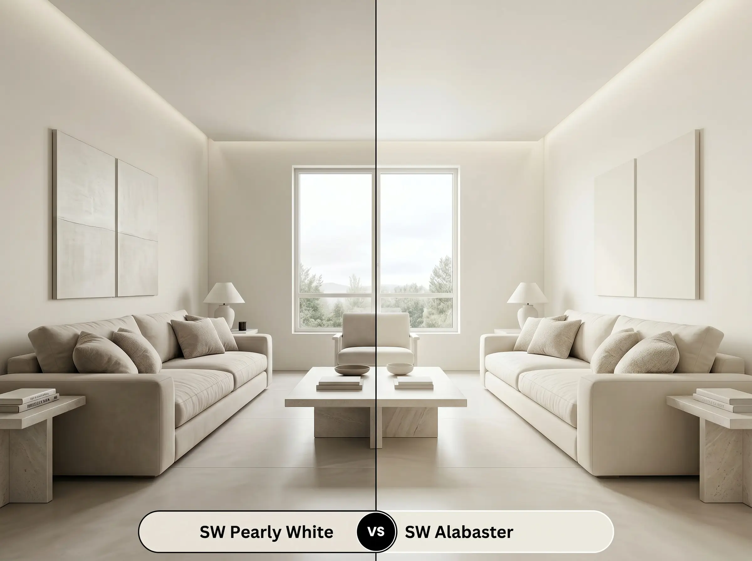
Sherwin-Williams Alabaster is significantly warmer and lacks the pronounced gray modifier found in SW 7009. With a higher light reflectance value, Alabaster reads as a brighter, more traditional soft white. If your room faces north and you are worried about the walls looking too shadowed or stony, Alabaster is the safer, more luminous choice to maintain a cozy glow.
Sherwin-Williams Pearly White vs. Sherwin-Williams Shoji White
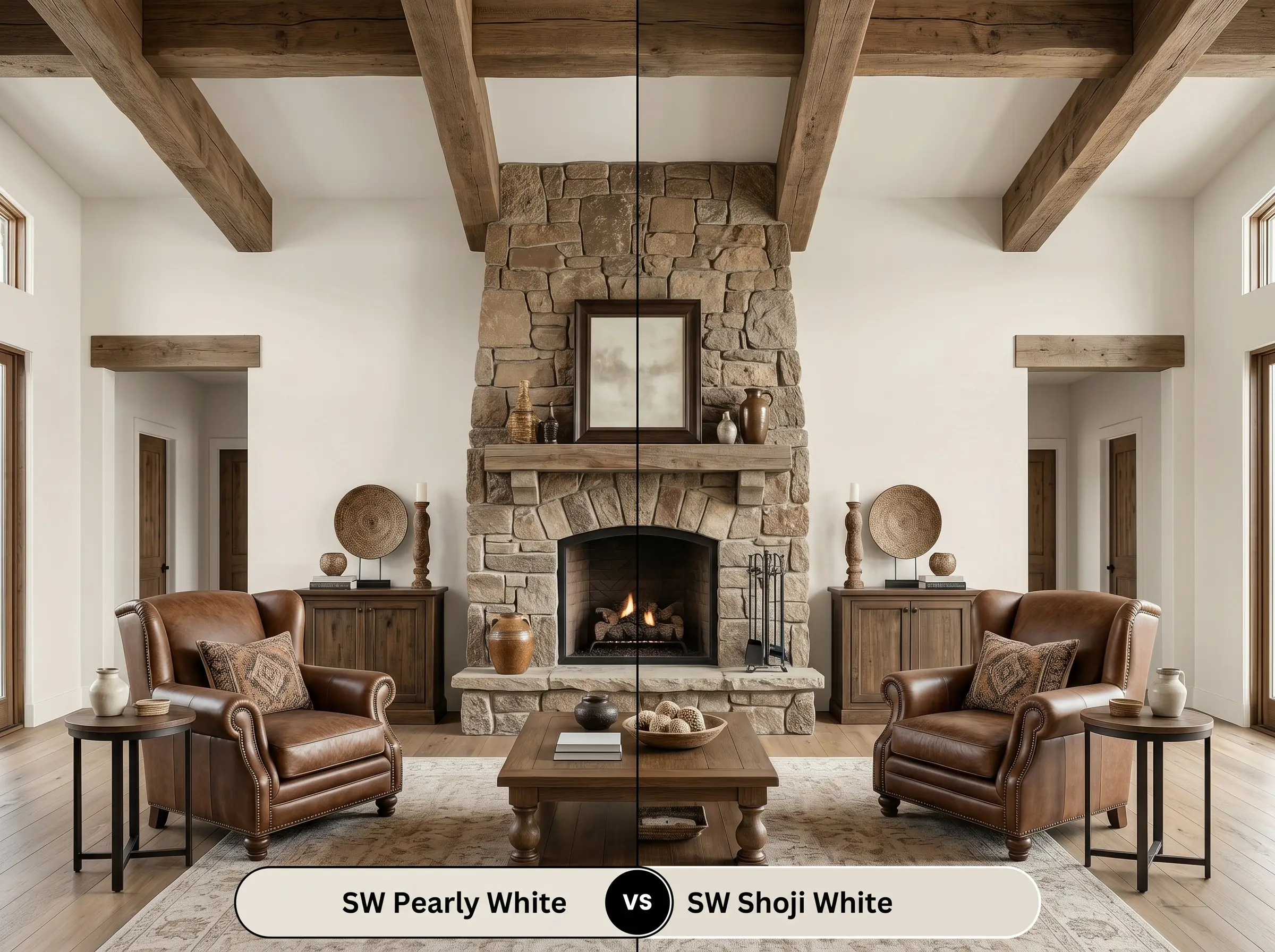
Sherwin-Williams Shoji White drops slightly lower on the brightness scale and carries a much stronger greige and tan influence. While Pearly White reads as a cream with a touch of gray, Shoji White reads as a distinct, light beige. If you are trying to coordinate with highly saturated, earthy stone fireplaces or dark brown roofing, Shoji White provides the necessary depth to hold its own.
Sherwin-Williams Pearly White vs. Sherwin-Williams Greek Villa
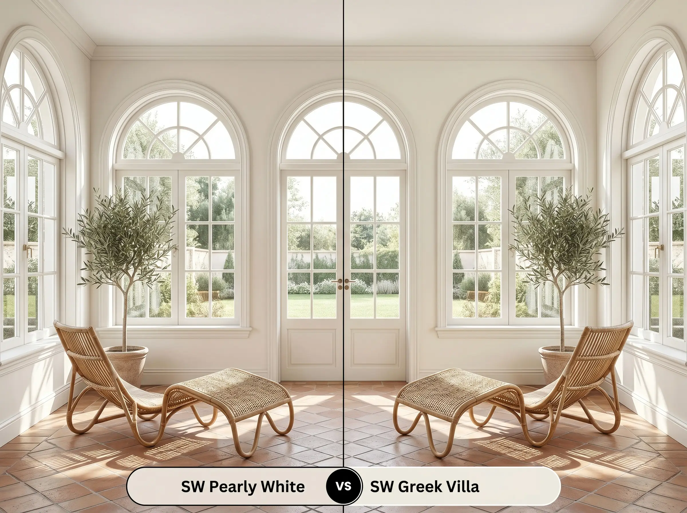
Sherwin-Williams Greek Villa is noticeably brighter and leans heavily into a clean, sunny yellow undertone. It completely lacks the subtle green-beige shadow that gives SW 7009 its muted, earthy quality. If you want a crisp, Mediterranean-inspired white that feels highly energetic and fresh, Greek Villa is the superior option.
Finding the Perfect Alternative: Similar Creams
Sometimes a color is almost perfect, but it needs a slight adjustment to harmonize with your home’s unique lighting. If you need a touch more depth or a slightly different undertone, consider these highly targeted alternatives.
Sherwin-Williams Color Matches
Cross-Brand Paint Equivalents
Professional Execution: Sheens, Primers, and Coverage
Moving from design theory to the physical application requires a strategic approach. The way this color reflects light will be entirely dictated by the finish you choose and the preparation of your walls.
The Ideal Sheen Strategy
Never paint your ceiling with standard, un-tinted ceiling white when using this color on the walls. The stark contrast will make the walls look unnecessarily dirty. Instead, ask your paint retailer to mix a flat ceiling paint using 25% of your wall color formula for a seamless upward transition.
Hackrea Pro-Tip (The Ceiling Strategy)
Priming and Coat Requirements
Because this shade sits comfortably in the upper-middle range of brightness, it does not require a specialized dark primer. A standard, high-quality white primer is perfectly sufficient to block out previous wall colors and provide a clean slate.
For a truly professional, opaque finish, plan for two full coats. Even if the first coat looks acceptable, a second coat is mandatory to fully develop the complex color structure and ensure the gray modifier reads evenly across the room.
Be highly cautious of “flashing”—visible roller marks that occur when you touch up a wall after the paint has dried. Because of the subtle undertones, touch-ups will almost always catch the light differently. If a wall gets damaged, it is often better to repaint the entire wall corner-to-corner to maintain a flawless finish.
Frequently Asked Questions
Because it contains a distinct gray modifier, this paint can lean slightly stony or shadowed in areas completely devoid of natural light. To prevent a windowless hallway from feeling dingy, ensure your ambient lighting utilizes bulbs around 3000K to pull the warm cream base forward.
The gray influence actually makes it a brilliant companion for red brick. The muted nature of the paint neutralizes the intense, fiery tones of the brick, creating a balanced, updated facade rather than a stark, glaring contrast.
It performs beautifully with yellow-toned oak. The warm yellow base of the paint harmonizes with the wood, while the subtle green-beige shadow prevents the entire room from looking overly yellow or dated.
Color drenching is highly recommended for this shade. By using a flat finish on the walls and a satin finish on the trim, the subtle shift in light reflection creates an expensive, cohesive, and highly architectural look.
Final Verdict: Is This the Right Cream for You?
Sherwin-Williams Pearly White is an incredibly sophisticated, highly adaptable architectural finish. It is the perfect solution for homeowners who want the crisp, airy feeling of a white room but desperately need the stabilizing warmth of a genuine color. It excels in sunlit living spaces, on elevated kitchen cabinetry, and across exterior brick, effortlessly bridging the gap between historic warmth and tailored modern design.
The Hackrea Clash Warning: This paint requires intentional coordination to succeed. It will actively fight against cool, blue-toned gray flooring or icy, stark white countertops. When placed next to cool, blue-grays, the gray modifier in the paint gets washed out, forcing the yellow base to look muddy and sour. If your home is filled with cool-toned fixed elements from the early 2010s gray trend, you must pivot to a cooler, crisper white to maintain visual harmony and avoid a disjointed, clashing aesthetic.
Closest Cross-Brand Equivalents
The absolute closest scientific color matches for Pearly White across top paint brands.