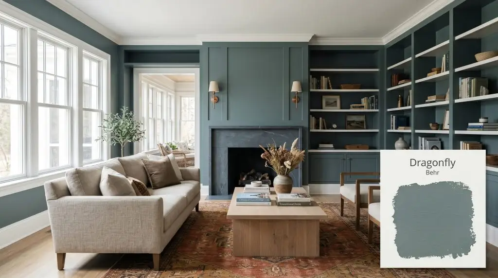
Dragonfly PPU12-03
BehrWhat color is Behr Dragonfly? Behr Dragonfly (PPU12-03) is a muted, medium-dark blue-green paint color with a pronounced smoky gray cast. Boasting an LRV of 26, this sophisticated teal strikes a perfect balance between vibrant coastal energy and grounded, moody elegance, making it ideal for cabinetry and accent walls.
Paint Technical Profile
| Color ID / SKU | PPU12-03 |
| HEX Code | #72908d |
| Light Reflectance (LRV) | 26 |
| Use | Interior, Exterior |
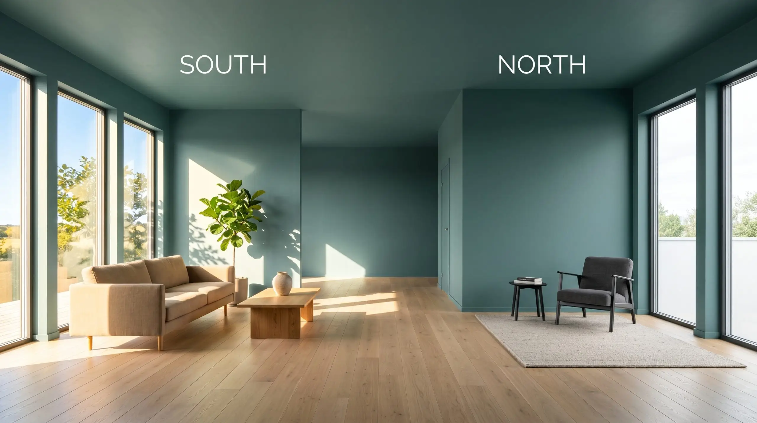
| Best Exposures | South-Facing, West-Facing |
| Best For | Kitchen Cabinets, Accent Walls, Built-ins, Exterior Doors |
Behr Dragonfly: The Smoky Teal That Elevates Everyday Architecture
True architectural color does not just sit flat on a wall; it actively interacts with the materials around it. Behr Dragonfly is a remarkable study in how a specific muted blue-green can completely alter the perceived value of a room. It takes the vibrant energy of a classic teal and filters it through a sophisticated, smoky lens.
This is not a loud, tropical shade that demands all the attention in a space. Instead, it relies on a complex color structure to provide a stabilizing backdrop for everything from unlacquered brass to intensely veined soapstone. By absorbing excess light, it creates an enveloping atmosphere that feels instantly intentional and highly curated.
Behr Dragonfly: Temperature, Undertones, & LRV
When evaluating whether Behr Dragonfly leans warm or cool, the answer is definitively cool. However, it avoids the sterile, icy chill often associated with standard blues. This specific pigment profile relies on earthy undertones to soften its temperature, making it incredibly adaptable across various lighting scenarios.
To truly understand how this color operates, we have to look at its underlying composition:
With an LRV of 26, this shade possesses a relatively low light reflectance. This means it absorbs a significant amount of light, giving the paint substantial visual weight on the wall. In practical terms, this color will physically close a room in slightly, creating a cozy, atmospheric environment rather than a bright, airy one.
Manipulating the Chromatic Profile: Lighting Effects
Because of its complex undertones, this paint is highly reactive to the shifting path of the sun. You must anticipate how your specific light source will pull different hues forward throughout the day.
Transforming Spaces: Popular Applications for Dragonfly
The true magic of this shade lies in its ability to adapt to entirely different architectural demands. By manipulating the surrounding textures and styling, you can push this color into completely distinct design territories.
Kitchen Cabinets & Islands
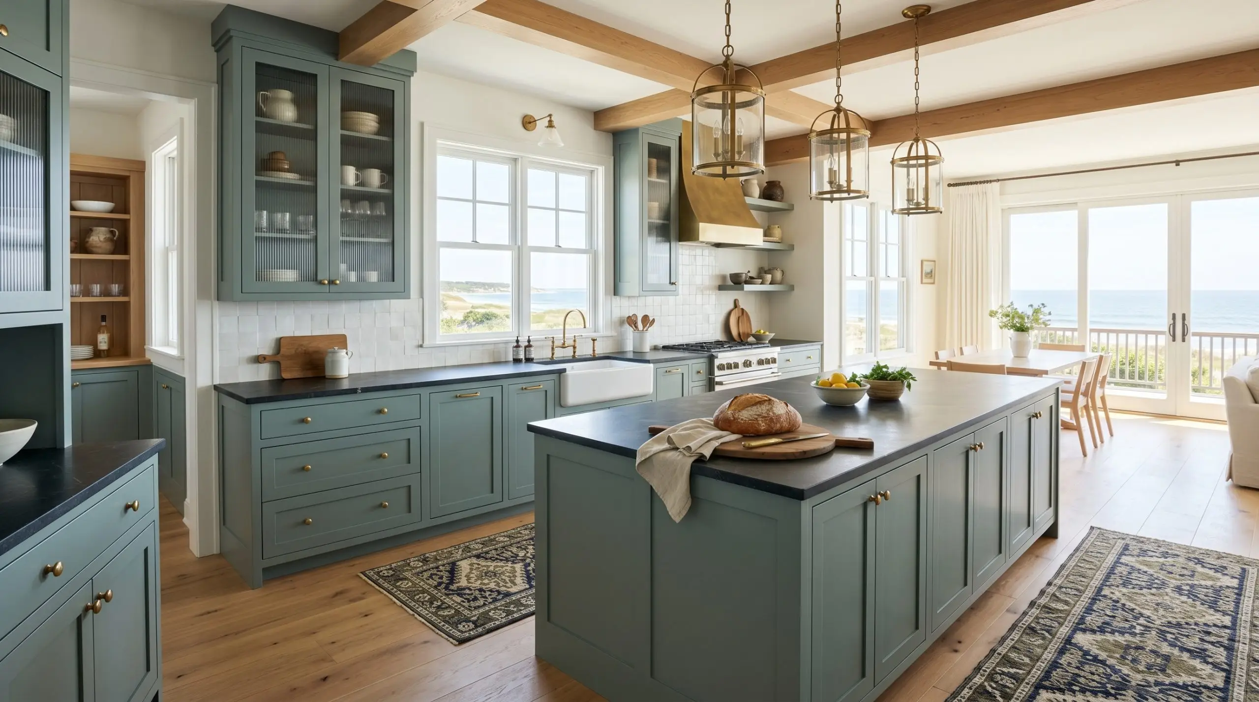
Applying this shade to kitchen cabinetry is a brilliant way to introduce color without overwhelming the daily routine of a busy household. A cabinet application in this moody teal instantly elevates standard shaker doors, giving them a bespoke, high-end feel.
Pair the painted island or lower cabinets with honed soapstone countertops and unlacquered brass hardware for a rich, tactile contrast. To push the design toward a coastal transitional aesthetic, incorporate fluted glass upper cabinets and a runner with a subtle block print.
When using a strong blue-green on cabinetry, avoid high-shine chrome hardware, which can make the finish feel cold and commercial. Opt for brushed copper or aged brass to introduce necessary warmth.
Hackrea Pro-Tip (The Hardware Harmony)
Bathrooms & Vanities
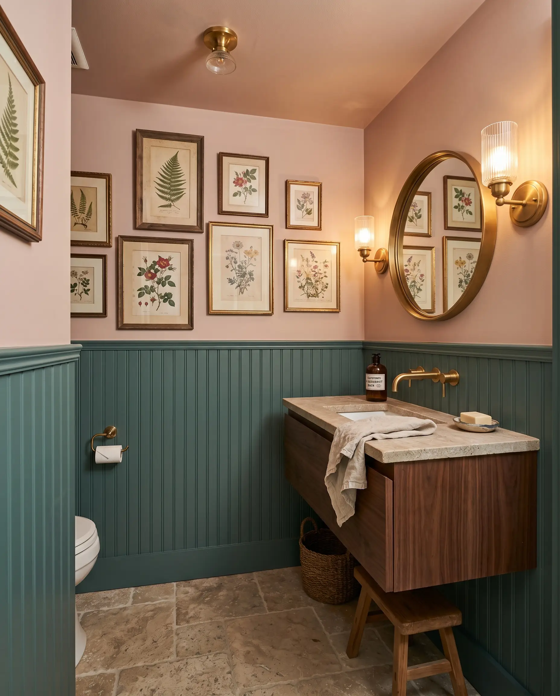
Small, windowless bathrooms are the perfect canvas for embracing this color’s atmospheric qualities. Instead of fighting the lack of light with stark white, use this shade to create a dramatic, eclectic jewel box.
Consider painting the beadboard wainscoting and the base of a floating walnut vanity in this rich tone. Layer the space with tumbled limestone floors, an asymmetrical gallery wall of vintage botanical prints, and warm 2700K sconces. This approach creates a highly curated, intimate environment that feels incredibly intentional for a young professional’s urban condo or a suburban powder room.
Bedrooms
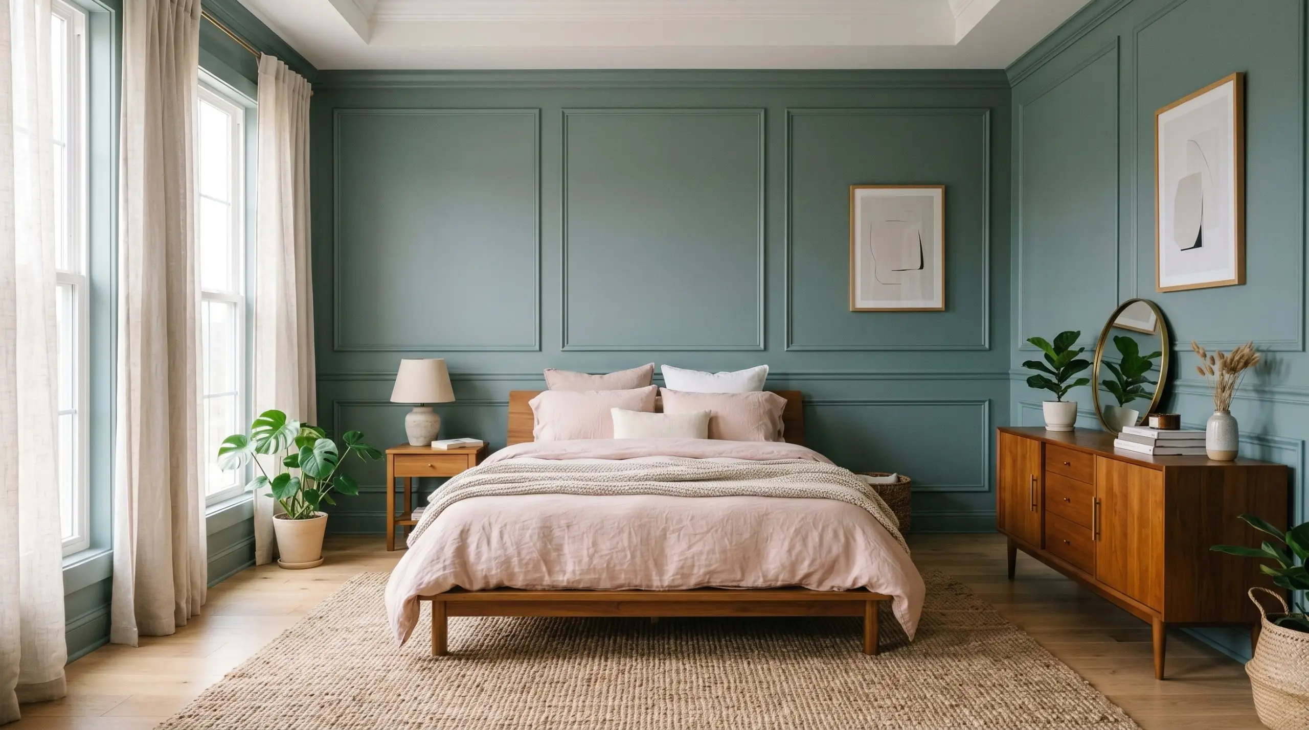
In a bedroom, this color acts as a stabilizing force, creating a restful sanctuary that promotes relaxation. Rather than a standard wall application, consider installing picture frame molding and painting the entire architectural feature to add structural interest.
To keep the room from feeling too enclosed, balance the walls with lighter, highly textured textiles. A platform bed dressed in soft blush washed linen, layered over a jute rug, softens the room’s energy. Add a mid-century teak sideboard and minimal ceramic vases to pivot the aesthetic toward a soft, contemporary retreat.
Dining Rooms
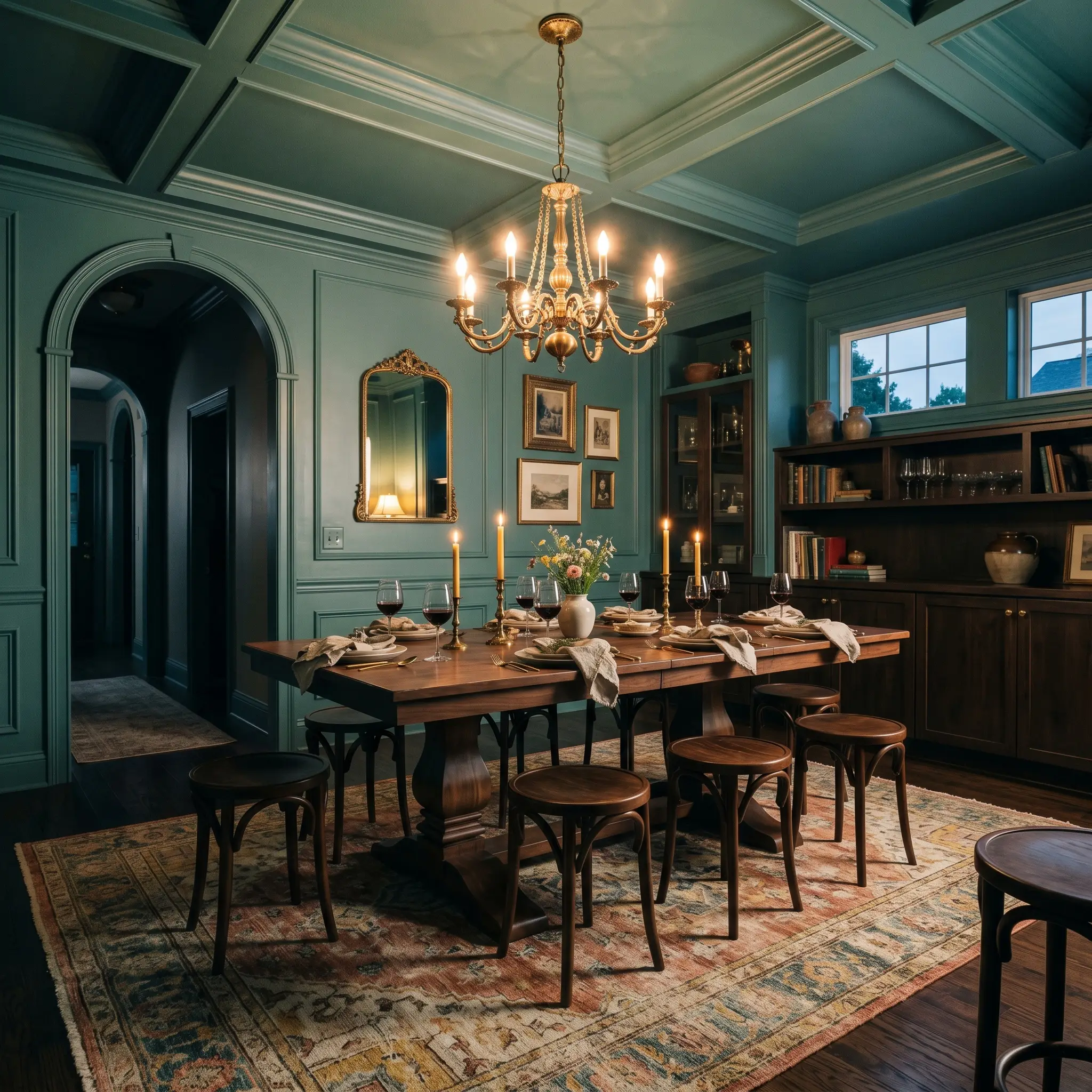
Dining rooms thrive on a bit of theatricality, making them ideal for a full color-drenching technique. Painting the walls, trim, and ceiling in this single hue blurs the room’s boundaries, creating a seamless, enveloping dining experience.
This immersive backdrop is perfect for frequent entertainers who want to host memorable dinner parties. Break up the solid color with a large pedestal dining table, bentwood stools, and a layered vintage rug featuring muted terracotta and mustard yellow accents.
Be highly strategic with your dining room wood tones. Strong red-toned woods like cherry will fiercely clash with the green undertones of this paint, creating an unsettling visual vibration. Stick to neutral white oak, rich walnut, or ebonized finishes for a seamless integration.
Clash Warning (The Wood Tone Trap)
Exterior Siding & Front Doors
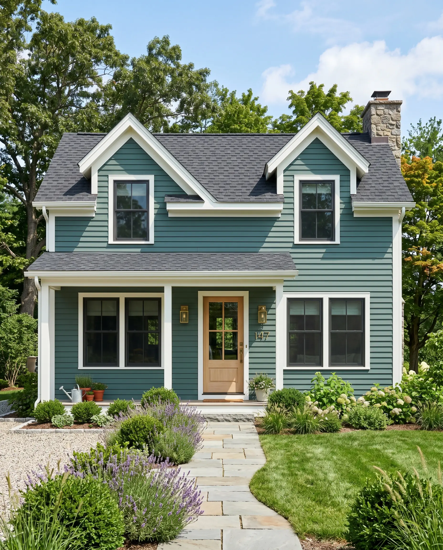
When taken outside, the harsh, direct sunlight will significantly wash out the color’s intensity. What looks like a dark teal indoors will read as a much softer, highly approachable blue-green on exterior siding.
It is an exceptional choice for modernizing a traditional cottage or updating the curb appeal of a mid-century fixer-upper. Pair it with crisp white trim to highlight the architectural lines, or use it exclusively on the front door to create a welcoming, high-contrast focal point against a warm beige stucco facade.
Curating the Palette: Best Pairings for Behr Dragonfly
This specific moody teal thrives when it is allowed to act as an architectural boundary rather than a soft, bleeding watercolor. Because it absorbs so much light, it requires highly intentional, contrasting textures to prevent the room from feeling flat or entirely shadowed.
Defining Boundaries with Millwork
Your trim color dictates exactly how modern or traditional this paint will feel on the wall. To create a razor-sharp, tailored edge that modernizes the teal, Behr Ultra Pure White 1850 provides the ultimate, uncompromised contrast.
If you prefer a softer, more historically inspired transition, Benjamin Moore Simply White OC-117 introduces just enough warmth to gracefully bridge the gap without turning yellow. For a reliable, crisp outline that leans slightly cool, Sherwin-Williams Extra White SW 7006 perfectly supports the smoky undertones of the main wall.
Tactile Elements and Hardware Finishes
The secret to making this rich hue feel incredibly expensive lies in how you bounce light around it.
The Complete Color Palette
Curated Styling Concepts
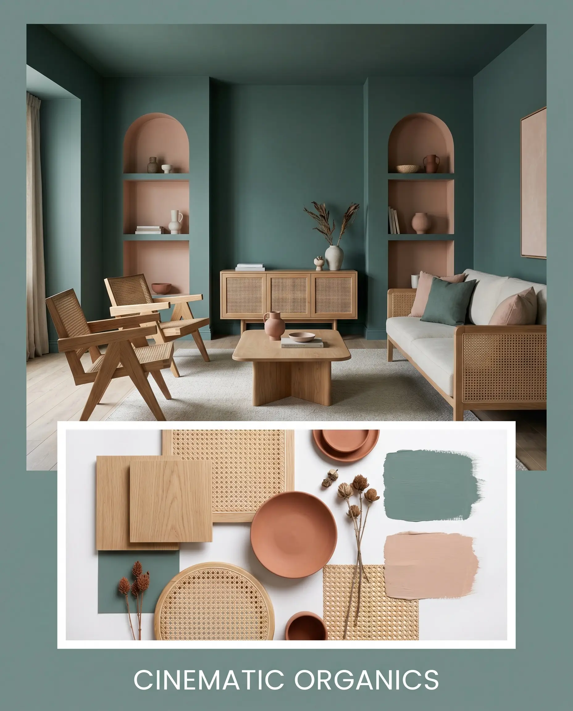
Cinematic Organics This styling direction embraces the moody, enveloping nature of the paint by pairing it with deeply tactile, earthy elements. The walls are grounded by the introduction of raw white oak furniture and woven cane accents, which immediately soften the room’s energy. To elevate the aesthetic, we introduce accents in Farrow & Ball Setting Plaster, alongside matte terracotta ceramics and dried botanicals. This combination creates a deeply restorative, organic atmosphere that feels intimately connected to nature while maintaining a highly sophisticated edge.
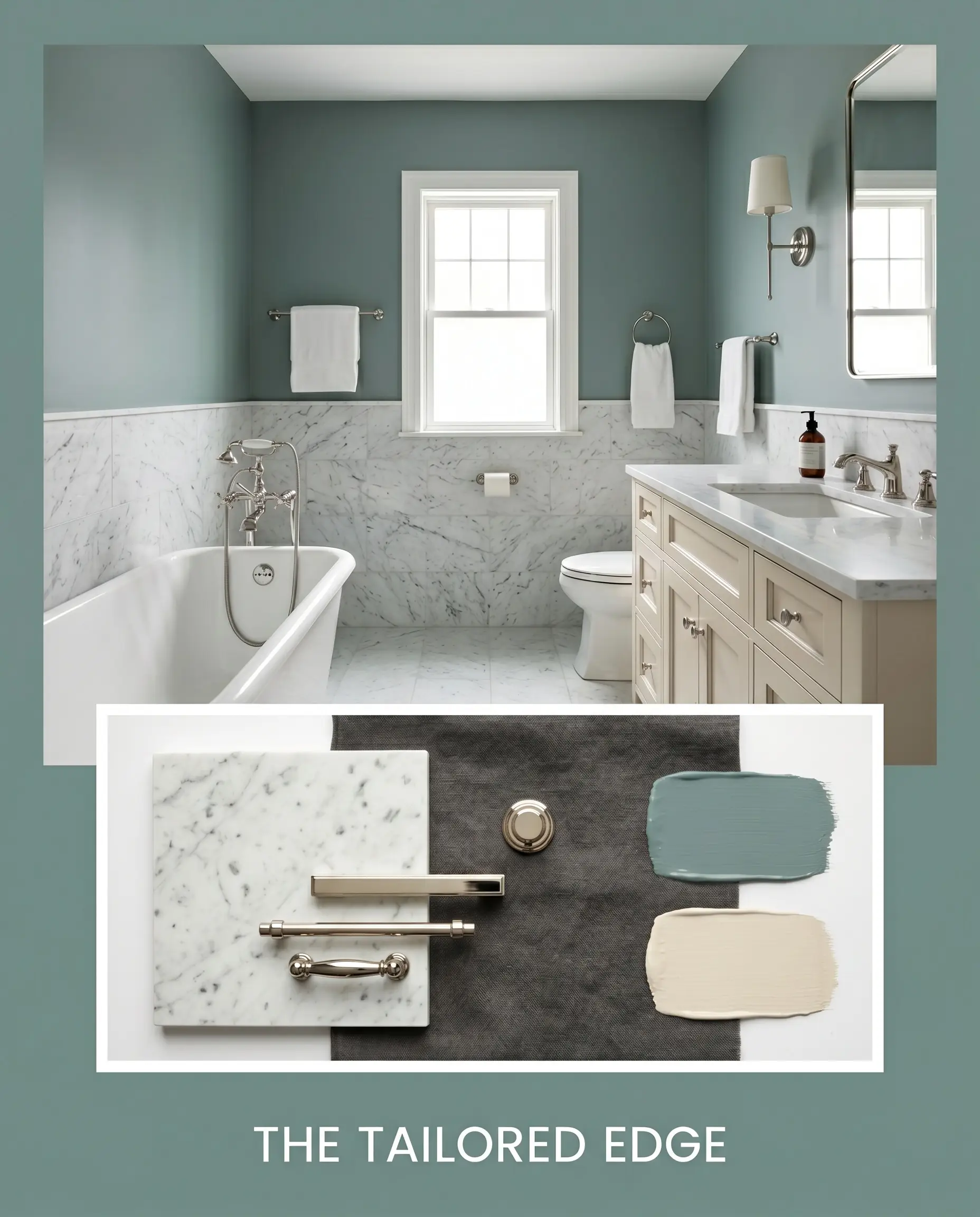
The Tailored Edge If you prefer a crisper, more transitional aesthetic, this approach utilizes high-contrast materials to sharpen the paint’s smoky profile. The rich teal is balanced by expansive surfaces of honed Carrara marble and sleek polished nickel hardware, which aggressively bounce light around the space. We soften this brilliant contrast by layering in Behr Coco Malt on adjacent surfaces and introducing washed linen textiles in a soft charcoal. The resulting energy is highly structured, refined, and effortlessly polished.
Head-to-Head: Behr Dragonfly vs. Rival Teals
There are specific architectural lighting scenarios where this particular smoky teal might lose its intended depth or pull too gray. When evaluating your home’s natural exposures, it is crucial to compare how similar pigments behave under pressure to ensure you make the most confident choice.
Benjamin Moore Aegean Teal 2136-40 vs. Behr Dragonfly
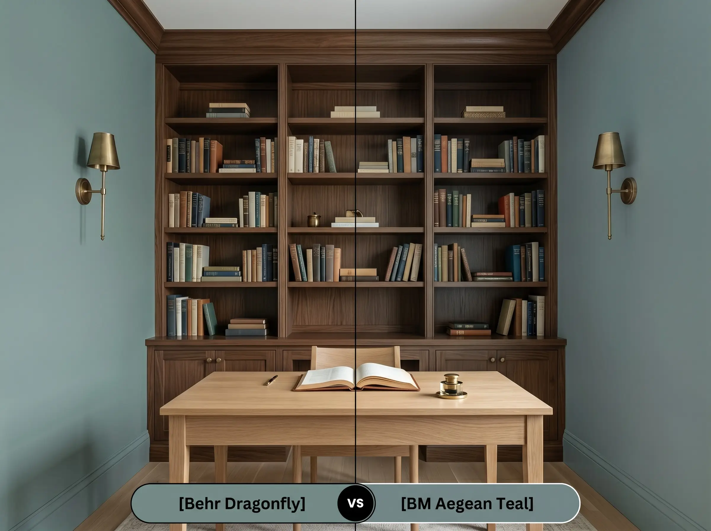
Aegean Teal is slightly warmer and significantly softer in its overall saturation. If your room faces north and you notice the Behr option turning into a flat, chilly slate-gray, Aegean Teal is the perfect pivot. It retains a touch more organic warmth, ensuring the room feels inviting even in the coolest, most indirect natural light.
Sherwin-Williams Moody Blue SW 6221 vs. Behr Dragonfly
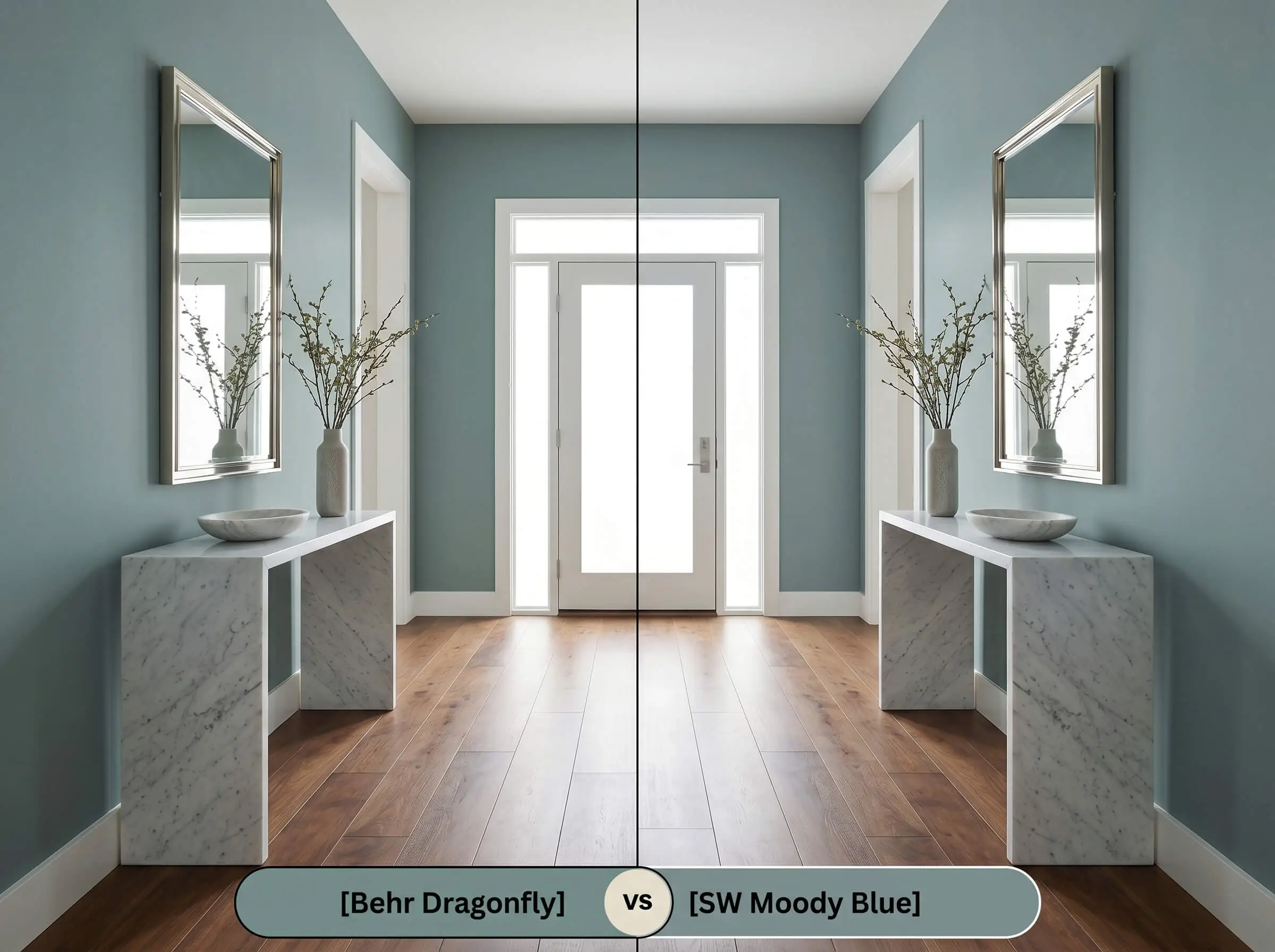
Moody Blue strips away much of the earthy green base, leaning far more definitively into a true, slate-blue profile. If your space features warm-toned flooring that clashes with green undertones, Moody Blue offers a safer, cooler alternative. It provides a similar depth and light absorption but delivers a crisper, more predictable blue aesthetic throughout the day.
Exploring Alternative Blue-Greens
Sometimes a color is theoretically perfect, but the specific lighting in your hallway or living room demands a slight adjustment in light reflectance or warmth.
Same-Brand Variations
Cross-Brand Matches
Executing Your Room Transformation
Moving from curatorial design theory to the practical reality of a roller requires a strategic approach to finishes and preparation.
Selecting the Right Sheen
Primer and Coverage Strategy
Because this color has a relatively low light reflectance value of 26, painting it directly over a standard white primer will often result in a frustrating, uneven finish. You must use a high-quality, gray-tinted primer to properly support the deep teal pigment.
Darker, matte colors are highly susceptible to “flashing”—visible, uneven roller marks that catch the light. To achieve a flawless, professional result, maintain a wet edge while rolling and commit to two full, generous coats, resisting the urge to touch up semi-dry patches.
Hackrea Pro-Tip (The Flashing Defense)
Expert Q&A
Because of its low light reflectance, it will absolutely deepen the shadows in a windowless space. However, this is actually a design advantage; by leaning into the moodiness and adding warm 2700K sconce lighting, you transform a dark, utilitarian room into an intentional, high-end jewel box.
Warm 2700K bulbs will actively neutralize the cooler slate-blue tones within the paint. This lighting shifts the visual focus toward the color’s earthy green base, resulting in a significantly softer, more inviting atmosphere.
Yes, it performs beautifully on exteriors, but intense, direct sunlight will make the color appear much lighter and slightly more vibrant than it looks indoors. To ensure longevity and resist UV fading on masonry, you must use a premium exterior masonry primer and a high-quality, UV-resistant exterior acrylic latex.
The cool, indirect light of a northern exposure will suppress the green undertone almost entirely. Instead, the hidden gray cast is pulled forward, making the paint read as a sophisticated, muted slate-blue.
The Final Verdict on Behr’s Moody Teal
Behr Dragonfly is an exceptional, transformative color for the homeowner who wants to introduce profound character into their space without resorting to loud, primary hues. Its true brilliance lies in its smoky gray filter, which allows it to act as a deeply stabilizing backdrop for everything from modern organic white oak to highly polished, traditional marble. It is the perfect architectural tool for elevating standard cabinetry, creating an enveloping dining experience, or adding curated depth to a windowless powder room.
However, this specific pigment profile requires careful relational styling to succeed.
You must actively protect this color from stark, cool-toned grays and bright, cherry-red wood finishes. Placing this nuanced teal next to a flat, icy gray will instantly drain its organic warmth, leaving the walls looking muddy and unresolved. Similarly, the intense red tones in cherry or mahogany will aggressively fight the paint’s green undertones, creating a vibrating visual clash that disrupts the entire room’s harmony. Instead, always surround this shade with creamy, warm neutrals and natural, muted wood grains to ensure it reaches its full aesthetic potential.
Hackrea Design Secret (The Undertone Collision)