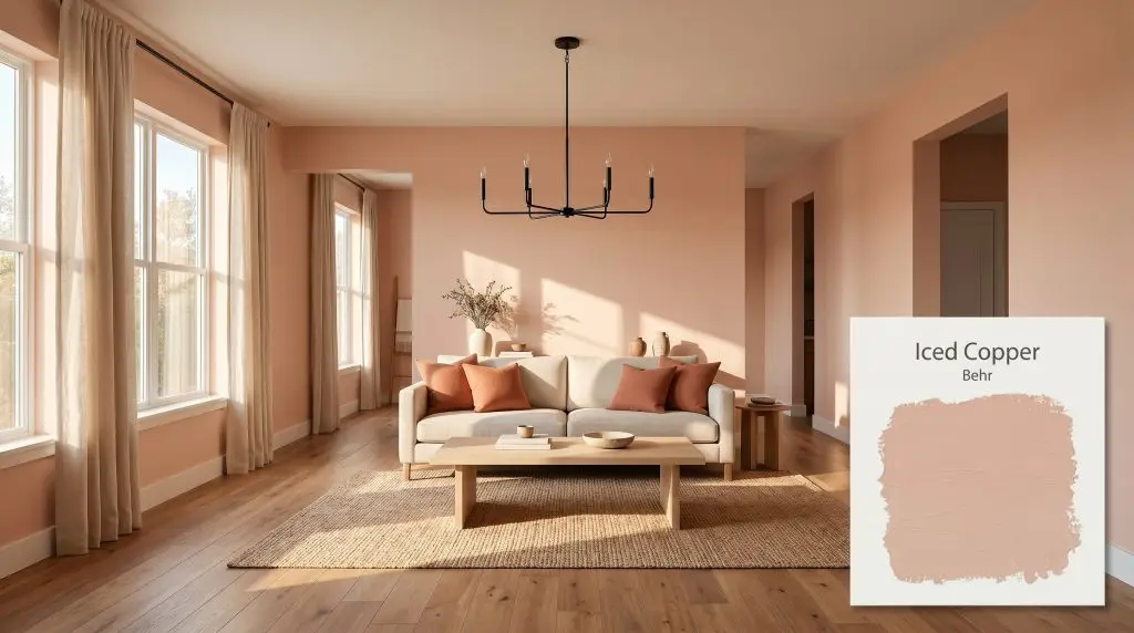
Iced Copper S200-3
BehrBehr Iced Copper (S200-3) is a warm, mid-tone earthy peach neutral with soft pink and terracotta undertones. Boasting an LRV of 46, it offers a comforting, delicate richness that functions beautifully as either a subtle backdrop or a cozy accent color.
Paint Technical Profile
| Color ID / SKU | S200-3 |
| HEX Code | #D0AE9A |
| Light Reflectance (LRV) | 46 |
| Use | Interior, Exterior |
| Best Exposures | South, East |
| Best For | Dining Rooms, Bedrooms, Bathrooms, Exteriors, Accent Walls |
The Warm Architectural Finish: Designing with Behr Iced Copper
We are currently witnessing a massive shift away from stark, sterile walls toward colors that actually feel like physical materials. Behr Iced Copper captures that exact sensory experience, mimicking the soft, sunbaked warmth of aged clay. This isn’t a loud, metallic orange, but rather a beautifully muted peachy pink neutral that instantly warms up a room without demanding all the visual attention.
Behr Iced Copper: Undertones & LRV Explained
When evaluating whether a paint reads warm or cool, this dusty rose hue leaves absolutely no room for debate. It is fundamentally warm, radiating an earthy richness that effortlessly alters the mood of your home.
Sitting at an LRV of 46, this mid-tone copper absorbs just enough light to feel incredibly cozy and enveloping. It possesses a sturdy color structure, meaning it won’t wash out into a pastel when hit with bright afternoon sun, yet it remains rich enough to wrap a dimmer room in soft warmth.
Lighting Effects: The Chameleon Factor of This Muted Copper
Because its chromatic profile relies heavily on those dusty pink and terracotta notes, this color is highly responsive to the temperature of your light source.
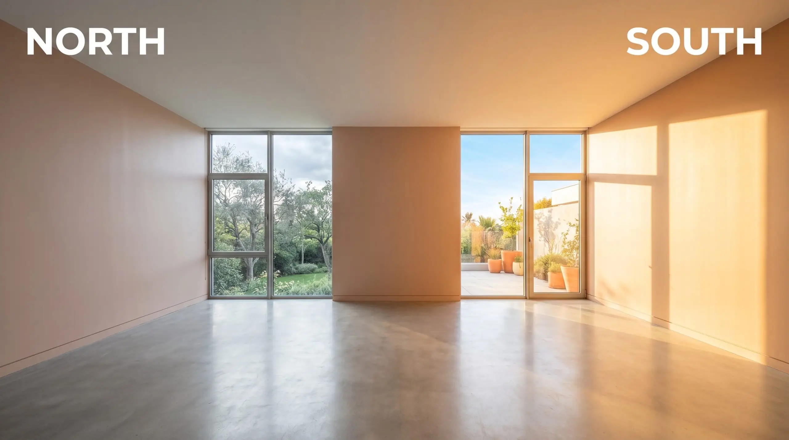
Never evaluate a terracotta or peach paint under standard daylight bulbs. The blue-toned light actively fights the red-orange base, making the walls look muddy rather than glowing.
Hackrea Pro-Tip (The Bulb Rule)
Popular Applications for Behr’s Earthy Copper
The true beauty of a mid-tone terracotta is its ability to transition seamlessly from a cozy interior wrap to a striking exterior statement. By manipulating the surrounding materials and light, you can push this hue into entirely different design territories.
Dining Rooms
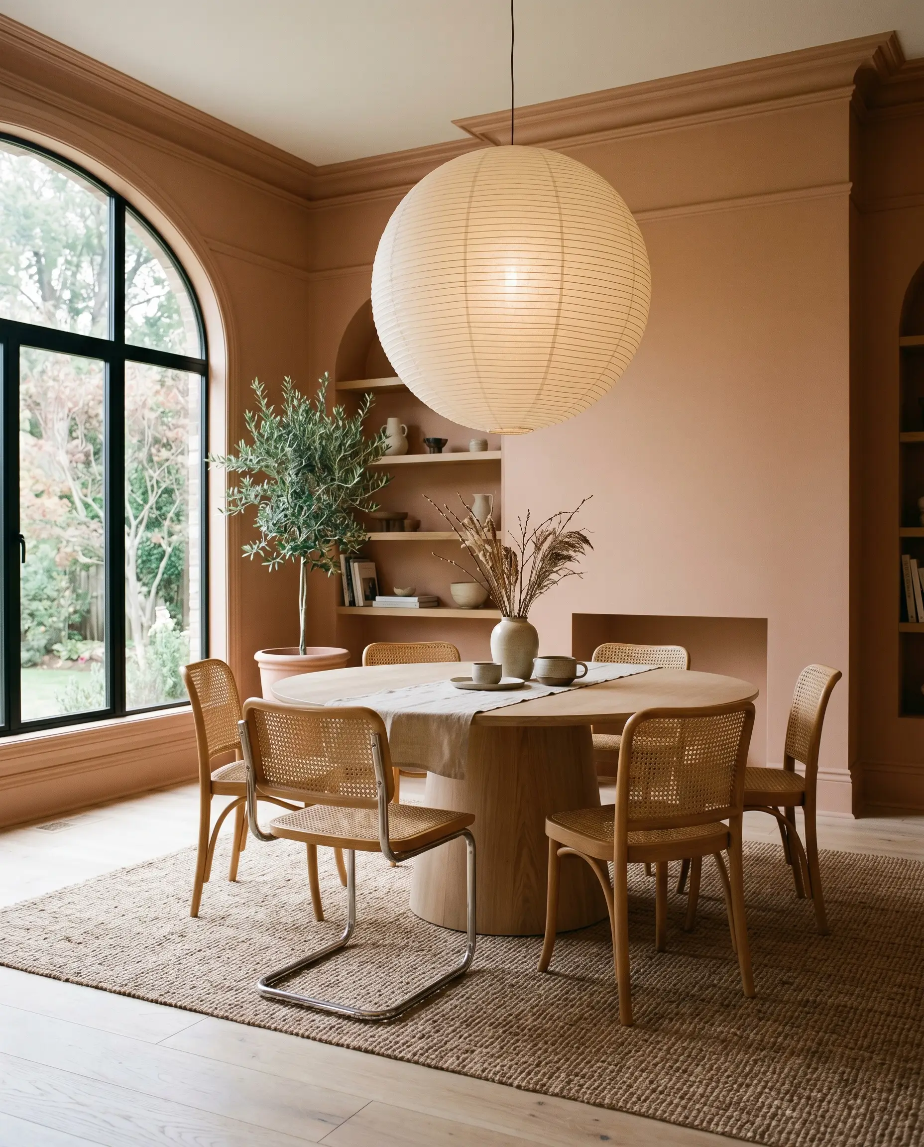
Instead of reserving this shade for formal, stuffy dining spaces, use it to cultivate a relaxed, conversational atmosphere. Color drenching the entire room—painting the walls, baseboards, and crown molding in the same finish—creates a seamless, enveloping tent of warmth.
Using a highly durable finish like Behr Dynasty ensures this approach works beautifully for a bustling family hub, hiding everyday scuffs while wrapping the space in an earthy glow.
Pair the walls with a light white oak pedestal table and mismatched woven cane chairs to introduce organic texture. To elevate the styling, hang an oversized paper lantern or a matte black linear chandelier to provide a sharp, modern contrast against the soft peach background.
Bedrooms
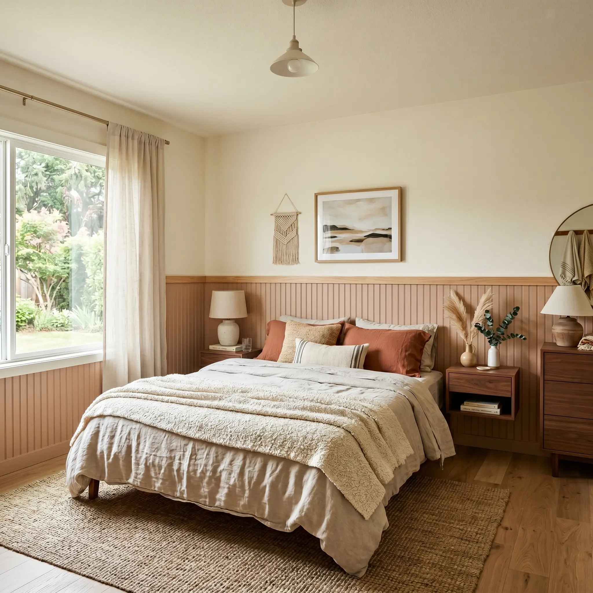
If committing to four solid walls feels too intense for a sleeping space, consider a high-contrast architectural application. Painting a sharp half-wall or installing beadboard painted in this mid-tone copper roots the bed frame while leaving the upper walls a creamy off-white.
This technique is brilliant for a guest room or a creative teenager’s retreat, offering a burst of personality without overwhelming the senses.
Lean into the dusty rose hue by layering the bed with washed linen sheets, a chunky boucle throw, and terracotta accent pillows. Flanking the bed with floating walnut nightstands and brushed brass sconces will pull out the subtle brown undertones, creating a highly intentional, curated look.
Bathrooms
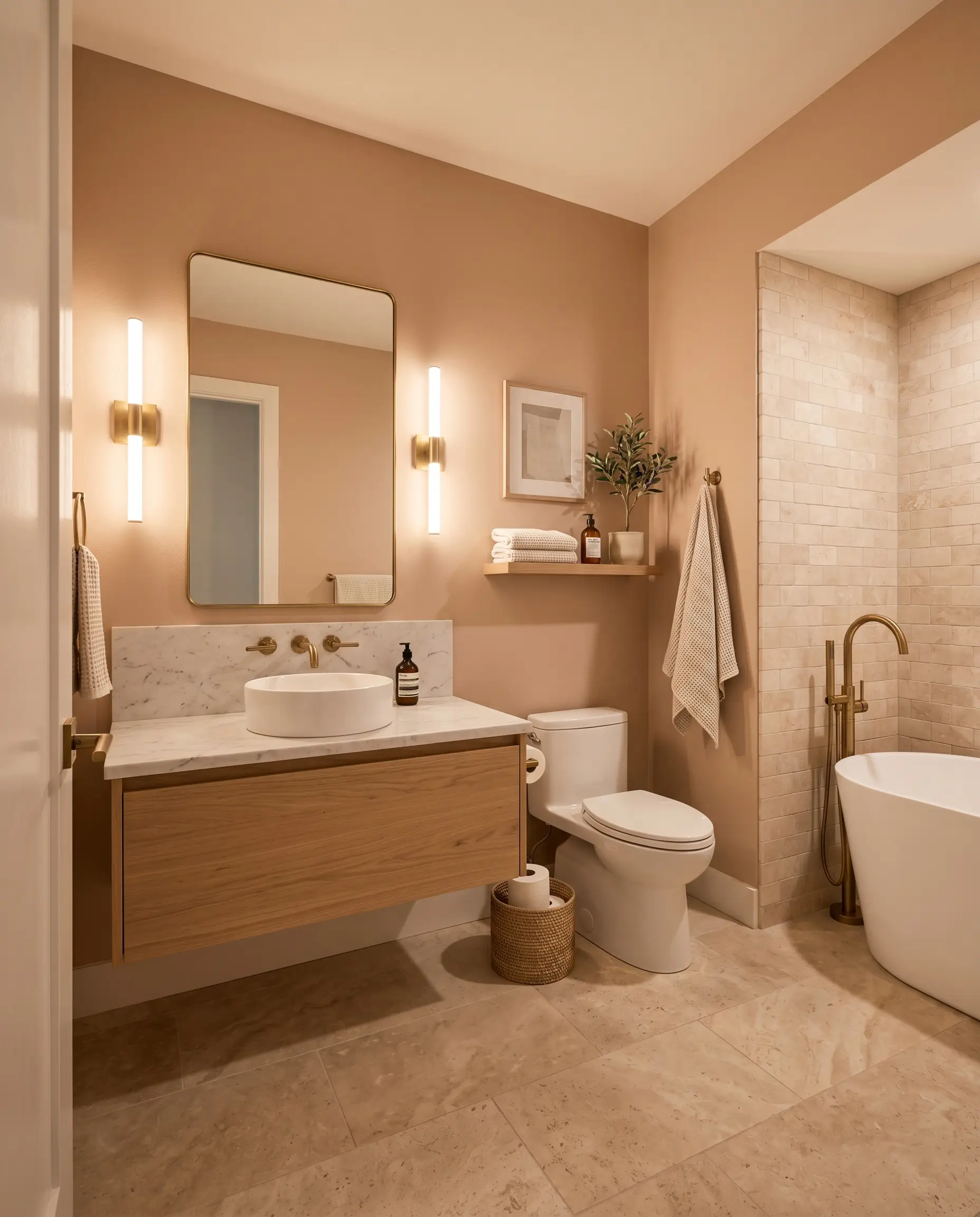
Windowless powder rooms or standard hallway bathrooms are prime real estate for this warm architectural finish. The rich, peachy pink neutral counteracts the cold, sterile feeling of porcelain tubs and standard white tiles.
For a truly custom feel, pair the painted walls with honed travertine floor tiles and unlacquered brass plumbing fixtures that will beautifully patina over time.
If you have a larger vanity mirror, flank it with fluted glass sconces to diffuse the light softly across the terracotta undertones.
Bathrooms often suffer from harsh, cool-toned overhead lighting. Using a warm, mid-tone shade like this on the walls physically warms up the reflected light, making your complexion look significantly better in the mirror.
Hackrea Design Secret (Counteracting Cold Light)
Home Exteriors (Stucco, Shutters, Doors)
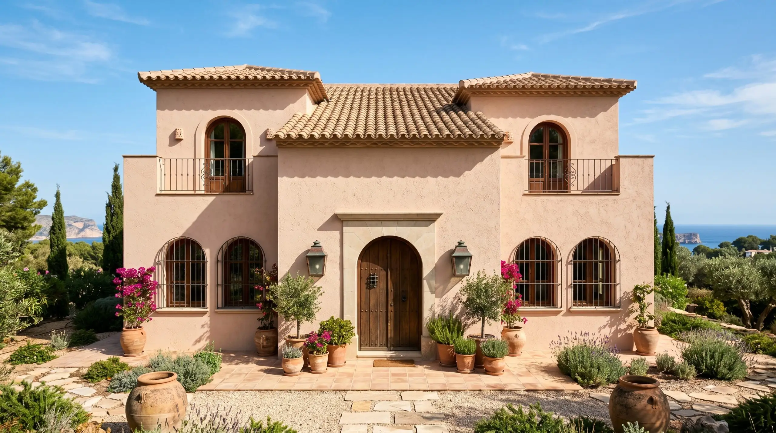
Taking this color outside requires an understanding of how direct sunlight impacts its intensity. On a full stucco facade, the bright sun will wash out the darker brown notes, leaving you with a beautiful, soft Mediterranean exterior.
If painting an entire house feels like too large of a commitment, use it as a strategic accent against a creamy ivory or warm taupe exterior.
Coating the front door, window sashes, or exterior shutters in this shade introduces an unexpected flash of color that pairs perfectly with coastal accents like weathered copper lanterns and terracotta planters.
Always test your exterior swatches on multiple sides of the house, as the shifting sun will make the color look wildly different from morning to late afternoon.
Designing & Pairing Behr Iced Copper
Because of its dense terracotta base, this hue requires crisp, intentional boundaries to hold its shape on the wall. When placed next to muddy or overly saturated shades, it loses its refined glow, so we must build a palette that offers clean contrast and tactile balance.
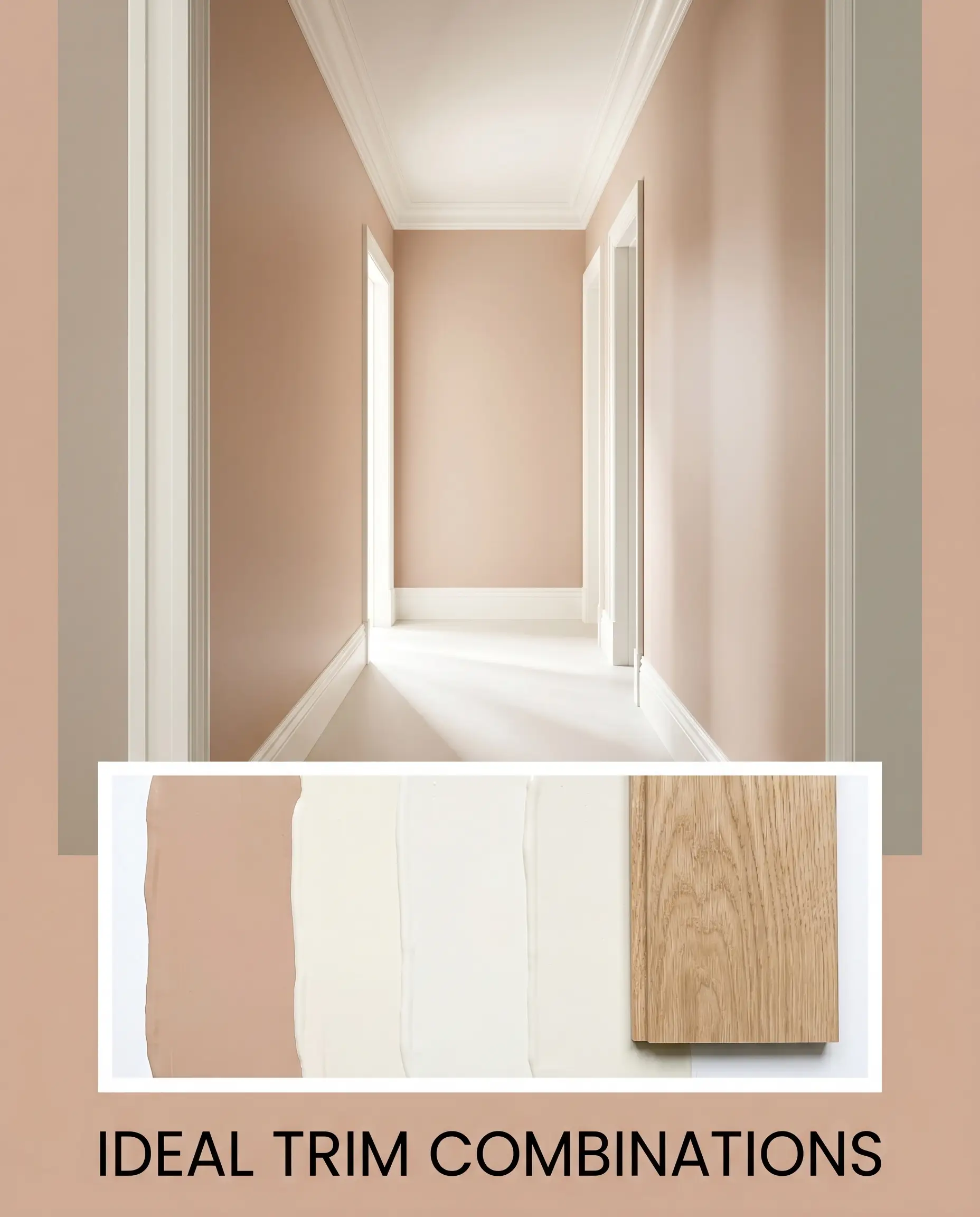
Ideal Trim & Baseboard Combinations
To keep this earthy richness feeling intentional rather than dated, your trim color needs to provide a soft, luminous boundary.
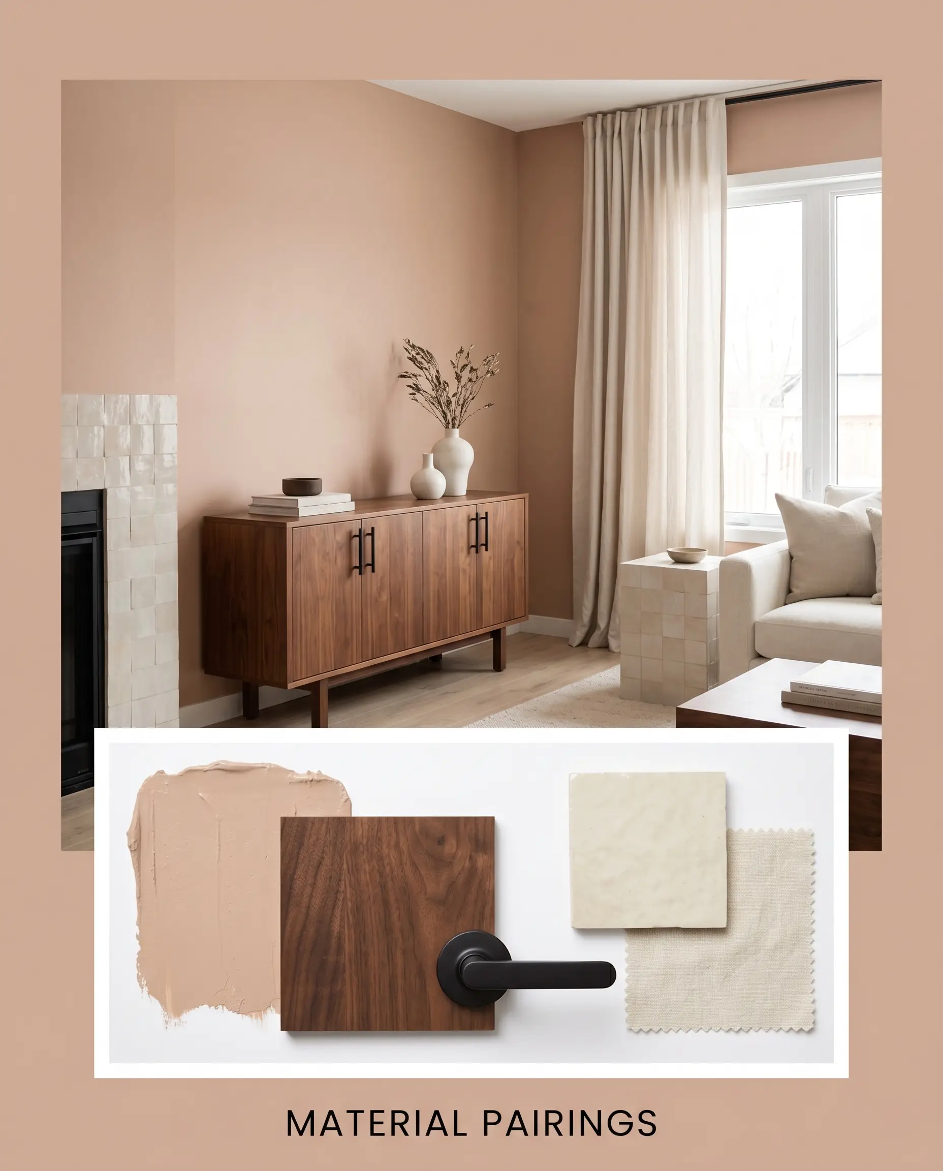
Hardware, Wood & Material Pairings
Treating paint as an architectural material means considering how it physically interacts with the hard finishes in your room.
Grounding Palette Additions
When selecting secondary colors, you must introduce cool, saturated tones that actively push back against the warmth of the copper.
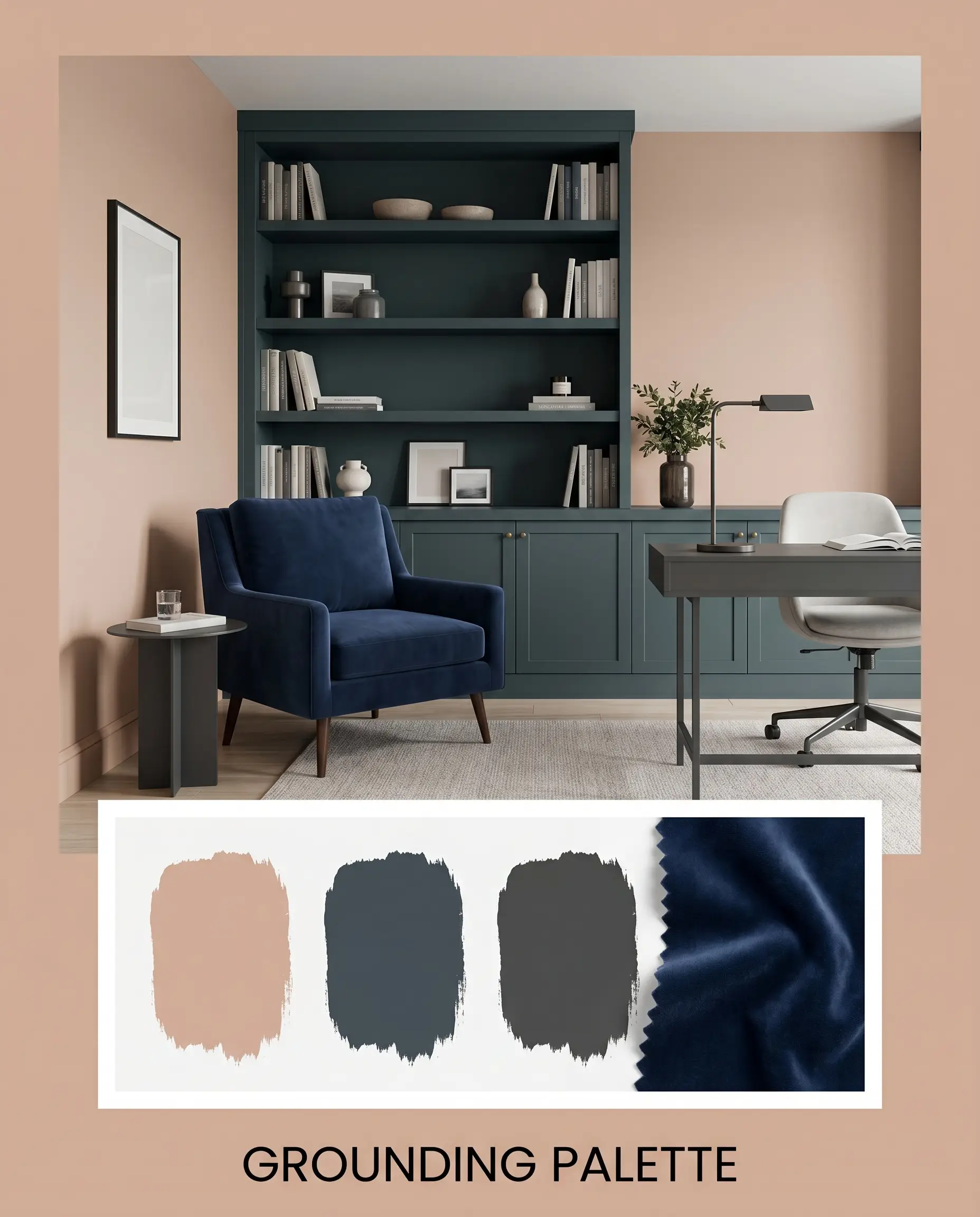
If you paint your walls in a warm terracotta, always introduce at least one cool-toned accent—like a navy throw pillow or a slate gray rug. This intentional tension is what separates a professionally styled room from a flat, one-dimensional space.
Hackrea Pro-Tip (The Contrast Strategy)
Curated Room Aesthetics
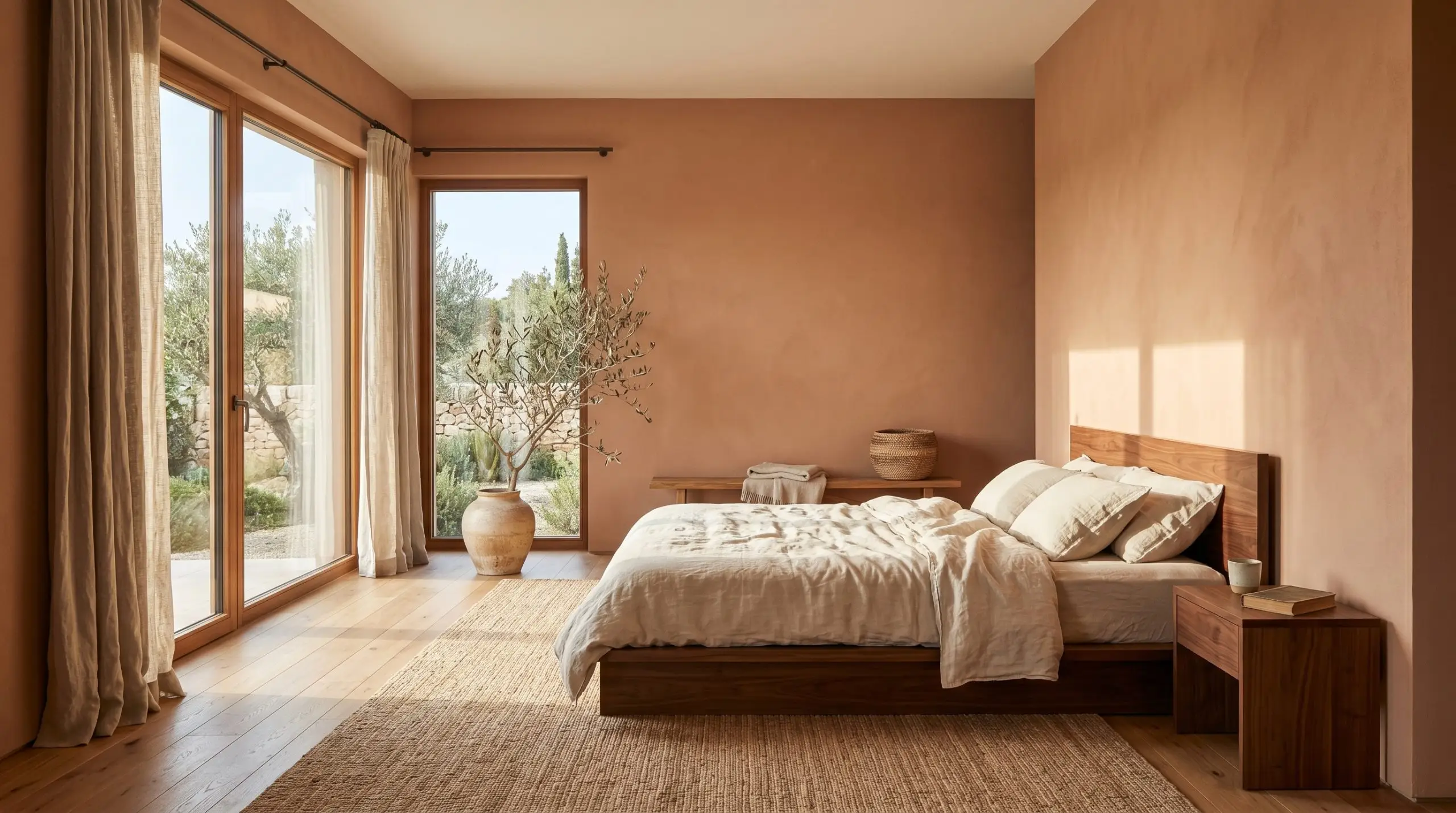
Sunbaked Minimalist This aesthetic relies on stripping away excess to let the raw warmth of the walls take center stage. Pair the copper paint with unbleached washed linen drapery and a low-profile walnut platform bed or minimalist console. By keeping the decor sparse and introducing a single oversized branch in a ceramic vase, the room feels like a serene, sun-drenched retreat.
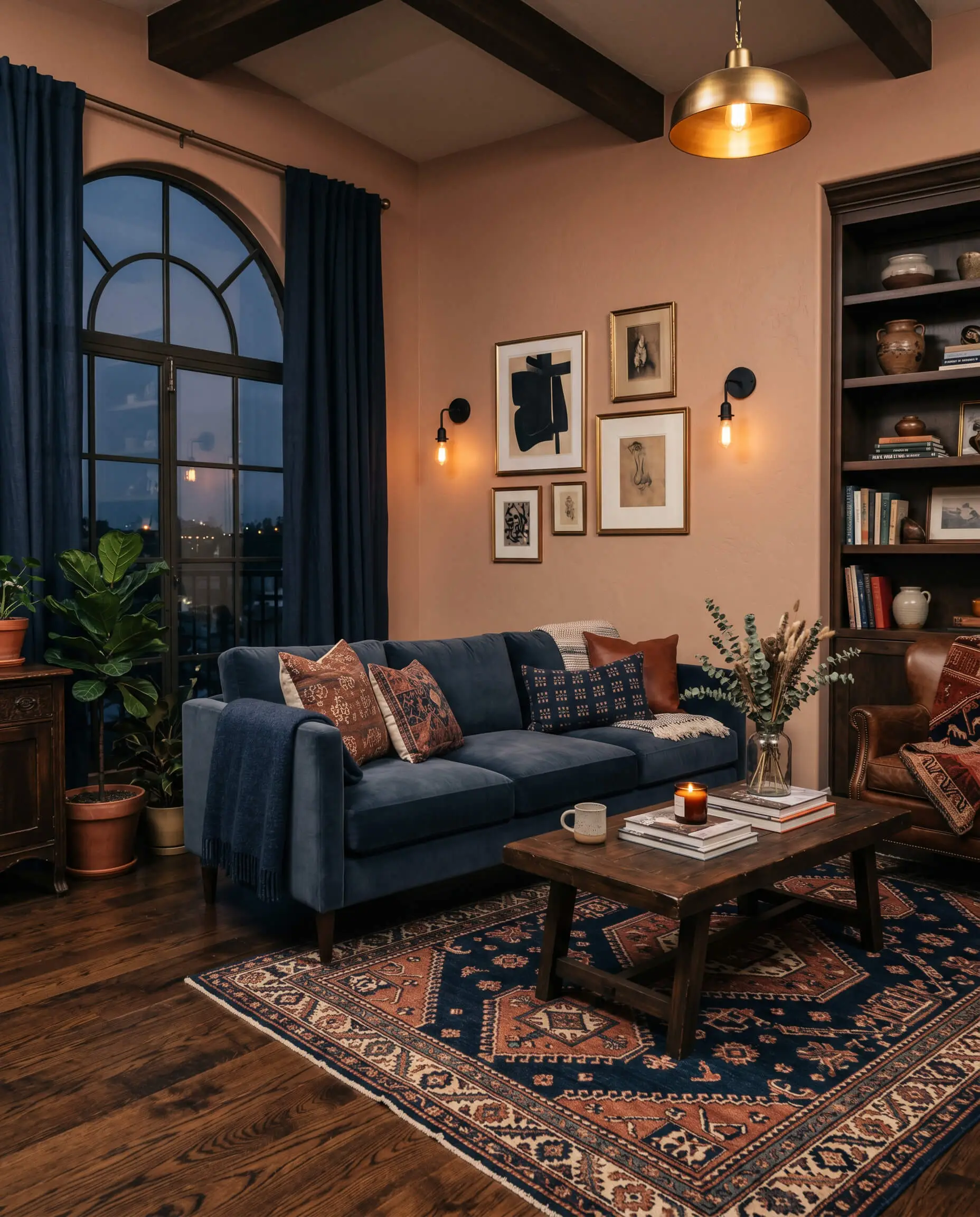
Midnight Hacienda To cultivate a moody, intimate energy, lean heavily into high-contrast color blocking. Imagine the earthy walls serving as a backdrop for a velvet sofa drenched in a color similar to Sherwin-Williams Naval, flanked by matte black sconces. Layering in a vintage, geometric tribal rug roots the space, creating a rich, evening-ready atmosphere that feels effortlessly sophisticated.
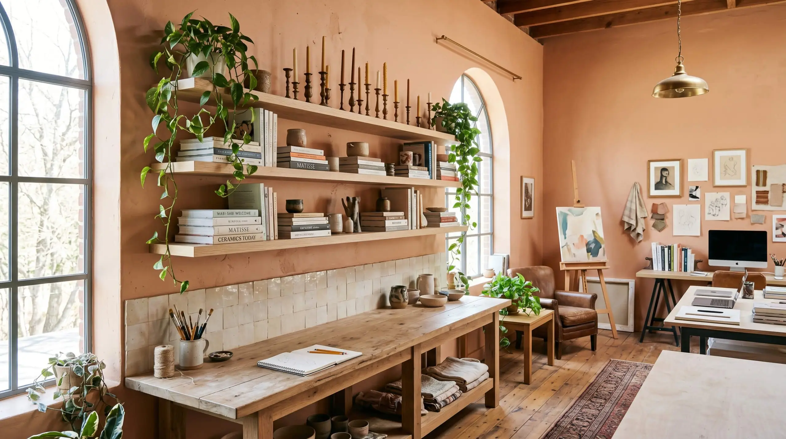
Artisan Studio This palette celebrates tactile imperfections and creative energy. The warm architectural finish of the walls is beautifully offset by creamy glazed Zellige tile accents and floating white oak shelving. Styling the space with stacked art books, trailing pothos, and mismatched brass candlesticks creates a collected, deeply personal vibe that thrives on organic texture.
Head-to-Head Paint Comparisons
While this mid-tone copper excels in sunlit, organic spaces, certain architectural styles or low-light exposures demand a slightly different profile. If your room lacks natural light or your existing hard finishes clash with orange tones, you need to understand exactly how these rival paints behave before making a final decision.
Behr Iced Copper vs. Sherwin-Williams Smoky Salmon SW 6331
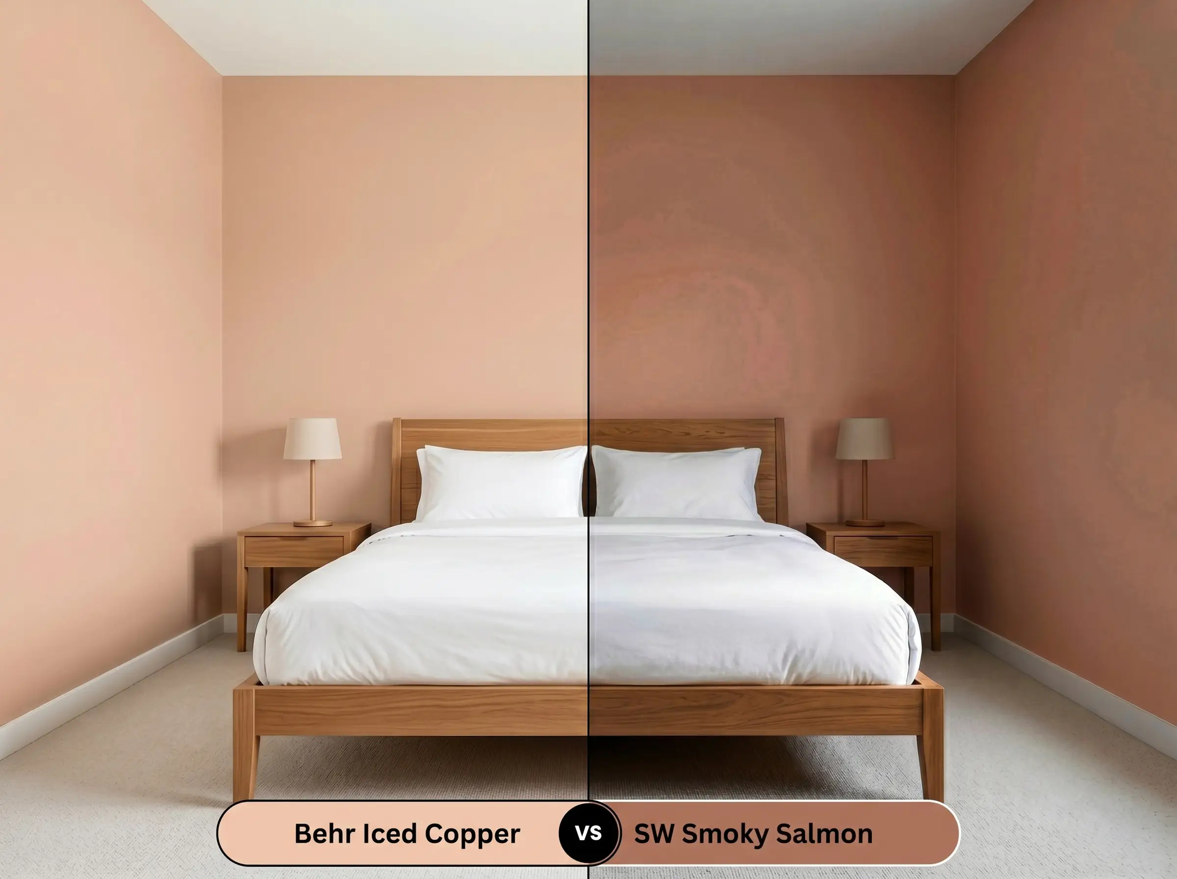
If you are worried about the paint looking too brown in a shaded room, Sherwin-Williams Smoky Salmon SW 6331 is your solution. It carries a noticeably higher pink saturation, stripping away the heavier terracotta influence. Choose the Behr option if you want a grounded, earthy feel, but pivot to the Sherwin-Williams shade if you need a brighter, more distinct coral-pink energy.
Behr Iced Copper vs. Benjamin Moore Milk Shake 1165
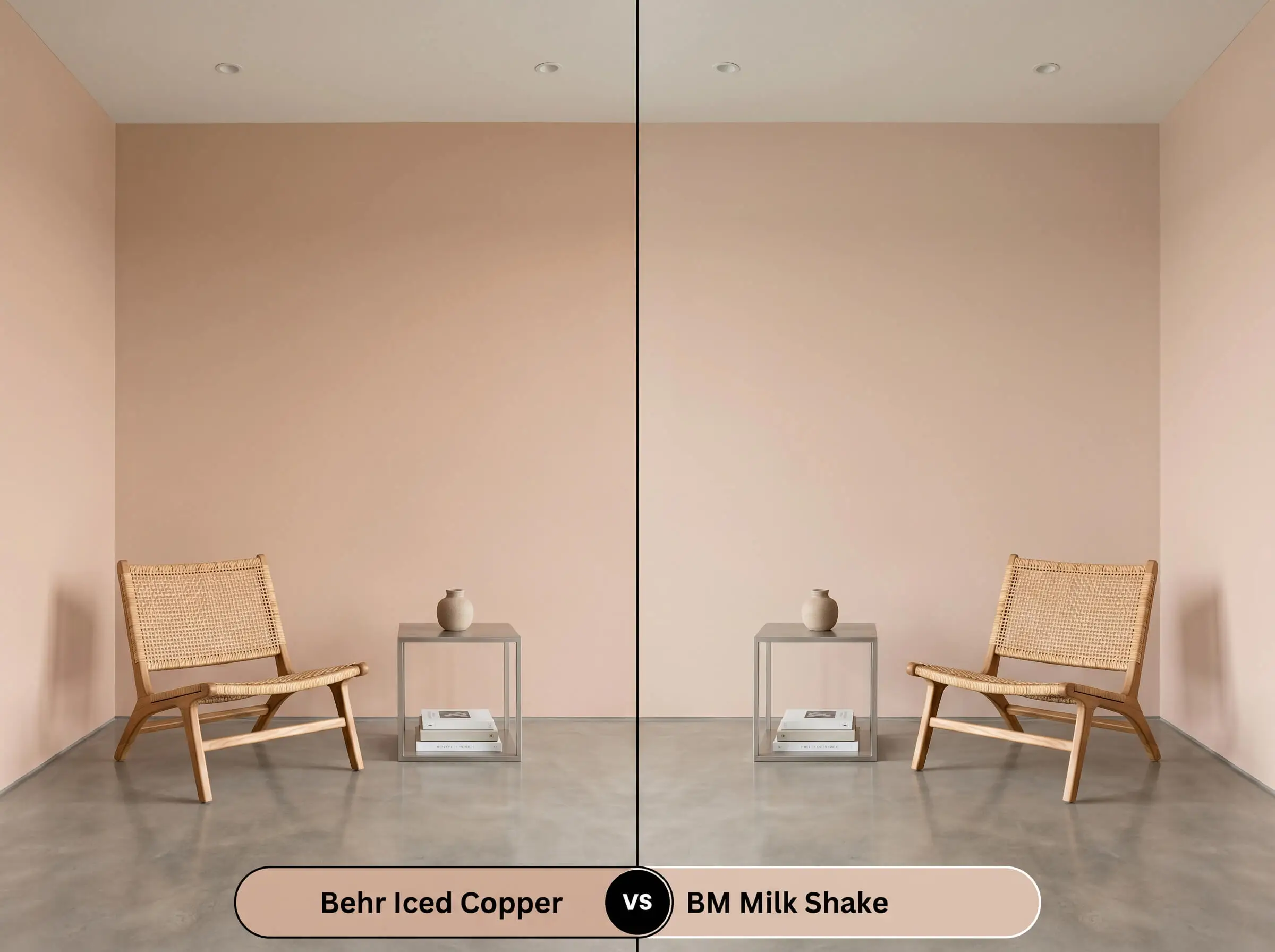
Benjamin Moore Milk Shake 1165 acts as a significantly lighter, softer alternative for spaces that cannot handle a dark wall. It leans much closer to a delicate blush, reflecting far more light and feeling inherently more delicate. If your room feels cavernous, the Benjamin Moore option will lift the shadows, whereas the Behr copper will purposefully absorb the light for a cozier, dramatic wrap.
Behr Iced Copper vs. Behr Cinnamon Tea S200-2
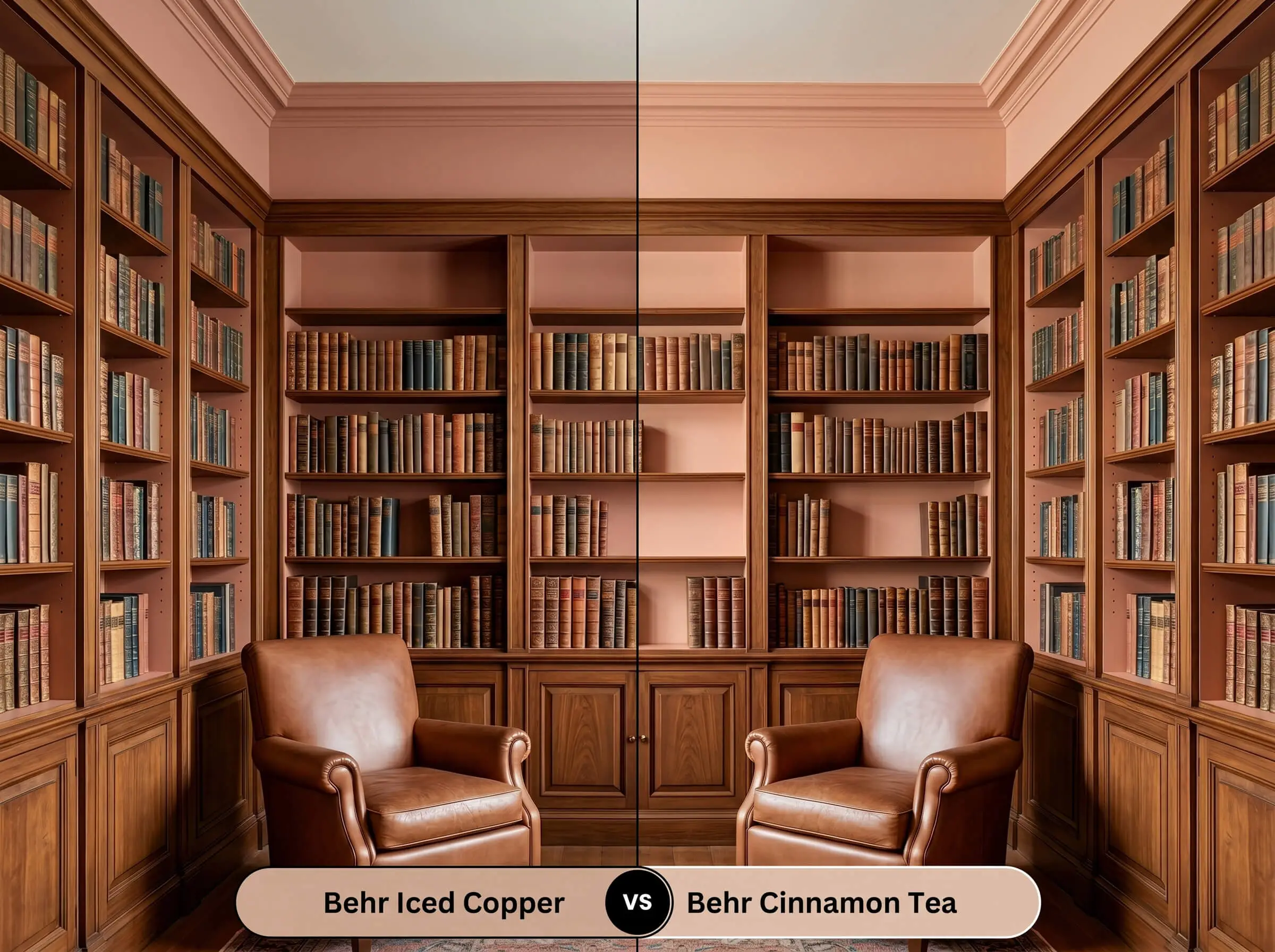
When comparing these two within the same brand family, Behr Cinnamon Tea S200-2 dives much deeper into true brown-orange territory. It is darker, richer, and significantly more traditional in its autumnal feel. If you want a playful, dusty rose undertone, stick with Iced Copper; if you are designing a moody, historic library space, Cinnamon Tea provides that necessary, weighted gravitas.
Exploring Similar Shades & Brand Equivalents
Sometimes a room’s natural light simply washes out a specific pigment, forcing you to find an alternative that offers just a touch more depth or a slightly crisper finish. Whether you are restricted by the brands available at your local hardware store or you just need a subtle tonal shift, these alternatives provide excellent starting points.
Behr Color Alternatives
Cross-Brand Paint Matches
Painting & Application Guide for Iced Copper
Transitioning this earthy richness from a digital swatch to your actual walls requires a strategic approach to finishes. The way light hits the surface of the paint will fundamentally alter how the color is perceived in your home.
The Best Sheens for Terracotta Tones
Primer Strategy & Coat Requirements
Because this color contains a complex mix of red, orange, and brown colorants, a high-quality primer is non-negotiable. If you are painting over a stark white or a very dark wall, ask your paint desk to tint your primer slightly gray; this prevents the old wall color from altering the final peach tone.
You must plan for a strict two-coat minimum to achieve the true, rich depth seen on the swatch.
Be highly conscious of your roller technique. Mid-tone colors with red bases are prone to “flashing”—meaning if you press too hard on the roller or touch up a dry spot, you will see visible, shiny streaks when the light hits the wall. Always maintain a wet edge and let the first coat dry completely before evaluating the coverage.
Frequently Asked Questions
Because direct sunlight naturally washes out subtle brown undertones, this color will definitely lean more toward a peachy pink on an exterior facade. However, the rough texture of stucco creates tiny shadows that help ground the hue, resulting in a beautiful, authentic Mediterranean aesthetic rather than a bright bubblegum pink.
It performs exceptionally well in windowless spaces because its warm, mid-tone depth counteracts the harshness of artificial vanity lighting. Instead of feeling closed in, the room will feel like a cozy, intentionally designed jewel box, especially when paired with brass hardware.
To complement the earthy terracotta vibe, pair this paint with warm, textured roofing materials like authentic clay barrel tiles, weathered cedar shakes, or a dimensional architectural shingle in a warm charcoal or deep brown. Avoid stark, cool-toned gray asphalt roofs, as they will actively clash with the warm orange base.
Yes, but it requires intentional styling to bridge the gap between the warm wood tones and the cool metal. The trick is to introduce matte black cabinet hardware or a slate-colored floor tile; these darker, grounding elements act as a visual buffer, allowing the earthy cabinets and the sleek stainless steel to coexist beautifully.
The Hackrea Final Verdict
Behr Iced Copper is a masterful, grounding hue designed for homeowners who are ready to inject genuine warmth and tactile energy into their spaces. It performs brilliantly in relaxed living rooms, creative bedroom retreats, and on Mediterranean-inspired exteriors where its sunbaked clay aesthetic can truly shine. This color thrives when paired with natural, accessible materials like walnut, woven cane, and washed linen, making it an incredibly versatile choice for organic modern, bohemian, or coastal design styles.
The Hackrea Clash Warning: You must exercise extreme caution if your home is currently outfitted with cool, blue-toned gray luxury vinyl plank flooring or stark white Carrara marble countertops. The icy, blue-purple undertones of those popular finishes will aggressively fight the warm, red-orange base of this paint, causing the walls to look unexpectedly muddy and the floors to appear sterile. If your fixed elements lean heavily into the cool gray spectrum, you are much better off selecting a deeply shaded taupe or a cool blue rather than trying to force this earthy terracotta to work against its own nature.