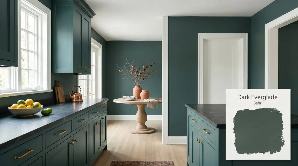
Dark Everglade HDC-CL-21A
BehrBehr Dark Everglade (HDC-CL-21A) is a deeply saturated, blackened blue-green paint color with an LRV of 8. Acting as a moody, sophisticated teal, it shifts between a rich emerald in warm lighting and a dark, dramatic cyan in cooler exposures.
Paint Technical Profile
| Color ID / SKU | HDC-CL-21A |
| HEX Code | #3e554f |
| Light Reflectance (LRV) | 8 |
| Use | Interior, Exterior |
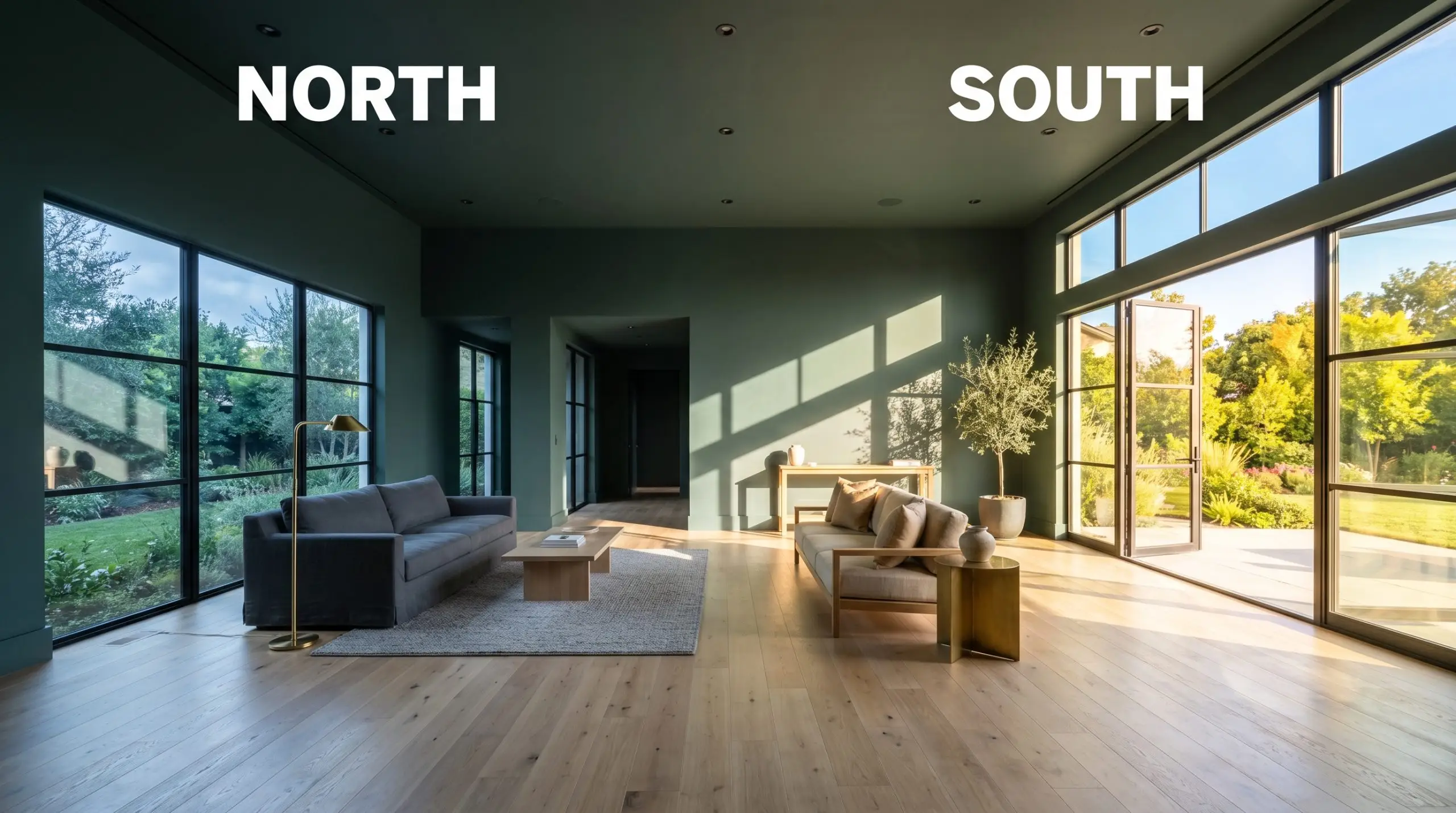
| Best Exposures | South-Facing, West-Facing |
| Best For | Cabinets, Accent Walls, Dining Rooms, Moody Bedrooms |
Behr Dark Everglade: The Moody Teal That Redefines Standard Architecture
Standard drywall often lacks character, but the right pigment can completely rewrite the visual boundaries of a room. Behr Dark Everglade HDC-CL-21A acts as an instant equalizer for basic spaces. This blackened green carries a profound, saturating presence that immediately softens the sharp corners of an everyday bedroom or living area.
It is far more complex than a standard forest tone. Thanks to a distinct blue-green chromatic profile, it reads as a sophisticated, moody teal that shifts beautifully as the sun moves across your home. When you want a room to feel intentionally designed rather than just painted, this is the exact color structure you reach for.
Behr Dark Everglade: Undertones & LRV
Homeowners constantly ask if a dark teal will feel too frigid or overly traditional. Behr HDC-CL-21A lands decisively on the cool side of the spectrum. Its structure is built on a very specific balance of pigments that keep it feeling modern rather than dated.
With an official LRV of 8, this shade possesses incredibly low light reflectance. It absorbs a staggering amount of illumination, which means it physically recedes from the eye. This optical illusion actually makes tight, windowless spaces feel surprisingly expansive and endless.
The Chameleon Factor: Lighting Interactions
Because of its complex cyan base, this architectural finish reacts dramatically to the shifting temperature of the sun. You must anticipate how your specific windows will manipulate the final color.
Popular Applications for This Blackened Green
Deploying a profoundly saturated color requires strategy, not just a roller. When applied thoughtfully, this shade turns everyday surfaces into custom-feeling architectural features. Here is how to manipulate this specific teal across your home.
Kitchen and Bathroom Cabinetry
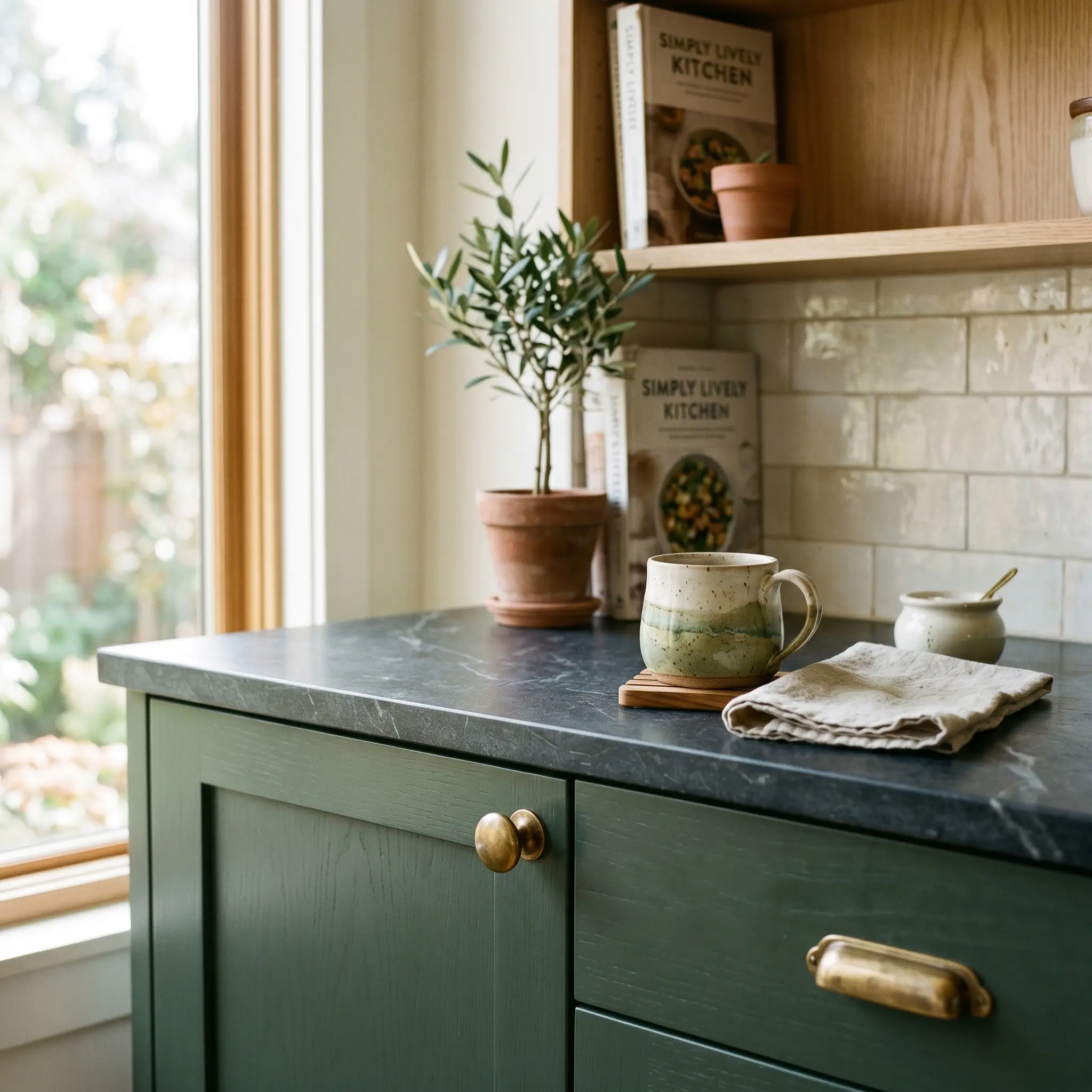
This shade is a brilliant cabinetry hue for homeowners looking to update existing shaker doors or floating vanities. Instead of defaulting to a predictable farmhouse aesthetic, push the design toward a modern transitional style. Pair the painted woodwork with honed soapstone counters and unlacquered brass hardware.
The brass will beautifully contrast against the cool teal, creating a tactile friction that feels incredibly premium. For a busy family bathroom, wrapping a standard builder-grade vanity in this color instantly establishes a serene, spa-like focal point.
When using a dark cyan-leaning green on cabinetry, avoid brushed nickel. The silver tones will clash with the cool undertones, making the room feel sterile. Always opt for warm metals like brass, copper, or aged bronze to balance the temperature.
Hackrea Pro-Tip (The Hardware Harmony)
Dining Rooms
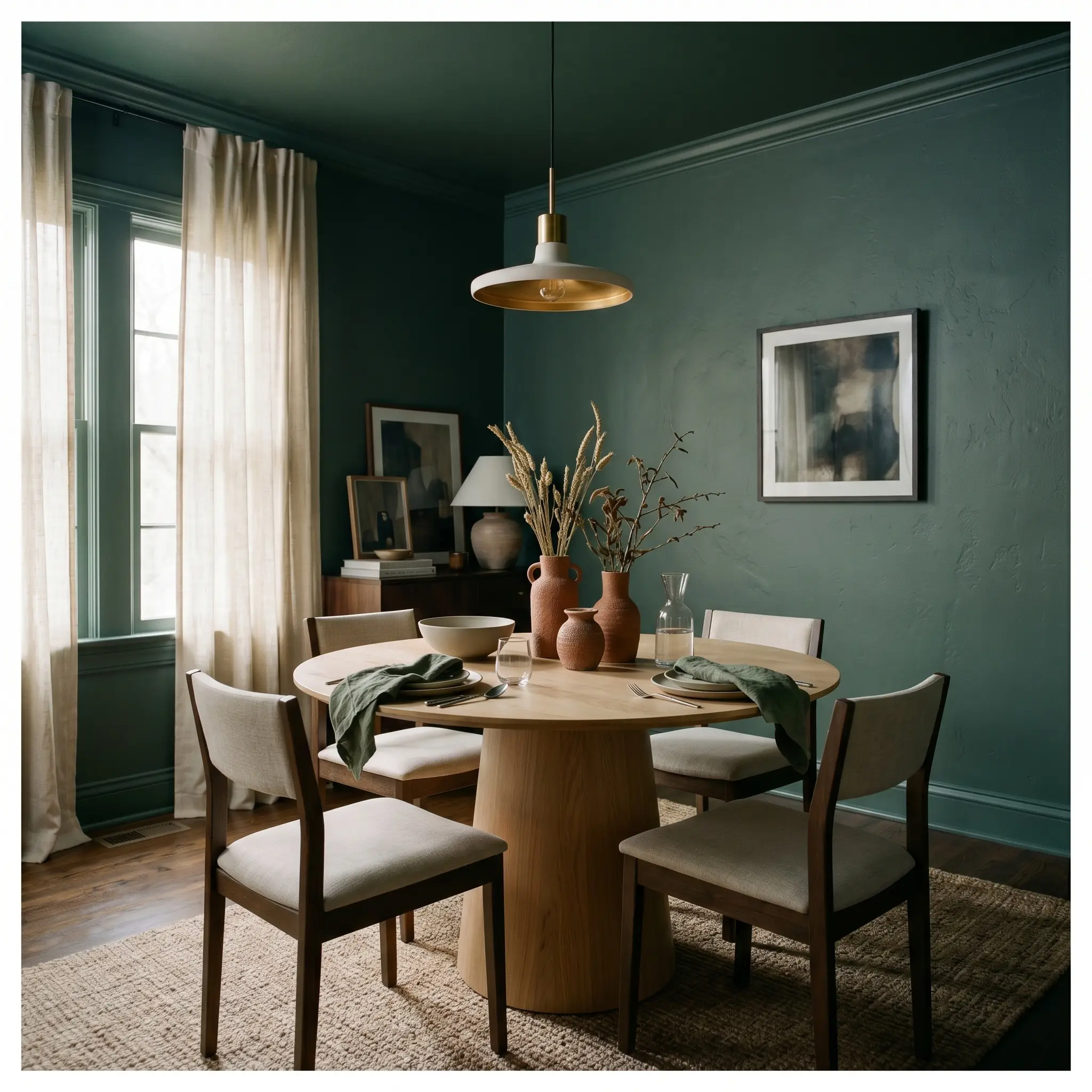
If you regularly host intimate dinners, consider color-drenching your entire dining room. Painting the walls, baseboards, and ceiling in the same saturated tone erases the visual boundaries of the room. This technique envelops your guests in a rich, moody atmosphere.
To keep the space from feeling overly formal, introduce modern organic elements. Center the room with a white oak pedestal table and drape the windows in sheer, raw silk. Adding terracotta vases or rust-colored textiles will provide a brilliant complementary contrast to the blue-green walls.
Home Offices and Libraries
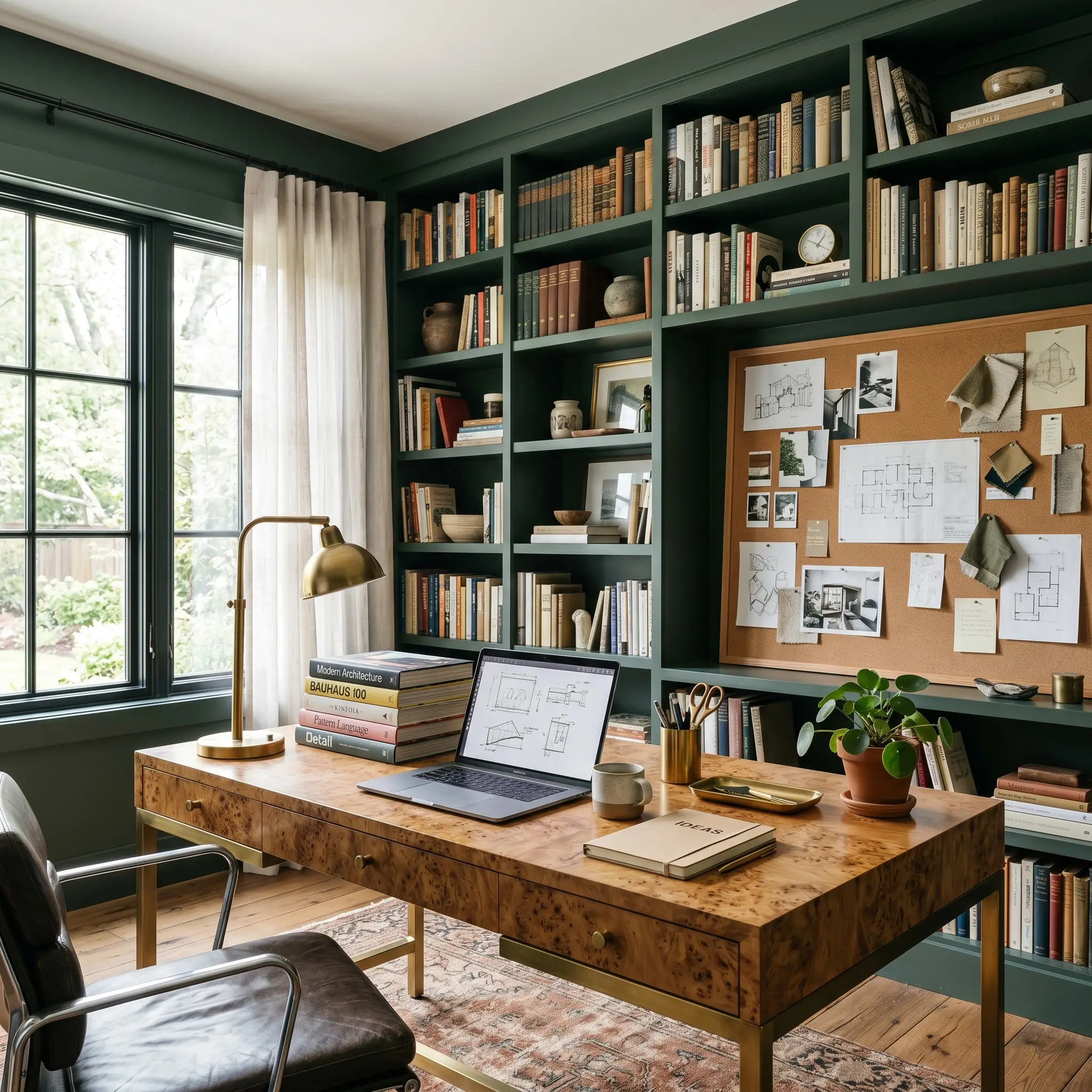
You do not need leather-bound books and tufted armchairs to use dark green in a workspace. Treat this color as a backdrop for a modern, eclectic creative studio. Paint your built-in bookcases or floating shelves to match the walls for a seamless, built-in look.
Against this saturated canvas, introduce a burl wood desk and an oversized cork board. The natural, warm textures of the wood and cork will pop intensely against the cool teal. It provides a focused, highly intentional environment for remote work.
Moody Bedrooms
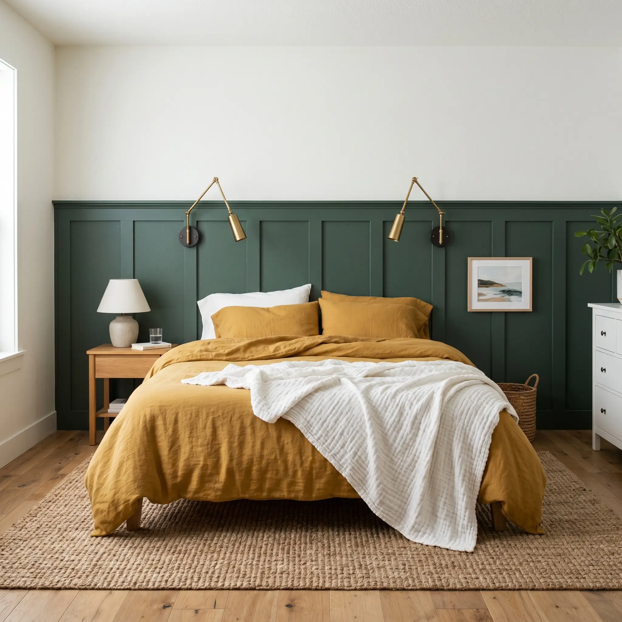
This color is exceptional for bedrooms, but you should avoid the predictable velvet-and-crystal styling. Instead, lean into an elevated coastal aesthetic. Install a simple board-and-batten half-wall, paint it dark, and leave the upper walls a crisp white.
Style the bed with mustard yellow or blush pink washed linen sheets. Layer a thick jute rug on the floor and install sleek brass sconces on either side of the bed. The resulting vibe is relaxed, tactile, and effortlessly sophisticated.
Exterior Accents
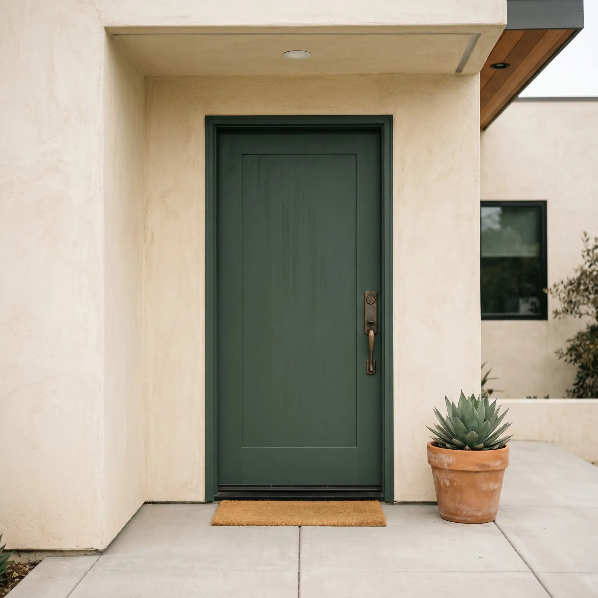
Using this shade on shutters or a front door creates a striking first impression. It works beautifully against warm cream stucco or standard white clapboard siding. The contrast highlights the architecture without resorting to a stark, harsh black.
Be highly strategic with exterior placement. If your front door faces directly south and receives ten hours of blistering sunlight, the intense UV rays will aggressively flatten the cyan notes. The color may lose its sophisticated edge and read as a dusty, washed-out green.
Clash Warning (The Sun Washout)
Coordinating Colors for Behr Dark Everglade
This profoundly deep pigment demands intentional companions to truly shine. Rather than letting it dictate the entire energy of the room, you must surround it with materials that either bounce light back into the space or offer a warm, tactile contrast.
Establishing Crisp Architectural Boundaries
When working with a shade this light-absorbing, your trim color acts as a crucial visual boundary. Benjamin Moore Chantilly Lace OC-65 provides a stark, luminous border that prevents the dark walls from bleeding into the ceiling. This sharp contrast acts as a visual frame, forcing the teal undertones to snap into focus.
If you prefer a slightly softer transition, Sherwin-Williams High Reflective White SW 7757 is an exceptional choice. It lacks the icy undertones of Chantilly Lace, offering a brilliantly clean edge that still feels inviting. Always use a semi-gloss finish on this trim to maximize the light reflection against the matte walls.
Hardware, Wood & Material Pairings
Pairing the right textures with this blackened green is the secret to making a standard room feel incredibly intentional. The goal is to introduce elements that create a dynamic visual dialogue with the paint’s cool undertones.
Building a Harmonious Color Palette
You must carefully select secondary colors to ensure this saturated shade feels integrated rather than isolated.
Designer Mood Boards
To truly understand how this color structure behaves, you have to visualize it interacting with an entire room’s styling. These curated palettes demonstrate how seamlessly this teal adapts to entirely different design philosophies.
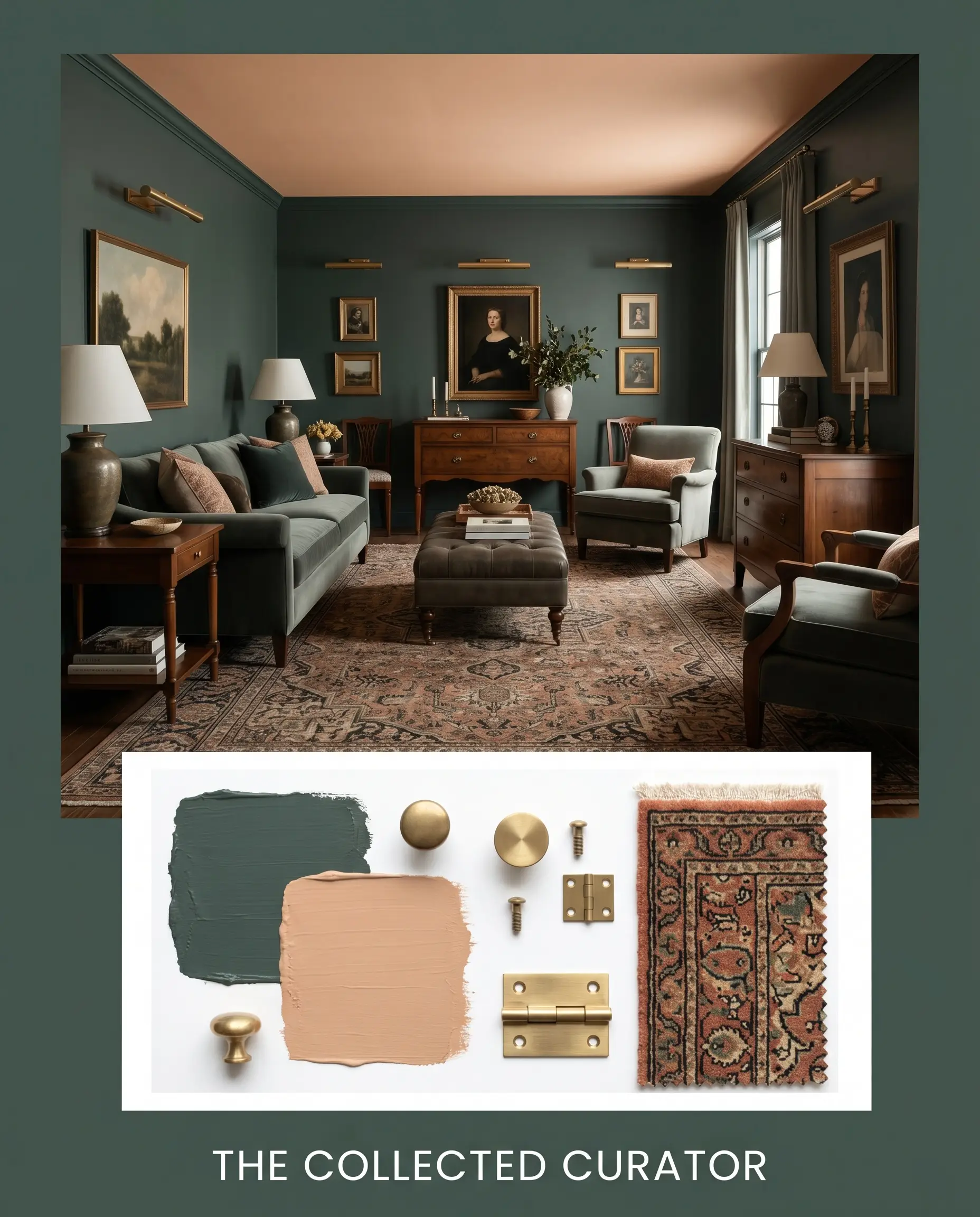
The Collected Curator This palette leans into a sophisticated, highly intentional friction. The dark teal walls act as a moody canvas for vintage Persian rugs and oversized abstract line art. Introducing Farrow & Ball Setting Plaster on the ceiling softens the entire room, while unlacquered brass picture lights add a premium, glowing focal point.
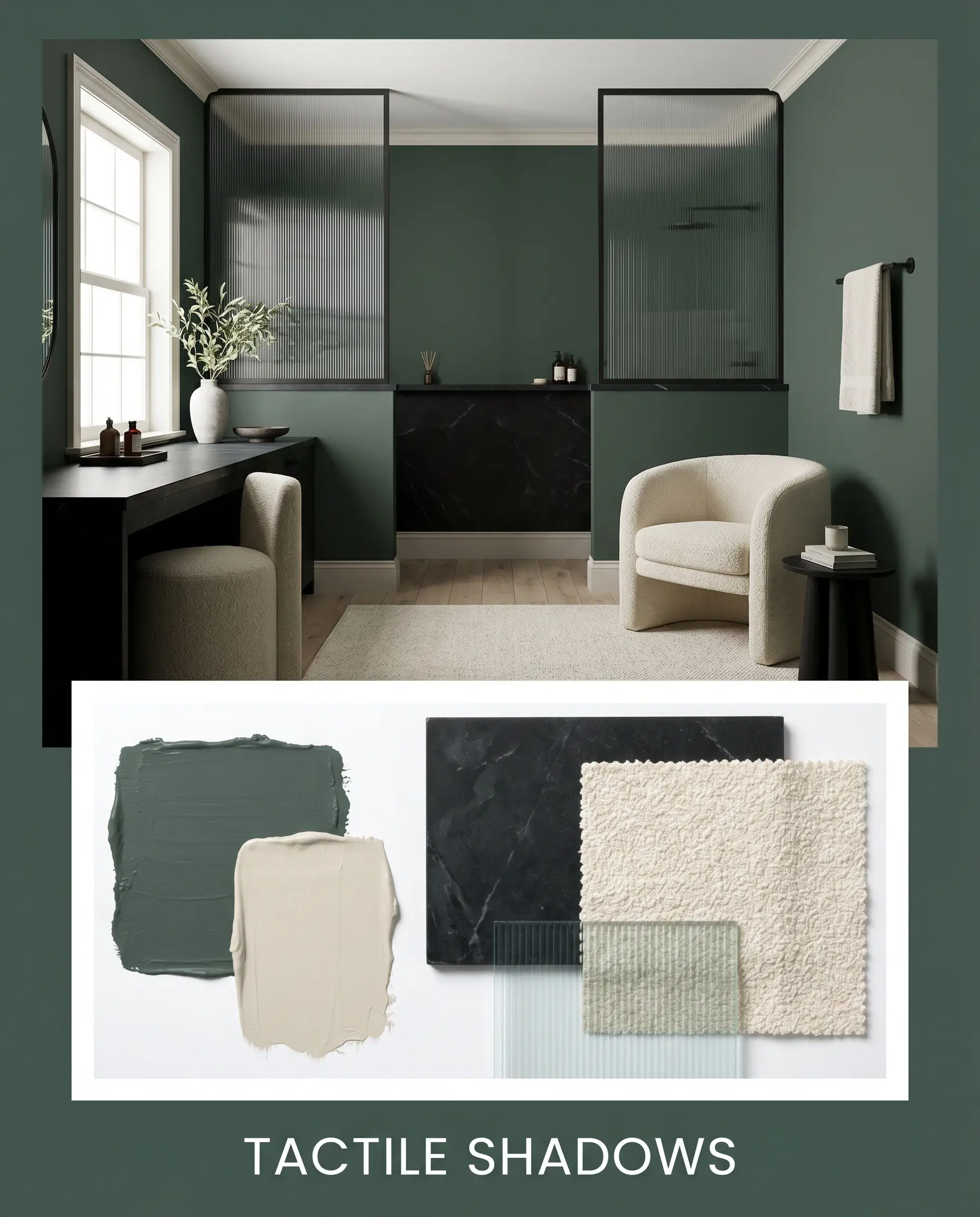
Tactile Shadows Designed for those who crave a serene, enveloping atmosphere without relying on pure black. The saturated walls are paired with black soapstone surfaces and layers of cream bouclé textiles to create profound depth. Fluted glass accents and Benjamin Moore Edgecomb Gray on the trim keep the energy feeling modern and intentionally subdued.
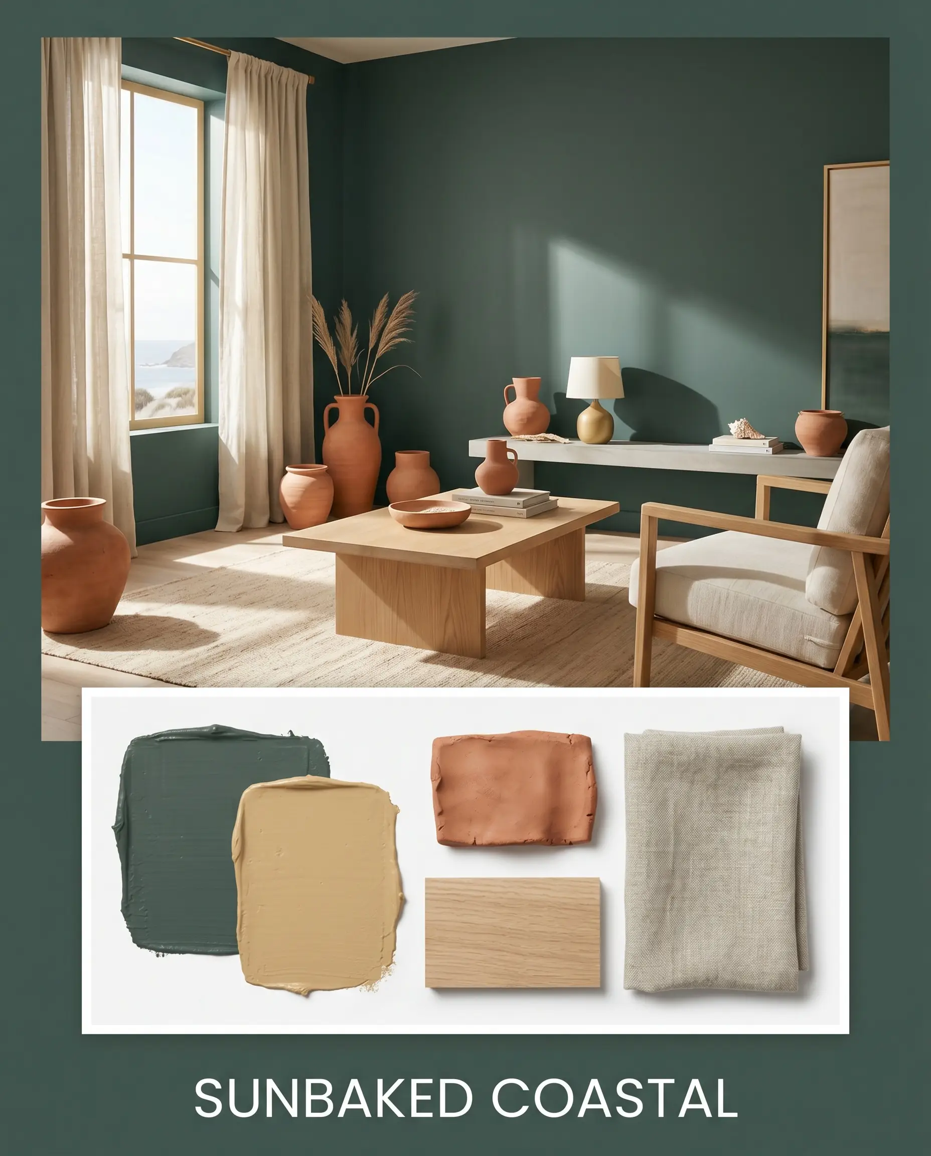
Sunbaked Coastal This approach completely flips the script on traditional dark greens by introducing vibrant, earthy warmth. The rich cyan notes of the paint are balanced by raw terracotta ceramics and expansive white oak elements. Washed linen drapery and subtle accents of Sherwin-Williams Tarnished Trumpet give the space a relaxed, sun-drenched energy.
Comparing This Blackened Green to Rival Shades
Sometimes your home’s specific lighting or natural exposures demand a slight pivot in your color strategy. If a room receives almost zero natural light, or if your flooring has a strong competing undertone, you may need a hue with a slightly different foundational structure.
Behr Dark Everglade vs. Behr Black Evergreen MQ6-44
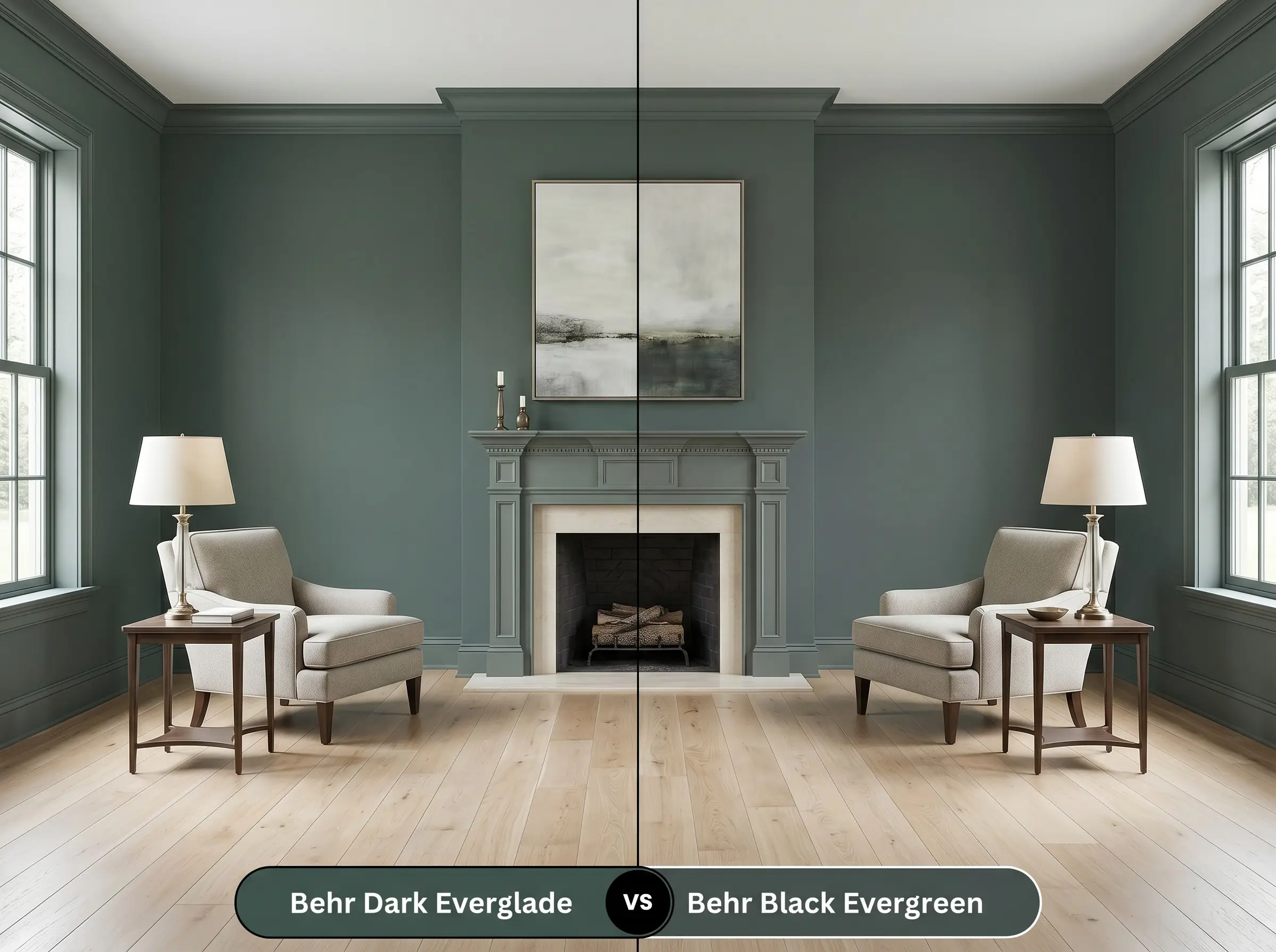
Black Evergreen drops the blue influence entirely, relying on a truer, forest-inspired base. If your room features a lot of warm red brick or cherry wood, the cyan in our primary teal might clash. Black Evergreen offers a classic, outdoorsy warmth that pairs beautifully with traditional finishes.
Behr Dark Everglade vs. Sherwin-Williams Pewter Green SW 6208
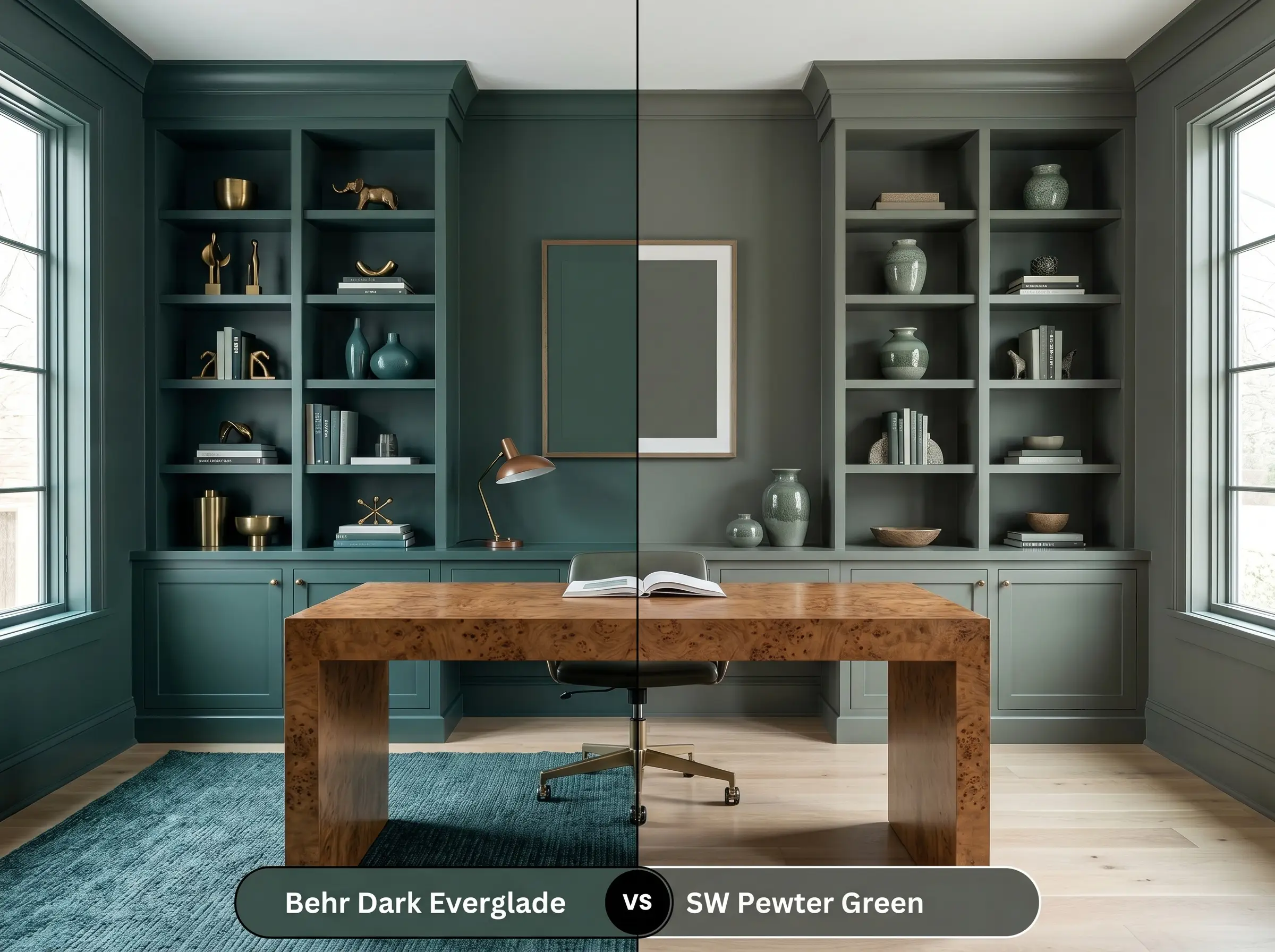
Pewter Green introduces a significant dose of gray, muting the overall intensity and raising the light reflectance just a touch. If you are hesitant about vibrant color but still want a moody atmosphere, Pewter Green offers a softer approach. It feels slightly more weathered and subdued on the wall.
Behr Dark Everglade vs. Benjamin Moore Salamander 2050-10
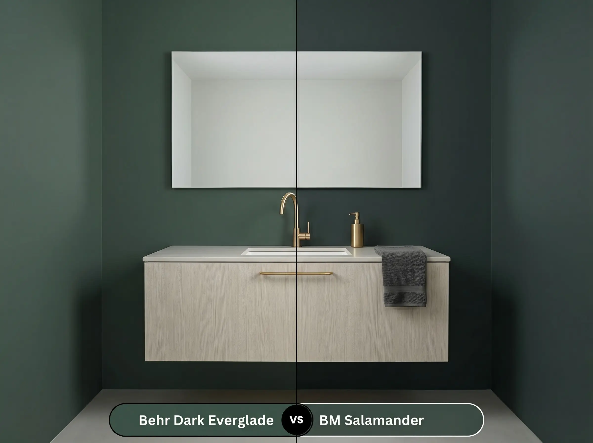
Salamander is noticeably darker and leans even further into the blackened spectrum, reading almost like a soft charcoal in low light. Choose Salamander if you have abundant southern light that can handle extreme light absorption. In a windowless room, Salamander will look nearly black, whereas the Behr option retains its distinct teal identity.
Exploring Alternatives to This Saturated Teal
You might love the concept of a moody hue but need something slightly crisper or perhaps a touch more muted to fit your exact vision.
Same-Brand Variations
If you want to stick with this manufacturer but need a slight adjustment in tone, consider these internal alternatives.
Cross-Brand Matches
When local availability dictates a brand switch, these equivalents offer a similar dramatic impact.
Behr Dark Everglade Application & DIY Advice
Moving from design theory to actual application requires a solid strategy, especially with a pigment this dense. Dark colors are notoriously unforgiving when rolled incorrectly, so preparation is your greatest asset.
The Dynamic Sheen Guide
Your choice of finish will completely alter how the undertones are perceived by the eye.
Primer Strategy
A high-quality tinted primer is absolutely non-negotiable for a shade this saturated. Ask your paint counter to tint the primer to a deep gray. If you apply this dark teal directly over a standard white primer, the vibrant base coats will struggle to hide the stark white underneath, requiring frustrating extra layers.
Coverage & Success Tips
Even with a tinted primer, you must plan for two generous coats to achieve the true, rich depth of this specific color.
Dark paints are highly susceptible to “flashing”—visible, uneven streaks or roller marks that catch the light. To prevent this, always maintain a wet edge while rolling, use a high-quality 3/8-inch nap microfiber roller, and never press hard against the drywall to squeeze out the last drop of paint.
Hackrea Design Secret (The Flashing Fix)
Frequently Asked Questions
Direct, relentless UV exposure will strip away the softer green notes over time. This leaves a much sharper, faded blue appearance, so you must use a premium exterior topcoat with UV protection to lock in the pigment.
Because it absorbs so much light, painting the walls, trim, and ceiling in this shade actually blurs the corners of the room. This optical trick pushes the walls outward, making a tight half-bath feel surprisingly expansive and intentional.
Heavily textured surfaces cast their own micro-shadows, which will dramatically darken an already low-LRV paint. Unless you have brilliant, direct natural light hitting that ceiling, it will likely read as a flat, dark charcoal.
Mid-tone woods with subtle orange or red bases, like classic cherry or warm white oak, provide a brilliant complementary contrast. This natural warmth balances the cool cyan notes, keeping the room grounded and inviting.
The Final Verdict on This Architectural Finish
Behr HDC-CL-21A is a transformative tool for homeowners who want to inject profound, curated drama into standard rooms. It is absolutely perfect for color-drenching intimate dining spaces, updating existing bathroom vanities, or creating a focused, moody backdrop for a home office. When paired with warm, tactile materials like unlacquered brass and white oak, it elevates everyday architecture into something that feels highly intentional and distinctly custom.
This color is NOT for spaces dominated by cool gray luxury vinyl plank flooring or stark, brushed nickel hardware. When placed next to frosty grays or silver metals, the cyan undertones in this paint turn visually icy. The resulting energy feels cold, corporate, and entirely uninviting. Always anchor this shade with earthy, warm elements to maintain a welcoming home.
Clash Warning (The Sterile Freeze)