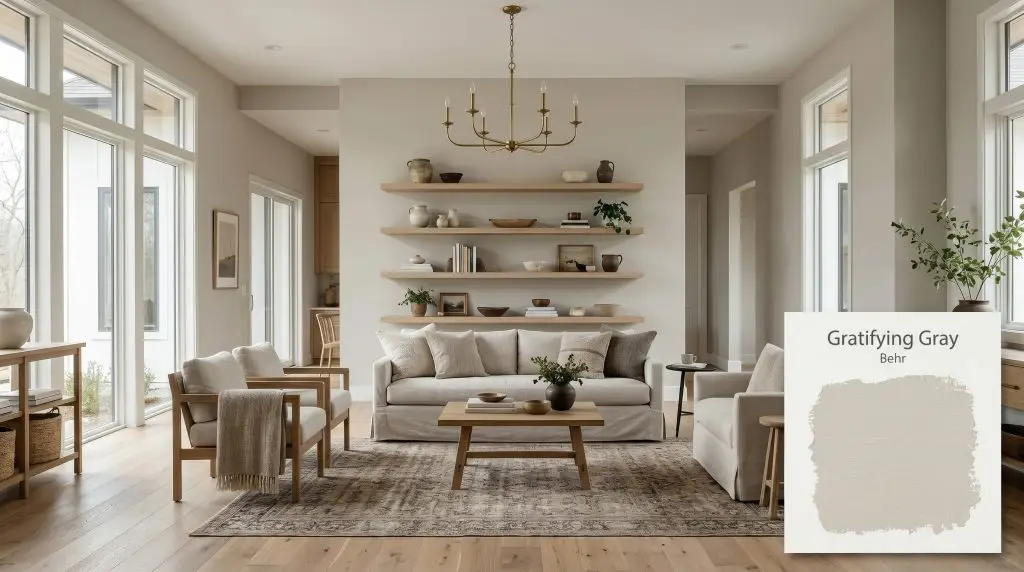
Gratifying Gray DC-008
BehrBehr Gratifying Gray (DC-008) is a warm, light-base gray with subtle green and yellow undertones. Boasting an LRV of 58, it acts as a versatile transitional neutral that brings a soothing, elegant purity to both interior and exterior spaces.
Paint Technical Profile
| Color ID / SKU | DC-008 |
| HEX Code | #cbc9c0 |
| Light Reflectance (LRV) | 58 |
| Use | Interior, Exterior |
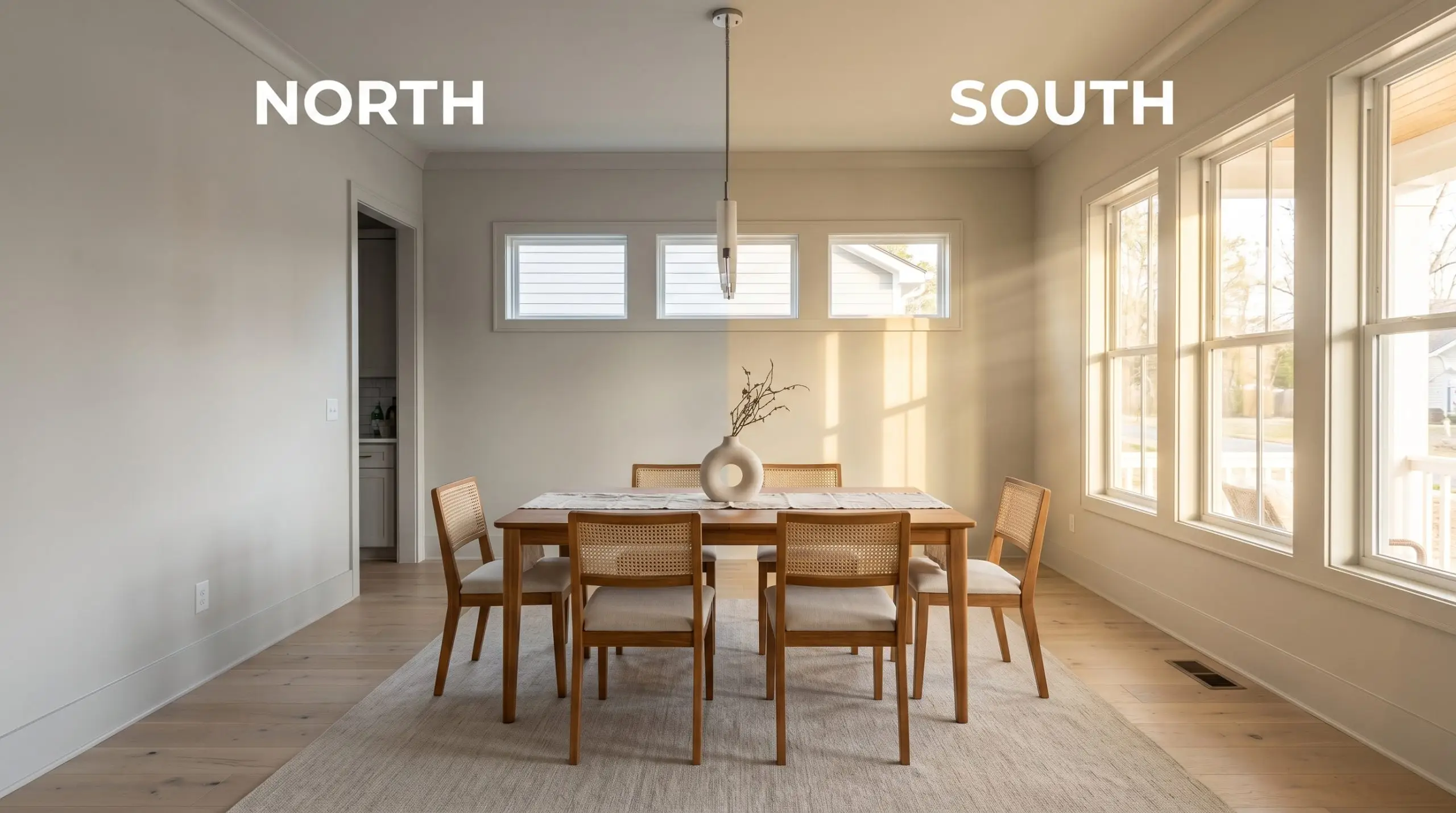
| Best Exposures | South-Facing, West-Facing |
| Best For | Open-Concept Living Areas, Kitchen Cabinetry, Exteriors |
Behr Gratifying Gray: The Warm Transitional Neutral That Redefines Everyday Spaces
The secret to a thoughtfully designed room often starts with a foundational layer that refuses to feel flat or sterile. When you are looking to update a standard living space, the right neutral acts as a stabilizing force for your entire aesthetic vision. Behr Gratifying Gray provides exactly that kind of reliable, earthy warmth without demanding constant attention.
This specific color structure allows you to build a highly intentional room around it, regardless of your personal style. It acts as a quiet, sophisticated backdrop that makes your chosen materials and textiles shine. By understanding how this pigment behaves, you can completely transform the energy of your home.
Behr Gratifying Gray: Undertones & LRV
If you are wondering whether Behr Gratifying Gray leans warm or cool, the definitive answer is that it is a distinctly warm gray tone. Its chromatic profile is carefully constructed to avoid the icy, unwelcoming feel that plagues so many standard grays on the market. Instead, it offers a welcoming, organic energy that instantly softens a room.
To truly understand how this architectural finish will look on your walls, we need to look at its underlying DNA:
With a light reflectance value (LRV) of 58, Gratifying Gray sits right in the transitional sweet spot for interior design. This means it absorbs a moderate amount of light while reflecting just enough to keep standard-sized rooms feeling open and breathable. It strikes a perfect balance—it will not wash out completely in bright rooms, nor will it turn excessively dark and heavy in shadowed corners.
Decoding the Light: How This Warm Gray Shifts
Every paint color is at the mercy of the sun, and this transitional neutral is no exception. Because of its specific hue angle, Gratifying Gray acts as a subtle chameleon throughout the day. The shifting color temperature of your light sources will pull different characteristics out of the paint.
Here is exactly how you can expect the color to behave in your home:
If you want to maintain the beautiful greige warmth of Gratifying Gray in the evening, swap your standard cool LEDs for bulbs rated between 2700K and 3000K. This simple switch prevents the paint from turning flat and lifeless after the sun goes down.
Hackrea Pro-Tip (The Bulb Strategy)
Transforming Your Home: Where to Use This Versatile Neutral
The true value of a well-balanced neutral lies in its ability to adapt to almost any architectural challenge you throw at it. Because its visual weight is so perfectly calibrated, this Behr shade works beautifully across a wide variety of standard home layouts. Here is how to maximize its potential in your most important spaces.
Expansive Living Spaces & Open Layouts
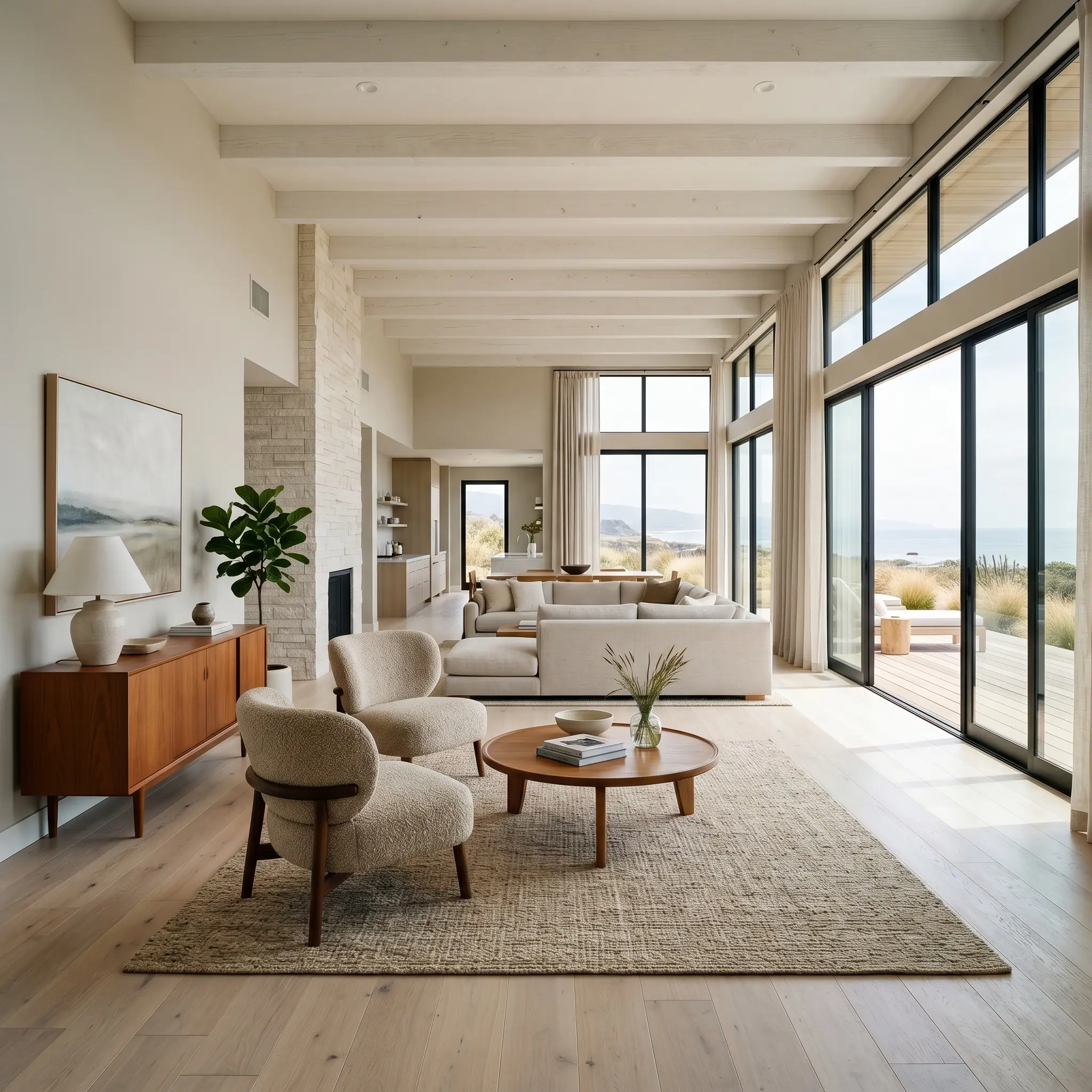
In open-concept homes where one color must flow seamlessly through hallways, dining areas, and living rooms, Gratifying Gray provides a beautiful, unifying foundation. Its subtle greige base warms up large, expansive walls without making the room feel enclosed or dense. This makes it an incredible backdrop for a relaxed coastal or organic modern aesthetic.
To elevate a standard living room, pair this paint with tactile, accessible furnishings like a slipcovered sofa in washed canvas or nubby bouclé accent chairs. Introduce warmth through bleached oak floating shelves or a mid-century teak sideboard to pull out the earthy undertones of the walls. Layering a vintage, subtly distressed damask rug over your floors will add character and ground the entire arrangement perfectly.
Cabinetry & Kitchen Walls
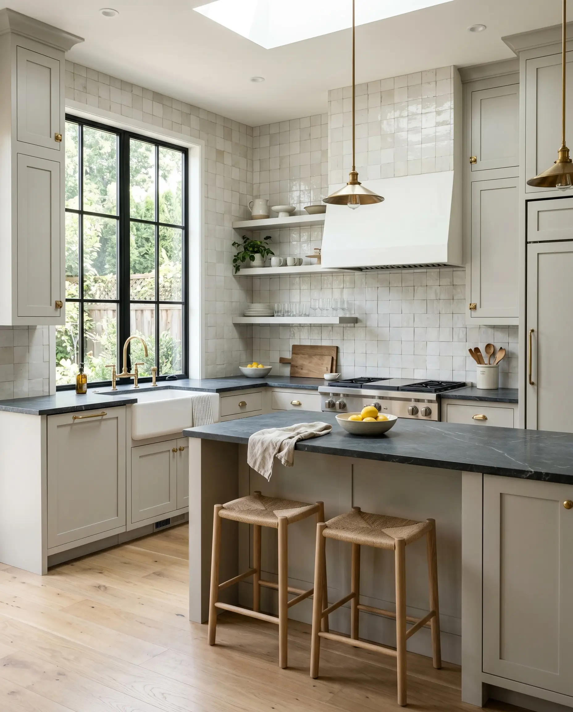
Updating a kitchen doesn’t always require a massive structural overhaul; sometimes, the right paint color completely changes the perceived quality of the room. When applied to kitchen cabinets, this warm gray tone feels instantly sophisticated and custom. It pairs beautifully with classic transitional elements, offering a softer alternative to stark white or trendy navy blue.
For a high-impact transformation, pair Gratifying Gray cabinetry with honed soapstone countertops and unlacquered brass hardware. The metallic warmth of the brass interacts beautifully with the paint’s yellow-green cast, creating a rich, layered look. If you are keeping your existing standard countertops, use a textured zellige tile backsplash to add a premium, artisanal focal point that elevates the entire kitchen.
Be incredibly cautious if your kitchen features dated granite countertops with prominent pink, peach, or purple flecks. The subtle green-yellow base of this paint will visually fight with those red-based tones, making the stone look muddy and the cabinets look slightly sickly.
Clash Warning (The Countertop Conflict)
Restful Bedroom Retreats
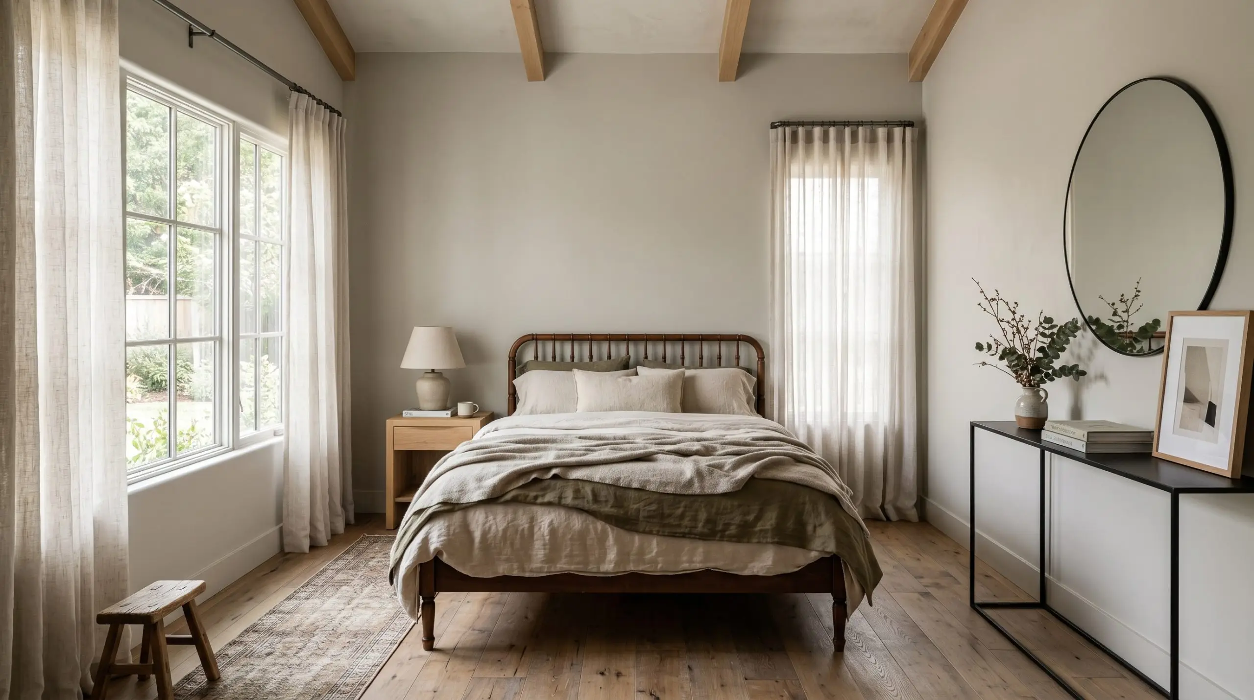
Your primary bedroom should be a sanctuary, and this color provides a deeply stabilizing energy for resting spaces. The moderate light reflectance value ensures the room feels bright enough during the morning while transitioning into a cozy, shadowed retreat at night. It is the perfect canvas for a cozy minimalist design approach.
Rather than relying on heavy furniture, build the room’s atmosphere through layered textiles. Dress a vintage spindle bed in draped washed linen and sheer cotton window treatments to keep the ambient lighting soft and diffused. To prevent the room from feeling too soft or entirely beige, introduce strategic contrast with matte black hardware, raw steel curtain rods, or a sleek, minimal metal console.
Facades, Siding, and Exterior Trim
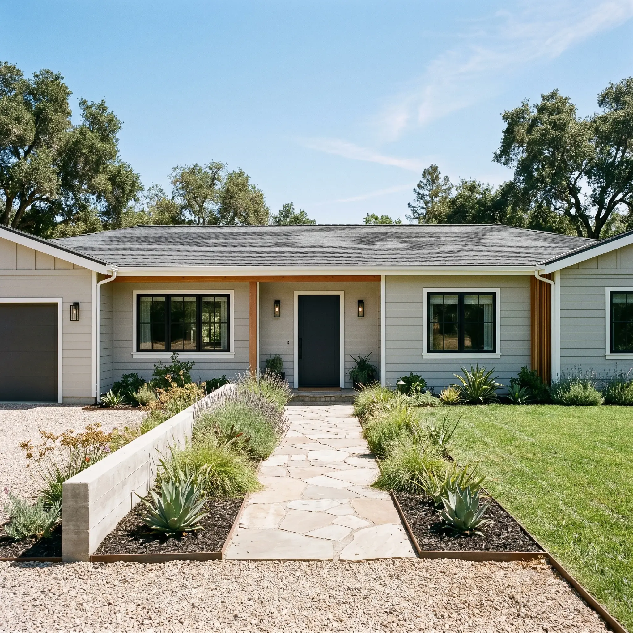
When taken outside, the intense wash of direct sunlight will always make a paint color appear significantly lighter than it does on an interior swatch. On exterior siding, Gratifying Gray loses some of its depth and reads as a beautifully soft, warm off-white with just enough pigment to avoid glaring in the sun. It is an excellent choice for updating suburban facades or modernizing a classic ranch home.
To give your exterior a striking, intentional finish, pair the warm siding with crisp white trim and deeply contrasting accents. Blackened bronze exterior sconces, a charcoal black front door, and natural stone pathways will ground the soft siding and provide necessary architectural definition. This combination creates a welcoming, refined curb appeal that feels both timeless and remarkably fresh.
Material Pairings & Coordinating Color Strategies
The most successful rooms do not rely on the wall color alone to carry the aesthetic weight. Because this Behr paint features a warm greige base with a subtle yellow-green cast, it thrives when paired with earthy, grounded accents that help define its boundaries. Soft tonal bleeds into similar colors will create a highly serene atmosphere, while crisp metallic contrasts will force the gray to read as a more tailored, structured neutral.
Flawless Trim & Baseboard Combinations
Selecting the right trim color dictates exactly how this warm gray tone will behave in your room. For a crisp, definitive boundary that highlights the wall’s depth, Benjamin Moore Chantilly Lace OC-65 provides a brilliant, clean contrast without feeling stark. If you prefer a softer, more atmospheric transition, Sherwin-Williams Pure White SW 7005 introduces just enough warmth to prevent the millwork from looking icy against the greige base.
For older homes or rooms leaning into a highly traditional aesthetic, Farrow & Ball Pointing No. 2003 is an exceptional choice. This rich, warm white pulls the underlying yellow notes out of the wall color, creating a beautifully sunlit, continuous glow from baseboard to ceiling.
Architectural Finishes & Tactile Elements
Harmonious Paint Matches
Curated Aesthetic Concepts
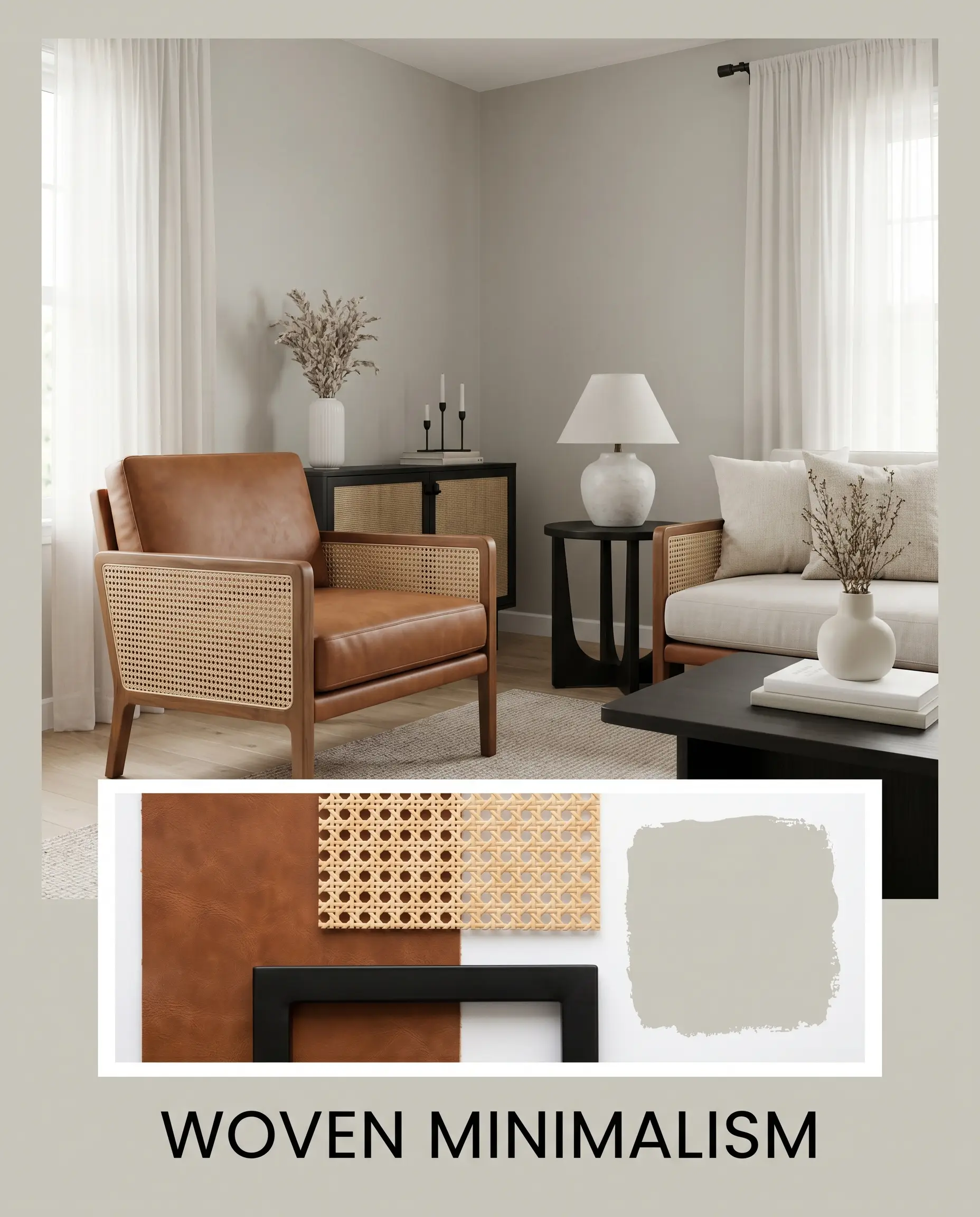
Woven Minimalism This styling approach strips away excess clutter while relying heavily on texture to maintain a deeply welcoming energy. The warm greige walls act as a quiet canvas for structured saddle leather chairs, natural cane webbing accents, and matte black hardware. By layering sheer cotton textiles over the windows, the natural light remains diffused and soft, allowing the earthy tones of the room to breathe. The resulting mood is uncluttered, serene, and remarkably grounded.
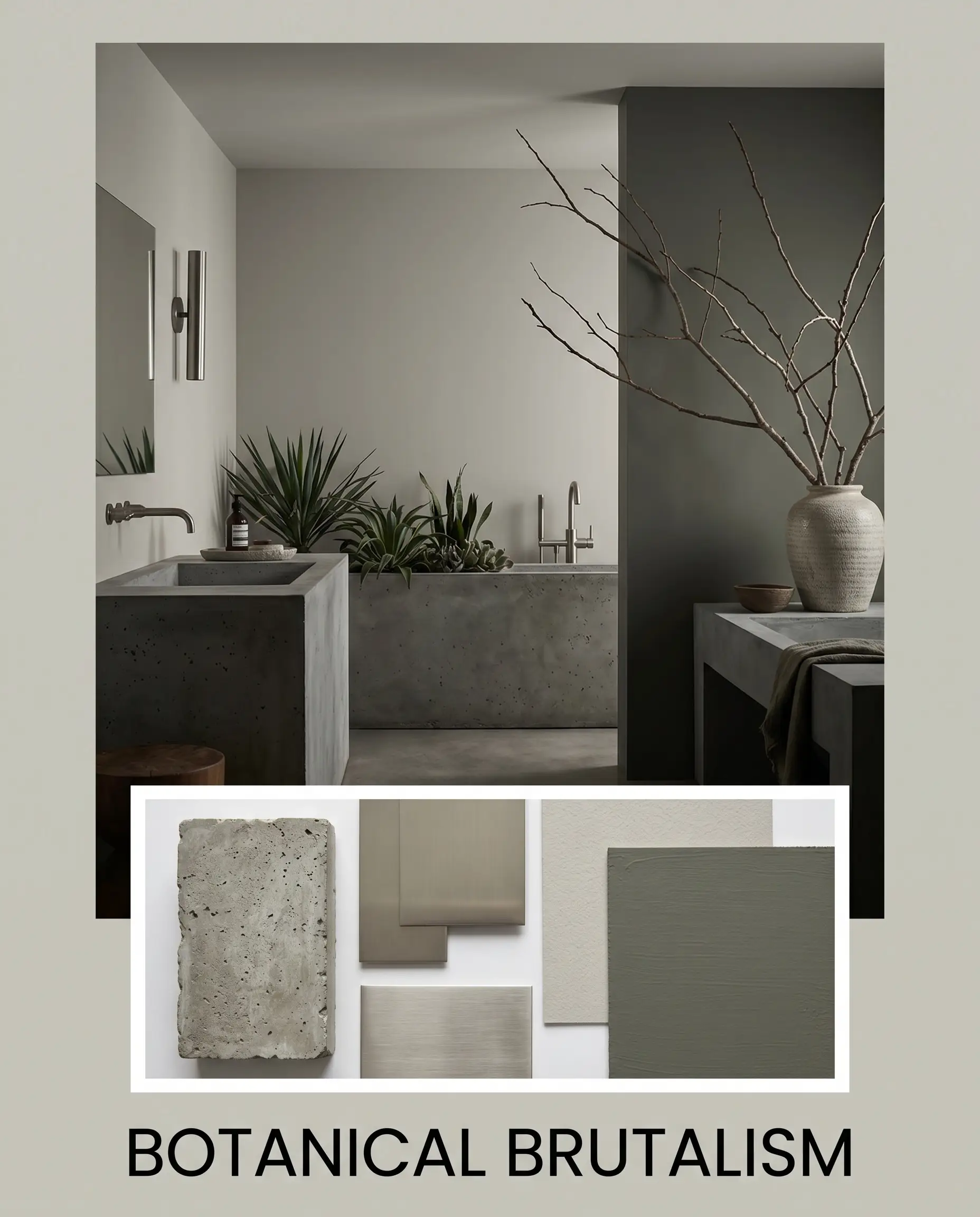
Botanical Brutalism For a moodier, more architectural aesthetic, this concept leverages intentional, high-impact contrast. The soft, transitional neutral walls are abruptly interrupted by raw concrete planters, sleek brushed nickel fixtures, and dramatic accent walls painted in Sherwin-Williams Rosemary. Introducing oversized, structural branches in simple ceramic vases softens the hard lines of the metals. This creates a sophisticated tension that feels highly curated, slightly moody, and undeniably modern.
Behr Gratifying Gray vs. Leading Market Alternatives
Even the most versatile neutral will occasionally face lighting conditions or architectural exposures where it fails to perform perfectly. If your room receives highly specific natural light, the subtle yellow-green cast of this Behr formula might lean too warm or lose its necessary depth. In those scenarios, understanding how it compares to direct market rivals allows you to pivot your design strategy with complete confidence.
Behr Gratifying Gray vs. Sherwin-Williams Repose Gray SW 7015
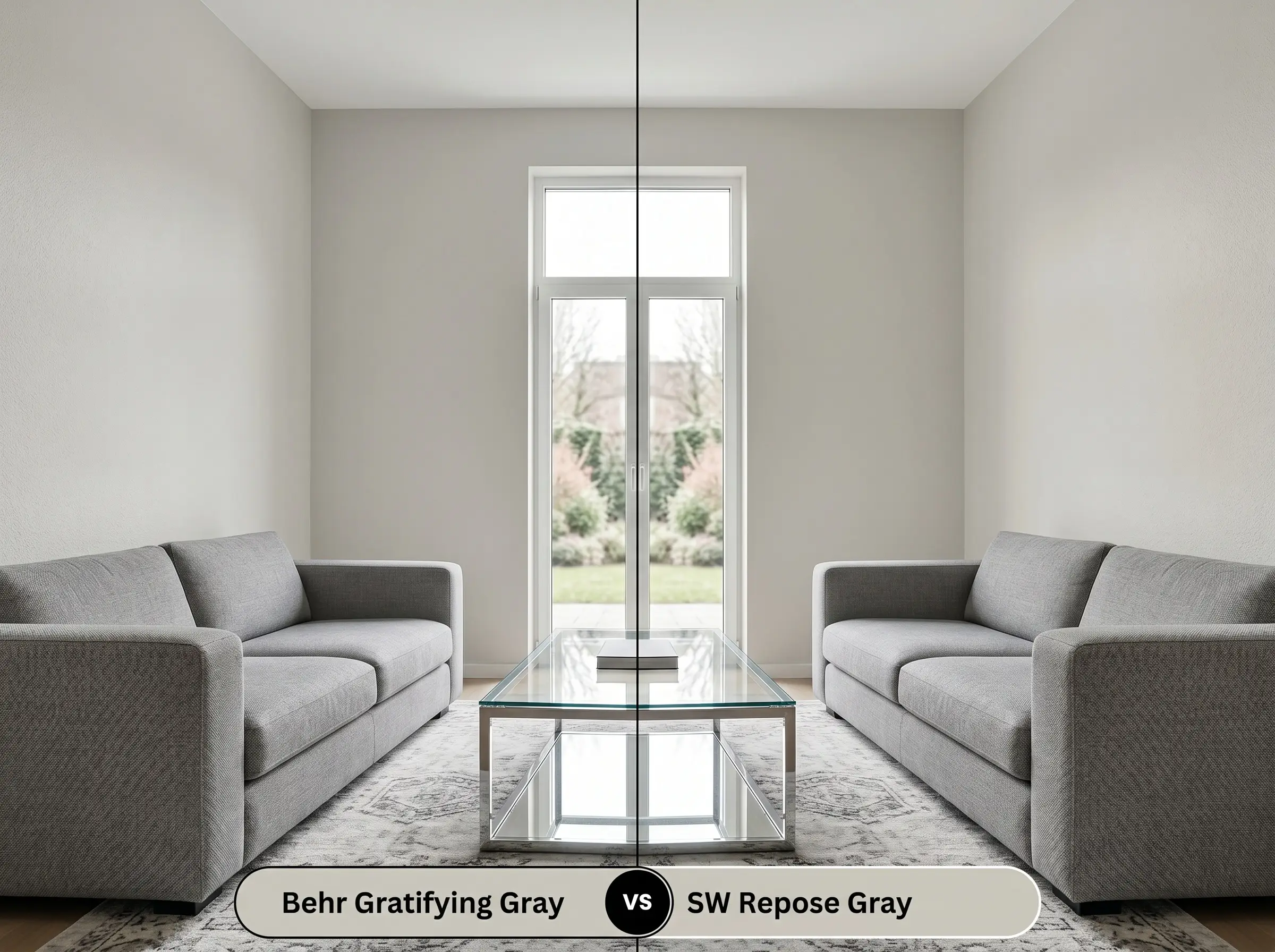
Sherwin-Williams Repose Gray features a slightly cooler, more violet-leaning base compared to the earthy yellow-green found in the Behr option. If your room faces south and is flooded with warm afternoon sunlight, Gratifying Gray can sometimes read a bit too creamy or beige for a modern aesthetic. When you need a crisper, more traditional gray that actively resists turning muddy in warm light, Repose Gray is the definitively safer choice. However, in north-facing rooms, Repose Gray runs the risk of looking chilly, whereas the Behr alternative will maintain its welcoming warmth.
Behr Gratifying Gray vs. Benjamin Moore Edgecomb Gray HC-173
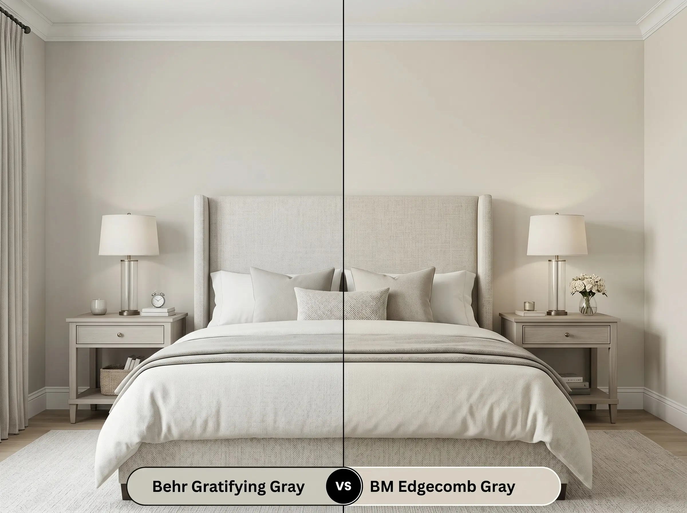
Benjamin Moore Edgecomb Gray is significantly warmer and boasts a higher light reflectance value, pushing it firmly into the beige category. If your space lacks natural light or feels entirely too shadowed, the Behr pigment might feel slightly too dense on the walls. By switching to Edgecomb Gray, you instantly lift the visual weight of the room and introduce a brighter, softer foundation. Conversely, if you want a color with enough structure to contrast beautifully against bright white trim, Gratifying Gray holds its shape much better.
Color Matching & Practical Alternatives
Sometimes a paint color is almost perfect, but it needs just a slight adjustment in depth or warmth to truly harmonize with your existing floors or furniture. Alternatively, you might be working with a contractor who strongly prefers a different manufacturer. Here are the most reliable pivots and matches to help you finalize your palette.
Behr Catalog Alternatives
Cross-Brand Color Matches
Professional Execution Strategies
Transitioning a color from a small paper swatch to an entire wall requires an understanding of how the paint physically dries and cures. The final aesthetic of this transitional neutral is heavily influenced by the sheen you select and the preparation underneath it.
Because this color relies on a delicate balance of warm and cool notes, applying a high-quality, neutral gray-tinted primer is highly recommended. This ensures that the old wall color does not bleed through and distort the new greige base.
Mid-tone grays with complex undertones are notorious for “flashing”—leaving visible, uneven roller marks when dried. Always maintain a wet edge while rolling, and apply two full coats to guarantee a professional, seamless finish that looks beautifully uniform in direct sunlight.
Hackrea Design Secret (The Wet Edge Rule)
Frequently Asked Questions
Because red and green are complementary colors, the warm red tones in the oak will actively pull the hidden green cast forward. To minimize this effect, use an expansive, neutral-toned rug to create a visual buffer between the wood and the wall.
Without natural daylight to balance it out, the yellow undertone can occasionally read as slightly muddy under standard artificial lighting. You can easily correct this by installing crisp, 3000K to 3500K LED bulbs to neutralize the warmth and restore the color’s balance.
Its moderate light reflectance value means it will lighten significantly under direct sunlight, reading as a soft off-white rather than a true gray. It works beautifully on textured masonry, provided you anchor it with deeply contrasting dark trim to maintain necessary architectural definition.
Cheap, low-CRI bulbs will flatten the complex yellow-green base, stripping the paint of its signature warmth and making it look lifeless. Investing in bulbs with a Color Rendering Index (CRI) of 90 or higher ensures the nuanced greige tones render beautifully and accurately at night.
The Final Verdict on Behr Gratifying Gray
Behr Gratifying Gray is a highly reliable, beautifully balanced transitional neutral that excels at softening everyday spaces. Its moderate light reflectance and earthy, yellow-green base make it the perfect foundational color for homeowners who want to introduce warmth without committing to a heavy beige. It performs brilliantly in open-concept living rooms, cozy bedrooms, and on kitchen cabinetry, seamlessly adapting to both relaxed coastal and modern organic design styles.
However, this specific paint formula requires careful consideration regarding what sits next to it. If your home features prominent, icy blue textiles, stark blue-based white trims, or heavily pink-toned granite countertops, this color will visually fight those elements. The cool, blue tones will clash directly with the paint’s yellow-green base, causing the gray to look slightly sickly and muddy rather than sophisticated. When you respect its underlying warmth and pair it with grounded, earthy materials, this paint provides a remarkably elegant and enduring backdrop for your home.
Closest Cross-Brand Equivalents
The absolute closest scientific color matches for Gratifying Gray across top paint brands.