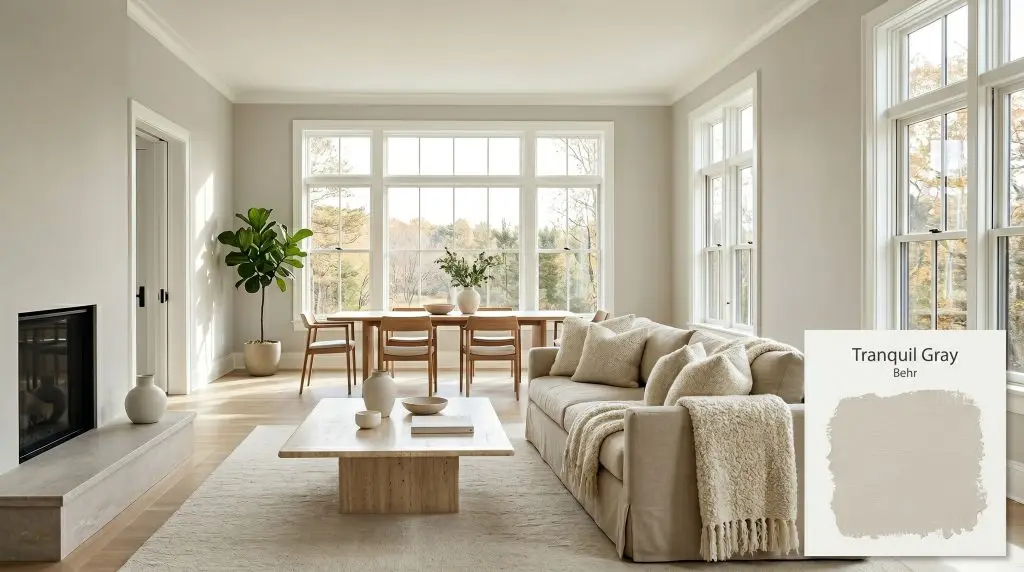
Tranquil Gray DC-007
BehrBehr Tranquil Gray (DC-007) is a soft, warm greige with subtle taupe undertones. Boasting an LRV of 60, it strikes a delicate balance between gray and beige, making it an incredibly versatile neutral that adds cozy sophistication to both interiors and exteriors.
Paint Technical Profile
| Color ID / SKU | DC-007 |
| HEX Code | #D0CBC0 |
| Light Reflectance (LRV) | 60 |
| Use | Interior, Exterior |
| Best Exposures | North-Facing, East-Facing |
| Best For | Living Rooms, Bedrooms, Open Concept Spaces, Exteriors |
Decoding Behr Tranquil Gray: The Perfect Mid-Tone Neutral for Effortless Flow
Nailing down the exact right neutral is often the most frustrating phase of any home update. You want a color that feels intentional and warm, yet you desperately want to avoid anything that looks muddy or dated on your walls. Behr Tranquil Gray delivers exactly that delicate, elusive balance.
As a standout in the Behr Designer Collection, this shade acts as a highly adaptive architectural finish. It wraps a room in a soft, inviting atmosphere while completely stepping out of the way of your furnishings and decor.
This is the kind of underlying color structure that makes standard walls feel custom and deliberately styled.
Behr Tranquil Gray: Temperature, Undertones & LRV
If you are wondering whether this shade leans warm or cool, it sits firmly in the warm neutral category. It originates from a yellow-orange base, which prevents the final color temperature from ever feeling icy or stark on your walls. Instead of a flat gray, you get a nuanced desaturated hue that shifts beautifully throughout the day.
To truly understand how this paint behaves, we have to look closely at its chromatic profile:
With an LRV 60, this shade sits right in the sweet spot of mid-light reflectivity. It absorbs just enough light to provide tangible depth against pure white trim. Yet, it still offers enough light reflectance to keep standard-height ceilings feeling expansive and airy.
Mastering the Ambient Lighting
Every paint color physically changes based on the sun’s position and the specific bulbs in your fixtures. Because it sits right in the middle of the greige spectrum, this shade is highly sensitive to its environment.
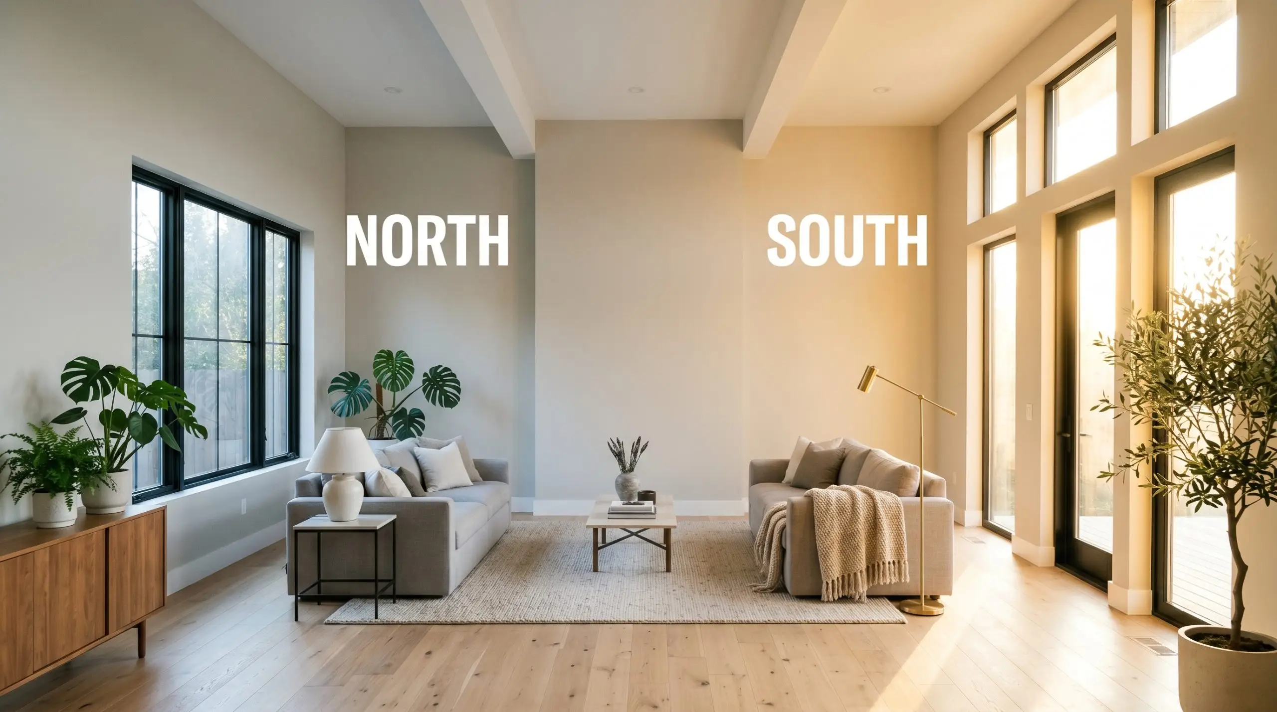
When testing this color on a home exterior, remember that direct sunlight washes out mid-tone neutrals. It will look significantly lighter—often reading like a crisp off-white—when painted on outdoor siding.
Hackrea Lighting Secret
Transforming Everyday Spaces
The true value of a well-formulated neutral is how effortlessly it adapts to different functions and materials. This color provides a flawless neutral backdrop that lets your personal style take the lead. Here is how to maximize its potential across your home.
Open-Concept Living Areas
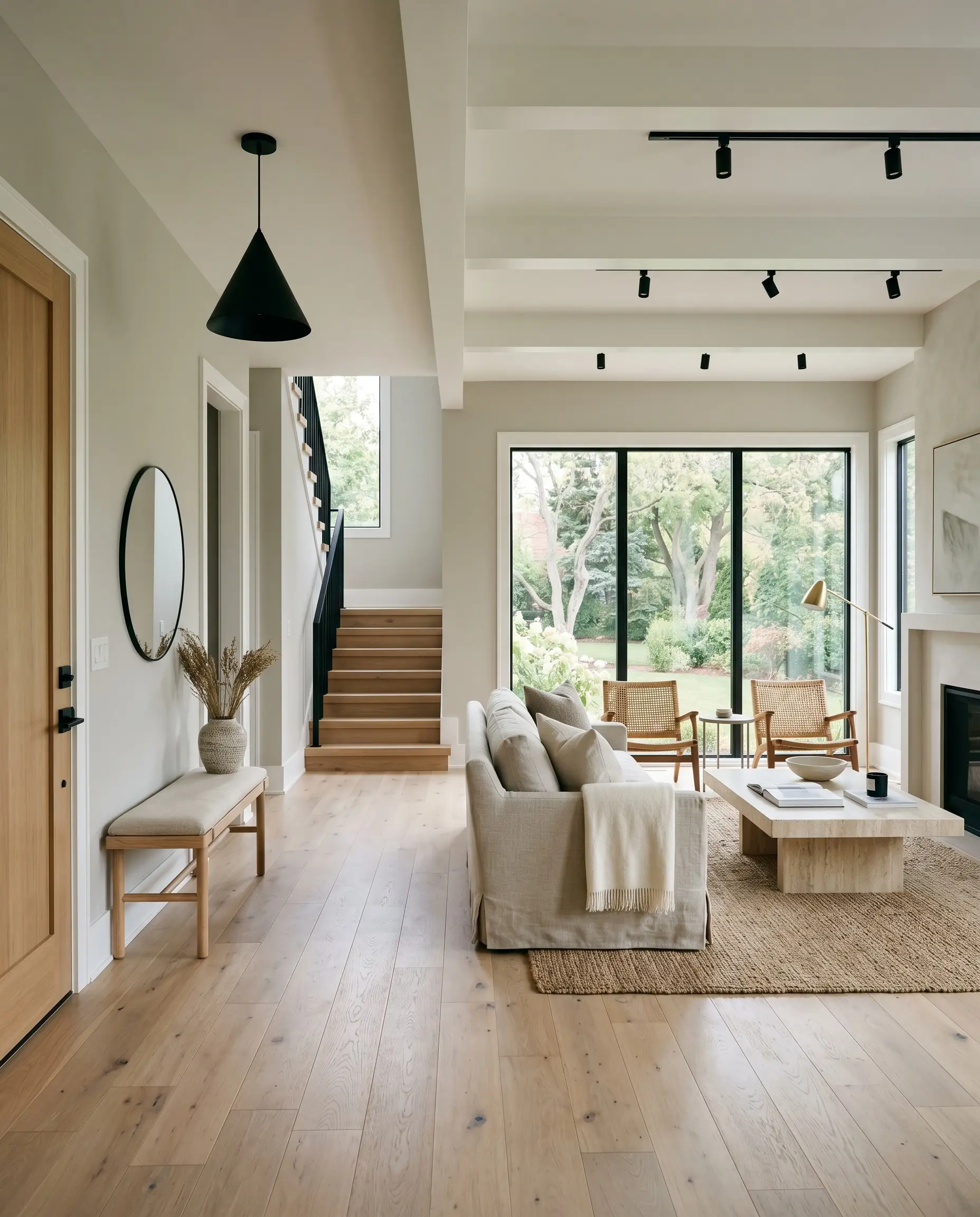
In large, multi-use spaces, a bustling family needs a wall color that establishes visual calm without feeling sterile. This warm greige is perfect for unifying a disjointed floor plan. It provides a soft, continuous flow from the entryway straight through to the living room.
To lean into a Soft Contemporary aesthetic, pair this paint with highly textural elements. Layer in chunky boucle throws, slipcovered linen sofas, and a honed travertine coffee table. Finish the space with matte black hardware on your doors and light fixtures to provide a sharp, modern contrast against the warm walls.
Cozy Primary Bedrooms
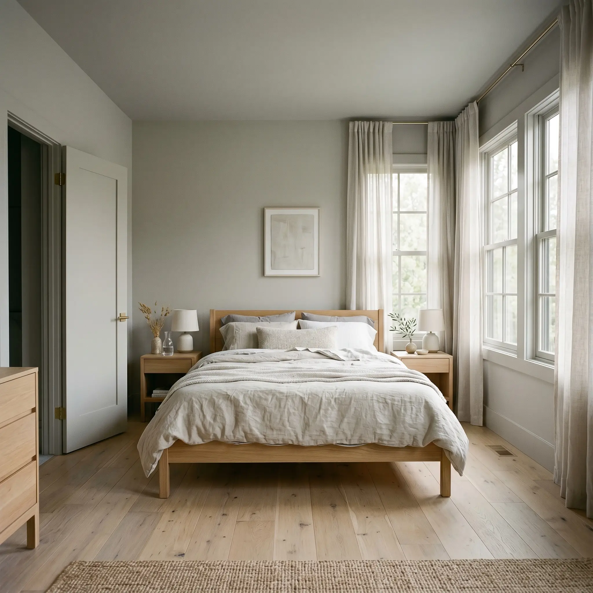
If you want to create a serene retreat at the end of the day, this shade is incredibly effective in a primary bedroom. To maximize the cozy factor, consider a color-drenching application. Paint the walls, the baseboards, the window sashes, and even the doors in the exact same finish.
This technique blurs the sharp lines of the room, making the space feel like a continuous, soft embrace. Style the room with a Scandinavian influence by bringing in light white oak furniture and draped, washed linen bedding. Hang sheer cotton curtains to filter the morning light, letting the taupe undertones glow softly.
Transitional Dining Rooms
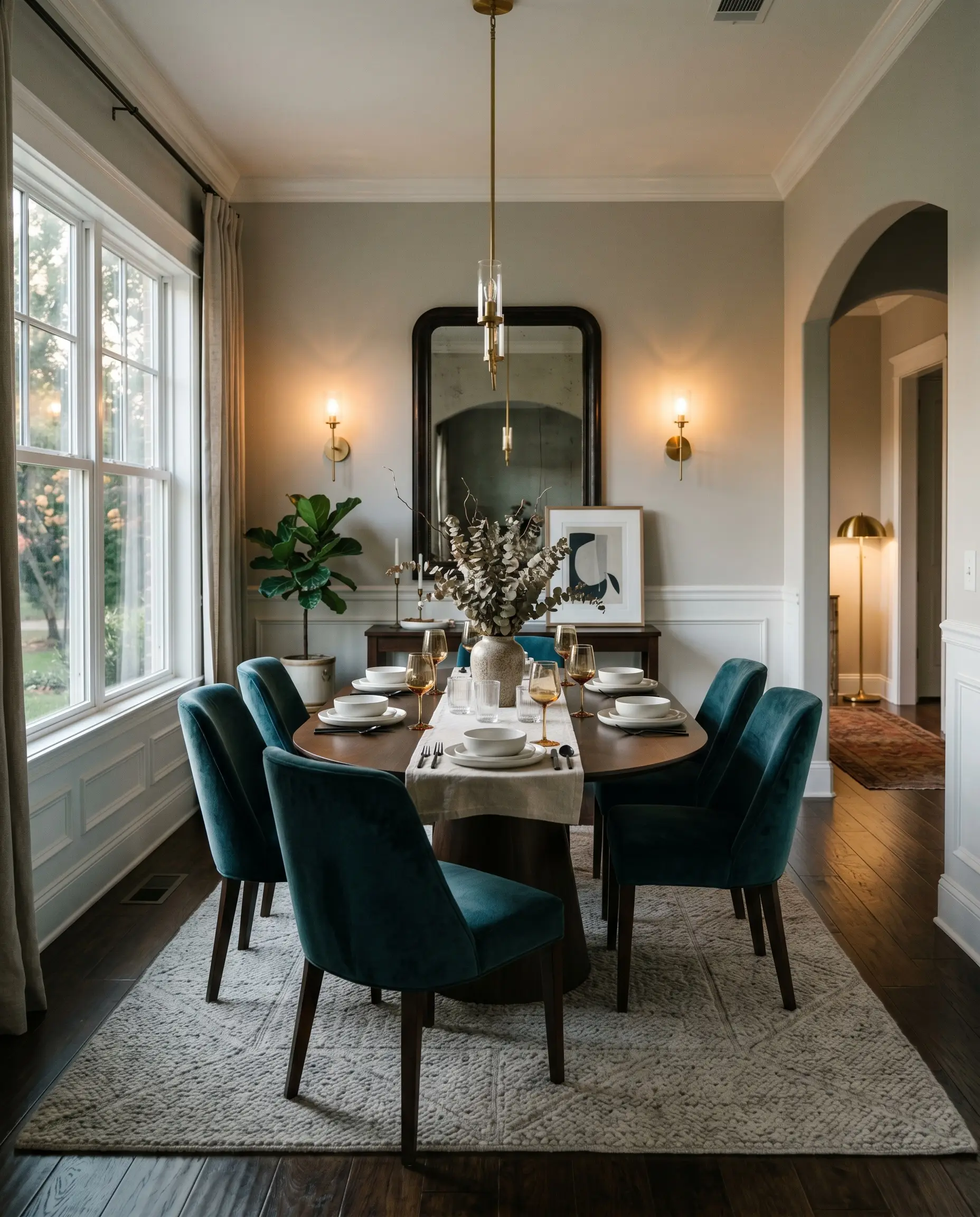
Dining rooms often handle a mix of casual family meals and formal entertaining, making a versatile mid-tone neutral essential. Instead of a standard wall application, use this color to highlight classic architectural features with a modern twist. Paint the upper half of the walls in this soft hue, and install simple picture molding below.
To make the taupe undertones pop in a dining space, avoid creamy whites on the trim or lower molding. Stick to a crisp, clean white to establish a sharp, intentional contrast.
Hackrea Pro-Tip (The Trim Pairing)
Furnish the space with a mix of eras to keep it feeling fresh. A sleek pedestal table surrounded by vintage-inspired velvet seating creates beautiful design tension. Add unlacquered brass sconces to reflect a warm, intimate glow during evening dinners.
Exterior Siding and Trim
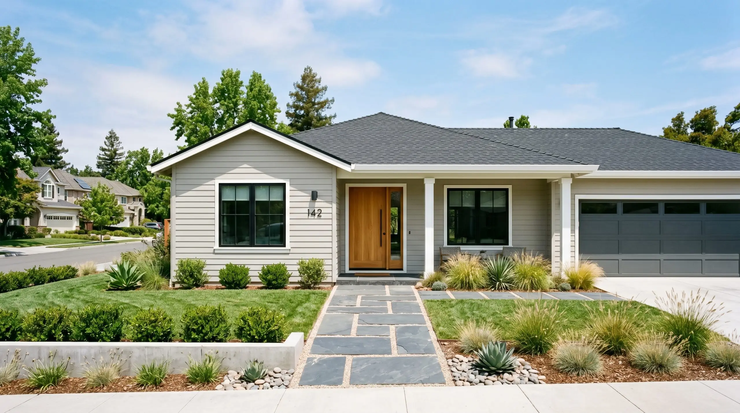
Updating an exterior facade requires a color that can hold its own against the harsh, washing effect of direct sunlight. Because it sits at an LRV of 60, this shade retains enough pigment to look substantial on siding, rather than blindingly white. It instantly modernizes standard suburban architecture.
Pair it with a dark charcoal roof and crisp white trim around the windows to frame the house beautifully. To complete the curb appeal, incorporate organic textures. A warm, natural wood front door and a geometric slate pathway will beautifully complement the yellow-orange base of the paint.
Kitchen Cabinetry
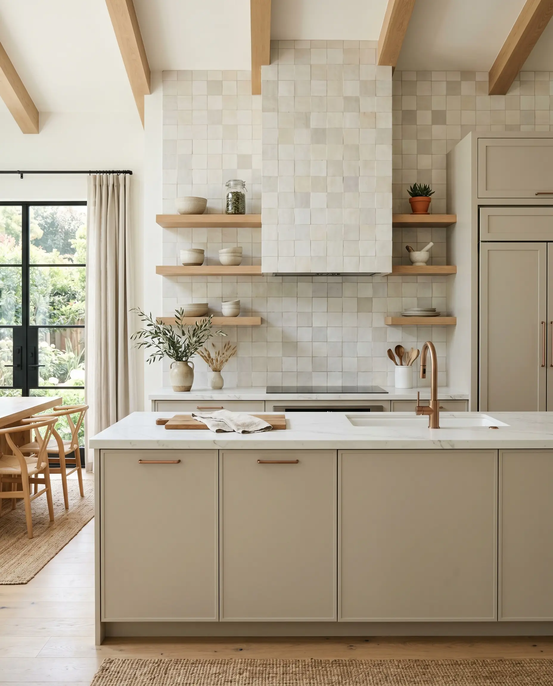
If you are tired of stark white kitchens but aren’t ready for dark, moody colors, this shade is a brilliant middle ground for cabinetry. It brings immediate warmth to the room, balancing out the cold, reflective surfaces of stainless steel appliances. It works exceptionally well on flat-panel or simple shaker doors.
To achieve an Organic Modern look, skip the upper cabinets entirely. Install floating white oak shelves against a backsplash of handmade, tonal zellige tile. Finish the lower cabinets with brushed copper pulls, which will naturally echo the hidden warmth inside the paint.
Building a Custom Palette Around This Warm Greige
Because this soft greige relies on subtle taupe undertones, it requires deeply saturated companion colors to hold its structure. It thrives when placed next to rich, earthy pigments rather than competing with other pale neutrals, which can cause the walls to look washed out.
Selecting the Right White for Millwork
To keep the yellow-orange base from losing its definition, you need a trim color with virtually no undertones of its own. Benjamin Moore Chantilly Lace OC-65 provides a brilliant, uncompromised boundary that forces the greige to step forward.
Similarly, Sherwin-Williams High Reflective White SW 7757 delivers a sharp, clean edge that highlights the subtle warmth of the walls without bleeding into them. Using a stark, crisp white is the ultimate strategy for making a mid-tone neutral feel incredibly intentional and custom.
Hardware, Wood & Material Pairings
To elevate this paint into a truly sophisticated design feature, you must surround it with materials that engage in a visual dialogue with its undertones.
Companion Shades and Accent Tones
Designer Mood Boards
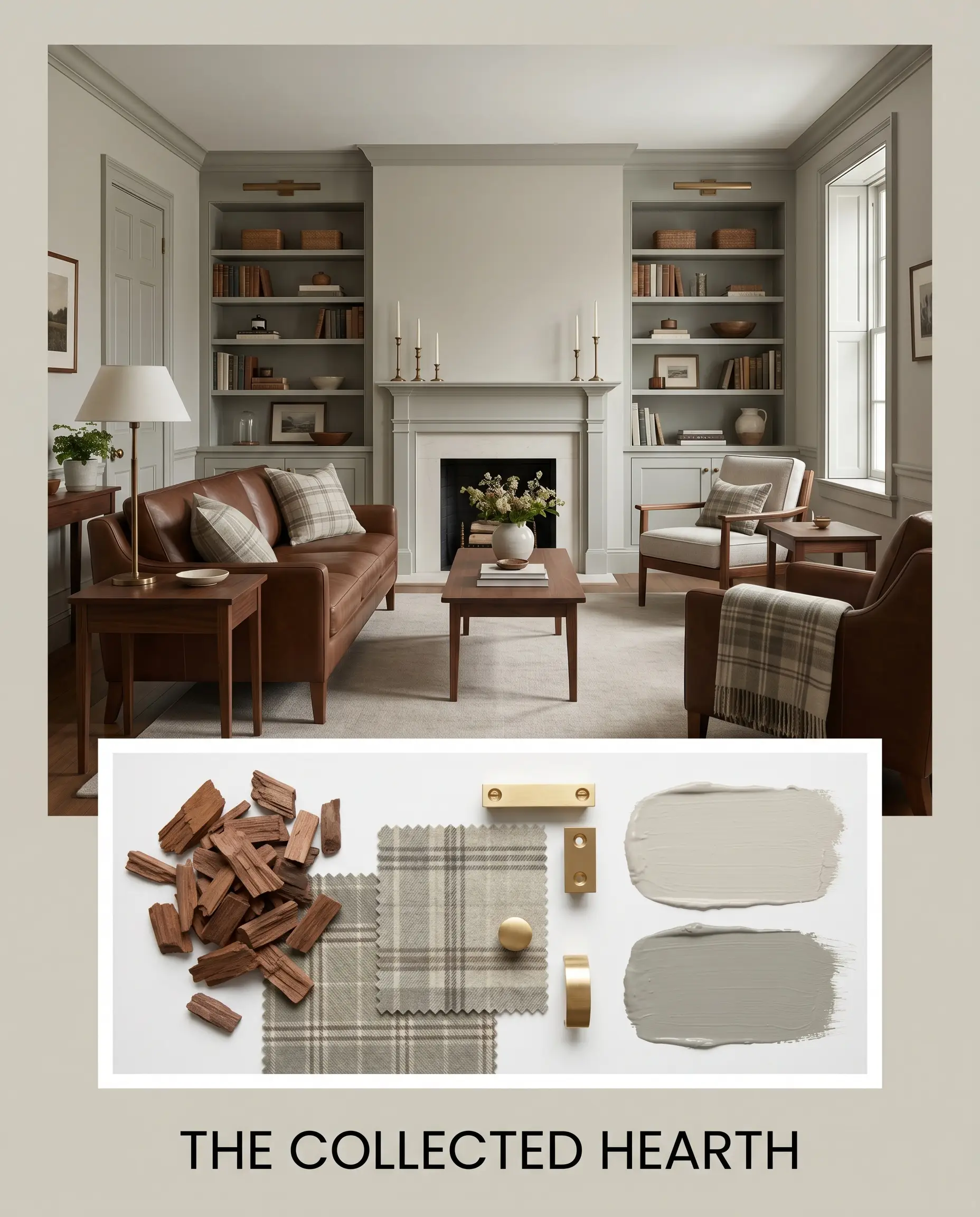
The Collected Hearth
This palette relies on layered, historic warmth to create an atmosphere that feels gathered over time rather than bought all at once. The walls serve as a soft, inviting backdrop for the deep, chocolate richness of vintage walnut furniture.
By introducing Farrow & Ball Pigeon on wainscoting or built-in bookcases, the room gains an earthy, organic energy. Finish the styling with unlacquered brass candlesticks and subtle plaid textiles to evoke a sense of quiet, enduring comfort.
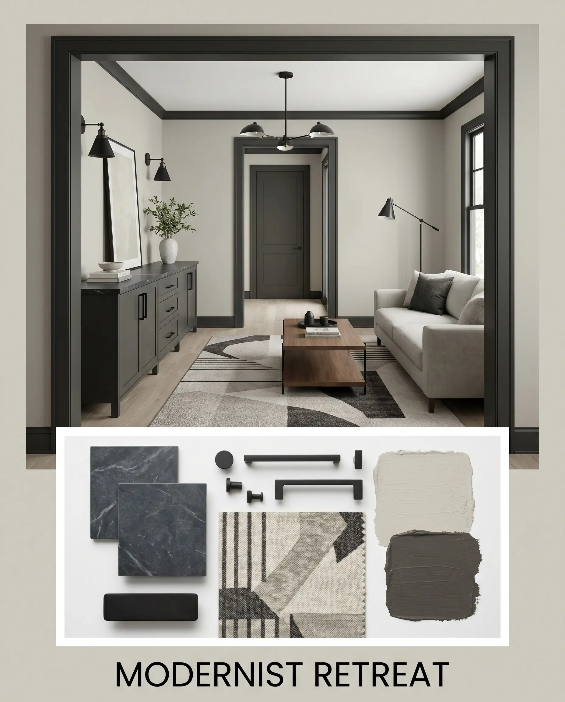
Modernist Retreat
If you prefer a sharper, more contemporary aesthetic, this combination uses high contrast to command attention. The soft greige walls are aggressively framed by architectural elements painted in Sherwin-Williams Iron Ore.
This dark boundary creates immediate visual drama, making the lighter walls glow by comparison. Ground the space with a sleek soapstone credenza top, matte black hardware, and an abstract geometric rug to maintain a crisp, tailored edge.
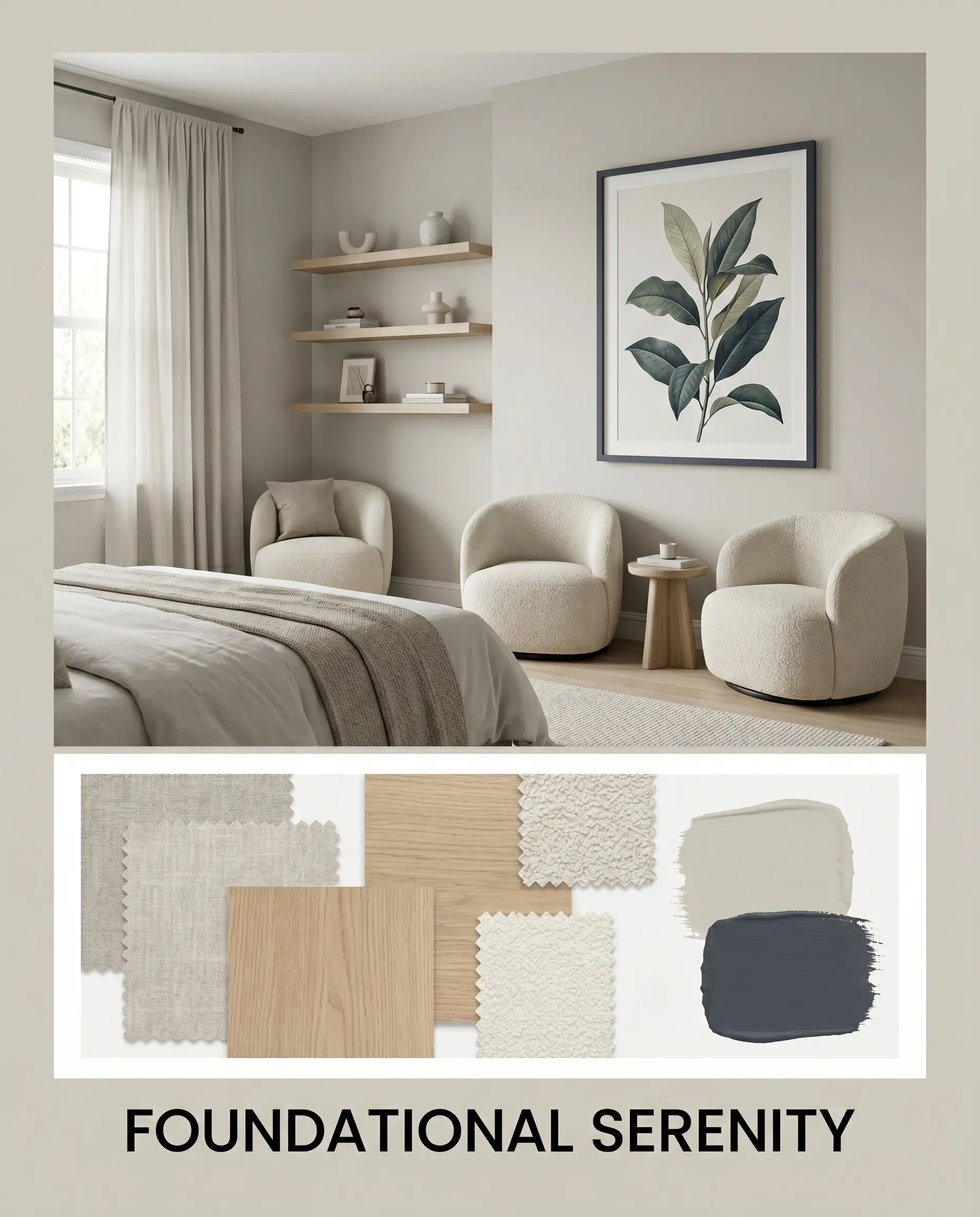
Foundational Serenity
Designed to lower your heart rate the moment you walk in, this palette is a masterclass in tonal layering. The paint provides a gentle, neutral canvas that supports a deeply relaxing, Scandinavian-inspired vibe.
Layer the room with washed linen drapery, light white oak floating shelves, and plush boucle seating to emphasize tactile softness. A single, oversized botanical art piece framed in Benjamin Moore Hale Navy adds just enough visual weight to keep the soft room from floating away.
Head-to-Head Comparisons
Selecting the right foundational color often comes down to understanding how a paint behaves under specific lighting constraints. If your room faces a certain direction or features specific permanent finishes, a rival shade might actually be the more successful candidate. Here is how this Behr favorite stacks up against its closest competitors in the greige spectrum.
Behr Tranquil Gray vs. Sherwin-Williams Agreeable Gray SW 7029
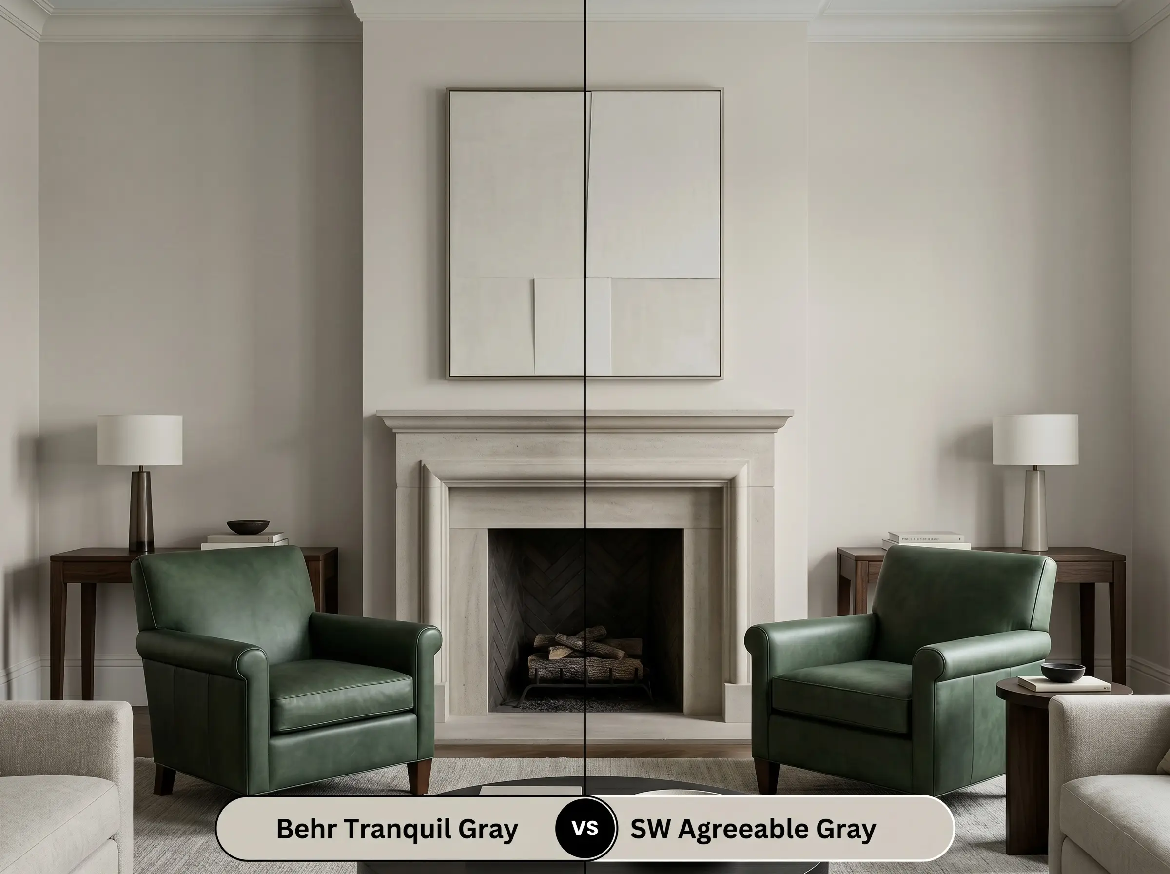
If you are dealing with a heavily shaded, north-facing room, Behr’s version might lean slightly too cool, pulling its gray base forward. Sherwin-Williams Agreeable Gray SW 7029 carries a slightly stronger beige influence that can combat chilly, indirect light. Choose Agreeable Gray if you need to artificially inject warmth into a dark space, but stick with the Behr option if you want a cleaner, more balanced neutral in well-lit areas.
Behr Tranquil Gray vs. Benjamin Moore Revere Pewter HC-172
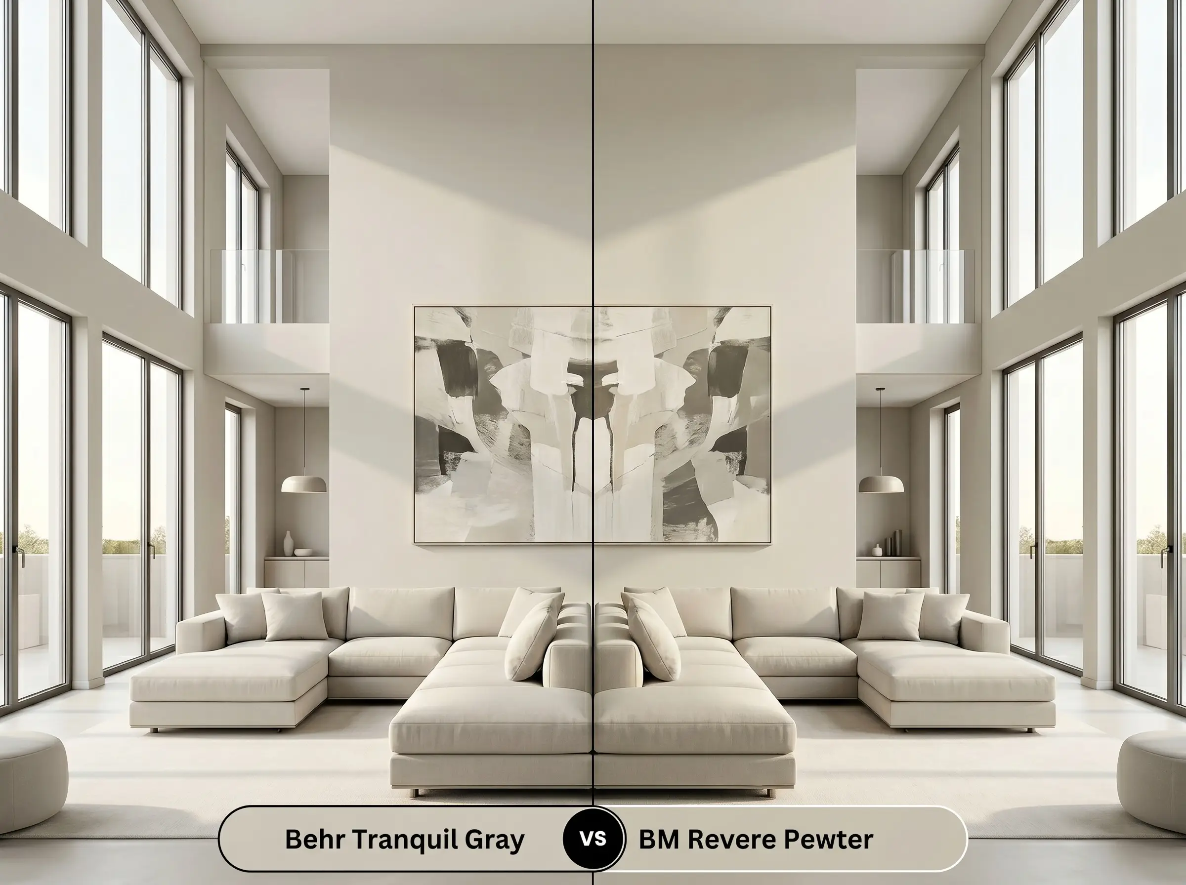
If your home features expansive, two-story windows that flood the walls with blinding afternoon sun, a mid-tone might wash out entirely. Benjamin Moore Revere Pewter HC-172 sits at a lower LRV of 55, giving it the depth required to hold its pigment under intense natural light. However, if your space has standard eight-foot ceilings and average light, Revere Pewter can feel a bit muddy, making the Behr alternative the superior choice for an airy feel.
Similar Colors & Brand Equivalents
Sometimes, a color is almost perfect, but you need it to be just a fraction lighter for a dark hallway, or you are restricted to a specific paint manufacturer by your contractor. Here are the closest alternatives that share a similar chromatic profile.
Behr Alternatives
Cross-Brand Matches
Practical Application & DIY Advice
Transitioning a color from a small paper swatch to an entire room requires a strategic approach to finishes and application. The right sheen and preparation will dictate whether the final result looks like a premium architectural feature or a weekend DIY project.
The Dynamic Sheen Guide
Primer Strategy
Because this is a mid-tone shade with an LRV of 60, it generally does not require a deeply tinted primer to achieve its true color. A standard, high-quality white primer is perfectly sufficient to block out previous wall colors and create a smooth, adhesive surface.
If you are painting over a highly porous surface like new drywall or bare wood, always use a dedicated sealing primer first. This prevents the topcoat from absorbing unevenly, which can cause the taupe undertones to look patchy.
Hackrea Pro-Tip (The Texture Rule)
Coverage & Success Tips
For a truly professional, opaque finish, plan for two full coats of paint over your primed surface. Even if the first coat looks relatively solid, the second coat is mandatory to lock in the true depth of the yellow-orange base.
Be highly cautious of “flashing”—visible, uneven streaks caused by the paint drying too quickly while you are still rolling. To avoid this, keep a “wet edge” by working in small, continuous sections from the ceiling down to the baseboards, and never press too hard on a half-dry roller.
Frequently Asked Questions
Because it lacks direct sunlight to activate its warm base, this paint will read significantly cooler and flatter on heavily shaded siding. It will lean closer to a true, traditional gray rather than showcasing its subtle taupe warmth.
Without natural light to balance it, the warm artificial bulbs typically used in bathrooms will heavily amplify its yellow-orange base. It will absolutely lean into its beige characteristics, creating a very warm, cozy space rather than a crisp gray one.
The subtle taupe undertones actually harmonize beautifully with the warmth of red oak. Instead of clashing, the slight earthy quality of the paint bridges the gap between the strong orange tones in the wood and the rest of your decor.
Yes, taking this mid-tone neutral up onto the ceiling is a brilliant architectural trick. The LRV of 60 provides just enough visual weight to draw the eye downward, making a cavernous, vaulted room feel instantly more intimate and grounded.
Final Verdict & Expert Warnings
Behr Tranquil Gray is the ultimate foundational neutral for homeowners who want a warm, inviting space that still feels modern and clean. It performs beautifully in open-concept living areas, transitional dining rooms, and cozy bedrooms where a soft, adaptable backdrop is required. By effortlessly bridging the gap between cool grays and traditional beiges, it provides a versatile canvas that elevates everything from sleek contemporary furnishings to layered, historic textiles.
However, this highly adaptable nature does have its limits. If your home features prominent cherry wood cabinets, red-leaning brick fireplaces, or cool-toned gray luxury vinyl plank floors, this paint will struggle to find its footing. The yellow-orange base will actively fight against pink or red-leaning woods, creating an unpleasant visual tension that can make the walls look slightly green. Instead of forcing a relationship that clashes with your home’s permanent hard finishes, pivot to a true, cool-toned gray or a stark, crisp white to maintain a cohesive design.
Closest Cross-Brand Equivalents
The absolute closest scientific color matches for Tranquil Gray across top paint brands.