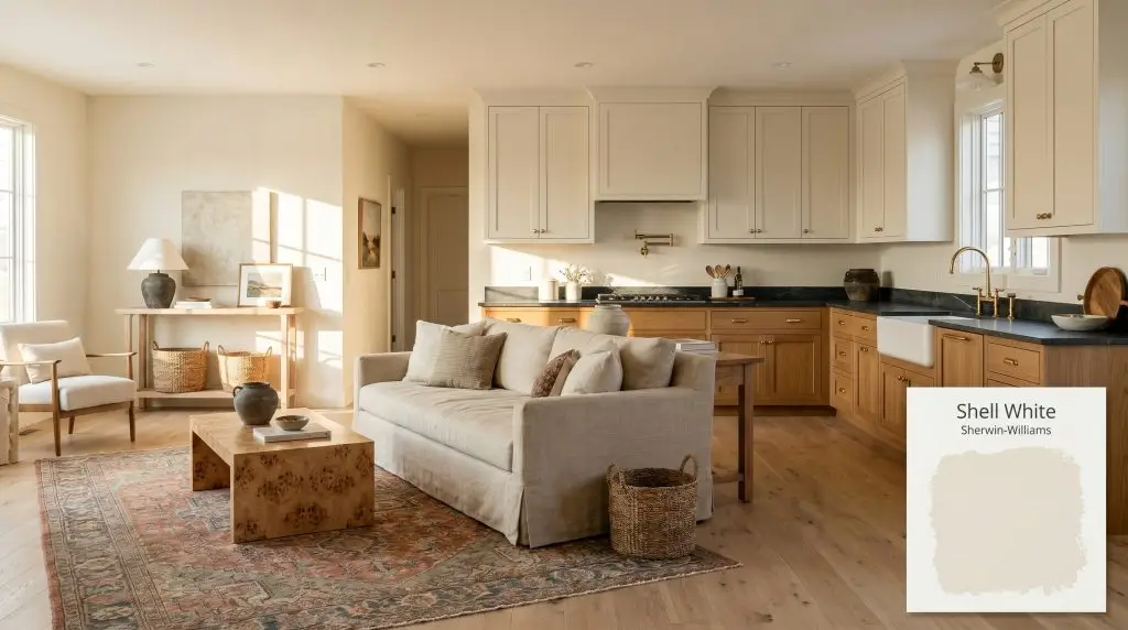
Shell White SW 8917
Sherwin-WilliamsSherwin-Williams Shell White (SW 8917) is a warm, creamy off-white with an LRV of 83. Characterized by its subtle peach and yellow-beige undertones, it provides a soft, inviting glow that avoids the starkness of pure white while maintaining high light reflectivity.
Paint Technical Profile
| Color ID / SKU | SW 8917 |
| HEX Code | #F0EBE0 |
| Light Reflectance (LRV) | 83 |
| Use | Interior, Exterior |
| Best Exposures | North-Facing, South-Facing |
| Best For | Living Rooms, Kitchen Cabinets, Exteriors |
Sherwin-Williams Shell White: The Secret to a Perfectly Luminous, Sunlit Aesthetic
Finding a white paint that feels simultaneously expansive and inviting is one of the most common challenges in residential design. Too stark, and the room instantly feels like a clinical waiting area; too yellow, and the walls take on an unwanted, dated glow. Sherwin-Williams Shell White offers a brilliant solution to this exact tension, wrapping interiors in a soft, ambient warmth that feels effortlessly natural.
This specific warm off-white acts as a highly responsive architectural finish, beautifully blurring the lines between crisp brightness and comforting cream. It is the kind of color that makes a space feel as though it is perpetually bathed in early morning sunlight. By carefully balancing its underlying pigments, Shell White establishes a luminous foundation that supports everything from relaxed coastal aesthetics to refined, transitional interiors.
Whether you are looking to soften a rigid, modern living room or breathe new life into a historic property, understanding how this color behaves is crucial. Its final appearance relies entirely on the surrounding environment. From the direction of your windows to the textiles you layer in the room, Shell White requires intentional, thoughtful styling to unlock its full potential.
Undertones & LRV of Sherwin-Williams Shell White
When evaluating Sherwin-Williams Shell White for your home, the most immediate question is always its visual temperature: is this paint warm or cool? Shell White is unequivocally a warm color, designed to inject a soft, comforting radiance into any space it touches. This warmth is not an accident; it is the direct result of a highly specific, carefully calibrated pigment structure.
To truly understand how this color will perform on your walls, we have to look past the initial creamy surface and examine the hidden nuances that drive its behavior.
At a light reflectance value (LRV) of 83, this paint is highly reflective, bouncing a massive amount of light back into the room. However, it intentionally stops short of the stark, blinding brightness found in pure, untinted whites. This specific LRV allows the paint to expand the visual boundaries of a room while retaining enough body to feel substantial and intentional. It absorbs just enough shadow to showcase beautiful millwork contrast, ensuring your trim and wall panels stand out with elegant definition.
Directional Lighting & Shifting Color Structures
Because Shell White relies so heavily on its delicate undertones, its final appearance is entirely at the mercy of your lighting environment. This color is highly reactive, meaning the exact same can of paint will look drastically different depending on which room you apply it to.
Understanding this shifting color cast is the key to preventing unexpected surprises once the paint dries.
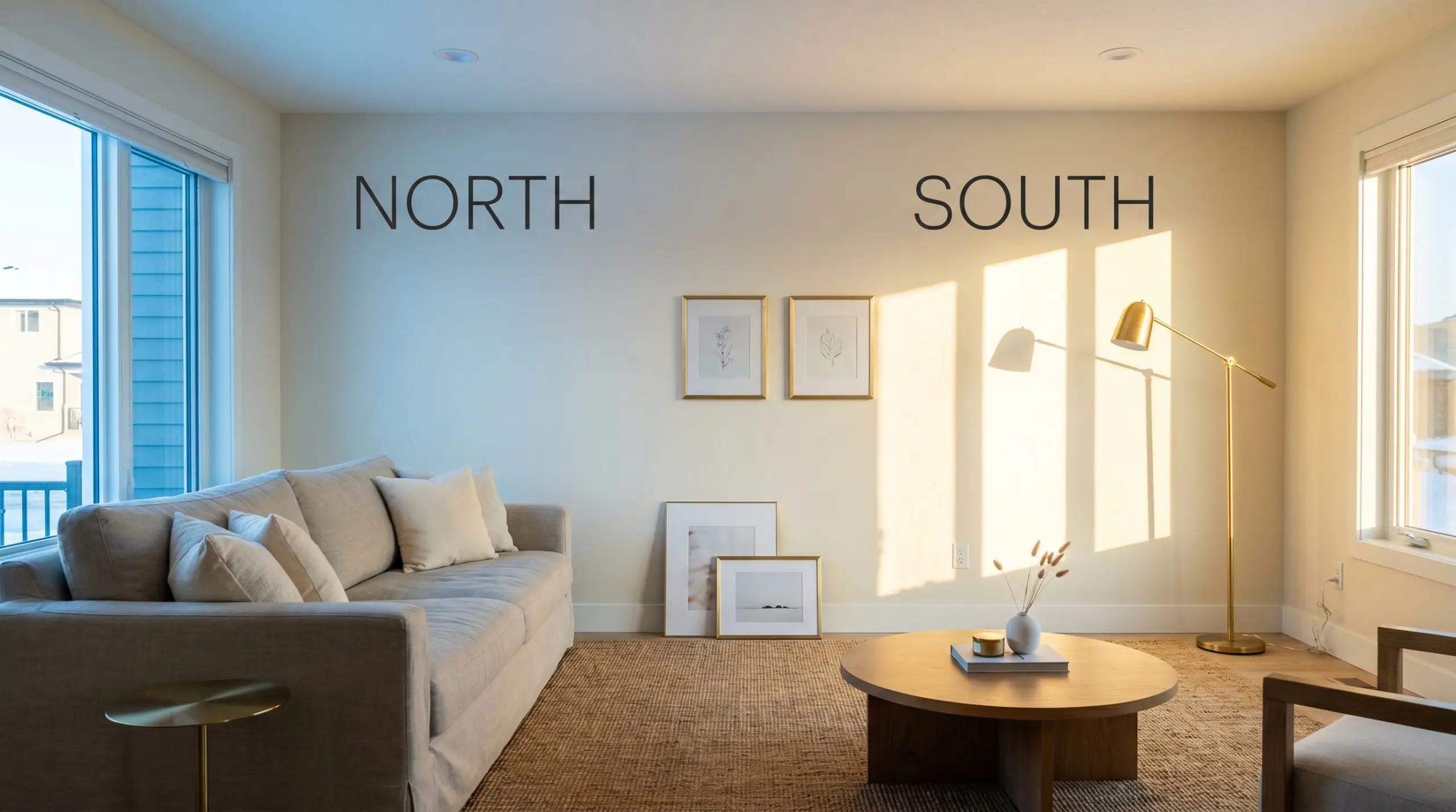
Never approve a warm off-white based on a tiny digital swatch. You must paint a large sample board and move it around the room, specifically checking how the peach undertone reacts in the darkest corners during the late afternoon.
Hackrea Pro-Tip (The Shadow Test)
Curating Spaces with This Luminous Warm White
Understanding the technical data behind a paint color is only the first step in the design process. The true magic happens when you pair that creamy, reflective canvas with the right textiles, architectural features, and lighting fixtures. Because Shell White is so adaptable, it serves as an incredible foundation for a wide variety of lifestyles and aesthetic preferences.
Here is how to strategically apply this warm off-white across different spaces to maximize its luminous qualities.
Reviving the Living Room
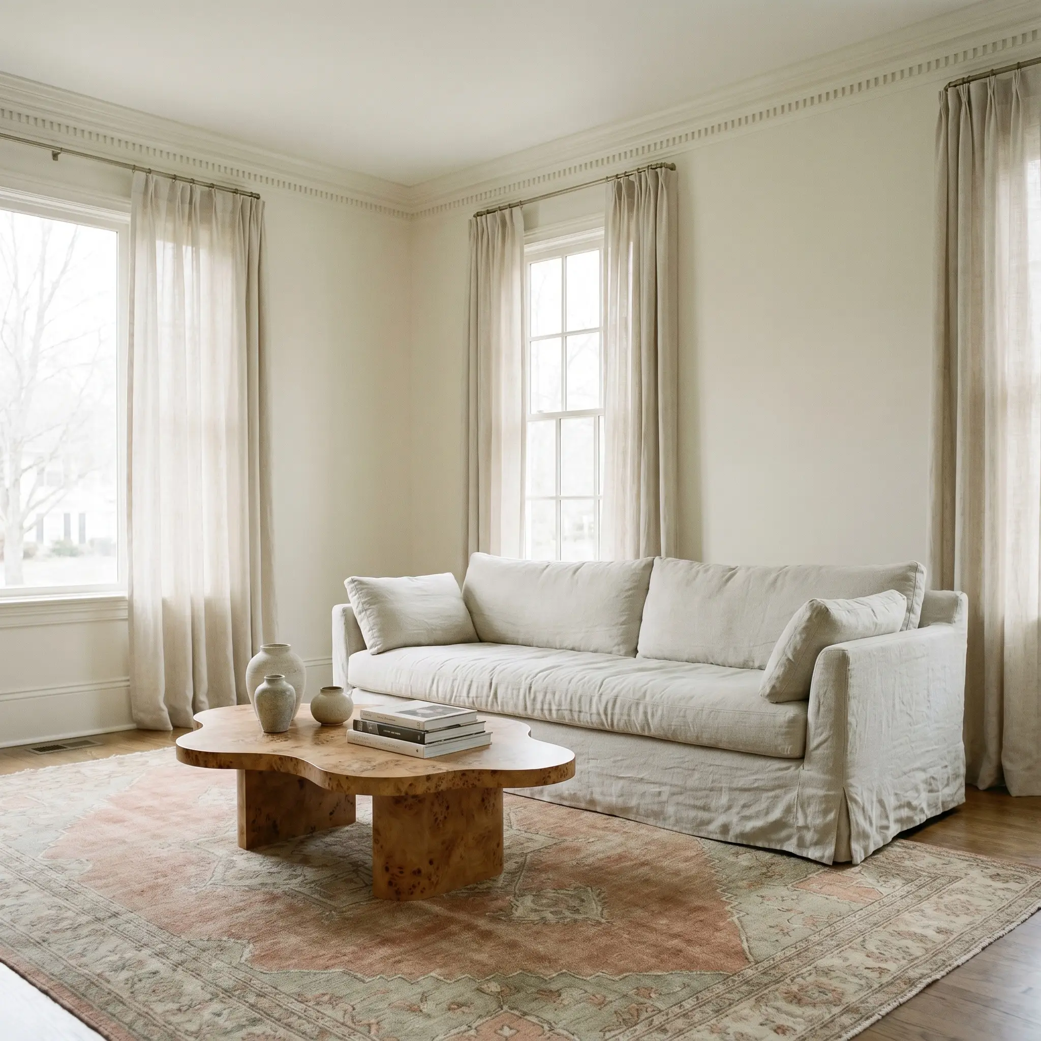
While it is incredibly easy to default to a strictly traditional aesthetic with a cream-based paint, Shell White thrives when pushed toward a more relaxed, transitional style. To modernize the space, consider color-drenching the entire room—painting the walls, baseboards, and crown molding in the exact same finish. This continuous application erases harsh visual boundaries, making standard living rooms feel significantly taller and more cohesive.
To balance the soft, ambient warmth of the walls, introduce tactile, organic materials that add visual friction. A large, accessible slipcovered sofa in washed linen provides comfortable, everyday seating for a busy family, while a statement burl wood coffee table serves as a premium, aspirational focal point. Layering a vintage Oushak rug in muted terracotta and sage tones will effortlessly pull the peach undertones out of the paint, creating a highly intentional, curated atmosphere.
Elevating Kitchen Cabinetry
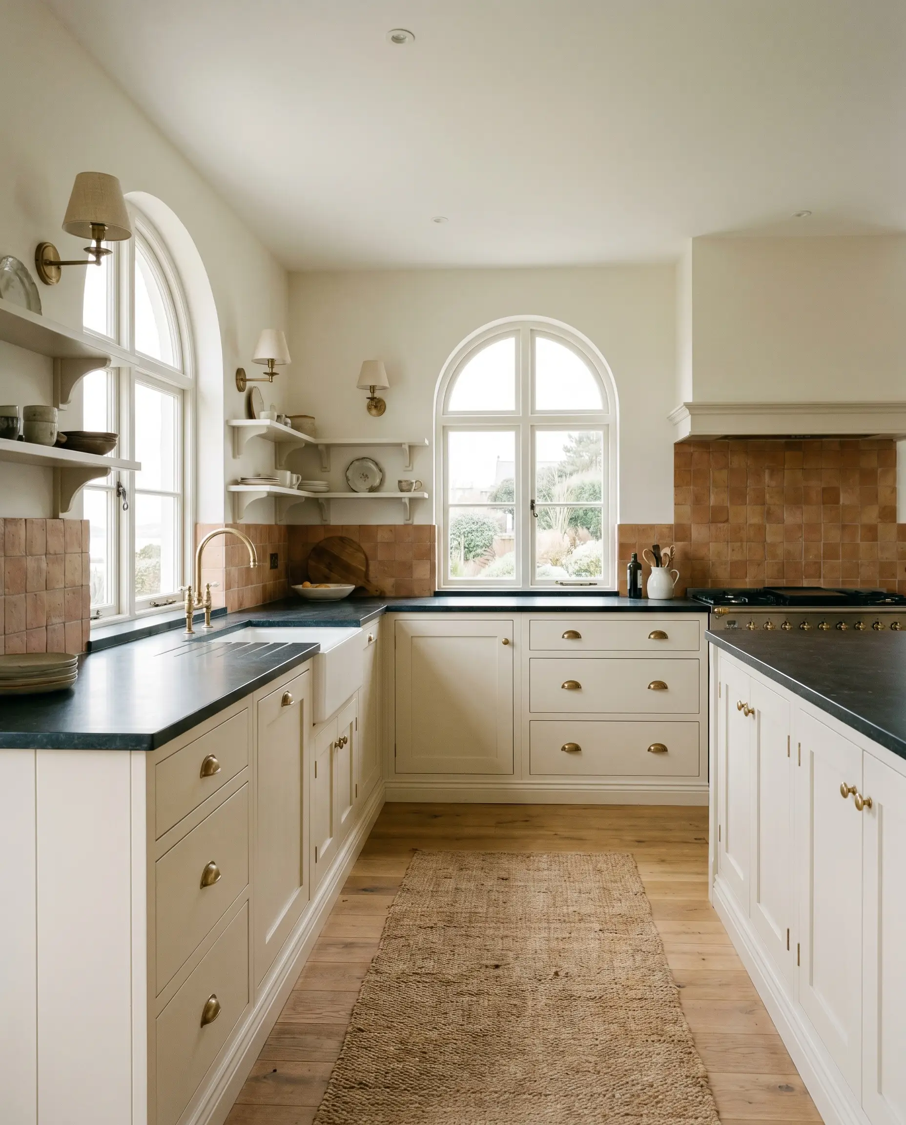
Applying a warm off-white to kitchen cabinetry instantly softens the utilitarian nature of the room, bringing in a highly sought-after English Country or relaxed coastal influence. When painted on shaker-style doors, the 83 LRV bounces natural light beautifully across the workspace while hiding everyday smudges far better than a stark, pure white. To prevent the cabinetry from feeling too monolithic, pair the creamy finish with high-contrast, organic countertops like honed soapstone.
The secret to making this application feel truly high-end lies in your choice of hardware and lighting. Standard brushed nickel can sometimes clash with the yellow-orange base, so opt for unlacquered brass cabinet pulls and vintage-inspired wall sconces instead. As the brass naturally patinas over time, it will harmonize perfectly with the subtle warmth of the cabinetry, resulting in a kitchen that feels collected rather than merely renovated.
If you are painting your upper cabinets Shell White, ensure your backsplash tile shares a similar warm undertone. Pairing this creamy paint with a stark, cool-toned bright white subway tile will make the cabinets look unintentionally dirty or yellowed by comparison.
Hackrea Design Secret (The Temperature Clash)
Designing a Restorative Primary Bedroom
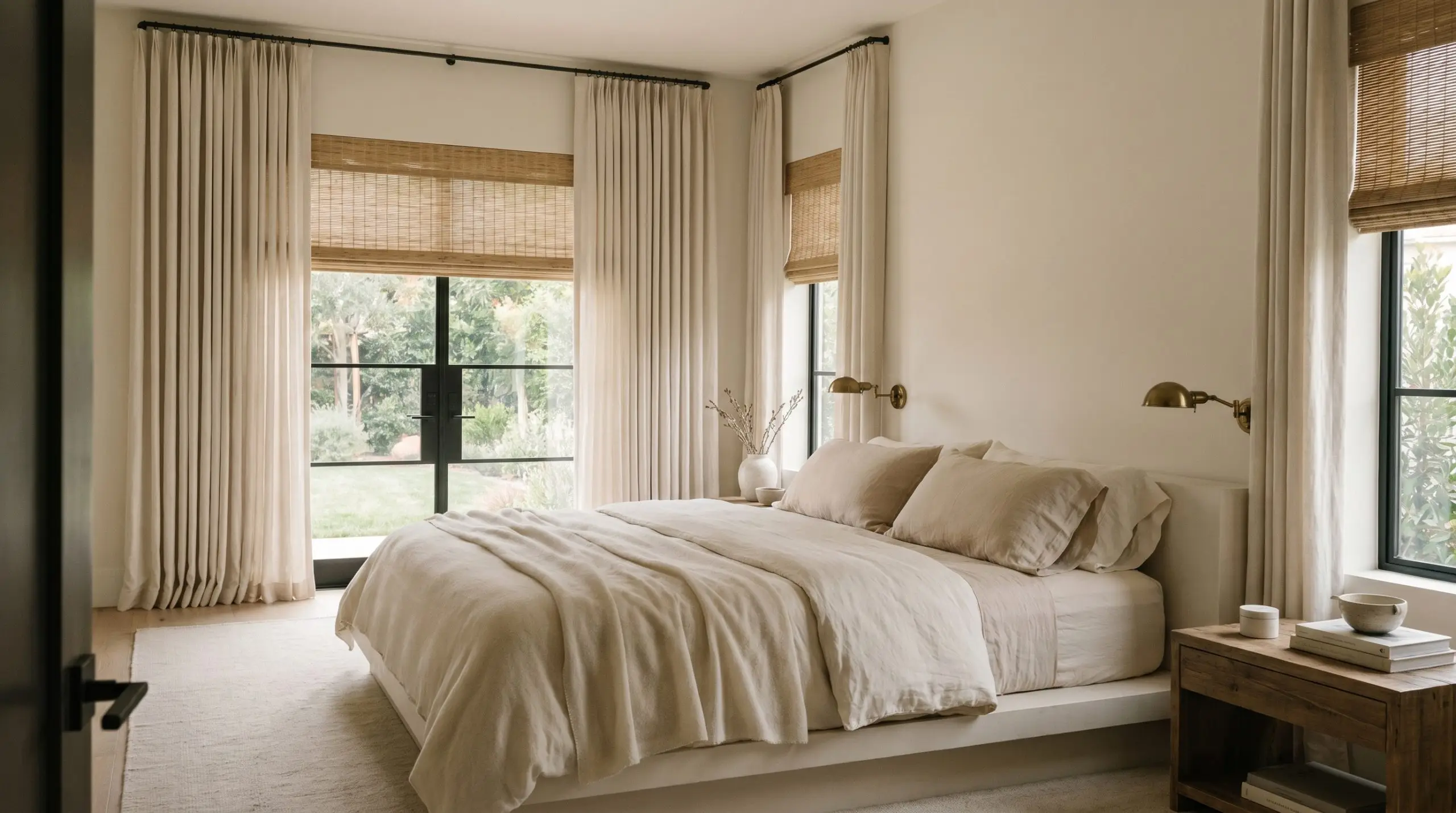
For those seeking a calm, restorative retreat, this paint provides the perfect backdrop for a soft, Mediterranean-inspired bedroom. The inherent warmth of the color creates an immediate sense of comfort, making the walls feel like a gentle embrace at the end of a long day. To enhance this soothing environment, focus heavily on layering rich, touchable textiles rather than cluttering the space with rigid furniture.
Start by securing the room with a low-profile platform bed dressed in layers of sheer wool and brushed cotton. Introduce subtle contrast through natural window treatments, such as woven rattan shades or floor-to-ceiling linen drapery. To add a touch of quiet luxury, install a pair of antique brass reading sconces flanking the bed, which will cast a beautiful, localized glow that highlights the paint’s creamy profile during the evening hours.
Refreshing Exterior Siding and Trim
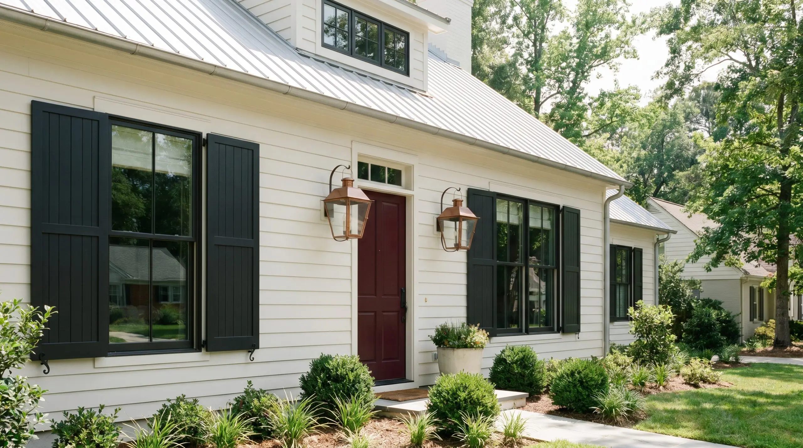
Using this color on a home’s exterior is a brilliant way to achieve a bright, welcoming facade without blinding your neighbors. Because of the inevitable exterior washout effect caused by direct sunlight, the paint will lose its prominent peach notes and read as a beautifully soft, classic white. It is an ideal choice for updating a 90s suburban build or refreshing a charming modern cottage.
However, a warm white exterior requires intentional, high-contrast accents to truly stand out. Pair the soft siding with dramatically dark shutters or an accent front door painted in a rich charcoal black or deep oxblood. Finish the look with oversized copper exterior lanterns that will naturally weather over time, rooting the home beautifully into its surrounding landscape.
Transforming Windowless Hallways

Hallways are notoriously difficult to design, often suffering from a complete lack of natural light and narrow, restrictive footprints. Shell White is a highly strategic choice for these transitional spaces because its impressive light reflectance value actively fights against the shadows. By bouncing whatever artificial light is available back into the space, the paint prevents the corridor from feeling cramped or forgotten.
Instead of leaving the hallway bare, treat this creamy canvas as a dedicated, art-forward gallery space. Install a symmetrical gallery wall featuring minimalist line art or botanical prints housed in thin, blackened steel frames. To elevate the experience even further, mount a few brass picture lights above the art; the localized 2700K bulbs will pull out the paint’s rich, traditional creaminess, turning a basic walkway into a beautifully curated destination.
Curating Harmonious Palettes with Sherwin-Williams Shell White
Instead of relying on rigid boundaries, this glowing hue prefers to interact with its surroundings through soft, tonal bleeds that gently warm up adjacent surfaces. Its delicate peach undertones require careful pairing to either enhance that sunlit radiance or ground it with contrasting depth.
Selecting the Perfect Architectural Trim
Defining your baseboards and crown molding is the most critical step in controlling how this wall color behaves. Benjamin Moore Chantilly Lace OC-65 provides a stark, crisp boundary that forces the wall color to read as a distinct, rich cream.
Farrow & Ball All White No. 2005, lacking any cold blue undertones, creates a much softer, atmospheric transition. This pairing allows the walls and trim to melt together visually, resulting in a highly tailored, seamless glow.
Tactile Elements and Finishes
Walnut introduces a rich, organic contrast that anchors the brightness of the walls without resorting to the harshness of stark black wood. Travertine tile, with its porous surface and earthy variations, absorbs the room’s light to beautifully ground the airy brightness of the paint.
To elevate the entire palette, introduce unlacquered brass hardware as your aspirational focal point. As the brass naturally patinas over time, its evolving warmth engages in a brilliant visual dialogue with the paint’s yellow-orange base.
Complementary Accent Tones
Curated Aesthetic Visions
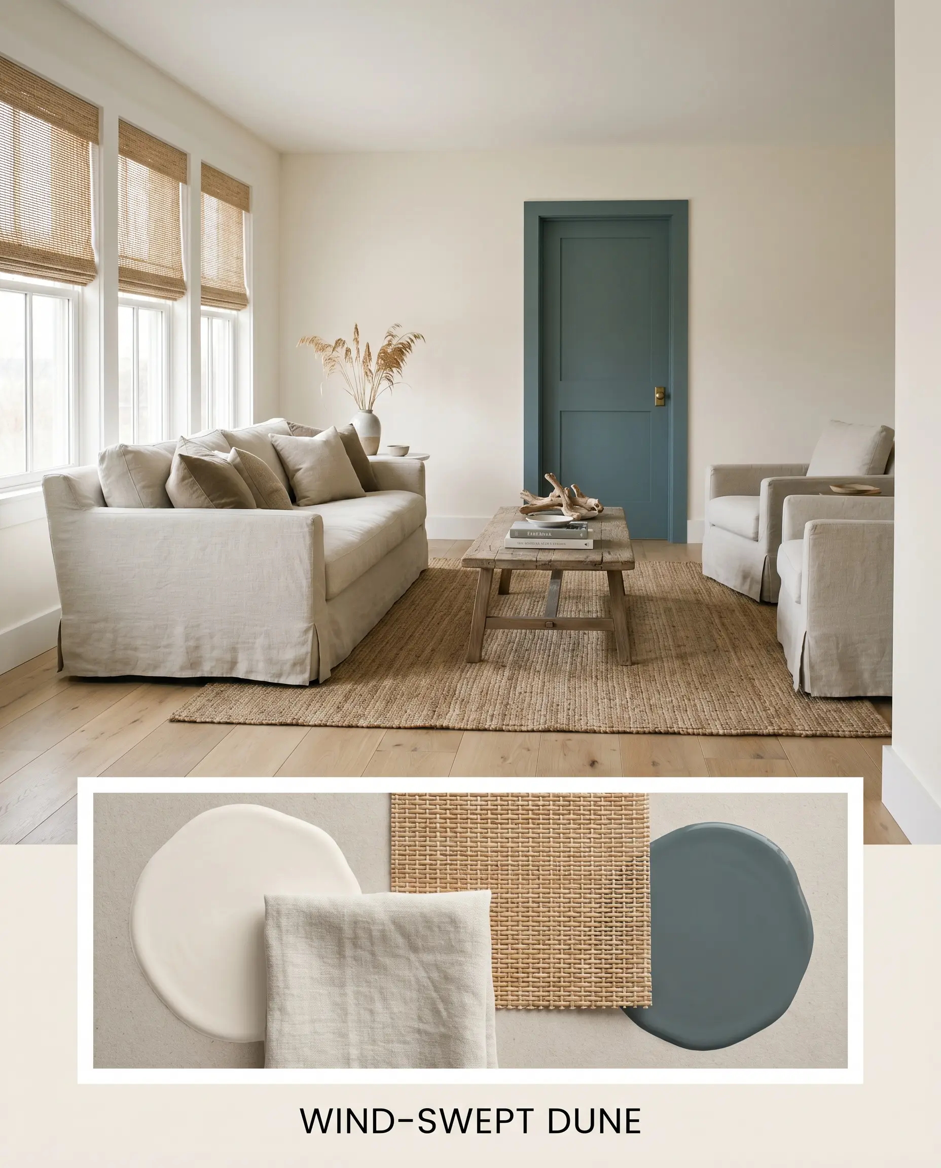
Wind-Swept Dune This palette captures the relaxed, restorative energy of a refined coastal hideaway without relying on predictable nautical tropes. The glowing off-white walls serve as an expansive backdrop for slipcovered seating in washed linen and woven rattan window shades. By weaving in accents of Farrow & Ball Inchyra Blue No. 289 on interior doors, the room gains just enough visual friction to feel grounded and intentional.
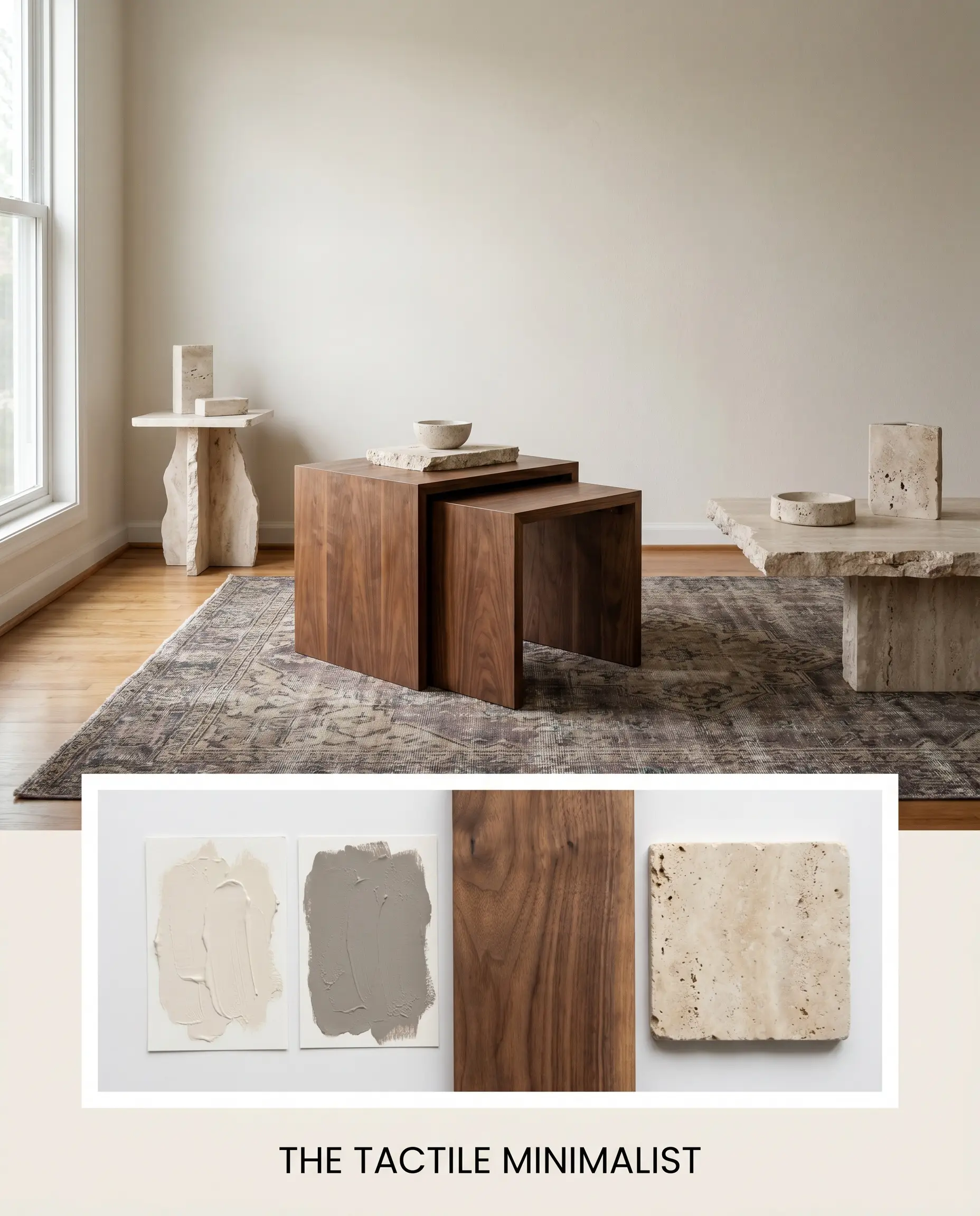
The Tactile Minimalist Designed for those who crave a clean aesthetic but reject clinical sterility, this direction relies entirely on sensory textures to build interest. Walnut nesting tables and raw travertine surfaces provide organic weight against the highly reflective walls. A vintage Oushak rug featuring faded threads of Sherwin-Williams Moonlit Orchid SW 9153 introduces a quiet, sophisticated color story that perfectly complements the room’s ambient warmth.
Comparing Sherwin-Williams Shell White to Leading Alternatives
Sometimes a room’s specific directional lighting or architectural style demands a slight pivot in your color strategy. If your space features heavily shaded northern windows, the prominent peach notes in this hue might lose their luster and fall flat. In those specific scenarios, exploring a rival shade with a different underlying structure becomes the smartest path forward.
Sherwin-Williams Shell White vs. Sherwin-Williams Pure White SW 7005
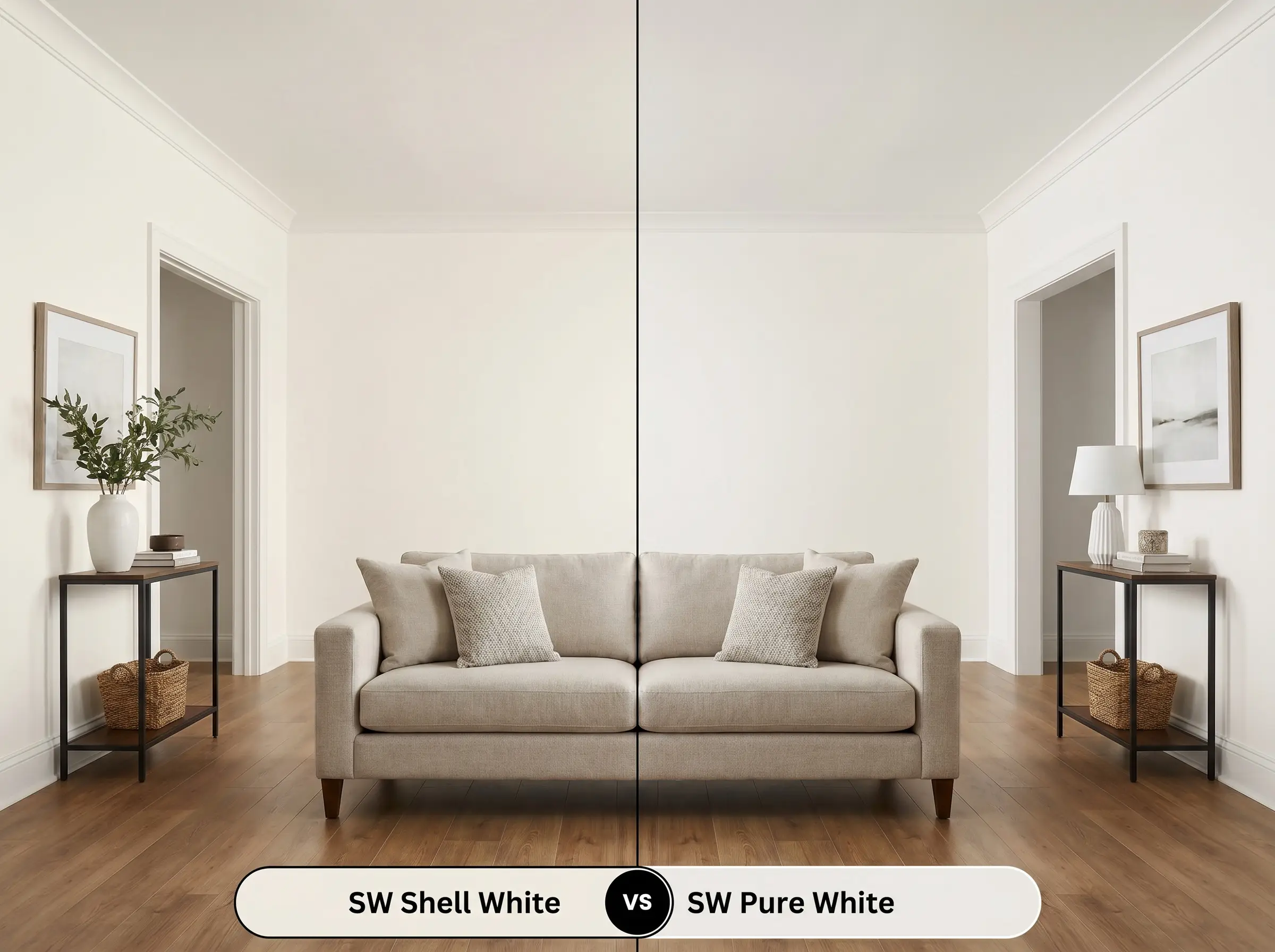
Pure White SW 7005 is significantly less saturated and relies on a microscopic drop of black pigment to neutralize its warmth. If your room features cool-toned gray flooring or stark marble countertops, Pure White will harmonize beautifully. Conversely, if you want to actively inject a sunlit glow into a cold room, the richer yellow-orange base of the former is the superior choice.
Sherwin-Williams Shell White vs. Sherwin-Williams Alabaster SW 7008
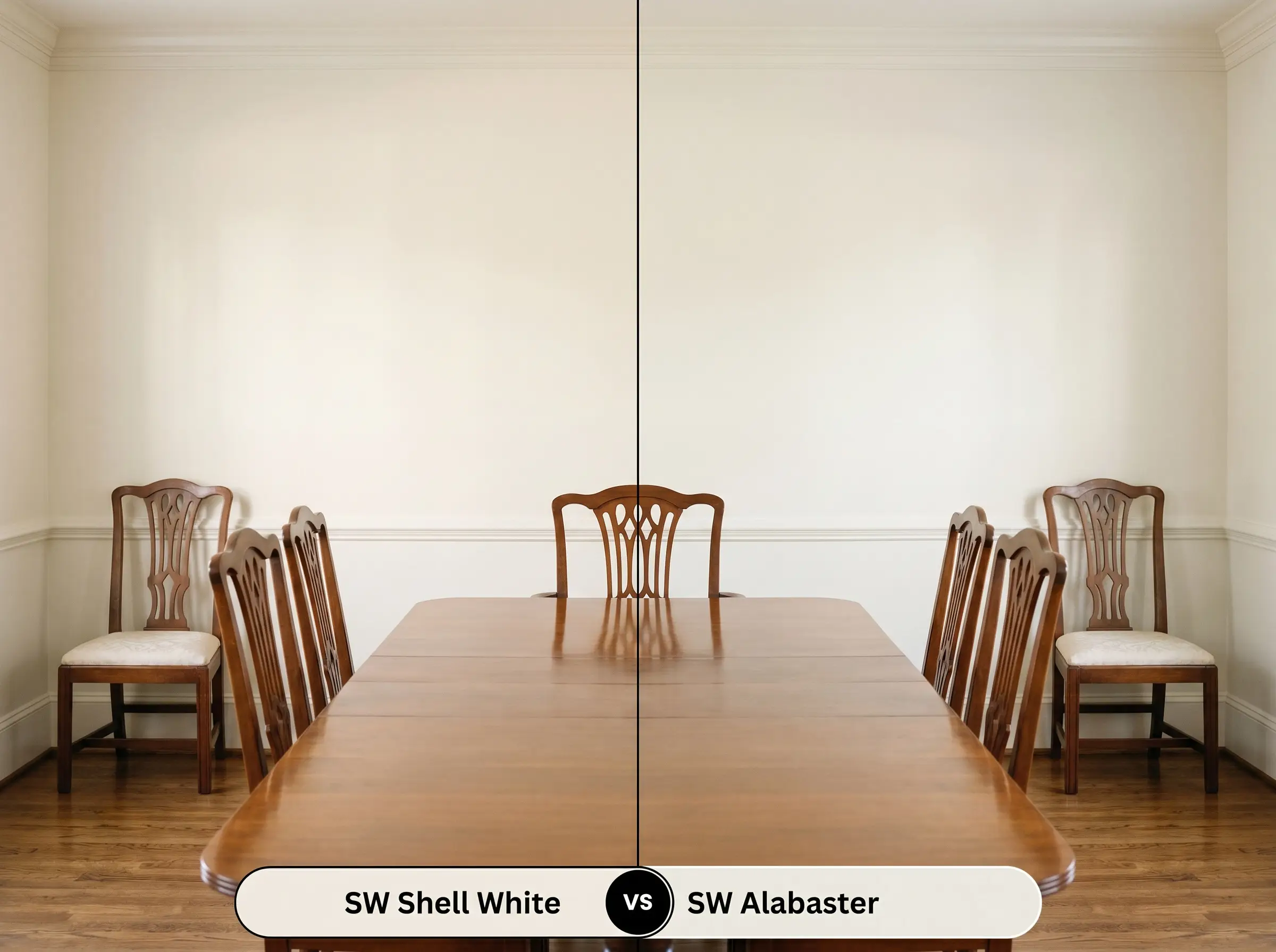
While both of these colors share a similar light reflectance value, Alabaster SW 7008 carries a much stronger beige undertone. Alabaster reads as a more traditional, creamy ivory that pairs effortlessly with historic wood tones and earthy palettes. If you find that Alabaster looks slightly too yellow or muddy in your afternoon light, the subtle peach clarity of its rival will provide a cleaner, brighter alternative.
Sherwin-Williams Shell White vs. Benjamin Moore White Dove OC-17
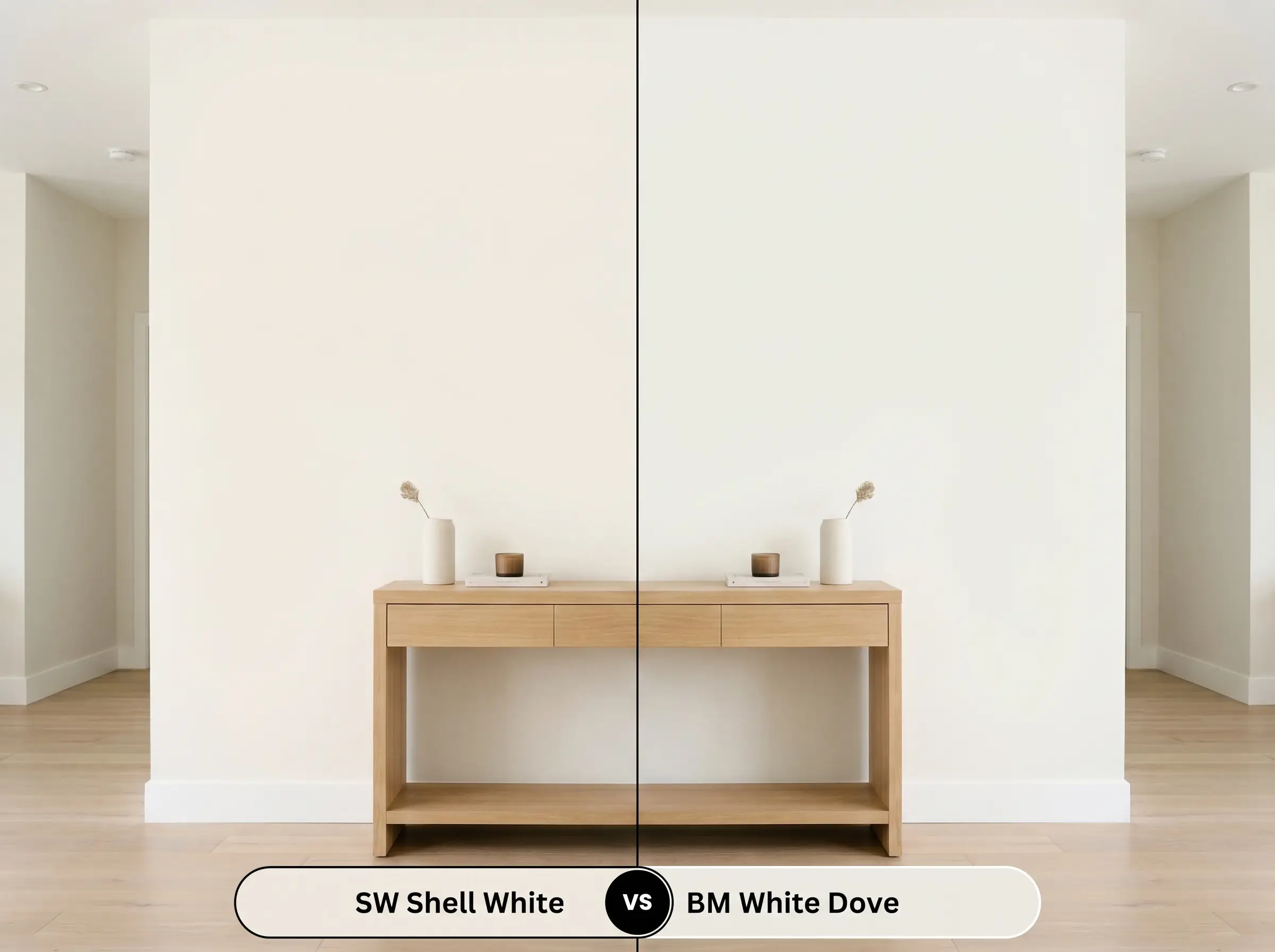
Benjamin Moore White Dove OC-17 is famous for its highly versatile, slightly greige undertone that expertly straddles the line between warm and cool. White Dove is the safer, more neutral option if you are trying to unify an open-concept home with conflicting lighting exposures. However, if you are designing a dedicated room where you want to maximize a feeling of cozy, enveloping warmth, OC-17 will simply not deliver the same radiant energy.
Exploring Alternative Warm Off-Whites
Finding the exact right level of creaminess often requires testing a few closely related variations on your walls. You might discover that you need a fraction more depth to anchor a large living room, or a slightly crisper finish for a shadowed hallway.
Same-Brand Variations
Rival Manufacturer Matches
Executing Your Paint Strategy Flawlessly
Transitioning from curated mood boards to the physical reality of rolling paint onto drywall requires a shift in strategy. The way this color absorbs light and hides imperfections is entirely dependent on your application technique and finish choices.
Selecting the Right Finish
Preparation and Coverage Rules
Because this shade has such a high light reflectance value, it requires a high-quality, bright white primer to ensure the yellow-orange base develops correctly. Applying this hue directly over a dark or heavily saturated wall without a primer will drastically alter the final visual temperature, often turning the cream into a muddy beige. Plan for a standard two-coat application to achieve professional opacity, and always maintain a wet edge with your roller to prevent visible flashing.
Common Questions About Sherwin-Williams Shell White
Because heavily shaded exteriors lack the direct sunlight needed to wash out subtle pigments, the peach undertones will absolutely become more prominent. To counteract this, surround the exterior with deep, grounding greens or charcoal accents that balance the warmth.
Textured surfaces naturally create thousands of tiny micro-shadows that will slightly darken the perceived color and amplify its earthy base. If you are applying it to a heavy popcorn or knockdown ceiling, expect it to read as a richer, cozier cream rather than a bright, expansive off-white.
The prominent yellow-orange base and peach undertones in this paint act as a brilliant natural counterweight to green exterior light. As the green light filters through the window, the warm pigments in the paint absorb and soften the chill, preventing your room from feeling like a sickly aquarium.
By bouncing a massive amount of artificial light around a restrictive space, this color actively fights the claustrophobic feeling of a dark corridor. The ambient warmth creates an immediate sense of welcoming comfort, guiding the eye effortlessly from one room to the next.
The Final Verdict on This Luminous Hue
Sherwin-Williams Shell White is the ultimate foundational color for homeowners who want to expand their visual square footage without sacrificing comfort. It performs brilliantly in north-facing rooms that need a synthetic injection of sunlight, and it effortlessly elevates both coastal and warm minimalist aesthetics.
While this glowing off-white is incredibly versatile, it is not the right choice for homes dominated by stark, icy finishes. Placing this paint next to cool-toned Carrara marble, blue-gray glass tile, or brilliant white vinyl windows will force the yellow-orange base to look unintentionally aged or dirty. The visual friction between these competing temperatures creates an unsettled, disjointed atmosphere that completely undermines the paint’s natural elegance. If your home features predominantly cool, blue-based hard finishes, you must pivot to a crisper, more neutralized white to maintain a cohesive design.
Hackrea Pro-Tip (The Temperature Clash)
Closest Cross-Brand Equivalents
The absolute closest scientific color matches for Shell White across top paint brands.