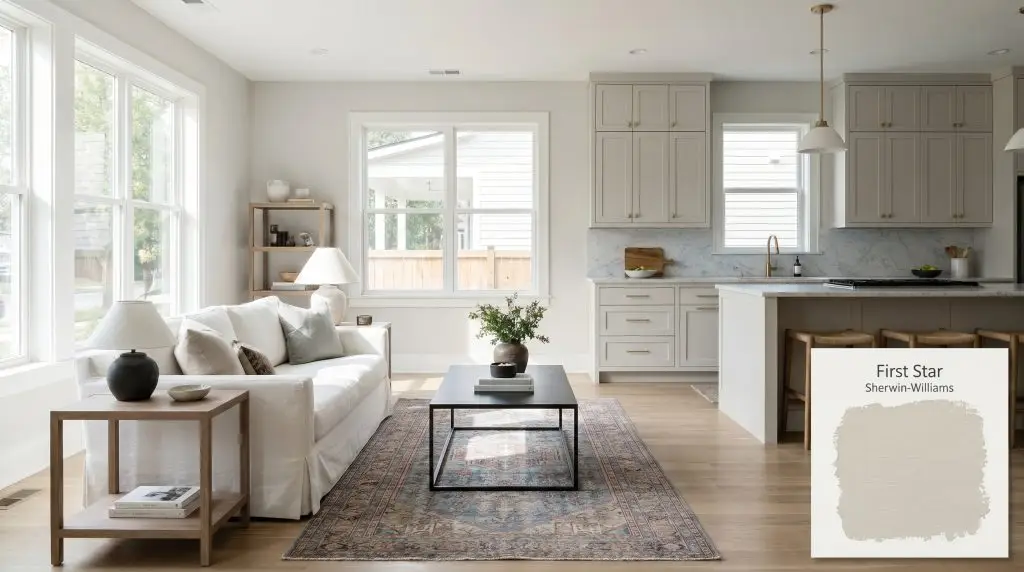
First Star SW 7646
Sherwin-WilliamsSherwin-Williams First Star (SW 7646) is a light, airy cool gray with an LRV of 69. While it appears as a crisp neutral, it carries subtle blue undertones that prevent it from feeling heavy, making it an excellent choice for modern, open-concept spaces.
Paint Technical Profile
| Color ID / SKU | SW 7646 |
| HEX Code | #DAD9D4 |
| Light Reflectance (LRV) | 69 |
| Use | Interior, Exterior |
| Best Exposures | South-Facing or West-Facing |
| Best For | Bedrooms, Living Rooms, Open-Concept Spaces, Whole-House Palettes |
The Crisp Architectural Flow of Sherwin-Williams First Star
Some neutrals quietly fade into the background, while others actively shape the atmosphere of your home.
Sherwin-Williams First Star belongs entirely to the latter category.
It acts like a crisp, tailored linen shirt for your walls, offering a clean, structured finish that instantly modernizes a room. This specific shade proves that you do not need bold, saturated pigments to completely redefine the energy of a space. Instead, it relies on a highly refined color structure to capture shifting sunlight and bounce it beautifully across your interior architecture.
If you want a home that feels effortlessly cohesive, bright, and intentionally curated, this desaturated hue is an exceptional starting point.
Temperature, Undertones, & LRV of Sherwin-Williams First Star
If you are wondering whether this shade leans warm or cool, the answer is definitively cool.
Despite where it technically sits on the color wheel, its desaturated hue strips away any noticeable warmth. This leaves you with an airy, refreshing gray that feels incredibly clean on the walls.
With a Light Reflectance Value (LRV) of 69, this color sits in a fantastic light-medium sweet spot.
It bounces a significant amount of ambient light around the room, keeping things bright and expansive. More importantly, it retains just enough pigment to avoid washing out completely when hit by direct, harsh midday sun.
Lighting Effects & The Chameleon Factor
Because this gray relies so entirely on its low chroma, it becomes highly reactive to the light streaming through your windows.
It absorbs and reflects the environment around it, shifting its personality as the sun moves across the sky.

Never evaluate a cool gray under unshaded, bright white construction bulbs. Always test your swatch using the exact temperature of lighting you plan to live with, as a simple switch from 4000K to 3000K can entirely change the wall from icy blue to sophisticated stone.
Hackrea Design Secret (The Bulb Balancing Act)
Popular Architectural Applications
Moving a color from a tiny paper square onto your actual walls requires understanding how it interacts with real-world materials.
This desaturated hue offers immense versatility, serving as a brilliant foundation for a variety of lifestyles and aesthetics.
Here is how to maximize its potential across different areas of your home.
Primary Bedrooms
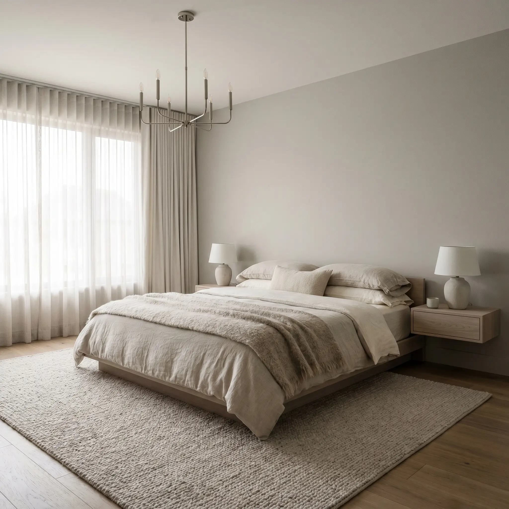
Creating a serene retreat often means dialing back the visual noise.
In a primary suite, this cool gray establishes a restful, cloud-like atmosphere that feels incredibly restorative for busy professionals at the end of a long day. Lean into a soft Scandinavian aesthetic by pairing the walls with bleached walnut nightstands and layers of washed linen bedding.
To prevent the room from feeling too sterile, introduce tactile warmth through an alpaca throw or a nubby wool area rug. A sleek, polished nickel chandelier or brushed brass reading sconces will add just the right amount of aspirational polish against the crisp walls.
Open-Concept Living Areas
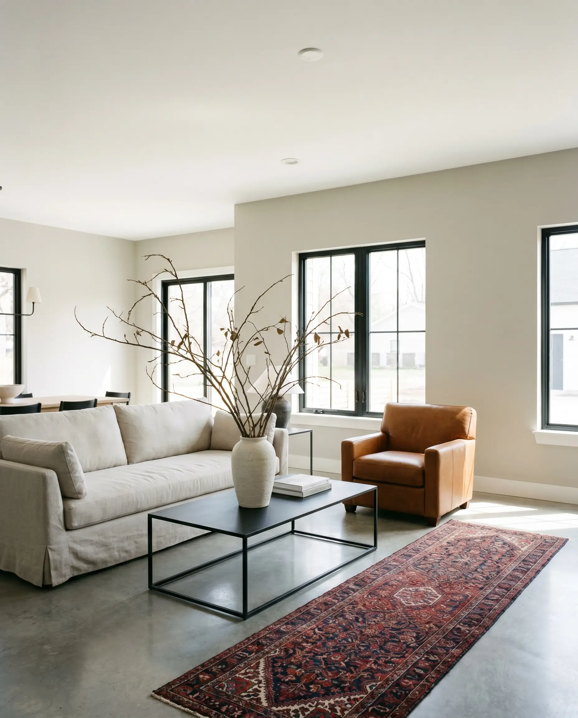
Large, multi-functional spaces require a whole-house color palette that flows effortlessly from one zone to the next.
This shade acts as the perfect gallery-white alternative, offering just enough pigment to contrast beautifully with bright white ceilings and baseboards. Embrace a modern, curated vibe by styling the room with a slipcovered sofa, a matte black steel coffee table, and oversized branches in a minimalist ceramic vessel.
The subtle blue undertone plays magnificently against warm cognac leather accents or a vintage Persian runner.
Be incredibly careful when pairing this cool neutral with strongly yellow-based tan or beige upholstery. The icy undertones will actively fight the yellow, making your furniture look dingy and the walls look unexpectedly baby blue.
Clash Warning (The Warmth Trap)
Modern Kitchens
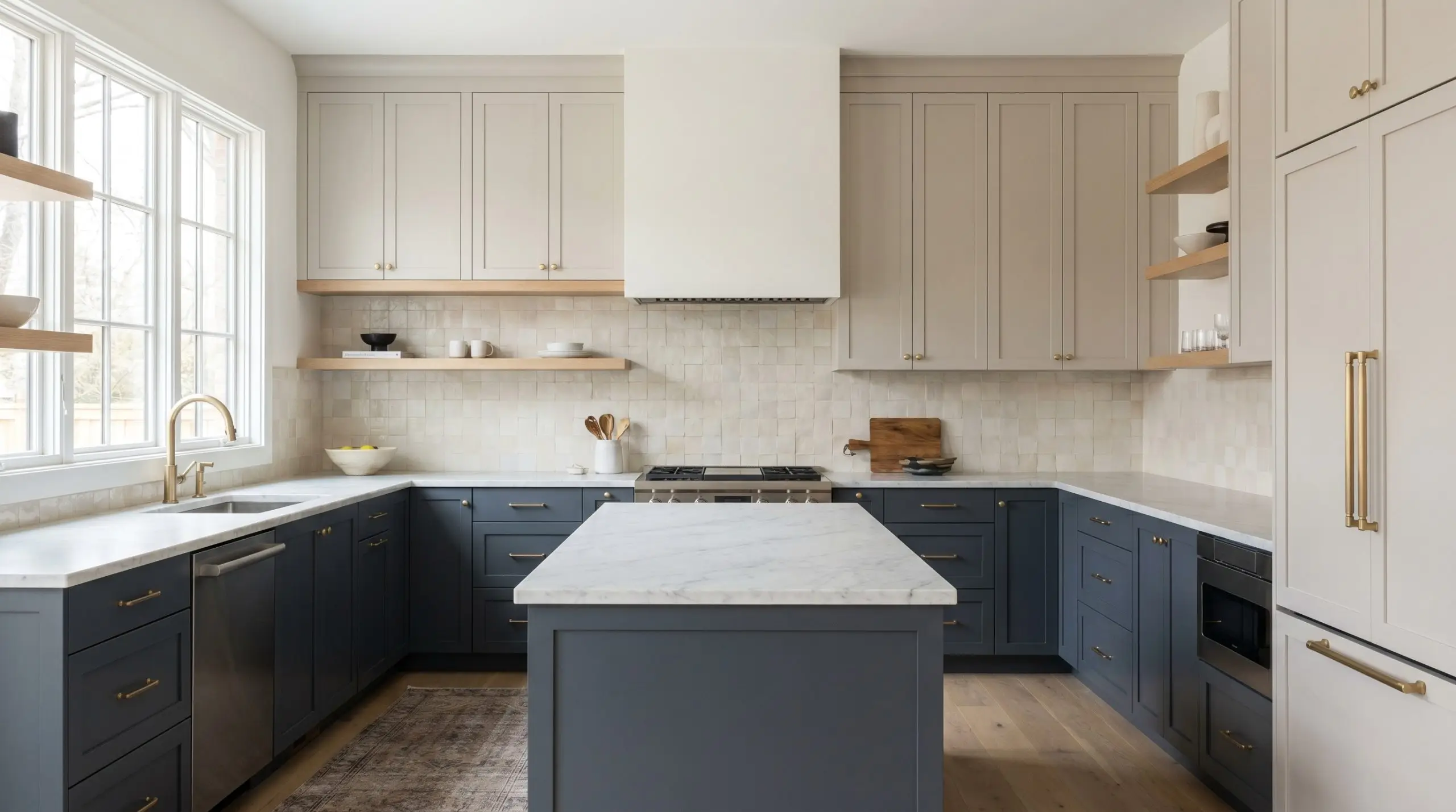
Whether splashed across the walls or sprayed directly onto the cabinetry, this color brings a refreshing, hygienic crispness to a culinary space.
For a truly custom look, try a two-tone application. Use this light gray on the upper cabinets to bounce light around the room, while rooting the lower cabinets in a rich navy or slate blue.
Elevate the everyday functionality by pairing the painted surfaces with honed Carrara marble countertops or a slightly textured zellige tile backsplash. Floating white oak shelves and unlacquered brass hardware will inject necessary organic warmth into the cool color structure.
Well-lit Hallways

Transitional spaces are often neglected, but they offer a fantastic opportunity to play with architectural shadow and light.
In a sun-drenched corridor, this shade feels expansive and breezy, making narrow walkways feel significantly wider. Instead of a standard wall application, consider color-drenching the entire space—painting the walls, crown molding, and interior doors in the exact same finish.
This unified approach creates a highly intentional, boutique-hotel vibe that serves as a brilliant backdrop for an asymmetrical gallery wall of abstract line art.
Exterior Siding
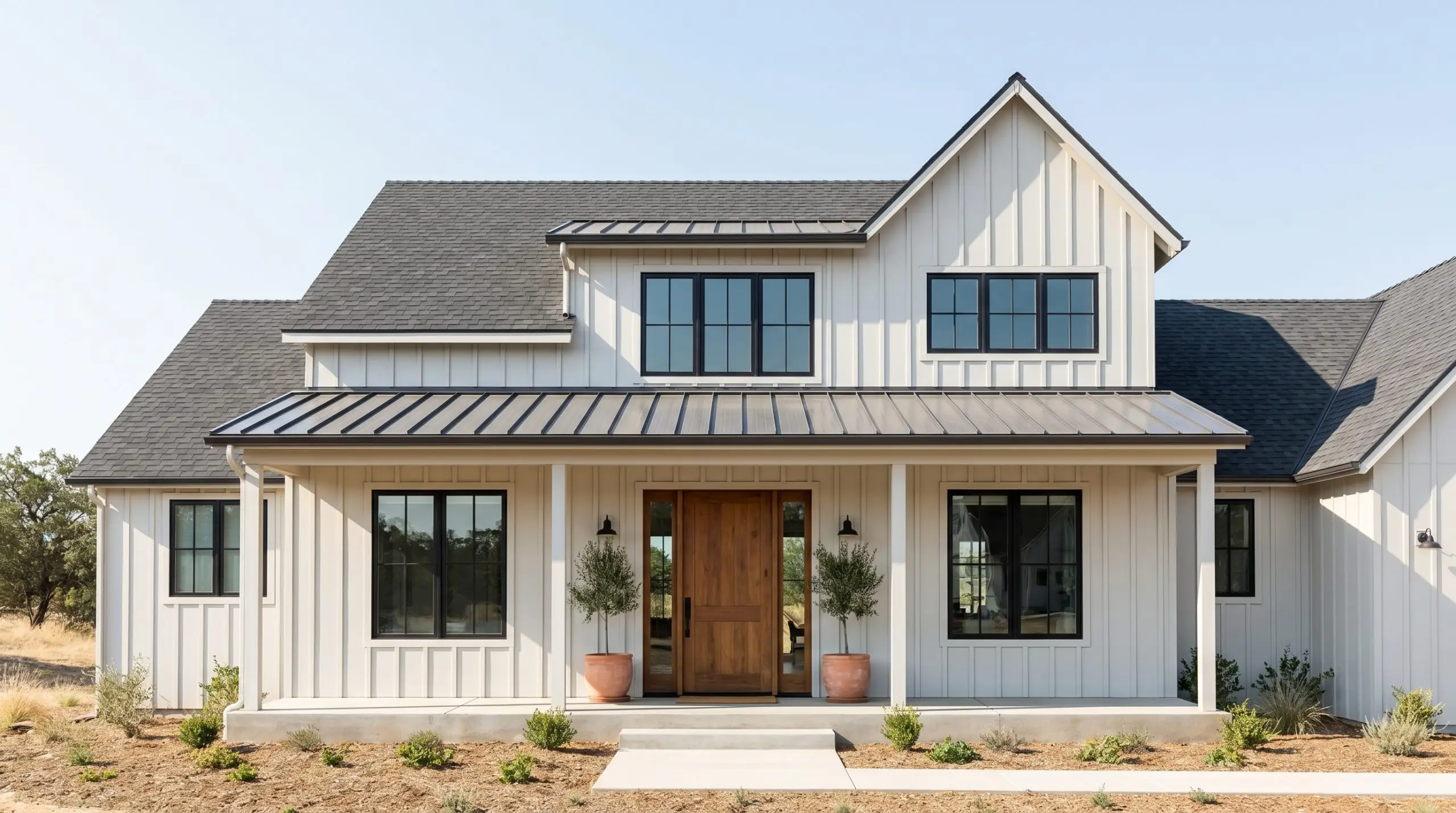
Taking this color outside requires a careful understanding of how direct sunlight washes out subtle pigments.
In bright, sun-drenched climates, this gray will often read as a brilliant, slightly cool off-white on a home’s facade. It works beautifully on coastal cottages or modern farmhouse exteriors when paired with crisp black window sashes and charcoal roofing.
To keep the exterior from looking too icy, introduce natural textures like a stained cedar front door or terracotta planters on the porch.
Perfect Pairings and Color Combinations
This specific paint pigment thrives on structural contrast rather than soft tonal bleeding. When placed next to crisp, definitive borders, the cool gray neutral holds its shape and prevents the room from feeling washed out.
Best White Trim Selections
For a flawless architectural finish, pair this shade with Sherwin-Williams Extra White SW 7006. This specific white lacks any yellow undertones, creating a sharp, clean boundary that allows the gray’s subtle blue notes to shine.
If you prefer a slightly softer transition that still reads as a true white, Benjamin Moore Chantilly Lace OC-65 provides a brilliant, un-tinted frame that keeps the walls looking fresh.
Tactile Materials and Hardware Finishes
Complementary Palette Selections
Curated Aesthetic Concepts
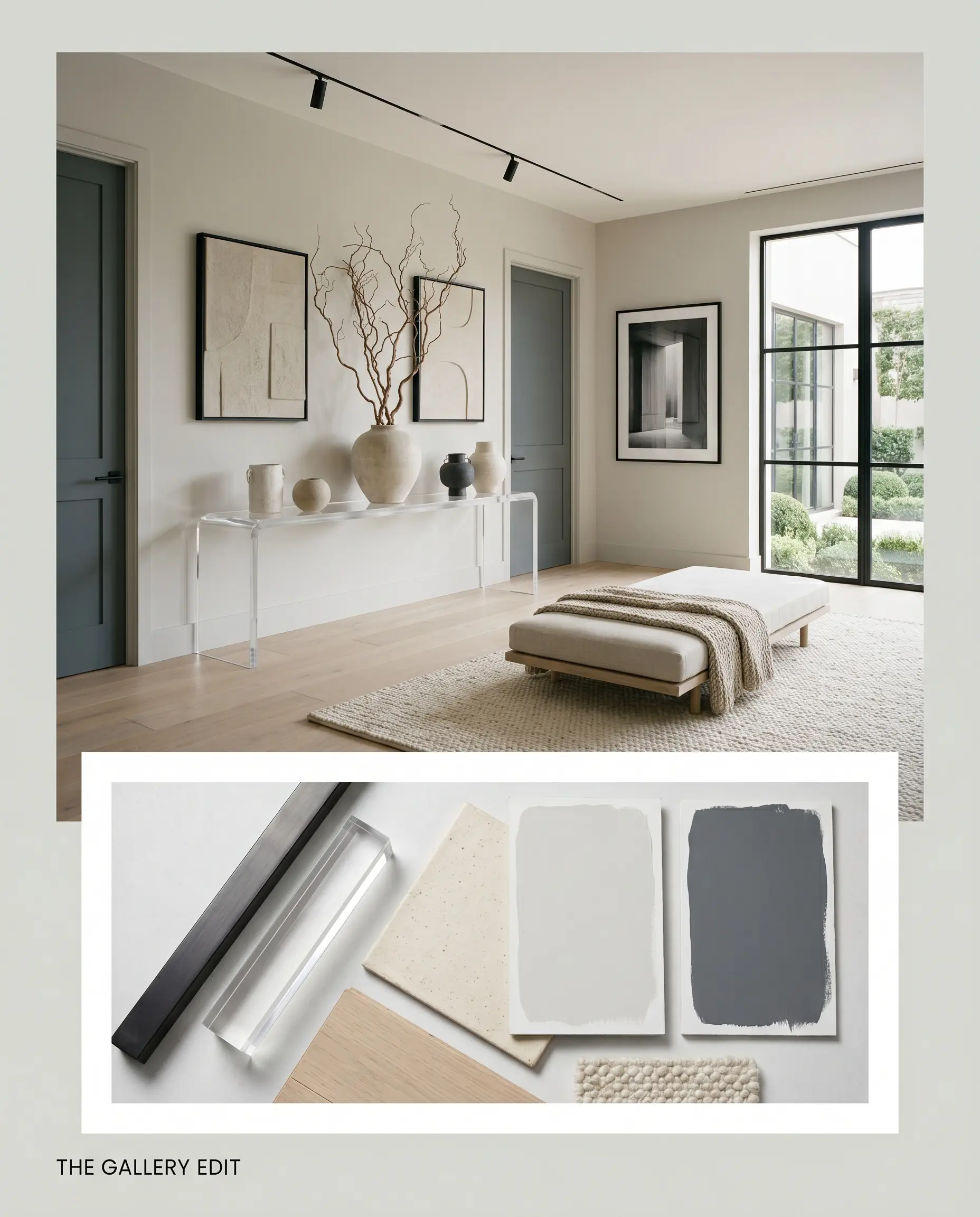
The Gallery Edit: This aesthetic leverages the gray as a sophisticated backdrop for high-contrast, curated moments. Anchor the palette with matte black steel frames and a sleek acrylic console to keep the visual weight light. Layer in Sherwin-Williams Outerspace SW 6251 on interior doors to build architectural depth, finishing the look with minimalist ceramic vessels and oversized branches.
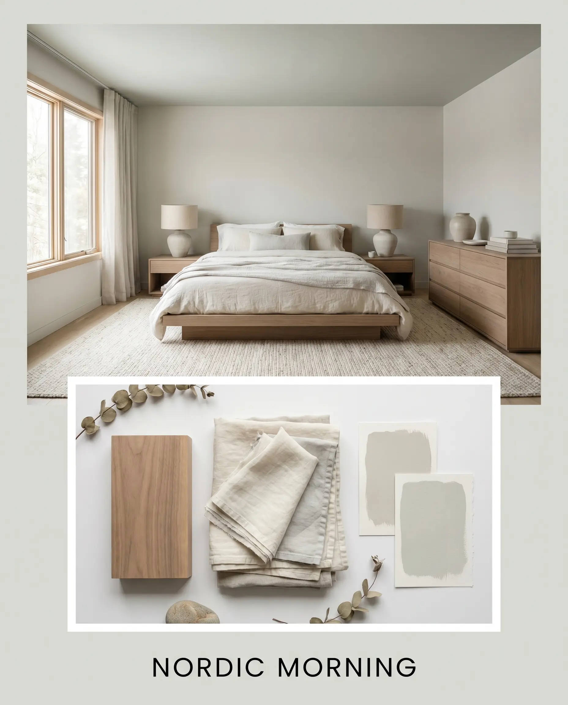
Nordic Morning: Focus on the restorative, cloud-like qualities of the wall color by flooding the space with tactile, light-absorbing textures. Pair the walls with bleached walnut furniture and layers of washed linen to physically soften the environment. A whisper of Sherwin-Williams Sea Salt SW 6204 on a painted ceiling or an accent piece introduces a gentle, frosty breeze to the design.
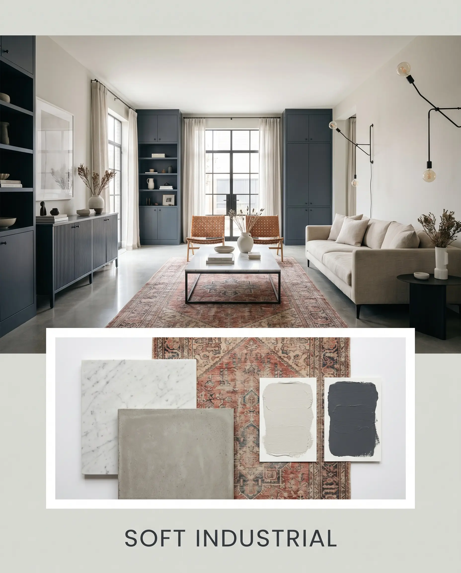
Soft Industrial: This concept bridges the gap between raw architectural elements and refined comfort. Utilize Benjamin Moore Hale Navy HC-154 on built-in cabinetry or wainscoting to root the airy gray walls. Elevate the ruggedness of poured concrete or exposed brick with the aspirational polish of honed Carrara marble surfaces and a vintage Persian runner.
Comparing Sherwin-Williams First Star to Rival Neutrals
When testing paint samples, the direction of your natural light will often dictate the ultimate winner. If your room faces north or lacks expansive windows, a gray with icy undertones might lean too chilly, prompting a strategic pivot to a slightly warmer or more deeply saturated alternative.
Sherwin-Williams First Star vs. Sherwin-Williams Agreeable Gray
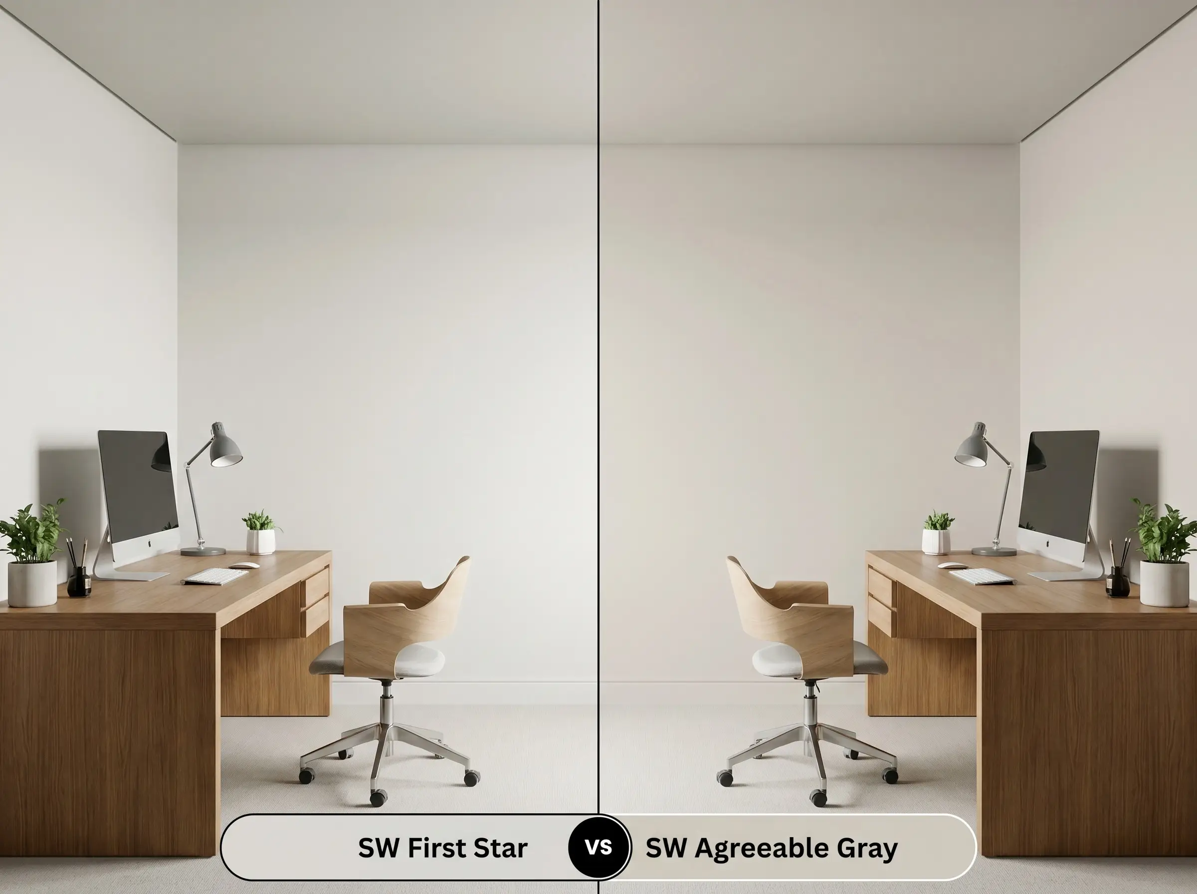
If you are dealing with a room that feels physically cold, Sherwin-Williams Agreeable Gray SW 7029 is the ultimate pivot. While our primary color relies on blue undertones, Agreeable Gray is rooted in a warm, taupe-beige base. Choose the warmer greige if you have north-facing windows, but stick to the crisp gray if you want to neutralize harsh, golden afternoon sunlight.
Sherwin-Williams First Star vs. Sherwin-Williams Big Chill
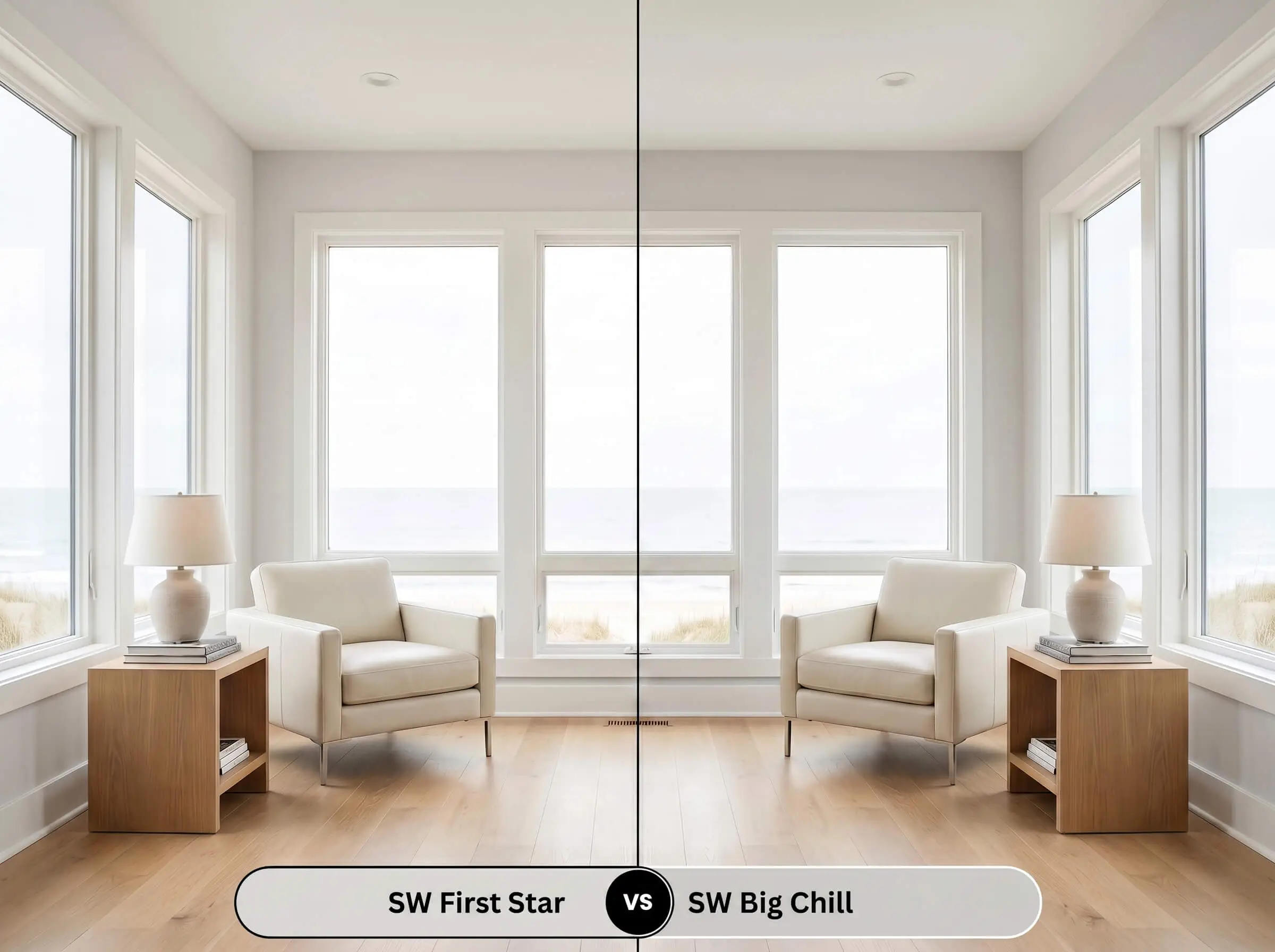
These two shades share a very similar cool-toned DNA, but Sherwin-Williams Big Chill SW 7648 brings slightly more pigment to the wall. With a lower LRV of 62, Big Chill absorbs more light, making it the better candidate for ultra-bright, south-facing rooms where a lighter shade might wash out. If your space relies heavily on artificial lighting, the lighter Sherwin-Williams First Star will keep the room feeling much more expansive.
Sherwin-Williams First Star vs. Benjamin Moore Stonington Gray
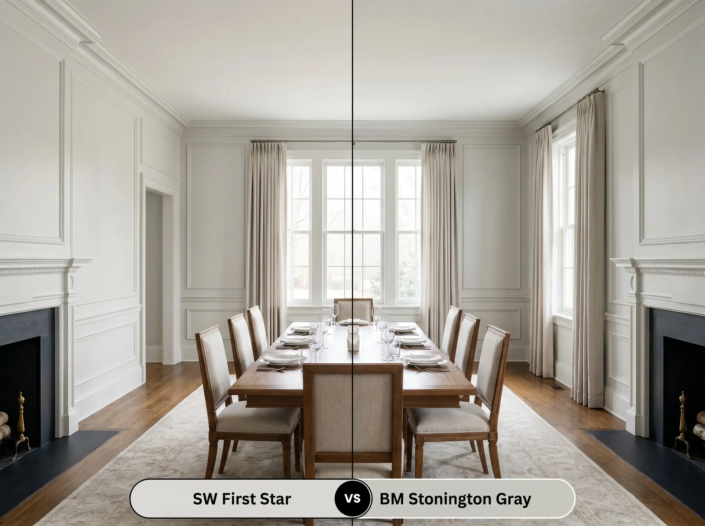
Benjamin Moore Stonington Gray HC-170 is a true, classic gray that carries a slightly more complex mix of blue and subtle green undertones. Stonington Gray feels a touch more historical and rooted, whereas the Sherwin-Williams option reads as a cleaner, more modern neutral. Opt for the Benjamin Moore rival if you are pairing it with rich, traditional wood tones that need a slightly earthier companion.
Alternative Options and Brand Matches
Sometimes a color is incredibly close to your vision, but you need a minor adjustment in light reflectance or a slight shift in temperature to perfect the room.
Closest Paint Matches Within the Brand
Comparable Shades Across Rival Brands
Real-World Execution and Painting Strategy
Transitioning from a beautiful swatch to a flawless wall requires a strategic approach to your tools and finishes.
Selecting the Right Finish
Primer and Coverage Requirements
Because this desaturated hue has a high LRV of 69, it requires a high-quality, bright white primer to ensure its subtle blue undertones render accurately on the wall.
Plan for two full coats of premium paint to achieve a truly opaque, professional result. Do not stretch the paint on your roller, as light grays are highly susceptible to flashing—those frustrating, uneven streaks that appear when the paint dries at different thicknesses.
Frequently Asked Questions About First Star
Greenery filtering through your windows will actually amplify the cool undertones of this paint. Instead of pulling purple, the green light typically clashes with the hidden cyan, sometimes resulting in a surprisingly frosty, almost minty gray.
Because stucco is heavily textured, it creates thousands of tiny micro-shadows that will slightly darken the perceived color of this gray. On smooth interior drywall, the paint reflects light evenly and appears significantly brighter and crisper.
The icy blue undertones in this gray directly oppose the strong yellow-orange hues found in honey oak. This interaction creates an intense visual tension that often makes the wood look overly orange and the walls look unexpectedly baby blue.
By introducing warm, tactile elements, you can easily utilize this shade in a space without natural light. Pair it with unlacquered brass hardware, woven baskets, and warm 3000K LED lighting to completely neutralize any clinical, icy feelings.
The Final Verdict on This Crisp Neutral
The absolute best application for this crisp neutral is in well-lit, modern spaces that crave structure without the starkness of pure white.
It is the perfect foundation for homeowners who want to cultivate a clean, curated aesthetic, allowing architectural details and high-contrast furnishings to take center stage. When utilized in south-facing rooms or open-concept living areas, it breathes a refreshing, airy energy into the home.
You must be incredibly intentional when pairing this specific gray with earthy, yellow-based finishes. Placing this cool, low-chroma paint directly against Tuscan-style travertine, golden oak floors, or deeply saturated beige upholstery will force the colors to fight for dominance. The warm materials will pull the hidden icy blue out of the gray, leaving your walls looking like a chilly nursery rather than a sophisticated living space.
Hackrea Design Secret (The Temperature Clash)
Closest Cross-Brand Equivalents
The absolute closest scientific color matches for First Star across top paint brands.