Rich Cream 2153-60
Benjamin MooreBenjamin Moore Rich Cream (2153-60) is a warm, soft beige-cream with a distinct touch of peach and yellow. Reminiscent of sweet almond crème custard, this highly reflective neutral brightens spaces while maintaining a rich, cozy depth.
Paint Technical Profile
| Color ID / SKU | 2153-60 |
| HEX Code | #F2E4C5 |
| Light Reflectance (LRV) | 76.61 |
| Use | Interior |
| Best Exposures | North-Facing, East-Facing |
| Best For | Kitchens, Bedrooms, Living Rooms, Nurseries |
Benjamin Moore Rich Cream: Shaping Sunlit Warmth and Tactile Elegance
Some colors sit flat against a wall, while others seem to wrap around you like a physical textile. Benjamin Moore’s Rich Cream behaves entirely like the latter, transforming rigid drywall into a soft, glowing envelope. It is a masterclass in subtlety, offering a decadent richness that never overwhelms the senses.
When you step into a room enveloped in this hue, the immediate sensation is one of settled comfort. It actively softens the hard angles of modern architecture while breathing fresh vitality into older, character-filled homes. You aren’t just painting a room; you are setting a highly intentional, welcoming mood.
As a versatile architectural finish, it serves as a brilliant canvas for the High/Low mix. It provides a luminous backdrop that makes everyday furnishings look incredibly deliberate, while allowing premium materials to truly shine. Let’s break down exactly how this beautiful pigment behaves and how you can manipulate it to elevate your own home.
Benjamin Moore Rich Cream: Undertones & LRV
If you are wondering whether this paint leans warm or cool, the answer is definitively and unapologetically warm. Benjamin Moore Rich Cream establishes a sunlit, welcoming baseline that instantly raises the visual temperature of any space it touches. Understanding exactly how this warmth is constructed is the secret to pairing it successfully with your existing finishes.
Every premium paint relies on a hidden structure to give it life. Here is the specific DNA that makes this color so uniquely appealing:
With an LRV (Light Reflectance Value) of 76.61, this finish bounces a substantial amount of ambient lighting back into the room. It operates brilliantly as a brightening agent for darker spaces. However, it retains enough beautiful chroma to avoid washing out into a stark, blinding white, maintaining its signature crème custard depth even in well-lit areas.
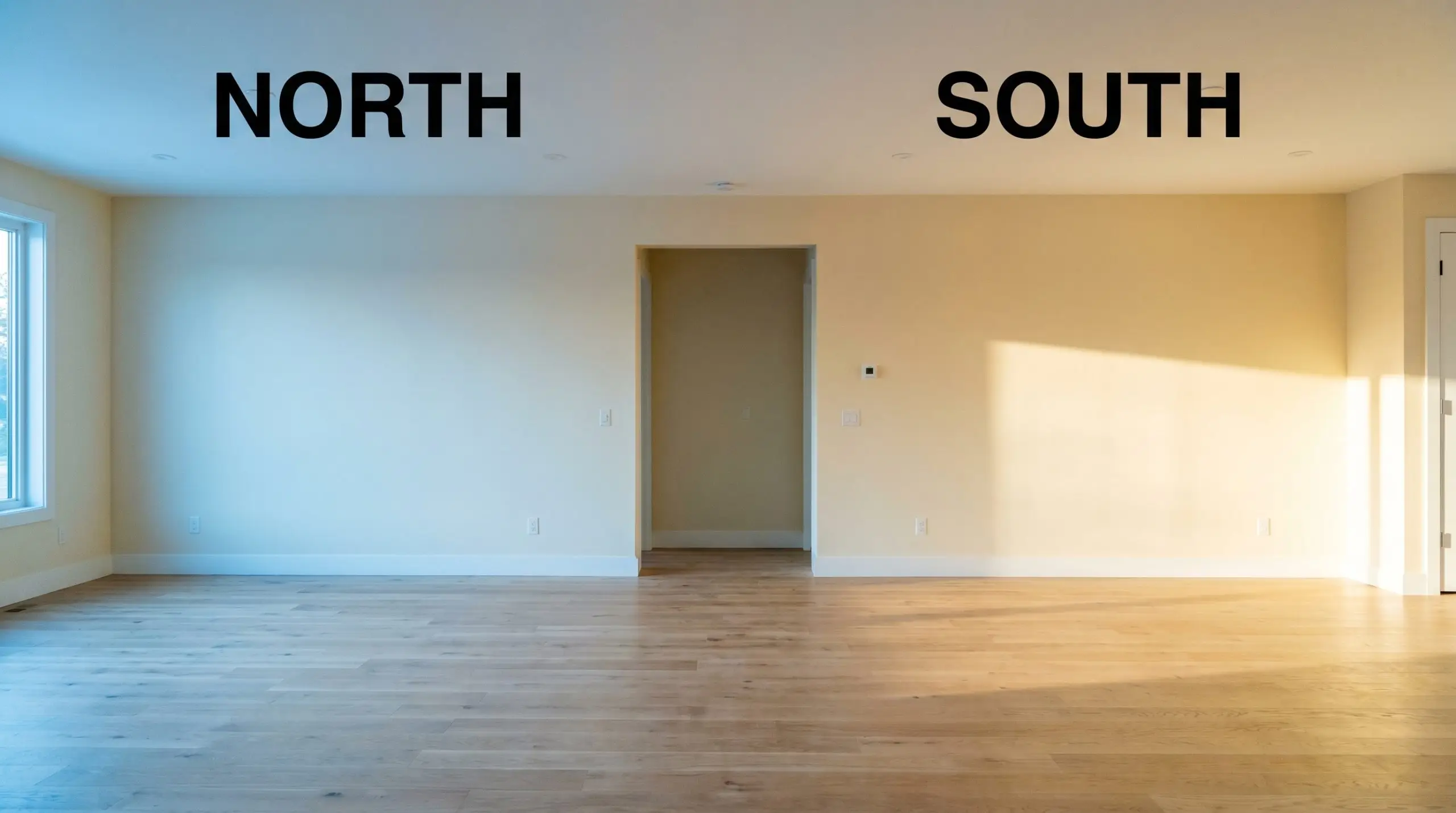
How Light Manipulates the Chromatic Profile
You cannot treat paint like a static sticker you apply to a wall; it is a highly reactive material that shifts alongside the sun. This specific warm neutral is a true chameleon, and its final appearance is entirely at the mercy of your light sources.
Here is exactly how this color will behave as the light changes throughout your home:
If you want to maintain the perfect balance of this color at night, aim for 3000K LED bulbs. They provide a clean, flattering light that enhances the creaminess without pushing it into a muddy, overly yellow territory.
Hackrea Pro-Tip (The Bulb Strategy)
Transforming Your Home with This Luminous Hue
Understanding the color temperature and light reflectance is only the first step in the design process. The true magic happens when you pair those physical traits with the right materials, textiles, and architectural applications. Let’s explore how to deploy this finish across different environments to maximize its potential.
Timeless Culinary Spaces
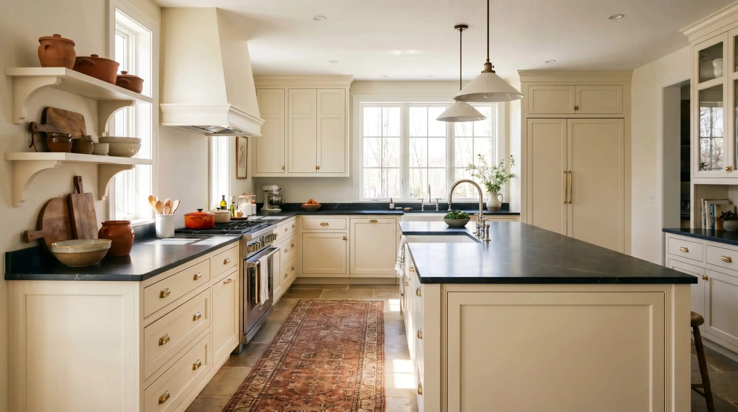
While often requested for strictly traditional kitchens, this rich hue truly excels when pushed into a transitional, English Country aesthetic. Imagine a bustling family kitchen where the cabinets are drenched in this creamy finish, instantly warming up the heart of the home. It provides a beautiful, soft contrast against harder, more utilitarian surfaces.
To elevate the space, pair the painted millwork with premium, organic materials. A dark, honed soapstone countertop creates a stunning visual break against the light cabinetry. Introduce unlacquered brass hardware and a polished nickel faucet to add a layer of living patina that grows more beautiful over time.
Be highly intentional if you have stark, bright white appliances. The brilliant white can sometimes make the subtle peach undertones in the cream look slightly dingy by comparison. Consider panel-ready appliances or softening the transition with warm-toned runners and terracotta styling accents.
Clash Warning (The Appliance Trap)
Restorative Morning Sanctuaries
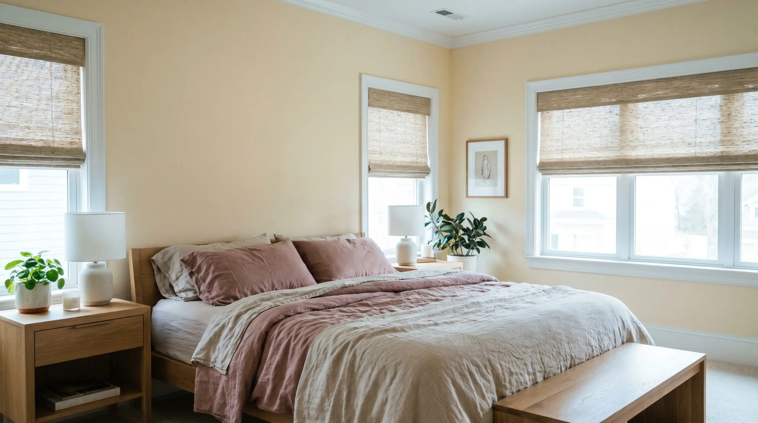
North-facing bedrooms are notoriously difficult to design because the cool, blue-tinted light often makes standard neutrals feel icy or flat. This is exactly where this specific pigment shines for professionals seeking a warm morning retreat. By absorbing that cool light, the paint settles into a highly sophisticated, muted beige that feels incredibly calming.
Lean into a Soft Organic or Coastal Modern aesthetic to maximize the relaxing atmosphere. Layer the bed with rumpled washed linen sheets in dusty rose or soft olive. Frame the space with natural white oak furniture and woven window shades to introduce essential tactile variety without overwhelming the eye.
Layered Gathering Rooms
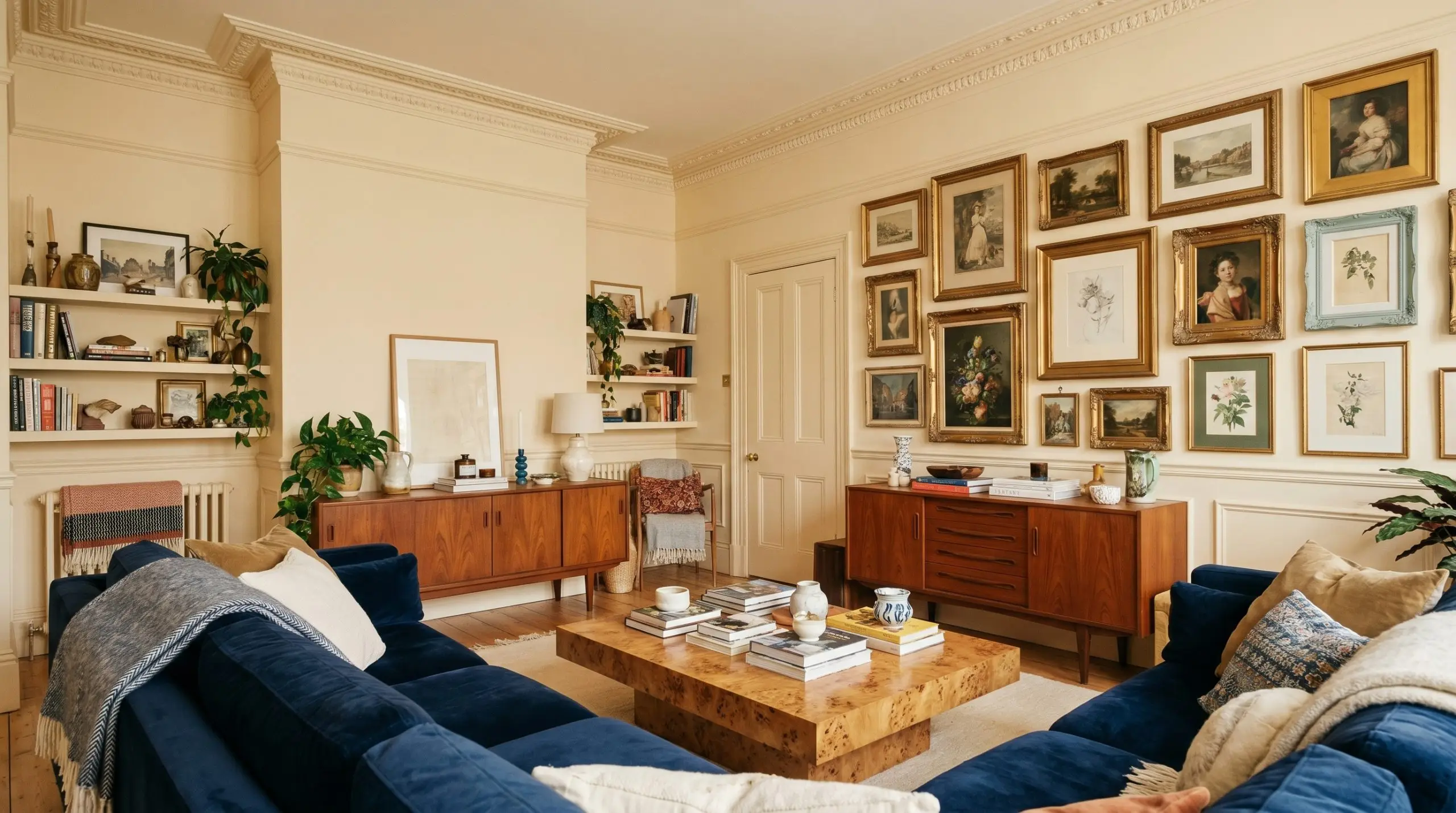
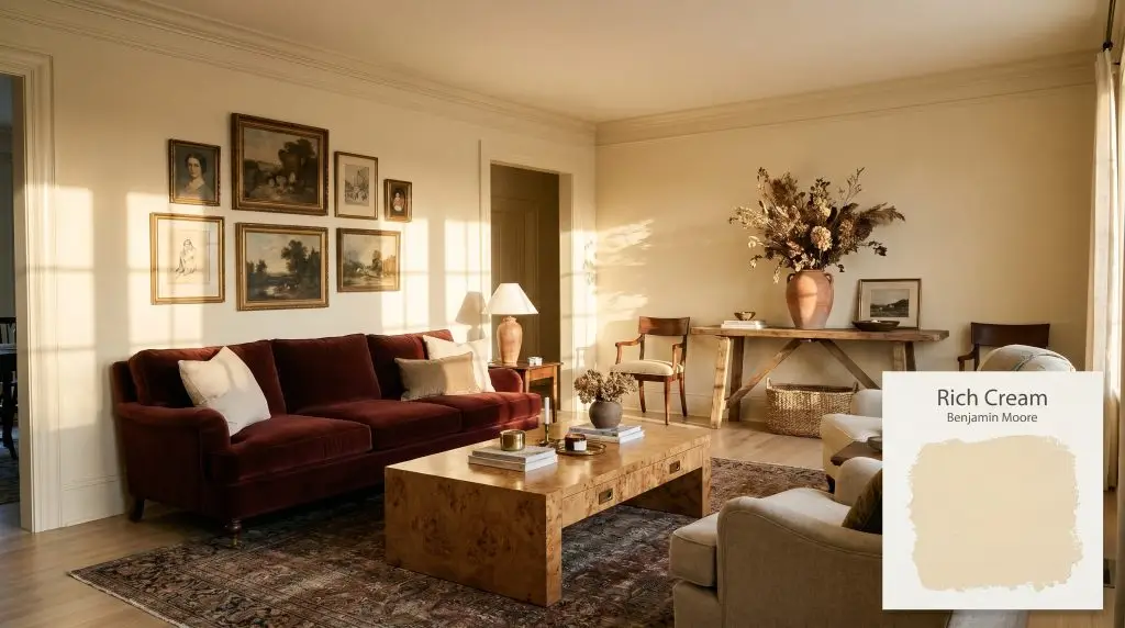
For a living room that hosts everything from quiet evenings to weekend entertaining, you want a backdrop that feels curated and intentional. Moving away from standard drywall applications, consider carrying the color across all the trim, baseboards, and even the crown molding. This subtle color-drenching technique blurs the architectural boundaries, making the room feel larger and more cohesive.
This glowing backdrop is the perfect canvas for an eclectic mix of furnishings. Center the room with a plush velvet sofa in a rich oxblood or navy, and flank it with mid-century teak sideboards or a burl wood coffee table. The warm walls will beautifully highlight an asymmetrical gallery wall of vintage art, tying disparate frames and canvas styles together.
Adaptable Early Years
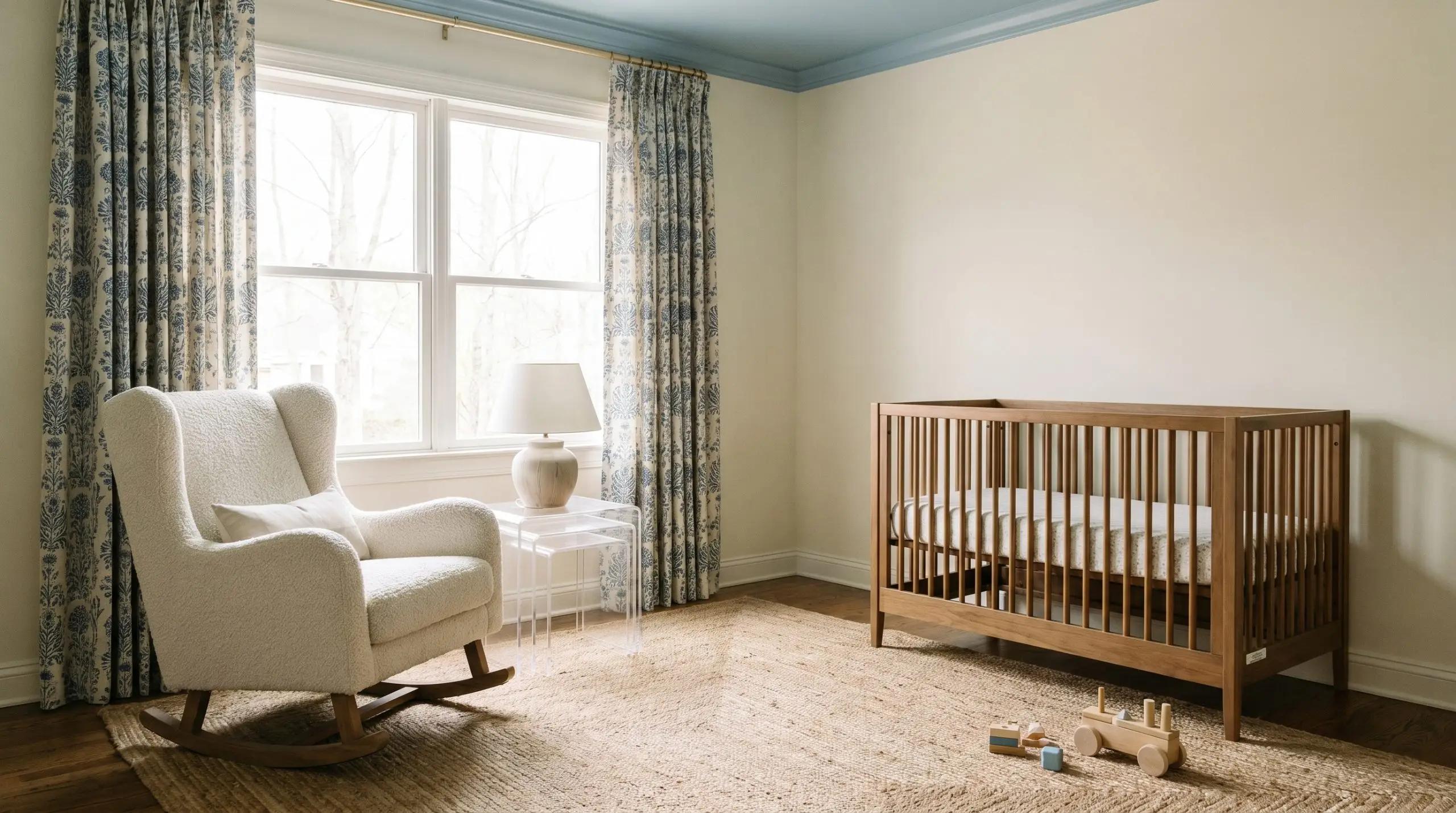
Nurseries are often painted in fleeting pastel shades that a child outgrows in just a few years. Choosing a sophisticated cream provides a much smarter, long-term foundation for first-time parents. It offers a gentle, soothing environment for late-night rocking while remaining entirely adaptable as the crib is eventually swapped for a toddler bed.
Keep the styling decidedly Soft Modern to prevent the room from feeling dated. Introduce a nubby bouclé rocking chair, acrylic nesting tables for easy storage, and block-printed cotton curtains. If you want to add a playful architectural element, consider painting the ceiling a soft powder blue; the warm walls will beautifully frame the unexpected pop of color above.
Selecting the Best Pairings for Benjamin Moore Rich Cream
This soft beige tint requires carefully considered boundaries to hold its shape, rather than bleeding endlessly into its surroundings. When placed against the right finishes, the yellow-orange color structure establishes a beautiful, glowing transition that feels distinctly intentional.
Framing with Trim and Baseboards
To keep this warm neutral looking fresh and modern, you must pair it with a trim that offers a crisp, definitive edge.
Avoid pairing this finish with strongly blue-tinted builder-grade whites. The stark color temperature difference will instantly make the creamy walls look dingy rather than intentional.
Clash Warning (The Cool White Trap)
Curating Tactile Materials
To elevate this soft beige tint, you must curate materials that either absorb its high light reflectance or enhance its underlying warmth. By mixing everyday textures with one premium focal point, you create a deeply intentional, high-end atmosphere.
Building a Cohesive Palette
Surrounding this hue with the right secondary colors will dictate exactly how the primary walls are perceived.
Designer Mood Boards
Heirloom Patina
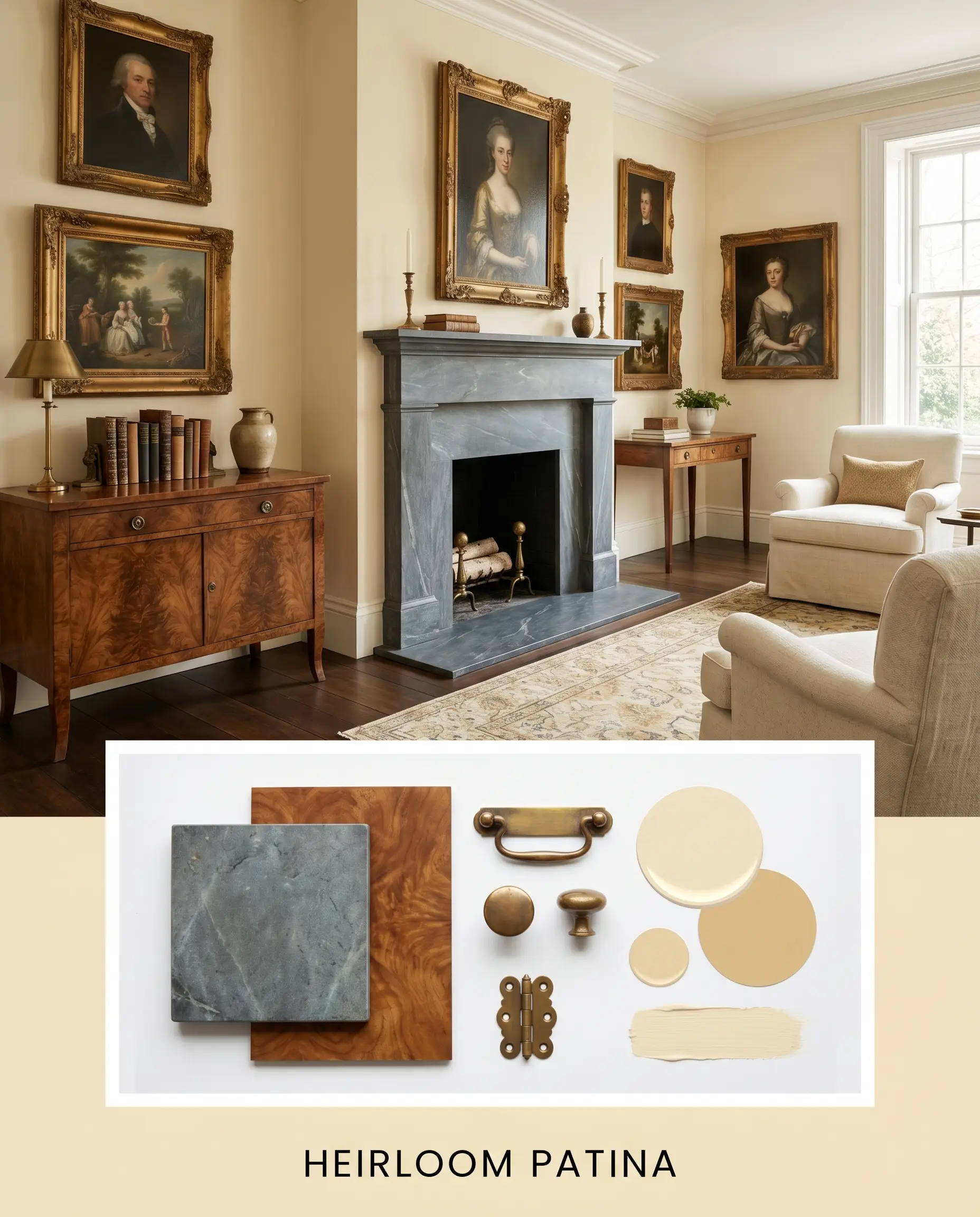
This aesthetic leans into the historical charm of the yellow-orange color structure by layering rich, time-worn textures. Imagine a room anchored by honed soapstone surfaces and accented with an asymmetrical gallery wall of antique oil portraits. The unlacquered brass hardware slowly ages against the creamy backdrop, while a vintage burl wood console introduces deep, swirling movement.
Sculpted Serenity
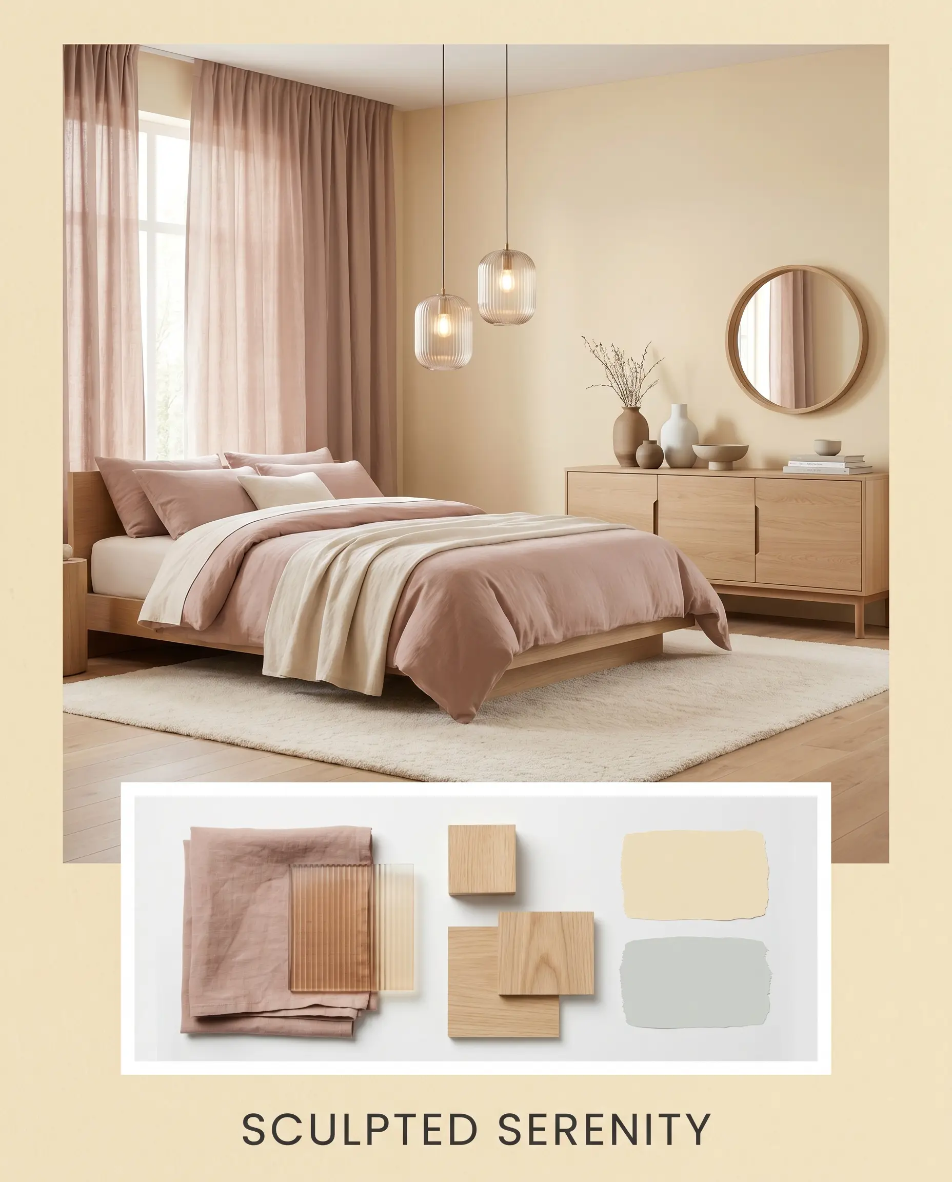
Focusing on soft, modern relief, this direction uses tactile materials to absorb the high light reflectance of the walls. Draped washed linen in dusty rose softens the hard architectural lines, pairing beautifully with the subtle peach cast of the paint. You can introduce fluted glass lighting fixtures and a minimalist ceramic grouping to maintain a clean, uncluttered visual flow.
Head-to-Head Paint Comparisons
Sometimes a specific lighting condition or architectural style exposes the limitations of your initial color choice. If your room lacks natural light or your existing hard finishes clash with the underlying warmth, you must pivot to a finish engineered for those specific constraints. Let’s analyze how this hue stacks up against its closest rivals.
Benjamin Moore Rich Cream vs. Benjamin Moore Windham Cream HC-6
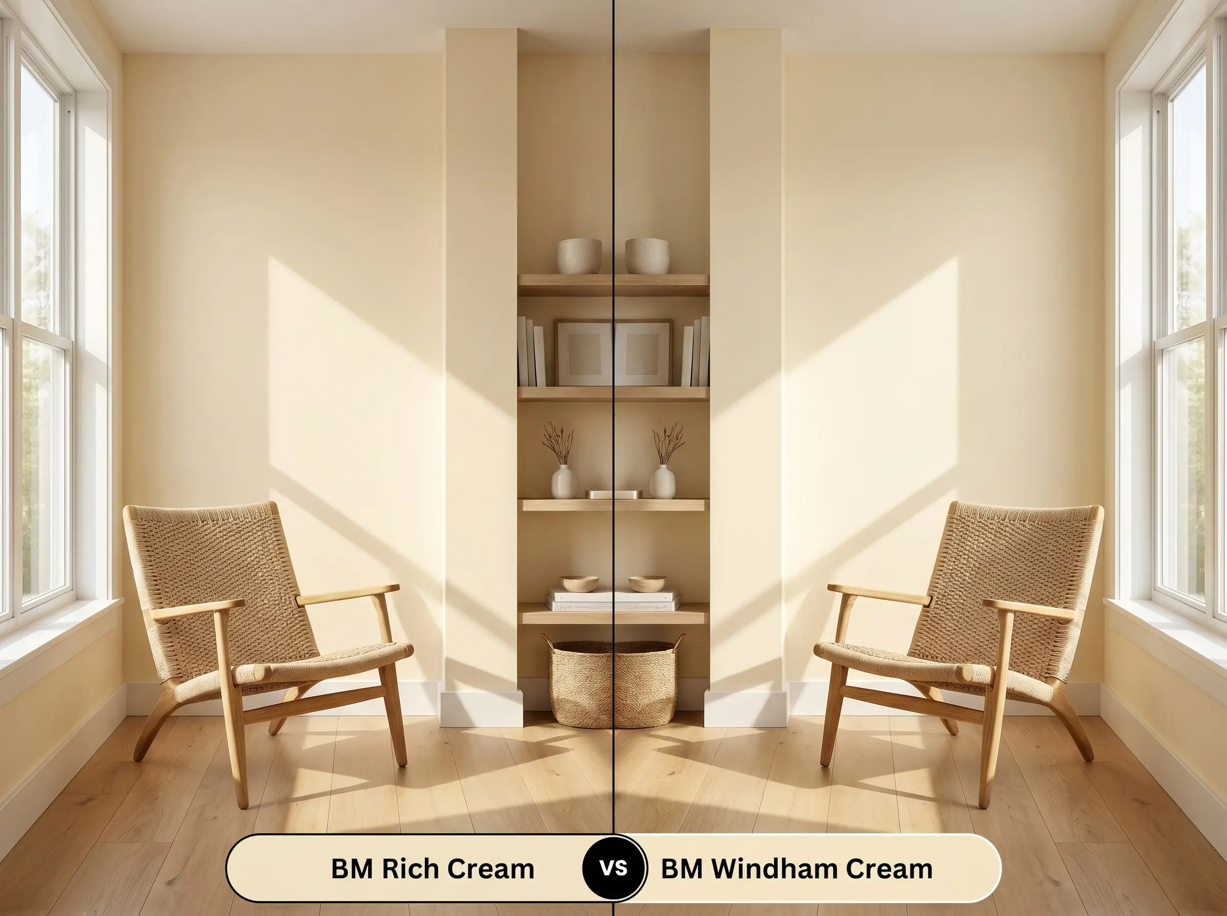
If your space receives intense, warm southern light, then Windham Cream might actually push the room into an overly saturated, sunny yellow. Rich Cream 2153-60 utilizes a slightly more muted beige foundation, which helps it maintain its composure and act as a neutral backdrop rather than a bright focal point. Windham Cream is excellent for dark, north-facing spaces that desperately need a jolt of sunshine, but it requires careful handling to avoid looking overly vibrant in bright exposures.
Benjamin Moore Rich Cream vs. Sherwin-Williams Crème SW 7556
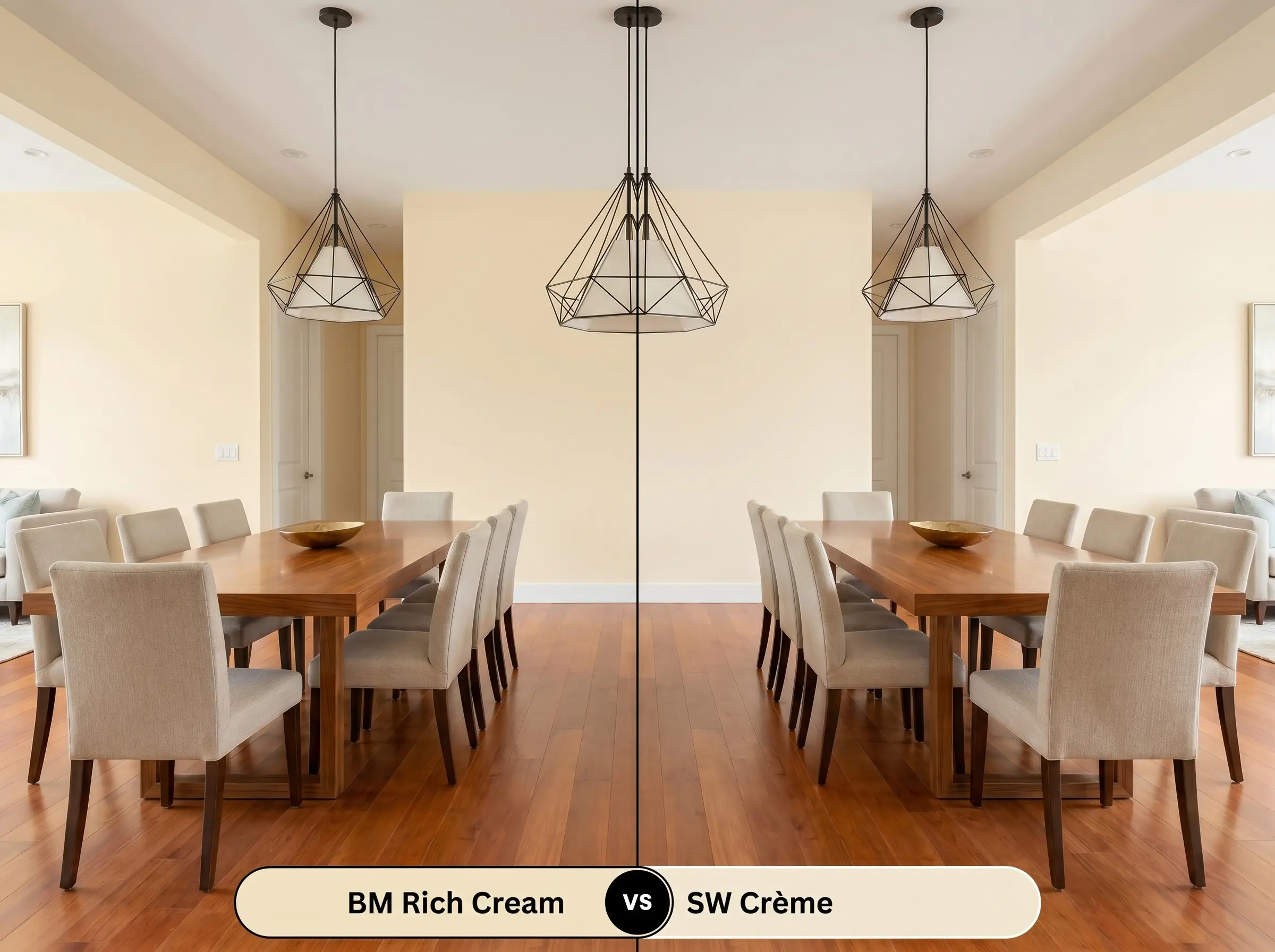
If your existing flooring features strong red or orange undertones that might clash with a peach base, then SW Crème provides a safer, more neutral boundary. While the Benjamin Moore option relies on a hidden peach cast for its signature depth, Sherwin-Williams Crème reads as a more straightforward, buttery off-white. SW Crème is the ideal pivot when you need a color that seamlessly bridges the gap between traditional styling and modern hard finishes.
Exploring Similar Colors and Brand Equivalents
Finding the perfect chromatic profile often requires minor adjustments to the lightness or saturation. Whether you need a slightly deeper tone to anchor a large room or a precise match from a different manufacturer, these alternatives provide excellent flexibility.
Same-Brand Alternatives
Cross-Brand Matches
Practical Application and DIY Success
Transitioning a color from a digital concept to a physical reality requires respecting the material properties of the paint itself. The way you prep and apply this finish will permanently dictate how the final color is perceived in your home.
The Dynamic Sheen Guide
Primer Strategy and Coverage
Because this warm neutral sits comfortably in the middle of the light reflectance spectrum, it requires a high-quality, bright white primer to ensure the delicate undertones read accurately. Using a tinted primer or painting directly over a dark existing color will muddy the final result and completely ruin the intended glow.
For a truly professional, flawless finish, plan for two full coats over the primed surface. Touch-ups on this specific sheen and color depth can be tricky, so always keep a wet edge while rolling to ensure a uniform appearance.
Be careful not to stretch the paint too thin on the roller. Doing so causes “flashing,” where uneven, streaky patches become highly visible when sunlight sweeps across the wall, but maintaining a fully loaded roller easily prevents this.
Hackrea Pro-Tip (The Flashing Warning)
Frequently Asked Questions
The literal texture of the wall drastically alters how this paint reflects light. On smooth drywall, it reads as a clean, continuous glow, while highly textured plaster will cast micro-shadows that deepen the color, making it appear slightly darker and more rustic.
Because it lacks natural sunlight to activate its high light reflectance, this hue can sometimes lean into its soft beige tint in dark basements. To prevent it from looking muddy, you must use warm, 3000K artificial lighting to intentionally pull out its welcoming, sunny character.
Direct exterior sunlight acts as a massive amplifier, often stripping the subtle nuances from lighter colors. On an exterior brick facade, the intense UV exposure will wash out the rich depth, causing it to read as a very bright, stark off-white rather than a nuanced cream.
Pairing this finish with cherry wood requires extreme caution due to the competing undertones. The strong red and orange hues in cherry cabinets can clash with the paint’s hidden peach cast, often making the walls look unexpectedly pink or overly sweet by comparison.
Final Verdict for BM 2153-60
Benjamin Moore Rich Cream 2153-60 is an exceptionally graceful architectural finish that excels at softening rigid spaces and injecting a permanent sense of sunlit warmth. It is the perfect foundational color for homeowners who want to cultivate a layered, inviting atmosphere, blending seamlessly into transitional, eclectic, and soft modern designs. When applied thoughtfully, it wraps a room in a deeply comforting, tactile elegance that stark whites simply cannot achieve.
However, this finish is not a universal solution for every home. If your existing architecture features cool-toned gray stone fireplaces, stark white vinyl window frames, or icy Carrara marble countertops, introducing this yellow-orange color structure will create an uncomfortable visual tension. The cool, rigid surfaces will force the warm walls to look dirty or aged, while the walls will make the stone feel incredibly sterile and uninviting.
Hackrea Design Secret (The Architectural Clash)
Closest Cross-Brand Equivalents
The absolute closest scientific color matches for Rich Cream across top paint brands.