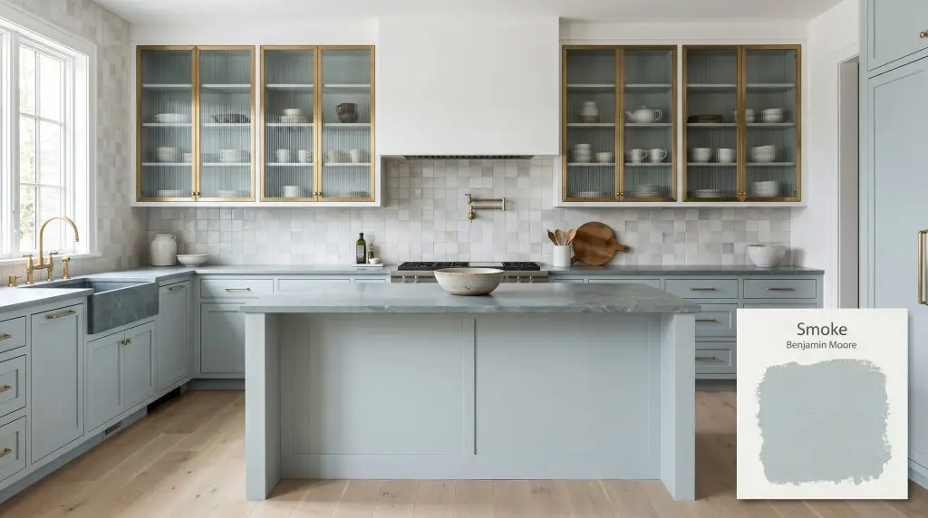
Smoke 2122-40
Benjamin MooreBenjamin Moore Smoke (2122-40) is a sophisticated, medium-light blue-gray paint color with subtle green undertones. With an LRV of 56.49, it acts as a calming, versatile neutral that shifts between a soft smoky blue and a tranquil aqua-gray depending on the lighting.
Paint Technical Profile
| Color ID / SKU | 2122-40 |
| HEX Code | #BAC8C9 |
| Light Reflectance (LRV) | 56.49 |
| Use | Interior, Exterior |
| Best Exposures | South, East, West |
| Best For | Bathrooms, Bedrooms, Cabinetry |
Benjamin Moore Smoke: Crafting Atmospheric Calm Through Blue-Gray Pigment
Capturing the exact moment morning light filters through a coastal fog is notoriously difficult to achieve with interior finishes. Yet, Benjamin Moore Smoke 2122-40 manages to bottle that exact restorative atmosphere. This is not just another pastel; it is a highly intentional architectural finish that fundamentally shifts the mood of a room.
When homeowners ask us for a color that feels simultaneously historic and effortlessly modern, this specific shade is always on our short list. It establishes a serene, almost meditative environment without ever feeling cold or uninviting. The secret lies in its complex pigment mixture, which actively responds to the styling and materials placed around it.
Whether you are brushing it across a beadboard ceiling or saturating a wall of custom millwork, Smoke offers incredible design flexibility. We love watching this color completely transform depending on the textiles and hard finishes you introduce. Let’s break down exactly how this pigment behaves and how to execute it flawlessly in your own home.
Benjamin Moore Smoke: Undertones & LRV
If you are wondering whether this paint leans warm or cool, Benjamin Moore Smoke is definitively a cool-toned color. However, it completely avoids the icy, sterile feeling that plagues many traditional light blues. This warmth and livability come directly from the hidden complexities within its color structure.
Understanding the light reflectance value (LRV) is crucial for predicting how this shade will physically behave on your walls. Sitting at an official LRV of 56.49, this mid-tone cast strikes a brilliant balance. It absorbs enough ambient light to maintain its rich chromatic profile, yet reflects just enough to keep smaller rooms feeling open and airy.
When working with a complex blue-gray hue like this, your textiles will dictate which undertone wins. Pairing Smoke with mustard yellow velvet or terracotta linen will instantly pull those hidden green notes forward, warming up the entire room.
Hackrea Pro-Tip (The Fabric Pull)
The Chromatic Profile in Shifting Light
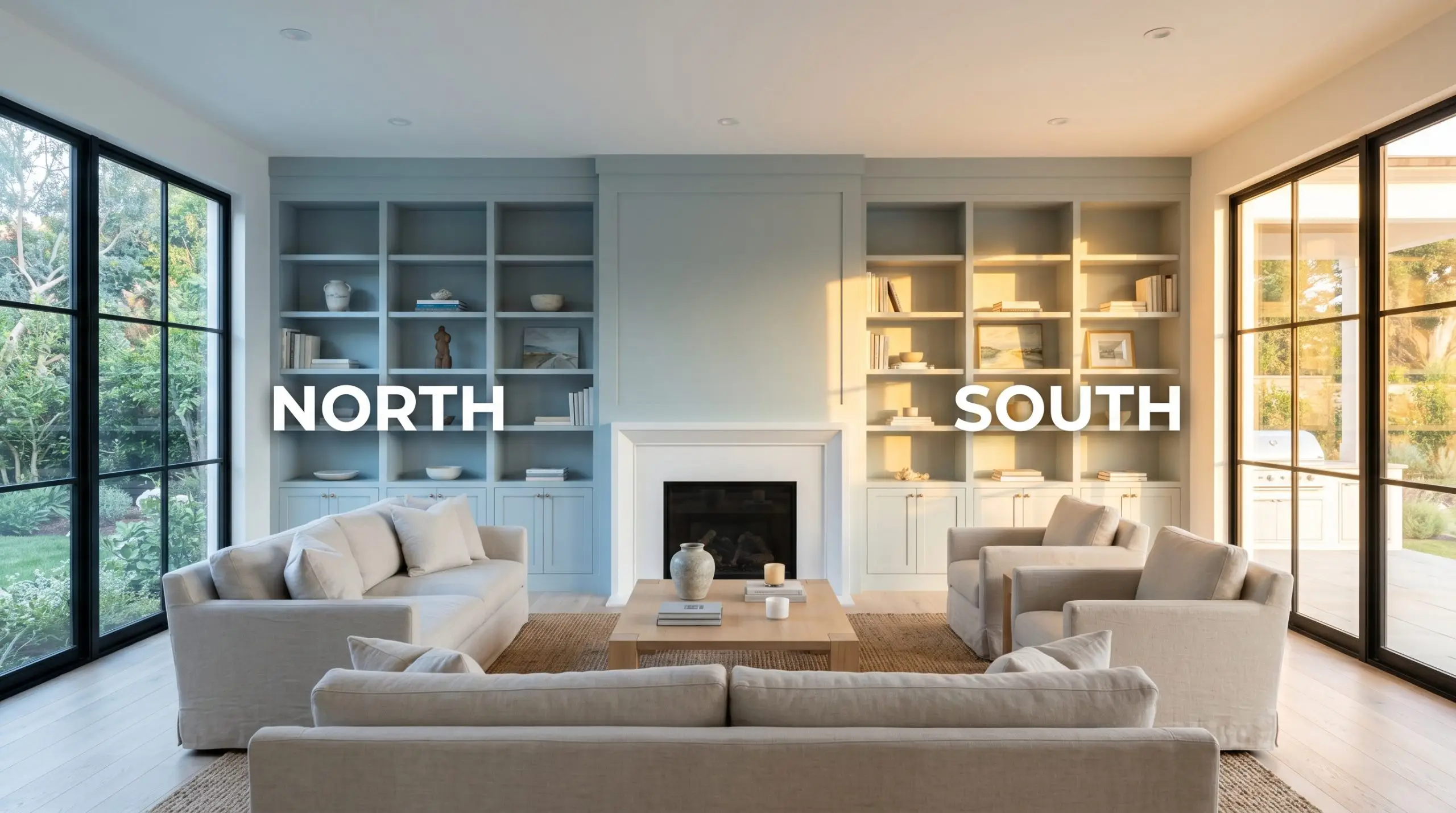
Because of that delicate tension between blue and green, this paint acts as a total chameleon throughout the day. You must evaluate your room’s natural light source before committing to a full application.
Be incredibly cautious with your bathroom vanity lighting. If you use bulbs cooler than 4000K, this color can suddenly read as a harsh, synthetic blue, entirely losing its sophisticated gray-green nuance. Stick to 3000K for a flattering, balanced glow.
Clash Warning (The Bulb Temperature Rule)
Ideal Architectural Applications for This Spa-Like Shade
The beauty of this specific pigment is how seamlessly it transitions from a hardworking utility space to a luxurious private retreat. Your application method and surrounding materials will completely dictate the final aesthetic. Here is how we love to see homeowners utilize this versatile shade.
Primary Bathrooms & Restorative Retreats
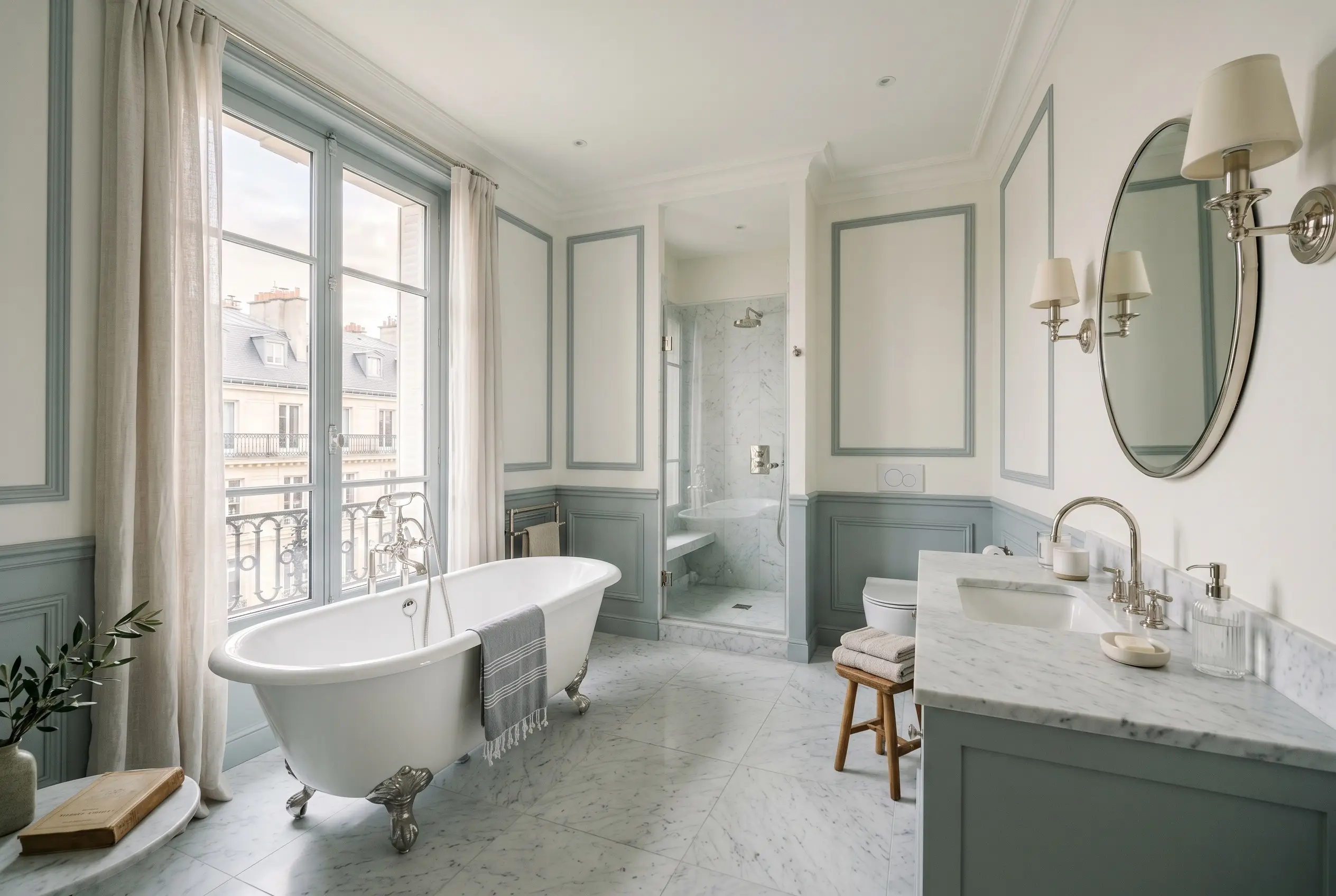
Instead of defaulting to a predictable, nautical bathroom theme, use this shade to cultivate a modern Parisian apartment aesthetic. Try applying the paint to classic wainscoting or picture frame molding, leaving the upper walls a crisp, gallery white. To elevate the space, pair the painted millwork with honed marble floor tiles and polished nickel plumbing fixtures.
For a more immersive experience, consider color drenching the entire room—walls, ceiling, and trim. This enveloping technique pairs beautifully with a floating white oak vanity and warm brass sconces. The natural wood tones stabilize the cool walls, creating a highly sophisticated environment to start your morning routine.
Tranquil Bedrooms
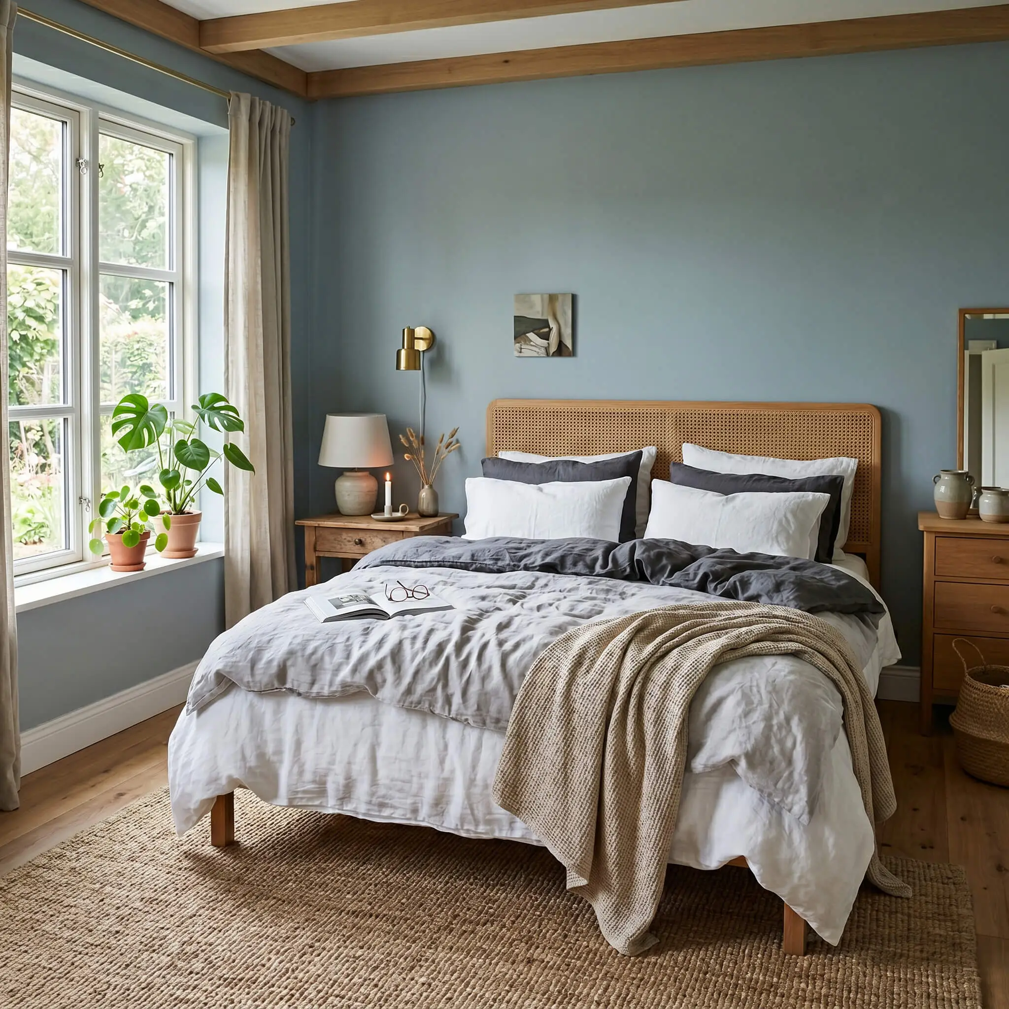
In a bedroom, this color excels at promoting rest, especially when styled through a Scandinavian hygge lens. Paint the walls in a flat finish to absorb the light, creating a soft, velvety backdrop for your furniture. Layer the bed with voluminous washed linen sheets in crisp white and charcoal gray to add crucial tactile warmth.
To keep the room from feeling too one-dimensional, introduce contrasting textures. A jute rug, a cane headboard, or a woven wall hanging will provide the necessary organic friction against the smooth, cool walls. If your bedroom receives heavy southern light, expect the walls to glow with a soft, green-tinted warmth by mid-afternoon.
Utility Spaces & Mudroom Cabinetry
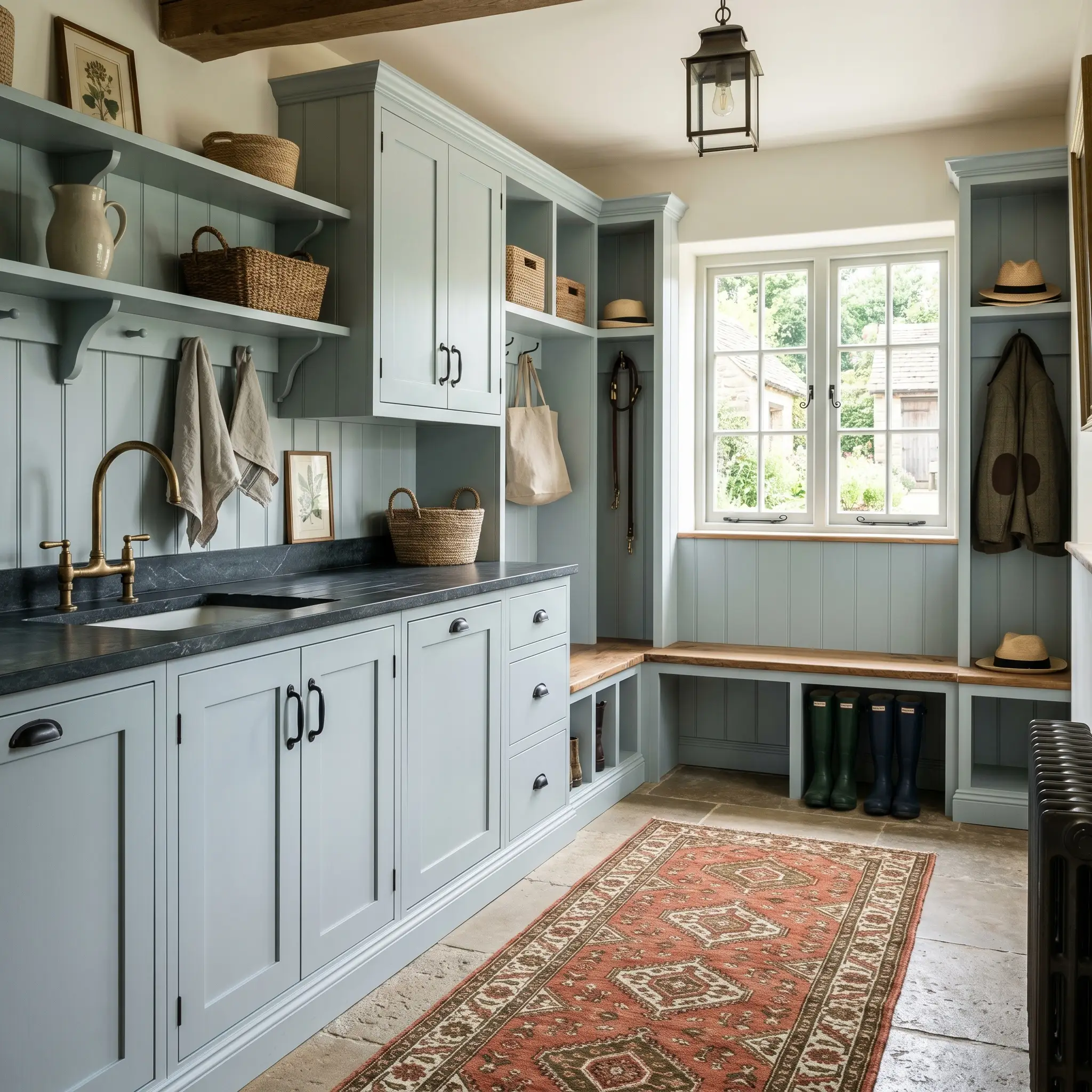
Utility spaces do not have to be an afterthought; they are the perfect canvas for this sophisticated cabinetry tint. Channel a classic British utility room by spraying your laundry or mudroom built-ins with a durable satin finish in this shade. The color hides everyday scuffs beautifully while making a mundane drop-zone feel incredibly custom.
Balance the cool cabinetry with highly durable, hardworking materials. Soapstone countertops and matte black hardware provide a stunning, high-contrast pairing that feels both practical and premium. Add a durable, block-print runner rug in rich terracotta to introduce an unexpected pop of warmth against the blue-gray cabinets.
Kitchen Islands & Lower Millwork
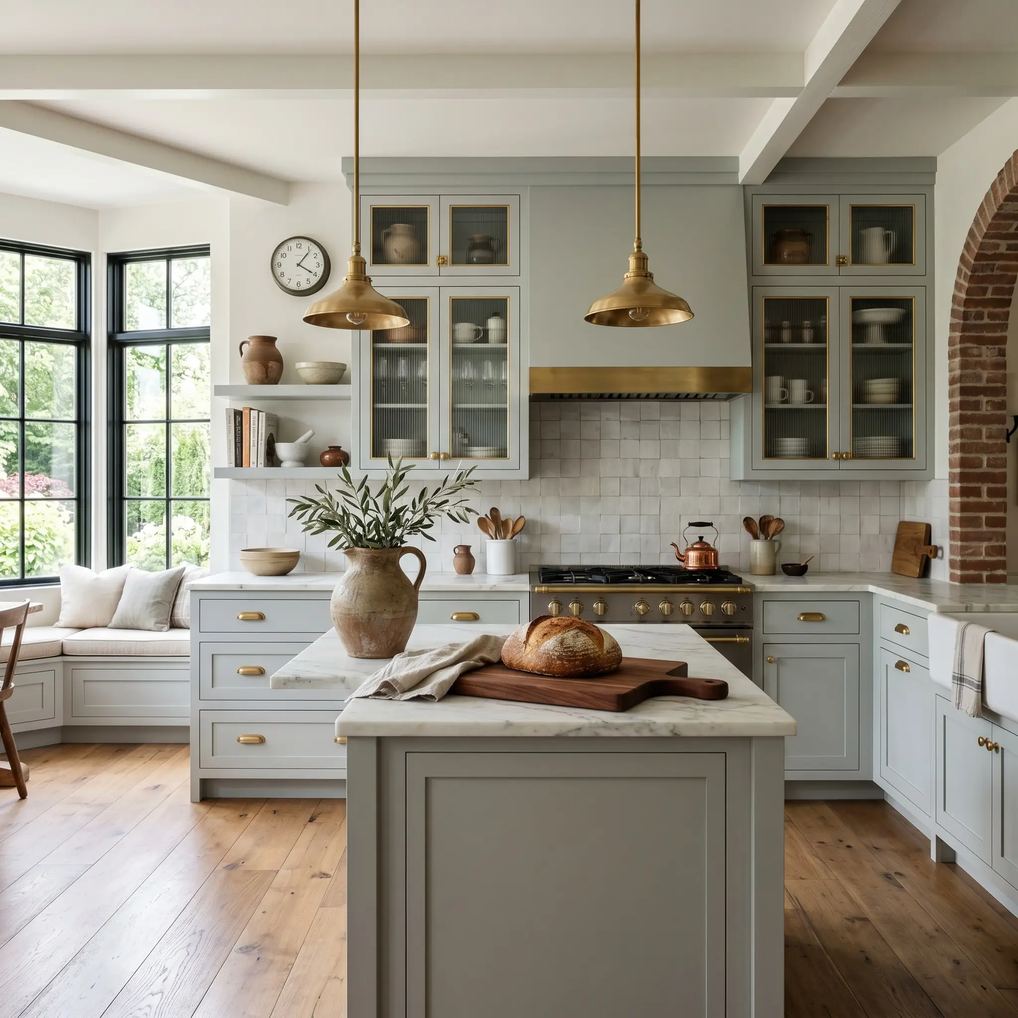
If an entirely blue kitchen feels like too much of a commitment, use this shade exclusively on your lower cabinets or a central island. This two-tone approach roots the kitchen layout while keeping the upper sightlines bright and open. It is a fantastic strategy for softening a kitchen that features harsh stainless steel appliances.
To maximize the design impact, pair the painted island with unlacquered brass hardware that will patina over time. The warmth of the aging brass sings against the cool blue-gray base. Introduce fluted glass upper cabinets and a textured zellige tile backsplash to complete a brilliantly layered, transitional kitchen.
Exterior Accents & Shutters
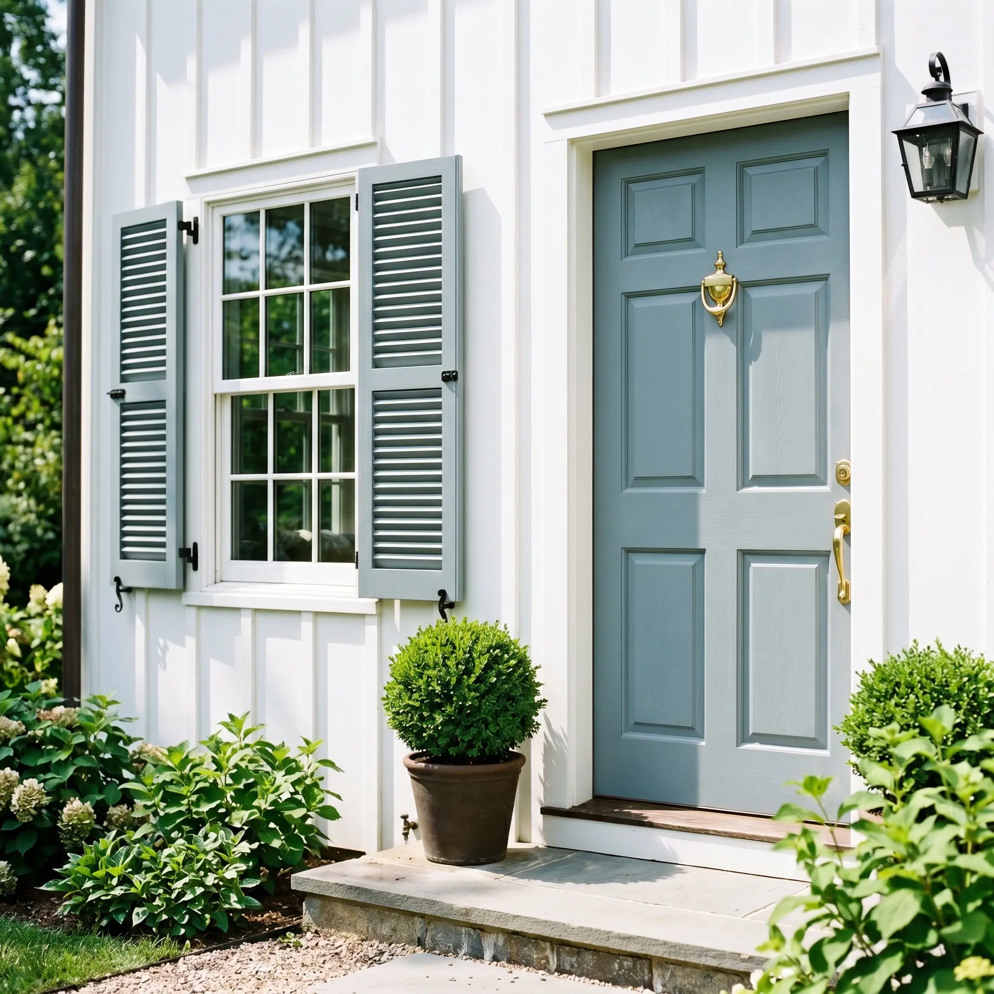
On an exterior facade, natural sunlight will significantly wash out the color, making it appear much lighter and slightly more gray than it does indoors. It serves as an exquisite accent color for front doors, window sashes, or traditional shutters. It looks particularly striking when paired with a classic red brick exterior or bright white board-and-batten siding.
Because direct sunlight strips away a paint’s intensity, this mid-tone will read closer to a soft, airy gray-blue on a front door. If you want a truly punchy, saturated blue for your exterior, you will need to select a color at least two shades darker on the paint chip.
Hackrea Design Secret (The Exterior Washout)
Coordinating Colors & Elevating Benjamin Moore Smoke
This muted plum-blue pigment requires thoughtful material relationships to truly sing. Instead of floating aimlessly on the wall, its subtle green notes crave tactile contrast to establish clear visual boundaries within a room. We love pairing it with elements that pull out its hidden warmth, ensuring the final design feels collected and highly intentional.
Tailoring the Trim and Baseboards
Sherwin-Williams High Reflective White SW 7757 provides a razor-sharp, brilliant contrast that forces the blue-gray hue to step forward as a distinct architectural feature. This crisp pairing is perfect for highlighting historic crown molding or intricate wainscoting.
For a softer, more atmospheric glow, Farrow & Ball All White No. 2005 drops the harsh contrast and allows the wall color to gently bleed into the millwork. This creates a beautifully seamless, continuous envelope of color that feels incredibly serene.
Tactile Material and Hardware Pairings
The Core Color Palette
Curated Design Mood Boards
Sunbaked Serenity This aesthetic leans into the tension between cool atmosphere and raw, earthy warmth. Imagine the blue-gray hue framing an environment layered with rich terracotta tiles and voluminous mustard washed linen drapery. We style this look with potted olive trees, woven sisal rugs, and abstract watercolor canvases to cultivate a relaxed, organic energy. The resulting vibe is deeply restorative, feeling effortlessly collected over time.

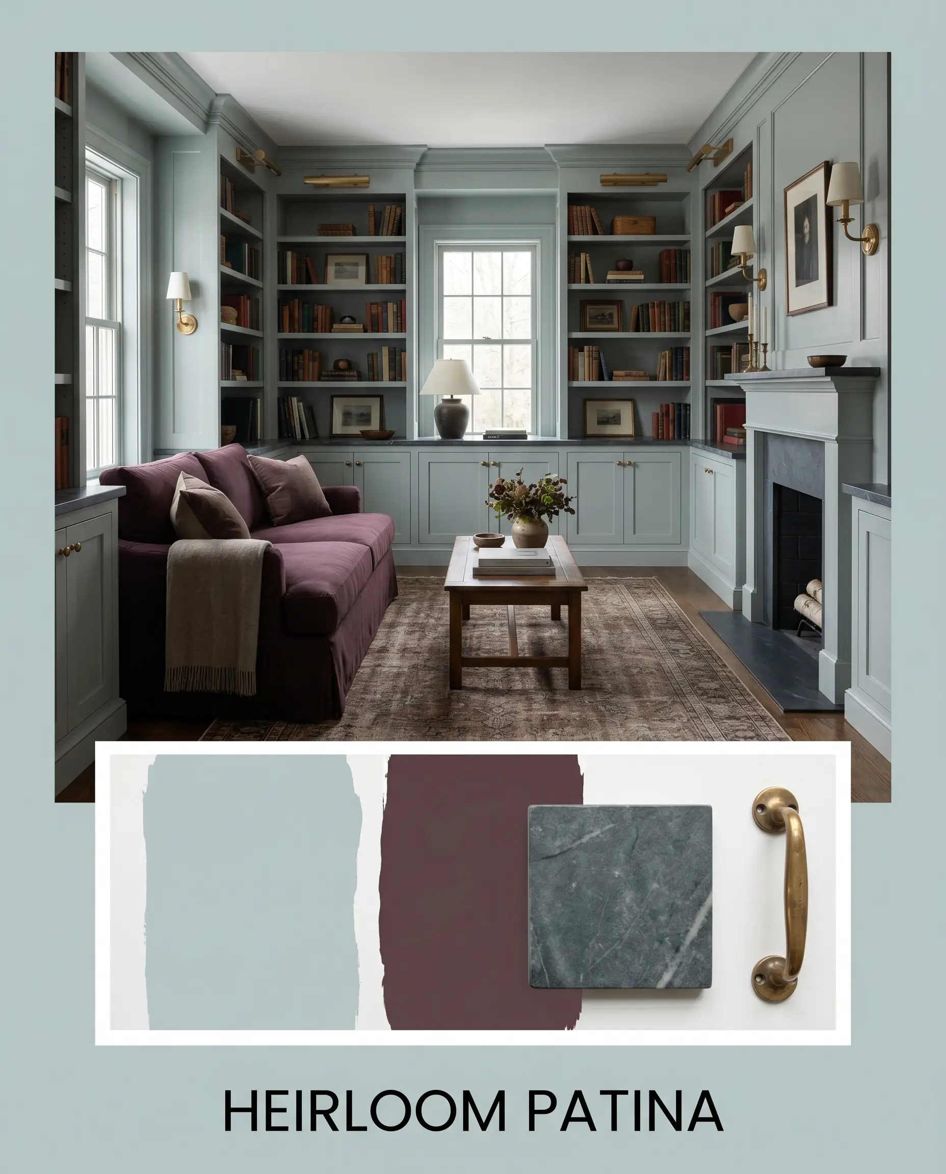
Heirloom Patina Here, the focus shifts to creating a moody, historically rich environment driven by material contrast. The walls serve as a quiet backdrop for deep, dramatic accents like a slipcovered sofa in a rich aubergine fabric. We anchor this palette with honed soapstone surfaces, unlacquered brass sconces, and vintage rugs featuring muted reds and blues. The energy is incredibly sophisticated, balancing traditional silhouettes with a fresh, modern chromatic profile.
Comparing Benjamin Moore Smoke to Rival Pigments
Selecting the perfect blue-gray often comes down to evaluating your specific lighting conditions and architectural layout. While this shade is highly adaptable, certain exposures or styling choices might require a slightly different undertone to truly succeed. Let’s look at how it behaves against its closest alternatives.
Benjamin Moore Smoke vs. Benjamin Moore Pale Smoke 1584
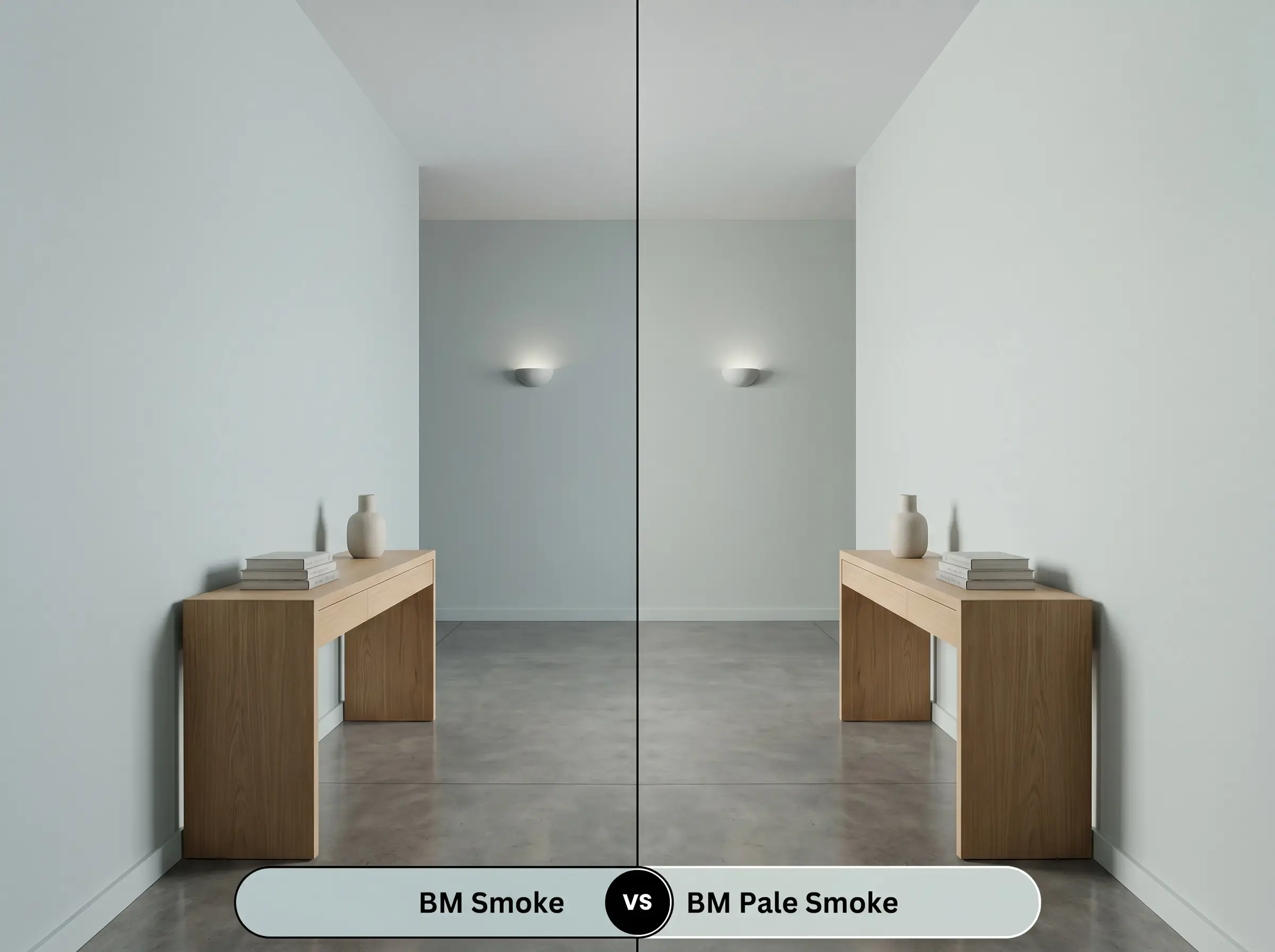
If your room lacks natural light and feels slightly gloomy, then Pale Smoke 1584 might be the superior choice. It carries a noticeably higher light reflectance value, making it feel much more delicate and airy on the wall. Smoke 2122-40, by contrast, offers a richer, more saturated color structure that requires decent lighting to prevent it from feeling overly shadowed.
Benjamin Moore Smoke vs. Benjamin Moore Woodlawn Blue HC-147
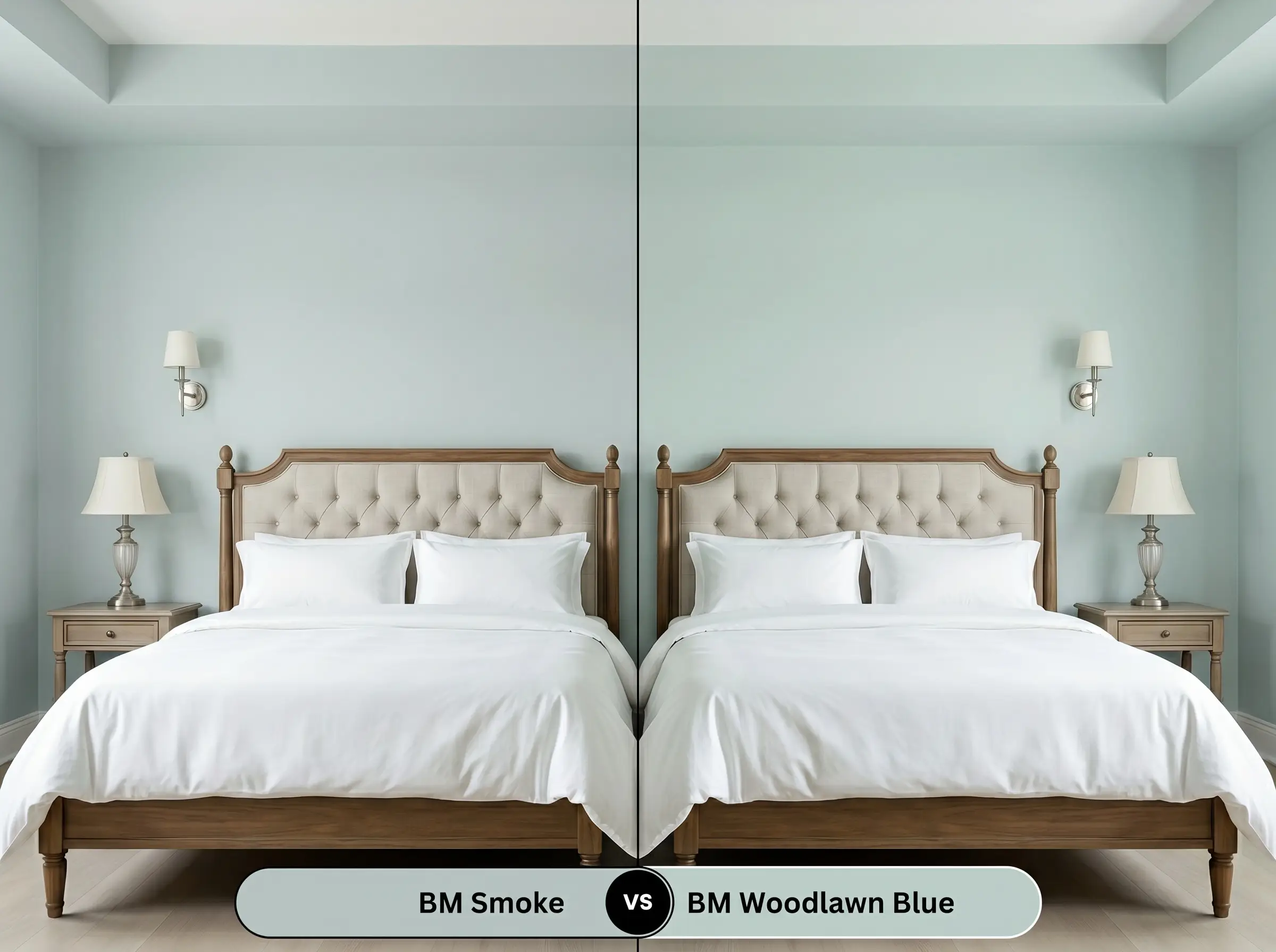
If you want a classic, undeniable blue presence, then Woodlawn Blue HC-147 is your answer. It is a much purer, sweeter blue that lacks the complex, muddy gray notes found in our primary color. We recommend 2122-40 when you need a highly nuanced, transitional shade that acts more like a colorful neutral than a pastel.
Benjamin Moore Smoke vs. Sherwin-Williams Sea Salt SW 6204
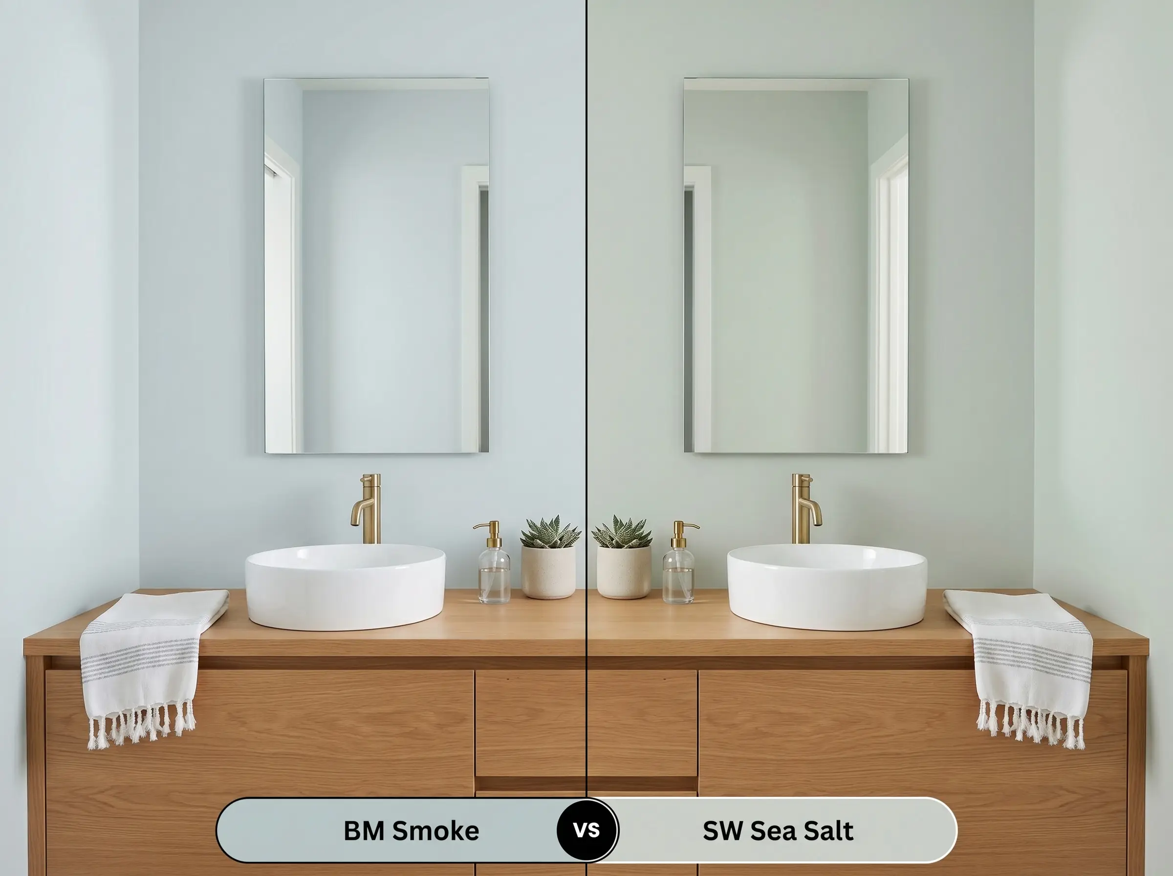
If your design relies heavily on warm wood tones, Sea Salt SW 6204 leans much further into its green base, creating a distinct sage-like glow. Smoke 2122-40 retains a stronger smoky blue base, making it feel slightly cooler and more tailored. Choose the Sherwin-Williams option for a distinctly earthy vibe, and the Benjamin Moore option for a crisper, more refined aesthetic.
Navigating Similar Tones and Brand Cross-Matches
Sometimes a color is almost perfect, but you need a subtle shift in depth to suit a tricky hallway or a specific brand match for your local painter. Here are the most reliable alternatives to keep your project moving forward.
Same-Brand Alternatives
Color Matches Across Rival Brands
Application Strategy and Finishing Details
Transitioning from a beautiful paint chip to a flawless wall requires a precise execution plan. The sheen and primer you select will fundamentally alter how this mid-tone cast reflects light in your home.
Selecting the Proper Sheen
Primer and Coverage Requirements
Because of its complex color structure, this shade requires a high-quality, white acrylic primer to ensure the subtle green notes render accurately. Skipping the primer over existing warm-toned walls will result in a muddy, confused finish.
Plan for two full coats applied with a high-quality microfiber roller to achieve true opacity. Touch-ups are generally straightforward with this specific depth of color, but we highly advise maintaining a wet edge during application to prevent visible roller marks in long hallways.
If you notice uneven streaks or “flashing” after your second coat dries, it often means the roller was pushed too hard or the paint dried too quickly. Always load your roller generously and let the paint level itself naturally to maintain that flawless, high-end finish.
Hackrea Design Secret (The Flashing Fix)
Frequently Asked Questions
Because direct, intense sunlight naturally washes out mid-tone colors, this shade will lose some of its nuanced depth and read as a much lighter, airy gray-blue on bright exteriors. If you desire a truly punchy contrast against your siding, you may need to select a color with a lower light reflectance value.
Actually, crisp 4000K lighting tends to sharpen the cool blue notes, often suppressing the subtle green undertones entirely. To bring out that restorative, spa-like green warmth in a windowless space, we recommend using softer 3000K bulbs.
Yes, this is a brilliant pairing because the cool, smoky blue base provides a stunning visual counterweight to the rich, warm veining of the stone. The tension between the cool cabinetry tint and the organic warmth of the marble creates a highly sophisticated, layered aesthetic.
The prominent pink and orange undertones in traditional red oak will actively pull the cool blue notes forward, creating a very sharp, sometimes disjointed contrast. White oak, with its muted, neutral warmth, provides a much more harmonious foundation that allows the paint’s subtle green notes to shine.
The Final Verdict on Benjamin Moore Smoke 2122-40
Benjamin Moore Smoke 2122-40 is an incredibly sophisticated, transitional architectural finish designed for homeowners who want color without the visual fatigue of a bright pastel. Its absolute best application is on custom millwork, wainscoting, or cabinetry, where its shifting blue-gray-green profile can interact dynamically with natural light and tactile materials. This shade is perfect for those aiming to cultivate a calm, collected energy that feels both historic and intentionally modern.
However, this nuanced pigment is not meant for every environment. If your home features vast expanses of highly saturated, warm-toned fixed elements—like cherry cabinets, prominent red brick fireplaces, or glossy red oak floors—this color will fight a losing battle. The aggressive warmth of those materials will strip away the paint’s sophisticated green notes, leaving the walls looking like a chilly, synthetic baby blue. To succeed with this shade, you must surround it with muted, organic textures and deliberate, curated contrast.
Closest Cross-Brand Equivalents
The absolute closest scientific color matches for Smoke across top paint brands.