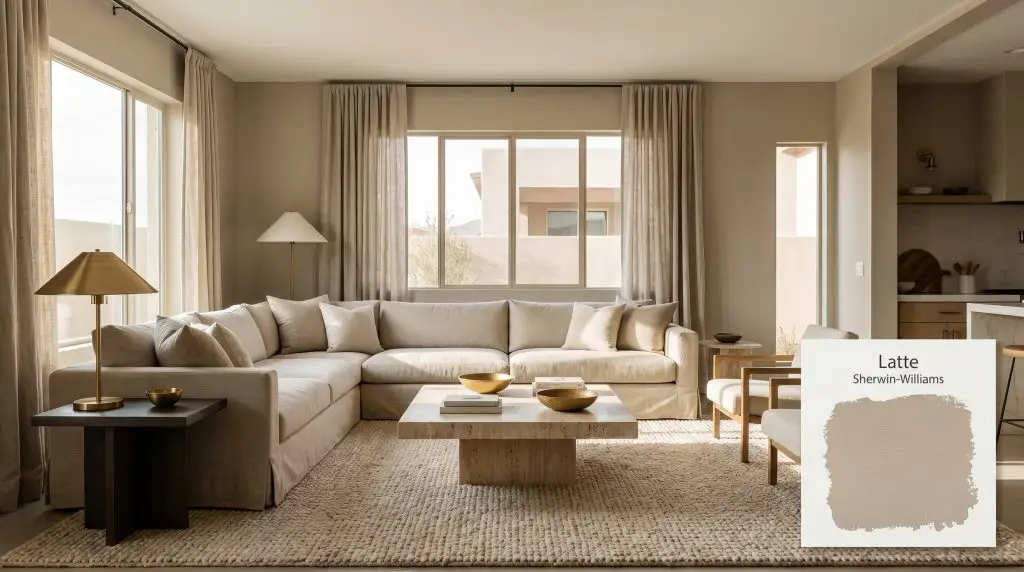
Latte SW 6108
Sherwin-WilliamsSherwin-Williams Latte (SW 6108) is a rich, warm mid-tone neutral with a distinct caramel-taupe profile. Sitting at an LRV of 38, it absorbs a moderate amount of light, offering a cozy, grounded atmosphere with subtle orange and earthy brown undertones.
Paint Technical Profile
| Color ID / SKU | SW 6108 |
| HEX Code | #BAA185 |
| Light Reflectance (LRV) | 38 |
| Use | Interior, Exterior |
| Best Exposures | North-Facing, East-Facing |
| Best For | Living Rooms, Dining Rooms, Home Offices, Kitchen Cabinets |
Sherwin-Williams Latte SW 6108: Designing with the Ultimate Baked Caramel Neutral
The era of sterile, icy interiors is officially behind us, making way for spaces that feel inherently lived-in and tactile. Homeowners are actively seeking out colors that wrap a room in sophisticated comfort rather than leaving it feeling stark or unfinished. Sherwin-Williams Latte SW 6108 steps into this role beautifully, offering a rich, enveloping alternative to standard builder-grade beige.
This shade is a masterclass in nuanced color formulation. It delivers a profound sense of visual warmth without ever tipping into overwhelming brightness. By striking a delicate balance between a mid-tone neutral and a saturated earth tone, this paint provides a remarkably versatile foundation for modern homes.
Whether you are restoring a mid-century property or adding character to a brand-new suburban build, this baked caramel adapts to your vision. It establishes a comforting, sophisticated baseline that allows your furnishings and architectural features to truly shine.
Undertones & LRV of Sherwin-Williams Latte
Sherwin-Williams Latte is undeniably a warm paint color. It radiates a sun-drenched, baked energy that instantly raises the color temperature of any space it inhabits. To successfully integrate this shade into your home, you must understand the underlying pigment structure that drives its behavior.
With a light reflectance value (LRV) of 38, SW 6108 falls comfortably into the mid-tone category. It absorbs significantly more light than it bounces back into the room.
This specific light reflectance value means the paint actively pulls the walls inward, creating a sense of intimacy and structural presence. It establishes a beautiful chromatic intensity that makes large, open-concept spaces feel instantly more cohesive and intentional.
Because a mid-tone neutral with an LRV of 38 absorbs light, it requires intentional contrast to prevent the room from feeling flat. Pair this shade with crisp, highly reflective trims like Sherwin-Williams Alabaster SW 7008 or Benjamin Moore White Dove OC-17 to keep the architectural lines sharp and defined.
Hackrea Pro-Tip (The Contrast Strategy)
Lighting Effects & The Chameleon Factor
Like all complex neutrals, this warm brown shifts dramatically depending on the specific light filtering through your windows. The color saturation you see on a tiny paper swatch will transform once applied to four walls.
Popular Applications for This Baked Caramel
Understanding how a paint behaves in the light is only half the battle. The true magic happens when you pair those raw color characteristics with the right materials, textiles, and styling choices. Here is how to execute this versatile shade across various functional spaces in your home.
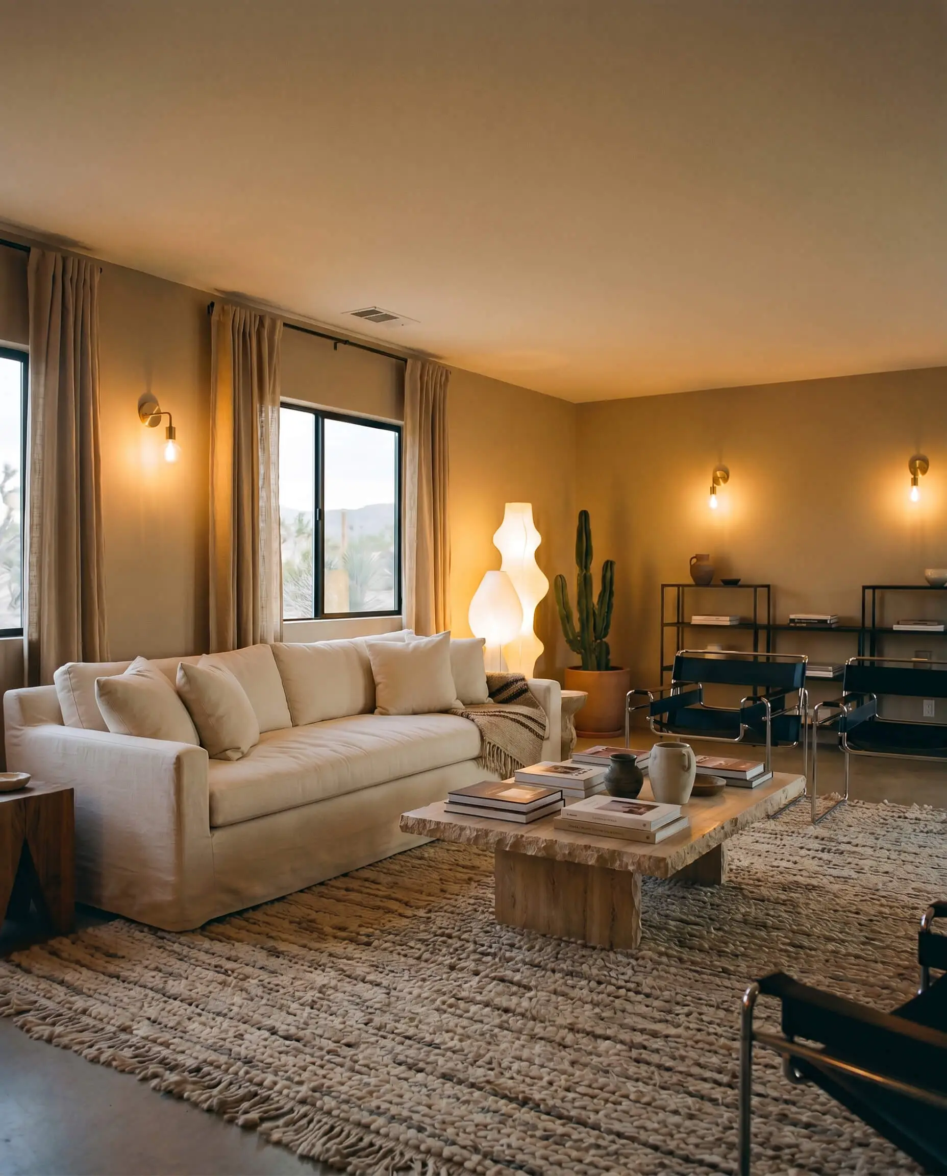
Living Rooms
For a modern living room, lean heavily into a Desert Modernism aesthetic. The rich, baked nature of Latte pairs beautifully with low-profile, slipcovered sectionals and raw, tactile materials. Introduce a brutalist travertine coffee table to establish a striking, earthy focal point.
To maximize design continuity, layer the room with organic textures rather than competing colors. Think chunky wool berber rugs, stonewashed linen drapery, and subtle accents of matte black steel for a touch of industrial sharpness.
If your living room lacks natural light, you must rely on layered ambient lighting. Use sculptural floor lamps and brass wall sconces fitted with warm 2700K bulbs to maintain the paint’s welcoming energy throughout the evening.
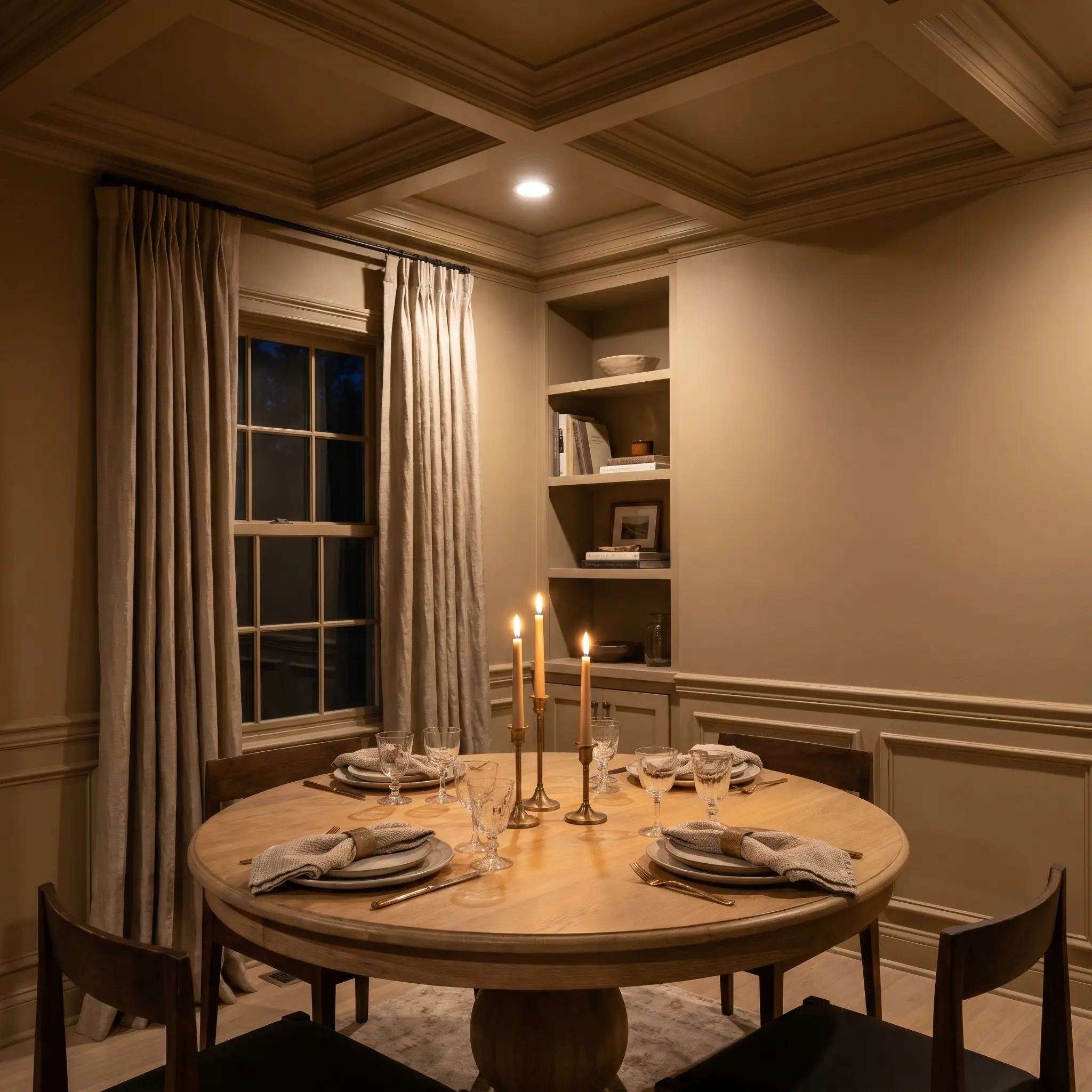
Dining Rooms
Dining spaces thrive on intimacy, making this light-absorbing shade an exceptional choice for evening entertaining. Consider wrapping the entire room—walls, trim, and ceiling—in this single color. This color drenching technique eliminates harsh visual breaks and creates a seamless, jewel-box effect.
Elevate the dining experience by integrating a mix of accessible and premium materials. Pair a standard white oak pedestal table with high-end, unlacquered brass candlesticks and slub silk window treatments.
To create subtle dimension in a color-drenched dining room, play with paint finishes rather than changing the color. Use a flat or matte finish on the walls and a satin finish on the wainscoting and trim to catch the candlelight beautifully.
Hackrea Design Secret (The Tonal Shift)
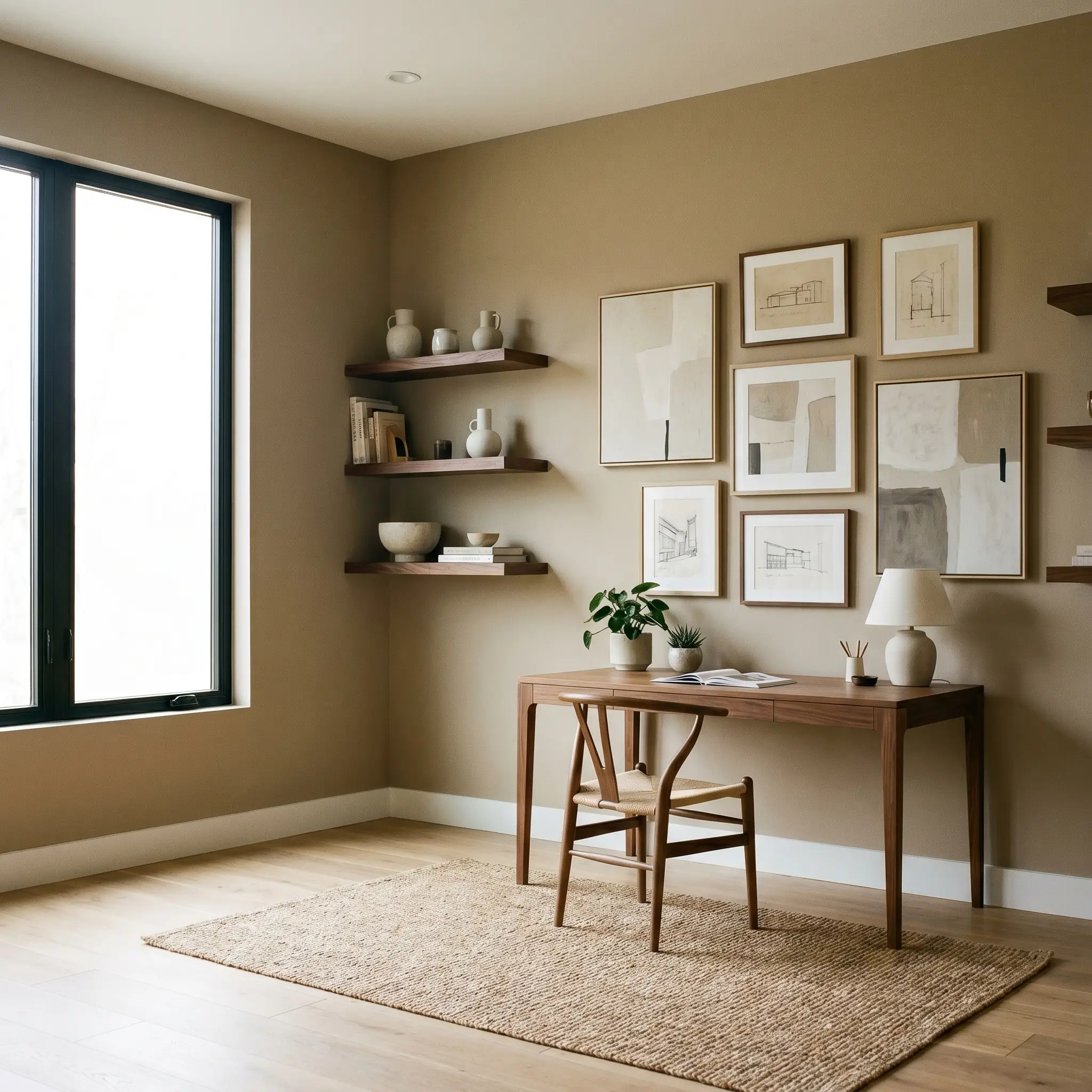
Home Offices
The modern home office requires a delicate balance between focused energy and calming comfort. Step away from the predictable dark, moody library aesthetic and instead embrace Soft Minimalism. Use this mid-tone neutral on the walls to provide a soft, stabilizing background for long hours of screen time.
Incorporate floating walnut shelves and an asymmetrical gallery wall featuring abstract canvas art and architectural sketches. This approach keeps the room feeling fresh, creative, and highly personalized for the modern professional.
Keep your textiles tailored and intentional. A sleek wishbone chair paired with a simple jute rug ensures the space remains functional without sacrificing an ounce of style.
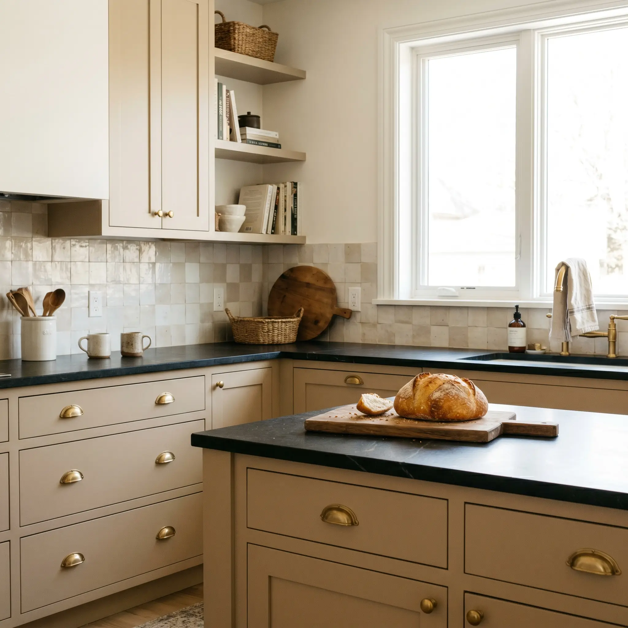
Kitchen Cabinets
Painting kitchen cabinets is a brilliant way to introduce color without committing to fully painted walls. When applied to lower cabinetry or an expansive kitchen island, SW 6108 roots the entire culinary space with a sophisticated, earthy presence.
Pair these warm cabinets with honed soapstone countertops and a textural zellige tile backsplash. The organic imperfections in the tile will beautifully echo the natural, baked feel of the paint.
Be highly strategic if you have existing cool-toned Carrara marble countertops. The warm orange cast in this paint can sometimes make crisp, blue-grey veining look stark and disconnected. If you must mix them, bridge the gap with warm wood cutting boards and brass hardware to soften the transition.
Clash Warning (Cool Stone Countertops)
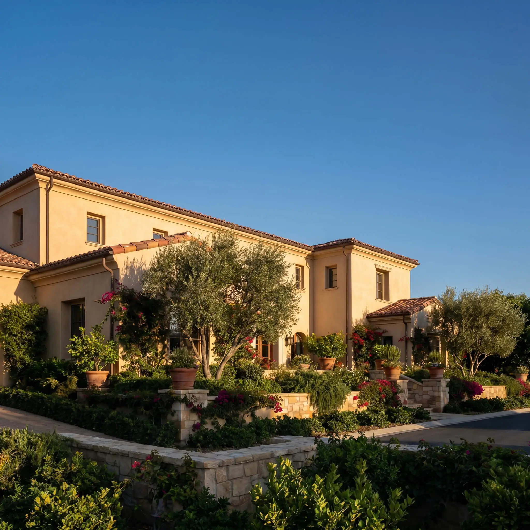
Exterior Stucco & Siding
When taken outside, the intense wash of natural sunlight will significantly lighten how you perceive this color. On exterior stucco, it loses some of its interior intensity and transforms into a beautiful, sun-washed Mediterranean Revival neutral.
It performs exceptionally well on homes surrounded by dense, mature landscaping. The earthy brown perfectly complements trailing greenery, olive trees, and terracotta roof tiles.
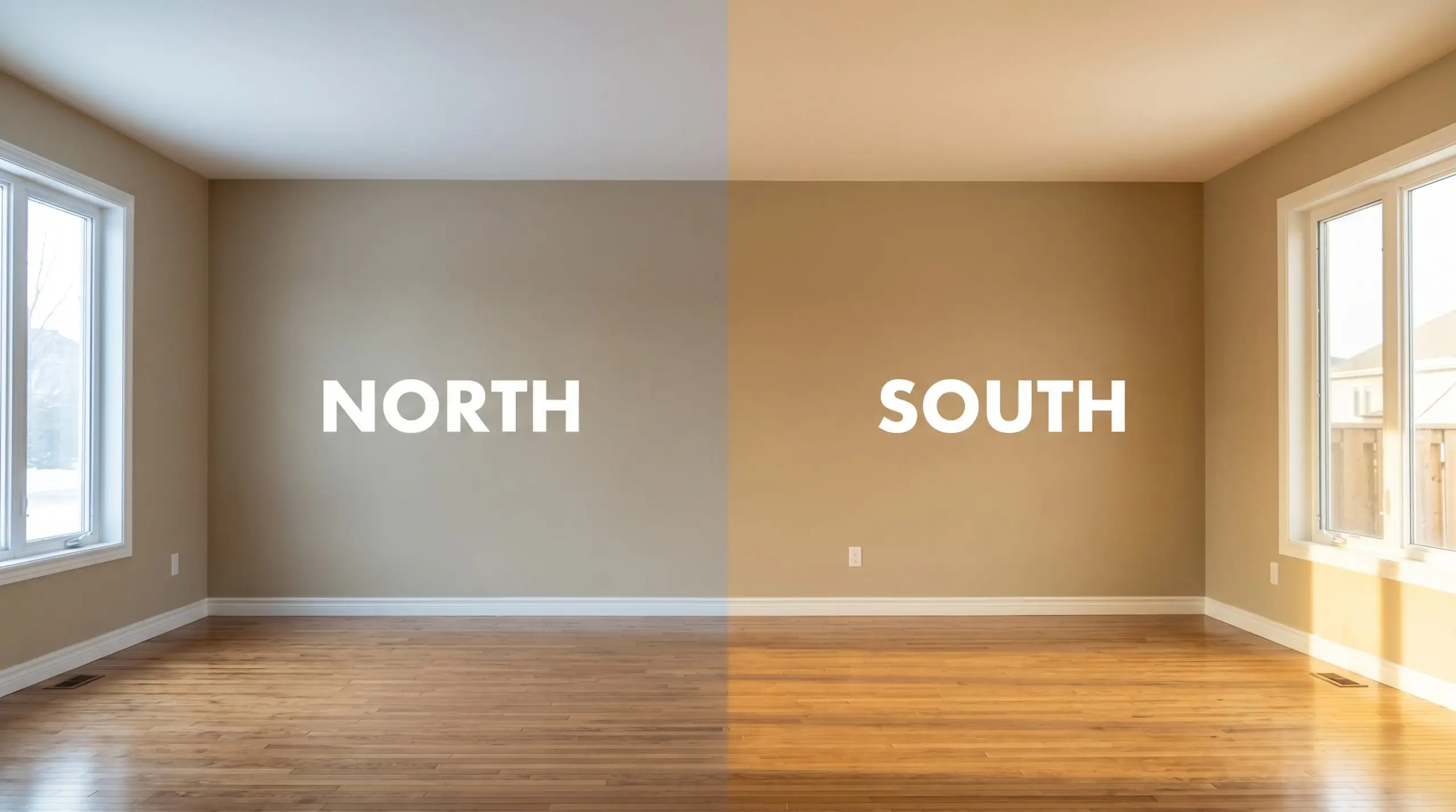
Always test a large swatch on both the north and south sides of your exterior. Direct afternoon sun will highly pronounce the caramel tones, while shaded areas will reflect a much cooler, subdued taupe.
Designing with This Baked Caramel Neutral
This specific pigment requires soft, tonal bleeds to feel truly serene rather than stark, high-contrast boundaries. When placed next to the right natural textures, the color actively softens, losing any residual harshness and enveloping the room in a gentle, ambient glow.
Baseboards & Architectural Trim
Pairing this shade with stark, un-tinted white trim will force an abrupt visual break that feels entirely too jarring. Instead, you need creamy, nuanced whites that share a similarly warm structural base to create a seamless, tailored boundary. Sherwin-Williams Alabaster SW 7008 provides a beautifully soft transition, while Benjamin Moore White Dove OC-17 offers just enough crispness without turning icy. For a truly atmospheric, historic feel, Farrow & Ball Pointing No. 2003 melts into the walls, blurring the lines between the baseboards and the primary color.
Tactile Elements & Wood Finishes
To elevate this mid-tone neutral, you must introduce textures that either absorb its warmth or reflect light back into the space.
Complementary Paint Selections
Curated Aesthetic Concepts
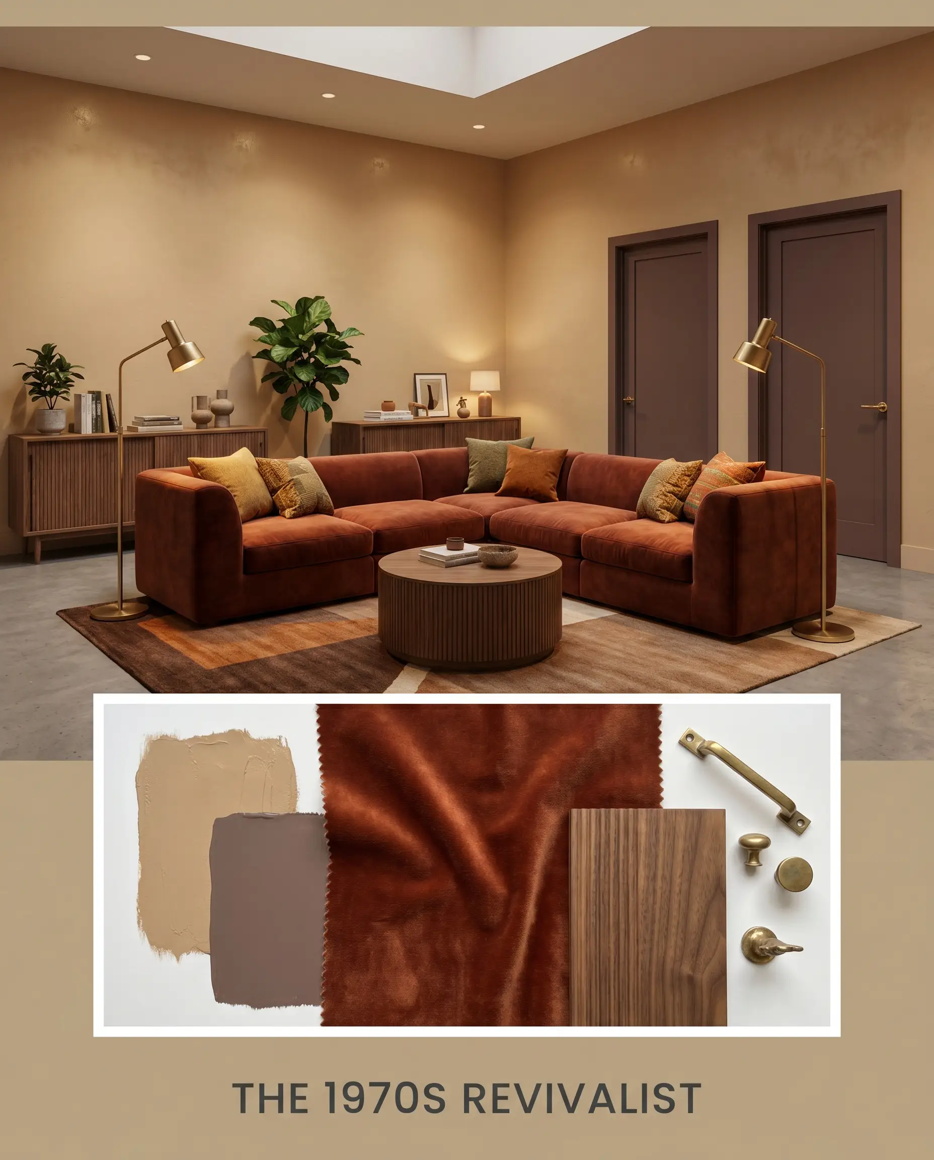
The 1970s Revivalist This palette embraces the nostalgic warmth of the era without feeling entirely retro. It centers around a low-profile sectional upholstered in rich rust velvet, anchored by the deep tones of Sherwin-Williams Dutch Cocoa SW 6032 on the interior doors. Layer in ribbed walnut credenzas and unlacquered brass floor lamps to reflect light, creating a moody, conversational lounge energy.
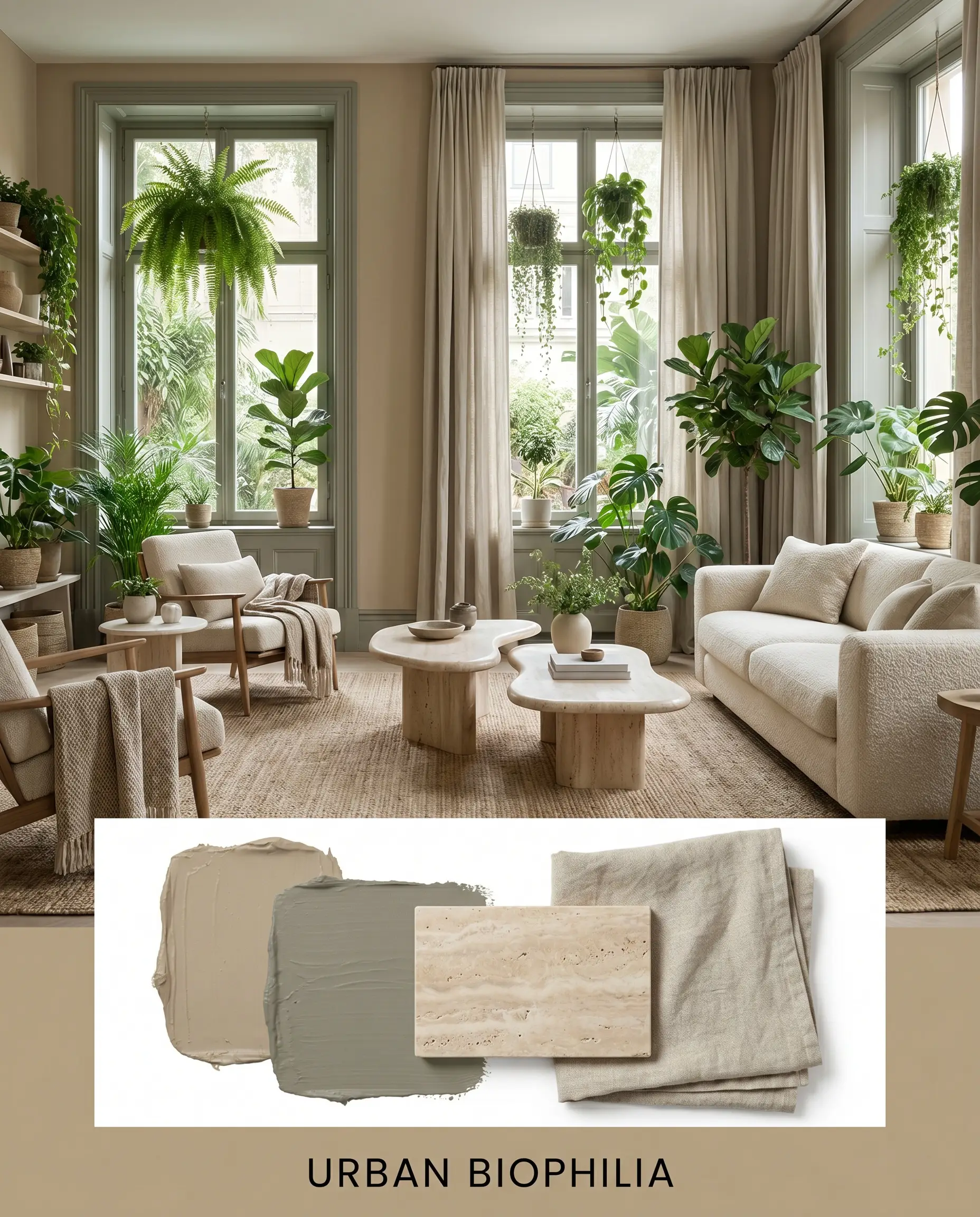
Urban Biophilia Designed to bring organic softness into structured city environments, this concept relies on layered greenery and natural stone. The walls interact beautifully with honed travertine accent tables and subtle window treatments made of stonewashed linen. Introduce Farrow & Ball Treron No. 292 on the window casings to frame the outside view, completing a deeply restorative, nature-driven atmosphere.
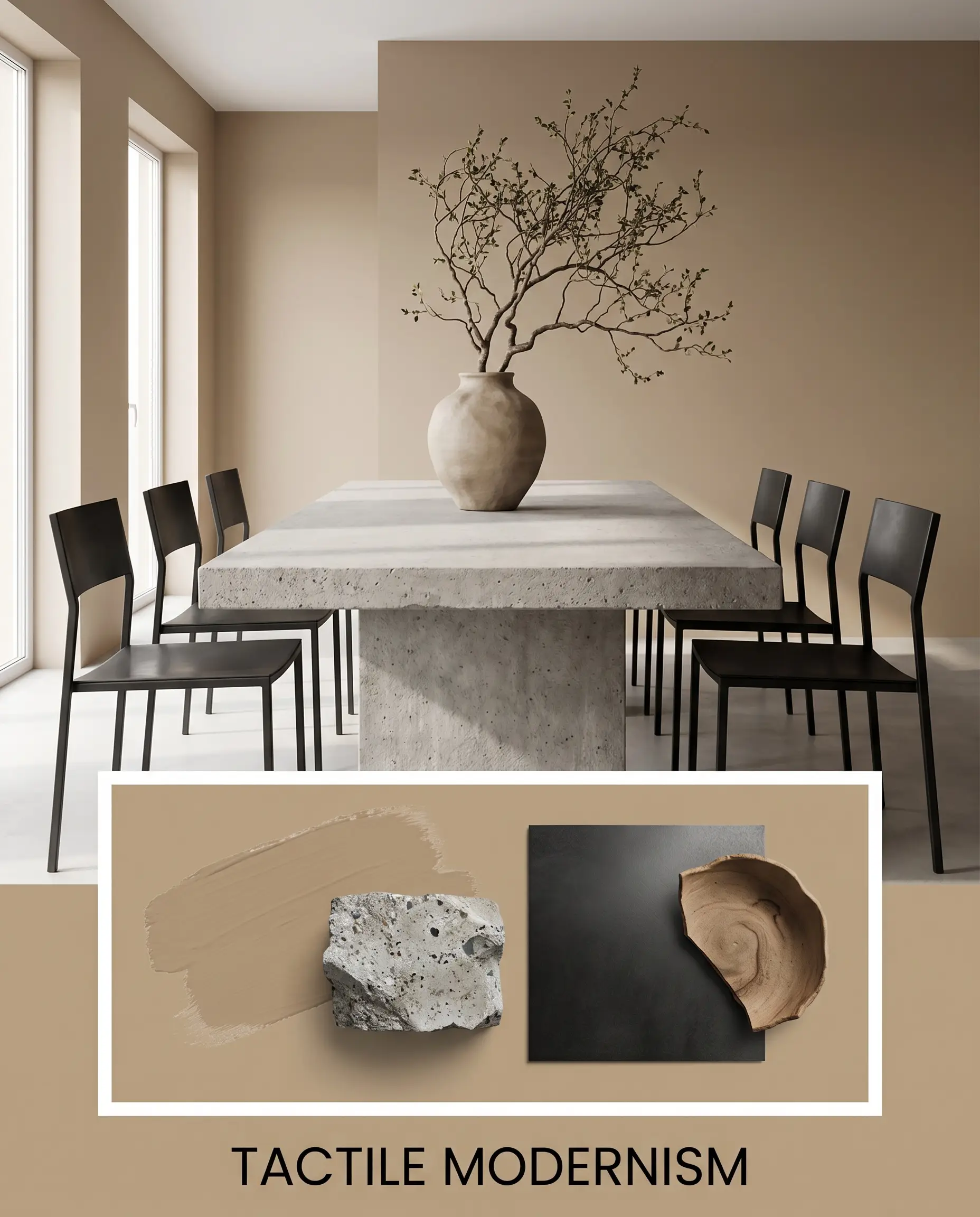
Tactile Modernism This approach removes all visual clutter, allowing the raw materials to speak for themselves. The baked caramel walls serve as a quiet backdrop for a brutalist concrete dining table and sleek matte black steel dining chairs. A single, oversized branch in an organic ceramic vase provides the only necessary styling, resulting in a highly intentional, serene aesthetic.
Comparing Sherwin-Williams Latte to Industry Alternatives
While this warm neutral excels in sunlit rooms, certain architectural layouts or specific exterior exposures demand a slightly different approach. If your space lacks natural light entirely or features cool-toned fixed elements, you may need a shade that behaves differently under pressure. Let us examine how it stacks up against its closest competitors.
Sherwin-Williams Latte vs. Sherwin-Williams Nomadic Desert SW 6107
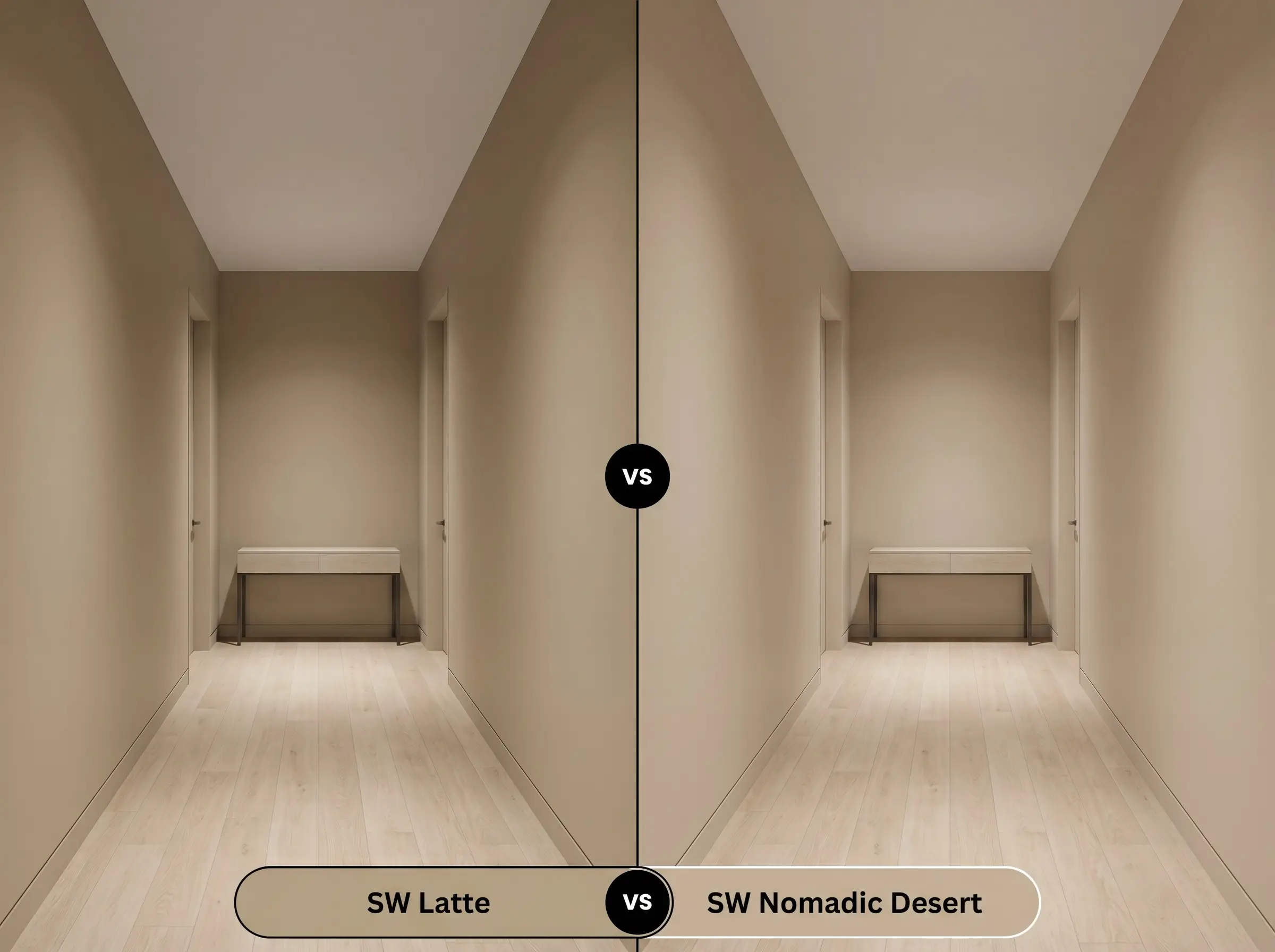
If you are dealing with a dimly lit hallway or a north-facing room, then SW Nomadic Desert is often the safer choice. It sits one step lighter on the same color strip, reflecting slightly more light to keep enclosed areas from feeling too dark. However, it lacks the profound, baked depth of its darker sibling, making it less effective if you want to create a truly enveloping, intimate atmosphere.
Sherwin-Williams Latte vs. Sherwin-Williams Macadamia SW 6142
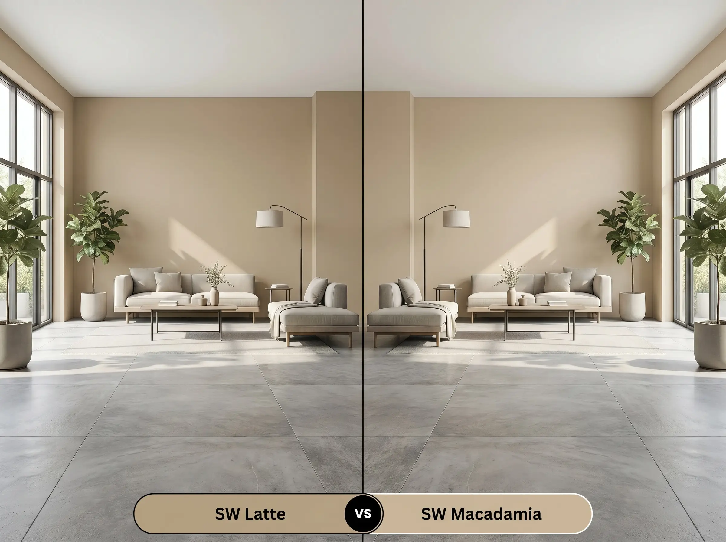
If your home features extensive cool-toned stone or grey-washed flooring, then SW Macadamia provides a much smoother transition. Macadamia leans significantly more into a green-beige base, neutralizing the prominent orange cast found in the caramel alternative. Choose the warmer option only when you intentionally want to amplify the sun-drenched energy of the room.
Sherwin-Williams Latte vs. Benjamin Moore Shaker Beige HC-45
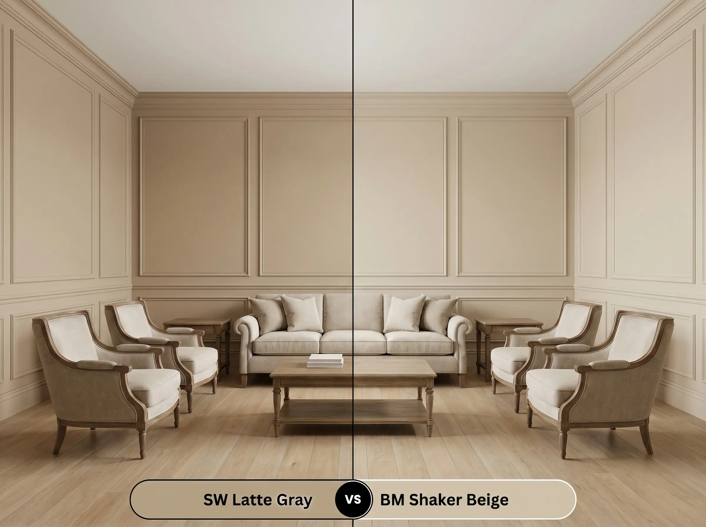
These two shades battle for dominance in the warm neutral category, but they behave very differently on the wall. If you prefer a highly predictable, classic tan that resists shifting in changing light, then BM Shaker Beige is your ideal candidate. It strips away the complex taupe undertones, offering a straightforward, sandy finish that pairs effortlessly with traditional white oak flooring.
Alternative Earthy Neutrals to Consider
Sometimes a room requires just a fraction more light reflectance or a slightly crisper finish to achieve your vision. Whether you need a subtle tonal shift or are simply shopping across different manufacturers, these alternatives deliver a similar comforting aesthetic.
Exploring Lighter & Deeper Variations
Color Matches Across Major Brands
Professional Execution Strategies for Latte SW 6108
Transitioning this rich color from a conceptual palette to a flawless wall application requires strict attention to detail. The depth of this mid-tone means your choice of finish and preparation will dictate the final success of the room.
Sheen Selection & Application Guidelines
Primer & Coverage Expectations
Because this shade absorbs a significant amount of light, applying it directly over a stark white builder-grade wall can result in a harsh, uneven finish. You must use a high-quality, gray-tinted primer to establish a neutral base and ensure the rich brown pigments develop correctly. Expect to apply two full, generous coats for a truly professional result.
Mid-tone colors are highly susceptible to “flashing,” which occurs when uneven roller pressure leaves visible, shiny streaks as the paint dries. To avoid this, always maintain a wet edge while rolling and never go back to touch up a section that has already begun to set.
Hackrea Pro-Tip (The Flashing Warning)
Common Application Questions
Because red oak inherently features dominant pink and orange tones, pairing it with this baked caramel can sometimes amplify the warmth to an overwhelming degree. To successfully balance the two, introduce a large, cool-toned area rug in slate blue or muted green to break up the visual heat.
In dense, shaded environments, the lack of direct sunlight mutes the vibrant caramel notes, causing the paint to read as a much cooler, subdued taupe. It provides a beautiful, earthy connection to the surrounding landscape, but you should sample it extensively to ensure it does not appear too muddy.
Wrapping a lofty, expansive ceiling in this light-absorbing shade is a brilliant strategy to instantly pull the visual plane downward. It creates a deeply intimate, enveloping canopy that makes overly large spaces feel intentionally cozy and grounded.
The inherent warmth of this paint often struggles against the crisp, icy blue-grey veining found in traditional Carrara marble. If your kitchen features these cool stone surfaces, you will need to bridge the gap by incorporating warm wood accents and unlacquered brass hardware to create a cohesive transition.
The Final Design Verdict
Sherwin-Williams Latte SW 6108 is an exceptionally sophisticated choice for homeowners who want to completely eliminate sterile, icy energy from their environments. Its absolute best application is within north-facing living rooms or intimate dining spaces where its baked caramel warmth can truly envelop the room. This shade is perfect for design enthusiasts embracing Desert Modernism or 1970s Revival, providing a deeply tactile foundation that elevates organic materials like travertine and walnut.
However, you must be highly strategic before committing to this color in certain architectural scenarios. If your home features predominantly cool-toned fixed elements—such as grey-washed luxury vinyl plank flooring or icy Carrara marble—this warm brown will actively resist blending, resulting in a disconnected, jarring aesthetic. It also struggles in narrow, windowless hallways where the lack of natural light causes the rich pigment to fall flat and feel overly enclosed. Always assess your existing hard finishes and lighting conditions to ensure this beautiful earthy neutral has the proper environment to thrive.
Closest Cross-Brand Equivalents
The absolute closest scientific color matches for Latte across top paint brands.