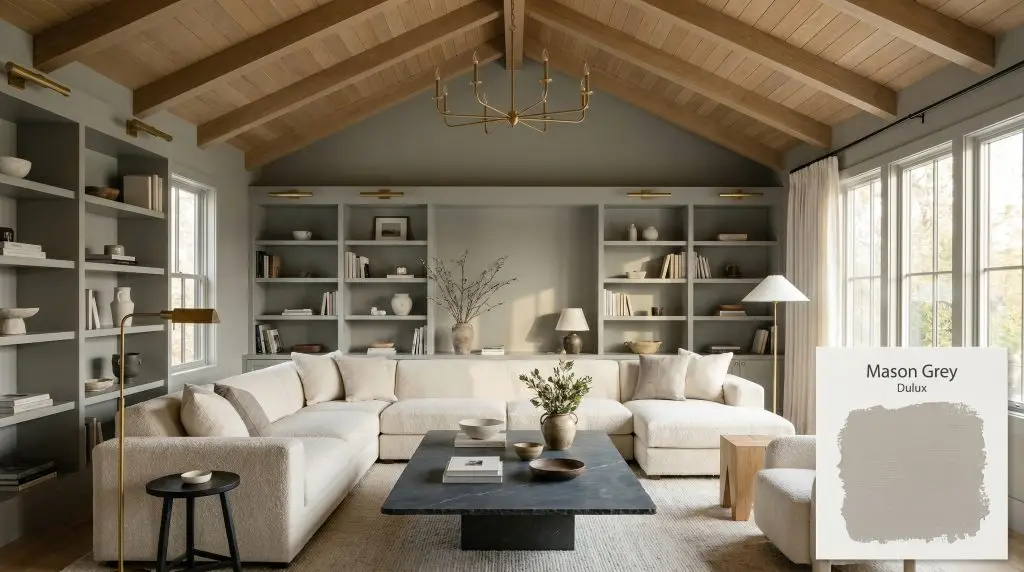
Mason Grey SG6H4
DuluxDulux Mason Grey (SG6H4) is a versatile, medium-depth warm grey with an LRV of 42. Featuring subtle earthy undertones, it acts as a chameleon-like neutral that adapts beautifully to both contemporary and traditional spaces, offering a grounded, sophisticated backdrop without feeling cold.
Paint Technical Profile
| Color ID / SKU | SG6H4 |
| HEX Code | #a6a5a1 |
| Light Reflectance (LRV) | 42 |
| Use | Interior, Exterior |
| Best Exposures | South-Facing, West-Facing |
| Best For | Living Rooms, Exteriors, Cabinetry, Bedrooms |
Dulux Mason Grey: The Earthy Neutral Reclaiming Modern Interiors
Finding a neutral paint that feels sophisticated without feeling completely sterile is one of the most common challenges in residential design. For years, homeowners defaulted to icy, industrial tones, only to realize their living spaces suddenly felt like corporate lobbies. If you are searching for a transitional shade that maintains a crisp, contemporary edge while still feeling inherently livable, Dulux Mason Grey demands your attention.
This medium-depth neutral completely redefines how a grey paint behaves on the wall. Instead of falling flat, it utilizes a highly complex chromatic profile to bring a subtle, organic warmth into the room. It acts as a beautiful architectural finish, adapting seamlessly to the shifting light throughout the day.
Whether you are updating a suburban exterior or softening the harsh lines of an urban loft, this specific pigment offers incredible versatility. Let’s break down exactly how this earthy neutral performs, how it manipulates light, and how to style it for maximum impact.
Dulux Mason Grey: Undertones & LRV
When evaluating this shade for your home, the most critical question is always its temperature: Is Mason Grey warm or cool? It is definitively a warm grey. While it retains enough of a classic stony base to feel modern, its underlying pigment structure prevents it from ever feeling stark or chilly.
To truly understand how this paint will look in your space, we have to look at its hidden DNA:
This paint carries a Light Reflectance Value (LRV) of 42. Sitting comfortably in the medium-depth category, it absorbs about 58% of the ambient light in a room. This means it has enough substance to contrast beautifully against crisp white trim, but it is dark enough that it requires thoughtful lighting to prevent enclosed spaces from feeling overly shadowed.
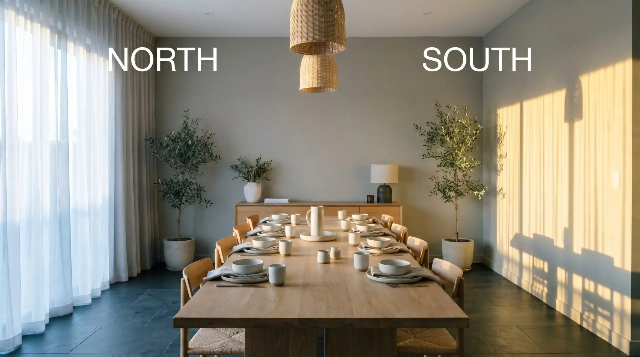
The Chameleon Factor: How Lighting Shifts Mason Grey
Because of its complex earthy undertone, this chameleon-like color structure reacts dramatically to the temperature of the light hitting it. You must anticipate how your room’s exposure will alter the final aesthetic.
Popular Architectural Applications
Because it sits right in the middle of the light reflectance scale, this shade requires a strategic approach depending on the size and function of the space. Here is how this earthy neutral performs across different architectural canvases.
Living Rooms and Open-Plan Living Spaces
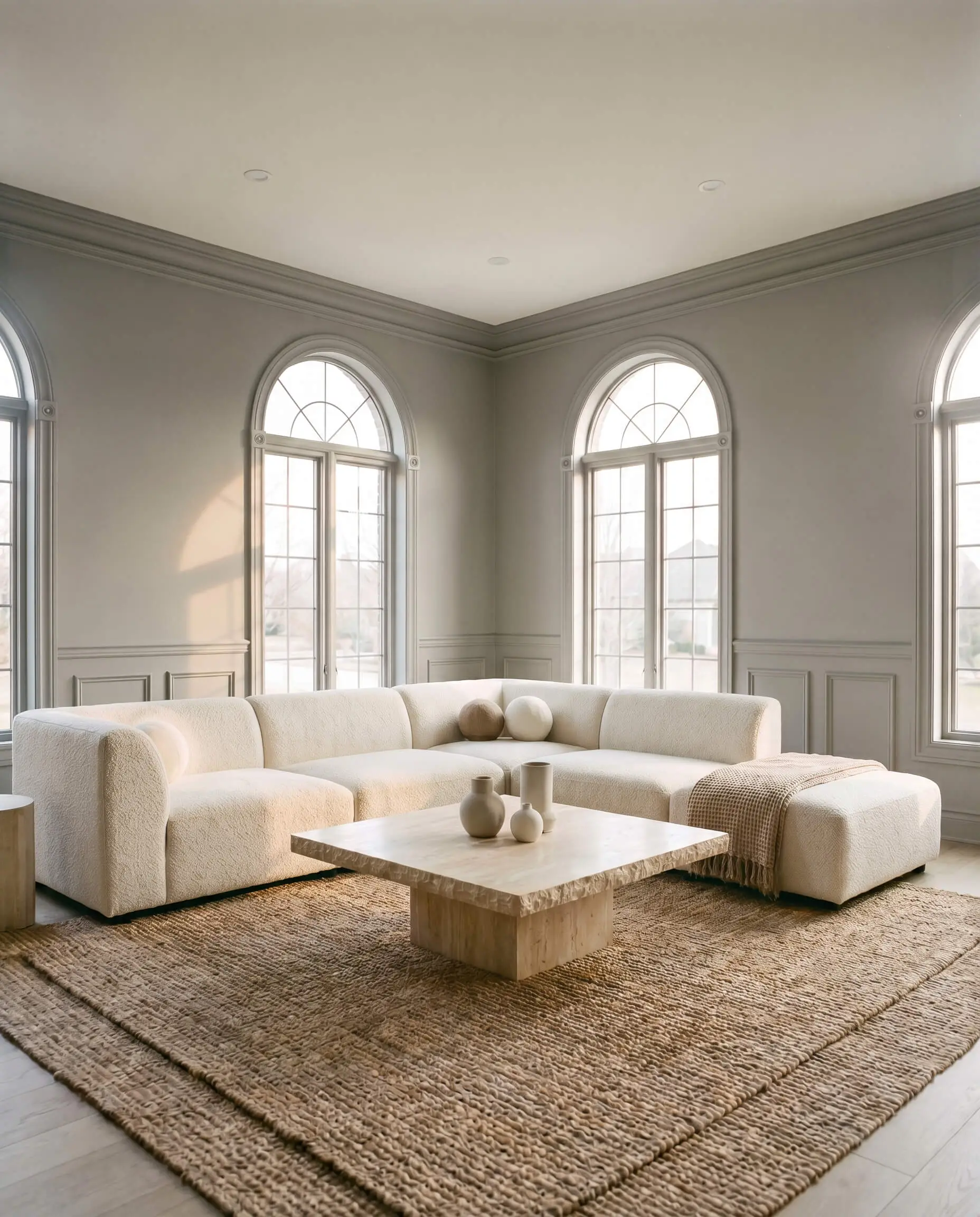
In expansive living areas, this shade acts as a brilliant stabilizing force, especially in homes with soaring ceilings or abundant natural light. Instead of defaulting to standard white walls, use this color to give the room immediate visual weight and character. It works exceptionally well in Organic Modern interiors where the goal is to create a serene, tactile environment.
To elevate the space, pair the painted walls with heavily textured materials that absorb light beautifully. Think oversized bouclé sectionals, tumbled travertine coffee tables, and layered jute rugs. If your living room features traditional architectural details like picture molding or built-in bookcases, color-drenching the entire space—painting the walls, trim, and built-ins the exact same shade—creates a highly sophisticated, enveloping atmosphere.
Because an LRV of 42 absorbs a significant amount of light, avoid painting a standard 8-foot ceiling in this color unless you are intentionally designing a moody, cave-like snug. Keep the ceiling a crisp, contrasting white to maintain a sense of vertical height.
Hackrea Pro-Tip (The Ceiling Strategy)
Kitchen Cabinetry and Islands
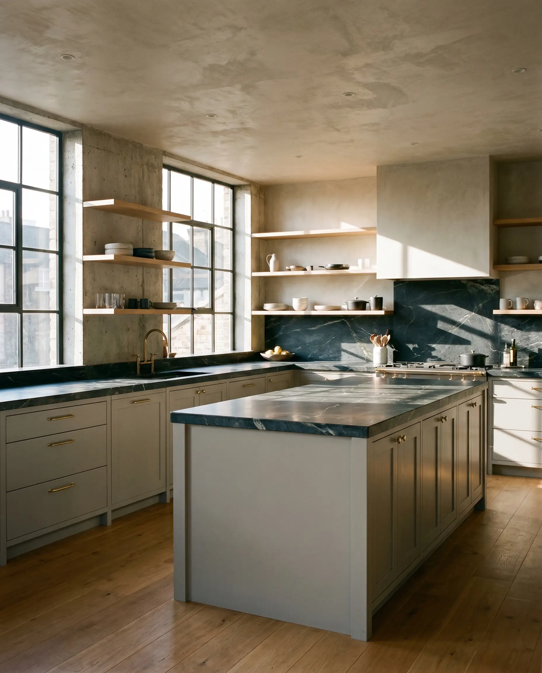
For homeowners tired of the ubiquitous all-white kitchen, this hue offers a fantastic, durable alternative for cabinetry. It provides the rich, bespoke feel of a custom kitchen without the visual density of a charcoal or navy blue. The subtle khaki undertone pairs flawlessly with natural stone countertops, particularly honed slate or heavily veined soapstone.
To push the design toward a Soft Brutalism aesthetic, pair the painted lower cabinets with open white oak shelving and unlacquered brass hardware. The living finish of the brass will echo the warm, earthy notes in the paint, while the raw wood adds necessary organic texture. If you have a kitchen that receives harsh afternoon sunlight, this color is dense enough to hold its shape without washing out.
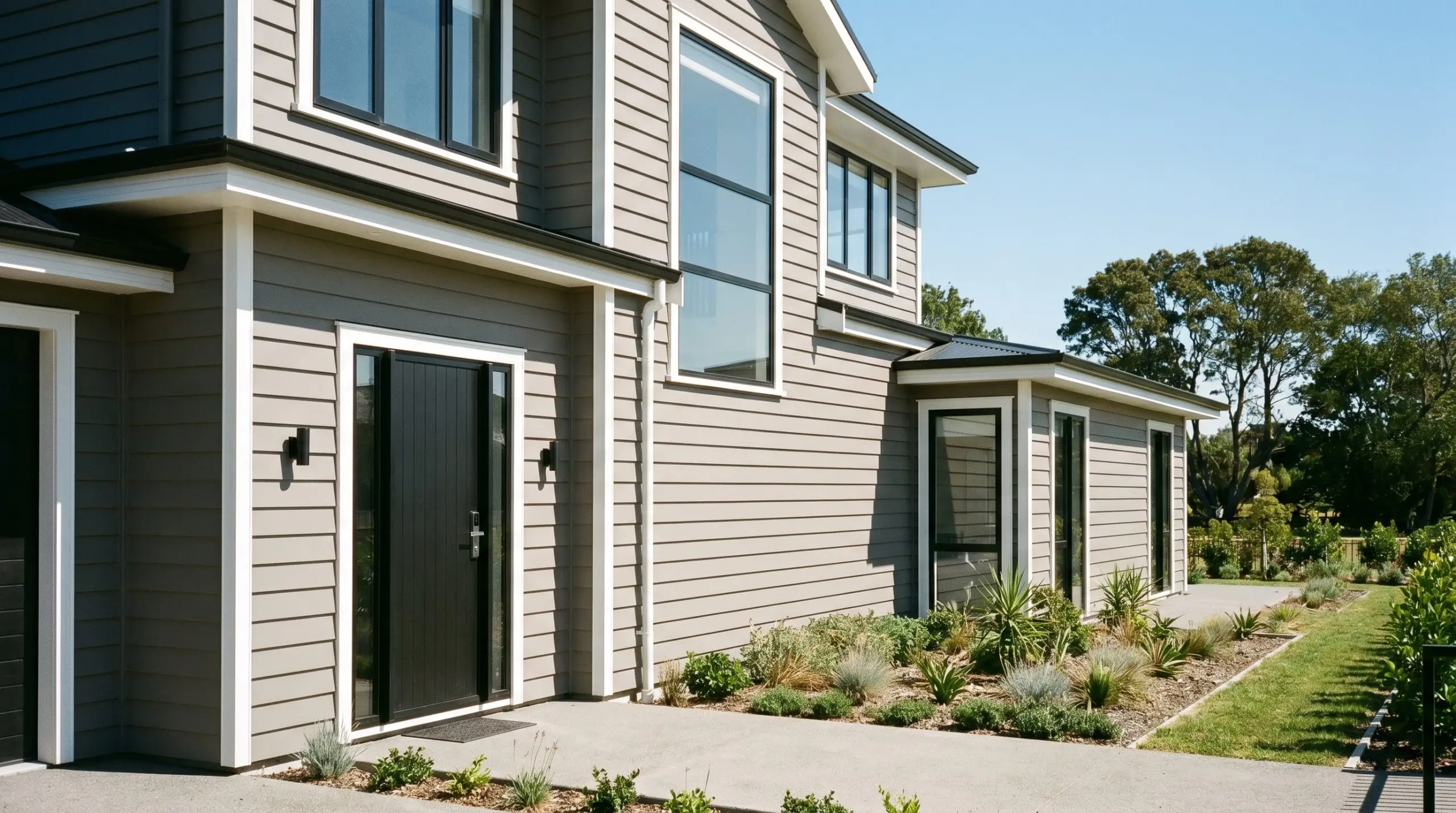
Home Exteriors (Weatherboard, Render, and Brick)
When taken outside, direct sunlight will significantly wash out any paint color, making it appear at least two shades lighter than it looks on an interior swatch. On a home exterior, this medium-depth neutral transforms into a highly elegant, contemporary exterior palette. It is particularly effective on textured surfaces like rough-cast render or classic weatherboard, where the shadows highlight the paint’s complexity.
To make the facade truly stand out, you must provide sharp visual boundaries. Pair the main siding with ultra-crisp white trim around the windows and roofline to highlight the architectural geometry. For a striking, modern contrast, finish the front door and exterior lighting fixtures in a matte charcoal black to root the entire color scheme.
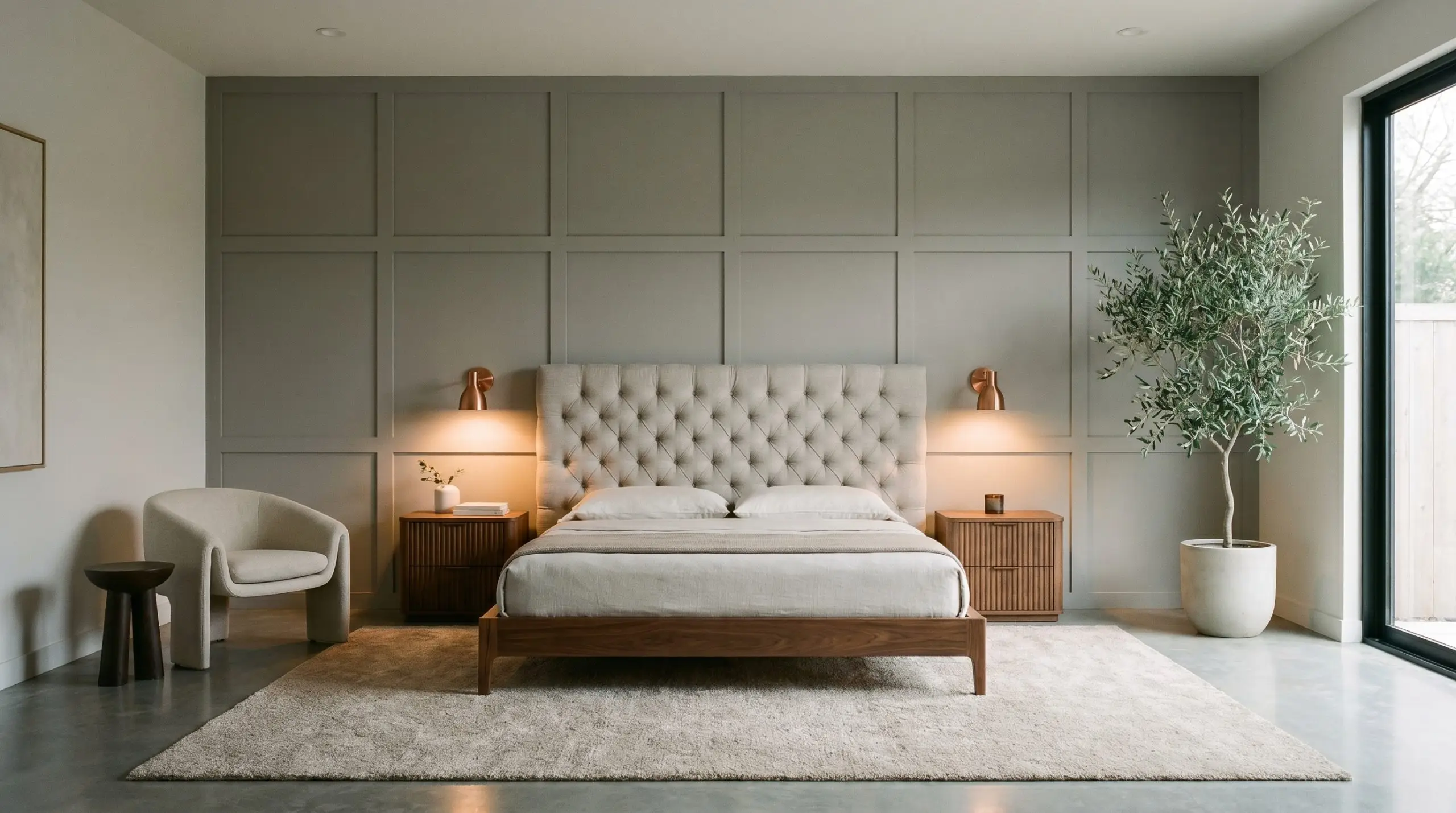
Primary Bedrooms
In a bedroom, the goal is often to create a restful, restorative sanctuary, and this shade delivers that energy effortlessly. The subtle green-yellow cast naturally mimics the calming tones found in nature, making it an ideal backdrop for relaxation. It is dark enough to feel cozy at night under warm lamp light, yet light enough to feel fresh and breathable in the morning.
For a beautifully tailored look, apply this color to a paneled accent wall behind the bed, pairing it with a deeply tufted headboard in slub cotton or washed linen. Introduce warmth through reeded walnut nightstands and brushed copper reading sconces. The metallic accents will bounce light around the room, ensuring the medium-depth paint never feels oppressive.
Styling Mason Grey: Coordinating Colors & Best Pairings
The true beauty of this specific pigment lies in how it responds to the materials placed next to it. Because it straddles the line between grey and greige, it requires intentional pairings to dictate its final aesthetic direction.
Ideal Trim Pairings
Your choice of trim color will completely alter how this wall color is perceived. You must decide whether you want a sharp, modern boundary or a softer, more atmospheric transition.
Hardware, Wood & Tactile Pairings
To bring out the absolute best in this architectural finish, you need to surround it with materials that either echo its earthy warmth or provide a stark, highly textural contrast.
A Curated Palette for Mason Grey
When building a whole-home color scheme, you need secondary colors that respect the earthy base of your primary neutral.
Designer Mood Boards
To help you visualize how these elements come together in reality, here are three distinct aesthetic pathways for this versatile neutral.
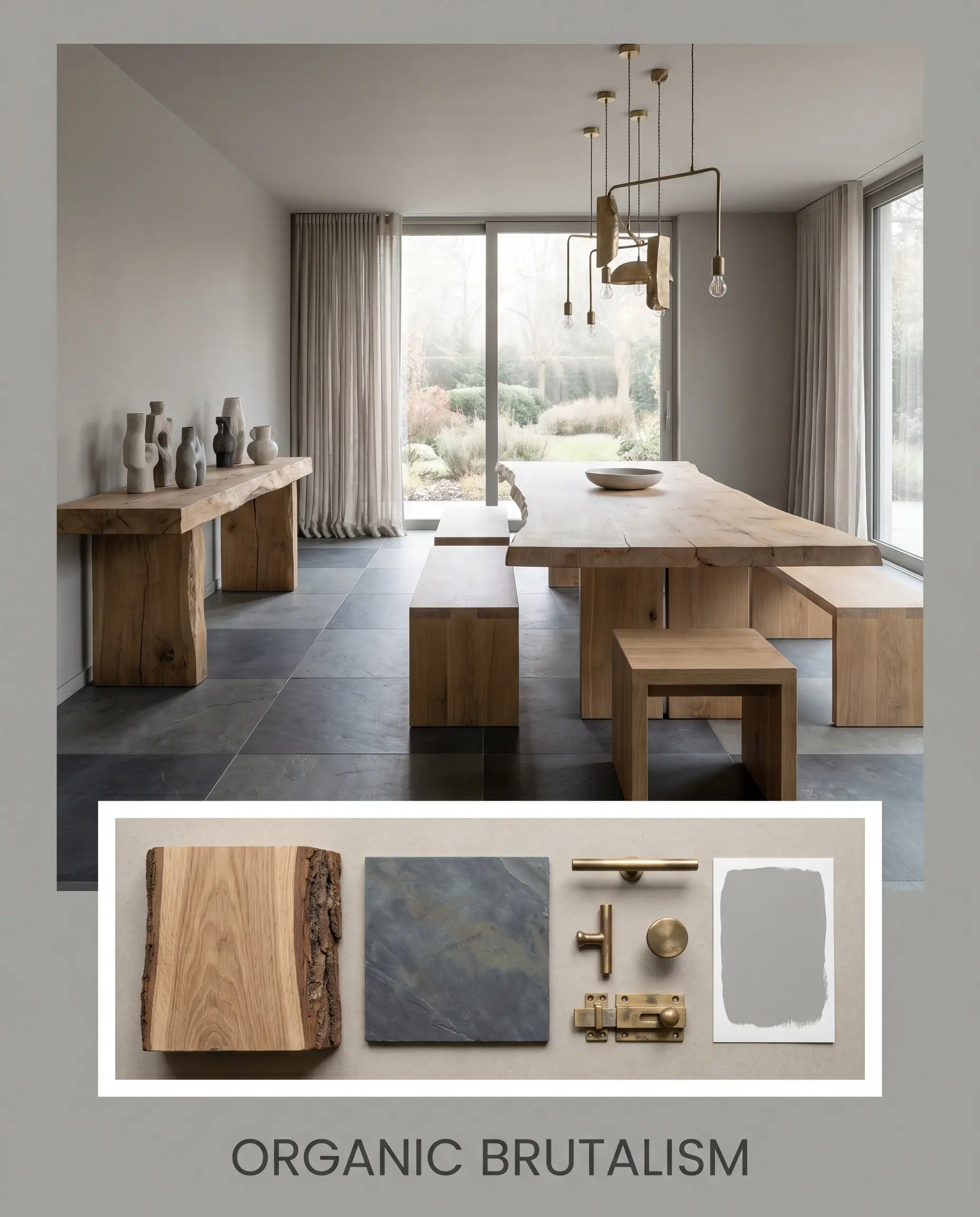
Organic Brutalism This palette leans heavily into raw textures and architectural shapes to create a serene, highly contemporary atmosphere. The earthy grey walls serve as the backdrop for massive, live-edge white oak furniture and matte, honed slate flooring. Accents of unlacquered brass on lighting fixtures add just enough warmth to keep the space from feeling cold, while minimal line art and oversized ceramic vessels complete the gallery-like vibe.
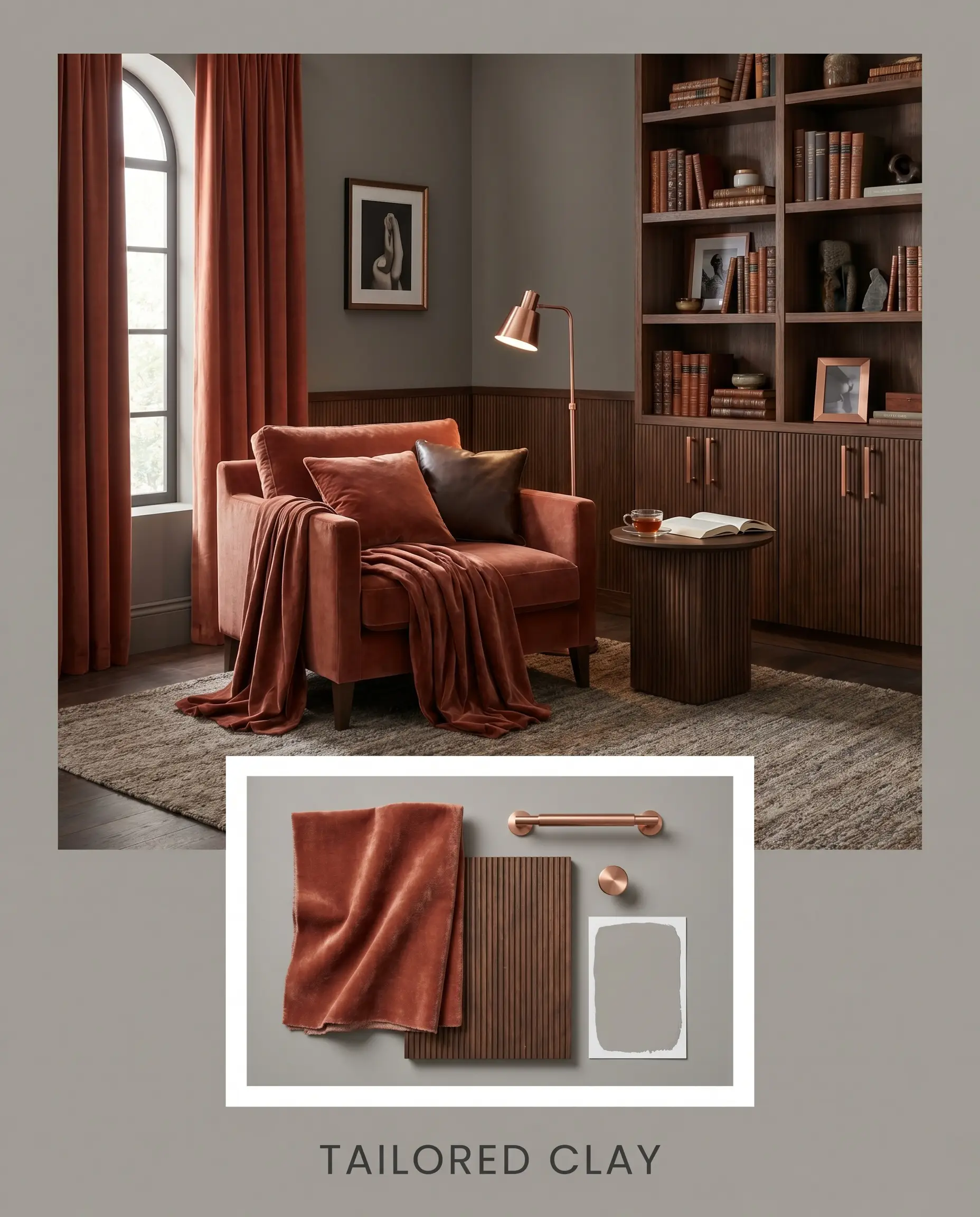
Tailored Clay Designed for those who crave warmth and sophisticated contrast, this mood board uses color to create undeniable energy. The medium-depth neutral walls are paired with plush, heavy velvet textiles in Benjamin Moore Baked Terra Cotta. Dark, reeded walnut accents and brushed copper hardware provide a deeply luxurious, tailored feel, perfect for a space meant for evening entertaining or quiet reading.
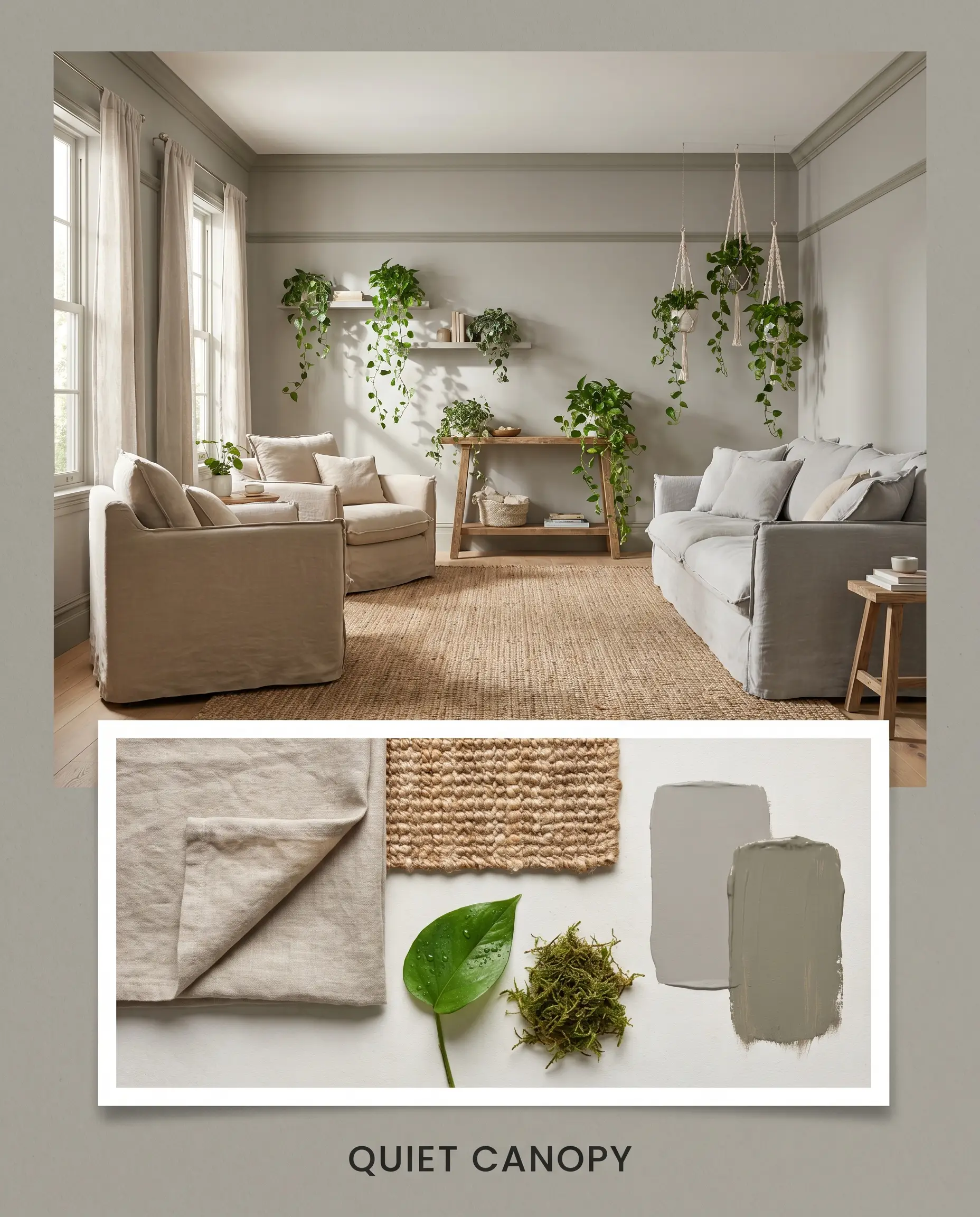
Quiet Canopy This highly restorative palette draws its inspiration directly from nature, amplifying the paint’s subtle green-yellow cast. By pairing the main walls with trim painted in Farrow & Ball Treron, the room takes on a lush, enveloping monochromatic feel. Soft washed linen slipcovers, woven jute rugs, and trailing pothos plants introduce essential organic textures that make the environment feel incredibly breathable and calm.
Deciding Factors: Head-to-Head Comparisons
Sometimes, the specific lighting in your home dictates that you need a slightly different pigment structure. Here is how this shade stacks up against its closest competitors.
Dulux Mason Grey (SG6H4) vs. Sherwin-Williams Repose Gray (SW 7015)
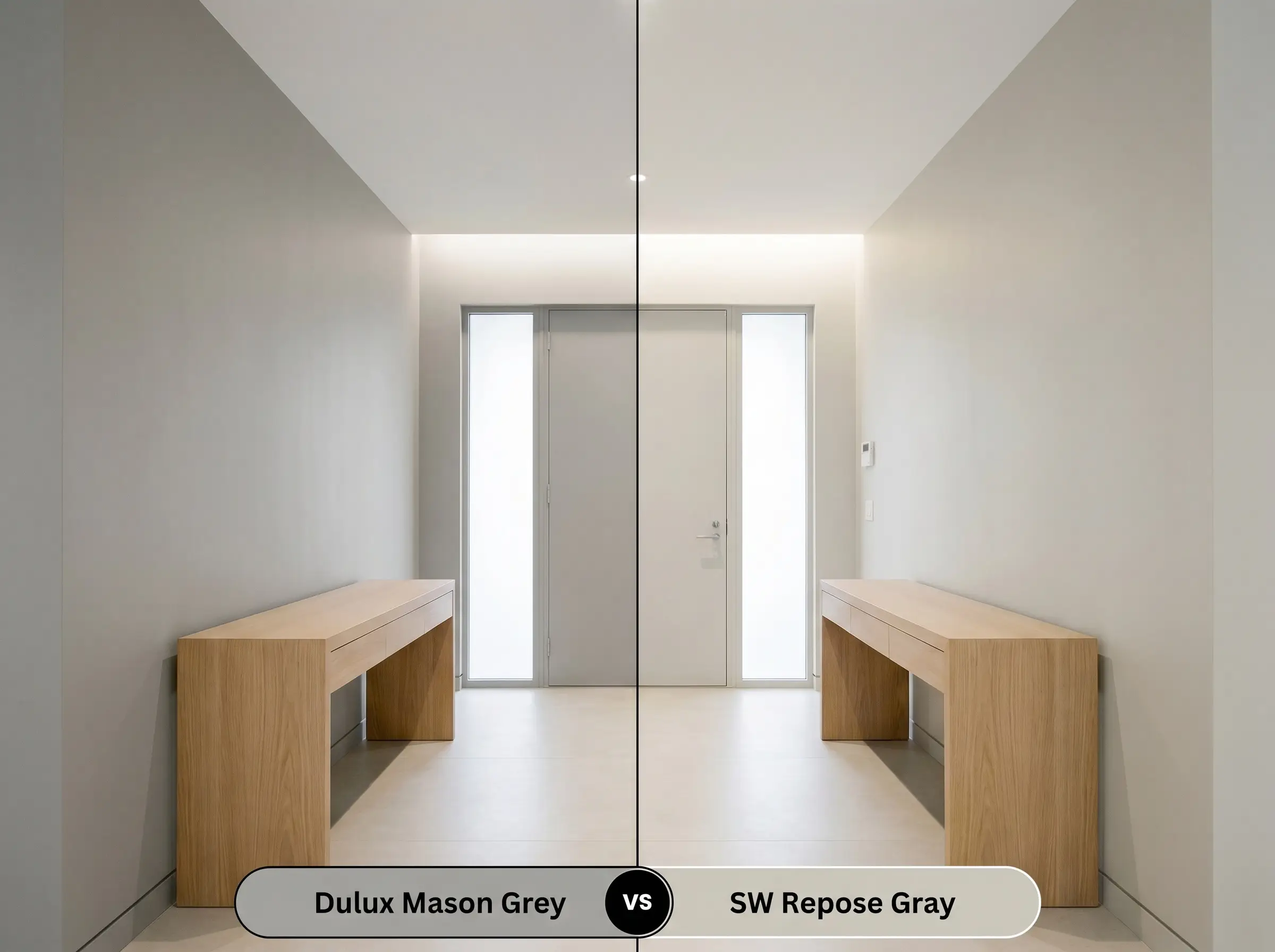
Repose Gray is a massively popular neutral, but it behaves very differently on the wall. If your room receives a lot of cool, north-facing light, Repose Gray will often flash a subtle violet or blue undertone. Choose the Dulux option if you want to guarantee a warmer, earthier finish that completely avoids those icy, purple notes.
Dulux Mason Grey (SG6H4) vs. Benjamin Moore Revere Pewter (HC-172)
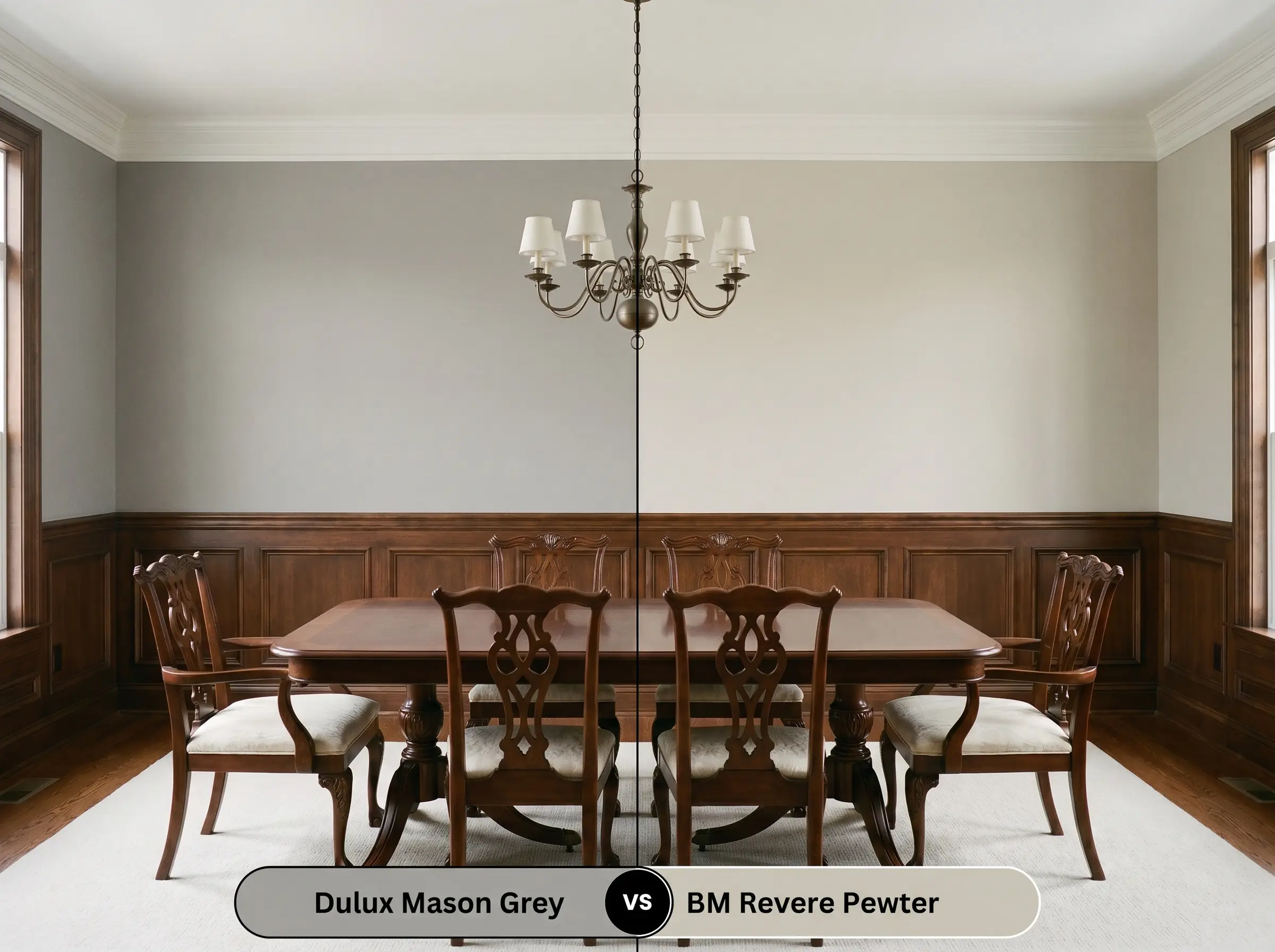
Revere Pewter is the quintessential greige, carrying significantly more yellow and brown in its base. If you want a space that feels distinctly modern and tailored, the Dulux shade is the better choice because it retains a stronger grey foundation. However, if your goal is maximum traditional warmth and you want to lean fully into beige territory, Revere Pewter will deliver that result.
Exploring Alternatives: Similar Colors & Brand Equivalents
If you love the general profile of this earthy neutral but need a slight adjustment in depth, or if you are restricted to a specific paint manufacturer, consider these highly viable alternatives.
Similar Colors (Same Brand)
Cross-Brand Equivalents
Execution & Finish: Practical Application Advice
Translating a color from a small paper swatch to a massive architectural surface requires an understanding of paint mechanics. Here is how to ensure a flawless physical application.
Primer Strategy & Coverage Warnings: Because this is a medium-depth color (LRV 42), applying it directly over builder-grade white or very dark walls will likely result in an uneven finish. You must use a high-quality, grey-tinted primer to establish a solid foundation. Expect to apply two full, generous coats for true color accuracy; rushing the process often leads to “flashing,” where uneven roller marks become highly visible when the light hits the wall from a side angle.
Frequently Asked Questions
Because of its hidden khaki cast, overcast weather can indeed pull those subtle earthy green notes forward. However, it rarely looks like a true ‘green’ paint; instead, it simply feels like a highly organic, natural stone color rather than a flat, industrial concrete grey.
With an LRV of 42, this color absorbs a significant amount of light. In a windowless space, it will feel quite moody and substantial, so you must compensate by integrating excellent artificial lighting (preferably around 3000K) and utilizing crisp white trim to keep the space from feeling overly heavy.
The earthy, green-yellow undertones in this paint actually sit opposite red on the color wheel, meaning they can inadvertently highlight the red tones in your flooring. If you want to downplay the red in your timber, this specific grey might create too much complementary contrast, and you may want to look for a warmer, brown-based greige instead.
Absolutely. The organic, earthy nature of this specific pigment makes it a brilliant candidate for textural applications like limewash or Roman clay. The subtle color variations created by the brushstrokes will beautifully highlight the paint’s complex mix of grey and khaki.
The Final Verdict on Dulux Mason Grey
Dulux Mason Grey is a masterclass in balanced, architectural color design. It is the absolute perfect choice for the homeowner who wants the sleek, tailored look of a contemporary grey but desperately needs the welcoming warmth of an earthy neutral. Whether applied to expansive living room walls, custom kitchen cabinetry, or a textured exterior facade, this paint establishes a serene, incredibly sophisticated foundation that elevates everything placed around it.
Because this paint relies on a delicate earthy, khaki undertone to generate its warmth, it will fight aggressively against highly cool, pink-leaning hard finishes. If your home features prominent pink-beige travertine floors, cherry-toned brick fireplaces, or stark, icy blue LED lighting, this grey will suddenly look muddy and discordant. Always ensure your existing fixed elements lean neutral or genuinely warm before committing to this shade.
Clash Warning (The Temperature Trap)