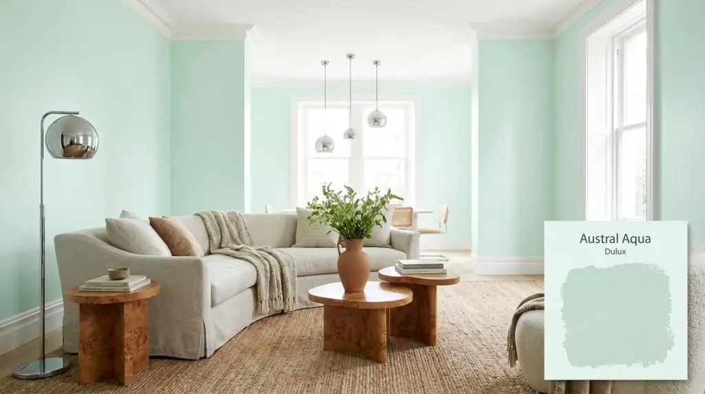
Austral Aqua SP2A9
DuluxDulux Austral Aqua is an incredibly light, refreshing pastel aqua with an exceptionally high Light Reflectance Value of 90. Blending a crisp green base with subtle cyan undertones, this cool-toned hue acts as a vibrant alternative to traditional off-whites in well-lit spaces.
Paint Technical Profile
| Color ID / SKU | SP2A9 |
| HEX Code | #e2f6ef |
| Light Reflectance (LRV) | 90 |
| Use | Interior, Exterior |
| Best Exposures | South-Facing or West-Facing |
| Best For | Bathrooms, Nurseries, Laundry Rooms, Coastal Living Spaces |
The Cool Confidence of Dulux Austral Aqua: A Mint Green That Defies Expectations
Finding a pastel green that feels sophisticated rather than saccharine is one of the most frustrating challenges in modern interior design. Too often, these shades lean into a sugary sweetness, instantly transforming a mature living space into a retro candy shop. Dulux Austral Aqua completely shatters that expectation by offering a crisp, highly structured take on a classic mint.
This specific formulation behaves less like a traditional pastel and more like a high-reflectance architectural finish. It brings an icy, invigorating energy to a room, acting as a brilliant foundational layer that bounces light beautifully. Whether you are softening a stark contemporary apartment or breathing life into a classic suburban home, this color provides a remarkably tailored aesthetic.
Dulux Austral Aqua: Undertones & LRV
If you are wondering whether this paint leans warm or cool, the definitive answer is undeniably cool. It completely avoids the yellowing often found in standard mints, maintaining a crisp, icy profile that feels incredibly refreshing. This inherent coolness dictates exactly how the paint will interact with your furnishings, requiring thoughtful pairings to keep the space from feeling chilly.
The Anatomy of the Color:
With an LRV (Light Reflectance Value) of 90, this color is exceptionally reflective and absorbs almost no incoming light. In direct sunlight, it functions very similarly to a tinted off-white, expanding the visual boundaries of a room effortlessly. However, its cyan chromatic profile remains just distinct enough to hold its shape, preventing the color from washing out into a stark, blinding white on your walls or exterior facade.
Lighting Effects & The Chameleon Factor
Because this color relies so heavily on its reflective tint, its personality shifts dramatically depending on the specific light rays hitting the surface.
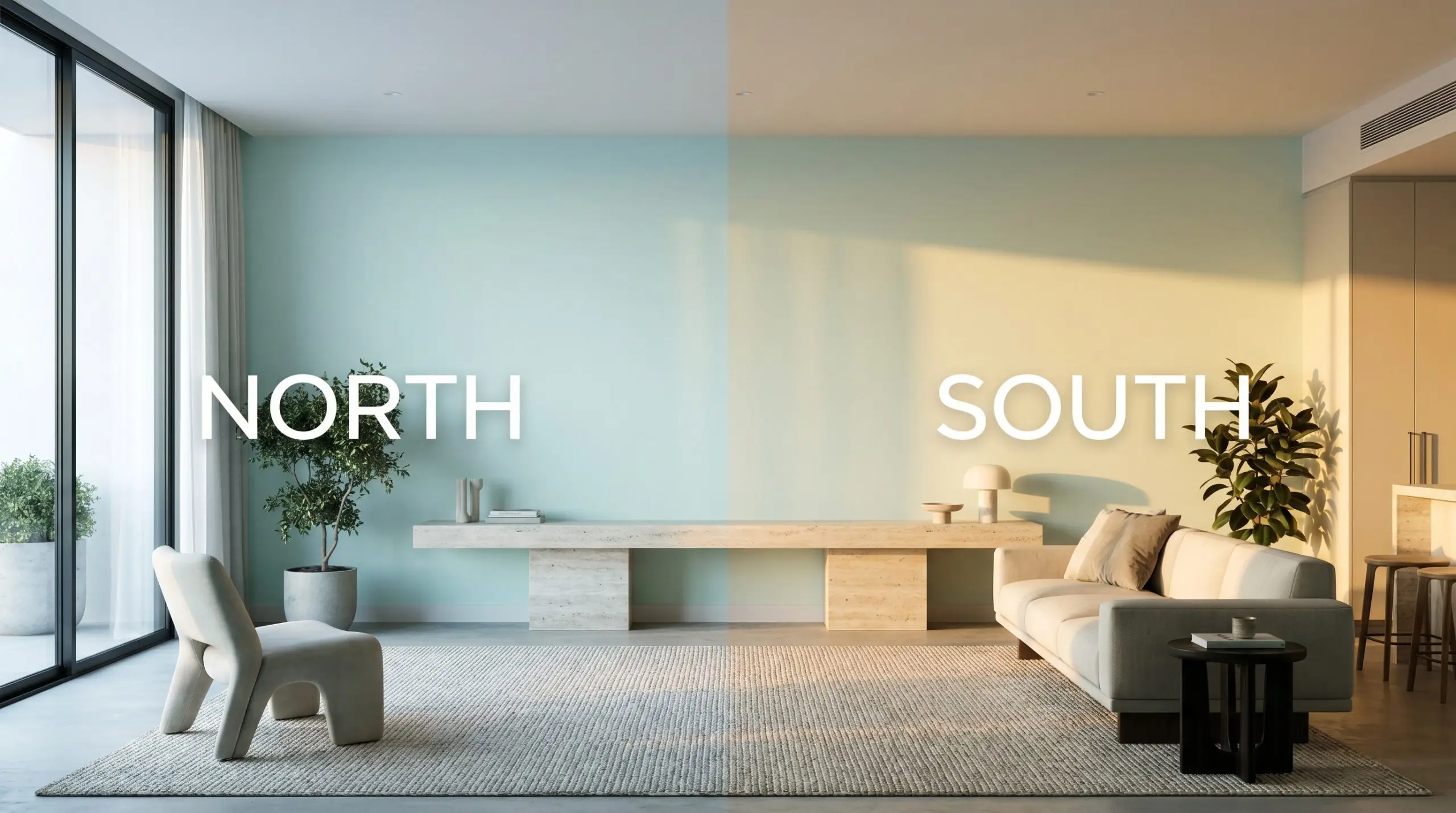
If you are considering this color for an exterior application, remember that full, direct sunlight strips away perceived pigmentation. An LRV 90 pastel will read almost entirely white on a sunny facade, leaving only the faintest whisper of mint in the architectural shadows.
Hackrea Pro-Tip (The Facade Washout)
Popular Applications for This Reflective Finish
While certain rooms naturally invite a cool-toned color structure, you should always treat your space as an architectural blank slate. The way this paint performs is dictated entirely by its high reflectivity and icy undertones, not by the traditional label on the door. Here is how to manipulate this luminous finish across various environments.
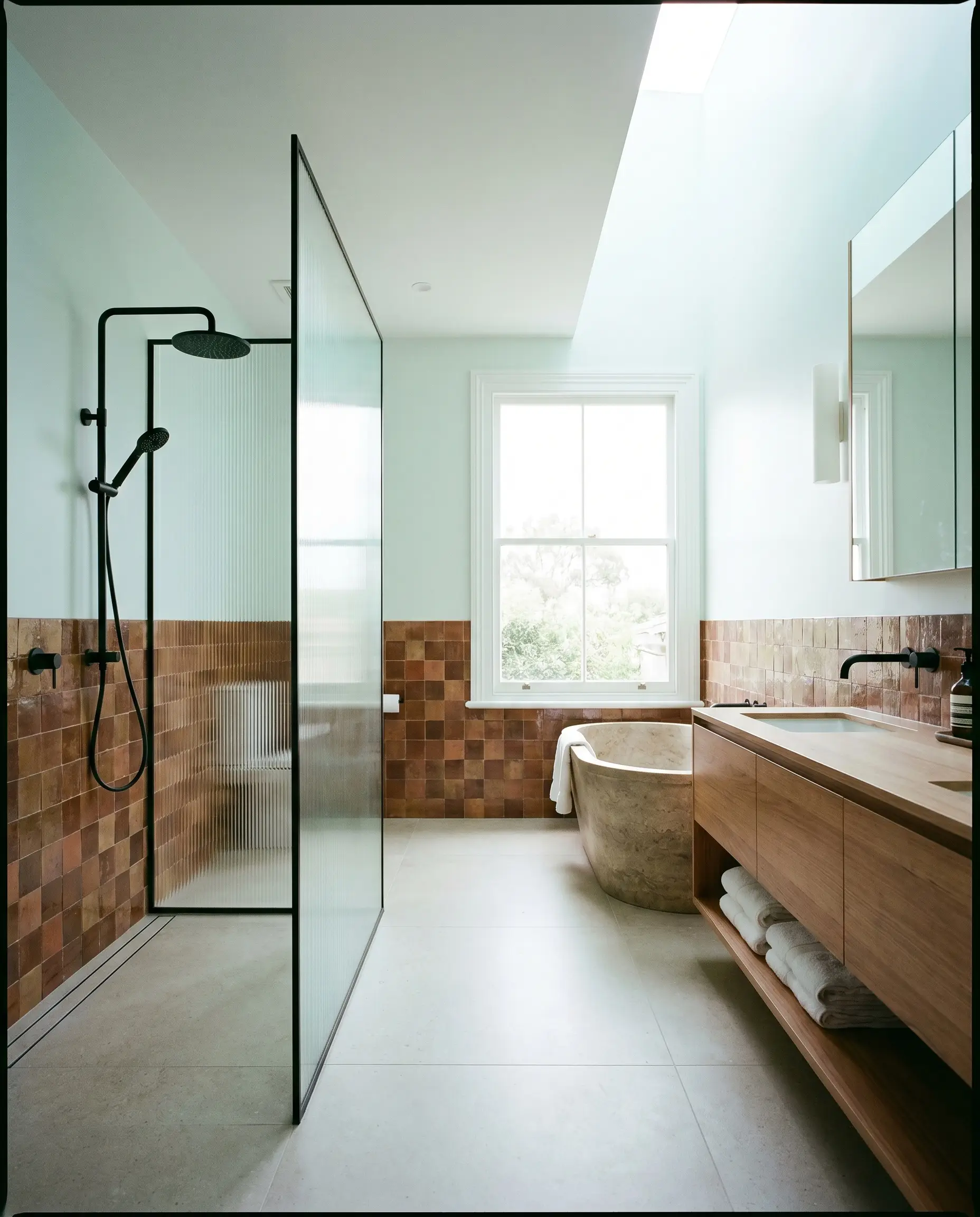
Bathrooms & Ensuites
This color thrives in bathrooms, where its crisp profile instantly creates a restorative, spa-like atmosphere. To avoid a predictable look, pair it with modern, tactile elements like fluted glass shower partitions and matte black steel fixtures. The high LRV bounces light around smaller ensuites, making tight quarters feel expansive and impeccably clean.
For a more curated approach, consider running this color on the upper half of the walls above a wainscoting of rich, earthy zellige tile. The contrast between the icy paint and the organic, handmade texture of the tile creates a beautiful visual tension. Finish the space with polished chrome hardware to enhance the modern, reflective quality of the room.
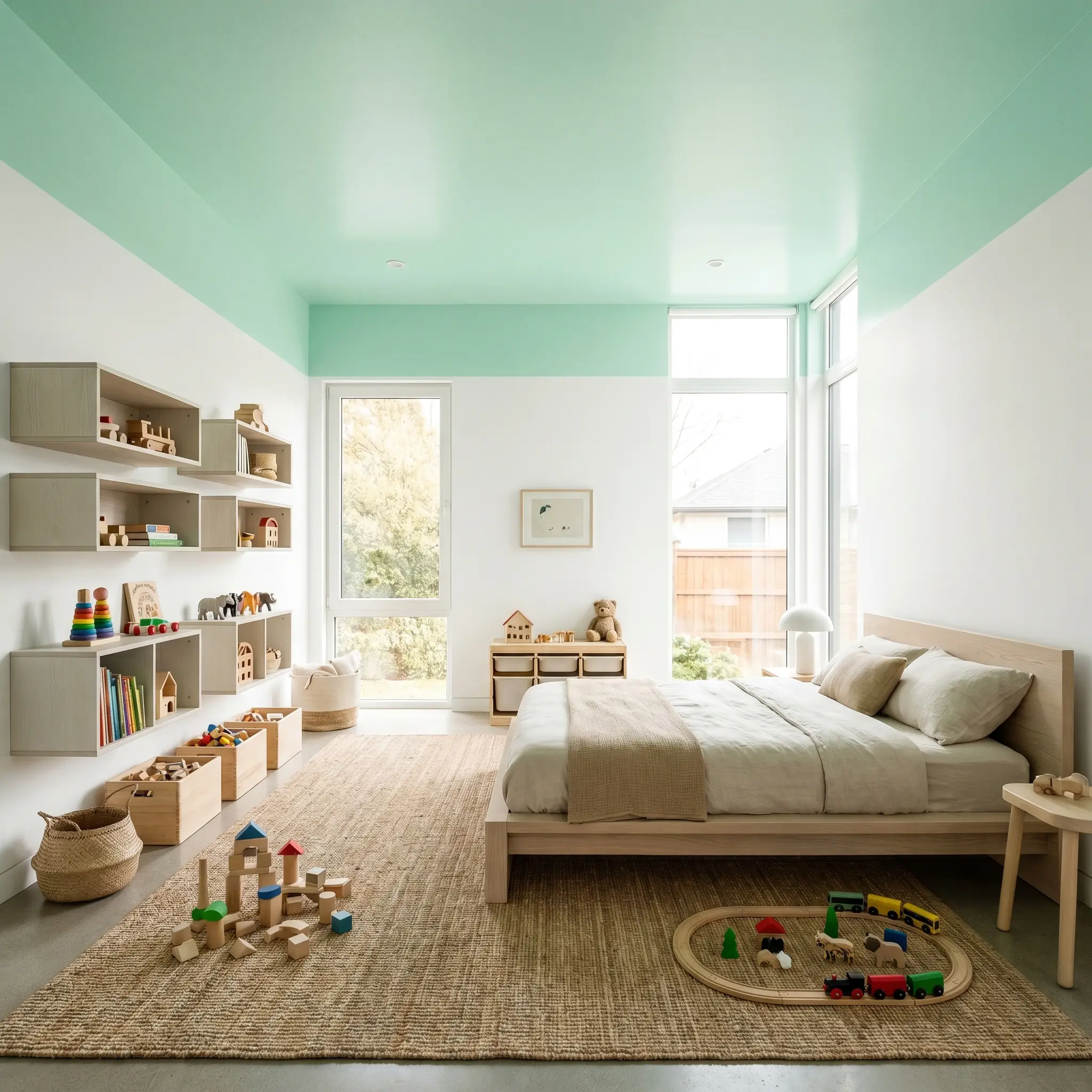
Nurseries & Playrooms
It is incredibly easy to default to standard nursery color schemes, but this shade offers a pathway to a much more sophisticated, organic modern aesthetic. Instead of pairing it with bright primary colors, stabilize the icy green with bleached oak platform beds or floating modular shelving. Layering the room with chunky knit wool rugs and soft bouclé slipcovered armchairs introduces essential warmth, ensuring the cool walls do not feel uninviting.
Instead of painting all four walls, use this reflective tint exclusively on the ceiling of a playroom. It draws the eye upward and mimics the feeling of an open sky, while allowing you to keep the main walls a durable, crisp white.
Hackrea Design Secret (The Ceiling Pop)
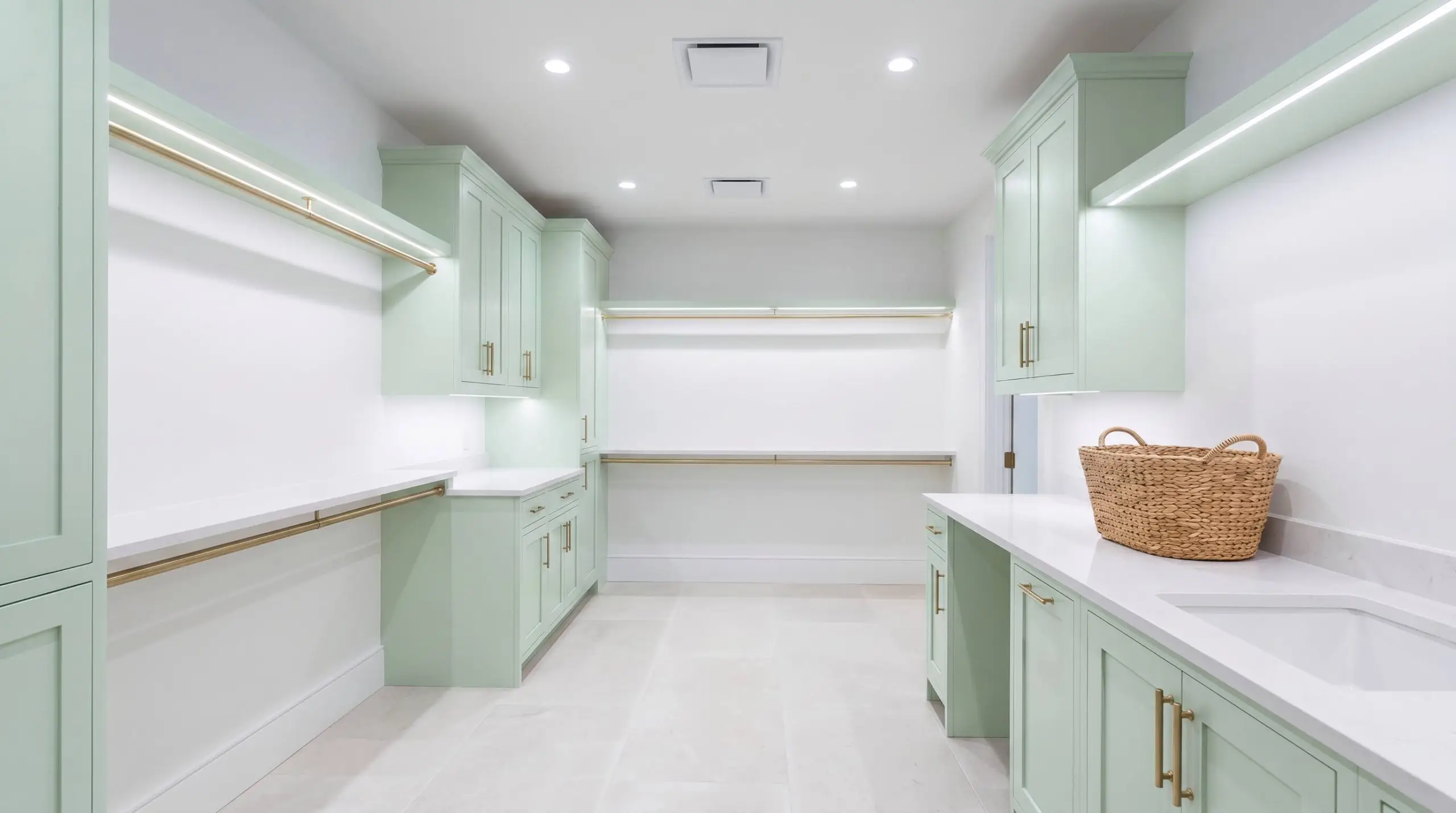
Laundry Rooms & Utility Spaces
Utility spaces often suffer from a lack of natural light, making a highly reflective finish an incredibly strategic choice. Painting standard shaker cabinets in this vibrant shade immediately lifts the energy of a windowless room. Pair it with low-profile lighting and brushed brass gallery rails to give a mundane workspace a touch of unexpected luxury.
However, you must pay strict attention to your artificial lighting in these functional zones. If you use low-quality, low-CRI fluorescent tubes, the green base can distort, taking on a sickly, institutional cast. Always opt for high-quality LEDs in the 3000K to 4000K range to keep the cyan notes looking fresh and intentional.
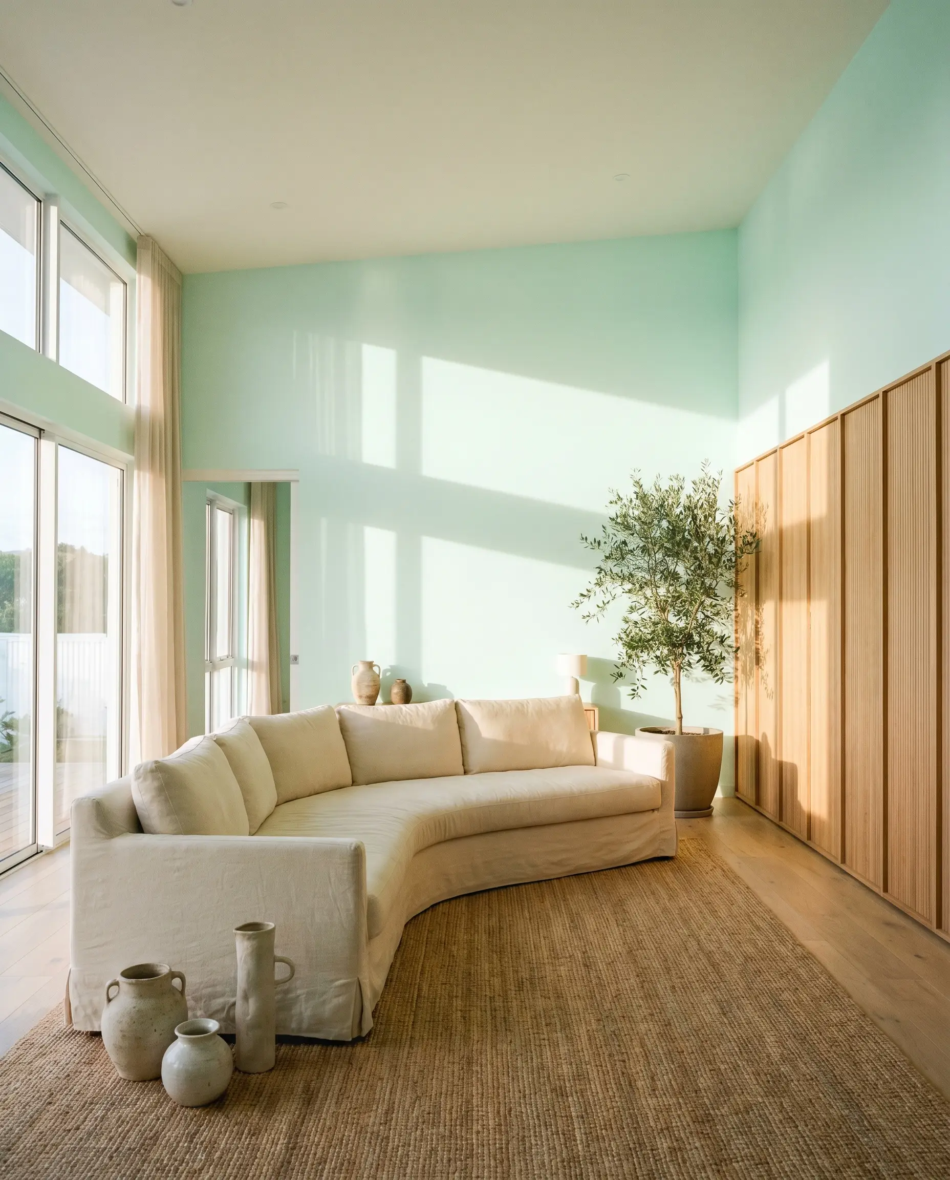
Airy Living Spaces
When designing a coastal interior palette for a main living area, you can easily bypass the cliché seashells and navy stripes. Use this color as a subtle, luminous backdrop for a Scandi-modern living room centered around a curved, slipcovered sofa and a large jute rug. The paint provides a gentle wash of color that feels breezy and elevated, allowing sculptural accents to take center stage.
To give the room a more grounded feel, introduce contrasting architectural features like natural reeded wood wall panels or a travertine coffee table. The earthy, porous nature of the stone absorbs light, providing the perfect visual counterweight to the highly reflective walls.
Coordinating Colors & Best Pairings
The secret to styling this specific pigment lies in understanding its relational behavior with other materials. Because it is so icy and reflective, it requires tactile elements and saturated companion colors to give the room a sense of gravity and intention.
Trim & Baseboards
To maintain the modern edge of this paint, you need a trim color that offers a crisp, definitive boundary.
Hardware, Wood & Material Pairings
Selecting the right tactile materials is crucial for balancing the temperature of this cool-toned finish.
Coordinating Colors
Building a palette around this color requires introducing shades that either dramatically contrast its lightness or gently support its temperature.
Designer Mood Boards
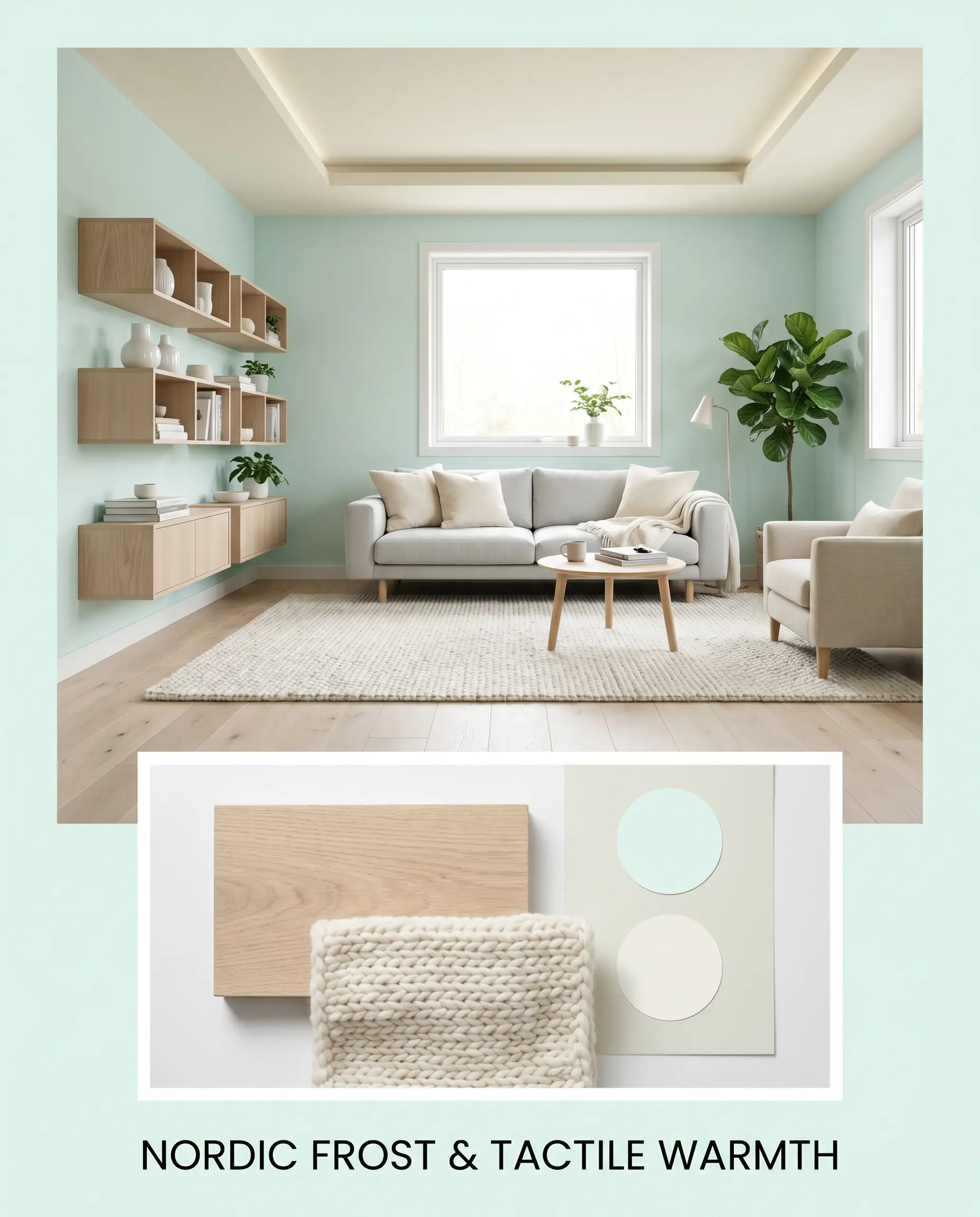
Nordic Frost & Tactile Warmth This palette relies on the beautiful tension between crisp architecture and organic comfort. The walls are coated in the luminous mint, while the floors feature wide-plank bleached oak to establish a serene, Scandi-modern foundation. Layer in a chunky knit wool rug, floating modular shelving, and touches of Benjamin Moore White Dove to create an atmosphere that feels incredibly restorative, calm, and effortlessly curated.
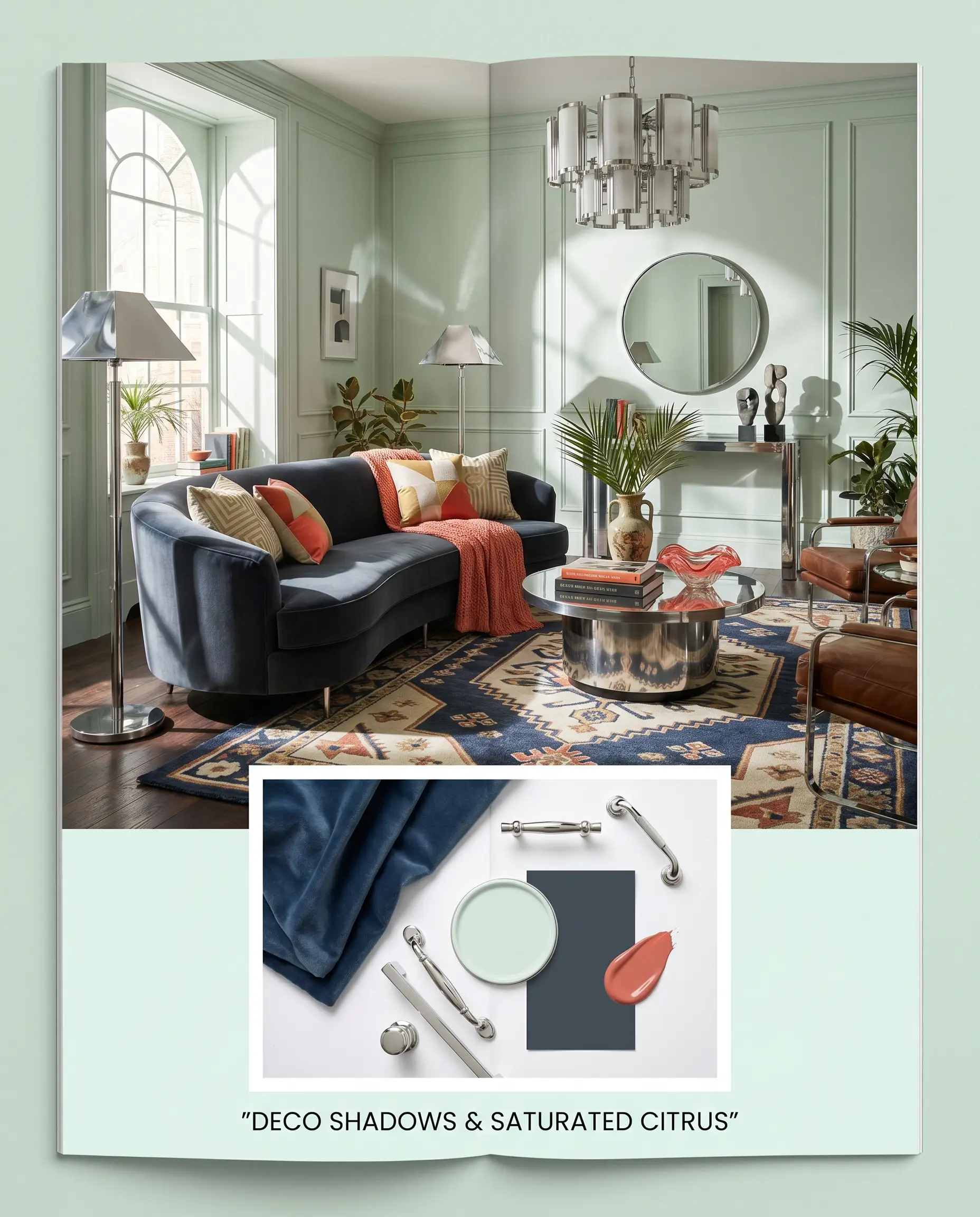
Deco Shadows & Saturated Citrus For a more daring, high-contrast aesthetic, this board leans heavily into Art Deco revival influences. The airy pastel walls serve as a bright backdrop for a curved velvet sofa in Farrow & Ball Hague Blue, instantly adding drama and sophistication. Accents of Sherwin-Williams Coral Reef, polished chrome lighting fixtures, and geometric geometric rugs inject a vibrant, energetic mood that feels highly intentional and chic.
Head-to-Head Paint Comparisons
When you are finalizing your color selection, it is crucial to understand how this specific formulation behaves compared to its closest market rivals.
Dulux Austral Aqua vs. Benjamin Moore Palladian Blue
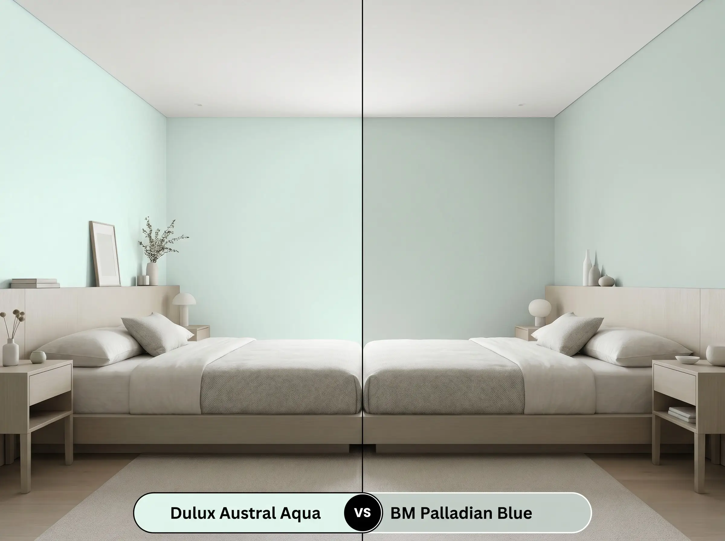
If your room receives heavy, warm southern light, Palladian Blue might be the safer choice. Palladian Blue features a much more muted, grayed-out base, allowing it to absorb warmth gracefully without turning overly vibrant. Conversely, if you want a truly crisp, modern pop of color in a naturally dim space, the Dulux option retains its icy clarity much better.
Dulux Austral Aqua vs. Sherwin-Williams Sea Salt
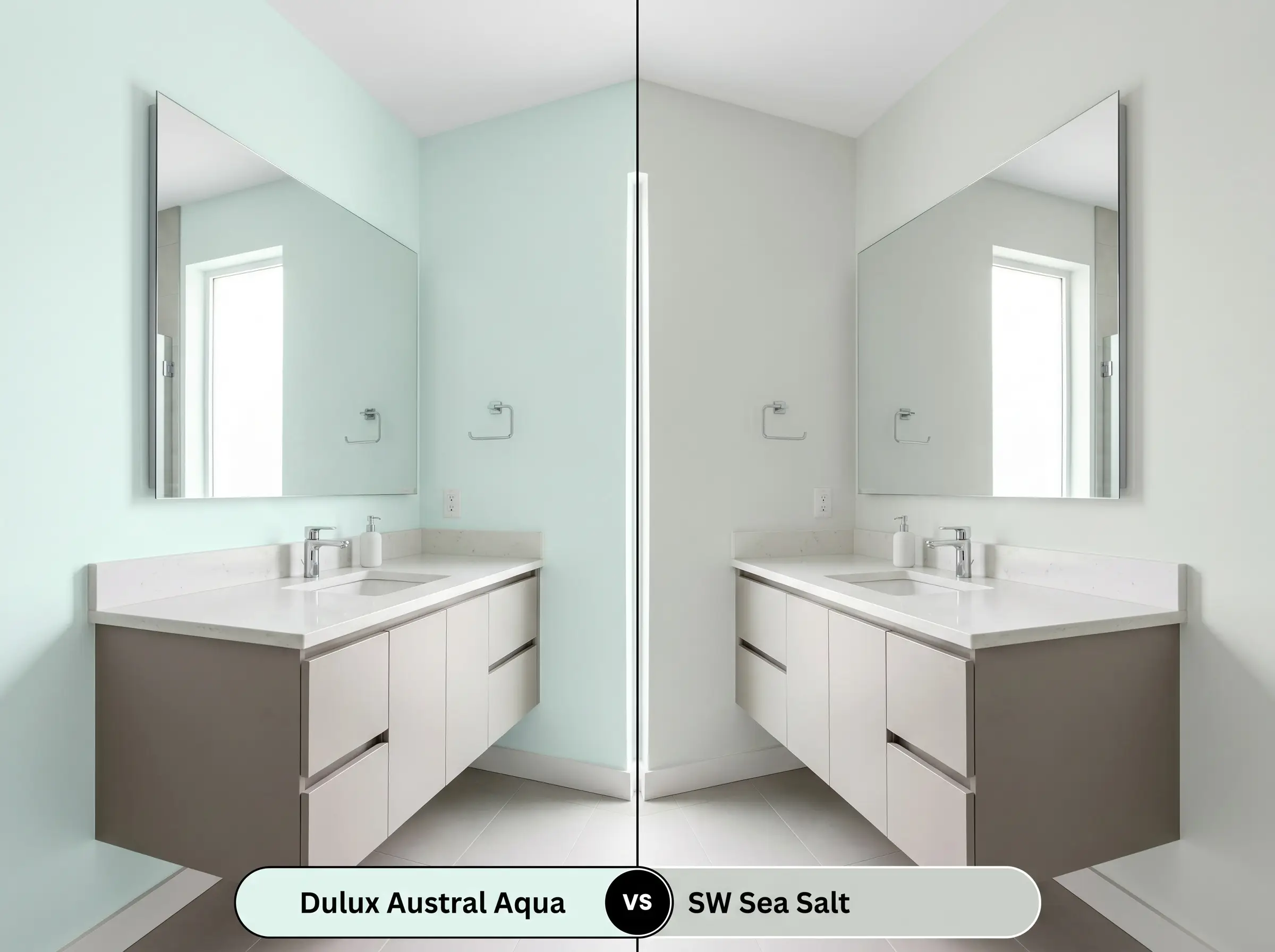
Sea Salt is famous for its chameleonic ability to shift between green, blue, and gray depending on the shadows. If you prefer a color that feels earthy, relaxed, and slightly unpredictable, Sea Salt is the winner. However, if you need a highly reflective, undeniably clean pastel that holds a consistent cyan edge, Austral Aqua delivers a much sharper, more tailored result.
Alternative Options & Brand Matches
Sometimes a space demands just a subtle shift in light reflectance or a slightly different undertone to perfectly align with your existing finishes.
Similar Colors (Same Brand):
Cross-Brand Equivalents:
Practical Application & DIY Advice for Austral Aqua
Moving from design theory to the physical reality of painting requires an understanding of how high-reflectance colors actually cure on the wall.
The Dynamic Sheen Guide:
Primer Strategy: Because this color has an LRV of 90, it is highly susceptible to underlying wall colors bleeding through and altering its delicate undertones. You must use a high-quality, pure white blocking primer, especially if you are painting over a dark or warm-toned existing wall.
Coverage & Success Tips: Even with a premium primer, light pastels often require two full coats to achieve true opacity and color accuracy. Be incredibly mindful of your roller technique, as high-LRV paints will easily show “flashing”—visible, uneven streaks where the paint dried at different rates. Maintain a wet edge as you work across the wall, and never go back over semi-dry sections with a loaded roller.
Frequently Asked Questions
Because of its icy, cool-toned structure, this paint creates a striking, high-contrast dynamic when placed next to rich, reddish-brown mahogany. The cool walls actually enhance the warmth of the wood, allowing antique silhouettes to stand out beautifully in a modern setting.
Not at all; in fact, the pairing is highly successful. The earthy, warm orange tones of the terracotta sit opposite the cyan-green on the color wheel, creating a vibrant, balanced tension that feels incredibly organic and intentional.
Absolutely. Its high reflectance mimics the open sky beautifully, while the subtle cyan notes provide that classic Southern porch aesthetic without feeling too dark or heavy overhead.
Low-quality fluorescent bulbs often cast a harsh, yellowish-green light that strips away the crisp cyan undertones. This distortion can make the paint look flat, institutional, and slightly sickly, which is why upgrading to high-quality LEDs is essential.
The Final Verdict
Dulux Austral Aqua is a brilliant, highly structured architectural finish designed for homeowners who want the refreshing energy of a mint green without the sugary, retro baggage. Its icy cyan undertones and exceptional light reflectance make it an incredibly powerful tool for modernizing dark utility spaces, elevating Scandi-modern living areas, or creating crisp, restorative bathrooms. It performs best in spaces that feature a thoughtful mix of warm, tactile materials—like bleached woods or textured bouclé—which beautifully balance its inherently cool temperature.
This highly reflective, cool-toned pastel will actively fight against heavily yellowed or Tuscan-style beige finishes. If your home features prominent creamy yellow carpets, dated honey-oak cabinets, or yellow-beige travertine backsplashes, the icy cyan base of this paint will make those warm elements look dingy and aged. The visual friction between the crisp, modern walls and the muddy, warm fixed elements creates an unsettling, disjointed atmosphere that is incredibly difficult to correct with styling alone.
Clash Warning (The Warm-Toned Neutral Trap)