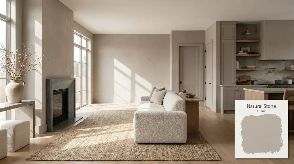
Natural Stone S10B3
DuluxDulux Natural Stone (S10B3) is a mid-tone, warm earthy greige with subtle taupe and brown undertones. With an LRV of 41, it offers substantial depth and grounding energy, making it an excellent choice for cozy interiors and sophisticated exterior facades.
Paint Technical Profile
| Color ID / SKU | S10B3 |
| HEX Code | #aea195 |
| Light Reflectance (LRV) | 41 |
| Use | Interior, Exterior |
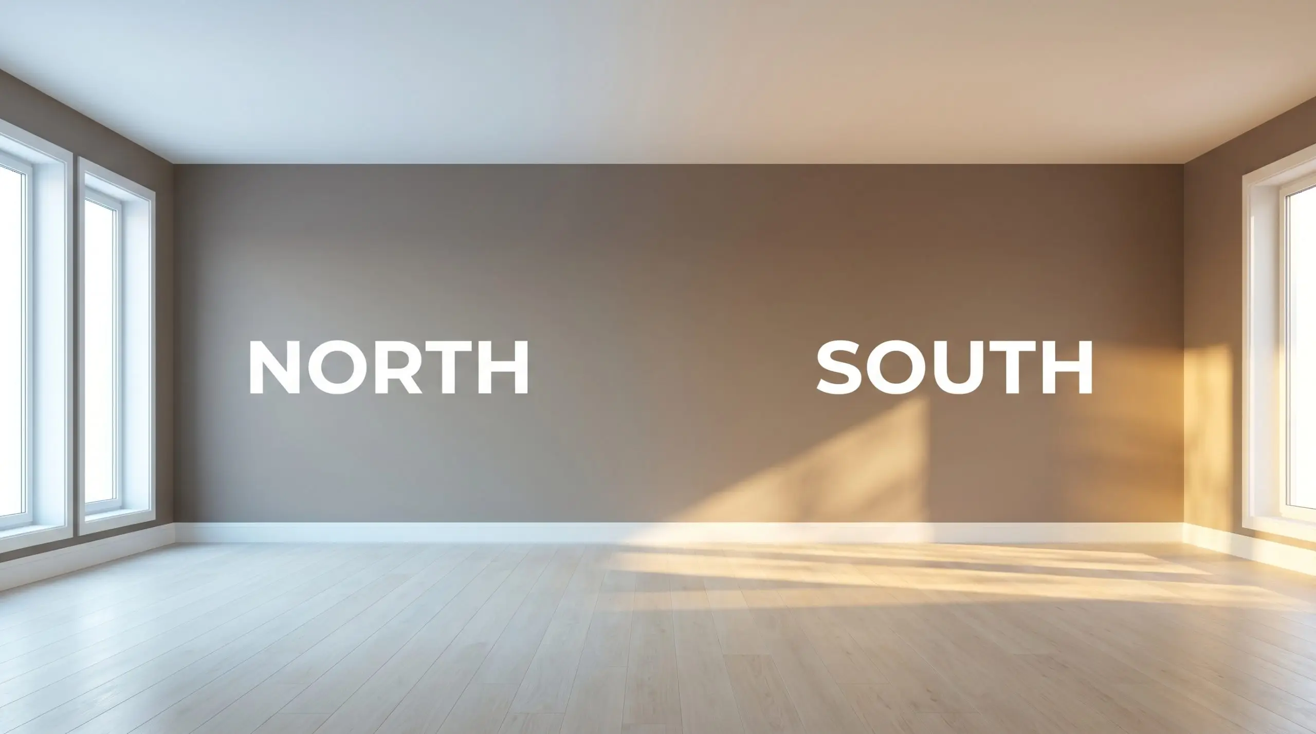
| Best Exposures | North, East |
| Best For | Living Rooms, Kitchen Cabinetry, Exterior Render, Cozy Bedrooms |
Dulux Natural Stone: The Earthy, Mid-Tone Greige Redefining Organic Modern Spaces
The era of stark, clinical white interiors is rapidly giving way to spaces that feel tactile, lived-in, and inherently warm. Homeowners are increasingly seeking out foundational colors that mimic the organic world, bringing a sense of calm and permanence indoors. Dulux Natural Stone (S10B3) captures this exact mood, offering a sophisticated alternative to the standard builder-grade neutrals.
This specific shade is a masterclass in balance, providing enough visual weight to make a room feel intentionally designed while remaining highly adaptable. It behaves less like a simple coat of paint and more like a true architectural material. If you are looking to wrap your walls in a color that feels as comforting and sturdy as sun-warmed clay, this versatile greige deserves a spot on your shortlist.
Unpacking the DNA: Undertones & LRV of Dulux Natural Stone
When evaluating whether a neutral will work in your home, identifying its core temperature is the absolute first step. Dulux Natural Stone is a definitively warm color. It completely bypasses the icy, sterile qualities of traditional greys, instead wrapping a room in a cozy, inviting atmosphere that feels highly organic.
To truly understand how this color behaves, we have to look at its underlying structure:
This earthy chromatic profile is paired with a light reflectance value 41 (LRV). Sitting squarely in the mid-tone category, it absorbs a significant amount of light rather than bouncing it around the room. This means the color will hold its shape beautifully and won’t wash out in bright spaces, but it does require thoughtful lighting in enclosed areas to prevent the room from feeling closed-in.
The Chameleon Factor: How Light Alters This Earthy Chromatic Profile
Paint is never static, and mid-tone greiges are particularly sensitive to the shifting angles of the sun. Because of its complex taupe color structure, Natural Stone will physically change its appearance as the light moves across your home throughout the day.
Here is exactly how you can expect the color to shift:
If you want to maintain the beautiful mushroom qualities of this paint after the sun goes down, strictly avoid daylight bulbs. Stick to soft white LEDs (around 2700K to 3000K) to keep the undertones glowing rather than looking muddy.
Hackrea Pro-Tip (The Bulb Rule)
Styling the S10B3 Greige Architectural Finish Across Your Home
Because of its perfectly balanced mid-tone depth, this Dulux greige acts as an incredible foundational layer for a wide variety of spaces. It provides enough contrast against white trim to feel intentional, yet it remains soft enough to wrap an entire room without overwhelming the senses.
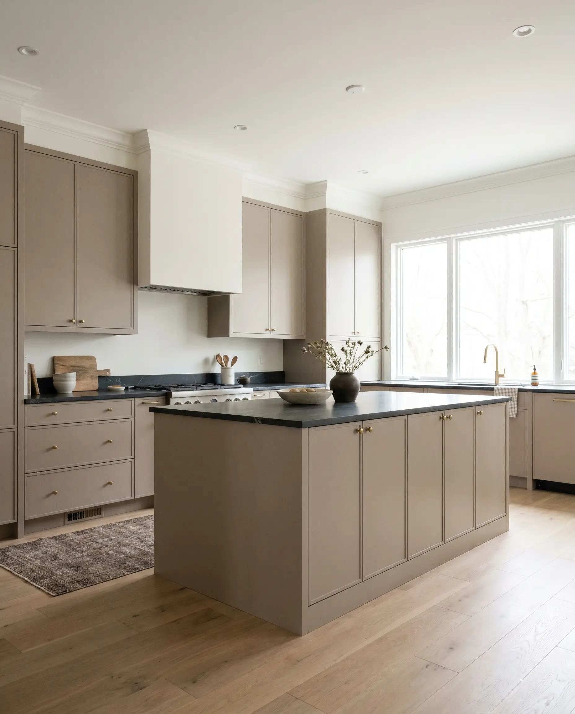
Kitchen Cabinetry & Islands
Moving away from stark white kitchens, this shade offers a stunning, sophisticated alternative for cabinetry. When applied to flat-panel doors or classic shaker profiles, it roots the kitchen in a Transitional or Organic Modern aesthetic. To elevate the look, pair the painted cabinets with honed soapstone countertops and unlacquered brass hardware, allowing the warm metallic tones to speak directly to the paint’s taupe undertones.
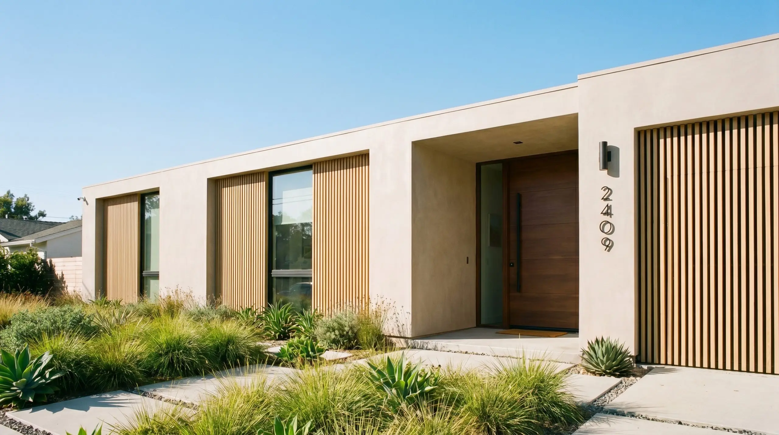
Exterior Render & Cladding
On an exterior facade, natural sunlight will instantly make any paint color appear significantly lighter than it looks on an indoor swatch. Because this shade has an LRV of 41, it has enough depth to hold its ground outside, transforming into a beautiful, sun-bleached stone color. It pairs flawlessly with natural white oak architectural accents, blackened steel house numbers, and lush green landscaping.
Always test this color on both the shaded and sunlit sides of your exterior. The direct sun will highlight the red-orange nuances, so ensure you love the warmer taupe version just as much as the cooler, shaded grey version.
Hackrea Design Secret (Exterior Testing)
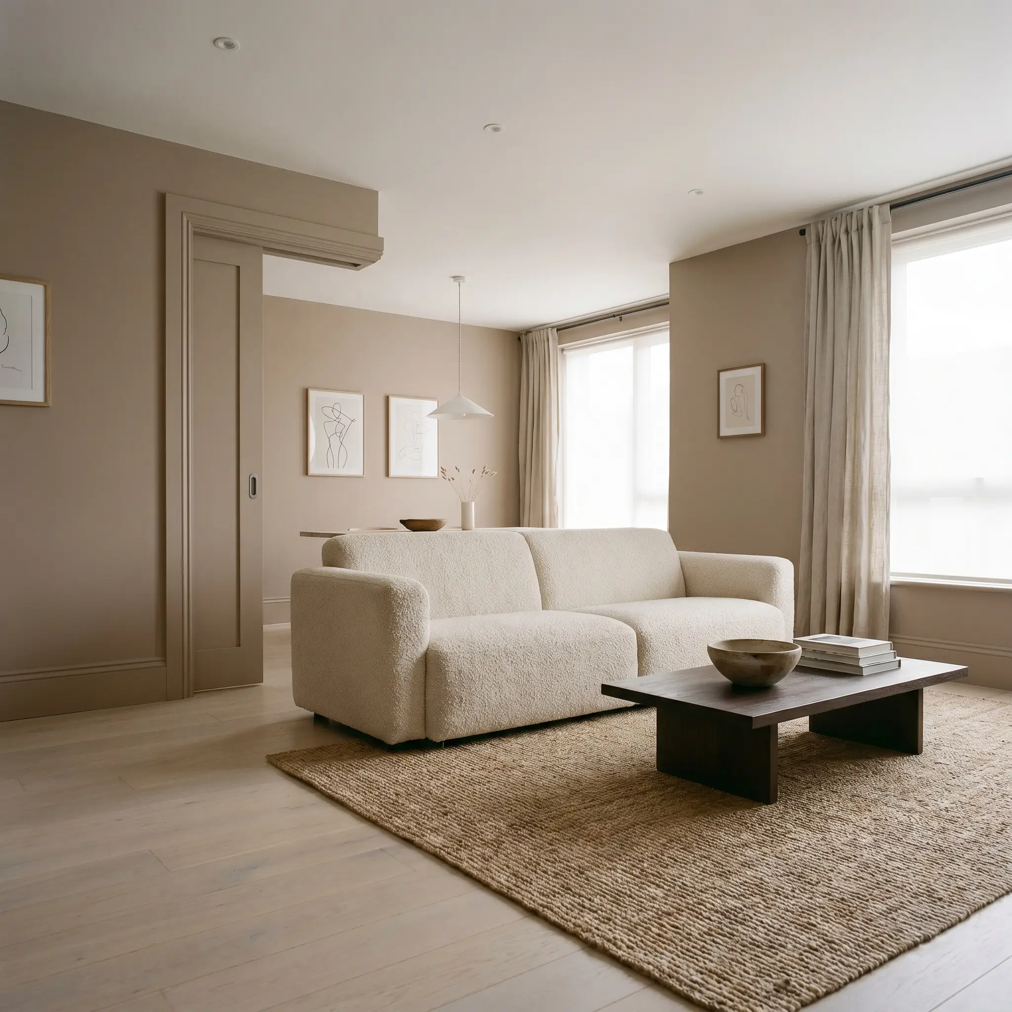
Open-Plan Living Areas
For large, open-concept spaces, this color is a brilliant tool for making expansive rooms feel more intimate. Consider a color-drenching approach—painting the walls, baseboards, and even the interior doors in the same S10B3 shade to create a seamless, enveloping atmosphere. Style the room with heavily textured fabrics like nubby bouclé sofas, jute rugs, and minimalist line art to lean heavily into a Japandi or Wabi-Sabi vibe.
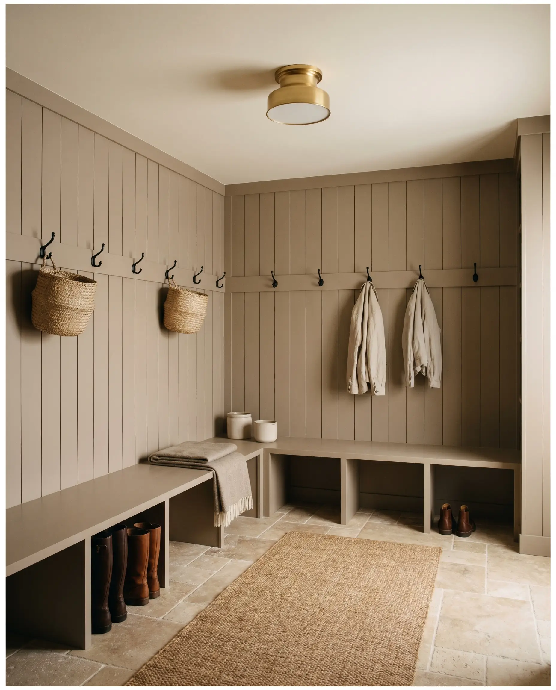
Mudrooms & Utility Spaces
Utility spaces often lack natural light, making them the perfect candidate for a color that brings its own inherent warmth. Apply this shade to beadboard or vertical shiplap to create a chic, utilitarian drop zone that feels incredibly custom. Pair it with highly durable materials like tumbled travertine floors and matte black hooks for a space that is both practical and visually striking.
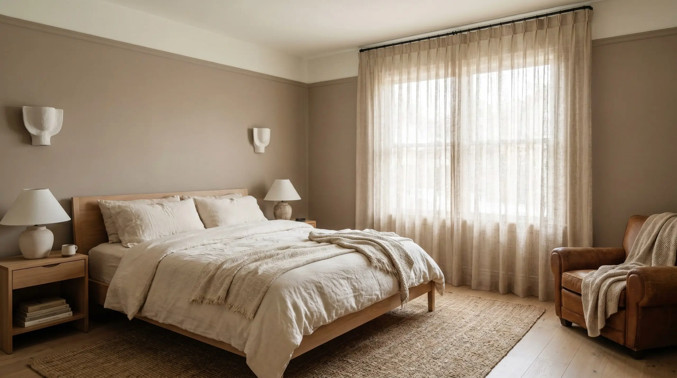
Primary Bedrooms
In a bedroom setting, the goal is often to create a serene, restful retreat. This warm mid-tone hue excels here, especially when paired with a Soft Minimalism approach. Layer the room with stonewashed linen bedding, sheer woven curtains, and layered ambient lighting via plaster sconces to create a space that feels like a high-end boutique hotel.
Curating the Palette: Best Pairings for This Warm Mid-Tone Hue
The true magic of this color is unlocked when you place it next to the right contrasting elements. Because it walks the line between grey and brown, it requires intentional pairings to either pull out its crispness or enhance its earthy glow.
The Boundary Lines: Trim & Baseboards
Choosing the right white for your trim is crucial; the wrong choice can make the walls look muddy or overly pink. You need a white that provides a clean boundary without clashing with the paint’s inherent warmth.
Tactile Dialogues: Hardware, Wood & Material Pairings
To truly elevate this paint color, you must surround it with materials that complement its tactile, stone-like qualities.
The Supporting Cast: Coordinating Colors
Building a whole-home palette around this greige requires secondary colors that respect its warmth.
Designer Mood Boards
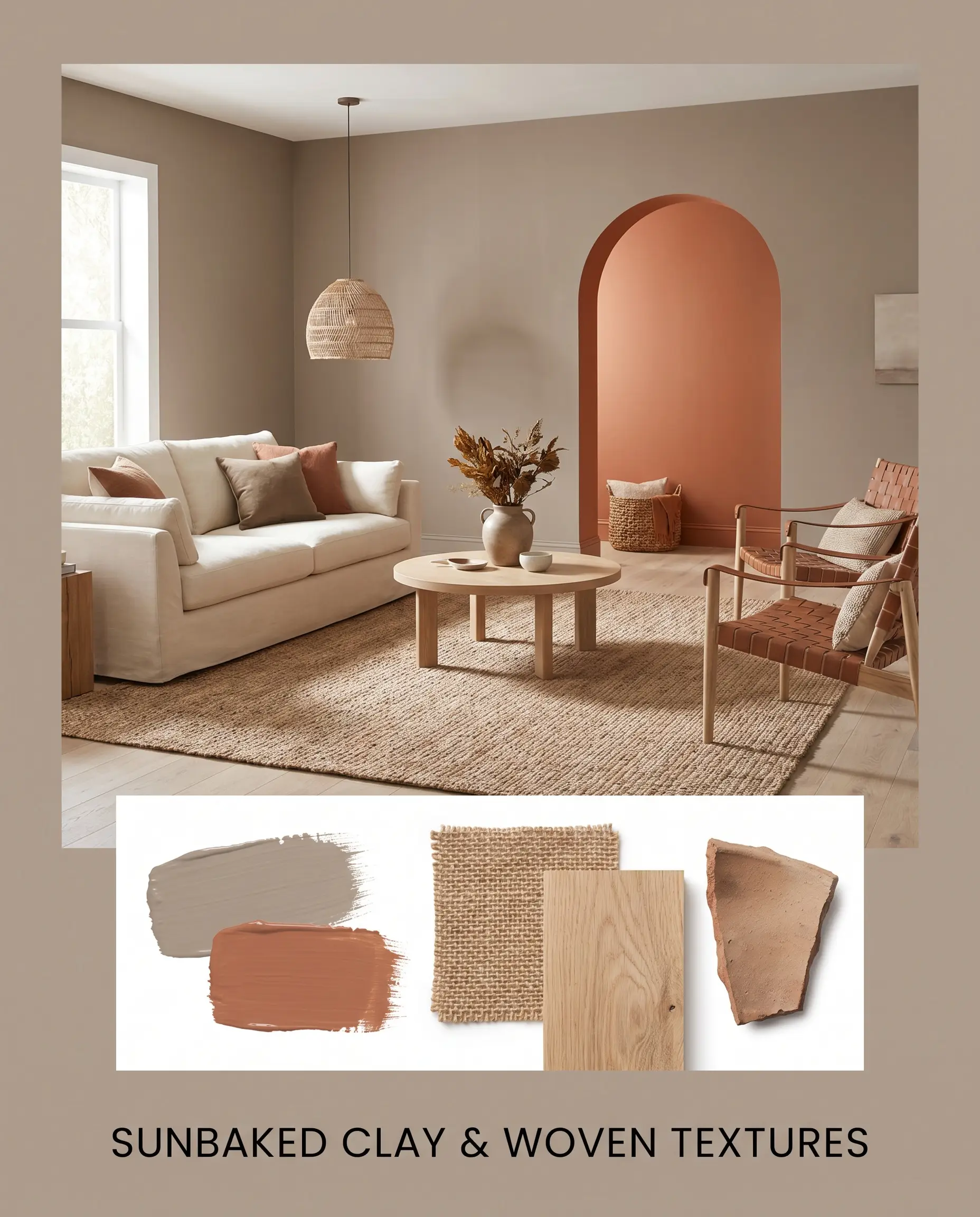
To help you visualize how these elements come together, here are two distinct aesthetic pathways for styling this color.
Sunbaked Clay & Woven Textures This palette leans heavily into a relaxed, California Casual energy. Imagine the walls painted in our featured greige, accented by a striking focal point painted in Cavern Clay. The room is styled with expansive jute rugs, low-profile white oak furniture, and oversized ceramic jugs filled with dried branches. The overall vibe is incredibly grounded, earthy, and effortlessly serene, perfect for spaces where you want to instantly lower your heart rate.
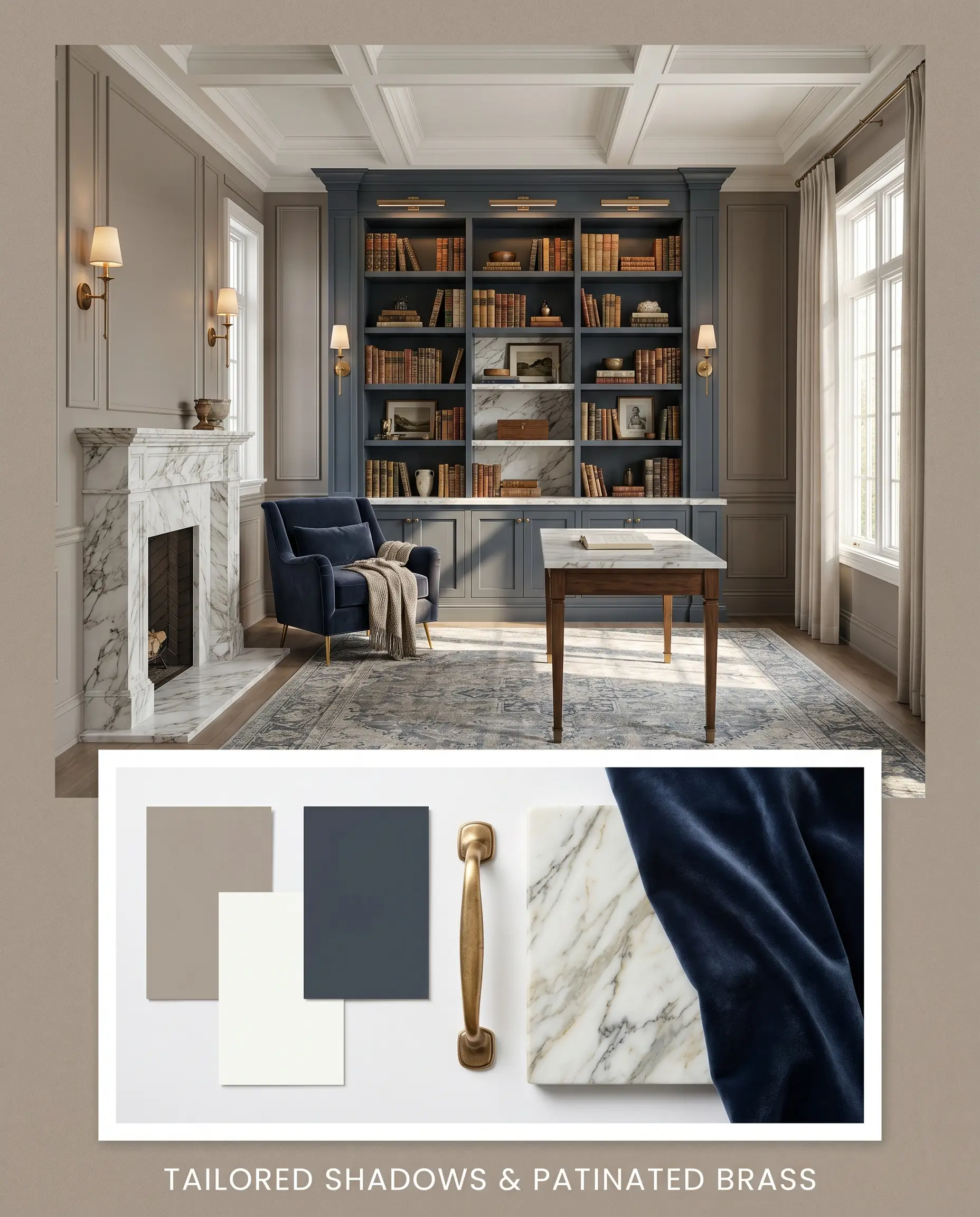
Tailored Shadows & Patinated Brass For a more sophisticated, Transitional approach, this palette utilizes high contrast and premium materials. The warm mid-tone walls are framed by crisp Vivid White trim, while accents of Hale Navy are introduced through velvet upholstery or a painted built-in bookcase. Unlacquered brass hardware and heavily veined marble accents elevate the room, creating an atmosphere that feels curated, historic, yet entirely modern.
The Neutral Showdown: Dulux Natural Stone vs. Rivals
Sometimes, the lighting in your home or the specific direction of your windows means your first paint choice isn’t quite right. If you are struggling to commit, comparing this shade against its closest rivals can clarify exactly what you need.
Dulux Natural Stone vs. Dulux Ghosting
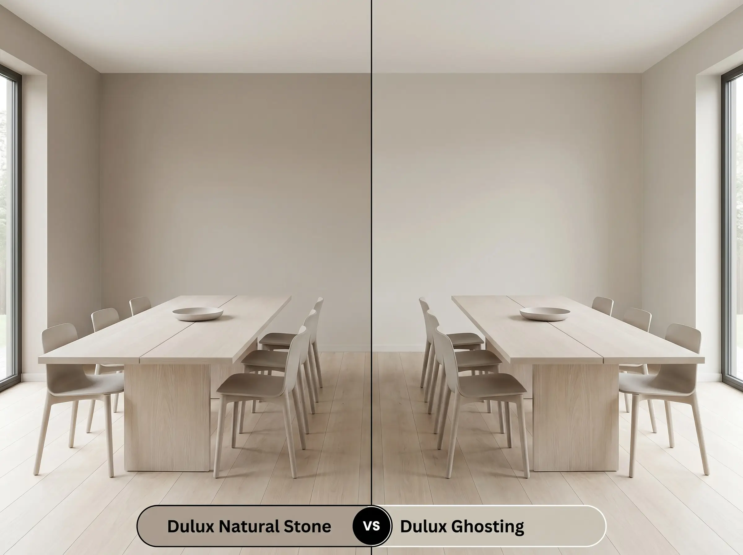
Ghosting is a significantly cooler, more traditional grey compared to our featured color. If your room receives an abundance of warm, southern light and you want to neutralize that warmth, Ghosting is the safer choice. However, if you place Ghosting in a north-facing room, it runs the risk of feeling icy—which is exactly where the warmer taupe base of Natural Stone excels.
Dulux Natural Stone vs. Dulux Dieskau
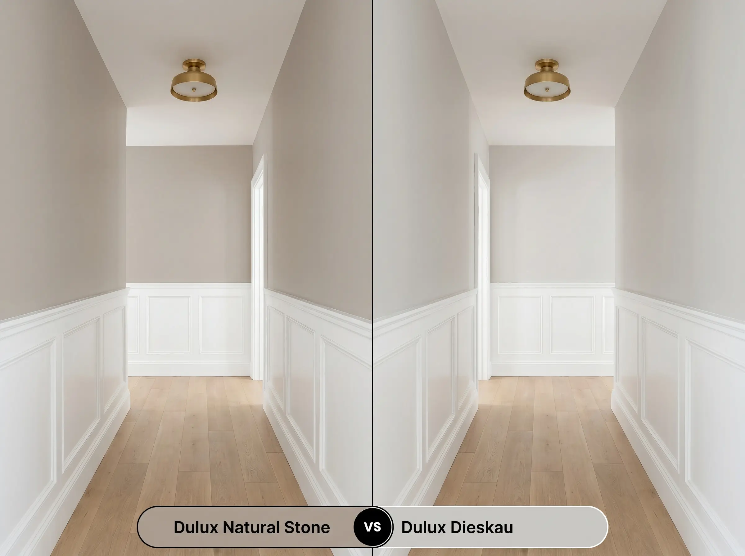
Dieskau is a lighter, highly popular greige with a much higher LRV, making it feel breezier and more expansive. If you are working with a small, windowless hallway or a room that desperately needs to bounce light, Dieskau will perform better. But if you want a color that provides distinct architectural weight and rich, cozy shadows, Natural Stone is the superior option.
Dulux Natural Stone vs. Sherwin-Williams Accessible Beige
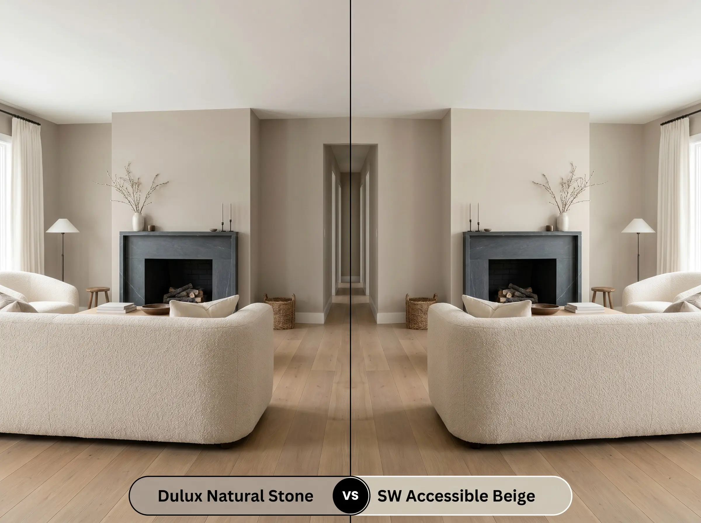
Accessible Beige is a legendary neutral, but it leans much closer to a true yellow-based beige than a grey. If you want a space that feels definitively warm and traditional, Accessible Beige is a fantastic anchor. If, instead, you want a more modern, complex color that dances between grey and mushroom depending on the hour, stick with the Dulux greige.
Exploring Alternatives: Similar Colors & Cross-Brand Matches
If you love the general vibe of this paint but need a slight adjustment in depth or are restricted by the brands available at your local hardware store, consider these alternatives.
Similar Colors from the Same Brand:
Cross-Brand Matches:
From Swatch to Surface: Application Secrets for the Dulux Greige
Transitioning from a tiny paper swatch to a fully painted room requires a practical understanding of how this specific pigment behaves on a roller.
The Dynamic Sheen Guide:
When preparing your walls, a standard white primer is usually sufficient, though a slightly tinted grey primer can help you achieve full opacity faster. Because it sits at an LRV of 41, it typically requires two full, generous coats for a flawless, professional-looking finish. Be mindful of “flashing”—visible, uneven roller marks that occur if you press too hard or stretch the paint too thin. Keep a wet edge on your roller and let the paint level itself naturally to ensure that beautiful, seamless mid-tone depth.
Frequently Asked Questions
Because direct exterior sunlight amplifies its red-orange undertones, it can occasionally flash a subtle pinkish-taupe on highly textured render. To counteract this, pair it with crisp, cool white exterior trims to help ground the color and pull the grey base back into focus.
An LRV of 41 means the paint absorbs more light than it reflects, which can make a windowless hallway feel quite heavy or enclosed. If you use it in these spaces, it is crucial to implement layered artificial lighting—like warm-toned wall sconces—to keep the earthy chromatic profile glowing rather than looking flat.
Pairing a taupe-based greige with heavily yellow or orange-toned timber floors can be risky, as the clashing undertones may make the paint look muddy or overly purple. It performs much better alongside desaturated, pale woods like white oak, or deeply rich, cool-toned walnut.
High-kelvin bulbs (4000K and above) will aggressively strip away the beautiful mushroom warmth of this paint. Under cool lighting, the earthy cast flattens out, leaving you with a much starker, colder grey that loses its cozy appeal.
The Final Verdict: Is This Stone-Inspired Cast Right for You?
Dulux Natural Stone is an absolute triumph for homeowners who want to bridge the gap between cool, modern minimalism and warm, lived-in comfort. Its perfect mid-tone depth and complex mushroom undertones make it the ultimate foundational color for Organic Modern, Japandi, and Transitional spaces. If you are ready to move away from sterile whites and embrace a color that adds genuine architectural weight and tactile warmth to your home, this greige is an exceptional choice.
However, recognizing when a color will fight against your home’s existing architecture is the key to premium design. If your home is currently filled with heavily yellow-toned timber floors, honey-oak cabinetry, or distinctly cool, blue-toned grey fixed elements (like early 2000s granite countertops), this paint will struggle to find its footing. The warm taupe nuances will actively clash with stark yellow or blue tones, often resulting in a muddy, confused aesthetic. It requires a curated environment of soft whites, natural stones, and desaturated woods to truly shine.