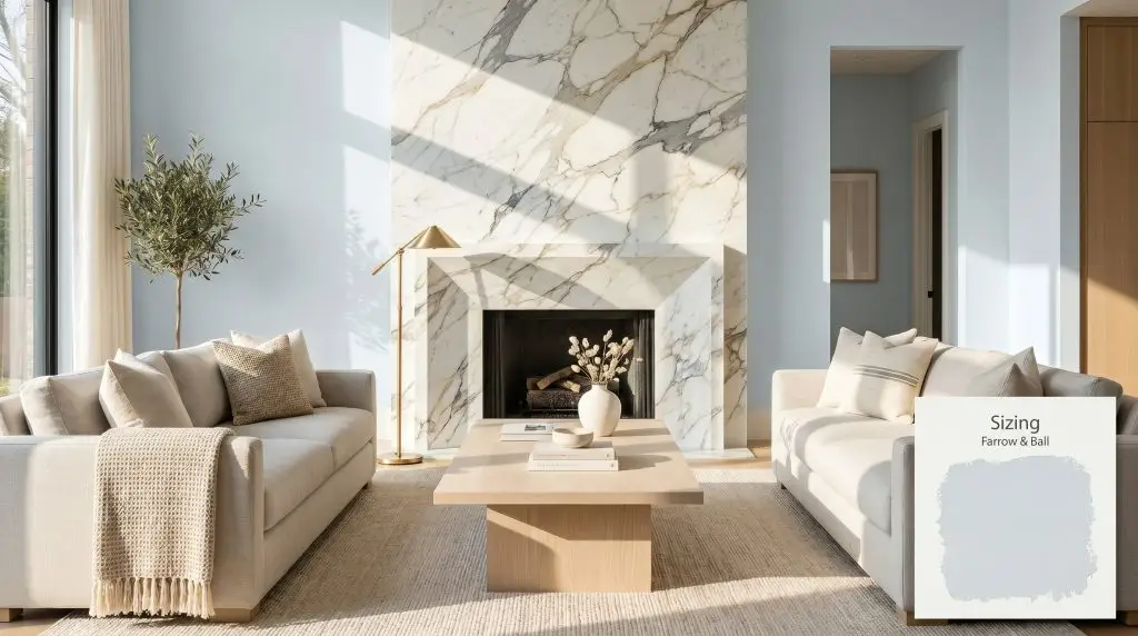
Sizing No. 314
Farrow & BallFarrow & Ball's Sizing No. 314 is a crisp, light neutral with distinctive blue and pale periwinkle undertones. Inspired by traditional starch, this airy hue boasts an LRV of 78, making it an excellent choice for brightening spaces while maintaining a sophisticated, cool-toned depth.
Paint Technical Profile
| Color ID / SKU | No. 314 |
| HEX Code | #dfe6ea |
| Light Reflectance (LRV) | 78 |
| Use | Interior, Exterior |
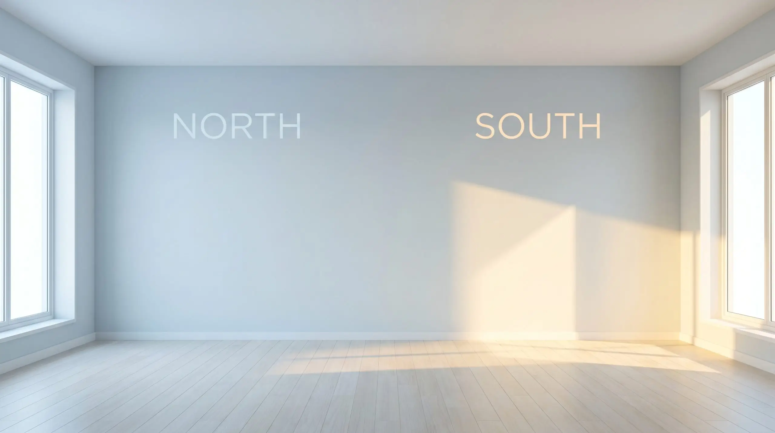
| Best Exposures | South, East |
| Best For | Bathrooms, Bedrooms, Utility Spaces, Cabinetry |
Farrow & Ball Sizing No. 314: The Crisp, Starch-Inspired Neutral Redefining Modern Interiors
Finding a clean neutral that doesn’t feel painfully stark or uncomfortably sterile is one of the most common challenges in interior design. Farrow & Ball Sizing emerges as a brilliant solution, offering a starch-inspired hue that brings an immediate sense of tailored elegance to any space. Originally introduced as part of the highly curated Carte Blanche collection, this color structure offers far more visual intrigue than a standard builder-grade gray.
The beauty of this specific pigment lies in its quiet complexity. It establishes a crisp, refined backdrop while carrying a subtle, atmospheric chill that feels incredibly sophisticated. When you roll this onto a wall, you are not just neutralizing a room; you are giving it a distinct, curated identity.
Farrow & Ball Sizing No. 314: Undertones & LRV
If you are wondering whether this shade leans warm or cool, it sits definitively on the cool side of the spectrum. Sizing is built upon a cool gray base, but it is the hidden notes within that dictate how it actually performs once applied.
With a light reflectance value (LRV) of 78, this tint acts as a highly effective mirror for ambient light. It bounces illumination beautifully around a room, making tight corners feel instantly more expansive. However, you must be mindful of its reflective power; in blindingly bright exterior sunlight, that delicate periwinkle DNA can easily wash out, leaving you with a brilliant, almost chalky off-white facade.
Lighting Effects & The Chameleon Factor
Because of its complex pigment profile, this Farrow & Ball creation shifts dramatically depending on the time of day and the temperature of your light bulbs.
Architectural Placements for This Crisp Neutral
The true value of this crisp neutral is its ability to adapt its personality based on the architectural features it highlights. By manipulating the surrounding textures and lighting, you can guide this shade to fit entirely different aesthetic narratives.
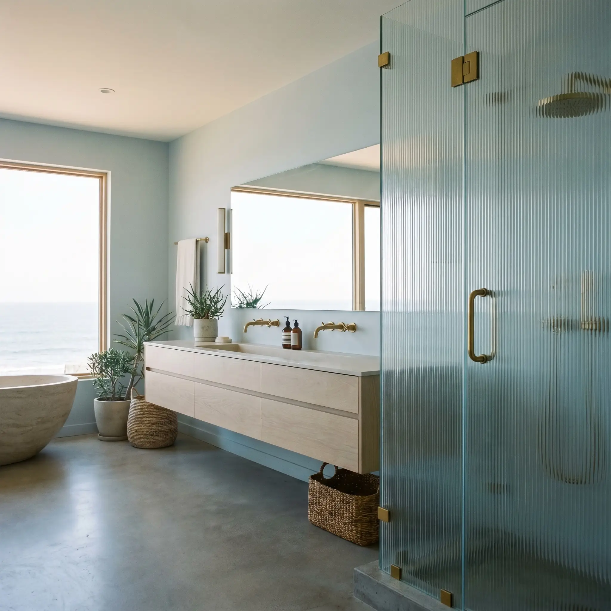
Spa-Centric Bathrooms
In a bathroom setting, the pale periwinkle undertones create an immediate sense of calm, perfectly suited for a Coastal Modern or Soft Minimalism aesthetic. Pair it with fluted glass shower enclosures and pale white oak floating vanities to enhance the airy, expansive feeling. To prevent the cool gray base from feeling too chilly, introduce warm, organic textures like Tadelakt plaster accents or woven jute bath runners.
When using cool-toned grays in a bathroom, always specify unlacquered brass or polished nickel plumbing fixtures. The warmth of the metal counteracts the icy undertones, creating a beautifully balanced, high-end sanctuary.
Hackrea Design Secret (The Temperature Balance)
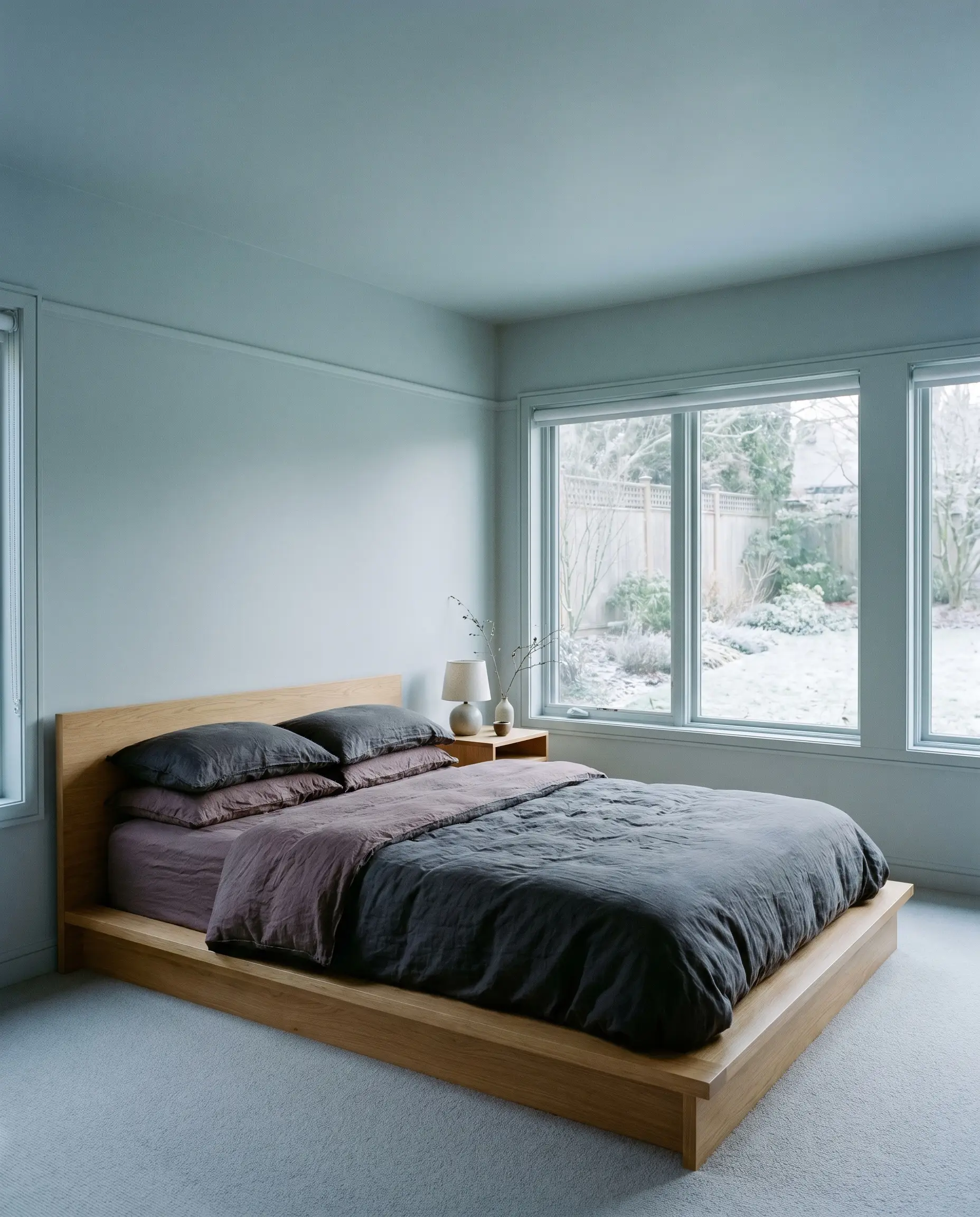
North-Facing Guest Bedrooms
North-facing light naturally pulls the blue forward, making this an excellent candidate for a serene, Japandi-inspired retreat. Lean into the color’s inherent coolness by layering the bed with tumbled linen sheets in soft charcoal and muted plum. You can color-drench the entire room—painting the walls, trim, and ceiling in the same Estate Emulsion finish—to create a seamless, immersive environment that feels incredibly intentional.
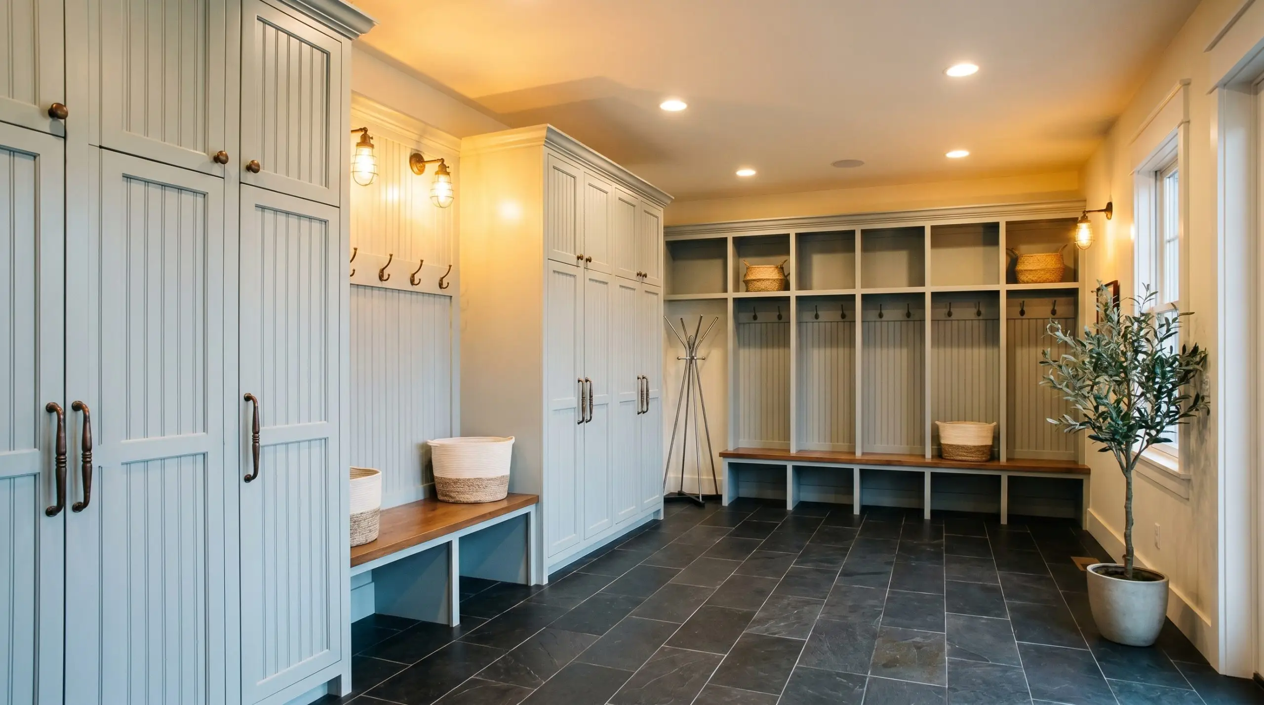
Utilitarian Spaces: Laundry & Mudrooms
Utilitarian spaces often lack natural light, which allows the soft gray qualities of No. 314 to shine without becoming overly vibrant. Use it on built-in mudroom lockers or beadboard paneling to establish a crisp, clean baseline that feels far more custom than standard white. Contrast the airy walls with durable, tactile materials like slate floor tiles or patinated bronze cabinet hardware for a Warm Industrial edge.
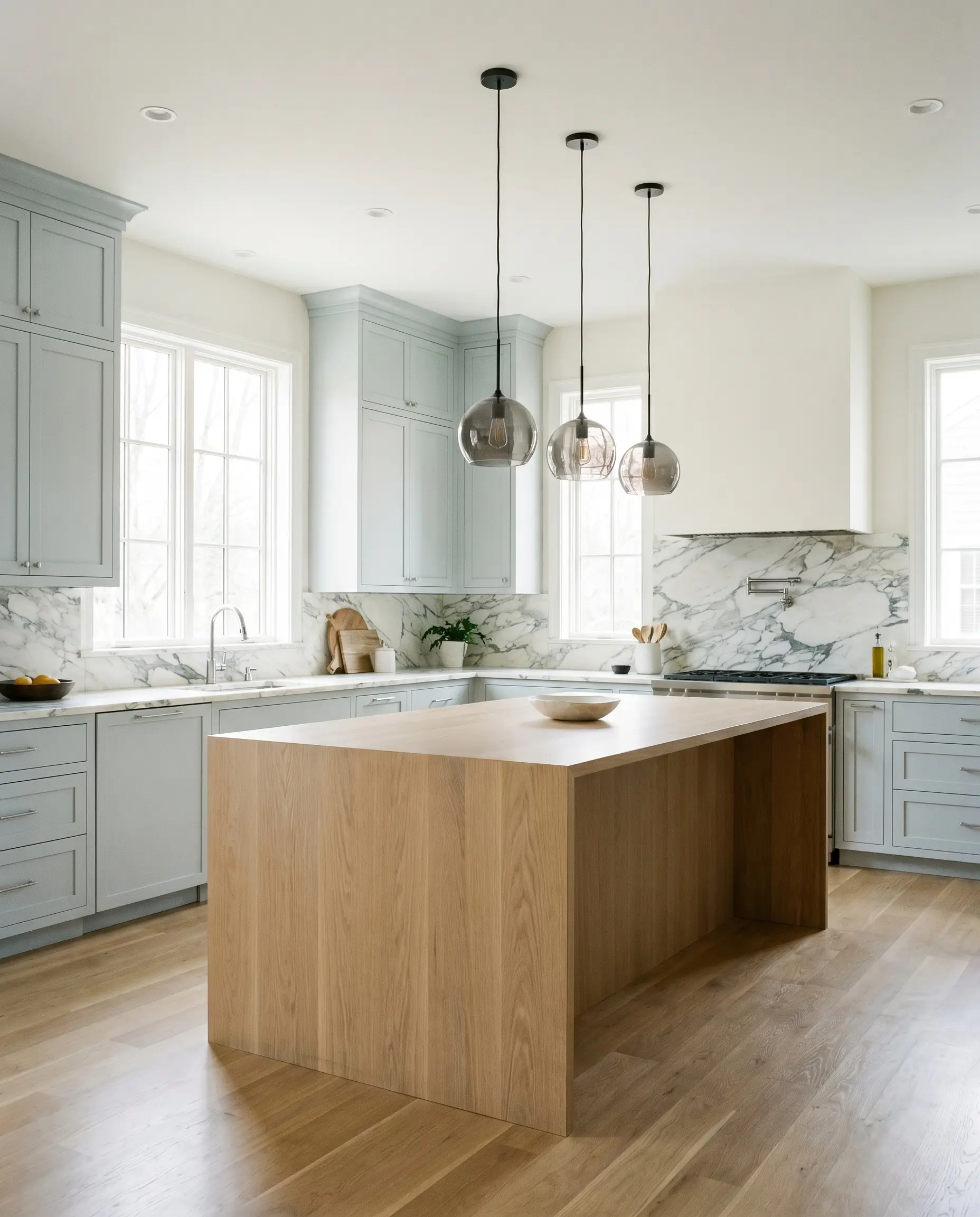
Kitchen Cabinetry
Applying this starch-inspired hue to kitchen cabinetry offers a brilliant alternative to the ubiquitous stark white kitchen. It provides enough tonal depth to hide minor smudges while maintaining a beautifully bright, Transitional aesthetic. Pair the painted cabinets with heavily veined Calacatta marble countertops and smoked glass pendant lights to elevate the entire culinary space.
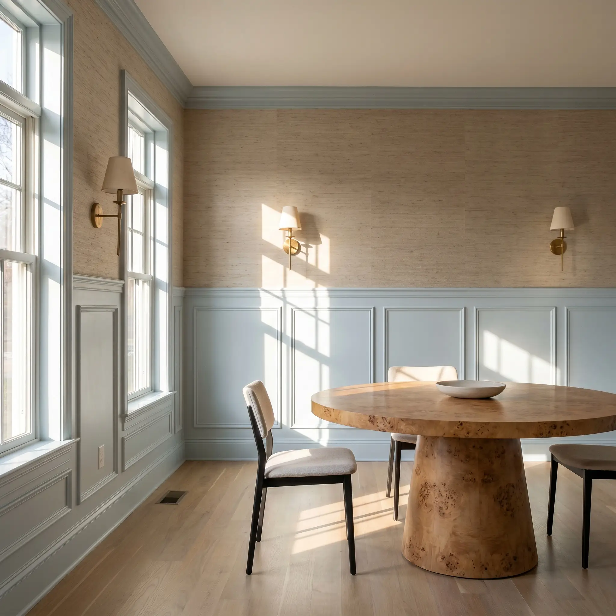
Beadboard and Wainscoting Accents
When used on lower-wall architectural features, this shade defines the room’s boundaries with tailored precision. It works beautifully in a Parisian Chic dining room when applied to picture molding or wainscoting, especially when paired with a highly textured grasscloth wallpaper above. The contrast between the smooth architectural finish of the paint and the nubby weave of the paper creates a stunning visual dialogue.
Coordinating Colors & Material Pairings for Sizing
The secret to integrating this shade successfully lies in understanding its relational boundaries. It requires thoughtful contrasting elements to either pull out its hidden warmth or lean into its sophisticated chill.
Trim & Baseboards
To maintain the crisp, tailored edge of this color, you need a trim paint that offers brilliant contrast without introducing conflicting yellow undertones. Benjamin Moore Chantilly Lace is an exceptional choice, as its near-zero undertone profile creates a sharp, clean boundary that makes the wall color pop. For an equally stunning result, Sherwin-Williams High Reflective White provides a luminous, icy frame that beautifully enhances the pale periwinkle notes.
Hardware, Wood & Material Pairings
Coordinating Colors
Designer Mood Boards
Morning Frost & Polished Stone
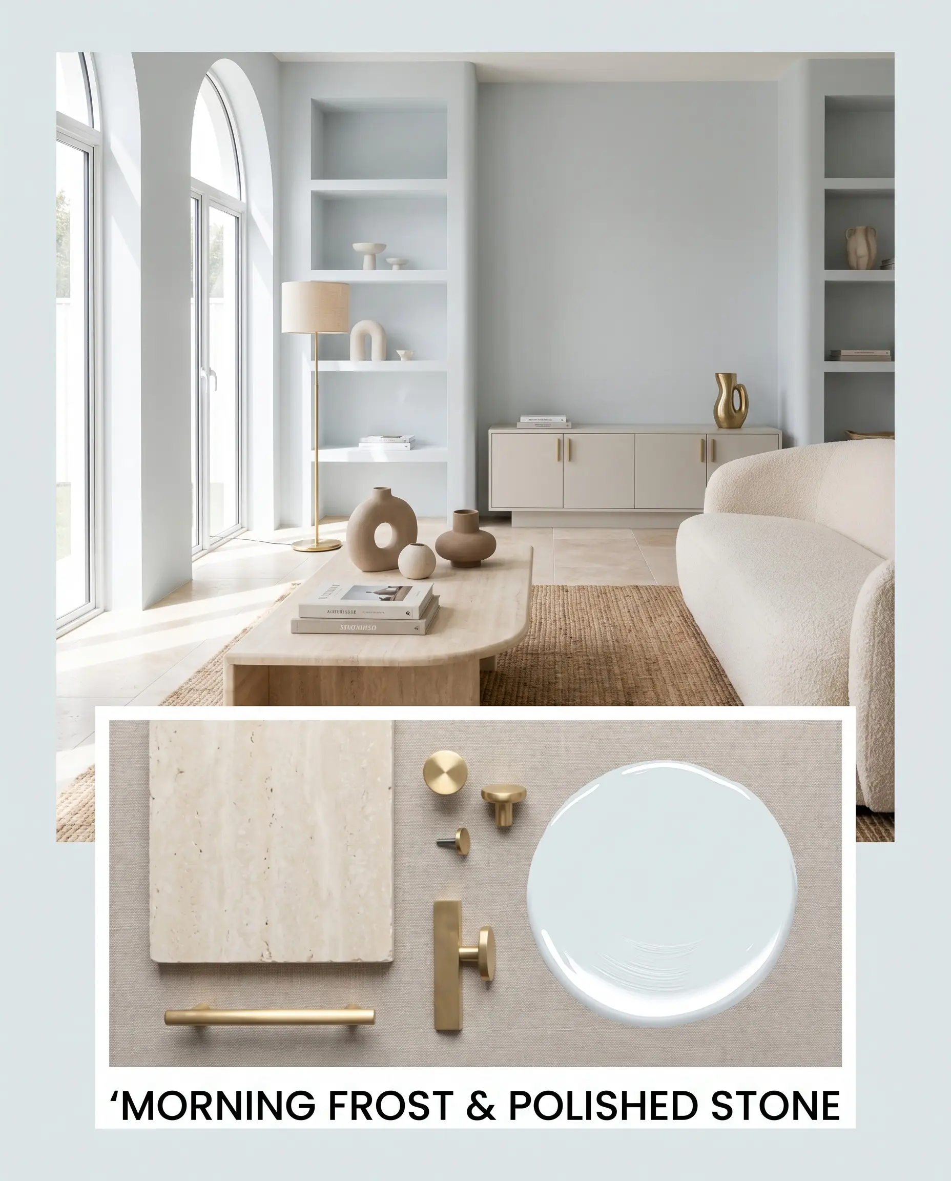
This aesthetic pathway leans entirely into a serene, Soft Minimalism vibe. The walls establish a crisp, airy baseline that is beautifully complemented by honed travertine surfaces and minimalist, organic-shaped ceramics. Accents of unlacquered brass add just enough visual heat to keep the cool gray base from feeling institutional.
Heritage Navy & Crisp Linen
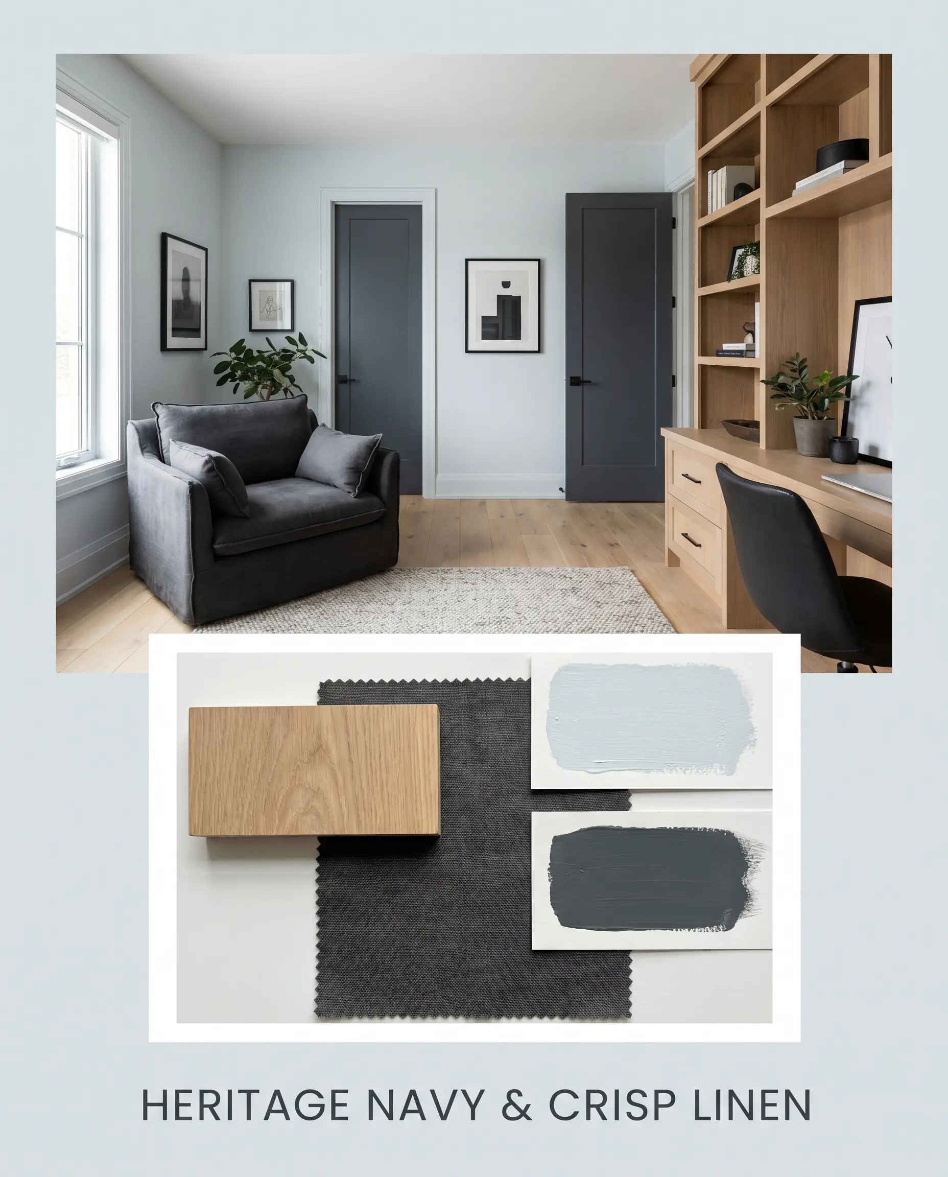
For a more Transitional, tailored approach, this palette relies on deep, stabilizing contrasts. Introducing Benjamin Moore Hale Navy on interior doors or built-in shelving provides a profound depth that centers the highly reflective wall color. Layering the space with charcoal tumbled linen and warm white oak floors creates a beautifully balanced, deeply inviting atmosphere.
Plum Shadows & Pale Light
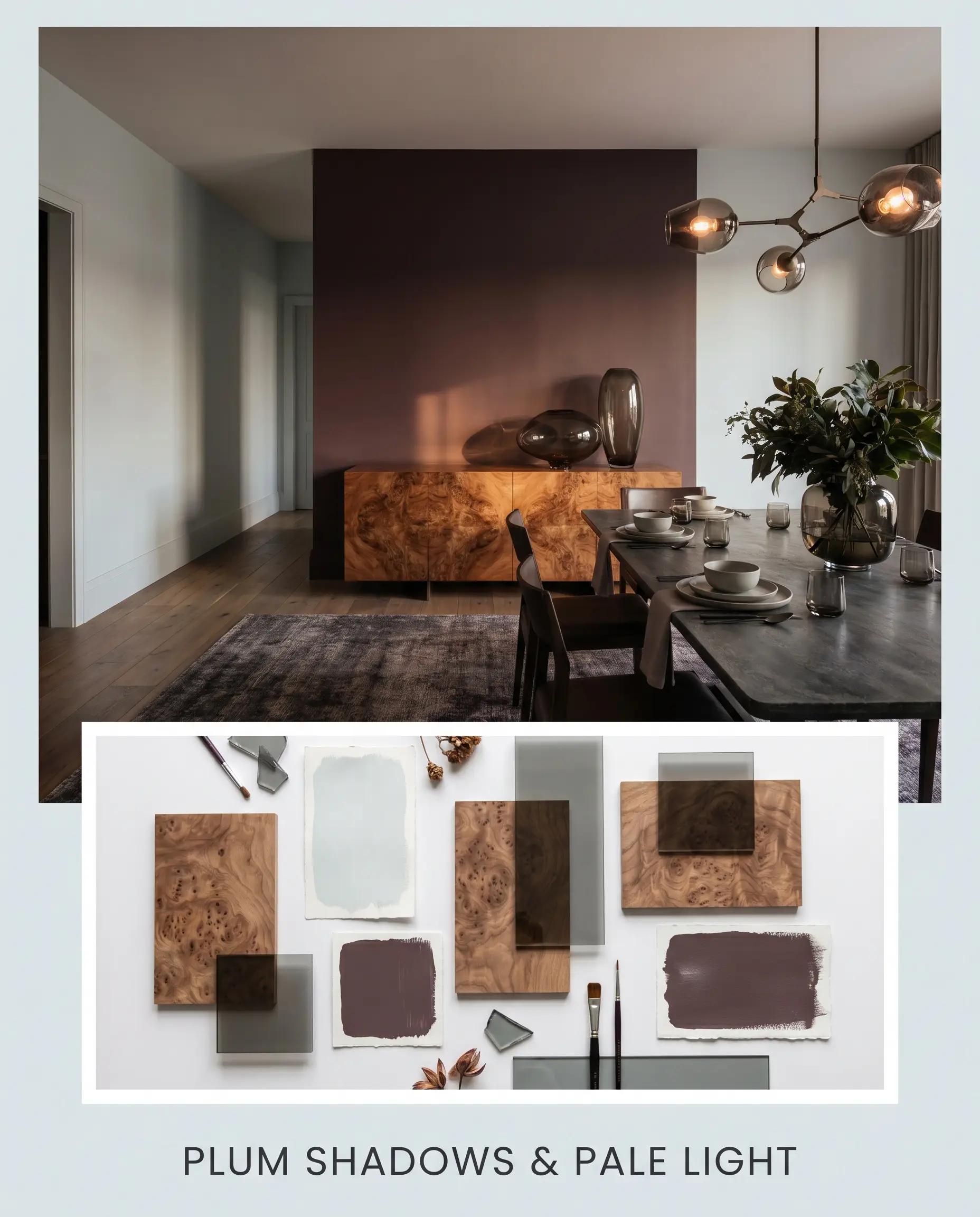
This highly bespoke, slightly avant-garde combination uses Farrow & Ball Brinjal as a dramatic counterweight. The rich, saturated plum tones draw out the hidden periwinkle cast in the main paint, creating a sophisticated tension. Incorporating smoked glass accents and a burl wood statement piece completes this luxurious, moody narrative.
Head-to-Head Paint Comparisons
Sometimes the subtle nuances of a color only become clear when placed directly next to its closest rivals. Understanding these minor shifts is crucial for making a confident final selection.
Farrow & Ball Sizing vs. Farrow & Ball Borrowed Light
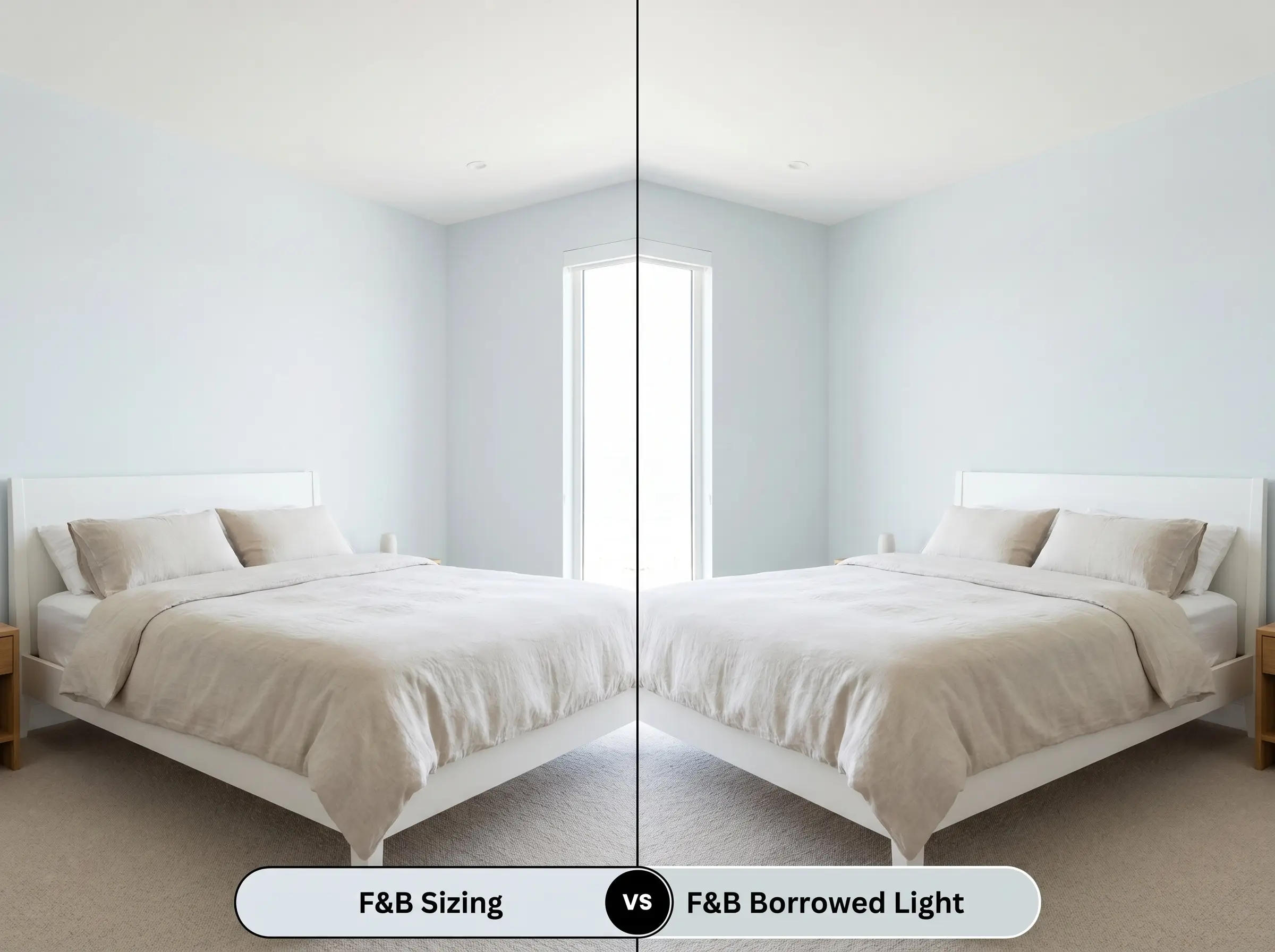
Borrowed Light is a much more literal, traditional pale blue, lacking the gray neutralizing base found in Sizing. If your room receives intense southern light that washes out subtle undertones, Borrowed Light will maintain its blue identity far better. However, if you want a sophisticated neutral that only hints at blue, No. 314 is the superior choice.
Farrow & Ball Sizing vs. Benjamin Moore Marilyn’s Dress
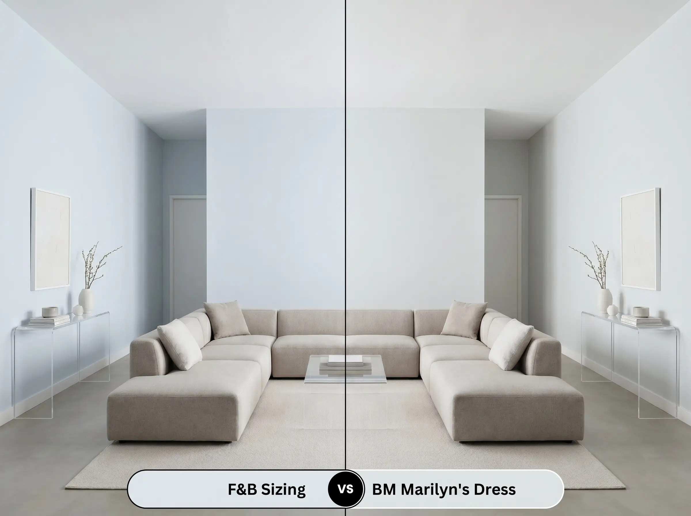
Marilyn’s Dress shares a very similar LRV but leans slightly cooler and icier in its gray profile. Sizing carries a touch more of that complex, starch-like softness, making it feel slightly more organic on the wall. Choose Marilyn’s Dress for a sharp, ultra-modern interior, and opt for the Farrow & Ball tint when you want a slightly more atmospheric, nuanced finish.
Farrow & Ball Sizing vs. Farrow & Ball Skylight
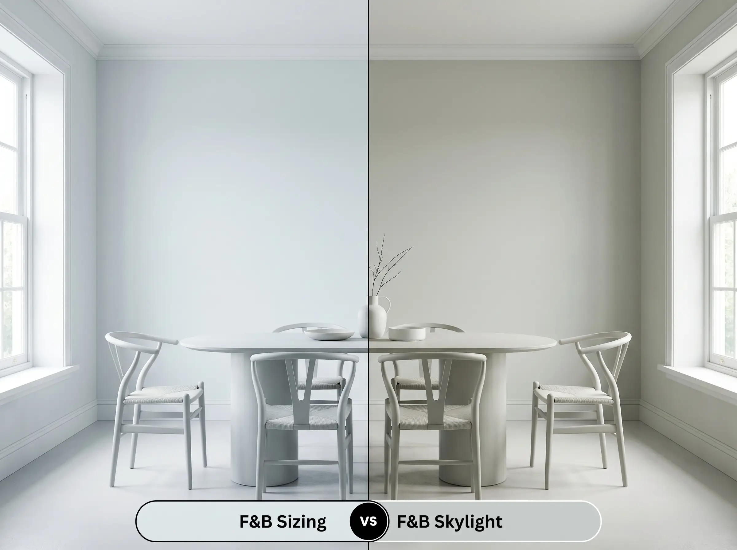
Skylight is noticeably deeper and carries a distinct green-blue undertone that Sizing completely lacks. If you are working with a heavily shaded room and want a color that asserts itself boldly, Skylight provides more visual weight. No. 314, by contrast, is much better suited for homeowners who want their walls to feel expansive, light-reflective, and undeniably crisp.
Similar Colors & Cross-Brand Matches
If you love the general profile of this hue but need to tweak the brightness or source an alternative brand, there are several excellent options available.
Same-Brand Alternatives
Cross-Brand Equivalents
Application Strategies for No. 314
Transitioning from color theory to the physical reality of painting requires an understanding of how finishes and prep work dictate the final result.
Frequently Asked Questions
Because it lacks natural light to neutralize its base, the pale periwinkle undertone will become much more prominent in a windowless space. To prevent it from reading as purple, ensure your vanity lighting utilizes crisp 3000K to 4000K bulbs, which will pull the color back toward a clean, cool gray.
In consistently cloudy or overcast environments, the cool gray base will dominate, often making the exterior look a bit icy. It performs beautifully on modern facades, but you must pair it with warm architectural elements like natural cedar siding or copper gutters to keep the exterior from feeling unwelcoming.
Absolutely, provided you manage the surrounding finishes. The key is to pair the painted cabinetry with highly sophisticated, mature materials like heavily veined marble, unlacquered brass hardware, and rich, dark hardwood floors to elevate the aesthetic far beyond a juvenile pastel.
Yes, the Dead Flat finish absorbs light so completely that it tends to deepen the perceived color slightly, making the periwinkle undertone feel a bit more muted and moody. Estate Emulsion, while still matte, has a microscopic chalky texture that scatters light, making the blue notes feel slightly more airy and pronounced.
Final Verdict & Curatorial Warnings
Farrow & Ball Sizing No. 314 is a masterful, starch-inspired neutral perfect for homeowners who want a crisp, clean aesthetic without resorting to sterile builder-grade whites. Its highest and best use is in sun-drenched, south-facing rooms or sophisticated utilitarian spaces where its high light reflectance can create an expansive, airy atmosphere. It beautifully elevates Coastal Modern, Soft Minimalism, and Transitional design styles, especially when paired with high-end tactile materials like unlacquered brass and natural stone.
You must exercise extreme caution when pairing this color with heavily yellow-toned woods, such as aged golden oak or honey pine. The aggressively warm, orange-yellow cast of those materials will violently clash with the icy periwinkle undertones of the paint, making the walls look uncomfortably cold and the wood look dated. If you have existing warm wood floors or cabinetry that you cannot change, you are much better off selecting a neutral with a warmer, green-gray base to ensure a harmonious design.
Hackrea Pro-Tip (The Temperature Clash)