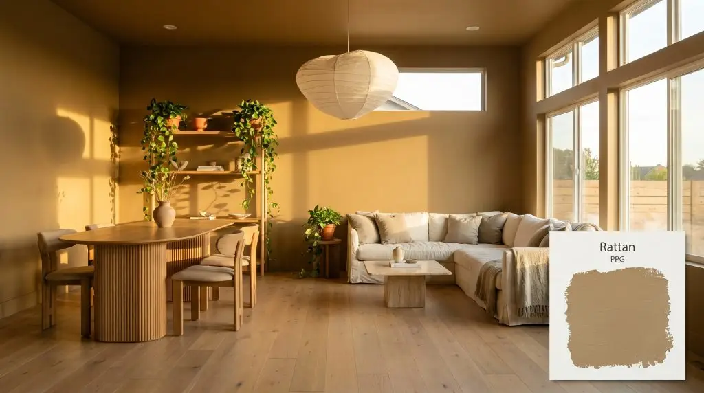
Rattan PPG1103-5
PPGPPG Rattan (PPG1103-5) is a saturated, earthy golden-yellow with subtle mossy-green undertones. With an LRV of 27, this mid-toned ochre brings grounded warmth and a cozy, organic richness to both interior accents and exterior siding.
Paint Technical Profile
| Color ID / SKU | PPG1103-5 |
| HEX Code | #a58e61 |
| Light Reflectance (LRV) | 27 |
| Use | Interior, Exterior |
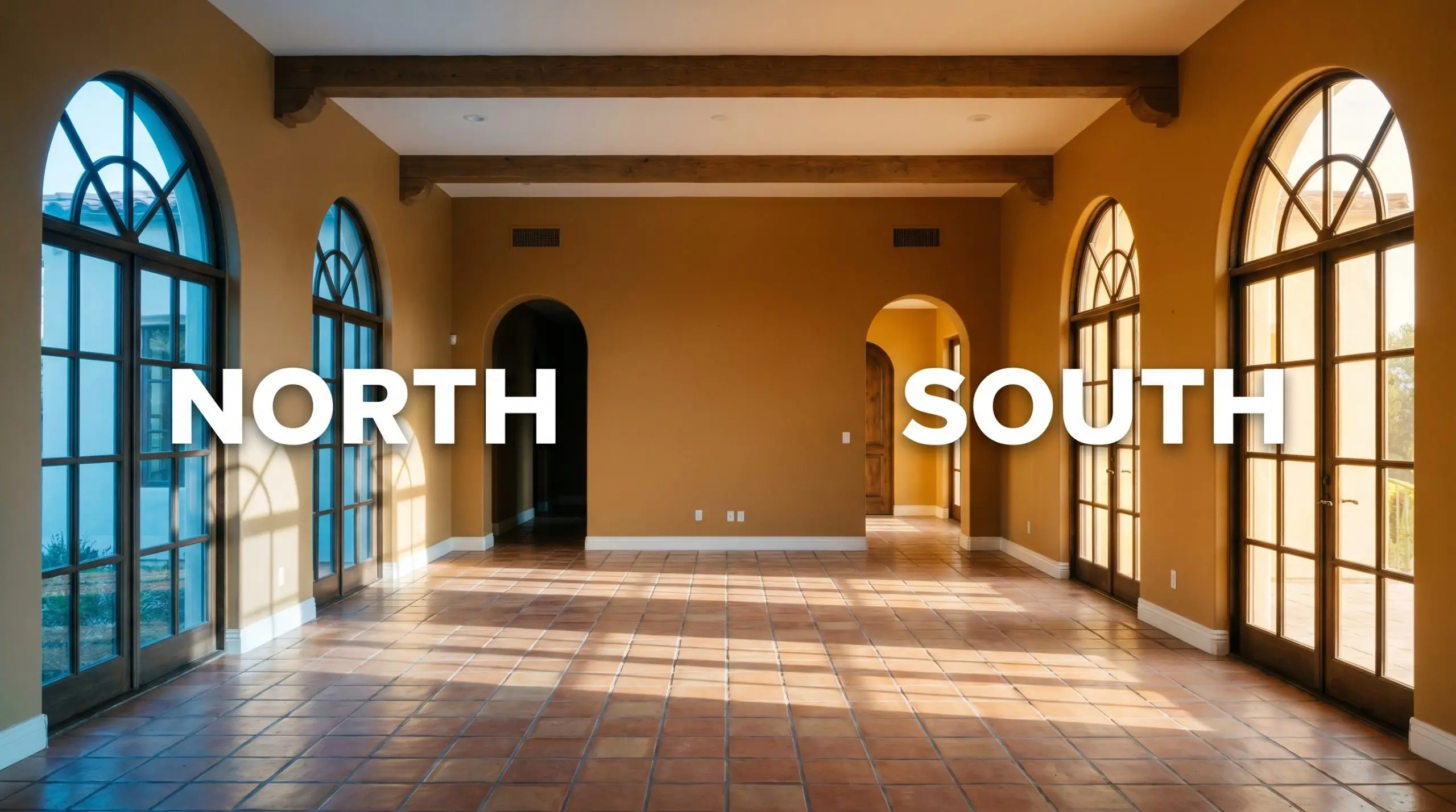
| Best Exposures | South, West |
| Best For | Dining Rooms, Home Offices, Cozy Living Spaces, Exterior Siding |
PPG Rattan PPG1103-5: The Golden Tan That Redefines Organic Modern Spaces
There is a notoriously fine line between a sophisticated, sunbaked tan and a muddy, uninspired brown. Finding a golden neutral that brings genuine warmth to a room without looking like a primary school classroom is one of the hardest challenges in interior design. Fortunately, PPG Rattan strikes that elusive balance beautifully.
This specific pigment steps away from stark, sterile neutrals and embraces a profound organic richness. It acts as a stabilizing force in a room, turning flat drywall into a surface that feels intentional and weighted. If you are looking to introduce an earthy yellow into your home, this shade offers a brilliant, foolproof foundation.
Understanding the Color Structure of PPG Rattan: Undertones & LRV
When evaluating its definitive temperature, PPG Rattan is unmistakably warm. It radiates a cozy, welcoming energy that instantly softens rigid architectural lines. To truly understand how this golden tan behaves on the wall, we have to look closely at its core pigment profile.
With a Light Reflectance Value (LRV) of 27, this shade absorbs a significant amount of light. It sits comfortably in the mid-to-dark range, meaning it carries substantial visual weight and will not wash out easily. This specific depth is exactly what gives the color its intimate, sophisticated atmosphere in a residential space.
Lighting Effects & The Chameleon Factor
Because of that hidden mossy undertone, this saturated mid-tone is highly reactive to its environment. The direction of your natural light will physically alter how the color is perceived throughout the day.
If you want to maintain the rich, sunbaked feel of this earthy yellow well into the evening, strictly avoid bulbs above 3000K. Cooler artificial lighting will instantly pull out the green undertones, making the walls feel murky rather than glowing.
Hackrea Pro-Tip (The Bulb Rule)
Architectural Placements for This Earthy Yellow
The true beauty of this color lies in its ability to manipulate the perceived scale and energy of a space. Rather than just acting as a passive background, this intense ochre actively shapes the mood of the room. Here is how to utilize its unique visual weight across different architectural zones.
Dining Rooms
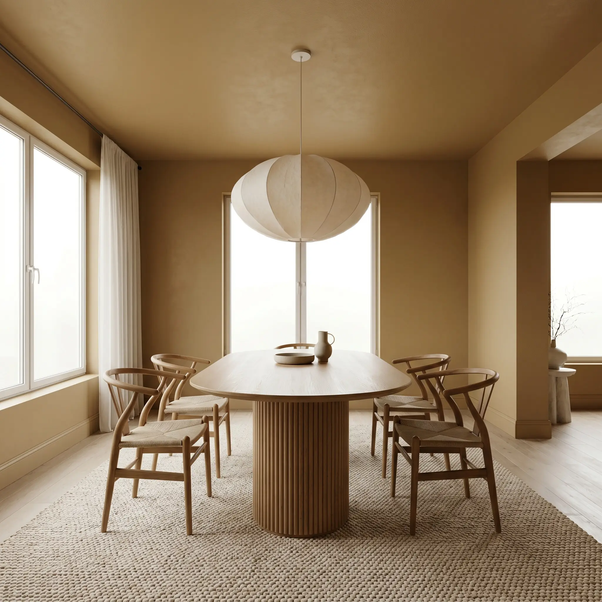
Instead of defaulting to formal, traditional wainscoting, use this rich tan to create an immersive Organic Modern dining experience. Color-drenching the entire room—including the ceiling and baseboards—wraps the space in a continuous, intimate glow. Pair this seamless application with a pedestal dining table in fluted oak and wishbone chairs to emphasize organic curves.
To elevate the sensory experience, introduce heavily textured textiles like stonewashed linen napkins and a large, nubby wool rug. The tactile nature of these materials interacts beautifully with the paint’s earthy structure. Finish the room with an oversized, sculptural paper pendant light to bounce a soft, diffused glow against the ochre walls.
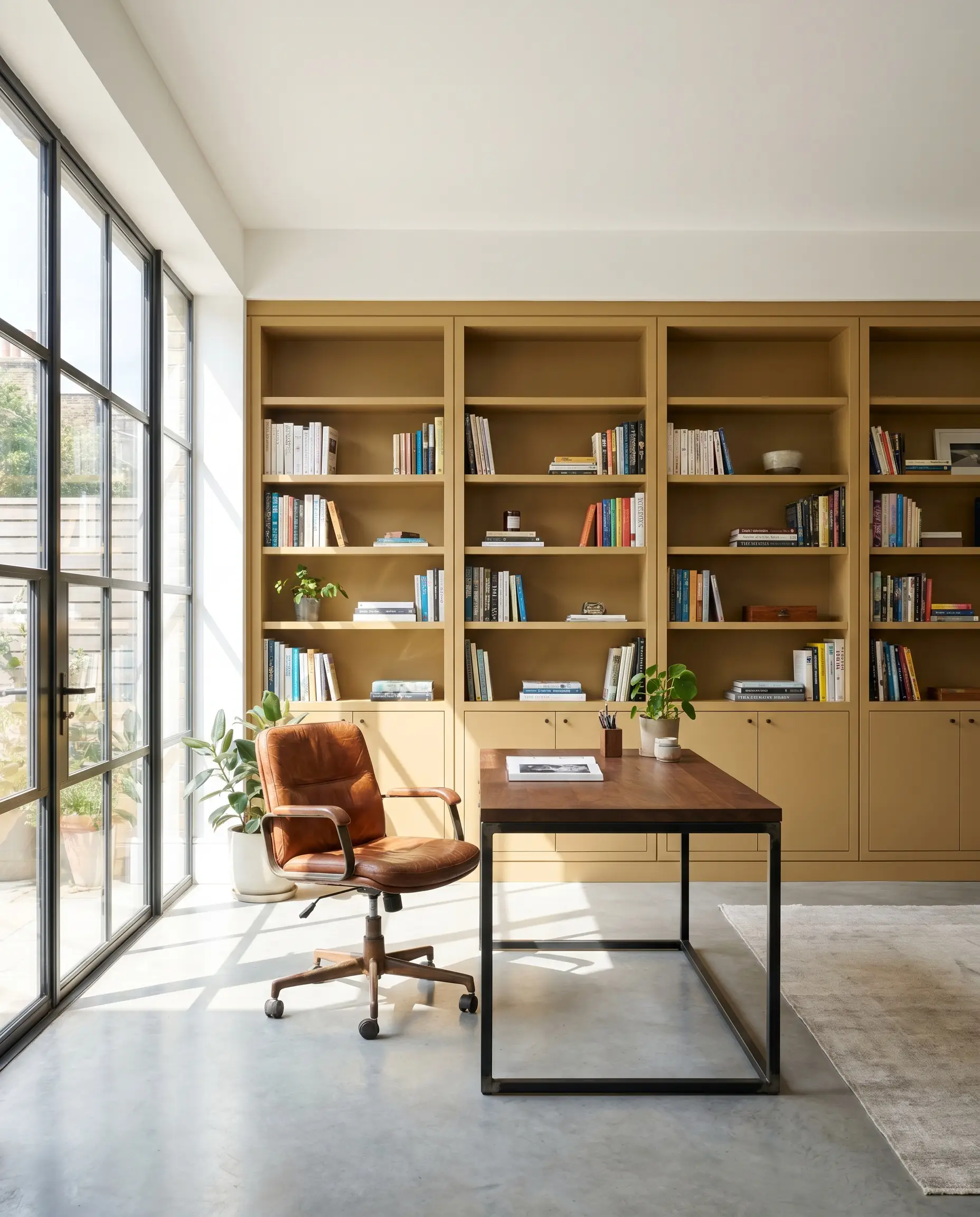
Home Offices
This shade is brilliant for a home office, particularly when styled with a Warm Industrial approach. The golden base stimulates creativity, while the mossy undertone keeps the environment centered and focused. Apply the paint to custom built-in bookcases or a prominent slat wall behind your desk to create a striking architectural focal point.
Contrast the warm walls with a blackened steel desk frame and a vintage saddle leather chair. The sleekness of the dark metal provides a necessary crisp boundary against the earthy paint. Add trailing pothos plants on floating shelves; the vibrant living greens will pull out the subtle mossy notes hidden in the paint’s DNA.
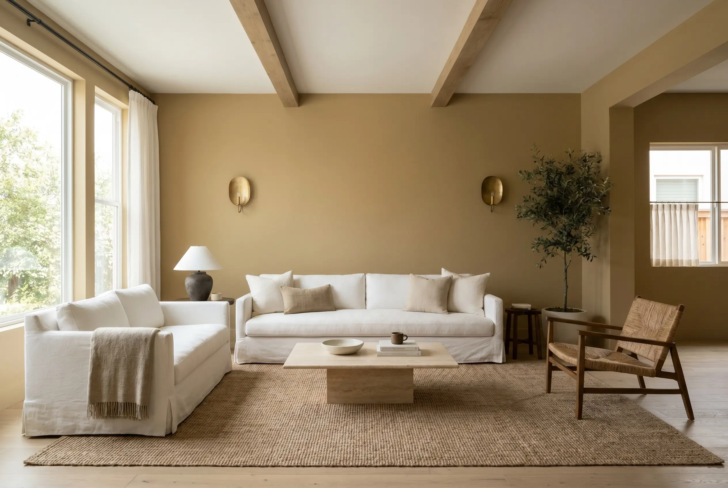
Cozy Living Rooms
In a living space, this color excels at creating a stabilizing, restorative atmosphere. It serves as a beautiful backdrop for California Casual styling, where relaxed, low-profile silhouettes take center stage. Paint the walls in a flat finish to maximize the velvety, light-absorbing qualities of the pigment.
Layer the room with a slipcovered sofa in sheer cotton and a plinth coffee table made of honed travertine. The porous, matte surface of the stone echoes the earthy nature of the walls perfectly. To prevent the room from feeling too weighted, incorporate unlacquered brass ambient sconces that will bounce warm pools of light around the space.
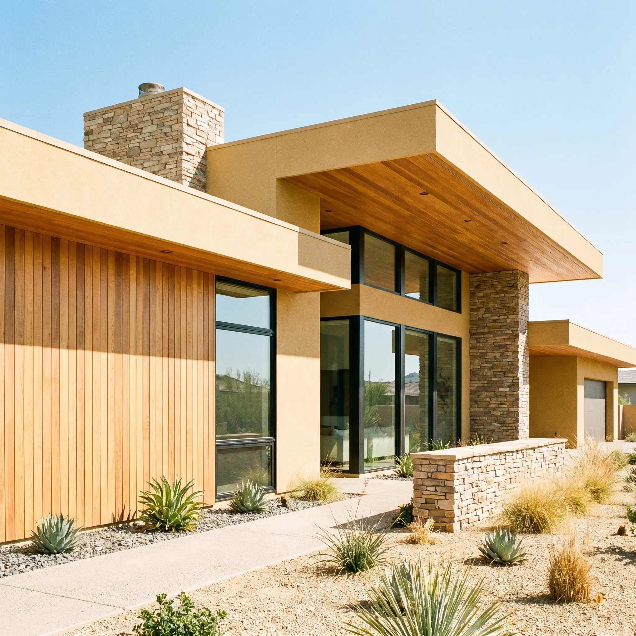
Exterior Siding
Taking this color outdoors requires a firm understanding of how direct sunlight strips away visual weight. On an exterior facade, the intense UV light will wash out a significant portion of its depth, making it read as a much softer, golden tan. It looks incredibly striking on Mid-Century Modern homes, especially when paired with natural stone accents or warm cedar soffits.
Be extremely careful using this exact shade on exterior siding if your home is nestled in a heavily wooded, deeply shaded lot. The constant canopy shadow will amplify the green-brown undertones, causing the house to blend too seamlessly into the surrounding foliage and lose its architectural definition.
Clash Warning (The Woodsy Washout)
Accent Cabinetry or Built-ins
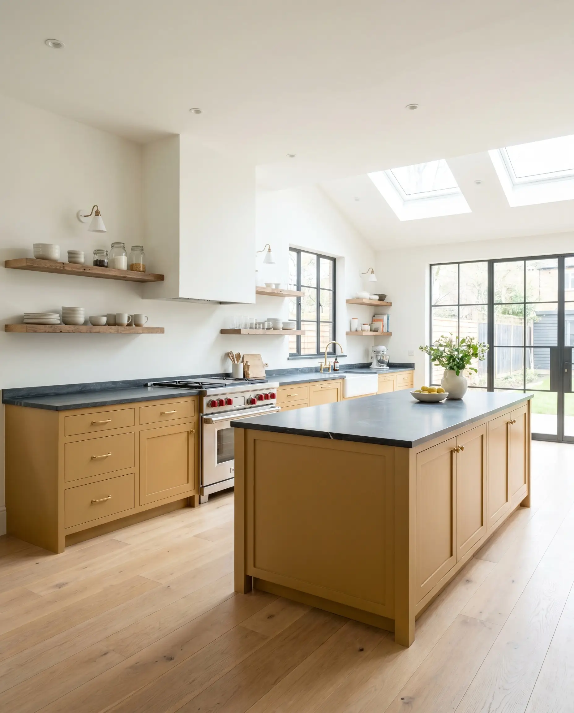
Using this ochre on cabinetry is a clever way to inject warmth into a kitchen without committing to fully colored walls. It works exceptionally well on lower cabinets or a central island, rooting the kitchen’s design while leaving the upper half of the room feeling airy. Pair the painted millwork with soapstone countertops; the cool, charcoal tones of the stone provide a stunning, sophisticated contrast to the golden wood tones.
Curating the Palette: Best Pairings for PPG Rattan
The secret to building a cohesive room around this saturated mid-tone is managing its relational behavior. Because it carries such a strong golden-green presence, it requires companions that either offer a crisp, clean boundary or share its muted, organic DNA.
Trim & Baseboards
To keep the room feeling tailored and intentional, you need a trim color that provides a soft but distinct contrast. Stark, brilliant whites will clash harshly against the earthy base, making the walls look dirty by comparison.
Hardware, Wood & Material Pairings
The materials you introduce will dictate whether this paint leans toward a refined, modern aesthetic or a rustic, textural one. Focus on elements that interact directly with the paint’s light-absorbing qualities.
Coordinating Colors
When building a broader color story, look for secondary shades that share a similar muted quality.
Designer Mood Boards
To truly harness the power of this color, you must view it as just one layer in a comprehensive textural story. Here is how these individual elements come together to create distinct, immersive atmospheres.
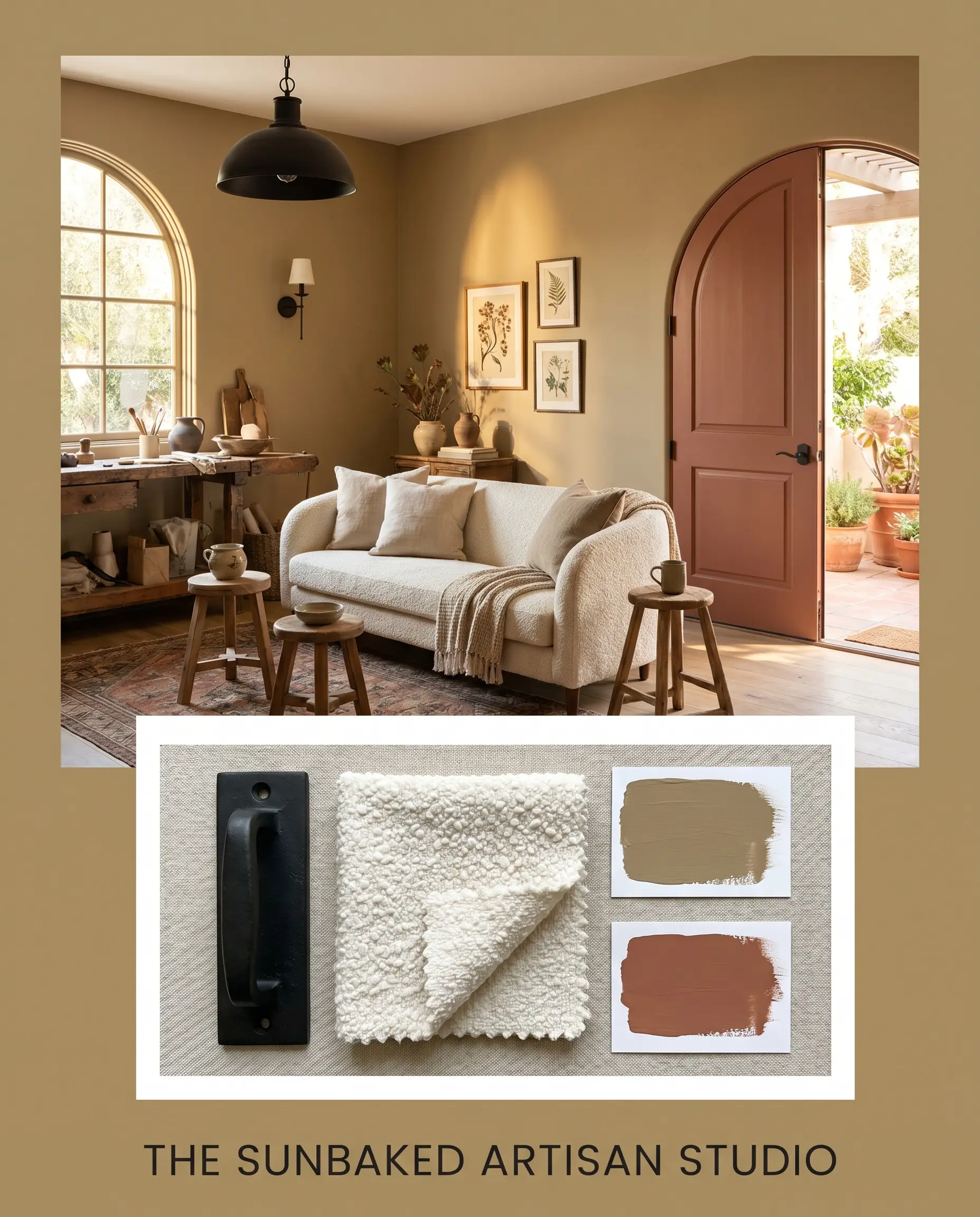
The Sunbaked Artisan Studio This palette relies on the natural friction between warm, earthy tones and crisp, industrial lines. The golden tan walls serve as the foundation, paired beautifully with accents in Audubon Russet to enhance the feeling of a sun-drenched Mediterranean afternoon. Matte black iron lighting fixtures cut through the warmth, while a plush ivory bouclé sofa ensures the overall vibe remains incredibly inviting and soft.
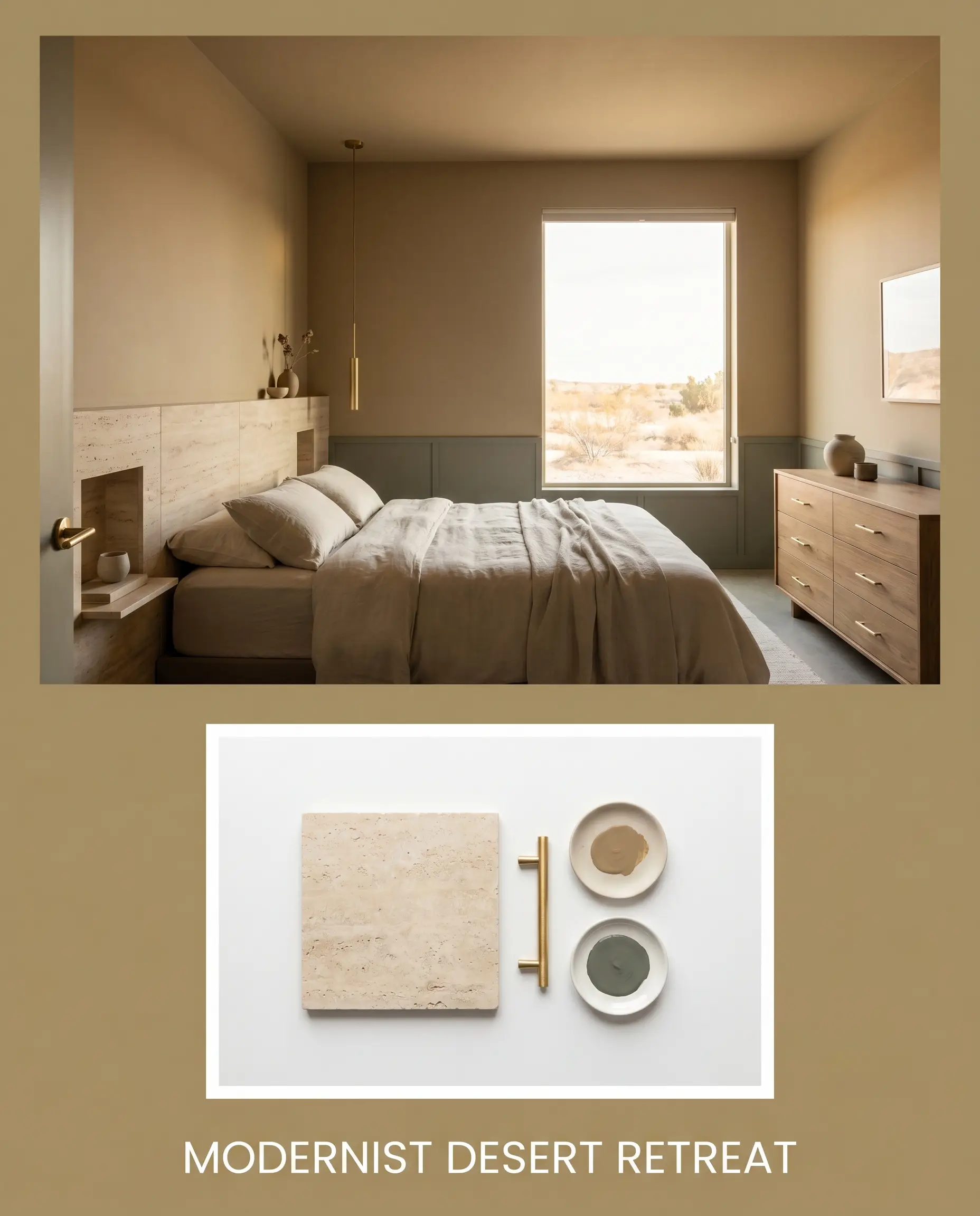
Modernist Desert Retreat Focusing on the paint’s subtle green shadows, this aesthetic leans heavily into Organic Modernism. By introducing secondary elements painted in Green Smoke, the palette immediately feels cooler and more complex. Honed travertine surfaces and raw, unlacquered brass hardware bounce soft, diffused light around the space, creating an environment that feels deeply restorative and effortlessly curated.
Deciding Between Golden Neutrals: Head-to-Head Comparisons
Sometimes a color looks perfect on a swatch but fails to perform in your specific lighting conditions. If your room lacks the right natural exposure, you may need to pivot to a slightly different pigment structure. Here is how this shade stacks up against its closest competitors.
PPG Rattan PPG1103-5 vs. Sherwin-Williams Burlap SW 6137
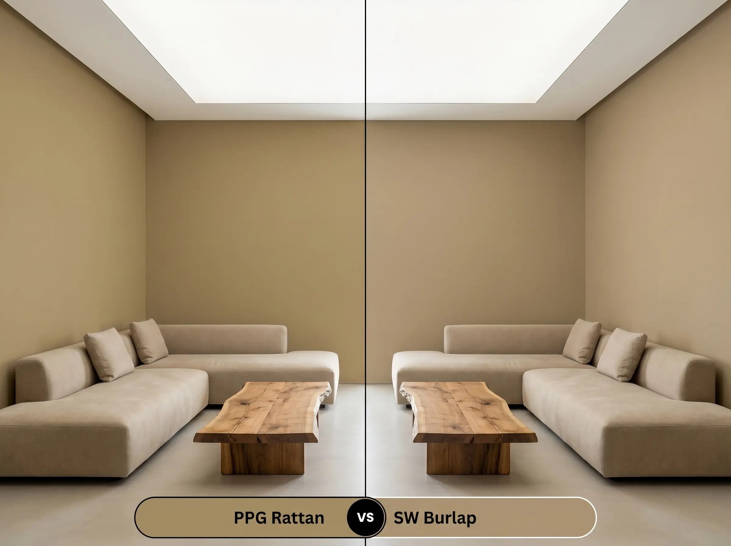
While both are earthy neutrals, they behave very differently on the wall. Sherwin-Williams Burlap leans much further into a true, neutral tan, stripping away the vibrant ochre energy found in the PPG option. If your room already receives intense, warm southern light and you fear an ochre will become too yellow, Burlap is the safer, more subdued choice.
PPG Rattan PPG1103-5 vs. Benjamin Moore Chestertown Buff HC-9
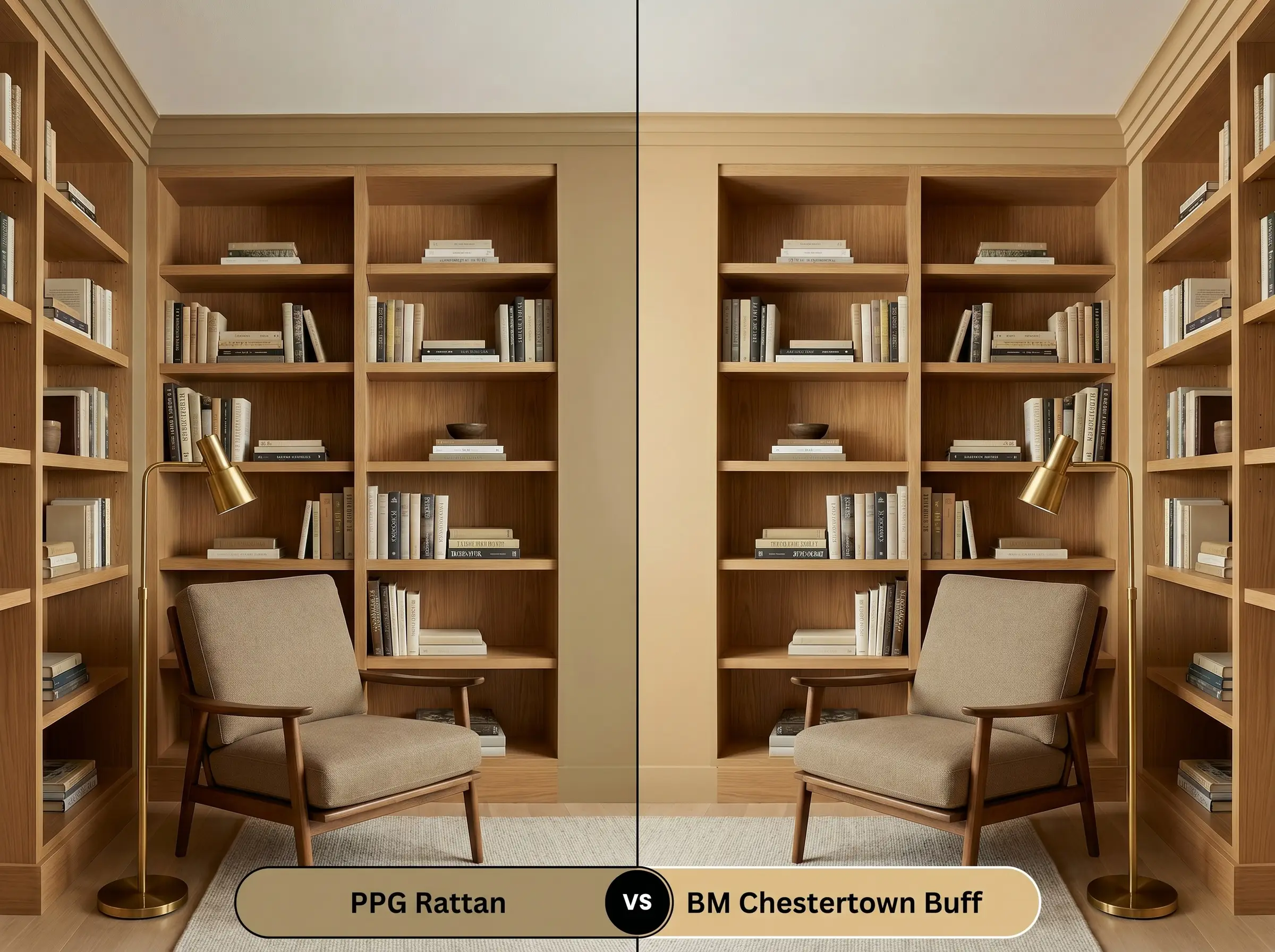
This is a battle of chromatic intensity. Chestertown Buff is significantly brighter and more saturated, presenting as a much more traditional, historic yellow. If you want a deeply muted, organic shade that feels modern and architectural, stick with the PPG1103-5; if you want a cheerful, undeniable yellow for a classic heritage space, pivot to Benjamin Moore.
Exploring Alternatives to PPG1103-5
Whether you need a slight shift in depth for a dark hallway or you are shopping across different manufacturers, having reliable alternatives is crucial. Here are the closest matches based on core pigment profiles.
Similar Colors from the Same Brand
Cross-Brand Matches
Executing the Perfect Finish: Practical Application Advice
Translating a beautiful color from a swatch to your walls requires strategic planning. The physical finish you choose will dramatically impact how this intense mid-tone is perceived in your home.
Because this color has a relatively low light reflectance, it requires a solid, even foundation to prevent the old wall color from bleeding through. A high-quality, tinted primer is highly recommended to ensure the golden and green pigments render accurately.
Saturated mid-tones are notoriously unforgiving when it comes to “flashing”—those visible, uneven roller marks that appear when the paint dries at different rates. To avoid this, always maintain a wet edge while rolling, work in small sections, and never press the roller completely dry against the wall.
Hackrea Pro-Tip (The Rolling Technique)
Frequently Asked Questions
Because of its hidden mossy undertone, applying this shade in a deeply shaded, wooded environment will pull those green-brown notes forward. It can cause the home to blend too seamlessly into the surrounding foliage, losing its distinct architectural definition.
Yes, without the balancing effect of natural daylight, the earthy green shadow becomes much more noticeable. In windowless spaces, you must rely on warm artificial lighting (around 2700K) to force the golden warmth back to the surface.
While highly versatile, it truly excels in Organic Modern, Mid-Century Modern, and Mediterranean Revival spaces. The rich, sunbaked pigment perfectly complements the natural materials and textured surfaces commonly found in these styles.
It requires careful balancing. The intense, earthy warmth of the cabinets can clash with stark, cool-toned white marbles, making the stone look icy. It pairs much better with warmer stones like soapstone, honed travertine, or heavily veined, creamy marbles.
The Final Verdict & Expert Warnings
PPG Rattan is an incredibly sophisticated, stabilizing color that elevates a home far beyond standard builder-grade neutrals. It is perfect for the homeowner who wants to introduce genuine, organic warmth into their space without crossing into the territory of bright, overwhelming yellows. Its greatest strength is its ability to make a room feel instantly curated, working brilliantly in textural, Organic Modern living spaces, cozy creative offices, and striking accent cabinetry.
However, this earthy ochre is not universally flawless. If your home features exclusively cool-toned finishes—like stark gray luxury vinyl plank flooring, icy white glass tiles, or brilliant blue-white trim—this paint will actively fight against your architecture. The warm, mossy golden base will make those cool grays look incredibly sterile, while the cool floors will make the paint feel murky and confused. To succeed with this color, you must fully commit to a warm, relational palette that honors its sunbaked, organic roots.