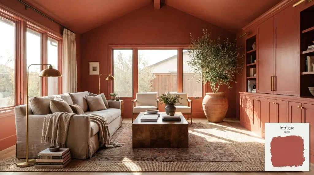
Intrigue P160-6
BehrBehr Intrigue (P160-6) is a captivating, deep warm red with a subtle earthy orange cast. Boasting an LRV of 16, this bold architectural finish absorbs significant light, making it an excellent choice for dramatic dining rooms, striking front doors, or cozy, enveloping libraries.
Paint Technical Profile
| Color ID / SKU | P160-6 |
| HEX Code | #be4b47 |
| Light Reflectance (LRV) | 16 |
| Use | Interior, Exterior |
| Best Exposures | North, East |
| Best For | Dining rooms, libraries, front doors, cabinetry |
Behr Intrigue: How to Master This Rich, Earthy Orange-Red in Your Home
The era of playing it safe with pale gray walls is officially behind us, making way for shades that actually bring a pulse to a room. Behr Intrigue (P160-6) steps into this space as a fiercely confident architectural finish that instantly transforms a blank box into a curated experience. This isn’t a loud, primary crimson that demands all the attention in the room.
Instead, this warm red base relies on a subtle, complex color structure to create a sophisticated, lived-in atmosphere. It bridges the gap between a classic brick tone and a vibrant terracotta, offering a highly usable foundation for bold interior design. If you are ready to introduce genuine warmth and character to your environment, understanding how this specific pigment behaves is your first step.
The Color Structure of Behr P160-6: Undertones & LRV
When evaluating Behr Intrigue, the definitive temperature is undeniably warm. This heat radiates from its core, but it is entirely stabilized by the specific way it absorbs and reflects light. Understanding this balance helps you predict exactly how it will interact with your existing floors and furnishings.
With a Light Reflectance Value of 16, this hue absorbs a substantial 84% of the light it receives. In practical terms, this low light reflectance means the color does not bounce illumination around the room. Instead, it creates an enveloping hue that visually pulls the walls slightly inward, establishing a cozy, intimate environment rather than an airy, expansive one.
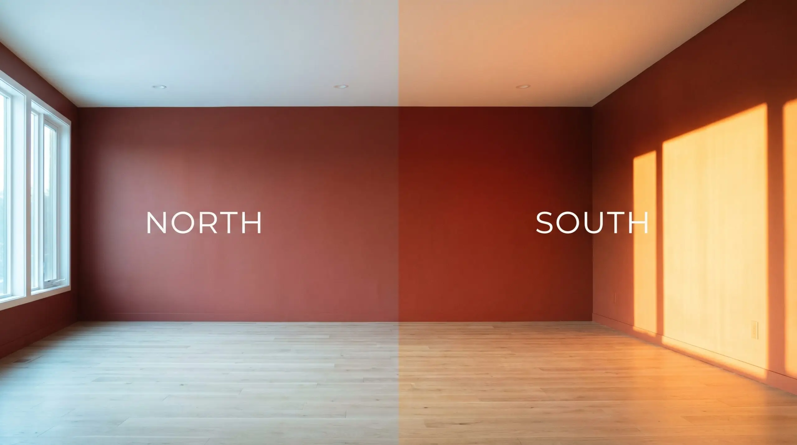
How Lighting Shifts Behr Intrigue: The Chameleon Factor
Every paint color is at the mercy of the light that hits it, and a saturated chromatic profile like this one is especially reactive. The way the sun moves across your home will dictate whether this shade feels subdued or highly energized.
Where to Apply This Saturated Tone: Popular Applications
Placing a bold color requires intention, as its visual weight will dictate the mood of the entire space. By strategically choosing where to apply this rich shade, you can manipulate the perceived proportions and energy of your home. Here is how to maximize its potential across different architectural features.
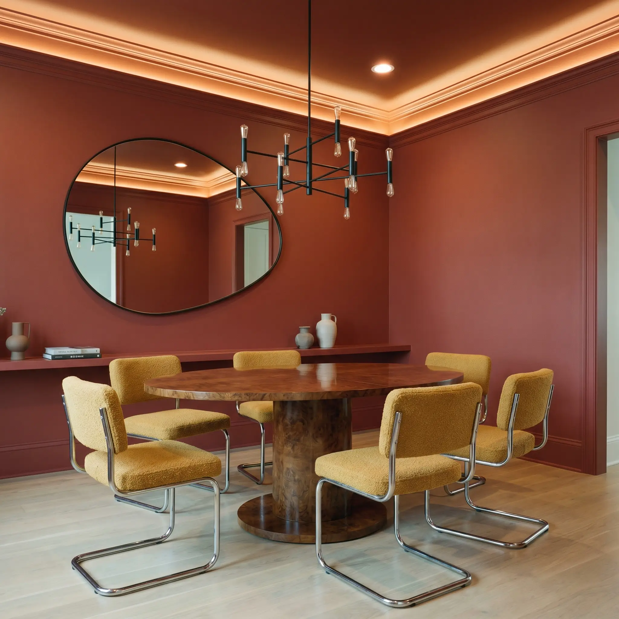
Dining Rooms
Rather than defaulting to a predictable heritage aesthetic, treat this shade as a backdrop for a Postmodern or Bauhaus-inspired dining space. Color-drench the entire room—walls, ceiling, and trim—to erase harsh architectural lines and create a seamless, glowing box. This continuous application reduces visual clutter and allows sculptural furniture to take center stage.
Pair the intense walls with a sleek burled walnut pedestal table and cantilever chairs upholstered in a contrasting mustard bouclé. To keep the room from feeling too enclosed, introduce an oversized, asymmetrical mirror to bounce the ambient light from a modern, blackened steel chandelier. The result is a dining space that feels both avant-garde and incredibly welcoming.
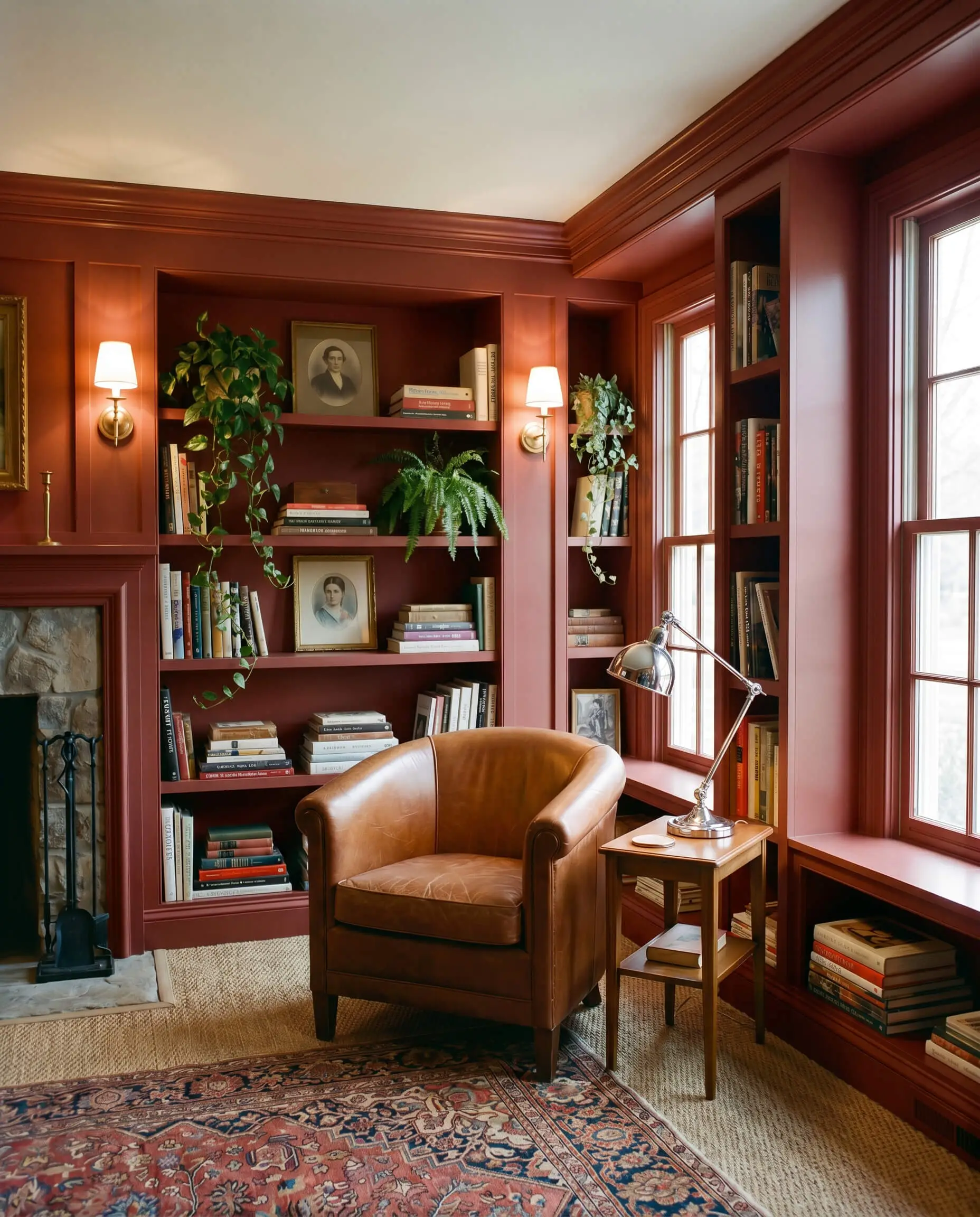
Home Libraries & Studies
This color was practically engineered to create focus and intimacy, making it a brilliant choice for a workspace or reading room. If you have built-in shelving, paint the entire unit—including the backing and the shelves themselves—in a satin finish. This unifies the millwork and creates a striking, monolithic display for stacked art books, vintage portraits, and trailing plants.
When using a low-LRV color on extensive cabinetry, always introduce a reflective surface to break up the visual mass. A polished chrome desk lamp or a fluted glass cabinet door will provide exactly the right amount of relief.
Hackrea Pro-Tip (The Contrast Rule)
Style the room with a mix of tactile elements, such as a slipcovered sofa in washed linen or a classic barrel-back chair in saddle leather. Layering a vintage rug over a natural sisal foundation adds texture without competing with the vibrant walls.
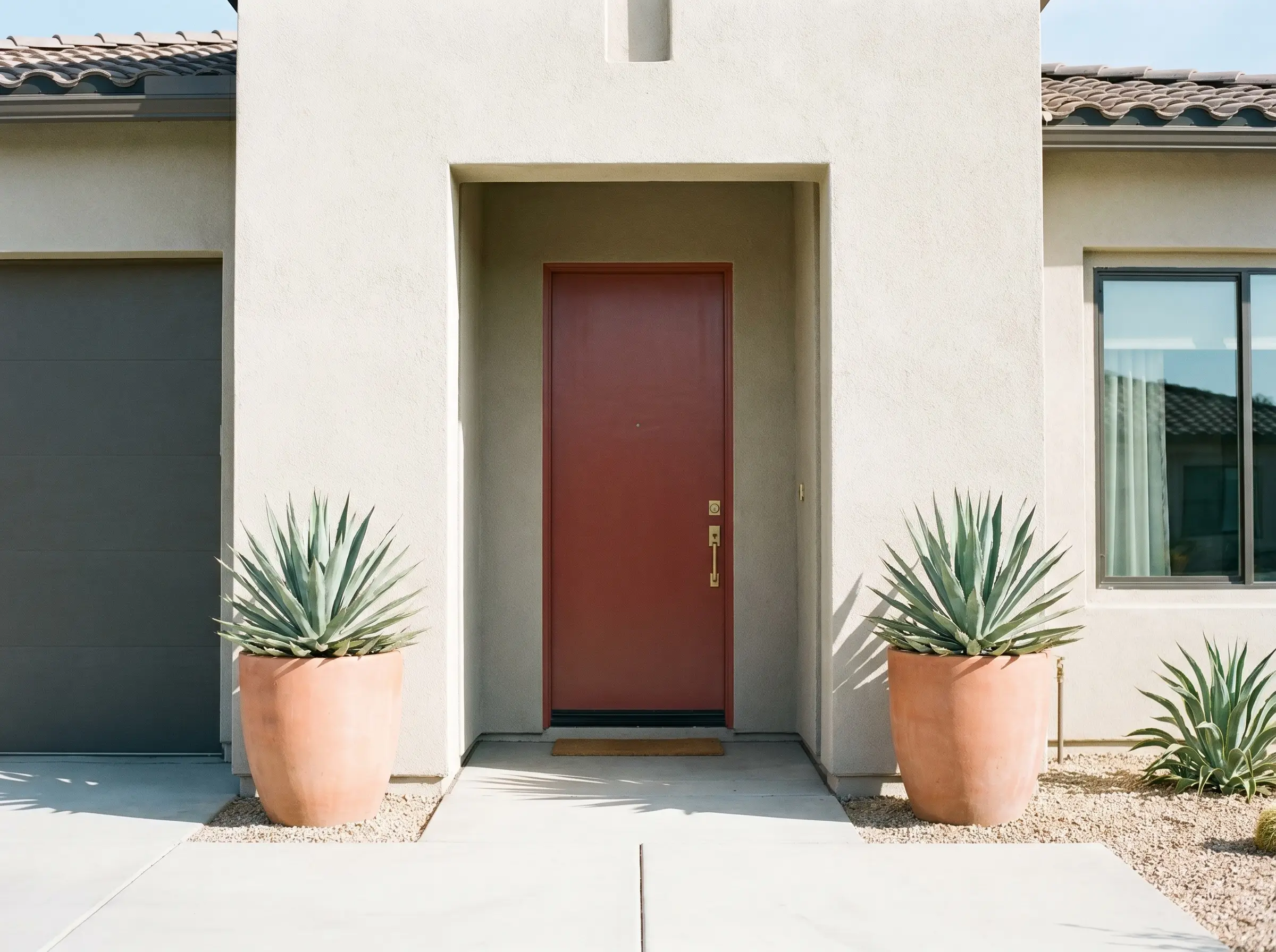
Front Doors & Exterior Shutters
On an exterior facade, natural sunlight will significantly wash out the intensity of any paint, causing this shade to read a bit lighter and more distinctly orange. It serves as an exceptional focal point against neutral siding, particularly on Desert Modern or Mediterranean Revival homes. Use a high-quality exterior semi-gloss finish to ensure the pigment remains vibrant and withstands the elements.
Complement the door with unlacquered brass hardware, which will develop a beautiful patina that echoes the earthy tones of the paint. Flank the entryway with oversized terracotta planters filled with architectural greenery like olive trees or agave. This combination roots the home in its landscape while offering a sophisticated, welcoming curb appeal.
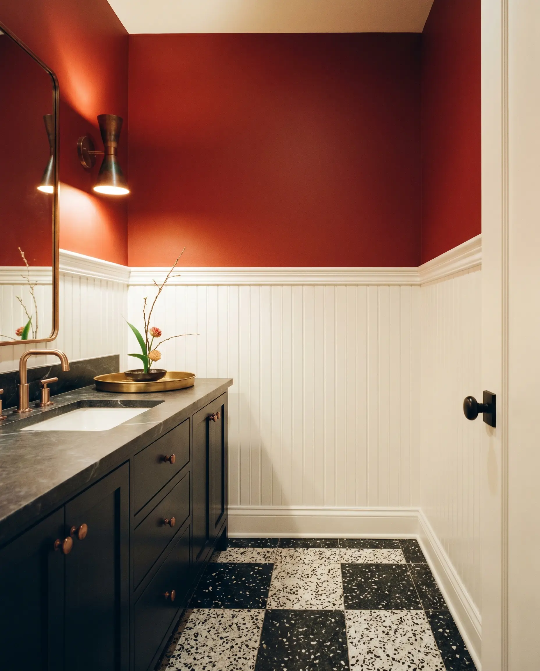
Powder Rooms
A windowless powder room is the perfect laboratory for high-impact design, as you do not have to worry about shifting natural light. Lean into the enveloping nature of the hue by applying it above a crisp, white wainscoting or beadboard to balance the visual weight. Alternatively, pair it with a graphic, black-and-white terrazzo floor for a striking, contemporary contrast.
Install a honed soapstone vanity top and oxidized copper sconces to introduce raw, organic textures. Because the space is small, the rich wall color acts almost like a jewel box, making the standard fixtures feel intentional and elevated. Keep the styling minimal—a single-stem Ikebana arrangement or a simple brass tray is all you need.
Building the Palette: Coordinating Colors & Best Pairings for Intrigue
The secret to integrating a saturated red lies in how you manage its boundaries and the materials you place next to it. This color demands companions that either match its earthy intensity or provide a crisp, structural contrast.
Trim & Baseboards
To maintain a tailored, modern aesthetic, this hue requires a trim color that offers a sharp, clean break without looking sterile.
Hardware, Wood & Material Pairings
The materials you introduce will either amplify the warmth of the paint or provide a necessary cooling effect. Focus on textures that offer a tactile contrast to the flat surface of the wall.
Coordinating Colors
Building a cohesive palette requires secondary colors that either cool down the heat or lean into the earthy aesthetic.
Designer Mood Boards
To truly visualize how these elements combine, consider these curated aesthetic pathways. Each board uses the core red as a foundation but shifts the resulting atmosphere entirely based on the styling.
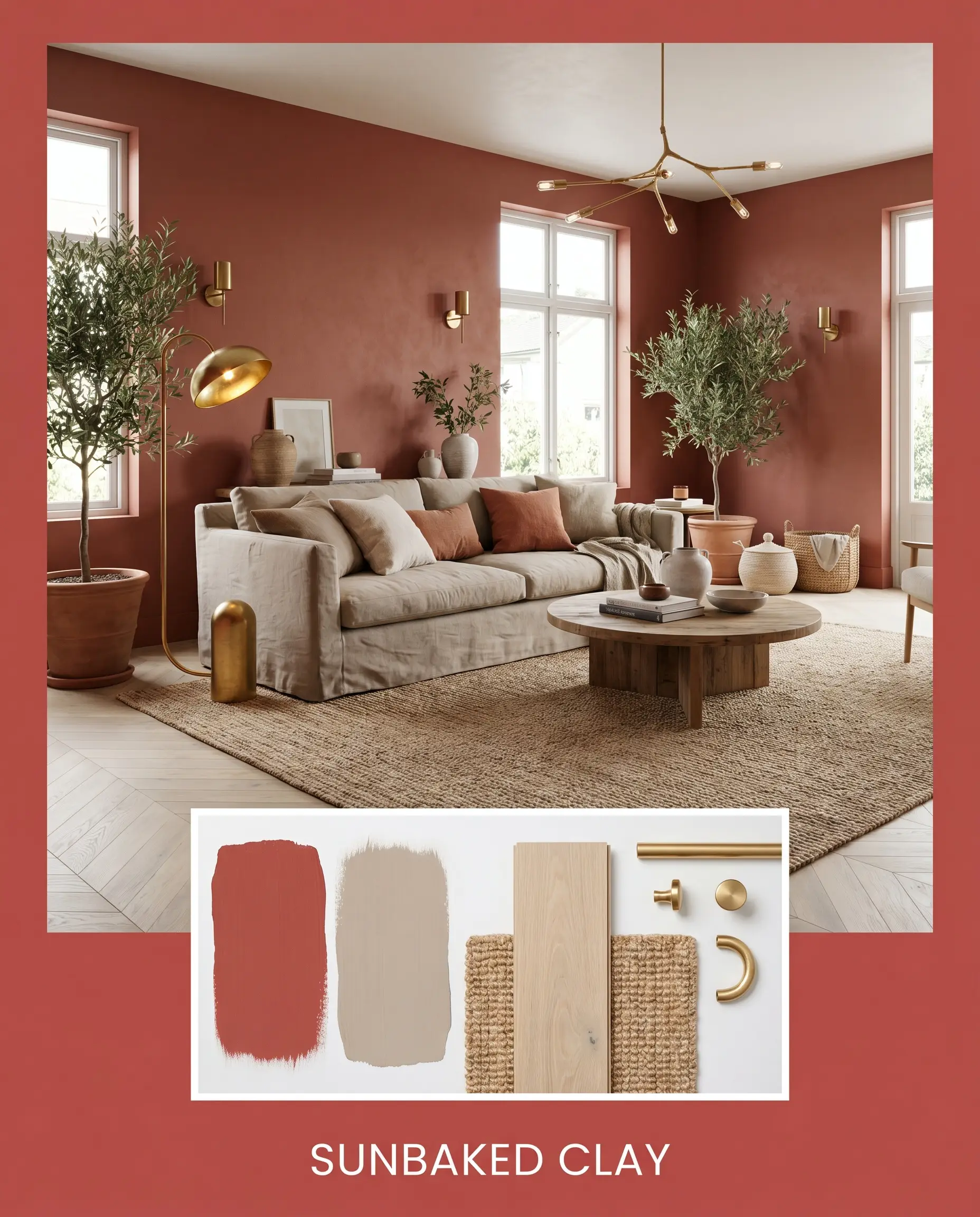
Sunbaked Clay
This palette leans heavily into an Organic Modern aesthetic, prioritizing raw textures and relaxed silhouettes. Combine the vibrant walls with pale white oak flooring and expansive natural jute rugs. Introduce furniture upholstered in soft, Farrow & Ball Jitney-toned linen, and accent the space with unlacquered brass lighting fixtures. The resulting mood is incredibly serene, grounded, and effortlessly welcoming.
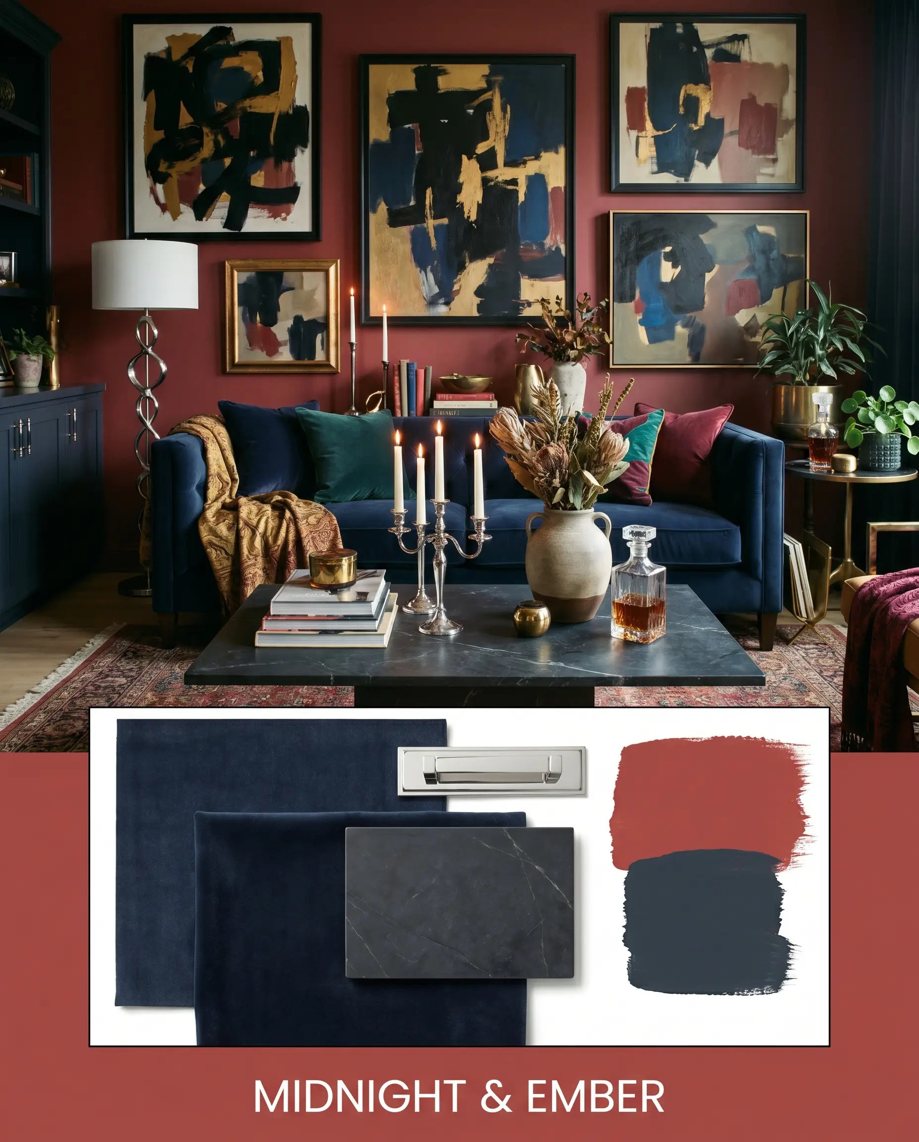
Midnight & Ember
For a more dramatic, Maximalist approach, use the intense red alongside accents of Sherwin-Williams Naval. Picture the red on the walls, paired with a navy velvet tuxedo sofa and a dark, honed soapstone coffee table. Layer in metallic touches with polished chrome hardware and frame vintage abstract canvases in sleek black. This combination feels electric, tailored, and highly curated.
Choosing the Right Red: Head-to-Head Comparisons
Selecting the perfect saturated tone often comes down to analyzing how its subtle undertones will react in your specific environment. If your lighting conditions are challenging, a rival shade might offer a more reliable result.
Behr Intrigue vs. Sherwin-Williams Red Tomato SW 6607
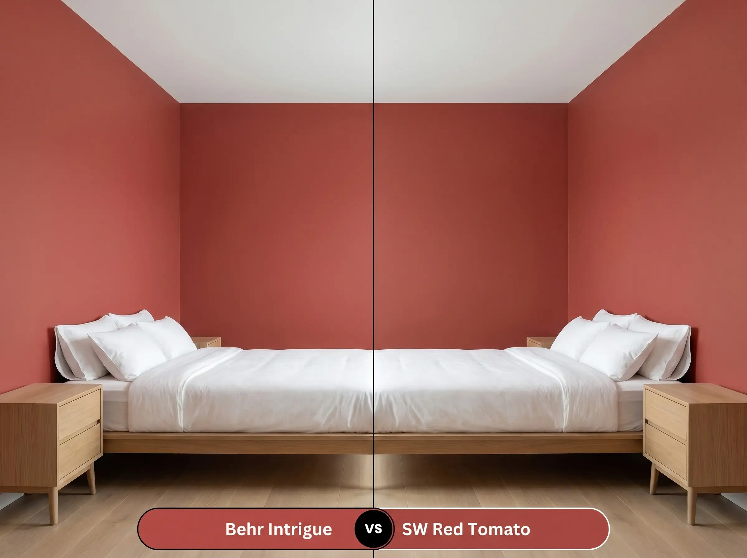
Red Tomato is significantly brighter and leans much further into a true, vibrant orange. If your space lacks natural light and you want a color that feels energetic and punchy, Red Tomato is the better option. However, if you prefer a more muted, sophisticated tone that feels baked and historical, the Behr option remains superior.
Behr Intrigue vs. Benjamin Moore Caliente AF-290
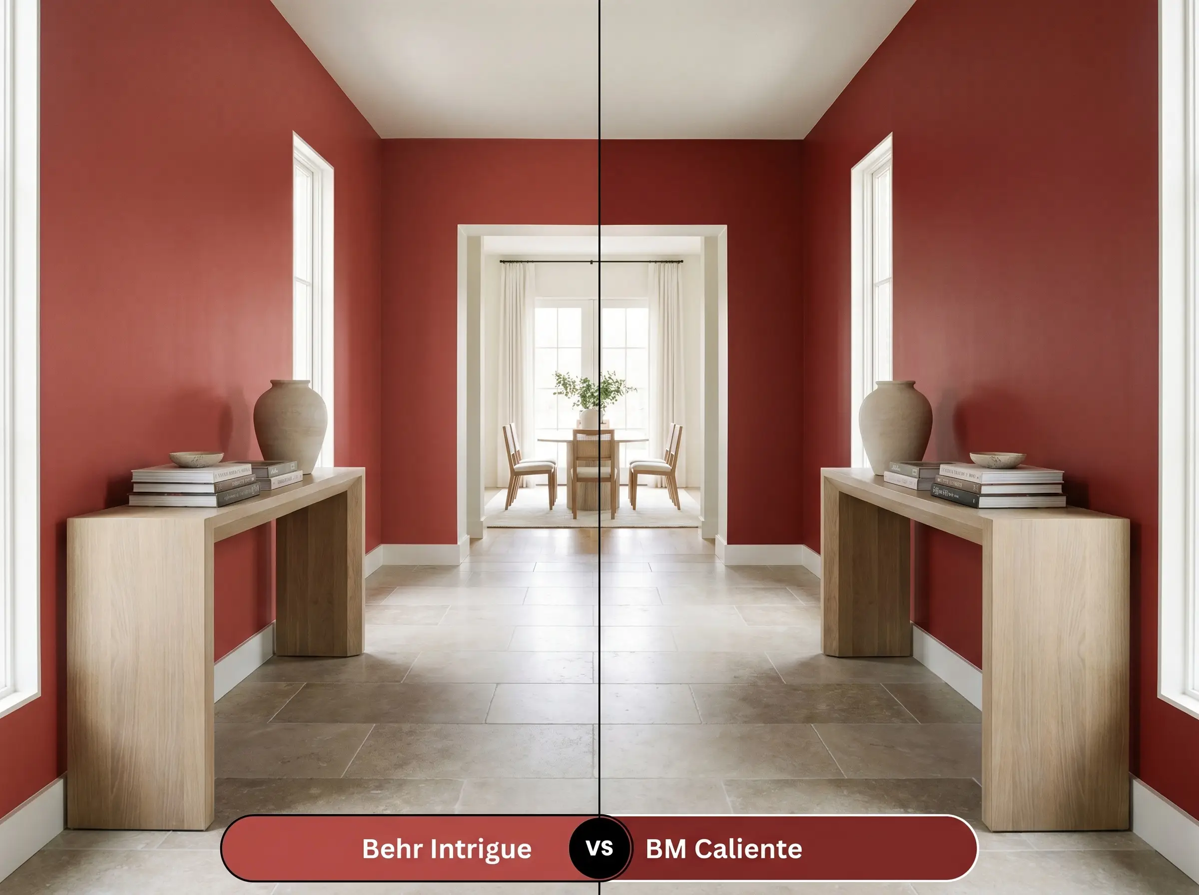
Caliente is a classic, fiery red with far less of the earthy orange cast found in the Behr shade. It reads as a purer, more traditional crimson. If you are pairing the paint with very cool-toned materials like stark white marble or polished nickel, Caliente will hold its shape better. The Behr shade is better suited for environments rich in warm woods and natural stones.
Alternative Options: Similar Colors & Brand Equivalents
If the core profile of this paint appeals to you but you need a slight adjustment in depth or brand availability, these alternatives provide excellent starting points.
Similar Colors
Cross-Brand Matches
Executing Bold Interior Design: Practical Application & DIY Advice
Transforming a room with a low-light reflectance color requires precise execution to ensure the finish looks intentional and professional.
The Dynamic Sheen Guide:
Primer Strategy: A standard white primer will struggle to support this level of saturation. You must use a high-quality gray-tinted primer to ensure the red base develops its full richness without looking streaky.
Coverage & Success Tips: Expect to apply a minimum of two generous coats, though three may be necessary depending on your roller technique. To avoid “flashing” (those visible, uneven roller marks that catch the light), maintain a wet edge while painting and avoid over-rolling sections that have already begun to dry.
Frequently Asked Questions
Because of its intense saturation, direct afternoon sun will significantly wash out the color, making the earthy orange cast much more prominent. To protect the pigment from fading prematurely, you must use a premium, UV-resistant exterior enamel in a semi-gloss finish.
Absolutely, provided you balance the visual weight. By pairing it with a bright white wainscoting on the lower half of the walls, or by utilizing reflective surfaces like oversized mirrors and polished hardware, the color feels cozy and curated rather than enclosed.
It actually pairs beautifully with dark walnut, as the rich brown tones ground the vibrant red. However, it can occasionally compete with the yellow tones in unpainted honey oak trim; if you have honey oak, ensure your lighting is crisp (3000K) to keep the wood from pulling too yellow.
Low-CRI (Color Rendering Index) lighting will flatten the complexity of this color, often making it look muddy or dull. To ensure the rich, earthy orange cast remains vibrant and true, always use bulbs with a CRI of 90 or higher.
The Final Verdict & Expert Warnings
Behr Intrigue (P160-6) is a masterful choice for homeowners ready to inject genuine warmth and architectural character into their spaces. Its greatest strength lies in its hidden orange cast, which prevents it from feeling like a harsh, primary red and instead transforms it into a sophisticated, baked-clay hue. It performs exceptionally well in dining rooms, intimate studies, and as a striking exterior accent, especially when paired with natural materials like soapstone, white oak, and unlacquered brass.
While this color is incredibly versatile, you must be highly cautious when pairing it with stark, cool-toned grays or icy blue-white marble countertops. Because this paint relies so heavily on its warm, earthy foundation, placing it directly against frosty, blue-based materials forces the red to look slightly rusty and dingy, while simultaneously making the cool materials appear sterile and uninviting. If your home features predominantly cool, gray-toned fixed elements, you will be much better served by a red with a distinct blue undertone to ensure the materials support one another.
Clash Warning (The Temperature Conflict)